Coursework evaluation
20
Farouk Alaka
-
Upload
dammyalaka -
Category
News & Politics
-
view
220 -
download
1
description
Transcript of Coursework evaluation
Farouk Alaka
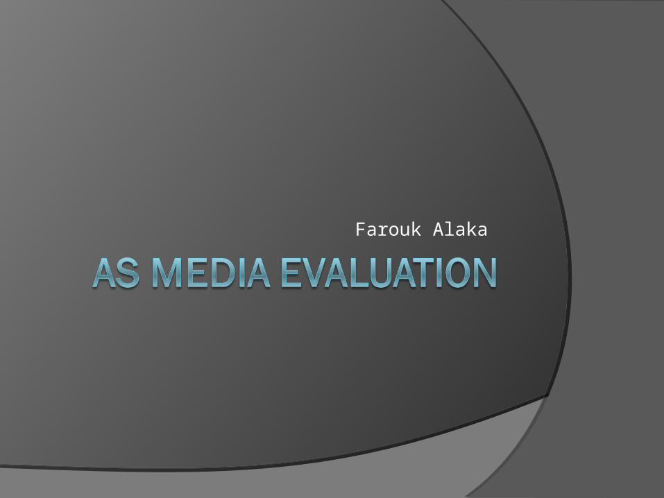
Final Edits
Front Cover Contents Page Double Page Spread
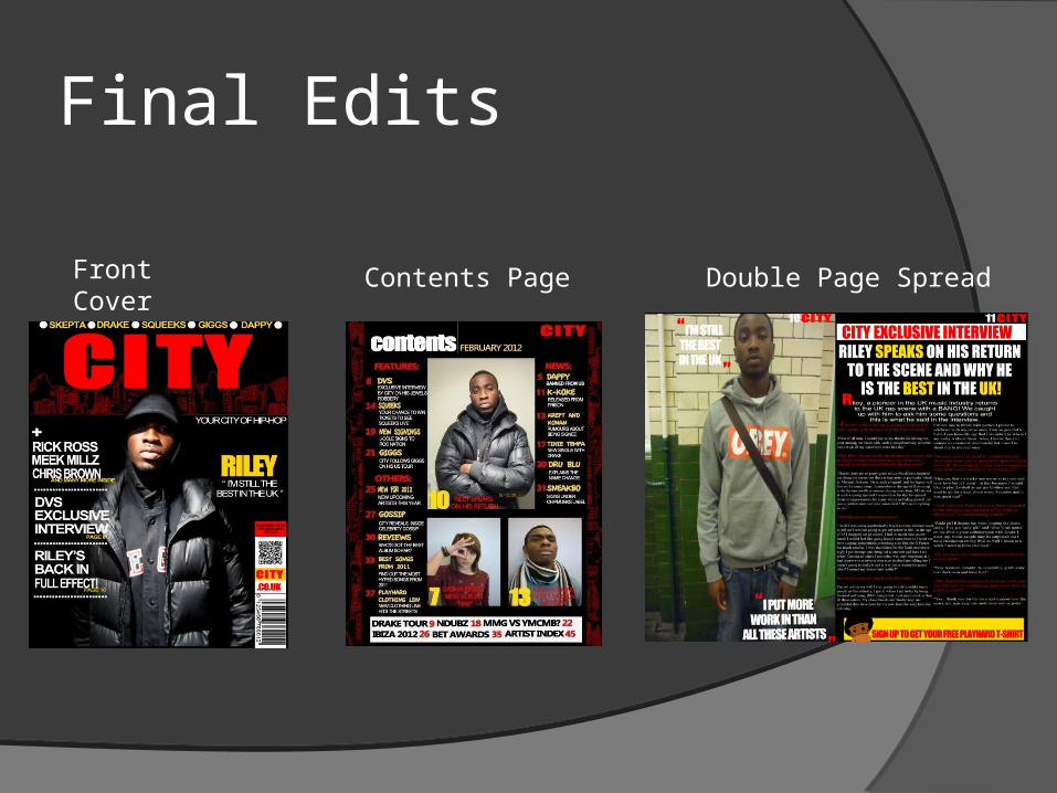
Draft Front Cover Final Front Cover
In what way does your media product use, develop or challenge forms and conventions of real media products?
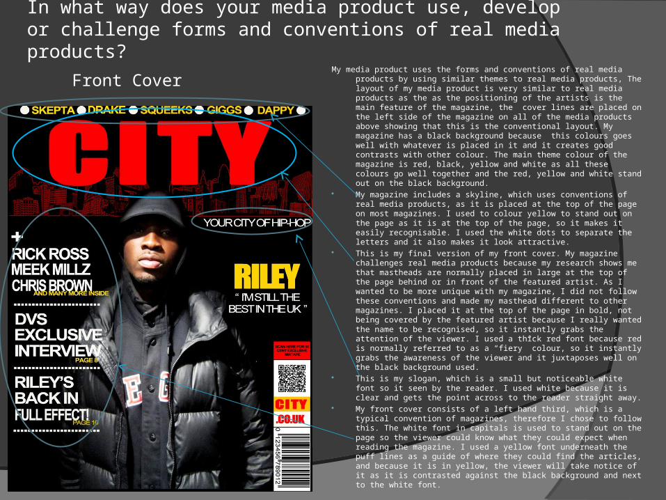
My media product uses the forms and conventions of real media products by using similar themes to real media products, The layout of my media product is very similar to real media products as the as the positioning of the artists is the main feature of the magazine, the cover lines are placed on the left side of the magazine on all of the media products above showing that this is the conventional layout. My magazine has a black background because this colours goes well with whatever is placed in it and it creates good contrasts with other colour. The main theme colour of the magazine is red, black, yellow and white as all these colours go well together and the red, yellow and white stand out on the black background.
My magazine includes a skyline, which uses conventions of real media products, as it is placed at the top of the page on most magazines. I used to colour yellow to stand out on the page as it is at the top of the page, so it makes it easily recognisable. I used the white dots to separate the letters and it also makes it look attractive.
This is my final version of my front cover. My magazine challenges real media products because my research shows me that mastheads are normally placed in large at the top of the page behind or in front of the featured artist. As I wanted to be more unique with my magazine, I did not follow these conventions and made my masthead different to other magazines. I placed it at the top of the page in bold, not being covered by the featured artist because I really wanted the name to be recognised, so it instantly grabs the attention of the viewer. I used a thick red font because red is normally referred to as a “fiery” colour, so it instantly grabs the awareness of the viewer and it juxtaposes well on the black background used.
This is my slogan, which is a small but noticeable white font so it seen by the reader. I used white because it is clear and gets the point across to the reader straight away.
My front cover consists of a left hand third, which is a typical convention of magazines, therefore I chose to follow this. The white font in capitals is used to stand out on the page so the viewer could know what they could expect when reading the magazine. I used a yellow font underneath the puff lines as a guide of where they could find the articles, and because it is in yellow, the viewer will take notice of it as it is contrasted against the black background and next to the white font.
Front Cover
In what way does your media product use, develop or challenge forms and conventions of real media products?
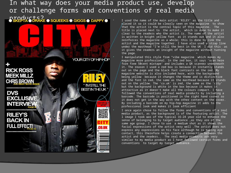
I used the name of the main artist ‘RILEY’ as the title and placed it so it could be clearly seen on the magazine to show that the artist is the central topic of this magazine. The title is placed next to the artist, which is done to make it clear to the readers who the artist is. The name of the artist is written in bright yellow font as it stands out and it also reinforces the magazine as a whole; this is done to link the artist and the magazine together. I have also used a strap line under the masthead “I’m still the best in the UK” I did this as it gives the readers an insight of the magazine without turning the page.
I manipulated this style from “vibe magazine” which makes my magazine more professional. In the red box, it says ‘scan here fore free 50cent mixtape’ and includes a QR scanner underneath it. The reason I used a red box is because it instantly stands out on the page and the black font contrasts on the red. My magazine website is also included here, with the background being yellow because it changes the theme and is distinctive and the font in red, the same as the masthead because it stands out on the yellow. The ‘co.uk’ is red, the same as the ‘city’ but the background is white in the box because it makes it attractive as it doesn't make all the colours compact. I have followed the conventions of real media products by including a barcode. The barcode is positioned in the right hand corner so it does not get in the way with the other content on the cover. By including a barcode on my hip-hop magazine it adds to the professional look and makes it look efficient
I once again chose to follow the forms and conventions of a real media product, as the background is of the featuring artist. The l image I took was of the typical 16-24 year old to enhance the sense of belonging to by target audience ,as they are of the same age group. I chose to use a medium shot as it shows the facial expressions of the artist very well .The artist does not express any expressions on his face although he is making eye contact, this therefore helps create a connection between the artist and the readers.. The real media products are very similar to my media product as I have followed certain forms and conventions to target my target audience.
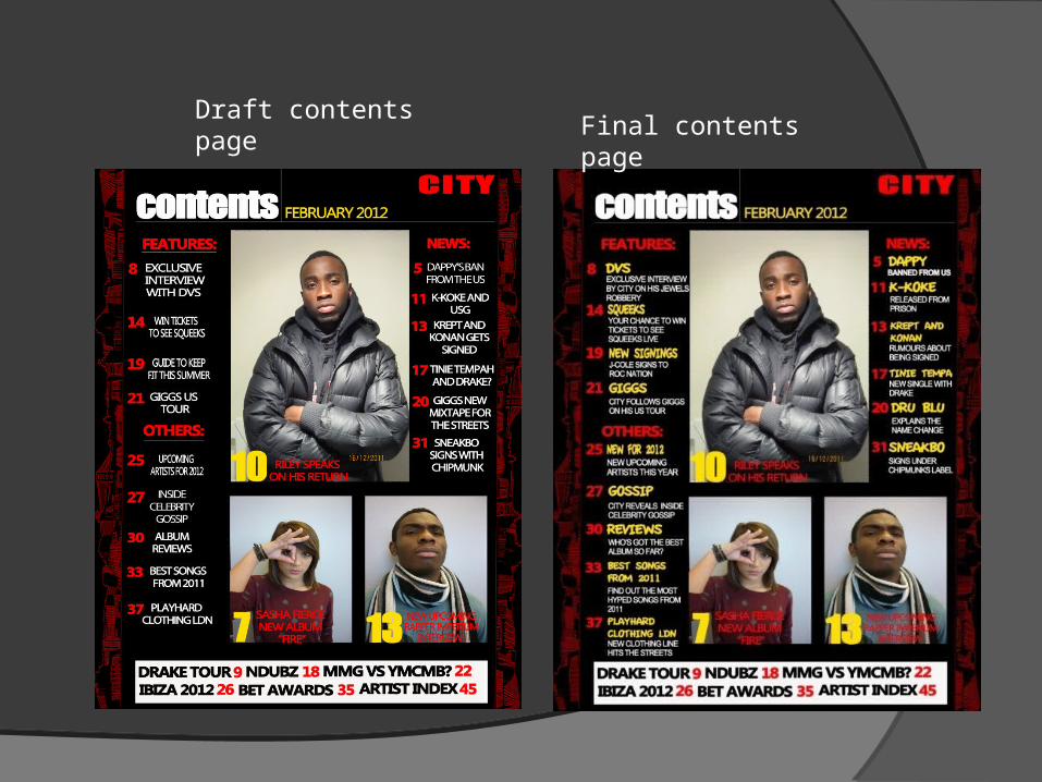
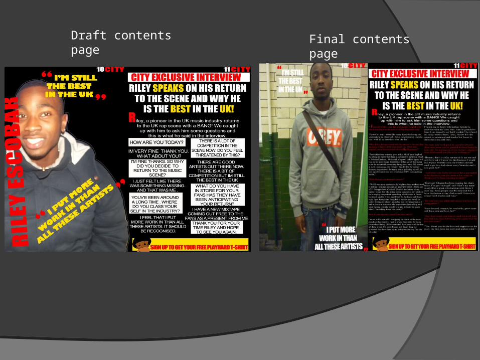
Draft contents page Final contents page
In what way does your media product use, develop or challenge forms and conventions of real media products?
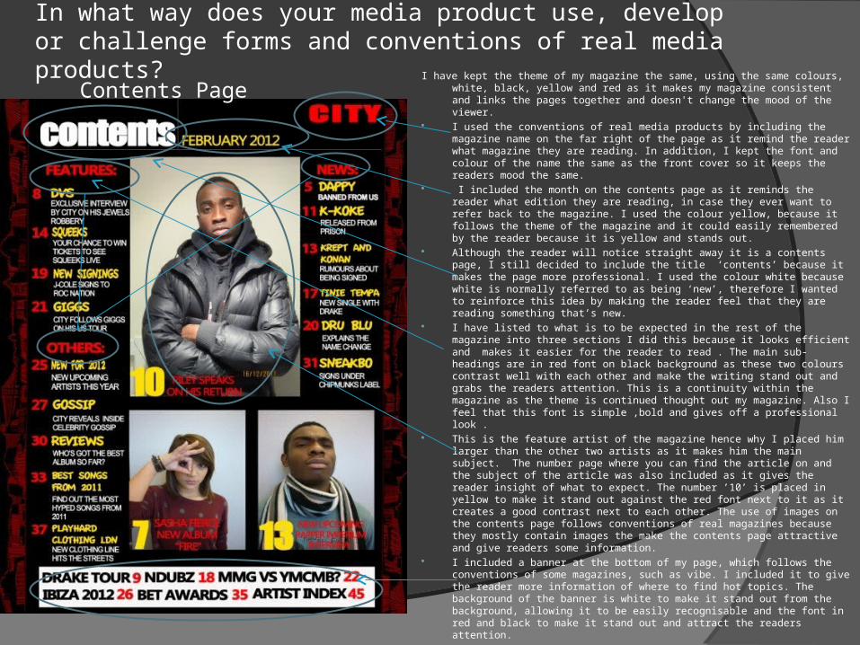
I have kept the theme of my magazine the same, using the same colours, white, black, yellow and red as it makes my magazine consistent and links the pages together and doesn't change the mood of the viewer.
I used the conventions of real media products by including the magazine name on the far right of the page as it remind the reader what magazine they are reading. In addition, I kept the font and colour of the name the same as the front cover so it keeps the readers mood the same.
I included the month on the contents page as it reminds the reader what edition they are reading, in case they ever want to refer back to the magazine. I used the colour yellow, because it follows the theme of the magazine and it could easily remembered by the reader because it is yellow and stands out.
Although the reader will notice straight away it is a contents page, I still decided to include the title ‘contents’ because it makes the page more professional. I used the colour white because white is normally referred to as being ‘new’, therefore I wanted to reinforce this idea by making the reader feel that they are reading something that’s new.
I have listed to what is to be expected in the rest of the magazine into three sections I did this because it looks efficient and makes it easier for the reader to read . The main sub-headings are in red font on black background as these two colours contrast well with each other and make the writing stand out and grabs the readers attention. This is a continuity within the magazine as the theme is continued thought out my magazine. Also I feel that this font is simple ,bold and gives off a professional look .
This is the feature artist of the magazine hence why I placed him larger than the other two artists as it makes him the main subject. The number page where you can find the article on and the subject of the article was also included as it gives the reader insight of what to expect. The number ’10’ is placed in yellow to make it stand out against the red font next to it as it creates a good contrast next to each other. The use of images on the contents page follows conventions of real magazines because they mostly contain images the make the contents page attractive and give readers some information.
I included a banner at the bottom of my page, which follows the conventions of some magazines, such as vibe. I included it to give the reader more information of where to find hot topics. The background of the banner is white to make it stand out from the background, allowing it to be easily recognisable and the font in red and black to make it stand out and attract the readers attention.
Contents Page
Draft contents page Final contents page
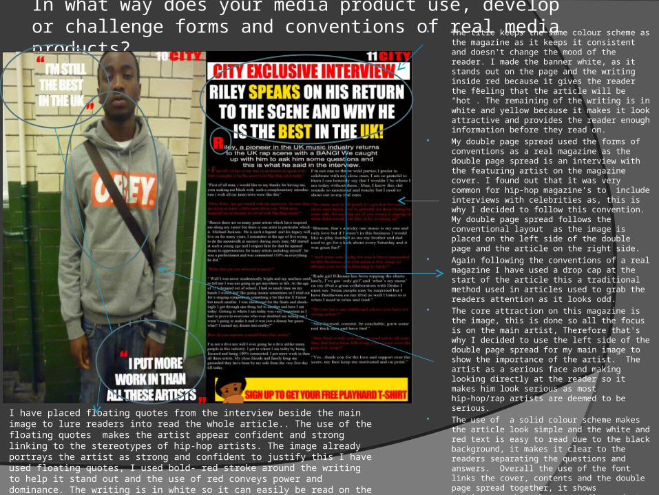
In what way does your media product use, develop or challenge forms and conventions of real media products? The title keeps the same colour scheme as the
magazine as it keeps it consistent and doesn't change the mood of the reader. I made the banner white, as it stands out on the page and the writing inside red because it gives the reader the feeling that the article will be “hot”. The remaining of the writing is in white and yellow because it makes it look attractive and provides the reader enough information before they read on.
My double page spread used the forms of conventions as a real magazine as the double page spread is an interview with the featuring artist on the magazine cover. I found out that it was very common for hip-hop magazine’s to include interviews with celebrities as, this is why I decided to follow this convention. My double page spread follows the conventional layout as the image is placed on the left side of the double page and the article on the right side.
Again following the conventions of a real magazine I have used a drop cap at the start of the article this a traditional method used in articles used to grab the readers attention as it looks odd.
The core attraction on this magazine is the image, this is done so all the focus is on the main artist, Therefore that's why I decided to use the left side of the double page spread for my main image to show the importance of the artist. The artist as a serious face and making looking directly at the reader so it makes him look serious as most hip-hop/rap artists are deemed to be serious.
The use of a solid colour scheme makes the article look simple and the white and red text is easy to read due to the black background, it makes it clear to the readers separating the questions and answers. Overall the use of the font links the cover, contents and the double page spread together, it shows consistency throughout my media product.
I have placed floating quotes from the interview beside the main image to lure readers into read the whole article.. The use of the floating quotes makes the artist appear confident and strong linking to the stereotypes of hip-hop artists. The image already portrays the artist as strong and confident to justify this I have used floating quotes, I used bold- red stroke around the writing to help it stand out and the use of red conveys power and dominance. The writing is in white so it can easily be read on the background of the picture and it also makes it look more attractive. I am challenging the conventions as floating quotes are not usually used in hip-hop magazines.
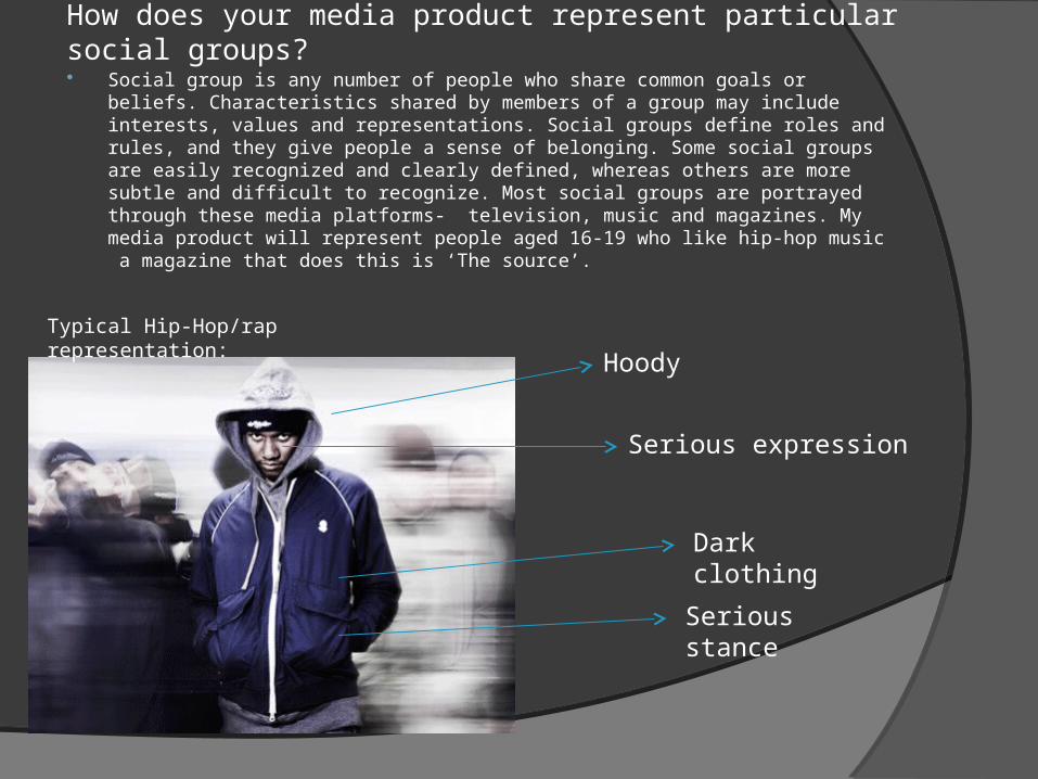
How does your media product represent particular social groups? Social group is any number of people who share common goals or beliefs.
Characteristics shared by members of a group may include interests, values and representations. Social groups define roles and rules, and they give people a sense of belonging. Some social groups are easily recognized and clearly defined, whereas others are more subtle and difficult to recognize. Most social groups are portrayed through these media platforms- television, music and magazines. My media product will represent people aged 16-19 who like hip-hop music a magazine that does this is ‘The source’.
Typical Hip-Hop/rap representation:
Serious expression
Hoody
Dark clothing
Serious stance
How does your media product represent particular social groups?
My media product represents the hip-hop social group very well through the colour scheme, models and props , language used on my media product. I intentionally used models aged between 16-19 age range, the reason for me doing this was so that the target audience can relate to the model as they are in the similar age range. The images I took where mainly of the typical 16-19 year olds to enhance the sense of belonging to by target audience ,as they are of the same age group. I mainly used black models as on my media product as most hip-hop artist are black, as hip-hop music originated from them and it is what the genre is all about. The fonts I have used on my media product are bold but simple I did not want to over do it as my target audience were mainly teenagers therefore it had to be basic and easy to understand this was also done to reach to a wider audience.
My magazine consisted of four main colours-red, black , yellow and white these colours were used as they appealed to both genders whereas if I used colours like pink which is stereotypically known as ‘feminine’ and blue as more of a ‘boy’ colour. The use of these colours helped me to reach to both genders without excluding either one. In most hip-hop magazines it is conventional to use three colours, my reason for using red is that the connotation of the colour red in hip-hop is strength and power, the use of black associates with masculinity as it is a very dark and powerful colour another reason for using black is that it is easier to see the text. The use of black and white is appealing as both colours can reach out to black and white audiences. I used colloquial language on my media product as being a teenager myself I am aware that teenagers use this type of language on a daily basis my motive for using colloquial language was to make it easy for my target audience to relate to the artist and feel that they belong.
What kind of media institution might distribute your media product and why?
The media institution that I have chosen to issue my media product is IPC Media IPC Media produces over 60 iconic media brands, with print alone reaching almost two thirds of UK women and 42% of UK men – almost 26 million UK adults – while they websites collectively reach over 20 million users every month. Its portfolio of 38 brands covers a huge spectrum of interests and includes famous names from Country Life and The Field to Nuts and NME. IPC Advertising offers you access to IPC Media's unparalleled range of print and online brands. Their leading magazine portfolio reaches 27million UK adults* and our online brands collectively reach 20 million users. IPC media Exports service to 90 countries worldwide selling over 13m copies every year through a committed team of international specialists.
I feel that IPC Media would be the best institution to distribute my publication because they have strong sales in magazines, and they do not sell any other magazine which is like my magazine as they currently issuing music magazines like NME which is not the same genre therefore there will be minimal rivalry to as I am targeting a different audience. An advantage that IPC Media has is that it has many years of experience in marketing magazines, which is shown through the other successful publications they distribute such as NME and Nuts.
What kind of media institution might distribute your media product and why?
• The type of distribution method I will be using is distributing my publication will be at off-licences/newsagents as this is the main place where purchase magazines from. Newsagents and off-licences are local places and people don't have to travel very far to find one. Most people like to go straight to newsagents to purchase their magazine as they are aware that the product will be available there.
• I will also be using internet distribution, I will put up copies of my music magazine online, this is because many other music magazines are now available on the internet therefore to keep up with competition I will also use internet distribution to stay in the competition. My primary and secondary research shows that my target audience 16-19 year olds spend the majority of their time on the internet, by distributing it on the internet it will make accessible to everyone.
Who would be the audience for your media product? The target audience for my music magazine ‘CITY’ are teenagers aged 16-19 year old
males and females who would most likely to be students and have a strong interest in current Hip-Hop music. Whilst creating my magazine I tried to reject the typical stereotypes of teenagers as they are portrayed to be violent and anti-social by the media. I chose to create a hip-hop magazine as hip-hop is the most popular genre of music and very popular amongst teenagers ages 16-19 as they can identify hip-hop music through the artists and the lyrical meanings of the songs. Hip-hop music can be seen as a motivation by teenagers as it can influence them to stay away from crime and can help with studies. Hip-hop music is also linked with fashion therefore it was important how my models were dressed. I included an interview on my double page spread of an artist same age as the audience this was done to help the audience relate with the artist and aspire to be like him some day. I used models which are comparable to my target audience as it helped them feel like a sense of belonging.
Although I did not include the price of the magazine on the front cover, I decided to price my media product £2.00 as from the questionnaire I found out over half the respondents said they are willing to pay between £1-3, I thought £2.00 was a fair price as most readers are students and will not able to pay more than that. The reason I did not include the price as I wanted the viewer to purchase the magazine because of its contents and not of the price. On my double page spread I included an incentive as it gives a readers a chance to win a free piece of clothing, which was done as readers find incentives and free give aways very appealing.
How did you attract/address your audience?
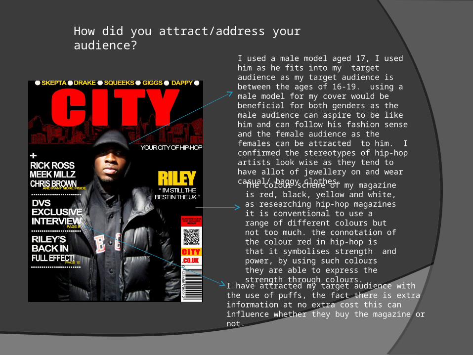
I used a male model aged 17, I used him as he fits into my target audience as my target audience is between the ages of 16-19. using a male model for my cover would be beneficial for both genders as the male audience can aspire to be like him and can follow his fashion sense and the female audience as the females can be attracted to him. I confirmed the stereotypes of hip-hop artists look wise as they tend to have allot of jewellery on and wear casual/ baggy clothes.
The colour scheme of my magazine is red, black, yellow and white, as researching hip-hop magazines it is conventional to use a range of different colours but not too much. the connotation of the colour red in hip-hop is that it symbolises strength and power, by using such colours they are able to express the strength through colours.
I have attracted my target audience with the use of puffs, the fact there is extra information at no extra cost this can influence whether they buy the magazine or not.
How did you attract/address your audience?
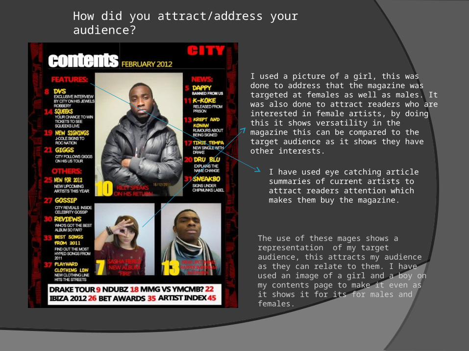
I used a picture of a girl, this was done to address that the magazine was targeted at females as well as males. It was also done to attract readers who are interested in female artists, by doing this it shows versatility in the magazine this can be compared to the target audience as it shows they have other interests.
I have used eye catching article summaries of current artists to attract readers attention which makes them buy the magazine.
The use of these mages shows a representation of my target audience, this attracts my audience as they can relate to them. I have used an image of a girl and a boy on my contents page to make it even as it shows it for its for males and females.
How did you attract/address your audience?
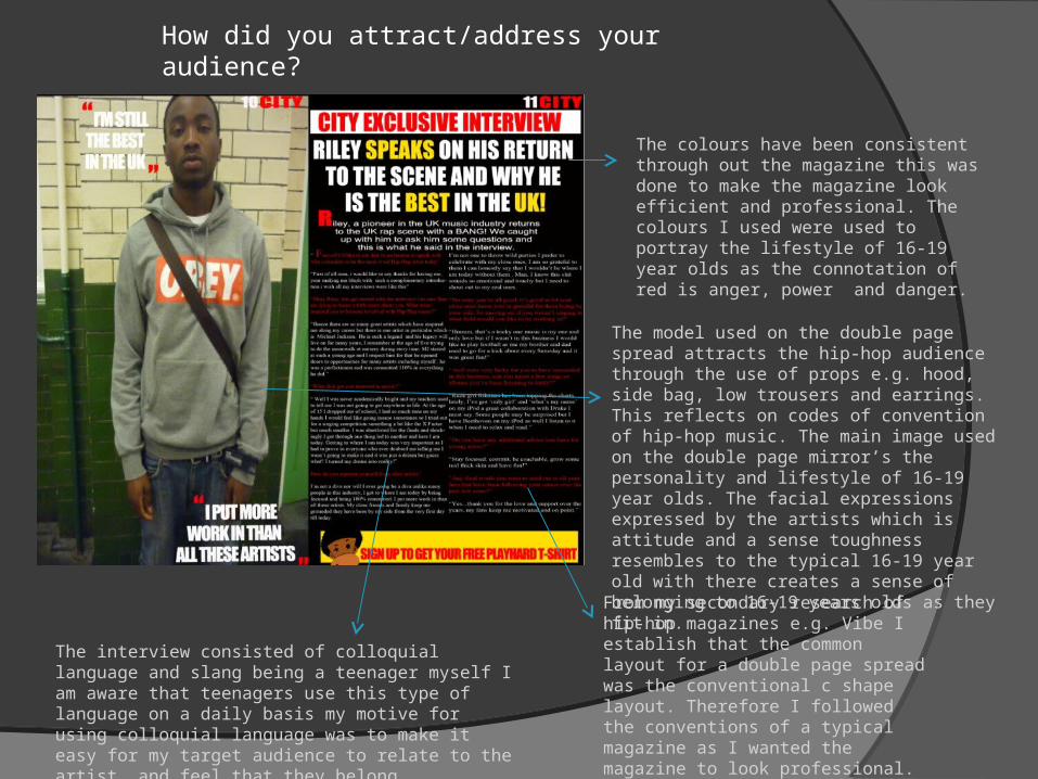
The colours have been consistent through out the magazine this was done to make the magazine look efficient and professional. The colours I used were used to portray the lifestyle of 16-19 year olds as the connotation of red is anger, power and danger.
The model used on the double page spread attracts the hip-hop audience through the use of props e.g. hood, side bag, low trousers and earrings. This reflects on codes of convention of hip-hop music. The main image used on the double page mirror’s the personality and lifestyle of 16-19 year olds. The facial expressions expressed by the artists which is attitude and a sense toughness resembles to the typical 16-19 year old with there creates a sense of belonging to 16-19 years olds as they fit in.
From my secondary research of hip-hop magazines e.g. Vibe I establish that the common layout for a double page spread was the conventional c shape layout. Therefore I followed the conventions of a typical magazine as I wanted the magazine to look professional.
The interview consisted of colloquial language and slang being a teenager myself I am aware that teenagers use this type of language on a daily basis my motive for using colloquial language was to make it easy for my target audience to relate to the artist and feel that they belong.
What have you learnt about technology from the process of constructing this product?
Throughout the process of constructing my music magazine I used a variety of technologies which helped me to produce my product professionally and efficiently. The range of technologies I used were:
Digital camera
Publisher
Adobe Photoshop CS5
Internet Explorer To create a music magazine I needed to take pictures in order to make it look professional and look like a good music magazine. I used a Nixon camera to take my pictures as I had experience using it before, the Nixon camera was easy to use and produced quality pictures. As soon I had taken my pictures I was able to connect my camera to a computer and upload them and start editing them. Publisher was a great programme to use to plan my layout of the actual magazine. I made draft copies on publisher this gave me a rough idea what I was going to do on my real magazine, although publisher didn't have much technical editing aspects but it did help me to decide where I was going to place the title, images and what fonts to use. The main and the most important form of technology used to construct my music magazine was Photoshop, I had no previous experience in using Photoshop therefore it made the construction process more difficult. During my media lessons my media teacher showed demonstrations how to use Photoshop after a few practise lessons I felt more comfortable using it and starting experimenting on the pictures I took. Photoshop enabled me to use a variety of techniques on my media product as it allowed me use a ‘vector mask’ this helped me to crop my pictures at an exceptional level, this helped my media product to look professional and efficient. I also used the internet for secondary research on current hip-hop magazines, researching gave me an insight to what my music magazine should and needed to look like. It helped me shape my magazine into a music magazine which would appealed to my target audience.
Looking back at your preliminary task, what do you feel you have learnt in the progression for it to the full product?
Looking back at your preliminary task, what do you feel you have learnt in the progression for it to the full product?
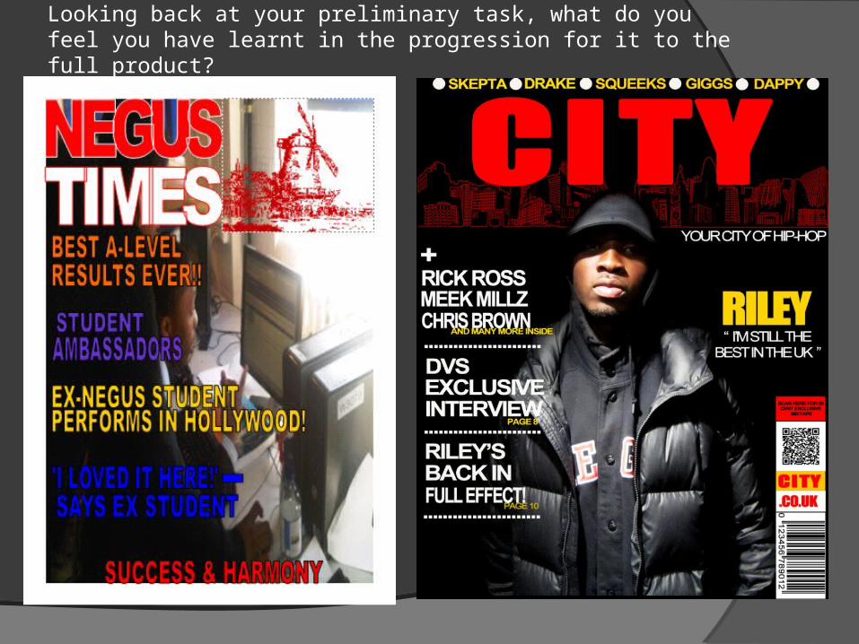
The comparison between my preliminary task and my actual media product is immense, as when creating my preliminary task I was not aware of the codes and conventions of magazines. My preliminary task shows minor understanding of magazines this was due to not having access to the right technology e.g. Photoshop. The preliminary task shows I don't have a specific colour scheme which makes my preliminary task look more like a poster than a school magazine. Publisher did not express my skill’s to best of my ability as I had limited techniques I would use on the school magazine due to the programme not being efficient enough. Comparing both of these magazine shows that a school magazine and a music magazine need to have a different structures as its very normal for a school magazine to consist of two or more stories on the front cover as there is a variety of age ranges from year 7-11 so it has to appeal to everyone not just one specific audience. Whereas on the other hand the music magazine targets a specific audience which makes it easier to know what to feature in the magazine as you are aware of the likes and dislikes. With the school magazine I had to be cautious what to write as it had to be formal and educational in contrast to the music magazine which consists of informal language as the readers are older and more mature. Overall looking back at the preliminary task I have learnt that social groups are very important when producing a magazine as each social group have different needs and wants, I have also learnt that its very important to have the right technology to produce a magazine.