MINITAB ASSISTANT WHITE PAPER - Support · ATTRIBUTE CONTROL CHARTS 3 Data checks Stability For...
23
WWW.MINITAB.COM MINITAB ASSISTANT WHITE PAPER This paper explains the research conducted by Minitab statisticians to develop the methods and data checks used in the Assistant in Minitab Statistical Software. Attribute Control Charts Overview Control charts are used to regularly monitor a process to determine whether it is in control. When it is not possible to measure the quality of a product or service with continuous data, attribute data is often collected to assess its quality. The Minitab Assistant includes two widely used control charts to monitor a process with attribute data: P chart: This chart is used when a product or service is characterized as defective or not defective. The P chart plots the proportion of defective items per subgroup. The data collected are the number of defective items in each subgroup, which is assumed to follow a binomial distribution with an unknown proportion parameter (p). U chart: This chart is used when a product or service can have multiple defects and the number of defects is counted. The U chart plots the number of defects per unit. The data collected are the total number of defects in each subgroup, which is assumed to follow a Poisson distribution with an unknown mean number of defects per subgroup. The control limits for a control chart are typically set in the control phase of a Six Sigma project. A good control chart should be sensitive enough to quickly signal when a special cause exists. This sensitivity can be assessed by calculating the average number of subgroups needed to signal a special cause. A good control chart should also rarely signal a “false alarm” when the process is in control. The false alarm rate can be assessed by calculating the percentage of subgroups that are deemed “out-of-control” when the process is in control. To help evaluate how well the control charts are performing, the Assistant Report Card automatically performs the following data checks: Stability Number of subgroups Subgroup size Expected Variation
Transcript of MINITAB ASSISTANT WHITE PAPER - Support · ATTRIBUTE CONTROL CHARTS 3 Data checks Stability For...

WWW.MINITAB.COM
MINITAB ASSISTANT WHITE PAPER
This paper explains the research conducted by Minitab statisticians to develop the methods and
data checks used in the Assistant in Minitab Statistical Software.
Attribute Control Charts
Overview Control charts are used to regularly monitor a process to determine whether it is in control.
When it is not possible to measure the quality of a product or service with continuous data,
attribute data is often collected to assess its quality. The Minitab Assistant includes two widely
used control charts to monitor a process with attribute data:
P chart: This chart is used when a product or service is characterized as defective or not
defective. The P chart plots the proportion of defective items per subgroup. The data
collected are the number of defective items in each subgroup, which is assumed to
follow a binomial distribution with an unknown proportion parameter (p).
U chart: This chart is used when a product or service can have multiple defects and the
number of defects is counted. The U chart plots the number of defects per unit. The data
collected are the total number of defects in each subgroup, which is assumed to follow a
Poisson distribution with an unknown mean number of defects per subgroup.
The control limits for a control chart are typically set in the control phase of a Six Sigma project.
A good control chart should be sensitive enough to quickly signal when a special cause exists.
This sensitivity can be assessed by calculating the average number of subgroups needed to
signal a special cause. A good control chart should also rarely signal a “false alarm” when the
process is in control. The false alarm rate can be assessed by calculating the percentage of
subgroups that are deemed “out-of-control” when the process is in control.
To help evaluate how well the control charts are performing, the Assistant Report Card
automatically performs the following data checks:
Stability
Number of subgroups
Subgroup size
Expected Variation
ATTRIBUTE CONTROL CHARTS 2
In this paper, we investigate how an attribute control chart behaves when these conditions vary
and we describe how we established a set of guidelines to evaluate requirements for these
conditions.
We also explain the Laney P’ and U’ charts that are recommended when the observed variation
in the data doesn’t match the expected variation and Minitab detects overdispersion or
underdispersion.
Note The P chart and the U chart depend on additional assumptions that either cannot be
checked or are difficult to check. See Appendix A for details.
ATTRIBUTE CONTROL CHARTS 3
Data checks
Stability For attribute control charts, four tests can be performed to evaluate the stability of the process.
Using these tests simultaneously increases the sensitivity of the control chart. However, it is
important to determine the purpose and added value of each test because the false alarm rate
increases as more tests are added to the control chart.
Objective
We wanted to determine which of the four tests for stability to include with the attribute control
charts in the Assistant. Our goal was to identify the tests that significantly increase sensitivity to
out-of-control conditions without significantly raising the false alarm rate, and to ensure the
simplicity and practicality of the charts.
Method
The four tests for stability for attribute charts correspond with tests 1-4 for special causes for
variables control charts. With an adequate subgroup size, the proportion of defective items (P
chart) or the number of defects per unit (U chart) follow a normal distribution. As a result,
simulations for the variables control charts that are also based on the normal distribution will
yield identical results for the sensitivity and false alarm rate of the tests. Therefore, we used the
results of a simulation and a review of the literature for variables control charts to evaluate how
the four tests for stability affect the sensitivity and the false alarm rate of the attribute charts. In
addition, we evaluated the prevalence of special causes associated with the test. For details on
the method(s) used for each test, see the Results section below and Appendix B.
Results
Of the four tests used to evaluate stability in attribute charts, we found that tests 1 and 2 are the
most useful:
TEST 1: IDENTIFIES POINTS OUTSIDE OF THE CONTROL LIMITS
Test 1 identifies points > 3 standard deviations from the center line. Test 1 is universally
recognized as necessary for detecting out-of-control situations. It has a false alarm rate of only
0.27%.
TEST 2: IDENTIFIES SHIFTS IN THE PROPORTION OF DEFECTIVE ITEMS (P CHART) OR THE MEAN NUMBER OF DEFECTS PER UNIT (U CHART)
Test 2 signals when 9 points in a row fall on the same side of the center line. We performed a
simulation to determine the number of subgroups needed to detect a signal for a shift in the
proportion of defective items (P chart) or a shift in the mean number of defects per unit (U
chart). We found that adding test 2 significantly increases the sensitivity of the chart to detect
ATTRIBUTE CONTROL CHARTS 4
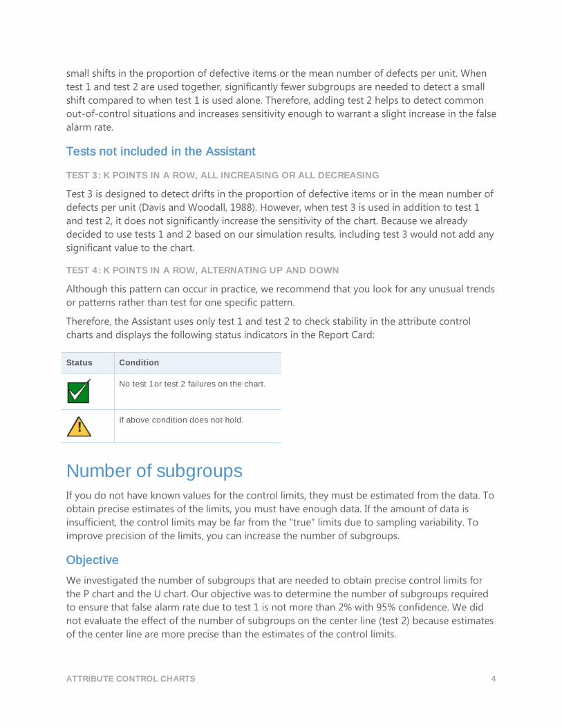
small shifts in the proportion of defective items or the mean number of defects per unit. When
test 1 and test 2 are used together, significantly fewer subgroups are needed to detect a small
shift compared to when test 1 is used alone. Therefore, adding test 2 helps to detect common
out-of-control situations and increases sensitivity enough to warrant a slight increase in the false
alarm rate.
Tests not included in the Assistant
TEST 3: K POINTS IN A ROW, ALL INCREASING OR ALL DECREASING
Test 3 is designed to detect drifts in the proportion of defective items or in the mean number of
defects per unit (Davis and Woodall, 1988). However, when test 3 is used in addition to test 1
and test 2, it does not significantly increase the sensitivity of the chart. Because we already
decided to use tests 1 and 2 based on our simulation results, including test 3 would not add any
significant value to the chart.
TEST 4: K POINTS IN A ROW, ALTERNATING UP AND DOWN
Although this pattern can occur in practice, we recommend that you look for any unusual trends
or patterns rather than test for one specific pattern.
Therefore, the Assistant uses only test 1 and test 2 to check stability in the attribute control
charts and displays the following status indicators in the Report Card:
Status Condition
No test 1 or test 2 failures on the chart.
If above condition does not hold.
Number of subgroups If you do not have known values for the control limits, they must be estimated from the data. To
obtain precise estimates of the limits, you must have enough data. If the amount of data is
insufficient, the control limits may be far from the “true” limits due to sampling variability. To
improve precision of the limits, you can increase the number of subgroups.
Objective
We investigated the number of subgroups that are needed to obtain precise control limits for
the P chart and the U chart. Our objective was to determine the number of subgroups required
to ensure that false alarm rate due to test 1 is not more than 2% with 95% confidence. We did
not evaluate the effect of the number of subgroups on the center line (test 2) because estimates
of the center line are more precise than the estimates of the control limits.
ATTRIBUTE CONTROL CHARTS 5
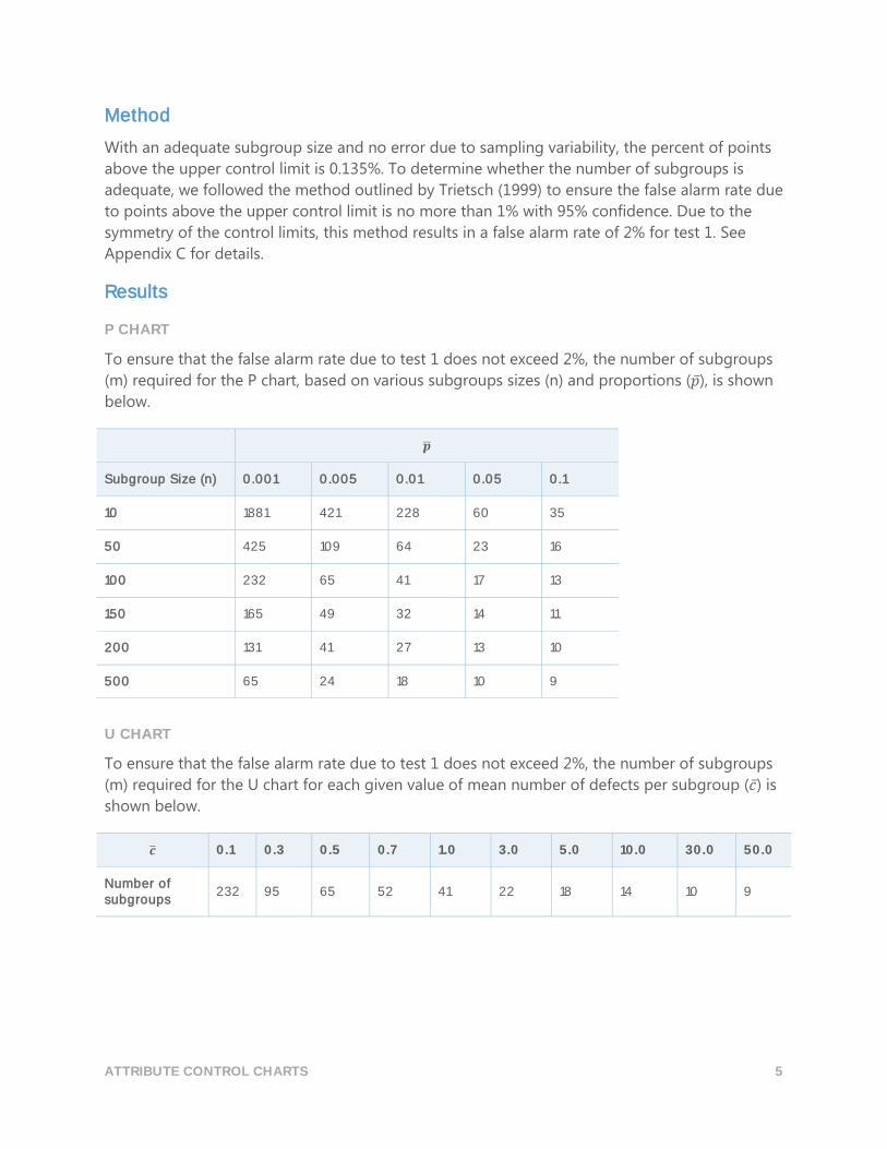
Method
With an adequate subgroup size and no error due to sampling variability, the percent of points
above the upper control limit is 0.135%. To determine whether the number of subgroups is
adequate, we followed the method outlined by Trietsch (1999) to ensure the false alarm rate due
to points above the upper control limit is no more than 1% with 95% confidence. Due to the
symmetry of the control limits, this method results in a false alarm rate of 2% for test 1. See
Appendix C for details.
Results
P CHART
To ensure that the false alarm rate due to test 1 does not exceed 2%, the number of subgroups
(m) required for the P chart, based on various subgroups sizes (n) and proportions (�̅�), is shown
below.
�̅�
Subgroup Size (n) 0.001 0.005 0.01 0.05 0.1
10 1881 421 228 60 35
50 425 109 64 23 16
100 232 65 41 17 13
150 165 49 32 14 11
200 131 41 27 13 10
500 65 24 18 10 9
U CHART
To ensure that the false alarm rate due to test 1 does not exceed 2%, the number of subgroups
(m) required for the U chart for each given value of mean number of defects per subgroup (𝑐̅) is
shown below.
�̅� 0.1 0.3 0.5 0.7 1.0 3.0 5.0 10.0 30.0 50.0
Number of subgroups
232 95 65 52 41 22 18 14 10 9
ATTRIBUTE CONTROL CHARTS 6
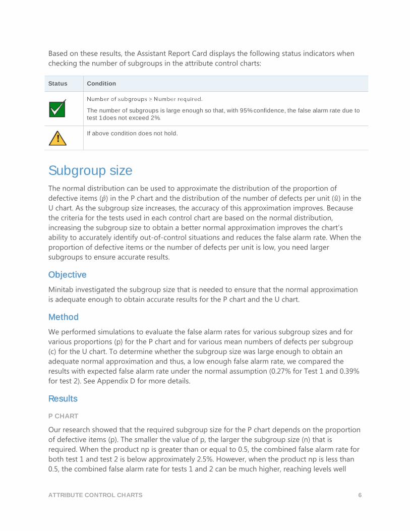
Based on these results, the Assistant Report Card displays the following status indicators when
checking the number of subgroups in the attribute control charts:
Status Condition
The number of subgroups is large enough so that, with 95% confidence, the false alarm rate due to test 1 does not exceed 2%.
If above condition does not hold.
Subgroup size The normal distribution can be used to approximate the distribution of the proportion of
defective items (�̂�) in the P chart and the distribution of the number of defects per unit (�̂�) in the
U chart. As the subgroup size increases, the accuracy of this approximation improves. Because
the criteria for the tests used in each control chart are based on the normal distribution,
increasing the subgroup size to obtain a better normal approximation improves the chart’s
ability to accurately identify out-of-control situations and reduces the false alarm rate. When the
proportion of defective items or the number of defects per unit is low, you need larger
subgroups to ensure accurate results.
Objective
Minitab investigated the subgroup size that is needed to ensure that the normal approximation
is adequate enough to obtain accurate results for the P chart and the U chart.
Method
We performed simulations to evaluate the false alarm rates for various subgroup sizes and for
various proportions (p) for the P chart and for various mean numbers of defects per subgroup
(c) for the U chart. To determine whether the subgroup size was large enough to obtain an
adequate normal approximation and thus, a low enough false alarm rate, we compared the
results with expected false alarm rate under the normal assumption (0.27% for Test 1 and 0.39%
for test 2). See Appendix D for more details.
Results
P CHART
Our research showed that the required subgroup size for the P chart depends on the proportion
of defective items (p). The smaller the value of p, the larger the subgroup size (n) that is
required. When the product np is greater than or equal to 0.5, the combined false alarm rate for
both test 1 and test 2 is below approximately 2.5%. However, when the product np is less than
0.5, the combined false alarm rate for tests 1 and 2 can be much higher, reaching levels well
ATTRIBUTE CONTROL CHARTS 7
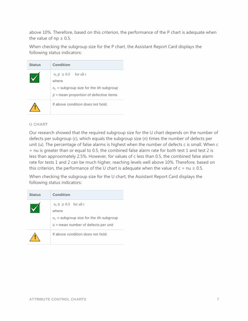
above 10%. Therefore, based on this criterion, the performance of the P chart is adequate when
the value of np ≥ 0.5.
When checking the subgroup size for the P chart, the Assistant Report Card displays the
following status indicators:
Status Condition
𝑛𝑖 �̅� ≥ 0.5 for all 𝑖
where
𝑛𝑖 = subgroup size for the ith subgroup
�̅� = mean proportion of defective items
If above condition does not hold.
U CHART
Our research showed that the required subgroup size for the U chart depends on the number of
defects per subgroup (c), which equals the subgroup size (n) times the number of defects per
unit (u). The percentage of false alarms is highest when the number of defects c is small. When c
= nu is greater than or equal to 0.5, the combined false alarm rate for both test 1 and test 2 is
less than approximately 2.5%. However, for values of c less than 0.5, the combined false alarm
rate for tests 1 and 2 can be much higher, reaching levels well above 10%. Therefore, based on
this criterion, the performance of the U chart is adequate when the value of c = nu ≥ 0.5.
When checking the subgroup size for the U chart, the Assistant Report Card displays the
following status indicators:
Status Condition
𝑛𝑖 u̅ ≥ 0.5 for all 𝑖
where
𝑛𝑖 = subgroup size for the ith subgroup
�̅� = mean number of defects per unit
If above condition does not hold.
ATTRIBUTE CONTROL CHARTS 8
Expected Variation Traditional P charts and U charts assume the variation in the data follows either the binomial
distribution for defectives or a Poisson distribution for defects. The charts also assume that your
rate of defectives or defects remains constant over time. When the variation in the data is either
greater than or less than expected, your data may have overdispersion or underdispersion and
the charts may not perform as expected.
Overdispersion
Overdispersion exists when the variation in your data is more than expected. Typically, some
variation exists in the rate of defectives or defects over time, caused by external noise factors
that are not special causes. In most applications of these charts, the sampling variation of the
subgroup statistics is large enough that the variation in the underlying rate of defectives or
defects is not noticeable. However, as the subgroup sizes increase, the sampling variation
becomes smaller and smaller and at some point the variation in the underlying defect rate can
become larger than the sampling variation. The result is a chart with extremely narrow control
limits and a very high false alarm rate.
Underdispersion
Underdispersion exists when the variation in your data is less than expected. Underdispersion
can occur when adjacent subgroups are correlated with each other, also known as
autocorrelation. For example, as a tool wears out, the number of defects may increase. The
increase in defect counts across subgroups can make the subgroups more similar than they
would be by chance. When data exhibit underdispersion, the control limits on a traditional P
chart or U chart may be too wide. If the control limits are too wide the chart will rarely signal,
meaning that you can overlook special cause variation and mistake it for common cause
variation.
If overdispersion or underdispersion is severe enough, Minitab recommends using a Laney P’ or
U’ chart. For more information, see Laney P’ and U’ charts below.
Objective
We wanted to determine a method to detect overdispersion and underdispersion in the data.
Method
We performed a literature search and found several methods for detecting overdispersion and
underdispersion. We selected a diagnostic method found in Jones and Govindaraju (2001). This
method uses a probability plot to determine the amount of variation expected if the data were
from a binomial distribution for defectives data or a Poisson distribution for defects data. Then,
a comparison is made between the amount of expected variation and the amount of observed
variation. See Appendix E for details on the diagnostic method.
As part of the check for overdispersion, Minitab also determines how many points are outside of
the control limits on the traditional P and U charts. Because the problem with overdispersion is a
ATTRIBUTE CONTROL CHARTS 9
high false alarm rate, if only a small percentage of points are out of control, overdispersion is
unlikely to be an issue.
Results
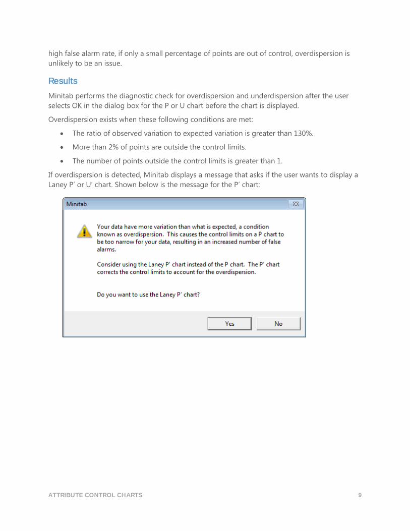
Minitab performs the diagnostic check for overdispersion and underdispersion after the user
selects OK in the dialog box for the P or U chart before the chart is displayed.
Overdispersion exists when these following conditions are met:
The ratio of observed variation to expected variation is greater than 130%.
More than 2% of points are outside the control limits.
The number of points outside the control limits is greater than 1.
If overdispersion is detected, Minitab displays a message that asks if the user wants to display a
Laney P’ or U’ chart. Shown below is the message for the P’ chart:
ATTRIBUTE CONTROL CHARTS 10
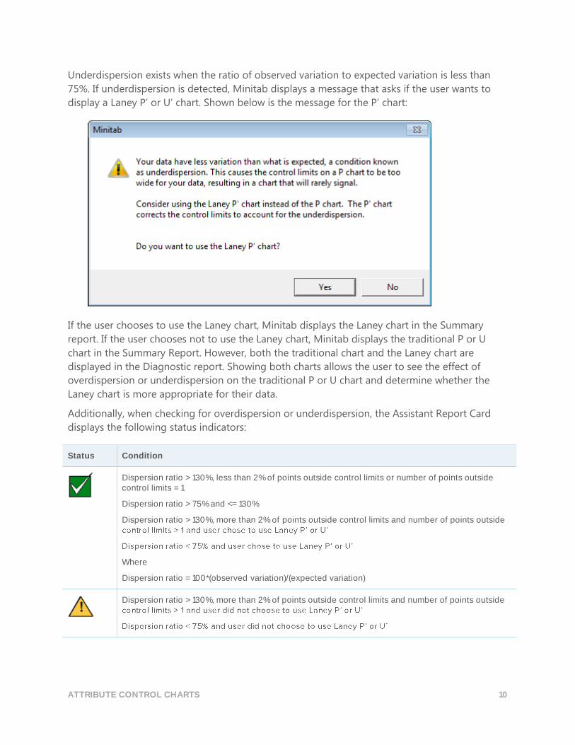
Underdispersion exists when the ratio of observed variation to expected variation is less than
75%. If underdispersion is detected, Minitab displays a message that asks if the user wants to
display a Laney P’ or U’ chart. Shown below is the message for the P’ chart:
If the user chooses to use the Laney chart, Minitab displays the Laney chart in the Summary
report. If the user chooses not to use the Laney chart, Minitab displays the traditional P or U
chart in the Summary Report. However, both the traditional chart and the Laney chart are
displayed in the Diagnostic report. Showing both charts allows the user to see the effect of
overdispersion or underdispersion on the traditional P or U chart and determine whether the
Laney chart is more appropriate for their data.
Additionally, when checking for overdispersion or underdispersion, the Assistant Report Card
displays the following status indicators:
Status Condition
Dispersion ratio > 130%, less than 2% of points outside control limits or number of points outside control limits = 1
Dispersion ratio > 75% and <= 130%
Dispersion ratio > 130%, more than 2% of points outside control limits and number of points outside
Where
Dispersion ratio = 100*(observed variation)/(expected variation)
Dispersion ratio > 130%, more than 2% of points outside control limits and number of points outside
ATTRIBUTE CONTROL CHARTS 11
ts Traditional P charts and U charts assume the variation in the data follows the binomial
distribution for defectives data or a Poisson distribution for defect data. The charts also assume
that your rate of defectives or defects remains constant over time. Minitab performs a check to
determine whether the variation in the data is either greater than or less than expected, an
indication the data may have overdispersion or underdispersion. See the Expected Variation
data check above.
If overdispersion or underdispersion are present in the data, the traditional P and U charts may
not perform as expected. Overdispersion can cause the control limits to be too narrow, resulting
in a high false alarm rate. Underdispersion can cause the control limits to be too wide, which can
cause you to overlook special cause variation and mistake it for common cause variation.
Objective Our objective was to identify an alternative to the traditional P and U charts when
overdispersion or underdispersion is detected in the data.
Method We reviewed the literature and determined that the best approach for handling overdispersion
and underdispersion are the Laney P’ and U’ charts (Laney, 2002). The Laney method uses a
revised definition of common cause variation, which corrects the control limits that are either
too narrow (overdispersion) or too wide (underdispersion).
In the Laney charts, common cause variation includes the usual short-term within subgroup
variation but also includes the average short-term variation between consecutive subgroups.
The common cause variation for Laney charts is calculated by normalizing the data and using
the average moving range of adjacent subgroups (referred to as Sigma Z on the Laney charts) to
adjust the standard P or U control limits. Including the variation between consecutive subgroups
helps correct the effect when the variation in the data across subgroups is greater than or less
than expected due to fluctuations in the underlying defect rate or a lack of randomness in the
data.
After Sigma Z is calculated, the data are transformed back to the original units. Using the
original data units is beneficial because if the subgroup sizes are not the same, the control limits
are allowed to vary just as they are in the traditional P and U charts. For more details on Laney P’
and U’ charts, see Appendix F.
Results Minitab performs a check for overdispersion or underdispersion and if either condition is
detected, Minitab recommends a Laney P’ or U’ chart.
ATTRIBUTE CONTROL CHARTS 12
References AIAG (1995). Statistical process control (SPC) reference manual. Automotive Industry Action
Group.
Bischak, D.P., & Trietsch, D. (2007). The rate of false signals in X̅ control charts with estimated
limits. Journal of Quality Technology, 39, 55–65.
Bowerman, B.L., & O' Connell, R.T. (1979). Forecasting and time series: An applied approach.
Belmont, CA: Duxbury Press.
Chan, L. K., Hapuarachchi K. P., & Macpherson, B.D. (1988). Robustness of 𝑋 ̅and R charts. IEEE
Transactions on Reliability, 37, 117–123.
Davis, R.B., & Woodall, W.H. (1988). Performance of the control chart trend rule under linear
shift. Journal of Quality Technology, 20, 260–262.
Jones, G., & Govindaraju, K. (2001). A Graphical Method for Checking Attribute Control Chart
Assumptions, Quality Engineering, 13(1), 19-26.
Laney, D. (2002). Improved Control Charts for Attributes. Quality Engineering, 14(4), 531-537.
Montgomery, D.C. (2001). Introduction to statistical quality control, 4th edition. New York: John
Wiley & Sons, Inc.
Schilling, E.G., & Nelson, P.R. (1976). The effect of non-normality on the control limits of �̅�
charts. Journal of Quality Technology, 8, 183–188.
Trietsch, D. (1999). Statistical quality control: A loss minimization approach. Singapore: World
Scientific Publishing Co.
Wheeler, D.J. (2004). Advanced topics in statistical process control. The power of Shewhart’s charts,
2nd edition. Knoxville, TN: SPC Press.
Yourstone, S.A., & Zimmer, W.J. (1992). Non-normality and the design of control charts for
averages. Decision Sciences, 23, 1099–1113.
ATTRIBUTE CONTROL CHARTS 13
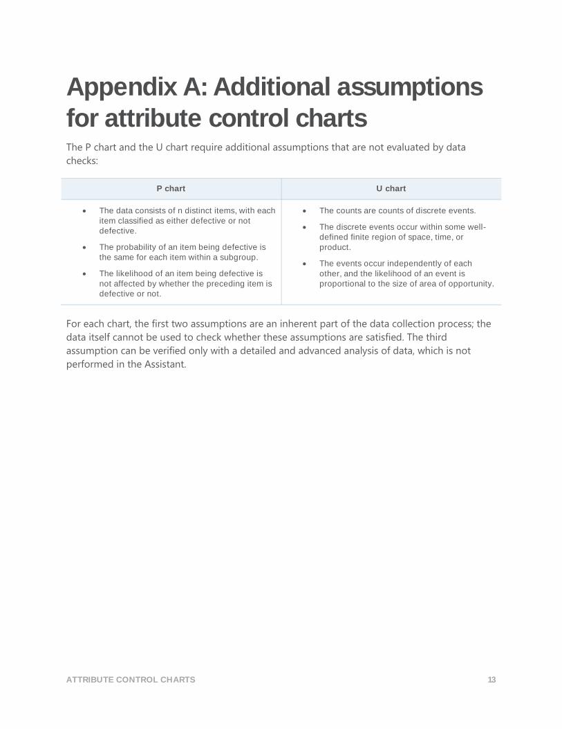
Appendix A: Additional assumptions for attribute control charts The P chart and the U chart require additional assumptions that are not evaluated by data
checks:
P chart U chart
The data consists of n distinct items, with each item classified as either defective or not defective.
The probability of an item being defective is the same for each item within a subgroup.
The likelihood of an item being defective is not affected by whether the preceding item is defective or not.
The counts are counts of discrete events.
The discrete events occur within some well-defined finite region of space, time, or product.
The events occur independently of each other, and the likelihood of an event is proportional to the size of area of opportunity.
For each chart, the first two assumptions are an inherent part of the data collection process; the
data itself cannot be used to check whether these assumptions are satisfied. The third
assumption can be verified only with a detailed and advanced analysis of data, which is not
performed in the Assistant.
ATTRIBUTE CONTROL CHARTS 14
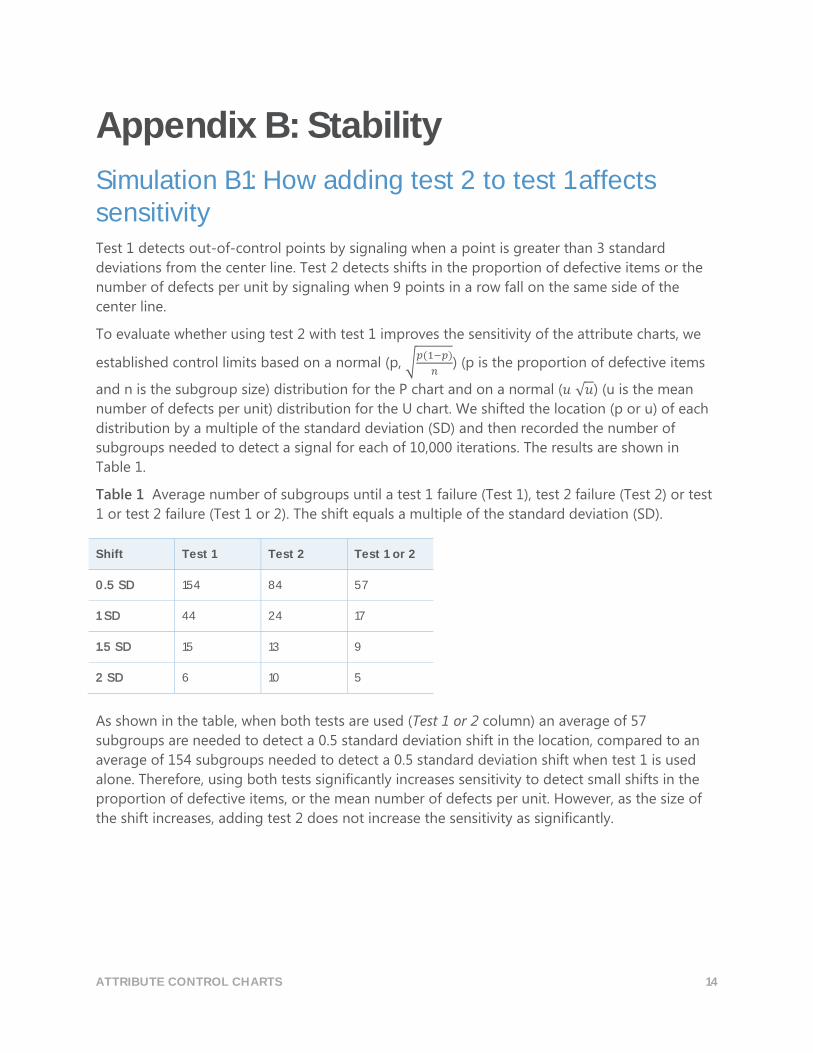
Appendix B: Stability
Simulation B1: How adding test 2 to test 1 affects sensitivity Test 1 detects out-of-control points by signaling when a point is greater than 3 standard
deviations from the center line. Test 2 detects shifts in the proportion of defective items or the
number of defects per unit by signaling when 9 points in a row fall on the same side of the
center line.
To evaluate whether using test 2 with test 1 improves the sensitivity of the attribute charts, we
established control limits based on a normal (p, √𝑝(1−𝑝)
𝑛) (p is the proportion of defective items
and n is the subgroup size) distribution for the P chart and on a normal (𝑢 √𝑢) (u is the mean
number of defects per unit) distribution for the U chart. We shifted the location (p or u) of each
distribution by a multiple of the standard deviation (SD) and then recorded the number of
subgroups needed to detect a signal for each of 10,000 iterations. The results are shown in
Table 1.
Table 1 Average number of subgroups until a test 1 failure (Test 1), test 2 failure (Test 2) or test
1 or test 2 failure (Test 1 or 2). The shift equals a multiple of the standard deviation (SD).
Shift Test 1 Test 2 Test 1 or 2
0.5 SD 154 84 57
1 SD 44 24 17
1.5 SD 15 13 9
2 SD 6 10 5
As shown in the table, when both tests are used (Test 1 or 2 column) an average of 57
subgroups are needed to detect a 0.5 standard deviation shift in the location, compared to an
average of 154 subgroups needed to detect a 0.5 standard deviation shift when test 1 is used
alone. Therefore, using both tests significantly increases sensitivity to detect small shifts in the
proportion of defective items, or the mean number of defects per unit. However, as the size of
the shift increases, adding test 2 does not increase the sensitivity as significantly.

ATTRIBUTE CONTROL CHARTS 15
Appendix C: Number of subgroups
Formula C1: Number of subgroups required for the P Chart based on a 95% CI for the upper control limit To determine whether there are enough subgroups to ensure that the false alarm rate stays
reasonably low, we follow Bischak (1999) and determine the number of subgroups that will
ensure that the false alarm rate due to test 1 is no higher than 2% with 95% confidence.
First, we find pc such that
𝑝𝑐 + 3 √𝑝𝑐(1 − 𝑝𝑐)
𝑛= �̅� + 𝑧0.99√
�̅� (1 − �̅�)
𝑛
where
𝑝𝑐= proportion that produces a 1% false alarm rate above the upper control limit, assuming
�̅� is the true value of p. Due to symmetry of the control limits, the total false alarm rate
becomes 2% when the upper and lower control limits are both considered.
n = subgroup size (if the subgroup size varies, the average subgroup size is used)
�̅� = average proportion of defective items
𝑧𝑝 = inverse cdf evaluated at p for the normal distribution with mean=0 and standard
deviation=1
To determine the number of subgroups, we calculate a 95% lower confidence limit for the upper
control limit and set it equal to 𝑝𝑐 ,
𝑝𝑐 = �̅� − 𝑧0.95√�̅� (1 − �̅�)
𝑛𝑚
and solve for m, which yields the following result:
𝑚 = �̅� (1 − �̅�)
𝑛 (�̅� − 𝑝𝑐
𝑧0.95)2
Using this formula, we can determine the number of subgroups required to ensure that the false
alarm rate above the upper control limit remains below 1% with 95% confidence for various
proportions and subgroup sizes, as shown in Table 2. Due to the symmetry of the control limits,
this is same number of subgroups that is required to ensure that the total false alarm rate due to
test 1 for the P chart remains below 2% with 95% confidence.
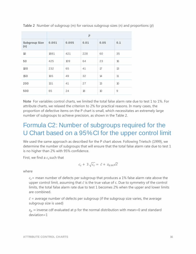
ATTRIBUTE CONTROL CHARTS 16
Table 2 Number of subgroup (m) for various subgroup sizes (n) and proportions (�̅�)
�̅�
Subgroup Size (n)
0.001 0.005 0.01 0.05 0.1
10 1881 421 228 60 35
50 425 109 64 23 16
100 232 65 41 17 13
150 165 49 32 14 11
200 131 41 27 13 10
500 65 24 18 10 9
Note For variables control charts, we limited the total false alarm rate due to test 1 to 1%. For
attribute charts, we relaxed the criterion to 2% for practical reasons. In many cases, the
proportion of defective items on the P chart is small, which necessitates an extremely large
number of subgroups to achieve precision, as shown in the Table 2.
Formula C2: Number of subgroups required for the U Chart based on a 95% CI for the upper control limit We used the same approach as described for the P chart above. Following Trietsch (1999), we
determine the number of subgroups that will ensure that the total false alarm rate due to test 1
is no higher than 2% with 95% confidence.
First, we find a 𝑐𝑐such that
𝑐𝑐 + 3 √𝑐𝑐 = 𝑐̅ + 𝑧0.99√𝑐 ̅
where
𝑐𝑐= mean number of defects per subgroup that produces a 1% false alarm rate above the
upper control limit, assuming that 𝑐̅ is the true value of c. Due to symmetry of the control
limits, the total false alarm rate due to test 1 becomes 2% when the upper and lower limits
are combined.
𝑐̅ = average number of defects per subgroup (if the subgroup size varies, the average
subgroup size is used)
𝑧𝑝 = inverse cdf evaluated at p for the normal distribution with mean=0 and standard
deviation=1
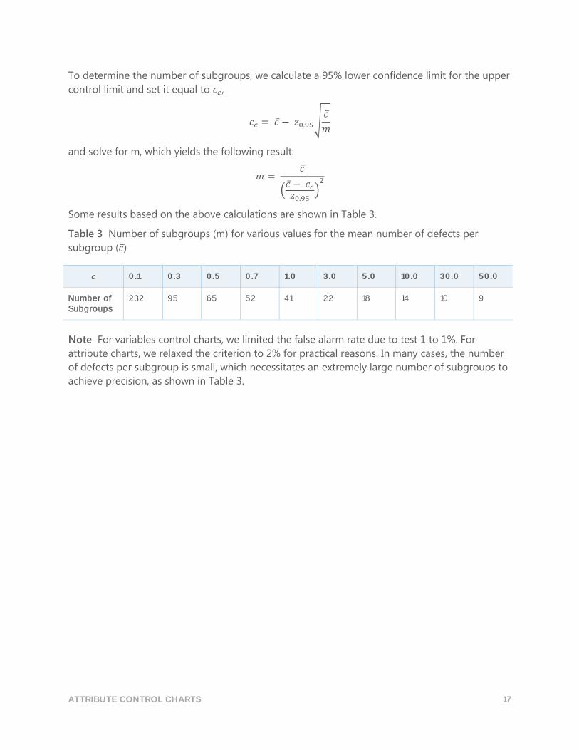
ATTRIBUTE CONTROL CHARTS 17
To determine the number of subgroups, we calculate a 95% lower confidence limit for the upper
control limit and set it equal to 𝑐𝑐 ,
𝑐𝑐 = 𝑐̅ − 𝑧0.95√𝑐̅
𝑚
and solve for m, which yields the following result:
𝑚 = 𝑐̅
(𝑐̅ − 𝑐𝑐𝑧0.95
)2
Some results based on the above calculations are shown in Table 3.
Table 3 Number of subgroups (m) for various values for the mean number of defects per
subgroup (𝑐̅)
�̅� 0.1 0.3 0.5 0.7 1.0 3.0 5.0 10.0 30.0 50.0
Number of Subgroups
232 95 65 52 41 22 18 14 10 9
Note For variables control charts, we limited the false alarm rate due to test 1 to 1%. For
attribute charts, we relaxed the criterion to 2% for practical reasons. In many cases, the number
of defects per subgroup is small, which necessitates an extremely large number of subgroups to
achieve precision, as shown in Table 3.

ATTRIBUTE CONTROL CHARTS 18
Appendix D: Subgroup size The central limit theorem states that the normal distribution can approximate the distribution of
the average of an independent, identically distributed random variable. For the P chart, �̂�
(subgroup proportion) is the average of an independent, identically distributed Bernoulli
random variable. For the U chart, �̂� (subgroup rate) is the average of an independent, identically
distributed Poisson random variable. Therefore, the normal distribution can be used as an
approximation in both cases.
The accuracy of the approximation improves as the subgroup size increases. The approximation
also improves with a higher proportion of defective items (P chart) or a higher number of
defects per unit (U chart). When either the subgroup size is small or the values of p (P chart) or u
(U chart) are small, the distributions for �̂� and �̂� are right-skewed, which increases the false
alarm rate. Therefore, we can evaluate the accuracy of the normal approximation by looking at
the false alarm rate, and we can also determine the minimum subgroup size necessary to obtain
an adequate normal approximation.
To do this, we performed simulations to evaluate the false alarm rates for various subgroup sizes
for the P chart and the U chart and compared the results with the expected false alarm rate
under the normal assumption (0.27% for test 1 and 0.39% for test 2).
Simulation D1: Relationship between subgroup size, proportion, and false alarm rate of the P chart Using an initial set of 10,000 subgroups, we established the control limits for various subgroup
sizes (n) and proportions (p). We also recorded the percentage of false alarms for an additional
2,500 subgroups. We then performed 10,000 iterations and calculated the average percentage
of false alarms from test 1 and test 2, as shown in Table 4.
Table 4 % of false alarms due to test 1, test 2 (np) for various subgroup sizes (n) and proportions
(p)
p
Subgroup Size (n)
0.001 0.005 0.01 0.05 0.1
10 0.99, 87.37 (0.01) 4.89, 62.97 (0.05) 0.43, 40.14 (0.1) 1.15, 1.01 (0.5) 1.28, 0.42 (1)
50 4.88, 63.00 (0.05)
2.61, 10.41 (0.25) 1.38, 1.10 (0.5) 0.32, 0.49 (2.5) 0.32, 0.36 (5)
100 0.47, 40.33 (0.10) 1.41, 1.12 (0.5) 1.84, 0.49 (1) 0.43, 0.36 (5) 0.20, 0.36 (10)
150 1.01, 25.72 (0.15) 0.71, 0.43 (0.75) 0.42, 0.58 (1.5) 0.36, 0.42 (7.5) 0.20, 0.36 (15)
ATTRIBUTE CONTROL CHARTS 19
p
Subgroup Size (n)
0.001 0.005 0.01 0.05 0.1
200 1.74, 16.43 (0.2) 1.86, 0.50 (1.00) 0.43, 0.41 (2) 0.27, 0.36 (10) 0.34, 0.36 (20)
500 1.43, 1.12 (0.5) 0.42, 0.50 (2.5) 0.52, 0.37 (5) 0.32, 0.37 (25) 0.23, 0.36 (50)
The results in Table 4 show that the percentage of false alarms is generally highest when the
proportion (p) is small, such as 0.001 or 0.005, or when the sample size is small (n=10).
Therefore, the percentage of false alarms is highest when the value of the product np is small
and lowest when np is large. When np is greater or equal to 0.5, the combined false alarm rate
for both test 1 and test 2 is below approximately 2.5%. However, for values of np less than 0.5,
the combined false alarm rate for tests 1 and 2 is much higher, reaching levels well above 10%.
Therefore, based on this criterion, the performance of the P chart, based on this criterion, is
adequate when the value of np ≥ 0.5. Thus, the subgroup size should be at least 0.5
�̅� .
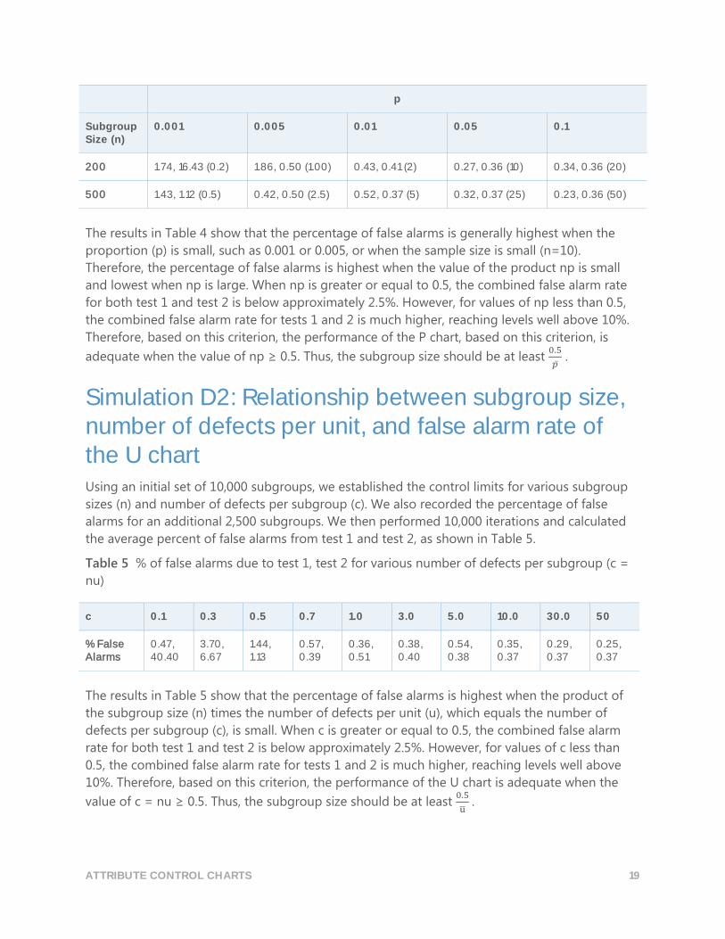
Simulation D2: Relationship between subgroup size, number of defects per unit, and false alarm rate of the U chart Using an initial set of 10,000 subgroups, we established the control limits for various subgroup
sizes (n) and number of defects per subgroup (c). We also recorded the percentage of false
alarms for an additional 2,500 subgroups. We then performed 10,000 iterations and calculated
the average percent of false alarms from test 1 and test 2, as shown in Table 5.
Table 5 % of false alarms due to test 1, test 2 for various number of defects per subgroup (c =
nu)
c 0.1 0.3 0.5 0.7 1.0 3.0 5.0 10.0 30.0 50
% False Alarms
0.47, 40.40
3.70, 6.67
1.44, 1.13
0.57, 0.39
0.36, 0.51
0.38, 0.40
0.54, 0.38
0.35, 0.37
0.29, 0.37
0.25, 0.37
The results in Table 5 show that the percentage of false alarms is highest when the product of
the subgroup size (n) times the number of defects per unit (u), which equals the number of
defects per subgroup (c), is small. When c is greater or equal to 0.5, the combined false alarm
rate for both test 1 and test 2 is below approximately 2.5%. However, for values of c less than
0.5, the combined false alarm rate for tests 1 and 2 is much higher, reaching levels well above
10%. Therefore, based on this criterion, the performance of the U chart is adequate when the
value of c = nu ≥ 0.5. Thus, the subgroup size should be at least 0.5
u̅ .
ATTRIBUTE CONTROL CHARTS 20
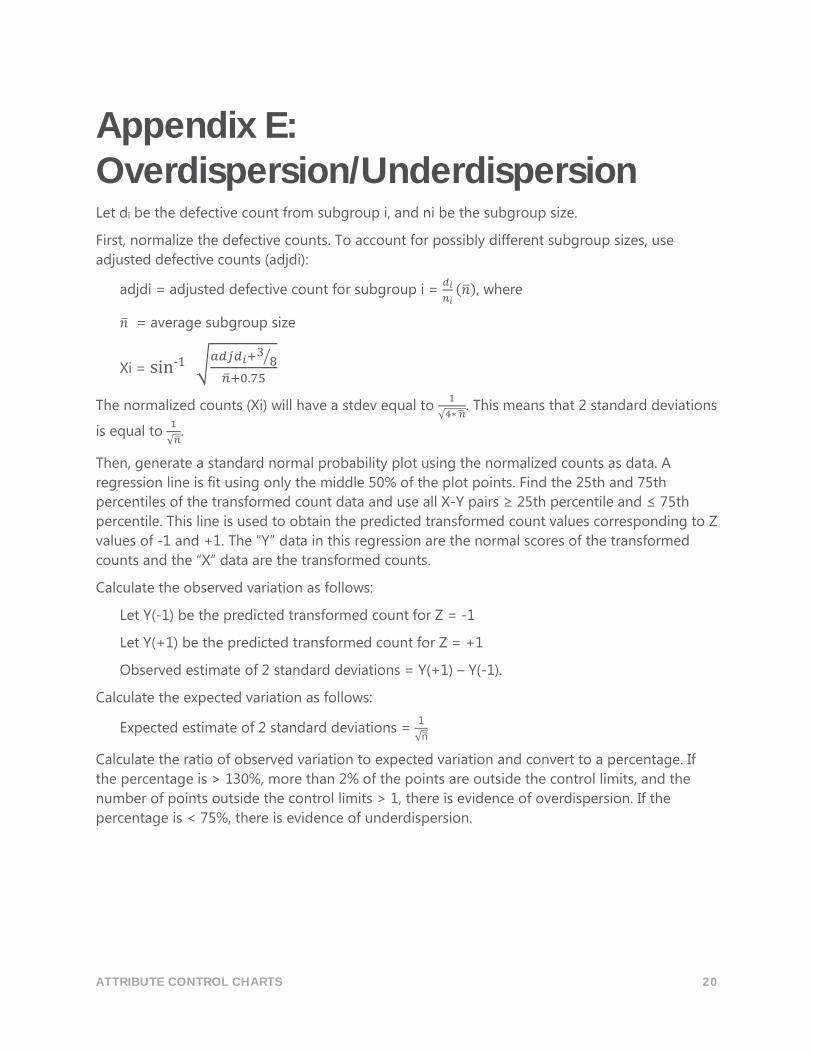
Appendix E: Overdispersion/Underdispersion Let di be the defective count from subgroup i, and ni be the subgroup size.
First, normalize the defective counts. To account for possibly different subgroup sizes, use
adjusted defective counts (adjdi):
adjdi = adjusted defective count for subgroup i = 𝑑𝑖
𝑛𝑖(�̅�), where
�̅� = average subgroup size
Xi = sin-1 √𝑎𝑑𝑗𝑑𝑖+3
8⁄
�̅�+0.75
The normalized counts (Xi) will have a stdev equal to 1
√4∗ �̅�. This means that 2 standard deviations
is equal to 1
√�̅�.
Then, generate a standard normal probability plot using the normalized counts as data. A
regression line is fit using only the middle 50% of the plot points. Find the 25th and 75th
percentiles of the transformed count data and use all X-Y pairs ≥ 25th percentile and ≤ 75th
percentile. This line is used to obtain the predicted transformed count values corresponding to Z
values of -1 and +1. The “Y” data in this regression are the normal scores of the transformed
counts and the “X” data are the transformed counts.
Calculate the observed variation as follows:
Let Y(-1) be the predicted transformed count for Z = -1
Let Y(+1) be the predicted transformed count for Z = +1
Observed estimate of 2 standard deviations = Y(+1) – Y(-1).
Calculate the expected variation as follows:
Expected estimate of 2 standard deviations = 1
√n̅
Calculate the ratio of observed variation to expected variation and convert to a percentage. If
the percentage is > 130%, more than 2% of the points are outside the control limits, and the
number of points outside the control limits > 1, there is evidence of overdispersion. If the
percentage is < 75%, there is evidence of underdispersion.
ATTRIBUTE CONTROL CHARTS 21
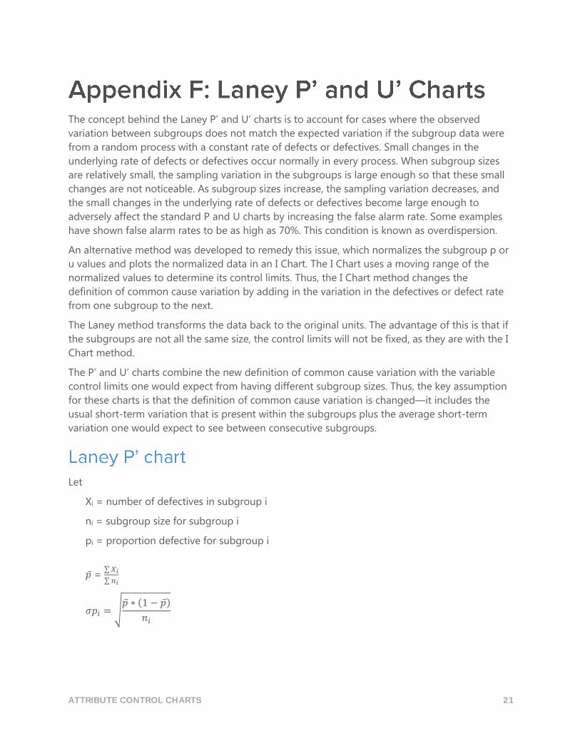
The concept behind the Laney P’ and U’ charts is to account for cases where the observed
variation between subgroups does not match the expected variation if the subgroup data were
from a random process with a constant rate of defects or defectives. Small changes in the
underlying rate of defects or defectives occur normally in every process. When subgroup sizes
are relatively small, the sampling variation in the subgroups is large enough so that these small
changes are not noticeable. As subgroup sizes increase, the sampling variation decreases, and
the small changes in the underlying rate of defects or defectives become large enough to
adversely affect the standard P and U charts by increasing the false alarm rate. Some examples
have shown false alarm rates to be as high as 70%. This condition is known as overdispersion.
An alternative method was developed to remedy this issue, which normalizes the subgroup p or
u values and plots the normalized data in an I Chart. The I Chart uses a moving range of the
normalized values to determine its control limits. Thus, the I Chart method changes the
definition of common cause variation by adding in the variation in the defectives or defect rate
from one subgroup to the next.
The Laney method transforms the data back to the original units. The advantage of this is that if
the subgroups are not all the same size, the control limits will not be fixed, as they are with the I
Chart method.
The P’ and U’ charts combine the new definition of common cause variation with the variable
control limits one would expect from having different subgroup sizes. Thus, the key assumption
for these charts is that the definition of common cause variation is changed—it includes the
usual short-term variation that is present within the subgroups plus the average short-term
variation one would expect to see between consecutive subgroups.
Let
Xi = number of defectives in subgroup i
ni = subgroup size for subgroup i
pi = proportion defective for subgroup i
�̅� = ∑ 𝑋𝑖
∑ 𝑛𝑖
𝜎𝑝𝑖 = √�̅� ∗ (1 − �̅�)
𝑛𝑖
ATTRIBUTE CONTROL CHARTS 22
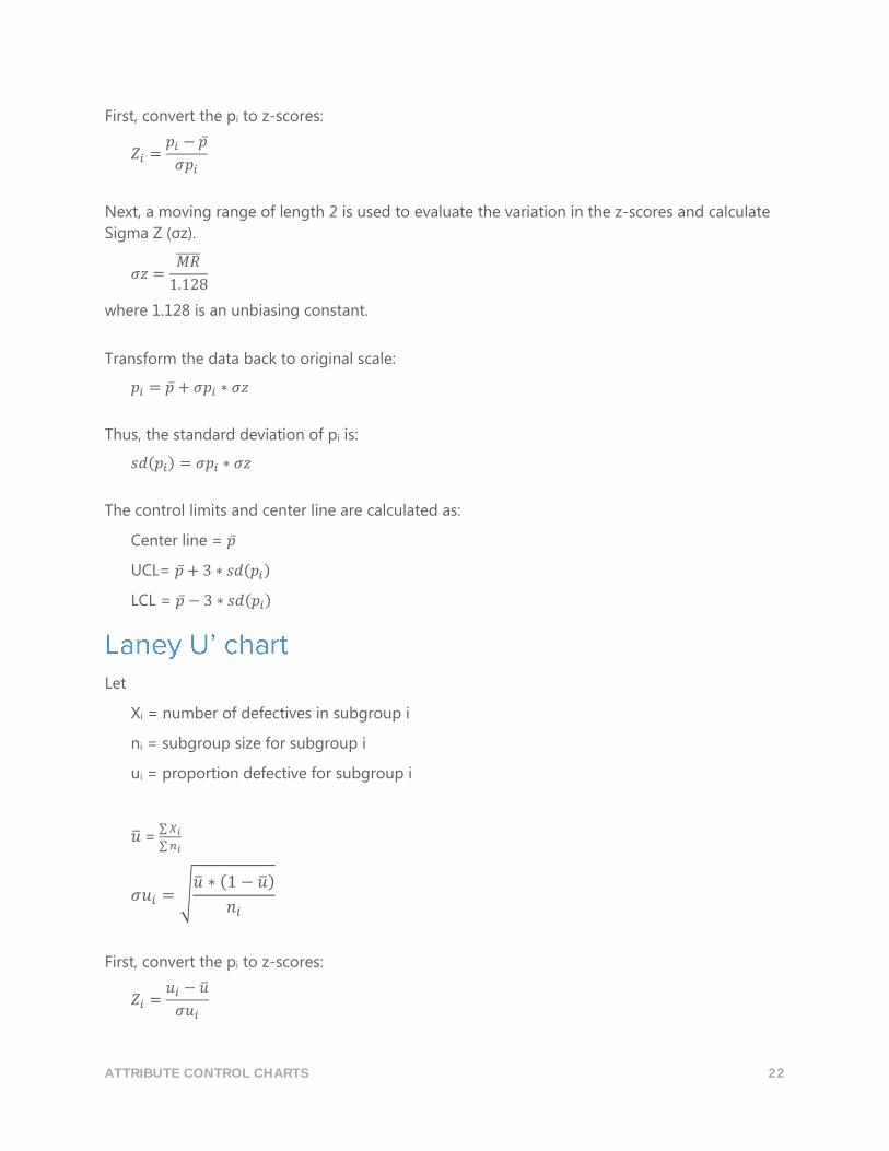
First, convert the pi to z-scores:
𝑍𝑖 =𝑝𝑖 − �̅�
𝜎𝑝𝑖
Next, a moving range of length 2 is used to evaluate the variation in the z-scores and calculate
Sigma Z (σz).
𝜎𝑧 =𝑀𝑅̅̅̅̅̅
1.128
where 1.128 is an unbiasing constant.
Transform the data back to original scale:
𝑝𝑖 = �̅� + 𝜎𝑝𝑖 ∗ 𝜎𝑧
Thus, the standard deviation of pi is:
𝑠𝑑(𝑝𝑖) = 𝜎𝑝𝑖 ∗ 𝜎𝑧
The control limits and center line are calculated as:
Center line = �̅�
UCL= �̅� + 3 ∗ 𝑠𝑑(𝑝𝑖)
LCL = �̅� − 3 ∗ 𝑠𝑑(𝑝𝑖)
Let
Xi = number of defectives in subgroup i
ni = subgroup size for subgroup i
ui = proportion defective for subgroup i
�̅� = ∑ 𝑋𝑖
∑ 𝑛𝑖
𝜎𝑢𝑖 = √�̅� ∗ (1 − �̅�)
𝑛𝑖
First, convert the pi to z-scores:
𝑍𝑖 =𝑢𝑖 − �̅�
𝜎𝑢𝑖
ATTRIBUTE CONTROL CHARTS 23
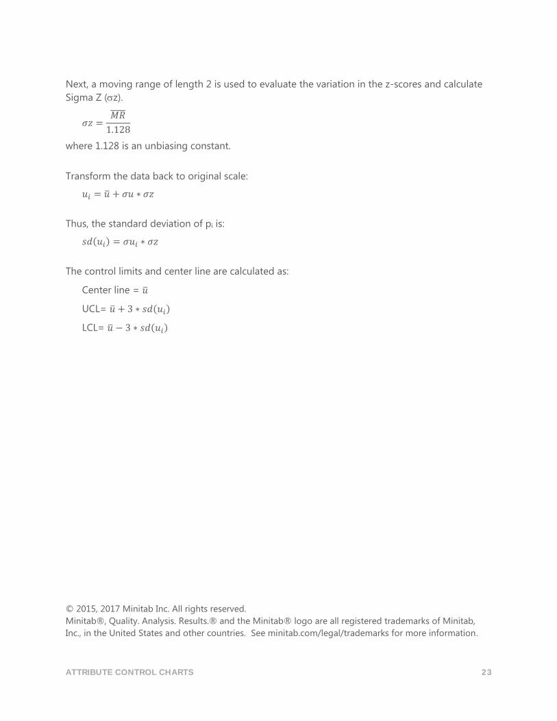
Next, a moving range of length 2 is used to evaluate the variation in the z-scores and calculate
Sigma Z (z).
𝜎𝑧 =𝑀𝑅̅̅̅̅̅
1.128
where 1.128 is an unbiasing constant.
Transform the data back to original scale:
𝑢𝑖 = �̅� + 𝜎𝑢 ∗ 𝜎𝑧
Thus, the standard deviation of pi is:
𝑠𝑑(𝑢𝑖) = 𝜎𝑢𝑖 ∗ 𝜎𝑧
The control limits and center line are calculated as:
Center line = �̅�
UCL= �̅� + 3 ∗ 𝑠𝑑(𝑢𝑖)
LCL= �̅� − 3 ∗ 𝑠𝑑(𝑢𝑖)
© 2015, 2017 Minitab Inc. All rights reserved.
Minitab®, Quality. Analysis. Results.® and the Minitab® logo are all registered trademarks of Minitab,
Inc., in the United States and other countries. See minitab.com/legal/trademarks for more information.