MAP COMPOSITION - West Virginia Universitypages.geo.wvu.edu/~elmes/geog462/Map Composition.pdf ·...
29
MAP COMPOSITION Composing the Display
Transcript of MAP COMPOSITION - West Virginia Universitypages.geo.wvu.edu/~elmes/geog462/Map Composition.pdf ·...

MAP COMPOSITION
Composing the Display
The Purpose of Map Composition
1) To organize the graphic material into a visual whole to:
a) stress the purpose of the map.b) direct the map reader's attention.c) coordinate the base and thematic elements of the map.d) maintain "sound" cartographic conventions.e) foster creative design solutions.
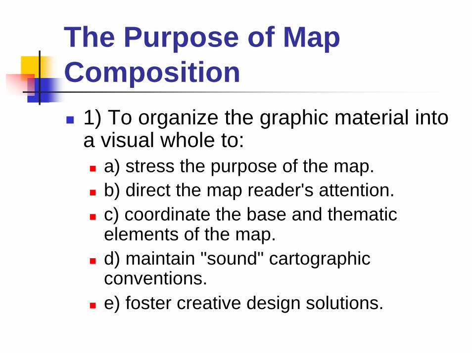
Composing maps: A few things to consider:
How are each of the map elements related to each other What is the relationship of the four maps? How they should be placed on the paper in an arrangement that makes intuitive sense to your reader? If you have a scale bar and north arrow, to what map(s) are theyreferring?
Where are the appropriate places to place each of the map elements?
What you have learned about how people read maps?
How can color be used to tie the elements together into a cohesive whole?How can the fonts and text size be varied for the importance of the various elements?
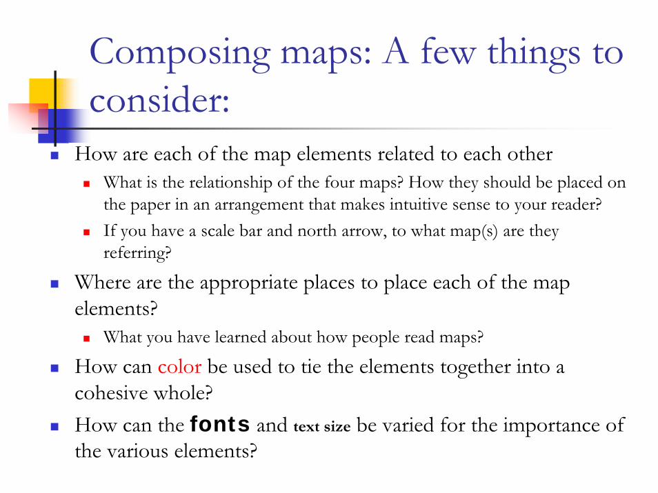
Basic Elements of Map Composition
Cartographic Communication – The Geographers Crafthttp://www.colorado.edu/geography/gcraft/notes/cartocom/section4.html
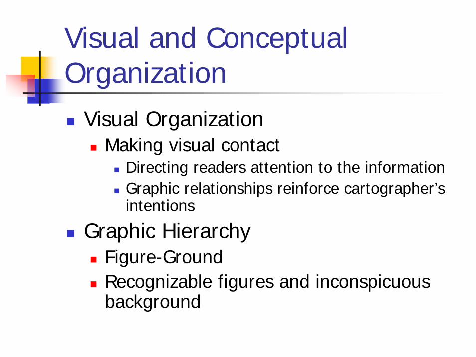
Visual and Conceptual Organization
Visual OrganizationMaking visual contact
Directing readers attention to the informationGraphic relationships reinforce cartographer’s intentions
Graphic HierarchyFigure-GroundRecognizable figures and inconspicuous background
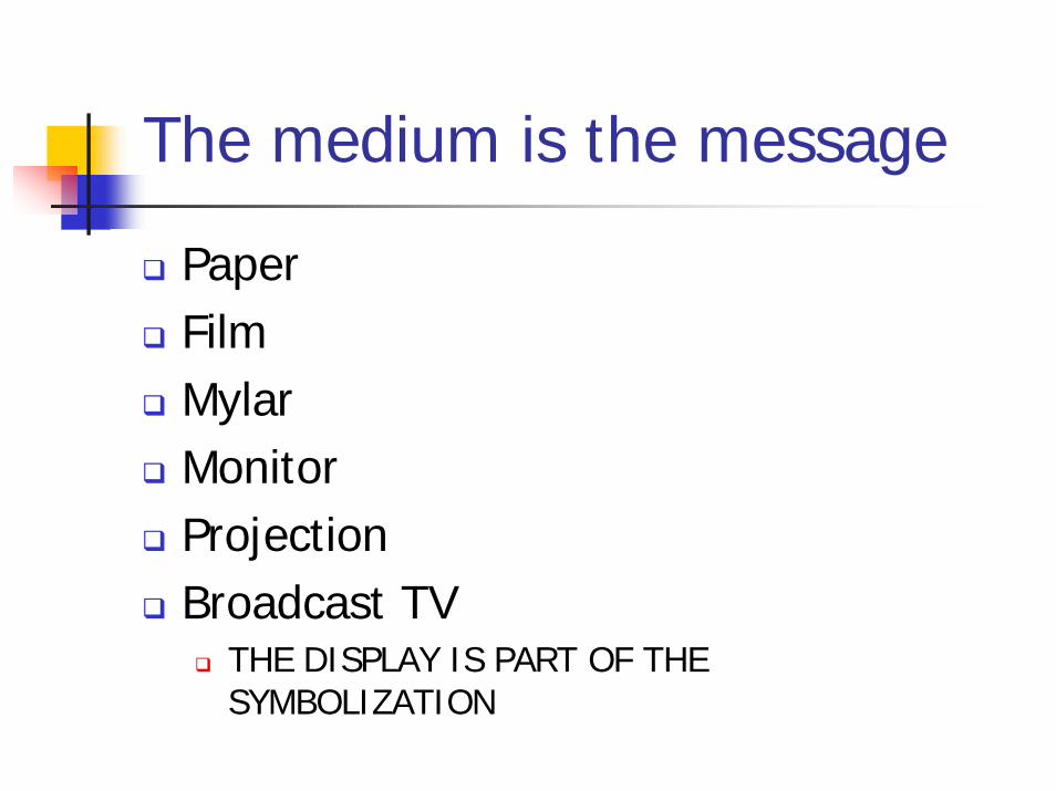
The medium is the message
PaperFilmMylarMonitorProjectionBroadcast TV
THE DISPLAY IS PART OF THE SYMBOLIZATION

The Parts of a Map: Map Elements
The United States of America
Alaska
Lambert Conformal Conic ProjectionSource: U.S. Dept. of State
0 41 2 3
hundreds ofkilometers
0 4 0 4
Washington,D.C.National Capital
Legend
Scale
CreditsNorth ArrowPlace nameInset
Ground
Figure
Neat line Border Title
Hawaii
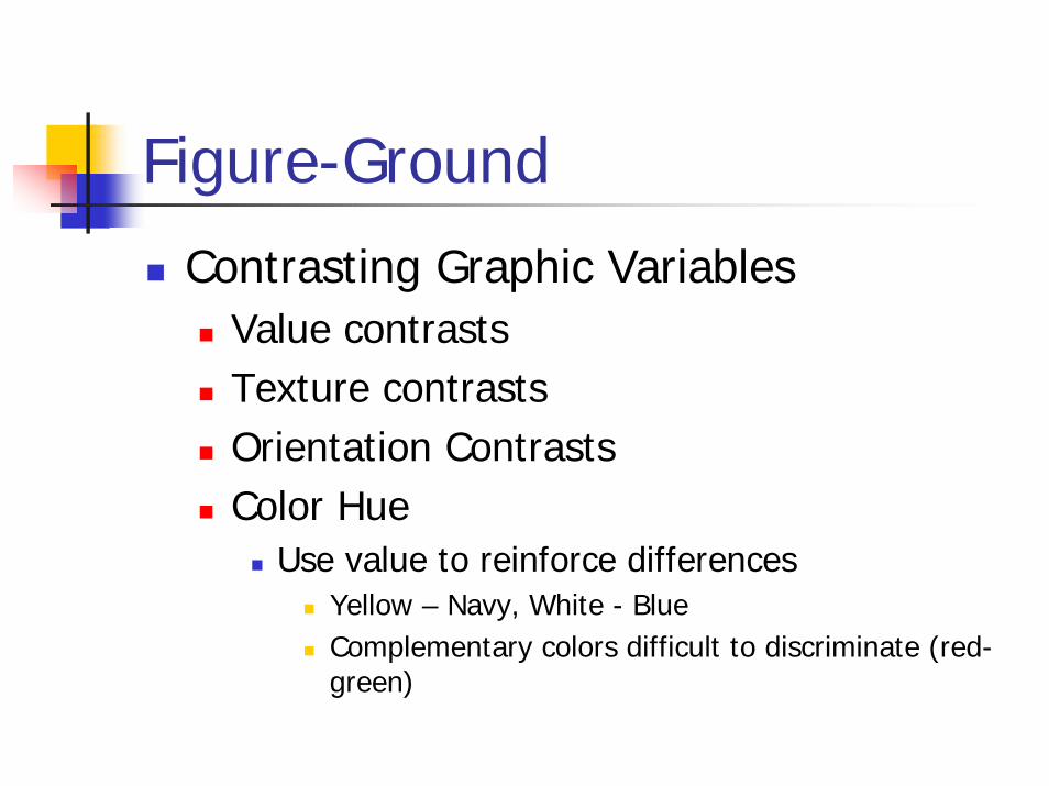
Figure-Ground
Contrasting Graphic VariablesValue contrastsTexture contrastsOrientation ContrastsColor Hue
Use value to reinforce differencesYellow – Navy, White - BlueComplementary colors difficult to discriminate (red-green)
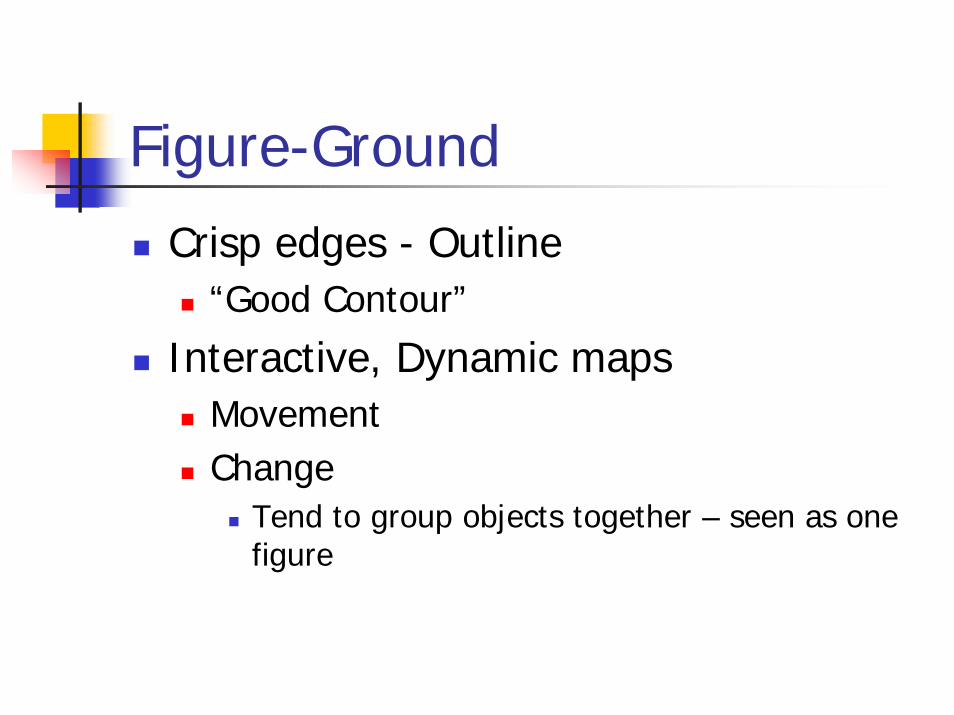
Figure-Ground
Crisp edges - Outline“Good Contour”
Interactive, Dynamic mapsMovementChange
Tend to group objects together – seen as one figure
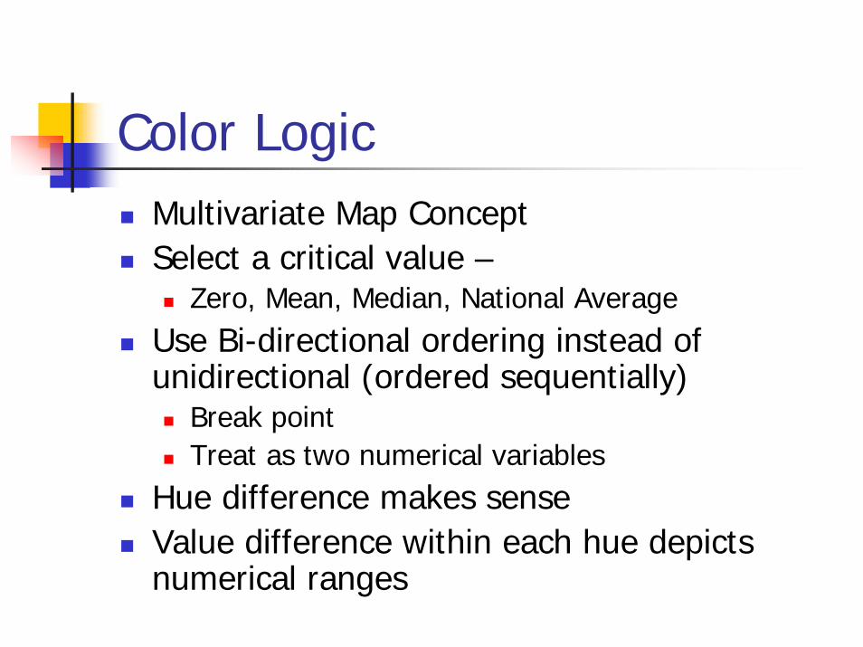
Color LogicMultivariate Map ConceptSelect a critical value –
Zero, Mean, Median, National AverageUse Bi-directional ordering instead of unidirectional (ordered sequentially)
Break pointTreat as two numerical variables
Hue difference makes senseValue difference within each hue depicts numerical ranges
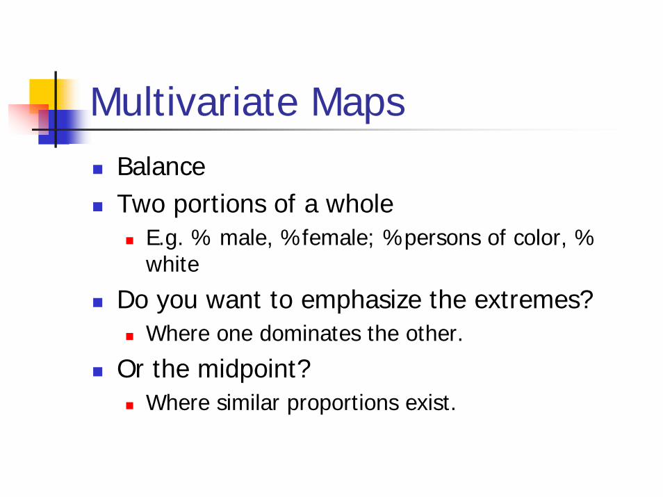
Multivariate MapsBalanceTwo portions of a whole
E.g. % male, %female; %persons of color, % white
Do you want to emphasize the extremes?Where one dominates the other.
Or the midpoint? Where similar proportions exist.
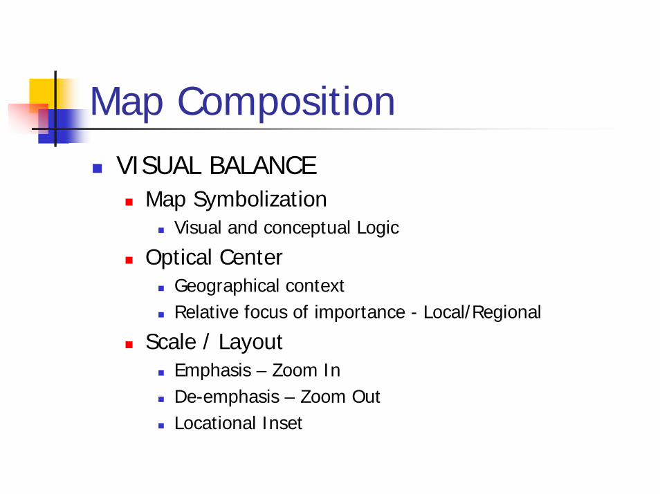
Map CompositionVISUAL BALANCE
Map SymbolizationVisual and conceptual Logic
Optical CenterGeographical contextRelative focus of importance - Local/Regional
Scale / LayoutEmphasis – Zoom InDe-emphasis – Zoom OutLocational Inset
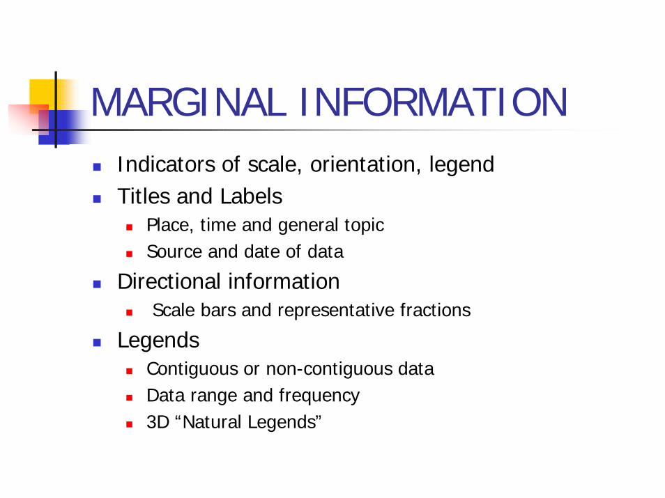
MARGINAL INFORMATIONIndicators of scale, orientation, legendTitles and Labels
Place, time and general topicSource and date of data
Directional informationScale bars and representative fractions
LegendsContiguous or non-contiguous dataData range and frequency3D “Natural Legends”
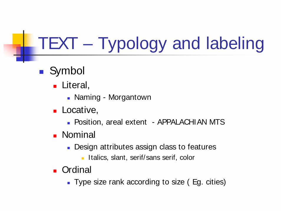
TEXT – Typology and labelingSymbol
Literal, Naming - Morgantown
Locative,Position, areal extent - APPALACHIAN MTS
NominalDesign attributes assign class to features
Italics, slant, serif/sans serif, color
OrdinalType size rank according to size ( Eg. cities)

TITLE - Map “impact”
Distribution of Employment by State 1996USA: Employment Distribution 1996U.S. Employment: 1996 DistributionAmerica at WorkWhere the Jobs are Today
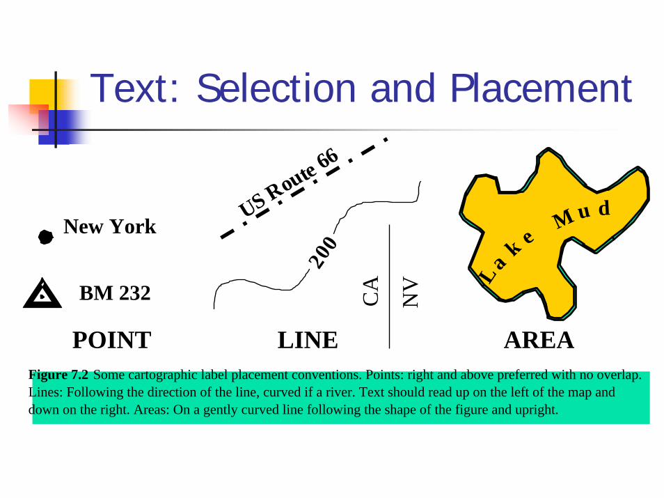
Text: Selection and Placement
New York
BM 232
US Route 66
200
L a
eu d
POINT LINE AREAFigure 7.2 Some cartographic label placement conventions. Points: right and above preferred with no overlap.Lines: Following the direction of the line, curved if a river. Text should read up on the left of the map anddown on the right. Areas: On a gently curved line following the shape of the figure and upright.
CA
NV
Mk
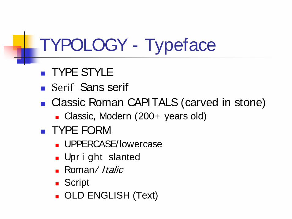
TYPOLOGY - TypefaceTYPE STYLESerif Sans serifClassic Roman CAPITALS (carved in stone)
Classic, Modern (200+ years old)TYPE FORM
UPPERCASE/lowercaseUpright slantedRoman/ ItalicScriptOLD ENGLISH (Text)
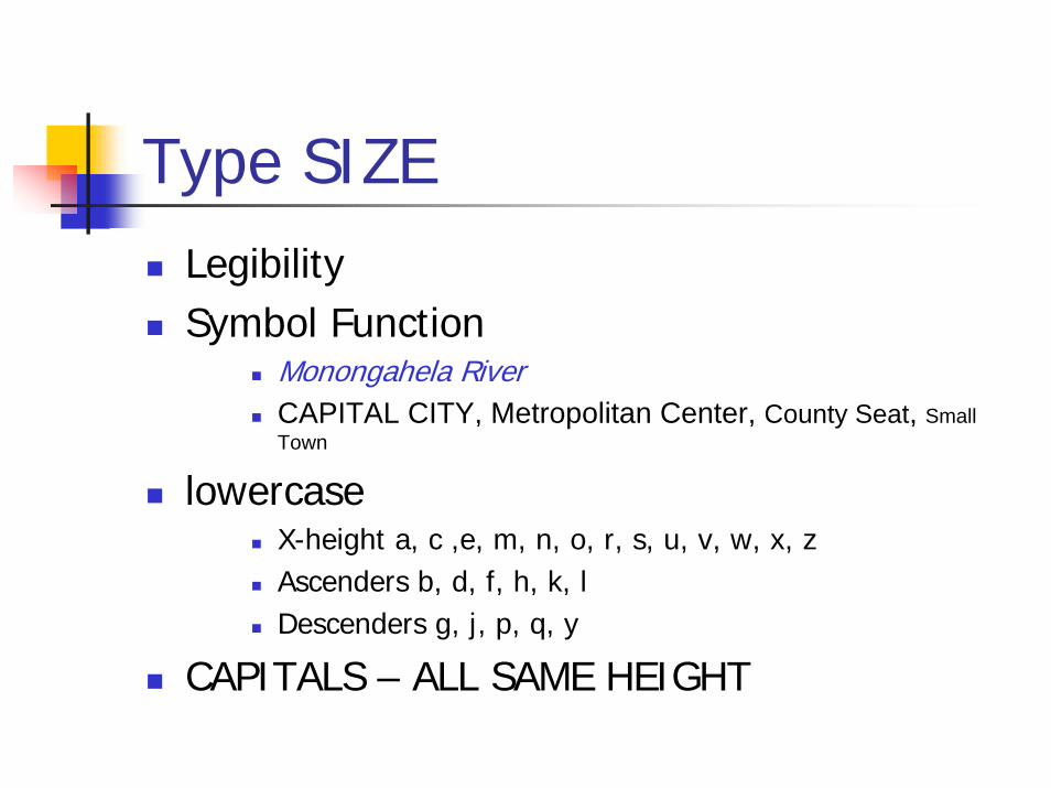
Type SIZELegibilitySymbol Function
Monongahela RiverCAPITAL CITY, Metropolitan Center, County Seat, Small Town
lowercase X-height a, c ,e, m, n, o, r, s, u, v, w, x, zAscenders b, d, f, h, k, l Descenders g, j, p, q, y
CAPITALS – ALL SAME HEIGHT

TYPE SIZEPOINTS height on printed page
1 point = 0.35mm (1/72”)Choice of font size
Balance and designSpace availableViewing distance
Size differences of less than 15% not recognizableTAHOMA 20 Point TAHOMA 18 Point
Differences of 25% between sizes – desirableGARAMOND 28 Point GARAMOND 21 Point
6 – 15 points difference of 2 to 21/2 points ARIAL 8 point, ARIAL 10 point, ARIAL 12 point, ARIAL 14 point
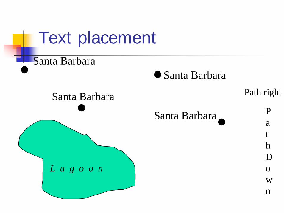
Text placementSanta Barbara
Santa BarbaraPath rightSanta Barbara
Path Down
Santa Barbara
L a g o o n

Imhof's basic rules of label placement
- names on maps should:- be legible- be easily associated with the features they describe- not overlap other map contents- be placed so as to show the extent of the feature - reflect the hierarchy of features by the use of different font sizes- not be densely clustered nor evenly dispersed
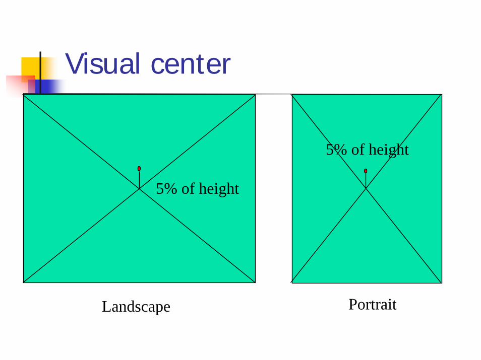
Visual center
5% of height
5% of height
PortraitLandscape

Visual Layout
Title Here
Title Here
Eye expects (1) balance and (2) allignment
POSITIONING TEXT
GUIDELINES (Robinson p.416)Bad practice / Good practice
p. 417, 418
Semi-automatedAutomated
DESIGN LOOP It is difficult to get a good graphic first time around
- mobilize every graphical element, perhaps several times over, to show the data- maximize data density and the number of data entries shown, within reason
Trial and ErrorPlay with your ideas and the tools
Nature of the data may suggest the shape of the graphic, Vertical or horizontal format
- otherwise, prefer horizontal graphicsabout 50% wider than tall
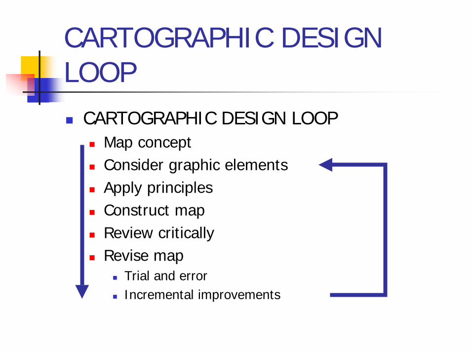
CARTOGRAPHIC DESIGN LOOP
CARTOGRAPHIC DESIGN LOOPMap conceptConsider graphic elementsApply principlesConstruct mapReview criticallyRevise map
Trial and errorIncremental improvements
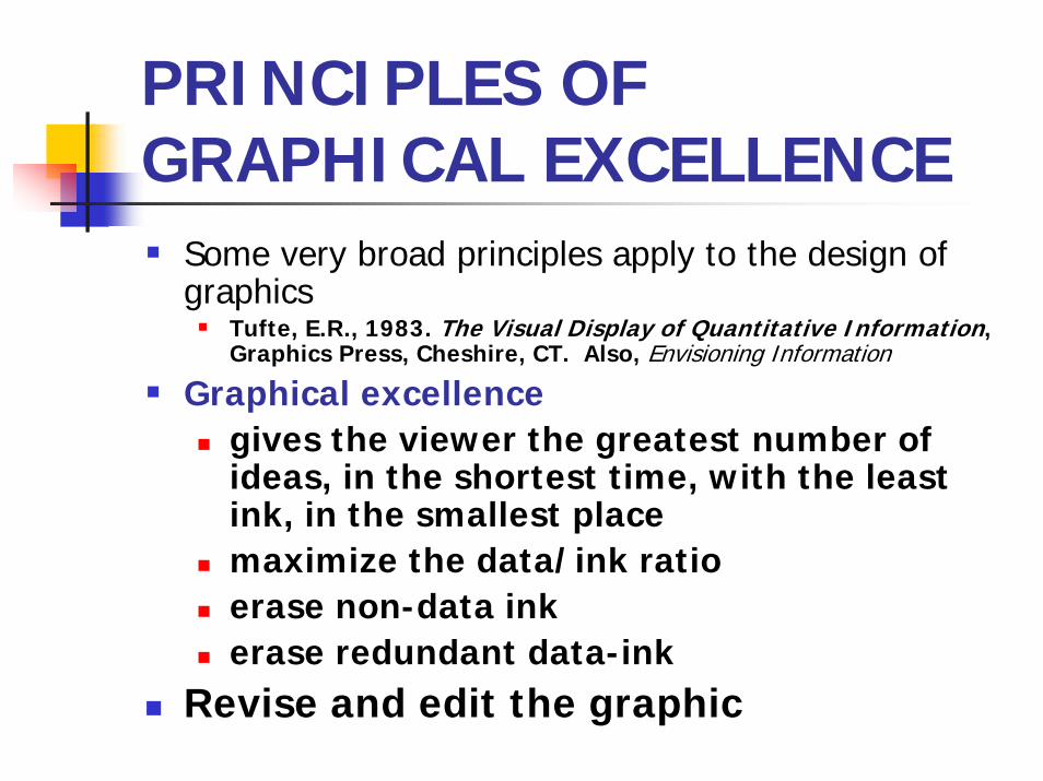
PRINCIPLES OF GRAPHICAL EXCELLENCE
Some very broad principles apply to the design of graphics
Tufte, E.R., 1983. The Visual Display of Quantitative Information, Graphics Press, Cheshire, CT. Also, Envisioning Information
Graphical excellencegives the viewer the greatest number of ideas, in the shortest time, with the least ink, in the smallest placemaximize the data/ink ratioerase non-data inkerase redundant data-ink
Revise and edit the graphic
Multimedia Map Design
http://www.birkey.com/maps/index.asp

SUMMARY
LegibilityPurposeForm follows FunctionCreativity and artistic expressionTakes time!!!!