Magazine Mind Map
14
OCR Media Studies – A2 Level Unit G324: Advanced Portfolio Mind Map and Research Name: Claire Olney Candidate Number: 1186 Center Name: St. Andrew’s Catholic School Center Number: 64135 Generation of Ideas for Ancillary Product 1) – TV Magazine Front Cover
-
Upload
claireolney -
Category
Education
-
view
85 -
download
0
Transcript of Magazine Mind Map

OCR Media Studies – A2 Level
Unit G324: Advanced Portfolio
Mind Map and Research
Name: Claire OlneyCandidate Number: 1186Center Name: St. Andrew’s Catholic SchoolCenter Number: 64135
Generation of Ideas for Ancillary Product 1) –
TV Magazine Front Cover

Source of InspirationHistory of the ProductInside Soap was published in October 1992 as a monthly magazine. It then went on to be published fortnightly in the mid 1990s, and as of early September 2003, it became a weekly magazine.Publisher- Hearst Magazines UK- Group Publishing Director: Matt Hayes- Editor: Steven MurphyCirculation Figures – HOW many people read the magazine?- 117, 539 people from July-December 2015Price: £1.75Socio-Economic NeedsStereotypically, the target audience will mainly consist of women, which is because they are more likely to want to read gossip about soap operas than men are, especially as women are more likely watch the actual soap opera anyway. The target audience would typically be in the socio-economics needs categories of C1, C2, D and E, because normally, most storylines are more relevant to those of a working class or students, so therefore the storylines I decide to use will be relatable to the audience.
Source: http://www.hearst.co.uk/about-us

Masthead Ideas
SoapLatest – This masthead would attract my target audience particularly due to the use of the verbal code ‘Latest’. This is because it will therefore ‘inform’ (Katz) the reader that the content of the magazine will be up-to-date, which will enable them to read about brand new storylines/gossip from soaps on a weekly basis. ‘Soap’ connotes that the magazine will revolve around the soap opera genre, which will target a niche readership. In terms of the positioning of the masthead, it will be in the center near the top of the magazine in order to stand out to the reader, so it is easily identifiable and promotes the brand identity of the magazine. I will make sure it is in a bold font, with a bold colour such as red, to connote significance on the page, and this will be easily recognizable for the reader and they will understand what the magazine is about.
SoapDisclosure – This masthead is engaging because of the use of the verbal code ‘Disclosure’. This is because it holds of connotations of revealing new and/secret information to the reader, which no other magazines would be able to report to their readers. The use of the verbal code ‘Soap’ displays that the magazine will release stories and gossip about soap operas, which will enable it to target a niche audience. I want to position the masthead at the top of the page in the center, in order for it to stand out as a main feature on the front cover, allowing the reader to identify it easily, and remember the name of it. I plan to use a bold font with a striking colour such as red, as it holds connotations of passion, therefore implying that the magazine is passionate to offer the reader new information about the soaps.
ExclusiveSoap – This masthead is appealing because of the verbal code ‘Exclusive’, which connotes that the news and information that the reader will receive is different and unique in comparison to other magazines. It also suggests that the reader will know something secret that other people who don’t buy the magazine won’t know about, therefore highlighting the exclusivity of the magazine. Again, the verbal code ‘Soap’ implies that the magazine is based around the soap opera genre, therefore targeting a niche audience. I plan to position the masthead in the top center of the page to connote its significance on the page, and this is also what my magazine of inspiration ‘InsideSoap’ has done too. I want to have the masthead in a bold colour with bold text in order to attract an audience to want to read it.

Font: Keep Calm
This font style is called ‘Keep Calm’. I feel that this type of font is quite simple, yet direct and will
lead the audience to believe that the
magazine is very informative. The
simplicity of it makes it easily readable and
recognizable to the reader, which is
important.
SoapLatest
ExclusiveSoap
SoapDisclosure

Font: Harabara MaisThis font is called ‘Harabara Mais’. I
think it is appealing as a potential masthead font
because it is quite rounded and bouncy, which connotes that the magazine is full
of gossip and is passionate about the soap opera genre. It
is also reminiscent of the ‘InsideSoap’ font,
therefore meaning that it would attract
the same kind of audience.
SoapLatest
ExclusiveSoap
SoapDisclosure

Font: Romance Fatal Serif
This font is called ‘Romance Fatal Serif’.
I believe that this font would be
attractive to my target audience
because it is formal yet simple, and
connotes elegance, which would secure female readers for
the magazine, which is important as they
make up the majority of the audience for
soap operas. It is also easy to read due to the simplicity of it.
SoapLatestExclusiveSoapSoapDisclosure
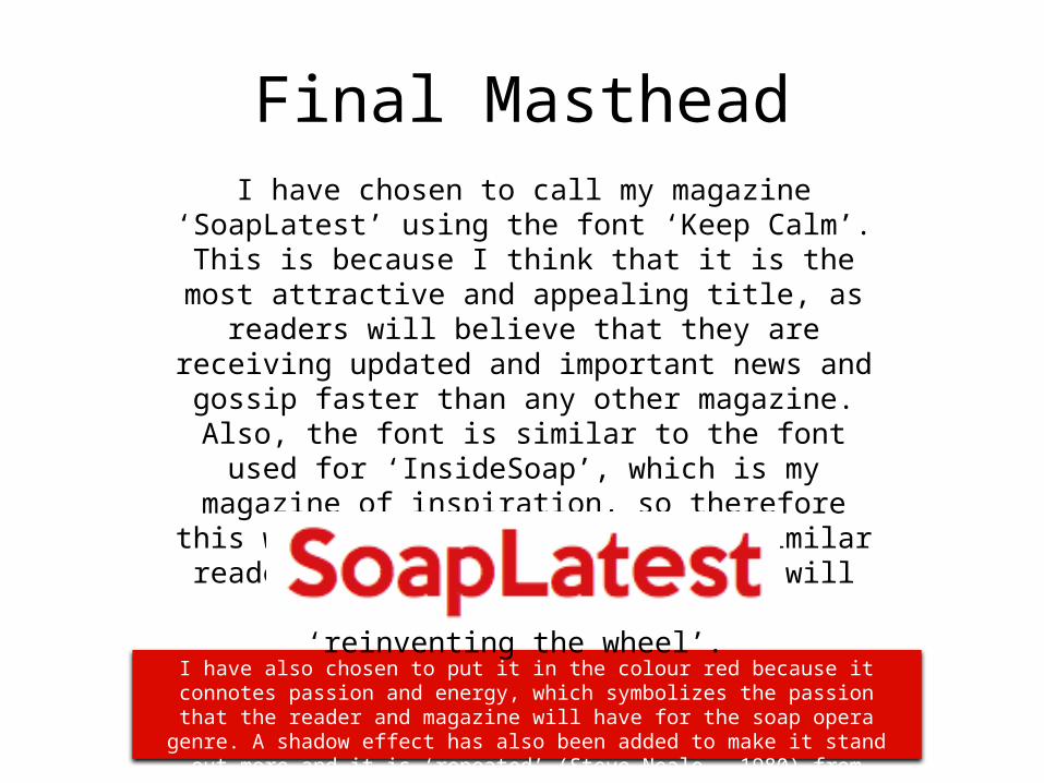
Final MastheadI have chosen to call my magazine ‘SoapLatest’ using the font ‘Keep Calm’. This is because I think that it is the most attractive and appealing title, as readers will believe that
they are receiving updated and important news and gossip faster than any other magazine. Also, the font is
similar to the font used for ‘InsideSoap’, which is my magazine of inspiration, so therefore this will enable me to attract a similar readership that they have, and it will
additionally help me to avoid ‘reinventing the wheel’.
I have also chosen to put it in the colour red because it connotes passion and energy, which symbolizes the passion that the reader and magazine will have for the soap
opera genre. A shadow effect has also been added to make it stand out more and it is ‘repeated’ (Steve Neale – 1980) from ‘InsideSoap’.
Main headline Ideas
Possible Headlines: • Who will she choose? By using a
question as a main headline without revealing very much, it entices the reader to purchase the magazine to find out details about the storyline, and understand more context behind the situation.
• Who is the killer? Again, through the use of a question, it enables the audience to come up with different theories to answer the question, and by reading the article it will help them by offering clues.
• Shock Revelations! A headline like this doesn’t give very much away, which therefore makes the audience want to read the story inside. Also, it would be supported with an image of the characters involved in order to give the audience an understanding regarding who the article is about and from what soap.
Language and Punctuation:• Capital Letters – Having the main
headline in all capital letters draws attention to it and highlights its importance and significance to the soap opera, which is important in order to attract a readership.
• Buzz Words – Words such as ‘shock’, ‘murder’ and ‘horror’ catches the reader’s attention, and it is important as it makes them want to read about the headline inside the magazine. It dramatizes the storyline to make it more appealing to the target audience.
• Explanation Marks – This will again dramatize the story and add importance to it, which will attract the audience to read about it as it connotes a sense of shock.
• Question Marks – By including questions in the main headline, this causes the reader to want to find out answers, so therefore it will make them want to purchase the magazine.
Positioning:• Across the main image – By
overlapping the main headline on the image, it connotes the significance of the story, and it also links the headline and image together in order to allow the reader to understand who is involved in the story. It also stands out on the page over the other cover lines as it will be in a different sized font in comparison to the others.
• Titled at an angle – This makes the headline more interesting and eye-catching, and it would stand out over the other cover lines that are not in this position. Also, it allows the image to be viewed slightly better, as the headline will be less likely to cover the image too much at this angle.

Images Needed
Main Image:From looking at copies of InsideSoap, I can see that the majority of their main images are mid shots, which feature the characters involved in the main headline looking directly at the camera. This therefore creates a personal relationship (Katz) with the reader, and makes it more personal. Also, it is easier for the text to be placed over the main image with this shot type. Therefore, I need to include a mid shot, with the characters engaging in eye contact with the camera for my magazine in order to attract the same audience as InsideSoap.
Other Soap Operas:Eastenders, Coronation Street, Hollyoaks, Emmerdale – These soap operas are the most well-known and popular on TV, so by including these on the cover it is easy for the audience to recognize them, so they would be more drawn to buy the magazine. Therefore, by including other soaps on my magazine cover, it makes the magazine more appealing to the audience, and it also demonstrates variety within my magazine.
Cover Lines:• Sectioned off (borders/shapes)
– Some of the images linked to cover lines are sectioned off from the main image and other cover lines on copies of InsideSoap. This therefore enables audience to tell which cover line belongs with which image, and it separates the different soaps from one another.
• No Background – There are cover line images that missing a background, which is done to make more space on the magazine cover, and this also allows the images to overlap each other easily.
Mode of Address: The people in the main image will be looking at the camera as these images will be the largest, and most significant, so they will draw the attention of the audience. The cover line images may not be making eye contact as they will more likely be action shots from the soap itself.
Language/Price
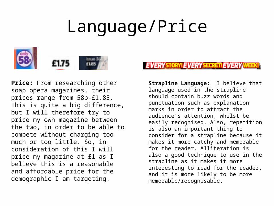
Price: From researching other soap opera magazines, their prices range from 58p-£1.85. This is quite a big difference, but I will therefore try to price my own magazine between the two, in order to be able to compete without charging too much or too little. So, in consideration of this I will price my magazine at £1 as I believe this is a reasonable and affordable price for the demographic I am targeting.
Strapline Language: I believe that language used in the strapline should contain buzz words and punctuation such as explanation marks in order to attract the audience’s attention, whilst be easily recognised. Also, repetition is also an important thing to consider for a strapline because it makes it more catchy and memorable for the reader. Alliteration is also a good technique to use in the strapline as it makes it more interesting to read for the reader, and it is more likely to be more memorable/recognisable.
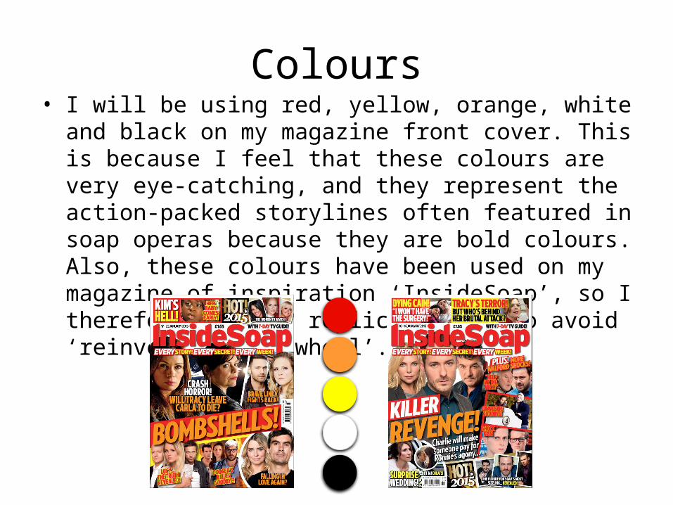
Colours• I will be using red, yellow, orange, white and black on my
magazine front cover. This is because I feel that these colours are very eye-catching, and they represent the action-packed storylines often featured in soap operas because they are bold colours. Also, these colours have been used on my magazine of inspiration ‘InsideSoap’, so I therefore want to replicate this to avoid ‘reinventing the wheel’.
Puff Promotion
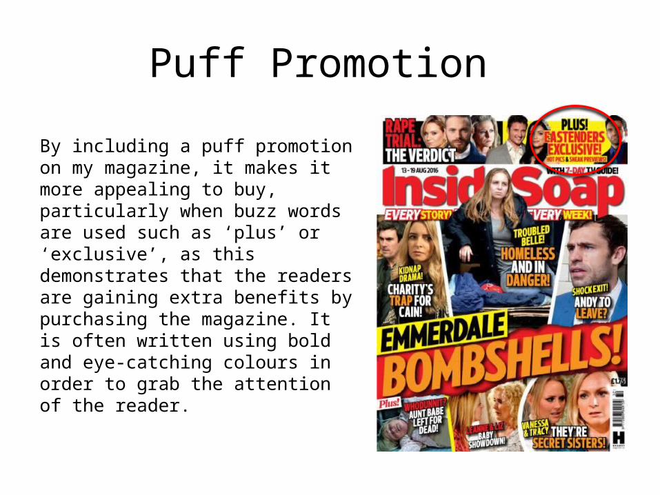
By including a puff promotion on my magazine, it makes it more appealing to buy, particularly when buzz words are used such as ‘plus’ or ‘exclusive’, as this demonstrates that the readers are gaining extra benefits by purchasing the magazine. It is often written using bold and eye-catching colours in order to grab the attention of the reader.

Synergy (Social Media)
• Within the magazines I have researched, I have not seen them containing social media logos present on the front cover. Therefore, I will include them on the front cover of my magazine to make it more accessible for ‘loyal fans’ to find out exclusive content and information through social media. Also, this is an efficient way to promote brand identity for the magazine.

Conclusion
• Through research, I have come to the conclusion that I need to purchase a copy of InsideSoap, which is my magazine of inspiration because it will be easier for me to use their codes and conventions to create my own magazine successfully like they have.
• In order to produce my magazine, I need to make sure I organise the people I want to take photos of, the locations where I will take these photos and the props I will use for them so everything can be done efficiently without wasting time.
• To create my magazine front cover, I will be using Photoshop CS5. This is because it is the best software available to me in order to make my magazine look attractive and professional. It also has the tools that I understand how to use and will need in order to make it look realistic and presentable.