Logo development
8
Logo Developoment Adi mohamed
-
Upload
adz1234 -
Category
Art & Photos
-
view
9 -
download
0
Transcript of Logo development

Logo Developoment
Adi mohamed

Coming up with the logo From the beginning of the production we knew
that we wanted to have a simple and professional logo in order for it to match our preferred genre; romance.
The colour scheme we aimed to have from the beginning was white and baby blue. The text that we decided to do was simply ‘HP’.
In order for us to achieve our preferred logo I have created a few drafts so that we could have a chance to compare and choose the logo that matches our production company.
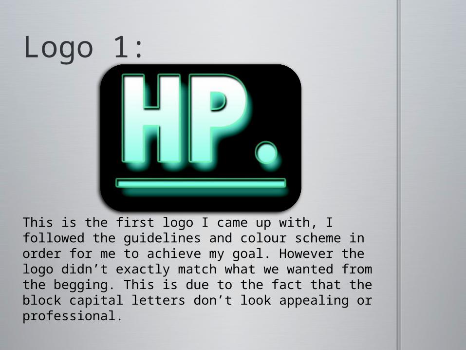
Logo 1:
This is the first logo I came up with, I followed the guidelines and colour scheme in order for me to achieve my goal. However the logo didn’t exactly match what we wanted from the begging. This is due to the fact that the block capital letters don’t look appealing or professional.

Logo 2:
This is the second logo I have created. I decided to try a new colour scheme so that we could have a comparison. The goal of this logo was simplicity, however when we put this up on our blog, it did not suit the theme of the website. As a result we decided not to pursue this logo.

Logo 3:
When I created this logo I decided to add more layers to achieve something more complex. The process of creating this logo required a lot of changes in background and text, however once I uploaded it on the website, similar to logo 2, it did not match our theme we were trying to portray.
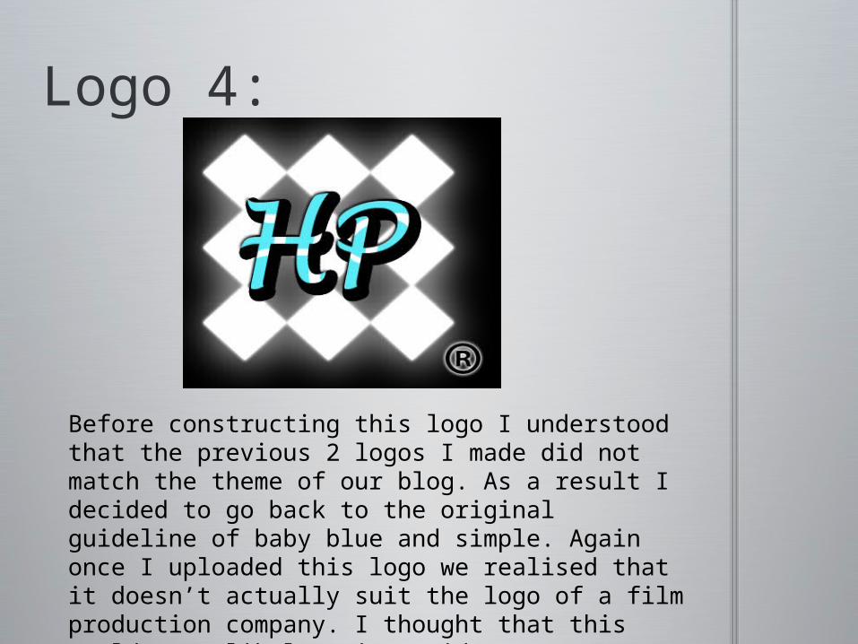
Logo 4:
Before constructing this logo I understood that the previous 2 logos I made did not match the theme of our blog. As a result I decided to go back to the original guideline of baby blue and simple. Again once I uploaded this logo we realised that it doesn’t actually suit the logo of a film production company. I thought that this would most likely suit a video game company rather then a film production.

Logo 5 (Final):
Throughout the process of construction my previous 4 logos, I realised that one of the main reasons that no logo would suit our blog was due to the fact that the actual logo wasn’t transparent. The background colour was always visible as a result I decided to change the background to transparent. This had a big impact on the look of the blog as it fit in really well.

The following image is the final logo on our actual blog. The fact that the logo blends in with the background allows it to fit in perfectly with the blog. The logo allows us to achieve all our goals of making it look simple and professional as well as suiting our production company, which this logo does perfectly.