Kristen Smirnov University of Alberta · 2009-08-14 · Stimuli. 13 Full-Bleed Visual Stimuli. 14...
95
1 Graphic Manipulation in Stimuli Creation Kristen Smirnov University of Alberta
Transcript of Kristen Smirnov University of Alberta · 2009-08-14 · Stimuli. 13 Full-Bleed Visual Stimuli. 14...

1
Graphic Manipulation in Stimuli
CreationKristen Smirnov
University of Alberta

2
Software to Consider
Adobe Photoshop
Top of the line: it will do everything anyone needs
Adobe Photoshop Elements
Companion software: it will probably do everything you need
GIMP (GNU Image Manipulation Program)
Freeware equivalent

3
Software to Consider
Adobe Photoshop
Pros:
Industry Standard
Well documented
Cons:
Expensive
Complicated

4
Software to Consider
Adobe Photoshop
Elements
Pros:
Cheaper
Simpler
Cons:
Not as well
documented

5
Software to Consider
GIMP
Pros:
Freeware
Community
Cons:
Difficult to learn
Not well
documented

6
Software to AVOID
Corel Draw &
Adobe Illustrator
Why?
They produce
vector graphics,
not raster.
That is, they work
with geometric
shapes, not
individual pixels.

7
Software to AVOID
Corel Painter
Why?
It’s not a photo
editing program.
It’s an artist’s
toolbox.
(It also has a
learning curve
that’s close to the
vertical.)

8
Hardware
Wacom Tablet
Pressure
sensitive
Use of a stylus,
not a mouse
Graphics
programs are
designed to work
with them

9
Hardware
Types of Wacoms
Bamboo
Fine for most ($99)
Intuos
For heavier use
($300)
Cintiq
Amazing (but you
don’t need it)
($3000)

10
AdsRealism
Intensity
Impact

11
Typical
Visual
Stimuli

12
Full-Bleed
Visual
Stimuli

13
Full-Bleed
Visual
Stimuli
13

14
Layers
Like animation cels, you can layer separate items
Layers can be hidden
You can contain every condition in one file

15
Layers

16
Layers

17
Layers

18
Layers

19
Layer
StructureEach layer to the right contains
one element that you saw in the
previous few slides.
What do all these buttons
mean, though?

20
The red area indicates 1 layer.
There are currently 5 layers
total. Each layer affects only
the layers below it.
The checkerboard pattern
means “no content,” meaning
an area is transparent.

21
Put these two together, and you
would see parts of the “Condo”
layer around the dogs.
But you won’t see the “Field”
layer, since the “Condo” layer
completely fills the screen.

22
How do you control what’s
shown?
If this eye symbol is showing
next to a layer, it’s visible.
Click it (left click) and the layer
will turn invisible.
23
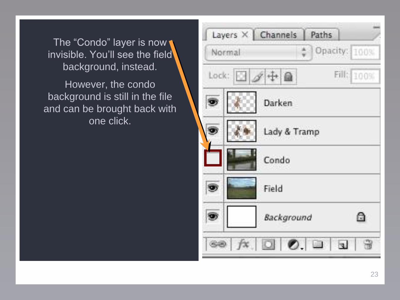
The “Condo” layer is now
invisible. You’ll see the field
background, instead.
However, the condo
background is still in the file
and can be brought back with
one click.

24
Finally, the “Darken” layer is an
effects one. It’s what made
Tramp look darker.
We’ll come back to effects
layers later.

25
Basic Tools
All screenshots are from Photoshop (Creative Suite 3 edition)
Other programs will have basically the same functionality, but
may look a little different
There are many, many more tools than covered here!

26
Move Tool
Lay down
areas of the
selected color
Brush
Used for free-
form
selections,
either entirely
freehand or as
a series of
lines
Lasso
Selection
Available in
rectangular,
elliptical, row, &
column
Marquee
Selection
Click and drag
to move
around objects
on the current
layer

27
Healing
Tools
Makes a new
text layer
Text Tool
It erases!
Eraser
Once an origin
point is
chosen, it
duplicates it
anywhere else
on the image
Clone
Stamp
For minor
blemishes,
scratches, red-
eye, etc.

28
Geometric
Shapes
Picks up any
color in the
picture
Eyedropper
For making
squares,
rounded
squares, stars,
etc.

29
Tool &
Layer Use1. Paste in the puppy
picture on a new
layer
2. Use the text tool
to type out a caption
3. Pick up a shade of
green with the
eyedropper to make
a border

30
Special
Effects (Make
Tramp
Darker!)Two kinds of “effects”:
1. Double-click a layer’s region
(grey area, not the name or
image) to bring up some basic
effects

31
Special
Effects (Make
Tramp
Darker!)Two kinds of “effects”:
1. Double-click a layer’s region
(grey area, not the name or
image) to bring up some basic
effects
2. Make an effects layer

32
Basic Photo

33
Changed Eye
Color

34
Menu
ApppearanceUnlike other layers, which are
just “normal,” this one was set
to have a special behavior.
“Color” changes the color of
anything under the colored
region.

35
Layer ContentHere’s what that layer looks like
on “normal” mode.

36
OpacityYou can change layer opacity
to tone down effects.
Here’s the brown layer taken
down to 50%.

37
OpacityYou make opacity changes
here.

38
Darken /
LightenCould be used to make pictures
(or parts of pictures) look
brighter or darker.
Here’s a common application in
photo retouching.

39
Removing Objects
Two methods: Clone Stamp & Selection Tools
Selection Tool
If it’s in front of something basic that can be quickly filled in
Clone Stamp
If there’s something complicated or textural behind the item

40
Selection ToolThis is the sort of image that
works with a basic select + fill.
It is a completely flat
background.

41
Clone StampWhen the item has some
texture to it, just filling it in with
a flat color may not be very
convincing.

42
Clone StampWhat looked like a flat blue
background does actually have
some shading, as becomes
apparent when a single-color
block is put on top of it.

43
Clone StampUsing the texture of the bin itself to
cover the text makes for a less
noticeable patch.

44
Healing
Tools
Makes a new
text layer
Text Tool
It erases!
Eraser
Once an origin
point is
chosen, it
duplicates it
anywhere else
on the image
Clone
Stamp
For minor
blemishes,
scratches, red-
eye, etc.

45
Clone
StampCan also be used to
remove a larger
section of an image

46
Clone
StampCan also be used to
remove a larger
section of an image

47
Clone StampHere’s a more dramatic
demonstration of cloning. Instead of
setting a point on the bin as the
origin, I picked the Coke can, then
started using the brush on the recycle
bin. That part of the picture was
duplicated where I started “painting.”

48
Clone StampGoing back to the prepared surface:
now text can be added!
But this text doesn’t look very
convincing. Time to work with text
changes.

49
Text ChangesThere are two issues here:
1. The bin in the picture is angled, but
the text is flat
2. The original text wasn’t flush with
the surface

50
Text ChangesTo do a variety of transformations to
a layer, in the top menu go to Edit >
Transform.
This has option for adding
perspective, rotating items, etc.
Here, I rotated the text layer so it
was parallel with the bottom of the
bin.

51
Text ChangesNow I’m going to emboss the text so
it looks like it belongs on this 3D
object.
This is the special effect I mentioned
before that you get from double-
clicking a layer name.

52
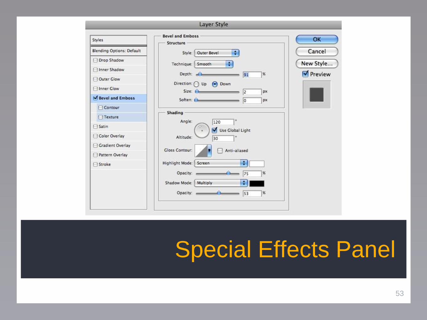
Special
Effects (Make
Tramp
Darker!)Two kinds of “effects”:
1. Double-click a layer’s region
(grey area, not the name or
image) to bring up some basic
effects
53
Special Effects Panel

54
Text ChangesIt’s not a perfect fit, still. The white is
too white, the textures aren’t exact,
and so on. But remember the
yardstick:
“Will an undergraduate research
participant notice and/or care about
the edit?”

55
Text ChangesHere? Probably not!

56
Text ChangesHere? ...They’ll probably notice.

57
More Text
EditingPutting text in proper
perspective is one of
the easiest ways to
make it look more
believable.
Pictures aren’t always
shot straight-on.

58
More Text
EditingHere I’ve (sort of)
prepared the
background, as
mentioned previously.
Clone tool, ahoy!

59
More Text
EditingI start with basic new
text.
(Note that the original
text wasn’t pure
white, so neither is
this. I used the
eyedropper to get
the right tone.)

60
More Text
EditingIn the Edit >
Transform menu, I
used the Skew
transformation to
move up the left side.

61
More Text
EditingThen I used Edit >
Free Transform to
make it larger overall,
and with a greater
height:width ratio than
before. Here, you just
drag points around as
you’d like.

62
More Text
EditingI noticed that the
original text had a
slight drop shadow.
With the effects menu
discussed before, I
add one.

63
More Text
EditingFinally, I notice that
the text is parallel to
the top, but not to the
bottom (because of
perspective). Edit >
Transform >
Perspective can fix
this.

64
Improving
Picture QualityThere are two important things
that you can do to have a good-
looking picture:
1. Pick a picture much larger
than you actually need
2. Spend a little time correcting
the colors

65
Improving
Picture QualityThis is a decently large picture
(approximately 1600 x 1000
pixels). For the web, if you
shrank this down to fit on a
typical monitor, it would look
very sharp.
Print needs higher quality.

66
Improving
Picture QualityHowever, the colors are sort of
washed out.
1. The colors aren’t very
saturated (bright)
2. The values are concentrated
around the middle (greys)

67
Improving
Picture QualityHowever, the colors are sort of
washed out.
1. The colors aren’t very
saturated (bright)
2. The values are concentrated
around the middle (greys)

68
Improving
Picture QualityImage > Adjustments >
Hue/Saturation lets you fix too
little (or too much) saturation.
You could also use this to make
a picture black & white.
Here, I’ve bumped up the
saturation. I just moved the
slider until it looked right.

69
Improving
Picture QualityImage > Adjustments > Levels
takes care of the
black/grey/white balance.
This is the dialog that comes
up.
It actually is telling you
something helpful!

70
Improving
Picture QualityThe bottom axis is the range of
darkness > light. (Ignore the
specific numbers.)
There are gaps at the top and
bottom.

71
Improving
Picture QualityThe bottom axis is the range of
darkness > light. (Ignore the
specific numbers.)
There are gaps at the top and
bottom with no content.
That means there’s no pure
black or pure white in the
image.

72
Improving
Picture QualityIf you drag the outside sliders
toward the middle, you force
the current darkest/lightest
tones toward actual
black/white.
You can play around with all
three sliders and see what
effect it has.

73
Adjusted Picture

74
Original Picture

75
Editing
FeaturesThis is getting into higher-level
editing that takes some
practice.
If you want to add something
(hair, age lines, etc.), it can be
easier to find the new item in an
entirely different image and
clone it in from there.

76
Editing
FeaturesUnfortunately, there’s no real
easy way to show you how to
do that; it requires getting a feel
for the sort of things shown
here (and the tablet hardware).
But here’s one application, to
keep your minds turning this
over.

77
Editing
FeaturesThe woman to the right is very
attractive. Perhaps you want
some participants to see a less
attractive version of the same
woman.

78
Editing
FeaturesTwo cross-cultural
attractiveness norms are 1.
symmetrical features and 2.
eyes being spaced with roughly
one eye-width between them.
Next, I mess her up!

79
Editing
FeaturesThe more advanced Liquify
tool was used (under the Filter
menu). This let me push her
face around, basically.

80
Editing
FeaturesHere, age advancement was
tackled. Reduced skin elasticity
was another Liquify round, and
some wrinkles were cloned
from another source image.
(Apologies to Gov. Kathy
Sebelius.)

81
Editing
FeaturesFor comparison, here is the
original image.

82
Compositing
ImagesWhat if you don’t care about
things being things perfectly
believable, you just want to set
the stage?
That’s really easy!

83
Compositing
ImagesWe’re back where we started,
in Lady & the Tramp territory.
Think back to the description of
an ice cream store line from a
previous seminar. (“Fattest
person/thinnest person you’ve
ever seen.”)

84
Compositing
ImagesSo long as you find pictures
that are somewhat believable
together, you can set the stage
with a background image that
works like you want and any
other elements.
(The picture around the kids in
line was simply erased.)

85
Compositing
ImagesSo long as you find pictures
that are somewhat believable
together, you can set the stage
with a background image that
works like you want and any
other elements.
(The picture around the kids in
line was simply erased.)

86
Compositing
ImagesYou could use this to make, for
example, a retail aisle that was
crowded (10 “person layers”
showing) or empty (1 “people
layer” showing).
87
Refresher
Look for Photoshop, Photoshop Elements, or GIMP
Get a pressure-sensitive tablet
Practice!
Don’t try too many options at once, you will get overwhelmed
You can use layers to contain all stimulus conditions within a
single file
Some suggestions for graphic manipulations you could do:

88
Editing ModelsCorrect blemishes
Change coloring
Add accessories
Blend features
Change features

89
Changing
ProductsAdding features
Adding accessories
Changing model
Changing styling

90
Editing TextChange advertisements
Change product descriptions
Change instructions
Change font, color, etc. styling

91
Compositing
ImagesSet up any situation
Use stock images to create
many situations
Control the products,
consumers, etc. visible

92
Final Suggestions
Have a specific problem in mind
Start small
Buy a reference book (don’t ignore For Dummies!)
Look at online tutorials
Talk to me... after comps :)
93
Appendix: Photo Resources
Two types of photos to consider
Ones that will only be used within the lab
Ones that you would like to use in public, or as a figure in your
paper submission

94
Appendix: Photo Resources
If it’s only ever going to be in the lab, you can be a little less
particular (although the options in the next slide should certainly
be considered!)
Google Image Search: http://images.google.com/
Flickr: http://www.flickr.com/
Picasa: http://picasa.google.com
Stock Photo Search: http://www.everystockphoto.com/

95
Appendix: Photo Resources
If you need to republish the photo elsewhere, you need an
image that grants you reproduction rights. You may or may not
need to credit the original photographer. (A photo’s page will say
so.) Also, you may or may not need to pay for the image.
stock.xchng: http://www.sxc.hu/
iStockPhoto: http://www.istockphoto.com/
Other commercial & free stock photography sites are plentiful on
Google if you don’t find the right image in the two above