Karlen Communications Accessible Word … 3 of 47 Introduction Over the past decade or so, those of...
47
Karlen Communications Accessible Word Document Design: Tables and Columns Karen McCall, M.Ed.
Transcript of Karlen Communications Accessible Word … 3 of 47 Introduction Over the past decade or so, those of...
Karlen Communications Accessible Word Document Design:
Tables and Columns
Karen McCall, M.Ed.

Page 2 of 47
Table of Contents
Introduction ............................................................................................................................................................ 3
Tables for design layout accessibility barriers ..................................................................................... 3
Optimizing the accessibility of a data table in a Word document ...................................................... 6
Inserting a table ................................................................................................................................................ 6
Identify the table header row ...................................................................................................................... 8
Do not let Rows break across pages. ...................................................................................................... 10
Adding cell padding to a table .................................................................................................................. 12
Add a Caption to a table .............................................................................................................................. 14
Add Alt Text to a table ................................................................................................................................. 16
Proper use of Tab Stops ................................................................................................................................... 18
Paragraph Styles to replace single cell tables ......................................................................................... 22
Indenting a paragraph from the left and right margins ................................................................. 30
Columns ................................................................................................................................................................. 32
Newspaper Columns .................................................................................................................................... 36
Parallel Columns ............................................................................................................................................ 38
Use a Paragraph style to show a sidebar.............................................................................................. 41
Summary ............................................................................................................................................................... 47
Contact Information .......................................................................................................................................... 47

Page 3 of 47
Introduction Over the past decade or so, those of us working in the field of accessible document design
have established “standards,” guidelines and best practices for optimizing the accessibility
of documents including Word documents. One of the first things we learned was that using
a table for design layout was generally considered bad design. This has been reinforced
over the years but with the added component of barriers to adaptive technology when
tables are used for design layout.
This accessible document design tutorial on tables and columns includes rationales for not
using tables for design layouts and the barriers they cause to people with disabilities using
adaptive technology. I would even say that some document that use tables for design layout
are not even accessible in terms of readability and ability to comprehend the content, for
people without disabilities.
Most file formats have a similar “don’t use tables for design layout” checkpoint or best
practice..
Tables for design layout accessibility barriers There are several accessibility barriers associated with tables used for design layout:
1. Someone using a screen reader (who is blind or visually disabled) and someone
using text-to-Speech (who has a learning, cognitive, print or visual disability) must
switch to table reading and navigation keyboard commands to access the content in
any table.
2. You cannot use Headings in a table. Headings are navigational points in a document
and navigating to a specific cell does not equate with navigating to a specific topic in
a document.
a. Headings provide information on the structural outline of content which is
another reason that they are not appropriate for a table.
3. When the document is converted to tagged PDF, the table structure for the
document is also converted requiring remediation to remove it which has both a
financial and human resources cost.
a. If the table structure is not removed, someone using a screen reader and TTS
tools will be forced to use table navigation and reading commands to access
the content.
4. If the document is converted to Braille, the content of the document will be in a
Braille table format and the Braille transcriber will have to remediate the document
to remove the table structure at an increased financial and human resources cost.
Page 4 of 47
5. If a Word document is presented to someone using a screen reader and Text-to-
Speech tools, the table structure must be removed to easily access the content which
results in an additional financial and human resources cost.
a. Most students using adaptive technology request that all tables be removed
from documents because they have to use different reading and navigation
keyboard commands to access the content in tables.
6. If a table is nested within a table, the inaccessibility of the content is compounded
because adaptive technology only looks at the table the focus is in, not the document
as a whole. All of a sudden cell coordinates are repeated. For example if one hears
“Table 2 cell A1” they may realize they are in a second table, however the
announcement of which table they are in is only stated when the table is entered
and not for every cell.
a. This is the correct way to access content in a table. Content in the current
table structure is the focus of reading/navigation, not the entire document.
b. There is also no relationship between the nested table and the table used for
design layout. It is like trying to navigate a labyrinth or maze and constantly
get navigational coordinates while taking in the surrounding content.
7. And…it is just bad design or rather lack of design.
This accessible document design tutorial contains the following sample documents as
attachments to the PDF document:
Sample of a document created using a table for design layout.
The same document with the table structure removed, Headings and a linked Table
of Contents added.
Sample of a document with Newspaper and Parallel Columns.
Sample of a document with Paragraph styles creating an accessible call out.
The document where a table is used for design layout is based on an actual document that I
remediated that had a table spanning 6 original columns and 165 rows. Throughout the
document I remediated, columns were added and removed, merged and split and cells in
rows were merged “at will.” The document has a footnote and a nested table as well as an
image with a caption.
As is true for the present time, the table structure was removed, Headings and a linked
Table of Contents was added.
I converted the sample document included in this tutorial that uses a table as design layout
to text and added the accessible format and structure including Headings and a linked
Table of Contents.
Page 5 of 47
I encourage you to try reading both of them using a screen reader or Text-to-Speech tool to
examine the level of accessibility of each. The document with the table as a design layout
has the JAWS table reading and navigation keyboard commands in Appendix A.
Keep in mind that it is “NOT permitted” to use Headings in a table. It is poor document
design. Headings are used as structural elements to provide information on the logical
order of content and to be able to navigate to a specific topic or sub-topic in a document not
a specific cell.
By attempting to use a heading in a table you are forcing someone to navigate to one
specific cell which does not equate to a topic or sub-topic in a document.
Just because you can doesn’t mean it is good design!
Page 6 of 47
Optimizing the accessibility of a data table in a Word
document There are three questions to answer before using a table in Word:
1. What is the table header for this table?
a. As I add rows and the table spans pages, what is the Table Header row or
rows that will repeat at the top of each page?
2. What is the caption for this table? For example is the caption “Summary of sales for
2015?
3. What is the Alt text for this table?
a. “Dog’s breakfast of content” is not good Alt text. What is the description of
the table that you are going to provide for someone using adaptive
technology that adequately describes the structure of the table?
If you can’t answer any of these questions and implement Table Header rows, a caption for
the table of Alt Text for the table, the content you are working with DOES NOT belong in a
table.
Tables are to be used for data representation and NOT to be used for design Layout.
Inserting a table Use the Insert Ribbon to add a table to a document. Never use drawn tables in a Word
document as they are not accessible and do not currently have the same level of table
reading and navigation commands as a table that is inserted. While some adaptive
technology can now recognize drawn tables, the accessibility of them is sporadic and most
adaptive technology has not caught up to the ability to access drawn tables.
Having experimented with drawn tables I can also verify that they are difficult to draw and
at times are like a tornado that sucks all surrounding content into them which is then hard
to get out of them. They take up time, do not create uniform table structures and just
because they are now sort of accessible, I would still recommend not using them. In terms
of having equal access to a drawn table as we have for an inserted table, we are nowhere
near a similar level of accessibility. The fact that some adaptive technology can recognize a
drawn table does not mean the drawn table is “accessible.” This is a work in progress.
To insert a data table into a document:
1. Press Alt + N, T for Insert Ribbon, Table.
2. You can use the Table Gallery to choose the number of rows and columns if your table
fits within the predetermined limits of the Table Gallery; or,

Page 7 of 47
3. Press the letter I to open the Insert Table dialog and specify a larger number of rows
and columns.
Either method will create an accessible “uniform” table.
Figure 1 Insert Table Gallery from the Insert Ribbon.
If you use the Table Gallery, as you choose the number of rows and columns, you’ll see
them appear in your document.
Page 8 of 47
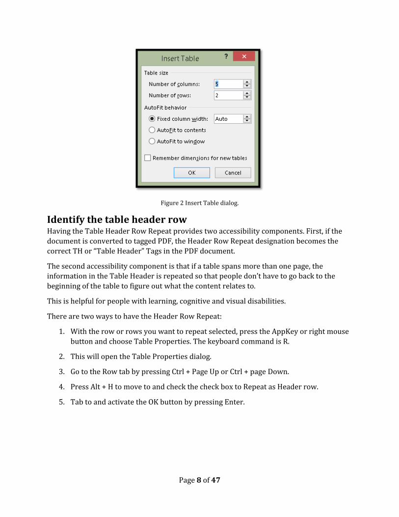
Figure 2 Insert Table dialog.
Identify the table header row Having the Table Header Row Repeat provides two accessibility components. First, if the
document is converted to tagged PDF, the Header Row Repeat designation becomes the
correct TH or “Table Header” Tags in the PDF document.
The second accessibility component is that if a table spans more than one page, the
information in the Table Header is repeated so that people don’t have to go back to the
beginning of the table to figure out what the content relates to.
This is helpful for people with learning, cognitive and visual disabilities.
There are two ways to have the Header Row Repeat:
1. With the row or rows you want to repeat selected, press the AppKey or right mouse
button and choose Table Properties. The keyboard command is R.
2. This will open the Table Properties dialog.
3. Go to the Row tab by pressing Ctrl + Page Up or Ctrl + page Down.
4. Press Alt + H to move to and check the check box to Repeat as Header row.
5. Tab to and activate the OK button by pressing Enter.
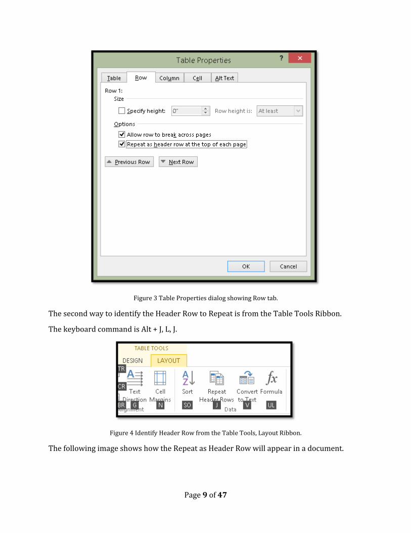
Page 9 of 47
Figure 3 Table Properties dialog showing Row tab.
The second way to identify the Header Row to Repeat is from the Table Tools Ribbon.
The keyboard command is Alt + J, L, J.
Figure 4 Identify Header Row from the Table Tools, Layout Ribbon.
The following image shows how the Repeat as Header Row will appear in a document.
Page 10 of 47
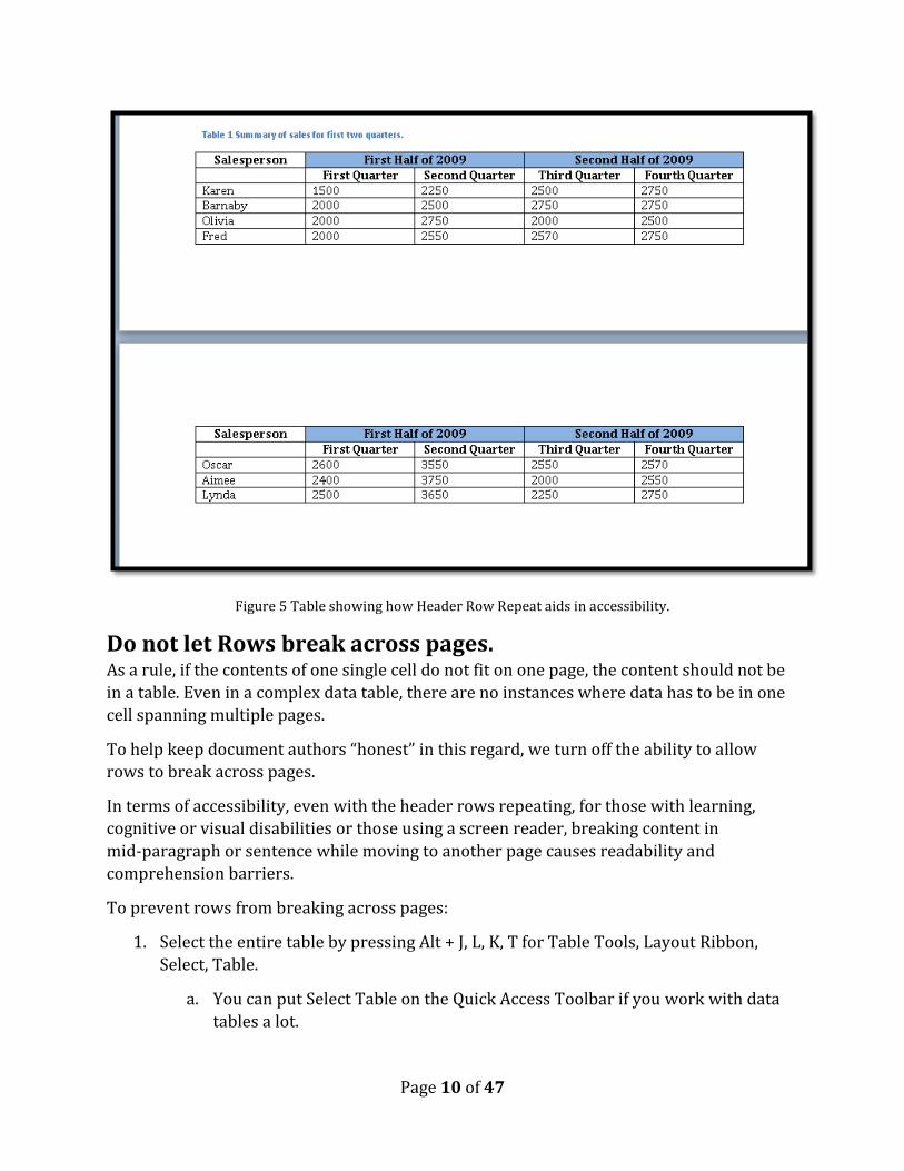
Figure 5 Table showing how Header Row Repeat aids in accessibility.
Do not let Rows break across pages. As a rule, if the contents of one single cell do not fit on one page, the content should not be
in a table. Even in a complex data table, there are no instances where data has to be in one
cell spanning multiple pages.
To help keep document authors “honest” in this regard, we turn off the ability to allow
rows to break across pages.
In terms of accessibility, even with the header rows repeating, for those with learning,
cognitive or visual disabilities or those using a screen reader, breaking content in
mid-paragraph or sentence while moving to another page causes readability and
comprehension barriers.
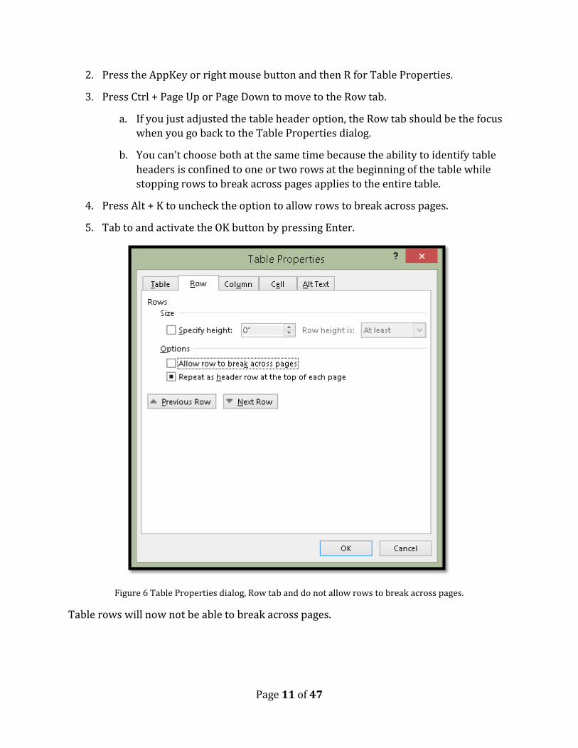
To prevent rows from breaking across pages:
1. Select the entire table by pressing Alt + J, L, K, T for Table Tools, Layout Ribbon,
Select, Table.
a. You can put Select Table on the Quick Access Toolbar if you work with data
tables a lot.
Page 11 of 47
2. Press the AppKey or right mouse button and then R for Table Properties.
3. Press Ctrl + Page Up or Page Down to move to the Row tab.
a. If you just adjusted the table header option, the Row tab should be the focus
when you go back to the Table Properties dialog.
b. You can’t choose both at the same time because the ability to identify table
headers is confined to one or two rows at the beginning of the table while
stopping rows to break across pages applies to the entire table.
4. Press Alt + K to uncheck the option to allow rows to break across pages.
5. Tab to and activate the OK button by pressing Enter.
Figure 6 Table Properties dialog, Row tab and do not allow rows to break across pages.
Table rows will now not be able to break across pages.

Page 12 of 47
Adding cell padding to a table As with other file formats and the preference of a document author to have a bit of space
around the text in a data table, you can do the same thing in Word.
Do not create space above and below content in a cell by pressing the Enter key! This
creates blank lines in the cell and “we” have to listen to those blank, blank, blank lines!
In Word the ability to adjust the spacing around text in a table is called “Cell Margins.”
I recommend that you create a consistent looking table by selecting the entire table and
adjusting the cell margins for the table rather than for individual rows.
To adjust cell margins for a data table:
1. Select the table by pressing Alt + J, L, K T for Table Tools, Layout, Select, Table.
2. Press the AppKey or right mouse button and then R for Table Properties.
3. Press Ctrl + Page Up or Page Down to move to the Cell tab.
4. Press Alt + letter O to open the Cell Options dialog.
5. Press Spacebar to uncheck the check box to make all margins equal. It has focus
when the dialog opens and is checked by default.
6. DO NOT use whole numbers for this. I’ve researched the visual spacing and found
that anything from .10 to .20 for the Top and Bottom spacing looks professional.
a. Once you are close to the .20 measure, it begins to look unprofessional so I
recommend something like .10 or .15 at the most.
7. Normally I don’t adjust the left or right margins but you can do this.
a. Keep in mind the measure for Top and Bottom and be consistent in the
measure. Don’t use whole numbers and keep the Left and Right margins
around .10 to .15.
8. Tab to and activate the OK button by pressing Enter.
9. You are taken back to the Borders and Shading dialog.
10. Tab to and activate the OK button by pressing Enter.
11. Your table now has a bit of space between the text and the top and bottom gridlines
or the content above or below if you choose not to use gridlines.
The following two images show the process of adding cell margins or cell padding to a table
in Word.

Page 13 of 47
Figure 7 Table Properties dialog open with focus on cell tab and Cell Options dialog.
Figure 8 Cell Margins dialog showing a .10 measure of cell padding for top and bottom of a cell.

Page 14 of 47
What does this look like in a table? The first image is the default when I use one of the
Table Styles. I used a Table Style to show that you can make these types of modifications
when using the Table Styles
Figure 9 Table with normal cell margins or padding.
The second image shows the table when the cell margins or cell padding has been changed
to the .10 measurement.
Figure 10 Table with cell margins or padding increased for top and bottom.
I chose to use images to illustrate the difference when Cell Margins are adjusted because I
am going to convert this document to tagged PDF so it will lose the exploratory value you
would have in Word by accessing the Table Properties dialog.
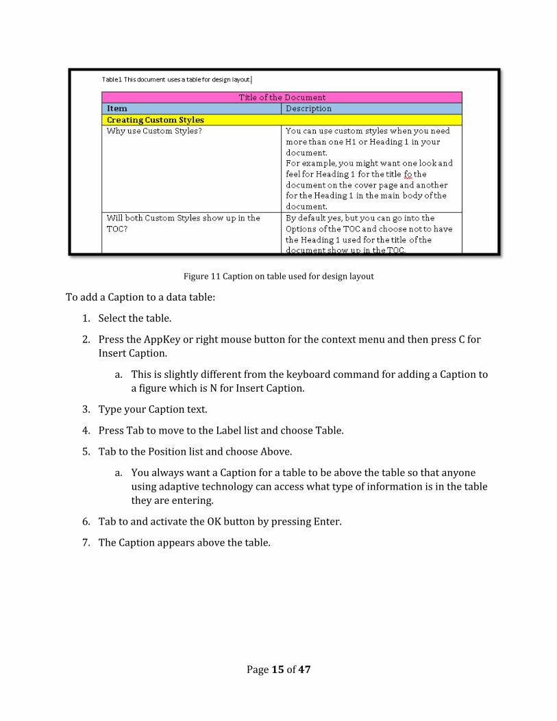
Add a Caption to a table One of the basic questions to ask when considering using a table in a Word document is
what the Caption of the table will be. For example, can you give a summary of what
information is contained in the table for people with learning, cognitive or visual
disabilities or who are using a screen reader so that they know what to expect once they
enter the Table?
You can do this for all data tables. You can’t do this for tables used for design layout. It
would defeat the intent of creating the inaccessible document. Taking the sample document
I created, imagine starting the document with a Caption.
Page 15 of 47
Figure 11 Caption on table used for design layout
To add a Caption to a data table:
1. Select the table.
2. Press the AppKey or right mouse button for the context menu and then press C for
Insert Caption.
a. This is slightly different from the keyboard command for adding a Caption to
a figure which is N for Insert Caption.
3. Type your Caption text.
4. Press Tab to move to the Label list and choose Table.
5. Tab to the Position list and choose Above.
a. You always want a Caption for a table to be above the table so that anyone
using adaptive technology can access what type of information is in the table
they are entering.
6. Tab to and activate the OK button by pressing Enter.
7. The Caption appears above the table.
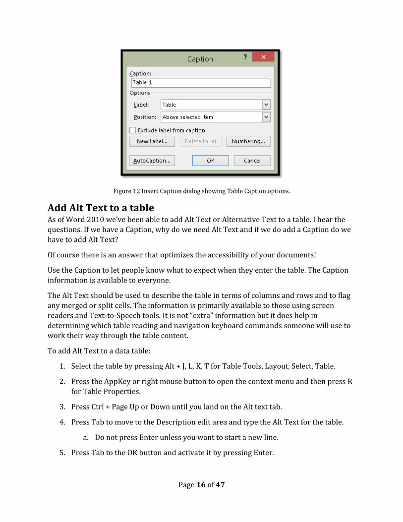
Page 16 of 47
Figure 12 Insert Caption dialog showing Table Caption options.
Add Alt Text to a table As of Word 2010 we’ve been able to add Alt Text or Alternative Text to a table. I hear the
questions. If we have a Caption, why do we need Alt Text and if we do add a Caption do we
have to add Alt Text?
Of course there is an answer that optimizes the accessibility of your documents!
Use the Caption to let people know what to expect when they enter the table. The Caption
information is available to everyone.
The Alt Text should be used to describe the table in terms of columns and rows and to flag
any merged or split cells. The information is primarily available to those using screen
readers and Text-to-Speech tools. It is not “extra” information but it does help in
determining which table reading and navigation keyboard commands someone will use to
work their way through the table content.
To add Alt Text to a data table:
1. Select the table by pressing Alt + J, L, K, T for Table Tools, Layout, Select, Table.
2. Press the AppKey or right mouse button to open the context menu and then press R
for Table Properties.
3. Press Ctrl + Page Up or Down until you land on the Alt text tab.
4. Press Tab to move to the Description edit area and type the Alt Text for the table.
a. Do not press Enter unless you want to start a new line.
5. Press Tab to the OK button and activate it by pressing Enter.

Page 17 of 47
Figure 13 Table Properties dialog showing Alt text tab.

Page 18 of 47
Proper use of Tab Stops Tab, Enter and Spacebar have suffered over the past years due to the misuse of each of
them. For example, I’ve seen documents where the Enter key has been used to create space
around text instead of using the Paragraph dialog and I’ve seen documents where the
Spacebar has been used to isolate text on lines. One document I worked on five years ago
has the Enter key pressed at the end of every line for the 85 page document. This meant
that every line in the report was an individual paragraph.
There are times when it is correct and proper to use a Tab.
For example, if you have a short agenda you can use Tabs to space out the information so
that the times, speaker and room allocation are visually separate but easily read by
someone using adaptive technology. Tables are not a good tool for displaying information
such as an agenda for a meeting. However, we often look around and say “I don’t know
where the hammer is so what can I use instead?” In word processed documents we tend to
gravitate toward tables (and Text Boxes) as our handy “hammer replacement.”
The following is an example of an agenda formatted using Tabs. The instructions for doing
this follow. In the attached Word document that is created using a table for design layout,
the visual presentation of the keyboard commands in Appendix A have been formatted
using Tabs.
9:00 -10:00 Keynote Manitoba Room
10:00-11:00 General Sessions Rooms Posted
11:00-12:00 Annual Meeting Alberta Room
This is easy to read if you are using a screen reader or Text-to-Speech tool because you can
use either Down Arrow to move to and read the next lime, activity and room number or
you can use Ctrl + Up Arrow to move to the previous time, activity and room number. You
can also use the keyboard commands for the adaptive technology to read the content again
without losing track of where you are.
The first step in the process is to select the text you want to adjust the Tabs for. In our
example, it is the three lines of the agenda.
Figure 14 Text selected for creating Tabs.

Page 19 of 47
The next step is to open the Paragraph dialog by pressing Alt +H, P, G for Home Ribbon,
Paragraph.
Figure 15 Paragraph dialog.
In the lower left of the Paragraph dialog is the button for Tabs. With the Paragraph dialog
open, press Alt + T which will open the Tabs dialog.
Page 20 of 47
Figure 16 Tabs dialog.
Press Alt + A to Clear All existing Tab Stops for the selected text.
Figure 17 New Tab Stops set for selected text.

Page 21 of 47
We now need to set the new Tab Stops for the selected text. I did experiment with what I
thought were Tab Stops close to where I wanted the text placed and found that two Tab
Stops, one at 2.25 inches from the margin and one at 4 inches from the margin worked best.
Once you clear all Tab Stops your focus is in the area where you can enter new Tab Stop
positions.
Type 2.5 and press Alt + S to Set that Tab Stop.
The number you just typed is still in the edit area but it is also just under this area which
confirms that it is set.
Type 4 over top of the existing number in the edit area and press Alt + S to Set the Tab Stop.
Press Tab to move to the OK button and activate it by pressing Enter.
You are returned to the Paragraph dialog where you can press Tab to move to the OK
button and activate it by pressing Enter.
You’ve now positioned the agenda items in a consistent manner both horizontally and
vertically.
An agenda like the one in this example is a simple piece of content to use Tabs with. If the
agenda is longer or more specific in terms of identifying each session, a short description
and room number along with the time, then best practice shows us that the content is best
formatted with headings and paragraphs.
For example, consider the following:
Monday (Heading 1)
Keynote Speaker (Heading 2)
Time (Paragraph)
Location (Paragraph)
Short description and/or bio (Paragraph)
General Sessions (Heading 2)
Time (Paragraph
Name of first Session (Heading 3))
Room (Paragraph)
Short Description (Paragraph)
Name of second Session (Heading 3))
Room (Paragraph)

Page 22 of 47
Short Description (Paragraph)
…and so forth.
This makes it easy to find the day you want, the session you want and then read the
additional information provided. A table is not appropriate for this type of a short summary
of information.
Paragraph Styles to replace single cell tables The other misuse of tables that we often see in documents is a single cell table used to
isolate important information on a page.
When someone using adaptive technology comes across this in a
document they hear that there is a table with one column and one row and
then they enter the table and are told they are in cell A1. They then have to
switch to the table reading and navigation commands which are designed
to read data tables.
The previous paragraph is formatted with a Paragraph style not a single cell table. Could
you tell just by looking at it?
The other problem with using single cell tables to call out content is that it takes some
tweaking to be able to read word by word or line by line or sentence by sentence in a table
cell if you are using adaptive technology. If there is a list in the table cell, access to that
granular information becomes equally challenging. It takes time and is a barrier to
productivity and efficiency in accessing content.
The reason for this is simply that tables were designed to be used to represent data, not
general document content.
So how can we create the same effect we visually see when we use a single cell table (or
Text Box) but in a completely accessible manner?
The first step is to either create a new style or modify and existing one. I usually modify the
“Quote” or “Intense Quote” style because they are already there, I don’t find that style
particularly accessible and it is easy to modify a style.
To modify the Intense Quote style:
1. Select a paragraph of text.
2. Apply the Intense Quote style to it by:
a. Accessing the Apply Styles Pane you put on the Quick Access Toolbar and
typing in Intense Quote and pressing Enter.
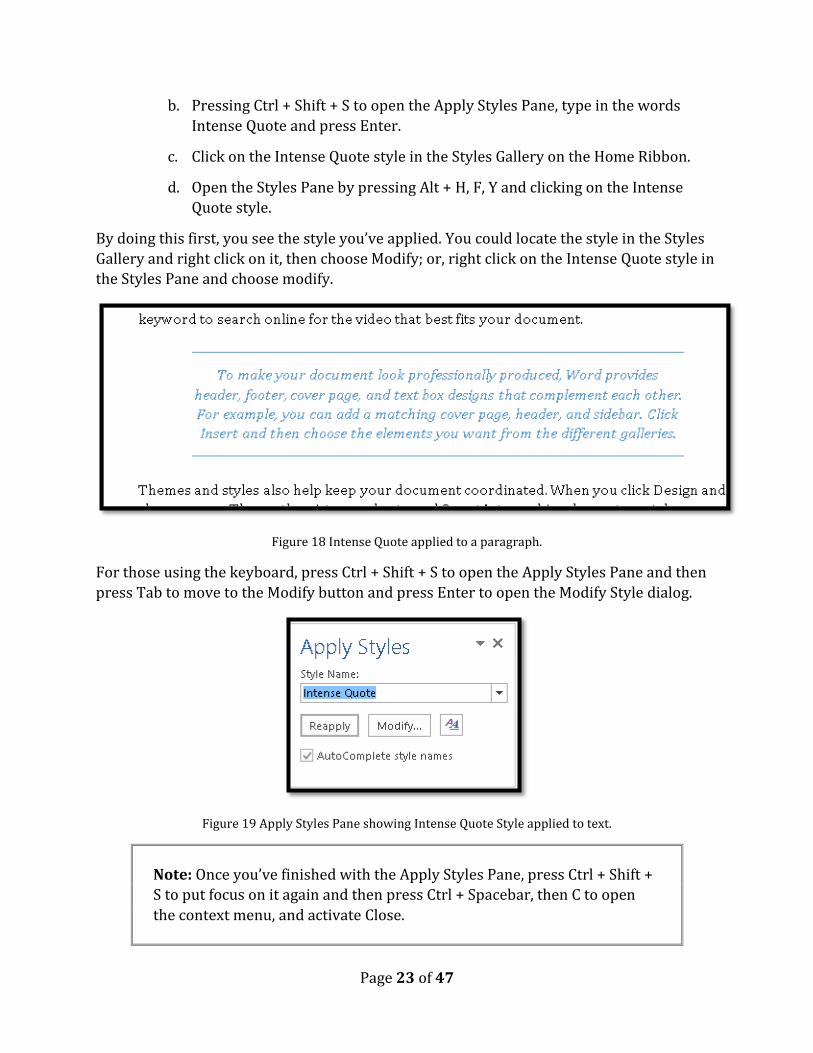
Page 23 of 47
b. Pressing Ctrl + Shift + S to open the Apply Styles Pane, type in the words
Intense Quote and press Enter.
c. Click on the Intense Quote style in the Styles Gallery on the Home Ribbon.
d. Open the Styles Pane by pressing Alt + H, F, Y and clicking on the Intense
Quote style.
By doing this first, you see the style you’ve applied. You could locate the style in the Styles
Gallery and right click on it, then choose Modify; or, right click on the Intense Quote style in
the Styles Pane and choose modify.
Figure 18 Intense Quote applied to a paragraph.
For those using the keyboard, press Ctrl + Shift + S to open the Apply Styles Pane and then
press Tab to move to the Modify button and press Enter to open the Modify Style dialog.
Figure 19 Apply Styles Pane showing Intense Quote Style applied to text.
Note: Once you’ve finished with the Apply Styles Pane, press Ctrl + Shift +
S to put focus on it again and then press Ctrl + Spacebar, then C to open
the context menu, and activate Close.

Page 24 of 47
The following image shows the context menu for the Intense Quote Style on the Styles Pane.
Note: Pressing Alt + H, F, Y is a toggle so pressing it with focus in your
document will close the Styles Pane if it is open.
Figure 20 Modify style option from the context menu in the Styles Pane for the Intense Quote style.
If you want to create a new style, there is a New Style button in the Apply Styles pane and
the Styles Pane. In both tools you would Tab to it.
Figure 21 New Style button in lower left of the Styles Pane.
The New Styles button is at the bottom of the Styles Pane and is the button on the left of the
three buttons you’ll come across.
When the Modify Style dialog opens, your focus is in the area where you can identify the
name of the style or, if you chose New Style, you can give it a meaningful name. By default
new styles are named Style 1, Style 2, Style 3 and so forth.
We are going to leave the name as it is.
In the sample document with Paragraph styles in it, I’ve created a new style called “Intense
Quote 2.” This lets me refer to a style I know and know that I’ve modified the style for yet a
different look and feel.
Page 25 of 47
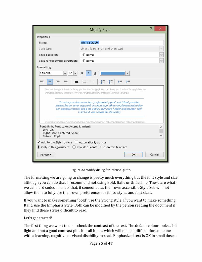
Figure 22 Modify dialog for Intense Quote.
The formatting we are going to change is pretty much everything but the font style and size
although you can do that. I recommend not using Bold, Italic or Underline. These are what
we call hard coded formats that, if someone has their own accessible Style Set, will not
allow them to fully use their own preferences for fonts, styles and font sizes.
If you want to make something “bold” use the Strong style. If you want to make something
Italic, use the Emphasis Style. Both can be modified by the person reading the document if
they find these styles difficult to read.
Let’s get started!
The first thing we want to do is check the contrast of the text. The default colour looks a bit
light and not a good contrast plus it is all italics which will make it difficult for someone
with a learning, cognitive or visual disability to read. Emphasized text is OK in small doses

Page 26 of 47
but not for entire paragraphs. I’m going to change the font colour to Automatic or black and
remove the Italics.
Figure 23 Modify Style dialog showing Italics removed and font colour changed to Automatic.
I’m going to keep the alignment as Centred.
For all of the rest of the changes to the Intense Quote, we’ll be working with the Format
button in the lower left of the Modify or New Style dialogs. Both dialogs have the same
options just different names for the dialogs because the dialogs have different functions.
Figure 24 Options under the Format button in the Modify or New Styles dialog.
We are going to start by working with the border around the text.

Page 27 of 47
Figure 25 Borders and Shading dialog.
If you are using the keyboard, press Alt + letter O in the Modify or New Style dialog to
activate the Format button. Then press B for Border. The Borders and Shading dialog
opens.
In this example the Box border should be selected but I like to verify this by selecting it
again. There are other types of borders and sometimes it is difficult to see which one is
selected.
If you are using the keyboard, your focus is on the list of border types when the Borders
and Shading dialog opens. If you are using a screen reader, you should hear which border is
selected. The choices are None, Box, Shadow, 3D and Custom. Custom lets you put a border
around content such as cupcakes, flowers, and other image based borders.
If you are using the keyboard, once you move to a border type, it is selected and you can
then Tab to the next setting which is the style of the border.
I then pressed Tab to move to the Styles list and chose the 3 line style.
Press Tab again to adjust the colour of the border. If you are using the keyboard, press Alt +
Down Arrow to open the colour choices and then use the Left, Right, Up and Down Arrows
to choose a colour.

Page 28 of 47
If you press Tab again you’ll land on the list where you can choose the thickness of the
line. The thickness is determined in point size. The higher the point size, the thicker the
line.
From this point you can either Tab to and press Enter to apply a border on eac side of the
paragraph or not. Enter is a toggle on these buttons so pressing it once might apply the
border and pressing it again might remove it. When you activate the Box button (or any of
the others) the border is immediately applied to all four sides of the text. This should give
those of you using screen readers a reference point. This is one of those things you can do
using a screen reader but I notice JAWS doesn’t tell me whether the border is on or off.
Once we have the border applied, we need to make sure that it is applied to the Paragraph
we’ve selected and not the text…which looks horrible when applied in the context of a
Paragraph.
To do this we Tab to the “Apply To” list or we can press Alt + L. We are just making sure
that it says Paragraph.
The last thing we want to do is to add some spacing between the text and the border to
make it stand out.
To adjust the spacing between the text and the border:
1. While on the Border page in the Borders and Shading dialog press Alt + letter O to
move to and activate the Options button.
2. The Borders and Shading Options dialog opens and your focus is in the edit area to
adjust the Top spacing.
3. We are going to make all of the spacing for Top, Bottom, Left and right 14 point.
4. Once this is done, Tab to and activate the OK button by pressing Enter.
5. You are taken back to the Borders and Shading dialog, Borders tab.
6. Tab to and activate the OK button by pressing Enter.
7. You are taken back to the Modify Styles dialog
a. As you make the changes to the border and spacing of the selected text, you
are able to see the preview of what this will look like in each of the dialogs.
8. You can now choose to modify the style for this document only or for all documents
based on this template.
a. To make your choice, press Alt + D which moves you to the option for this
document only. These are radio buttons so pressing the down Arrow will
move to and check the option to have this change apply to new documents
based on this template.

Page 29 of 47
9. Tab to and activate the OK button by pressing Enter.
Figure 26 Borders and Shading Options dialog showing new spacing.
You now have a Paragraph Style that provides the Emphasis of content you want, does not
have to be confined to “Inline” and is completely accessible. Additionally, when you need to
call out content again, you don’t have to guess at the formatting of either a single cell table
or a text box.
Figure 27 Text with the formatting modifications.
There are other formatting effects you can apply to a Paragraph Style including shading
and shadow effects. Be careful not to over format!
Page 30 of 47
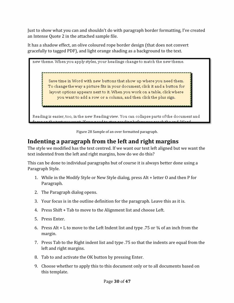
Just to show what you can and shouldn’t do with paragraph border formatting, I’ve created
an Intense Quote 2 in the attached sample file.
It has a shadow effect, an olive coloured rope border design (that does not convert
gracefully to tagged PDF), and light orange shading as a background to the text.
Figure 28 Sample of an over formatted paragraph.
Indenting a paragraph from the left and right margins The style we modified has the text centred. If we want our text left aligned but we want the
text indented from the left and right margins, how do we do this?
This can be done to individual paragraphs but of course it is always better done using a
Paragraph Style.
1. While in the Modify Style or New Style dialog, press Alt + letter O and then P for
Paragraph.
2. The Paragraph dialog opens.
3. Your focus is in the outline definition for the paragraph. Leave this as it is.
4. Press Shift + Tab to move to the Alignment list and choose Left.
5. Press Enter.
6. Press Alt + L to move to the Left Indent list and type .75 or ¾ of an inch from the
margin.
7. Press Tab to the Right indent list and type .75 so that the indents are equal from the
left and right margins.
8. Tab to and activate the OK button by pressing Enter.
9. Choose whether to apply this to this document only or to all documents based on
this template.
Page 31 of 47
10. Tab to and activate the OK button by pressing Enter.
Figure 29 Paragraph dialog showing the left/right indent of .75 inches.
I previously mentioned that you should use the Strong and Emphasis styles in paragraph
formatting instead of the Bold and Italic buttons. The following illustrates how I use the
Strong style to further call out important concepts in my books.
I add the word “Note” before the paragraph followed by a colon and then make both of
them Strong instead of Bold. This way, if someone who has their own Style Set swaps out
my styles for ones they prefer, everything adjusts to their preferences. There is no hard
coding or inflexible formatting of the document.
This example is also in the attachments to this PDF document.
Page 32 of 47
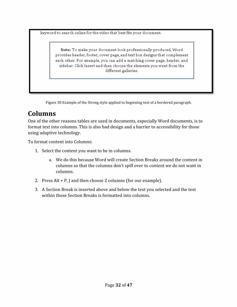
Figure 30 Example of the Strong style applied to beginning text of a bordered paragraph.
Columns One of the other reasons tables are used in documents, especially Word documents, is to
format text into columns. This is also bad design and a barrier to accessibility for those
using adaptive technology.
To format content into Columns:
1. Select the content you want to be in columns.
a. We do this because Word will create Section Breaks around the content in
columns so that the columns don’t spill over to content we do not want in
columns.
2. Press Alt + P, J and then choose 2 columns (for our example).
3. A Section Break is inserted above and below the text you selected and the text
within those Section Breaks is formatted into columns.
Page 33 of 47
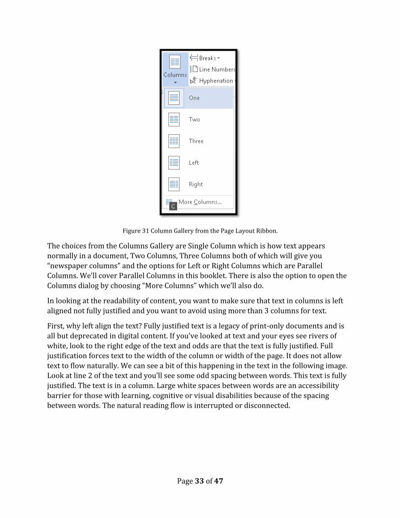
Figure 31 Column Gallery from the Page Layout Ribbon.
The choices from the Columns Gallery are Single Column which is how text appears
normally in a document, Two Columns, Three Columns both of which will give you
“newspaper columns” and the options for Left or Right Columns which are Parallel
Columns. We’ll cover Parallel Columns in this booklet. There is also the option to open the
Columns dialog by choosing “More Columns” which we’ll also do.
In looking at the readability of content, you want to make sure that text in columns is left
aligned not fully justified and you want to avoid using more than 3 columns for text.
First, why left align the text? Fully justified text is a legacy of print-only documents and is
all but deprecated in digital content. If you’ve looked at text and your eyes see rivers of
white, look to the right edge of the text and odds are that the text is fully justified. Full
justification forces text to the width of the column or width of the page. It does not allow
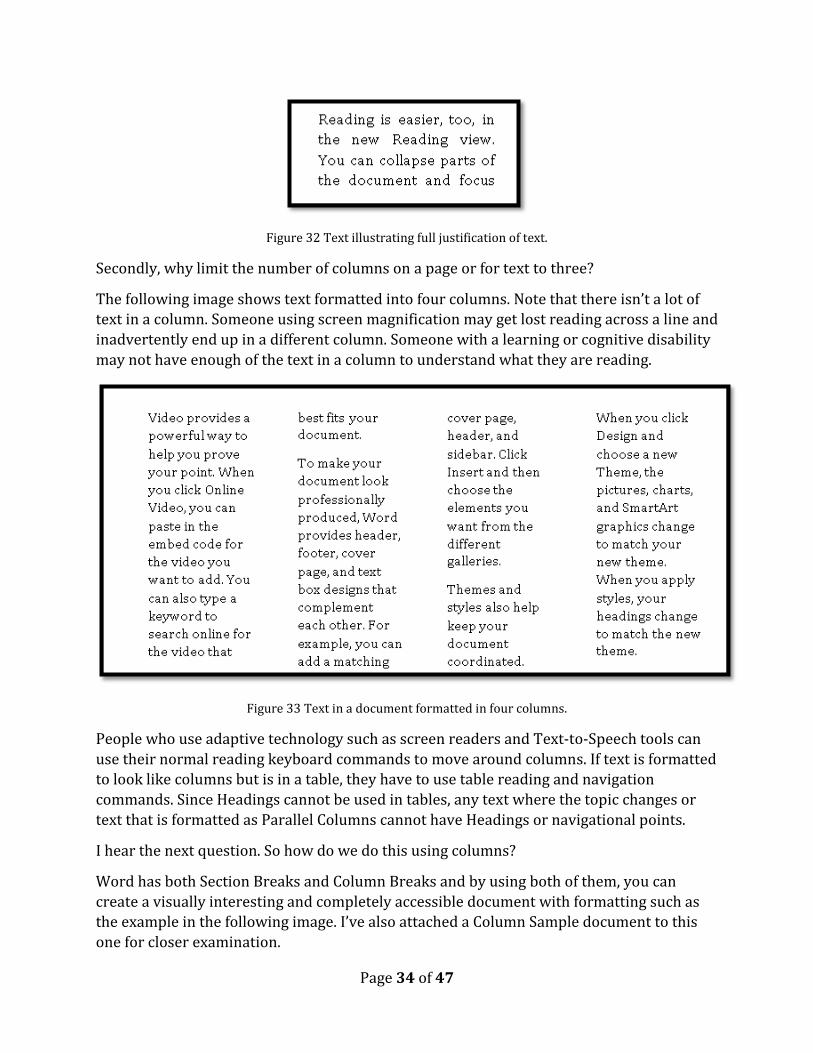
text to flow naturally. We can see a bit of this happening in the text in the following image.
Look at line 2 of the text and you’ll see some odd spacing between words. This text is fully
justified. The text is in a column. Large white spaces between words are an accessibility
barrier for those with learning, cognitive or visual disabilities because of the spacing
between words. The natural reading flow is interrupted or disconnected.
Page 34 of 47
Figure 32 Text illustrating full justification of text.
Secondly, why limit the number of columns on a page or for text to three?
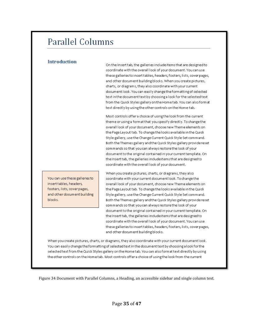
The following image shows text formatted into four columns. Note that there isn’t a lot of
text in a column. Someone using screen magnification may get lost reading across a line and
inadvertently end up in a different column. Someone with a learning or cognitive disability
may not have enough of the text in a column to understand what they are reading.
Figure 33 Text in a document formatted in four columns.
People who use adaptive technology such as screen readers and Text-to-Speech tools can
use their normal reading keyboard commands to move around columns. If text is formatted
to look like columns but is in a table, they have to use table reading and navigation
commands. Since Headings cannot be used in tables, any text where the topic changes or
text that is formatted as Parallel Columns cannot have Headings or navigational points.
I hear the next question. So how do we do this using columns?
Word has both Section Breaks and Column Breaks and by using both of them, you can
create a visually interesting and completely accessible document with formatting such as
the example in the following image. I’ve also attached a Column Sample document to this
one for closer examination.
Page 35 of 47
Figure 34 Document with Parallel Columns, a Heading, an accessible sidebar and single column text.

Page 36 of 47
Newspaper Columns Newspaper columns are typically balanced or have an equal amount of text in each column.
Our example has two columns with a horizontal line between the columns to help identify
the boundaries of each column.
To create the two columns with the horizontal line between them, we are going to use the
Columns dialog:
1. Select the text you want to be in columns.
2. Press Alt + P, J, C for the Page Layout Ribbon, Columns, More Columns.
3. The Columns dialog opens.
4. Choose 2 columns by pressing the Up Arrow. By default your focus is in the list
where you can adjust the number of columns. If you are mouse dependent you can
also click on the two columns button just above the default focus.
a. If you look at the middle left of the dialog you can see that Word
automatically calculates the gutter or white space between the columns.
Leave this as it is because Word usually does a good job of these calculations.
5. When you choose more than one column, the check box to make the columns equal
is automatically checked and we are going to leave that as it is. We want the columns
to be balanced.
6. We need to add the horizontal line between columns.
7. Press Alt + H to move to and check the check box for “line Horizontal.”
a. You will be able to see the way the columns will look in the small preview
area (not accessible if you are using a screen reader).
b. This keyboard command is a toggle so pressing it again will uncheck this
option.
8. Tab to and activate the OK button by pressing Enter.
The text you selected is now in balanced newspaper columns with a horizontal line
between them.

Page 37 of 47
Figure 35 Columns dialog showing two columns with horizontal line between them.
The text I selected for the sample has an odd number of lines in it so Word did the best it
could do with what I gave it. In column 2 there is one blank line after the last line of text,
but this is considered balanced.
Figure 36 Newspaper columns with a horizontal line between them.

Page 38 of 47
Parallel Columns Parallel Columns are columns where one column is smaller than the other. Typically we
find this in textbooks where there is a heading to the left, text to the right or text to the
right and a sidebar to the left.
The following is how text would look if we just applied Parallel Columns to it.
Figure 37 Image of Parallel Columns applied to text.
Let’s take a look at how this will look and work if we add Headings and a “sidebar” to the
text.
Figure 38 Initial formatting of text into Parallel Columns.
Position your cursor just after the letter N in Introduction (using my example Introduction
is going to be a Heading).

Page 39 of 47
Figure 39 Page Layout, Breaks Gallery showing Column Break selected.
Press Alt + P, B, C for Page Layout, Break, Column. The text after the word Introduction will
be put into the second column/to the right of the word Introduction.
Notice that we now also have a blank line at the top of column 2.
Page 40 of 47
Figure 40 Parallel Columns showing blank line at the top of second column.
Press the Delete key to remove that blank line and the text will line up with the word
Introduction.
Figure 41 Parallel Columns with Column Break in place.
Select all of the letters in the word Introduction except the N.
Press Ctrl + Alt + 1 for a Heading 1.
Move the cursor to just after the letter o.
Type the letter n and then Delete the existing letter n that is not formatted as a Heading.
Figure 42 Finished Parallel Columns.

Page 41 of 47
The way this is going to be read by a screen reader and Text-to-Speech tool is by reading
the Heading Introduction followed by the content in column 2 until a Section Break is
reached and “new instructions” about the formatting and structure of the content are given.
We can visually see the logical reading order by going to Draft View of the document. Press
Alt + W, E to do this. When you are finished examining Draft View, press Alt + W, P for Print
Layout View.
Figure 43 Draft View of the document showing both the Section and Column Break.
Use a Paragraph style to show a sidebar Now we will take it to the next step by using a Style to provide an accessible Sidebar.
First I separated the sentence I want to put in the sidebar.
Figure 44 Text with sentence to be in sidebar isolated from other text.
Then I use a paragraph style I have modified, for me it is usually the “Quote” or “Intense
Quote” style that is in the Normal document template. I tend to modify inherent styles I
don’t use or are not accessible or readable in their current format and make them more
accessible and usable for my documents. This means I don’t have a lot of extra styles in the
Styles Pane or my document.
In this case I modified the Intense Quote style to have a border around it and some space
between the text and the border.
Page 42 of 47
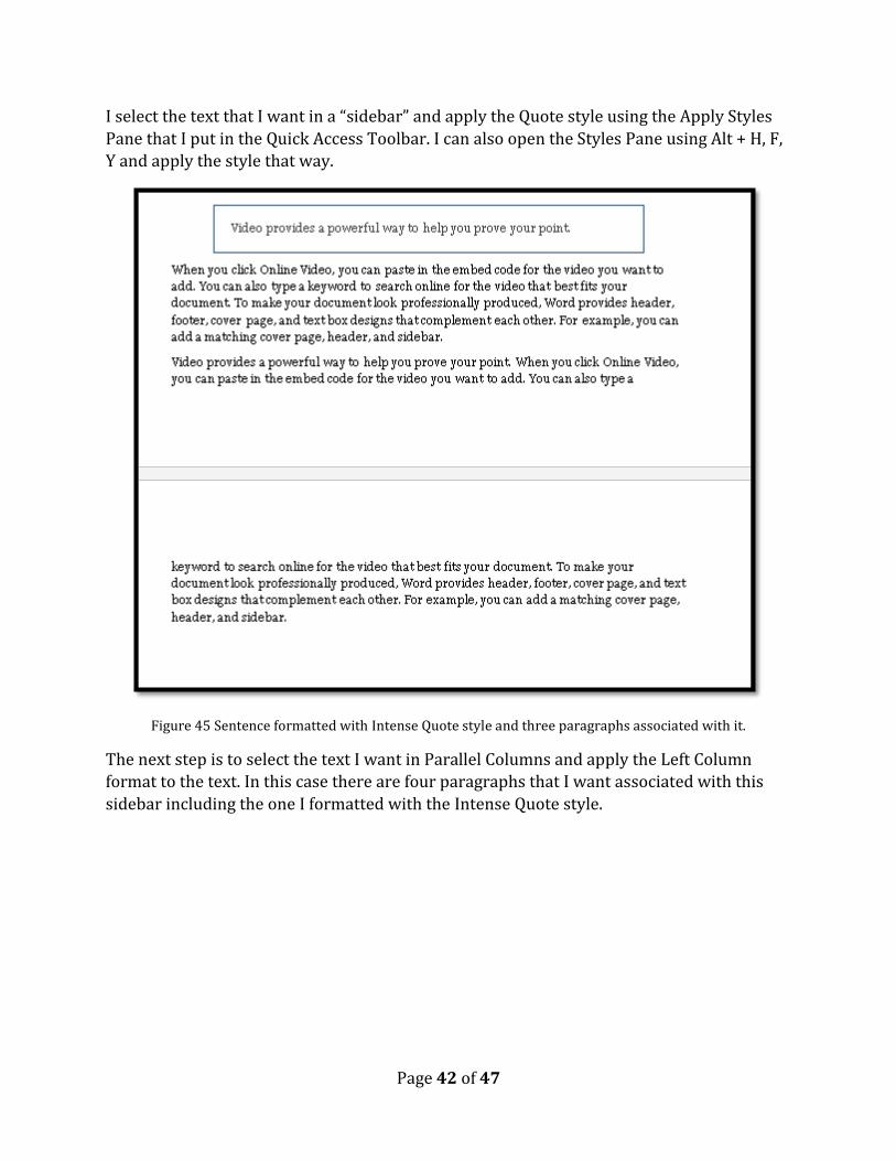
I select the text that I want in a “sidebar” and apply the Quote style using the Apply Styles
Pane that I put in the Quick Access Toolbar. I can also open the Styles Pane using Alt + H, F,
Y and apply the style that way.
Figure 45 Sentence formatted with Intense Quote style and three paragraphs associated with it.
The next step is to select the text I want in Parallel Columns and apply the Left Column
format to the text. In this case there are four paragraphs that I want associated with this
sidebar including the one I formatted with the Intense Quote style.

Page 43 of 47
Figure 46 Four paragraphs put into Parallel Columns.
I did take a look at the width of the left column based on the amount of text I wanted for the
sidebar and determined I needed a slightly larger column width on the left.
I selected both columns and pressed Alt + P, J, C to open the More Columns dialog. I
modified the width of column 1 to 2.5 inches. Word automatically adjusted the gutter and
the second column. I did this for both sets of Parallel Columns on this page so they would
line up correctly.

Page 44 of 47
Figure 47 Columns dialog showing change in the width of column 1.
Visually, on the left I now have two paragraphs: the one with the border and the one that
follows immediately after it.
Figure 48 Text placed in Parallel Column format showing text in both columns.

Page 45 of 47
I place my cursor at the beginning of the second paragraph in the first column and press Alt
+ P, B, C to insert a Column Break.
I then go to the top of the second page…because my text has spilled onto the second page.
I place my cursor just before the text in the first column on the second page and insert
another Column Break.
Figure 49 parallel Column spanning two pages.
The text now lines up as it should and will read as it logically should. When this document
is converted to tagged PDF or Braille, it will also be read as it should.
The following image shows the two pages with the Heading for part of the text at the top of
the first page and the bordered paragraph mimicking a text box at the bottom of the same
page.

Page 46 of 47
Figure 50 Two pages of content formatted as Parallel Columns.
That’s it! This is completely accessible!
Page 47 of 47
Summary It doesn’t matter what file format you are working with, purposely using tables for design
layout is simply a bad practice and poor design principle. It creates multiple levels of
accessibility barriers.
The elements of an accessible table are:
1. Insert a table, never draw a table.
2. Make sure you identify a header row or multiple Header rows to repeat at the top of
each page. (As of Word 2010 we’ve been able to use about the first 3 rows in a table
if we absolutely need them as Header rows.)
3. Do not allow rows to break across pages. If the content does not fit into one cell,
then a table is not the right structure for that content.
4. Use the ability to adjust Cell Margins to add space around text in a table. Do not
press the Enter key.
5. Always include a Caption for your table and place the Caption above the table so
that those using adaptive technology or those who don’t use adaptive technology
who may have a leaning or cognitive disability know what to expect when they enter
the table.
6. Provide your table with Alt Text to give more information about the general
structure of the table. Not every adaptive technology gives information about the
number of rows or columns or whether it is a uniform or non-uniform table.
This document has provided an overview of how to optimize data tables for accessibility to
a broad range of people with disabilities.
We’ve also looked at how to effectively use Tab Stops, a Paragraph Style, columns, Section
Breaks and Column Breaks to optimize a document for accessibility and avoid bad design
and inaccessible documents
As new techniques become available (such as being able to add Alt Text to a table as of
Word 2010) this document will be updated.
Contact Information Contact Karen McCall with questions or suggestions for other how to booklets. You’ll find
other helpful documents on accessible document design on the Karlen Communications
website.
Copyright 2015 by Karen McCall, M.Ed.
Microsoft Word MVP 2009-2015 and Microsoft Accessibility MVP 2014 (new category
established in 2014).