
Introduction to SWING - Technion · –Drag and Drop (Java 2 Platform only) ... –JLabel, JButton,...
37
Introduction to JFC Swing Written by Adam Carmi
Transcript of Introduction to SWING - Technion · –Drag and Drop (Java 2 Platform only) ... –JLabel, JButton,...
Introduction to JFC Swing
Written by
Adam Carmi

Agenda
• About JFC and Swing
• Pluggable Look and Feel
• Swing Components
• Borders
• Layout Management
• Events Handling

About JFC and Swing
• JFC – JavaTM Foundation Classes
• Encompass a group of features for constructing
graphical user interfaces (GUI).
• Implemented without any native code.
• “Swing” is the codename of the project that
developed the first JFC components (JFC 1.11).
• The name “Swing” is frequently used to refer to
new components and related API.
1) Initially released as an extension to JDK 1.1

About JFC and Swing (cont)
• Swing features:
– The Swing Components
• Dialog, Tabbed pane, Buttons, File Chooser, ...
– Pluggable Look and Feel
– Accessibility API
• Screen readers, Braille displays, ...
– Java 2DTM API (Java 2 Platform only)
– Drag and Drop (Java 2 Platform only)
• Between Java applications and native applications.
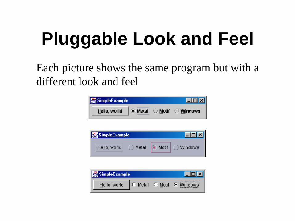
Pluggable Look and Feel
Each picture shows the same program but with a
different look and feel

Swing Components
• Swing provides many standard GUI components
such as buttons, lists, menus, and text areas, which
you combine to create your program's GUI.
• Swing provides containers such as windows and
tool bars.
– top level: frames, dialogs
– intermediate level: panel, scroll pane, tabbed pane, ...
– other Swing components: buttons, labels, ...
• A visual index of Swing components
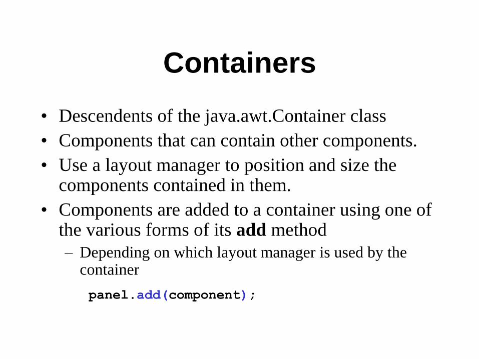
Containers
• Descendents of the java.awt.Container class
• Components that can contain other components.
• Use a layout manager to position and size the components contained in them.
• Components are added to a container using one of the various forms of its add method
– Depending on which layout manager is used by the container
panel.add(component);

Top Level Containers
• Every program that presents a Swing GUI contains at least one top-level container.
• A Top level container provides the support that Swing components need to perform their painting and event-handling.
• Swing provides three top-level containers:
– JFrame (Main window)
– JDialog (Secondary window)
– JApplet (An applet display area within a browser window)

Top Level Containers (cont)
• To appear on screen, every GUI component must
be part of a containment hierarchy, with a top-
level container as its root.
• Each top-level container has a content pane that
contains visible components in that top-level
container’s GUI.
Don’t add a component
directly to a top-level
container.

JFrame
• A frame implemented as an instance of the JFrame class, is a window that has decorations such as a border, a title and buttons for closing and iconifying the window.
– The decorations on a frame are platform dependent.
• Applications with a GUI typically use at least one frame.

Example 1
import javax.swing.*;
public class HelloWorldSwing {
public static void main(String[] args) {
JFrame frame = new JFrame("HelloWorldSwing");
final JLabel label = new JLabel("Hello World");
frame.getContentPane().add(label);
frame.setDefaultCloseOperation(JFrame.EXIT_ON_CLOSE);
frame.pack();
frame.setVisible(true);
}
}
pack() causes a window to be
sized to fit the preferred size and
layouts of its sub-components
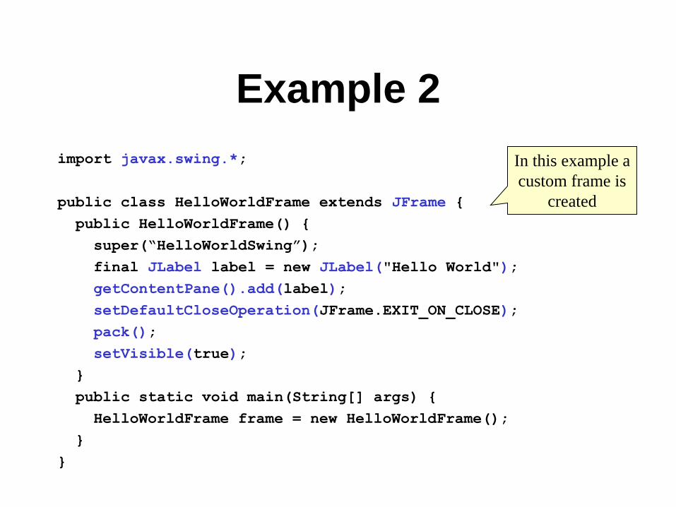
Example 2
import javax.swing.*;
public class HelloWorldFrame extends JFrame {
public HelloWorldFrame() {
super(“HelloWorldSwing”);
final JLabel label = new JLabel("Hello World");
getContentPane().add(label);
setDefaultCloseOperation(JFrame.EXIT_ON_CLOSE);
pack();
setVisible(true);
}
public static void main(String[] args) {
HelloWorldFrame frame = new HelloWorldFrame();
}
}
In this example a
custom frame is
created

JDialog
• Every dialog is dependent on a frame
– Destroying a frame destroys all its dependent dialogs.
– When the frame is iconified, its dependent dialogs
disappear from the screen.
– When the frame is deiconified, its dependent dialogs
return to the screen.
• A dialog can be modal. When a modal dialog is
visible it blocks user input to all other windows in
the program.
JDialog (cont)
• To create custom dialogs, use the JDialog
class directly (as in the previous examples).
• Swing provides several standard dialogs
– JProgressBar, JFileChooser, JColorChooser, ...
• The JOptionPane class can be used to create
simple modal dialogs
– icons, title, text and buttons can be customized.
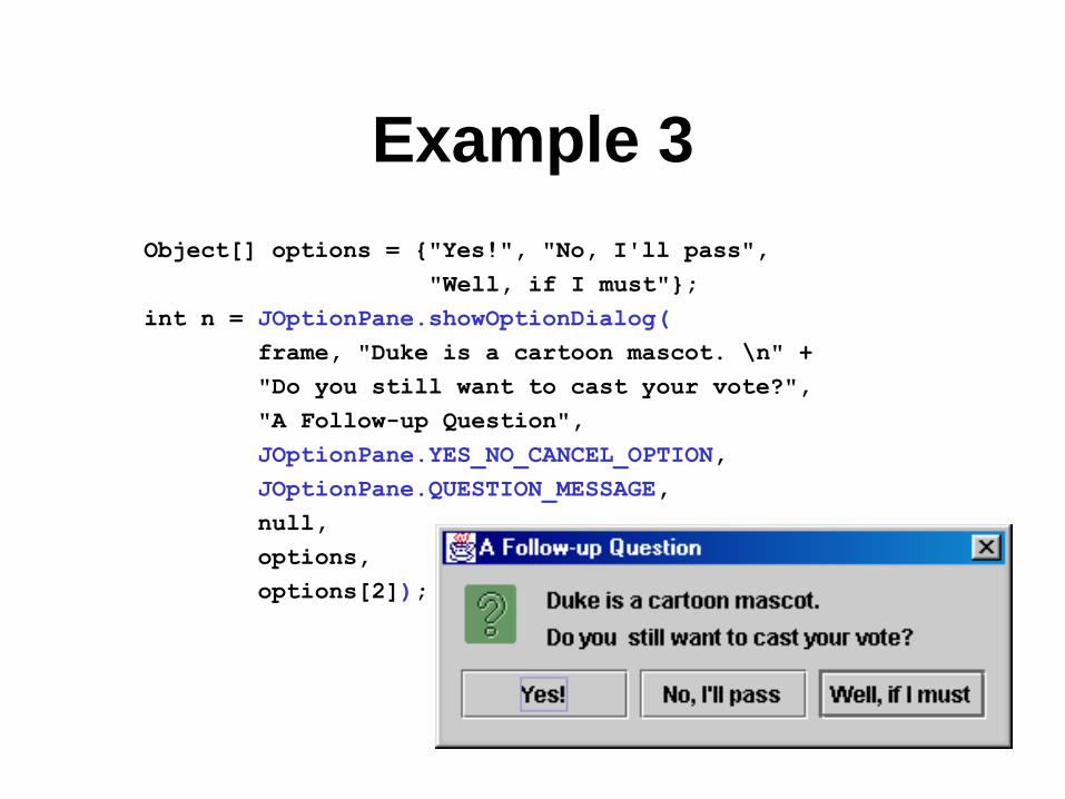
Example 3
Object[] options = {"Yes!", "No, I'll pass",
"Well, if I must"};
int n = JOptionPane.showOptionDialog(
frame, "Duke is a cartoon mascot. \n" +
"Do you still want to cast your vote?",
"A Follow-up Question",
JOptionPane.YES_NO_CANCEL_OPTION,
JOptionPane.QUESTION_MESSAGE,
null,
options,
options[2]);

JComponent
• JComponent is the base class for all Swing
components except top-level containers.
– JLabel, JButton, JList, JPanel, JTable, ...
• To use a component that inherits from
JComponent, it must be placed in a
containment hierarchy who’s base is a top-
level container.

JComponent (cont)
• The JComponent class provides the following (partial list): – Pluggable Look & Feel
– Keystroke handling
– Tooltip support
– Accessibility
– An infrastructure for painting
– Support for borders.
• All descendents of JComponent are also Containers – A JButton can contain text, icons etc.

Borders
• Every JComponent can have one or more borders.
• The class BorderFactory may be used to create
standard borders pane.setBorder(BorderFactory.
createLineBorder(Color.black));
• Using a compound border, you can combine any
two borders, which can themselves be compound
borders BorderFactory.createCompoundBorder(border1, border2);

Simple Borders

Titled Borders

Compound Border

Intermediate Level
Containers • Also known as panels or panes
• Simplify the positioning of other components.
– JPanel
• Play a visible and interactive role in a program’s GUI
– JScrollPane
– JTabbedPane
• A panel’s default layout manager is FlowLayout.
– Other layout managers can easily be set panel.setLayout(new BorderLayout());

Intermediate Level
Containers (cont)
• By default, panels don’t paint anything
except for their background.
• By default, panels are opaque.
– An opaque panel can be set as a top-level
container’s content pane.
– transparent (non-opaque) panels draw no
background.

Layout Management
• The process of determining the size and position of components.
• Layout management can be done using absolute positioning
– Size and position of every component within the container must be specified.
– Does not adjust well when the top-level container is resized.
– Does not adjust well to differences between users and systems, such as font size.
Layout Management (cont)
• Layout management is often performed
using layout mangers
– Components can provide size and position hints
to layout managers, but layout managers have
the final say on the size and position of those
components.
Layout Management (cont)
• Layout hints
– Minimum, preferred and maximum size
– X axis alignment, Y axis alignment
• Customizing layout hints
– Invoking setter methods: setMinimumSize,
setAlignmentX, ...
– Subclassing and overriding the getter methods:
getMinimumSize, getAlignmentX, ...

Layout Management (cont)
• The Java platform supplies five commonly
used layout managers:
– BorderLayout
– BoxLayout
– FlowLayout
– GridLayout
– GridBagLayout
Layout Management (cont)
• When using the add method to put a
component in a container, the container’s
layout manager must be taken into account.
– Relative position (BorderLayout) panel.add(component, BorderLayout.CENTER);
– Order of addition (BoxLayout, GridLayout, ...)
panel.add(component);

BorderLayout
• Has five areas available to hold components
– north, south, east, west and center
• All extra space is placed in the center area
– Only the center area is affected when the container is resized.
• Default layout manager of content panes.
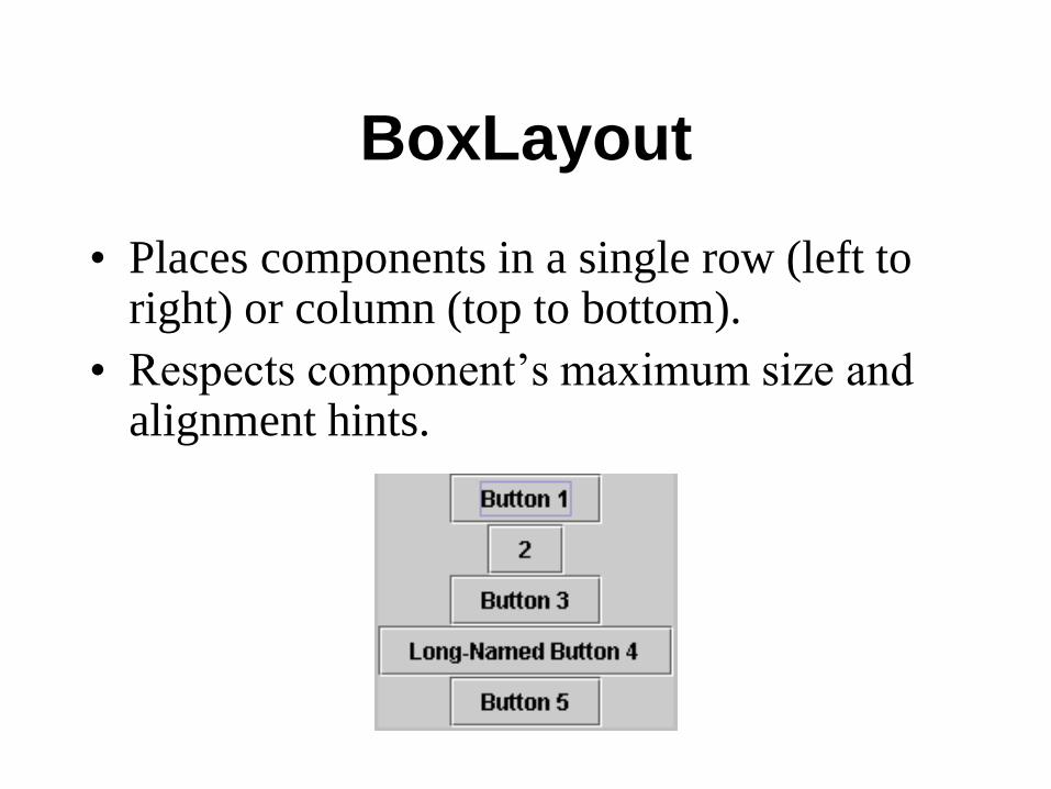
BoxLayout
• Places components in a single row (left to right) or column (top to bottom).
• Respects component’s maximum size and alignment hints.

FlowLayout
• Places components from left to right,
starting new rows if necessary.
• Default LayoutManager of JPanel

GridLayout
• Places components in a requested number of rows and columns.
• Components are placed left-to-right and top-to-bottom.
• Forces all components to be the same size
– as wide as the widest component's preferred width
– as high as the highest component’s preferred height

Layout Management (cont)
• The following factors influence the amount of space between visible components in a container:
– Layout manager
• automatically, user specified, none
– Invisible components
• often used with BoxLayout
– Empty borders
• works best with components that have no default border such as panels and labels.

Events Handling
• Every time a user types a character or pushes a mouse button, an event occurs.
• Any object can be notified of an event by registering as an event listener on the appropriate event source.
• Multiple listeners can register to be notified of events of a particular type from a particular source.

Types of Event Listeners
Act that results in event Listener type
User clicks a button, presses Return while typing in a
text field, or chooses a menu item
ActionListener
User closes a frame (main window) WindowListener
User presses a mouse button while the cursor is over a
component MouseListener
User moves the mouse over a component MouseMotionListener
Component becomes visible ComponentListener
Component gets the keyboard focus FocusListener
Table or list selection changes ListSelectionListener
Implementing an Event
Handler • Implement a listener interface or extend a class
that implements a listener interface.
• Register an instance of the event handler class as a listener upon one or more components.
• Implement the methods in the listener interface to handle the event.
Lesson: Writing Events Handlers

Example 4
button.addActionListener(new ActionListener() {
public void actionPerformed(ActionEvent e) {
numClicks++;
label.setText(labelPrefix + numClicks);
}});