
Chapter 13 Creating User Interfaces F What is JavaBeans? Component and JComponent F JButton ...
78
Chapter 13 Creating User Interfaces What is JavaBeans? Component and JComponent JButton ImageIcon JLabel JTextField JTextArea JComboBox JList JCheckBox JRadioButton Borders Menus Creating Multiple Windows JScrollBar JScrollPane
-
Upload
regina-powers -
Category
Documents
-
view
232 -
download
4
Transcript of Chapter 13 Creating User Interfaces F What is JavaBeans? Component and JComponent F JButton ...

Chapter 13Creating User Interfaces
What is JavaBeans? Component and JComponent
JButton ImageIcon JLabel JTextField JTextArea JComboBox JList
JCheckBox JRadioButton Borders
Menus Creating Multiple
Windows JScrollBar JScrollPane

What is a JavaBean?
A JavaBean component is just a Java class that meets the following requirements.
Data membersMethodsConstructors public class
default public constructorserializablemay have accessor methodsmay have registration methods
class
JavaBean Minimumrequirements
Optionalrequirements
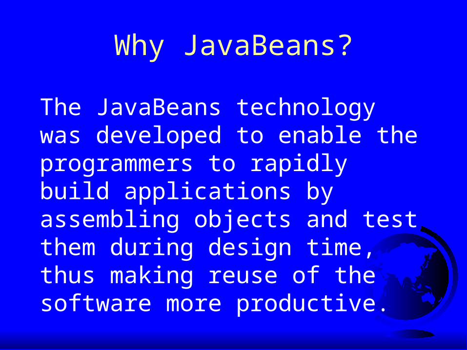
Why JavaBeans?
The JavaBeans technology was developed to enable the programmers to rapidly build applications by assembling objects and test them during design time, thus making reuse of the software more productive.

Component PropertiesfontbackgroundforegroundpreferredSizeminimumSizemaximumSize

JComponent PropertiestoolTipTextdoubleBufferedborder

JButton
A button is a component that triggers an action event when clicked. The following are JButton non-default constructors:
JButton(String text)
JButton(String text, Icon icon)
JButton(Icon icon)

JButton PropertiestexticonmnemonichorizontalAlignmentverticalAlignmenthorizontalTextPositionverticalTextPosition

Responding to JButton Eventspublic void actionPerformed(ActionEvent e) { // Get the button label String actionCommand = e.getActionCommand();
// Make sure the event source is a button if (e.getSource() instanceof JButton) // Make sure it is the right button if ("My Button".equals(actionCommand) System.out.println ("Button pressed!");}

JButton
RunRunButtonDemoButtonDemo
JButton JButton
MessagePanel

JLabel
A label is a display area for a short text, an image, or both. The non-default constructors for labels are as follows:
JLabel(String text, int horizontalAlignment)
JLabel(String text)
JLabel(Icon icon)
JLabel(Icon icon, int horizontalAlignment)
JLabel(String text, Icon icon, int horizontalAlignment)

JLabel PropertiestexticonhorizontalAlignmentverticalAlignment

Example 13.2: Using Labels
RunRunLabelDemoLabelDemo
This example gives a program that uses a label as an area for displaying images. There are fifty-two images in image files named L1.gif, L2.gif, ..., L52.gif stored in the image directory under c:\book. You can use two buttons, Prior and Next, to browse the images.

JTextField
A text field is an input area where the usercan type in characters. Text fields are usefulin that they enable the user to enter in variable data (such as a name or a description).

JTextField Constructors JTextField(int columns)
Creates an empty text field with the specified number of columns.
JTextField(String text)
Creates a text field initialized with the specified text.
JTextField(String text, int columns)
Creates a text field initialized with thespecified text and the column size.

JTextField PropertiestexthorizontalAlignmenteditablecolumns

JTextField Methods getText()
Returns the string from the text field.
setText(String text)Puts the given string in the text field.
setEditable(boolean editable)Enables or disables the text field to be edited. By default, editable is true.
setColumns(int)Sets the number of columns in this text field.The length of the text field is changeable.

Example 13.3: Using Text FieldsThis program converts Celsius and Fahrenheit temperatures. If you enter a value in the Celsius-degree text field and press the Enter key, the Fahrenheit temperature is displayed in the Fahrenheit text field. Likewise, if you enter a value in the Fahrenheit-degree text field, and press the Enter key, the corresponding Celsius degree is displayed in the Celsius text field.
RunRun
TextFieldDemoTextFieldDemo

JTextArea
If you want to let the user enter multiple lines of text, you cannot use text fields unless you create several of them. The solution is to use JTextArea, which enables the user to enter multiple lines of text.

JTextArea Constructors JTextArea(int rows, int columns)
Creates a text area with the specified number of rows and columns.
JTextArea(String s, int rows, int columns)
Creates a text area with the initial text andthe number of rows and columns specified.

JTextArea PropertiestexteditablecolumnslineWrapwrapStyleWordrowslineCounttabSize

Example 13.4 Using Text Areas
This example gives a program that displays an image in a label, a title in a label, and a text in a text area.
DescriptionPanel -jlblImage: JLabel -jlblTitle: JLabel -jtaTextDescription: JTextArea +setImageIcon(icon: ImageIcon): void +setTitle(title: String): void +setTextDescription(text: String): void +getMinimumSize(): Dimension
1 TextAreaDemo
JPanel -char token +getToken +setToken +paintComponet +mouseClicked
JFrame -char token +getToken +setToken +paintComponet +mouseClicked
1

Example 13.4, cont.
RunRunTextAreaDemoTextAreaDemo

JComboBox
A combo box is a simple list of items from which the user can choose. It performs basically the same function as a list, but can get only one value. To create a choice, use its default constructor:
JComboBox()

JComboBox Methods
To add an item to a JComboBox jcbo, use
jcbo.addItem(Object item)
To get an item from JComboBox jcbo, use
jcbo.getItem()
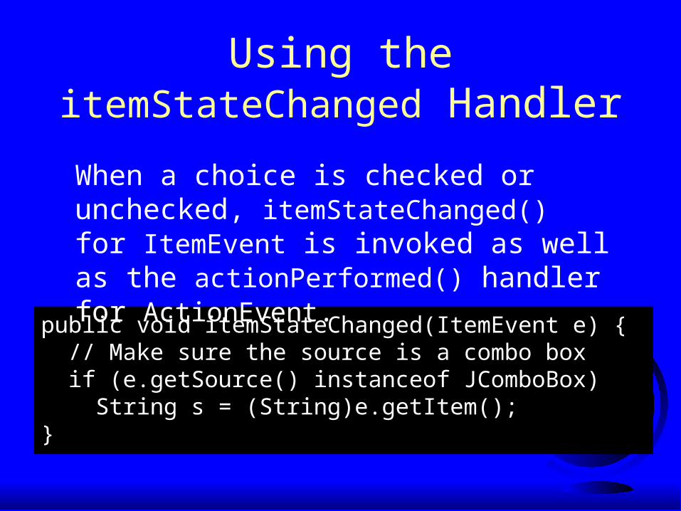
Using theitemStateChanged Handler
public void itemStateChanged(ItemEvent e) { // Make sure the source is a combo box if (e.getSource() instanceof JComboBox) String s = (String)e.getItem();}
When a choice is checked or unchecked, itemStateChanged() for ItemEvent is invoked as well as the actionPerformed() handler for ActionEvent.

Example 13.5: Using Combo Boxes
This example lets users view an image and a description of a country's flag by selecting the country from a combo box. Figure 13.8 shows a sample run of the program.
RunRunComboBoxDemoComboBoxDemo
JList
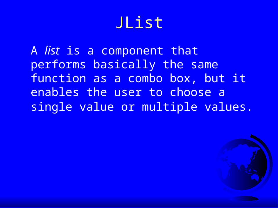
A list is a component that performs basically the same function as a combo box, but it enables the user to choose a single value or multiple values.

JList Constructors JList()
Creates an empty list.
JList(Object[] stringItems)
Creates a new list initialized with items.
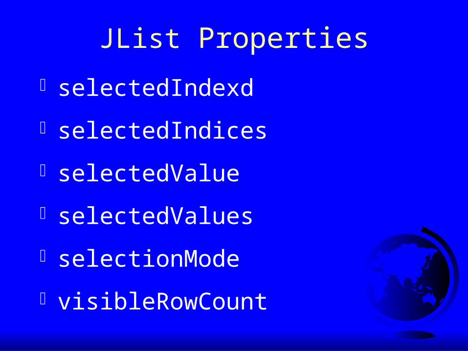
JList Properties
selectedIndexd
selectedIndices
selectedValue
selectedValues
selectionMode
visibleRowCount

Example 13.6: Using Lists This example gives a program that lets users select countries in a list and display the flags of the selected countries in the labels.
RunRunListDemoListDemo
JCheckBox
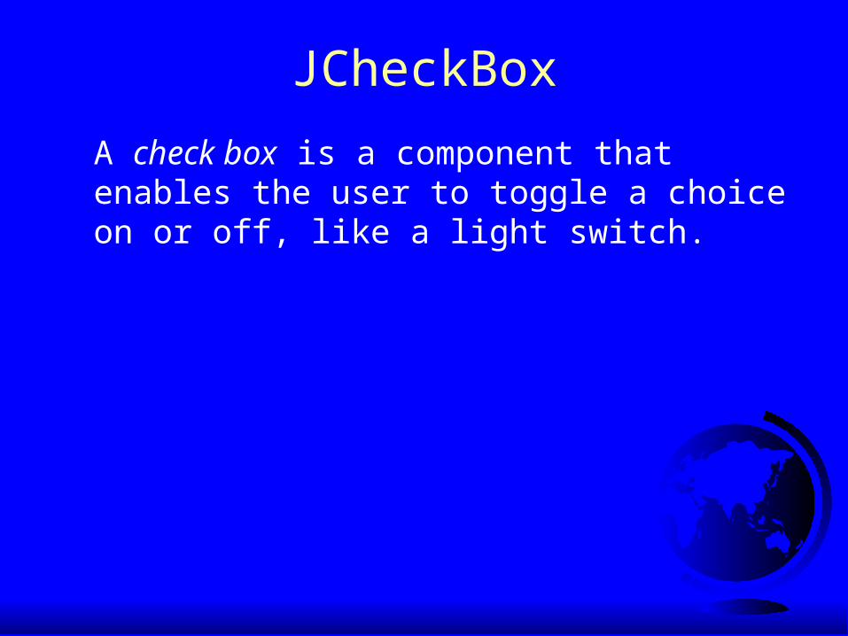
A check box is a component that enables the user to toggle a choice on or off, like a light switch.

JCheckBox Constructors
JCheckBox()
JCheckBox(String text)
JCheckBox(String text, boolean selected)
JCheckBox(Icon icon)
JCheckBox(String text, Icon icon)
JCheckBox(String text, Icon icon, boolean
selected)

JCheckBox Properties
JCheckBox has all the properties in JButton. Additionally, JButton has the following property:
selected
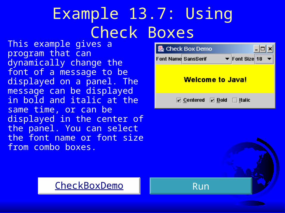
Example 13.7: Using Check BoxesThis example gives a program that can dynamically change the font of a message to be displayed on a panel. The message can be displayed in bold and italic at the same time, or can be displayed in the center of the panel. You can select the font name or font size from combo boxes.
CheckBoxDemoCheckBoxDemo RunRun

JRadioButton
Radio buttons are variations of check boxes. They are often used in the group, where only one button is checked at a time.

JRadioButton
Radio buttons are variations of check boxes. They are often used in the group, where only one button is checked at a time.
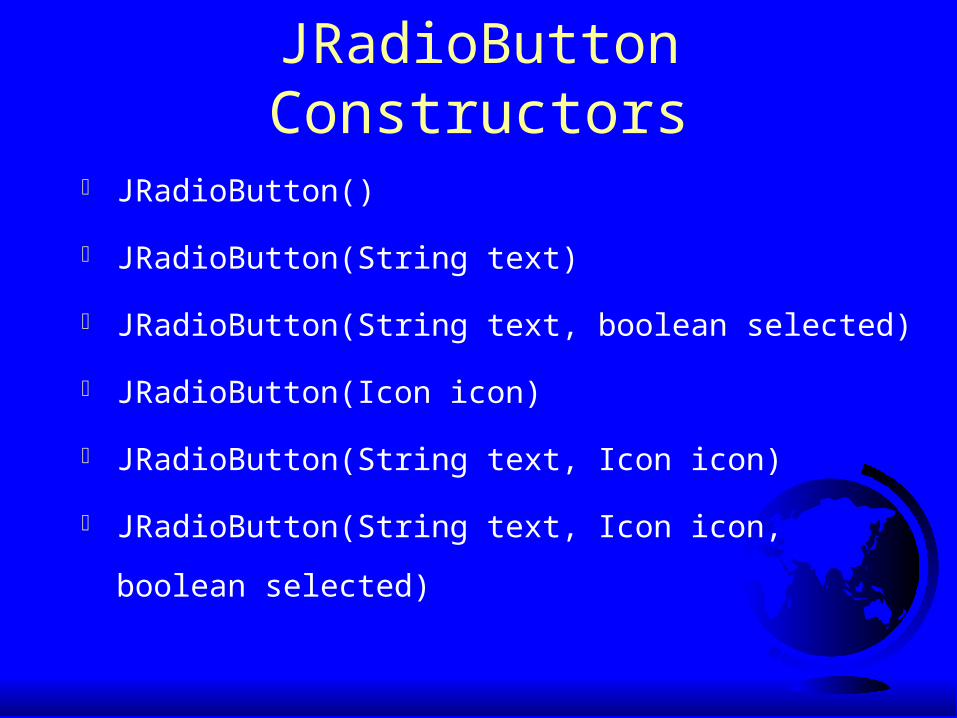
JRadioButton Constructors
JRadioButton()
JRadioButton(String text)
JRadioButton(String text, boolean selected)
JRadioButton(Icon icon)
JRadioButton(String text, Icon icon)
JRadioButton(String text, Icon icon,
boolean selected)

JRadioButton Properties
JRadioButton has all the properties in JButton. Additionally, JRadioButton has the following property:
selected

Grouping Radio Buttons
ButtonGroup btg = new ButtonGroup();
btg.add(jrb1);
btg.add(jrb2);

Example 13.8: Using Radio ButtonsThis example shows a program that simulates traffic lights. The program lets the user select one of three lights: red, yellow, or green. When a radio button is selected, the light is turned on, and only one light can be on at a time. No light is on when the program starts.
RunRunRadioButtonDemoRadioButtonDemo
Borders
You can set a border on any object of the JComponent class, but often it is useful to set a titled border on a JPanel that groups a set of related user interface components.

Static Method for Creating BorderscreateTitledBorder(String title)createLoweredBevelBorder()createRaisedBevelBorder()createLineBorder(Color color)createLineBorder(Color color, int thickness)createEtchedBorder()createEtchedBorder(Color highlight, Color shadow, boolean selected)createEmptyBorder()createMatteBorder(int top, int left, int bottom, int right, Icon tileIcon)createCompoundBorder(Border outsideBorder, Border insideBorder)

Example 13.9: Using BordersThis example gives a program that creates and displays various types of borders. You can select a border with a title or without a title. For a border without a title, you can choose a border style from Lowered Bevel, Raised Bevel, Etched, Line, Matte, or Empty. For a border with a title, you can specify the title position and justification. You can also embed another border into a titled border.

Example 13.9, cont.
RunRunBorderDemoBorderDemo

JOptionPane Dialogs
A dialog is normally used as a temporary window to receive additional information from the user, or to provide notification that some event has occurred.

Message Dialogs
A message dialog box simply displays a message to alert the user and waits for the user to click the OK button to close the dialog.

Message TypesThe messageType is one of the following constants:
JOptionPane.ERROR_MESSAGEJOptionPane.INFORMATION_MESSAGE JOptionPane.PLAIN_MESSAGEJOptionPane.WARNING_MESSAGEJOptionPane.QUESTION_MESSAGE

Message Types, cont.
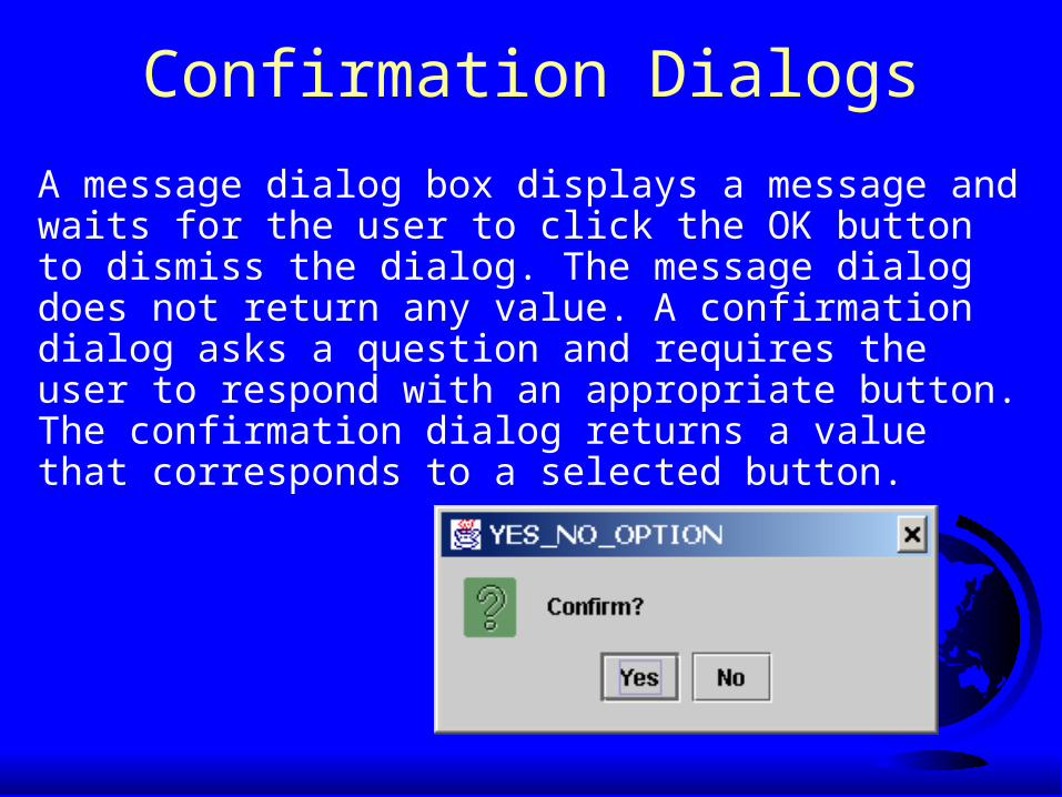
Confirmation Dialogs
A message dialog box displays a message and waits for the user to click the OK button to dismiss the dialog. The message dialog does not return any value. A confirmation dialog asks a question and requires the user to respond with an appropriate button. The confirmation dialog returns a value that corresponds to a selected button.
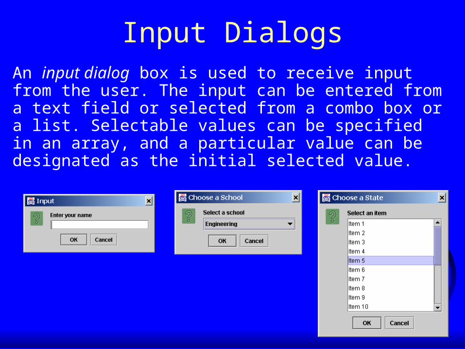
Input DialogsAn input dialog box is used to receive input from the user. The input can be entered from a text field or selected from a combo box or a list. Selectable values can be specified in an array, and a particular value can be designated as the initial selected value.

Option Dialogs
An option dialog allows you to create custom buttons.

Example 13.10: Creating Standard Dialogs
Objective: This example demonstrates using standard dialogs. The program prompts the user to select the annual interest rate from a list in an input dialog, the number of years from a combo box in an input dialog, and the loan amount from an input dialog, and displays the loan payment schedule in a text area inside a JScrollPane in a messasge dialog.
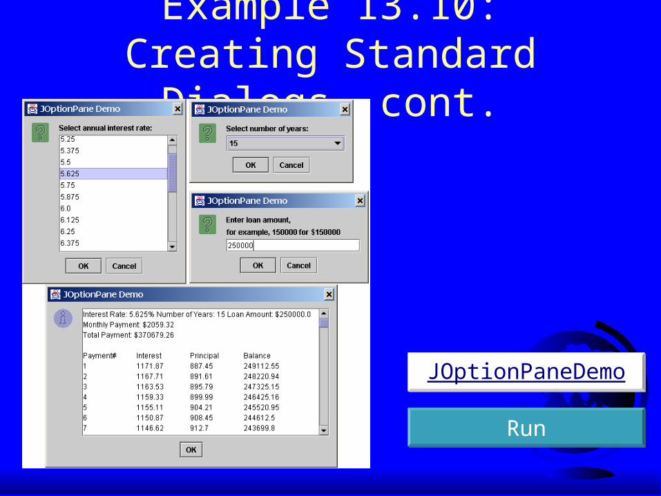
Example 13.10: Creating Standard Dialogs, cont.
RunRun
JOptionPaneDemoJOptionPaneDemo

Menus Java provides several classes—JMenuBar, JMenu, JMenuItem, JCheckBoxMenuItem, and JRadioButtonMenuItem —to implement menus in a frame.
A JFrame or JApplet can hold a menu bar to which the pull-down menus are attached. Menus consist of menu items that the user can select (or toggle on or off). Menu bars can be viewed as a structure to support menus.

Menu Demo

The JMenuBar Class
JFrame f = new JFrame();f.setSize(300, 200);f.setVisible(true);JMenuBar mb = new JMenuBar(); f.setJMenuBar(mb);
A menu bar holds menus; the menu bar can only be added to a frame. Following is the code to create and add a JMenuBar to a frame:

The Menu Class
JMenu fileMenu = new JMenu("File", false);JMenu helpMenu = new JMenu("Help", true);mb.add(fileMenu);mb.add(helpMenu);
You attach menus onto a JMenuBar. The following code creates two menus, File and Help, and adds them to the JMenuBar mb:
The JMenuItem Class
fileMenu.add(new JMenuItem("new"));fileMenu.add(new JMenuItem("open"));fileMenu.addSeparator();fileMenu.add(new JMenuItem("print"));fileMenu.add(new JMenuItem("exit"));fileMenu.addSeparator();
You add menu items on a menu. The following code adds menu items and item separators inmenu fileMenu:

Submenus
JMenu softwareHelpSubMenu = new JMenu("Software");
JMenu hardwareHelpSubMenu = new JMenu("Hardware");
helpMenu.add(softwareHelpSubMenu);
helpMenu.add(hardwareHelpSubMenu);
softwareHelpSubMenu.add(new JMenuItem("Unix"));
softwareHelpSubMenu.add(new JMenuItem("NT"));
softwareHelpSubMenu.add(new JMenuItem("Win95"));
You can add submenus into menu items. The following code adds the submenus “Unix,” “NT,” and “Win95” into the menu item “Software.”

Submenu Demo

Example 13.11: Using Menus
Objective: Create a user interface that performs arithmetic. The interface contains labels and text fields for Number 1, Number 2, and Result. The Result box displays the result of the arithmetic operation between Number 1 and Number 2.
Example 13.11: Using Menus Objective: Create a user interface that performs
arithmetic. The interface contains labels and text fields for Number 1, Number 2, and Result. The Result box displays the result of the arithmetic operation between Number 1 and Number 2.

Example 13.11, cont.
MenuDemoMenuDemo RunRun

Creating Multiple Windows
The following slides show step-by-step how to create an additional window from an application or applet.
Step 1: Create a subclass of JFrame (called a SubFrame) that tells the new window whatto do. For example, all the GUI application programs extend JFrame and are subclassesof JFrame.
Creating Additional Windows, Step 1

Creating Additional Windows, Step 2
Step 2: Create an instance of SubFrame in the application or applet.
Example:
SubFrame subFrame = new
SubFrame("SubFrame Title");

Creating Additional Windows, Step 3
Step 3: Create a JButton for activating the subFrame.
add(new JButton("Activate SubFrame"));

Creating Additional Windows, Step 4
Step 4: Override the actionPerformed()method as follows:public actionPerformed(ActionEvent e) { String actionCommand = e.getActionCommand(); if (e.target instanceof Button) { if ("Activate SubFrame".equals(actionCommand)) { subFrame.setVisible(true); } }}

Example 13.12 Creating Multiple Windows
This example creates a main window with a text area in the scroll pane, and a button named "Show Histogram." When the user clicks the button, a new window appears that displays a histogram to show the occurrence of the letters in the text area.
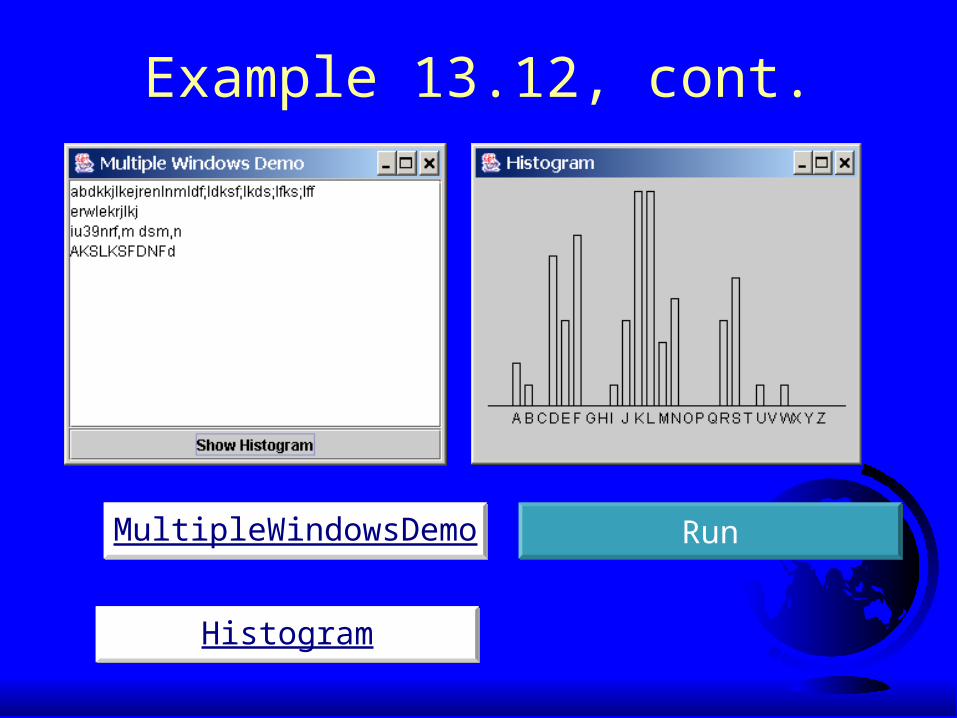
Example 13.12, cont.
RunRunMultipleWindowsDemoMultipleWindowsDemo
HistogramHistogram

JScrollBar
A scroll bar is a control that enables the user to select from a range of values. The scrollbar appears in two styles: horizontal and vertical.

Scroll Bar Properties
Bubble
Unit increment
Block decrement Block increment
Minimal value Maximal value
Unit decrement

Example 13.13: Using Scrollbars
This example uses horizontal and vertical scrollbars to control a message displayed on a panel. The horizontal scrollbar is used to move the message to the left or the right, and the vertical scrollbar to move it up and down.
ScrollBarDemoScrollBarDemo RunRun

JScrollPane
A scroll pane is a component that supports automatically scrolling without coding.

Example 13.14: Using Scroll Panes
This example uses a scroll pane to browse a large map. The program lets you choose a map from a combo box and display it in the scroll pane,
ScrollPaneDemoScrollPaneDemo RunRun

Scroll Pane StructuresColumn headerCorner
Component
Row header
JViewport
Scrollable Component
Horizontal scroll bars
Vertical scroll bars
CornerComponent
CornerComponent
CornerComponent

JTabbedPane
A tabbed pane provides a set of mutually exclusive tabs for accessing multiple components.

Example 13.15: Using Tabbed Panes
This example uses a tabbed pane with four tabs to display four types of figures: Square, Rectangle, Circle, and Oval. You click the corresponding tab to select a figure to be displayed. You can also use the radio buttons to specify the tab placement.
TabbedPaneDemoTabbedPaneDemo RunRun