Introduction to Probability Theory and Statistics for ... · 12.2.2 What could go wrong with the T...
302
Introduction to Probability Theory and Statistics for Psychology and Quantitative Methods for Human Sciences David Steinsaltz 1 University of Oxford (Lectures 1–8 based on earlier version by Jonathan Marchini) Lectures 1—8: MT 2011 Lectures 9—16: HT 2012 1 University lecturer at the Department of Statistics, University of Oxford
-
Upload
vuonghuong -
Category
Documents
-
view
213 -
download
0
Transcript of Introduction to Probability Theory and Statistics for ... · 12.2.2 What could go wrong with the T...

Introduction toProbability Theory
and Statisticsfor Psychology
and
Quantitative Methods forHuman Sciences
David Steinsaltz1
University of Oxford(Lectures 1–8 based on earlier version by Jonathan Marchini)
Lectures 1—8: MT 2011Lectures 9—16: HT 2012
1University lecturer at the Department of Statistics, University of Oxford


Contents
1 Describing Data 1
1.1 Example: Designing experiments . . . . . . . . . . . . . . . . 2
1.2 Variables . . . . . . . . . . . . . . . . . . . . . . . . . . . . . 3
1.2.1 Types of variables . . . . . . . . . . . . . . . . . . . . 4
1.2.2 Ambiguous data types . . . . . . . . . . . . . . . . . . 5
1.3 Plotting Data . . . . . . . . . . . . . . . . . . . . . . . . . . . 7
1.3.1 Bar Charts . . . . . . . . . . . . . . . . . . . . . . . . 8
1.3.2 Histograms . . . . . . . . . . . . . . . . . . . . . . . . 9
1.3.3 Cumulative and Relative Cumulative Frequency Plotsand Curves . . . . . . . . . . . . . . . . . . . . . . . . 14
1.3.4 Dot plot . . . . . . . . . . . . . . . . . . . . . . . . . . 14
1.3.5 Scatter Plots . . . . . . . . . . . . . . . . . . . . . . . 16
1.3.6 Box Plots . . . . . . . . . . . . . . . . . . . . . . . . . 17
1.4 Summary Measures . . . . . . . . . . . . . . . . . . . . . . . . 17
1.4.1 Measures of location (Measuring the center point) . . 19
1.4.2 Measures of dispersion (Measuring the spread) . . . . 24
1.5 Box Plots . . . . . . . . . . . . . . . . . . . . . . . . . . . . . 29
1.6 Appendix . . . . . . . . . . . . . . . . . . . . . . . . . . . . . 32
1.6.1 Mathematical notation for variables and samples . . . 32
1.6.2 Summation notation . . . . . . . . . . . . . . . . . . . 33
2 Probability I 35
2.1 Why do we need to learn about probability? . . . . . . . . . . 35
2.2 What is probability? . . . . . . . . . . . . . . . . . . . . . . . 38
2.2.1 Definitions . . . . . . . . . . . . . . . . . . . . . . . . 39
2.2.2 Calculating simple probabilities . . . . . . . . . . . . . 39
2.2.3 Example 2.3 continued . . . . . . . . . . . . . . . . . . 40
2.2.4 Intersection . . . . . . . . . . . . . . . . . . . . . . . . 40
2.2.5 Union . . . . . . . . . . . . . . . . . . . . . . . . . . . 41
iii

iv Contents
2.2.6 Complement . . . . . . . . . . . . . . . . . . . . . . . 42
2.3 Probability in more general settings . . . . . . . . . . . . . . 43
2.3.1 Probability Axioms (Building Blocks) . . . . . . . . . 43
2.3.2 Complement Law . . . . . . . . . . . . . . . . . . . . . 44
2.3.3 Addition Law (Union) . . . . . . . . . . . . . . . . . . 44
3 Probability II 47
3.1 Independence and the Multiplication Law . . . . . . . . . . . 47
3.2 Conditional Probability Laws . . . . . . . . . . . . . . . . . . 51
3.2.1 Independence of Events . . . . . . . . . . . . . . . . . 53
3.2.2 The Partition law . . . . . . . . . . . . . . . . . . . . 55
3.3 Bayes’ Rule . . . . . . . . . . . . . . . . . . . . . . . . . . . . 56
3.4 Probability Laws . . . . . . . . . . . . . . . . . . . . . . . . . 59
3.5 Permutations and Combinations (Probabilities of patterns) . 59
3.5.1 Permutations of n objects . . . . . . . . . . . . . . . . 59
3.5.2 Permutations of r objects from n . . . . . . . . . . . . 61
3.5.3 Combinations of r objects from n . . . . . . . . . . . . 62
3.6 Worked Examples . . . . . . . . . . . . . . . . . . . . . . . . 62
4 The Binomial Distribution 69
4.1 Introduction . . . . . . . . . . . . . . . . . . . . . . . . . . . . 69
4.2 An example of the Binomial distribution . . . . . . . . . . . . 69
4.3 The Binomial distribution . . . . . . . . . . . . . . . . . . . . 72
4.4 The mean and variance of the Binomial distribution . . . . . 73
4.5 Testing a hypothesis using the Binomial distribution . . . . . 75
5 The Poisson Distribution 81
5.1 Introduction . . . . . . . . . . . . . . . . . . . . . . . . . . . . 81
5.2 The Poisson Distribution . . . . . . . . . . . . . . . . . . . . 83
5.3 The shape of the Poisson distribution . . . . . . . . . . . . . 86
5.4 Mean and Variance of the Poisson distribution . . . . . . . . 86
5.5 Changing the size of the interval . . . . . . . . . . . . . . . . 87
5.6 Sum of two Poisson variables . . . . . . . . . . . . . . . . . . 88
5.7 Fitting a Poisson distribution . . . . . . . . . . . . . . . . . . 89
5.8 Using the Poisson to approximate the Binomial . . . . . . . . 90
5.9 Derivation of the Poisson distribution (non-examinable) . . . 95
5.9.1 Error bounds (very mathematical) . . . . . . . . . . . 96

Contents v
6 The Normal Distribution 99
6.1 Introduction . . . . . . . . . . . . . . . . . . . . . . . . . . . . 99
6.2 Continuous probability distributions . . . . . . . . . . . . . . 101
6.3 What is the Normal Distribution? . . . . . . . . . . . . . . . 102
6.4 Using the Normal table . . . . . . . . . . . . . . . . . . . . . 103
6.5 Standardisation . . . . . . . . . . . . . . . . . . . . . . . . . . 108
6.6 Linear combinations of Normal random variables . . . . . . . 110
6.7 Using the Normal tables backwards . . . . . . . . . . . . . . . 113
6.8 The Normal approximation to the Binomial . . . . . . . . . . 114
6.8.1 Continuity correction . . . . . . . . . . . . . . . . . . 115
6.9 The Normal approximation to the Poisson . . . . . . . . . . . 117
7 Confidence intervals and Normal Approximation 121
7.1 Confidence interval for sampling from a normally distributedpopulation . . . . . . . . . . . . . . . . . . . . . . . . . . . . . 121
7.2 Interpreting the confidence interval . . . . . . . . . . . . . . . 123
7.3 Confidence intervals for probability of success . . . . . . . . . 126
7.4 The Normal Approximation . . . . . . . . . . . . . . . . . . . 127
7.4.1 Normal distribution . . . . . . . . . . . . . . . . . . . 128
7.4.2 Poisson distribution . . . . . . . . . . . . . . . . . . . 128
7.4.3 Bernoulli variables . . . . . . . . . . . . . . . . . . . . 130
7.5 CLT for real data . . . . . . . . . . . . . . . . . . . . . . . . . 130
7.5.1 Quebec births . . . . . . . . . . . . . . . . . . . . . . . 132
7.5.2 California incomes . . . . . . . . . . . . . . . . . . . . 133
7.6 Using the Normal approximation for statistical inference . . . 135
7.6.1 An example: Average incomes . . . . . . . . . . . . . 136
8 The Z Test 139
8.1 Introduction . . . . . . . . . . . . . . . . . . . . . . . . . . . . 139
8.2 The logic of significance tests . . . . . . . . . . . . . . . . . . 139
8.2.1 Outline of significance tests . . . . . . . . . . . . . . . 142
8.2.2 Significance tests or hypothesis tests? Breaking the.05 barrier . . . . . . . . . . . . . . . . . . . . . . . . . 143
8.2.3 Overview of Hypothesis Testing . . . . . . . . . . . . . 145
8.3 The one-sample Z test . . . . . . . . . . . . . . . . . . . . . . 146
8.3.1 Test for a population mean µ . . . . . . . . . . . . . . 147
8.3.2 Test for a sum . . . . . . . . . . . . . . . . . . . . . . 148
8.3.3 Test for a total number of successes . . . . . . . . . . 148
8.3.4 Test for a proportion . . . . . . . . . . . . . . . . . . . 150
8.3.5 General principles: The square-root law . . . . . . . . 151

vi Contents
8.4 One and two-tailed tests . . . . . . . . . . . . . . . . . . . . . 152
8.5 Hypothesis tests and confidence intervals . . . . . . . . . . . . 153
9 The χ2 Test 155
9.1 Introduction — Test statistics that aren’t Z . . . . . . . . . . 155
9.2 Goodness-of-Fit Tests . . . . . . . . . . . . . . . . . . . . . . 157
9.2.1 The χ2 distribution . . . . . . . . . . . . . . . . . . . 158
9.2.2 Large d.f. . . . . . . . . . . . . . . . . . . . . . . . . . 161
9.3 Fixed distributions . . . . . . . . . . . . . . . . . . . . . . . . 162
9.4 Families of distributions . . . . . . . . . . . . . . . . . . . . . 167
9.4.1 The Poisson Distribution . . . . . . . . . . . . . . . . 168
9.4.2 The Binomial Distribution . . . . . . . . . . . . . . . . 169
9.5 Chi-squared Tests of Association . . . . . . . . . . . . . . . . 173
10 The T distribution and Introduction to Sampling 177
10.1 Using the T distribution . . . . . . . . . . . . . . . . . . . . . 177
10.1.1 Using t for confidence intervals: Single sample . . . . 178
10.1.2 Using the T table . . . . . . . . . . . . . . . . . . . . . 181
10.1.3 Using t for Hypothesis tests . . . . . . . . . . . . . . . 183
10.1.4 When do you use the Z or the T statistics? . . . . . . 183
10.1.5 Why do we divide by n − 1 in computing the sampleSD? . . . . . . . . . . . . . . . . . . . . . . . . . . . . 184
10.2 Paired-sample t test . . . . . . . . . . . . . . . . . . . . . . . 185
10.3 Introduction to sampling . . . . . . . . . . . . . . . . . . . . . 186
10.3.1 Sampling with and without replacement . . . . . . . . 186
10.3.2 Measurement bias . . . . . . . . . . . . . . . . . . . . 187
10.3.3 Bias in surveys . . . . . . . . . . . . . . . . . . . . . . 188
10.3.4 Measurement error . . . . . . . . . . . . . . . . . . . . 192
11 Comparing Distributions 195
11.1 Normal confidence interval for difference between two popu-lation means . . . . . . . . . . . . . . . . . . . . . . . . . . . 195
11.2 Z test for the difference between population means . . . . . . 197
11.3 Z test for the difference between proportions . . . . . . . . . . 198
11.4 t confidence interval for the difference between populationmeans . . . . . . . . . . . . . . . . . . . . . . . . . . . . . . . 199
11.5 Two-sample test and paired-sample test. . . . . . . . . . . . . 200
11.5.1 Schizophrenia study: Two-sample t test . . . . . . . . 200
11.5.2 The paired-sample test . . . . . . . . . . . . . . . . . . 201
11.5.3 Is the CLT justified? . . . . . . . . . . . . . . . . . . . 203

Contents vii
11.6 Hypothesis tests for experiments . . . . . . . . . . . . . . . . 204
11.6.1 Quantitative experiments . . . . . . . . . . . . . . . . 204
11.6.2 Qualitative experiments . . . . . . . . . . . . . . . . . 206
12 Non-Parametric Tests, Part I 209
12.1 Introduction: Why do we need distribution-free tests? . . . . 209
12.2 First example: Learning to Walk . . . . . . . . . . . . . . . . 210
12.2.1 A first attempt . . . . . . . . . . . . . . . . . . . . . . 210
12.2.2 What could go wrong with the T test? . . . . . . . . . 211
12.2.3 How much does the non-normality matter? . . . . . . 213
12.3 Tests for independent samples . . . . . . . . . . . . . . . . . . 215
12.3.1 Median test . . . . . . . . . . . . . . . . . . . . . . . . 215
12.3.2 Rank-Sum test . . . . . . . . . . . . . . . . . . . . . . 218
12.4 Tests for paired data . . . . . . . . . . . . . . . . . . . . . . . 221
12.4.1 Sign test . . . . . . . . . . . . . . . . . . . . . . . . . . 221
12.4.2 Breastfeeding study . . . . . . . . . . . . . . . . . . . 222
12.4.3 Wilcoxon signed-rank test . . . . . . . . . . . . . . . . 224
12.4.4 The logic of non-parametric tests . . . . . . . . . . . . 225
13 Non-Parametric Tests Part II, Power of Tests 227
13.1 Kolmogorov-Smirnov Test . . . . . . . . . . . . . . . . . . . . 227
13.1.1 Comparing a single sample to a distribution . . . . . . 227
13.1.2 Comparing two samples: Continuous distributions . . 234
13.1.3 Comparing two samples: Discrete samples . . . . . . . 235
13.1.4 Comparing tests to compare distributions . . . . . . . 237
13.2 Power of a test . . . . . . . . . . . . . . . . . . . . . . . . . . 237
13.2.1 Computing power . . . . . . . . . . . . . . . . . . . . 238
13.2.2 Computing trial sizes . . . . . . . . . . . . . . . . . . 239
13.2.3 Power and non-parametric tests . . . . . . . . . . . . . 241
14 ANOVA and the F test 245
14.1 Example: Breastfeeding and intelligence . . . . . . . . . . . . 245
14.2 Digression: Confounding and the “adjusted means” . . . . . . 245
14.3 Multiple comparisons . . . . . . . . . . . . . . . . . . . . . . . 247
14.3.1 Discretisation and the χ2 test . . . . . . . . . . . . . . 247
14.3.2 Multiple t tests . . . . . . . . . . . . . . . . . . . . . . 248
14.4 The F test . . . . . . . . . . . . . . . . . . . . . . . . . . . . . 249
14.4.1 General approach . . . . . . . . . . . . . . . . . . . . . 249
14.4.2 The breastfeeding study: ANOVA analysis . . . . . . 252
14.4.3 Another Example: Exercising rats . . . . . . . . . . . 253

viii Contents
14.5 Multifactor ANOVA . . . . . . . . . . . . . . . . . . . . . . . 25414.6 Kruskal-Wallis Test . . . . . . . . . . . . . . . . . . . . . . . . 255
15 Regression and correlation: Detecting trends 25915.1 Introduction: Linear relationships between variables . . . . . 25915.2 Scatterplots . . . . . . . . . . . . . . . . . . . . . . . . . . . . 26115.3 Correlation: Definition and interpretation . . . . . . . . . . . 26215.4 Computing correlation . . . . . . . . . . . . . . . . . . . . . . 263
15.4.1 Brain measurements and IQ . . . . . . . . . . . . . . . 26515.4.2 Galton parent-child data . . . . . . . . . . . . . . . . . 26615.4.3 Breastfeeding example . . . . . . . . . . . . . . . . . . 267
15.5 Testing correlation . . . . . . . . . . . . . . . . . . . . . . . . 26915.6 The regression line . . . . . . . . . . . . . . . . . . . . . . . . 270
15.6.1 The SD line . . . . . . . . . . . . . . . . . . . . . . . . 27015.6.2 The regression line . . . . . . . . . . . . . . . . . . . . 27115.6.3 Confidence interval for the slope . . . . . . . . . . . . 27415.6.4 Example: Brain measurements . . . . . . . . . . . . . 277
16 Regression, Continued 28116.1 R2 . . . . . . . . . . . . . . . . . . . . . . . . . . . . . . . . . 281
16.1.1 Example: Parent-Child heights . . . . . . . . . . . . . 28216.1.2 Example: Breastfeeding and IQ . . . . . . . . . . . . . 282
16.2 Regression to the mean and the regression fallacy . . . . . . . 28416.3 When the data don’t fit the model . . . . . . . . . . . . . . . 287
16.3.1 Transforming the data . . . . . . . . . . . . . . . . . . 28716.3.2 Spearman’s Rank Correlation Coefficient . . . . . . . 28716.3.3 Computing Spearman’s rank correlation coefficient . . 288

Lecture 1
Describing Data
Uncertain knowledge+ knowledge about the extent of uncertainty in it
= Useable knowledge
C. R. Rao, statistician
As we know, there are known knowns. There are things we know we know.We also know there are known unknowns. That is to say we know there aresome things we do not know. But there are also unknown unknowns, Theones we don’t know we don’t know.
Donald Rumsfeld, US Secretary of defense
Observations and measurements are at the centre of modern science. Weput our ideas to the test by comparing them to what we find out in theworld. Easier said than done, because all observation and measurement isuncertain. Some of the reasons are:
Sampling Our observations are only a small sample of the range of possibleobservations — the population.
Errors Every measurement suffers from errors.
Complexity The more observations we have, the more difficult it becomesto make them tell a coherent story.
We can never observe everything, nor can we make measures without error.But, as the quotes above suggest, uncertainty is not such a problem if it canbe constrained — that is, if we know the limits of our uncertainty.
1

2 Describing Data
1.1 Example: Designing experiments
“If a newborn infant is held under his arms and his bare feet are permittedto touch a flat surface, he will perform well-coordinated walking movementssimilar to those of an adult[. . . ] Normally, the walking and placing reflexesdisappear by about 8 weeks.” [ZZK72] The question is raised, whether ex-ercising this reflex would enable children to more quickly acquire the abilityto walk independently. How would we resolve this question?
Of course, we could perform an experiment. We could do these exerciseswith an infant, starting from when he or she was a newborn, and followup every week for about a year, to find out when this baby starts walking.Suppose it is 10 months. Have we answered the question then?
The obvious problem, then, is that we don’t know what age this babywould have started walking at without exercise. One solution would be totake another infant, observe this one at the same weekly intervals withoutdoing any special exercises, and see which one starts walking first. We callthis other infant the control. Suppose this one starts walking aged 11.50months (that is, 11 months and 2 weeks). Now, have we answered thequestion?
It is clear that we’re still not done, because children start walking at alldifferent ages. It could be that we happened to pick a slow child for theexercises, and a particularly fast-developing child for the control. How canwe resolve this?
Obviously, the first thing we need to do is to understand how muchvariability there is among the age at first walking, without imposing anexercise regime. For that, there is no alternative to looking at multipleinfants. Here several questions must be considered:
• How many?
• How do we summarise the results of multiple measurements?
• How do we answer the original question?: Do the special exercisesmake the children learn to walk sooner?
In the original study, the authors had six infants in the treatment group(the formal name for the ones who received the exercise — also called theexperimental group), and six in the control group. (In fact, they had asecond control group, that was subject to an alternative exercise regime. Butthat’s a complication for a later date.) The results are tabulated in Table1.1. We see that most of the treatment children did start walking earlier

Describing Data 3
than most of the control children. But not all. The slowest child from thetreatment group in fact started walking later than four of the six controlchildren. Should we still be convinced that the treatment is effective? Ifnot, how many more subjects do we need before we can be confident? Howwould we decide?
Treatment 9.00 9.50 9.75 10.00 13.00 9.50Control 11.50 12.00 9.00 11.50 13.25 13.00
Table 1.1: Age (in months) at which infants were first able to walk indepen-dently. Data from [ZZK72].
The answer is, we can’t know for sure. The results are consistent withbelieving that the treatment had an effect, but they are also consistent withbelieving that we happened to get a particularly slow group of treatmentchildren, or a fast group of control children, purely by chance. What weneed now is a formal way of looking at these results, to tell us how to decidehow to draw conclusions from data — “The exercise helped children walksooner” — and how properly to estimate the confidence we should have inour conclusions — How likely is it that we might have seen a similary resultpurely by chance, if the exercise did not help? We will use graphical tools,mathematical tools, and logical tools.
1.2 Variables
The datasets that Psychologists and Human Scientists collect will usuallyconsist of one or more observations on one or more “variables”.
A variable is a property of an object or event that can take on differ-ent values.
For example, suppose we collect a dataset by measuring the hair colour,resting heart rate and score on an IQ test of every student in a class. Thevariables in this dataset would then simply be hair colour, resting heartrate and score on an IQ test, i.e. the variables are the properties that wemeasured/observed.

4 Describing Data
Discrete
Nominal Ordinal
Quantitative
Discrete(counts) Continuous
Binary Non-Binary
Qualitative
Number of offspringsize of vocabulary at 18 months
Heightweight
tumour massbrain volume
Birth order (firstborn, etc.)Degree classification
"How offensive is this odour?(1=not at all, 5=very)"
Smoking (yes/no)Sex (M/F)
place of birth (home/hospital)
Hair colourethnicity
cause of death
Figure 1.1: A summary of the different data types with some examples.
1.2.1 Types of variables
There are 2 main types of data/variable (see Figure 1.1)
• Measurement / Quantitative Data occur when we measure ob-jects/events to obtain some number that reflects the quantitative traitof interest e.g. when we measure someone’s height or weight.
• Categorical / Qualitative Data occur when we assign objects intolabelled groups or categories e.g. when we group people according tohair colour or race. Often the categories have a natural ordering. Forexample, in a survey we might group people depending upon whetherthey agree / neither agree or disagree / disagree with a statement. Wecall such ordered variables Ordinal variables. When the categoriesare unordered, e.g. hair colour, we have a Nominal variable.

Describing Data 5
It is also useful to make the distinction between Discrete and Con-tinuous variables (see Figure 1.2). Discrete variables, such as number ofchildren in a family, or number of peas in a pod, can take on only a limitedset of values. (Categorical variables are, of course, always discrete.) Con-tinuous variables, such as height and weight, can take on (in principle) anunlimited set of values.
No. of students late for a lecture
There are only a limited set of distinct values/categoriesi.e. we can’t have exactly 2.23 students late, only integer values are allowed.
0Time spent studying statistics (hrs)
0 1 2 ................................................... 8
3.76 5.67
In theory there are an unlimited set of possible values!There are no discrete jumps between possible values.
Discrete Data
Continuous Data
Figure 1.2: Examples of Discrete and Continuous variables.
1.2.2 Ambiguous data types
The distinctions between the data types described in section 1.2.1 is notalways clear-cut. Sometimes, the type isn’t inherent to the data, but dependson how you choose to look at it. Consider the experiment described insection 1.1. Think about how the results may have been recorded in thelab notebooks. For each child, it was recorded which group (treatment orcontrol) the child was assigned to, which is clearly a (binary) categoricalvariable. Then, you might find an entry for each week, recorded the resultof the walking test: yes or no, the child could or couldn’t walk that week. Inprinciple, this is a long sequence of categorical variables. However, it would
6 Describing Data
be wise to notice that this sequence consists of a long sequence of “no”followed by a single “yes”. No information is lost, then, if we simply look atthe length of the sequence of noes, which is now a quantitative variable. Is itdiscrete or continuous? In principle, the age at which a child starts walkingis a continuous variable: there is no fixed set of times at which this can occur.But the variable we have is not the exact time of first walking, but the weekof the follow-up visit at which the experimenters found that the child couldwalk, reported in the shorthand that treats 1 week as being 1/4 month. Infact, then, the possible outcomes are a discrete set: 8.0, 8.25, 8.5, . . . . Whatthis points up, though, is simply that there is no sharp distinction betweencontinuous and discrete. What “continuous” means, in practice, is usuallyjust that there are a large number of possible outcomes. The methods foranalysing discrete variables aren’t really distinct from those for continuousvariables. Rather, we may have special approaches to analysing a binaryvariable, or one with a handful of possible outcomes. As the number ofoutcomes increases, the benefits of considering the “discreteness” disappear,and the methods shade off into the continuous methods.
One important distinction, though, is between categorical and quanti-tative data. It is obvious that if you have listed each subject’s hair colour,that that needs to be analysed differently from their blood pressure. Whereit gets confusing is the case of ordinal categories. For example, supposewe are studying the effect of family income on academic achievement, asmeasured in degree classification. The possibilities are: first, upper second,lower second, third, pass, and fail. It is clear that they are ordered, so thatwe want our analysis to take account of the fact that a third is between a failand a first. The designation even suggests assigning numbers: 1,2,2.5,3,4,5,and this might be a useful shorthand for recording the results. But oncewe have these numbers, it is tempting to do with them the things we dowith numbers: add them up, compute averages, and so on. Keep in mind,though, that we could have assigned any other numbers as well, as long asthey have the same order. Do we want our conclusions to depend on theimplication that a third is midway between a first and a fail? Probably not.
Suppose you have asked subjects to sniff different substances, and ratethem 0, 1, or 2, corresponding to unpleasant, neutral, or pleasant. It’sclear that this is the natural ordering — neutral is between unpleasant andpleasant. The problem comes when you look at the numbers and are temptedto do arithmetic with them. If we had asked subjects how many livinggrandmothers they have, the answers could be added up to get the totalnumber of grandmothers, which is at least a meaningful quantity. Does thetotal “pleasant-unpleasant smell” score mean anything? What about the

Describing Data 7
average score? Is neutral mid-way between unpleasant and pleasant? If halfthe subjects find it pleasant and half unpleasant, do they have “on average”a neutral response? The answers to these questions are not obvious, andrequire some careful consideration in each specific instance. Totalling andaveraging of arbitrary numbers attached to ordinal categories is a commonpractice, often carried out heedlessly. It should be done only with caution.
1.3 Plotting Data
One of the most important stages in a statistical analysis can be simply tolook at your data right at the start. By doing so you will be able to spotcharacteristic features, trends and outlying observations that enable you tocarry out an appropriate statistical analysis. Also, it is a good idea to lookat the results of your analysis using a plot. This can help identify if you didsomething that wasn’t a good idea!
DANGER!! It is easy to become complacent and analyse your data withoutlooking at it. This is a dangerous (and potentially embarrassing) habit toget into and can lead to false conclusions on a given study. The value ofplotting your data cannot be stressed enough.
Given that we accept the importance of plotting a dataset we now needthe tools to do the job. There are several methods that can be used whichwe will illustrate with the help of the following dataset.
The baby-boom dataset
Forty-four babies (a new record) were born in one 24-hour period at theMater Mothers’ Hospital in Brisbane, Queensland, Australia, on December18, 1997. For each of the 44 babies, The Sunday Mail recorded the timeof birth, the sex of the child, and the birth weight in grams. The data areshown in Table 1.2, and will be referred to as the “Baby boom dataset.”
While we did not collect this dataset based on a specific hypothesis, if wewished we could use it to answer several questions of interest. For example,
• Do girls weigh more than boys at birth?
• What is the distribution of the number of births per hour?
• Is birth weight related to the time of birth?

8 Describing Data
TimeSex
Weight(min) (g)
5 F 383764 F 333478 M 3554115 M 3838177 M 3625245 F 2208247 F 1745262 M 2846271 M 3166428 M 3520455 M 3380492 M 3294494 F 2576549 F 3208635 M 3521649 F 3746653 F 3523693 M 2902729 M 2635776 M 3920785 M 3690846 F 3430
TimeSex
Weight(min) (g)
847 F 3480873 F 3116886 F 3428914 M 3783991 M 33451017 M 30341062 F 21841087 M 33001105 F 23831134 M 34281149 M 41621187 M 36301189 M 34061191 M 34021210 F 35001237 M 37361251 M 33701264 M 21211283 M 31501337 F 38661407 F 35421435 F 3278
Table 1.2: The Baby-boom dataset
• Is gender related to the time of birth?
• Are these observations consistent with boys and girls being equallylikely?
These are all questions that you will be able to test formally by the end ofthis course. First though we can plot the data to view what the data mightbe telling us about these questions.
1.3.1 Bar Charts
A Bar Chart is a useful method of summarising Categorical Data. We rep-resent the counts/frequencies/percentages in each category by a bar. Figure1.3 is a bar chart of gender for the baby-boom dataset. Notice that the barchart has its axes clearly labelled.

Describing Data 9
Frequency
Girl Boy
04
812
1620
24
Figure 1.3: A Bar Chart showing the gender distribution in the Baby-boomdataset.
1.3.2 Histograms
An analogy
‘A Bar Chart is to Categorical Data as a Histogram is toMeasurement Data’
A histogram shows us the “distribution” of the numbers along some scale.A histogram is constructed in the following way
• Divide the measurements into intervals (sometimes called “bins”);
• Determine the number of measurements within each category.
• Draw a bar for each category whose heights represent the counts ineach category.
The ‘art’ in constructing a histogram is how to choose the number of binsand the boundary points of the bins. For “small” datasets, it is often feasibleto simply look at the values and decide upon sensible boundary points.

10 Describing Data
For the baby-boom dataset we can draw a histogram of the birth weights(Figure 1.4). To draw the histogram I found the smallest and largest values
smallest = 1745 largest = 4162
There are only 44 weights so it seems reasonable to take 6 bins
1500-2000 2000-2500 2500-3000 3000-3500 3500-4000 4000-4500
Using these categories works well, the histogram shows us the shape of thedistribution and we notice that distribution has an extended left ‘tail’.
Birth Weight (g)
Freq
uenc
y
1500 2000 2500 3000 3500 4000 4500
05
1015
200
510
1520
Figure 1.4: A Histogram showing the birth weight distribution in the Baby-boom dataset.
Too few categories and the details are lost. Too many categories and theoverall shape is obscured by haphazard details (see Figure 1.5).
In Figure 1.6 we show some examples of the different shapes that his-tograms can take. One can learn quite a lot about a set of data by lookingjust at the shape of the histogram. For example, Figure 1.6(c) shows thepercentage of the tuberculosis drug isoniazid that is acetylated in the liversof 323 patients after 8 hours. Unacetylated isoniazid remains longer in theblood, and can contribute to toxic side effects. It is interesting, then, to

Describing Data 11
Too few categories
Birth Weight (g)
Freq
uenc
y
1500 2500 3500 4500
05
1015
2025
3035
Too many categories
Birth Weight (g)Fr
eque
ncy
1500 2500 3500 4500
01
23
45
67
Figure 1.5: Histograms with too few and too many categories respectively.
notice that there is a wide range of rates of acetylation, from patients whoacetylate almost all, to those who acetylate barely one fourth of the drug in8 hours. Note that there are two peaks — this kind of distribution is calledbimodal — which points to the fact that there is a subpopulation who lacksa functioning copy of the relevant gene for efficiently carrying through thisreaction.
So far, we have taken the bins to all have the same width. Sometimeswe might choose to have unequal bins, and more often we may be forced tohave unequal bins by the way the data are delivered. For instance, supposewe did not have the full table of data, but were only presented with thefollowing table: What is the best way to make a histogram from these data?
Bin 1500–2500g 2500–3000g 3000-3500g 3500–4500gNumber of Births 5 4 19 16
Table 1.3: Baby-boom weight data, allocated to unequal bins.
We could just plot rectangles whose heights are the frequencies. We thenend up with the picture in Figure 1.7(a). Notice that the shape has changedsubstantially, owing to the large boxes that correspond to the widened bins.In order to preserve the shape — which is the main goal of a histogram —we want the area of a box to correspond to the contents of the bin, ratherthan the height. Of course, this is the same when the bin widths are equal.Otherwise, we need to switch from the frequency scale to density scale,

12 Describing Data
Birth Weight (g)
Freq
uenc
y
1500 2000 2500 3000 3500 4000 4500
05
1015
200
510
1520
(a) Left-skewed: Weights from Babyboomdata set.
Histogram of California household income 1999
income in $thousands
Density
0 50 100 150 200 250 300
0.000
0.002
0.004
0.006
0.008
0.010
0.012
(b) Right-skewed: 1999 California house-hold incomes. (From www.census.gov.)
Percentage acetylation of isoniazid
Frequency
010
2030
4050
25 30 35 40 45 50 55 60 65 70 75 80 85 90 95
(c) Bimodal: Percentage of isoniazid acety-lated in 8 hours.
Serum cholesterol (Mg/100 ml)
Density
0.000
0.005
0.010
0.015
0.020
100 120 140 160 180 200 220 240 260 280 300
(d) Bell shaped: Serum cholesterol of 10-year-old boys [Abr78].
Figure 1.6: Examples of different shapes of histograms.

Describing Data 13
Birth Weight (g)
Freq
uenc
y
1500 2000 2500 3000 3500 4000 4500
05
1015
200
510
1520
(a) Frequency scale
Weight (g)D
ensi
ty (b
abie
s/g)
1500 2000 2500 3000 3500 4000 4500
00.01
0.02
0.03
0.04
(b) Density scale
Figure 1.7: Same data plotted in frequency scale and density scale. Notethat the density scale histogram has the same shape as the plot from thedata with equal bin widths.
in which the height of a box is not the number of observations in the bin,but the number of observations per unit of measurement. This gives us thepicture in Figure 1.7(b), which has a very similar shape to the histogramwith equal bin-widths.
Thus, for the data in Table 1.3 we would calculate the height of the firstrectangle as
Density =Number of births
width of bin=
5 babies
1000g= 0.005.
The complete computations are given in Table 1.4, and the resulting his-togram is in Figure 1.7(b).
Bin 1500–2500g 2500–3000g 3000-3500g 3500–4500gNumber of Births 5 4 19 16Density 0.005 0.008 0.038 0.016
Table 1.4: Computing a histogram in density scale
A histogram in density scale is constructed in the following way
• Divide the measurements into bins (unless these are already given);

14 Describing Data
• Determine the number of measurements within each category (Note:the “number” can also be a percentage. Often the exact numbersare unavailable, but you can simply act as though there were 100observations);
• For each bin, compute the density, which is simply the number ofobservations divided by the width of a bin;
• Draw a bar for each bin whose height represent the density in each bin.The area of the bar will correspond to the number of observations inthe bin.
1.3.3 Cumulative and Relative Cumulative Frequency Plotsand Curves
A cumulative frequency plot is very similar to a histogram. In a cumu-lative frequency plot the height of the bar in each interval represents thetotal count of observations within interval and lower than the interval (seeFigure 1.8)
In a cumulative frequency curve the cumulative frequencies are plot-ted as points at the upper boundaries of each interval. It is usual to join upthe points with straight lines (see Figure 1.8).
Relative cumulative frequencies are simply cumulative frequencies dividedby the total number of observations (so relative cumulative frequencies al-ways lie between 0 and 1). Thus relative cumulative frequency plotsand curves just use relative cumulative frequencies rather than cumulativefrequencies. Such plots are useful when we wish to compare two or moredistributions on the same scale.
Consider the histogram of birth weight shown in Figure 1.4. The frequencies,cumulative frequencies and relative cumulative frequencies of the intervalsare given in Table 1.5.
1.3.4 Dot plot
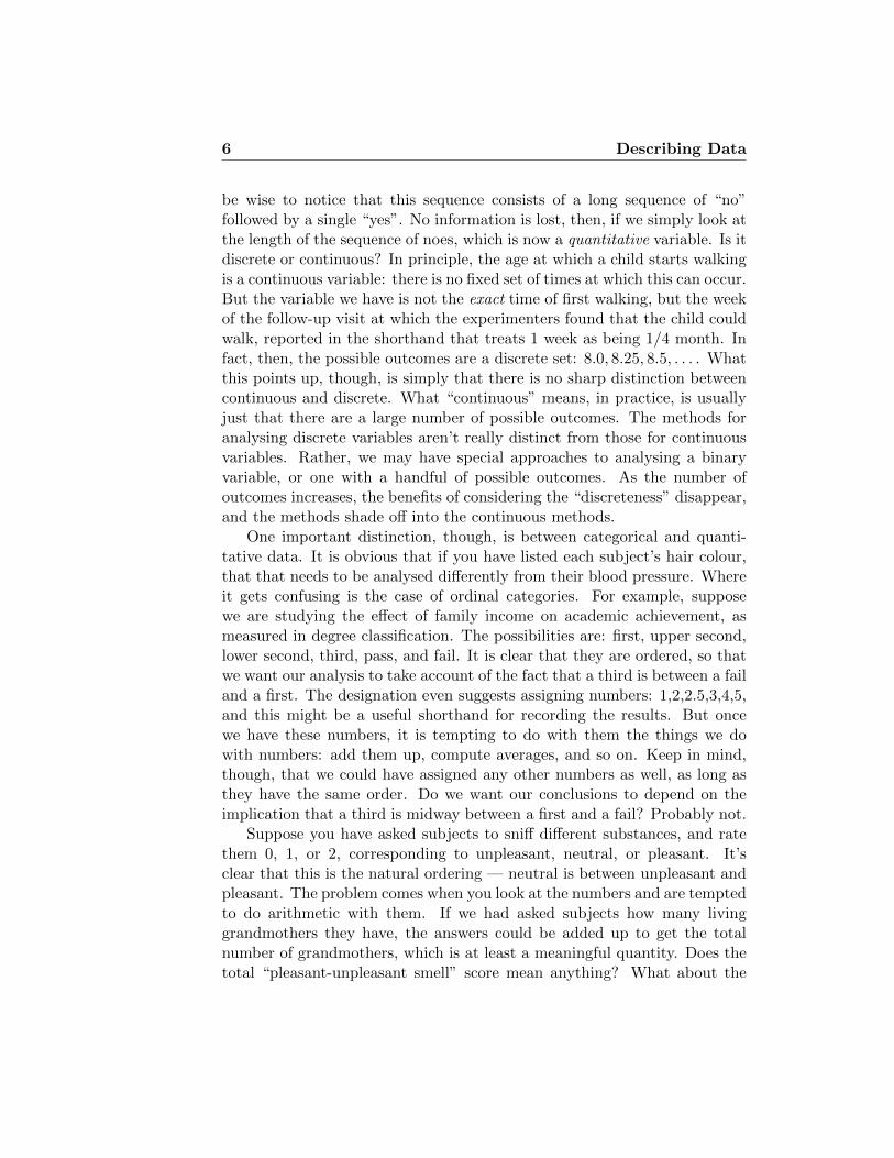
A Dot Plot is a simple and quick way of visualising a dataset. This typeof plot is especially useful if data occur in groups and you wish to quicklyvisualise the differences between the groups. For example, Figure 1.9 shows

Describing Data 15
Interval 1500-2000 2000-2500 2500-3000 3000-3500 3500-4000 4000-4500
Frequency 1 4 4 19 15 1
Cumulative 1 5 9 28 43 44Frequency
RelativeCumulative 0.023 0.114 0.205 0.636 0.977 1.0Frequency
Table 1.5: Frequencies and Cumulative frequencies for the histogram inFigure 1.4.
Cumulative Frequency Plot
Birth Weight (g)
Cum
ulat
ive
Freq
uenc
y
1500 2000 2500 3000 3500 4000 4500
010
2030
4050
2000 2500 3000 3500 4000 4500
010
2030
4050
Cumulative Frequency Curve
Birth Weight (g)
Cum
ulat
ive
Freq
uenc
y
Figure 1.8: Cumulative frequency curve and plot of birth weights for thebaby-boom dataset.
a dot plot of birth weights grouped by gender for the baby-boom dataset.The plot suggests that girls may be lighter than boys at birth.
16 Describing Data
Birth Weight (g)
Gen
der
1500 2000 2500 3000 3500 4000 4500
Girl
Boy
Figure 1.9: A Dot Plot showing the birth weights grouped by gender for thebaby-boom dataset.
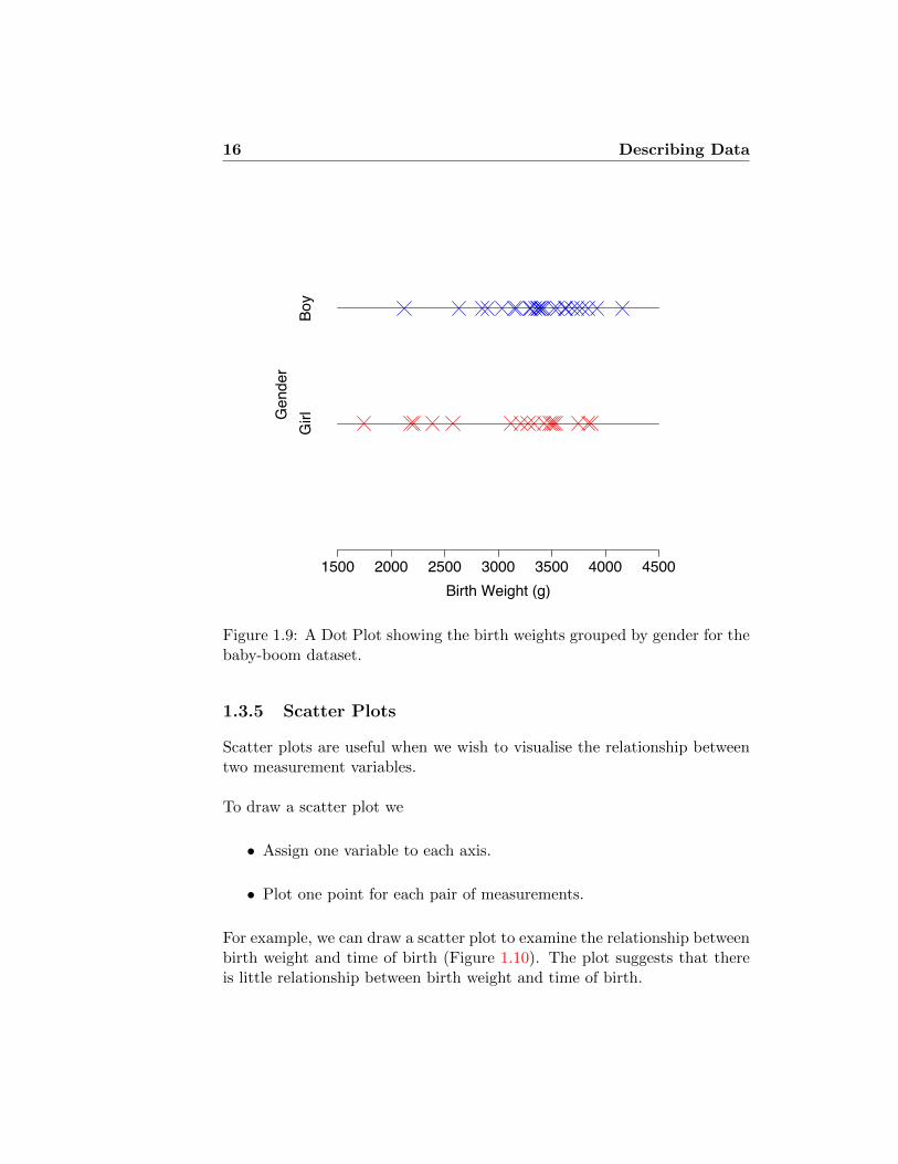
1.3.5 Scatter Plots
Scatter plots are useful when we wish to visualise the relationship betweentwo measurement variables.
To draw a scatter plot we
• Assign one variable to each axis.
• Plot one point for each pair of measurements.
For example, we can draw a scatter plot to examine the relationship betweenbirth weight and time of birth (Figure 1.10). The plot suggests that thereis little relationship between birth weight and time of birth.

Describing Data 17
2000 2500 3000 3500 4000
020
040
060
080
010
0012
0014
00
Birth Weight (g)
Tim
e of
birt
h (m
ins
sinc
e 12
pm)
Figure 1.10: A Scatter Plot of birth weights versus time of birth for thebaby-boom dataset.
1.3.6 Box Plots
Box Plots are probably the most sophisticated type of plot we will consider.To draw a Box Plot we need to know how to calculate certain “summarymeasures” of the dataset covered in the next section. We return to discussBox Plots in Section 1.5.
1.4 Summary Measures
In the previous section we saw how to use various graphical displays in orderto explore the structure of a given dataset. From such plots we were ableto observe the general shape of the “distribution” of a given dataset andcompare visually the shape of two or more datasets.Consider the histogram in Figure 1.11. Comparing the first and secondhistograms we see that the distributions have the same shape or spread butthat the center of the distribution is different. Roughly, by eye, the centersdiffer in value by about 10. Comparing first and third histograms we see

18 Describing Data
10 0 10 20 30
10 0 10 20 30
10 0 10 20 30
Figure 1.11: Comparing shapes of histograms
that the distributions seem to have roughly the same center but that thedata plotted in the third are more spread out than in the first. Obviously,comparing second and the third we observe differences in both the centerand the spread of the distribution.
While it is straightforward to compare two distributions “by eye”, plac-ing the two histograms next to each other, it is clear that this would bedifficult to do with ten or a hundred different distributions. For example,Figure 1.6(a) shows a histogram of 1999 incomes in California. Suppose wewanted to compare incomes among the 50 US states, or see how incomesdeveloped annually from 1980 to 2000, or compare these data to incomes in20 other industrialised countries. Laying out the histograms and comparingthem would not be very practical.
Instead, we would like to have single numbers that measure
• the ‘center’ point of the data.
• the ‘spread’ of the data.
These two characteristics of a set of data (the center and spread) are thesimplest measures of its shape. Once calculated we can make precise state-ments about how the centers or spreads of two datasets differ. Later we will
Describing Data 19
learn how to go a stage further and ‘test’ whether two variables have thesame center point.
1.4.1 Measures of location (Measuring the center point)
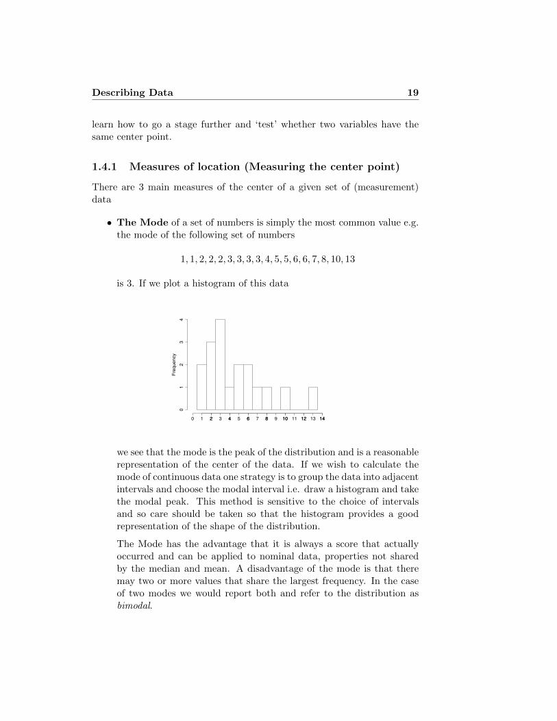
There are 3 main measures of the center of a given set of (measurement)data
• The Mode of a set of numbers is simply the most common value e.g.the mode of the following set of numbers
1, 1, 2, 2, 2, 3, 3, 3, 3, 4, 5, 5, 6, 6, 7, 8, 10, 13
is 3. If we plot a histogram of this data
Frequency
0 2 4 6 8 10 12 14
01
23
4
1 2 3 4 5 6 7 8 9 10 11 12 13 14
we see that the mode is the peak of the distribution and is a reasonablerepresentation of the center of the data. If we wish to calculate themode of continuous data one strategy is to group the data into adjacentintervals and choose the modal interval i.e. draw a histogram and takethe modal peak. This method is sensitive to the choice of intervalsand so care should be taken so that the histogram provides a goodrepresentation of the shape of the distribution.
The Mode has the advantage that it is always a score that actuallyoccurred and can be applied to nominal data, properties not sharedby the median and mean. A disadvantage of the mode is that theremay two or more values that share the largest frequency. In the caseof two modes we would report both and refer to the distribution asbimodal.

20 Describing Data
• The Median can be thought of as the ‘middle’ value i.e. the value forwhich 50% of the data fall below when arranged in numerical order.For example, consider the numbers
15, 3, 9, 21, 1, 8, 4,
When arranged in numerical order
1, 3, 4, 8 , 9, 15, 21
we see that the median value is 8. If there were an even number ofscores e.g.
1, 3, 4,8 , 9, 15
then we take the midpoint of the two middle values. In this case themedian is (4 + 8)/2 = 6. In general, if we have N data points then themedian location is defined as follows:
Median Location = (N+1)2
For example, the median location of 7 numbers is (7 + 1)/2 = 4 andthe median of 8 numbers is (8 + 1)/2 = 4.5 i.e. between observation 4and 5 (when the numbers are arranged in order).
A major advantage of the median is the fact that it is unaffected byextreme scores (a point it shares with the mode). We say the medianis resistant to outliers. For example, the median of the numbers
1, 3, 4, 8 , 9, 15, 99999
is still 8. This property is very useful in practice as outlying observa-tions can and do occur (Data is messy remember!).
• The Mean of a set of scores is the sum1 of the scores divided by thenumber of scores. For example, the mean of
1, 3, 4, 8, 9, 15 is1 + 3 + 4 + 8 + 9 + 15
6= 6.667 (to 3 dp)
In mathematical notation, the mean of a set of n numbers x1, . . . , xnis denoted by x where
x =
∑ni=1 xin
or x =
∑x
n(in the formula book)
1The total when we add them all up

Describing Data 21
See the appendix for a brief description of the summation notation (∑
)
The mean is the most widely used measure of location. Historically,this is because statisticians can write down equations for the meanand derive nice theoretical properties for the mean, which are muchharder for the mode and median. A disadvantage of the mean is thatit is not resistant to outlying observations. For example, the mean of
1, 3, 4, 8, 7, 15, 99999
is 14323.57, whereas the median (from above) is 8.
Sometimes discrete measurement data are presented in the form of a fre-quency table in which the frequencies of each value are given. Remember,the mean is the sum of the data divided by the number of observations.To calculate the sum of the data we simply multiply each value by its fre-quency and sum. The number of observations is calculated by summing thefrequencies.
For example, consider the following frequency table
Data (x) 1 2 3 4 5 6
Frequency (f) 2 4 6 7 4 1
Table 1.6: A frequency table.
We calculate the sum of the data as
(2× 1) + (4× 2) + (6× 3) + (7× 4) + (4× 5) + (1× 6) = 82
and the number of observations as
2 + 4 + 6 + 7 + 4 + 1 = 24
The the mean is given by
x =82
24= 3.42 (2 dp)
In mathematical notation the formula for the mean of frequency data isgiven by
x =
∑ni=1 fixi∑ni=1 fi
or x =
∑fx∑f

22 Describing Data
The relationship between the mean, median and mode
In general, these three measures of location will differ but for certain datasetswith characteristic ‘shapes’ we will observe simple patterns between thethree measures (see Figure 1.12).
• If the distribution of the data is symmetric then the mean, medianand mode will be very close to each other.
MODE ≈ MEDIAN ≈ MEAN
• If the distribution is positively skewed or right skewed i.e. thedata has an extended right tail, then
MODE < MEDIAN < MEAN.
Income data, as in Figure 1.6(b), tends to be right-skewed. The meanis shown by a red
• If the distribution is negatively skewed or left skewed i.e. the datahas an extended left tail, as then
MEAN < MEDIAN < MODE.
• If the
The mid-range
There is actually a fourth measure of location that can be used (but rarelyis). The Mid-Range of a set of data is half way between the smallestand largest observation i.e. half the range of the data. For example, themid-range of
1, 3, 4, 8, 9, 15, 21
is (1 + 21) / 2 = 11. The mid-range is rarely used because it is not resistantto outliers and by using only 2 observations from the dataset it takes noaccount of how spread out most of the data are.

Describing Data 23
Symmetric
10 0 10 20 30
mean = median = mode
Positive Skew
0 5 10 15 20 25 30
meanmedianmode
Negative Skew
0 5 10 15 20 25 30
meanmedianmode
Figure 1.12: The relationship between the mean, median and mode.

24 Describing Data
1.4.2 Measures of dispersion (Measuring the spread)
The Interquartile Range (IQR) and Semi-Interquartile Range (SIQR)
The Interquartile Range (IQR) of a set of numbers is defined to be the rangeof the middle 50% of the data (see Figure 1.13). The Semi-InterquartileRange (SIQR) is simply half the IQR.
We calculate the IQR in the following way:
• Calculate the 25% point (1st quartile) of the dataset. The locationof the 1st quartile is defined to be the
(N+1
4
)th data point.
• Calculate the 75% point (3rd quartile) of the dataset. The location
of the 3rd quartile is defined to be the(3(N+1)
4
)th data point2.
• Calculate the IQR as
IQR = 3rd quartile - 1st quartile
Example 1 Consider the set of 11 numbers (which have been arranged inorder)
10, 15, 18, 33, 34, 36, 51, 73, 80, 86, 92.
The 1st quartile is the (11+1)4 = 3rd data point = 18
The 3rd quartile is the 3(11+1)4 = 9th data point = 80
⇒ IQR = 80 - 18 = 62⇒ SIQR = 62 / 2 = 31.
What do we do when the number of points +1 isn’t divisible by 4? Weinterpolate, just like with the median. Suppose we take off the last datapoint, so the list of data becomes
10, 15, 18, 33, 34, 36, 51, 73, 80, 86.
What is the 1st quartile? We’re now looking for the (10+1)4 = 2.75 data
point. This should be 3/4 of the way from the 2nd data point to the 3rd.The distance from 15 to 18 is 3. 1/4 of the way is .75, and 3/4 of the wayis 2.25. So the 1st quartile is 17.25.
2The 2nd quartile is the 50% point of the dataset i.e. the median.

Describing Data 25
Frequency
5 0 5 10 15 20 25
050
100
150
200
25% 75%
IQR
Figure 1.13: The Interquartile Range.
The Mean Deviation
To measure the spread of a dataset it seems sensible to use the ‘deviation’of each data point from the mean of the distribution (see Figure 1.14). Thedeviation of each data point from the mean is simply the data point minusthe mean.For example, for deviations of the set of numbers
10, 15, 18, 33, 34, 36, 51, 73, 80, 86, 92
which have mean 48 are given in Table 1.7.
The Mean Deviation of a set of numbers is simply mean of deviations.
In mathematical notation this is written as∑ni=1(xi − x)
n
At first this sounds like a good way of assessing the spread since you mightthink that large spread gives rise to larger deviations and thus a larger

26 Describing Data
small spread = small deviations large spread = large deviations
Figure 1.14: The relationship between spread and deviations..
mean deviation. In fact, though, the mean deviation is always zero. Thepositive and negative deviations cancel each other out exactly. Even so, thedeviations still contain useful information about the spread, we just have tofind a way of using the deviations in a sensible way.
Mean Absolute Deviation (MAD)
We solve the problem of the deviations summing to zero by considering theabsolute values of the deviations. The absolute value of a number is thevalue of that number with any minus sign removed, e.g. |− 3| = 3. We thenmeasure spread using the mean of the absolute deviations, denoted (MAD).
This can be written in mathematical notation as∑ni=1 |xi − x|
nor
∑|x− x|n
Note The second formula is just a short hand version of the first (See theAppendix).
We calculate the MAD in the following way (see Table 1.7 for an exam-ple)

Describing Data 27
Data Deviations |Deviations| Deviations2
x x− x |x− x| (x− x)2
10 10 - 48 = -38 38 144415 15 - 48 = -33 33 108918 18 - 48 = - 30 30 90033 33 - 48 = -15 15 22534 34 - 48 = -14 14 19636 36 - 48 = -12 12 14451 51 - 48 = 3 3 973 73 - 48 = 25 25 62580 80 - 48 = 32 32 102486 86 - 48 = 38 38 144492 92 - 48 = 44 44 1936
Sum = 528 Sum = 0 Sum = 284 Sum = 9036∑x = 528
∑(x− x) = 0
∑|x− x| = 284
∑(x− x)2 = 9036
Table 1.7: Deviations, Absolute Deviations and Squared Deviations.
• Calculate the mean of the data, x
• Calculate the deviations by subtracting the mean from each value,x− x
• Calculate the absolute deviations by removing any minus signs fromthe deviations, |x− x|.
• Sum the absolute deviations,∑|x− x|.
• Calculate the MAD by dividing the sum of the absolute deviations bythe number of data points,
∑|x− x|/n.
From Table 1.7 we see that the sum of the absolute deviations of the numbersin Example 1 is 284 so
MAD =284
11= 25.818 (to 3dp)
The Sample Variance (s2) and Population Variance (σ2)
Another way to ensure the deviations don’t sum to zero is to look at thesquared deviations i.e. the square of a number is always positive. Thus

28 Describing Data
another way of measuring the spread is to consider the mean of the squareddeviations, called the variance
If our dataset consists of the whole population (a rare occurrence) then wecan calculate the population variance σ2 (said ‘sigma squared’) as
σ2 =
∑ni=1(xi − x)2
nor σ2 =
∑(x− x)2
n
When we just have a sample from the population (most of the time) we cancalculate the sample variance s2 as
s2 =
∑ni=1(xi − x)2
n− 1or s2 =
∑(x− x)2
n− 1
Note We divide by n − 1 when calculating the sample variance as then s2
is a ‘better estimate’ of the population variance σ2 than if we had dividedby n. We will see why later.
For frequency data (see Table 1.6) the formula is given by
s2 =
∑ni=1 fi(xi − x)2∑n
i=1 fi − 1or s2 =
∑f(x− x)2∑f − 1
We can calculate s2 in the following way (see Table 1.7)
• Calculate the deviations by subtracting the mean from each value,x− x
• Calculate the squared deviations, (x− x)2.
• Sum the squared deviations,∑
(x− x)2.
• Divide by n− 1,∑
(x− x)2/(n− 1).
From Table 1.7 we see that the sum of the squared deviations of the numbersin Example 1 is 9036 so
s2 =9036
11− 1= 903.6

Describing Data 29
The Sample Standard Deviation (s) and Population Standard De-viation (σ)
Notice how the sample variance in Example 1 is much higher than the SIQRand the MAD.
SIQR = 31 MAD = 25.818 s2 = 903.6
This happens because we have squared the deviations transforming themto a quite different scale. We can recover the scale of the original data bysimply taking the square root of the sample (population) variance.
Thus we define the sample standard deviation s as
s =
√∑ni=1(xi − x)2
n− 1
and we define the population standard deviation σ as
σ =
√∑ni=1(xi − x)2
n
Returning to Example 1 the sample standard deviation is
s =√
903.6 = 30.05 (to 2dp)
which is comparable with the SIQR and the MAD.
1.5 Box Plots
As we mentioned earlier a Box Plot (sometimes called a Box-and-WhiskerPlot) is a relatively sophisticated plot that summarises the distribution of agiven dataset.
A box plot consists of three main parts
• A box that covers the middle 50% of the data. The edges of the boxare the 1st and 3rd quartiles. A line is drawn in the box at the medianvalue.
• Whiskers that extend out from the box to indicate how far the dataextend either side of the box. The whiskers should extend no furtherthan 1.5 times the length of the box, i.e. the maximum length of awhisker is 1.5 times the IQR.

30 Describing Data
• All points that lie outside the whiskers are plotted individually asoutlying observations.
2000
2500
3000
3500
4000
Median
1st quartile
3rd quartile
Lower Whisker
Upper Whisker
Outliers
Figure 1.15: A Box Plot of birth weights for the baby-boom dataset showingthe main points of plot.
Plotting box plots of measurements in different groups side by side can beillustrative. For example, Figure 1.16 shows box plots of birth weight foreach gender side by side and indicates that the distributions have quitedifferent shapes.
Box plots are particularly useful for comparing multiple (but not verymany!) distributions. Figure 1.17 shows data from 14 years, of the total

Describing Data 31
Girls Boys
2000
2500
3000
3500
4000
Figure 1.16: A Box Plot of birth weights by gender for the baby-boomdataset.
number of births each day (5113 days in total) in Quebec hospitals. Bysummarising the data in this way, it becomes clear that there is a substantialdifference between the numbers of births on weekends and on weekdays. Wesee that there is a wide variety of numbers of births, and considerable overlapamong the distributions, but the medians for the weekdays are far outsidethe range of most of the weekend numbers.

32 Describing Data
Sun Mon Tues Wed Thur Fri Sat
150
200
250
300
350
Babies born in Quebec hospitals 1 Jan 1977 to 31 Dec 1990
Day of Week
Figure 1.17: Daily numbers of births in Quebec hospitals, 1 Jan 1977 to 31Dec 1990.
1.6 Appendix
1.6.1 Mathematical notation for variables and samples
Mathematicians are lazy. They can’t be bothered to write everything outin full so they have invented a language/notation in which they can expresswhat they mean in a compact, quick to write down fashion. This is a goodthing. We don’t have to study maths every day to be able to use a bit of thelanguage and make our lives easier. For example, suppose we are interestedin comparing the resting heart rate of 1st year Psychology and Human Sci-ences students. Rather than keep on referring to variables ‘the resting heartrate of 1st year Psychology students’ and ‘the resting heart rate of 1st year

Describing Data 33
Human Sciences students’ we can simple denote
X = the resting heart rate of 1st year Psychology studentsY = the resting heart rate of 1st year Human Sciences students
and refer to the variables X and Y instead.In general, we use capital letters to denote variables. If we have a sample
of a variable the we use small letters to denote the sample. For example,if we go and measure the resting heart rate of 1st year Psychology andHuman Sciences students in Oxford we could denote the p measurements onPsychologists as
x1, x2, x3, . . . , xp
and the h measurements on Human Scientists as
y1, y2, y3, . . . , yh
1.6.2 Summation notation
One of the most common letters in the Mathematicians alphabet is theGreek letter sigma (
∑), which is used to denote summation. It translates
to “add up what follows”. Usually, the limits of the summation are writtenbelow and above the symbol. So,
5∑i=1
xi reads “add up the xis from i = 1 to i = 5”
or5∑i=1
xi = (x1 + x2 + x3 + x4 + x5)
If we have some actual data then we know the values of the xis
x1 = 3 x2 = 6 x3 = 1 x4 = 7 x5 = 6
and we can calculate the sum as
5∑i=1
xi = (3 + 2 + 1 + 7 + 6) = 19
If the limits of the summation are obvious within context the the notationis often abbreviated to ∑
x = 19

34 Describing Data

Lecture 2
Probability I
In this and the following lecture we will learn about
• why we need to learn about probability
• what probability is
• how to assign probabilities
• how to manipulate probabilities and calculate probabilities of complexevents
2.1 Why do we need to learn about probability?
In Lecture 1 we discussed why we need to study statistics, and we saw thatstatistics plays a crucial role in the scientific process (see figure 2.1). We sawthat we use a sample from the population in order to test our hypothesis.There will usually be a very large number of possible samples we could havetaken and the conclusions of the statistical test we use will depend on theexact sample we take. It might happen that the sample we take leads us tomake the wrong conclusion about the population. Thus we need to knowwhat the chances are of this happening. Probability can be thought of asthe study of chance.
35

36 Probability I
populationabout aHypothesis
STATISTICSStudyDesign
Propose anexperiment
Takea
sample
STATISTICALTEST
ExamineResults
Figure 2.1: The scientific process and role of statistics in this process.
Example 2.1: Random controlled experiment
The Anturane Reinfarction Trial (ART) was a famous study ofa drug treatment (anturane) for the aftereffects of myocardialinfarction [MDF+81]. Out of 1629 patients, about half (813)were selected to receive anturane; the other 816 patients receivedan ineffectual (“placebo”) pill. The results are summarised inTable 2.1.
Table 2.1: Results of the Anturane Reinfarction Trial.
Treatment Control(anturane) (placebo)
# patients 813 816deaths 74 89
% mortality 9.1% 10.9%

Probability I 37
Imagine the following dialogue:
Drug Company: Every hospital needs to use antu-rane. It saves patients’ lives.Skeptical Bureaucrat: The effect looks pretty small:15 out of about 800 patients. And the drug is prettyexpensive.DC: Is money all you bean counters can think about?We reduced mortality by 16%.SB: It was only 2% of the total.DC: We saved 2% of the patients! What if one of themwas your mother?SB: I’m all in favour of saving 2% more patients. I’mjust wondering: You flipped a coin to decide whichpatients would get the anturane. What if the coinshad come up differently? Might we just as well behere talking about how anturane had killed 2% of thepatients?
How can we resolve this argument? 163 patients died. Supposeanturane has no effect. Could the apparent benefit of anturanesimply reflect the random way the coins fell? Or would such aseries of coin flips have been simply too unlikely to countenance?To answer this question, we need to know how to measure thelikelihood (or “probability”) of sequences of coin flips.
Imagine a box, with cards in it, each one having written on itone way in which the coin flips could have come out, and the pa-tients allocated to treatments. How many of those coinflip cardswould have given us the impression that anturane performedwell, purely because many of the patients who died happened toend up in the Control (placebo) group? It turns out that it’smore than 20% of the cards, so it’s really not very unlikely atall.
To figure this out, we are going to need to understand
1. How to enumerate all the ways the coins could come up.How many ways are there? The number depends on theexact procedure, but if we flip one coin for each patient, thenumber of cards in the box would be 21629, which is vastly

38 Probability I
more than the number of atoms in the universe. Clearly,we don’t want to have to count up the cards individually.
2. How coin flips get associated with a result, as measured inapparent success or failure of anturane. Since the numberof “cards” is so large, we need to do this without having togo through the results one by one.
�
Example 2.2: Baby-boom
Consider the Baby-boom dataset we saw in Lecture 1. Supposewe have a hypothesis that in the population boys weigh morethan girls at birth. We can use our sample of boys and girls toexamine this hypothesis. One intuitive way of doing this wouldbe to calculate the mean weights of the boys and girls in thesample and compare the difference between these two means
Sample mean of boys weights = xboys = 3375
Sample mean of girls weights = xgirls = 3132
⇒ D = xboys − xgirls = 3375− 3132 = 243
Does this allow us to conclude that in the population boys areborn heavier than girls? On what scale to we assess the sizeof D? Maybe boys and girls weigh the same at birth and weobtained a sample with heavier boys just by chance. To be ableto conclude confidently that boys in the population are heavierthan girls we need to know what the chances are of obtaininga difference between the means that is 243 or greater, i.e. weneed to know the probability of getting such a large value of D.If the chances are small then we can be confident that in thepopulation boys are heavier than girls on average at birth. �
2.2 What is probability?
The examples we have discussed so far look very complicated. They aren’treally, but in order to see the simple underlying structure, we need to intro-duce a few new concepts. To do so, we want to work with a much simplerexample:

Probability I 39
Example 2.3: Rolling a die
Consider a simple experiment of rolling a fair six-sided die.
When we toss the die there are six possible outcomes i.e. 1,2, 3, 4, 5 and 6. We say that the sample space of our experi-ment is the set S = {1, 2, 3, 4, 5, 6}.
The outcome ”the top face shows a three” is the sample point 3.
The event A1, that the die shows an even number is the subsetA1 = {2, 4, 6} of the sample space.
The event A2 that the die shows a number larger than 4 isthe subset A2 = {5, 6} of S2. �
2.2.1 Definitions
The example above introduced some terminology that we will use repeatedlywhen we talk about probabilities.
An experiment is some activity with an observable outcome.
The set of all possible outcomes of the experiment is called the samplespace.
A particular outcome is called a sample point.
A collection of possible outcomes is called an event.
2.2.2 Calculating simple probabilities
Simply speaking, the probability of an event is a number between 0 and 1,inclusive, that indicates how likely the event is to occur.
In some settings (like the example of the fair die considered above) it isnatural to assume that all the sample points are equally likely.In this case, we can calculate the probability of an event A as
P (A) =|A||S|
,

40 Probability I
where |A| denotes the number of sample points in the event A.
2.2.3 Example 2.3 continued
It is often useful in simple examples like this to draw a diagram (known asa “Venn diagram”) to represent the sample space, and then label specificevents in the diagram by grouping together individual sample points.
S = {1, 2, 3, 4, 5, 6} A1 = {2, 4, 6} A2 = {5, 6}
P (A1) =|A1||S|
=3
6=
1
2
S
2
1 3
4 6
5
A1
P (A2) =|A2||S|
=2
6=
1
3
S
2
1 3
4 6
5 A2
2.2.4 Intersection
What about P (face is even, and larger than 4) ?
We can write this event in set notation as A1 ∩A2.
This is the intersection of the two events, A1 and A2
i.e the set of elements which belong to both A1 and A2.

Probability I 41
A1 ∩A2 = {6} ⇒ P (A1 ∩A2) =|A1 ∩A2||S|
=1
6
S
2
1 3
4 6
5 A2
A1
2.2.5 Union
What about P (face is even, or larger than 4) ?
We can write this event in set notation as A1 ∪A2.
This is the union of the two events, A1 and A2
i.e the set of elements which belong either A1 and A2 or both.
A1 ∪A2 = {2, 4, 5, 6} ⇒ P (A1 ∪A2) =|A1 ∪A2||S|
=4
6=
2
3

42 Probability I
S
2
1 3
4 6
5 A2
A1
2.2.6 Complement
What about P (face is not even) ?
We can write this event in set notation as Ac1.
This is the complement of the event, A1
i.e the set of elements which do not belong to A1.
Ac1 = {1, 3, 5} ⇒ P (Ac1) =|Ac1||S|
=3
6=
1
2

Probability I 43
S
2
1 3
4 6
5
A1
2.3 Probability in more general settings
In many settings, either the sample space is infinite or all possible outcomesof the experiment are not equally likely. We still wish to associate probabil-ities with events of interest. Luckily, there are some rules/laws that allowus to calculate and manipulate such probabilities with ease.
2.3.1 Probability Axioms (Building Blocks)
Before we consider the probability rules we need to know about the axioms(or mathematical building blocks) upon which these rules are built. Thereare three axioms which we need in order to develop our laws
(i). 0 ≤ P (A) ≤ 1 for any event A.This axiom says that probabilities must lie between 0 and 1
(ii). P (S) = 1.This axiom says that the probability of everything in the sample spaceis 1. This says that the sample space is complete and that there are nosample points or events that allow outside the sample space that canoccur in our experiment.
(iii). If A1, . . . , An are mutually exclusive events, then
P (A1 ∪ . . . ∪An) = P (A1) + . . .+ P (An).
44 Probability I
A set of events are mutually exclusive if at most one of the eventscan occur in a given experiment.This axiom says that to calculate the probability of the union of distinctevents we can simply add their individual probabilities.
2.3.2 Complement Law
If A is an event, the set of all outcomes that are not in A is called the com-plement of the event A, denoted A{.
This is (pronounced ‘A complement’).
The rule is
A{ = 1− P (A) (Law 1)
Example 2.4: Complements
Let S (the sample space) be the set of students at Oxford. Weare picking a student at random.
Let A = The event that the randomly selected student suffersfrom depression
We are told that 8% of students suffer from depression, so P (A) =0.08. What is the probability that a student does not suffer fromdepression?
The event {student does not suffer from depression} is A{. IfP (A) = 0.08 then P (A{) = 1− 0.08 = 0.92. �
2.3.3 Addition Law (Union)
Suppose,
A = The event that a randomly selected student from the class has brown eyesB = The event that a randomly selected student from the class has blue eyes

Probability I 45
What is the probability that a student has brown eyes OR blue eyes?
This is the union of the two events A and B, denoted A∪B (pronounced ‘Aor B’)
We want to calculate P(A∪B).
In general for two events
P(A∪B) = P(A) + P(B) - P(A∩B) (Addition Law)
To understand this law consider a Venn diagram of the situation (below) inwhich we have two events A and B. The event A∪B is represented in sucha diagram by the combined sample points enclosed by A or B. If we simplyadd P (A) and P (B) we will count the sample points in the intersectionA ∩B twice and thus we need to subtract P (A ∩B) from P (A) + P (B) tocalculate P (A ∪B).
A B
A∩B
S
Example 2.5: SNPs
Single nucleotide polymorphisms (SNPs) are nucleotide positionsin a genome which exhibit variation amongst individuals in aspecies. In some studies in humans, SNPs are discovered in Eu-ropean populations. Suppose that of such SNPs, 70% also showvariation in an African population, 80% show variation in an
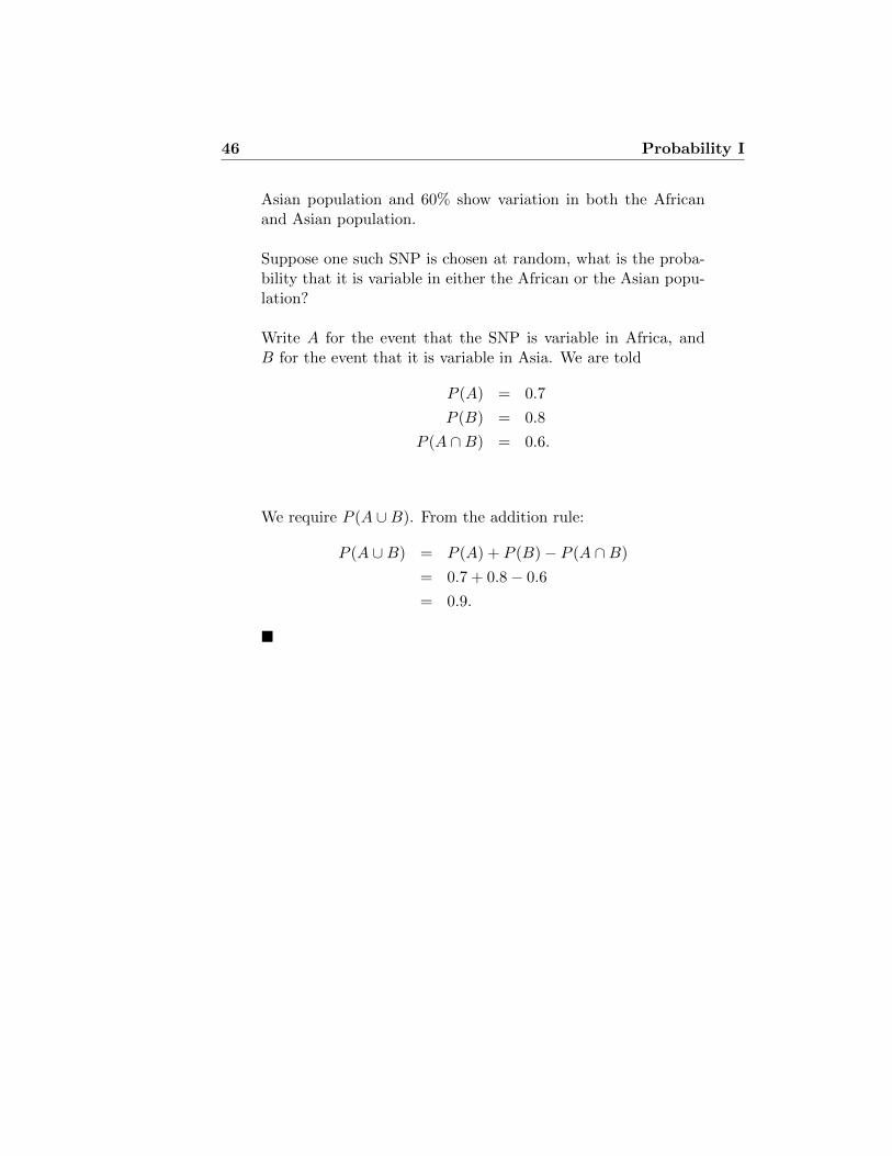
46 Probability I
Asian population and 60% show variation in both the Africanand Asian population.
Suppose one such SNP is chosen at random, what is the proba-bility that it is variable in either the African or the Asian popu-lation?
Write A for the event that the SNP is variable in Africa, andB for the event that it is variable in Asia. We are told
P (A) = 0.7
P (B) = 0.8
P (A ∩B) = 0.6.
We require P (A ∪B). From the addition rule:
P (A ∪B) = P (A) + P (B)− P (A ∩B)
= 0.7 + 0.8− 0.6
= 0.9.
�

Lecture 3
Probability II
3.1 Independence and the Multiplication Law
If the probability that one event A occurs doesn’t affect the probability thatthe event B also occurs, then we say that A and B are independent. Forexample, it seems clear than one coin doesn’t know what happened to theother one (and if it did know, it wouldn’t care), so if A1 is the event thatthe first coin comes up heads, and A2 the event that the second coin comesup heads, then
Example 3.1: One die, continued
Continuing from Example 2.3, with event A1 = {face is even} ={2, 4, 6} and A2 = {face is greater than 4} = {5, 6}, we see thatA1 ∩A2 = {6}
P (A1) =3
6= 0.5,
P (A2) =2
6= 0.33,
P (A1 ∩A2) =1
6= P (A1)× P (A2).
On the other hand, if A3 = {4, 5, 6}, then A3 and A1 are notindependent. �
47

48 Probability II
Example 3.2: Two dice
Suppose we roll two dice. The sample space may be representedas pairs (first roll, second roll).
(1,1) (1,2) (1,3) (1,4) (1,5) (1,6)(2,1) (2,2) (2,3) (2,4) (2,5) (2,6)(3,1) (3,2) (3,3) (3,4) (3,5) (3,6)(4,1) (4,2) (4,3) (4,4) (4,5) (4,6)(5,1) (5,2) (5,3) (5,4) (5,5) (5,6)(6,1) (6,2) (6,3) (6,4) (6,5) (6,6)
There are 36 points in the sample space. These are all equallylikely. Thus, each point has probability 1/36. Consider theevents
A = {First roll is even},B = {Second roll is bigger than 4},
A ∩B = {First roll is even and Second roll is bigger than 4},
(1,1) (1,2) (1,3) (1,4) (1,5) (1,6)
(2,1) (2,2) (2,3) (2,4) (2,5) (2,6)
(3,1) (3,2) (3,3) (3,4) (3,5) (3,6)
(4,1) (4,2) (4,3) (4,4) (4,5) (4,6)
(5,1) (5,2) (5,3) (5,4) (5,5) (5,6)
(6,1) (6,2) (6,3) (6,4) (6,5) (6,6)
B
Figure 3.1: Events A = {First roll is even} and B ={Second roll is bigger than 4}.

Probability II 49
We see from Figure 3.1 that A contains 18 points and B contains12 points, so that P (A) = 18/36 = 1/2, and P (B) = 12/36 =1/3. Meanwhile, A∩B contains 6 points, so P (A∩B) = 6/36 =1/6 = 1/2×1/3. Thus A and B are independent. This should notbe surprising: A depends only on the first roll, and B dependson the second. These two have no effect on each other, so theevents must be independent. �
This points up an important rule:
Events that depend on experiments that can’t influence eachother are always independent.
Thus, two (or more) coin flips are always independent. But this is alsorelevant to analysing experiments such as those of Example 2.1. If thedrug has no effect on survival, then events like {patient # 612 survived}are independent of events like {patient # 612 was allocated to the controlgroup}.
Example 3.3: Two dice
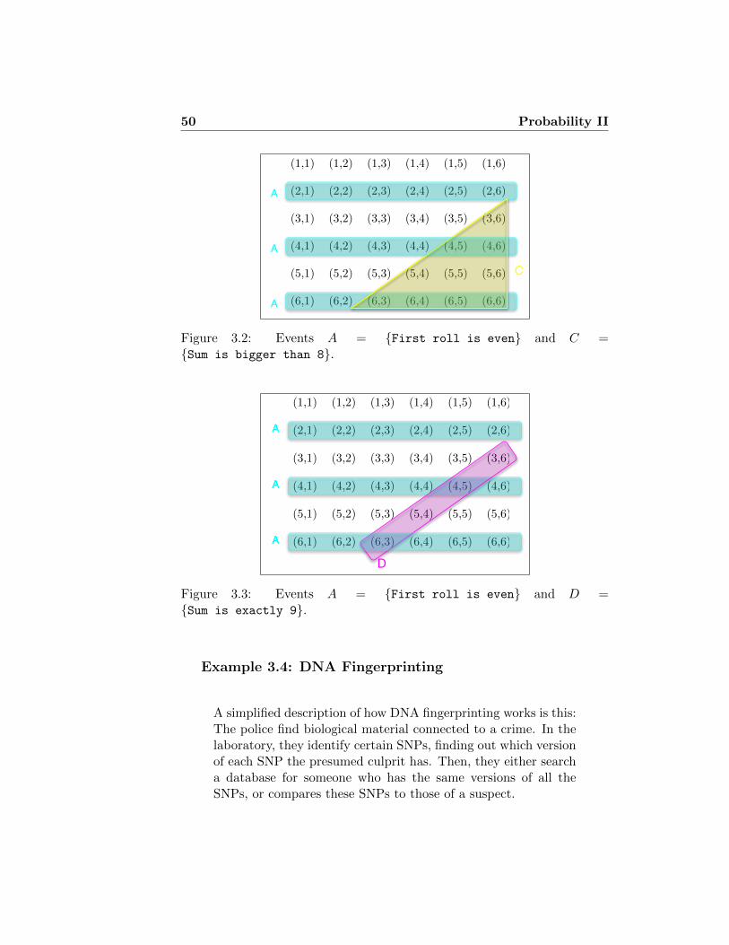
Suppose we roll two dice. Consider the events
A = {First roll is even},C = {Sum of the two rolls roll is bigger than 8},
A ∩ C = {First roll is even and sum is bigger than 8},
Then we see from Figure 3.2 that P (C) = 10/36, and P (A∩C) =6/36 6= 10/36 × 1/2. On the other hand, if we replace C byD = {Sum of the two rolls roll is exactly 9}, then wesee from Figure 3.3 that P (D) = 4/36 = 1/9, and P (A ∩D) =2/36 = 1/9 × 1/2, so the events A and D are independent. Wesee that events may be independent, even if they are not basedon separate experiments.
�
50 Probability II
(1,1) (1,2) (1,3) (1,4) (1,5) (1,6)
(2,1) (2,2) (2,3) (2,4) (2,5) (2,6)
(3,1) (3,2) (3,3) (3,4) (3,5) (3,6)
(4,1) (4,2) (4,3) (4,4) (4,5) (4,6)
(5,1) (5,2) (5,3) (5,4) (5,5) (5,6)
(6,1) (6,2) (6,3) (6,4) (6,5) (6,6)
A
A
A
C
Figure 3.2: Events A = {First roll is even} and C ={Sum is bigger than 8}.
(1,1) (1,2) (1,3) (1,4) (1,5) (1,6)
(2,1) (2,2) (2,3) (2,4) (2,5) (2,6)
(3,1) (3,2) (3,3) (3,4) (3,5) (3,6)
(4,1) (4,2) (4,3) (4,4) (4,5) (4,6)
(5,1) (5,2) (5,3) (5,4) (5,5) (5,6)
(6,1) (6,2) (6,3) (6,4) (6,5) (6,6)
D
Figure 3.3: Events A = {First roll is even} and D ={Sum is exactly 9}.
Example 3.4: DNA Fingerprinting
A simplified description of how DNA fingerprinting works is this:The police find biological material connected to a crime. In thelaboratory, they identify certain SNPs, finding out which versionof each SNP the presumed culprit has. Then, they either searcha database for someone who has the same versions of all theSNPs, or compares these SNPs to those of a suspect.

Probability II 51
Searching a database can be potentially problematic. Imaginethat the laboratory has found 12 SNPs, at which the crime-sceneDNA has rare versions, each of which is found in only 10% of thepopulation. They then search a database and find someone withall the same SNP versions. The expert then comes and testifies,to say that the probability of any single person having the sameSNPs is (1/10)12 = 1/1 trillion. There are only 60 million peoplein the UK, so the probability of there being another person withthe same SNPs is only about 60 million/1 trillion= 0.00006 —less than 1 in ten thousand. So it can’t be mistaken identity.
Except. . . Having particular variants at different SNPs are notindependent events. For one thing, some SNPs in one population(Europeans, for example) may not be SNPs in other population(Asians, for example) where everyone may have the same variant.Thus, the 10% of the population that has each of these differentrare SNP variants could in fact be the same 10%, and they mayhave all of these dozen variants in common because they all comefrom the same place, where everyone has just those variants.
And don’t forget to check whether the suspect has a monozygotictwin! More than 1 person in a thousand has one, and in thatcase, the twins will have all the same rare SNPs, because theirgenomes are identical. �
3.2 Conditional Probability Laws
Suppose,
A = The event that a randomly selected student from the class has a bikeB = The event that a randomly selected student from the class has blue eyes
and P(A) = 0.36, P(B) = 0.45 and P(A∩B) = 0.13
What is the probability that a student has a bike GIVEN that the stu-dent has blue eyes?
in other words
Considering just students who have blue eyes, what is the probability thata randomly selected student has a bike?

52 Probability II
This is a conditional probability.
We write this probability as P(B|A) (pronounced ‘probability of B givenA’)
Think of P(B|A) as ‘how much of A is taken up by B’.
A BA∩B
S
A∩Bc Ac∩B
Ac∩Bc
Then we see that
P(B|A) = P(A ∩ B)
P(A)(Conditional Probability Law)
Example 3.5: SNPs again
We return to the setting of Example 2.5. What is the probabilitythat a SNP is variable in the African population given that it isvariable in the Asian population?

Probability II 53
We have that
P (A) = 0.7
P (B) = 0.8
P (A ∩B) = 0.6.
We want
P (A|B) =P (A ∩B)
P (B)=
0.6
0.8= 0.75
�
We can rearrange the conditional probability law to obtain a generalMultiplication Law.
P(B|A) = P(A ∩ B) ⇒ P(B|A)P(A) = P(A ∩ B)
P(A)
Similarly
P(A|B)P(B) = P(A ∩ B)
⇒ P(A ∩ B) = P(B|A)P(A) = P(A|B)P(B)
Example 3.6: Multiplication Law
If P(B) = 0.2 and P(A|B) = 0.36 what is P(A∩B)?
P(A∩B) = 0.36×0.2 = 0.072 �
3.2.1 Independence of Events
Definition Two events are A and B are said to be independent if P (A∩B) =P (A)P (B).

54 Probability II
Note that in this case (provided P (B) > 0), if A and B are independent
P (A|B) =P (A ∩B)
P (B)=P (A)P (B)
P (B)= P (A),
and similarly P (B|A) = P (B) (provided P (A) > 0).
So for independent events, knowledge that one of the events has occurreddoes not change our assessment of the probability that the other event hasoccur.
Example 3.7: Snails
In a population of a particular species of snail, individuals exhibitdifferent forms. It is known that 45% have a pink backgroundcolouring, while 55% have a yellow background colouring. In ad-dition, 30% of individuals are striped, and 20% of the populationare pink and striped.
1. Is the presence or absence of striping independent of back-ground colour?
2. Given that a snail is pink, what is the probability that itwill have stripes.
Define the events: A, B, that a snail has a pink, respectivelyyellow, background colouring, and S for the event that is hasstripes.
Then we are told P (A) = 0.45, P (B) = 0.55, P (S) = 0.3, andP (A ∩ S) = 0.2.
For part (1), note that
0.2 = P (A ∩ S) 6= 0.135 = P (A)P (S),
so the events A and S are not independent.
For part (2),
P (S|A) =P (S ∩A)
P (A)=
0.2
0.45= 0.44.

Probability II 55
Thus, knowledge that a snail has a pink background colouringincreases the probability that it is striped. (That P (S|A) 6= P (S)also establishes that background colouring and the presence ofstripes, are not independent.) �
3.2.2 The Partition law
The partition law is a very useful rule that allows us to calculate the prob-ability of an event by spitting it up into a number of mutually exclusiveevents. For example, suppose we know that P(A∩B) = 0.52 and P(A∩Bc)= 0.14 what is p(A)?
P(A) is made up of two parts (i) the part of A contained in B (ii) thepart of A contained in Bc.
A B
A∩B
S
So we have the rule
P(A) = P(A∩B) + P(A∩Bc)
and P(A) = P(A∩B) + P(A∩Bc) = 0.52 + 0.14 = 0.66
More generally, events are mutually exclusive if at most one of the eventscan occur in a given experiment. Suppose E1, . . . , En are mutually exclusiveevents, which together form the whole sample space: E1∪E2∪· · ·∪En = S.(In other words, every possible outcome is in exactly one of the E’s. Then
P(A) =∑n
i=1 P(A ∩ Ei) =∑n
i=1 P(A| Ei)P(Ei)

56 Probability II
Example 3.8: Mendelian segregation
At a particular locus in humans, there are two alleles A and B,and it is known that the population frequencies of the genotypesAA, AB, and BB, are 0.49, 0.42, and 0.09, respectively. An AAman has a child with a woman whose genotype is unknown.
What is the probability that the child will have genotype AB?
We assume that as far as her genotype at this locus is concernedthe woman is chosen randomly from the population.
Use the partition rule, where the partition corresponds to thethree possible genotypes for the woman. Then
P (child AB) = P (child AB and mother AA)
+P (child AB and mother AB)
+P (child AB and mother BB)
= P (mother AA)P (child AB|mother AA)
+P (mother AB)P (child AB|mother AB)
+P (mother BB)P (child AB|mother BB)
= 0.49× 0 + 0.42× 0.5 + 0.09× 1
= 0.3.
�
3.3 Bayes’ Rule
One of the most common situations in science is that we have some obser-vations, and we need to figure out what state of the world is likely to haveproduced those observations. For instance, we observe that a certain numberof vaccinated people contract polio, and a certain number of unvaccinatedpeople contract polio, and we need to figure out how effective the vaccineis. The problem is, our theoretical knowledge goes in the wrong direction:If the vaccine is so effective, how many people will contract polio. Bayes’Rule allows us to turn the inference around.

Probability II 57
Example 3.9: Medical testing
In a medical setting we might want to calculate the probabilitythat a person has a disease D given they have a specific symptomS, i.e. we want to calculate P (D|S). This is a hard probabilityto assign as we would need to take a random sample of peoplefrom the population with the symptom.
A probability that is much easier to calculate is P (S|D), i.e.the probability that a person with the disease has the symptom.This probability can be assigned much more easily as medicalrecords for people with serious diseases are kept.
The power of Bayes Rule is its ability to take P (S|D) and cal-culate P (D|S).
We have already seen a version of Bayes’ Rule
P(B|A) = P(A ∩ B)
P(A)
Using the Multiplication Law we can rewrite this as
P(B|A) = P(A|B)P(B)
P(A)(Bayes Rule)
Suppose P (S|D) = 0.12, P (D) = 0.01 and P (S) = 0.03. Then
P (D|S) =0.12× 0.01
0.03= 0.04
�
Example 3.10: Genetic testing
A gene has two possible types A1 and A2. 75% of the populationhave A1. B is a disease that has 3 forms B1 (mild), B2 (severe)

58 Probability II
and B3 (lethal). A1 is a protective gene, with the probabilitiesof having the three forms given A1 as 0.9, 0.1 and 0 respectively.People with A2 are unprotected and have the three forms withprobabilities 0, 0.5 and 0.5 respectively.
What is the probability that a person has gene A1 given theyhave the severe disease?
The first thing to do with such a question is ‘decode’ the in-formation, i.e. write it down in a compact form we can workwith.
P(A1) = 0.75 P(A2) = 0.25
P(B1|A1) = 0.9 P(B2|A1) = 0.1 P(B3|A1) = 0
P(B1|A2) = 0 P(B2|A2) = 0.5 P(B3|A2) = 0.5
We want P(A1|B2)?
From Bayes Rule we know that
P(A1|B2) = P(B2|A1)P(A1)
P(B2)
We know P(B2|A1) and P(A1) but what is P(B2)?
We can use the Partition Law since A1 and A2 are mutuallyexclusive.
P(B2) = P(B2 ∩A1) + P(B2 ∩A2) (Partition Law)
= P(B2|A1)P(A1) + P(B2|A2)P(A2) (Multiplication Law)
= 0.1× 0.75 + 0.5× 0.25
= 0.2
We can use Bayes Rule to calculate P(A1|B2).
P(A1|B2) =0.1× 0.75
0.2= 0.375
�

Probability II 59
3.4 Probability Laws
P(Ac) = 1 - P(A) (Complement Law)
P(A∪B) = P(A) + P(B) - P(A∩B) (Addition Law)
P(B|A) = P(A ∩ B)
P(A)(Conditional Probability Law)
P(A ∩ B) = P(B|A)P(A) = P(A|B)P(B) (Multiplication Law)
If E1, . . . , En are a set of mutually exclusive events then
P(A) =∑n
i=1 P(A ∩ Ei) =∑n
i=1 P(A| Ei)P(Ei) (Partition Law)
P(B|A) = P(A|B)P(B)
P(A)(Bayes Rule)
3.5 Permutations and Combinations (Probabilitiesof patterns)
In some situations we observe a specific pattern from a large number ofpossible patterns. To calculate the probability of the pattern we need tocount the total number of patterns. This is why we need to learn aboutpermutations and combinations.
3.5.1 Permutations of n objects
Consider 2 objects A B
Q. How many ways can they be arranged? i.e. how many permutationsare there?

60 Probability II
A. 2 ways AB BA
Consider 3 objects A B C
Q. How many ways can they be arranged (permuted)?
A. 6 ways ABC ACB BCA BAC CAB CBA
Consider 4 objects A B C D
Q. How many ways can they be arranged (permuted)?
A. 24 ways
ABCD ABDC ACBD ACDB ADBC ADCBBACD BADC BCAD BCDA BDAC BDCACBAD CBDA CABD CADB CDBA CDABDBCA DBAC DCBA DCAB DABC DACB
There is a pattern emerging here.
No. of objects 2 3 4 5 6 . . .
No. of permutations 2 6 24 120 720 . . .
Can we find a formula for the number of permutations of n objects?
A good way to think about permutations is to think of putting objectsinto boxes.
Suppose we have 5 objects. How many different ways can we place theminto 5 boxes?
There are 5 choices of object for the first box.
5
There are now only 4 objects to choose from for the second box.
5 4
There are 3 choices for the 3rd box, 2 for the 4th and 1 for the 5th box.

Probability II 61
5 4 3 2 1
Thus, the number of permutations of 5 objects is 5× 4× 3× 2× 1.
In general, the number of permutations of n objects is
n(n− 1)(n− 2) . . . (3)(2)(1)
We write this as n! (pronounced ‘n factorial’). There should be a button onyour calculator that calculates factorials.
3.5.2 Permutations of r objects from n
Now suppose we have 4 objects and only 2 boxes. How many permutationsof 2 objects when we have 4 to choose from?
There are 4 choices for the first box and 3 choices for the second box
4 3
So there are 12 permutations of 2 objects from 4. We write this as
4P2 = 12
We say there are nPr permutations of r objects chosen from n.
The formula for nPr is given by
nPr =n!
(n− r)!
To see why this works consider the example above 4P2.
Using the formula we get
4P1 =4!
2!=
4× 3× 2× 1
2× 1= 4× 3
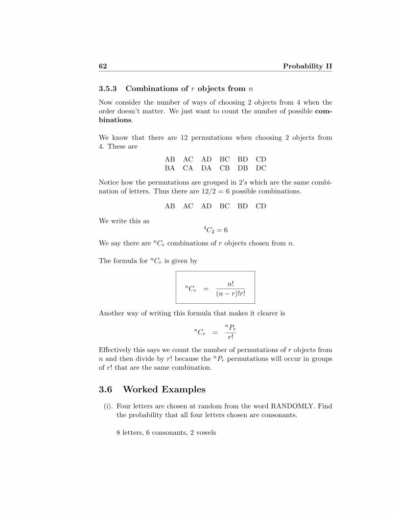
62 Probability II
3.5.3 Combinations of r objects from n
Now consider the number of ways of choosing 2 objects from 4 when theorder doesn’t matter. We just want to count the number of possible com-binations.
We know that there are 12 permutations when choosing 2 objects from4. These are
AB AC AD BC BD CDBA CA DA CB DB DC
Notice how the permutations are grouped in 2’s which are the same combi-nation of letters. Thus there are 12/2 = 6 possible combinations.
AB AC AD BC BD CD
We write this as4C2 = 6
We say there are nCr combinations of r objects chosen from n.
The formula for nCr is given by
nCr =n!
(n− r)!r!
Another way of writing this formula that makes it clearer is
nCr =nPrr!
Effectively this says we count the number of permutations of r objects fromn and then divide by r! because the nPr permutations will occur in groupsof r! that are the same combination.
3.6 Worked Examples
(i). Four letters are chosen at random from the word RANDOMLY. Findthe probability that all four letters chosen are consonants.
8 letters, 6 consonants, 2 vowels

Probability II 63
P(all four are consonants) = # of ways of choosing 4 consonants# of ways of choosing 4 letters
# of ways of choosing 4 consonants = 6C4 = 6!4!2! = 15
# of ways of choosing 4 letters = 8C4 = 8!4!4! = 70
⇒ P(all four are consonants) = 1570 = 3
14
(ii). A bag contains 8 white counters and 3 black counters. Two countersare drawn, one after the other. Find the probability of drawing onewhite and one black counter, in any order
(a) if the first counter is replaced
(b) if the first counter is not replaced
What is the probability that the second counter is black (assume thatthe first counter is replaced after it is taken)?
A useful way of tackling many probability problems is to draw a ‘proba-bility tree’. The branches of the tree represent different possible events.Each branch is labelled with the probability of choosing it given whathas occurred before. The probability of a given route through the treecan then be calculated by multiplying all the probabilities along thatroute (using the Multiplication Rule)
(a) With replacementLetW1 be the event ‘a white counter is drawn first’,W2 be the event ‘a white counter is drawn second’,B1 be the event ‘a black counter is drawn first’,B2 be the event ‘a black counter is drawn second’,
P (one white and one black counter) = P (W1 ∩B2) + P (B1 ∩W2)
=24
121+
24
121
=48
121
(b) Without replacement

64 Probability II
W1
B1
W2
B2
W2
B2
8/11
3/11
3/11
3/11
8/11
8/11
P(W1∩W2)=(8/11)(8/11)=64/121
P(W1∩B2)=(8/11)(3/11)=24/121P(B1∩W2)
=(3/11)(8/11)=24/121
P(B1∩B2)=(3/11)(3/11)
=9/121
P (one white and one black counter) = P (W1 ∩B2) + P (B1 ∩W2)
=24
110+
24
110
=48
110
W1
B1
W2
B2
W2
B2
8/11
3/11
2/10
3/10
7/10
8/10
P(W1∩W2)=(8/11)(7/10)=56/110
P(W1∩B2)=(8/11)(3/10)=24/110P(B1∩W2)
=(3/11)(8/10)=24/110
P(B1∩B2)=(3/11)(2/10)
=6/110

Probability II 65
P (second counter is black) = P (W1 ∩B2) + P (B1 ∩B2)
=24
121+
9
121
=33
121
(iii). From 2001 TT Prelim Q1 Two drugs that relieve pain are availableto treat patients. Drug A has been found to be effective in three-quarters of all patients; when it is effective, the patients have relieffrom pain one hour after taking this drug. Drug B acts quicker but onlyworks with one half of all patients: those who benefit from this drughave relief of pain after 30 mins. The physician cannot decide whichpatients should be prescribed which drug so he prescribes randomly.Assuming that there is no variation between patients in the timestaken to act for either drug, calculate the probability that:
(a) a patient is prescribed drug B and is relieved of pain;
(b) a patient is relieved of pain after one hour;
(c) a patient who was relieved of pain after one hour took drug A;
(d) two patients receiving different drugs are both relieved of painafter one hour.
(e) out of six patients treated with the same drug, three are relievedof pain after one hour and three are not.
LetR30 = The event that a patient is relieved of pain within 30 minsR60 = The event that a patient is relieved of pain within 60 minsA = Event that a patient takes drug AB = Event that a patient takes drug B
P (R60|A) = 0.75 P (R30|B) = 0.5 P (A) = P (B) = 0.5
(a) P (R30|B)P (B) = 0.25
(b) P (R60) = P (R60|A)P (A) + P (R60|B)P (B) since R30 ⇒ R60P (R60) = 0.75× 0.5 + 0.5× 0.5 = 0.625
(c) P (A|R60) = P (A∩R60)P (R60)

66 Probability II
P (A ∩R60) = P (R60|A)P (A) = 0.75× 0.5 = 0.375
⇒ P (A|R60) = 0.3750.625 = 0.6
(d) P (R60|A)P (R60|B) = 0.75× 0.5 = 0.375Assuming the events are independent.
(e) n = 6 X = no. of patients relieved of pain after 1hr
For A, p = P (R60|A) = 0.75
P (X = 3|A) = 6C3(0.75)3(0.25)3 = 0.1312
For B, p = P (R60|B) = 0.5
P (X = 3|B) = 6C3(0.5)3(0.5)3 = 0.3125
⇒ P (X = 3) = P (X = 3|A)P (A) + (X = 3|B)P (B)= 0.1312× 0.5 + 0.3125× 0.5 = 0.2222
4. In the National Lottery you need to choose 6 balls from 49.
What is the probability that I choose all 6 balls correctly?
There are 2 ways of answering this question(i) using permutations and combinations(ii) using a tree diagram

Probability II 67
Method 1 - using permutations and combinations
P (6 correct) =No. of ways of choosing the 6 correct balls
No. of ways of choosing 6 balls
=6P6
49P6
=6!0!49!43!
=6× 5× 4× 3× 2× 1
49× 48× 47× 46× 45× 44= 0.0000000715112 (1 in 14 million)
Method 2 - using a tree diagram
Consider the first ball I choose, the probability it is correct is
6
49
The second ball I choose is correct with probability
5
48
The third ball I choose is correct with probability
4
47
and so on.
Thus the probability that I get all 6 balls correct is
6
49
5
48
4
47
3
46
2
45
1
44= 0.0000000715112 (1 in 14 million)

68 Probability II

Lecture 4
The Binomial Distribution
4.1 Introduction
In Lecture 2 we saw that we need to study probability so that we cancalculate the ‘chance’ that our sample leads us to the wrong conclusionabout the population. To do this in practice we need to ‘model’ the processof taking the sample from the population. By ‘model’ we mean describe theprocess of taking the sample in terms of the probability of obtaining eachpossible sample. Since there are many different types of data and manydifferent ways we might collect a sample of data we need lots of differentprobability models. The Binomial distribution is one such model that turnsout to be very useful in many experimental settings.
4.2 An example of the Binomial distribution
Suppose we have a box with a very large number1 of balls in it: 23 of the
balls are black and the rest are red. We draw 5 balls from the box. Howmany black balls do we get? We can write
X = No. of black balls in 5 draws.
X can take on any of the values 0, 1, 2, 3, 4 and 5.
X is a discrete random variable
1We say “a very large number” when we want to ignore the change in probability thatcomes from drawing without replacement. Alternatively, we could have a small numberof balls — 2 black and 1 red, for instance — but replace the ball (and mix well!) aftereach draw.
69

70 The Binomial Distribution
Some values of X will be more likely to occur than others. Each valueof X will have a probability of occurring. What are these probabilities?Consider the probability of obtaining just one black ball, i.e. X = 1.
One possible way of obtaining one black ball is if we observe the patternBRRRR. The probability of obtaining this pattern is
P(BRRRR) = 23 ×
13 ×
13 ×
13 ×
13
There are 32 possible patterns of black and red balls we might observe. 5 ofthe patterns contain just one black ball
BBBBB RBBBB BRBBB BBRBB BBBRB BBBBR RRBBB RBRBBRBBRB RBBBR BRRBB BRBRB BRBBR BBRRB BBRBR BBBRRRRRBB RRBRB RRBBR RBRRB RBRBR RBBRR BRRRB BRRBR
BRBRR BBRRR BRRRR RBRRR RRBRR RRRBR RRRRB RRRRR
The other 5 possible combinations all have the same probability so the prob-ability of obtaining one head in 5 coin tosses is
P(X = 1) = 5×(
23 × (1
3)4)
= 0.0412 (to 4 decimal places)
What about P(X = 2)? This probability can be written as
P (X = 2) = No. of patterns × Probability of pattern
= 5C2 ×(2
3
)2×(1
3
)3
= 10 × 4
243= 0.165
It’s now just a small step to write down a formula for this situation specificsituation in which we toss a coin 5 times
P (X = x) = 5Cx ×(2
3
)x×(1
3
)(5−x)
We can use this formula to tabulate the probabilities of each possible valueof X.
These probabilities are plotted in Figure 4.1 against the values of X. Thisshows the distribution of probabilities across the possible values of X. This

The Binomial Distribution 71
P(X = 0) = 5C0 ×(
23
)0×(
13
)5= 0.0041
P(X = 1) = 5C1 ×(
23
)1×(
13
)4= 0.0412
P(X = 2) = 5C2 ×(
23
)2×(
13
)3= 0.1646
P(X = 3) = 5C3 ×(
23
)3×(
13
)2= 0.3292
P(X = 4) = 5C4 ×(
23
)4×(
13
)1= 0.3292
P(X = 5) = 5C5 ×(
23
)5×(
13
)0= 0.1317
0 1 2 3 4 5
0.0
0.1
0.2
0.3
0.4
0.5
X
P(X)
Figure 4.1: A plot of the Binomial(5, 2/3) probabilities.
situation is a specific example of a Binomial distribution.
Note It is important to make a distinction between the probability dis-tribution shown in Figure 4.1 and the histograms of specific datasets seenin Lecture 1. A probability distribution represents the distribution of val-ues we ‘expect’ to see in a sample. A histogram is used to represent thedistribution of values that actually occur in a given sample.

72 The Binomial Distribution
4.3 The Binomial distribution
The key components of a Binomial distribution
In general a Binomial distribution arises when we have the following 4 con-ditions
- n identical trials, e.g. 5 coin tosses
- 2 possible outcomes for each trial “success” and “failure”, e.g. Headsor Tails
- Trials are independent, e.g. each coin toss doesn’t affect the others
- P(“success”) = p is the same for each trial, e.g. P(Black) = 2/3 is thesame for each trial
Binomial distribution probabilities
If we have the above 4 conditions then if we let
X = No. of “successes”
then the probability of observing x successes out of n trials is given by
P(X = x) = nCxpx(1− p)(n−x) x = 0, 1, . . . , n
If the probabilities of X are distributed in this way, we write
X∼Bin(n, p)
n and p are called the parameters of the distribution. We say X follows abinomial distribution with parameters n and p.
Examples
With this general formula we can calculate many different probabilities.
(i). Suppose X ∼ Bin(10, 0.4), what is P(X = 7)?
P(X = 7) = 10C7(0.4)7(1− 0.4)(10−7)
= (120)(0.4)7(0.6)3
= 0.0425

The Binomial Distribution 73
(ii). Suppose Y ∼ Bin(8, 0.15), what is P(Y < 3)?
P(Y < 3) = P(Y = 0) + P(Y = 1) + P(Y = 2)
= 8C0(0.15)0(0.85)8 + 8C1(0.15)1(0.85)7 + 8C2(0.15)2(0.85)6
= 0.2725 + 0.3847 + 0.2376
= 0.8948
(iii). Suppose W ∼ Bin(50, 0.12), what is P(W > 2)?
P(W > 2) = P(W = 3) + P(W = 4) + . . .+ P(W = 50)
= 1− P(W ≤ 2)
= 1−(
P(W = 0) + P(W = 1) + P(W = 2))
= 1−(
50C0(0.12)0(0.88)50 + 50C1(0.12)1(0.88)49 + 50C2(0.12)2(0.88)48)
= 1−(
0.00168 + 0.01142 + 0.03817)
= 0.94874
4.4 The mean and variance of the Binomial distri-bution
Different values of n and p lead to different distributions with differentshapes (see Figure 4.2). In Lecture 1 we saw that the mean and standarddeviation can be used to summarize the shape of a dataset. In the case of aprobability distribution we have no data as such so we must use the prob-abilities to calculate the expected mean and standard deviation. In otherwords, the mean and standard deviation of a random variable is the meanand standard deviation that a collection of data would have if the numbersappeared in exactly the proportions given by the distribution. The meanof a distribution is also called the expectation or expected value of thedistribution.
Consider the example of the Binomial distribution we saw above
x 0 1 2 3 4 5
P(X = x) 0.004 0.041 0.165 0.329 0.329 0.132
The expected mean value of the distribution, denoted µ can be calculatedas
µ = 0× (0.004) + 1× (0.041) + 2× (0.165) + 3× (0.329) + 4× (0.329) + 5× (0.132)
= 3.333

74 The Binomial Distribution
0 2 4 6 8 10
0.0
0.1
0.2
0.3
0.4
0.5
n=10 p=0.5
X
P(X)
0 2 4 6 8 10
0.0
0.1
0.2
0.3
0.4
0.5
n=10 p=0.1
X
P(X)
0 2 4 6 8 10
0.0
0.1
0.2
0.3
0.4
0.5
n=10 p=0.7
X
P(X)
Figure 4.2: 3 different Binomial distributions.
In general, there is a formula for the mean of a Binomial distribution. Thereis also a formula for the standard deviation, σ.
If X ∼ Bin(n, p) then
µ = np
σ =√npq where q = 1− p
In the example above, X ∼ Bin(5, 2/3) and so the mean and standarddeviation are given by
µ = np = 5× (2/3) = 3.333
and
σ =√npq = 5× (2/3)× (1/3) = 1.111
Shapes of Binomial distributions
The skewness of a Binomial distribution will also depend upon the values ofn and p (see Figure 4.2). In general,
• if p < 0.5 the distribution will exhibit POSITIVE SKEW

The Binomial Distribution 75
• if p = 0.5 the distribution will be SYMMETRIC
• if p > 0.5 the distribution will exhibit NEGATIVE SKEW
However, for a given value of p, the skewness goes down as n increases. Allbinomial distributions eventually become approximately symmetric for largen. This will be discussed further in Lecture 6.
4.5 Testing a hypothesis using the Binomial dis-tribution
Consider the following simple situation: You have a six-sided die, and youhave the impression that it’s somehow been weighted so that the number 1comes up more frequently than it should. How would you decide whetherthis impression is correct? You could do a careful experiment, where youroll the die 60 times, and count how often the 1 comes up.
Suppose you do the experiment, and the 1 comes up 30 times (and othernumbers come up 30 times all together). You might expect the 1 to comeup one time in six, so 10 times, so 30 times seems high. But is it too high?There are two possible hypotheses:
(i). The die is biased.
(ii). Just by chance we got more 1’s than expected.
How do we decide between these hypotheses? Of course, we can never provethat any sequence of throws couldn’t have come from a fair die. But we canfind that the results we got are extremely unlikely to have arisen from a fairdie, so that we should seriously consider whether the alternative might betrue.
Since the probability of a 1 on each throw is 1/6, so we apply the formulafor the binomial distribution with n = 60 and p = 1/6. Then we have
Now we summarise the general approach:
• posit a hypothesis
• design and carry out an experiment to collect a sample of data
• test to see if the sample is consistent with the hypothesis
Hypothesis The die is fair. All 6 outcomes have the same probability.

76 The Binomial Distribution
Experiment We roll the die.
Sample We obtain 60 outcomes of a die roll.
Testing the hypothesis Assuming our hypothesis is true what is the prob-ability that we would have observed such a sample or a sample more extreme,i.e. is our sample quite unlikely to have occurred under the assumptions ofour hypothesis?
Assuming our hypothesis is true the experiment we carried out satisfiesthe conditions of the Binomial distribution
• n identical trials, i.e. 60 die rolls.
• 2 possible outcomes for each trial: “1” and “not 1”.
- Trials are independent.
- P(“success”) = p is the same for each trial, i.e. P(1 comes up) = 1/6is the same for each trial
We define X = No. of 1’s that come up
We observed X = 30. Which samples are more extreme than this?
Under our hypothesis we would expect X = 10
X ≥ 30 are the samples as or more extreme than X = 30.
We can calculate each of these probabilities using the Binomial proba-bility formula
P (# 1’s is exactly 30) =60 C30 −(
1
6
)18(5
6
)60−30
= 2.25× 10⁻⁹.
P (# 1’s is at least 30) =60∑
x=30
60Cx −(
1
6
)x(5
6
)60−x= 2.78× 10⁻⁹.
Which is the appropriate probability? The “strange event” from the per-spective of the fair die was not that 1 came up exactly 30 times, but that itcame up so many times. So the relevant number is the second one, whichis a little bigger. Still, the probability is less than 3 in a billion. In other

The Binomial Distribution 77
words, if you were to perform one of these experiments once a second, con-tinuously, you might expect to see a result this extreme once in 10 years. Soyou either have to believe that you just happened to get that one in 10 yearsoutcome the one time you tried it, or you have to believe that there reallyis something biased about the die. In the language of hypothesis testing wesay we would ‘reject the hypothesis’.
Example 4.1: Analysing the Anturane Reinfarction Trial
From Table 2.1, we know that there were 163 patients who died,out of a total of 1629. Now, suppose the study works as follows:Patients come in the door, we flip a coin, and allocate them tothe treatment group if heads comes up, or to the control groupif tails comes up. (This isn’t exactly how it was done, but closeenough. Next term, we’ll talk about other ways of getting thesame results.)
We had a total of 813 heads out of 1629, which is pretty closeto half, which seems reasonable. On the other hand, if we lookat the 163 coin flips for the patients who died, we only had 74heads, which seems pretty far from half (which would be 81.5).It seems there are two plausible hypotheses:
(i). Anturane works. In that case, it’s perfectly reasonable toexpect that fewer patients who died got the anturane treat-ment.
(ii). Purely by chance we had fewer heads than expected.
One way of thinking about this formally is to use Bayes’ rule:
P (coin heads |patient died) = P (coin heads)P (patient died | coin heads)
P (patient died)
=1
2× P (patient died | anturane treatment)
P (patient died).
If the conditional probability of dying is lowered by anturane,then retrospectively the coin flips for the patients who died haveless than probability 1/2 of coming up heads; but if anturane hasno effect, then these are fair coin flips, and should have come out50% heads.

78 The Binomial Distribution
So how do we figure out which possibility is true? Of course,we can never conclusively rule out the possibility of hypothesis2. Any number of heads is possible. But we can say thatsome numbers are extremely unlikely, indicating that it wouldbe advisable to accept hypothesis 1 — anturane works — ratherthan believe that we had gotten such an exceptional result fromthe coin flips.
So. . . 74 heads in 163 flips is not the most likely outcome. Buthow unlikely is it? Let’s consider three different probabilities:
P (# heads is exactly 74)
P (# heads is at most 74)
P (# heads is at most 74 or at least 89).
Which is the probability we want? It’s pretty clearly not the firstone. After all, any particular number of heads is pretty unlikely(and getting exactly 50% heads is impossible, since the numberof tosses was odd). And if we had gotten 73 heads, that wouldhave been considered even better evidence for hypothesis 1.
Choosing between the other two probabilities isn’t so clear, though.After all, if we want to answer the question “How likely would itbe to get such a strange outcome purely by chance?” we proba-bly should consider all outcomes that would have seemed equally“strange”, and 89 is as far away from the “expected” number ofheads as 74. There isn’t a definitive answer to choosing betweenthese “one-tailed” and “two-tailed” tests, but we will have moreto say about this later in the course.
Now we compute the probabilities:
P (# heads is exactly 74) = 163C74
(1
2
)74(1
2
)163−74
= 0.0314,
P (# heads is at most 74) =
74∑i=0
163Ci
(1
2
)i(1
2
)163−i
= 163C0
(1
2
)0(1
2
)163−0
+ 163C1
(1
2
)1(1
2
)163−1
+ · · ·+ 163C74
(1
2
)74(1
2
)163−74
= 0.136,

The Binomial Distribution 79
P (# heads at most 74 or at least 89) =
74∑i=0
163Ci
(1
2
)i(1
2
)163−i
+163∑i=89
163Ci
(1
2
)i(1
2
)163−i
= 0.272.
Note that the “two-tailed” probability is exactly twice the “one-tailed”. We show these probabilities on the probability his-togram of Figure 4.3.
0.00
0.01
0.02
0.03
0.04
0.05
0.06
Number of Heads
Probability
60 61 62 63 64 65 66 67 68 69 70 71 72 73 74 75 76 77 78 79 80 81 82 83 84 85 86 87 88 89 90 91 92 93 94 95 96 97 98 99
mean=81.5
lower tailX≤74
prob.=0.136
upper tailX≥89
prob.=0.136
We observe 74
Figure 4.3: The tail probabilities for testing the hypothesis that anturanehas no effect.
What is the conclusion? Even 0.136 doesn’t seem like such asmall probability. This says that we would expect, even if antu-rane does nothing at all, that we would see such a strong appar-ent effect about one time out of seven. Our conclusion is thatthis experiment does not provide significant evidence that antu-rane is effective. In the language of hypotheses testing we saythat we do not reject the hypothesis that anturane is ineffective.�

80 The Binomial Distribution

Lecture 5
The Poisson Distribution
5.1 Introduction
Example 5.1: Drownings in Malta
The book [Mou98] cites data from the St. Luke’s Hospital Gazette,on the monthly number of drownings on Malta, over a period ofnearly 30 years (355 consecutive months). Most months therewere no drownings. Some months there was one person whodrowned. One month had four people drown. The data aregiven as counts of the number of months in which a given num-ber of drownings occurred, and we repeat them here as Table5.1.
Looking at the data in Table 5.1, we might suppose that one ofthe following hypotheses is true:
• Some months are particularly dangerous;
• Or, on the contrary, when one person has drowned, the sur-rounding publicity makes others more cautious for a while,preventing drownings?
• Or, drownings are simply independent events?
How can we use the data to decide which of these hypothesesis true? We might reasonably suppose that the first hypothesiswould predict that there would be more months with high num-bers of drownings than the independence hypothesis; the second
81

82 The Poisson Distribution
Table 5.1: Monthly counts of drownings in Malta.
No. of drowning Frequency (No.deaths per month months observed)
0 2241 1022 233 54 1
5+ 0
hypothesis would predict fewer months with high numbers ofdrownings. The problem is, we don’t know how many we shouldexpect, if independence is correct.
What we need is a model: A sensible probability distribution,giving the probability of a month having a certain number ofdrownings, under the independence assumption. The standardmodel for this sort of situation is called the Poisson distribu-tion. �
The Poisson distribution is used in situations when we observe the countsof events within a set unit of time, area, volume, length etc. For example,
• The number of cases of a disease in different towns;
• The number of mutations in given regions of a chromosome;
• The number of dolphin pod sightings along a flight path through aregion;
• The number of particles emitted by a radioactive source in a giventime;
• The number of births per hour during a given day.
In such situations we are often interested in whether the events occur ran-domly in time or space. Consider the Babyboom dataset (Table 1.2), thatwe saw in Lecture 1. The birth times of the babies throughout the day areshown in Figure 5.1(a). If we divide up the day into 24 hour intervals and

The Poisson Distribution 83
count the number of births in each hour we can plot the counts as a his-togram in Figure 5.1(b). How does this compare to the histogram of countsfor a process that isn’t random? Suppose the 44 birth times were distributedin time as shown in Figure 5.1(c). The histogram of these birth times perhour is shown in Figure 5.1(d). We see that the non-random clustering ofevents in time causes there to be more hours with zero births and morehours with large numbers of births than the real birth times histogram.
This example illustrates that the distribution of counts is useful in un-covering whether the events might occur randomly or non-randomly in time(or space). Simply looking at the histogram isn’t sufficient if we want toask the question whether the events occur randomly or not. To answerthis question we need a probability model for the distribution of counts ofrandom events that dictates the type of distributions we should expect tosee.
5.2 The Poisson Distribution
The Poisson distribution is a discrete probability distribution for the countsof events that occur randomly in a given interval of time (or space).
If we let X = The number of events in a given interval,
Then, if the mean number of events per interval is λ
The probability of observing x events in a given interval is given by
P(X = x) = e−λλx
x!x = 0, 1, 2, 3, 4, . . .
Note e is a mathematical constant. e ≈ 2.718282. There should be a buttonon your calculator ex that calculates powers of e.
If the probabilities of X are distributed in this way, we write
X∼Po(λ)
λ is the parameter of the distribution. We say X follows a Poisson distri-bution with parameter λ

84 The Poisson Distribution
Birth Time (minutes since midnight)
0 200 400 600 800 1000 1200 1440
(a) Babyboom data birth times
No. of births per hour
Freq
uenc
y
0 2 4 6
05
1015
(b) Histogram of Babyboom birth times
Birth Time (minutes since midnight)0 200 400 600 800 1000 1200 1440
(c) Nonrandom birth times
No. of births per hour
Freq
uenc
y
0 2 4 6
05
1015
(d) Histogram of nonrandom birth times
Figure 5.1: Representing the babyboom data set (upper two) and a nonran-dom hypothetical collection of birth times (lower two).
Note A Poisson random variable can take on any positive integer value.In contrast, the Binomial distribution always has a finite upper limit.

The Poisson Distribution 85
Example 5.2: Hospital births
Births in a hospital occur randomly at an average rate of 1.8births per hour.
What is the probability of observing 4 births in a given hourat the hospital?
Let X = No. of births in a given hour
(i) Events occur randomly(ii) Mean rate λ = 1.8
⇒ X ∼ Po(1.8)
We can now use the formula to calculate the probability of ob-serving exactly 4 births in a given hour
P (X = 4) = e−1.8 1.84
4! = 0.0723
What about the probability of observing more than or equalto 2 births in a given hour at the hospital?
We want P (X ≥ 2) = P (X = 2) + P (X = 3) + . . .
i.e. an infinite number of probabilities to calculate
but
P (X ≥ 2) = P (X = 2) + P (X = 3) + . . .
= 1− P (X < 2)
= 1− (P (X = 0) + P (X = 1))
= 1− (e−1.8 1.80
0!+ e−1.8 1.81
1!)
= 1− (0.16529 + 0.29753)
= 0.537
�
Example 5.3: Disease incidence

86 The Poisson Distribution
Suppose there is a disease, whose average incidence is 2 per mil-lion people. What is the probability that a city of 1 millionpeople has at least twice the average incidence?
Twice the average incidence would be 4 cases. We can reasonablysuppose the random variable X=# cases in 1 million people hasPoisson distribution with parameter 2. Then
P (X ≥ 4) = 1−P (X ≤ 3) = 1−(e−2 20
0!+ e−2 21
1!+ e−2 22
2!+ e−3 23
3!
)= 0.143.
�
5.3 The shape of the Poisson distribution
Using the formula we can calculate the probabilities for a specific Poissondistribution and plot the probabilities to observe the shape of the distribu-tion. For example, Figure 5.2 shows 3 different Poisson distributions. Weobserve that the distributions
(i). are unimodal;
(ii). exhibit positive skew (that decreases as λ increases);
(iii). are centred roughly on λ;
(iv). have variance (spread) that increases as λ increases.
5.4 Mean and Variance of the Poisson distribution
In general, there is a formula for the mean of a Poisson distribution. Thereis also a formula for the standard deviation, σ, and variance, σ2.
If X ∼ Po(λ) then
µ = λ
σ =√λ
σ2 = λ

The Poisson Distribution 87
0 5 10 15 20
0.00
0.05
0.10
0.15
0.20
0.25
Po(3)
X
P(X)
0 5 10 15 20
0.00
0.05
0.10
0.15
0.20
0.25
Po(5)
X
P(X)
0 5 10 15 20
0.00
0.05
0.10
0.15
0.20
0.25
Po(10)
X
P(X)
Figure 5.2: Three different Poisson distributions.
5.5 Changing the size of the interval
Suppose we know that births in a hospital occur randomly at an averagerate of 1.8 births per hour.
What is the probability that we observe 5 births in a given 2 hour interval?
Well, if births occur randomly at a rate of 1.8 births per 1 hour intervalThen births occur randomly at a rate of 3.6 births per 2 hour interval
Let Y = No. of births in a 2 hour period
Then Y ∼ Po(3.6)
P (Y = 5) = e−3.6 3.65
5! = 0.13768
This example illustrates the following rule
If X ∼ Po(λ) on 1 unit interval,then Y ∼ Po(kλ) on k unit intervals.

88 The Poisson Distribution
5.6 Sum of two Poisson variables
Now suppose we know that in hospital A births occur randomly at an aver-age rate of 2.3 births per hour and in hospital B births occur randomly atan average rate of 3.1 births per hour.
What is the probability that we observe 7 births in total from the twohospitals in a given 1 hour period?
To answer this question we can use the following rule
If X ∼ Po(λ1) on 1 unit interval,and Y ∼ Po(λ2) on 1 unit interval,then X + Y ∼ Po(λ1 + λ2) on 1 unit interval.
So if we let X = No. of births in a given hour at hospital Aand Y = No. of births in a given hour at hospital B
Then X ∼ Po(2.3), Y ∼ Po(3.1) and X + Y ∼ Po(5.4)
⇒ P (X + Y = 7) = e−5.4 5.47
7! = 0.11999
Example 5.4: Disease Incidence, continued
Suppose disease A occurs with incidence 1.7 per million, anddisease B occurs with incidence 2.9 per million. Statistics arecompiled, in which these diseases are not distinguished, but sim-ply are all called cases of disease “AB”. What is the probabilitythat a city of 1 million people has at least 6 cases of AB?
If Z=# cases of AB, then P ∼ Po(4.6). Thus,
P (Z ≥ 6) = 1− P (Z ≤ 5)
= 1− e−4.6(4.60
0!+
4.61
1!+
4.62
2!+
4.63
3!+
4.64
4!+
4.65
5!
)= 0.314.
�

The Poisson Distribution 89
5.7 Fitting a Poisson distribution
Consider the two sequences of birth times we saw in Section 1. Both of theseexamples consisted of a total of 44 births in 24 hour intervals.
Therefore the mean birth rate for both sequences is 4424 = 1.8333
What would be the expected counts if birth times were really random i.e.what is the expected histogram for a Poisson random variable with meanrate λ = 1.8333.
Using the Poisson formula we can calculate the probabilities of obtainingeach possible value1
x 0 1 2 3 4 5 ≥ 6
P (X = x) 0.15989 0.29312 0.26869 0.16419 0.07525 0.02759 0.01127
Then if we observe 24 hour intervals we can calculate the expected fre-quencies as 24× P (X = x) for each value of x.
x 0 1 2 3 4 5 ≥ 6
Expected frequency 3.837 7.035 6.448 3.941 1.806 0.662 0.27124× P (X = x)
We say we have fitted a Poisson distribution to the data.
This consisted of 3 steps
(i). Estimating the parameters of the distribution from the data
(ii). Calculating the probability distribution
(iii). Multiplying the probability distribution by the number of observations
Once we have fitted a distribution to the data we can compare the expectedfrequencies to those we actually observed from the real Babyboom dataset.We see that the agreement is quite good.
x 0 1 2 3 4 5 ≥ 6
Expected 3.837 7.035 6.448 3.941 1.806 0.662 0.271
Observed 3 8 6 4 3 0 0
1in practice we group values with low probability into one category.
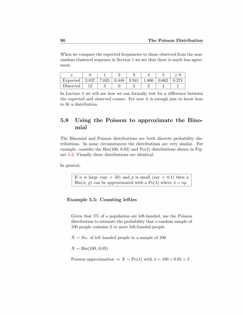
90 The Poisson Distribution
When we compare the expected frequencies to those observed from the non-random clustered sequence in Section 1 we see that there is much less agree-ment.
x 0 1 2 3 4 5 ≥ 6
Expected 3.837 7.035 6.448 3.941 1.806 0.662 0.271
Observed 12 3 0 2 2 4 1
In Lecture 9 we will see how we can formally test for a difference betweenthe expected and observed counts. For now it is enough just to know howto fit a distribution.
5.8 Using the Poisson to approximate the Bino-mial
The Binomial and Poisson distributions are both discrete probability dis-tributions. In some circumstances the distributions are very similar. Forexample, consider the Bin(100, 0.02) and Po(2) distributions shown in Fig-ure 5.3. Visually these distributions are identical.
In general,
If n is large (say > 50) and p is small (say < 0.1) then aBin(n, p) can be approximated with a Po(λ) where λ = np
Example 5.5: Counting lefties
Given that 5% of a population are left-handed, use the Poissondistribution to estimate the probability that a random sample of100 people contains 2 or more left-handed people.
X = No. of left handed people in a sample of 100
X ∼ Bin(100, 0.05)
Poisson approximation ⇒ X ∼ Po(λ) with λ = 100× 0.05 = 5

The Poisson Distribution 91
0 2 4 6 8 10
0.00
0.10
0.20
Bin(100, 0.02)
X
P(X)
0 2 4 6 8 100.00
0.10
0.20
Po(2)
X
P(X)
Figure 5.3: A Binomial and Poisson distribution that are very similar.
We want P (X ≥ 2)?
P (X ≥ 2) = 1− P (X < 2)
= 1−(P (X = 0) + P (X = 1)
)≈ 1−
(e−5 50
0!+ e−5 51
1!
)≈ 1− 0.040428
≈ 0.9596
If we use the exact Binomial distribution we get the answer0.9629. �
The idea of using one distribution to approximate another is widespreadthroughout statistics and one we will meet again. Why would we use anapproximate distribution when we actually know the exact distribution?
• The exact distribution may be hard to work with.
• The exact distribution may have too much detail. There may be somefeatures of the exact distribution that are irrelevant to the questions

92 The Poisson Distribution
we want to answer. By using the approximate distribution, we focusattention on the things we’re really concerned with.
For example, consider the Babyboom data, discussed in Example 5.2.We said that “random” birth times should yield numbers of births in eachhour that are Poisson distributed. Why? Consider the births between 6am and 7 am. When we say that the births are random, we probably meansomething like this: The times are independent of each other, and have equalchances of happening at any time. Any given one of the 44 births has 24hours when it could have happened. The probability that it happens duringthis hour is p = 1/24 = 0.0417. The births between 6 am and 7 am shouldthus have about the Bin(44, 0.0417) distribution. This distribution is aboutthe same as Po(1.83), since 1.83 = 44× 0.0417.
Example 5.6: Drownings in Malta, continued
We now analyse the data on the monthly numbers of drowningincidents in Malta. Under the hypothesis that drownings havenothing to do with each other, and have causes that don’t changein time, we would expect the probability the random number Xof drownings occur in a month to have a Poisson distribution?Why is that? We might imagine that there are a large numbern of people in the population, each of whom has an unknownprobability p of drowning in any given month. Then the numberof drownings in a month has Bin(n, p) distribution. In order touse this model, we need to know what n and p are. That is, weneed to know the size of the population, which we don’t reallycare about.
On the other hand, the expected (mean) number of monthlydrownings is np, and that can be estimated from the observedmean number of drownings. If we approximate the binomialdistribution by Po(λ), where λ = np, then we don’t have toworry about
We estimate λ as total number of drownings/number of months.The total number of drownings is 0 · 224 + 1 · 102 + 2 · 23 + 3 ·5 + 4 ·1 = 167, so we estimate λ = 167/355 = 0.47. We show theprobabilities for the different possible outcomes in the last lastcolumn of Table 5.2. In the third column we show the expectednumber of months with a given number of drownings, assuming
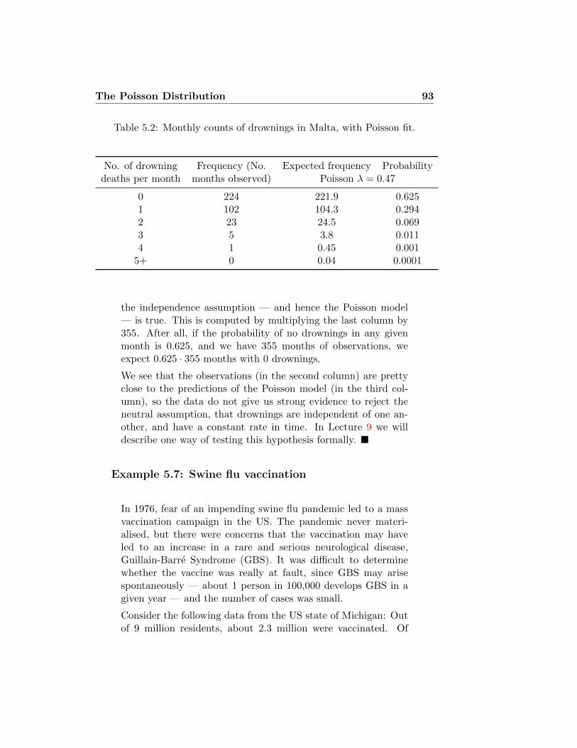
The Poisson Distribution 93
Table 5.2: Monthly counts of drownings in Malta, with Poisson fit.
No. of drowning Frequency (No. Expected frequency Probabilitydeaths per month months observed) Poisson λ = 0.47
0 224 221.9 0.6251 102 104.3 0.2942 23 24.5 0.0693 5 3.8 0.0114 1 0.45 0.001
5+ 0 0.04 0.0001
the independence assumption — and hence the Poisson model— is true. This is computed by multiplying the last column by355. After all, if the probability of no drownings in any givenmonth is 0.625, and we have 355 months of observations, weexpect 0.625 · 355 months with 0 drownings.
We see that the observations (in the second column) are prettyclose to the predictions of the Poisson model (in the third col-umn), so the data do not give us strong evidence to reject theneutral assumption, that drownings are independent of one an-other, and have a constant rate in time. In Lecture 9 we willdescribe one way of testing this hypothesis formally. �
Example 5.7: Swine flu vaccination
In 1976, fear of an impending swine flu pandemic led to a massvaccination campaign in the US. The pandemic never materi-alised, but there were concerns that the vaccination may haveled to an increase in a rare and serious neurological disease,Guillain-Barre Syndrome (GBS). It was difficult to determinewhether the vaccine was really at fault, since GBS may arisespontaneously — about 1 person in 100,000 develops GBS in agiven year — and the number of cases was small.
Consider the following data from the US state of Michigan: Outof 9 million residents, about 2.3 million were vaccinated. Of
94 The Poisson Distribution
those, 48 developed GBS between July 1976 and June 1977. Wemight have expected
2.3 million× 10−5cases/person-year = 23 cases.
How likely is it that, purely by chance, this population wouldhave experienced 48 cases in a single year? If Y is the numberof cases, it would then have Poisson distribution with parameter23, so that
P (Y ≥ 48) = 1−47∑i=0
e−23 23i
i!= 3.5× 10⁻⁶.
So, such an extreme number of cases is likely to happen less than1 year in 100,000. Does this prove that the vaccine caused GBS?
The people who had the vaccine are people who chose to bevaccinated. They may differ from the rest of the population inmultiple ways in addition to the elementary fact of having beenvaccinated, and some of those ways may have predisposed themto GBS. What can we do? The paper [BH84] takes the followingapproach: If the vaccine were not the cause of the GBS cases,we would expect no connection between the timing of the vac-cine and the onset of GBS. In fact, though, there seemed to be aparticularly large number of cases in the six weeks following vac-cination. Can we say that this was more than could reasonablybe expected by chance?
The data are given in Table 5.3. Each of the 40 GBS caseswas assigned a time, which is the number of weeks after vac-cination when the disease was diagnosed. (Thus “week 1” is adifferent calendar week for each subject.) If the cases are evenlydistributed, the number in a given week should be Poisson dis-tributed with parameter 40/30 = 1.33. Using this parameter, wecompute the probabilities of 0, 1, 2, . . . cases in a week, which wegive in row 3 of Table 5.3. Multiplying these numbers by 30 givesthe expected frequencies in row 4 of the table. It is clear that theobserved and expected frequencies are very different. One wayof seeing this is to consider the standard deviation. The Poissondistribution has SD
√1.33 = 1.15 (as discussed in section 5.4,

The Poisson Distribution 95
while the data have SD
s =
√√√√√ 130−1
(16 · (0− 1.33)2 + 7 · (1− 1.33)2 + 3 · (2− 1.33)2
+2 · (4− 1.33)2 + 1 · (9− 1.33)2 + 1 · (10− 1.33)2) = 2.48.
Table 5.3: Cases of GBS, by weeks after vaccination
# cases per week 0 1 2 3 4 5 6+
observed frequency 16 7 3 0 2 0 2probability 0.264 0.352 0.234 0.104 0.034 0.009 0.003
expected frequency 7.9 10.6 7.0 3.1 1.0 0.3 0.1
�
5.9 Derivation of the Poisson distribution (non-examinable)
This section is not officially part of the course, but is optional, for thosewho are interested in more mathematical detail. Where does the formula insection 5.2 come from?
Think of the Poisson distribution as in section 5.8, as an approximationto a binomial distribution. Let X be the (random) number of successes ina collection of independent random trials, where the expected number ofsuccesses is λ. This will, of course, depend on the number of trials, butwe show that when the number of trials (call it n) gets large, the exactnumber of trials doesn’t matter. In mathematical language, we say thatthe probability converges to a limit as n goes to infinity. But how large is“large”? We would like to know how good the approximation is, for realvalues of n, of the sort that we are interested in.
Let Xn be the random number of successes in n independent trials, wherethe probability of each success is λ/n. Thus, the probability of success goesdown as the number of trials goes up, and expected number of successes isalways the same λ. Then
P{Xn = x} = nCx
(λ
n
)x(1− λ
n
)n−x.

96 The Poisson Distribution
Now, those of you who have learned some calculus at A-levels may rememberthe Taylor series for ez:
ez = 1 + z +z2
2!+z3
3!+ · · · .
In particular, for small z we have e−z ≈ 1− z, and the difference (or “error”in the approximation) is no bigger than z2/2. The key idea is that if z isvery small (as it is when z = λ/n, and n is large), then z2 is a lot smallerthan z.
Using a bit of algebra, we have
P{Xn = x} = nCx
(λ
n
)x(1− λ
n
)−x(1− λ
n
)n=n(n− 1) · · · (n− x+ 1)
x!
(λx
nx
)(1− λ
n
)−x(1− λ
n
)n=λx
x!
(1)(1− 1
n
)· · ·(1− x−1
n
)(1− λ
n
)x (1− λ
n
)n.
Now, if we’re not concerned about the size of the error, we can simplysay that n is much bigger than λ or x (because we’re thinking of a fixed λand x, and n getting large). So we have the approximations(
1− 1
n
)· · ·(
1− x− 1
n
)≈ 1;(
1− λ
n
)x≈ 1;(
1− λ
n
)n≈(e−λ/n
)n= e−λ.
Thus
P{Xn = x} ≈ λx
x!e−λ.
5.9.1 Error bounds (very mathematical)
In the long run, Xn has a distribution very close to the Poisson distributiondefined in section 5.2. But how long is “the long run”? Do we need 10trials? 1000? a billion?
If you just want the answer, it’s approximately this: The error that you’llmake by taking the Poisson distribution instead of the binomial is no more

The Poisson Distribution 97
than about 1.6λ2/n3/2. In Example 5.5, where n = 100 and λ = 5, thissays the error won’t be bigger than about 0.04, which is useful information,although in reality the maximum error is about 10 times smaller than this.On the other hand, if n = 400, 000 (about the population of Malta), andλ = 0.47, then the error will be only about 10−8.
Let’s assume that n is at least 4λ2, so λ <√n/2. Define the approxima-
tion error to be
ε := max∣∣P{Xn = x} − P{X = x}
∣∣.(The bars | · | mean that we’re only interested in how big the difference is,not whether it’s positive or negative.) Then
P{Xn = x} − P{X = x} =λx
x!
((1)(1− 1
n
)· · ·(1− x−1
n
)(1− λ
n
)x (1− λ
n
)n− λx
x!e−λ
)
=λx
x!e−λ
((1)
(1− 1
n
)· · ·(
1− x− 1
n
)(1− λ
n
)−x(1− λ/ne−λ/n
)n− 1
)
If x is bigger than√n, then P{X = x} and P{Xn = x} are both tiny; we
won’t go into the details here, but we will consider only x that are smallerthan this. Now we have to do some careful approximation. Basic algebratells us that if a and b are positive,
(1− a)(1− b) = 1− (a+ b) + ab > 1− (a+ b).
We can extend this to (1−a)(1−b)(1−c) > (1−(a+b))(1−c) > 1−(a+b+c).And so, finally, if a, b, c, . . . are all positive, then
1 > (1− a)(1− b)(1− c) · · · (1− z) > 1− (a+ b+ c+ · · ·+ z).
Thus
1−(
1− 1
n
)· · ·(
1− x− 1
n
)> 1−
x−1∑k=0
k
n> 1− x2
2n,
and
1 >
(1− λ
n
)x> 1− λx
n.
Again applying some calculus, we turn this into
1 <
(1− λ
n
)−x< 1 +
λx
n− λx.

98 The Poisson Distribution
We also know that
1− λ
n< e−λ/n < 1− λ
n+
λ2
2n2,
which means that
1− λ2
2(n2 − nλ)<
1− λ/ne−λ/n
< 1,
and
1− λ2
2(n− λ)<
(1− λ2
2(n2 − nλ)
)n<
(1− λ/ne−λ/n
)n< 1.
Now we put together all the overestimates on one side, and all the un-derestimates on the other.
λx
x!e−λ
(− λ2
2(n− λ)− λx
n
)≤ P{Xn = x}−P{X = x} ≤ λx
x!e−λ
(λx
n− λx
).
So, finally, as long as n ≥ 4λ2,we get
ε ≤ maxλx+1
x!e−λ
(λ
n+x
n+
x
n(1− x/2√n)
).
We need to find the maximum over all possible x. If x <√n then this
becomes
ε ≤ max1
n
λx+1
x!e−λ (λ+ 3x) ≤ 4λ2
∗n√
2πn,
(by a formula known as “Stirling’s formula”), where λ∗ = max{λ, 1}.

Lecture 6
The Normal Distribution
6.1 Introduction
In previous lectures we have considered discrete datasets and discrete prob-ability distributions. In practice many datasets that we collect from ex-periments consist of continuous measurements. For example, there are theweights of newborns in the babyboom data set (Table 1.2). The plots inFigure 6.1 show histograms of real datasets consisting of continuous mea-surements. From such samples of continuous data we might want to testwhether the data is consistent with a specific population mean value orwhether there is a significant difference between 2 groups of data. To an-swer these question we need a probability model for the data. Of course,there are many different possible distributions that quantities could have. Itis therefore a startling fact that many different quantities that we are com-monly interested in — heights, weights, scores on intelligence tests, serumpotassium levels of different patients, measurement errors of distance to thenearest star — all have distributions which are close to one particular shape.This shape is called the Normal or Gaussian1 family of distributions.
1Named for German mathematician Carl Friedrich Gauss, who first worked out theformula for these distributions, and used them to estimate the errors in astronomicalcomputations. Until the introduction of the euro, Gauss’s picture — and the Gaussiancurve — were on the German 10 mark banknote.
99

100 The Normal Distribution
Birth weight (g)
Freq
uenc
y
1000 2000 3000 4000 5000 6000
02
46
810
(a) Babyboom birthweights
Petal lengthFr
eque
ncy
1.0 1.2 1.4 1.6 1.80
24
68
1012
(b) Petal measurements in a species of flower
Brain size
Freq
uenc
y
700000 800000 900000 1100000
02
46
810
(c) Brain sizes of 40 Psychology students
Serum potassium level
Frequency
3.0 3.5 4.0 4.5 5.0 5.5
05
1015
2025
3035
(d) Serum potassium measurements from 152 healthy vol-unteers
Figure 6.1: Histograms of some continuous data.

The Normal Distribution 101
6.2 Continuous probability distributions
When we considered the Binomial and Poisson distributions we saw that theprobability distributions were characterized by a formula for the probabilityof each possible discrete value. All of the probabilities together sum up to1. We can visualize the density by plotting the probabilities against thediscrete values (Figure 6.2). For continuous data we don’t have equallyspaced discrete values so instead we use a curve or function that describesthe probability density over the range of the distribution (Figure 6.3). Thecurve is chosen so that the area under the curve is equal to 1. If we observe asample of data from such a distribution we should see that the values occurin regions where the density is highest.
0 5 10 15 20
0.00
0.02
0.04
0.06
0.08
0.10
0.12
X
P(X
)
Figure 6.2: A discrete probability distribution

102 The Normal Distribution
60 80 100 120 140
0.00
0.01
0.02
0.03
0.04
X
density
Figure 6.3: A continuous probability distribution
6.3 What is the Normal Distribution?
There will be many, many possible probability density functions over a con-tinuous range of values. The Normal distribution describes a special classof such distributions that are symmetric and can be described by the dis-tribution mean µ and the standard deviation σ (or variance σ2). 4 differentNormal distributions are shown in Figure 6.4 together with the values of µand σ. These plots illustrate how changing the values of µ and σ alter thepositions and shapes of the distributions.
If X is Normally distributed with mean µ and standard deviation σ, wewrite
X∼N(µ, σ2)
µ and σ are the parameters of the distribution.

The Normal Distribution 103
The probability density of the Normal distribution is given by
f(x) =1
σ√
2πexp−(x−µ)2/2σ2
For the purposes of this course we do not need to use this expression. It isincluded here for future reference.
50 100 150
0.00
0.04
0.08
µ = 100 ! = 10
X
density
50 100 150
0.00
0.04
0.08
µ = 100 ! = 5
X
density
50 100 150
0.00
0.04
0.08
µ = 130 ! = 10
X
density
50 100 150
0.00
0.04
0.08
µ = 100 ! = 15
X
density
Figure 6.4: 4 different Normal distributions
6.4 Using the Normal table
For a discrete probability distribution we calculate the probability of beingless than some value z, i.e. P (Z < z), by simply summing up the probabil-ities of the values less than z.

104 The Normal Distribution
For a continuous probability distribution we calculate the probability ofbeing less than some value z, i.e. P (Z < z), by calculating the area underthe curve to the left of z.
For example, suppose Z ∼ N(0, 1) and we want to calculate P (Z < 0)?
0
P(Z < 0)
For this example we can calculate the required area as we know the distri-bution is symmetric and the total area under the curve is equal to 1, i.e.P (Z < 0) = 0.5.What about P (Z < 1.0)?
0 1
P(Z < 1)
Calculating this area is not easy2 and so we use probability tables. Probabil-
2For those Mathematicians who recognize this area as a definite integral and try to dothe integral by hand please note that the integral cannot be evaluated analytically

The Normal Distribution 105
ity tables are tables of probabilities that have been calculated on a computer.All we have to do is identify the right probability in the table and copy itdown! Obviously it is impossible to tabulate all possible probabilities for allpossible Normal distributions so only one special Normal distribution, N(0,1), has been tabulated.
The N(0, 1) distribution is called the standard Normal distribution.
The tables allow us to read off probabilities of the form P (Z < z). Most ofthe table in the formula book has been reproduced in Table 6.1. From thistable we can identify that P (Z < 1.0) = 0.8413 (this probability has beenhighlighted with a box).
z 0.0 0.01 0.02 0.03 0.04 0.05 0.06 0.07 0.08 0.09
0.0 0.5000 5040 5080 5120 5160 5199 5239 5279 5319 53590.1 0.5398 5438 5478 5517 5557 5596 5636 5675 5714 57530.2 0.5793 5832 5871 5910 5948 5987 6026 6064 6103 61410.3 0.6179 6217 6255 6293 6331 6368 6406 6443 6480 65170.4 0.6554 6591 6628 6664 6700 6736 6772 6808 6844 68790.5 0.6915 6950 6985 7019 7054 7088 7123 7157 7190 72240.6 0.7257 7291 7324 7357 7389 7422 7454 7486 7517 75490.7 0.7580 7611 7642 7673 7704 7734 7764 7794 7823 78520.8 0.7881 7910 7939 7967 7995 8023 8051 8078 8106 81330.9 0.8159 8186 8212 8238 8264 8289 8315 8340 8365 8389
1.0 0.8413 8438 8461 8485 8508 8531 8554 8577 8599 86211.1 0.8643 8665 8686 8708 8729 8749 8770 8790 8810 8830
Table 6.1: N(0, 1) probability table
Once we know how to read tables we can calculate other probabilities.
Example 6.1: Upper tails
The table gives P (Z < z). Suppose we want P (Z > 0.92).We know that P (Z > 0.92) = 1 − P (Z < 0.92) and we can cal-culate P (Z < 0.92) from the tables.
Thus, P (Z > 0.92) = 1− 0.8212 = 0.1788.�

106 The Normal Distribution
0 00.92 0.92
P(Z < 0.92)P(Z > 0.92)
0 z
Example 6.2: Negative z
The table only includes positive values of z. What about nega-tive values? Compute P (Z > −0.5).
0!0.5
P(X > !0.5) P(X < 0.5)
0 0.5
The Normal distribution is symmetric so we know that P (Z >−0.5) = P (Z < 0.5) = 0.6915We can use the symmetry of the Normal distribution to calculate

The Normal Distribution 107
0
P(X < !0.76) P(X < 0.76)
0.760!0.76
P (Z < −0.76) = P (Z > 0.76)
= 1− P (Z < 0.76)
= 1− 0.7764
= 0.2236.
�
Example 6.3: Intervals
How do we compute P (−0.64 < Z < 0.43)?
0 0.43!0.64 0
!0.64 0.430
P(X < !0.64) P(X < 0.43)
P(!0.64 < X < 0.43)
We can calculate this using
P (−0.64 < Z < 0.43) = P (Z < 0.43)− P (Z < −0.64)
= 0.6664− (1− 0.7389)
= 0.4053.
�

108 The Normal Distribution
Example 6.4: Interpolation
How would we compute P (Z < 0.567)?
From tables we know that P (Z < 0.56) = 0.7123 and P (Z <0.57) = 0.7157To calculate P (Z < 0.567) we interpolate between these twovalues
P (Z < 0.567) = 0.3× 0.7123 + 0.7× 0.7157 = 0.7146
�
6.5 Standardisation
All of the probabilities above were calculated for the standard Normal distri-bution N(0, 1). If we want to calculate probabilities from different Normaldistributions we convert the probability to one involving the standard Nor-mal distribution. This process is called standardisation.
Suppose X ∼ N(3, 4) and we want to calculate P (X < 6.2). We convertthis probability to one involving the N(0, 1) distribution by
(i). Subtracting the mean µ
(ii). Dividing by the standard deviation σ
Subtracting the mean re-centers the distribution on zero. Dividing by thestandard deviation re-scales the distribution so it has standard deviation 1.If we also transform the boundary point of the area we wish to calculatewe obtain the equivalent boundary point for the N(0, 1) distribution. Thisprocess is illustrated in the figure below. In this example, P (X < 6.2) =P (Z < 1.6) = 0.9452 where Z ∼ N(0,1)This process can be described by the following rule
If X ∼ N(µ, σ2) and Z = X−µσ then Z ∼ N(0, 1)
Example 6.5: Birth weights

The Normal Distribution 109
!
"
#$%
" &$#
'(%()*(+,"-(&.
!!()*(+,"-(/.
+,!-(/.
!$%
Suppose we know that the birth weight of babies is Normally dis-tributed with mean 3500g and standard deviation 500g. Whatis the probability that a baby is born that weighs less than 3100g?
That is X ∼ N(3500, 5002) and we want to calculate P (X <3100)?
We can calculate the probability through the process of stan-dardization.
Drawing a rough diagram of the process can help you to avoidany confusion about which probability (area) you are trying tocalculate.

110 The Normal Distribution
03100 ! 350035003100
X ~ N(3500, 500 )
P(X < 3100) P(Z < !0.8)
Z ~ N(0, 1)2
Z = X ! 3500 500
500= !0.8
P (X < 3100) = P
(X − 3500
500<
3100− 3500
500
)= P (Z < −0.8) where Z ∼ N(0, 1)
= 1− P (Z < 0.8)
= 1− 0.7881
= 0.2119
�
6.6 Linear combinations of Normal random vari-ables
Suppose two rats A and B have been trained to navigate a large maze.The time it takes rat A is normally distributed with mean 80 seconds andstandard deviation 10 seconds. The time it takes rat B is normally dis-tributed with mean 78 seconds and standard deviation 13 seconds. On anygiven day what is the probability that rat A runs the maze faster than rat B?
X = Time of run for rat A X ∼ N(80, 102)Y = Time of run for rat B Y ∼ N(78, 132)

The Normal Distribution 111
Let D = X − Y be the difference in times of rats A and B
If rat A is faster than rat B then D < 0 so we want P (D < 0)?
To calculate this probability we need to know the distribution of D. Todo this we use the following rule
If X and Y are two independent normal variable such that
X ∼ N(µ1, σ21) and Y ∼ N(µ2, σ2
2)
then X − Y ∼ N(µ1 - µ2, σ21 + σ2
2)
In this example,
D = X − Y ∼ N(80− 78, 102 + 132) = N(2, 269)
We can now calculate this probability through standardisation
Z ~ N(0, 1)
P(D < 0)
0
D ~ N(2, 269)
P(Z < !0.122)
20
16.40Z = D ! 2
0 ! 2 16.40= !0.122

112 The Normal Distribution
P (D < 0) = P
(D − 2√
269<
0− 2√269
)= P (Z < −0.122) where Z ∼ N(0, 1)
= 1− (0.8× 0.5478 + 0.2× 0.5517)
= 0.45142
Other rules that are often used are
If X and Y are two independent normal variable such that
X ∼ N(µ1, σ21) and Y ∼ N(µ2, σ2
2)
then
X + Y ∼ N(µ1 + µ2, σ21 + σ2
2)
aX ∼ N(aµ1, a2σ2
1)
aX + bY ∼ N(aµ1 + bµ2, a2σ2
1 + b2σ22)
Example 6.6: Maze-running times
Suppose two rats A and B have been trained to navigate a largemaze. The time it takes rat A is normally distributed with mean80 seconds and standard deviation 10 seconds. The time it takesrat B is normally distributed with mean 78 seconds and standarddeviation 13 seconds. On any given day what is the probabilitythat the average time the rats take to run the maze is greaterthan 82 seconds?
X = Time of run for rat A X ∼ N(80, 102)Y = Time of run for rat B Y ∼ N(78, 132)
Let A = X+Y2 = 1
2X + 12Y be the average time of rats A and B
Then A ∼ N(
1280 + 1
278, (12)2102 + (1
2)2132)
= N(79, 67.25)
We want P (A > 82)

The Normal Distribution 113
Z ~ N(0, 1)
0
A ~ N(79, 67.25)
79 82
Z = A ! 79 8.20
P(Z > 0.366)
= 0.366
82 ! 798.20
P(A > 82)
P (A > 82) = P
(A− 79√
67.25<
82− 79√67.25
)= P (Z > 0.366) where Z ∼ N(0, 1)
= 1− (0.4× 0.6406 + 0.6× 0.6443)
= 0.35718
�
6.7 Using the Normal tables backwards
Example 6.7: Exam scores
The marks of 500 candidates in an examination are normallydistributed with a mean of 45 marks and a standard deviationof 20 marks.
If 20% of candidates obtain a distinction by scoring x marksor more, estimate the value of x.
We have X ∼ N(45, 202) and we want x such that P (X >x) = 0.2
⇒ P (X < x) = 0.8
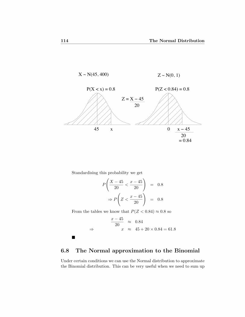
114 The Normal Distribution
Z ~ N(0, 1)
0
X ~ N(45, 400)
P(X < x) = 0.8 P(Z < 0.84) = 0.8
45
= 0.84
Z = X ! 45 20
x x ! 45 20
Standardising this probability we get
P
(X − 45
20<x− 45
20
)= 0.8
⇒ P
(Z <
x− 45
20
)= 0.8
From the tables we know that P (Z < 0.84) ≈ 0.8 so
x− 45
20≈ 0.84
⇒ x ≈ 45 + 20× 0.84 = 61.8
�
6.8 The Normal approximation to the Binomial
Under certain conditions we can use the Normal distribution to approximatethe Binomial distribution. This can be very useful when we need to sum up

The Normal Distribution 115
a large number of Binomial probabilities to calculate the probability thatwe want.
For example, Figure 6.5 compares a Bin(300, 0.5) and a N(150, 75) whichboth have the same mean and variance. The figure shows that the distribu-tions are very similar.
100 120 140 160 180 200
0.00
0.01
0.02
0.03
0.04
Bin(300, 0.5)
X
P(X
= x)
100 120 140 160 180 200
0.00
0.01
0.02
0.03
0.04
N(150, 75)
X
dens
ity
Figure 6.5: Comparison of a Bin(300, 0.5) and a N(150, 75) distribution
In general,
If X ∼ Bin(n, p) then
µ = np
σ2 = npq where q = 1− p
For large n and p not too small or too large
X ∼ N(np, npq)
n > 10 and p ≈ 12 OR n > 30 and p moving away from 1
2
6.8.1 Continuity correction
Suppose X ∼Bin(12, 0.5) what is P (4 ≤ X ≤ 7)?

116 The Normal Distribution
For this distribution we have
µ = np = 6
σ2 = npq = 3
So we can use a N(6, 3) distribution as an approximation.
Unfortunately, it’s not quite so simple. We have to take into account thefact that we are using a continuous distribution to approximate a discretedistribution. This is done using a continuity correction. The continuitycorrection appropriate for this example is illustrated in the figure below
In this example, P (4 ≤ X ≤ 7) transforms to P (3.5 < X < 7.5)
0 121110987654321
3.5 7.5
P (3.5 < X < 7.5) = P
(3.5− 6√
3<X − 6√
3<
7.5− 6√3
)= P (−1.443 < Z < 0.866) where Z ∼ N(0, 1)
= 0.732

The Normal Distribution 117
The exact answer is 0.733 so in this case the approximation is very good.
6.9 The Normal approximation to the Poisson
We can also use the Normal distribution to approximate a Poisson distribu-tion under certain conditions.
In general,
If X ∼ Po(λ) then
µ = λ
σ2 = λ
For large λ (say λ > 20)
X ∼ N(λ, λ)
Example 6.8: Radioactive emission
A radioactive source emits particles at an average rate of 25 par-ticles per second. What is the probability that in 1 second thecount is less than 28 particles?
X = No. of particles emitted in 1 second X ∼ Po(25)
So, we can use a N(25, 25) as an approximate distribution.
Again, we need to make a continuity correction
So P (X < 27) transforms to P (X < 26.5)
P (X < 26.5) = P
(X − 25
5<
26.5− 25
5
)= P (Z < 0.3) where Z ∼ N(0, 1)
= 0.6179
�

118 The Normal Distribution
Z ~ N(0, 1)
0
X ~ N(25, 25)
P(X < 26.5) P(Z < 0.3)
25
= 0.3
26.5
Z = X ! 25 5
26.5 ! 25 5
Example 6.9: ESP Experiment
This example is adapted from [FPP98].
In the 1970s, the psychologist Charles Tart tried to test whetherpeople might have the power to see into the future. His “Aquar-ius machine” was a device that would flash four different lightsin random orders. Subjects would press buttons to predict whichof the 4 lights will come on next.
15 different subjects each ran a trial of 500 guesses, so 1500guesses in total. They produced 2006 correct guesses and 5494incorrect. What should we conclude?
We might begin by hypothesising that without any power topredict the future, a subject has just a 1/4 chance of guess-ing right each time, independent of any other outcomes. Thus,the number of correct guesses X has Bin(7500, 1/4) distribu-tion. This has mean µ = 7500/4 = 1875, and standard deviation√
7500× 0.25× 0.75 = 37.5. The result is thus above the mean:There were more correct guesses than would be expected. Mightwe plausibly say that the difference from the expectation is justchance variation?
We want to know how likely a result this extreme would be ifX really has this binomial distribution. We could compute this
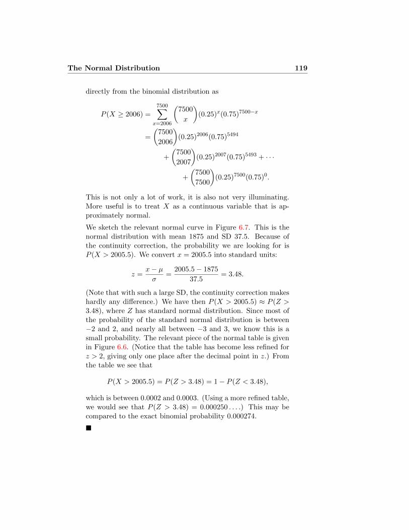
The Normal Distribution 119
directly from the binomial distribution as
P (X ≥ 2006) =7500∑
x=2006
(7500
x
)(0.25)x(0.75)7500−x
=
(7500
2006
)(0.25)2006(0.75)5494
+
(7500
2007
)(0.25)2007(0.75)5493 + · · ·
+
(7500
7500
)(0.25)7500(0.75)0.
This is not only a lot of work, it is also not very illuminating.More useful is to treat X as a continuous variable that is ap-proximately normal.
We sketch the relevant normal curve in Figure 6.7. This is thenormal distribution with mean 1875 and SD 37.5. Because ofthe continuity correction, the probability we are looking for isP (X > 2005.5). We convert x = 2005.5 into standard units:
z =x− µσ
=2005.5− 1875
37.5= 3.48.
(Note that with such a large SD, the continuity correction makeshardly any difference.) We have then P (X > 2005.5) ≈ P (Z >3.48), where Z has standard normal distribution. Since most ofthe probability of the standard normal distribution is between−2 and 2, and nearly all between −3 and 3, we know this is asmall probability. The relevant piece of the normal table is givenin Figure 6.6. (Notice that the table has become less refined forz > 2, giving only one place after the decimal point in z.) Fromthe table we see that
P (X > 2005.5) = P (Z > 3.48) = 1− P (Z < 3.48),
which is between 0.0002 and 0.0003. (Using a more refined table,we would see that P (Z > 3.48) = 0.000250 . . . .) This may becompared to the exact binomial probability 0.000274.
�
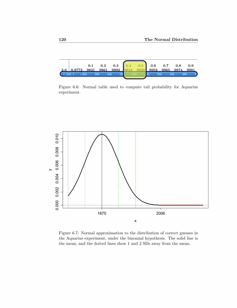
120 The Normal Distribution
z 0.00 0.01 0.02 0.03 0.04 0.05 0.06 0.07 0.08 0.090.0 0.5000 5040 5080 5120 5160 5199 5239 5279 5319 53590.1 0.5398 5438 5478 5517 5557 5596 5636 5675 5714 57530.2 0.5793 5832 5871 5910 5948 5987 6026 6064 6103 61410.3 0.6179 6217 6255 6293 6331 6368 6406 6443 6480 65170.4 0.6554 6591 6628 6664 6700 6736 6772 6808 6844 68790.5 0.6915 6950 6985 7019 7054 7088 7123 7157 7190 72240.6 0.7257 7291 7324 7357 7389 7422 7454 7486 7517 75490.7 0.7580 7611 7642 7673 7704 7734 7764 7794 7823 78520.8 0.7881 7910 7939 7967 7995 8023 8051 8078 8106 81330.9 0.8159 8186 8212 8238 8264 8289 8315 8340 8365 83891.0 0.8413 8438 8461 8485 8508 8531 8554 8577 8599 86211.1 0.8643 8665 8686 8708 8729 8749 8770 8790 8810 88301.2 0.8849 8869 8888 8907 8925 8944 8962 8980 8997 90151.3 0.9032 9049 9066 9082 9099 9115 9131 9147 9162 91771.4 0.9192 9207 9222 9236 9251 9265 9279 9292 9306 93191.5 0.9332 9345 9357 9370 9382 9394 9406 9418 9429 94411.6 0.9452 9463 9474 9484 9495 9505 9515 9525 9535 95451.7 0.9554 9564 9573 9582 9591 9599 9608 9616 9625 96331.8 0.9641 9649 9656 9664 9671 9678 9686 9693 9699 97061.9 0.9713 9719 9726 9732 9738 9744 9750 9756 9761 9767
0.1 0.2 0.3 0.4 0.5 0.6 0.7 0.8 0.92.0 0.9772 9821 9861 9893 9918 9938 9953 9965 9974 99813.0 0.9987 9990 9993 9995 9997 9998 9998 9999 9999 9999
Figure 6.6: Normal table used to compute tail probability for Aquariusexperiment.
0.0000.0020.0040.0060.0080.010
x
y
1875 2006
Figure 6.7: Normal approximation to the distribution of correct guesses inthe Aquarius experiment, under the binomial hypothesis. The solid line isthe mean, and the dotted lines show 1 and 2 SDs away from the mean.

Lecture 7
Confidence intervals andNormal Approximation
7.1 Confidence interval for sampling from a nor-mally distributed population
In lecture 8 we learned about significance testing, which is one way toquantify uncertainty. Consider the following example: Data set #231 from[HDL+94] includes height measurements from 198 men and women, sampledat random from the much larger data 1980 OPCS (Office of Population Cen-sus and Survey) survey. The sample of 198 men’s heights averages 1732mm,with an SD of 68.8mm. What does this tell us about the average height ofBritish men?
We only measured 198 of the many millions of men in the country, butif we can assume that this was a random sample, this allows us to drawconclusions about the entire population from which it was sampled. Wereason as follows: Imagine a box with millions of cards in it, on each ofwhich is written the height of one British man. These numbers are normallydistributed with mean µ and variance σ2. We get to look at 198 of thesecards, sampled at random. Call the cards we see X1, . . . , X198. Our bestguess for µ will of course be the sample mean
X =1
198(X1 + · · ·+X198) = 1732mm.
“Best guess” is not a very precise statement, though. To make a precisestatement, we use the sampling distribution of the estimation error X −µ. The average of independent normal random variables is normal. The
121

122 Confidence intervals
expectation is the average of the expectations, while the variance is
V ar(X) =1
n2V ar(X1+· · ·+X198) =
1
n2
(V ar(X1)+· · ·+V ar(X198)
)=σ2
n.
since the variance of a sum of independent variables is always the sum ofthe variances. Thus, we can standardise X by writing
Z =X − µσ/√n,
which is a standard normal random variable (that is, with expectation 0 andvariance 1).
A tiny bit of algebra gives us
µ = X − σ√nZ.
This expresses the unknown quantity µ in terms of known quantities and arandom variable Z with known distribution. Thus we may use our standardnormal tables to generate statements like “the probability is 0.95 that Z isin the range −1.96 to 1.96,” implying that
the probability is 0.95 that µ is in the range X − 1.96σ√n
to X + 1.96σ√n.
(Note that we have used the fact that the normal distribution is symmetricabout 0.) We call this interval a 95% confidence interval for the unknownpopulation mean.
The quantity σ/√n, which determines the scale of the confidence inter-
val, is called the Standard Error for the sample mean, commonly abbrevi-ated SE. If we take σ to be the sample standard deviation — more about thisassumption in chapter 10 — the Standard Error is 69mm/
√198 ≈ 4.9mm.
The 95% confidence interval for the population mean is then 1732± 9.8mm,so (1722, 1742)mm. In place of our vague statement about a best guess forµ, we have an interval of width 20 mm in which we are 95% confident thatthe true population mean lies.
General procedure for normal confidence intervals: SupposeX1, . . . , Xn
are independent samples from a normal distribution with unknown mean µ,and known variance σ2. Then a (symmetric) c% normal confidence intervalfor µ is the interval
(X − z SE, X + z SE), which we also write as X ± z SE,
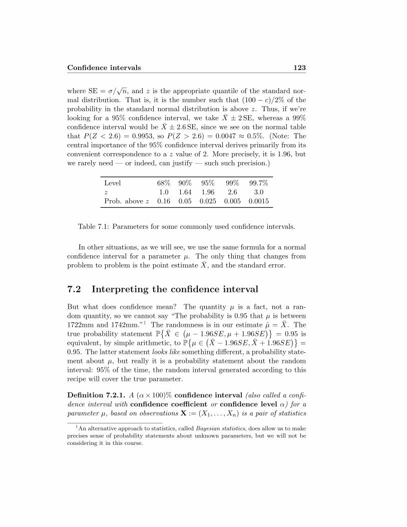
Confidence intervals 123
where SE = σ/√n, and z is the appropriate quantile of the standard nor-
mal distribution. That is, it is the number such that (100 − c)/2% of theprobability in the standard normal distribution is above z. Thus, if we’relooking for a 95% confidence interval, we take X ± 2 SE, whereas a 99%confidence interval would be X ± 2.6 SE, since we see on the normal tablethat P (Z < 2.6) = 0.9953, so P (Z > 2.6) = 0.0047 ≈ 0.5%. (Note: Thecentral importance of the 95% confidence interval derives primarily from itsconvenient correspondence to a z value of 2. More precisely, it is 1.96, butwe rarely need — or indeed, can justify — such such precision.)
Level 68% 90% 95% 99% 99.7%z 1.0 1.64 1.96 2.6 3.0Prob. above z 0.16 0.05 0.025 0.005 0.0015
Table 7.1: Parameters for some commonly used confidence intervals.
In other situations, as we will see, we use the same formula for a normalconfidence interval for a parameter µ. The only thing that changes fromproblem to problem is the point estimate X, and the standard error.
7.2 Interpreting the confidence interval
But what does confidence mean? The quantity µ is a fact, not a ran-dom quantity, so we cannot say “The probability is 0.95 that µ is between1722mm and 1742mm.”1 The randomness is in our estimate µ = X. Thetrue probability statement P
{X ∈
(µ − 1.96SE, µ + 1.96SE
)}= 0.95 is
equivalent, by simple arithmetic, to P{µ ∈
(X − 1.96SE, X + 1.96SE
)}=
0.95. The latter statement looks like something different, a probability state-ment about µ, but really it is a probability statement about the randominterval: 95% of the time, the random interval generated according to thisrecipe will cover the true parameter.
Definition 7.2.1. A (α× 100)% confidence interval (also called a confi-dence interval with confidence coefficient or confidence level α) for aparameter µ, based on observations X := (X1, . . . , Xn) is a pair of statistics
1An alternative approach to statistics, called Bayesian statistics, does allow us to makeprecises sense of probability statements about unknown parameters, but we will not beconsidering it in this course.

124 Confidence intervals
(that is, quantities you can compute from the data X) A(X) and B(X), suchthat
P{A(X) ≤ µ ≤ B(X)
}= α.
The quantity P{A(X) ≤ θ ≤ B(X)
}is called the coverage probability
for µ. Thus, a confidence interval for µ with confidence coefficient α isprecisely a random interval with coverage probability α. In many cases, it isnot possible to find an interval with exactly the right coverage probability.We may have to content ourselves with an approximate confidence interval(with coverage probability ≈ α) or a conservative confidence interval (withcoverage probability ≥ α). We usually make every effort not to overstate ourconfidence about statistical conclusions, which is why we try to err on theside of making the coverage probability — hence the interval — too large.
An illustration of this problem is given in Figure 7.1. Suppose we aremeasuring systolic blood pressure on 100 patients, where the true bloodpressure is 120 mmHg, but the measuring device makes normally distributederrors with mean 0 and SD 10 mmHg. In order to reduce the errors, wetake four measures on each patient and average them. Then we computea confidence interval. The measures are shown in figure 7.1(a). In Figure7.1(b) we have shown a 95% confidence interval for each patient, computedby taking the average of the patient’s four measurements, plus and minus 10.Notice that there are 6 patients (shown by red X’s for their means) wherethe true measure — 120 mmHg — lies outside the confidence interval. InFigures 7.1(c) and 7.1(d) we show 90% and 68% confidence intervals, whichare narrower, and hence miss the true value more frequently.
A 90% confidence interval tells you that 90% of the time the true valuewill lie in this range. In fact, we find that there are exactly 90 out of 100cases where the true value is in the confidence interval. The 68% confidenceintervals do a bit better than would be expected on average: 74 of the 100trials had the true value in the 68% confidence interval.

Con
fid
en
ce
inte
rvals
125
0 20 40 60 80 100
90100
110
120
130
140
150
Trial
Blo
od P
ress
ure
(a) 100 patients
0 20 40 60 80 100
90100
110
120
130
140
150
Trial
Blo
od P
ress
ure
(b) 95% confidence intervals
0 20 40 60 80 100
90100
110
120
130
140
150
Trial
Blo
od P
ress
ure
(c) 90% confidence intervals
0 20 40 60 80 100
90100
110
120
130
140
150
Trial
Blo
od P
ress
ure
(d) 68% confidence intervals
Figure 7.1: Confidence intervals for 100 patients’ blood pressure, based on four measurements. Each column ofFigure 7.1(a) shows a single patient’s four measurements. The true BP in each case is 120, and the measurementerrors are normally distributed with mean 0 and SD 10.

126 Confidence intervals
7.3 Confidence intervals for probability of success
We discussed in section 6.8 that the binomial distribution can be well ap-proximated by a normal distribution. This means that if we are estimatingthe probability of success p from some observations of successes and failures,we can use the same methods as above to put a confidence interval on p.For instance, the Gallup organisation carried out a poll in October, 2005,of Americans’ attitudes about guns (see http://www.gallup.com/poll/
20098/gun-ownership-use-america.aspx). They surveyed 1,012 Ameri-cans, chosen at random. Of these, they found that 30% said they personallyowned a gun. But, of course, if they’d picked different people, purely bychance they would have gotten a somewhat different percentage. How dif-ferent could it have been? What does this survey tell us about the truefraction (call it p) of Americans who own guns?
We can compute a 95% confidence interval as 0.30±1.96 SE. All we needto know is the SE for the proportion p, which is the same as the standarddeviation for the observed proportion of successes. We know from section6.8 (and discussed again at length in section 8.3), that the standard error is
SE =
√p(1− p)
n,
where n is the number of samples. In this case, we get SE=√
0.3× 0.7/1012 =0.0144. So
95% confidence interval for p is 0.30± 0.029 = (0.271, 0.329).
Loosely put, we can be 95% confident that the true proportion support-ing EPP is between 27% and 33%. A 99% confidence interval comes frommultiplying by 2.6 instead of 1.96: it goes from 26.3% to 33.7%.
Notice that the Standard Error for a proportion is a maximum whenp = 0.5. Thus, we can always get a “conservative confidence interval” — aninterval where the probability of finding the true parameter in it is at least95% (or whatever the level is) by taking the SE to be
√.25/n. The 95%
confidence interval then has the particularly simple form sample mean ±1/√n.

Confidence intervals 127
7.4 The Normal Approximation
Approximation Theorems in Probability
Suppose X1, X2, . . . , Xn are independent samples from aprobability distribution with mean µ and variance σ2.Then
Law of Large Numbers (LLN): For n large, X will beclose to µ.
Central Limit Theorem (CLT): For n large, the errorin the LLN is close to a normal distribution, with varianceσ2/n. That is, using our standardisation procedure for thenormal distribution,
Z =X − µσ/√n
(7.1)
is close to having a standard normal distribution. Equiv-alently, X1 + · · ·+Xn has approximately N(nµ, nσ2) dis-tribution.
So far, we have been assuming that our data are sampled from a pop-ulation with a normal distribution. What justification do we have for thisassumption? And what do we do if the data come from a different distribu-tion? One of the great early discoveries of probability theory is that manydifferent kinds of random variables come close to a normal distribution whenyou average enough of them. You have already seen examples of this phe-nomenon in the normal approximation to the binomial distribution and thePoisson.
In probability textbooks such as [Fel71] you can find very precise state-ments about what it means for the distribution to be “close”. For our pur-poses, we will simply treat Z as being actually a standard normal randomvariable. However, we also need to know what it means for n to be “large”.For most distributions that you might encounter, 20 is usually plenty, while2 or 3 are not enough. The key rules of thumb are that the approximationworks best when the distribution of X
(i). is reasonably symmetric: Not skewed in either direction.

128 Confidence intervals
(ii). has thin tails: Most of the probability is close to the mean, not manySDs away from the mean.
More specific indications will be given in the following examples.
7.4.1 Normal distribution
Suppose Xi are drawn from a normal distribution with mean µ and varianceσ2 — N(µ, σ2). We know that X1 + · · ·+Xn has N(nµ, nσ2) distribution,and so that X has N(µ, σ2/n) distribution. A consequence is that Z, asdefined in (7.1), in fact has exactly the standard normal distribution. Infact, this is an explanation for why the CLT works: The normal distributionis the only distribution such that when you average multiple copies of it,you get another distribution of the same sort.2 Other distributions are notstable under averaging, and naturally converge to the distributions that are.
7.4.2 Poisson distribution
Suppose Xi are drawn from a Poisson distribution with parameter µ. Thevariance is then also µ. We know that X1 + · · ·+Xn has Poisson distributionwith parameter nµ. The CLT tells us, then, that for n large enough, thePo(nµ) distribution is very close to the N(nµ, nµ) distribution; or, in otherwords, Po(λ) is approximately the same as N(λ, λ) for λ large. How largeshould it be?
The Poisson distribution is shown in Figure 7.2 for different values of λ,together with the approximating normal density curve. One way of seeingthe failure of the approximation for small λ is to note that when λ is notmuch bigger than
√λ — much bigger meaning a factor of 2.5 or so, so
λ < 6.2, the normal curve will have substantial probability below−0.5. Sincethis is supposed to approximate the probability of the corresponding Poissondistribution below 0, this manifestly represents a failure. For instance, whenλ = 1, the Po(1) distribution is supposed to be approximated by N(1, 1),implying
P{Po(1) < 0
}≈ P
{N(1, 1) < −0.5
}≈ P
{N(0, 1) < −1.5
}= .067.
In general, the threshold −0.5 corresponds to Z = (−0.5 − λ)/√λ. The
corresponding values for other parameters are given in Table 7.2.
2Technically, it is the only distribution with finite variance for which this is true.

Confidence intervals 129
-3 -2 -1 0 1 2 3 4
0.0
0.1
0.2
0.3
0.4
Z
Density
(a) λ = 1
-4 -2 0 2 4 6 8 10
0.00
0.10
0.20
Z
Density
(b) λ = 4
0 5 10 15 20
0.00
0.04
0.08
0.12
Z
Density
(c) λ = 10
5 10 15 20 25 30 35
0.00
0.04
0.08
Z
Density
(d) λ = 20
Figure 7.2: Normal approximations to Po(λ). Shaded region is the impliedapproximate probability of the Poisson variable < 0.

130 Confidence intervals
λ Standardised Z Normal probability
1 -1.5 0.0674 -2.25 0.01210 -3.32 0.0004520 -4.58 0.0000023
Table 7.2: Probability below −0.5 in the normal approximation to Poissonrandom variables with different parameters λ.
7.4.3 Bernoulli variables
“Bernoulli variables” is the name for random variables that are 1 or 0,with probability p or 1 − p respectively. Then B = X1 + · · · + Xn is thenumber of successes in n trials, with success probability p each time —that is, a Bin(n, p) random variable. Again, we have already discussedthat binomial random variables may be approximated by normal randomvariables. Xi has expectation p and variance p(1 − p). The CLT thenimplies that Bin(n, p) ∼ N(np, np(1 − p)) for large values of n. Note thatB/n is the proportion of successes in n trials, and this has approximatelyN(p, p(1− p)/n) distribution. In other words, the observed proportion willbe close to p, but will be off by a small multiple of the SD, which shrinks asσ/√n, where σ =
√p(1− p). This is exactly the same thing we discussed
in section 7.3.How large does n need to be? As in the case of the Poisson distribu-
tion, discussed in section 7.4.2, a minimum requirement is that the mean besubstantially larger than the SD; in other words, np�
√np(1− p), so that
n� 1/p. (The condition is symmetric, so we also need n� 1/(1−p).) Thisfits with our rule of thumb that n needs to be bigger when the distributionof X is skewed, which is the case when p is close to 0 or 1.
In Figure 7.3 we see that when p = 0.5 the normal approximation isquite good, even when n is only 10; on the other hand, when p = 0.1 wehave a good normal approximation when n = 100, but not when n is 25.(Note, by the way, that Binom(25, 0.1) is approximately Po(2.5), so this isclosely related to the observations we made in section 7.4.2.
7.5 CLT for real data
We show how the CLT is applied to understand the mean of samples fromreal data. It permits us to apply our Z and t tests for testing population

Confidence intervals 131
-2 -1 0 1 2 3 4 5
0.0
0.1
0.2
0.3
0.4
(a) p = 0.5, n = 3
-2 -1 0 1 2 3
0.0
0.2
0.4
0.6
(b) p = 0.1, n = 3
0 2 4 6 8 10
0.00
0.05
0.10
0.15
0.20
0.25
(c) p = 0.5, n = 10
-2 -1 0 1 2 3 4
0.0
0.1
0.2
0.3
0.4
(d) p = 0.1, n = 10
5 10 15 20
0.00
0.05
0.10
0.15
(e) p = 0.5, n = 25
-2 0 2 4 6 8
0.00
0.10
0.20
(f) p = 0.1, n = 25
35 40 45 50 55 60 65
0.00
0.02
0.04
0.06
0.08
(g) p = 0.5, n = 100
5 10 15
0.00
0.04
0.08
0.12
(h) p = 0.1, n = 100
Figure 7.3: Normal approximations to Binom(n, p). Shaded region is the implied approximateprobability of the Binomial variable < 0 or > n.

132 Confidence intervals
means and computing confidence intervals for the population mean (as wellas for differences in means) even to data that are not normally distributed.(Caution: Remember that t is an improvement over Z only when the numberof samples being averaged is small. Unfortunately, the CLT itself may notapply in such a case.) We have already applied this idea when we did the Ztest for proportions, and the CLT was also hidden in our use of the χ2 test.
7.5.1 Quebec births
We begin with an example that is well suited to fast convergence. Wehave a list of 5,113 numbers, giving the number of births recorded eachday in the Canadian province of Quebec over a period of 14 years, from 1January, 1977 through 31 December, 1990. (The data are available at theTime Series Data Library http://www.robjhyndman.com/TSDL/, under therubric “demography”.) A histogram of the data is shown in Figure 7.4(a).The mean number of births is µ = 251, and the SD is σ = 41.9.
Suppose we were interested in the average number of daily births, butcouldn’t observe data for all of the days. How many days would we needto observe to get a reasonable estimate? Obviously, if we observed just asingle day’s data, we would be seeing a random pick from the histogram7.4(a), which could be far off of the true value. (Typically, it would be offby about the SD, which is 41.9.) Suppose we sample the data from n days,obtaining counts x1, . . . , xn, which average to x. How far off might this be?The normal approximation tells us that a 95% confidence interval for µ willbe x ± 1.96 · 41.9/
√n. For instance, if n = 10, and we find the mean of
our 10 samples to be 245, then a 95% confidence interval will be (229, 271).If there had been 100 samples, the confidence interval would be (237, 253).Put differently, the average of 10 samples will lie within 26 of the true mean95% of the time, while the average of 100 samples will lie within 8 of thetrue mean 95% of the time.
This computation depends upon n being large enough to apply the CLT.Is it? One way of checking is to perform a simulation: We let a computerpick 1000 random samples of size n, compute the means, and then look atthe distribution of those 1000 means. The CLT predicts that they shouldhave a certain normal distribution, so we can compare them and see. Ifn = 1, the result will look exactly like Figure 7.4(a), where the curve in redis the appropriate normal approximation predicted by the CLT. Of course,there is no reason why the distribution should be normal for n = 1. We seethat for n = 2 the true distribution is still quite far from normal, but byn = 10 the normal is already starting to fit fairly closely, and by n = 100

Confidence intervals 133
the fit has become extremely good.
Suppose we sample 100 days at random. What is the probability thatthe total number of births is at least 25500? Let S =
∑100i=1Xi. Then S
is normally distributed with mean 25100, and SD 41.9√
100 = 419. Wecompute by standardising:
P{S > 25500
}= P
{S − 25100
419>
25500− 25100
419
}= P {Z > 0.95}
where Z = (S−25100)/419. By the CLT, Z has approximately the standardnormal distribution, so we can look up its probabilities on the table, and seethat P{Z > 0.95} = 1− P{Z ≤ 0.95} = 0.171.
Bonus question: S comes in whole number values, soshouldn’t we have made the cutoff 25500.5? Or should itbe 25499.5? If we want to answer the question about theprobability that S is strictly bigger than 25500, then thecutoff should be 25500.5. If we want the probability thatS is strictly bigger than 25500, then the cutoff should be25499.5. If we don’t have a specific preference, then 25500is a reasonable compromise. Of course, in this case, it onlymakes a difference of about 0.002 in the value of Z, whichis negligible.
This is of course the same as the probability that the average number ofbirths is at least 255. We could also compute this by reasoning that X =S/100 is normally distributed with mean 251 and SD 41.9/
√100 = 4.19.
Thus,
P{X > 255
}= P
{X − 251
4.19>
255− 251
4.19
}= P {Z > 0.95} ,
which comes out to the same thing.
7.5.2 California incomes
A standard example of a highly skewed distribution — hence a poor can-didate for applying the CLT — is household income. The mean is muchgreater than the median, since there are a small number of extremely highincomes. It is intuitively clear that the average of incomes must be hard topredict. Suppose you were sampling 10,000 Americans at random — a verylarge sample — whose average income is £30,000. If your sample happens

134 Confidence intervals
# Daily births
Density
150 200 250 300 350
0.000
0.004
0.008
(a) n = 1
average # Daily births
Density
200 250 300
0.000
0.005
0.010
0.015
(b) n = 2
average # Daily births
Density
180 200 220 240 260 280 300
0.000
0.005
0.010
0.015
0.020
(c) n = 5
average # Daily births
Density
220 240 260 280
0.000
0.010
0.020
0.030
(d) n = 10
average # Daily births
Density
240 250 260 270
0.00
0.02
0.04
0.06
(e) n = 50
average # Daily births
Density
235 240 245 250 255 260 265
0.00
0.02
0.04
0.06
0.08
(f) n = 100
Figure 7.4: Normal approximations to averages of n samples from the Que-bec birth data.

Confidence intervals 135
to include Bill Gates, with annual income of, let us say, £3 billion, then hisincome will be ten times as large as the total income of the entire remainderof the sample. Even if everyone else has zero income, the sample mean willbe at least £300,000. The distribution of the mean will not converge, or willconverge only very slowly, if it can be substantially affected by the presenceor absence of a few very high-earning individuals in the sample.
Figure 7.5(a) is a histogram of household incomes, in thousands of USdollars, in the state of California in 1999, based on the 2000 US census (seewww.census.gov). We have simplified somewhat, since the final category is“more than $200,000”, which we have treated as being the range $200,000 to$300,000. (Remember that histograms are on a density scale, with the areaof a box corresponding to the number of individuals in that range. Thus,the last three boxes all correspond to about 3.5% of the population, despitetheir different heights.) The mean income is about µ = $62, 000, while themedian is $48,000. The SD of the incomes is σ = $55, 000.
Figures 7.5(b)—7.5(f) show the effect of averaging 2,5,10,50, and 100randomly chosen incomes, together with a normal distribution (in green) aspredicted by the CLT, with mean µ and variance σ2/n. We see that theconvergence takes a little longer than it did with the more balanced birthdata of Figure 7.4 — averaging just 10 incomes is still quite skewed — butby the time we have reached the average of 100 incomes the match to thepredicted normal distribution is remarkably good.
7.6 Using the Normal approximation for statisti-cal inference
There are many implications of the Central Limit Theorem. We can use itto estimate the probability of obtaining a total of at least 400 in 100 rolls ofa fair six-sided die, for instance, or the probability of a subject in an ESPexperiment, guessing one of four patterns, obtaining 30 correct guesses outof 100 purely by chance. These were discussed in lecture 6 of the first setof lectures. It suggests an explanation for why height and weight, and anyother quantity that is affected by many small random factors, should endup being normally distributed.
Here we discuss one crucial application: The CLT allows us to com-pute normal confidence intervals and apply the Z test to data that are notthemselves normally distributed.

136 Confidence intervals
7.6.1 An example: Average incomes
Suppose we take a random sample of 400 households in Oxford, and findthat they have an average income of £36,200, with an SD of £26,400. Whatcan we infer about the average income of all households in Oxford?
Answer: Although the distribution of incomes is not normal — and ifwe weren’t sure of that, we could see from the fact that the SD is notmuch smaller than the mean — the average of 400 incomes will be nor-mally distributed. The SE for the mean is £26400/
√400 = 1320, so a
95% confidence interval for the average income in the population will be£36200 ± 1.96 · £1320 = (£33560,£38840). A 99% confidence interval is£36200± 2.6 ·£1320 = (£32800,£39600).

Confidence intervals 137
Histogram of California household income 1999
income in $thousands
Density
0 50 100 150 200 250 300
0.000
0.004
0.008
0.012
(a) n = 1
Averages of 2 California household incomes
income in $thousands
Density
0 50 100 150 200 250 300
0.000
0.004
0.008
0.012
(b) n = 2
Averages of 5 California household incomes
income in $thousands
Density
0 50 100 150 200
0.000
0.005
0.010
0.015
(c) n = 5
Averages of 10 California household incomes
income in $thousands
Density
50 100 150
0.000
0.005
0.010
0.015
0.020
(d) n = 10
Averages of 50 California household incomes
income in $thousands
Density
40 50 60 70 80 90 100
0.00
0.01
0.02
0.03
0.04
0.05
(e) n = 50
Averages of 100 California household incomes
income in $thousands
Density
50 60 70 80
0.00
0.02
0.04
0.06
(f) n = 100
Figure 7.5: Normal approximations to averages of n samples from the Cal-ifornia income data. The green curve shows a normal density with mean µand variance σ2/n.

138 Confidence intervals

Lecture 8
The Z Test
8.1 Introduction
In Lecture 1 we saw that statistics has a crucial role in the scientific processand that we need a good understanding of statistics in order to avoid reach-ing invalid conclusions concerning the experiments that we do. In Lectures 2and 3 we saw how the use of statistics necessitates an understanding of prob-ability. This lead us to study how to calculate and manipulate probabilitiesusing a variety of probability rules. In Lectures 4, 5 and 6 we consider threespecific probability distributions that turn out to be very useful in practicalsituations. Effectively, all of these previous lectures have provided us withthe basic tools we need to use statistics in practical situations.
The goal of statistical analysis is to draw reasonable conclusions from thedata and, perhaps even more important, to give precise statements about thelevel of certainty that ought to be attached to those conclusions. In lecture7 we used the normal distribution to derive one form that these “precisestatements” can take: a confidence interval for some population mean. Inthis lecture we consider an alternative approach to describing very much thesame information: Significance tests.
8.2 The logic of significance tests
Example 8.1: Baby-boom hypothesis test
Consider the following hypothetical situation: Suppose we thinkthat UK newborns are heavier than Australian newborns. We
139

140 The Z Test
know from large-scale studies that UK newborns average 3426g,with an SD of 538g. (See, for example, [NNGT02].) The weightsare approximately normally distributed. We think that maybebabies in Australia have a mean birth weight smaller than 3426gand we would like to test this hypothesis.
Intuitively we know how to go about testing our hypothesis. Weneed to take a sample of babies from Australia, measure theirbirth weights and see if the sample mean is significantly smallerthan 3426g. Now, we have a sample of 44 Australian newborns,presented in Table 1.2, and with histogram presented in Figure8.1. (Ignore for the moment that these are not really a sampleof all Australian babies. . . )
Birth Weight (g)
Freq
uenc
y
1500 2000 2500 3000 3500 4000 4500
05
1015
200
510
1520
Figure 8.1: A Histogram showing the birth weight distribution in the Baby-boom dataset.
We observe that the sample mean of these 44 weights is 3276g.So we might just say that we’re done. The average of theseweights is smaller than 3426g, which is what we wanted to show.
“But wait!” a skeptic might say. “You might have just happenedby chance to get a particularly heavy group of newborns. Afterall, even in England lots of newborns are lighter than 3276g.And 44 isn’t such a big sample.”

The Z Test 141
How do we answer the skeptic? Is 44 big enough to concludethat there is a real difference in weights between the Australiansample and the known English average? We need to distinguishbetween
The research hypothesis: “Australian newborns havea mean weight greater than 3426g;”
and
The null hypothesis: “There’s no difference in meanweight; the apparent difference is purely due to chance.”
How do we decide which is true? We put the null hypothesisto the test. It says that the 44 observed weights are just likewhat you might observe if you picked 44 at random from the UKnewborn population; that is, from a normal distribution withmean 3426g and SD 538g.
LetX1, . . . , X44 be 44 weights picked at random from a N(3426, 5382)distribution, and let X = 1
44(X1 + · · ·+X44) be their mean. Howlikely is it that X is as small as 3276? Of course, it’s never im-possible, but we want to know how plausible it is.
We know from section 6.6 that
X1 + · · ·+X44 ∼ N(3426× 44, 5382 × 44), and
X =1
44(X1 + · · ·+X44) ∼ N(3426, 5382/44) = N(3000, 812).
Thus,
P (X ≤ 3276) = P
(Z ≤ 3276− 3426
81
)= P (Z ≤ −1.81) = 1−P (Z < 1.81),
where Z = (X − µ)/σ = (X − 3426)/81 has standard normaldistribution. Looking this up on the standard normal table, wesee that the probability is about 0.0351. �
The probability 0.0351 that we compute at the end of Example 8.1 iscalled the p-value of the test. It tells us how likely it is that we wouldobserve such an extreme result if the null hypothesis were true. The lowerthe p-value, the stronger the evidence against the null hypothesis. We arefaced with the alternative: Either the null hypothesis is false, or we have by

142 The Z Test
chance happened to get a result that would only happen about one time in30. This seems unlikely, but not impossible.
Pay attention to the double negative that we commonly use for sig-nificance tests: We have a research hypothesis, which we think would beinteresting if it were true. We don’t test it directly, but rather we use thedata to challenge a less interesting null hypothesis, which says that theapparently interesting differences that we’ve observed in the data are simplythe result of chance variation. We find out whether the data support theresearch hypothesis by showing that the null hypothesis is false (or unlikely).If the null hypothesis passes the test, then we know only that this particularchallenge was inadequate. We haven’t proven the null hypothesis. Afterall, we may just not have found the right challenger; a different experimentmight show up the weaknesses of the null. (The potential strength of thechallenge is called the “power” of the test, and we’ll learn about that insection 13.2.)
What if the challenge succeeds? We can then conclude with confidence(how much confidence depends on the p-value) that the null was wrong. Butin a sense, this is shadow boxing: We don’t exactly know who the challengeris. We have to think carefully about what the plausible alternatives are.(See, for instance, Example 8.2.)
8.2.1 Outline of significance tests
The basic steps carried out in Example 8.1 are common to most significancetests:
(i). Begin with a research (alternative) hypothesis.
(ii). Set up the null hypothesis.
(iii). Collect a sample of data.
(iv). Calculate a test statistic from the sample of data.
(v). Compare the test statistic to its sampling distribution under thenull hypothesis and calculate the p-value. The strength of the evi-dence is larger, the smaller the p-value.

The Z Test 143
8.2.2 Significance tests or hypothesis tests? Breaking the.05 barrier
We use p-values to weigh scientific evidence. What if we need to make adecision?
One common situation is that the null hypothesis is being compared toan alternative that implies a definite course of action. For instance, we maybe testing whether daily doses of vitamin C prevent colds: We take 100subjects, and give them vitamin C supplements every day for a year, and novitamin C supplement for another year, and compare the numbers of colds.At the end, we have two alternatives: either make a recommendation forvitamin C, or not.
The standard approach is to start by saying: The neutral decision is tomake no recommendation, and we associate that with the null hypothesis,which says that any difference observed may be due to chance. In this sys-tem, the key goal is to control the likelihood of falsely making a positiverecommendation (because we have rejected the null hypothesis). This sit-uation, where we incorrectly reject the null hypothesis is called a Type IError. The opposite situation, where we retain the null hypothesis althoughit is false, is called a Type II Error.
By definition, if the null hypothesis is true, the probability that thep-value is less than a given number α is exactly α. Thus, we begin ourhypothesis test by fixing α, the probability of a Type I error, to be sometolerably low number. We call this α the significance level of the test. (Acommon choice is α = 0.05, but the significance level can be anything youchoose. If the consequences of a Type I Error would be extremely serious —for instance, if we are testing a new and very expensive cancer drug, withthe expectation that we will move to prescribing this drug for all patients atgreat expense if it is shown to be “significantly” better — we might choosea smaller value of α.)
In our current example, the p-value is about 10−6 which is lower than0.05. In this case, we would conclude that
“there is significant evidence against the null hypothesis at the 5% level”
Another way of saying this is that
“we reject the null hypothesis at the 5% level”
If the p-value for the test were much larger, say 0.23, then we would concludethat

144 The Z Test
DecisionTruth
H0 True H0 False
Retain H0Correct Type II Error(Prob. 1− α) (Prob.=β)
Reject H0Type I Error Correct(Prob.=level=α) (Prob.=Power=1− β)
Table 8.1: Types of errors
“the evidence against the null hypothesis is not significant at the 5% level”
Another way of saying this is that
“we cannot reject the null hypothesis at the 5% level”
Note that the conclusion of a hypothesis test, strictly speaking, is binary:We either reject or retain the null hypothesis. There are no gradations, nostrong rejection or borderline rejection or barely retained. The fact that ourp-value was 10−6 ought not to be taken, retrospectively, as stronger evidenceagainst the null hypothesis than a p-value of 0.04 would have been.
By the strict logic imposed the data are completely used up in the test:If we are testing at the 0.05 level and the p-value is 0.06, we cannot thencollect more data to see if we can get a lower p-value. We would have tothrow away the data, and start a new experiment. Needless to say, thisis not what scientists really do, which makes even the apparently clear-cutyes/no decision set-up of the hypothesis test in reality rather difficult tointerpret.
It is also quite common to confuse this situation with using significancetests to judge scientific evidence. So common, in fact, that many scientificjournals impose the 0.05 significance threshold to decide whether results areworth publishing. An experiment that resulted in a statistical test witha p-value of 0.10 is considered to have failed, even if it may very well beproviding reasonable evidence of something important; if it resulted in astatistical test with a p-value of 0.05 then it is a success, even if the effectsize is minuscule, and even though 1 out of 20 true null hypotheses will failthe test at significance level 0.05.
Another way of thinking about hypothesis tests is that there is somecritical region of values such that if the test statistic lies in this regionthen we will reject H0. If the test statistic lies outside this region we willnot reject H0. In our example, using a 5% level of significance this set of

The Z Test 145
values will be the most extreme 5% of values in the right hand tail of thedistribution. Using our tables backwards we can calculate that the boundaryof this region, called the critical value, will be 1.645. The value of ourtest statistic is 3.66 which lies in the critical region so we reject the nullhypothesis at the 5% level.
0
0.05
1.645
N(0, 1)
Critical Region
8.2.3 Overview of Hypothesis Testing
Hypothesis tests are identical to significance tests, except for the choice ofa significance level at the beginning, and the nature of the conclusions wedraw at the end:
(i). Begin with a research (alternative) hypothesis and decide upona level of significance for the test.
(ii). Set up the null hypothesis.
(iii). Collect a sample of data.
(iv). Calculate a test statistic from the sample of data.

146 The Z Test
(v). Compare the test statistic to its sampling distribution under thenull hypothesis and calculate the p-value,
or equivalently,
Calculate the critical region for the test.
(vi). Reject the null hypothesis if
the p-value is less than the level of significance,
or equivalently,
the test statistic lies in the critical region.
Otherwise, retain the null hypothesis.
8.3 The one-sample Z test
A common situation in which we use hypothesis tests is when we have mul-tiple independent observations from a distribution with unknown mean, andwe can make a test statistic that is normally distributed. The null hypothe-sis should then tell us what the mean and standard error are, so that we cannormalise the test statistic. The normalised test statistic is then commonlycalled Z. We always define Z by
Z =observation− expectation
standard error. (8.2)
The expectation and standard error are the mean and the standard deviationof the sampling distribution: that is, the mean and standard deviation thatthe observation has when seen as a random variable, whose distribution isgiven by the null hypothesis. Thus, Z has been standardised: its distributionis standard normal, and the p-value comes from looking up the observedvalue of Z on the standard normal table.
We call this a “one-sample” test because we are interested in testing themean of samples from a single distribution. This is as opposed to the “two-

The Z Test 147
sample test” (discussed in section ??), in which we are testing the differencein means between two populations.
8.3.1 Test for a population mean µ
We know from Lecture 6 that if
X1 ∼ N(µ, σ2) X2 ∼ N(µ, σ2)
then
X =1
2X1 +
1
2X2 ∼ N
(1
2µ+
1
2µ, (
1
2)2σ2 + (
1
2)2σ2
)⇒ X ∼ N
(µ,σ2
2
)In general,
If X1, X2, . . . , Xn are n independent and identically dis-tributed random variables from a N(µ, σ2) distribution then
X ∼ N(µ,σ2
n
)Thus, if we are testing the null hypothesis
H0 : The Xi have N(µ, σ) distribution,
the expectation is µ, and the standard error is σ/√n. Thus,
When testing the sample mean of n normal samples, withknown SD σ, for the null hypothesis mean= µ, the teststatistic is
Z =sample mean− µ
σ/√n
.
Thus, under the assumption of the null hypothesis the sample mean of44 values from a N(3426, 5382) distribution is
X ∼ N(
3426,5382
44
)= N
(3426, 812
)

148 The Z Test
8.3.2 Test for a sum
Under some circumstances it may seem more intuitive to work with the sumof observations rather than the mean. If S = X1 + · · · + Xn, where the Xi
are independent with N(µ, σ2) distribution, then S ∼ N(nµ, nσ2). That is,the expectation is nµ and the standard error is σ
√n.
When testing the sum of n normal samples, with known SDσ, for the null hypothesis mean= µ, the test statistic is
Z =observed sum of samples− nµ
σ ×√n
.
8.3.3 Test for a total number of successes
Suppose we are observing independent trials, each of which has unknownprobability of success p. We observe X successes. We have the estimatep = X/n. Suppose we have some possible value p0 of interest, and we wishto test the null hypothesis
H0 : p = p0
against the alternativeH1 : p > p0.
We already observed in section 6.8 that the random variable X has distri-bution very close to normal, with mean pn and standard error
√np(1− p),
as long as n is reasonably large. We have then the test statistic
When testing the number of successes in n trials, for thenull hypothesis P (success) = p0, the test statistic is
Z =observed number of successes− np0√
np0(1− p0).
Example 8.2: The Aquarius Machine, continued
We repeat the computation of Example 6.9. The null hypothesis,corresponding to “no extrasensory powers”, is
H0 : p = p0 = 0.25;

The Z Test 149
the alternative hypothesis, Tart’s research hypothesis, is
H1 : p > 0.25.
With n = 7500, the expected number of successes under thenull hypothesis is 7500 × 1
4 = 1875, and the standard error is√7500× 1
4 ×34 = 37.5. We compute the test statistic
Z =observed number of successes− expected number of successes
standard error
=2006− 1875
37.5= 3.49.
(This is slightly different from the earlier computation (z = 3.48)because we conventionally ignore the continuity correction whencomputing test statistics.) Thus we obtain from the standardnormal table a p-value of 0.0002.
So it is extraordinary unlikely that we would get a result this ex-treme purely by chance, if the null hypothesis holds. If p0 = 1/4,then Tart happened to obtain a result that one would expect tosee just one time in 5000. Must we then conclude that p0 > 1/4?And must we then allow that at least some subjects had precog-nitive powers? Actually, in this case we know what happenedto produce this result. It seems that there were defects in therandom number generator, making the same light less likely tocome up twice in a row. Subjects presumably cued in to thispattern after a while — they were told after each guess whetherthey’d been right — and made use of it for their later guesses.Thus, the binomial distribution did not hold — the outcomes ofdifferent tries were not independent, and did not all have proba-bility 1/4 — but not in the way that Tart supposed. Thus, oneneeds always to keep in mind: Statistical tests tell us that thecome from our chance model, but it doesn’t necessarily followthat our favourite alternative is true.
Some people use the term Type III error to refer to the mis-take of correctly rejecting the null hypothesis, but for the wrongreason. Thus, to infer that the subjects had extrasensory powersfrom these data would have been a Type III error. �

150 The Z Test
8.3.4 Test for a proportion
When testing for probability of success in independent trials, it often seemsnatural to consider the proportion of successes rather than the number ofsuccesses as the fundamental object. Under the null hypothesis
H0 : p = p0
the expected proportion of successes X/n is p0, and the standard error is√p0(1− p0)/n.
When testing the proportion of successes in n trials, for thenull hypothesis P (success) = p0, the test statistic is
Z =proportion of successes− p0√
p0(1− p0)/n.
Z has standard normal distribution.
The test statistic will come out exactly the same, regardless of whetherwe work with numbers of successes or proportions.
Example 8.3: The Aquarius machine, again
We repeat the computations of Example 8.2, treating the pro-portion of correct guesses as the basic object. The observedproportion of successes is p = k/n = 2006/7500 = 0.26747. Thestandard error for the proportion is
SEp =√p0(1− p0)/n =
√1
4· 3
4/7500 = 0.005.
Thus, the test statistic is
Z =0.26747− 0.25
0.005= 3.49,
which is exactly the same as what we computed before. �
Example 8.4: GBS and swine flu vaccine

The Z Test 151
In Example 5.7 we fit a Poisson distribution to the number ofGBS cases by week after vaccination. We noted that the fit,given in Table 5.3, didn’t look very good, and concluded thatGBS cases were not independent of the time of vaccination. Butwe did not test this goodness of fit formally.
In the current formalism, the null hypothesis formalises the no-tion that GBS is independent of vaccination, so that numbers ofGBS cases are Poisson distributed, with parameter λ = 1.33. Wetest this by looking at the number of weeks with 0 GBS cases,which was observed to be 16. The formal null hypothesis is
H0 : P (0 cases in a week) = e−1.33 = 0.2645.
The alternative hypothesis is
H1 : P (0 cases in a week) 6= 0.2645.
The observed proportion is 16/40 = 0.4. The standard error is
SE =√
0.2645× 0.7355/40 = 0.0697.
Thus, we may compute
Z =0.2645− 0.4
0.0697= −1.94
Looking this up on the table, we see that P (Z < −1.94) =1−P (Z < 1.94) = 0.026. Since we have a two-sided alternative,the p-value is twice this, or 0.052.
If we were doing a significance test at the 0.05 level (or any lowerlevel), we would simply report that the result was not significantat the 0.05 level, and retain the null hypothesis. Otherwise, wesimply report the p-value and let the reader make his or her ownjudgement. �
8.3.5 General principles: The square-root law
The fundamental fact which makes statistics work is the fact that when weadd up n independent observations, the expected value increases by a factorof n, while the standard error increases only by a factor of
√n. Thus, when
we divide by n to obtain a mean (or a proportion), the standard error ends up

152 The Z Test
shrinking by a factor of√n. This corresponds to our intuition that averaging
many independent samples will tend to be closer to the true value than anysingle measurement. If the standard deviation of the population is σ, thestandard error of the sample mean is σ/
√n. Intuitively, the standard error
tells us about how far off the sample mean will be from the true populationmean (or true probability of success): we will almost never be off by morethan 3 SEs.
8.4 One and two-tailed tests
In Example 8.1 we wanted to test the research hypothesis that mean birthweight of Australian babies was less than 3426g. This suggests that wehad some prior information that the mean birth weight of Australian babieswas definitely not higher than 3426g, and that the interesting question waswhether the weight was lower. If this were not the case then our researchhypothesis would be that the mean birth weight of Australian babies wasdifferent from 3426g. This allows for the possibility that the mean birthweight could be less than or greater than 3426g.
In this case we would write our hypotheses as
H0 : µ = 3426gH1 : µ 6= 3426g
As before we would calculate our test statistic as −1.81. The p-value isdifferent, though. We are not looking at the probability that Z is onlyless than −1.81 (in the positive direction), but that Z is at least this bigin either direction; so P (|Z| > 3.66), or P (Z > 3.66) + P (Z < −3.66) =2P (Z > 3.66). Because of symmetry,
For a Z test, the two-tailed p-value is always twice asbig as the one-tailed p-value.
In this case we allow for the possibility that the mean value is greaterthan 3426g by setting our critical region to be lowest 2.5% and highest 2.5%of the distribution. In this way the total area of the critical region remains0.05 and so the level of significance of our test remains 5%. In this exam-ple, the critical values are -1.96 and 1.96. Thus if our test statistic is lessthan -1.96 or greater than 1.96 we would reject the null hypothesis. In thisexample, the value of test statistic does lie in the critical region so we reject
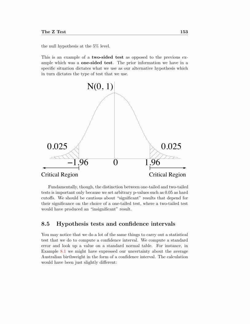
The Z Test 153
the null hypothesis at the 5% level.
This is an example of a two-sided test as opposed to the previous ex-ample which was a one-sided test. The prior information we have in aspecific situation dictates what we use as our alternative hypothesis whichin turn dictates the type of test that we use.
0
N(0, 1)
Critical Region
0.025 0.025
1.96Critical Region
1.96
Fundamentally, though, the distinction between one-tailed and two-tailedtests is important only because we set arbitrary p-values such as 0.05 as hardcutoffs. We should be cautious about “significant” results that depend fortheir significance on the choice of a one-tailed test, where a two-tailed testwould have produced an “insignificant” result.
8.5 Hypothesis tests and confidence intervals
You may notice that we do a lot of the same things to carry out a statisticaltest that we do to compute a confidence interval. We compute a standarderror and look up a value on a standard normal table. For instance, inExample 8.1 we might have expressed our uncertainty about the averageAustralian birthweight in the form of a confidence interval. The calculationwould have been just slightly different:

154 The Z Test
We start with the mean observed birthweight in the Australian sample:3276g. The standard error is σ/
√44, where σ is the (unknown) SD of
Australian birthweights. Since we don’t know σ, we substitute the SD ofthe sample, which is s = 528g. So we use
SE =√
528g√
44 = 80g.
Then a 95% confidence interval for the mean birthweight of Australian ba-bies is 3276± 1.96 · 80g = (3120, 3432)g; a 99% confidence interval would be3276±1.96 ·80g = (3120, 3432)g; a 3276±2.58 ·80g = (3071, 3481)g. (Again,remember that we are making the — not particularly realistic — assump-tion that the observed birthweights are a random sample of all Australianbirthweights.) This is consistent with the observation that the Australianbirthweights would just barely pass a test for having the same mean as theUK average 3426g, at the 0.05 significance level.
In fact, it is almost true to say that the symmetric 95% confidence in-terval contains exactly the possible means µ0 such that the data would passa test at the 0.05 significance level for having mean equal to µ0. What’sthe difference? It’s in how we compute the standard error. In computinga confidence interval we estimate the parameters of the distribution fromthe data. When we perform a statistical test, we take the parameters (asfar as possible) from the null hypothesis. In this case, that means that itmakes sense to test based on the presumption that the standard deviation ofweights is the SD of the UK births, which is the null hypothesis distribution.In this case, this makes only a tiny difference between 538g (the UK SD)and 528g (the SD of the Australian sample).
.

Lecture 9
The χ2 Test
9.1 Introduction — Test statistics that aren’t Z
In lecture 8 we learned how to test hypotheses that a population has acertain mean, or that the probability of an event has a certain value. Webase our test on the Z statistic, defined as
Z =observed− expected
standard error,
which we then compare to a standard normal distribution. This Z has threeproperties that are crucial for making a test statistic:
(i). We compute Z from the data;
(ii). Extreme values of Z correspond to what we intuitively think of asimportant failures of the null hypothesis. The larger Z is, the moreextremely the null hypothesis has failed;
(iii). Under the null hypothesis, we know the distribution of Z.
In this lecture and many of the following ones we will learn about otherstatistical tests, for testing other sorts of scientific claims. The procedurewill be largely the same: Formulate the claim in terms of the truth or falsityof a null hypothesis, find an appropriate test statistic (according to theprinciples enumerated above), and then judge the null hypothesis accordingto whether the p-value you compute is high (good for the null!) or low (badfor the null, good for the alternative!).
The Z test was used for testing whether the mean of quantitative datacould have a certain value. In this lecture we consider categorical data.
155

156 χ2 Test
These don’t have a mean. We’re usually interested in some claim about thedistribution of the data among the categories. The most basic tool we havefor testing whether data we observe really could have come from a certaindistribution is called the χ2 test.
Example 9.1: Suicide and month of birth
A recent paper [SCB06] attempts to determine whether peopleborn in certain months have higher risk of suicide than peopleborn in other months. They gathered data for 26,886 suicidesin England and Wales between 1979 and 2001, by people bornbetween 1955 and 1966, for which birth dates were recorded.Looking just at the women in the sample, the data are sum-marised in Table 9.1, where the second column gives the fractionof dates that are in that month (that is, 31 or 30 or 28.25 dividedby 365.25). The number of suicides is not the same every month
Month Prob Female Male Total
Jan 0.0849 527 1774 2301Feb 0.0773 435 1639 2074Mar 0.0849 454 1939 2393Apr 0.0821 493 1777 2270May 0.0849 535 1969 2504Jun 0.0821 515 1739 2254Jul 0.0849 490 1872 2362Aug 0.0849 489 1833 2322Sep 0.0821 476 1624 2100Oct 0.0849 474 1661 2135Nov 0.0821 442 1568 2010Dec 0.0849 471 1690 2161
Total 1.0000 5801 21085 26886Mean 483.4 1757.1 2240.5
Table 9.1: Suicides 1979–2001 by month of birth in England and Wales1955–66, taken from [SCB06].
— as you would inevitably expect, by chance variation. But isthere a pattern? Are there some months whose newborns are

χ2 Test 157
more likely than others’ to take their own lives 20 to 40 yearslater? There seem to be more suicides among spring babies. Wemight formulate a hypothesis as follows:
H0 : a suicide has equal chances (1/365.25) of having been
born on any date of the year
The alternative hypothesis is that people born on some dates aremore likely to commit suicide. (We count 29 February as 0.25days, since it is present in one year out of four.)
How might we test this? One way would be to split up thesuicides into two categories: “Spring births” (March throughJune) and “Others”. We then have 9421 suicides among thespring births, and 17465 among the others. Now, 122 days arein the spring-birth category, so our null hypothesis is
H0 : p0 = Probability of a suicide being spring-birth = 122/365.25 = 0.334.
The expected number of spring-birth suicides (under the nullhypothesis) is 26886 × p0 = 8980, and the standard error is√p0(1− p0)n =
√0.334× 0.666× 26886 = 77.3. We then per-
form a Z test with
Z =9421− 8980
77.3= 5.71.
The Z statistic runs off the end of our table, indicating a p-valuebelow 0.0001. (In fact, the p-value is below 10−8, or about 1chance in 100 million.)
Is this right, though? Not really. We are guilty here of datasnooping: We looked at the data in order to choose which wayto break up the year into two categories. If we had split up theyear differently, we might have obtained a very different result.(For example, if we had defined “spring-birth” to include onlyApril through June, we would have obtained a Z statistic of only4.6461.) It would be helpful to have an alternative approach thatcould deal with multiple categories as they are, without needingto group them arbitrarily into two. �
9.2 Goodness-of-Fit Tests
We are considering the following sort of situation. We observe n realisationsof a categorical random variable. There are k categories. We have a null

158 χ2 Test
hypothesis that tells us that these categories have probabilities p1, . . . , pk, sothat the expected number of observations in the categories are np1, . . . , npk.The observed numbers in each category are n1, . . . , nk.
We want to have a test statistic that measures how far off the observedare, in total, from the expected. We won’t fall into the trap of summing upni − npi (which will always be 0). We might instead add up the squareddifferences (ni − npi)
2. But that seems like a problem, too: If we wereexpecting to have just 1 outcome in some category, and we actually got11, that seems a lot more important than if we were expecting 1000 andactually got 1010, even though the difference is 10 in each case. So we wanta difference to contribute more to the test statistic if the expected numberis small.
By this reasoning we arrive at the χ2 (“chi-squared”, pronounced “keyesquared”) statistic
X2 :=(n1 − np1)2
np1+· · ·+ (nk − npk)2
npk=∑ (observed− expected)2
expected. (9.1)
9.2.1 The χ2 distribution
The statistic X2 has properties (i) and (ii) for a good test statistic: wecan compute it from the data, and bigger values of X correspond to datathat are farther away from what you would expect from the null hypothesis.But what about (iii)? We can’t do a statistical test unless we know thedistribution of X under the null hypothesis. Fortunately, the distribution isknown. The statistic X has approximately (for large n) one of a family ofdistributions, called the χ2 distribution. There is a positive integer, calledthe number of degrees of freedom (abbreviated “d.f.”) which tells uswhich χ2 distribution we are talking about. One of the tricky things aboutusing the χ2 test statistic is figuring out the number of degrees of freedom.This depends on the number of categories, and how we picked the nullhypothesis that we are testing. In general,
degrees of freedom = # categories - # parameters fit from the data - 1.
When is n large enough? The rule of thumb is that the expected numberin every category must be at least about 5. So what do we do if some of theexpected numbers are too small? Very simple: We group categories together,

χ2 Test 159
until the problem disappears. We will see examples of this in sections 9.4.1and 9.4.2.
The χ2 distribution with d degrees of freedom is a continuous distribu-tion1 with mean d and variance 2d. In Figure 9.1 we show the density of thechi-squared distribution for some choices of the degrees of freedom. We notethat these distributions are always right-skewed, but the skew decreases asd increases. For large d, the χ2 distribution becomes close to the normaldistribution with mean d and variance 2d.
As with the standard normal distribution, we rely on standard tableswith precomputed values for the χ2 distribution. We could simply have aseparate table for each number of degrees of freedom, and use these exactlylike the standard normal table for the Z test. This would take up quitea bit of space, though. (Potentially infinite — but for large numbers ofdegrees of freedom see section 9.2.2.) Alternatively, we could use a computerprogramme that computes p-values for arbitrary values of X and d.f. (In theR programming language the function pchisq does this.) This is an idealsolution, except that you don’t have computers to use on your exams.
Instead, we rely on a traditional compromise approach, taking advantageof the fact that the most common use of the tables is to find the critical valuefor hypothesis testing at one of a few levels, such as 0.05 and 0.01.
Example 9.2: Using the χ2 table
We perform a χ2 test to test a certain null hypothesis at the0.05 significance level, and find an observed X2 of 12.1 with 5degrees of freedom. We look on the table and see in the rowfor 5 d.f. that the critical value is 11.07. Since our observedvalue is above this, we reject the null hypothesis. On the otherhand, we would have retained the null hypothesis had we beentesting at the 0.01 level, since the critical value at level 0.01 is15.09. (The actual p-value is 0.0334.) We show, in figure 9.2,the region corresponding to the 0.01 significance level in green,and the remainder of the 0.05 critical region in red. We haveobserved 12.1, so the logic tells us that either the data did notcome from the null hypothesis, or we happen, purely by chance,to have made a pick that wound up in the tiny red region.
1It happens to be the same as the distribution of the sum of d independent randomvariables, each of which is the square of a standard normal. In particular, the χ2 with 1degree of freedom is the same as the square of a standard normal random variable.

160 χ2 Test
0 2 4 6 8 10
0.0
0.1
0.2
0.3
0.4
0.5
x
Density
1 d.f.2 d.f.3 d.f.4 d.f.5 d.f.6 d.f.7 d.f.
(a) Small d.f.
0 10 20 30 40 50
0.00
0.05
0.10
0.15
x
Density
5 d.f.10 d.f.20 d.f.30 d.f.
(b) Moderate d.f.
Figure 9.1: The density of χ2 distributions with various degrees of freedom.

χ2 Test 161
d.f. P = 0.05 P = 0.01
1 3.84 6.632 5.99 9.213 7.81 11.344 9.49 13.285 11.07 15.096 12.59 16.817 14.07 18.488 15.51 20.099 16.92 21.67
10 18.31 23.2111 19.68 24.7212 21.03 26.2213 22.36 27.6914 23.68 29.1415 25.00 30.5816 26.30 32.00
d.f. P = 0.05 P = 0.01
17 27.59 33.4118 28.87 34.8119 30.14 36.1920 31.41 37.5721 32.67 38.9322 33.92 40.2923 35.17 41.6424 36.42 42.9825 37.65 44.3126 38.89 45.6427 40.11 46.9628 41.34 48.2829 42.56 49.5930 43.77 50.8940 55.76 63.6960 79.08 88.38
Table 9.2: A χ2 table
�
9.2.2 Large d.f.
Table 9.2 only gives values for up to 60 degrees of freedom. What do wedo when the problem gives us more than 60? Looking at Figure 9.1(b) youprobably are not surprised to hear that the χ2 distribution gets ever closerto a normal distribution when the number of degrees of freedom gets large.Which normal distribution? We already know the mean and variance of theχ2. For large d, then,
χ2(d) is approximately the same as N(d, 2d).
Thus, the p-value for a given observed X2 is found by taking
Z =X2 − d√
2d,
and looking it up on the standard normal table. Conversely, if we want toknow the critical value for rejecting X2 with d degrees of freedom, with d

162 χ2 Test
0.00
0.05
0.10
0.15
Density
0 5 10 2011.07 15.09
Figure 9.2: χ2 density with 5 degrees of freedom. The green region represents1% of the total area. The red region represents a further 4% of the area, sothat the tail above 11.07 is 5% in total.
large, at significance level α, we start by finding the appropriate z for thelevel (if we were doing a Z test). The critical value for X2 is then
√2dz + d.
For example, if we were testing at the 0.01 level, with 60 d.f., we wouldfirst look for 9950 on the standard normal table, finding that this correspondsto z = 2.58. (Remember that in a two-tailed test at the 0.01 level, theprobability above z is 0.005.) We conclude that the critical value for χ2
with 60 d.f. at the 0.01 level is about
2.58√
120 + 60 = 88.26.
The exact value, given on the table, is 88.38. For larger values of d.f. wesimply rely on the approximation.
9.3 Fixed distributions
We start with a simple example. Suppose we have a six-sided die, and weare wondering whether it is fair — that is, whether each side is equally likely

χ2 Test 163
to come up. We roll it 60 times, and tabulate the number of times each sidecomes up. The results are given in Table 9.3.
Table 9.3: Outcome of 60 die rolls
Side 1 2 3 4 5 6Observed Frequency 16 15 4 6 14 5Expected Frequency 10 10 10 10 10 10
It certainly appears that sides 1,2, and 5 come up more often than theyshould, and sides 3, 4, and 6 less frequently. On the other hand, somedeviation is expected, due to chance. Are the deviations we see here tooextreme to be attributed to chance?
Suppose we wish to test the null hypothesis
H0 : Each side comes up with probability 1/6
at the 0.01 significance level. In addition to the Observed Frequency ofeach side, we have also indicated, in the last row of Table 9.3, the ExpectedFrequency, which is the probability (according to H0) of the side comingup, multiplied by the number of trials, which is 60. Since each side hasprobability 1/6 (under the null hypothesis), the expected frequencies areall 10. (Note that the observed and expected frequencies both add up toexactly the number of trials.)
We now plug these numbers into our formula for the chi-squared statistic:
X2 =∑ (observed− expected)2
expected
=(16− 10)2
10+
(15− 10)2
10+
(4− 10)2
10+
(6− 10)2
10+
(14− 10)2
10+
(5− 10)2
10= 3.6 + 2.5 + 3.6 + 1.6 + 1.6 + 2.5
= 15.4.
Now we need to decide whether this number is a big one, by comparingit to the appropriate χ2 distribution. Which one is the appropriate one?When testing observations against a single fixed distribution, the numberof degrees of freedom is always one fewer than the number of categories.2
There are six categories, so five degrees of freedom.
2Why minus one? You can think of degrees of freedom as saying, how many different

164 χ2 Test
Example 9.3: Suicides, continued
We complete Example 9.1. We want to test whether the observeddata in Table 9.1 could plausibly have come from the null hy-pothesis, with the probability for each month given in column 2.In Table 9.4 we add columns for “expected” numbers of suicides.For example, if we look in the column “Female/Exp”, and therow January, we find the number 493. This is obtained from mul-tiplying 5801 (the total number of women in the study) by 0.0849(the probability of a woman having been born in January, underthe null hypothesis). (The numbers in the “expected” columnsdon’t add up to exactly the same as those in the corresponding“observed” column, because of rounding.)
Month Prob.Female Male Combined
Obs Exp Obs Exp Obs Exp
Jan 0.0849 527 493 1774 1790 2301 2283Feb 0.0773 435 448 1639 1630 2074 2078Mar 0.0849 454 493 1939 1790 2393 2283Apr 0.0821 493 476 1777 1731 2270 2207May 0.0849 535 493 1969 1790 2504 2283Jun 0.0821 515 476 1739 1731 2254 2207Jul 0.0849 490 493 1872 1790 2362 2283
Aug 0.0849 489 493 1833 1790 2322 2283Sep 0.0821 476 476 1624 1731 2100 2207Oct 0.0849 474 493 1661 1790 2135 2283Nov 0.0821 442 476 1568 1731 2010 2207Dec 0.0849 471 493 1690 1790 2161 2283
Total 1.0000 5801 5803 21085 21084 26886 26887
Table 9.4: Suicides 1979–2001 by month of birth in England and Wales1955–66, taken from [SCB06].
We now test the null hypothesis for the combined sample of menand women, at the 0.01 significance level. We plug these columns
numbers did we really observe? We observed six numbers (the frequency counts for thesix sides), but they had to add up to 60, so any five of them determine the sixth one. Sowe really only observed five numbers.

χ2 Test 165
into equation (9.1), obtaining
X2 =(2301− 2283)2
2283+
(2073− 2078)2
2078
+(2393− 2283)2
2283+ · · ·+ (2161− 2283)2
2283= 71.9.
Since there are 12 categories, the number of degrees of freedomis 12 − 1 = 11. We look on the χ2 table in row 11 d.f., col-umn P = 0.01, and find the critical value is 24.73. Since theobserved value is higher, we reject the null hypothesis, and con-clude that the difference between the observed distribution ofsuicides’ birthmonths and what would be expected purely bychance is highly significant. (The actual p-value is less than10−10, so there is less than one chance in ten billion that wewould observe such a deviation purely by chance, if the null hy-pothesis were true.)
If we considered only the female data, on the other hand, the χ2
value that we would compute from those two columns is 17.4,which is below the critical value. Considered on their own, thefemale data do not provide strong evidence that suicides’ birthmonths differ in distribution from what would be expected bychance. �
Example 9.4: Distribution of births
Did we use the right null hypothesis in Example 9.1? We as-sumed that all birthdates should be equally likely.
At http://www.statistics.gov.uk/downloads/theme_population/FM1_32/FM1no32.pdf we have official UK government statisticsfor births in England and Wales. Table 2.4 gives the data forbirth months, and we repeat them in the column “observed” inTable 9.5. The “Expected” column tells us how many birthswould have been expected in that month under the null hy-pothesis that all dates are equally likely. We compute X2 =∑ (Obsi−Expi)2
Expi= 477. The critical value is still the same as be-
fore, which is 24.73, so this is much bigger. (In fact, the p-value

166 χ2 Test
is around 10−16.) So births are definitely not evenly distributedthrough the year.
Month Prob. Observed Expected
Jan 0.0849 29415 30936Feb 0.0767 26890 27942Mar 0.0849 30122 30936Apr 0.0822 30284 29938May 0.0849 31516 30936Jun 0.0822 30571 29938Jul 0.0849 32678 30936
Aug 0.0849 31008 30936Sep 0.0822 31557 29938Oct 0.0849 31659 30936Nov 0.0822 29358 29938Dec 0.0849 29186 30936
Total 1.0000 364244 364246
Table 9.5: Observed frequency of birth months, England and Wales, 1993.
We might then decide to try testing a new null hypothesis
H0: Suicides have the same distribution of birth monthas the rest of the population.
In Table 9.6 we show the corresponding calculations. In the col-umn “Prob.” we give the observed empirical fraction of birthsfor that month, as tabulated in Table 9.5. Thus, the probabilityfor January is 0.0808, which is 29415/364244. The “Observed”column copies the final observed column from Table 9.4, and the“Expected” column is obtained by multiplying the “Prob” col-umn by 26886, the total number of suicides in the sample. Usingthese two columns, we compute X2 = 91.8, which is even largerthan the value computed before. Thus, when we change to thismore appropriate null hypothesis, the evidence that somethinginteresting is going on becomes even stronger.
�

χ2 Test 167
Month Prob. Observed Expected
Jan 0.0808 2301 2171Feb 0.0738 2074 1985Mar 0.0827 2393 2223Apr 0.0831 2270 2235May 0.0865 2504 2326Jun 0.0839 2254 2257Jul 0.0897 2362 2412
Aug 0.0851 2322 2289Sep 0.0866 2100 2329Oct 0.0869 2135 2337Nov 0.0806 2010 2167Dec 0.0801 2161 2154
Total 1.0000 26886 26885
Table 9.6: Birth months of suicides compared with observed frequencies ofbirth months in England and Wales, from Table 9.5.
9.4 Families of distributions
In many situations, it is not that we want to know whether the data camefrom a single distribution, but whether it may have come from any oneof a whole family of distributions. For example, in Lecture 5 we consideredseveral examples of data that might be Poisson distributed, and for which thefailure of the Poisson hypothesis would have serious scientific significance.In such a situation, we modify our χ2 hypothesis test procedure slightly:
(1). Estimate the parameters in the distribution. Now we have a partic-ular distribution to represent the null hypothesis.
(2). Compute the expected occupancy in each cell as before.
(3). Using these expected numbers and the observed numbers (the data)compute the χ2 statistic.
(4). Compare the computed statistic to the critical value. Important: Thedegrees of freedom are reduced by one for each parameter that hasbeen estimated.

168 χ2 Test
Thus, if we estimated a single parameter (e.g., Poisson distribution) we lookin the row for # categories−2 d.f. If we estimated two parameters (e.g.,normal distribution) we look in the row for # categories−3 d.f.
9.4.1 The Poisson Distribution
Consider Example 5.7. We argued there that the distribution of Guillain-Barre Syndrome (GBS) cases by weeks should have been Poisson distributedif the flu vaccine was not responsible for the disease. The data are given inTable 5.3, showing the number of weeks in which different numbers of caseswere observed.
If some Poisson distribution were correct, what would be the parameter?We estimated that λ, which is the expected number of cases per week, shouldbe estimated by the observed average number of cases per week, which is40/30 = 1.33. We computed the probabilities for different numbers of cases,assuming a Poisson distribution with parameter 1.33, and multiplied theseprobabilities by 40 to obtain expected numbers of weeks. We comparedthe observed to these expected numbers, and expressed the impression thatthese distributions were different. But the number of observations is small.Could it be that the difference is purely due to chance?
We want to test the null hypothesisH0: The data came from a Poisson
distribution with a χ2 test. We can’t use the numbers from Table 5.3 di-rectly, though. As discussed in section 9.2.1, the approximation we use forthe χ2 distribution depends on the categories all being “large enough”, therule of thumb being that the expected numbers under the null hypothesisshould be at least 5. The last three categories are all too small. So, wegroup the last four categories together, to obtain the new Table 9.7. Thelast category includes everything 3 and higher.
Table 9.7: Cases of GBS, by weeks after vaccination
# cases per week 0 1 2 3+
observed frequency 16 7 3 4probability 0.264 0.352 0.234 0.150
expected frequency 10.6 14.1 9.4 6.0

χ2 Test 169
We now compute
X2 =(16− 10.6)2
10.6+
(7− 14.1)2
14.1+
(3− 9.4)2
9.4+
(4− 6.0)2
6.0= 11.35.
Suppose we want to test the null hypothesis at the 0.01 significance level.In order to decide on a critical value, we need to know the correct numberof degrees of freedom. The reduced Table 9.7 has oly 4 categories. Therewould thus be 3 d.f., were it not for our having estimated a parameter todecide on the distribution. This reduces the d.f. by one, leaving us with 2degrees of freedom. Looking in the appropriate row, we see that the criticalvalue is 9.21, so we do reject the null hypothesis (the true p-value is 0.0034),and conclude that the data did not come from a Poisson distribution.
9.4.2 The Binomial Distribution
In 1889, A. Geissler published data on births recorded in Saxony over a 10year period, tabulating the numbers of boys and girls. (The complete dataset, together with analysis and interpretation, may be found in [Edw58].)Table 9.8 shows the number of girls in the 6115 families with 12 children.If the gender of successive children are independent, and the probabilitiesremain constant over time, the number of girls born to a particular familyof 12 children should be a binomial random variable with 12 trials and anunknown probability p of success.
Table 9.8: Numbers of girls in families with 12 children, from Geissler.
# Girls 0 1 2 3 4 5 6Frequency 7 45 181 478 829 1112 1343Expected 2.3 26.1 132.8 410.0 854.2 1265.6 1367.3
Probability 0.0004 0.0043 0.0217 0.0670 0.1397 0.2070 0.2236
# Girls 7 8 9 10 11 12Frequency 1033 670 286 104 24 3Expected 1085.2 628.1 258.5 71.8 12.1 0.9
Probability 0.1775 0.1027 0.0423 0.0117 0.0020 0.0002
We can use a Chi-squared test to test the hypothesis that the data followa Binomial distribution.

170 χ2 Test
H0 : The data follow a Binomial distributionH1 : The data do not follow a Binomial distribution
At this point we also decide upon a 0.05 significance level.
From the data we know that n = 6115 and we can estimate p as
p =x
12=
7(0) + 45(1) + . . .+ 3(12)
12× 6115= 0.4808
Thus we can fit a Bin(12, 0.4808) distribution to the data to obtain theexpected frequencies (E) alongside the observed frequencies (O). The prob-abilities are shown at the bottom of Table 9.8, and the expectations arefound by multiplying the probabilities by 6115. The first and last cate-gories have expectations smaller than 5, so we absorb them into the nextcategories, yielding Table 9.9.
Table 9.9: Modified version of Table 9.8, with small categories groupedtogether.
# Girls 0, 1 2 3 4 5 6 7 8 9 10 11, 12Frequency 52 181 478 829 1112 1343 1033 670 286 104 27Expected 28.4 132.8 410.0 854.2 1265.6 1367.3 1085.2 628.1 258.5 71.8 13.0
Probability 0.0047 0.0217 0.0670 0.1397 0.2070 0.2236 0.1775 0.1027 0.0423 0.0117 0.0022
The test statistic can then be calculated as
X2 =(52− 28.4)2
28.4+ . . .+
(27− 13.0)2
13.0= 105.95
The degrees of freedom are given by
df = (k − 1)− p = (11− 1)− 1 = 9
Thus, the Critical Region for the test is X2 > 16.92.
The test statistics lies well within the Critical Region so we conclude thatthere is significant evidence against the null hypothesis at the 5% level.We conclude that the sex of newborns in families with 12 children is NOTbinomially distributed.

χ2 Test 171
Explaining the Geissler data
Non-examinable. Just if you’re interested.So what is going on? A good discussion may be found in [LA98]. A briefsummary is that two things happened:
(1). Large numbers of children tended to appear in families which startedout unbalanced, particularly if they had all girls. That is, a familywith three girls would be more likely to have another child than afamily with two boys and a girl.
(2). The p value really doesn’t seem to be the same between families. Somefamilies have a tendency to produce more boys, others more girls.
Note that (1) is consistent with our original hypothesis, that babies all havethe same probability p of being female: We have just pushed the variabilityfrom small families to large ones. Think of it this way: Suppose there werea rule that said: Stop when you have 3 children, unless the children are allboys or all girls. Otherwise, keep trying to get a balanced family. Thenthe small families would be more balanced than you would have expected,and the big families more unbalanced — for instance, half of the four-childfamilies would have all boys or all girls. Of course, it’s more complicatedthan that: Different parents have different ideas about the “ideal” family.But this effect does seem to explain some of the deviation from the binomialdistribution.
The statistical analysis in [LA98] tries to pull these effects apart (and alsotake into account the small effect of identical twins), finding that there is anSD of about 0.16 in the value of p, the probability of a girl, and furthermorethat there is some evidence that some parents produce nothing but girls, orat most have a very small probability of producing boys.
The Normal Distribution
The following table gives the heights in cm of 100 students. In such asituation we might be interested in testing whether the data follow a Normaldistribution or not.
Height (cm) 155-160 161-166 167-172 173-178 179-184 185-190Frequency 5 17 38 25 9 6
We can use a Chi-squared test to test the hypothesis that the data follow aNormal distribution.

172 χ2 Test
H0 : The data follow a Normal distributionH1 : The data do not follow a Normal distribution
At this point we also decide upon a 0.05 significance level.
From the data we can estimate the mean and standard deviation using thesample mean and standard deviation
x = 172
s = 7.15
To fit a Normal distribution with this mean and variance we need to calculatethe probability of each interval. This is done in four straightforward steps
(i). Calculate the upper end point of each interval (u)
(ii). Standardize the upper end points (z)
(iii). Calculate the probability P (Z < z)
(iv). Calculate the probability of each interval
(v). Calculate the expected cell counts
Height (cm) 155-160 161-166 167-172 173-178 179-184 185-190Endpoint (u) 160.5 166.5 172.5 178.5 184.5 ∞
Standardized (z) -1.61 -0.77 0.07 0.91 1.75 ∞P (Z < z) 0.054 0.221 0.528 0.818 0.960 1.00
P (a < Z < b) 0.054 0.167 0.307 0.290 0.142 0.040Expected 5.4 16.7 30.7 29.0 14.2 4.0Observed 5 17 38 25 9 6
From this table we see that there is one cell with an expected count lessthan 5 so we group it together with the nearest cell. (A single cell withexpected count is on the borderline; we could just leave it. We certainlydon’t want any cell with expected count less than about 2, and not morethan one expected count under 5.)
Height (cm)155-160 161-166 167-172 173-178 179-190
Expected 5.4 16.7 30.7 29.0 18.2Observed 5 17 38 25 15

χ2 Test 173
We can then calculate the test statistic as
X2 =(5.4− 6)2
5.4+ . . .+
(15− 18.2)2
18.2= 2.88
The degrees of freedom are given by
df = (# categories− 1)−# parameters estimated = (5− 1)− 2 = 2.
Thus, the Critical Region for the test is X2 > 5.99.
The test statistics lies outside the Critical Region so we conclude that theevidence against the null hypothesis is not significant at the 0.05 level.
9.5 Chi-squared Tests of Association
This section develops a Chi-squared test that is very similar to the one ofthe preceding section but aimed at answering a slightly different question.To illustrate the test we use an example, which we borrow from [FPP98,section 28.2].
Table 9.10 gives data on Americans aged 25–34 from the NHANES sur-vey, a random sample of Americans. Among other questions, individualswere asked their age, sex, and handedness.
Table 9.10: NHANES handedness data for Americans aged 25–34
Men Women
right-handed 934 1070left-handed 113 92ambidextrous 20 8
Looking at the data, it looks as though the women are more likely tobe right-handed. Someone might come along and say: “The left cerebralhemisphere controls the right side of the body, as well as rational thought.This proves that women are more rational than men.” Someone else mightsay, “This shows that women are under more pressure to conform to soci-ety’s expectations of normality.” But before we consider this observationas evidence of anything important, we have to pose the question: Does this

174 χ2 Test
reflect a difference in the underlying population, or could it merely be arandom effect of sampling?
The research hypothesis in this situation is whether a person’s handed-ness is associated with their sex. In this situation, the null hypothesis wouldbe that there is no association between the two variables. In other words,the null hypothesis is that the two variables are independent.
H0 : The two variables are independent.H1 : The two variables are associated.
Or, to put it differently, each person gets placed in one of the six cells of thetable. The null hypothesis says that which row you’re in is independent ofthe column. This is a lot like the problems we had in section 9.4: Here thefamily of distributions we’re interested in is all the distributions in whichthe rows are independent of the columns. The procedure is essentially thesame:
(1). Estimate the parameters in the null distribution. This means we esti-mate the probability of being in each row and each column.
(2). Compute the expected occupancy in each cell: This is the number ofobservations times the row probability times the column probability.
(3). Using these expected numbers and the observed numbers (the data)compute the χ2 statistic.
(4). Compare the computed statistic to the critical value. The number ofdegrees of freedom is (r − 1)(c − 1), where r is the number of rowsand c the number of columns. (Why? The number of cells is rc. Weestimated r−1 parameters to determine the row probabilities and c−1parameters to determine the column probabilities. So we have r+c−2parameters in all. By our standard formula,
d.f. = rc− 1− (r + c− 2) = (r − 1)(c− 1).
We wish to test the null hypothesis at the 0.01 significance level. We ex-tend the table to show the row and column fractions in Table 9.11. Thus, wesee that 89.6% of the sample were right-handed, and 47.7% were male. Thefraction that were right-handed males would be 0.896×0.477 = 0.427 underthe null hypothesis. Multiplying this by 2237, the total number of observa-tions, we obtain 956, the expected number of right-handed men under the
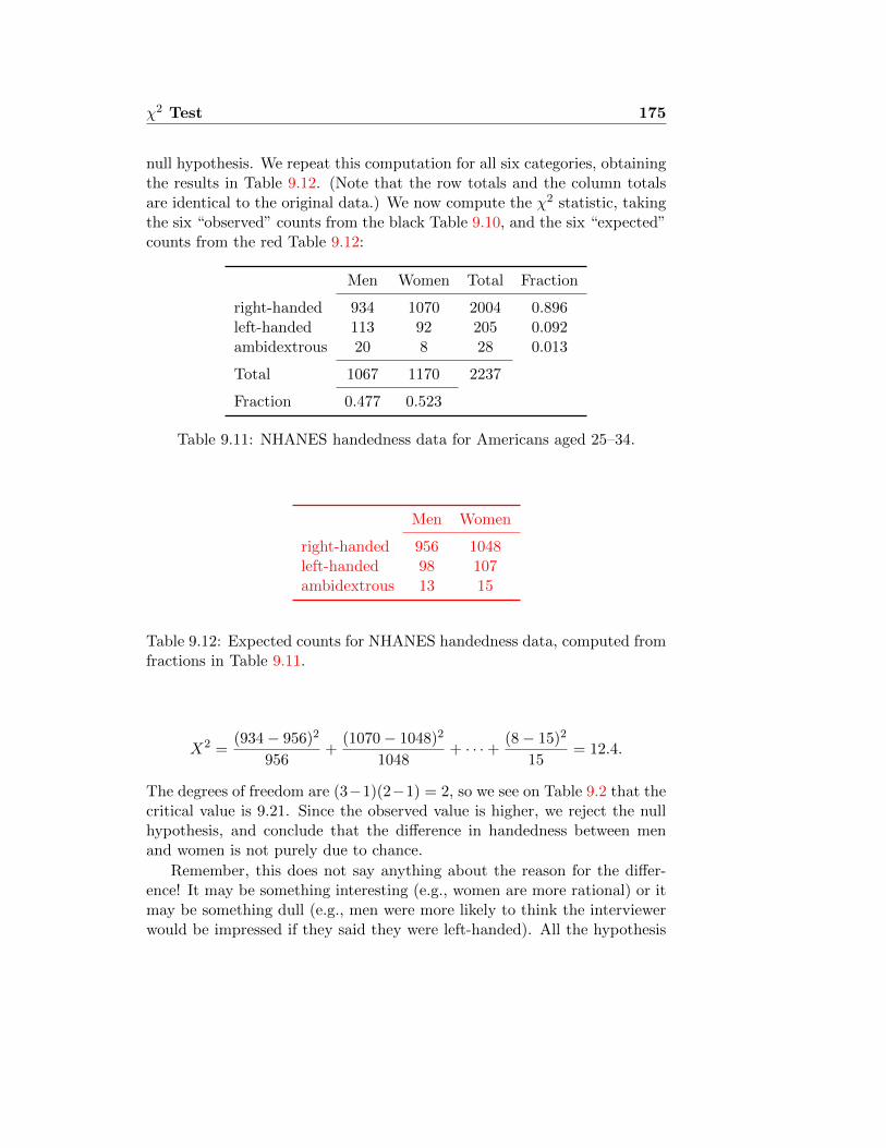
χ2 Test 175
null hypothesis. We repeat this computation for all six categories, obtainingthe results in Table 9.12. (Note that the row totals and the column totalsare identical to the original data.) We now compute the χ2 statistic, takingthe six “observed” counts from the black Table 9.10, and the six “expected”counts from the red Table 9.12:
Men Women Total Fraction
right-handed 934 1070 2004 0.896left-handed 113 92 205 0.092ambidextrous 20 8 28 0.013
Total 1067 1170 2237
Fraction 0.477 0.523
Table 9.11: NHANES handedness data for Americans aged 25–34.
Men Women
right-handed 956 1048left-handed 98 107ambidextrous 13 15
Table 9.12: Expected counts for NHANES handedness data, computed fromfractions in Table 9.11.
X2 =(934− 956)2
956+
(1070− 1048)2
1048+ · · ·+ (8− 15)2
15= 12.4.
The degrees of freedom are (3−1)(2−1) = 2, so we see on Table 9.2 that thecritical value is 9.21. Since the observed value is higher, we reject the nullhypothesis, and conclude that the difference in handedness between menand women is not purely due to chance.
Remember, this does not say anything about the reason for the differ-ence! It may be something interesting (e.g., women are more rational) or itmay be something dull (e.g., men were more likely to think the interviewerwould be impressed if they said they were left-handed). All the hypothesis

176 χ2 Test
test tells us is that we would most likely have found a difference in handed-ness between men and women if we had surveyed the whole population.

Lecture 10
The T distribution andIntroduction to Sampling
10.1 Using the T distribution
You may have noticed a hole in the reasoning we used in reasoning aboutthe husbands’ heights in section 7.1. Our computations depended on thefact that
Z :=X − µσ/√n
has standard normal distribution, when µ is the population mean and σ isthe population standard deviation. But we don’t know σ! We did a littleslight of hand, and substituted the sample standard deviation
S :=
√√√√ 1
n− 1
n∑i=1
(Xi − X)2
for the (unknown) value of σ. But S is only an estimate for σ: it’s a randomvariable that might be too high, and might be too low. So, what we werecalling Z is not really Z, but a quantity that we should give another nameto:
T :=X − µS/√n. (10.1)
If S is too big, then Z > T , and if S is too small then Z < T . On average,you might suppose, Z and T would be about the same — and, in this youwould be right. Does the distinction matter then?
177

178 T distribution
Since T has an extra source of error in the denominator, you would ex-pect it to be more widely scattered than Z. That means that if you computeT from the data, but look it up on a table computed from the distributionof Z — the standard normal distribution — you would underestimate theprobability of a large value. The probability of rejecting a true null hypothe-sis (Type I error) will be larger than you thought it was, and the confidenceintervals that you compute will be too narrow. This is very bad! If wemake an error, we always want it to be on the side of underestimating ourconfidence.
Fortunately, we can compute the distribution of T (sometimes called“Student’s t”, after the pseudonym under which statistician William Gossettpublished his first paper on the subject, in 1908). While the mathematicsbehind this is beyond the scope of this course, the results can be found intables. These are a bit more complicated than the normal tables, becausethere is an extra parameter: Not surprisingly, the distribution depends onthe number of samples. When the estimate is based on very few samples(so that the estimate of SD is particularly uncertain) we have a distribu-tion which is far more spread out than the normal. When the number ofsamples is very large, the estimate s varies hardly at all from σ, and thecorresponding t distribution is very close to normal. As with the χ2 distri-bution, this parameter is called “degrees of freedom”. For the T statistic,the number of degrees of freedom is just n − 1, where n is the number ofsamples being averaged. Figure 10.1 shows the density of the t distributionfor different degrees of freedom, together with that of the normal. Note thatthe t distribution is symmetric around 0, just like the normal distribution.
Table 10.1 gives the critical values for a level 0.05 hypothesis test whenZ is replaced by t with different numbers of degrees of freedom. In otherwords, if we define tα(d) to be the number such that P
{T < tα
}= α when
T has the Student distribution with d degrees of freedom, Table 10.1(a)gives values of t0.95, and Table 10.1(b) gives values of t0.975. Note that thevalues of tα(d) decrease as d increases, approaching a maximum, which iszα = tα(∞).
10.1.1 Using t for confidence intervals: Single sample
Suppose we have observations x1, . . . , xn from a normal distribution, wherethe mean and the SD are both unknown. To compute confidence intervals

T distribution 179
●●●●●●●●●●●●●●●●●●●●●●●●●●●●●●●●●●●●●●●●●●●●●●●●●●●●●●●●●●●●●●●●●●●●●●●●●●●●●●●●●●●●●●●●●●●●●●●●●●●●●●●●●●●●●●●●●●●●●●●●●●●●●●●●●●●●●●●●●●●
●●●●●●●●●●●●●●●●●●●●●●●●●●●●
●●●●●●●●●●●●●●●●●●●●●●●●●●●●●●●●●●●●●●●●●●●●●●●●●●●●●●●●●●●●●●●●●●●●●●●●●●●●●●●●●●●●●●●●●●●●●●●●●●●●●●●●●●●●●●●●●●●●●●●●●●●●●●●●●●●●●●●●●●●●●●●●●●●●●●●●●●●●●●●●●●●●●●●●●●●●●●●●●●●●●●●●●●●●●●●●●●●●●●●●●●●●●●●●●●●●●●●●●●●●●●●●●●●●●●●●●●●●●●●●●●●●●●●●●●●●●●●●●●●●●●●●●●●●●●●●●●●●●●●●●●●●●●●●●●●●●●●●●●●●●●●●●●●●●●●●●●●●●●●●●●●●●●●●●●●●●●●●●●●●●●●●●●●●●●●●●●●●●●●●●●●●●●●●●●●●●●●●●●●●●●●●●●●●●●●●●●●●●●●●●●●●●●●●●●●●●●●●●●●●●●●●●●●●●●●●●●●●●●●●●●●●●●●●●●●●●●●●●●●●●●●●●●●●●●●●●●●●●●●●●●●●●●●●●●●●●●●●●●●●●●●●●●●●●●●●●●●●●●●●●●●●●●●●●●●●●●●●●●●●●●●●●●●●●●●●●●●●●●●●●●●●●●●●●●●●●●●●●●●●●●●●●●●●●●●●●●●●●●●●●●●●●●●●●●●●●●●●●●●●●●●●●●●●●●●●●●
−4 −2 0 2 4
0.0
0.1
0.2
0.3
0.4
Probability density for normal and t−distributions
z
dnor
m(z
)
Normal1 d.f.2 d.f.4 d.f.10 d.f.25 d.f.
Figure 10.1: The standard normal density together with densities for the tdistribution with different degrees of freedom.
Table 10.1: Cutoffs for hypothesis tests at the 0.95 level, using the t statisticwith different degrees of freedom. The ∞ level is the limit for a very largenumber of degrees of freedom, which is identical to the distribution of the Zstatistic.
(a) one-tailed test
degrees of criticalfreedom value
1 6.312 2.924 2.1310 1.8150 1.68∞ 1.64
(b) two-tailed test
degrees of criticalfreedom value
1 12.72 4.304 2.7810 2.2350 2.01∞ 1.96

180 T distribution
with the t statistic, we follow the same procedures as in section 7.1, substi-tuting s for σ, and the quantiles of the t distribution for the quantiles of thenormal distribution: that is, where we looked up a number z on the normaltable, such that P (Z < z) was a certain probability, we substitute a numbert such that P (T < t) is that same probability, where T has the Student Tdistribution with the right number of degrees of freedom. Thus, if we wanta 95% confidence interval, we take
X ± t× s√n,
where t is found in the column marked “P = 0.05” on the T-distributiontable — 0.05 being the probability above t that we are excluding. It corre-sponds, of course, to P (T < t) = 0.975.
Example 10.1: Heights of British men
In section 7.1 we computed a confidence interval for the heightsof married British men, based on a sample of size 198. Sincewe were using the sample SD to estimate the population SD, weshould have used the t quantiles with 197 degrees of freedom,rather than the Z quantiles. If you look on a table of the tdistribution you won’t find a row corresponding to 197 degreesof freedom, though. Why not? The t distribution with 197degrees of freedom is almost indistinguishable from the normaldistribution. To give an example, the multiplier for a symmetric90% normal confidence interval is z = 1.645; the correspondingt quantile is t(197) = 1.653, so the difference is less than 1%.There is no real application where you are likely to be able tonotice an error of that magnitude. �
Example 10.2: Kidney dialysis
A researcher measured the blood level of phosphate in the bloodof dialysis patients on six consecutive clinical visits.1 It is im-portant to maintain the levels of various nutrients in appropriatebounds during dialysis treatment. The values are known to vary
1This example is adapted from [MM98, p.529], where it was based on a Master’s thesisof Joan M. Susic at Purdue University.

T distribution 181
approximately according to a normal distribution. For one pa-tient, the values (in mg/dl) were measured 5.6, 5.1, 4.6, 4.8,5.7, 6.4. What is a symmetric 99% confidence interval for thepatient’s true phosphate level?
We compute
X =1
6(5.6 + 5.1 + 4.6 + 4.8 + 5.7 + 6.4) = 5.4mg/dl
s =
√1
5
((5.6− 5.4)2 + (5.1− 5.4)2 + (4.6− 5.4)2
+(4.8− 5.4)2 + (5.7− 5.4)2 + (6.4− 5.4)2
)= 0.67mg/dl.
The number of degrees of freedom is 5. Thus, the symmetricconfidence interval will be(
5.4− t0.67√6, 5.4 + t
0.67√6
)mg/dl,
where t is chosen so that the T variable with 5 degrees of freedomhas probability 0.01 of being bigger than t. �
10.1.2 Using the T table
T tables are like the χ2 table. For Z, the table in your official booklet allowsyou to choose your value of Z, and gives you the probability of finding Zbelow this value. Thus, if you were interested in finding zα, you would lookto find α inside the table, and then check which index Z corresponds to it. Inprinciple, we could have a similar series of T tables, one for each number ofdegrees of freedom. To save space, though, and because people are usuallynot interested in the entire t distribution, but only in certain cutoffs, theT tables give much more restricted information. The rows of the T tablerepresent degrees of freedom, and the columns represent cutoff probabilities.The values in the table are then the values of t that give the cutoffs at thoseprobabilities. One peculiarity of these tables is that, whereas the Z tablegives one-sided probabilities, the t table gives two-sided probabilities. Thismakes things a bit easier when you are computing symmetric confidenceintervals, which is all that we will do here.
The probability we are looking for is 0.01, which is the last column ofthe table, so looking in the row for 5 d.f. (see Figure 10.2) we see that

182 T distribution
Figure 10.2: Excerpt from the official t table, p. 21.
the appropriate value of t is 4.03. Thus, we can be 99% confident that thepatient’s true average phosphate level is between 4.3mg/dl and 6.5mg/dl.Note that if we had known the SD for the measurements to be 0.67, insteadof having estimated it from the observations, we would have used z = 2.6(corresponding to a one-sided probability of 0.995) in place of t = 4.03,yielding a much narrower confidence interval.
Summary
If you want to compute an α× 100% confidence interval for the populationmean of a normally distributed population based on n samples you do thefollowing:
(1). Compute the sample mean x.
(2). Compute the sample SD s.
(3). Look on the table to find the number t in the row corresponding ton− 1 degrees of freedom and the column corresponding to α.
(4). The confidence interval is from x − st/√n to x + st/
√n. In other
words, we are α× 100% confident that µ is in this range.

T distribution 183
10.1.3 Using t for Hypothesis tests
We continue Example 10.2. Suppose 4.0 mg/dl is a dangerous level of phos-phate, and we want to be 99% sure that the patient is, on average, abovethat level. Of course, all of our measurements are above that level, but theyare also quite variable. It could be that all six of our measurements wereexceptionally high. How do we make a statistically precise test?
Let H0 be the null hypothesis, that the patient’s phosphate level is ac-tually µ0 = 4.0mg/dl. The alternative hypothesis is that it is a differentvalue, so this is a two-sided test. Suppose we want to test, at the 0.01 level,whether the null hypothesis could be consistent with the observations. Wecompute
T =x− µ0
s/√n
= 5.12.
This statistic T has the t distribution with 5 degrees of freedom. The criticalvalue is the value t such that the probability of |T | being bigger than t is0.01. This is the same value that we looked up in Example 10.2, which is4.03. Since our T value is 5.12, we reject the null hypothesis. That is, T ismuch too big: the probability of such a high value is smaller than 0.01. (Infact, it is about 0.002.) Our conclusion is that the true value of µ is not 4.0.
In fact, though, we’re likely to be concerned, not with a particular valueof µ, but just with whether µ is too big or too small. Suppose we areconcerned to be sure that the average phosphate level µ is really at least µ0 =4.0mg/dl. In this case, we are performing a one-sided test, and we will rejectT values that are too large (meaning that x is too large to have plausiblyresulted from sampling a distribution with mean µ0. The computation ofT proceeds as before, but now we have a different cutoff, corresponding toa probability twice as big as the level of the test, so 0.02. (This is becauseof the peculiar way the table is set up. We’re now only interested in theprobability in the upper tail of the t distribution, which is 0.01, but the tableis indexed according to the total probability in both tails.) This is t = 3.36,meaning that we would have been more likely to reject the null hypothesis.
10.1.4 When do you use the Z or the T statistics?
When testing or making a confidence interval for the population mean,
• If you know the population variance, use Z.
• If you estimate the population variance from the sample, use T .
• Exception: Use Z when estimating a proportion.

184 T distribution
• Another exception: If the number of samples is large there is no dif-ference between Z and t. You may as well use Z, which is conceptuallya bit simpler. For most purposes, n = 50 is large enough to do only Ztests.
10.1.5 Why do we divide by n − 1 in computing the sampleSD?
This section is not examinable. The population variance is defined to be theaverage of the squared deviations from the mean (and the SD is defined tobe the square root of that):
σ2x = V ar(x) =
1
n
n∑i=1
(xi − x)2
Why is it, then, that we estimate variance and SD by using a sample varianceand sample SD in which n in the denominator is replaced by n− 1?:
s2x =
1
n− 1
n∑i=1
(xi − x)2.
The answer is that, if x1, . . . , xn are random samples from a distributionwith variance σ2, then s2
x is a better estimate for σ2 than is σ2x. Better in
what sense? The technical word is “unbiased,” which simply means thatover many trials it will turn out to be correct. In other words, σ2
x is, onaverage a bit too small, by exactly a factor of (n− 1)/n. It makes sense toexpect it to be too small, since you would expect
1
n
n∑i=1
(xi − µ)2
to be just right, on average, if only we knew what µ was. Replacing µ bythe estimate x will make it smaller. (In fact, for any numbers x1, . . . , xn,the number a that makes
∑(xi− a)2 as small as possible is a = x. Can you
see why?)
As an example, consider the case n = 2, and let X1, X2 be two random

T distribution 185
choices from the distribution. Then X = (X1 +X2)/2, and
σ2X =
1
2
((X1 − X)2 + (X2 − X)2
)=
(X1 −X2
2
)2
=1
4((X1 − µ) + (µ−X2))2
=1
4
[(X1 − µ)2 + (µ−X2)2 + 2(X1 − µ)(µ−X2)
].
How big is this on average? The first two terms in the brackets will averageto σ2 (the technical term is, their expectation is σ2), while the last termaverages to 0. The total averages then to just σ2/2.
10.2 Paired-sample t test
A study2 was carried out to study the effect of cigarette smoking on bloodclotting. Some health problems that smokers are prone to are a result ofabnormal blood clotting. Blood was drawn from 11 individuals before andafter they smoked a cigarette, and researchers measured the percentage ofblood platelets — the factors responsible for initiating clot formation —that aggregated when exposed to a certain stimulus. The results are shownin Table 10.2.
We see that the “Before” numbers tend to be larger than the “After”numbers. But could this be simply a result of random variation? After all,there is quite a lot of natural variability in the numbers.
Imagine that we pick a random individual, who has a normally dis-tributed Before score Xi. Smoking a cigarette adds a random effect (alsonormally distributed) Di, to make the After score Yi. It’s a mathematicalfact that, if X and D are independent, and Y = X +D, then
V ar(Y ) = V ar(X) + V ar(D).
We are really interested to know whether Di is positive on average, which wedo by comparing the observed average value of di to the SD of di. But whenwe did the computation, we did not use the SD of di in the denominator;we used the SD of xi and yi, which is much bigger. That is, the averagedifference between Before and After numbers was found to be not large
2[Lev73], discussed in [Ric95].

186 T distribution
Before After Difference25 27 225 29 427 37 1044 56 1230 46 1667 82 1553 57 453 80 2752 61 960 59 -128 43 15
Table 10.2: Percentage of blood platelets that aggregated in 11 differentpatients, before and after smoking a cigarette.
enough relative to the SD to be statistically significant, but it was the wrongSD. Most of the variability that we found was variation between individualsin their Before scores, not variability in the change due to smoking.
We can follow exactly the same procedure as in section 10.1.3, appliednow to the differences. We find that the mean of the differences is d = −10.3,and the SD is sd = 7.98. The t statistic is
T =−10.3
7.98/√
11= −4.28.
The cutoff for p = 0.05 at 10 d.f. is found from the table to be 2.23, so we cancertainly reject the null hypothesis at the 0.05 level. The difference betweenthe Before and After measurements is found to be statistically significant.(In fact, the p-value may be calculated to be about 0.002.)
10.3 Introduction to sampling
10.3.1 Sampling with and without replacement
It may seem odd that the computations in section 7.1 take no account ofthe size of the population that we are sampling from. After all, if these 200men were all the married men in the UK, there would be no sampling errorat all. And if the total population were 300, so that we had sampled 2 menout of 3, there would surely be less random error than if there are 20 million

T distribution 187
men in total, and we have sampled only 1 man out of 100,000. Indeed, thisis true, but the effect vanishes quite quickly as the size of the populationgrows.
Suppose we have a box with N cards in it, each of which has a number,and we sample n cards without replacement, drawing numbers X1, . . . , Xn.Suppose that the cards in the box were themselves drawn from a normaldistribution with variance σ2, and let µ be the population mean — that is,the mean of the numbers in the box. The sample mean X is still normallydistributed, with expectation µ, so the only question now is to determinethe standard error. Call this standard error SENR (NR=no replacement),and the SE computed earlier SEWR (WR=with replacement. It turns outthat the standard error is precisely
SENR = SEWR
√(1− n− 1
N − 1
)=
σ√n
√(1− n− 1
N − 1
). (10.2)
Thus, if we had sampled 199 out of 300, the SE (and hence also the width ofall our confidence intervals) would be multiplied by a factor of
√101/299 =
0.58, so would be barely half as large. If the whole population is 1000, sothat we have sampled 1 out of 5, the correction factor has gone up to 0.89,so the correction is only by about 10%. And if the population is 10,000, thecorrection factor is 0.99, which is already negligible for nearly all purposes.
Thus, if the 199 married men had been sampled from a town with just300 married men, the 95% confidence interval for the average height of mar-ried men in the town would be 1732mm±2·0.58·4.9mm = 1732mm±5.7mm,so about (1726, 1738)mm, instead of the 95% confidence interval computedearlier for sampling with replacement, which was (1722, 1742)mm.
The size of the sample matters far more than the size of the pop-ulation (unless you are sampling a large fraction of the populationwithout replacement).
10.3.2 Measurement bias
Bias is a crucial piece of the picture. This is the piece of the error that issystematic: For instance, if you are measuring plots of land with a metrestick, some of your measures will by chance be too big, and some will be toosmall. The random errors will tend to be normally distributed with mean0. Averaging more measurements produces narrower confidence bounds.

188 T distribution
Suppose your metre stick is actually 101 cm long, though. Then all of yourmeasurements will start out about 1% too short before you add randomerror on to them. Taking more measurements will not get you closer to thetrue value, but rather to the ideal biased measure. The important lesson is:Statistical analysis helps us to estimate the extent of random error. Biasremains.
Of course, statisticians are very concerned with understanding the sourcesof bias; but bias is very subject-specific. The bias that comes in conductinga survey is very different from the bias that comes from measuring the speedof blink reflexes in a psychology experiment.
Better measurement procedures, and better sampling procedures,can reduce bias. Increasing numbers of measurements, or larger
samples, reduce the random error. Both cost time and effort. Thetrick is to find the optimum tradeoff.
10.3.3 Bias in surveys
An excellent discussion of the sources of bias in surveys may be found in thebook Statistics, by Freedman, Pisani, and Purves. Here are some types ofbias characteristic of surveys that researchers have given names to:
Selection bias
The distribution you sample from may actually differ from the distributionyou thought you were sampling from. In the simplest (and most common)type of survey, you mean to be doing a so-called “simple random sample” ofthe population: Each individual has the same chance of being in the sample.It’s easy to see how this assumption could go wrong. How do you pick arandom set of 1000 people from all 60 million people in Britain? Do youdial a random telephone number? But some people have multiple telephonelines, while others have none. And what about mobiles? Some people arehome more than others, so are more likely to be available when you call.And so on. All of these factors can bias a survey. If you survey people onthe street, you get only the people who are out and about.
Early in the 20th century, it was thought that surveys needed to be hugeto be accurate. The larger the better. Then some innovative pollsters, likeGeorge Gallup in the US, realised that for a given amount of effort, youwould get a better picture of the true population distribution by taking

T distribution 189
a smaller sample, but putting more effort into making sure it was a goodrandom sample. More random error, but less bias. The biggest advantageis that you can compute how large the random error is likely to be, whereasbias is almost entirely unknowable.
In section 7.1 we computed confidence intervals for the heights of Britishmen (in 1980) on the basis of 199 samples from the OPCS survey. In fact,the description we gave of the data was somewhat misleading in one respect:The data set we used actually gave the paired heights of husbands and wives.Why does this matter? This sample is potentially biased because the onlymen included are married. It is not inconceivable that unmarried men havedifferent average height from married men. In fact, the results from thecomplete OCPS sample are available [RSKG85], and the average height wasfound to be 1739mm, which is slightly higher than the average height formarried men that we found in our selective subsample, but still within the95% confidence interval.
The most extreme cases of selection bias arise when the sample is self-selected. For instance, if you look on a web site for a camera you’re inter-ested in, and see that 27 buyers said it was good and 15 said it was bad,what can you infer about the true percentage of buyers who were satisfied?Essentially nothing. We don’t know what motivated those particular peopleto make their comments, or how they relate to the thousands of buyers whodidn’t comment (or commented on another web site).
Non-response bias
If you’re calling people at home to survey their opinions about something,they might not want to speak to you — and the people who speak to youmay be different in important respects from the people who don’t speakto you. If you distribute a questionnaire, some will send it back and somewon’t. Again, the two groups may not be the same.
As an example, consider the health questionnaire that was mailed toa random sample of 6009 residents of Somerset Health District in 1992.The questionnaire consisted of 43 questions covering smoking habits, eatingpatterns, alcohol use, physical activity, previous medical history and demo-graphic and socio-economic details. 57.6% of the surveys were returned,and on this basis the health authorities could estimate, for instance, that24.2% of the population were current smokers, or that 44.3% engage in “nomoderate or vigorous activity”. You might suspect something was wrongwhen you see that 45% of the respondents were male — as compared withjust under 50% of the population of Somerset (known from the census). In

190 T distribution
fact, a study [HREG97] evaluated the nonresponse bias by attempting tocontact a sample of 437 nonrespondents by telephone, and asking them someof the same questions. 236 were reached and agreed to take part. It turnedout that 57.5% of them were male; 32.3% of the contacted nonrespondentswere current smokers, and 67.8% of them reported no moderate or vigorousactivity. Thus, nonresponse bias had led to substantial underestimation ofthese important risk factors in the population.
Response bias
Sometimes subjects don’t respond. Sometimes they do, but they don’t tellthe truth. “Response bias” is the name statisticians give to subjects givingan answer that they think is more acceptable than the true answer. Forinstance, one 1973 study [LSS73] asked women to express their opinion (from1=strongly agree to 5=strongly disagree) to “feminist” or “anti-feminist”statements. When the interviewer was a woman, the average response to thestatement “The woman’s place is in the home” was 3.09 — essentially neutral— but this shifted to clear disagreement (3.80) when the interviewer was aman. Similarly for “Motherhood and a career should not be mixed” (2.96as against 3.62). On the other hand, those interviewed by women averagedclose to neutral (2.78) on the statement “A completely liberalized abortionlaw is right,” whereas those interviewed by men were close to unanimousstrong agreement (1.31 average).
On a similar note, in the preceding 2 November presidential election,just over 60% of registered voters cast ballots; when Gallup polled the pub-lic less than three weeks later, 80% said they had voted. Another well-knownanomaly is the difference between heterosexual men and women in the num-ber of lifetime sexual partners they report (which logically must be the same,on average). [BS]
Example 10.3: Tsunami donations
Carl Bialik [Bia05] pointed to a 2005 poll by the Gallup organisa-tion, in which Americans were asked whether they had donatedto aid victims of the recent Asian tsunami. A stunning 33%said they had. The pollsters went on to ask those who said theyhad donated how much they had donated. The results, avail-able from the Gallup web site, are given in Table 10.3. Puttingaside the two very large donors, we see that 1/4 of households

T distribution 191
$Amount 0 1 5 10 15 20 25 30 35 40 50 55 75N 3 6 7 19 1 20 22 7 1 4 28 1 1
$Amount 78 79 80 100 120 150 151 180 200 250 300 325N 1 1 0 73 1 4 2 1 15 5 8 0
$Amount 400 500 550 750 1000 1100 2000 2500 5000 9999+N 1 9 1 0 4 1 1 1 3 2
Table 10.3: The amounts claimed to have been donated to tsunami relief by254 respondents to a Gallup survey in January 2005, out of 1008 queried.
donated an average of $192, meaning $48 per household. Sincethere are about 110 million households in the US, that bringsus to a total of more that $5 billion donated. Bialik noted that“the Chronicle of Philanthropy, a trade publication, reported atotal of $745 million donated by private sources”, leaving a gapof more than $4 billion between what people said they donated,and what relief organisations received.
�
Ascertainment bias
You analyse the data you have, but don’t know which data you never got toobserve. This can be a particular problem in a public health context, whereyou only get reports on the illnesses serious enough to people to seek medicaltreatment. The recent swine flu outbreak Before the recent outbreak of swineflu, a novel bird flu was making public health experts nervous as it spreadthrough the world from its site of origin in East Asia. While it mainly affectswaterfowl, occasional human cases have occurred. Horrific mortality rates,on the order of 50%, have been reported. Thorson et al. [TPCE06] pointedout, though, that most people with mild cases of flu never come to theattention of the medical system, particularly in poor rural areas of Vietnamand China, where the disesase is most prevalent. They found evidence of ahigh rate of “flulike illness” associated with contact with poultry among therural population in Vietnam. Quite likely, then, many of these illnesses weremild cases of the avian influenza. Mortality rate is the probability of cases ofdisease resulting in death, which we estimate from the fraction of observedcases resulting in death. In this case, though, the sample of observed caseswas biased: A severe case of flu was more likely to be observed than a

192 T distribution
mild case. Thus, while the fraction of observed cases resulting in death wasquite high — in Vietnam 2003–5 there were 87 confirmed cases, of which38 resulted in death — this likely does not reflect accurately the fraction ofdeaths among all cases in the population. In all likelihood, the 38 includesnearly all the deaths, but the 87 represents only a small fraction of the cases.
During World War II the statistician Abraham Wald worked with the USair force to analyse the data on damage to military airplanes from enemy fire.The question: Given the patterns of damage that we observe, what wouldbe the best place to put extra armour plating to protect the aircraft. (Youcan’t put too much armour on, because it makes the aircraft too heavy.) Hisanswer: Put armour in places where you never see a bullet hole. Why? Thebullet holes you see are on the planes that made it back. If you never seea bullet hole in some part of the plane, that’s probably because the planesthat were hit there didn’t make it back. (His answer was more complicatedthan that, of course, and involved some careful statistical calculations. Fora discussion, see [MS84].)
10.3.4 Measurement error
An old joke says, “If you have one watch you know what time it is. Ifyou have two watches you’re never sure.” What do you do when multiplemeasurements of the same quantity give different answers. One possibilityis to try to find out which one is “right”. Anders Hald, in his history ofstatistics [Hal90], wrote
The crude instruments used by astronomers in antiquity and theMiddle Ages could lead to large [. . . ] errors. By planning theirobservations astronomers tried to balance positive and negativesystematic errors. If they made several observations of the sameobject, they usually selected the best as estimator of the truevalue, the best being defined from such criteria as the occur-rence of good observational conditions, special care having beenexerted, and so on.
One of the crucial insights that spurred the development of statistical theoryis that the sampling and error problems are connected. Each measurementcan be thought of as a sample from the population of possible measurements,and the whole sample tells you more about the population — hence aboutthe hidden “true” value — than any single measurement could.
There are no measurements without error.

T distribution 193
Of course, in most real settings measurement error is mixed with populationvariation. Furthermore, effort put into perfecting the measurement mightbe more beneficially put into acquiring more samples.
A very basic model is the Gauss model of errors, which breaks downthe error into two pieces, the chance error, which is a random quantitywith expectation 0:
measurement = true value + chance error + bias. (10.3)
This is a bit of a fiction, whereby we simply define chance error to be zeroon average, and call any trend that is left over “bias”.
In a study where you measure each individual once, population variabil-ity and random measurement error are mixed up together: If your mea-surements have a high SD, you don’t know whether that is because thepopulation is really variable, or because each measurement had a large errorattached to it. You may not care. If you do care, you can make multiplemeasurements for each individual. Then the methods of chapter 14 willshow you how to separate out the two pieces.

194 T distribution

Lecture 11
Comparing Distributions
11.1 Normal confidence interval for difference be-tween two population means
Consider again the sample of 198 men’s heights, which we discussed in sec-tions 7.1 and 10.3.3. As mentioned there, the data set gives paired heightsof husbands and wives, together with their ages, and the age of the husbandat marriage. This might allow us to pose a different sort of question. Forinstance, What is the average difference in height between men who marriedearly and the men who married late? We summarise the data in Table 11.1,defining “early-married” to mean before age 30.
What does this tell us? We know that the difference in our sample is19mm, but does this reflect a true difference in the population at large, orcould it be a result of mere random selection variation? To put it differently,how sure are we that if we took another sample of 199 and measured them,that we wouldn’t find a very different pattern?
early (< 30) late (≥ 30) unknown total
number 160 35 3 198mean 1735 1716 1758 1732SD 67 78 59 69
Table 11.1: Summary statistics for heights in mm of 198 married men,stratified by age at marriage: early (before age 30), late (age 30 or later),or unknown.
195

196 Comparing Distributions
Let µX be the true average in the population of the heights of early-married men, and µY the true average for late-marrieds. The parameter weare interested in is µX−Y := µX−µY . Obviously the best estimate for µX−Ywill be X − Y , which will be normally distributed with the right mean, sothat a symmetric level confidence interval will be (X − Y ) ± z × SE. Butwhat is the appropriate standard error for the difference?
Since the variance of a sum of independent random variables is the sumof their variances, we see that
SE2X−Y = V ar(X − Y ) = V ar(X) + V ar(Y ) =
σ2X
nX+σ2Y
nY,
where σX is the standard deviation for the X variable (the height of early-marrieds) and σY is the standard deviation for the Y variable (the height oflate-marrieds); nX and nY are the corresponding numbers of samples. Thisgives us the standard formula:
SEX−Y =
√σ2XnX
+σ2YnY
= σ√
1nY
+ 1nX
if σX = σY .
Formula 11.1: Standard error for the difference between two normally dis-tributed variables
Thus, µX−Y = µX−Y + SEX−Y ·Z, where Z has standard normal distribu-tion. Suppose now we want to compute a 95% confidence interval for thedifference in heights of the early- and late-marrieds. The point estimator weknow is +19mm, and the SE is√
672
160+
782
35≈ 14mm.
The confidence interval for the difference ranges then from−9mm to +47mm.Thus, while our best guess is that the early-marrieds are on average 19mmtaller than the late-marrieds, all that we can say with 95% confidence, on thebasis of our sample, is that the difference in height is between −9mm and+47mm. That is, heights are so variable, that a sample of this size mighteasily be off by 28 mm either way from the true difference in the population.

Comparing Distributions 197
11.2 Z test for the difference between populationmeans
Suppose we wish to make an important argument about the way peoplechoose marriage partners, and base it on the observation that men whomarry young tend to be taller — hence that taller men marry younger. Butis this true? Or could it be just the particular sample we happened to get,and might we have come to the opposite conclusion from a different sample?One way of answering this is to point out that the 95% confidence intervalwe computed in section 11.1 includes 0. Another way of expressing exactlythe same information is with a significance test.
We have assumed that our samples come from normal distributions, withknown (and distinct) variances σ2
X and σ2Y , and unknown (and possibly
distinct) means µX and µY . (In fact, the variances have been estimatedfrom the data, but the number of observations is large enough that we canignore this limitation. For smaller numbers of observations, see sections 11.4and 11.5.1. The null hypothesis, which says “nothing interesting happened,it’s just chance variation” is
H0 : µX = µY ,
The two-sided alternative is µX 6= µY .
Using our results from section 11.1 compute the test statistic
Z =µX − µYSEX−Y
=19mm
14mm= 1.4.
If we were testing at the 0.05 level, we would not reject the null hypothesis,we would reject values of Z bigger than 1.96 (in absolute value). Eventesting at the 0.10 level we would not reject the null, since the cutoff is 1.6.Our conclusion is that the difference in heights between the early-marriedand late-married groups is not statistically significant. Notice that this isprecisely equivalent to our previous observation that the symmetric 95%confidence interval includes 0.
If we wish to test H0 against the alternative hypothesis µX > µY , we areperforming a one-sided test: We use the same test statistic Z, but we rejectvalues of Z which correspond to large values of µX − µY , so large positivevalues of Z. Large negative values of Z, while they are unlikely for the nullhypothesis, are even more unlikely for the alternative. The cutoff for testingat the 0.05 level is z0.95 = 1.64. Thus, we do not reject the null hypothesis.

198 Comparing Distributions
11.3 Z test for the difference between proportions
Proportions are analysed in exactly the same way as population means,where the population consists only of the numbers 0 and 1 in some unknownproportion. We sample two populations, x and y, with nx samples and nysamples respectively, and observe kx and ky “successes” respectively. Underthe null hypothesis, the population SD is
√p(1− p), where p is the common
proportion of 1’s (successes) in the population. We substitute the estimatefrom the sample p = (kx + ky)/(nx + ny).
Consider the results of a study that was carried out in Rakai, Uganda totest the theory that circumcision would reduce infection rates for HIV. Whilethe procedure seemed to succeed in its primary goal — reducing infectionrates of the men who were circumcised — there was some evidence that itactually increased the likelihood of the men’s partners becoming infected.The results (reported in The International Herald Tribune 6 March, 2007)showed that among 70 men with HIV who were circumcised, 11 of theirpartners became infected in the month following surgery; among 54 controlswho were not circumcised, only 4 of the partners became infected in the firstmonth. Writing subscripts c and u for “circumcised” and “uncircumcised”respectively, we have then the estimated proportion infected pc = 11/70 =0.157, and pu = 4/54 = 0.074. Could the difference be simply due to chance?We perform a Z test at the 0.05 significance level.
The joint estimate of the proportion is p = 15/124 = 0.121, giving us asample SD of σ = 0.326. The standard error for the difference is then
SEPu−Pc = σ
√1
nu+
1
nc= 0.326 ∗
√1
54+
1
70= 0.059.
The z statistic is then
Z =pu − pcSE
=−0.083
0.059= −1.41.
The cutoff for rejecting Z at the 0.05 level is 1.96. Since the observed Z issmaller than this, we do not reject the null hypothesis, that the infectionrates are in fact equal. The difference in infection rates is not statisticallysignificant, as we cannot be confident that the difference is not simply dueto chance.

Comparing Distributions 199
11.4 t confidence interval for the difference be-tween population means
Consider the following study [SCT+90], discussed in [RS02, Chapter 2]: Re-searchers measured the volume of the left hippocampus of the brains of 30men, of whom 15 were schizophrenic. The goal is to determine whetherthere is a difference in the size of this brain region between schizophrenicsand unaffected individuals. The data are given in Table 11.2. The aver-age size among the unaffected subjects (in cm3) is 1.76, while the mean forthe schizophrenic subjects is 1.56. The sample SDs are 0.24 and 0.3 re-spectively. What can we infer about the populations that these individualswere sampled from? Do schizophrenics have smaller hippocampal volume,on average?
We make the modeling assumption that these individuals are a randomsample from the general population (of healthy and schizophrenic men, re-spectively. More about this in section 11.5.2.) We also assume that theunderlying variance of the two populations is the same, but unknown: Thedifference between the two groups (potentially) is in the population meansµx (healthy) and µy (schizophrenic), and we want a confidence interval forthe difference.
Since we don’t know the population SD in advance, and since the numberof samples is small, we use the T distribution for our confidence intervalsinstead of the normal. (Since we don’t know that the population is normallydistributed, we are relying on the normal approximation, which may bequestionable for averages small samples. For more about the validity of thisassumption, see section 11.5.3.) As always, the symmetric 95% confidenceinterval is of the form
Estimate± t× SE,
where t is the number such that 95% of the probability in the appropriateT distribution is between −t and t (that is, the number in the P = 0.05column of your table.) We need to know
(1). How many degrees of freedom?
(2). What is the SE?
The first is easy: We add the degrees of freedom, to get nx + ny − 2 —in this case, 28.
The second is sort of easy: Like for the Z test, when σx = σy (that’s
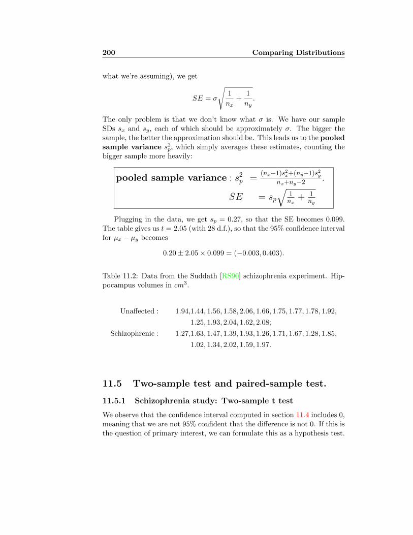
200 Comparing Distributions
what we’re assuming), we get
SE = σ
√1
nx+
1
ny.
The only problem is that we don’t know what σ is. We have our sampleSDs sx and sy, each of which should be approximately σ. The bigger thesample, the better the approximation should be. This leads us to the pooledsample variance s2
p, which simply averages these estimates, counting thebigger sample more heavily:
pooled sample variance : s2p =
(nx−1)s2x+(ny−1)s2ynx+ny−2 .
SE = sp√
1nx
+ 1ny
Plugging in the data, we get sp = 0.27, so that the SE becomes 0.099.The table gives us t = 2.05 (with 28 d.f.), so that the 95% confidence intervalfor µx − µy becomes
0.20± 2.05× 0.099 = (−0.003, 0.403).
Table 11.2: Data from the Suddath [RS90] schizophrenia experiment. Hip-pocampus volumes in cm3.
Unaffected : 1.94,1.44, 1.56, 1.58, 2.06, 1.66, 1.75, 1.77, 1.78, 1.92,
1.25, 1.93, 2.04, 1.62, 2.08;
Schizophrenic : 1.27,1.63, 1.47, 1.39, 1.93, 1.26, 1.71, 1.67, 1.28, 1.85,
1.02, 1.34, 2.02, 1.59, 1.97.
11.5 Two-sample test and paired-sample test.
11.5.1 Schizophrenia study: Two-sample t test
We observe that the confidence interval computed in section 11.4 includes 0,meaning that we are not 95% confident that the difference is not 0. If this isthe question of primary interest, we can formulate this as a hypothesis test.

Comparing Distributions 201
Is the difference in hippocampal volume between the two groups statisti-cally significant? Can the observed difference be due to chance? We performa t test at significance level 0.05. Our null hypothesis is that µx = µy, andour two-tailed alternative is µx 6= µy. The standard error is computed ex-actly as before, to be 0.099. The T test statistic is
T =X − YSE
=0.20
0.099= 2.02.
We then observe that this is not above the critical value 2.05, so we RE-TAIN the null hypothesis, and say that the difference is not statisticallysignificant.
If we had decided in advance that we were only interested in whetherµx > µy — the one-tailed alternative — we would use the same test statisticT = 2.02, but now we draw our critical value from the P = 0.10 column,which gives us 1.70. In this case, we would reject the null hypothesis. On theother hand, if we had decided in advance that our alternative was µx < µy,we would have a critical value −1.70, with rejection region anything belowthat, so of course we would retain the null hypothesis.
11.5.2 The paired-sample test
It may seem disappointing that we can’t do more with our small samples.The measurements in the healthy group certainly seem bigger than those ofthe schizophrenic group. The problem is, there’s so much noise, in the formof general overall variability among the individuals, that we can’t be sure ifthe difference between the groups is just part of that natural variation.
It might be nice if we could get rid of some of that noise. For instance,suppose the variation between people was in three parts — call them A, B,and S, so your hippocampal volume is A+B + S. S is the effect of havingschizophrenia, and A is random stuff we have no control over. B is anotherindividual effect, but one that we suppose is better defined — for instance,the effect of genetic inheritance. Suppose we could pair schizophrenic andnon-schizophrenic people with the same B score up, and then look at thedifference between individuals within a pair. Then B cancels out, and Sbecomes more prominent. This is the idea of the matched case-controlstudy.
In fact, that’s just what was done in this study. The real data are givenin Table 12.5. The 30 subjects were, in fact, 30 pairs of monozygotic twins,of whom one was schizophrenic and the other not. The paired-sample Ttest is exactly the one that we described in section 10.2. The mean of the
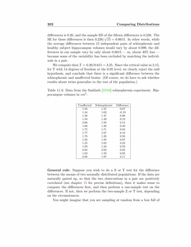
202 Comparing Distributions
differences is 0.20, and the sample SD of the fifteen differences is 0.238. TheSE for these differences is then 0.238/
√15 = 0.0615. In other words, while
the average differences between 15 independent pairs of schizophrenic andhealthy subject hippocampus volumes would vary by about 0.099, the dif-ferences in our sample vary by only about 0.0615 — so, about 40% less —because some of the variability has been excluded by matching the individ-uals in a pair.
We compute then T = 0.20/0.615 = 3.25. Since the critical value in 2.15,for T with 14 degrees of freedom at the 0.05 level, we clearly reject the nullhypothesis, and conclude that there is a significant difference between theschizophrenic and unaffected brains. (Of course, we do have to ask whetherresults about twins generalise to the rest of the population.)
Table 11.3: Data from the Suddath [RS90] schizophrenia experiment. Hip-pocampus volumes in cm3.
Unaffected Schizophrenic Difference
1.94 1.27 0.671.44 1.63 -0.191.56 1.47 0.091.58 1.39 0.192.06 1.93 0.131.66 1.26 0.401.75 1.71 0.041.77 1.67 0.101.78 1.28 0.501.92 1.85 0.071.25 1.02 0.231.93 1.34 0.592.04 2.02 0.021.62 1.59 0.032.08 1.97 0.11
General rule: Suppose you wish to do a Z or T test for the differencebetween the means of two normally distributed populations. If the data arenaturally paired up, so that the two observations in a pair are positivelycorrelated (see chapter 15 for precise definitions), then it makes sense tocompute the differences first, and then perform a one-sample test on thedifferences. If not, then we perform the two-sample Z or T test, dependingon the circumstances.
You might imagine that you are sampling at random from a box full of

Comparing Distributions 203
cards, each of which has an X and a Y side, with numbers on each, and youare trying to determine from the sample whether X and Y have the sameaverage. You could write down your sample of X’s, then turn over all thecards and write down your sample of Y’s, and compare the means. If theX and Y numbers tend to vary together, though, it makes more sense tolook at the differences X − Y over the cards, rather than throw away theinformation about which X goes with which Y. If the X’s and Y’s are notactually related to each other then it shouldn’t matter.
11.5.3 Is the CLT justified?
In section 11.5.2 we supposed that the average difference between the unaf-fected and schizophrenic hippocampus volumes would have a nearly normaldistribution. The CLT tells us that that the average of a very large num-ber of such differences, picked at random from the same distribution, wouldhave an approximately normal distribution. But is that true for just 15?We would like to test this supposition.
One way to do this is with a random experiment. We sample 15 volumedifferences at random from the whole population of twins, and average them.Repeat 1000 times, and look at the distribution of averages we find. Arethese approximately normal?
But wait! We don’t have access to any larger population oftwins; and if we did, we would have included their measure-ments in our study. The trick (which is widely used in modernstatistics, but is not part of this course), called “the bootstrap”,is instead to resample from the data we already have, picking15 samples with replacement from the 15 we already have —so some will be counted several times, and some not at all. Itsounds like cheating, but it can be shown mathematically that itworks.
A histogram of the results is shown in Figure 11.2(a), together with theappropriate normal curve. The fit looks pretty good, which should reassureus of the appropriateness of the test we have applied. Another way of seeingthat this distribution is close to normal is Figure 11.2(b), which shows a so-called Q-Q plot. (The Q-Q plot is not examinable as such. In principle, it isthe basis for the Kolmogorov-Smirnov test, which we describe in section 13.1.This will give us a quantitative answer to the question: Is this distributionclose to the normal distribution?) The idea is very simple: We have 1000numbers that we think might have been sampled from a normal distribution.We look at the normal distribution these might have been sampled from —

204 Comparing Distributions
the one with the same mean and variance as this sample — and take 1000numbers evenly spaced from the normal distribution, and plot them againsteach other. If the sample really came from the normal distribution, then thetwo should be about equal, so the points will all lie on the main diagonal.Figure 11.2(c) shows a Q-Q plot for the original 15 samples, which clearlydo not fit the normal distribution very well.
Histogram of resampled means
dmean
Frequency
0.0 0.1 0.2 0.3 0.4
020
4060
80100
120
140
(a) Histogram of 1000 resampled means
-3 -2 -1 0 1 2 3
0.1
0.2
0.3
0.4
Normal Q-Q Plot
Theoretical Quantiles
Sam
ple
Qua
ntile
s
(b) Q-Q plot of 1000 resampled means
-1 0 1
-0.2
0.0
0.2
0.4
0.6
Normal Q-Q Plot
Theoretical Quantiles
Sam
ple
Qua
ntile
s
(c) Q-Q plot of 15 original measure-ments
Figure 11.2: Comparisons of normal distribution to means of resampledschizophrenia data and original schizophrenia data.
11.6 Hypothesis tests for experiments
11.6.1 Quantitative experiments
276 women were enrolled in a study to evaluate a weight-loss interventionprogram [SKK91]. They were allocated at random to one of two differentgroups: 171 women in the intervention group received nutrition counselingand behaviour modification treatment to help them reduce the fat in theirdiets. The 105 women in the control group were urged to maintain theircurrent diet.
After 6 months, the intervention group had lost 3.2kg on average, withan SD of 3.5 kg, while the control group had lost 0.4kg on average, withan SD of 2.8 kg. Is the difference in weight loss between the two groupsstatistically significant?

Comparing Distributions 205
Let us first apply a Z test at the 0.05 significance level, without thinkingtoo deeply about what it means. (Because of the normal approximation,it doesn’t really matter what the underlying distribution of weight loss is.)We compute first the pooled sample variance:
s2p =
170 · 3.52 + 104 · 2.82
274= 10.6,
so sp = 3.25kg. The standard error is sp√
1/n+ 1/m = 0.40kg. Our teststatistic is then
Z =x− ySE
=3.1
0.4= 7.7.
This exceeds the rejection threshold of 1.96 by a large margin, so we con-clude that the difference in weight loss between the groups is statisticallysignificant.
But are we justified in using this hypothesis test? What is the randomsampling procedure that defines the null hypothesis? What is the “just bychance” that could have happened, and that we wish to rule out? These276 women were not randomly selected from any population — at least,not according to any well-defined procedure. The randomness is in theassignment of women to the two groups: We need to show that the differencebetween the two groups is not merely a chance result of the women that wehappened to pick for the intervention group, which might have turned outdifferently if we happened to pick differently.
In fact, this model is a lot like the model of section 11.5. Imagine a boxcontaining 276 cards, one for each woman in the study. Side A of the cardsays how much weight the woman would lose if she were in the interventiongroup; side B says how much weight she would lose if she were in the controlgroup. The null hypothesis states, then, that the average of the A’s is thesame as the average of the B’s. The procedure of section 11.5 says that wecompute all the values A-B from our sample, and test whether these couldhave come from a distribution with mean 0. The problem is that we neverget to see A and B from the same card.
Instead, we have followed the procedure of section 11.5.1, in which wetake a sample of A’s and a sample of B’s, and test for whether they couldhave come from distributions with the same mean. But there are someimportant problems that we did not address there:
• We sample the A’s (the intervention group) without replacement. Fur-thermore, this is a large fraction of the total population (in the box).We know from section 10.3.1 that this makes the SE smaller.

206 Comparing Distributions
• The sample of B’s is not an independent sample; it’s just the com-plement of the sample of A’s. A bit of thought makes clear that thistends to make the SE of the difference larger.
This turns out to be one of those cases where two wrongs really do makea right. These two errors work in opposite directions, and pretty muchcancel each other out. Consequently, in analysing experiments we ignorethese complications and proceed with the Z- or t-test as in section 11.5.1,as though they were independent samples.
11.6.2 Qualitative experiments
A famous experiment in the psychology of choice was carried out by A.Tversky and D. Kahnemann [TK81], to address the following question: Dopeople make economic decisions by a rational calculus, where they measurethe perceived benefit against the cost, and then choose the course of actionwith the highest return? Or do they apply more convoluted decision proce-dures? They decided to try to find out whether people would give the sameanswer to the following questions:
Question A: Imagine that youhave decided to see a play where ad-
Question B: Imagine that youhave decided to see a play and paid
mission is $10 per ticket. As you en- the admission price of $10 per ticket.ter the theatre you discover that you As you enter the theatre you discoverhave lost a $10 bill. Would you still that you have lost the ticket. Thepay $10 for a ticket for the play? seat was not marked and the ticket
cannot be recovered. Would you pay$10 for another ticket?
From a rational economic perspective, the two situations are exactlyidentical, from the point of view of the subject: She is at the theatre, theplay that she wants to see is about to start, but she doesn’t have a ticketand would have to buy one. But maybe people still see these two situationsdifferently. The problem is, you can’t just show people both questions andask them if they would answer the same to both questions. Instead, theyposed Question A to about half the subjects (183 people) and Question Bto the other half (200 people). The results are given in Table 11.4.
It certainly appears that people are more likely to answer yes to A thanto B (88% vs. 46%), but could this difference be merely due to chance? Asusual, we need to ask, what is the chance model? It is not about the sampleof 383 people that we are studying. They are not a probability sample from

Comparing Distributions 207
Table 11.4
Yes No
Question A 161 22
Question B 92 54
any population, and we have no idea how representative they may or maynot be of the larger category of Homo sapiens. The real question is, amongthese 383 people, how likely is it that we would have found a different resulthad we by chance selected a different group of 200 people to pose questionB to. We want to do a significance test at the 0.01 level.
The model is then: 383 cards in a box. On one side is that person’s an-swer to Question A, on the other side the same person’s answer to QuestionB (coded as 1=yes, 0=no). The null hypothesis is that the average on theA side is the same as the average on the B side (which includes the morespecific hypothesis that the A’s and the B’s are identical).
We pick 183 cards at random, and add up their side A’s, coming to 161;from the other 200 we add up the side B’s, coming to 92. Our procedure isthen:
(1). The average of the sampled side A’s is XA = 0.88, while the averageof the sampled side B’s is XB = 0.46.
(2). The standard deviation of the A sides is estimated at σA =√p(1− p) =
0.32, while the standard deviation of the B sides is estimated atσB =
√p(1− p) = 0.50.
(3). The standard error for the difference is estimated at
SEA−B =
√σ2A
nA+σ2B
nB=
√0.322
183+
0.52
200= 0.043.
(4). Z = (XA− XB)/SEA−B = 9.77. The cutoff for a two-sided test at the0.01 level is z0.995 = 2.58, so we clearly do reject the null hypothesis.
The conclusion is that the difference in answers between the two ques-tions was not due to the random sampling. Again, this tells us nothingdirectly about the larger population from which these 383 individuals weresampled.

208 Comparing Distributions

Lecture 12
Non-Parametric Tests, Part I
12.1 Introduction: Why do we need distribution-free tests?
One of the most common problems we need to deal with in statistics is tocompare two population means: We have samples from two different popu-lations, and we want to determine whether the populations they were drawnfrom could have had the same mean, or we want to compute a confidenceinterval for the difference between the means. The methods described ear-lier in the course began with the assumption that the populations underconsideration were normally distributed, and only the means (and perhapsthe variances) were unknown. But most data that we consider do not comefrom a normal distribution. What do we do then?
In section 7.4 we discussed how we can use a mathematical result — theCentral Limit Theorem — to justify treating data as though they had comefrom a normal distribution, as long as enough independent random samplesare being averaged. But in some cases we don’t have enough samples toinvoke the Central Limit Theorem. In other cases (such as that of section11.5.1) the experimental design seems to lack the randomisation that wouldjustify the normal approximation.
In this lecture and the next we describe alternative approaches to thestandard hypothesis tests described in previous lectures, which are indepen-dent of any assumption about the underlying distribution of the data. In thefollowing lectures we describe new problems — partitioning variance into dif-ferent sources, and describing the strength of relationship between differentvariables — and in sections 14.6 and 16.3.2 we will present non-parametricversions of these.
209

210 Non-Parametric Tests I
The advantage of these “non-parametric tests” lie in their robustness:The significance level is known, independent of assumptions about the dis-tribution from which the data were drawn — a valuable guarantee, since wecan never really confirm these assumptions with certainty. In addition, thenon-parametric approach can be more logically compelling for some commonexperimental designs, something we will discuss further in section 12.4.4.
Of course, there is always a tradeoff. The reliability of the non-parametricapproach comes at the expense of power: The non-parametric test is alwaysless powerful than the corresponding parametric test. (Or, to put it theother way, if we know what the underlying distribution is, we can use thatknowledge to construct a more powerful test at the same level as the generictest that works for any distribution.)
12.2 First example: Learning to Walk
12.2.1 A first attempt
We recall the study of infant walking that we described way back in section1.1. Six infants were given exercises to maintain their walking reflex, andsix control infants were observed without any special exercises. The ages(in months) at which the infants were first able to walk independently arerecapitulated in Table 12.1.
Treatment 9.00 9.50 9.75 10.00 13.00 9.50Control 11.50 12.00 9.00 11.50 13.25 13.00
Table 12.1: Age (in months) at which infants were first able to walk inde-pendently. Data from [ZZK72].
As we said then, the Treatment numbers seem generally smaller than theControl numbers, but not entirely, and the number of observations is small.Could we merely be observing sampling variation, where we happened to getsix (five, actually) early walkers in the Treatment group, and late walkersin the Control group.
Following the approach of Lecture 11, we might perform a two-sampleT test for equality of means. We test the null hypothesis µTREAT = µCONagainst the one-tailed alternative µTREAT < µCON , at the 0.05 level. Tofind the critical value, we look in the column for P = 0.10, with 6 + 6 − 2d.f., obtaining 1.81. The critical region is then {T < −1.81}. The relevant
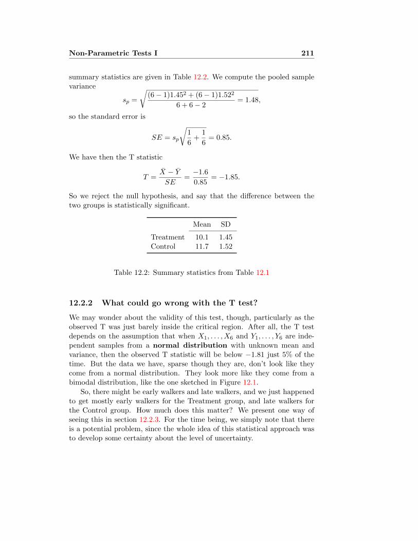
Non-Parametric Tests I 211
summary statistics are given in Table 12.2. We compute the pooled samplevariance
sp =
√(6− 1)1.452 + (6− 1)1.522
6 + 6− 2= 1.48,
so the standard error is
SE = sp
√1
6+
1
6= 0.85.
We have then the T statistic
T =X − YSE
=−1.6
0.85= −1.85.
So we reject the null hypothesis, and say that the difference between thetwo groups is statistically significant.
Mean SD
Treatment 10.1 1.45Control 11.7 1.52
Table 12.2: Summary statistics from Table 12.1
12.2.2 What could go wrong with the T test?
We may wonder about the validity of this test, though, particularly as theobserved T was just barely inside the critical region. After all, the T testdepends on the assumption that when X1, . . . , X6 and Y1, . . . , Y6 are inde-pendent samples from a normal distribution with unknown mean andvariance, then the observed T statistic will be below −1.81 just 5% of thetime. But the data we have, sparse though they are, don’t look like theycome from a normal distribution. They look more like they come from abimodal distribution, like the one sketched in Figure 12.1.
So, there might be early walkers and late walkers, and we just happenedto get mostly early walkers for the Treatment group, and late walkers forthe Control group. How much does this matter? We present one way ofseeing this in section 12.2.3. For the time being, we simply note that thereis a potential problem, since the whole idea of this statistical approach wasto develop some certainty about the level of uncertainty.

212 Non-Parametric Tests I
8 10 12 14
0.00
0.05
0.10
0.15
0.20
Time (months)
Density
Figure 12.1: Sketch of what the distribution of walking times from whichthe data of Table 12.1 might have been drawn from, if they all came fromthe same distribution. The actual measurements are shown as a rug plotalong the bottom — green for Treatment, red for Control. The marks havebeen adjusted slightly to avoid exact overlaps.

Non-Parametric Tests I 213
We would like to have an alternative procedure for testing hypothesesabout equality of distributions, which will give correct significance levelswithout depending on (possibly false) assumptions about the shape of thedistributions. Of course, you never get something for nothing. In return forhaving procedures that are more generally applicable, and give the correctsignificance level when the null hypothesis is true, we will lose some power:The probability of rejecting a false null hypothesis will be generally lower,so that we will need larger samples to attain the same level of confidence.Still, true confidence is better than deceptive confidence! We call thesealternatives “distribution-free” or “non-parametric” tests. Some possibilitiesare described in section 12.3.
12.2.3 How much does the non-normality matter?
This section is optionalSuppose the null hypothesis were true, that the samples really came all fromthe same distribution, but that distribution were not normal, but distributedlike the density in Figure 12.1. What would the distribution of the T statis-tics then look like? We can find this out by simulation: We pick 2 groups ofsix at random from this distribution, and call one of them “Treatment”, andthe other “Control”. We compute T from these 12 observations, exactly aswe did on the real data, and then repeat this 10,000 times.
The histogram of these 10,000 simulated T values is shown in Figure12.2. Notice that this is similar to the superimposed Student T density,but not exactly the same. In fact, in the crucial tails there are substantialdifferences. Table 12.3 compares the critical values at different significancelevels for the theoretical T distribution and the simulated (non-normal) Tdistribution. Thus, we see in Table 12.3(b) that if we do a one-tailed testat the 0.05 significance level by rejecting T < −1.81, instead of making the(correct) 10% type I errors, we will make 10.4% type I errors. Similarly,if we reject |T | > 3.17, to make what we think is a two-tailed test at level0.01, we will in fact be making 1.1% type I errors when the null hypothesisis true. Thus, we would be overstating our confidence.

214 Non-Parametric Tests I
Simulated T
Frequency
-5 -4 -3 -2 -1 0 1 2 3 4 5
0200
400
600
800
Figure 12.2: Histogram of 10,000 simulated T values, computed from pairsof samples of six values each from the distribution sketched in Figure 12.1.The Student T density with 10 degrees of freedom is superimposed in red.
Table 12.3: Comparison of the tail probabilities of the T distribution simu-lated from non-normal samples, with the standard T distribution.
(a) Real vs. standard critical values
P Standard Simulated
0.10 1.81 1.830.05 2.23 2.250.01 3.17 3.220.001 4.59 5.14
(b) Real vs. standard tail probabili-ties
T Standard Simulated
1.81 0.100 0.1042 0.073 0.076
2.5 0.031 0.0353.17 0.010 0.011
4 0.0025 0.0033
Why are these tests called non-parametric? The more basichypothesis tests that you have already learned are parametric,because they start from the assumption that both populations
have distributions that fall into the same general class —generally normal — and the specific member of that class is
determined by a single number, or a few numbers — theparameters. We are testing to decide only whether the parametersare the same. In the new tests, we drop this assumption, allowinga priori that the two population distributions could be anything
at all.

Non-Parametric Tests I 215
12.3 Tests for independent samples
12.3.1 Median test
Suppose we have samples x1, . . . , xnx and y1, . . . , yny from two distinct distri-butions whose medians are mx and my. We wish to test the null hypothesis
H0 : mx = my
against a two-tailed alternative
Halt : mx 6= my,
or a one-tailed alternative
Halt : mx < my, or Halt : mx > my.
The idea of this test is straightforward: Let M be the median of the com-bined sample {x1, . . . , xnx , y1, . . . , yny}. If the medians are the same, thenthe x’s and the y’s should have an equal chance of being above M . Let Pxbe the proportion of x’s that are above M , and Py the proportion of y’s thatare above M . It turns out that we can treat these as though they were theproportions of successes in nx and ny trials respectively. Analysing theseresults is not entirely straightforward; we get a reasonable approximationby using the Z test for differences between proportions, as in section 11.3.
Consider the case of the infant walking study, described in section 1.1.The 12 measurements are
9.0, 9.0, 9.5, 9.5, 9.75, 10.0, 11.5, 11.5, 12.0, 13.0, 13.0, 13.25,
where the CONTROLresults have been coloured RED, , and the TREAT-MENT results have been coloured GREEN. The median is 10.75, and wesee that there are 5 control results above the median, and one treatment.
Calculating the p-value: Exact method
Imagine that we have nx red balls and ny green balls in a box. We pick halfof them at random — these are the above median outcomes — and get kx redand ky green. We expected to get about nx/2 red and ny/2 green. What isthe probability of such an extreme result? This is reasonably straightforwardto compute, though slightly beyond what we’re doing in this course. We’lljust go through the calculation for this one special case.

216 Non-Parametric Tests I
We pick 6 balls from 12, where 6 were red and 6 green. We want P(atleast 5 red). Since the null hypothesis says that all picks are equally likely,this is simply the fraction of ways that we could make our picks whichhappen to have 5 or 6 red. That is,
P (at least 5 R) =# ways to pick 5 R, 1G + # ways to pick 6 R, 0G
total # ways to pick 6 balls from 12.
The number of ways to pick 6 balls from 12 is what we call 12C6 = 924. Thenumber of ways to pick 6 red and 0 green is just 1: We have to take all thereds, we have no choice. The only slightly tricky one is # ways to pick 5 redand 1 green. A little thought shows that we have 6C5 = 6 ways of choosingthe red balls, and 6C1 = 6 ways of choosing the green one, so 36 ways in all.Thus, the p-value comes out to 37/954 = 0.039, so we still reject the nullhypothesis at the 0.05 level. (Of course, the p-value for a two-tailed test istwice this, or 0.078.
Calculating the p-value: Approximate method
Slightly easier is to use the normal approximation to compute the p-value.This is the method described in your formula booklets. But this needs tobe done with some care.
The idea is the following: We have observed a certain number n+ ofabove-median outcomes. (This will be about 1
2 the total number of samplesn = nx +ny, but slightly adjusted if the number is odd, or if there are ties.)We have observed proportions px = kx/nx and py = ky/ny above-mediansamples from the two groups, respectively. We apply a Z test (as in sections11.3 and 11.6.2) to test whether these proportions could be “really” thesame (as they should be under the null hypothesis).1
We compute the standard error as
SE =√p(1− p)
√1
nx+
1
ny,
1If you’re thinking carefully, you should object at this point, that we can’t apply theZ test for difference between proportions, because that requires that the two samples beindependent. That’s true. The fact that they’re dependent raises the standard error;but the fact that we’re sampling without replacement lowers the standard error. Thetwo effects more or less cancel out, just as we described in section 11.6. Another wayof computing this result is to use the χ2 test for independence, writing this as a 2 × 2contingency table. In principle this gives the same result, but it’s hard to apply thecontinuity correction there. In a case like this one, the expected cell occupancies aresmaller than we allow.

Non-Parametric Tests I 217
where p = n+/n is the proportion of samples above the median, which is 12
or a bit below. Then we compute the test statistic
Z =px − pySE
,
and find the p-value by looking this up on the standard normal table.Applying this to our infant walking example, we see obtain p = 1
2 , and
SE =1
2
√1
6+
1
6= 0.289.
Then we get Z = −0.667/0.289 = 2.3. The normal table gives us a p-valueof 0.01 for the one-tailed test. This is a long way off our exact computationof 0.04. What went wrong?
The catch is that we are approximating a discrete distribution with acontinuous one (the normal), and that can mean substantial errors when thenumbers involved are small, as they are liable to be when we are interestedin applying the median test. We need a continuity correction (as discussedin section 6.8.1). We are asking for the probability of having at least 5 outof 6 from the Control group. But if we are thinking of this as a continuousmeasurement, we have to represent it as at least 4.5 out of 6. (A picture ofthe binomial probability with the normal approximation is given in Figure12.3.) Similarly, the extreme fraction of treatment samples in the above-median sample must be seen to start at 1.5/6 = 0.25, rather than at 1/6.Thus, we have the test statistic
Z =0.25− 0.75
0.289= −1.73.
If we look up 1.73 on the normal table, we get the value 0.9582, meaning thatthe one-tailed probability below −1.73 is 1− 0.9582 = 0.0418, which is veryclose to the exact value computed above. Thus, we see that this normalapproximation can work very well, if we remember to use the continuitycorrection.
To compute the observed significance level (p-value) for the median test,we use the Z test for differences between proportions, applied to theproportions px and py of the two samples that are above the median,
Z = (px − py)/SE, with SE =
√p(1− p)
(1nx
+ 1ny
). If px is the larger
proportion, we adjust it to
px =kx − 0.5
n+and py =
ky + 0.5
n+.

218 Non-Parametric Tests I
Fraction red
Probability
0/6 1/6 2/6 3/6 4/6 5/6 6/6
0.00
0.05
0.10
0.15
0.20
0.25
0.30
0.35
Fraction green
Probability
0/6 1/6 2/6 3/6 4/6 5/6 6/6
0.00
0.05
0.10
0.15
0.20
0.25
0.30
0.35
Figure 12.3: The exact probabilities from the binomial distribution for theextreme results of number of red (control) and green (treatment) in theinfant walking experiment. The corresponding normal approximations areshaded. Note that the upper tail starts at 4.5/6 = 0.75, not at 5/6; and thelower tail starts at 1.5/6 = 0.25, rather than at 1/6.
There are many defects of the median test. One of them is that theresults are discrete — there are at most n/2 + 1 different possible outcomesto the test — while the analysis with Z is implicitly discrete. This is oneof the many reasons why the median test, while it is sometimes seen, is notrecommended. (For more about this, see [FG00].) The rank-sum test isalmost always preferred.
Note that this method requires that the observations be all distinct.There is a version of the median test that can be used when there are tiesamong the observations, but we do not discuss it in this course.
12.3.2 Rank-Sum test
The median test is obviously less powerful than it could be, because itconsiders only how many of each group are above or below the median, but

Non-Parametric Tests I 219
not how far above or below. In the example of section 12.2, while 5 of the6 treatment samples below the median, the one that is above the median isnear the top of the whole sample; and the one control sample that is belowthe median is in fact near the bottom. It seems clear that we should wantto take this extra information into account. The idea of the rank-sum test(also called the Mann-Whitney test) is that we consider not just yes/no,above/below the median, but the exact relative ranking.
Continuing with this example, we list all 12 measurements in order, andreplace them by their ranks:
measurements 9.0 9.0 9.5 9.5 9.75 10.0 11.5 11.5 12.0 13.0 13.0 13.25ranks 1 2 3 4 5 6 7 8 9 10 11 12modified ranks 1.5 1.5 3.5 4.5 5 6 7.5 7.5 9 10.5 10.5 12
When measurements are tied, we average the ranks (we show this in thecolumn labelled “modified ranks”.) We wish to test the null hypothesisH0 : control and treatment came from the same distribution; against thealternative hypothesis that the controls are generally larger.
We compute a test statistic R, which is just the sum of the ranks inthe smaller sample. (In this case, the two samples have the same size, sowe can take either one. We will take the treatment sample.) The idea isthat these should, if H0 is true, be like a random sample from the numbers1, . . . , nx +ny. If R is too big or too small we take this as evidence to rejectH0. In the one-tailed case, we reject R for being too small (if the alternativehypothesis is that the corresponding group has smaller values; or for beingtoo large (if the alternative hypothesis is that the corresponding group haslarger values.
In this case, the alternative hypothesis is that the group under con-sideration, the treatment group has smaller values, so the rejection regionconsists of R below a certain threshold. It only remains to find the appro-priate threshold. These are given on the Mann-Whitney table (Table 5 inthe formula booklet). The layout of this table is somewhat complicated.The table lists critical values corresponding only to P = 0.05 and P = 0.10.We look in the row corresponding to the size of the smaller sample, andcolumn corresponding to the larger. For a two-tailed test we look in the(sub-) row corresponding to the desired significance level; for a one-tailedtest we double the p-value.
The sum of the ranks for the treatment group in our example is R = 30.Since we are performing a one-tailed test with the alternative being thatthe treatment values are smaller, our rejection region will be of the form

220 Non-Parametric Tests I
R ≤ some critical value. We find the critical value on Table 12.4. Thevalues corresponding to two samples of size 6 have been highlighted. For aone-tailed test at the 0.05 level we take the upper values 28, 50. Hence, wewould reject R ≤ 28. Since R = 30, we retain the null hypothesis in thistest.
If we were performing a two-tailed test instead, we would reject R ≤ 26and R ≥ 52.
The table you are given goes up only as far as the larger sample sizeequal to 10. For larger samples, we use a normal approximation:
z =R− µσ
,
µ =1
2nx(nx + ny + 1),
σ =
√nxny(nx + ny + 1)
12.
As usual, we compare this z to the probabilities on the normal table. Thus,for instance, for a two-tailed test at the 0.05 level, we reject the null hypoth-esis if |z| > 1.96.
larger sample size, n2
4 5 6 7 8 9 10
smaller sample 4 12,24 13,27 14,30 15,33 16,36 17,39 18,42size n1 11,25 12,28 12,32 13,35 14,38 15,41 16,44
5 19,36 20,40 22,43 23,47 25,50 26,5418,37 19,41 20,45 21,49 22,53 24,56
6 28,5026,52
30,54 32,58 33,63 35,6728,56 29,61 31,65 33,69
7 39,66 41,71 43,76 46,8037,68 39,73 41,78 43,83
8 52,84 54,90 57,9549,87 51,93 54,98
9 66,105 69,11163,108 66,114
10 83,12779,131
Table 12.4: Critical values for Mann-Whitney rank-sum test.

Non-Parametric Tests I 221
12.4 Tests for paired data
As with the t test, when the data fall naturally into matched pairs, we canimprove the power of the test by taking this into account. We are given datain pairs (x1, y1), . . . , (xn, yn), and we wish to test the null hypothesis H0: xand y come from the same distribution. In fact, the null hypothesis may bethought of as being even broader than that. As we discuss in section 12.4.4,there is no reason, in principle, why the data need to be randomly sampledat all. The null hypothesis says that the x’s and the y’s are indistinguishablefrom a random sample from the complete set of x’s and y’s together. Wedon’t use the precise numbers — which depend upon the unknown distribu-tion of the x’s and y’s — but only basic reasoning about the relative sizesof the numbers. Thus, if the x’s and y’s come from the same distribution,it is equally likely that xi > yi as that xi < yi.
12.4.1 Sign test
The idea of the sign test is quite straightforward. We wish to test the nullhypothesis that paired data came from the same distribution. If that is thecase, then which one of the two observations is the larger should be justlike a coin flip. So we count up the number of times (out of n pairs) thatthe first observation in the pair is larger than the second, and compute theprobability of getting that many heads in n coin flips. If that probability isbelow the chosen significance level α, we reject the null hypothesis.
Schizophrenia study
Consider the schizophrenia study, discussed in section 11.5.2. We wish totest, at the 0.05 level, whether the schizophrenic twins have different brainmeasurements than the unaffected twins, against the null hypothesis thatthe measurements are really drawn from the same distribution. We focusnow on the differences. Instead of looking at their values (which dependsupon the underlying distribution) we look only at their signs, as indicatedin Table 12.5. The idea is straightforward: Under the null hypothesis, thedifference has an equal chance of being positive or negative, so the numberof positive signs should be like the number of heads in fair coin flips. In thiscase, we have 14 + out of 15, which is obviously highly unlikely.

222 Non-Parametric Tests I
Table 12.5: Data from the Suddath [SCT+90] schizophrenia experiment.Hippocampus volumes in cm3.
Unaffected Schizophrenic Difference Sign
1.94 1.27 0.67 +1.44 1.63 -0.19 -1.56 1.47 0.09 +1.58 1.39 0.19 +2.06 1.93 0.13 +1.66 1.26 0.40 +1.75 1.71 0.04 +1.77 1.67 0.10 +1.78 1.28 0.50 +1.92 1.85 0.07 +1.25 1.02 0.23 +1.93 1.34 0.59 +2.04 2.02 0.02 +1.62 1.59 0.03 +2.08 1.97 0.11 +
Formally, we analyse this with a single-sample Z test, comparing theproportion of + to 0.5. We have n = 15 trials, so the SE is
√0.5 · 0.5/15 =
0.129, while the observed proportion of + is 14/15 = 0.933. The Z statisticis
Z =0.933− 0.5
0.129= 3.36,
which is far above the cutoff level 1.96 for rejecting the null hypothesis atthe 0.05 level. In fact, the probability of getting such an extreme result (theso-called p-value) is less than 0.001.
What if we had ignored the pairing and applied the median test instead?We find that the median is 1.665. There are 9 schizophrenic and 6 unaffectedtwins with measures above the median, so pu = 0.4 and ps = 0.6. Thedifference is small, as the standard error is SE =
√0.5 · 0.5
√1/15 + 1/15 =
0.18. We compute Z = 1.10, which does not allow us to reject the nullhypothesis at any level. The rank-sum test also turns out to be too weak toreject the null hypothesis.
12.4.2 Breastfeeding study
We adopt an example from [vBFHL04], discussing a study by Brown andHurlock on the effectiveness of three different methods of preparing breasts

Non-Parametric Tests I 223
for breastfeeding. Each mother treated one breast and left the other un-treated, as a control. The two breasts were rated daily for level of discomfort,on a scale 1 to 4. Each method was used by 19 mothers, and the average dif-ference between the treated and untreated breast for each of the 19 motherswho used the “toughening” treatment were: −0.525, 0.172, −0.577, 0.200,0.040, −0.143, 0.043, 0.010, 0.000, −0.522, 0.007, −0.122, −0.040, 0.000,−0.100, 0.050, −0.575, 0.031, −0.060.
The original study performed a one-tailed t test at the 0.05 level ofthe null hypothesis that the true difference between treated and untreatedbreasts was 0: The cutoff is then −1.73 (so we reject the null hypothesison any value of T below −1.73). We have x = −0.11, and sx = 0.25. Wecompute then T = (x − 0)/(sx/
√n) = −1.95, leading us to reject the null.
We should, however, be suspicious of this marginal result, which dependsupon the choice of a one-tailed test: for a two-tailed test the cutoff wouldhave been 2.10.
In addition, we note that the assumption of normality is drastically vi-olated, as we see from the histogram of the observed values 12.4. To ap-ply the sign test, we see that there are 8 positive and 9 negative values,which is as close to an average value as we could have, and so concludethat there is no evidence in the sign test of a difference between the treatedand untreated breasts. (Formally, we could compute p = 8/17 = 0.47, andZ = (0.47− 0.50)/(0.5/
√17) = −0.247, which is nowhere near the cutoff of
1.96 for the z test at the 0.05 level.)
Average reported difference
Frequency
-0.6 -0.4 -0.2 0.0 0.2
01
23
45
6
Figure 12.4: Histogram of average difference between treated and untreatedbreasts, for 19 subjects.

224 Non-Parametric Tests I
Historical note: This study formed part of the “rediscovery” of breast-feeding in the 1970s, after a generation of its being disparaged by the medicalcommunity. Their overall conclusion as that the traditional treatments wereineffective, the “toughening” marginally so. The emphasis on breastfeedingbeing fundamentally uncomfortable reflects the discomfort that the medicalresearch community felt about nursing at the time.
12.4.3 Wilcoxon signed-rank test
As with the two-sample test in section 12.3.2, we can strengthen the paired-sample test by considering not just which number is bigger, but the relativeranks. The idea of the Wilcoxon (or signed-rank) test is that we might haveabout equal numbers of positive and negative values, but if the positivevalues are much bigger than the negative (or vice versa) that will still be ev-idence that the distributions are different. For instance, in the breastfeedingstudy, the t test produced a marginally significant result because several ofthe very large values are all negative.
The mechanics of the test are the same as for the two-sample rank-sumtest, only the two samples are not the x’s and the y’s, but the positive andnegative differences. In a first step, we rank the differences by their absolutevalues. Then, we carry out a rank-sum test on the positive and negative dif-ferences. To apply the Wilcoxon test, we first drop the two 0 values, andthen rank the remaining 17 numbers by their absolute values:
Diff 0.007 0.010 0.031 0.040 -0.040 0.043 0.050 -0.060 -0.100Rank 1 2 3 4.5 4.5 6 7 8 9
Diff -0.122 -0.143 0.172 0.200 -0.522 -0.525 -0.575 -0.577Rank 10 11 12 13 14 15 16 17
The ranks corresponding to positive values are 1, 2, 3 ,4.5, 6, 7, 12, 13, whichsum toR+ = 48.5, while the negative values have ranks 4.5,8,9,10,11,14,15,16,17,summing to R− = 104.5. The Wilcoxon statistic is defined to be T =min{R+, R−} = 48.5. We look on the appropriate table (given in Figure12.5). We see that in order for the difference to be significant at the 0.05level, we would need to have T ≤ 34. Consequently, we still conclude thatthe effect of the treatment is not statistically significant.

Non-Parametric Tests I 225
Figure 12.5: Critical values for Wilcoxon test.
12.4.4 The logic of non-parametric tests
One advantage of the non-parametric test is that it avoids the assumptionthat the means are sufficiently normal to fit the t distribution. In fact,though, we have presented reasonable evidence in section 11.5.3 that thesample means are quite close to normal. Is there any other reason to usea non-parametric test? Yes. The non-parametric test also avoids logicallysuspect assumptions which underly the parametric test.
As in section 11.6, there seems to be a logical hole in the application ofthe t test in the schizophrenia study of sections 11.5.2 and 11.5.3. Supposewe accept that the average of a random sample of 15 differences like theones we’ve observed should have an approximately normal distribution, withmean equal to the population mean and variance equal to the populationvariance. Do we actually have such a random sample? The answer is,almost certainly, no. There is no population that these fifteen twin pairswere randomly sampled from. There is no register of all schizophrenia-discordant identical twin pairs from which these fifteen could have beenrandomly sampled.
We also cannot apply the logic of 11.6, which would say that everyone has
226 Non-Parametric Tests I
a “schizophrenic” and an “unaffected” measurement, and that we randomlydecide whether we observe the one or the other. Is there some logic that wecan apply? Yes. Imagine that some prankster had tampered with our data,randomly swapping the labels on the data, flipping a coin to decide whichmeasurement would be called “schizophrenic” and which would be called“unaffected”. In other words, she randomly flips the signs on the differencesbetween positive and negative. Our null hypothesis would say that we shouldnot be able to recognise this tampering, because the two measurements areindistinguishable overall. What the sign test and the Wilcoxon test tell usis that our actual observations are not consistent with this hypothesis.
Note that the null hypothesis is now not tied to any probability modelof the source of the actual data. Rather, it expresses our intuitive notionthat “the difference is due to chance” in terms of a randomisation thatcould be performed. We have 15 cards, one for every twin pair in the study.One side has the measurement for the schizophrenic twin, the other hasthe measurement for the unaffected twin, but we have not indicated whichis which. The null hypothesis says: The schizophrenic and the unaffectedmeasurements have the same distribution, which means that we are just aslikely to have either side of the card be the schizophrenic measurement. Thedifferences we observe should be just like the differences we would observe ifwe labelled the sides schizophrenic and unaffected purely by flipping a coin.The signs test shows that this is not the case, forcing us to reject the nullhypothesis. Statistical analysis depends on seeing the data we observe inthe context of the entire array of equivalent observations that we could havemade.

Lecture 13
Non-Parametric Tests PartII, Power of Tests
13.1 Kolmogorov-Smirnov Test
13.1.1 Comparing a single sample to a distribution
In Figure 11.2 we compared some data — in Figure 11.2(c) these were 15differences in brain measurements between schizophrenic and unaffected sub-jects, while in Figure 11.2(b) they were simulated data, from random resam-pling and averaging the original 15 — to a normal distribution. While theseQ-Q plots seem to tell us something, it is hard to come to a definitive conclu-sion from them. Is the fit to the line close enough or not? It is this questionthat the Kolmogorov-Smirnov test is supposed to answer.
The basic setup of the Kolmogorov-Smirnov test is that we have someobservations X1, X2, . . . , Xn which we think may have come from a givenpopulation (probability distribution) P . You can think of P as being a boxwith tickets in it, and the numbers representing the values that you mightsample. We wish to test the null hypothesis
H0 : The samples came from P
against the general alternative that the samples did not come from P . Todo this, we need to create a test statistic whose distribution we know, andwhich will be big when the data are far away from a typical sample fromthe population P .
You already know one approach to this problem, using the χ2 test. Todo this, we split up the possible values into K ranges, and compare the
227

228 Non-Parametric Tests, Power
number of observations in each range with the number that would have beenpredicted. For instance, suppose we have 100 samples which we think shouldhave come from a standard normal distribution. The data are given in Table13.1. The first thing we might do is look at the mean and variance of thesample: In this case, the mean is −0.06 and the sample variance 1.06, whichseems plausible. (A z test for the mean would not reject the null hypothesisof 0 mean, and the test for variance — which you have not learned — wouldbe satisfied that the variance is 1.) We might notice that the largest value is3.08, and the minimum value is −3.68, which seem awfully large. We haveto be careful, though, about scanning the data first, and then deciding whatto test after the fact: This approach, sometimes called data snooping, caneasily mislead, since every collection of data is likely to have something thatseems wrong with it, purely by chance. (This is the problem of multipletesting, which we discuss further in section 14.3.)
-0.16 -0.68 -0.32 -0.85 0.89 -2.28 0.63 0.41 0.15 0.741.30 -0.13 0.80 -0.75 0.28 -1.00 0.14 -1.38 -0.04 -0.25
-0.17 1.29 0.47 -1.23 0.21 -0.04 0.07 -0.08 0.32 -0.170.13 -1.94 0.78 0.19 -0.12 -0.19 0.76 -1.48 -0.01 0.20
-1.97 -0.37 3.08 -0.40 0.80 0.01 1.32 -0.47 2.29 -0.26-1.52 -0.06 -1.02 1.06 0.60 1.15 1.92 -0.06 -0.19 0.670.29 0.58 0.02 2.18 -0.04 -0.13 -0.79 -1.28 -1.41 -0.230.65 -0.26 -0.17 -1.53 -1.69 -1.60 0.09 -1.11 0.30 0.71
-0.88 -0.03 0.56 -3.68 2.40 0.62 0.52 -1.25 0.85 -0.09-0.23 -1.16 0.22 -1.68 0.50 -0.35 -0.35 -0.33 -0.24 0.25
Table 13.1: Data possibly from standard normal distribution
The X2 statistic for this table is 7.90. This does not exceed the thresholdof 9.49 for rejecting the null hypothesis at the 0.05 level.
There are two key problems with this approach:
(1). We have thrown away some of the information that we had to beginwith, by forcing the data into discrete categories. Thus, the powerto reject the null hypothesis is less than it could have been. Thebottom category, for instance, does not distinguish between −2 andthe actually observed extremely low observation −3.68.
(2). We have to draw arbitrary boundaries between categories, and we mayquestion whether the result of our significance test would have come
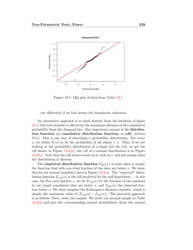
Non-Parametric Tests, Power 229
-4 -2 0 2 4
-3-2
-10
12
3
Normal Q-Q Plot
Theoretical Quantiles
Sam
ple
Qua
ntile
s
Figure 13.1: QQ plot of data from Table 13.1.
out differently if we had drawn the boundaries otherwise.
An alternative approach is to work directly from the intuition of figure13.1: Our test statistic is effectively the maximum distance of the cumulativeprobability from the diagonal line. One important concept is the distribu-tion function (or cumulative distribution function, or cdf), writtenF (x). This is one way of describing a probability distribution. For everyx, we define F (x) to be the probability of all values ≤ x. Thus, if we arelooking at the probability distribution of a single fair die roll, we get thecdf shown in Figure 13.2(a); the cdf of a normal distribution is in Figure13.2(b). Note that the cdf always starts at 0, ends at 1, and has jumps whenthe distribution is discrete.
The empirical distribution function Fobs(x) of some data is simplythe function that tells you what fraction of the data are below x. We showthis for our normal (possibly) data in Figure 13.3(a). The “expected” distri-bution function Fexp(x) is the cdf predicted by the null hypothesis — in thiscase, the For each number x, we let Fexp(x) be the fraction of the numbersin our target population that are below x, and Fobs(x) the observed frac-tion below x. We then compute the Kolmogorov-Smirnov statistic, which issimply the maximum value of |Fexp(x) − Fobs(x)|. The practical approachis as follows: First, order the sample. We order our normal sample in Table13.2(a) and give the corresponding normal probabilities (from the normal
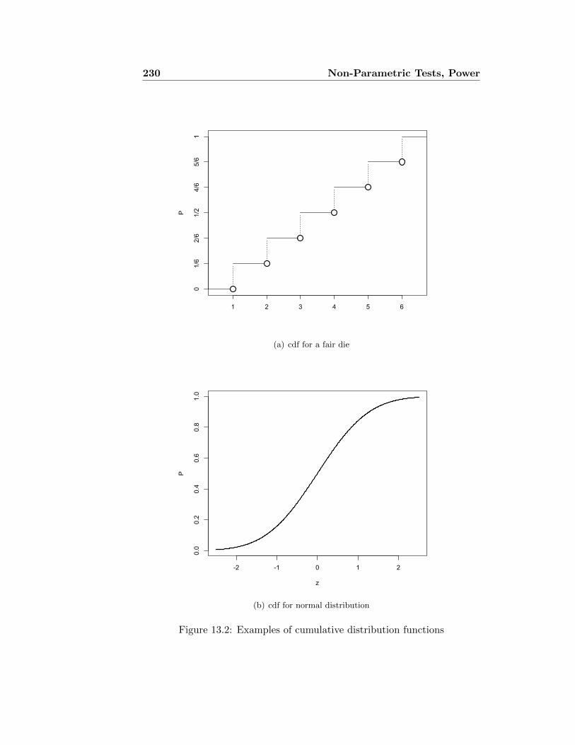
230 Non-Parametric Tests, Power
1 2 3 4 5 6
P
01/6
2/6
1/2
4/6
5/6
1
(a) cdf for a fair die
-2 -1 0 1 2
0.0
0.2
0.4
0.6
0.8
1.0
z
P
(b) cdf for normal distribution
Figure 13.2: Examples of cumulative distribution functions

Non-Parametric Tests, Power 231
Category Lower Upper Observed Expected
1 ∞ -1.5 9 6.72 -1.5 -0.5 15 24.23 -0.5 0.5 49 38.34 0.5 1.5 22 24.25 1.5 ∞ 5 6.7
Table 13.2: χ2 table for data from Table 13.1, testing its fit to a standardnormal distribution.
table) in Table 13.2(b). These probabilities need to be compared to theprobabilities of the sample, which are just 0.01, 0.02, . . . , 1.00. This proce-dure is represented graphically in Figure 13.3.
The Kolmogorov-Smirnov statistic is the maximum difference, shown inblue in Table 13.3. This is Dn = 0.092. For a test at the 0.05 significancelevel, we compare this to the critical value, which is
Dcrit =1.36√n
In this case, with n = 100, we get Dcrit = 0.136. Since our observed Dn issmaller, we do not reject the null hypothesis.
Of course, if you wish to compare the data to the normal distributionwith mean µ and variance σ2, the easiest thing to do is to standardise: Thehypothesis that (xi) come from the N(µ, σ2) distribution is equivalent tosaying that (xi − µ)/σ come from the standard N(0, 1) distribution. (Ofcourse, if µ and σ are estimated from the data, we get a Student t distribu-tion in place of the standard normal.)
One final point: In point of fact, the data are unlikely to have comefrom a normal distribution. One way of seeing this is to look at the largest(negative) data point, which is −3.68. The probability of a sample from astandard normal distribution being at least this large is about 0.0002. In 100observations, the probability of observing such a large value at least once isno more than 100 times as big, or 0.02. We could have a goodness-of-fit testbased on the largest observation, which would reject the hypothesis that thissample came from a normal distribution. The Kolmogorov-Smirnov test, onthe other hand, is indifferent to the size of the largest observation.
There are many different ways to test a complicated hypothesis, such asthe equality of two distributions, because there are so many different ways

232 Non-Parametric Tests, Power
-3 -2 -1 0 1 2 3
0.0
0.2
0.4
0.6
0.8
1.0
x
F(x)
Fobs(x)Fexp(x)Fobs(x) − Fexp(x)
(a) Fobs shown in black circles, and Fexp (the normal distribution function) in red. The green segments show thedifference between the two distribution functions.
-3 -2 -1 0 1 2 3
0.00
0.02
0.04
0.06
0.08
x
|Fobs(x)−F exp(x)|
(b) Plot of |Fobs − Fexp|
Figure 13.3: Computing the Kolmogorov-Smirnov statistic for the data ofTable 13.1.
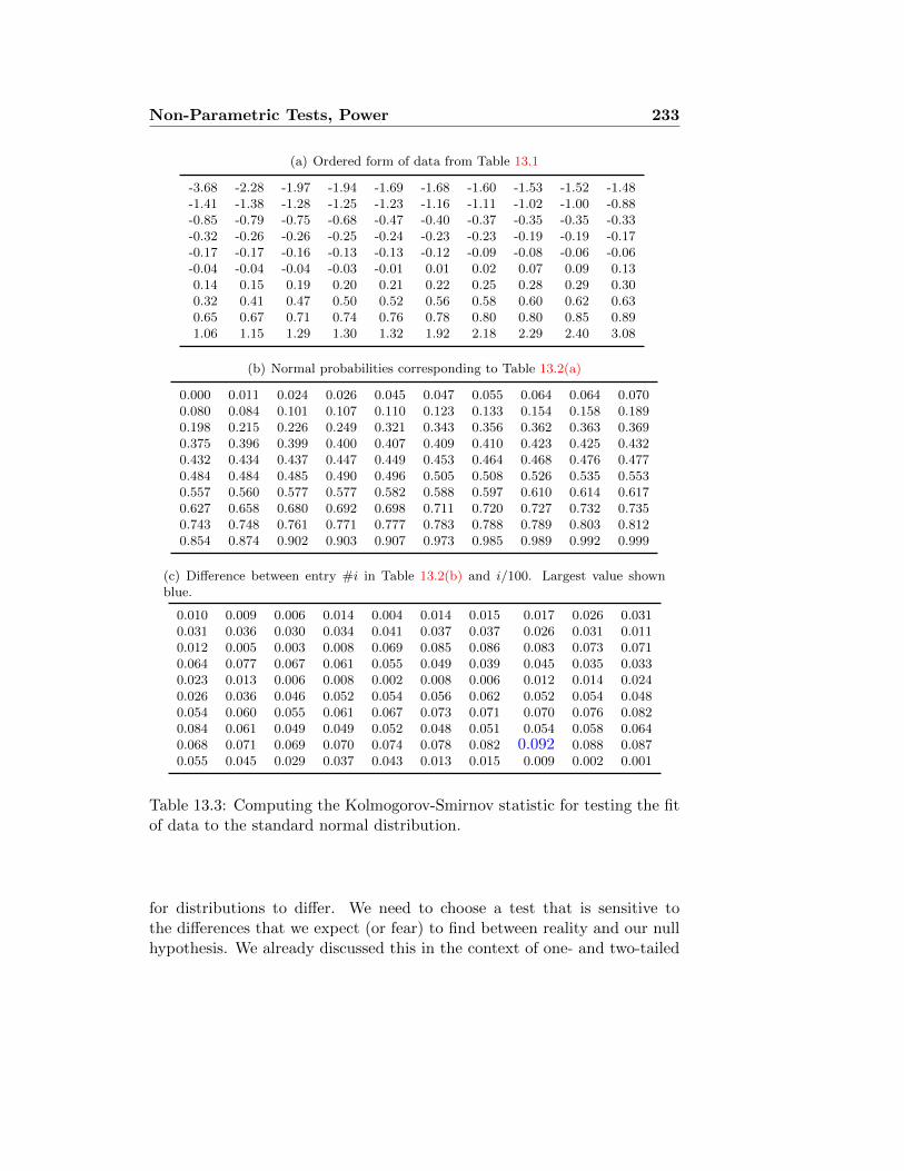
Non-Parametric Tests, Power 233
(a) Ordered form of data from Table 13.1
-3.68 -2.28 -1.97 -1.94 -1.69 -1.68 -1.60 -1.53 -1.52 -1.48-1.41 -1.38 -1.28 -1.25 -1.23 -1.16 -1.11 -1.02 -1.00 -0.88-0.85 -0.79 -0.75 -0.68 -0.47 -0.40 -0.37 -0.35 -0.35 -0.33-0.32 -0.26 -0.26 -0.25 -0.24 -0.23 -0.23 -0.19 -0.19 -0.17-0.17 -0.17 -0.16 -0.13 -0.13 -0.12 -0.09 -0.08 -0.06 -0.06-0.04 -0.04 -0.04 -0.03 -0.01 0.01 0.02 0.07 0.09 0.130.14 0.15 0.19 0.20 0.21 0.22 0.25 0.28 0.29 0.300.32 0.41 0.47 0.50 0.52 0.56 0.58 0.60 0.62 0.630.65 0.67 0.71 0.74 0.76 0.78 0.80 0.80 0.85 0.891.06 1.15 1.29 1.30 1.32 1.92 2.18 2.29 2.40 3.08
(b) Normal probabilities corresponding to Table 13.2(a)
0.000 0.011 0.024 0.026 0.045 0.047 0.055 0.064 0.064 0.0700.080 0.084 0.101 0.107 0.110 0.123 0.133 0.154 0.158 0.1890.198 0.215 0.226 0.249 0.321 0.343 0.356 0.362 0.363 0.3690.375 0.396 0.399 0.400 0.407 0.409 0.410 0.423 0.425 0.4320.432 0.434 0.437 0.447 0.449 0.453 0.464 0.468 0.476 0.4770.484 0.484 0.485 0.490 0.496 0.505 0.508 0.526 0.535 0.5530.557 0.560 0.577 0.577 0.582 0.588 0.597 0.610 0.614 0.6170.627 0.658 0.680 0.692 0.698 0.711 0.720 0.727 0.732 0.7350.743 0.748 0.761 0.771 0.777 0.783 0.788 0.789 0.803 0.8120.854 0.874 0.902 0.903 0.907 0.973 0.985 0.989 0.992 0.999
(c) Difference between entry #i in Table 13.2(b) and i/100. Largest value shownblue.
0.010 0.009 0.006 0.014 0.004 0.014 0.015 0.017 0.026 0.0310.031 0.036 0.030 0.034 0.041 0.037 0.037 0.026 0.031 0.0110.012 0.005 0.003 0.008 0.069 0.085 0.086 0.083 0.073 0.0710.064 0.077 0.067 0.061 0.055 0.049 0.039 0.045 0.035 0.0330.023 0.013 0.006 0.008 0.002 0.008 0.006 0.012 0.014 0.0240.026 0.036 0.046 0.052 0.054 0.056 0.062 0.052 0.054 0.0480.054 0.060 0.055 0.061 0.067 0.073 0.071 0.070 0.076 0.0820.084 0.061 0.049 0.049 0.052 0.048 0.051 0.054 0.058 0.0640.068 0.071 0.069 0.070 0.074 0.078 0.082 0.092 0.088 0.0870.055 0.045 0.029 0.037 0.043 0.013 0.015 0.009 0.002 0.001
Table 13.3: Computing the Kolmogorov-Smirnov statistic for testing the fitof data to the standard normal distribution.
for distributions to differ. We need to choose a test that is sensitive tothe differences that we expect (or fear) to find between reality and our nullhypothesis. We already discussed this in the context of one- and two-tailed

234 Non-Parametric Tests, Power
t and Z tests. If the null hypothesis says µ = µ0, and the alternative is thatµ > µ0, then we can increase the power of our test against this alternative bytaking a one-sided alternative. On the other hand, if reality is that µ < µ0
then the test will have essentially no power at all. Similarly, if we thinkthe reality is that the distributions of X and Y differ on some scatteredintervals, we might opt for a χ2 test.
13.1.2 Comparing two samples: Continuous distributions
Suppose an archaeologist has measured the distances of various settlementsfrom an important cult site at two different periods — let us say, X1, . . . , X10
are the distances (in km) for the early settlements, and Y1, . . . , Y12 are thedistances for the late settlements. She is interested to know whether therehas been a change in the settlement pattern, and believes that these settle-ments represent a random sample from a large number of such settlementsin these two periods. The measurements are:
X : 1.2, 1.4, 1.9, 3.7, 4.4, 4.8, 9.7, 17.3, 21.1, 28.4
Y : 5.6, 6.5, 6.6, 6.9, 9.2, 10.4, 10.6, 19.3.
We put these values in order to compute the cdf (which we also plot inFigure 13.4).
1.2 1.4 1.9 3.7 4.4 4.80.60.0
5.6 6.5 6.6 6.9 9.2 9.7 10.4 10.6 17.3 19.3 21.1 28.4
Fx 0.1 0.2 0.3 0.4 0.5 0.6 0.6 0.6 0.6 0.6 0.7 0.7 0.7 0.8 0.8 0.9 1.0Fy 0.0 0.0 0.0 0.0 0.0 0.1 0.2 0.4 0.5 0.6 0.6 0.8 0.9 0.9 1.0 1.0 1.0
Table 13.4: Archaeology (imaginary) data, tabulation of cdfs.

Non-Parametric Tests, Power 235
0 5 10 15 20 25 30
x
P
00.2
0.4
0.6
0.8
1
Figure 13.4: Cumulative distribution functions computed from “archaeol-ogy” data, as tabulated in Table 13.4.
The Kolmogorov-Smirnov statistic is D = 0.6. We estimate the criticalvalue from this formula:
Kolmogorov-Smirnov Critical value:
Dcrit,0.05 = 1.36√
1nx
+ 1nx
= 1.36√
nx+ny
nxny.
With nx = 10 and ny = 8, this yields Dcrit,0.05 = 0.645, so that wejust miss rejecting the null hypothesis. (As it happens, the approximatecritical value is too high here. The true critical value is exactly 0.6. Atable of exact critical values is available at http://www.soest.hawaii.edu/wessel/courses/gg313/Critical_KS.pdf.)
13.1.3 Comparing two samples: Discrete samples
The Kolmogorov-Smirnov test is designed to deal with samples from a con-tinuous distribution without having to make arbitrary partitions. It is notappropriate for samples from discrete distributions, or when the data are
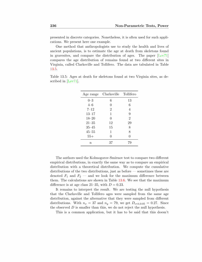
236 Non-Parametric Tests, Power
presented in discrete categories. Nonetheless, it is often used for such appli-cations. We present here one example.
One method that anthropologists use to study the health and lives ofancient populations, is to estimate the age at death from skeletons foundin gravesites, and compare the distribution of ages. The paper [Lov71]compares the age distribution of remains found at two different sites inVirginia, called Clarksville and Tollifero. The data are tabulated in Table13.5.
Table 13.5: Ages at death for skeletons found at two Virginia sites, as de-scribed in [Lov71].
Age range Clarksville Tollifero
0–3 6 134–6 0 67–12 2 413–17 1 918–20 0 221–35 12 2935–45 15 845–55 1 855+ 0 0
n 37 79
The authors used the Kolmogorov-Smirnov test to compare two differentempirical distributions, in exactly the same way as to compare an empiricaldistribution with a theoretical distribution. We compute the cumulativedistributions of the two distributions, just as before — sometimes these aredenoted F1 and F2 — and we look for the maximum difference betweenthem. The calculations are shown in Table 13.6. We see that the maximumdifference is at age class 21–35, with D = 0.23.
It remains to interpret the result. We are testing the null hypothesisthat the Clarksville and Tollifero ages were sampled from the same agedistribution, against the alternative that they were sampled from differentdistributions. With nx = 37 and ny = 79, we get Dcrit,0.05 = 0.27. Sincethe observed D is smaller than this, we do not reject the null hypothesis.
This is a common application, but it has to be said that this doesn’t

Non-Parametric Tests, Power 237
Table 13.6: Calculations for Kolmogorov-Smirnov test on data from Table13.5.
Cumulative Distrib.Age range Clarksville Tollifero Difference
3 0.16 0.16 06 0.16 0.24 0.0812 0.22 0.29 0.0717 0.24 0.41 0.1720 0.24 0.43 0.1935 0.57 0.8 0.2345 0.97 0.9 0.0755 1 1 0
entirely make sense. What we have done is effectively to take the maximumdifference not over all possible points in the distribution, but only at eightspecially chosen points. This inevitably makes the maximum smaller. Theresult is to make it harder to reject the null hypothesis, so our significancelevel is too high. We should compensate by lowering the critical value.
13.1.4 Comparing tests to compare distributions
Note that the Kolmogorov-Smirnov test differs from χ2 in another importantway: The chi-squared statistic doesn’t care what order the categories comein, while order is crucial to the Kolmogorov-Smirnov statistic. This may begood or bad, depending on the kinds of deviation from the null hypothesisyou think are important. (Thus, in our example here, Kolmogorov-Smirnovwould record a larger deviation from the null hypothesis if the Clarksville sitehad lower mortality at all juvenile age classes, than if it had lower mortalityin age classes 0–3 and 35–55, and higher mortality elsewhere. There arealternative tests
13.2 Power of a test
What is a hypothesis test? We start with a null hypothesis H0, which forour purposes is a distribution that the observed data may have come from,and a level α, and we wish to determine whether the data could have had
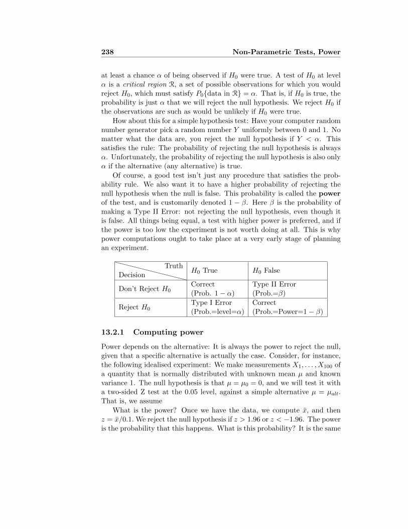
238 Non-Parametric Tests, Power
at least a chance α of being observed if H0 were true. A test of H0 at levelα is a critical region R, a set of possible observations for which you wouldreject H0, which must satisfy P0{data in R} = α. That is, if H0 is true, theprobability is just α that we will reject the null hypothesis. We reject H0 ifthe observations are such as would be unlikely if H0 were true.
How about this for a simple hypothesis test: Have your computer randomnumber generator pick a random number Y uniformly between 0 and 1. Nomatter what the data are, you reject the null hypothesis if Y < α. Thissatisfies the rule: The probability of rejecting the null hypothesis is alwaysα. Unfortunately, the probability of rejecting the null hypothesis is also onlyα if the alternative (any alternative) is true.
Of course, a good test isn’t just any procedure that satisfies the prob-ability rule. We also want it to have a higher probability of rejecting thenull hypothesis when the null is false. This probability is called the powerof the test, and is customarily denoted 1 − β. Here β is the probability ofmaking a Type II Error: not rejecting the null hypothesis, even though itis false. All things being equal, a test with higher power is preferred, and ifthe power is too low the experiment is not worth doing at all. This is whypower computations ought to take place at a very early stage of planningan experiment.
DecisionTruth
H0 True H0 False
Don’t Reject H0Correct Type II Error(Prob. 1− α) (Prob.=β)
Reject H0Type I Error Correct(Prob.=level=α) (Prob.=Power=1− β)
13.2.1 Computing power
Power depends on the alternative: It is always the power to reject the null,given that a specific alternative is actually the case. Consider, for instance,the following idealised experiment: We make measurements X1, . . . , X100 ofa quantity that is normally distributed with unknown mean µ and knownvariance 1. The null hypothesis is that µ = µ0 = 0, and we will test it witha two-sided Z test at the 0.05 level, against a simple alternative µ = µalt.That is, we assume
What is the power? Once we have the data, we compute x, and thenz = x/0.1. We reject the null hypothesis if z > 1.96 or z < −1.96. The poweris the probability that this happens. What is this probability? It is the same

Non-Parametric Tests, Power 239
as the probability that X > 0.196 or X < −0.196. We know that X hasN(µ, 0.1) distribution. If we standardise this, we see that Z ′ := 10(X − µ)is standard normal. A very elementary probability computation shows usthat
P{X < −0.196
}= P
{X − µ < −0.196− µ
}= P
{Z ′ < −1.96− 10µ
}P{X > 0.196
}= P
{X − µ > 0.196− µ
}= P
{Z ′ > 1.96− 10µ
}Thus
Power = Φ(−1.96− 10µalt) + 1− Φ(1.96− 10µalt), (13.1)
where Φ is the number we look up on the normal table.
More generally, suppose we have n measures of a quantity with unknowndistribution, unknown mean µ, but known variance σ2, and we wish to usea two-tailed Z test for the null hypothesis µ = µ0 against the alternativeµ = µalt. The same computation as above shows that
Power = Φ
(−z −
√n
σ(µ0 − µalt)
)+ 1− Φ
(z −√n
σ(µ0 − µalt)
).
(13.2)
To put this differently, the power is the probability of getting a decisiveresult (rejecting the null hypothesis) if the hidden real mean is µalt.
You don’t need to memorise this formula, but it is worth paying attentionto the qualitative behaviour of the power. Figure 13.5 shows the power fora range of alternative numbers of samples, and levels of test. Note thatincreasing the number of samples increases the power, while lowering thelevel of the test decreases the power. Note, too, that the power approachesthe level of the test, as the alternative µalt approaches the null µ0.
13.2.2 Computing trial sizes
Suppose now that you are planning an experiment to test a new blood-pressure medication. Medication A has been found to lower blood pressureby 10 mmHg, with an SD of 8 mmHg, and we want to test it against thenew medication B. We will recruit some number of subjects, randomly dividethem into control and experiment groups; the control group receives A, theexperiment group receives B. At the end we will perform a Z test at the 0.05level to decide whether B really lowered the subjects’ blood pressure morethan A; that is, we will let µA and µB be the true mean effect of drugs A

240 Non-Parametric Tests, Power
-0.5 -0.4 -0.3 -0.2 -0.1 0.0 0.1 0.2 0.3 0.4 0.5
0.0
0.2
0.4
0.6
0.8
1.0
µalt − µ0
Power
n=100, α=.05n=100, α=.01n=1000, α=.05n=1000, α=.01
Figure 13.5: Power for Z test with different gaps between the null and alter-native hypotheses for the mean, for given sizes of study (n) and significancelevels α.
and B respectively on blood pressure, and test the null hypothesis µA = µBagainst the two-tailed alternative µA 6= µB, or the one-tailed alternativeµA < µB. Following the discussion of section 11.6, we can act as thoughthese were simple random samples of size n/2 from one population receivingA and another receiving B, with the test statistic
Z =b− a
σ√
1n/2 + 1
n/2
.
Is it worth doing this experiment? Given our resources, there is a limitednumber of subjects we can afford to recruit, and that determines the powerof the test we do at the end. Our estimate of the power also depends, ofcourse, on what we think the difference between the two population means

Non-Parametric Tests, Power 241
is. We see from the formula (13.2) that if the gap between µA and µBbecomes half as big, we need 4 times as many subjects to keep the samepower. If the power is only 0.2, say, then it is hardly worth starting in onthe experiment, since the result we get is unlikely to be conclusive.
Figure 13.6 shows the power for experiments where the true experimentaleffect (the difference between µA and µB) is 10 mmHg, 5 mmHg, and 1mmHg), performing one-tailed and two-tailed significance tests at the 0.05level.
Notice that the one-tailed test is always more powerful when µB − µAis on the right side (µB bigger than µA, so B is superior), but essentially 0when B is inferior; the power of the two-tailed test is symmetric. If we areinterested to discover only evidence that B is superior, then the one-tailedtest obviously makes more sense.
Suppose now that we have sufficient funding to enroll 50 subjects in ourstudy, and we think the study would be worth doing only if we have at leastan 80% chance of finding a significant positive result. In that case, we seefrom Figure 13.6(b) that we should drop the project unless we expect thedifference in average effects to be at least 5 mmHg. On the other hand, ifwe can afford 200 subjects, we can justify hunting for an effect only halfas big, namely 2.5 mmHg. With 1000 subjects we have a good chance ofdetecting a difference between the drugs as small as 1 mmHg. On the otherhand, with only 10 subjects we would be unlikely to find the difference tobe statistically significant, even if the true difference is quite large.
Important lesson: The difference between a statisticallysignificant result and a non-significant result may be just the sizeof the sample. Even an insignificant difference in the usual sense
(i.e., tiny) has a high probability (power) of producing astatistically significant result if the sample size is large enough.
13.2.3 Power and non-parametric tests
The cost of dispensing with questionable assumptions is to reduce the powerto reject a false null hypothesis in cases where the assumptions do hold. Tosee this, we consider one very basic example: We observe 10 samples from anormal distribution with mean µ and variance 1, which is unknown. We donot know µ either, so we wish to test the null hypothesis H0 : µ = 0 againstthe alternative hypothesis that µ 6= 0. We perform our test at the 0.05 level.

242 Non-Parametric Tests, Power
1 2 5 10 20 50 100 200 500 1000 2000 5000 10000
0.0
0.2
0.4
0.6
0.8
1.0
Number of subjects (log scale)
Power
one-tailed test,µB − µA=10one-tailed test,µB − µA=5one-tailed test,µB − µA=1two-tailed test,µB − µA=10two-tailed test,µB − µA=5two-tailed test,µB − µA=1
(a) Power as function of trial size.
-10 -5 0 5 10
0.0
0.2
0.4
0.6
0.8
1.0
µB − µA
Power
one-tailed test,n=10one-tailed test,n=50one-tailed test,n=200one-tailed test,n=1000two-tailed test,n=10two-tailed test,n=50two-tailed test,n=200two-tailed test,n=1000
(b) Power as function of µB − µA.
Figure 13.6: Power of the BP experiment, depending on number of subjectsand true difference between the two means.
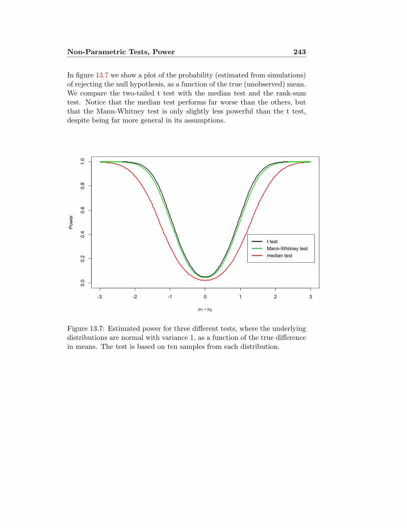
Non-Parametric Tests, Power 243
In figure 13.7 we show a plot of the probability (estimated from simulations)of rejecting the null hypothesis, as a function of the true (unobserved) mean.We compare the two-tailed t test with the median test and the rank-sumtest. Notice that the median test performs far worse than the others, butthat the Mann-Whitney test is only slightly less powerful than the t test,despite being far more general in its assumptions.
-3 -2 -1 0 1 2 3
0.0
0.2
0.4
0.6
0.8
1.0
µ1 − µ2
Power
t testMann-Whitney testmedian test
Figure 13.7: Estimated power for three different tests, where the underlyingdistributions are normal with variance 1, as a function of the true differencein means. The test is based on ten samples from each distribution.

244 Non-Parametric Tests, Power

Lecture 14
ANOVA and the F test
14.1 Example: Breastfeeding and intelligence
A study was carried out of the relationship between duration of breastfeedingand adult intelligence. The subjects were part of the Copenhagen Perina-tal Cohort, 9125 individuals born at the Copenhagen University Hospitalbetween October 1959 and December 1961. As reported in [MMSR02], asubset of the cohort was contacted for follow-up as adults (between ages 20and 34). 983 subjects completed the Danish version of the Wechsler AdultIntelligence Scale (WAIS).
Table 14.1 shows the average scores for 3 tests, for 5 classes of breast-feeding duration. Look first at the rows marked “Unadjusted mean”. Wenotice immediately that 1) Longer breastfeeding was associated with highermean intelligence scores, but 2) The longest breastfeeding (more than 9months) was associated with lower mean scores. We ask whether either orboth of these associations is reliably linked to the duration of breastfeeding,or whether they could be due to chance.
14.2 Digression: Confounding and the “adjustedmeans”
Before we can distinguish between these two possibilities — causation orchance association — we need to address another possibility: confounding.Suppose, for instance, that mothers who smoke are less likely to breastfeed.Since mother’s smoking is known to reduce the child’s IQ scores, this wouldproduce higher IQ scores for the breastfed babies, irrespective of any causalinfluence of the milk. The gold standard for eliminating confounding is
245

246 ANOVA
Table 14.1: Intelligence scores (WAIS) by duration of breastfeeding.
TestDuration of Breastfeeding (months)≤ 1 2-3 4-6 7-9 > 9
N 272 305 269 104 23
Verbal IQUnadjusted mean 98.2 101.7 104.0 108.2 102.3
SD 16.0 14.9 15.7 13.3 15.2Adjusted Mean 99.7 102.3 102.7 105.7 103.0
Performance IQUnadjusted mean 98.5 100.5 101.8 106.3 102.6
SD 15.8 15.2 15.6 13.9 14.9Adjusted Mean 99.1 100.6 101.3 105.1 104.4
Full Scale IQUnadjusted mean 98.1 101.3 103.3 108.2 102.8
SD 15.9 15.2 15.7 13.1 14.4Adjusted Mean 99.4 101.7 102.3 106.0 104.0
the double-blind random controlled experiment. Subjects are assigned atrandom to receive the treatment or not, so that the only difference betweenthe two groups is whether they received the treatment. (“Double blind”refers to the use of protocols that keep the subjects and the experimentersfrom knowing who has received the treatment and who is a control. Withoutblinding, the two groups would differ in their knowledge of having receivedthe treatment or not. We then might be unable to distinguish between effectswhich are actually due to the treatment, and those that come from believingyou have received the treatment — in particular, the so-called placeboeffects.)
Of course, it is usually neither possible nor ethical to randomly assignbabies to different feeding regimens. What we have here is an observationalstudy. The next best solution is then to try to remove the confounding. Inthis case, the researchers looked at all the factors that they might expect tohave an effect on adult intelligence — maternal smoking, maternal height,parents’ income, infant’s birthweight, and so on — and adjusted the scoresfor each category to compensate for a preponderance of characteristics thatmight be expected to raise or lower IQ in that category, regardless of infantnutrition. Thus, we see that the first and last categories both had theirmeans adjusted substantially upward, which must mean that the infants
ANOVA 247
who were nursed more than 9 months and those nursed less than 1 monthboth had, on average, characteristics (whether their own or their mothers’)that would seem to predispose them to lower IQ. For the rest of this chapterwe will work with the adjusted means.
The statistical technique for doing this, called multiple regression, isoutside the scope of this course, but it is fairly straightforward, and mosttextbooks on statistical methods that go beyond the mast basic techniqueswill describe it. Modern statistical software makes it particularly easy toadjust data with multiple regression.
14.3 Multiple comparisons
Let us consider the adjusted Full Scale IQ scores. We wish to determinewhether the scores of individuals with the same breastfeeding class mighthave come from the same distribution, with the differences being solely dueto random variation.
14.3.1 Discretisation and the χ2 test
One approach would be to group the IQ scores into groups — low, medium,and high, say. We would then have an incidence table If these were categor-ical data — proportions of subjects in each breastfeeding class who scored“high” and “low”, for instance — we could produce an incidence table suchas that in Table 14.2. (The data shown here are purely invented, for illustra-tive purposes.) You have learned how to analyse such a table to determinewhether the vertical categories (IQ score) are independent of the horizontalcategories (duration of breastfeeding), using the χ2 test.
The problem with this approach is self-evident: We have thrown awaysome of the information that we had to begin with, by forcing the data intodiscrete categories. Thus, the power to reject the null hypothesis is less thanit could have been. Furthermore, we have to draw arbitrary boundaries be-tween categories, and we may question whether the result of our significancetest would have come out differently if we had drawn the boundaries other-wise. (These are the same problems, you may recall, that led us to preferthe Kolomogorov-Smirnov test over χ2. The χ2 test has the virtue of beingwonderfully general, but it is often not quite the best choice.)

248 ANOVA
Table 14.2: Hypothetical incidence table, if IQ data were categorised intolow, medium, and high
Full IQ scoreBreastfeeding months
≤ 1 2-3 4-6 7-9 > 9
high 100 115 120 40 9medium 72 85 69 35 9low 100 115 80 29 5
14.3.2 Multiple t tests
Alternatively, we can compare the mean IQ scores between two differentbreastfeeding categories, using the t test — effectively, this is the z test, sincethe number of degrees of freedom is so large, but we still need to pool thevariance, because one of the categories has a fairly small number of samples.(The large number of samples also allows us to be reasonably confidentin treating the mean as normally distributed, as discussed in section 7.4.)For instance, suppose we wish to compare the children breastfed less than1 month with those breastfed more than 9 months. We want to test forequality of means, at the 0.05 level.
We compute the pooled standard deviation by
sp =
√(nx − 1)s2
x + (ny − 1)s2y
nx + ny − 2=
√271 · 15.92 + 22 · 14.42
293= 15.8,
and the standard error by
SEdiff = sp
√1
nx+
1
ny= 3.43.
This yields a t statistic of
t =x− ySEdiff
=−4.6
3.42= −1.34.
Since the cutoff is 1.96, we do not reject the null hypothesis.If we repeat this test for all 10 pairs of categories, we get the results
shown in Table 14.3. We see that 4 out of the 10 pairwise comparisonsshow statistically significant differences. But what story are these telling to-gether? Remember that if the null hypothesis were true — if the population

ANOVA 249
means were in fact all the same — 1 out of 20 comparisons should yield astatistically significant difference at the 0.05 level. How many statisticallysignificant differences do we need before we can reject the overall null hy-pothesis of identical population means? And what if none of the differenceswere individually significant, but they all pointed in the same direction?
Table 14.3: Pairwise t statistics for comparing all 10 pairs of categories.Those that exceed the significance threshold for the 0.05 level are shown inred.
2-3 4-6 7-9 > 9
≤ 1 −1.78 −2.14 −3.78 −1.342-3 −0.47 −2.58 −0.704-6 −2.14 −0.507-9 0.65
14.4 The F test
We will see in lecture 15 how to treat the covariate — the duration ofbreastfeeding — as a quantitative rather than categorical variable. That is,how to measure the effect (if any) per unit time breastfeeding. Here weconcern ourselves only with the question: Is there a nonrandom differencebetween the mean intelligence in the different categories? As we discussedin section 14.3, we want to reduce the question to a single test.
What should the test statistic look like? Fundamentally, a test statisticshould have two properties: 1) It measures significant deviation from thenull hypothesis; that is, one can recognise from the test statistic whetherthe null hypothesis has been violated substantially. 2) We can compute thedistribution of the statistic under the null hypothesis.
14.4.1 General approach
Suppose we have independent samples fromK different normal distributions,with means µ1, . . . , µK and variance σ2 (so the variances are all the same).We call these K groups levels (or sometimes treatments). We have nisamples from distribution i, which we denote Xk1, Xk2, . . . , Xknk
. The goal

250 ANOVA
is to determine from these samples whether the K treatment effects µkcould be all equal.
We let N =∑K
k=1 nk be the total number of observations. The averageof all the observations is X, while the average within level i is Xi:
Xi =1
ni
ni∑j=1
Xij .
The idea of analysis of variance (ANOVA) is that under the null hypothesis,which says that the observations from different levels really all are comingfrom the same distribution, the observations should be about as far (onaverage) from their own level mean as they are from the overall mean of thewhole sample; but if the means are different, observations should be closerto their level mean than they are to the overall mean.
We define the Between Groups Sum of Squares, or BSS, to be thetotal square difference of the group means from the overall mean; and theError Sum of Squares, or ESS, to be the total squared difference ofthe samples from the means of their own groups. (The term “error” refersto a context in which the samples can all be thought of as measures ofthe same quantity, and the variation among the measurements representsrandom error; this piece is also called the Within-Group Sum of Squares.)And then there is the Total Sum of Squares, or TSS, which is simplythe total square difference of the samples from the overall mean, if we treatthem as one sample.
BSS =
K∑i=1
ni(Xk − X)2;
ESS =K∑i=1
ni∑j=1
(Xij − Xi)2
=
K∑i=1
(ni − 1)s2i where si is the SD of observations in level i.
TSS =∑i,j
(Xij − X)2
= (N − 1)s2, where s is the sample SD of all observations together.
The initials BMS and EMS stand for Between Groups Mean Squaresand Error Mean Squares respectively.

ANOVA 251
The analysis of variance (ANOVA) is based on two mathematical
facts. The first is the identity TSS=ESS+BSS. In other words, all the
variability among the data can be divided into two pieces: The variabilitywithin groups, and the variability among the means of different groups.Our goal is to evaluate the apportionment, to decide if there is “too much”between group variability to be purely due to chance.
Of course, BSS and ESS involve different numbers of observations intheir sums, so we need to normalise them. We define
BMS =BSS
K − 1EMS =
ESS
N −K.
This brings us to the second mathematical fact: if the null hypothesis istrue, then EMS and BMS are both estimates for σ2. On the other hand,interesting deviations from the null hypothesis — in particular, where thepopulations have different means — would be expected to increase BMS rel-ative to EMS. This leads us to define the deviation from the null hypothesisas the ratio of these two quantities:
F =BMS
EMS=N −KK − 1
· BSSESS
.
We reject the null hypothesis when F is too large: That is, if we obtain avalue f such that P{F ≥ f} is below the significance level of the test.
Table 14.4: Tabular representation of the computation of the F statistic.
SS d.f. MS F
Between BSS K − 1 BMSX/Y
Treatments (A) (B) (X = A/B)
Errors (Within ESS N −K EMSTreatments) (C) (D) (Y = C/D)
Total TSS N − 1
Under the null hypothesis, the F statistic computed in this way has aknown distribution, called the F distribution with (K − 1, N −K) degreesof freedom. We show the density of F for K = 5 different treatments anddifferent values of N in Figure 14.1.

252 ANOVA
0 1 2 3 4 5
0.0
0.2
0.4
0.6
0.8
1.0
F
Density
K=5,N=10K=5,N=20K=5,N=∞K=3,N=6K=3,N=∞
Figure 14.1: Density of F distribution for different values of K and N .
14.4.2 The breastfeeding study: ANOVA analysis
In this case, since we do not know the individual observations, we cannotcompute TSS directly. We compute
ESS =
5∑k=1
(nk − 1)s2k
= 271 · 15.92 + 304 · 15.22 + 268 · 15.72 + 104 · 13.12 + 23 · 14.42
= 227000;
BSS =
5∑k=1
nk(xk· − x)2
= 272 · (99.4− 101.7)2 + 305 · (101.7− 101.7)2 + 269 · (102.3− 101.7)2
+ 104 · (106.0− 101.7)2 + 23 · (104.0− 101.7)2
= 3597.
We complete the computation in Table 14.5, obtaining F = 3.81. Thenumbers of degrees of freedom are (4, 968). The table in the official booklet is

ANOVA 253
quite small — after all, there is one distribution for each pair of integers. Thetable gives only the cutoff only for select values of (d1, d2) at the 0.05 level.For parameters in between one needs to interpolate, and for parametersabove the maximum we go to the row or column marked ∞. Looking onthe table in Figure 14.2, we see that the cutoff for F (4,∞) is 2.37. Usinga computer, we can compute that the cutoff for F (4, 968) at level 0.05 isactually 2.38; and the cutoff at level 0.01 would be 3.34.
Table 14.5: ANOVA table for breastfeeding data: Full Scale IQ, Adjusted.
SS d.f. MS F
Between 3597 4 894.83.81
Samples (A) (B) (X = A/B)
Errors (Within 227000 968 234.6Samples) (C) (D) (Y = C/D)
Total 230600 972(TSS=A+C) (N − 1)
14.4.3 Another Example: Exercising rats
We consider the following example, adapted from [MM98, Chapter 15]. Astudy was performed to study the effect of exercise on bone density in rats.30 rats were divided into three groups of ten: The first group carried outten “high jumps” (60 cm) a day for eight weeks; the second group carriedout ten “low jumps” (30 cm) a day for eight weeks; the third group had nospecial exercise. At the end of the treatment period, each rat’s bone densitywas measured. The results are given in Table 14.6.
We wish to test the null hypothesis that the different groups have thesame mean bone density, against the alternative hypothesis that they havedifferent bone densities. We first carry out the ANOVA analysis. The totalsum of squares is 20013.4. The error sum of squares (ESS) is computed as9s2
1 + 9s22 + 9s2
3 = 12579.5. The between-groups sum of squares (BSS) iscomputed as 10(638.7− 617.4)2 + 10(612.5− 617.4)2 + 10(601.1− 617.4)2 =7433.9 (here the overall mean is 617.4). Note that indeed TSS = ESS +BSS. We complete the computations in Table 14.7, obtaining F = 7.98.Looking in the column for 2, and the row for 30 (since there is no row on your

254 ANOVA
Figure 14.2: Table of F distribution; finding the cutoff at level 0.05 for thebreastfeeding study.
table for 27), we see that the cutoff at level 0.05 is 3.32. Thus, we concludethat the difference in means between the groups is statistically significant.
14.5 Multifactor ANOVA
The procedure described in section 14.4 leads to obvious extensions. Wehave observations
xki = µk + εki, k = 1, . . . ,K; i = 1, . . . , nk
where the εki are the normally distributed “errors”, and µk is the true meanfor group k. Thus, in the example of section 14.4.3, there were three groups,corresponding to three different exercise regimens, and ten different samplesfor each regimen. The obvious estimate for µk is
xk· =1
nk
nk∑i=1
xki,
and we use the F test to determine whether the differences among the meansare genuine. We decompose the total variance of the observations into the

ANOVA 255
(a) Full data
High 626 650 622 674 626 643 622 650 643 631Low 594 599 635 605 632 588 596 631 607 638
Control 614 569 653 593 611 600 603 593 621 554
(b) Summary statistics
Group Mean SD
High 638.7 16.6Low 612.5 19.3
Control 601.1 27.4
Table 14.6: Bone density of rats after given exercise regime, in mg / cm3
portion that is between groups and the portion that is within groups. If thebetween-group variance is too big, we reject the hypothesis of equal means.
Many experiments naturally lend themselves to a two-way layout. Forinstance, there may be three different exercise regimens and two differentdiets. We represent the measurements as
xkji = µk + νj + εkji, k = 1, 2, 3; j = 1, 2; i = 1, . . . , nkj .
It is then slightly more complicated to isolate the exercise effect µk and thediet effect νj . We test for equality of these effects by again splitting thevariance into pieces: the total sum of squares falls naturally into four pieces,corresponding to the variance over diets, variance over exercise regimens,variance over joint diet and exercise, and the remaining variance withineach group. We then test for whether the ratios of these pieces are too farfrom the ratio of the degrees of freedom, as determined by the F distribution.
Multifactor ANOVA is quite common in experimental practice, but willnot be covered in this course.
14.6 Kruskal-Wallis Test
Just as there is the non-parametric rank-sum test, similar to the t and ztests for equality of means, there is a non-parametric version of the F test,called the Kruskal-Wallis test. As with the rank-sum test, the basic idea is

256 ANOVA
Table 14.7: ANOVA table for rat exercise data.
SS d.f. MS F
Between 7434 2 37177.98
Samples (A) (B) (X = A/B)
Errors (Within 12580 27 466Samples) (C) (D) (Y = C/D)
Total 20014 29(TSS=A+C) (N − 1)
simply to substitute ranks for the actual observed values. This avoids theassumption that the the data were drawn from a normal distribution.
In Table 14.8 we duplicate the data from Table 14.6, replacing the mea-surements by the numbers 1 through 30, representing the ranks of the data:the lowest measurement is number 1, and the highest is number 30. In otherwords, suppose we have observed K different groups, with ni observationsin each group. We order all the observations in one large sequence of lengthN , from lowest to highest, and assign to each one its rank. (In case of ties,we assign the average rank.) We then sum the ranks in group i, obtainingnumbers R1, . . . , RK . Then
The Kruskal-Wallis test statistic is
H =12
N(N + 1)
K∑i=1
R2i
ni− 3(N + 1).
Under the null hypothesis, that all the samples came from the same distri-bution, H has the χ2 distribution with K − 1 degrees of freedom.
In the rat exercise example, we have the values of Ri given in Table14.7(b), yielding H = 10.7. If we are testing at the 0.05 significance level,the cutoff for χ2 with 2 degrees of freedom is 5.99. Thus, we conclude againthat there is a statistically significant difference among the distributions ofbone density in the three groups.

ANOVA 257
(a) Full data
High 18.5 27.5 16.5 30 18.5 25.5 16.5 27.5 25.5 20.5Low 6 8 23 11 22 3 7 20.5 12 24
Control 14 2 29 4.5 13 9 10 4.5 15 1
(b) Summary statis-tics
Group Sum
High 226.5Low 136.5
Control 102
Table 14.8: Ranks of data in Table 14.6.

258 ANOVA

Lecture 15
Regression and correlation:Detecting trends
15.1 Introduction: Linear relationships betweenvariables
In lectures 11 and 14 we have seen several examples of statistical problemswhich could be stated in this form: We have pairs of observations (xi, yi),where yi is numerical, and xi categorical — that is, xi is an assignmentto one of a few possible categories — and we seek to establish the extentto which the distribution of yi depends on the category xi. For example,in section 11.1, yi is a height and xi is either “early-married” or “late-married”. In section 14.4.3 the yi are measures of bone density, and thexi are the experimental category (control, high exercise, low exercise). Insection 14.4.2 the yi are IQ measures, and the xi are categories of length ofbreastfeeding.
The last example in particular points up the limitation of the approachwe have taken so far. If we think that breastfeeding affects IQ, we wouldlike to know if there is a linear relationship, and if so, how strong it is. Thatis, the data would be telling a very different story if group 5 infants (> 9months) wound up with the highest IQ and group 1 (≤ 1 month) with thelowest; than if the high IQs were in groups 1, 2 and 4, with lower IQs ingroups 3 and 5. But ANOVA only gives one answer: The group means aredifferent.
The linear relationship is the simplest one we can test for, when thecovariate xi is numerical. Intuitively, it says that each increase in xi byone unit effects a change in yi by the same fixed amount. Formally, we write
259

260 Regression
Regression Model yi = βxi + α + εi.
We think of this as a set of observations from random variables (X,Y )that satisfy the relationship Y = βX + α + E, where E is independentof X. We call this a linear relation because the pairs of points (xi, yi)with yi = βxi + α lie approximately on a straight line. Here the εi are“noise” or “error” terms. They are the random variation in measurementof Y that prevent us from seeing the data lying exactly (and obviously) ona line y = βx+ α. They may represent actual random errors from a “true”value of Y that is exactly βX+α, or it may mean that βX+α is an overalltrend, with E reflecting the contribution of other factors that have nothingto do with X. For instance, in the breastfeeding example, we are interestedto see whether children who received more breastmilk had higher IQs —but we don’t expect children who were nursed for the same length of timeto end up all with the same IQ, as they will differ genetically, socially, andin simple random proclivities. (As mentioned in section 14.4.2, the changefrom raw to adjusted mean IQ scores is intended to compensate for some ofthe more systematic contributions to the “error term”: mothers’ smoking,parents’ IQ and income, and so forth. The effect is to reduce the size of theεi terms, and so (one hopes) to make the true trend β more apparent.) Ofcourse, if the εi are large on average — if E has a high variance relative tothe variance of X — then the linear relationship will be drowned in a sea ofnoise.
** *
**
0 2 4 6 8 10 12
8090
100
110
120
Months breastfeeding
Adjus
ted m
ean F
ull Sc
ale IQ
Figure 15.1: Plot of data from the breastfeeding IQ study in Table 14.1.Stars represent mean for the class, boxes represent mean ± 2 StandardErrors.

Regression 261
15.2 Scatterplots
The most immediate thing that we may wish to do is to get a picture of thedata with a scatterplot. Some examples are shown in Figure 15.2.
●
●
●
●
●
●●
●
●
●●
●●
●
●●
●
●
●
●
●
●
●
●
●
●
●
●
●
●
●
●
●
●
●
●
●
●
●●
●
●
●
●
●
●
●
●
●
●
●
●
●●
● ●
●
●
●
●
●●
●
●
●
●
●
●
●
●
●
●
●
●
●
●
● ●
●
●
●
●
●
●
●
●
●
●
●
●
●
●
●
●
●
●
●●
●
●●●
●
●
●
●
●●
●
●
●
●
●
●
●
●
●
●
●
●
●
●
●
●●
●
●
●
●
●
●
●
● ●
●
●
●
●
●
●
●
●
●
●
●
●
●
●
●●
●
●
●
●
●
●
●
●
●
●
●
● ●
●
●
●
●
● ●
●●
●●
●
●
●
●
●
●
●
●
●
●
●
●
●
●
●
●
●
●
●
●
●
●
●
●
●
●
●
●
●
●
●
●
●
●
●
●
●
●
●
●
●
●
●
●
●●
●
●
●●
●
●
●
●
●
●
●
●
●
●●
●
●
●
●●
●
●
●
●
●
●●
●
●
●
●
●●
●
●
●
●
●●
●
●
●
●
●
●
●
●
●
●
●
●
●
●
●●
●
●
●
●
●
●
●
●
●●
●
●
●
●
●
●
●
●
●
●
●
●
●
●
●
●
●
●
●
●
●
● ●
●
●●
●
●
●
●
●
●
●
●
●
●
●
●
●
●
●
●
●
●
●
●
●
●
●
●
●
●
●
●●
●●
● ●●
●
●●
●
●
●
●
●
●
●
●
●
●
●
●●
●
●●
●
●
●
●
●
●
●
●
●
●
●
●● ● ●
●
●●
●●
●
●
●
●
●
●
●●●●
●
●
●
●
●
●
●
●
●
●●
●
●
● ●
●
● ●●
●
●
●●
●
●
●
●
●
●
●
●
●
●
●
●
●
●
●
●
●
●
●
●
●
●
●
●
●
●
●
●
●
●
●
●
●
●
●
●
●
●●
●
●
●
●
●●
●
●
●
●
●
●
●
●
●●
●●
●
●
●
●
●
●
●
●
●
●
●
●
●
●
●
●
●
●
●●
●
●
●●
●
●
●●
●
●
●
●
●
●●
●
●
●
●
●
●
●
●
●
●
●
●
●
●
●
●
●
●
●
●
●
●
●
●
●
●
●
●
●●
●
●
●
●
●
●
●●
●
●
●
●
●●
●
●
●
●●
●
●
●
●
●
●●
●
●
●
●
●
●
●
●
●
●
●●
●
●
●●●
●
●
●
●
●●
●
●
●
●
●
●
●
●
●
●
●
●
●
●
●●
●
●
●●
●
●
● ●
●
●
●
●●
●
●
●
●
●
●
●
●
●●
●
● ●
●●
●
●
●
●
●
●
●
●
●
●
●●
●
●
●
●
●
●
●
●
●●
●
●
●
●
●
●
●
●
●
●
●●●
●
●●
●
●
●
●
●
●
●
●
●
●
●
●
●
●
●
●
●●
●
●
●
●
●
●
●
●
●
●
●
●
●
●
●
●
●
●
●
●
●
●
●
●
●
●●●
●
●
●
●
●
●
●
●
●
●
●
● ●●
●
●
●
●●
●
●
●●
●
●
●
●
●
●
●
●
●
●
●
●●
●
●
●
●
●
●
●
●
●
●
●
●
●
●
●
●
●
●●
●
●
●
●
●
●
●
●
●
●
●
●
●
●
●
●
●
●
●
●
●
●●
●
●
●
●
●
●
●
●
●
●
●
●
●
●
●
●
●
●
●
●
●
●
●
●
●
●
●
●
●
●
●
●
●
●
●
●●
●
●
●
●
●
●
●
●
●
●
●
●
●
●
●
●
●
●
●
●
●
●
●
●
●●
●● ●
●
●
●
●
●
●
●
●
●
●
●
●●
●
●
●
●
●
●
● ●
●
●
●
●●
●
●
●
●
●
●
●
●
●
●●
●
●
●
●
●
●
●
●
●
●
●
●
●
●●
●
●
●
●
●●
●
●
●
●
●
●
●
●
●
●
●
●
●
●●
●
●
●
●
●
●
●
●
●
●
●
●
●
●
●●●
●
●
●
●
●
●
●●
●
●
●
●
●
●
●
●
●
●
●
●
●
●
●●
●
●
●
●
●
●●
●
●
●●
●
●
●
●
●
●
●
●
●
●
●
●●
●
●
●
●
●
●
●●●●
●
●
●
●
●
●
●
●
●
●
●
●
●●
●
●●
●
●
●
●
●
●
●●
●
●
●
●
●
●
●
●
●
●
●
●
●
●
●
●
●
●
●●
●
●
●
●●
●
●
●
●
●
●
●
●
●
●
●
●
●
●
●
●
●
●
●
●
●
●
●
●
●●
●
●
●
●
●●
●
●
●
●
●
●
● ●
●
●
●
●
●
●
●
●● ●
●
●
●●
●
●
●
●
●
●
●
●
● ●
●
●
●
●
●
●
●●
●
●
●
● ●
●●
● ●●
●
●
●
●
●
●
●
●
●
●
●
●
●
●
●
●
●
●
●
●
●
●
●
●
●
●
●
●
●
●●
●
●
●
●
●
●
●
●
●
●
●
●
●●
●
●
●●
●
●
●
●
●
●
●
●
●
●
●
●
●
●
●
●
●
●
●
●
●
●
●●
●
●
0 10 20 30 40 50
6080
100
120
140
160
180
Birth weight and mother's smoking
Number of cigarettes smoked
Birth
wei
ght (
oz.)
(a) Infant birth weight against maternal smoking
64 66 68 70 72
6264
6668
7072
74
Parent average height (in.)
Child
heigh
t (in.)
(b) Galton’s parent-child height data
1700 1800 1900 2000 2100 2200
90100
110
120
Total brain surface area (cm2)
Full-s
cale
IQ
(c) IQ and brain surface area
1700 1800 1900 2000 2100 2200
1000
1100
1200
1300
1400
Total brain surface area (cm2)
Total
brain
volum
e (cm
3 )
(d) Brain volume and brain surface area
0 1000 2000 3000 4000 5000 6000
01000
2000
3000
4000
5000
Body weight (kg)
Brain
weigh
t (g)
(e) Brain weight and body weight (62 species of landmammals)
-2 -1 0 1 2 3 4
-10
12
3
log10Body weight (kg)
log10
Brain
weigh
t (g)
(f) log Brain weight and log body weight (62 species ofland mammals)
Figure 15.2: Examples of scatterplots

262 Regression
15.3 Correlation: Definition and interpretation
Given two paired random variables (X,Y ), with means X and Y , we definethe covariance of X and Y , to be
Cov(X,Y ) = mean[(X − X)(Y − Y )
].
For n paired observations (xi, yi), with means x and y, we define the pop-ulation covariance
cxy = mean[(xi − x)(yi − y)
]=
1
n
n∑i=1
(xi − x)(yi − y).
As with the SD, we usually work with the sample covariance, which isjust
sxy =n
n− 1cxy =
1
n− 1
n∑i=1
(xi − x)(yi − y).
This is a better estimate for the covariance of the random variables that xiand yi are sampled from.
Notice that the means of xi− x and yi− x are both 0: On average, xi isneither higher nor lower than x. Why is the covariance then not also 0? IfX and Y are independent, then each value of X will come with, on average,the same distribution of Y ’s, so the positives and negatives will cancel out,and the covariance will indeed be 0. On the other hand, if high values of xitend to come with high values of yi, and low values with low values, thenthe product (xi − x)(yi − y) will tend to be positive, making the covariancepositive.
While positive and negative covariance have obvious interpretations, themagnitude of covariance does not say anything straightforward about thestrength of connection between the covariates. After all, if we simply mea-sure heights in millimetres rather than centimetres, all the numbers willbecome 10 times as big, and the covariance will be multiplied by 100. Forthis reason, we normalise the covariance by dividing it by the product of thetwo standard deviations, producing the quantity called correlation:
CorrelationρXY = Cov(X,Y )
σXσY.
Of course, we estimate the correlation in a corresponding way:

Regression 263
Sample correlationrxy =
sxysxsy
.
It is easy to see that correlation does not change when we rescale the data— for instance, by changing the unit of measurement. If xi were universallyreplaced by x∗i = αxi + β, then sxy becomes s∗xy = αsxy, and sx becomess∗x = αsx. Since the extra factor of α appears in the numerator and in thedenominator, the final result of rxy remains unchanged. In fact, it turnsout that rxy is always between −1 and 1. The correlation of −1 means thatthere is a perfect linear relationship between x and y with negative sign;correlation of +1 means that there is a perfect linear relationship betweenx and y with positive sign; and correlation 0 means no linear relationshipat all.
In Figure 15.3 we show some samples of standard normally distributedpairs of random variables with different correlations. As you can see, highpositive correlation means the points lie close to an upward-sloping line;high negative correlation means the points lie close to a downward-slopingline; and correlation close to 0 means the points lie scattered about a disk.
15.4 Computing correlation
There are several alternative formulae for the covariance, which may be moreconvenient than the standard formula:
sxy =1
n− 1
n∑i=1
(xi − x)(yi − y)
=1
n− 1
n∑i=1
xiyi −n
n− 1xy
=1
4
(s2x+y − s2
x−y),
where sx+y and sx−y are the sample SDs of the collections (xi + yi) and(xi − yi) respectively.

264 Regression
●
●●
●
●
●
●
●
●
●
●
●
●
●
●
●
●●
●
●
●
●
●●
●
●
●
●
●●
●
●
●
●
●●
●●●
●
●
●
●
●
●
●
●
●
●
●●
●
●
●
●
●
●
●
●
●
●
●
●
●
●
●
●
●
●
●
●
●
●
●
●
●
●
●
●
●
●
●●
●
●
●
●
●
●
●
●
●
●●
●
●●
●●
●
●●
●
●
●●
●●
●
●
●
●
● ●
●
●
●
●
●
●
●
●
●
●
●
●●●
●
●
●
●
●
●
●
●
●
●
●
●
●
●
●●●
●
●
●
●
●
●
●
●
●
●
●
●
●
●
●
●
●
●
●
●
●●
●
●
●
●
●
●
●
●
●
● ●
●
●
●
●
●
●
●
●
●
●
●
●
●
●
●
●
●●
●
●
●
●●
●
● ●●
●
●
●
●
●
●
●
●
●
●
●
●
●
●
●
●
●
●
●
●●
●
●
●
●
●
●
●
●
●
●
●
●
●
●
●
● ●
● ●
●
●
●
●
●
●
●
●
●
●
●
●
●
●
●●
●
●
●●
●
●
●●
●
●
●
●
●
●
●
●
●
●
●
●
●
●●
●
●
●
●
● ●
●
●
●
●
●
●
● ●
●
●
●
●
●●
●
●
●
●
●
●
●
●
●
●
●
●
●
●
●
●
●
●
●
●
●
●
●
●
●
●
●
●
●
●
●
●
●
●
●
●
●
●
●
●
●
● ●
●
●
●
●
●
●
●
●
●
●
●
●
●
●
●
●
●
●
●
●
●
●
●
●
●
●
●
●
●
●
●
●
●
●
●
●
●
●●
●
●●
●
●
●
●
●●●
●●
●
●
●
●
●
●
●
●
●
●
●
●
●
●
●
● ●
●
●
●
●
●●
●
●●
●
●
●
●●
●
●
●
●●
●
●
●
●
●
●
● ●
●
●
●
●
●
●
●
●
●
●
●
●
●●
●
●
●
●●
●
●
●
●●
●
●
●
●
●
●
●
●
●
● ●
●
●
●
●●
●●
●
●
●
●
●
●
●
●
●
●
●
●
●●
●
●
−3 −2 −1 0 1 2
−2
−1
01
2
Correlation=0.95
x
z1
●
●
●●
●
●
●
●
●
●
●
●
●●
●
●
●●
●
● ●
●●
●
●●
●
●
●●
●
●
●
●●●
●
●
●
●
●
●
●
●
●
●
●
●
●
●
●
●
●
●
●
●
●
●
●
●
●
●
●
●
●
●
●
●
●
●
●
●
●
●
●●
●
●●
●●
●
●
●
●
●
●●
●
●
●
●
●
●
●
●
●
●
●
●
●
●
●
●
● ●
●
●
●
●
●
●
● ●
●
●
●
●
●
●
●
●●
●
●
●
●
●
●
●
●
●
●
●
●
●
●
●
●
●
●
●
●●
●
●●
●
●
●●
● ●
●
●●
●
●
●
●
●
●
●
●
●
●
●
●
●●
●
●
●●
●
●
●
●
●
●
●●
●
●
●
●
●
●●
●
●
●
●
●
●
●
●
●
●
●
●
●
●●●
●
●
●
●
●
●
●
●
●●
●
●
●
●
●
●
●
●
●
●
●
●
●
●
●
●
●
●
●
●
●
●
●
●
●
●
●
●
●● ●
●
●
●
●●
●
●
●
●
●
●
●●
●
●
●●●
●
●
●
●
●
●
●
● ●●
●
●●
●●
●
●
●
●●
●
●
●
●
●
●
●●
●
●●
●
●
●
●
●
●●
●
●
●
●
●●
●
●
●
●●
●
●
●
●
●●
●
●
●
●
●
●
●
●
●
●
●
● ●●
●
●
●●
●
●
●
●●
●
●
●
●
●
●
●
●
●
●●
●
●
●
●●
●
●
●
●
●
●
● ●
●●
●
●
●
●
●
●●
●
●
●
●
●
●
●
●
● ●
●●
●
●
●
●
●
●●●
●
●
●●
●
●●
●
●
●
●
●
●
●
●
●
●
●
●
● ●
●
●
● ●
●
●
●
●
●
●
●
●
●
●
●
●
●
● ●
●
●
●
●
●
●
●
●
●
●
●
●
●
●
●
●
●
●
●●
●
●
●
●●
●
●
●
●●
●
●●
●
●
●
●
●
●
●
●
●
●
●
●
●
●
●
●
●
●
●
●
●
●
●
●
●
●
●
●●
●
●
●
−3 −2 −1 0 1 2
−3
−2
−1
01
23
Correlation=0.4
x
z2
●
●
●
●
●
● ●●
●
●
●
●
●
●
●●
●● ●
●
●
● ●
●
●
●●
●●
●
●
●
●
●
●
●
●
●
●
● ●●
●
●●
●
●
●
●
●
●
●
●
●
●
●
●
●
●●
●
●
●
●
●
●
●
●
●●
●
●
●●
●
●
●
●
●
●
●
●
●
●
●
●
●
●
●
●
●
●
●
●
●
●
●
●
●
●
●
●
●
●
● ●
●
●
●
●
●
●
● ●
●
●
●
● ●
●
●
●●
●
●
●
●
●●●
●
●●
●● ●
●●
●
●
●
●
●●
●
●
●
●
●
●
●●
●
● ●
●
●
●
●
●
●
●
●●
●
●
●
●
●
●
●
●●
●
●
●
●
●
●
●
●
●
●
●
●● ●
●●
●●
●
●
●
●
●
●
●
●
●
●
●
●
●●
●
●
●
●
●
●
●
●
●
●
●
●
●●
●
●
●
●
●●
●
●
●
●
●
●
●●
●
●
●●●
●
●
●
●
●●
●●
●
●
●
●●
●
●
●
●
●
●
●
● ●
●
●
●●
●
●
●
●
●●
●●
●
●
●
●
●●
●
●●
●
●●
●●
●
●
●
●
●●
●
●
●
●
●
●
●
●
●●
●
●
●
● ●
●
●
●
●
●
●
●
●
●
●
●
●
●
●
●
●
●
●
●
● ●
●
●
●
●●
●
● ●
●
●
●
●
● ●
●
●
●
●
●
●
●
●
●
● ●
●
●
●
●●
●
●
●
●
●
●
●●
●●
●
●
●
●
●
●●
●
●
●
●●
●
●
●
●
●
●●
●
●
●
●
●
●
●●
●
●
●●
●
● ●
●
●
●
●
●
●●
●
●
●
●
●
●
●●
●
● ●
●
●
●
●
●
●
●
●
●
●
●
●
●
●●
●
●
●
●●
●
●●●
●
●
●
●
●
●
●
● ●
●●
●
●
●●
●
●
●
●
●●
●
●
●
●
●
●
●● ●
●●
●
●
●
●●
●
●
●
●
●
●●
● ●
●
● ●●
●
●
●
●
●
●
−3 −2 −1 0 1 2
−2
−1
01
23
Correlation=0
x
y
●
●
●
●
●
●
●
●
●
●
●
●
●
●
●
●
●●
●
●
●
●
●
●
●
●
●
●
●
●
●
●
●
●
●
●
●
●
●
●
●
●
●
● ●●
●
●
●
●
●
●
●
●●
●
●
●
●
●
●
●
●
●
●●
● ●
●
●
●
●●
●
●
●
●
●
●
●
●
●
●
●
●
●
●
●●
●
●●●
●
●
●
●
●
●
●
●
●
●
●
●●
●
●
●
●●
●
●●
●
●
●●
●
●
●
●
●
●
●
●
●
●
●
●●
●
●●
●
●
●
●●
●
●
●
●●
●
●
●
●
●
●
●
●
●
●
●
●
●
●
●
●
●
●
●
●●
●
●
●
●
●
●
●
●
●
●
●
●
●
●●
●
●
●
●
●
●
●
●
● ●
●
●
●
●
●
●
●●
●
●
●
●
●
●●
●●
●
●
●
●
●
●
●
●
●
●
●
●●●
●
●●
●
●
●
●
●
●
●
●
●
●
●
●
●
●
●●
●
●
●
●
●
●●
●
●
●
● ●
●
●
●●
●
●
●
●
●
●
●
●
●
●●
●
●
●
●
●
●
●
●
●
●
●
●
●
●
●
● ●●
●
●
●
●
●
●
●
●
●
●
●
●
●
●
●
●
●
●
●
●
●
●
●●
●
●●
●
●
●
●
●
●
●
●
●
●
●
●
●
●
●
●
●●
●
●
●
●
●
●
●
●
●
●
●
●
●
●
●
●
●
●
●
●
●
●
●
●
●
●
●●
●●
●●●
●
●
●●
●●
●
●
●
●
●
●●
●
●
●
●
●
●
●
●
●
●●
●
●
●
●
●
●
●●
●
●
●●●
●
●
●
●
●●
●
●
●
●●
●
●●
●
●
●
●
●
●
●
●
●
●
●
●
●
●
●
●
● ●
●
●
●
●
●●
●
●
●
●
●
●
●
●
●
●●
●●
●
●
●
●
●
●
●
●
●
●
●●
●
●
●
●
●
●
●
●
●
●
●
●
●
●
●
●
●
●
●
●
●
●
●
●
●
●
●
●
●
●
●●
●
●
●
●
●
−3 −2 −1 0 1 2
−2
−1
01
2
Correlation=−0.8
x
z3
Figure 15.3: Examples of pairs of random variables with different correla-tions.

Regression 265
15.4.1 Brain measurements and IQ
A study was done [TLG+98] to compare various brain measurements and IQscores among 20 subjects.1 In Table 15.1 we give some of the data, includinga measure of full-scale IQ and MRI estimates of total brain volume and totalbrain surface area.
Table 15.1: Brain measurement data.
SubjectBrain volume Brain surface
IQ(cm3) area (cm2)
1 1005 1914 962 963 1685 893 1035 1902 874 1027 1860 875 1281 2264 1016 1272 2216 1037 1051 1867 1038 1079 1851 969 1034 1743 12710 1070 1709 12611 1173 1690 10112 1079 1806 9613 1067 2136 9314 1104 2019 8815 1347 1967 9416 1439 2155 8517 1029 1768 9718 1100 1828 11419 1204 1774 11320 1160 1972 124
Mean 1125 1906 101SD 125 175 13.2
In Figures 15.2(c) and 15.2(d) we see scatterplots of IQ against surface
1In fact, the 20 subjects comprised 5 pairs of male and 5 pairs of female monozygoustwins, so there are plenty of interesting possibilities for factorial analysis. The data areavailable in a convenient table at http://lib.stat.cmu.edu/datasets/IQ_Brain_Size.

266 Regression
area and volume against surface area, respectively. There seems to be anegative relationship between IQ and surface area, and a postive relation-ship between volume and surface area — the latter, while not surprising,being hardly inevitable. Given the triples of numbers it is straightforwardto compute all three paired correlations. If we denote the volume, surfacearea, and IQ by xi, yi, and zi, we can compute
sxy = 13130, syz = −673, sxz = −105.
This leads us to
rxy =13130
sxsy= 0.601.
Similarly
ryz = −0.291, rxz = −0.063.
15.4.2 Galton parent-child data
There is a famous collection of data collected by Francis Galton, measuringheights and lengths of various body parts for various related individuals.(This was one of the earliest quantitative studies of human inheritance.)We consider the heights of parents and children.2 Parent height is givenas the average height of the two parents.3 The data were given in unitsof whole inches, so we have “jittered” the data to make the scatterplot ofFigure 15.2(b). That is, we have added some random noise to each of thevalues when it was plotted, so that the dots don’t lie right on top of eachother.
Suppose we have the list of parent height and child heights; and the listof differences between parent and child heights and sum of parent and childheights. We know the variances for each of these: Then we have
sxy =1
4(13.66− 5.41) = 2.07,
and
rxy =sxysxsy
=2.07
2.52 · 1.79= 0.459.
2Available as the dataset galton of the UsingR package of the R programming
language, or directly from http://www.bun.kyoto-u.ac.jp/~suchii/galton86.
html.3We do not need to pay attention to the fact that Galton multiplied all female heights
by 1.08.

Regression 267
Table 15.2: Variances for different combinations of the Galton height data.
SD Variance
Parent 1.79 3.19Child 2.52 6.34Sum 3.70 13.66
Difference 2.33 5.41
15.4.3 Breastfeeding example
This example is somewhat more involved than the others, and than the kindsof covariance computations that appear on exams.Consider the breastfeeding–IQ data (Table 14.1), which we summarise inthe top rows of Table 15.3. We don’t have the original data, but we can usethe above formulas to estimate the covariance, and hence the correlation,between number of months breastfeeding and adult IQ. Here xi is the numberof months individual i was breastfed, and yi the adult IQ.
Table 15.3: Computing breastfeeding–Full-IQ covariance for Copenhageninfant study.
Average number of months breastfeeding1 3 5.5 8.5 > 9 Total
N 272 305 269 104 23 973
SD 15.9 15.2 15.7 13.1 14.4 15.7Adjusted Mean 99.4 101.7 102.3 106.0 104.0 101.74
Contribution 27037 93056 151353 93704 28704to∑xiyi
In the bottom row of the table we give the contribution that those in-dividuals made to the total
∑xiyi. Since the xi are all about the same in
any column, we treat them as though they were all about the same, equalto the average x value in the column. (We give these averages in the firstrow. This involves a certain amount of guesswork, particularly for the lastcolumn; on the other hand, there are very few individuals in that column.)

268 Regression
The sum of the y values in any column is the average y value multipliedby the relevant number of samples. Consider the first column:∑
i in first column
xiyi ≈ 1 ·∑
i in first column
yi
= 1 ·N1y1
= 1 · 272 · 99.4
= 27037.
Similarly, the second column contributes 3 · 305 · 101.7 = 93065, and so on.Adding these contributions yields
∑xiyi = 393853.
We next estimate x, treating it as though there were 272 xi = 1, 305xi = 3, and so on, yielding
x =1
973(272 · 1 + 305 · 3 + 269 · 5.5 + 104 · 8.5 + 27 · 12) = 3.93.
To estimate y, we take∑i
=∑
i in column 1
yi+∑
i in column 2
yi+∑
i in column 3
yi+∑
i in column 4
yi+∑
i in column 5
yi.
The sum in a column is just the average in the column multiplied by thenumber of observations in the column, so we get
y =1
973(272 · 99.4 + 305 · 101.7 + 269 · 102.3 + 104 · 106.0 + 27 · 104.0) = 101.74.
Thus, we get
sxy =393853
972− 973
972· 101.74 · 3.93 = 4.95
To compute the correlation we now need to estimate the variance of xseparately. (The variance of y could be computed from the other given data— using the individual column variances to compute
∑y2i — but we are
given that sy = 15.7.) For the x values, we continue to treat them as thoughthey were all the same in a column, and use the formula for grouped data.We get then
s2x =
1
972
(272 · (1− 3.93)2 + 305 · (3− 3.93)2 + 269 · (5.5− 3.93)2
+ 104 · (8.5− 3.93)2 + 27 · (12− 3.93)2)
= 7.13.

Regression 269
Thus, we have
rxy =sxysxsy
=4.95
2.67 · 15.7= 0.118.
15.5 Testing correlation
One thing we want to do is to test whether the correlation between twovariables is different from 0, or whether the apparent correlation could bemerely due to chance variation. After all, if we sample X and Y at random,completely independently, the correlation won’t come out to be exactly 0.
We suppose we have a sample (xi, yi), i = 1, . . . , n, from random vari-ables (X,Y ), which we assume are normally distributed, but with unknownmeans, variances, and correlation. We formulate the null hypothesis
H0 : ρXY = 0,
and test it against the alternative hypothesis that ρXY 6= 0. As usual, weneed to find a test statistic R that has two properties
(1). Extreme values of R correspond to extreme failure of the null hypoth-esis (relative to the alternative). In other words, R should tend to takeon more extreme values when ρXY is farther away from 0.
(2). We know the distribution of R (at least approximately).
In this case, our test statistic is
R =rxy√n− 2√
1− r2xy
.
It can be shown that, under the null hypothesis, this R has the Studentt distribution with n − 2 degrees of freedom. Thus, we can look up theappropriate critical value, and reject the null hypothesis if |R| is above thiscutoff. For example, in the Brain measurement experiments of section 15.4.1we have correlation between brain volume and surface area being 0.601 from20 samples, which produces R = 3.18, well above the threshold value for twith 18 degrees of freedom at the 0.05 level, which is 2.10. On the otherhand, the correlation −0.291 for surface area against IQ yields R = 1.29,which does not allow us to reject the null hypothesis that the true underlyingpopulation correlation is 0; and the correlation −0.063 between volume andIQ yields R only 0.255.

270 Regression
Note that for a given n and choice of level, the threshold in t translatesdirectly to a threshold in r. If t∗ is the appropriate threshold value in t,then we reject the null hypothesis when our sample correlation r is largerthan
√t∗/(n− 2 + t∗). In particular, for large n and α = 0.05, we have a
threshold for t very close to 2, so that we reject the null hypothesis when|r| >
√2/n.
15.6 The regression line
15.6.1 The SD line
One way of understanding the relationship between X and Y is to ask, ifyou know X, how much does that help you to predict the correspondingvalue of Y ? For instance, in section 15.4.2 we might want to know what thepredicted adult height should be for a child, given the height of the parents.Presumably, average-height parents (68.3 inches) should have average-heightchildren (68.1 inches). But what about parents who average 70 inches (re-member, the “parent height” is an average of the mother and father): theyare a bit taller than average, so we expect them to have children who aretaller than average, but by how much?
The most naıve approach would be to say that parents who are 1.7 inchesabove the mean should have children who are 1.7 inches above the mean.This can’t be right, though, because there is considerably more spread inthe children’s heights than in the parents’ heights4 — the parents’ SD is1.79, where the children’s SD is 2.50.
One approach would be to say, the parents are about 1 SD above themean for parents (actually, 0.95 SD), so the children should be about 1 SDabove the mean for children. If we make that prediction for all parents, andplot the corresponding prediction for their children, we get the green linein Figure 15.4. We follow [FPP98] in calling this the SD line. This is aline that passes through the point corresponding to the means of the twovariables, and rises one SD in Y for every SD in X. If we think of the cloudof points as an oval, the SD line runs down the long axis of the oval. Theformula for the SD line is then
Y − y =sysx
(X − x). (15.1)
4This is because the parent height is the average of two individuals. We note that theparents’ SD is almost exactly 1/
√2 times the children’s SD.
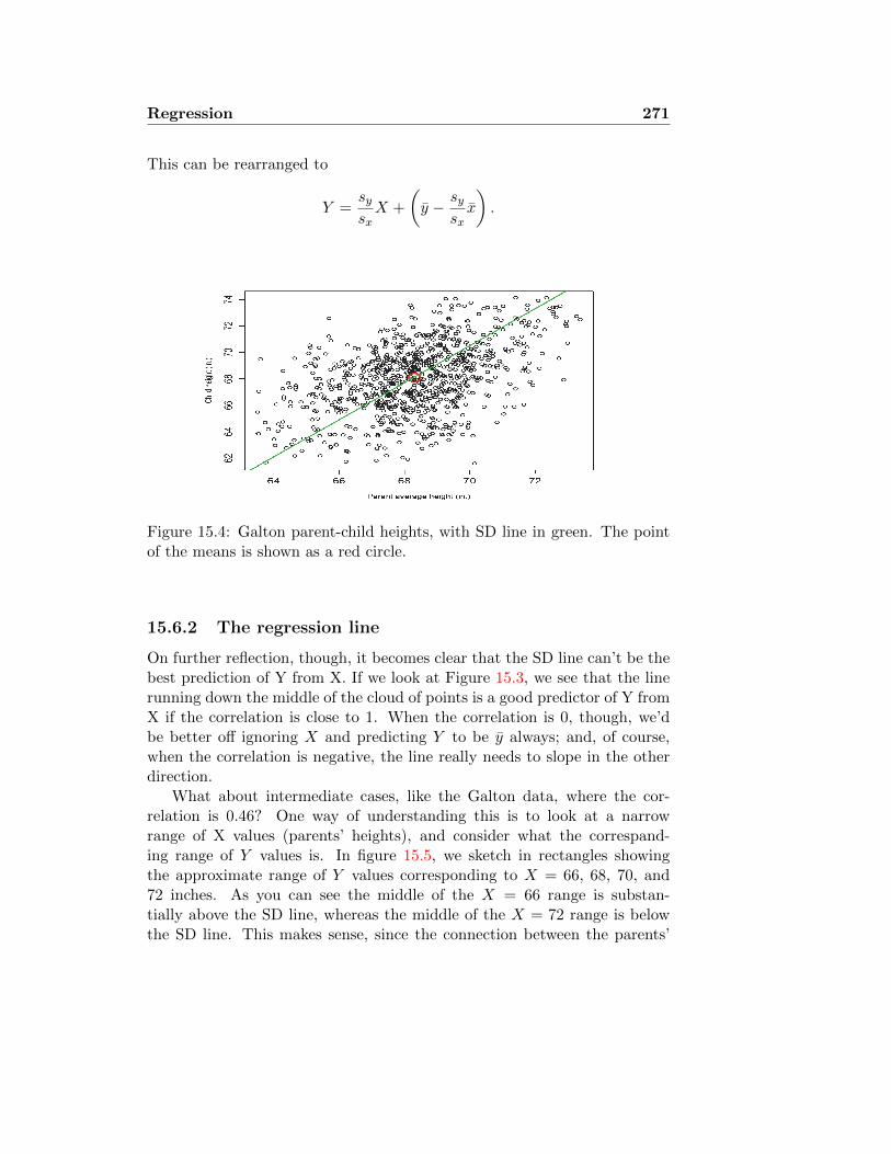
Regression 271
This can be rearranged to
Y =sysxX +
(y − sy
sxx
).
Figure 15.4: Galton parent-child heights, with SD line in green. The pointof the means is shown as a red circle.
15.6.2 The regression line
On further reflection, though, it becomes clear that the SD line can’t be thebest prediction of Y from X. If we look at Figure 15.3, we see that the linerunning down the middle of the cloud of points is a good predictor of Y fromX if the correlation is close to 1. When the correlation is 0, though, we’dbe better off ignoring X and predicting Y to be y always; and, of course,when the correlation is negative, the line really needs to slope in the otherdirection.
What about intermediate cases, like the Galton data, where the cor-relation is 0.46? One way of understanding this is to look at a narrowrange of X values (parents’ heights), and consider what the correspand-ing range of Y values is. In figure 15.5, we sketch in rectangles showingthe approximate range of Y values corresponding to X = 66, 68, 70, and72 inches. As you can see the middle of the X = 66 range is substan-tially above the SD line, whereas the middle of the X = 72 range is belowthe SD line. This makes sense, since the connection between the parents’

272 Regression
and childrens’ height is not perfect. If the linear relation Y = βX + αheld exactly, then SD(Y ) = βSD(X), and if X = X + SD(X), thenY = Y + βSD(X) = Y + SD(Y ) exactly. But when the Y values arespread out around βX+α, the more SD(Y ) gets inflated by irrelevant noisethat has nothing to do with X. This means that an increase of 1 SD in Xwon’t contribute a full SD to Y , on average, but something less than that.The line that runs approximately through the midpoints of the columns,shown in blue in Figure 15.5, is called the regression line. So how manySD’s of Y is a 1 SD change in X worth? It turns out, this is exactly thecorrelation.
Figure 15.5: The parent-child heights, with an oval representing the generalrange of values in the scatterplot. The SD line is green, the regressionline blue, and the rectangles represent the approximate span of Y valuescorresponding to X = 66, 68, 70, 72 inches.
The formula for the regression line is
(Y − y) = rxysysx
(X − x) =sxys2x
(X − x).
This is equivalent to
Y = bX + a, where b =sxys2x
and a =
(y − sy
sxx
).

Regression 273
Another way of understanding the regression line is as the answer tothe question: Suppose we want to predict yi from xi with a linear relationy = bx + a. Which choice of a and b will make the total squared error assmall as possible. That is, the regression line makes
∑(yi − (bxi + a)
)2as
small as possible. Note that the choice of the total square error as the wayto “score” the prediction errors implies a certain choice about how much wecare about a few big errors relative to a lot of small errors. The regressionline tries, up to a point, to make the biggest error as small as possible, atthe expense of making some of the smaller errors bigger than they mighthave been.
Example 15.1: Regression line(s) for Galton’s data
For Galton’s parent-child height data, the correlation was 0.46,so that the slope of the regression line is
b =sysxrxy = 0.649,
a = y − bx = 23.8.
Thus, if we have parents with average height 72 inches, we wouldpredict that their child should have, on average, height
ypred = 72× 0.649 + 23.8 = 70.5 inches.
Suppose we reverse the question: Given a child of height 70.5inches, what should we predict for the average of his or her par-ents’ heights? You might suppose it is 72 inches, simply reversingthe previous calculation. In fact, though, we need to redo thecalculation. All predictions must be closer to the (appropriate)mean than the observations of the independent variable on whichthe prediction is based. The child is (70.5 − 68.1)/2.52 = 0.95SDs away from the mean, and the prediction for the parentsmust be closer to the parents’ mean than that. In fact, if wewrite the coefficients for the regression line predicting parentsfrom children as b′ and a′, we have
b′ =sxysxsy
= 0.326,
a′ = x− b′y = 45.9.

274 Regression
Thus, the prediction for the parents’ heights is 45.9 − 0.326 ×70.5 = 68.9 inches. �
This may be seen in the following simple example. Suppose we have fivepaired observations:
Table 15.4: Simple regression example
mean SDx 6 2 5 7 4 4.8 1.9y 3 2 4 6 5 4.0 1.58
prediction4.65 2.49 4.11 5.19 3.57
0.54x+ 1.41residual −1.65 −0.49 −0.11 0.81 1.43
We compute the sample covariance as
sxy =1
5− 1
(∑xiyi − 5xy
)=
1
y(104− 5 · 4.8 · 4.0) = 2.0,
yielding
rxy =sxysxsy
= 0.66.
The regression line then has coefficients
b =sxys2x
= 0.54, and a = y − bx = 1.41.
This is the line plotted in blue in Figure 15.6; in green is the SD line. Wehave shown with dashed lines the size of the errors that would accrue if theone or the other line were used for predicting y from x. Note that some ofthe errors are smaller for the SD line, but the largest errors are made largerstill, which is why the regression line has a smaller total squared error. InFigure 15.8 we do the same thing for the brain volumes and surface areas ofTable 15.1.
15.6.3 Confidence interval for the slope
Suppose the observations (xi, yi) are independent observations of normalrandom variables (X,Y ), which satisfy
Y = βX + α+ ε,

Regression 275
1 2 3 4 5 6 7 8
01234567
x
y
Regression lineSD line
Figure 15.6: A scatterplot of the hypothetical data from Table 15.4. Theregression line is shown in blue, the SD line in green. The dashed lines showthe prediction errors for each data point corresponding to the two lines.
900 1000 1100 1200 1300 1400 1500
1600
1800
2000
2200
2400
Total brain volume (cm3)
Tota
l bra
in s
urfa
ce a
rea
(cm2 )
(a) Volume against surface area regression
1700 1800 1900 2000 2100 2200
8090
100
110
120
130
Total brain surface area (cm2)
Full-
scal
e IQ
(b) Surface area against IQ regression
Figure 15.7: Regression lines for predicting surface area from volume andpredicting IQ from surface area. Pink shaded region shows confidence inter-val for slope of the regression line.

276 Regression
900 1000 1100 1200 1300 1400 1500
1600
1800
2000
2200
2400
Total brain volume (cm3)
Tota
l bra
in s
urfa
ce a
rea
(cm2 )
Regression lineSD line
Figure 15.8: A scatterplot of brain surface area against brain volume, fromthe data of Table 15.1. The regression line is shown in blue, the SD linein green. The dashed lines show the prediction errors for each data pointcorresponding to the two lines.

Regression 277
where ε is a normal “error term” independent of X. The idea is that Y gets acontribution from X, and then there is the contribution from ε, representing“everything else” that has nothing to do with X. The regression coefficientsb and a will be estimates for the true slope and intercept β and α. We thenask the standard question: How certain are we of these estimates?
One thing we may want to do is to test whether there is really a nonzeroslope, or whether the apparent difference from β = 0 might be purely dueto chance variation. Since the slope is zero exactly when the correlation iszero, this turns out to be exactly the same as the hypothesis test for zerocorrelation, as described in section 15.5.
The same ideas can be used to produce a confidence interval for β. Underthe normality assumption, it can be shown that the random estimate b hasstandard error
SE(b) ≈ b√
1− r2
r√n− 2
,
and that
t :=β − bSE(b)
has approximately the t distribution with n − 2 degrees of freedom. Thus,a (1− α)× 100% confidence interval for β is
b± T · SE(b),
where T is chosen from the t distribution table to be the threshold valuefor the test at level α with n − 2 degrees of freedom; in other words, T =t1−α/2(n − 2), the value such that the t distribution has a total of α/2probability above T (and another α/2 probability below −T ).
15.6.4 Example: Brain measurements
Suppose we know an individual’s brain volume x, and wish to make a bestguess about that individual’s brain surface area. We have already computedthe correlation to be 0.601 in section 15.4.1. Combining this with the meansand SDs from Table 15.1, we get the regression coefficients
b = rxysysx
= 0.601 · 175
125= 0.841 a = y − bx = 959
The standard error for b is
SE(b) ≈ b√
1− r2
r√n− 2
=0.841 ·
√1− 0.6012
0.601√
18= 0.264.

278 Regression
We look on the t-distribution table in the row for 18 degrees of freedom andthe column for p = 0.05 (see Figure 15.9) we see that 95% of the probabilitylies between −2.10 and +2.10, so that a 95% confidence interval for β is
b± 2.10 · SE(b) = 0.841± 2.10 · 0.264 = (0.287, 1.40).
The scatterplot is shown with the regression line y = .841x+ 959 in Figure15.7(a), and the range of slopes corresponding to the 95% confidence intervalis shown by the pink shaded region. (Of course, to really understand theuncertainty of the estimates, we would have to consider simultaneously therandom error in estimating the means, hence the intercept of the line. Thisleads to the concept of a two-dimensional confidence region, which is beyondthe scope of this course.)
Similarly, for predicting IQ from surface area we have
b = ryzszsy
= −0.29113.2
125= −0.031, a = z − by = 160.
The standard error for b is
SE(b) ≈ b√
1− r2
r√n− 2
=0.031 ·
√1− 0.2912
0.291√
18= 0.024.
A 95% confidence interval for the true slope β is then given by −0.031 ±2.10 · 0.024 = (−0.081, 0.019). The range of possible predictions of y fromx — pretending, again, that we know the population means exactly — isgiven in Figure 15.7(b).
What this means is that each change of 1 cm3 in brain volume is typicallyassociated with a change of 0.841 cm2 in brain surface area. A person ofaverage brain volume — 1126 cm3 — would be expected to have averagebrain surface area — 1906 cm2 — but if we know that someone has brainvolume 1226 cm3, we would do well to guess that he has a brain surfacearea of 1990 cm2 (1990 = 1906 + 0.841 · 100 = .841 · 1226 + 959). However,given sampling variation the number of cm2 typically associated with 1 cm3
change in volume might really be as low as 0.287 or as high as 1.40, with95% confidence.
Similarly, a person of average brain surface area 1906 cm2 might bepredicted to have average IQ of 101, but someone whose brain surface areais found to be 100 cm2 might be predicted to have IQ below average by 3.1points, so 97.9. At the same time, we can only be 95% certain that thechange associated with 100 cm2 increase in brain surface area is between−8.1 and +1.9 points — hence, it might just as well be 0. We say that thecorrelation between IQ and brain surface area is not statistically significant,or that the slope of the regression line is not significantly different from 0.

Regression 279
Figure 15.9: T table for confidence intervals for slopes computed in section15.6.4

280 Regression
Lecture 16
Regression, Continued
16.1 R2
What does it mean to say that bxi + a is a good predictor of yi from xi?One way of interpretting this would be to say that we will typically makesmaller errors by using this predictor, than if we tried to predict yi withouttaking account of the corresponding value of xi.
Suppose we have our standard regression probability model Y = βX +α+ E: this means that the observations are
yi = βxi + α+ εi.
Of course, we don’t really get to observe the ε terms: they are only inferredfrom the relationship between xi and yi. But if we have X independent ofE, then we can use our rules for computing variance to see that
V ar(Y ) = β2V ar(X) + V ar(E). (16.1)
If we think of variance as being a measure of uncertainty, then this says thatthe uncertainty about Y can be divided up into two parts: One part thatcomes from the uncertainty about X, and would be cleared up once we knowX, and a residual uncertainty, that remains independent of X.1 From ourformula for the regression coefficients, we see that β2 = r2V ar(Y )/V ar(X).This means that the first term on the right in expression (16.1) becomesr2V ar(Y ). In other words, the portion of the variance that is due to vari-ability in X is r2V ar(Y ), and the residual variance — the variance of the
1If this sounds a lot like the ANOVA approach from lecture 14, that’s because it is.Formally, they’re variants of the same thing, though developing this equivalence is beyondthe scope of this course.
281

282 Regression II, Review
“error” term — is (1− r2)V ar(Y ). Often this relation is summarised by thestatement: “X explains r2 × 100% of the variance.”
16.1.1 Example: Parent-Child heights
From the Galton data of section 15.4.2, we see that the variance of the child’sheight is 6.34. Since r2 = 0.21, we say that the parents’ heights explain21% of the variance in child’s height. We expect the residual varianceto be about 6.34×0.79 = 5.01. What this means is that the variance amongchildren whose parents were all about the same height should be 5.01. InFigure 16.1 we see histograms of the heights of children whose parents allhad heights in the same range of ±1 inch. Not surprisingly, there is somevariation in the shapes of these histograms, vary somewhat, but the variancesare all substantially smaller than 6.34, a varying between 4.45 and 5.75.
16.1.2 Example: Breastfeeding and IQ
In section 15.4.3 we computed the correlation between number of monthsbreastfeeding and adult IQ to be 0.118. This gives us r2 = 0.014, so wesay that the length of breastfeeding accounts for about 1.4% of adult IQ.The variance in IQ among children who were nursed for about the samelength of time is about 1% less than the overall variance in IQ among thepopulation. Not a very big effect, in other words. Is the effect real at all, orcould it be an illusion, due to chance variation? We perform a hypothesistest, computing
R =r√
973− 2√1− r2
= 3.70.
The threshold for rejecting t with 971 degrees of freedom (the ∞ row —essentially the same as the normal distribution) at the α = 0.01 significancelevel is 2.58. Hence, the correlation is highly significant. This is a goodexample of where “significant” in the statistical sense should not be confusedwith “important”. The difference is significant because the sample is so largethat it is very unlikely that we would have seen such a correlation purely bychance if the true correlation were zero. On the other hand, explaining 1%of the variance is unlikely to be seen as a highly useful finding. (At the sametime, it might be at least theoretically interesting to discover that there isany detectable effect at all.)
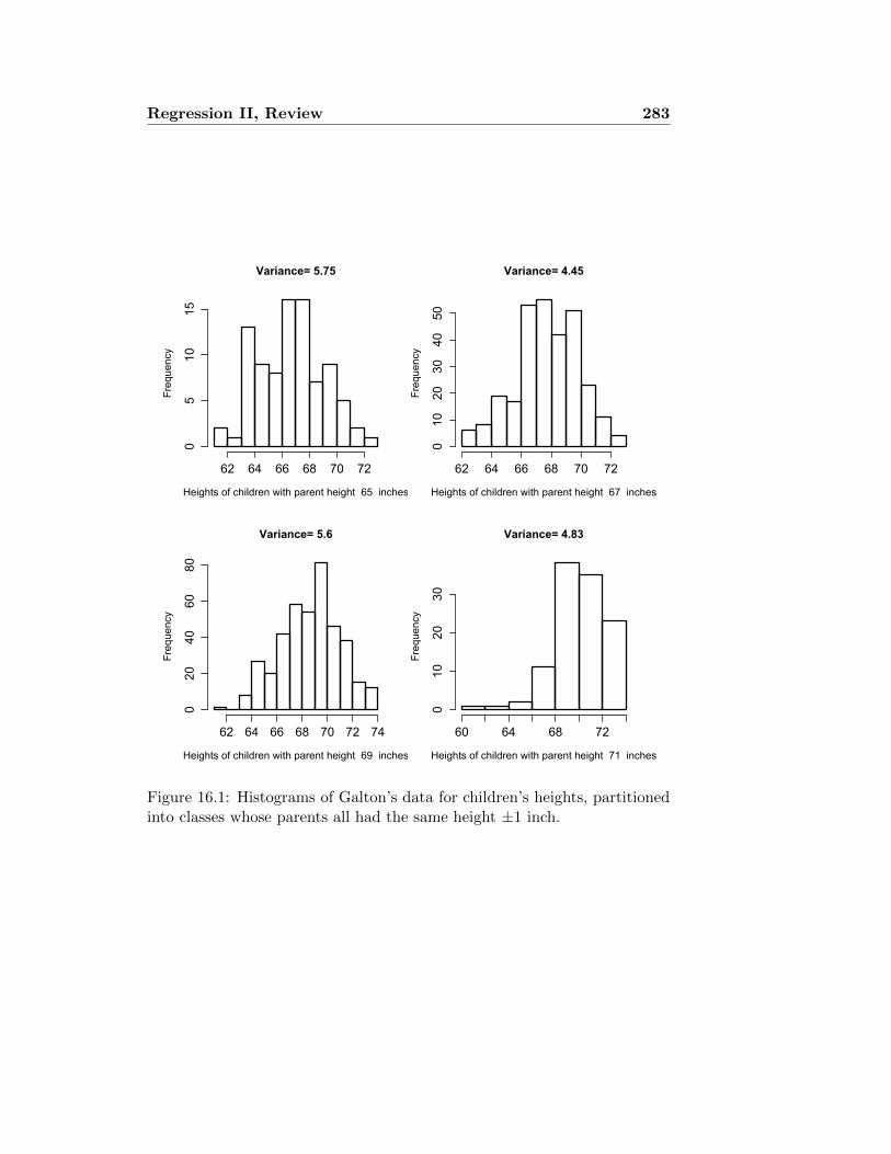
Regression II, Review 283
Variance= 5.75
Heights of children with parent height 65 inches
Frequency
62 64 66 68 70 72
05
1015
Variance= 4.45
Heights of children with parent height 67 inches
Frequency
62 64 66 68 70 72
010
2030
4050
Variance= 5.6
Heights of children with parent height 69 inches
Frequency
62 64 66 68 70 72 74
020
4060
80
Variance= 4.83
Heights of children with parent height 71 inches
Frequency
60 64 68 72
010
2030
Figure 16.1: Histograms of Galton’s data for children’s heights, partitionedinto classes whose parents all had the same height ±1 inch.

284 Regression II, Review
16.2 Regression to the mean and the regressionfallacy
We have all heard stories of a child coming home proudly from school witha score of 99 out of 100 on a test, and the strict parent who points out thathe or she had 100 out of 100 on the last test, and “what happened to theother point?” Of course, we instinctively recognise the parent’s responseas absurd. Nothing happened to the other point (in the sense of the childhaving fallen down in his or her studies); that’s just how test scores work.Sometimes they’re better, sometimes worse. It is unfair to hold someone tothe standard of the last perfect score, since the next score is unlikely to beexactly the same, and there’s nowhere to go but down.
Of course, this is true of any measurements that are imperfectly cor-related: If |r| is substantially less than 1, the regression equation tells usthat those individuals who have extreme values of x tend to have valuesof y that are somewhat less extreme. If r = 0.5, those with x values thatare 2 SDs above the mean will tend to have y values that are still aboveaverage, but only 1 SD above the mean. There is nothing strange aboutthis: If we pick out those individuals who have exceptionally voluminousbrains, for instance, it is not surprising that the surface areas of their brainsare less extreme. While athletic ability certainly carries over from one sportto another, we do not expect the world’s finest footballers to also win goldmedals in swimming. Nor does it seem odd that great composers are rarelygreat pianists, and vice versa.
And yet, when the x and y are successive events in time — for instance,the same child’s performance on two successive tests — there is a strongtendency to attribute causality to this imperfect correlation. Since thereis a random component to performance on the test, we expect that thesuccessive scores will be correlated, but not exactly the same. The plot ofscore number n against score number n + 1 might look like the upper leftscatterplot in Figure 15.3. If she had an average score last time, she’s likelyto score about the same this time. But if she did particularly well last time,this time is likely to be less good. But consider how easy it would be to lookat these results and say, “Look, she did well, and as a result she slacked off,and did worse the next time;” or “It’s good that we punish her when shedoes poorly on a test by not letting her go outside for a week, because thatalways helps her focus, and she does better the next time.” Galton noticedthat children of exceptionally tall parents were closer to average than theparents were, and called this “regression to mediocrity” [Gal86].

Regression II, Review 285
Some other examples:
• Speed cameras tend to be sited at intersections where there have beenhigh numbers of accidents. Some of those high numbers are certainlyinherent to the site, but sometimes the site was just “unlucky” in oneyear. You would expect the numbers to go down the next year regard-less of whether you made any changes, just as you would expect anintersection with very few accidents to have more the next year. Someexperts have pointed out that this can lead to overestimating the effectof the cameras. As described in The Times 15 December 2005 [http://www.timesonline.co.uk/tol/news/uk/article766659.ece],
The Department for Transport [. . . ] published a study whichfound that cameras saved only half as many lives as claimed.This undermines the Governments main justification for in-creasing speed camera penalties five-fold from 340,000 in1997 to 1.8 million in 2003.
Safe Speed, the anti-camera campaign, has argued for yearsthat the policy of siting cameras where there have been re-cent clusters of crashes makes it impossible to attribute anyfall in collisions to the presence of a camera. Collisions wouldbe expected to fall anyway as they reverted from the tem-porary peak to the normal rate.
The department commissioned the Department of Engineer-ing at Liverpool University to study this effect, which isknown as regression to the mean. The study concluded thatmost of the fall in crashes could be attributed to regressionto the mean. The presence of the camera was responsiblefor as little as a fifth of the reduction in casualties.
The report goes on to say that “The department put the results ofthe study close to the bottom of a list of appendices at the back of a160-page report which claims that cameras play an important role insaving lives.”
• Suppose you are testing a new blood pressure medication. As wehave described in section 11.5, it is useful to compare the same in-dividual’s blood pressure before and after taking the medication. Sowe take a group of subjects, measure their blood pressure (xi), givethem the medication for two weeks, then measure again (yi), and test

286 Regression II, Review
to see whether yi − xi is negative, on average. We can’t give blood-pressure-lowering medication to people who have normal blood pres-sure, though, so we start by restricting the study to those whose firstmeasurement x is in the hypertension range, xi > 140mmHg. Sincethey are above average, and since there is significant random fluc-tuation in blood pressure measurements, those individuals would beexpected to have lower blood pressure measurements the second time,purely by chance. If you are not careful, you will find yourself overes-timating the effectiveness of the medication.
• The behavioural economists Amos Tversky and Daniel Kahneman tellthe story of having taught psychology to air force flight instructors.He tried to explain to them that there was a great deal of evidencethat positive reinforcement — praise for good performance — is moreeffective than negative reinforcement (criticism of poor performance).
After some experience with this training approach, the in-structors claimed that contrary to psychological doctrine,high praise for good execution of complex maneuvers typ-ically results in a decrement of performance on the nexttry[. . . ] Regression is inevitable in flight maneuvers becauseperformance is not perfectly reliable and progress betweensuccessive maneuvers is slow. Hence, pilots who did excep-tionally well on one trial are likely to deteriorate on the next,regardless of the instructors’ reaction to the initial success.The experienced flight instructors actually discovered the re-gression but attributed it to the detrimental effect of positivereinforcement. This true story illustrates a saddeningaspect of the human condition. We normally reinforceothers when their behavior is good and punish them whentheir behavior is bad. By regression alone, therefore, theyare most likely to improve after being punished and mostlikely to deteriorate after being rewarded. Consequently,we are exposed to a lifetime schedule in which weare most often rewarded for punishing others, andpunished for rewarding. [Tve82]

Regression II, Review 287
16.3 When the data don’t fit the model
As part of a cross-species study of sleep behaviour [AC76] presented a tableof brain and body weights for 62 different species of land mammal. Weshow these data in Table 16.1. We have already shown a scatterplot of brainweights against body weights in Figure 15.2(e). It is clear from looking atthe data that there is some connection between brain and body weights,but it is also clear that we have some difficulty in applying the ideas ofthis lecture. These are based, after all, on a model in which the variablesare normally distributed, so that they are distributed about in some kindof approximately oval scatterplot. The correlation is supposed to representa summary of the relation between all x values and the corresponding y’s.Here, though, the high correlation (0.93) is determined almost entirely bythe elephants, which have brain and body sizes far above the mean.
16.3.1 Transforming the data
One approach to understanding the correlation in this data set is illustratedin Figure 15.2(f), where we have plotted log of brain weight against log ofbody weight. The result now looks quite a bit like our standard regressionscatter plots. We can compute that the correlation of these two measuresis actually even a bit higher: 0.96. Thus, we can say that 92% (= 0.962) ofthe variance in log brain weight is explained by body weight. What is more,the regression line now seems to make some sense.
16.3.2 Spearman’s Rank Correlation Coefficient
Taking logarithms may seem somewhat arbitrary. After all, there are a lotof ways we might have chosen to transform the data. Another approach todealing with such blatantly nonnormal data, is to follow the same approachthat we have taken in all of our nonparametric methods: We replace the rawnumbers by ranks. Important: The ranking takes place within a variable.We have shown in Table 16.1, in columns 3 and 5, what the ranks are:The highest body weight — african elephant — gets 62, the next gets 61,down to the lesser short-tailed shrew, that gets rank 1. Then we start overagain with the brain weights. (When two or more individuals are tied, weaverage the ranks.) The correlation that we compute between the ranks iscalled Spearman’s rank correlation coefficient, denoted rs. It tells usquantitatively whether high values of one variable tend to go with high valuesof the other, without relying on assumptions of normality or otherwise being

288 Bibliography
dominated by a few very extreme values. Since it is really just a correlation,we test it (for being different from 0) the same way we test any correlation,by comparing rs
√n− 2/
√1− r2
s with the t distribution with n− 2 degreesof freedom.
16.3.3 Computing Spearman’s rank correlation coefficient
There is a slightly quicker way of computing the Spearman coefficient. Wefirst list the rankings of the two variables in two parallel rows, and let dibe the difference between the xi ranking and the yi ranking. We show thiscalculation in Table 16.2. We then have D =
∑d2i = 1846.5. We have then
the formula
rs = 1− 6∑d2i
n(n2 − 1)= 0.954.
This is exactly what we get when we compute the correlation between thetwo lists of ranks, as described in section 15.4.

Bibliography 289
Species Body weight (kg) Body rank Brain weight (g) Brain rank
African elephant 6654.00 62 5712.00 62African giant 1.00 21 6.60 22
pouched ratArctic Fox 3.38 32 44.50 37Arctic ground 0.92 20 5.70 19squirrelAsian elephant 2547.00 61 4603.00 61Baboon 10.55 42 179.50 50Big brown bat 0.02 4 0.30 3Brazilian tapir 160.00 53 169.00 47Cat 3.30 31 25.60 35Chimpanzee 52.16 47 440.00 56Chinchilla 0.42 14 6.40 21Cow 465.00 58 423.00 55Desert hedgehog 0.55 16 2.40 10Donkey 187.10 54 419.00 54Eastern American mole 0.07 7 1.20 8Echidna 3.00 30 25.00 34European hedgehog 0.79 18 3.50 14Galago 0.20 12 5.00 17Genet 1.41 25 17.50 32Giant armadillo 60.00 49 81.00 41Giraffe 529.00 60 680.00 59Goat 27.66 44 115.00 44Golden hamster 0.12 10 1.00 6Gorilla 207.00 56 406.00 53Gray seal 85.00 51 325.00 52Gray wolf 36.33 46 119.50 45Ground squirrel 0.10 8 4.00 16Guinea pig 1.04 22 5.50 18Horse 521.00 59 655.00 58Jaguar 100.00 52 157.00 46Kangaroo 35.00 45 56.00 39Lesser short- 0.01 1 0.14 1
tailed shrewLittle brown bat 0.01 2 0.25 2Man 62.00 50 1320.00 60Mole rat 0.12 11 3.00 13Mountain beaver 1.35 23 8.10 23Mouse 0.02 4 0.40 5Musk shrew 0.05 5 0.33 4N. American 1.70 27 6.30 20
opossumNine-banded 3.50 34 10.80 24
armadilloOkapi 250.00 57 490.00 57Owl monkey 0.48 15 15.50 30Patas monkey 10.00 41 115.00 44Phanlanger 1.62 26 11.40 25Pig 192.00 55 180.00 51Rabbit 2.50 29 12.10 26Raccoon 4.29 39 39.20 36Rat 0.28 13 1.90 9Red fox 4.24 38 50.40 38Rhesus monkey 6.80 40 179.00 49Rock hyrax 0.75 17 12.30 28
(Hetero. b)Rock hyrax 3.60 35 21.00 33
(Procavia hab)Roe deer 14.83 43 98.20 42Sheep 55.50 48 175.00 48Slow loris 1.40 24 12.50 29Star nosed mole 0.06 6 1.00 6Tenrec 0.90 19 2.60 12Tree hyrax 2.00 28 12.30 28Tree shrew 0.10 9 2.50 11Vervet 4.19 37 58.00 40Water opossum 3.50 34 3.90 15Yellow-bellied marmot 4.05 36 17.00 31
mean 199 243SD 899 930
Table 16.1: Brain and body weights for 62 different land mammal species.Available at http://lib.stat.cmu.edu/datasets/sleep, and as the ob-ject mammals in the statistical language sR.

290 Bibliography
body 62 21 32 20 61 42 4 53 31 47 14 58 16 54 7 30 18 12 25 49 60brain 62 22 37 19 61 50 3 47 35 56 21 55 10 54 8 34 14 17 32 41 59
diff. 0 1 5 1 0 8 0 6 4 9 7 3 6 0 1 4 4 5 7 8 1
body 44 10 56 51 46 8 22 59 52 45 1 2 50 11 23 4 5 27 34 57 15brain 44 6 53 52 45 16 18 58 46 39 1 2 60 13 23 5 4 20 24 57 30
diff. 0 4 3 1 1 8 4 1 6 6 0 0 10 2 0 2 1 7 10 0 15
body 41 26 55 29 39 13 38 40 17 35 43 48 24 6 19 28 9 37 34 36brain 44 25 51 26 36 9 38 49 28 33 42 48 29 6 12 28 11 40 15 31
diff. 2 1 4 3 3 4 0 9 10 2 1 0 5 0 7 0 2 3 18 5
Table 16.2: Ranks for body and brain weights for 62 mammal species, fromTable 16.1, and the difference in ranks between body and brain weights.

Bibliography
[Abr78] Sidney Abraham. Total serum cholesterol levels of children,4-17 years, United States, 1971-1974. Number 207 in Vitaland Health statistics: Series 11, Data from the National HealthSurvey. National Center for Health Statistics, 1978.
[AC76] Truett Allison and Domenic V. Cicchetti. Sleep in mammals:Ecological and constitutional correlates. Science, 194:732–4,November 12 1976.
[BH84] Joel G. Breman and Norman S. Hayner. Guillain-Barre Syn-drome and its relationship to swine influenza vaccination inMichigan, 1976-1977. American Journal of Epidemiology,119(6):880–9, 1984.
[Bia05] Carl Bialik. When it comes to donations, polls don’t tell thewhole story. The Wall Street Journal, 2005.
[BS] Norman R. Brown and Robert C. Sinclair. Estimat-ing number of lifetime sexual partners: Men and womendo it differently. http://www.ualberta.ca/~nrbrown/pubs/
BrownSinclair1999.pdf.
[Edw58] A. W. F. Edwards. An analysis of Geissler’s data on the humansex ratio. Annals of Human Genetics, 23(1):6–15, 1958.
[Fel71] William Feller. An Introduction to Probability and its Applica-tions, volume 2. John Wiley & Sons, New York, 1971.
[FG00] Boris Freidlin and Joseph L. Gastwirth. Should the mediantest be retired from general use? The American Statistician,54(3):161–4, August 2000.
291

292 Bibliography
[FPP98] David Freedman, Robert Pisani, and Roger Purves. Statistics.Norton, 3 edition, 1998.
[Gal86] Francis Galton. Regression toward mediocrity in hereditarystature. Journal of the Anthropological Institute, 15:246–63,1886.
[Hal90] Anders Hald. History of Probability and Statistics and theirapplications before 1750. John Wiley & Sons, New York, 1990.
[HDL+94] D. J. Hand, F. Daly, A. D. Lunn, K. J. McConway, and E. Os-trowski. A Handbook of small data sets. Chapman & Hall, 1994.
[HREG97] Anthony Hill, Julian Roberts, Paul Ewings, and David Gunnell.Non-response bias in a lifestyle survey. Journal of Public Health,19(2), 1997.
[LA98] J. K. Lindsey and P. M. E. Altham. Analysis of the humansex ratio by using overdispersion models. Journal of the RoyalStatistical Society. Series C (Applied Statistics), 47(1):149–157,1998.
[Lev73] P. H. Levine. An acute effect of cigarette smoking on plateletfunction. Circulation, 48:619–23, 1973.
[Lov71] C. Owen Lovejoy. Methods for the detection of census errorin palaeodemography. American Anthropologist, New Series,73(1):101–9, February 1971.
[LSS73] Judson R. Landis, Daryl Sullivan, and Joseph Sheley. Femi-nist attitudes as related to sex of the interviewer. The PacificSociological Review, 16(3):305–14, July 1973.
[MDF+81] G. S. May, D. L. DeMets, L. M. Friedman, C. Furberg, andE. Passamani. The randomized clinical trial: bias in analysis.Circulation, 64:669–673, 1981.
[MM98] David S. Moore and George P. McCabe. Introduction to thePractice of Statistics. W. H. Freeman, New York, 3rd edition,1998.
[MMSR02] Erik Lykke Mortensen, Kim Fleischer Michaelsen, Stephanie A.Sanders, and June Machover Reinisch. The association be-tween duration of breastfeeding and adult intelligence. JAMA,287(18):2365–71, May 8 2002.

Bibliography 293
[Mou98] Richard Francis Mould. Introductory medical statistics. CRCPress, 3 edition, 1998.
[MS84] Marc Mangel and Francisco J. Samaniego. Abraham wald’swork on aircraft survivability. Journal of the American Statis-tical Association, 79(386):259–267, 1984.
[NNGT02] Mark J. Nieuwenhuijsen, Kate Northstone, Jean Golding, andThe ALSPAC Study Team. Swimming and birth weight. Epi-demiology, 13(6):725–8, 2002.
[Ric95] John A. Rice. Mathematical Statistics and Data Analysis.Duxbury Press, 1995.
[RS90] Luigi M. Ricciardi and Shunsuke Sato. Diffusion processes andfirst-passage-time problems. In Luigi M. Ricciardi, editor, Lec-tures in applied mathematics and informatics, pages 206–285.Manchester Univ. Press, Manchester, 1990.
[RS02] Fred L. Ramsey and Daniel W. Schafer. The Statistical Sleuth:A course in methods of data analysis. Duxbury Press, 2nd edi-tion, 2002.
[RSKG85] S. Rosenbaum, R. K. Skinner, I. B. Knight, and J. S. Garrow. Asurvey of heights and weights of adults in Great Britain, 1980.Annals of Human Biology, 12(2):115–27, 1985.
[SCB06] Emad Salib and Mario Cortina-Borja. Effect of month of birthon the risk of suicide. British Journal of Psychiatry, 188:416–22,2006.
[SCT+90] R. L. Suddath, G. W. Christison, E. F. Torrey, M. F. Casanova,and D. R. Weinberger. Anatomical abnormalities in the brainsof monozygotic twins discordant for schizophrenia. New EnglandJournal of Medicine, 322(12):789–94, March 22 1990.
[SKK91] L. Sheppard, A. R. Kristal, and L. H. Kushi. Weight loss inwomen participating in a randomized trial of low-fat diets. TheAmerican Journal of Clinical Nutrition, 54:821–8, 1991.
[TK81] Amos Tversky and Daniel Kahneman. The framing of decisionsand the psychology of choice. Science, 211(4481):453–8, January30 1981.

294 Bibliography
[TLG+98] M. J. Tramo, W. C. Loftus, R. L. Green, T. A. Stukel, J. B.Weaver, and M. S. Gazzaniga. Brain size, head size, and intel-ligence quotient in monozygotic twins. Neurology, 50:1246–52,1998.
[TPCE06] Anna Thorson, Max Petzold, Nguyen Thi Kim Chuc, and KarlEkdahl. Is exposure to sick or dead poultry associated withflulike illness?: A population-based study from a rural area inVietnam with outbreaks of highly pathogenic avian influenza.Archives of Internal Medicine, 166:119–23, 2006.
[Tve82] Amos Tversky. On the psychology of prediction. In DanielKahneman, Paul Slovic, and Amos Tversky, editors, Judgmentunder uncertainty: heuristics and biases. Cambridge UniversityPress, 1982.
[vBFHL04] Gerald van Belle, Lloyd D. Fisher, Patrick J. Heagerty, andThomas S. Lumley. Biostatistics: A methodology for the healthsciences. Wiley-IEEE, 2nd edition, 2004.
[ZZK72] Philip R. Zelazo, Nancy Ann Zelazo, and Sarah Kolb. “walking”in the newborn. Science, 176(4032):314–5, April 21 1972.