
Interactive Sketching Notation - Linowski · The interactive sketching notation is an emerging...
7
Interactive Sketching Notation Apr 23, 2012 - version 1.2 Credits: Linowski Interaction Design http://www.linowski.ca/sketching This work is licenced under the Creative Commons Attribution-Share Alike 2.5 Canada License http://creativecommons.org/licenses/by-sa/2.5/ca/ Some Screen The interactive sketching notation is an emerging visual language which fuses user actions and screen sketches together into one deliverable. Through a few simple and standardized rules, what the user sees (drawn in greys, blacks & blues) and does (drawn in red) are unified into a coherent sketching system. This unification of both interface and use, enables designers tell more powerful stories of interaction. As with all sketching techniques it can be performed on traditional paper, however I find that the best approach seems to be within an electronic medium. Sketching using the computer allows for easier editing and refining which are important characteristics of early exploratory design. Therefore my main weapons of choice which I highly recommend to all, include Adobe Illustrator and a Wacom tablet. The Interactive Sketching Notation is also an example of light documentation that complements agile processes. While using this approach, do keep in mind that the amount of detail you draw is a variable. Sketching the right amount of scope and at the right level of fidelity is what it’s all about. So don’t be afraid to leave stuff out for others to fill if it sparks an interesting conversation. You are also free to use, adapt, remix, share and redistribute this document if you attribute and credit the source properly. If you decide to release another version of this, it has to be done under the same conditions. If you improve or use this on a real project, please also feel free to send me a copy back so that I can possibly incorporate some of your great ideas for others in the next release! Enjoy. A New Screen Some Text Link A New Screen ISN Click Click
Transcript of Interactive Sketching Notation - Linowski · The interactive sketching notation is an emerging...
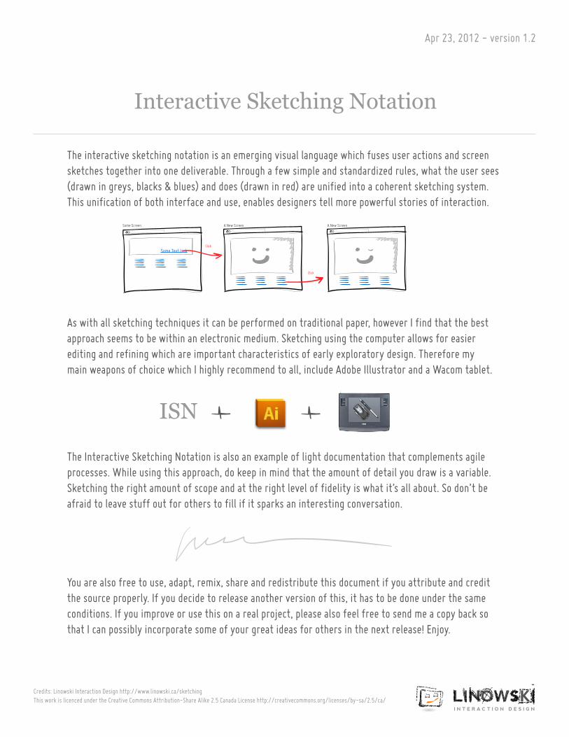
Interactive Sketching Notation
Apr 23, 2012 - version 1.2
Credits: Linowski Interaction Design http://www.linowski.ca/sketching This work is licenced under the Creative Commons Attribution-Share Alike 2.5 Canada License http://creativecommons.org/licenses/by-sa/2.5/ca/
Some Screen
The interactive sketching notation is an emerging visual language which fuses user actions and screen sketches together into one deliverable. Through a few simple and standardized rules, what the user sees (drawn in greys, blacks & blues) and does (drawn in red) are unified into a coherent sketching system. This unification of both interface and use, enables designers tell more powerful stories of interaction.
As with all sketching techniques it can be performed on traditional paper, however I find that the best approach seems to be within an electronic medium. Sketching using the computer allows for easier editing and refining which are important characteristics of early exploratory design. Therefore my main weapons of choice which I highly recommend to all, include Adobe Illustrator and a Wacom tablet.
The Interactive Sketching Notation is also an example of light documentation that complements agile processes. While using this approach, do keep in mind that the amount of detail you draw is a variable. Sketching the right amount of scope and at the right level of fidelity is what it’s all about. So don’t be afraid to leave stuff out for others to fill if it sparks an interesting conversation.
You are also free to use, adapt, remix, share and redistribute this document if you attribute and credit the source properly. If you decide to release another version of this, it has to be done under the same conditions. If you improve or use this on a real project, please also feel free to send me a copy back so that I can possibly incorporate some of your great ideas for others in the next release! Enjoy.
A New Screen
Some Text Link
A New Screen
ISN
Click
Click
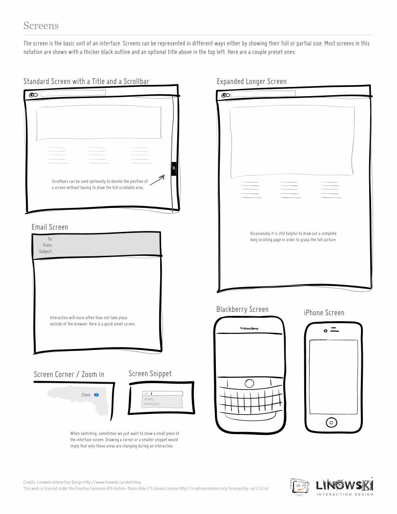
Screens
Credits: Linowski Interaction Design http://www.linowski.ca/sketching This work is licenced under the Creative Commons Attribution-Share Alike 2.5 Canada License http://creativecommons.org/licenses/by-sa/2.5/ca/
To:From:
Subject:
Standard Screen with a Title and a Scrollbar
Email Screen
Screen Corner / Zoom in Screen Snippet
Blackberry Screen iPhone Screen
The screen is the basic unit of an interface. Screens can be represented in different ways either by showing their full or partial size. Most screens in this notation are shown with a thicker black outline and an optional title above in the top left. Here are a couple preset ones:
Expanded Longer Screen
Scrollbars can be used optionally to denote the position of a screen without having to draw the full scrollable area.
Occasionally it is still helpful to draw out a complete long scrolling page in order to grasp the full picture.
Interaction will more often than not take place outside of the browser. Here is a quick email screen.
abcdefgabcdefghijkl
abcClose
When sketching, sometimes we just want to show a small piece of the interface screen. Drawing a corner or a smaller snippet would imply that only those areas are changing during an interaction.
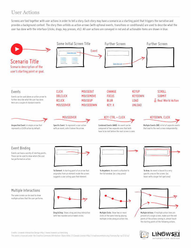
User Actions
Credits: Linowski Interaction Design http://www.linowski.ca/sketching This work is licenced under the Creative Commons Attribution-Share Alike 2.5 Canada License http://creativecommons.org/licenses/by-sa/2.5/ca/
Further Screen
Events can be used above an action arrow to further describe what the user has done. Here are a couple of standard events:
Events can have a variety of starting points. These can be used to show where the user has performed an action.
Events
The same screen can be used to show multiple actions that the user performs.
Multiple Interactions
Event Binding
Unspecified Event. A simple arrow that represents a CLICK action by default.
Specific Event. To represent a user action with an event, note it above the arrow.
To Element. A starting point of an arrow that originates from an element inside the screen suggests a user acting upon that element.
Drag & Drop. Show a drag and drop interaction with two rounded and arrowed circles.
Multiple Clicks. Show two or more clicks at the same time by placing multiple circles along an action line.
Multiple Actions. If multiple action lines are present at a single screen, make sure the end points of the actions coming in, almost touch the starting points of the following actions.
To Anywhere. An event is attached to the full window. (ex: a key press)
To Area. An event is bound to a very specific area on the screen. (ex: hover with a larger hot spot area)
CLICKDBLCLICKRCLICKMOUSEOVER
MOUSEOVER
Multiple Events (OR). A list of separate events that lead to the next screen independently.
KEYDOWN, CLICK
Combined Events (AND). An event can be composed of two separate ones that both have to be met before the next screen is seen.
KEY: CTRL + CLICK
Some Initial Screen Title
Screens are tied together with user actions in order to tell a story. Each story may have a scenario as a starting point that triggers the narrative and provides a background context. The story then unfolds as action arrows (with optional events, transitions or conditionals) are used to describe what the user has done with the interface (clicks, drags, key presses, etc). All user actions are conveyed in red and all actionable items are shown in blue.
Some Text Link
Some Text LinkScenario TitleScenario description of the user’s starting point or goal.
MOUSEOUTMOUSEMOVEMOUSEUPMOUSEDOWN
CHANGEFOCUSBLURKEY: X
KEYUPKEYDOWNLOADUNLOAD
SCROLLSUBMITReal World Action
Further Screen
Event
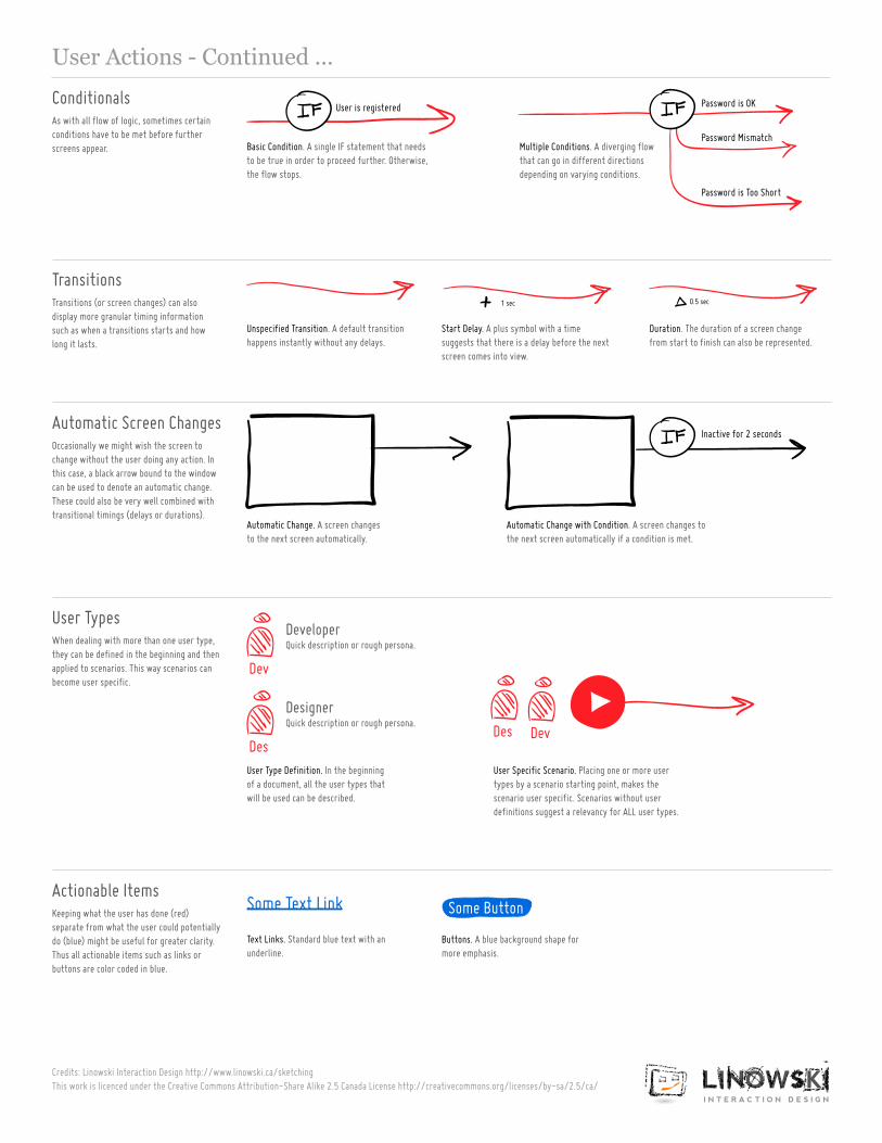
User Actions - Continued ...
Credits: Linowski Interaction Design http://www.linowski.ca/sketching This work is licenced under the Creative Commons Attribution-Share Alike 2.5 Canada License http://creativecommons.org/licenses/by-sa/2.5/ca/
As with all flow of logic, sometimes certain conditions have to be met before further screens appear.
Occasionally we might wish the screen to change without the user doing any action. In this case, a black arrow bound to the window can be used to denote an automatic change.These could also be very well combined with transitional timings (delays or durations).
Transitions (or screen changes) can also display more granular timing information such as when a transitions starts and how long it lasts.
Conditionals
Automatic Screen Changes
When dealing with more than one user type, they can be defined in the beginning and then applied to scenarios. This way scenarios can become user specific.
User Types
Keeping what the user has done (red) separate from what the user could potentially do (blue) might be useful for greater clarity. Thus all actionable items such as links or buttons are color coded in blue.
Actionable Items
Transitions
Basic Condition. A single IF statement that needs to be true in order to proceed further. Otherwise, the flow stops.
Multiple Conditions. A diverging flow that can go in different directions depending on varying conditions.
Automatic Change with Condition. A screen changes to the next screen automatically if a condition is met.
Automatic Change. A screen changes to the next screen automatically.
User Type Definition. In the beginning of a document, all the user types that will be used can be described.
Text Links. Standard blue text with an underline.
Buttons. A blue background shape for more emphasis.
User Specific Scenario. Placing one or more user types by a scenario starting point, makes the scenario user specific. Scenarios without user definitions suggest a relevancy for ALL user types.
Unspecified Transition. A default transition happens instantly without any delays.
Start Delay. A plus symbol with a time suggests that there is a delay before the next screen comes into view.
Duration. The duration of a screen change from start to finish can also be represented.
DeveloperQuick description or rough persona.
DesignerQuick description or rough persona.
Dev
DevDes
Des
User is registered Password is OK
Password Mismatch
Password is Too Short
1 sec 0.5 sec
Some ButtonSome Text Link
Inactive for 2 seconds
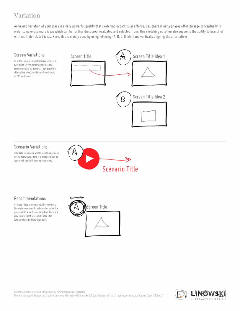
Variation
Credits: Linowski Interaction Design http://www.linowski.ca/sketching This work is licenced under the Creative Commons Attribution-Share Alike 2.5 Canada License http://creativecommons.org/licenses/by-sa/2.5/ca/
In order to create an alternative idea for a particular screen, first tag the desired screen with an “A” symbol. Then draw the alternative idea(s) underneath and tag it as “B” and so on.
Similarly to screens, whole scenarios can also have alternatives. Here is a proposed way to represent this in the scenario context:
Screen Variations
Scenario Variations
As more ideas are explored, there comes a time when we need to help lead or guide the process into a particular direction. Here is a way to represent a recommended idea (should there be more than one).
Recommendations
Achieving variation of your ideas is a very powerful quality that sketching in particular affords. Designers in early phases often diverge conceptually in order to generate more ideas which can be further discussed, evaluated and selected from. This sketching notation also supports the ability to branch off with multiple related ideas. Here, this is mainly done by using lettering (A, B, C, D, etc.) and vertically aligning the alternatives.
Scenario Title
Screen Title Screen Title Idea 1
Screen Title Idea 2
Screen Title
Notes & Feedback
Credits: Linowski Interaction Design http://www.linowski.ca/sketching This work is licenced under the Creative Commons Attribution-Share Alike 2.5 Canada License http://creativecommons.org/licenses/by-sa/2.5/ca/
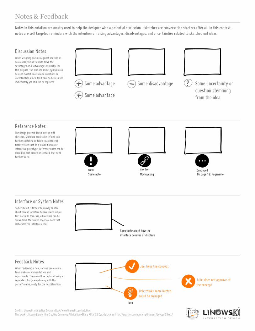
When weighing one idea against another, it occasionally helps to write down the advantages or disadvantages explicitly. For this purpose, the plus and minus symbols can be used. Sketches also raise questions or uncertainties which don’t have to be resolved immediately yet still can be captured.
The design process does not stop with sketches. Sketches need to be refined into further sketches, or taken to a different fidelity state such as a visual mockup or interactive prototype. Reference notes can be placed by each screen or scenario that need further work.
Discussion Notes
Reference Notes
Sometimes it is fastest to convey an idea about how an interface behaves with simple text notes. In this case, a black line can be drawn from the screen edge to a note that elaborates the interface detail.
Interface or System Notes
When reviewing a flow, various people on a team make recommendations and adjustments. These could be captured using a separate color (orange) along with the person’s name, ready for the next iteration.
Feedback Notes
Notes in this notation are mostly used to help the designer with a potential discussion - sketches are conversation starters after all. In this context, notes are self targeted reminders with the intention of raising advantages, disadvantages, and uncertainties related to sketched out ideas.
Some advantage
Some advantage
Some disadvantage
Some note Mockup.png On page 12: Pagename
Some uncertainty or question stemming from the idea
Also See ContinuedTODO
Idea
Some note about how the interface behaves or displays
Joe: likes the concept
Julie: does not approve of the concept
Bob: thinks some button could be enlarged
Illustrator Setup
Credits: Linowski Interaction Design http://www.linowski.ca/sketching This work is licenced under the Creative Commons Attribution-Share Alike 2.5 Canada License http://creativecommons.org/licenses/by-sa/2.5/ca/
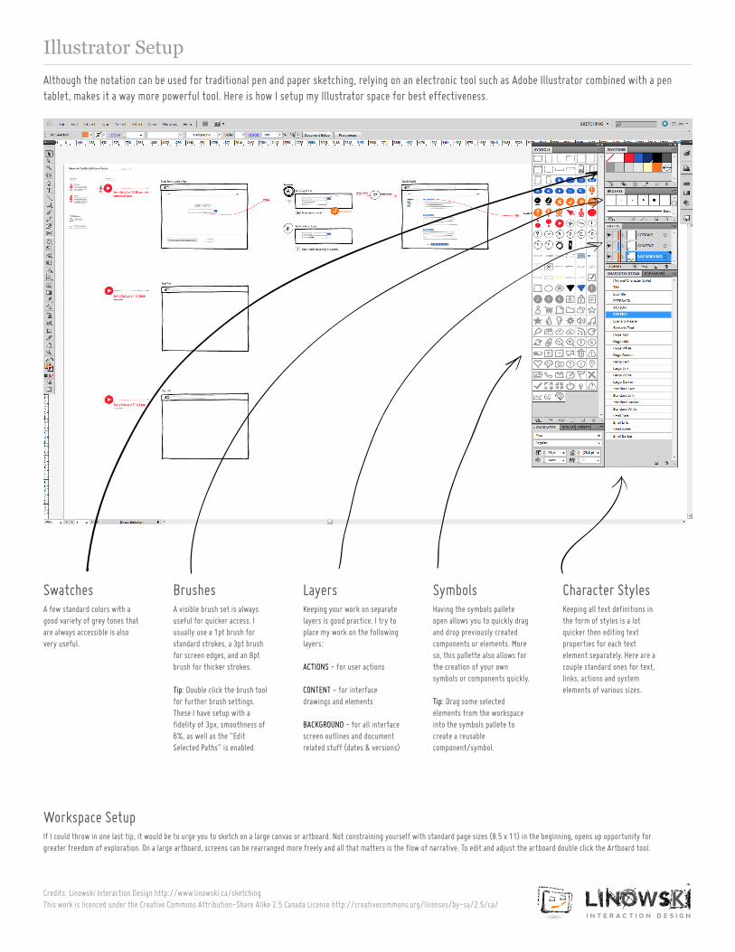
A visible brush set is always useful for quicker access. I usually use a 1pt brush for standard strokes, a 3pt brush for screen edges, and an 8pt brush for thicker strokes.
Tip: Double click the brush tool for further brush settings. These I have setup with a fidelity of 3px, smoothness of 6%, as well as the “Edit Selected Paths” is enabled.
If I could throw in one last tip, it would be to urge you to sketch on a large canvas or artboard. Not constraining yourself with standard page sizes (8.5 x 11) in the beginning, opens up opportunity for greater freedom of exploration. On a large artboard, screens can be rearranged more freely and all that matters is the flow of narrative. To edit and adjust the artboard double click the Artboard tool.
A few standard colors with a good variety of grey tones that are always accessible is also very useful.
Keeping your work on separate layers is good practice. I try to place my work on the following layers:
ACTIONS - for user actions
CONTENT - for interface drawings and elements
BACKGROUND - for all interface screen outlines and document related stuff (dates & versions)
Having the symbols pallete open allows you to quickly drag and drop previously created components or elements. More so, this pallette also allows for the creation of your own symbols or components quickly.
Tip: Drag some selected elements from the workspace into the symbols pallete to create a reusable component/symbol.
Keeping all text definitions in the form of styles is a lot quicker then editing text properties for each text element separately. Here are a couple standard ones for text, links, actions and system elements of various sizes.
Although the notation can be used for traditional pen and paper sketching, relying on an electronic tool such as Adobe Illustrator combined with a pen tablet, makes it a way more powerful tool. Here is how I setup my Illustrator space for best effectiveness.
BrushesSwatches Layers Symbols Character Styles
Workspace Setup