Interactive Medical Record Visualization based on Symptom ...
143
Interactive Medical Record Visualization based on Symptom Location in a 2D Human Body by Yongji Jin Thesis submitted to the Faculty of Graduate and Postdoctoral Studies In partial fulfillment of the requirements for the degree Master of Applied Science in Electrical and Computer Engineering School of Electrical Engineering and Computer Science Faculty of Engineering University of Ottawa January 2016 © Yongji Jin, Ottawa, Canada, 2016
Transcript of Interactive Medical Record Visualization based on Symptom ...

Interactive Medical Record Visualization based on
Symptom Location in a 2D Human Body
by
Yongji Jin
Thesis submitted to the
Faculty of Graduate and Postdoctoral Studies
In partial fulfillment of the requirements for the degree
Master of Applied Science in Electrical and Computer Engineering
School of Electrical Engineering and Computer Science
Faculty of Engineering
University of Ottawa
January 2016
© Yongji Jin, Ottawa, Canada, 2016

ii
Abstract
An electronic medical record (EMR) is “an electronic record of health-related information on an
individual.” EMRs are widely used in healthcare organizations and have many advantages over
traditional paper-based medical records, such as their efficiency and reduced storage needs.
However, the use of EMRs has not yet reached its full potential. The numerous items of
medical data are always shown with redundant and complex text contained in various
monotonous forms and tables. It is hard for users to obtain useful information in a short
timeframe.
We propose a prototype system to intuitively and interactively visualize patients’ medical
records. Navigation is improved through graphics-based and interaction-based visualization. Our
interface features clickable two-dimensional (2D) images of a human body, on which the
symptom locations are the starting point of the navigation. In addition, interactive and classified
history visualization is also provided. Finally, some pertinent suggestions and comments from
medical professionals are discussed.

iii
Acknowledgements
I would like to express my deepest appreciation and thanks to my supervisor Professor WonSook
Lee, who continually conveyed a spirit of adventure in research. I would like to thank her for
giving me the chance to study at CG++ Research Laboratory, encouraging and supporting me to
conduct my research and providing me with critical and insightful feedback related to my work.
Her advice on my research as well as on my life has been priceless. Without her patience,
motivation, enthusiasm, and immense knowledge, this dissertation would not have been possible.
I would also like to give special thanks to my colleagues (Jiaren Suo, Jing Wang, Shiyi
Huang, Chao Sun, Yang Liu, etc.) at CG++ Research Laboratory for all the fun time and
collaboration. It was my pleasure to meet all of them, and these inspiring people helped me very
much during my masters’ study in the research field.
In addition, many thanks and appreciation also go to my friends, Jun Yang, Hao Han,
Mingyang Sun, Yuchen Ge, Yang Li, and Huang Cheng. They have offered so much support and
encouragement throughout my life in Ottawa.
Moreover, I would like to thanks InnerBody.com (HowToMedia Inc.) for generously
giving us the permission to use their web site images in our prototype system.
Finally, my deepest gratitude goes to my parents for raising and supporting me throughout
the entire process of striving to achieve my goal in Canada. There are not enough words in the
world to express my appreciation to them.

iv
Table of Contents
Contents
Abstract ................................................................................................................................. ii
Acknowledgements ............................................................................................................. iii
Table of Contents................................................................................................................. iv
List of Figures .................................................................................................................... viii
List of Tables ..................................................................................................................... xiv
Abbreviations...................................................................................................................... xv
Chapter 1. Introduction ...................................................................................................... 1
1.1 Current Visualization Systems for EMRs ................................................................... 3
1.2 Objective ..................................................................................................................... 4
1.3 Contributions ............................................................................................................... 5
1.4 Thesis Organization ..................................................................................................... 6
Chapter 2. Literature Review ............................................................................................. 7
2.1 Medical Record ........................................................................................................... 7
2.1.1 Primary Components ........................................................................................ 7
2.1.2 Medical Coding ............................................................................................... 11

v
2.1.3 Requirements for Medical Records ................................................................ 13
2.2 Electronic Medical Record ........................................................................................ 14
2.2.1 Benefits of EMRs Compared to Paper-based Medical Records ..................... 14
2.2.2 The Development of the EMR Systems.......................................................... 18
2.3 Information Visualization (IV) .................................................................................. 20
2.3.1 Introduction ..................................................................................................... 20
2.3.2 The History of IV ............................................................................................ 22
2.3.3 IV Examples.................................................................................................... 27
2.3.4 IV Techniques ................................................................................................. 32
2.3.5 IV Toolkits ...................................................................................................... 37
2.3.6 IV Evaluation Criteria ..................................................................................... 39
2.4 Existing EMR systems .............................................................................................. 43
2.4.1 EMR Visualization Prototype Systems ........................................................... 43
2.4.2 Commercial EMR Systems ............................................................................. 50
Chapter 3. System Design and Implementation ............................................................... 61
3.1 Requirements for Our Visualization System ............................................................. 61
3.2 User Interface Design ................................................................................................ 62
3.2.1 Start Page ........................................................................................................ 62
3.2.2 Patient Information ......................................................................................... 63
vi
3.2.3 Five Physiological Systems ............................................................................ 66
3.2.4 Location-based Symptoms .............................................................................. 67
3.2.5 Timeline-based and Icon-based History Records ........................................... 73
3.2.6 Color-based Blood Test Display ..................................................................... 78
3.3 System Implementation Overview ............................................................................ 80
3.3.1 System Architecture ........................................................................................ 80
3.3.2 Benefits of Web-based System ....................................................................... 83
3.3.3 System Performance Optimization ................................................................. 85
3.4 Limitations ................................................................................................................ 86
Chapter 4. Discussion ...................................................................................................... 88
4.1 Requirements Check ................................................................................................. 88
4.2 Comparison with Other Systems ............................................................................... 92
4.2.1 Comparison between Five Ws and Our System ............................................. 99
4.2.2 Comparison between Two Patents and Our System ..................................... 100
4.3 Informal Feedback ................................................................................................... 101
Chapter 5. Conclusion .................................................................................................... 104
5.1 Contributions ........................................................................................................... 105
5.2 Future Work ............................................................................................................ 106
References ........................................................................................................................ 108

vii
Publications by Author ..................................................................................................... 126

viii
List of Figures
Figure 2.1: (a) Paper-based medical record. (b) Electronic medical record. ...................... 17
Figure 2.2: Visual analytics combine scientific disciplines to enhance distributing the work
between humans and machines [50]. ............................................................................................ 21
Figure 2.3: The time distribution of events considered milestones in the history of IV [52].
....................................................................................................................................................... 22
Figure 2.4: Planetary movements shown as cyclic inclinations over time, by an unknown
astronomer, appearing in a 10th century appendix to commentaries by A. T. Macrobius [52]. ... 23
Figure 2.5: Graph of determinations of the distance, in longitude, from Toldo to Rome
[52]. ............................................................................................................................................... 24
Figure 2.6: William Playfair’s 1821 time series graph of prices, wages, and the ruling
monarchs over a 250-year period [52]. ......................................................................................... 25
Figure 2.7: (a) A portion of Dr. Robert Baker’s cholera map of Leeds, 1833, showing the
districts affected by cholera [52]. (b) A dot-map created by Dr. John Snow [1813–1858] shows
the deaths from an outbreak of cholera in 1854 in London [52]. ................................................. 25
Figure 2.8: Visualization of historic weather-station data for the UK between 1880 and
2013 [71]. ...................................................................................................................................... 28
Figure 2.9: Visualization of immigration flows in the US in 2012 [72]. ........................... 29

ix
Figure 2.10: Displaying the Salmonella typhi genome as a circular plot. The tracks from
the outside represent: forward CDS; reverse CDS; pseudogenes; Salmonella pathogenicity
islands (red); repeat regions (blue); rRNA and tRNA (green) [73]. ............................................. 30
Figure 2.11: Facebook Network Visualization [74]. .......................................................... 31
Figure 2.12: Citation Network Visualization [75]. ............................................................. 32
Figure 2.13: Correlation between the life expectancy, fertility rate, and population of
several countries [77]. ................................................................................................................... 33
Figure 2.14: Tree map for displaying the iTunes Top 100 on February 27, 2006, grouped
by genre, sized by chart position, and colored by 24-hour change in chart position [79]. ........... 34
Figure 2.15: Car modeling in the 1970s and 1980s with MPG, cylinder, displacement,
power, weight, MPH, and year [82]. ............................................................................................. 35
Figure 2.16: Timeline of major technological advancements [84]. .................................... 35
Figure 2.17: Using a data flow diagram (DFD) to present the process of a student
registration system [87]................................................................................................................. 36
Figure 2.18: Simple diagram of a semantic network illustrating the directed nature of
relationships [88]. ......................................................................................................................... 37
Figure 2.19: Timeline [8] – Visualization of personal medical histories. Horizontal lines
represent the events and episodes in a single patient record. The line color, height, and captions
are used to convey information. A detailed panel to the right shows further information about a
selected item such as an ultrasound image. .................................................................................. 44

x
Figure 2.20: Lifelines 2 [92] – Visualization of records of temporal categorical data. (a)
Shows each individual record. (b) Shows the aggregation of events over time. (c) Contains
controls to basic operators: align, rank, and filter. (d) Shows controls for event distribution and
grouping. ....................................................................................................................................... 45
Figure 2.21: KNAVE-II [96] – Provides an overview of an oncology patient’s data: (a) On
the left, a browser of the domain ontology allows the user to add abstract concepts and raw data
variables for visualization. (b) In addition, there is a string search for concepts. (c) Abstract
concepts have an ordinal scale and duration. They are represented with line segments similar to
Lifelines. (d) Line plots display numerical raw data. ................................................................... 46
Figure 2.22: Five Ws [18] – The two coordinated displays of the 5W system. (a) The
radial (patient overview) display using an integrated body map, along with the user interface. (b)
The corresponding sequential (diagnostic reasoning) display using the same color coding. ....... 47
Figure 2.23: EMR visual representation with a human figure and a timeline [117]. ......... 49
Figure 2.24: Human image-based EMR visualization with indicators [118]. .................... 50
Figure 2.25: Market Share of commercial EMR systems [112]. ........................................ 52
Figure 2.26: Interface of the Epic EMR system [123]. ...................................................... 53
Figure 2.27: Interface of the Allscripts EMR system [124]. .............................................. 54
Figure 2.28: Interface of the eClinicalWork EMR system [125]. ...................................... 54
Figure 2.29: Interface of NextGEN EMR system [126]. .................................................... 55
Figure 2.30: Interface of GE EMR system [127]. .............................................................. 56
xi
Figure 2.31: Allscripts Wand Timeline [116] shows an overview of a patient’s diagnosis,
medication, vital signs, lab values, and encounters along a horizontal time axis. ........................ 57
Figure 2.32: Interface of WatsonPaths [121]. (a) WatsonPaths’s medical scenario
analytics. (b) The solution provided by WatsonPaths. ................................................................. 60
Figure 3.1: Start page of the system: the far left side is a login box, next to the login box is
a select box, the right side is a navigation board, and a clickable 2D human body is placed in the
center of the page. ......................................................................................................................... 63
Figure 3.2: The interface used to create a new patient’s record. The input box for entering
a new patient’s basic information is highlighted in red on the left side of the page. .................... 64
Figure 3.3: Interface for a female patient [105]. ............................................................... 65
Figure 3.4: Interface for a male patient [106]. .................................................................... 65
Figure 3.5: Five physiological systems: from left to right, the skeletal, muscular,
cardiovascular, digestive, and nervous systems are displayed [100] [101] [102] [103] [104]. .... 67
Figure 3.6: (a) Record a new symptom, including its location information and symptom
type. (b) Symptom locations are labeled with colored circles. ..................................................... 68
Figure 3.7: (a) All kinds of the problems are displayed on the home page. (b) Only skeletal
problems are displayed on the skeletal system page. (c) Only muscular problems are displayed
on muscular system page. (d) Only cardiovascular problems are displayed on the cardiovascular
system page. (e) Only digestive problems are displayed on the digestive system page. (f) Only
nervous problems are displayed on the nervous system page....................................................... 69
xii
Figure 3.8: (a) Symptoms are labeled with colored circles and displayed on the human
body. (b) A pop-up box, which will appear when clicking on a symptom location, is used to add,
display, and retrieve medical records............................................................................................ 70
Figure 3.9: The red border means this pop-up box belongs to skeleton problems: (a) A
pop-up input box used to insert diagnosis information. (b) A pop-up input box used to insert
treatment information. (c) A pop-up input box used to insert medication information. (d) A pop-
up input box used to upload scanning images and insert related notes. ....................................... 71
Figure 3.10: The red border means this pop-up box belongs to skeleton problems: (a) A
pop-up box for displaying the latest diagnosis information. (b) A pop-up box for displaying the
latest treatment information. (c) A pop-up box for displaying the latest medication information.
(d) A pop-up box for displaying the latest scanning results. ........................................................ 72
Figure 3.11: Icon-based and time-line based history record display. ................................. 73
Figure 3.12: The full page of history records. Navigation buttons and icons are placed on
the upper part of the page, which can be clicked to filter medical data. ....................................... 74
Figure 3.13: (a) All diagnosis history for all symptoms. (b) All treatment history for all
symptoms. (c) All medication history for all symptoms. (d) All scanning history for all
symptoms. (e) All blood test history for all symptoms. ................................................................ 76
Figure 3.14: (a) A patient’s full history of skeletal problem. (b) A patient’s full history of
muscular problem. (c) A patient’s full history of cardiovascular problem. (d) A patient’s full
history of digestive problem. (e) A patient’s full history of nervous problem. ............................ 77
xiii
Figure 3.15: Information displayed by clicking on the icons. The border color for each
icon indicates which physiological system it belongs to. ............................................................. 78
Figure 3.16: Display of blood test results. A table of three sets of blood test results for the
same individual. Red highlighting is used to indicate an abnormal index.................................... 79
Figure 3.17: Display of blood test results. Graph-based visualization of the trend of each
index in the past three tests. The red spot shows abnormal results; blue shows normal results. .. 79
Figure 3.18: System architecture. ....................................................................................... 80
Figure 3.19: Entity-relationship model of our database. .................................................... 83

xiv
List of Tables
Table 1: Comparison with other systems (compared by their interactive features). .......... 95
Table 2: Comparison with other systems (compared by items). ........................................ 98
Table 3: Comparison between our system and two patents.............................................. 101

xv
Abbreviations
2D Two Dimensional
3D Three Dimensional
AMA American Medical Association
AMC Academic Medical Center
CDS Coding Sequence
CG Computer Graphics
COSTAR Computer Stored Ambulatory Record
CPT Current Procedural Terminology
CS Computer Science
CSS Cascading Style Sheet
CSV Comma Separated Value
D3 Data Driver Document
DFD Data Flow Diagram
DNA Deoxyribonucleic Acid
DOM Document Object Model
EMR Electronic Medical Record

xvi
ER Entity Relationship
GPU Graphics Processing Unit
HCI Human Computer Interaction
HELP Health Evaluation through Logical Processing
HTML Hyper Text Markup Language
HTTP Hyper Text Transfer Protocol
ICD Interactional Classification of Diseases
IO Input / Output
IOM Institute of Medicine
IV Information Visualization
JSON JavaScript Object Notation
MPG Mile Per Gallon
MPH Mile Per Hour
NDC National Drug Code
PNG Portable Network Graphics
SNP Single Nucleotide Polymorphism
SOAP Simple Object Access Protocol
UI User Interface

xvii
UK United Kingdom
UX User Experience
WHO World Health Organization
XML Extensible Markup Language

1
Chapter 1. Introduction
The term medical record, also called a health record, has existed for a long time. In fact, it can be
traced back to the days of Hippocrates, who is considered the father of Western medicine [1].
Hippocrates defined a medical record as an entity that must meet two basic rules: (1) It should
accurately reflect the patient’s past disease history. (2) It should indicate the probable cause of
his/her disease. These two basic goals remain today and are now reinforced by the additional
functions and features enabled by the electronic storage, computing, transmission, and
processing capabilities of the electronic medical record (EMR), which is a longitudinal electronic
record of patient health information [2]. The development of EMRs can be divided into two main
time periods: before and after the 1980s [42]. The earliest research and implementation of EMR
systems began in some academic medical centers in 1960s. Since the 1980s, EMRs have become
more and more powerful because of the rapid development of computer and information
technology and are widely used in healthcare organizations today.
EMRs include various types of information such as problems, diagnoses, symptoms,
treatments, immunizations, allergies, medications, X-ray results, vital signs, radiology reports,
progress notes, patient demographics, laboratory data, and others. Hence, referring back to the
two fundamental rules proposed by Hippocrates, an advanced and comprehensive electronic
system not only enables superior storage and mobility of medical records (improving rule 1), but
also supports further advanced and accurate reasoning with regards to the probable cause of a
disease (improving rule 2). What is more important is that the EMRs are dedicated to improving
evidential medicine as an acceleration of growth in the field of modern medicine. In addition to

2
these key features, EMRs have many advantages over traditional paper-based medical records,
such as their efficiency and reduced storage needs [3].
However, nothing is perfect. Although the EMRs have many advantages, as mentioned
above, EMR use in clinical practice is still not fully accepted and has not reached its full
potential [3]. As the volume of medical records is growing at an alarming rate, important
information and an overview of clinical records are always hard to retrieve and obtain, seriously
limiting physicians’ diagnostic efficiency. We consider the improperly sorted, arranged health
data and the fragmented, non-intuitive, non-interactive display of health information are the main
causes.
As a goal, we believe the ideal EMR system should be interactive and intuitive, integrating
and displaying comprehensive information in an easily digestible and meaningful format. An
uncluttered, interactive, navigable user interface should be integrated in the EMR system to
support and reinforce clinical decision-making and allow for rapid, simple input/output (IO).
Moreover, it should also have the ability to work on health data directly and immediately, thus
minimizing the need for multitasking and allowing the healthcare provider to focus mainly on the
health problem to achieve the best therapeutic result.
Interactive visualization is considered the most appropriate approach to achieve such a
goal. There is a famous saying, “A picture is worth a thousand words,” which means that a large
amount of related data can be most effectively conveyed with visual representations (e.g., images,
graphs). Good visualization can make it possible to quickly retrieve and obtain useful
information from numerous types of complex data. Consequently, in this thesis, we would like to
propose an interactive visualization system to better represent medical records.

3
1.1 Current Visualization Systems for EMRs
To date, only a few approaches have been proposed for visualizing patients’ medical records.
The most common paradigm is to organize and display the health records along the time axis. In
1983, Tufte [4] described timelines as a frequent and powerful form of visual design. The early
work using timelines for medical records was proposed and implemented by Powsner and Tufte
[5]. They constructed a graphic summary using a table of individual scatterplots of relevant
medical variables such as test results and treatment data. Many recent works in that direction
include CDDV [6], VIE-VISU [7], LifeLines [8], and LifeLines2 [9], in which medical records
are distinguished by their inherent aspects (e.g., symptoms, problems, diagnosis, treatments, tests
results, medications). These systems have the following two features: (1) color is used to show
normal or abnormal states and indicate the disease severity or type; (2) line segments can be
zoomed and panned to reveal more or fewer details. Many other systems have also embraced this
type of medical data visualization, such as the KNAVE-II [10] and VisuExplore [11], and
Midgaard [12]. Another widely used paradigm is a flowchart, as applied in medical algorithm
maps [13] and other systems [14] [15], where health records are visually represented as a logical
execution sequence of plans (like a pipeline).
Today, a number of modern EMR systems not only offer timeline views or flowchart
diagrams, but are also starting to support body-centric data layouts. This is because clinical data
often have some relation to human anatomy. For such data, a template of a virtual human body is
an intuitive, quick, and simple means to provide an index to the corresponding part of the human
body. For example, the system presented in [16] gathers close-ups of required radiological data
around a rendered human body and the system Midgaard [12] provides a visualization method

4
that maps collected patient records to an image of the human body. What is more, the Five Ws
system, proposed in [17], [3], and [18], also presents patient records with a radial display
integrated on a human body map. This system allows physicians to use a red dot to mark the
location of symptoms in the body and present the corresponding diseases in a sunburst tree
around this body.
1.2 Objective
Although there are many advantages to the visualization systems mentioned above, there are also
several drawbacks, such as too much text, a lack of interactivity, fragmented and non-intuitive
displays. The interfaces are still filled with unreadable text, boring tables and complex
navigations. Consequently, we can conclude that intuitive user interaction systems to visualize
EMRs have not been well explored yet.
The goal of our work is to design and implement an intuitive, interactive EMR
visualization system which is integrated with a minimal amount of textual data and easy
navigation.
To achieve this goal, we propose a web-based interactive visualization system to
intuitively illustrate health information with graphics and images instead of redundant text. Our
system focuses on an interactive display of a two-dimensional (2D) image of the human body to
support body-centric data layouts. A clickable 2D human body is exploited to denote symptom
locations. These symptom locations are labeled with colored circles, which are the starting point
of the interactive navigation. By clicking on these symptoms, users can easily add, insert, and
update information and also navigate corresponding physiological systems and obtain detailed

5
information, such as symptom type, severity, and Interactional Classification of Diseases (ICD)
codes. Furthermore, to provide a better layout of health records, interactive icons are integrated
into a timeline to illustrate the history records, and various colors are used in blood tests to help
users distinguish normal or abnormal indices of test results.
1.3 Contributions
We have designed and implement a graphics-based, image-based and symptom location-based
EMR visualization system integrated with a minimal amount of textual data and simple
navigation. We made the following major contributions:
Our system is integrated with a graphics-based and image-based interface to provide
intuitive visual representation of health data.
In our system, the diseases are divided into different categories of physiological
systems, such as skeletal, muscular, cardiovascular, digestive, and nervous systems.
This is very helpful for users to better understand the disease.
Our system provides a clickable 2D image of the human body to support body-centric
data layout. Symptom locations are indicated with colored circles on the body.
Moreover, an easy navigation is provided in our system. Users can click on the
symptom locations for further health information.
Our system provides a novel history record by integrating the timeline and icons. Users
can easily and accurately retrieve and extract useful records with the help of
meaningful icons and a powerful filtration function.

6
1.4 Thesis Organization
The remainder of this thesis is organized as follows:
Chapter 2 introduces the background and related works of this research. First, we
present the basic concept of medical records and conventional EMR systems. After that,
we propose the idea of visualization and describe several visualization applications,
techniques, and toolkits. Finally, we introduce some existing medical record
visualization systems.
Chapter 3 introduces our approach to visualizing the medical records. This chapter is
divided into two parts: a visualization description section and a system architecture
section. In the visualization description, we introduce the user interface and features of
our system. Additionally, the system framework and the technologies we used are
presented in the system architecture section.
Chapter 4 includes a comparison between our system and other EMR systems, together
with some informal feedback.
Chapter 5 concludes the thesis and highlights the contributions of this research. Future
works are also discussed.
7
Chapter 2. Literature Review
This thesis topic is based on two major research fields: medical records and information
visualization (IV). In this chapter, we introduce the research background of these two
perspectives. First, we introduce the general idea of medical records, including the basic
components, medical coding, and requirements. Following that, we present some benefits of
EMR and the development of EMR system. We also demonstrate the relevant background of IV,
including visualization examples, techniques, toolkits, etc. Finally, we also demonstrate an
overview of some existing EMR visualization systems, including visualization prototype systems
and commercial systems.
2.1 Medical Record
The medical record is a powerful tool that includes patients’ previous health conditions and
treatments [19]. It allows physicians to track their patients’ medical history as well as identify
potential issues for diagnosis and is now widely used in hospitals, clinics, and other healthcare
organizations. The primary purpose of medical records is to help physicians optimize the use of
resources and provide comprehensive and high-quality healthcare to their patients [20]. By using
this useful tool, physicians can determine the course of healthcare and offer patients the best
treatment.
2.1.1 Primary Components
As mentioned before, a medical record is a living document that stores patients’ story relevant to
their healthcare (e.g., diagnosis, treatment, scanning results, test results, and clinical notes). In

8
addition to merely telling the story, a complete and accurate medical record needs to include
compulsory information (e.g., personal identification information, medical history, and
medication history). As time goes by, medical records continually develop and change. However,
the common information remains unchanged over time and all medical records should contain it.
Some common components of medical records are as follows:
Personal Identification Information – This is the information that can be used on its
own or with other information to identify an individual [21]. When a patient goes to a
hospital to see a physician, the first thing the physician does is check the patient’s
personal identification information. In general, personal identification information is on
the first page of the medical record. Just as deoxyribonucleic acid (DNA) makes every
human being special and unique, each patient’s medical record must have specific
personal identification information such as his/her name, gender, address, birth date,
and government-issued identification number. Such personal identification information
helps physicians distinguish their patients and provide accurate treatment to each
patient.
Basic Medical Profile – A basic medical profile must be maintained in each patient’s
practice chart, which contains a brief summary of essential information about the
patient. This can help physicians quickly obtain a picture of the patient’s overall health
information. This information could include elements such as risk factors, allergies,
drug reactions, and others [22].
Family Medical History – A family medical history is a collection of health
information about a patient and his/her relatives [23]. It contains all the health

9
information from three generations of the family. Family members share similar genes,
living environments, lifestyles, and habits. These factors may offer clues to medical
conditions that probably exist and spread among a particular family. Being aware of
these clues, physicians can determine whether an individual, other family members, or
future generations may be at an increasing risk of developing a particular condition.
Therefore, having detailed knowledge about a family’s medical history contributes to
an individual’s preventive measures and reduces the risk of disease.
Diagnosis History – Medical diagnosis is the process of determining which disease or
condition explains a patient’s symptoms [24]. The information required for diagnosis is
typically collected from a history and physical examination of the person seeking
medical care. The diagnosis history is the collection of patients’ previous diagnoses.
This information provides physicians with all the details of patients’ health conditions,
enabling physicians to provide proper healthcare.
Treatment History – The treatment history is a document recording all the therapy
patients have received. Given this information, physicians have knowledge of what has
succeeded and failed. As a consequence, physicians are able to save treatment time,
and for patients, the expenditure on medical services is also reduced.
Medication History – When a patient sees a doctor, one of the most important things
the doctor needs to do is to determine what medications the patient has taken before
and what he/she is allergic to. The medication history details what medications the
patient has taken, is very important for diagnosis, and needs to be accurate. Otherwise,
it can lead to improper treatment. To emphasize the importance and necessity of the

10
medication history in treatment, the National Institute for Health and Clinical
Excellence published regulations and guidelines in December 2007 [25] requiring all
physicians and patients to have the responsibility of following the medication history
policy after each treatment.
Scanning Test – A scanning test is a common image test that has been used for
decades to help doctors view the inside of the human body without having to make an
incision. One of popular scanning methods is X-ray test, and it has become a key
element in the identification, diagnosis, and treatment of many types of medical
conditions. Today, different types of X-rays are used for specific purpose. For example,
mammograms are used to examine the breasts and a barium enema is used to detect
bowel problems.
Blood Test – A blood test is a laboratory analysis performed on a blood sample that is
usually extracted from a vein in the arm using a needle, or via finger prick. Blood tests
are widely used in health care to determine the physiological and biochemical states,
such as disease, mineral content, pharmaceutical drug effectiveness, and organ function.
Blood tests help physicians check for certain diseases and conditions and they also help
check the functions of your organs and show how well treatments are working.
Clinical Notes – Clinical notes are the notes that are made contemporaneously
regarding physician-patient encounters. They are always completed by physicians after
patients visit the hospital. Good clinical notes are included in accurate and
comprehensive records and have a positive effect on healthcare [25]. Physicians always

11
retrieve patient information from brief and professional clinical notes; therefore, the
significant information from patient encounters needs to be included in them.
2.1.2 Medical Coding
Medical coding, or medical classification, is the process of transforming medical diagnostic
descriptions into medical code numbers. This procedure is usually taken from a wide range of
medical record sources (e.g., clinical notes, laboratory/radiologic results). Many institutes such
as government health programs and private health insurance companies use it to
track diseases and health conditions. Although many different medical classifications have been
proposed, they occur into the following groups:
ICD - The International Classification of Diseases (ICD) is the standard diagnostic tool for
epidemiology, health management, and clinical purposes [26]. This medical classification is
generated and listed by the World Health Organization (WHO). The ICD contains codes for
diseases, signs and symptoms, abnormal findings, complaints, social circumstances, and external
causes or injuries. Because of this, the ICD has been used by healthcare professionals,
researchers, health information managers, and heath information technology coders to classify
diseases and other health problems.
After a long period of development and evolution, an extensive amount of data and many
functions have been integrated into the ICD. The latest and enhanced version of the ICD is the
ICD-10, the development of which started in 1983 and was completed in 1992. It contains more
than 14,400 different codes and allows the tracking of any diagnosis. The ICD-10 has been
translated into more than 43 languages and its international version has been used in over 110

12
countries. Some of these countries, such as Canada, China, the US, South Korea, Japan, and
Australia, have modified the international version to adapt it to their own healthcare systems.
CPT – The Current Procedural Terminology (CPT) is a uniform medical code set that is
published and maintained by the American Medical Association (AMA) [27]. It provides
reliable nationwide communication among physicians and other healthcare providers, patients,
and third parties thanks to the standard coding format. As one of the most important groups of
medical coding, the CPT is similar to ICD-9 and ICD-10 coding, but instead of including a
diagnosis on the claim, it identifies the services rendered.
The first version of the CPT was developed and published by the AMA in 1996, and it
continues to be updated by releasing new versions every few years. The first version contained
not only surgical procedures, but some other sections regarding medicine, radiology, and
laboratory procedures. Later, in 1970, the second edition expanded the terms and codes for the
designation of diagnostic and therapeutic procedures in the application of surgery, medicine, and
the specialties. Since then, four-digit coding was replaced with a brand new five-digit system.
Currently, the CPT is widely used through the US and Canada because of its well-organized
coding and descriptive services.
NDC – Unlike the above two systems, the National Drug Code (NDC) is rarely used worldwide.
The NDC is a specific drug identifier that is used in the US for humans [28]. Each NDC contains
10 digits and 3 segments. The first segment identifies the drug labeler or vendor. Following this,
the second set of numbers is the product code, which identifies the composition of the product.

13
Finally, the third set is used for identifying the drug package (size and types). The labeler and
product code contain 4–5 as well as another 3–4 digits out of 10 digits, respectively. The
remaining 1–2 digits belong to the package code. Consequently, it has three combinations, 4-4-2,
5-3-2 and 5-4-1.
2.1.3 Requirements for Medical Records
As discussed above, a medical record is a living document that details a patient’s story. To be an
excellent storyteller in the medical field, several requirements should be met. Specifically, to
ensure comprehensive and high-quality care for patients, a good medical record needs to be
legible and regulatory [130].
Legibility: As one of the most important indicators, the regulation requires that medical
records be legible. This information is expected to be understood by all physicians and
professionals and therefore, using conventional medical short forms is permissible. However,
due to a variety of errors from abbreviations and poor handwriting, misunderstandings of
medical records are quite common. Several studies have been reported on this legibility issue
[19] [29] [30] [31] [32]. To address this problem, it is necessary for physicians to provide
explanations and demonstrations to patients of abbreviations used in their medical record.
High-Level Privacy: Apart from legibility, there is a great deal of extremely private
information and huge amounts of data in medical records. Hospitals and physicians have the
responsibility of protecting patients’ information and ensuring it is stored in a secure
environment [128]. For example, a login system that contains users’ identification and
passwords can be a good solution for hospitals to establish a secure system. Physicians must
use sufficiently secure internet to access medical record systems to protect patient privacy.

14
Big Storage: On the other hand, as times goes, the amount of patient data is increasing at a
high speed and the storage of medical records has become an important issue [129]. As result,
healthcare organizations are dealing with large datasets of medical records and have the
responsibility to provide enough storage to guard against this rapid growth. A variety of
enterprise-class database systems have been developed to handle it. Recently, the cloud
computing technique has been leveraged to store large amounts of medical data in the cloud
side, which is good for the sustainable development of the medical record system.
2.2 Electronic Medical Record
An EMR is a computer- and internet-based medical record. It has paper charts in a digital format
and contains the standard medical and clinical information gathered in one healthcare provider’s
office [33]. EMRs go beyond the data collected in the provider’s office and include a more
comprehensive patient history. EMRs and the ability to exchange health information
electronically can help physicians provide higher-quality and safer care for patients. Beyond that,
as EMRs are stored through the computer and the internet, the data can be shared by different
healthcare organizations, such as hospitals, clinics, and other health offices [20]. This section
describes the state of EMRs, their advantage over paper-based medical records, and the
development of the EMR system.
2.2.1 Benefits of EMRs Compared to Paper-based Medical Records
Before the development and popularization of computers and networks, paper-based medical
records were the main way to store patients’ health data. Before the 21st century, despite the
development and benefits of EMRs, most treatment and relevant medical information documents

15
were written by hand in paper records. This was not without reason. Dick et al. [34] noted that
traditional paper-based medical records are used widely due to their portability, simplicity, and
familiarity to users. Even now, some patient-related information is still recorded manually.
Nevertheless, there are many problems with paper-based medical records, such as their access,
incompleteness and confidentiality leakage [35]. With the rapid development of science and
computer technologies, EMRs have become more and more popular and most of the traditional
paper-based medical records have been replaced by EMRs. In comparison with paper-based
records, the benefits of EMRs are as follows:
Costs - Many types of costs are associated with paper-based medical records. One of the
most expensive costs is medical record duplication, which consumes a large amount of
material resources [36]. In addition, it is necessary to hire staff to organize, distribute, and
manage these documents, which also costs more in terms of labor resources. Moreover, to
keep the physical integrity of the documents, it is certainly necessary to spend money to
protect the copies from water, fires, and other risks. However, by using EMRs, these costs
can be reduced significantly, and for healthcare organizations, a positive financial return on
their investment will result [35]. EMRs do not require much labor power, time, and material
resources and a physical storage space is not required. In a previous study [37], Davis
demonstrated that although some initial costs are required to implement an EMR, the costs
will decrease over time. Consequently, EMRs cost less than the paper-based medical record
system.
Legibility – Paper-based medical records are often not legible, which can contribute
to medical errors [38]. As we all know, most physicians have poor penmanship, and very few

16
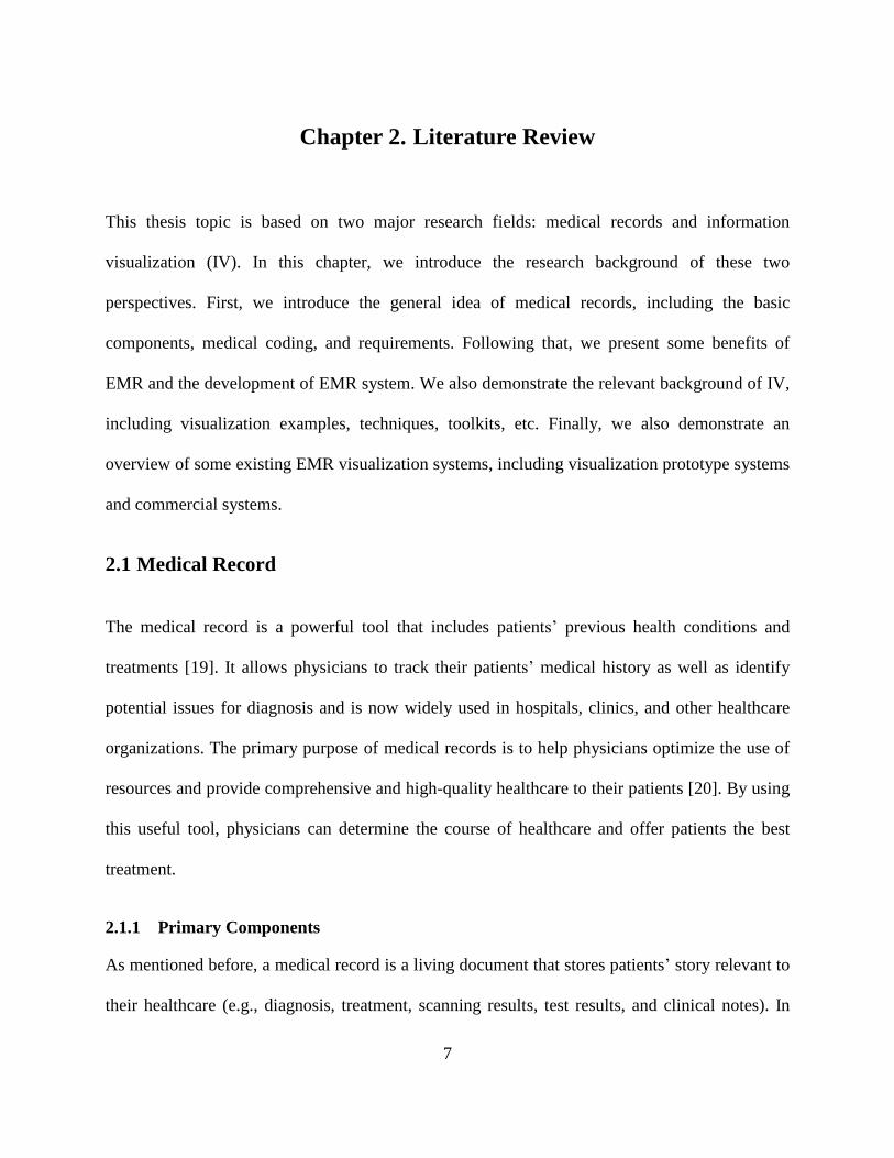
have good handwriting. Figure 2.1 (a) illustrates the problems with a paper-based medical
record. Despite the fact that clinicians used templates, it is still difficult to read paper-based
medical records and obtain useful information from them. In comparison, EMRs (Figure 2.1
(b)) are easy to read and obtain information from because the type font is more standard than
paper-based records. According to a Harris Interactive Poll in 2006, around 60% of
physicians believe that the use of EMRs reduces the amount of medical errors because of
their improved readability [39].
Accessibility – The biggest problem for paper-based medical records is the lack of access to
the records. Only one physician can access the medical record at a specific location at a given
time. Other physicians who want to access this record have to wait until it is available for
them to use. This is a significant issue when a patient travels from one place to another for
further treatment. To share the patient’s paper medical records with other physicians, the
paper records should be packaged first and then mailed to other physicians. This costs a
considerable amount of money and time due to the lack of accessibility. However, using
EMRs, physicians can access the same records at the same time online. The work in [40] and
[41] illustrates that EMRs allow healthcare professionals to access records via a website,
email, and other specific applications. By sharing the resources online, regardless of the time
and place, we can improve the utilization of resources and provide better healthcare to
patients.
17
(a)
(b)
Figure 2.1: (a) Paper-based medical record. (b) Electronic medical record.

18
Storage – The amount of patient data is increasing at a considerably high speed. The storage
for this large amount of medical data has thus become the top priority issue for healthcare
organizations. These organizations have the responsibility to provide effective measures to
store patients’ medical records. Many hospitals need to use a physical storage space to store
paper medical records. However, the use of EMRs can help healthcare organizations save
considerable physical space and use fewer resources to store these records. Most medical
records are currently stored in an extremely large set of hard drive whose storage capacity is
thousands of times of the physical storage. This storage mode is easy to control and manage.
Security – There is a great deal of personal and private information in the medical records.
Hospitals and physicians have the responsibility to protect patients’ private information and
ensure that all the medical records are stored in a safe environment. Paper medical records
are easily damaged or stolen if someone breaks into the physical storage space. It is therefore
necessary to hire a professional security team to protect these paper records, which requires
significant resources that are unnecessary in EMRs. EMRs can provide high-precision
security by using the most advanced network security system. For example, network
firewalls, encryption algorithms, and identification systems can provide almost perfect
security for the EMRs.
2.2.2 The Development of the EMR Systems
As described above, EMRs are expected to achieve significant improvements over paper-based
medical records and satisfy regulations as well as the public’s requirements. As a consequence,
different types of EMR systems have been developed by academic medical centers, industries,

19
and the government. The development of EMR systems can be categorized into two major time
periods: before and after the 1980s [42]. Early efforts began in the 1960s, when academic
medical centers developed their own EMR systems. Since the 1980s, due to their benefits in
industries, leaders have devoted significant effort to forming organizations to promote the use of
electronic medical information.
The first EMR system was created in the 1960s in the United Kingdom (UK), known as
the clinical information system [43]. This project was supported by the government and
academic medical centers (ACMs). Based on this system, in the mid-1960s, Lockheed developed
the product, which was handed down to the vendors Technicon, TDS Healthcare, as well as
Eclipsys [44]. It had a significant effect on the development of EMR systems and influenced the
development of many later systems due to its ideal properties (e.g., high processing speed
and flexibility in that many users are allowed in the system simultaneously) [34]. At the same
time, many other systems have also been developed such as Health Evaluation through Logical
Processing (HELP) [45] and the Computer Stored Ambulatory Record (COSTAR) [46]. The
University of Utah developed HELP, which was activated in 1967. It was the first system to
integrate clinical data accumulation and the decision support. In 1968, COSTAR was developed
by Massachusetts General Hospital in collaboration with Harvard. This EMR system was
implemented with the MUMPS programming language.
Since the 1980s, more concerted efforts have been devoted to developing and improving
the performance of EMR systems. A technical report, published in 1991 and revised in 1997 by
the Institute of Medicine (IOM) [34], argued that use of EMRs is one of the key components in
improving patient records, facilitating the conversion from paper-based medical records to EMRs.
These findings attracted the attention of private industry, and supporters formed the Computer-

20
Based Patient Record Institute (CPRI) to further its development. In 2000, the IOM was
collaborating with HL7, an electronic standards organization, on the development of electronic
standards so that the components of an EMR can communicate more easily [34]. In 2004, EMR
systems have appeared in the national political forum, indicating widespread concerns about
their effect on public health.
2.3 Information Visualization (IV)
IV refers to visual representations of abstract data to reinforce human cognition [47]. It is
currently a popular research area and attracting more and more attention in both academic and
industrial environments. This is a powerful method that helps people to easily analyze and
identify the significance of huge and complex data with visual representation. In this section, we
present three IVs. We first give a brief introduction of data visualization. Subsequently, the
history, applications, and methods of data visualization are then presented. Finally, we introduce
some open-source visualization toolkits (e.g., D3.js, Google Charts, and JavaScript InfoVis) and
evaluation criteria.
2.3.1 Introduction
With the explosion of data and its accompanying effects, information has become an integrated
part of human life and facilitates new approaches toward innovations. With the advent of the
information industry, society has entered into an era of information exploration. Large amounts
of information and data are generated from various kinds of sources, often containing different
content and stored in different formats. For example, individuals can generate a countless
amount of data every day (e.g., chatting records, mailing records, schedules, news). With the
21
growing amount of data, it is becoming increasingly difficult to represent such information in a
useful manner so that the user can use it efficiently. In other words, for the sake of understanding
and extracting knowledge from stored data or information, representing such massive data is the
main challenge and also a ubiquitous task.
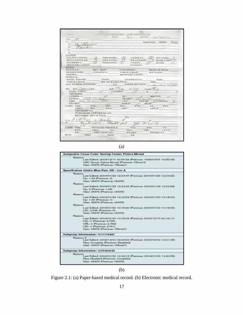
Visualization is considered an effective way to represent a significant amount of data
because it provides mental models of the information [48] [49]. It refers to a visual user interface
and makes huge amounts of unreadable information intelligible by providing insight to the user
[50]. The main purpose of visualization is to create an interactive representation of information
and take advantage of humans’ perception and cognitive abilities to solve problems. After being
visualized, information and data can be precisely, clearly, and efficiently represented by visual
objects, including images, charts, animations, bars, and maps.
Figure 2.2: Visual analytics combine scientific disciplines to enhance distributing the work
between humans and machines [50].

22
As the combination of the above concepts, IV represents abstract data to enhance human
cognition. This is an interdisciplinary field of science that involves human computer interaction
(HCI), computer science (CS), computer graphics (CG), computer vision, psychology, and
business processes. This visual analytic describes the combination of multiple disciplines to
reinforce the communication between humans and machines and is illustrated in Figure 2.2.
Researchers in these fields have promoted the emergence of IV. Although there are many
definitions for IV, the most referenced one, which was proposed by Card et al. [51] in 1998, is
“the use of computer supported, interactive, visual representations of data to amplify cognition.”
Figure 2.3: The time distribution of events considered milestones in the history of IV [52].
2.3.2 The History of IV
IV is usually regarded as the product of the development of modern science and technology [52]
[53] [54] [55]. In fact, statistical graphics and data visualization have existed for quite a long
time, ranging from drawings on caves illustrating successful hunting activities to the complex
dashboards at present aggregating millions of rows of data. To have a better understanding of the

23
present and future trends in the area of IV, it is necessary for us to know the relevant historical
context. Figure 2.3 provides a graphic overview of the developmental history of IV.
Before the 17th century, visualization technology was mainly used to make maps. Most of
the maps used geometric diagrams to display roads, markers, and cities. Among them, the
earliest one to describe information quantitatively is an anonymous 10th century multiple time-
series graph (Figure 2.4), described by Funkhouser [56] and reproduced by Tufte [57]. It
illustrates the changing position of the seven most prominent heavenly bodies over space and
time. Following this, a theoretical graph of distance vs. speed appeared in the work of Nicolas of
Cusa. By the 16th century, techniques and instruments were fully developed for measuring
physical quantities and geographic positions. These early steps comprise the beginning stage of
IV.
Figure 2.4: Planetary movements shown as cyclic inclinations over time, by an unknown
astronomer, appearing in a 10th century appendix to commentaries by A. T. Macrobius [52].
With the progress of human civilization, the need for more accurate and quantitative
mapping of the physical world continued increasing. Thus, by the 17th century, the most
important problem became the need to provide a more precise physical measurement of time,

24
distance, and space for astronomy, surveying, map making, navigation, and territorial expansion.
In the early years of the 17th century, the first visualization for statistical data was created by Van
Langren (Figure 2.5) [58]. It was a one-dimensional line graph with the X-coordinate
representing the estimated longitude difference between Rome and Toledo by 12 different
astronomers. By putting the information in one table, Van Langren successfully visualized the
wide variations in an estimate.
Figure 2.5: Graph of determinations of the distance, in longitude, from Toldo to Rome [52].
Trials of the thematic mapping of geologic, economic, and medical data were first made
close to the end of the 18th century. It was then that abstract graphs of functions, measurement
errors, and sets of empirical data were adopted. The development of visualization in this century
was progressed rapidly, and many visualization methods were innovated in this era. As one of
the greatest representatives, William Playfair invented many well-known graphs that are still
using today (e.g., line, bar, pie, and circle charts). Figure 2.6 is one of his works, which
demonstrates the patterns and trends of the prices of wheat, wages, and the ruling monarchs
between 1565 and 1820 [59].

25
Figure 2.6: William Playfair’s 1821 time series graph of prices, wages, and the ruling monarchs
over a 250-year period [52].
Figure 2.7: (a) A portion of Dr. Robert Baker’s cholera map of Leeds, 1833, showing the districts
affected by cholera [52]. (b) A dot-map created by Dr. John Snow [1813–1858] shows the deaths
from an outbreak of cholera in 1854 in London [52].

26
The first half of the 19th century was the beginning of modern graphics. With the rapid
development and innovation of design and technique, this period witnessed explosive growth in
statistical graphics and thematic mapping. Among statistical graphics, most of the modern forms
of data displays were created, such as pie charts, histograms, timelines, and others. Thematic
mapping developed from single maps to powerful atlases that depict data in different fields or
topics (e.g., sociology, economics, and medical science). Figure 2.7 (a) shows the well-known
disease map of cholera, the districts of Leeds affected by cholera in 1832, which was created by
Dr. Robert Baker [60]. As all the important conditions for the rapid growth of data visualization
were established by the mid-19th century, the development of visualization entered its golden age
in the second half of the 19th century. During this period, many widely known visualization
applications appeared, and among them, the most representative graphical display is a dot-map
(Figure 2.7 (b)), created by Dr. John Snow to describe the deaths from an outbreak of cholera in
London, 1854.
As Figure 2.3 illustrates, under the mushroom growth of statistical graphics and thematic
cartography, the “Golden Age” of IV appeared in the late 1800s. By contrast, its estimated
density plummeted in the early 1900s, called the “Modern Dark Ages.” Only a few graphical
innovations were proposed during this period, and the enthusiasm for visualization was
substituted by the rise of quantification and formal models in the social sciences. Fortunately,
despite the influence of this zeitgeist, data visualization began to rise from dormancy in the mid-
1960s. This was spurred significantly by several developments [61] [62] [63] [64] [65]. The
work in [61] is a landmark, which issued the recognition of data analysis as a legitimate branch
of statistics distinct from mathematical statistics. In France, Jacques Bertin organized the visual
elements of graphics according to the features and relations in data [62]. Two interactive

27
statistical applications [64] and [65] were also developed for the processing of statistical data
during this age. Under these promotions, IV has finally blossomed into a flourishing and vibrant
research area at the end of the 20th century. Various advanced methods and techniques were
developed accordingly, the details of which can be found in [67] [68] [69] [70].
2.3.3 IV Examples
IV plays a significant role in different contexts and has been widely used in various areas. It
makes complex data more accessible, understandable, and efficient to users via the information
media such as graphics, tables, and charts. Today, IV insights are being applied in many areas; a
few examples are presented below.
Climate Data Visualization: Nowadays, visualization is widely used in climate research.
With increasing computational power, large weather datasets are generated increasingly for
the analysis of climate impact and other related applications. However, it is becoming a
challenging task to identify the underlying properties, such as patterns and statistical relations
among weather data. To address this issue, a variety of methods and tools (e.g., 2D-maps,
3D-globes, time charts, and scatterplots) are proposed to visualize weather data in both
independent and interactive ways, such as weather forecasting and ship monitoring. Figure
2.8 visualizes the historic weather-station data for the UK in the period of 1880–2013. With
the help of data-driven documents (D3), the weather data are superimposed onto a map-
projection of the UK.

28
Figure 2.8: Visualization of historic weather-station data for the UK between 1880 and 2013
[71].
Immigration Data Visualization: There is a growing interest in visualizing immigrant data
to judge the tendency and distribution of immigration. For example, the US is an immigrant
friendly country and many people around the world come to the US for a variety of reasons,
such as the high standard of living and quality of education. There are 50 states in the US and
immigrants are distributed in different states. The immigration flow in 2012 is visualized in
Figure 2.9. The destination is presented on the right side, and the left describes where they
are from. With the visualized graph, it can be seen that most of the immigrants are from Asia
and North America, and the states that immigrants love are Florida, New York, and
California.

29
Figure 2.9: Visualization of immigration flows in the US in 2012 [72].
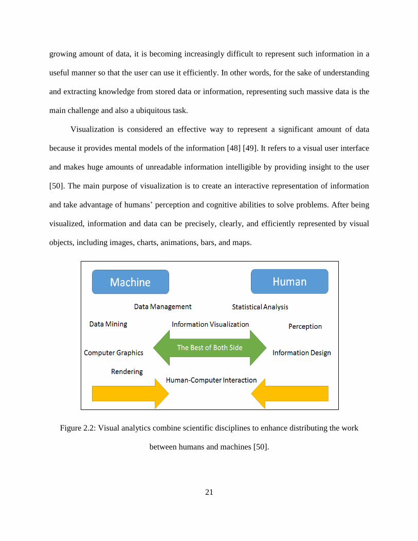
Genome Visualization: By using IV, gathering information no longer appears as a major
bottleneck in genome research. Relevant biological data on genes, transcripts, chromosomes,
exons, and single nucleotide polymorphism (SNP) are available for the interactive
visualization of circular or linear genome maps. It provides an opportunity for researchers to
understand structural relationships in the genome better than just examining the sequence
information alone. Figure 2.10 shows the Salmonella typhi genome as a circular plot. The
tracks from the outside represent: forward coding sequence (CDS); reverse CDS; repeat
regions (blue); rRNA and tRNA (green).
30
Figure 2.10: Displaying the Salmonella typhi genome as a circular plot. The tracks from the
outside represent: forward CDS; reverse CDS; pseudogenes; Salmonella pathogenicity islands
(red); repeat regions (blue); rRNA and tRNA (green) [73].
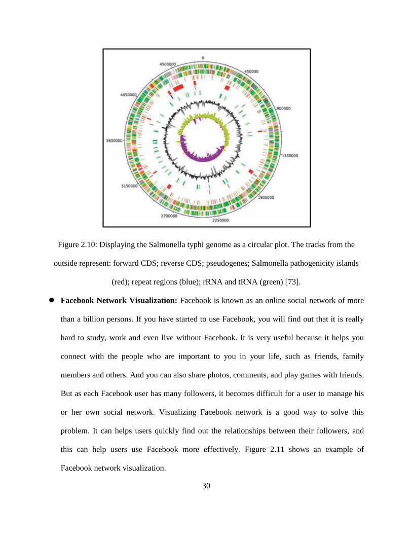
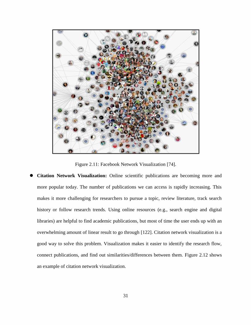
Facebook Network Visualization: Facebook is known as an online social network of more
than a billion persons. If you have started to use Facebook, you will find out that it is really
hard to study, work and even live without Facebook. It is very useful because it helps you
connect with the people who are important to you in your life, such as friends, family
members and others. And you can also share photos, comments, and play games with friends.
But as each Facebook user has many followers, it becomes difficult for a user to manage his
or her own social network. Visualizing Facebook network is a good way to solve this
problem. It can helps users quickly find out the relationships between their followers, and
this can help users use Facebook more effectively. Figure 2.11 shows an example of
Facebook network visualization.
31
Figure 2.11: Facebook Network Visualization [74].
Citation Network Visualization: Online scientific publications are becoming more and
more popular today. The number of publications we can access is rapidly increasing. This
makes it more challenging for researchers to pursue a topic, review literature, track search
history or follow research trends. Using online resources (e.g., search engine and digital
libraries) are helpful to find academic publications, but most of time the user ends up with an
overwhelming amount of linear result to go through [122]. Citation network visualization is a
good way to solve this problem. Visualization makes it easier to identify the research flow,
connect publications, and find out similarities/differences between them. Figure 2.12 shows
an example of citation network visualization.

32
Figure 2.12: Citation Network Visualization [75].
2.3.4 IV Techniques
For the sake of analyzing huge and complex datasets, the preprocessing task of transforming
them into a meaningful representation is unavoidable. To address this issue and convey
information maximally, a number of visualization techniques have been developed during the
last few decades. In this section, we describe several commonly used data visualization
techniques, such as tree map, timeline, and others.
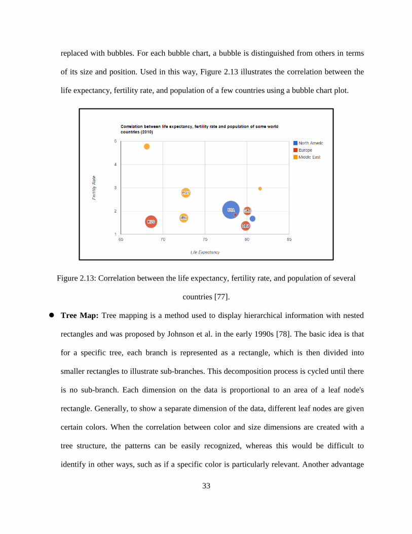
Bubble Chart: A bubble chart displays three-dimensional (3D) data in a two-dimensional
(2D) plane [76]. Each entity with its triplet (v1, v2, v3) is represented by three numeric
values: positions along x- and y-coordinates, respectively, as well as the size of the bubble.
Bubble charts can be considered another form of a scatterplot, in which the data points are
33
replaced with bubbles. For each bubble chart, a bubble is distinguished from others in terms
of its size and position. Used in this way, Figure 2.13 illustrates the correlation between the
life expectancy, fertility rate, and population of a few countries using a bubble chart plot.
Figure 2.13: Correlation between the life expectancy, fertility rate, and population of several
countries [77].
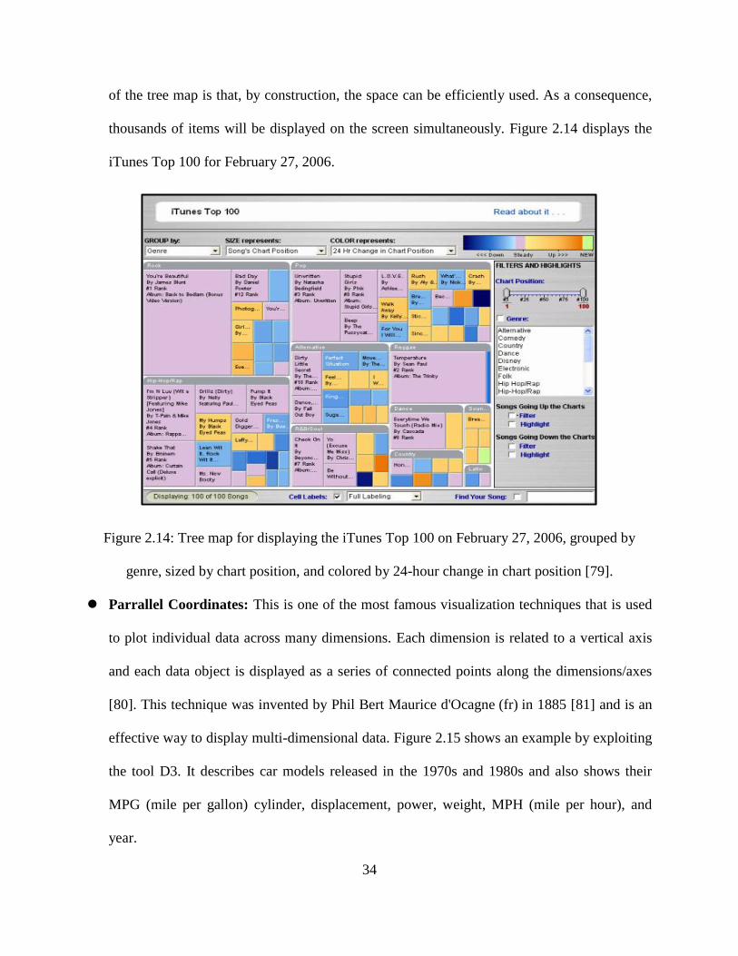
Tree Map: Tree mapping is a method used to display hierarchical information with nested
rectangles and was proposed by Johnson et al. in the early 1990s [78]. The basic idea is that
for a specific tree, each branch is represented as a rectangle, which is then divided into
smaller rectangles to illustrate sub-branches. This decomposition process is cycled until there
is no sub-branch. Each dimension on the data is proportional to an area of a leaf node's
rectangle. Generally, to show a separate dimension of the data, different leaf nodes are given
certain colors. When the correlation between color and size dimensions are created with a
tree structure, the patterns can be easily recognized, whereas this would be difficult to
identify in other ways, such as if a specific color is particularly relevant. Another advantage
34
of the tree map is that, by construction, the space can be efficiently used. As a consequence,
thousands of items will be displayed on the screen simultaneously. Figure 2.14 displays the
iTunes Top 100 for February 27, 2006.
Figure 2.14: Tree map for displaying the iTunes Top 100 on February 27, 2006, grouped by
genre, sized by chart position, and colored by 24-hour change in chart position [79].
Parrallel Coordinates: This is one of the most famous visualization techniques that is used
to plot individual data across many dimensions. Each dimension is related to a vertical axis
and each data object is displayed as a series of connected points along the dimensions/axes
[80]. This technique was invented by Phil Bert Maurice d'Ocagne (fr) in 1885 [81] and is an
effective way to display multi-dimensional data. Figure 2.15 shows an example by exploiting
the tool D3. It describes car models released in the 1970s and 1980s and also shows their
MPG (mile per gallon) cylinder, displacement, power, weight, MPH (mile per hour), and
year.

35
Figure 2.15: Car modeling in the 1970s and 1980s with MPG, cylinder, displacement, power,
weight, MPH, and year [82].
Figure 2.16: Timeline of major technological advancements [84].
Timeline: A timeline is a method to represent a list of events in chronological sequence [83].
All the events are drawn along a straight bar labeled with dates to enable users easily
understand the relationship between different events. In general, most timelines are linear
(horizontally or vertically) and events are represented by images and text. This technique is
usually used in research laboratories to help researchers fully understand the order of

36
historical events and take up new research subjects. Several studies have exploited this
method to visualize data and information. Figure 2.16 shows an example of a timeline.
Figure 2.17: Using a data flow diagram (DFD) to present the process of a student registration
system [87].
DFD : A DFD is typically used as a preliminary step to create an overview of a system. This
method represents the processing of data in a system to obtain the transformed information.
In other words, a DFD illustrates how the data are processed and stored and shows the flow
of data through the entire system. It is applied to visualize data processing at different levels.
Level 0 creates an overview of the whole system and based on this, level 1 of the DFD
elaborates on more details of the system’s process [85] [86]. Following this, further
processing such as of level 2 and level 3 provides a more specific detailed view. Figure 2.17
illustrates the process of a student registration system using a DFD.
Semantic Network: As a visual representation of semantic relations between different
concepts, a semantic network is a directed graph that consists of nodes and arcs; nodes

37
represent indivuals or concepts, and arcs are labeled to represent the logical relationship
between the concepts. Each concept is only represented by one node, and several arcs can
have the same label. A semantic network is a knowledge representation schema based on
human cognition and used to express ideas about groups of concepts. A semantic network is
always used as a form of knowledge representation in natural language processing
applications. Figure 2.18 shows a semantic network example. With this diagram, we can
make the statement, "A fish is an animal that lives in the water." Or, "A bear is a mammal (a
type of animal with vertebra) that has fur."
Figure 2.18: Simple diagram of a semantic network illustrating the directed nature of
relationships [88].
2.3.5 IV Toolkits
As discussed above, information has become an integral part of human life. Applying
visualization on raw data or information makes it easier for people to digest. Creating graphs and
38
charts is time-consuming, but these tools make it easier. If data are the new world currency, the
web toolkits will be the exchange bureau on which they are traded. To make the tedious task of
making visual graphs and charts easier, a large number of available data visualization tools that
can help create useful, informative graphs have been developed. In this section, we present
several popular web-based visualization toolkits.
D3.js: As noted previously, D3 is an abbreviation for data-driven documents, which is a
JavaScript library that renders some visual charts and diagrams from all kinds of data sources
using Hyper Text Markup Language (HTML), Scalable Vector Graphics (SVG) and
Cascading Style Sheets (CSS) [89]. It first appeared in the early 1990s and was initially
capable of displaying static web pages only. However, in 2009, as various visualizations had
already been developed, Stanford University created Protovis for generating SVG graphics
from data [90]. With this toolkit, we are able to visualize many ideas in our mind. D3 library
is a free, open-source and web-standard library and supports many good interactional
functions to users. This library can help users bind data to the Document Object Model
(DOM) and transform them into graphs afterwards. Moreover, D3 can handle multiple data
formats, such as Extensible Markup Language (XML), Comma Separated Values (CSV), and
JavaScript Object Notation (JSON), and some functions are provided to make it simple to
loop through datasets.
Google Charts: Google Charts is a good approach for users to visualize data on their
websites. It creates a chart from data by a Portable Network Graphics (PNG) image and
formatting parameters in an Hyper Text Transfer Protocol (HTTP) request. A large number
of ready-to-use chart types have been provided to their users, from entry-level line charts to
high-level hierarchical tree maps. Furthermore, this technique is especially useful for

39
specialist visualizations like geocharts and gauges, and user interaction controls and built-in
animation are also included. For the function, this toolkit uses a new tag SVG, which is
published together with the fifth revision of the HTML (HTML5) to render charts and also
provides cross-browser compatibility and cross portability to smart machines, like android,
iPhone, and iPad devices.
JavaScript InfoVis: The techniques presented above are all 2D flat visualization libraries.
The JavaScript InfoVis Toolkit provides tools for creating interactive data visualizations for
the Web. With the latest released tag SVG and CANVAS in HTML5, this toolkit provides a
way to import different media (videos, images, etc.) to web pages. It also allows the creation
of Graphics Processing Unit (GPU)-accelerted 3D animations using the JavaScript language
as part of a website without relying on propertietary browser plugins. The JavaScript InfoVis
Toolkit was created by by Nicolas Belmonte and is free to use.
2.3.6 IV Evaluation Criteria
As many IV applications have been designed and implemented recently, the evaluation of IV has
become a hot topic [99]. A good evaluation of usability studies is really helpful to understand the
limitations and potential of a system. Two kinds of criteria for evaluating a visualization system
are presented below.
2.3.6.1 Interactive Features Criteria
Information visualization systems has major components: representation and interaction [107].
The representation component mostly concerns the mapping from data to representation and how
this representation is rendered and displayed on the interface. The interaction component

40
involves the interactive dialog between the system and the user, and it helps user to explore the
complex data to discover insights. Although discussed as two individual components, interaction
and representation are not mutually exclusive. For example, interaction with a system may
achieve a change in representation.
Interaction is an important part of information visualization and a good visual
representation is always achieved on the basis of a friendly interactive interface [107]. Without a
good interaction, an information visualization system will become a static image. [119].
Although static images have analytic and expressive value, their usefulness might be limited as
the data set grows larger with more variables [108] [109] [110].
From what we mentioned above, we can see that information visualization systems can be
evaluated by their interaction features. For now, the user intent model proposed by Yi et al. [107]
is a good way to evaluate an information visualization system. Based on the concept of user
intent, seven categories of interaction are proposed in their study to rate information visualization
systems. Each category is presented in more detail in following contents.
Select: Mark a subset of the dataset as interesting
With the help of Select interaction techniques, users can get the ability to mark data items
to keep track of them [107]. It is really hard for users to retrieve items which they are
interested in, when numerous data items are displayed on a view, or when visual
representations are changed. But if we make items of interest visually distinctive, users
can easily keep track of them even in a big data set.
Explore: show me something else

41
Explore interaction techniques provide users the ability to look over a different subset of
data cases [107]. In general, users always see a limited number of data items at a time
when they are using an information visualization system. There are many reasons such as
the large scale of the data set, screen limitations and others. To solve this problem,
information visualization systems always support Explore interaction techniques to help
users examine a subset of the data to gain better understanding and insights.
Reconfigure: show me a different arrangement
Reconfigure interaction techniques offer users different perspectives on to a large scale of
data set by changing spatial arrangement of visual representations [107]. One purpose of
information visualization is to reveal hidden characteristics of data and relationships
between them. But a single visual representation is not enough to offers sufficient
perspectives. To avoid this issue, information visualization systems always support
Reconfigure interaction techniques which allow users to change the way data items are
arranged to provide different perspectives on the data set.
Encode: show me a different representation
Encode techniques provide users the ability to alter the fundamental visual representation
of the data including visual appearance (e.g., shape, size, and color) of each element
[107]. For example, by encoding height information to a map using a spectrum of color,
users can easily know the height of a mountain.
Abstract/Elaborate: show me more or less detail
Abstract/Elaborate interaction techniques enable users to adjust the level of abstraction of
a data representation to satisfy their needs [106]. This type of interactions allows users

42
alter the representation from an overview down to details of each data sets. One example
of Abstract/Elaborate techniques is zooming.
Filter: show me something conditionally
Filter interaction techniques provide users the ability to change the set of data items
being presented based on some specific conditions [107]. By using this kind of
interaction techniques, users can specify a range or condition, so that only data items
which meet these criteria can be presented. Other items not satisfying the condition or out
of the range will be hidden from display.
Connect: show me related items
Connect interaction techniques are always used to show hidden data items that are
relevant to a specific item and highlight relationships between data items [107]. By using
this type of interaction techniques, users can better understand the relationship between
many data items. And it is really helpful for users to interactively retrieve, obtain and
compare data items they are interested in.
2.3.6.2 Review Criteria
Functionality- A good visualization system should provide many functionalities
required by users.
Efficiency- The efficiency should be considered in each visualization system. By
improving the efficiency, users can achieve a better performance.
Effectiveness- Dose the visualization make a positive effective in use?

43
Usability- The usability can be evaluated from two aspects. First, how easily can the
users interact with the system? Second, are the information provided in a clear and
understandable format?
Usefulness- Is the visualization useful in process of actual application?
2.4 Existing EMR systems
As presented before, for now, EMR systems are the primary way to store patient healthcare
information (e.g., diagnoses, symptoms, treatment notes, medication history). In the following
contents, we give a brief introduction of EMR systems, including EMR visualization prototype
systems and commercial EMR systems.
2.4.1 EMR Visualization Prototype Systems
As we have mentioned before, in clinical practice, the use of EMRs has not fully achieved its
potential and expectation yet. Many factors have hindered the adoption of EMR systems, such as
non-friendly user interfaces, and fragmented, inefficient display of medical data. Therefore, a
significant number of approaches for the visualization of medical records have been proposed to
improve these disadvantages. In this section, we propose an overview of existing EMR
visualization prototype systems.
Lifelines: As one of the earliest systems of the visualization of medical histories, Lifelines
was developed by Plaisant et al. in 1996 [91]. It used numerous line segments to represent the
medical records, personal histories, and other types on biographical data. The horizontal axis
is used to describe the temporal duration and location of events, respectively. It also uses
different colors and line-thicknesses to indicate the importance and relationship of events

44
(Figure 2.19). For example, red represents higher severity and green represents a cure. This
technology provides zooming functionality that allows physicians to compress and stretch the
segment along a time axis, and as the consequence, various medical variables can be
visualized on the same screen.
Figure 2.19: Timeline [8] – Visualization of personal medical histories. Horizontal lines
represent the events and episodes in a single patient record. The line color, height, and captions
are used to convey information. A detailed panel to the right shows further information about a
selected item such as an ultrasound image.
Lifelines2: As an extension of Lifelines, Lifelines2 was proposed by Wang et al. in 2008 [9].
It allows the user to analyze records from multiple patients simultaneously and facilitates
comparative visualization of records by sorting, aligning, and filtering. With these operations,
the system is particularly suitable for observational research. For example, to better

45
understand health and treatment issues, researchers are able to analyze data from different
studies. Figure 2.20 shows an interface of Lifelines2 for visualizing the record of temporal
categorical data. The system employs the interaction technique (Figure 2.20 (a)),
complemented by temporal summaries frameworks, which are histogram-like charts (Figure
2.20 (b)). The controls for both basic operators such as align and rank as well as event
distribution (Figure 2.20 (c) and (d)) are also involved. Several studies in [93], [94], and [95]
have evaluated that the system simplifies analysis tasks significantly, and medical physicians
can learn the interface in a short time period.
Figure 2.20: Lifelines 2 [92] – Visualization of records of temporal categorical data. (a) Shows
each individual record. (b) Shows the aggregation of events over time. (c) Contains controls to
basic operators: align, rank, and filter. (d) Shows controls for event distribution and grouping.

46
Figure 2.21: KNAVE-II [96] – Provides an overview of an oncology patient’s data: (a) On the
left, a browser of the domain ontology allows the user to add abstract concepts and raw data
variables for visualization. (b) In addition, there is a string search for concepts. (c) Abstract
concepts have an ordinal scale and duration. They are represented with line segments similar to
Lifelines. (d) Line plots display numerical raw data.
KNAVE-II: Knave II is a web-based tool for visualizing and exploring clinical data, with a
specific focus on time-oriented raw data [10]. It uses clinical knowledge and temporal data
abstraction to visualize raw data from an EMR and summarize them (Figure 2.21). The
underlying architecture uses standardized vocabularies and mappings to project local data
sources. As the result, users are able to access multiple remote databases even without
knowing their structure and vocabulary. The complete KNAVE-II tool is implemented by
including two components: (1) a user-interface module to display the windows, and (2) a

47
computational module, which analyzes information obtained from the media. It has been
evaluated in several studies by expert clinicians in different medical domains, such as
oncology, which involve the monitoring of chronic patients [97] [98].
Figure 2.22: Five Ws [18] – The two coordinated displays of the 5W system. (a) The radial
(patient overview) display using an integrated body map, along with the user interface. (b) The
corresponding sequential (diagnostic reasoning) display using the same color coding.
Five Ws: The five Ws is a popular concept for information gathering in journalistic reporting,
research and police investigations. It captures all aspects of a story or incidence: who, what,
where, when, and why. In the work [17], Zhang et al. proposed a framework involving a
series of cooperating types of visual information to display and demonstrated the use of five
Ws within a healthcare informatics application. By representing a patient as radial sunburst
visualization integrated with a human body, this system provides a quick overview of both
past and present health conditions of the patient. Figure 2.22 shows the user interface of this

48
system along with the two types of displays it offers (radial display and sequential display).
The detail of this system can be found in [18]. With this framework, the needed time and
effort to access patients’ medical information will be reduced significantly. Another
interesting finding is its support in medical coding. Since users can easily switch between
medical terms and ICD codes, this system can be used by both physicians and coders,
whether the ICD9 code or the new ICD10 code. This system implemented in [18] used the
Action Script and the Flare visualization toolkit. To store patient histories such as visit IDs
and codes with the structured database, the back-end server was first implemented in Java
and Java EE. Furthermore, the communication between the interface and the server was
achieved by exploiting BlazeDS.
Electronic Health Record Timeline and the Human Figure: This is a patent publication of
the United States (Pub. No. US 2009/0192823 A1) [117]. The user interface of the system is
shown as Figure 2.23. From the figure, we can see that a human body is placed on the left
part of the interface and a timeline of clinical events is displayed on the right part of the
interface. Users can draw a dot or a circle on the human body to mark the location of
symptom. Each dot or circle is linked with an indicator (labeled with numbers, such as 530,
538) as shown in Figure 2.23. These circles and dots can visually indicate an outcome of
diagnosis (e.g., good, bad, unknown). Then users can drill down each of the indicators to
retrieve and review detailed information. For example, a user can hover over or click on an
indicator (530-538) to see a corresponding report. In addition to this, users can also review
the EMR timeline by clicking on the corresponding indicators as shown in Figure 2.23.

49
Figure 2.23: EMR visual representation with a human figure and a timeline [117].
Systems and methods for a seamless visual presentation of a patient’s integrated health
information: This is a patent publication of the United States (Pub. No. US 2011/0161854
A1) [118]. The user interface of the system is shown as Figure 2.24. From the figure, we can
see that several human bodies are placed on the central part of the interface. Each human
body represents a specific physiological system. For example, the first body indicates
muscular system and the second body indicates cardiovascular system. In this system, each
diagnosis, treatment, exam and result is linked to a particular body system and location of a
patient. In Figure 2.24, we can see that some indicators (labeled with numbers, such as 131,

50
139) are located at locations of human bodies. Each indicator is connected to a specific
clinical event or physiological system. By selecting a physiological system view (131-134) or
an indicator (135-139), users can retrieve and obtain more detailed information they wanted.
Figure 2.24: Human image-based EMR visualization with indicators [118].
2.4.2 Commercial EMR Systems
All the above EMR visualization systems we have mentioned above was conducted based on
literature search in academic publications and patents. This method allows us to give an
extensive view on the scientific state of the art, but it is still not fully representative for the
commercial EMR systems deployed in the health care sector.

51
However, there are some difficulties in surveying these existing commercial EMR systems
[111]:
It is hard to get the access to these systems. Commercial EMR systems are always
customized for each health care organization [111]. Usually they are acquired from
professional software providers and always designed and implemented in-house by
professional health care institutions.
Information about these commercial EMR systems is not readily available to outside
reviewers [111]. The details of these systems are not made public due to customizing for
individual customers. Even if some capabilities are available, the article rather describes
the systems in general and technical terms than it elaborates on UI, interactions, or
visualizations. What is more, screen shots of these systems are not always available,
either.
Some academic publications report on the evaluation of their systems, but such
information seldom available from software providers [111]. For instance, we are unable
to get access to a commercial system case studies or internal evaluations.
Therefore, in the following sections, we first give an overview of popular commercial
EMR systems (Figure 2.25). After that, we introduce some visualizations in commercial EMR
systems. Finally, IBM Watson and Medical Records Text Analytics is presented.

52
Figure 2.25: Market Share of commercial EMR systems [112].
2.4.2.1 Market Share of Commercial EMR systems
In this section, we are to present the top five popular EMR vendors around the world.
Epic Systems Corporation [113] – The market share of Epic is 20.0%. Epic Systems
Corporation is a titan of healthcare information technology. Epic caters its services to mid-
sized and large practices and hospitals. Epic offers an integrated suite of health care software
with a hierarchical database. Their system supports all the functions related to patient care,
including registration and scheduling system for clerks; clinical system for physicians, nurses,
emergency personnel, and other care providers; ancillary systems for lab technicians and
radiologists; and billing systems for care providers as well as insurers [131]. Epic provides a
patient portal that allows patients to login and access their records. In addition, this system
also allows physicians to communicate with patients via video platform [132]. Figure 2.26
shows the interface of Epic EMR system.

53
Figure 2.26: Interface of the Epic EMR system [123].
Allscripts [113] – The market share of Allscripts is 10.7%. Allscripts is one of the most
popular EMR vendors that cater to small and mid-sized practices. This system is designed
and implemented for ease of use, allowing users to keep track of their most important
information through a convenient, one-glance layout. This system offers a patient portal that
allows patients to login and access their records, appointment and billing [133]. Figure 2.27
shows the interface of Allscripts EMR system.
eClinicalWorks [113] – The market share of eClinicalWorks is 8.2%. eClinicalWorks is one
of the most popular EMR vendors in the southern states and New England, with over 30%
market share among the top five vendors in those regions. This system supports ICD-10
search feature, which helps health care providers to find an ICD-10 code with ease [134].
Figure 2.28 shows the interface of eClinicalWorks system.
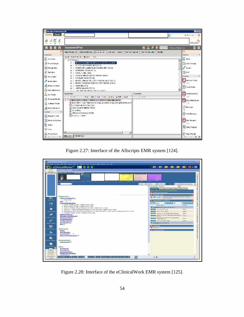
54
Figure 2.27: Interface of the Allscripts EMR system [124].
Figure 2.28: Interface of the eClinicalWork EMR system [125].

55
NextGen Healthcare [113] – The market share of NextGen Healthcare is 7.7%. NexGen’s
ambulatory EMR solution was designed with heavy input from physicians. This software
provides a powerful, intuitive interface that helps reduce errors and maximize efficiency and
accuracy. NextGen also offers revenue cycle management, health information exchange and
patient portal applications [135]. Figure 2.29 shows the interface of NextGen EMR system.
Figure 2.29: Interface of NextGEN EMR system [126].
GE Healthcare [113] – The market share of GE Healthcare is 5.5%. GE is a large company,
and it caters to the needs of large practices. GE’s Centricity EMR is designed to integrate
with practice management software to provide powerful solutions. This system offers
Clinical Messenger to support communication with patients and other practices involved in a
patient’s care [136]. And an interface engine supports the integration of the program with

56
third party systems to share lab reports, billing data, clinical notes and related data. Figure
2.30 shows the interface of GE EMR system.
Figure 2.30: Interface of GE EMR system [127].
2.4.2.2 Common Visualizations in Commercial EMR Systems
One of most frequent visualizations in commercial EMR systems is the flowsheet [111]. It
contains key medical variables for an individual patient over a period of time (e.g., 1 month, 1
week, or 24 hour) and thus highlights abnormal values and changing trends [114] [115]. The
electronic flowsheets are a combination of spreadsheets with line or point plots. The horizontal
axis of plots and the spreadsheet columns using a same timescale. On the vertical axis, variables
are always displayed either as marks in a line or point plot or as numbers in a spread sheet row.
In addition, there are some plots that use different icons along the horizontal time axis to display
medication overview. Abnormal values are also highlighted in the plots and spreadsheets.
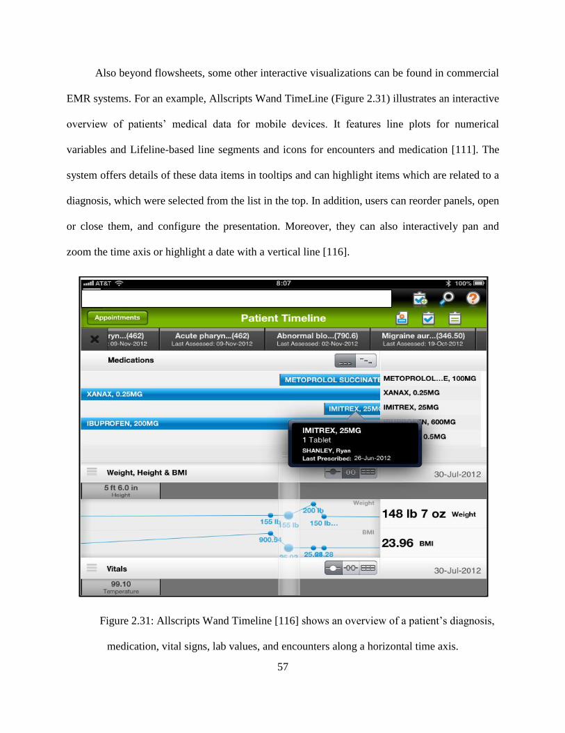
57
Also beyond flowsheets, some other interactive visualizations can be found in commercial
EMR systems. For an example, Allscripts Wand TimeLine (Figure 2.31) illustrates an interactive
overview of patients’ medical data for mobile devices. It features line plots for numerical
variables and Lifeline-based line segments and icons for encounters and medication [111]. The
system offers details of these data items in tooltips and can highlight items which are related to a
diagnosis, which were selected from the list in the top. In addition, users can reorder panels, open
or close them, and configure the presentation. Moreover, they can also interactively pan and
zoom the time axis or highlight a date with a vertical line [116].
Figure 2.31: Allscripts Wand Timeline [116] shows an overview of a patient’s diagnosis,
medication, vital signs, lab values, and encounters along a horizontal time axis.

58
In conclusion, there is some adoption of visualization methods in commercial EMR
systems. It is obvious that the most widely applied visualization technique is flowsheet, which
always use simple line and point plots.
2.4.2.3 IBM Watson and Medical Records Text Analytics
IBM Watson, developed by IBM, is a cognitive system which has the ability to answer questions
posed in natural language. Watson can find and understand the clues in questions by using
machine learning, statistical analysis and natural language processing [120]. In addition, it can
compare and rank the possible answers, and finally give them to users.
With the research collaboration with faculty, physicians and students at Cleveland Clinical
Lerner College of Medicine of Case Western Reserve University, IBM has published two
cognitive technologies which can be used by Watson. The two projects are “WatsonPaths” and
“Watson EMR Assistant”, and they are expected to help health care providers (e.g., physicians,
nurses) to make accurate decisions and find out new insights from EMR.
WatsonPaths
WatsonPaths is a cognitive system that can explore a complex scenario and draw a
conclusion like physicians do in real life [121]. When a medical case is presented,
WatsonPaths can extract important information based on the knowledge it has learned from
professional medical people and from medical literature. When a physician enters a summary
about patient, WatsonPaths takes natural language questions as input and produces possible
answers of most likely diagnosis or most appropriate treatment as output. At first,
WatsonPaths breaks down the input scenario into several pieces of important information

59
(like keywords) with the help of natural language processing as shown in Figure 2.32 (a).
Afterwards, WatsonPaths analyzes such information with the help of machine learning and
represents the solution in a graphical model (flowsheet) as shown in Figure 2.32 (b).
Watson EMR Assistant
IBM is also using Watson to explore how to navigate and process EMRs to find out the
hidden insights within the data. The large amount of health data within EMRs presents huge
value in transforming clinical decision making, but is always difficult to absorb. Watson’s
natural language processing capabilities make it possible to process an EMR with semantic
understanding of the contents. This can help physicians efficiently and quickly extract useful
information from massive amount of complex medical data. The goal of the Watson EMR
Assistant research project is to develop a technology that will collate keywords in the past
medical history and present to the physician a problem list of clinical concerns [121].

60
(a)
(b)
Figure 2.32: Interface of WatsonPaths [121]. (a) WatsonPaths’s medical scenario analytics. (b)
The solution provided by WatsonPaths.
61
Chapter 3. System Design and Implementation
In this chapter, we discuss how we have designed and implemented a set of graphic components
and integrated them into our web-based medical record system. Before introduce our system, we
first propose some requirements and components of an EMR visualization system which are
should be considered in our research. Second, we would like to provide a detailed visual
description of our system, such as features, functions, and the user interface. After that, we give
an overview of our system, including the architecture, benefits and performance of the system.
Finally, some limitations are listed.
3.1 Requirements for Our Visualization System
In previous two chapters, we have discussed some requirements and components of medical
records, EMR and visualization system. They are listed below.
Requirements for Medical Records posed by Hippocrates: (1) It must accurately
reflect the past disease history of a patient. (2) It should help indicate the probable
cause of a patient’s problem.
Primary Components of Medical Records: (1) Personal Identification Information.
(2) Basic Medical Profile. (3) Family Medical History. (4) Diagnosis History. (5)
Treatment History. (5) Medication History. (6) Test result display. (7) Clinical Notes.
Requirements of EMR: (1) costs. (2) Legibility. (3) Accessibility. (4) Big Storage. (5)
Security.

62
Evaluation Criteria of IV: (1) Functionality. (2) Efficiency. (3) Effectiveness. (4)
Usability. (5) Usefulness.
These requirements, components and evaluation criteria are significantly considered in our
research, and we designed and implemented our visualization system based on them. We will
discuss what we have achieved and what remains for future work in the Chapter 5.
3.2 User Interface Design
In this section, we propose our approach to design an intuitive, interactive user interface (UI) and
easy navigation. As the main feature of our system, a clickable 2D human body is placed in the
center of the page to provide a body-centric data layout. Symptoms are labeled with colored
circles, which are the starting point of the interactive navigation. By clicking on these symptoms,
users can easily add, show, and retrieve information. Besides, we also propose how we used
icons and timelines to improve the display of history records and how we used color attributes to
improve the display of blood test results.
3.2.1 Start Page
The start page of our system is shown in Figure 3.1, which is the entry point of our system. This
layout is designed with the help of Bootstrap, which is a popular front-end framework for
developing a friendly user interface on the web. A user login box is placed on the far left of the
page. By using this login box, users can create a new patient’s record or select an existing
patient’s record. Next to the login box, there is a select box, which is used to input the symptom
location information and disease type. Some navigation bars on the right side of the page are
leveraged to link to other pages for further health information. A clickable 2D human body is

63
placed in the center of the page to interactively display health information. Symptoms’ locations
can be marked on this human body and these locations are used as a navigation.
Figure 3.1: Start page of the system: the far left side is a login box, next to the login box is a
select box, the right side is a navigation board, and a clickable 2D human body is placed in the
center of the page.
3.2.2 Patient Information
In this section, we first introduce how to create new records for new patients using our system.
Subsequently, we present how our system displays patient information in an intuitive way.
3.2.2.1 Create a New Record for a New Patient
The registration function is an essential function in any EMR system. There will always be new
patients visiting the physician’s office every day. Before starting the first diagnosis, physicians
need to know patients’ basic individual information and create a new record to store them for the
future visit.
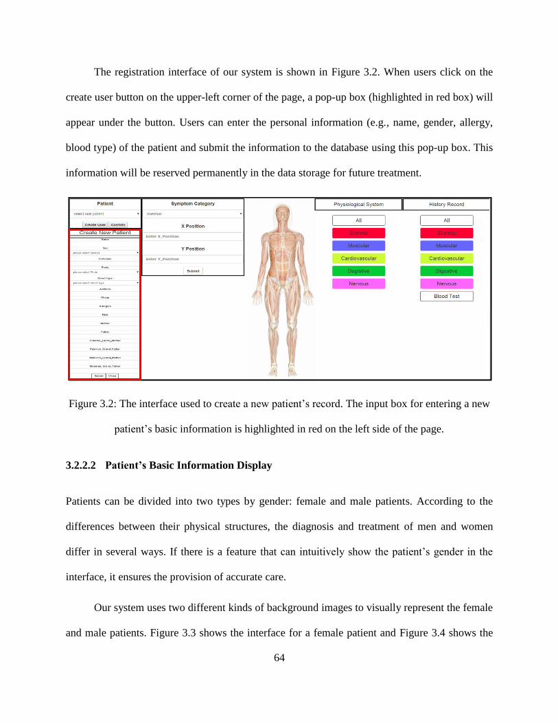
64
The registration interface of our system is shown in Figure 3.2. When users click on the
create user button on the upper-left corner of the page, a pop-up box (highlighted in red box) will
appear under the button. Users can enter the personal information (e.g., name, gender, allergy,
blood type) of the patient and submit the information to the database using this pop-up box. This
information will be reserved permanently in the data storage for future treatment.
Figure 3.2: The interface used to create a new patient’s record. The input box for entering a new
patient’s basic information is highlighted in red on the left side of the page.
3.2.2.2 Patient’s Basic Information Display
Patients can be divided into two types by gender: female and male patients. According to the
differences between their physical structures, the diagnosis and treatment of men and women
differ in several ways. If there is a feature that can intuitively show the patient’s gender in the
interface, it ensures the provision of accurate care.
Our system uses two different kinds of background images to visually represent the female
and male patients. Figure 3.3 shows the interface for a female patient and Figure 3.4 shows the

65
interface for a male patient. Users can distinguish the patient’s gender at a glance, and it saves
time compared to reading the patient’s information.
Figure 3.3: Interface for a female patient [105].
Figure 3.4: Interface for a male patient [106].

66
Individual Information / Basic Medical Profile / Family Medical History – A cumulative
summary of patients’ basic information must be maintained and displayed in each EMR system’s
interface. The “snap shot” of the patient generally contains his/her individual information, basic
medical profile, family medical history, and others. These kinds of information allow physicians
or other healthcare professionals to quick get a picture of the patient’s overall health condition.
Our system supports a table (highlighted in the red box on the left side of Figure 3.3 and the left
side of Figure 3.4) to provide a quick patient information display. Furthermore, we also use an
angle-double-up button to hide the information and an angle-double-down button to show the
information, which can raise the utilization ratio of interface spaces.
In the following section, we introduce our system with a default 2D human body, as
shown in Figure 3.1.
3.2.3 Five Physiological Systems
The human body consists of many physiological systems. Each system consists of two or more
organs and contributes to the maintenance of the homeostasis of itself, of other systems, and of
the entire body. Classifying diseases according to different physiological systems could be a
good way to display medical records.
Five physiological systems (skeletal, muscular, cardiovascular, digestive, and nervous
systems) are used in our system to visually represent health data, as shown in Figure 3.5. With
the help of these rich, detailed anatomical figures, our system offers a novel way to manage and
visualize health information. These body images allow users insert and retrieve patients’ health
records in an intuitive and interactive way.
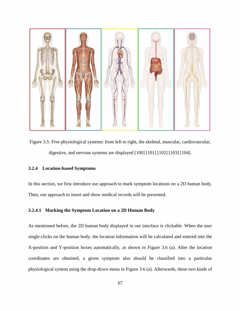
67
Figure 3.5: Five physiological systems: from left to right, the skeletal, muscular, cardiovascular,
digestive, and nervous systems are displayed [100] [101] [102] [103] [104].
3.2.4 Location-based Symptoms
In this section, we first introduce our approach to mark symptom locations on a 2D human body.
Then, our approach to insert and show medical records will be presented.
3.2.4.1 Marking the Symptom Location on a 2D Human Body
As mentioned before, the 2D human body displayed in our interface is clickable. When the user
single-clicks on the human body, the location information will be calculated and entered into the
X-position and Y-position boxes automatically, as shown in Figure 3.6 (a). After the location
coordinates are obtained, a given symptom also should be classified into a particular
physiological system using the drop-down menu in Figure 3.6 (a). Afterwards, these two kinds of

68
data will be transmitted to the database by clicking on the submit button. As soon as the data are
inserted into the database, the interface will load the information automatically and display the
symptom on the 2D human body with a circle (Figure 3.6 (b)). In order to provide an intuitive
and quick way to distinguish the problem type, our system uses different colors to label different
physiological system symptoms. Similarly, each physiological system has a corresponding
colored navigation button that maps to the corresponding circle. This is illustrated in Figure 3.1.
Moreover, to provide better interactive visualization, we applied different kinds of mouse events
to show health information. To be more specific, single-clicking on a colored button (Figure 3.1)
provides user with an easy way to navigate to a corresponding physiological system page (Figure
3.7). To support more intuitive navigation, the system also allows users to double-click on
colored circles to achieve the same effect (Figure 3.7).
Figure 3.6: (a) Record a new symptom, including its location information and symptom type. (b)
Symptom locations are labeled with colored circles.

69
Figure 3.7: (a) All kinds of the problems are displayed on the home page. (b) Only skeletal
problems are displayed on the skeletal system page. (c) Only muscular problems are displayed
on muscular system page. (d) Only cardiovascular problems are displayed on the cardiovascular
system page. (e) Only digestive problems are displayed on the digestive system page. (f) Only
nervous problems are displayed on the nervous system page.
3.2.4.2 Insert Medical Records for Specific Symptoms
Intuitive and interactive navigations are provided in our system to allow users to quickly input
records of each symptom. For each symptom, users can click on the symptom locations to enter
health records since all the insert functions are integrated in each symptom.
Clicking on a symptom location (Figure 3.8 (a)), a corresponding pop-up box will appear,
as shown in Figure 3.8 (b). Basic symptom information and some navigation buttons are
included in this pop-up box. The brief symptom description allows the physician to have a

70
preliminary understanding of the symptom. Users can use these buttons to navigate to a
corresponding interface to add new records, show the latest records, and check the history
records. For example, when a user clicks on the add diagnosis button, a pop-up input box
(different border color indicates different type of physiological systems) will appear, as shown in
Figure 3.9 (a). In this input box, users can input the ICD number, severity and symptom
descriptions, and clinical notes. After submitting this information, it will be transmitted to the
database and stored permanently for future works. The addition of treatment information and
medication information are also designed and implemented in the same way (Figure 3.9 (b) and
Figure 3.9 (c)). Moreover, the system also provides an upload function to allow users to upload
the scanning results, as shown in Figure 3.9 (d).
Figure 3.8: (a) Symptoms are labeled with colored circles and displayed on the human body. (b)
A pop-up box, which will appear when clicking on a symptom location, is used to add, display,
and retrieve medical records.

71
(a) (c)
(b) (d)
Figure 3.9: The red border means this pop-up box belongs to skeleton problems: (a) A pop-up
input box used to insert diagnosis information. (b) A pop-up input box used to insert treatment
information. (c) A pop-up input box used to insert medication information. (d) A pop-up input
box used to upload scanning images and insert related notes.

72
(a)
(b)
(c)
Figure 3.10: The red border means this pop-up box belongs to skeleton problems: (a) A pop-up
box for displaying the latest diagnosis information. (b) A pop-up box for displaying the latest
treatment information. (c) A pop-up box for displaying the latest medication information. (d) A
pop-up box for displaying the latest scanning results.
3.2.4.3 Showing the Latest Medical Records for Specific Symptoms
Our system also provides a quick way to display each symptom’s latest medical records. Users
can click on the latest diagnosis button (Figure 3.8 (b)) to look over a symptom’s latest
(d)

73
diagnosis. As soon as the button is clicked, a pop-up display box will appear to show the detailed
information of the symptom’s latest diagnosis, as shown in Figure 3.10 (a). The display of
treatment information, medication information, and scanning results is also designed and
implemented in this way, as shown in Figure 3.10 (b), Figure 3.10 (c), and Figure 3.10 (d). And
different border color indicates different type of physiological systems.
3.2.5 Timeline-based and Icon-based History Records
The history record is an essential component of any medical record system. In medical records, a
patient’s history includes all past medical information, such as diagnosis records, treatment
records, scanning results, blood test results, and so on. In our system, this information is
illustrated interactively and intuitively with a combination of icons and a timeline, as shown in
Figure 3.11. In contrast to existing systems, the icons we used here are clickable. Each icon has
colored border and the color is used to indicate which physiological system it belongs; users can
recognize the information of interest at first glance of the icons, and click on them for details.
Figure 3.11: Icon-based and time-line based history record display.

74
Figure 3.12: The full page of history records. Navigation buttons and icons are placed on the
upper part of the page, which can be clicked to filter medical data.
Some navigation buttons and icons are placed on the upper part of the full history record
page (Figure 3.12). Users can click on these buttons to filter out unwanted information and
obtain what they wanted. This will be explained in detail below.
Diagnosis button or icon: All diagnosis history for all symptoms will be obtained by
clicking on this button (Figure 3.13 (a)).
Treatment button or icon: All treatment history for all symptoms will be obtained by
clicking on this button (Figure 3.13 (b)).
Medication button or icon: All medication history for all symptoms will be obtained by
clicking on this button. (Figure 3.13 (c)).
Scanning button or icon: All scanning history will be obtained by clicking on this button
(Figure 3.13 (d)).
Blood test button or icon: All blood test history for all symptoms will be obtained by
clicking on this button (Figure 3.13 (e)).

75
Skeletal button or icon: A patient’s full history of skeletal problem will be obtained by
clicking on this button (Figure 3.14 (a)).
Muscular button or icon: A patient’s full history of muscular problem will be obtained by
clicking on this button (Figure 3.14 (b)).
Cardiovascular button or icon: A patient’s full history of cardiovascular problem will be
obtained by clicking on this button (Figure 3.14 (c))
Digestive button or icon: A patient’s full history of digestive problem will be obtained by
clicking on this button (Figure 3.14 (d)).
Nervous button or icon: A patient’s full history of nervous problem will be obtained by
clicking on this button (Figure 3.14 (e)).
In order to improve our filtration and navigation systems, we also connect the symptom
location to the history records. Users can click on five history navigation buttons in Figure 3.8 (b)
to navigate to the history record page to check the corresponding history information they want.
Diagnosis history button: All diagnosis history for on symptom will be displayed.
Treatment history button: All treatment history for one symptom will be displayed.
Medication history button: All medication history for one symptom will be displayed.
Scanning history button: All scanning history for one symptom will be displayed.
All history button: All kinds of history for one symptom will be displayed.
After filtering out unwanted data and obtaining what they want, users can click on the
icons display in the timeline to review the detailed history records. (Figure 3.15).

76
(a)
(b)
(c)
(d)
(e)
Figure 3.13: (a) All diagnosis history for all symptoms. (b) All treatment history for all
symptoms. (c) All medication history for all symptoms. (d) All scanning history for all
symptoms. (e) All blood test history for all symptoms.
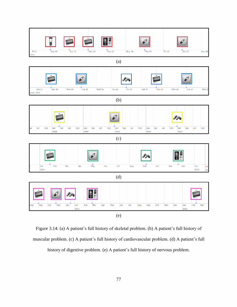
77
(a)
(b)
(c)
(d)
(e)
Figure 3.14: (a) A patient’s full history of skeletal problem. (b) A patient’s full history of
muscular problem. (c) A patient’s full history of cardiovascular problem. (d) A patient’s full
history of digestive problem. (e) A patient’s full history of nervous problem.

78
Figure 3.15: Information displayed by clicking on the icons. The border color for each icon
indicates which physiological system it belongs to.
3.2.6 Color-based Blood Test Display
Blood testing involves a laboratory analysis performed on a blood sample and is often used in
healthcare to determine physiological and biochemical states. Conventional blood test results
displays use a monotonous table format and text, making it difficult to determine whether the
index is normal.
In our system, the abnormal index is highlighted in red and can thus be easily noticed
(Figure 3.16). We also provide a way to monitor the trend by clicking on the specific index
because this changing trend can help physicians better understand a patient’s health condition.

79
This is illustrated in Figure 3.17. The index trend is represented by a line graph with red and blue
spots to mark abnormal and normal results, respectively. In our future work, we can also use this
kind of method to display other types of test results.
Figure 3.16: Display of blood test results. A table of three sets of blood test results for the same
individual. Red highlighting is used to indicate an abnormal index.
Figure 3.17: Display of blood test results. Graph-based visualization of the trend of each index in
the past three tests. The red spot shows abnormal results; blue shows normal results.

80
3.3 System Implementation Overview
In this section, we provide an overview of our system’s implementation from the following three
perspectives. First, we present the architecture of our system. Second, we demonstrate some
benefits of web-based systems. Finally, we explain how we optimized our system’s performance.
Figure 3.18: System architecture.
3.3.1 System Architecture
Our system is a web-based system. It is designed and implemented on the basis of the client-
server framework. The overall architecture of our system is illustrated in Figure 3.18. It consists

81
of two major parts: a client (user) stub and a server stub. The client stub involves the following
components: input, input parser, a client-side web service interface, visual processing engine,
and a visual display interface. These components are implemented by display and visualization
technologies (e.g., HTML, CSS, JavaScript, jQuery, Ajax, Bootstrap, and D3.js). Accordingly,
we leverage Java, Java EE, and a MySQL database to implement the server stub components,
including a server-side web service interface, a database extractor, and database storage. Finally,
the communication between the client stub and the server stub is over the Simple Object Access
Protocol (SOAP) web service, and the data transmission format we used is JSON.
To better understand the working process of our system, it is necessary to know the
principle and functions of the components and the related technologies that were applied. In the
following contents, the components and technologies are described in detail.
Input: This is the entry point of the whole system, and all interactions between the user and
the system occur in this component. It provides users the capacity to enter, edit, delete, and
visualize data with interactive devices, such as a keyboard, mouse, and others.
Input Parser: The Input Parser receives data (e.g., textual information, mouse commands)
from the input component and then analyzes them to obtain the true meaning of the sentence.
These parsed and extracted data play an important role in improving the system’s
performance.
Client/Server Web Service Interface: These two interfaces are the essential parts of our
system. They are used to ensure that the web service is working under a stable and safe
environment. Moreover, they are also responsible for matching the request from the client
side and the response from server side.
82
Information Extractor: This component is used to filter numerous types of complex data
and extract useful information from it. The information extractor organizes and structures the
data.
Database (MySQL): Medical records are stored in forms of schemas, tables, queries, and
views in the database component. In our system, we constructed our storage with the help of
MySQL since it is an open-source relational database management system and a popular
choice of database for use in web applications. The medical code ICD is also stored in the
database. The entity-relationship (ER) model of our database is shown in Figure 3.19.
Visualization Engine: This is the component that is mainly responsible for visualizing data
extracted from the database. Most of the visualization techniques and toolkits are applied
here, such as HTML, CSS, JavaScript, jQuery, D3.js, and others.
Visual Display Interface: This is the user interface that is used to show the ultimate
visualization outcomes, such as images, charts, timelines, and etc. This interface also allows
users to easily, quickly, and intuitively access our system with some interactive
functionalities.
SOAP: Our web service is implemented with the Simple Object Access Protocol (SOAP). It
is a protocol specification for exchanging structured information in the implementation of
web services in a web application. In our system, the SOAP web service interface provides
the simplified communication between the client and server stubs.
JSON: JSON is an acronym for JavaScript Object Notation, is an open standard format that
used human-readable text to transmit data objects consisting of attribute-value pairs. It is
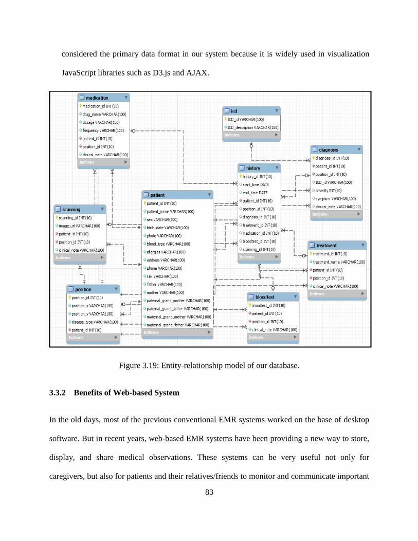
83
considered the primary data format in our system because it is widely used in visualization
JavaScript libraries such as D3.js and AJAX.
Figure 3.19: Entity-relationship model of our database.
3.3.2 Benefits of Web-based System
In the old days, most of the previous conventional EMR systems worked on the base of desktop
software. But in recent years, web-based EMR systems have been providing a new way to store,
display, and share medical observations. These systems can be very useful not only for
caregivers, but also for patients and their relatives/friends to monitor and communicate important

84
health information (long-term goal). In this section, we are to present some advantages with web-
based systems.
Convenient: Web-based system gives physicians an opportunity to access the system from
anywhere with an internet connection at any time and allows physicians easily to add, insert,
modify, update, and delete patient records just by using a simple web browser (e.g., Internet
Explorer, Chrome, Firefox, and Safari).
Safe: With traditional software, physicians save data on their computers, USB drives, or
portable hard drives. This is not as safe as it sounds. These devices can be stolen, and
computers are rarely backed up properly; it is unlikely that everyone’s machines are up to
date with the latest security patches and updates. But, with a web-based system, medical data
are stored on secure, always updated, backed up daily enterprise-class servers in a state-of-
the-art, highly-secure data center.
Everything together in one place: A key advantage of web-based system is that all the data
are centralized and accessible over the internet from any computer at any time because of the
server is shared by these users and all the users can access this server simultaneously. You
can get to it from anywhere.
Cross-platform: Software used to only be available on certain platforms, e.g., Windows
software, Mac software, Linux software, UNIX software. Web-based system works on any
platform with a web browser and internet connection. Mac, Windows, and Linux are all
supported.
Always using the latest and greatest: Unlike conventional software that requires you to
download and install updates yourself, web-based system can be updated automatically as
85
long as you are internet connected. Whenever you use web-based system, you are always
using the latest and greatest version.
3.3.3 System Performance Optimization
Navigating through a large amount of graphical data with a simple web browser can be difficult.
Since the data all reside on the server side, it is important for us to minimize the exchange of
graphical data (e.g., charts, images) between the server and browser in order to maintain good
application performance and to continue to offer a good user experience (UX). A combination of
techniques such as caching and dynamic data upload can be used at runtime to solve this problem.
Furthermore, it is better to try to render the graphic views or images on the client than sending
large amounts of graphic data across the network between the server and the client.
To solve the problem mentioned above and improve the system’s performance, it is
necessary to design a graph container that can meet the following requirements:
Parse the data and render a graphic view on the client side, rather than sending more graphic
data across the network between the client and server.
Minimize the exchange of data between the browser and server in order to maintain better
system performance.
Easily add, remove, or modify a particular data visualization module.
Provide features at runtime to offer pluggable rules to compare data between observation
types.
In our system, we have implemented the visualization engine in the client stub to reduce
the graphic data exchange between the server and client, as shown in Figure 3.18. This plays an

86
important role in improving the system’s performance and provides a better UX. Moreover, by
using a combination of popular web technologies and libraries, such as HTML, HTTP Request
(GET/POST), JavaScript, jQuery, JSON, D3.js, and other graphic components on the client side,
we managed to make our system more responsive than conventional EMR systems.
3.4 Limitations
The main limitations of our system are listed below.
Five categories of physiological systems are involved in our EMR visualization system to
help user to distinguish diseases. But they are still too general and not enough to cover all
diseases. For example, some health problems cannot be visually represented by using these
five physiological systems, such as mental problem, skin cancer and others.
Some functions are integrated in our system to allow users to enter, display and retrieve
medical records. But our system does not have an analysis function to help users to analyze
medical data. A good data analysis function can enable physicians to discover the insight of
the data set to provide patients a better health care. This is one of our shortcomings.
Only a limited number of 2D images are available in our system. For example, some diseases
might be located at the back of the body, but our system only supports the front view of a 2D
human body. Multiple 2D views (like back body) can help users to mark symptom locations
more accurately.
A patient’s basic information is displayed in the user interface, such as personal identification
information, basic medical profile and family medical history. But they are still too simple

87
and insufficient to know a patient well. For example, the history of infectious diseases is not
showed in our system.
As our goal is to propose a prototype, the security and storage were not handled well in this
EMR. For example, the storage capability is not big enough and the database structure is too
simple, which limits the scalability of the system.

88
Chapter 4. Discussion
In this chapter, we first to check if our system satisfies the requirements of EMR system we
mention in Chapter 2. After that we present the comparison between our prototype system and
other EMR systems. Finally, some comments and suggestions from medical professionals are
also illustrated.
4.1 Requirements Check
In the Section 3.1, we have discussed requirements, components and evaluation criteria of our
visualization prototype system. They are considered during our UI design. In the following
contents, we discuss what we have achieved and what are still remains for future work.
Requirements for Medical Records posed by Hippocrates:
It should accurately reflect the patient’s past disease history
We have achieved this goal. The history record has been illustrated interactively and
intuitively with a combination of icons and a timeline (Section 3.2.5).
It should indicate the probable cause of his/her disease
This is not achieved in our system, although we have provided many functions, such as
history record display, blood test result display and latest record display, etc. This is part of
our future work.
Primary Components of Medical Records:
Personal Identification Information

89
This information is organized and displayed in our system (Section 3.2.2).
Basic Medical Profile
This information is organized and displayed in our system (Section 3.2.2)
Family Medical History
This information is organized and displayed our system (Section 3.2.2).
Diagnosis History
This information is displayed with icons and timeline in the history record (Section 3.2.5).
Several functions are provided in our system to quickly add and display diagnosis data, such
as “add diagnosis” function, “show latest diagnosis” function and “display diagnosis history”
function, as shown in Figure 3.8 (b) and Figure 3.9.
Treatment History
This information is organized and displayed with icons and timeline (Section 3.2.5). Several
functions are provided in our system to quickly add and display treatment data, such as “add
treatment” function, “show latest treatment” function and “display treatment history”
function, as shown in Figure 3.8 (b) and Figure 3.9.
Medication History
This information is displayed with icons and timeline in the history record (Section 3.2.5).
Several functions are provided in our system to quickly add and display medication data,
such as “add medication” function, “show latest medication” function and “display
medication history” function, as shown in Figure 3.8 (b) and Figure 3.9.
Requirements of EMR:

90
Costs
We used many open-source technologies and toolkits to reduce our spending, such as HTML,
MySQL, JavaScript, D3.js and others. The running costs are also minor as users do not
require any special equipment to access the system. Just a simple internet browser is enough
for running this prototype system.
Legibility
As the large number of medical data is displayed with intuitive, interactive and meaningful
graphics and images, we suspect the readability to be good, but this needs to be tested
formally.
Accessibility
Web-based system gives users an opportunity to access the system from anywhere with an
internet connection at any time and allows physicians easily add, insert, modify and update
medical records just by using a simple web browser.
Storage
Though we have increased the storage capability by using MySQL database, the memory
space is still not enough for storing the full medical data of a health organization. In the
future work, our system’s storage capability can be increased through more advanced storage
devices.
Security

91
Since we put more focus on the visualization part, the security has not been seriously treated
in this thesis. In the future work, we can improve the system security in several ways, such as
installing the data service in data layer, deploying a firewall and controlling the accessibility.
Review Criteria of IV:
Functionality- To what extend the does the system provide the functionalities required
by the users?
There are many functions provided by our system for adding and displaying medical records,
such as “add diagnosis” function, “add treatment” function, “add medication” function, “add
scanning result” function, and “show history” function. In addition, a quick navigation
function was provided in our system. Users can click on a symptom location to navigate to
the corresponding physiological system.
Efficiency- To what extend may the visualization help users achieve a better performance?
Many different kinds of mouse events have been applied on the symptom location of human
body to provide quick inputting and navigating. This allows users to quickly add, retrieve and
obtain useful information in a short time. Moreover, icon-based history record visualization
makes a user understand the patient medical history in a glance, which also improves user’s
working efficiency.
Effectiveness- Do the visualizations provide value? Do they provide new insight?
We have divided the disease into five categories of physiological systems. Users can easily
and quickly understand the disease and discover the insight of it with the help of color
attributes and physiological system images.

92
Usability- How easily can users interact with the system? Is the information provided in
clear and understandable format?
In our system, a clickable 2D human body is placed in the user interface to support good
interaction. Users can click on the body to mark the symptom location and enter and show
medical data. In addition, interactive timelines and icons are also provided to enhance the
interaction between users and system. Moreover, meaningful icons can help users to
understand the basic idea of the information in a glance.
Usefulness- Are the visualizations useful? How may we benefit from them?
The location-based symptom visualization can be very helpful for physicians to treat trauma
patients since they suffer from pain in multiple locations of body (comment from medical
people). In addition, the timeline-based and icon-based history record visualization might be
very useful in emergency room, because physicians can quickly retrieve and obtain the
patient’s previous medical history in a short time (comment from medical people).
Furthermore, this system perhaps also can be used by patients and their relatives and friends,
because they can easily access the system and understand the health problem with graphics-
based and image-based visualization (comment from medical people).
4.2 Comparison with Other Systems
As we have mentioned in Section 2.3.6.1, information visualization systems can be compared by
their interactive features. Interaction is an integral part of information visualization and
contributes many benefits of EMR visualization systems. Many interaction techniques are
implemented by the systems we have introduced in Chapter 1 and Chapter 2. Therefore, we use

93
the user intent model proposed by Yi et al. [107] to compare our system with other EMR
visualization systems. This categorization focuses on “what a user wants to achieve” and
describes an interaction technique by one of seven user intents (see below). In order to provide
an objectively comparison, we use the model with 20 sub-intent categories which are referenced
from [111]. The comparison result is shown in Table 1.
1) Select: Mark a subset of the dataset as interesting.
To keep track of selected items for a short term while the visualization is changed
To manage groups, for example adding or removing patients to groups
2) Explore: Show a different part of the dataset.
To navigate in time (e.g., panning and zooming the time axis)
To add or remove parameters to the visualization
To add or remove patients to the visualization
3) Reconfiguration: Rearrange the visual layout of the dataset.
By repositioning items manually (freely or by some constraints)
By sorting items along an axis
By other adjustments of an axis (e.g., alignment to a relative timescale, distortion to
see some items in focus and some in context)
By applying another technique to avoid occlusion (e.g., 3D camera movement)
4) Encode: Change the way each item of the dataset is represented.
By switching to a different visualization technique or opening it in a new view

94
By varying visual encoding (e.g., map outcome to item color, encode severity as item
size)
5) Abstract/Elaborate: Show less or more detail.
By abstraction of one or more parameters (e.g., abstraction of a series of temperature
readings over 37.5C into a period of fever or subsuming different medication as beta-
blockers)
By temporal data binning (e.g., aggregate parameter values either by fixed time
intervals or for as long as they have the same value)
By showing details of items (e.g., in a tooltip)
6) Filter: Show ore highlight something conditionally.
By patient status without considering time or development over time
By development overtime like event sequences (e.g., surgery after stroke) or value
trends (e.g., increasing cholesterol) without time constraints
By time constraints (e.g., relapse within 3 weeks after discharge, surgery in May 2009)
7) Connect: show related data.
To show patient/patient group relationship
To brush items in other representations
To brush items for other variables at the same point of time or of the same patient

95
Table 1: Comparison with other systems (compared by their interactive features).
Ou
r Sy
stem
Lifelin
es
Lifelin
es2
KN
AV
E-II
Mid
ga
ard
Visu
Ex
plo
re
Fiv
eWs
No
:US
20
09
/01
928
3 A
1
No
:US
20
11
/01
618
54
A1
●: Full support
○: Partial support
×: No support
● × ● × ● ● ● ● ● Keep track Select × × ● × × × × × × Manage groups
● ● ● ● ● ● ● ● ● Navigate in time Explo
re
● ● ● ● × ● ● ● ● Add/Remove parameters
○ ○ ● × × × ● × × Add/Remove patients
● × × × ○ ● × × × Reposition items manually Reco
nfig
ure
● × ● ● × ○ ● ● ● Sort items
● × ● ● ● ● ● ● ● Adjust axis
× × ● × × × × ○ ● Development with time constraints
● × ● ● ● ● ● ● ● Switch representation technique E
nco
de
● ● ● × × × ○ ● ● Vary visual encoding
× ● × × ● ● × × × Parameter abstraction Abstra
ct/Ela
bo
rate
× ● ● ● ● × × × × Temporal data binning
● ● ● ● ● ● ● ● ● Show details of items
● ● ● × × × ● ● ● Patient status
Filter
● × ● × × × ● ● ● Development over time
× × ● × × × ● × × Development with time constraints
× × × × × × × × × Patient/group relationship Co
nn
ect
● × ● × × × ● ● ● Brush in other representation
× × × × × × ● × × Brush in other parameters
96
Although all systems are designed and implemented for interactive exploration, the depths
and foci in respect to user intents differ as shown in Table 1.
The Select intent, marking some items as interesting, is supported by most of the systems.
Selection is always considered as a way for users to perform additional manipulations on the
selected data. Most of the systems, including our system, allow users to keep tracking of items in
a short time when visualization is changed. However, as shown in Table 1, only Lifelines2
provides features to allow users manage patients’ data in groups.
The Explore user intent plays an important role in most of the systems. Table 1 shows that
all systems support navigation in time. Panning and zooming the time axis are the most popular
interaction techniques for navigating. Some systems (e.g., Midgarrd, VisualExplore) do not
allow users to add or remove patients and some systems (like Lifelines2 and Five Ws) allow
users to add and remove patients. Our system recently only allows users to add patients.
The Reconfigure intent is to allow users to rearrange the visual layout of the dataset based
on the chosen visualization method. This goal is well achieved in our system. Our system allows
users reposition items (e.g., dragging icons), and sort items along time axis, and show items they
wanted (filter functions). Other systems (e.g., Five Ws, Lifelines2 and US2011/0161854A1) also
offer some functions to enable users rearrange items. But Lifeline does not achieve this goal.
The Encode user intent allows user to change the way the data is represented. This goal is
well achieved by most of the systems. VisualExplore and Midgaard provide different visual
representation techniques to display numerical data, such as line plot, semantic zoom chart and
bar chart. Lifelines2 includes a histogram display and parallel coordinates plot. Our system also

97
uses different physiological systems to display different kinds of diseases and also applies color
attributes and line plot to show blood test results.
The Abstract/Elaborate user intent plays an important role in the reviewed systems. As
shown in Table 1, all of the systems provide functions to show details about items. Parameter
abstraction and temporal data binning are always used to fit large data volumes in the display or
make them easier to understand. Only Lifelines and Midgaard satisfy these two categories.
The Filter user intent can show or highlight something important to physicians, and this
can help them quickly extract useful information. This interaction technique is very helpful
because most of the EMR systems work with large number of medical data. Some systems (e.g.,
Midgarrd, VisualExplore) do not support good filter functions. Five Ws and Lifelines2 are
integrated with advanced filter functions, and their search functions can highlight all items with
an implicit relationship with the search term. Our system and two patents (US2009/019283A1
and US2011/0161854A1) are all satisfied two of the three categories. Although we have
provided filter functions to users to extract history records, they are still too simple. In our future
work, we should support more complex queries to search more detailed information.
The Connect intent, which is used to show related items, is not well supported by these
systems. The search function of Lifeline shows that their medical data contains some
relationships, for example, tests and medications are linked to diagnoses. In our system, all
diagnoses and treatments and test results are linked to a specific location of human body. Five
Ws systems and two patents (US2009/019283A1 and US2011/0161854A1) also linked health
problem to body locations. However, the relationships were not well illustrated in other
visualization systems.

98
Table 2: Comparison with other systems (compared by items).
Items
Ou
r Sy
stem
Lifelin
e
Lifelin
e2
KN
AV
E-II
Fiv
e Ws
Allscr
ipts
No
: US
20
09
/01
92
83
A1
No
: US
20
11
/01
61
85
4A
1
Clickable
human body Yes No No No Yes No Yes Yes
Symptom
location Yes No No No Yes No Yes Yes
Timeline Yes Yes Yes Yes No Yes Yes Yes
Icon Yes No No No No No No No
Amount of
text Little A lot A lot A lot A lot A lot Little Little
Navigation
By
clicking
human
body
By using
button
By using
button
By using
button
By using
button
By using
button
By
clicking
human
body
By
clicking
human
body
History
record
With
timeline
and
icons
With
text in
tables
With
text in
tables
With
text in
tables
With
text in
tables
With
text in
tables
Line
trend
segment
Line
trend
segment
Physiological
systems Yes No No No No No No Little
Color
attributes Yes Yes Yes Yes Yes Yes No No
Line plot Yes Yes Yes Yes Yes Yes No No
Point plot Yes Yes Yes Yes Yes Yes Yes Yes
Mobile device No No No No No Yes No No
Interact with
other systems No No Yes No No Yes No No
We also compared our prototype system with other EMR systems by items as shown in
Table 2.

99
Five Ws system [18], two patents (US2009/019283A1 [117] and US2011/0161854A1
[118]), and our prototype system all integrate a human body in the interface to provide body-
based medical record visualization. In addition, our system and the two patents also allow users
to click on the body to navigate more detailed health information. By contrast, other systems use
buttons to navigate.
Most of the systems offer timeline-based medical record display. In addition to this, in our
system, icons are also integrated into a timeline to provide icon-based and timeline-based history
record display. Other systems mainly support text-based and table-based history record display.
By integrating body-centric data display and icon-based and timeline-based history record
visualization, our system and the two patents (US2009/019283A1 and US2011/0161854A1)
interface contain less text compared to text-based and table-based systems.
Almost all systems (except the two patents) use colors to indicate normal or abnormal
health condition, and all systems offer line and point plots to show changing trends.
Different from others, our system and a patent (US2011/0161854A1) use some
physiological systems to distinguish health problems and diseases.
Some systems can interact with other systems such as Lifelines2 and Allscripts. This
should be considered in our future work.
4.2.1 Comparison between Five Ws and Our System
There are some similarities and differences between the Five Ws system [18] and our prototype
system. Both of Five Ws and our system provide a body-centric medical data layout and allow
users to click on the body to mark symptom locations. However, there are still some differences

100
between these two systems. Our system allows users clicking on the symptoms to navigate to
corresponding page for detailed information, but the symptoms in Five Ws are not clickable. And
our system also provides five physiological systems (e.g., skeletal system, muscular system) to
distinguish different kinds of symptoms. In addition, Five Ws still use lots of textual data to
present medical records, but our interface integrates fewer texts. Moreover, our system offers
timeline-based and icon-based history record display, but Five Ws applies many line segments to
show this information.
4.2.2 Comparison between Two Patents and Our System
There are some similarities and differences between our system and two patents
(US2009/019283A1 [117] and US2011/0161854A1 [118]). All these three systems use little text,
and offer a clickable body to display medical records, but only our use color to convey structure
and establish identity of our five physiological systems. The patent (US2009/019283A1)
provides 2D and 3D human bodies, but our system and the patent (US2009/019283A1) only
provide 2D body images. Our system and the patent (US2011/0161854A1) provide several
physiological systems (e.g., skeletal system, muscular system), but the patent
(US2009/019283A1) does not. Our system uses color to establish identity such as colored border
to indicate which physiological system a symptom and medical history belongs, but other two
patents have no use of color. Both our system and the patent (US2011/0161854A1) distinguish
different diseases into different physiological systems; users can click on circles to see detailed
information. However, in the patent (US2009/019283A1), the circles are only used to show
outcome of diagnosis (e.g., good, bad, unknown). All systems provide timeline-based history
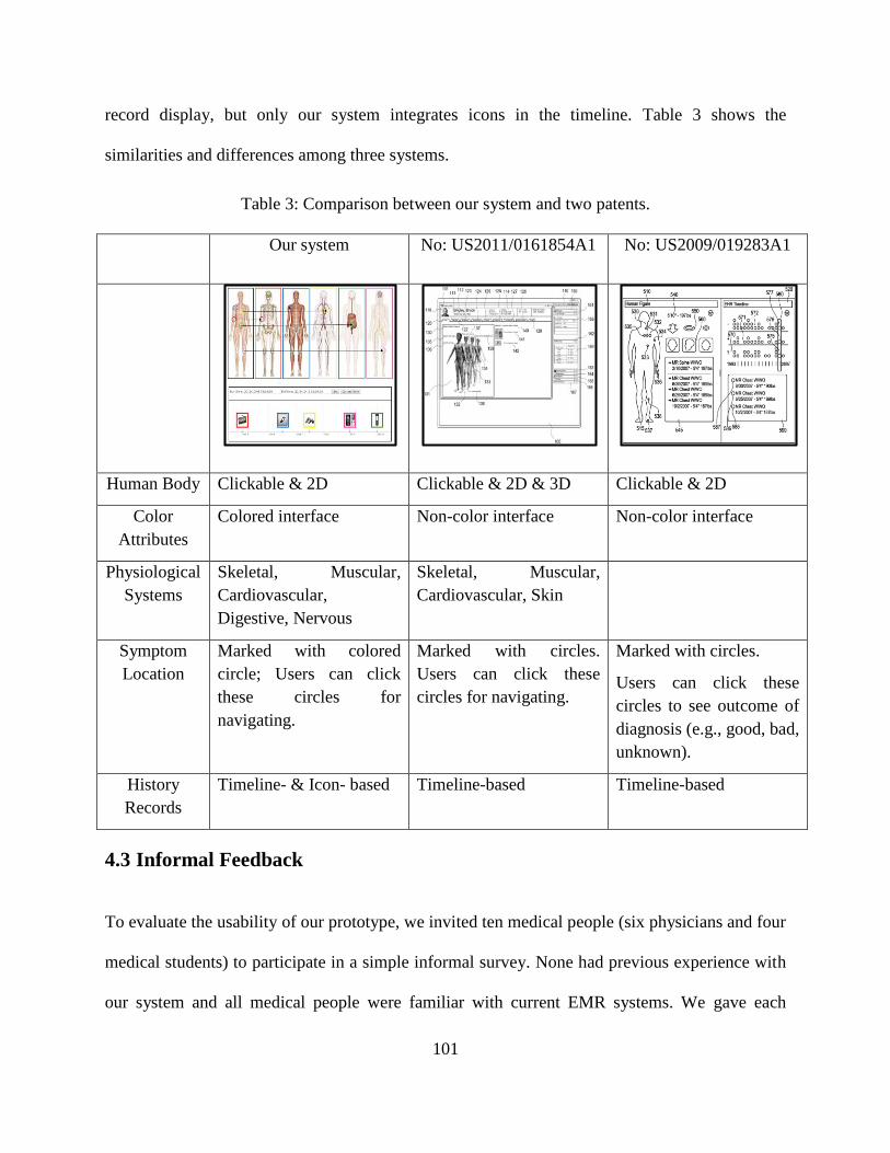
101
record display, but only our system integrates icons in the timeline. Table 3 shows the
similarities and differences among three systems.
Table 3: Comparison between our system and two patents.
Our system No: US2011/0161854A1 No: US2009/019283A1
Human Body Clickable & 2D Clickable & 2D & 3D Clickable & 2D
Color
Attributes
Colored interface Non-color interface Non-color interface
Physiological
Systems
Skeletal, Muscular,
Cardiovascular,
Digestive, Nervous
Skeletal, Muscular,
Cardiovascular, Skin
Symptom
Location
Marked with colored
circle; Users can click
these circles for
navigating.
Marked with circles.
Users can click these
circles for navigating.
Marked with circles.
Users can click these
circles to see outcome of
diagnosis (e.g., good, bad,
unknown).
History
Records
Timeline- & Icon- based Timeline-based Timeline-based
4.3 Informal Feedback
To evaluate the usability of our prototype, we invited ten medical people (six physicians and four
medical students) to participate in a simple informal survey. None had previous experience with
our system and all medical people were familiar with current EMR systems. We gave each

102
participant a 10-minute tutorial on our system. The tutorial covered the idea behind the layouts,
as well as the basic functions, including the insert and filter functions. Finally, we received some
feedback from medical people to help us to improve our system in the future.
All participants felt that users could quickly and easily retrieve medical records by using
our system, since the system provides different kinds of navigations such as symptom location-
based navigation, icon-based navigation and others. In addition, three medical students also
thought that even beginners could become familiar with it in a short time.
Eight medical people (six physicians and one medical student) showed great interest in the
location-based symptom display, and five physicians among them thought it would be helpful for
physicians to treat trauma patients since they suffer from multiple locations. However, the other
two participants said that it may be not necessary for certain health problems like endocrine
problems.
Seven participants (three physicians and four medical students) said that they liked the
graphics-based visualization, as they can locate the desired information at a glance, and even
beginners could likely retrieve data quickly. In addition, two medical students thought that the
images and graphics would affect their mental map because it is easy to figure out where
everything is. But on the other hand, three physicians said that they had already gotten used to
texts and tables, and that graphics would make them uncomfortable.
All medical people believed that the five categories of physiological systems are helpful
for obtaining a better understanding of health issues because they can illustrate problem in more
detail. This could be helpful for health care providers to treat patients. Two physicians also
thought that more user testing would be required to determine whether this categorization is

103
effective. Three physicians and two medical students also believed that these five categories are
still too general, and that there should be more categories, such as endocrine system, immune
system, urinary system and others.
All medical people said that our prototype system has provided a good way to display
medical histories and also believed that the icon-based and timeline-based display could save
them time compared to the text-based records they use. Four physicians and two medical
students said that timeline is an interesting function and they liked it, because it can be zoomed
and dragged which could help physicians to quickly retrieve history records. In addition, two
physicians and two medical students also thought that the icon visualization provided an intuitive
way to cognize the type of information. Moreover, two participants (one physician and one
medical student) believed that the icon-based and timeline-based history records display could be
used in the emergency room since it could help emergency room physicians to retrieve and
obtain useful information they want in a short time
Two physicians believed that our system could be used by patients and their relatives and
friends, because they do not have professional knowledge of medical science, but are desperate
to more fully understand their illness. Patients’ health problems could likely more easily be
understood with the graphic-based, image-based visualization.

104
Chapter 5. Conclusion
A medical record is an important document including all the data of a single patient’s medical
history and care. The record contains information on past and present conditions, diagnoses,
treatment, clinical notes, and laboratory tests. It is compiled primarily to assist physicians and
other healthcare professionals in treating patients.
Before computer technologies were highly developed, patients’ medical records were
recorded on paper. However, with the rapid development of science and technologies, paper-
based medical records have been replaced by electronic ones, known as EMRs. Today, EMRs
are widely used in healthcare organizations and have many advantages, including the fact that
they can store large amounts of information and are easy to search, more secure, and less
expensive.
However, conventional EMR systems have not met their expectations or achieved their
full potential. The large amount of medical data is always displayed with too much text, boring
tables, and unfriendly navigation. It is challenging for users to obtain useful information in a
short time period. One possible solution, intuitive user interaction to visualize EMRs, has not
been well explored yet.
We presented an interactive visualization prototype system to enhance the usability of
medical records. This system is implemented on the base of a client/server framework. It
provides users with an opportunity to access the system from anywhere they can connect to the
internet, at any time, with a simple web browser. In addition, it is integrated with an easy
navigation through graphics-based and interaction-based visual representation. Our system

105
features a clickable two-dimensional (2D) image of a human body in the center of the user
interface to provide a novel way to visualize medical records. The symptom locations are labeled
with colored circles on the 2D human body and are used as the starting point of the navigation.
Users can easily add, insert, and retrieve the medical records by merely clicking on symptom
locations. Furthermore, the display of history records and blood test results is also improved. To
provide intuitive and interactive visualization, we use timelines and icons in the history records.
For blood test results, the system applies different colors to indicate normal or abnormal indices
of test results and uses line graphic to monitor the trends of specific indexes.
Finally, we got some pertinent suggestions and comments from medical people to help us
improve our system in the future.
5.1 Contributions
Some contributions of our research can be summarized as follows:
Our system is integrated with a graphics-based and image-based interface to provide an
intuitive visual representation of health data.
Five different categories of physiological systems (e.g., skeletal, muscular,
cardiovascular, digestive, and nervous systems) are applied in our system to help users
better understand the disease.
A clickable 2D human body is placed in the center of the interface to provide good
interaction between users and system. In addition, our system provides an easy
navigation for retrieving data by clicking on the symptom locations.

106
Our system provides a novel way to display history record by integrating timeline and
icons. Users can easily and quickly retrieve and obtain useful records with the help of
meaningful icons and a powerful filtration function.
5.2 Future Work
Although we have proposed a novel way to interactively visualize medical records, there are still
ways in which we can deepen our research and improve our existing system. We may take the
following considerations into account for our future research.
More physiological system categories can be added to cover a wider variety of diseases.
A 3D human body can be applied to enhance the visualization and interaction. By
using 3D rather than 2D, users can accurately view any and all components of the
human body, such as joints, organs, and others. Consequently, the symptom locations
can be marked more accurately in a 3D body.
Multiple 2D views (e.g., front body, back body) can be used in our future study to
provide more accurate symptom location information.
A connection of multiple symptom locations can be established if they influence each
other. This will provide a better understanding of the cause of diseases, as each
symptom does not occur in isolation; there are connections between them.
Real medical data can be applied in our future research. Even though we have
consulted and got feedback from medical doctors and medical students, we have not
obtained real patients’ data.

107
Storage capability and security should be handled well. More professional database
structure and better security should be supported by our system.

108
References
[1] Aigner, Wolfgang, and Silvia Miksch. "Supporting protocol-based care in medicine via
multiple coordinated views." In Coordinated and Multiple Views in Exploratory
Visualization, 2004. Proceedings. Second International Conference on, pp. 118-129. IEEE,
2004.
[2] Mandl, Kenneth D., David Markwell, Rhona MacDonald, Peter Szolovits, and Isaac S.
Kohane. "Public standards and patients' control: how to keep electronic medical records
accessible but private Medical information: access and privacy Doctrines for developing
electronic medical records Desirable characteristics of electronic medical records
Challenges and limitations for electronic medical records Conclusions Commentary: Open
approaches to electronic patient records Commentary: A patient's viewpoint." BMJ 322,
no. 7281 (2001): 283-287.
[3] Zhang, Zhiyuan, Faisal Ahmed, Arunesh Mittal, I. V. Ramakrishnan, Rong Zhao, Asa
Viccellio, and Klaus Mueller. "AnamneVis: a framework for the visualization of patient
history and medical diagnostics chains." In Proceedings of the IEEE visual analytics in
health care (VAHC) workshop. 2011.
[4] Tufte, Edward R., and P. R. Graves-Morris. The visual display of quantitative information.
Vol. 2, no. 9. Cheshire, CT: Graphics press, 1983.
[5] Powsner, Seth M., and Edward R. Tufte. "Graphical summary of patient status." The
Lancet 344, no. 8919 (1994): 386-389.
109
[6] Faiola, Anthony, and Simon Hillier. "Multivariate relational visualization of complex
clinical datasets in a critical care setting: A data visualization interactive prototype."
In Information Visualization, 2006. IV 2006. Tenth International Conference on, pp. 460-
468. IEEE, 2006.
[7] Horn, Werner, Christian Popow, and Lukas Unterasinger. "Support for fast comprehension
of ICU data: Visualization using metaphor graphics." Methods Inf Med 40, no. 5 (2001):
421-424.
[8] Plaisant, Catherine, Richard Mushlin, Aaron Snyder, Jia Li, Dan Heller, and Ben
Shneiderman. "LifeLines: using visualization to enhance navigation and analysis of patient
records." In Proceedings of the AMIA Symposium, p. 76. American Medical Informatics
Association, 1998.
[9] Wang, Taowei David, Catherine Plaisant, Alexander J. Quinn, Roman Stanchak, Shawn
Murphy, and Ben Shneiderman. "Aligning temporal data by sentinel events: discovering
patterns in electronic health records." In Proceedings of the SIGCHI conference on Human
factors in computing systems, pp. 457-466. ACM, 2008.
[10] Goren-Bar, Dina, Yuval Shahar, Maya Galperin-Aizenberg, David Boaz, and Gil Tahan.
"KNAVE II: the definition and implementation of an intelligent tool for visualization and
exploration of time-oriented clinical data." In Proceedings of the working conference on
Advanced visual interfaces, pp. 171-174. ACM, 2004.
[11] Rind, Alexander, Silvia Miksch, Wolfgang Aigner, Thomas Turic, and Margit Pohl.
"VisuExplore: gaining new medical insights from visual exploration." In Proc. Int.
Workshop on Interactive Systems in Healthcare (WISH@ CHI2010), pp. 149-152. 2010.

110
[12] Bade, Ragnar, Stefan Schlechtweg, and Silvia Miksch." Connecting time-oriented data and
information to a coherent interactive visualization." In Proceedings of the SIGCHI
conference on Human factors in computing systems, pp. 105-112. ACM, 2004.
[13] Hadorn, David C. "Use of algorithms in clinical practice guideline development:
Methodology perspectives." AHCPR Pub 9, no. 95 (1995): 93-104.
[14] Fox, John, and Richard Thomson. "Decision support and disease management: a logic
engineering approach." Information Technology in Biomedicine, IEEE Transactions on 2,
no. 4 (1998): 217-228.
[15] Quaglini, Silvana, Mario Stefanelli, Giordano Lanzola, Vincenzo Caporusso, and Silvia
Panzarasa. "Flexible guideline-based patient care flow systems." Artificial intelligence in
medicine 22, no. 1 (2001): 65-80.
[16] Ropinski, Timo, Ivan Viola, Martin Biermann, Helwig Hauser, and Klaus Hinrichs.
"Multimodal visualization with interactive closeups." In 7th Theory and Practice of
Computer Graphics Conference, Cardiff University, UK, 17-19 June 2009, pp. 17-24.
Eurographics-European Association for Computer Graphics, 2009.
[17] Zhang, Zhiyuan, Arunesh Mittal, Supriya Garg, Alexander E. Dimitriyadi, I. V.
Ramakrishnan, Rong Zhao, Asa Viccellio, and Klaus Mueller. "A visual analytics
framework for emergency room clinical encounters." In IEEE Workshop on Visual
Analytics in Health Care. 2010.
[18] Zhang, Zhiyuan, Bing Wang, Foisal Ahmed, I. V. Ramakrishnan, Rong Zhao, Asa
Viccellio, and Klaus Mueller. "The five WS for information visualization with application
111
to healthcare informatics." Visualization and Computer Graphics, IEEE Transactions
on 19, no. 11 (2013): 1895-1910.
[19] Winslow, Elizabeth H., Vanessa A. Nestor, Shirley K. Davidoff, Pamela G. Thompson,
and Jimmie C. Borum. "Legibility and completeness of physicians' handwritten medication
orders." Heart & Lung: The Journal of Acute and Critical Care 26, no. 2 (1997): 158-164.
[20] Bates, David W., Mark Ebell, Edward Gotlieb, John Zapp, and H. C. Mullins. "A proposal
for electronic medical records in US primary care." Journal of the American Medical
Informatics Association 10, no. 1 (2003): 1-10.
[21] Jain, Anil, Ruud Bolle, and Sharath Pankanti, eds. Biometrics: personal identification in
networked society. Vol. 479. Springer Science & Business Media, 2006.
[22] Bush, Trudy L., Susan R. Miller, ANNE L. Golden, and William E. Hale. "Self-report and
medical record report agreement of selected medical conditions in the elderly." American
journal of public health 79, no. 11 (1989): 1554-1556.
[23] Strom, Brian L., Marcus M. Reidenberg, Suzanne West, Ellen Sim Snyder, Bruce
Freundlich, and Paul D. Stolley." Shingles, allergies, family medical history, oral
contraceptives, and other potential risk factors for systemic lupus
erythematosus." American journal of epidemiology 140, no. 7 (1994): 632-642.
[24] Alberti, Kurt George Matthew Mayer, and PZ ft. Zimmet. "Definition, diagnosis and
classification of diabetes mellitus and its complications. Part 1: diagnosis and classification
of diabetes mellitus. Provisional report of a WHO consultation." Diabetic medicine 15, no.
7 (1998): 539-553.

112
[25] Abraham, Charles, Michael P. Kelly, Robert West, and Susan Michie. "The UK National
Institute for Health and Clinical Excellence public health guidance on behavior change: a
brief introduction." Psychology Health & Medicine 14, no. 1 (2009): 1-8.
[26] World Health Organization. The ICD-10 classification of mental and behavioural
disorders: clinical descriptions and diagnostic guidelines. Geneva: World Health
Organization, 1992.
[27] American Medical Association. Current procedural terminology: CPT. American Medical
Association, 2007.
[28] US Food and Drug Administration. "National drug code directory." Internet address:
http://www. fda. gov/cder/ndc/. (Accessed 2003.) (2011).
[29] Brodell, Robert T., Stephen E. Helms, Indira KrishnaRao, and Donald L. Bredle.
"Prescription errors: legibility and drug name confusion." Archives of family medicine 6,
no. 3 (1997): 296.
[30] Russell, N., R. Morrison, S. Johnson, and W. O. Robertson. "Reducing errors by increasing
legibility." Western Journal of Medicine 173, no. 3 (2000): 163.
[31] Kozak, Elizabeth A., Robert S. Dittus, Wally R. Smith, John F. Fitzgerald, and Carl D.
Langfeld. "Deciphering the physician note." Journal of general internal medicine 9, no. 1
(1994): 52-54.
[32] Lyons, Ronan, Christopher Payne, Michael McCabe, and Colin Fielder. "Legibility of
doctors' handwriting: quantitative comparative study." BMJ 317, no. 7162 (1998): 863-
864.

113
[33] Häyrinen, Kristiina, Kaija Saranto, and Pirkko Nykänen. "Definition, structure, content,
use and impacts of electronic health records: a review of the research
literature." International journal of medical informatics 77, no. 5 (2008): 291-304.
[34] Dick, Richard S., Elaine B. Steen, and Don E. Detmer, Eds. The Computer-Based Patient
Record: An Essential Technology for Health Care. National Academies Press, 1997.
[35] Wang, Samuel J., Blackford Middleton, Lisa A. Prosser, Christiana G. Bardon, Cynthia D.
Spurr, Patricia J. Carchidi, Anne F. Kittler et al. "A cost-benefit analysis of electronic
medical records in primary care." The American journal of medicine 114, no. 5 (2003):
397-403.
[36] Hillestad, Richard, James Bigelow, Anthony Bower, Federico Girosi, Robin Meili, Richard
Scoville, and Roger Taylor. "Can electronic medical record systems transform health care?
Potential health benefits, savings, and costs." Health Affairs 24, no. 5 (2005): 1103-1117.
[37] Davis, Michael W. "Reaping the benefits of electronic medical record systems."
Healthcare financial management: journal of the Healthcare Financial Management
Association 47, no. 6 (1993): 60-2.
[38] Sokol, Daniel K., and Samantha Hettige. "Poor handwriting remains a significant problem
in medicine." Journal of the Royal Society of Medicine99, no. 12 (2006): 645-646.
[39] Nygren, Else, and Peter Henriksson. "Reading the medical record. I. Analysis of
physician's ways of reading the medical record." Computer methods and programs in
biomedicine 39, no. 1 (1992): 1-12.

114
[40] Ross, Stephen E., and Chen-Tan Lin. "The effects of promoting patient access to medical
records: a review." Journal of the American Medical Informatics Association 10, no. 2
(2003): 129-138.
[41] Masys, Daniel, Dixie Baker, Amy Butros, and Kevin E. Cowles. "Giving patients access to
their medical records via the Internet." Journal of the American Medical Informatics
Association 9, no. 2 (2002): 181-191.
[42] Atherton, Jim. "Development of the electronic health record." Virtual Mentor 13, no. 3
(2011): 186.
[43] Embi, Peter J., Anil Jain, Jeffrey Clark, and C. Martin Harris. "Development of an
electronic health record-based Clinical Trial Alert system to enhance recruitment at the
point of care." In AMIA Annual Symposium Proceedings, vol. 2005, p. 231. American
Medical Informatics Association, 2005.
[44] Amatayakul, Margret. Electronic health records: A practical guide for professionals and
organizations. Amer Health Information Management, 2007.
[45] Gardner, Reed M., T. Allan Pryor, and Homer R. Warner. "The HELP hospital information
system: update 1998." International journal of medical informatics 54, no. 3 (1999): 169-
182.
[46] Hattwick, Michael AW. "Computer Stored Ambulatory Record Systems in Real Life
Practice." In Proceedings of the Annual Symposium on Computer Application in Medical
Care, p. 761. American Medical Informatics Association, 1979.
115
[47] Fekete, Jean-Daniel, Jarke J. Van Wijk, John T. Stasko, and Chris North. "The value of
information visualization." In Information visualization, pp. 1-18. Springer Berlin
Heidelberg, 2008.
[48] Card, Stuart K., Jock D. Mackinlay, and Ben Shneiderman. Readings in information
visualization: using vision to think. Morgan Kaufmann, 1999.
[49] Ware, Colin. Information visualization: perception for design. Elsevier, 2012.
[50] Keim, Daniel, Gennady Andrienko, Jean-Daniel Fekete, Carsten Görg, Jörn Kohlhammer,
and Guy Melançon. Visual analytics: Definition, process, and challenges. Springer Berlin
Heidelberg, 2008.
[51] Spence, Robert. Information visualization. Vol. 1. New York: Addison-Wesley, 2001.
[52] Friendly, Michael. "A brief history of data visualization." In Handbook of data
visualization, pp. 15-56. Springer Berlin Heidelberg, 2008.
[53] Friendly, Michael. "Milestones in the history of data visualization: A case study in
statistical historiography." In Classification—the Ubiquitous Challenge, pp. 34-52.
Springer Berlin Heidelberg, 2005.
[54] Friendly, Michael. Visualizing categorical data. Cary, NC: SAS Institute, 2000.
[55] Chen, Chun-houh, Wolfgang Karl Härdle, and Antony Unwin. Handbook of data
visualization. Springer Science & Business Media, 2007.
[56] Funkhouser, H. Gray. "A note on a tenth century graph." Osiris (1936): 260-262.
[57] Tufte, Edward R. "Improving data analysis in political science." World Politics 21, no. 04
(1969): 641-654.

116
[58] Tufte, Edward R., and David Robins. Visual explanations. Cheshire, CT: Graphics, 1997.
[59] Playfair, William. "Commercial and political atlas: Representing, by copper-plate charts,
the progress of the commerce, revenues, expenditure, and debts of England, during the
whole of the eighteenth century." Corry, London. Republished in The Commercial and
Political Atlas and Statistical Breviary (1786).
[60] Gilbert, Edmund W. "Pioneer maps of health and disease in England." Geographical
Journal (1958): 172-183.
[61] Friendly, Michael, and Daniel Denis. "Discussion and comment. Approche graphique en
analyse des données. The roots and branches of modern statistical graphics." Journal de la
Société Française de Statistique 141, no. 4 (2000): 51-60.
[62] Tukey, John W. "The future of data analysis." The Annals of Mathematical
Statistics (1962): 1-67.
[63] Bertin, Jacques. "Sémiologie graphique: Les diagrammes-Les réseaux-Les cartes."
Mouton, 1975.
[64] Fowlkes, E. B. "User’s manual for a system for interactive probability plotting on Graphic-
2." Technical Memorandum, AT&T Bell Labs, Murray Hill, NJ (1969).
[65] Fisher Keller, Mary Anne, Jerome H. Friedman, and John W. Tukey. "PRIM-9, an
interactive multidimensional data display and analysis system." Dynamic Graphics for
Statistics (1988): 91-109.
[66] Becker, Richard A., and William S. Cleveland. "Brushing scatterplots." Technimetrics 29,
no. 2 (1987): 127-142.
117
[67] Asimov, Daniel. "The grand tour: a tool for viewing multidimensional data." SIAM journal
on scientific and statistical computing 6, no. 1 (1985): 128-143.
[68] Tukey, P., and J. Tukey. "Graphic display of data sets in 3 or more dimensions." The
collected works of John Tukey 5 (1988): 189-288.
[69] Inselberg, Alfred. "The plane with parallel coordinates." The Visual Computer 1, no. 2
(1985): 69-91.
[70] Wegman, Edward J. "Hyper dimensional data analysis using parallel coordinates." Journal
of the American Statistical Association 85, no. 411 (1990): 664-675.
[71] Kyran Dale, "Historic weather station data for UK," Feb 2014. [Online]. Available:
http://kyrandale.com/viz/uk-weather-stations.html.
[72] Yitian Fan, "Factors analysis by region of US immigration situation in 2012," Jan 2015.
[Online]. Available: https://yitianfan.wordpress.com/2015/01/17/factors-analysis-by-
regions-of-u-s-immigration-situation-in-2012/.
[73] Carver, Tim, Nick Thomson, Alan Bleasby, Matthew Berriman, and Julian Parkhill.
"DNAPlotter: circular and linear interactive genome visualization." Bioinformatics 25, no.
1 (2009): 119-120.
[74] Lee Odden, "Facebook Search Engine and Data Visualization Tools," Oct 2014. [Online].
Available: http://www.toprankblog.com/2010/08/6-facebook-search-engine-data-
visualization-tools/.
[75] Weimal Ke, Katy Borner and Lalitha Viswanath, "InfoVis Contest," Sep 2004. [Online].
Available: http://iv.slis.indiana.edu/ref/iv04contest/.

118
[76] Griffiths, M., and A. Berg. "The bubble chart: an update on its development." Food and
Nutrition Bulletin 10, no. 3 (1988): 71-4.
[77] Saravanan Arumugam, "Bubble chart examples," Mar 2013. [Online]. Available:
http://www.dotnetfox.com/articles/create-google-bubble-chart-from-database-in-Asp-Net-
1093.aspx.
[78] Plaisant, Catherine. "The challenge of information visualization evaluation."
In Proceedings of the working conference on Advanced visual interfaces, pp. 109-116.
ACM, 2004.
[79] Shneiderman, Ben. "Discovering business intelligence using treemap visualizations." B-
EYE-Network-Boulder, CO, USA (2006).
[80] Inselberg, Alfred, and Bernard Dimsdale. "Parallel coordinates." In Human-Machine
Interactive Systems, pp. 199-233. Springer US, 1991.
[81] d'Ocagne, Maurice. Coordonnées parallèles & axiales: méthode de transformation
géométrique et procédé nouveau de calcul graphique déduits de la considération des
coordonnées parallèles. Gauthier-Villars, 1885.
[82] Fua, Ying-Huey, Matthew O. Ward, and Elke A. Rundensteiner. "Hierarchical parallel
coordinates for exploration of large datasets." In Proceedings of the conference on
Visualization'99: celebrating ten years, pp. 43-50. IEEE Computer Society Press, 1999.
[83] Morris, Steven A., G. Yen, Zheng Wu, and Benyam Asnake. "Time line visualization of
research fronts." Journal of the American society for information science and
technology 54, no. 5 (2003): 413-422.

119
[84] Khan, Muzammil, and Sarwar Shah Khan. "Data and information visualization methods,
and interactive mechanisms: A survey." International Journal of Computer
Applications 34, no. 1 (2011): 1-14.
[85] Pressman, Roger S. Software engineering: a practitioner's approach. Palgrave Macmillan,
2005.
[86] Batini, Carlo, Enrico Nardelli, and Roberto Tamassia." A layout algorithm for data flow
diagrams." Software Engineering, IEEE Transactions on 4 (1986): 538-546.
[87] Rameshgavva, "Student management system DFD diagram," Jan 5 2012. [Online].
Available: http://1000projects.org/student-management-system-dfd-diagrams.html.
[88] John F. Sowa, "Semantic network documentation," Jan 1992. [Online]. Available:
http://www.jfsowa.com/pubs/semnet.htm.
[89] Mike Bostock, Jeffrey Heer and Vadim Ogievetsky, "Data Driver Documentation library,"
Feb 2011. [Online]. Available: http://d3js.org/.
[90] Savva, Manolis, Nicholas Kong, Arti Chhajta, Li Fei-Fei, Maneesh Agrawala, and Jeffrey
Heer. "Revision: Automated classification, analysis and redesign of chart images."
In Proceedings of the 24th annual ACM symposium on User interface software and
technology, pp. 393-402. ACM, 2011.
[91] Plaisant, Catherine, Brett Milash, Anne Rose, Seth Widoff, and Ben Shneiderman.
"LifeLines: visualizing personal histories." In Proceedings of the SIGCHI conference on
Human factors in computing systems, pp. 221-227. ACM, 1996.

120
[92] Wang, Taowei David, Catherine Plaisant, Ben Shneiderman, Neil Spring, David Roseman,
Greg Marchand, Vikramjit Mukherjee, and Mark Smith. "Temporal summaries: supporting
temporal categorical searching, aggregation and comparison." Visualization and Computer
Graphics, IEEE Transactions on 15, no. 6 (2009): 1049-1056.
[93] Guerra Gómez, J., Krist Wongsuphasawat, Taowei David Wang, M. Pack, and Catherine
Plaisant. "Analyzing incident management event sequences with interactive visualization."
In Transportation Research Board 90th Annual Meeting Compendium of Papers. 2011.
[94] Manning, John D., Beatriz E. Marciano, and James J. Cimino. "Visualizing the Data–Using
Lifelines2 to Gain Insights from Data Drawn from a Clinical Data Repository." AMIA
Summits on Translational Science Proceedings 2013 (2013): 168.
[95] Aigner, Wolfgang, Alexander Rind, and Stephan Hoffmann. "Comparative Evaluation of
an Interactive Time‐Series Visualization that Combines Quantitative Data with Qualitative
Abstractions." In Computer Graphics Forum, vol. 31, no. 3, pp. 995-1004. Blackwell
Publishing Ltd, 2012.
[96] Shahar, Yuval, Dina Goren-Bar, David Boaz, and Gil Tahan. "Distributed, intelligent,
interactive visualization and exploration of time-oriented clinical data and their
abstractions." Artificial intelligence in medicine 38, no. 2 (2006): 115-135.
[97] Martins, Susana B., Yuval Shahar, Maya Galperin, Herbert Kaizer, Dina Goren-Bar,
Deborah McNaughton, Lawrence V. Basso, and Mary K. Goldstein. "Evaluation of
KNAVE-II: a tool for intelligent query and exploration of patient data." Medinfo 11, no. Pt
1 (2004): 648-52.

121
[98] Martins, Susana B., Yuval Shahar, Dina Goren-Bar, Maya Galperin, Herbert Kaizer,
Lawrence V. Basso, Deborah McNaughton, and Mary K. Goldstein. "Evaluation of an
architecture for intelligent query and exploration of time-oriented clinical data." Artificial
intelligence in medicine 43, no. 1 (2008): 17-34.
[99] Plaisant, Catherine. "The challenge of information visualization evaluation." In
Proceedings of the working conference on Advanced visual interfaces, pp. 109-116. ACM,
2004.
[100] Taylor, Tim. “Skeletal System.” InnerBody.com. HowToMedia, Inc., Oct 2012. Mon. 21
Dec 2015. [Online]. Available: http://www.innerbody.com/image/skelfov.html.
[101] Taylor, Tim. “Muscular System.” InnerBody.com. HowToMedia, Inc., Oct 2012. Mon. 21
Dec 2015. [Online]. Available: http://www.innerbody.com/image/musfov.html.
[102] Taylor, Tim. “Cardiovascular System.” InnerBody.com. HowToMedia, Inc., Oct 2012.
Mon. 21 Dec 2015. [Online]. Available: http://www.innerbody.com/image/cardov.html.
[103] Taylor, Tim. “Digestive System.” InnerBody.com. HowToMedia, Inc., Oct 2012. Mon. 21
Dec 2015. [Online]. Available: http://www.innerbody.com/image/digeov.html.
[104] Taylor, Tim. “Nervous System.” InnerBody.com. HowToMedia, Inc., Oct 2012. Mon. 21
Dec 2015. [Online]. Available: http://www.innerbody.com/image/nervov.html.
[105] Taylor, Tim. “Female Body.” InnerBody.com. HowToMedia, Inc., Oct 2012. Mon. 21 Dec
2015. [Online]. Available: http://www.innerbody.com/anategumentary.
[106] Taylor, Tim. “Male Body.” InnerBody.com. HowToMedia, Inc., Oct 2012. Mon. 21 Dec
2015. [Online]. Available: http://www.innerbody.com/anatomy/integumentary-male.

122
[107] Yi, Ji Soo, Youn ah Kang, John T. Stasko, and Julie A. Jacko. "Toward a deeper
understanding of the role of interaction in information visualization." Visualization and
Computer Graphics, IEEE Transactions on 13, no. 6 (2007): 1224-1231.
[108] Bertin, Jacques. "Semiology of graphics: diagrams, networks, maps." (1983).
[109] Norman, Donald A. Things that make us smart: Defending human attributes in the age of
the machine. Basic Books, 1993.
[110] Tufte, Edward R. "Envisioning information." Optometry & Vision Science 68, no. 4
(1991): 322-324.
[111] Rind, Alexander, Taowei David Wang, A. Wolfgang, Silvia Miksch, Krist
Wongsuphasawat, Catherine Plaisant, and Ben Shneiderman. "Interactive information
visualization to explore and query electronic health records." Foundations and Trends in
Human-Computer Interaction 5, no. 3 (2011): 207-298.
[112] Melissa McCormack, "Market share of commercial EMR systems," Feb 2015. [Online].
Available : http://www.softwareadvice.com/resources/ehr-meaningful-use-market-share/.
[113] BizBrian Staff, "Top EMR vendors," Mar 2015. [Online]. Available:
http://www.bizbrain.org/top-ehr-vendors/.
[114] Di Battista, Giuseppe, Peter Eades, Roberto Tamassia, and Ioannis G. Tollis." Algorithms
for drawing graphs: an annotated bibliography." Computational Geometry 4, no. 5 (1994):
235-282.
[115] Tang, Paul C., and Clement J. McDonald. "Electronic health record systems."
In Biomedical informatics, pp. 447-475. Springer New York, 2006.
123
[116] Allscripts, "Allscripts Wands," Nov 2013. [Online]. Available:
http://allscripts.com/en/solutions/ambulatory-add-ons/wand.html.
[117] Hawkins, Michael, Dmitry Pavlov, Christopher Burt, Kenneth Lopez, and Khan Siddiqui.
"Electronic health record timeline and the human figure." U.S. Patent Application
12/323,033, filed November 25, 2008.
[118] Shukla, Monica Harit. "Systems and methods for a seamless visual presentation of a
patient's integrated health information." U.S. Patent Application 12/647,753, filed
December 28, 2009.
[119] Miller, Todd, and John Stasko. "The InfoCanvas: information conveyance through
personalized, expressive art." In CHI'01 Extended Abstracts on Human Factors in
Computing Systems, pp. 305-306. ACM, 2001.
[120] IBM, "Watson," Jan 2011. [Online]. Available : www.research.ibm.com/cognitive-
computing/watson/index.shtml#fbid=zekXNoLFhB0.
[121] IBM, "IBM research," Feb 2013. [Online]. Available : www.research.ibm.com/cognitive-
computing/watson/watsonpaths.shtml#fbid=zekXNoLFB0.
[122] Nerur, Sridhar, Riyaz Sikora, George Mangalaraj, and VenuGopal Balijepally. "Assessing
the relative influence of journals in a citation network." Communications of the ACM 48,
no. 11 (2005): 71-74.
[123] Marianne Kolbasuk McGee, "Today’s Hottest Health IT Jobs Are Epic," Mar 2012.
[Online]. Available: http://www.informationweek.com/healthcare/electronic-health-
records/todays-hottest-health-it-jobs-are-epic/d/d-id/1103613?.

124
[124] TechnologyAdive, "About Allscripts EMR," May 2014. [Online]. Available:
http://technologyadvice.com/products/allscripts-reviews/.
[125] TechnologyAdive, "About eClinicalWorks EMR," May 2014. [Online]. Available:
http://technologyadvice.com/products/eclinicalworks-reviews/.
[126] GBS AMERICA’S PRODUCTIVITY PARTNER, Jan 2013. [Online:] Available:
http://www.gbscorp.com/Solutions/Healthcare/NextGen%C2%AEAmbulatoryEHRforSpe
cialties/Oncology.aspx.
[127] TechnologyAdive, "About GE Centricity EMR," Feb 2015. [Online]. Available:
http://technologyadvice.com/products/centricity-emr-reviews/.
[128] Kahn, Stasia, and Vikram Sheshadri. "Medical record privacy and security in a digital
environment." IT professional 10, no. 2 (2008): 46-52.
[129] Davis, Lou S., Morris F. Collen, Leonard Rubin, and Edmund E. Van Brunt. "Computer-
stored medical record." Computers and Biomedical Research 1, no. 5 (1968): 452-469.
[130] Shortliffe, Edward H. "The evolution of electronic medical records."Academic
Medicine 74, no. 4 (1999): 414-9.
[131] Elegant WordPress Themes, "Epic Systems Corporation," Mar 2012. [Online]. Available:
http://emr-matrix.org/2011/04/epic/.
[132] Software Advice, "EpicCare Software," Jan 2015. [Online]. Available:
http://www.softwareadvice.com/ca/medical/epic-systems-epiccare-profile/.
[133] Software Advice, "Allscripts Profesional HER Software" Jan 2015. [Online]. Available:
http://www.softwareadvice.com/medical/allscripts-ehr-profile/#reviews

125
[134] Software Advice, "eClinicalWorks EMR Software," Jan 2015. [Online]. Available:
http://www.softwareadvice.com/ca/medical/eclinicalworks-profile/.
[135] Software Advice, "NextGEN Software," Jan 2015. [Online]. Available:
http://www.softwareadvice.com/ca/medical/nextgen-profile/.
[136] Software Advice, "GE Centricity Practice Solution," Jan 2015. [Online]. Available:
http://www.softwareadvice.com/ca/medical/ge-centricity-emr-profile/.

126
Publications by Author
"Medical Record Visualization Based on Symptom Location of 2D Human Body", Yongji Jin,
Won-Sook Lee, lecture presentation in NextMed/MMVR22, April 7 - 9, 2016, Sheraton Los
Angeles Downtown Hotel, Los Angeles, California.