Data Visualization on Interactive Surfaces: A Research...
15
The final, definitive version of this article is published in IEEE Computer Graphics and Applications, 33(2):16–24, March/April 2013. Doi: /10.1109/MCG.2013.24/ Pre-print version: does not include changes made by CG&A after acceptance. Data Visualization on Interactive Surfaces: A Research Agenda Petra Isenberg † Tobias Isenberg * Tobias Hesselmann ¶ Bongshin Lee $ Ulrich von Zadow θ Anthony Tang ‡ † INRIA * DIGITEO/CNRS/INRIA, University of Groningen ¶ OFFIS Institute for IT $ Microsoft Research θ Archimedes Exhibitions GmbH ‡ University of Calgary Abstract Interactive tabletops and surfaces (ITSs) provide rich opportunities for data visualization and analysis and consequently are used increasingly in such settings. A research agenda of some of the most pressing challenges related to visualization on ITSs emerged from discussions with researchers and practitioners in human-computer interaction, computer-supported collaborative work, and a variety of visualization fields at the 2011 Workshop on Data Exploration for Interactive Surfaces (Dexis 2011) 1 Introduction Interactive tabletops and surfaces (ITS) provide new opportunities for the analysis and communication of data using visualizations. In particular in consumer electronics, new forms of computing devices that go beyond the possibilities of desktop screen-, mouse-, and keyboard- based systems are becoming an important attractor. Touch devices, for example, promise to be easier or more comfortable to use and are often thought to be more “intuitive.” Also, it was shown that touch interaction can outperform mouse input for target selection, 1 that it can foster awareness in collaborative settings, 2 and that it provides important somesthetic feedback. 3 In visualization, display medium and data interaction are well recognized as important factors for supporting insight extraction from the depicted data. As visualization practitioners we should, therefore, embrace and explore the possibilities that ITS offer. 4,5 Yet, as tabletops and surfaces are slowly becoming part of our everyday environments, we still have numerous open research questions to solve at the intersection of visualization and ITS, including: How can ITS contribute to efficient, effective, and satisfactory data analysis with visualizations—what value do ITS have for data exploration with visualizations? What are the design challenges for visualization use on ITS of varying size and configuration and how can we meet them? How do visualizations and applications have to change to take into account novel usage contexts that ITS afford, such as collaborative data analysis? In an effort to explore this research space, we held a workshop on Data Exploration on Interactive Surfaces (DEXIS) 6 at the ACM Tabletop and Interactive Surfaces (ITS 2011) conference in Kobe, Japan. The goals of this viewpoint article are to report on our results and to propose an initial research agenda for information visualization, scientific visualization, and visual analytics on interactive tabletops and surfaces.
Transcript of Data Visualization on Interactive Surfaces: A Research...
The final, definitive version of this article is published in IEEE Computer Graphics and Applications, 33(2):16–24,
March/April 2013. Doi: /10.1109/MCG.2013.24/
Pre-print version: does not include changes made by CG&A after acceptance.
Data Visualization on Interactive Surfaces:
A Research Agenda
Petra Isenberg† Tobias Isenberg
* Tobias Hesselmann
¶ Bongshin Lee
$
Ulrich von Zadowθ Anthony Tang
‡
†INRIA
*DIGITEO/CNRS/INRIA, University of Groningen
¶OFFIS Institute for IT
$Microsoft Research
θArchimedes Exhibitions GmbH
‡University of Calgary
Abstract
Interactive tabletops and surfaces (ITSs) provide rich opportunities for data visualization and
analysis and consequently are used increasingly in such settings. A research agenda of some of
the most pressing challenges related to visualization on ITSs emerged from discussions with
researchers and practitioners in human-computer interaction, computer-supported collaborative
work, and a variety of visualization fields at the 2011 Workshop on Data Exploration for
Interactive Surfaces (Dexis 2011)
1 Introduction
Interactive tabletops and surfaces (ITS) provide new opportunities for the analysis and
communication of data using visualizations. In particular in consumer electronics, new forms of
computing devices that go beyond the possibilities of desktop screen-, mouse-, and keyboard-
based systems are becoming an important attractor. Touch devices, for example, promise to be
easier or more comfortable to use and are often thought to be more “intuitive.” Also, it was
shown that touch interaction can outperform mouse input for target selection,1 that it can foster
awareness in collaborative settings,2 and that it provides important somesthetic feedback.3 In
visualization, display medium and data interaction are well recognized as important factors for
supporting insight extraction from the depicted data. As visualization practitioners we should,
therefore, embrace and explore the possibilities that ITS offer.4,5 Yet, as tabletops and surfaces
are slowly becoming part of our everyday environments, we still have numerous open research
questions to solve at the intersection of visualization and ITS, including:
How can ITS contribute to efficient, effective, and satisfactory data analysis with
visualizations—what value do ITS have for data exploration with visualizations?
What are the design challenges for visualization use on ITS of varying size and
configuration and how can we meet them?
How do visualizations and applications have to change to take into account novel usage
contexts that ITS afford, such as collaborative data analysis?
In an effort to explore this research space, we held a workshop on Data Exploration on
Interactive Surfaces (DEXIS)6 at the ACM Tabletop and Interactive Surfaces (ITS 2011)
conference in Kobe, Japan. The goals of this viewpoint article are to report on our results and to
propose an initial research agenda for information visualization, scientific visualization, and
visual analytics on interactive tabletops and surfaces.
The final, definitive version of this article is published in IEEE Computer Graphics and Applications, 33(2):16–24,
March/April 2013. Doi: /10.1109/MCG.2013.24/
Pre-print version: does not include changes made by CG&A after acceptance.
2 The Value of Interactive Surfaces for Visualization
Today, efficient access to information is crucial to stay up-to-date, to make appropriate
decisions, and to ensure the success of a business. People want to access information anywhere
and anytime, making it increasingly important that tools and techniques for data access are
designed to be immediately and intuitively accessible. Visualization tools are one important
factor for making information access more effective in many different contexts as has been
convincingly argued in the past.7 However, the access medium also plays an increasingly crucial
role. Decision makers and analysts, for instance, use a variety of mobile devices including tablets
and smartphones to browse and analyze data; and large interactive surfaces are becoming
ubiquitous in company settings as well as in research and learning contexts such as museums or
schools.
Despite the increasingly common use of ITS, we do not yet fully leverage the possible benefits
of ITS for visualization. For example, interactive surfaces offer alternative and potentially more
effective and engaging ways to use visualizations, making data more accessible and insight
formation more attainable for users. Thus, novel visualization systems for public, collaborative,
and mobile settings can promote visualization use to a broad range of users beyond the
traditional visualization audience of data analysis experts.
ITS also increasingly come in the form of larger screens (e.g., wall-sized displays), potentially
with much higher pixel counts than desktop displays. These high-resolution displays can display
large amounts of information at a glance and provide space for sensemaking and collaborative
analysis. Both the higher pixel count and the leveraging of the data analysis capabilities of
multiple people can help to deal with the problem of increasing data complexity, potentially
leading to a better user experience and more satisfying use of visualizations when reading,
learning from, communicating, or analyzing data.8
The combination of the wide variety of emerging ITS not only offers numerous opportunities for
visualization but also gives rise to several dedicated research challenges. The following section
provides an overview of the most pressing challenges we identified at the DEXIS workshop.
3 Where Visualization and ITS meet—A Research Agenda
To learn how to best leverage the possibilities of ITS for visualization, researchers have to
address three main types of challenges: a) the technical challenges of understanding, using, and
effectively combining novel displays and their interaction capabilities; b) the challenges of
understanding how to best design data representations and interactions with them for ITS; and c)
the social challenges associated with the use of visualization applications in novel contexts such
as museums, meeting rooms, or other non-work settings.
This proposed research agenda summarizes a number of these immediate challenges inherent to
different surfaces and types of visualization. The side boxes provide examples of successful
visualization applications for ITS presented at the DEXIS workshop. They were chosen as
examples of how some of the challenges summarized in the agenda can be addressed.
The final, definitive version of this article is published in IEEE Computer Graphics and Applications, 33(2):16–24,
March/April 2013. Doi: /10.1109/MCG.2013.24/
Pre-print version: does not include changes made by CG&A after acceptance.
3.1 Visualization Environments: Technical Challenges
The first set of challenges concern the role of the environment in which visualizations are to be
used. We discuss challenges based on the role of the surface types used for visualization and the
challenges of how different ITS can be combined.
3.1.1 Role of Surface Type for Visualization
Different types of interactive surfaces have different types of affordances. These affordances can
make a particular surface more amenable to certain types of visualization use but also influence
which visualizations are more or less useful for a certain surface type.
Shared work or presentation tasks are often considered the appropriate domain of large upright
displays, while independent activities or control tasks may be relegated to horizontal surfaces
and laptops (e.g., Wigdor et al.9). However, the physical location of a surface type influences
how it may be used in social visualization settings. A large display placed in a hallway may best
support more casual visualization settings, for example in the form of an ambient display or a
support for an ad-hoc discussion between colleagues. The same type of display placed in a
meeting room may be most useful for dedicated and planned use of visualizations, for example
for collaborative data analysis.10 These technical factors and their influence on the
appropriateness of surfaces for visualization tasks have to be further investigated.
On the other hand, the surface type also influences which types of visualizations may be well or
not so well suited for being displayed and interacted with on an interactive surface. The screen
real-estate of a surface also influences how much data a visualization can show that is presented
on it. For example, large and detailed overviews can be placed on wall-sized displays while only
rough overviews or small detail sections can be inspected from personal devices.8
The sidebox “Visualization in an Exhibition Context” gives an example for a case where
decisions had to be made on both factors: which surface type would best support data exploration
in a museum exhibition context and what type of visualizations and interactions to provide. The
surface had to catch the audience’s attention, be easily approachable, shareable, and be large
enough to hold geospatial data in a resolution that would afford exploration. The developers built
dedicated lens-based access to the data to allow for the types of exploration common in this
usage context. This example illustrates that, in general, we need to investigate what types of
surfaces and surface settings are best suited for what kind of visualizations, visualization tasks,
represented data types, types of representations, and interactions.
3.1.2 Multi-Display Environments
Multi-display environments (MDEs) are typically prototyped in dedicated workrooms. They
often contain different types of interactive surfaces such as whiteboard-sized displays, tabletop
displays, and perhaps infrastructure that integrates multiple mobile devices (e.g., tablets, laptops,
hand-helds). MDEs present a number of exciting opportunities for visualization: they provide a
larger and discretized display space for analysis—meaning that more data can be visualized at a
given time—, they can semantically separate data across different devices, and allow the
distribution of visualization tasks across individuals so that they can work independently when
The final, definitive version of this article is published in IEEE Computer Graphics and Applications, 33(2):16–24,
March/April 2013. Doi: /10.1109/MCG.2013.24/
Pre-print version: does not include changes made by CG&A after acceptance.
required. Yet, while MDEs present opportunities for data analysis, they also present a number of
interesting questions: what roles do visualizations play when shown on different displays (and
surfaces); how should the relationships between the visualizations be conceptualized; how can
work with the visualized data be coordinated in these spaces, and how do visualizations designed
for different screen scales work together in concert.
As discussed above, certain types of analytic tasks with visualizations may lend themselves to
specific form factors. In an MDE, presentation and sharing could, for example, be done on a
large display, while detailed exploratory investigations could occur on personal/private displays.
When work is distributed across displays where some actions are more visible than others,
however, the coordination of activity becomes a challenge. There is some evidence that suggests
that making use of a subset of these displays for overviews of people’s activities can aid
coordination (e.g., Wallace et al.11). This again suggests an alternative conceptualization of the
role of displays in an MDE and that additional data visualizations may be required for these
spaces. Rather than simply depicting data for task-centric purposes, visualizations may have to
be designed and displayed for “meta” tasks to support group work.2
A principal question in MDEs related to visualization use is how information is to be managed
and moved across different displays. This raises issues of ownership and control (who can
manipulate content, and where can they manipulate it), as well as different mechanisms for data
transfer and replication. For example, in cases where the same data is shown on different
displays, should only changes to the view of this data be allowed or are also changes to the
underlying data itself possible? If the latter is the case, how should changes to the dataset be
visually propagated to all displays?
In summary, visualizations in an MDE context not only have to be effective and successful for a
single surface but work well and integrate with visualizations on other surfaces. MDEs, thus,
pose particular coordination challenges but are also concerned with the challenges discussed
above and hereafter.
3.2 Visualization Design for ITS
Being inherently different from the traditional desktop environment, ITS offer new form factors
for visualization displays as well as new forms of interaction with data encodings. In
visualization research and practice, our goal is to find most appropriate ways to represent,
display, and interact with different types of data. In this section we focus on challenges specific
to finding the right visual data representations for different surface types and highlight two
interaction-specific challenges. We highlight challenges inherent to touch interaction as a
popular type of input for ITS as well as the challenge of effectively coordinating input and data
dimensions. For additional input-related challenges we refer the interested reader to a recent
paper by Lee et al.5
3.2.1 Data Representations
Interactive surfaces come in various sizes, shapes, and resolutions: from displays as small and
compact as a wrist watch—perhaps showing personal fitness or workout data—to wall-sized
displays of several meters in diagonal that may be in use in control rooms to show mission-
The final, definitive version of this article is published in IEEE Computer Graphics and Applications, 33(2):16–24,
March/April 2013. Doi: /10.1109/MCG.2013.24/
Pre-print version: does not include changes made by CG&A after acceptance.
critical data. We need to understand how visual data encodings have to change depending on
screen size and resolution and how visual variables are understood and perceived differently
depending on the device and viewing condition. Several guidelines exist for developing visual
representations for standard desktop displays, for example with respect to which types of data
encoding are most useful for depicting certain types of data. But are these guidelines also
applicable to other surfaces? A recent study12 has shown, for instance, that the distortion
introduced by extreme viewing angles on very large displays introduces additional errors in the
correct perception of angles or areas. The perception of color of small data elements can also be
negatively impacted,13 in particular on tiny displays in outside viewing conditions. We thus need
to conduct more studies for different surface types and viewing conditions in order to understand
how the perception of visualizations is affected. Clear surface-specific guidelines, perhaps
bundled in visualization toolkits, can assist others in developing visualization applications and,
consequently, increase the audience that benefits from visualization use.
3.2.2 Touch Interaction Techniques
Compared to the traditional mouse interactions that support a simple point-and-click mechanism,
multi-touch interactions give people additional degrees of freedom to express their intentions and
provide them with a more direct access to their objects of interest. Touch interactions can be
realized in numerous ways; there has not been much research, however, on how people would
best use them in visualization settings. As a first step, for example, researchers have observed
how people naturally interact with charts in a multi-touch setting—giving a good first indication
of the many different ways hands and fingers can be used for manipulation of data.14
In addition to expanding our understanding of how people use touch interactions in many
different conditions, it would also be useful to make efforts to systematically develop a
vocabulary of touch interactions for visualization (some efforts are underway to develop such a
well-defined vocabulary for HCI—see, for instance, http://www.gispl.org/). This vocabulary of
interactions could further enable people to interact with different visualization systems without
havingto learn individual interactions specifically designed for each visualization system. In
other words, having a unified vocabulary will reduce the load of learning them and improve
touch interaction literacy. Bundling such a vocabulary into visualization toolkits that natively
support multiple points and types of input could greatly benefit developers in making their own
visualization systems for touch-enabled ITS.
There are two things to consider while developing an interaction vocabulary. First, as data type is
often related to tasks, different data types and/or representations call for different interactions.
However, the same gestural interactions could—depending on the visualization—mean different
modifications to view, representation, or underlying data. For example, while a touch-drag for a
2D chart may mean a move, the same interaction for a 3D flow visualization may mean a
translation or the rotation around a specific axis. Second, it would be useful to design touch
interactions supporting different levels of complexity or power to cover tasks for a wide
audience. For example, lay people should be able to perform more casual data exploration
without learning very complex gestural interaction. The difficulty of developing a vocabulary
also greatly impacts the difficulty of enriching visualization toolkits with dedicated multi-touch
interaction capabilities.
The final, definitive version of this article is published in IEEE Computer Graphics and Applications, 33(2):16–24,
March/April 2013. Doi: /10.1109/MCG.2013.24/
Pre-print version: does not include changes made by CG&A after acceptance.
3.2.3 Data and Interaction Dimensionality
Touch is currently the predominant input mechanism on ITS with often no other alternative input
modalities provided or available. While coming up with a good touch interaction vocabulary is
challenging in general, for visualization on ITS an additional challenge arises in that touch is
always provided on the two-dimensional touch surface while the data is often defined in a
higher-dimensional space. In typical desktop applications, interactions with such higher-
dimensional spaces are typically provided through the use of different modalities via mouse or
keyboard buttons, through a set of dedicated widgets (sliders, drop-down boxes, arcballs, etc.)
with mouse or mouse+keyboard input, or even through use of dedicated input devices. When
interacting with visualizations in ITS environments, however, one typically cannot take
advantage of these techniques: Moding through physical buttons is impossible due to the lack of
buttons, widgets do not always make sense in an ITS context (e.g., given the orientation problem
on tabletops) or simply do not fit the available interaction surface (e.g., on mobile devices), and
dedicated devices (similar to physical buttons) are often not wanted due to people’s expectation
that ITS are touch-only devices.
Therefore, touch-based interfaces for visualizations have to facilitate the modification of multi-
dimensional data through the coordination of input from 2D touch-points. When high-
dimensional abstract data is visualized, this restriction is typically not a problem: many data
representations, for example parallel coordinates, aim for a visual mapping from the data space
to the image plane, so that the 2D interaction paradigm nicely fits the 2D visual representations.
Similarly, data which is two-dimensional by nature (e.g., map-based data) can be interacted with
relatively easily.
This problem remains, however, for data that is defined and explored in a 3D spatial domain
(e.g., medical scans, physical simulations, etc.). When using direct touch as the primary
interaction metaphor for such 3D data visualizations, we face the challenge that we need to find
intuitive mappings from the 2D input space to the 3D data domain. This is an important issue due
to the directness and perceived “naturalness” of the touch input. People seem to orient
themselves in their use of interaction metaphors on ITS closely to their everyday interaction on
real-world objects. Moreover, we need to be able to navigate in the 3D data space regardless of
the specific data type (e.g., volumetric vs. iso-surface vs. particle data, etc.). This means that we
have to solve not only the problem of having to map the 2D touch input to 3D manipulations of
the visualizations. Many existing general mouse- or touch-based 3D interaction techniques are
not directly applicable: most of these techniques require individual objects, which have at least a
certain size, to constrain the 3D interaction based on the used input configuration. Such
meaningfully accessible individual objects do not exists, e.g., for particle clouds or volumetric
datasets (e.g., see the sidebox “Touch-Based Exploration of Visualizations of Spatial 3D Data”).
The problem is complicated further as we start to consider stereoscopic displays that are also
capable of detecting touch input.15 In this case we not only need to create a mapping from 2D
touch input to 3D data space but also have to decide where to display the 3D data with respect to
the 2D touch surface: placing 3D data elements far away from the surface leads to numerous
problems including parallax issues, people “bumping into” the invisible touch surface, and/or
people having to “touch through” objects they see. On the other hand, it will not always be
The final, definitive version of this article is published in IEEE Computer Graphics and Applications, 33(2):16–24,
March/April 2013. Doi: /10.1109/MCG.2013.24/
Pre-print version: does not include changes made by CG&A after acceptance.
possible to conceive arrangements in which the touch surface is close to the focus locations in a
3D dataset, so research is needed to address this challenge.
3.3 Social Challenges
In addition to the technical challenges discussed so far, also a number of social challenges arise
for the support of visualization on ITS—including special issues in collaboration and evaluation.
3.3.1 Collaboration
ITS offer new means of working together with visualizations. On large multi-touch displays,
several people can interact simultaneously while smaller devices include capabilities to transmit
and receive information quickly and effortlessly from others in distributed locations. As
researchers we need to understand how to best support social exchanges when people gather to
look at or distribute visualizations and how to support them as they switch from working
individually to collaboratively with visualizations. On the technical side it is, thus, important to
examine how to best merge visualizations created and used by individuals and how to best
present them for collaborative use. Awareness features of what others have looked at, analyzed,
created, or discussed could also help small and large groups in synthesizing their analysis
results.2 Creating step-by-step instructions could further improve the way people can transition
between modes of working individually and working together with data representations.
Moreover, we do not know which types of visualization tasks and which types of data
representations are best used in collaboration. Are there representations that support groups
better than others? Are there visualization tasks or interactions that people prefer to do by
themselves rather than in groups? Also, we do not yet have clear guidelines for the use of
visualization in time-critical, intense, data-driven work scenarios such as in emergency response
or mission control. Many different types of data, visualization, and social group makeups will
have to be explored in the future before we can begin to develop a good understanding of the
social work implications of visualization use on ITS.
3.3.2 Evaluation
To better understand the role that interactive surfaces can play in supporting visualization-based
data analysis (especially for the collaborative setting), we need to conduct dedicated evaluations.
While the question of how to best evaluate the success of a visualization is itself a difficult one,
it becomes even more difficult if one wants to tease out the role that an interactive surface plays
in the efficiency and effectiveness of or satisfaction with a visualization tool. As with
visualization in general, this higher-level question may not be easily answered in one session but
will likely require many long-term assessments and perhaps the development of dedicated study
methodologies. This last point is particularly crucial since visualization in an ITS context
typically not only comprises a single, easily controllable visualization that we compare to a
second visualization with respect to time and error. Instead, we will typically face complex
visualization environments with complex interaction techniques operated, potentially, by several
people simultaneously. These scenarios can likely not easily be evaluated based on time and
error metrics—instead we want to understand how to improve an ITS-based visualization setting
to better support data analysis tasks.
The final, definitive version of this article is published in IEEE Computer Graphics and Applications, 33(2):16–24,
March/April 2013. Doi: /10.1109/MCG.2013.24/
Pre-print version: does not include changes made by CG&A after acceptance.
On a lower level, we also need to understand how representations or dedicated novel interaction
techniques affect data analysis with visualizations. For instance, we do not yet have a good
understanding of how touching virtual data affects comprehension or memorability of
information. We hope to see more dedicated user studies conducted at the intersection of ITS and
visualization to help us understand and communicate the value ITS add to the process of data
analysis with visualizations.
4 Conclusion
In the future, it is important to more strongly communicate the value that novel surfaces and
interaction mechanisms bring to the visualization community. This can be done in multiple ways.
On the one hand, it is important to start a cross-disciplinary dialogue between visualization,
human-computer interaction, CSCW, and other related research fields because many factors
influence the successful data analysis experience on ITS. On the other hand, it is important to
develop and deploy more systems that clearly demonstrate the value and benefit of novel data
analysis environments. In order to support the development of such systems it is important to
offer a clear and structured design space. Currently, (1) too little effort is invested in creating
specific guidelines, heuristics, and best practices for ITS-based visualization platforms, and (2)
too few toolkits and software frameworks exist that support developers in efficiently engineering
ITS-based visualization interfaces. Thus, we need to dedicate focused attention to these issues in
the future, evaluating whether we can establish generalizable guidelines, reusable practices, and
software frameworks that support the efficient engineering of appropriate, powerful, and
appealing visualization platforms on ITS.
Yet, a few success stories exist, in particular, in museums and command-and-control centers—
but more alternative deployments and reports or evaluations on their use are needed. As
visualization research is just beginning to embrace the possibilities of novel display devices it is
perhaps not surprising that few systems exist whose success has been widely communicated. The
proceedings of the DEXIS workshop,6 however, give a brief introduction to the variety of
potential applications and challenges that researchers are currently working on. We saw
applications in learning in the biology domain, museum displays that contain rich geographic
information (see the sidebox “Visualization in an Exhibition Context”), software visualization on
a tabletop display, medical visualization for mobile displays, or tangible magic lenses for
exploring data above a tabletop display.
In this article we highlight only a subset of the challenges in this research space. For example,
interactive surfaces are commonly associated with multi-touch technology and we highlight it
here as one very important research challenge. Touch, however, is by no means the only novel
way to interact with data visualization on surfaces. For example, other input modalities such as
sketching, speech, free-air gestures, tangible devices, etc. that are receiving more attention could
potentially provide better user experiences for data visualization on surface. When properly
integrated, tightly combined modalities may significantly improve the experience of using,
modifying, or creating a visualization.
In the future, we will see an even larger variety of scenarios in which visualization will be central
to understanding data. New tools will give people powerful means for gaining insight through
The final, definitive version of this article is published in IEEE Computer Graphics and Applications, 33(2):16–24,
March/April 2013. Doi: /10.1109/MCG.2013.24/
Pre-print version: does not include changes made by CG&A after acceptance.
visualizations anytime/anyplace using novel types of displays and interaction techniques. In
order to support these novel data analysis contexts, however, it is essential to address and solve
the challenges briefly outlined in this article and the additional challenges that are to come.
References
[1] Kenrick Kin, Maneesh Agrawala, and Tony DeRose. Determining the Benefits of Direct-
Touch, Bimanual, and Multifinger Input on a Multitouch Workstation. In Proc. Graphics
Interface, pages 119–124, Toronto, 2009. CIPS.
[2] Petra Isenberg and Danyel Fisher. Collaborative Brushing and Linking for Co-located
Visual Analytics of Document Collections. Computer Graphics Forum, 28(3):1031–1038,
June 2009. doi: 10.1111/j.1467-8659.2009.01444.x.
[3] Gabriel Robles-De-La-Torre. The Importance of the Sense of Touch in Virtual and Real
Environments. IEEE MultiMedia, 13(3):24–30, July–September 2006. doi:
10.1109/MMUL.2006.69.
[4] Daniel F. Keefe. Integrating Visualization and Interaction Research to Improve Scientific
Workflows. IEEE Computer Graphics and Applications, 30(2):8–13, March/April 2010.
doi: 10.1109/MCG.2010.30.
[5] Bongshin Lee, Petra Isenberg, Nathalie Henry Riche, and Sheelagh Carpendale. Beyond
Mouse and Keyboard: Expanding Design Considerations for Information Visualization
Interactions. IEEE Transactions on Visualization and Computer Graphics, 18(12),
November/December 2012. To appear.
[6] Petra Isenberg, Sheelagh Carpendale, Tobias Hesselmann, Tobias Isenberg, and Bongshin
Lee, editors. Proc. Workshop on Data Exploration on Interactive Surfaces (DEXIS 2011,
November 13, 2011, Kobe, Japan), 2012. Published as INRIA (France) research report #
RR-0421 in May 2012; ISSN 0249-6399, url: http://hal.inria.fr/hal-00659469.
[7] Jean-Daniel Fekete, Jarke van Wijk, John T. Stasko, and Chris North. The Value of
Information Visualization. In Andreas Kerren, John T. Stasko, Jean-Daniel Fekete, and
Chris North, editors, Information Visualization: Human-Centered Issues and Perspectives,
volume 4950 of LNCS, pages 1–18. Springer-Verlag, Berlin, 2008. doi: 10.1007/978-3-540-
70956-5_1.
[8] Christopher Andrews, Alex Endert, Beth Yost, and Chris North. Information Visualization
on Large, High-resolution Displays: Issues, Challenges, and Opportunities. Information
Visualization, 10(4):341–355, October 2011. doi: 10.1177/1473871611415997.
[9] Daniel Wigdor, Hao Jiang, Clifton Forlines, Michelle Borkin, and Chia Shen. WeSpace:
The Design Development and Deployment of a Walk-up and Share Multi-Surface Visual
Collaboration System. In Proc. CHI, pages 1237–1246, New York, 2009. ACM. doi:
10.1145/1518701.1518886.
[10] Petra Isenberg, Uta Hinrichs, Mark Hancock, and Sheelagh Carpendale. Digital Tables for
Collaborative Information Exploration. In Christian Müller-Tomfelde, editor, Tabletops—
Horizontal Interactive Displays, Human-Computer Interaction Series, pages 387–405.
Springer-Verlag, Berlin, 2010. doi: 10.1007/978-1-84996-113-4_16.

The final, definitive version of this article is published in IEEE Computer Graphics and Applications, 33(2):16–24,
March/April 2013. Doi: /10.1109/MCG.2013.24/
Pre-print version: does not include changes made by CG&A after acceptance.
[11] James R. Wallace, Stacey D. Scott, Eugene Lai, and Deon Jajalla. Investigating the Role of
a Large, Shared Display in Multi-Display Environments. Computer Supported Cooperative
Work, 20(6):529–561, December 2011. doi: 10.1007/s10606-011-9149-8.
[12] Anastasia Bezerianos and Petra Isenberg. Perception of Visual Variables on Tiled Wall-
Sized Displays for Information Visualization Applications. IEEE Transactions on
Visualization and Computer Graphics, 18(12), November/December 2012. To appear.
[13] Maureen Stone. In Color Perception, Size Matters. IEEE Computer Graphics and
Applications, 32(2):8–13, March/April 2012. doi: 10.1109/MCG.2012.37.
[14] Mathias Frisch, Jens Heydekorn, and Raimund Dachselt. Investigating Multi-Touch and
Pen Gestures for Diagram Editing on Interactive Surfaces. In Proc. ITS, pages 149–156,
New York, 2009. ACM. doi: 10.1145/1731903.1731933.
[15] Dimitar Valkov, Frank Steinicke, Gerd Bruder, and Klaus Hinrichs. 2D Touching of 3D
Stereoscopic Objects. In Proc. CHI, pages 1353–1362, New York, 2011. ACM. doi:
10.1145/1978942.1979142.
Petra Isenberg is a research scientist in INRIA’s Aviz project. Contact her at
Tobias Isenberg is a senior research scientist in INRIA’s Aviz project. Previously, he held a
Digiteo Chair in France and was assistant professor at the University of Groningen, the
Netherlands. Contact him at [email protected].
Tobias Hesselmann recently graduated with a PhD from the OFFIS Institute for Information
Technology. Contact him at [email protected].
Bongshin Lee is a researcher in Microsoft Research’s Computational User Experiences Group.
Contact her at [email protected].
Ulrich von Zadow is a software developer at Archimedes Exhibitions. Contact him at
Anthony Tang is an assistant professor in the University of Calgary’s Department of Computer
Science. Contact him at [email protected].
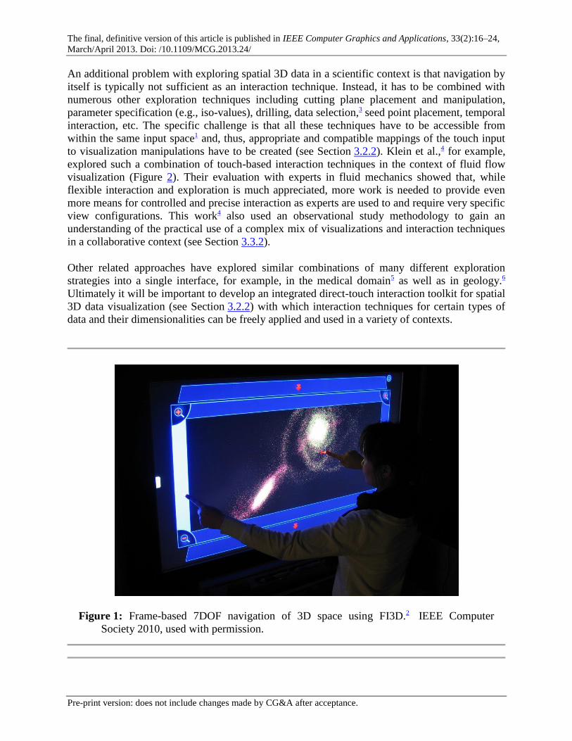
Sidebox: Touch-Based Exploration of Visualizations of Spatial 3D Data
One way to address the challenge of interacting with visualizations of spatial 3D data using the
2D direct-touch paradigm1 (see Section 3.2.3) is, instead of manipulating specific objects or to
navigate a camera in 3D, to employ the metaphor of interacting with the 3D space itself that
carries the information. Yu et al.’s FI3D widget,2 for example, takes this approach and uses the
frame around the projected 3D data display as well as some well-chosen heuristics to constrain
the interaction (Figure 1). Depending on which region of the widget is touched and the initial
direction of motion (specifically on the frame), FI3D provides a full 7DOF navigation of the 3D
space using one or two touch points, while most of the DOF can also be used in an isolated
manner.
The final, definitive version of this article is published in IEEE Computer Graphics and Applications, 33(2):16–24,
March/April 2013. Doi: /10.1109/MCG.2013.24/
Pre-print version: does not include changes made by CG&A after acceptance.
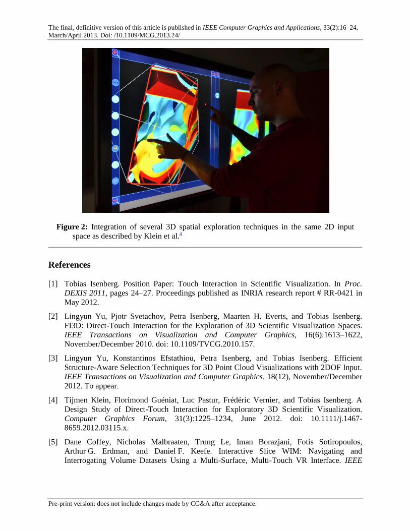
An additional problem with exploring spatial 3D data in a scientific context is that navigation by
itself is typically not sufficient as an interaction technique. Instead, it has to be combined with
numerous other exploration techniques including cutting plane placement and manipulation,
parameter specification (e.g., iso-values), drilling, data selection,3 seed point placement, temporal
interaction, etc. The specific challenge is that all these techniques have to be accessible from
within the same input space1 and, thus, appropriate and compatible mappings of the touch input
to visualization manipulations have to be created (see Section 3.2.2). Klein et al.,4 for example,
explored such a combination of touch-based interaction techniques in the context of fluid flow
visualization (Figure 2). Their evaluation with experts in fluid mechanics showed that, while
flexible interaction and exploration is much appreciated, more work is needed to provide even
more means for controlled and precise interaction as experts are used to and require very specific
view configurations. This work4 also used an observational study methodology to gain an
understanding of the practical use of a complex mix of visualizations and interaction techniques
in a collaborative context (see Section 3.3.2).
Other related approaches have explored similar combinations of many different exploration
strategies into a single interface, for example, in the medical domain5 as well as in geology.6
Ultimately it will be important to develop an integrated direct-touch interaction toolkit for spatial
3D data visualization (see Section 3.2.2) with which interaction techniques for certain types of
data and their dimensionalities can be freely applied and used in a variety of contexts.
Figure 1: Frame-based 7DOF navigation of 3D space using FI3D.2 IEEE Computer
Society 2010, used with permission.
The final, definitive version of this article is published in IEEE Computer Graphics and Applications, 33(2):16–24,
March/April 2013. Doi: /10.1109/MCG.2013.24/
Pre-print version: does not include changes made by CG&A after acceptance.
Figure 2: Integration of several 3D spatial exploration techniques in the same 2D input
space as described by Klein et al.4
References
[1] Tobias Isenberg. Position Paper: Touch Interaction in Scientific Visualization. In Proc.
DEXIS 2011, pages 24–27. Proceedings published as INRIA research report # RR-0421 in
May 2012.
[2] Lingyun Yu, Pjotr Svetachov, Petra Isenberg, Maarten H. Everts, and Tobias Isenberg.
FI3D: Direct-Touch Interaction for the Exploration of 3D Scientific Visualization Spaces.
IEEE Transactions on Visualization and Computer Graphics, 16(6):1613–1622,
November/December 2010. doi: 10.1109/TVCG.2010.157.
[3] Lingyun Yu, Konstantinos Efstathiou, Petra Isenberg, and Tobias Isenberg. Efficient
Structure-Aware Selection Techniques for 3D Point Cloud Visualizations with 2DOF Input.
IEEE Transactions on Visualization and Computer Graphics, 18(12), November/December
2012. To appear.
[4] Tijmen Klein, Florimond Guéniat, Luc Pastur, Frédéric Vernier, and Tobias Isenberg. A
Design Study of Direct-Touch Interaction for Exploratory 3D Scientific Visualization.
Computer Graphics Forum, 31(3):1225–1234, June 2012. doi: 10.1111/j.1467-
8659.2012.03115.x.
[5] Dane Coffey, Nicholas Malbraaten, Trung Le, Iman Borazjani, Fotis Sotiropoulos,
Arthur G. Erdman, and Daniel F. Keefe. Interactive Slice WIM: Navigating and
Interrogating Volume Datasets Using a Multi-Surface, Multi-Touch VR Interface. IEEE
The final, definitive version of this article is published in IEEE Computer Graphics and Applications, 33(2):16–24,
March/April 2013. Doi: /10.1109/MCG.2013.24/
Pre-print version: does not include changes made by CG&A after acceptance.
Transactions on Visualization and Computer Graphics, 2012. To appear. doi:
10.1109/TVCG.2011.283.
[6] Nicole Sultanum, Sowmya Somanath, Ehud Sharlin, and Mario Costa Sousa. “Point it, Split
it, Peel it, View it”: Techniques for Interactive Reservoir Visualization on Tabletops. In
Proc. ITS, pages 192–201, New York, 2011. ACM. doi: 10.1145/2076354.2076390.
Sidebox: Visualization in an Exhibition Context
Exhibitions—particularly exhibitions in science centers—often need to present large datasets in
compelling, easily understandable ways. Visitors spend only a few minutes with each exhibit and
will abandon exhibits that they do not understand very quickly. This brief moment of attention
stands in contrast to the large amount and complexity of available data, often full of hidden
relationships.
Figure 3: Visitors interacting with the GlobalData exhibit. Image reprinted with permission
of Archimedes Exhibitions GmbH.
The final, definitive version of this article is published in IEEE Computer Graphics and Applications, 33(2):16–24,
March/April 2013. Doi: /10.1109/MCG.2013.24/
Pre-print version: does not include changes made by CG&A after acceptance.
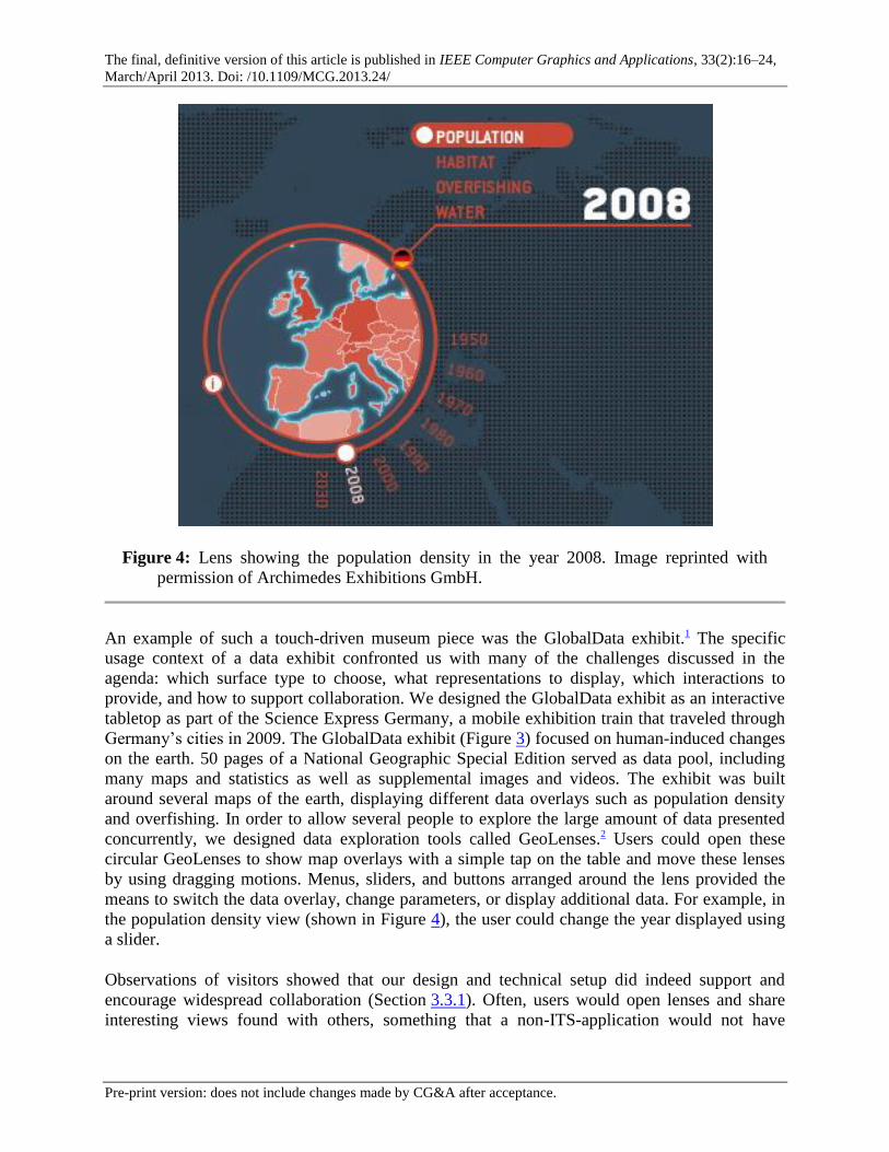
Figure 4: Lens showing the population density in the year 2008. Image reprinted with
permission of Archimedes Exhibitions GmbH.
An example of such a touch-driven museum piece was the GlobalData exhibit.1 The specific
usage context of a data exhibit confronted us with many of the challenges discussed in the
agenda: which surface type to choose, what representations to display, which interactions to
provide, and how to support collaboration. We designed the GlobalData exhibit as an interactive
tabletop as part of the Science Express Germany, a mobile exhibition train that traveled through
Germany’s cities in 2009. The GlobalData exhibit (Figure 3) focused on human-induced changes
on the earth. 50 pages of a National Geographic Special Edition served as data pool, including
many maps and statistics as well as supplemental images and videos. The exhibit was built
around several maps of the earth, displaying different data overlays such as population density
and overfishing. In order to allow several people to explore the large amount of data presented
concurrently, we designed data exploration tools called GeoLenses.2 Users could open these
circular GeoLenses to show map overlays with a simple tap on the table and move these lenses
by using dragging motions. Menus, sliders, and buttons arranged around the lens provided the
means to switch the data overlay, change parameters, or display additional data. For example, in
the population density view (shown in Figure 4), the user could change the year displayed using
a slider.
Observations of visitors showed that our design and technical setup did indeed support and
encourage widespread collaboration (Section 3.3.1). Often, users would open lenses and share
interesting views found with others, something that a non-ITS-application would not have
The final, definitive version of this article is published in IEEE Computer Graphics and Applications, 33(2):16–24,
March/April 2013. Doi: /10.1109/MCG.2013.24/
Pre-print version: does not include changes made by CG&A after acceptance.
allowed. It also became clear that it is indeed essential to keep the interaction as simple as
possible in this context. About a third of the visitors interacted with just a single finger, and
many of those never used dragging gestures. Nevertheless, the exhibit allowed even these people
full access to the application’s functionality.
To implement the exhibit we had to address another challenge—that of adequate sofware support
for a touch and visualization application. We used our in-house media development toolkit
libavg (http://www.libavg.de/). At the time when GlobalData was being developed,
libavg supported complex graphics but delivered only low-level multi-touch events. Libavg was
a good choice for us because it provided the higher-level graphics capabilities (i.e., vector
graphics, formatted text, interactive masking of subscenes, as well as videos etc.) we needed for
this project. Yet, we spent a lot of time coding interaction basics. In part because of this
experience, we have since expanded the toolkit to support a wide variety of touch interaction
techniques.
References
[1] Ulrich von Zadow, Florian Daiber, Johannes Schöning, and Antonio Krüger. GlobalData:
Multi-User Interaction with Geographic Information Systems on Interactive Surfaces. In
Proc. ITS, pages 318–318, New York, 2010. ACM. doi: 10.1145/1936652.1936746.
[2] Ulrich von Zadow, Florian Daiber, Johannes Schöning, and Antonio Krüger. GeoLens:
Multi-User Interaction with Rich Geographic Information. In Proc. DEXIS 2011, pages 16–
19. INRIA (proceedings published as INRIA research report # RR-0421 in May 2012).