Integrated Math 1 Module 8 Honors Modeling Data Ready, Set, Go! Homework...
24
1 Integrated Math 1 Module 8 Honors Modeling Data Ready, Set, Go! Homework Solutions Adapted from: The Mathematics Vision Project: Scott Hendrickson, Joleigh Honey, Barbara Kuehl, Travis Lemon, Janet Sutorius www.mathematicsvisionproject.org In partnership with the Utah State Office of Education
-
Upload
nguyentram -
Category
Documents
-
view
214 -
download
0
Transcript of Integrated Math 1 Module 8 Honors Modeling Data Ready, Set, Go! Homework...

1
Integrated Math 1 Module 8 Honors
Modeling Data Ready, Set, Go! Homework
Solutions
Adapted from:
The Mathematics Vision Project: Scott Hendrickson, Joleigh Honey, Barbara Kuehl,
Travis Lemon, Janet Sutorius www.mathematicsvisionproject.org
In partnership with the Utah State Office of Education

2
SDUHSD Math 1 Honors
Name: Modeling Data 8.1H
Ready, Set, Go!
Ready Topic: Measures of central tendency
Fill in the blanks for each statement about measures of central tendency. 1. The mean of a data set is the average of the data. 2. The median of a data set is the middle of the data. 3. The mode of a data set is the most frequent value(s) of the data. Sam’s test scores for the term were 60, 89, 83, 99, 95, and 60. 4. Suppose that Sam’s teacher decided to base the term grade on the mean score.
a. What grade would Sam receive? 81
b. Do you think this is a fair grade? Explain your reasoning. Answers may vary. Students should refer to the mean being the average of the data and they may reference how the low grades of 60 pull the mean down.
5. Suppose that Sam’s teacher decided to base the term grade on his median score.
a. What grade would Sam receive? 86
b. Do you think this is a fair grade? Explain your reasoning. Answers may vary. Students should refer to the median being the middle score and therefore, the low grades do not skew the median.
6. Suppose that Sam’s teacher decided to base the term grade on the mode score.
a. What grade would Sam receive? 60
b. Do you think this is a fair grade? Explain your reasoning. Answers may vary. Students should refer to the mode being the most frequently occurring value in the data set. Since the mode is lower than the rest of the data, it is not a fair grade.
7. Aiden’s test scores for the same term were 30, 70, 90, 90, 91, and 99. Which measure of central tendency
would Aiden want his teacher to base his grade on? Justify your thinking. Aiden would want his teacher to base his grade on the mode (90) or the median (90) since they are both higher than the mean (78).
8. Most teachers base grades on the mean. Do you think this is a fair way to assign grades? Why or why
not? Answers may vary.

3
SDUHSD Math 1 Honors
Set Topic: Examining data distributions in a box-and-whisker plot 9. Make a box-and-whisker plot for the following test scores. 60, 64, 68, 68, 72, 76, 76, 80, 80, 80, 84, 84, 84, 84, 88, 88, 88, 92, 92, 96, 96, 96, 96, 96, 96, 96, 100, 100
10. a. How much of the data is represented by the box? 19 out of 28 data values are represented by the box (68%) b. How much is represented by each whisker?
The lower whisker represents 7 data values (25%) and the higher whisker represents 2 data values (7%).
11. What does the graph tell you about student success on the test? Most students will score between 78 and 96 on the test.
Go Topic: Drawing histograms. Use the data from the SET section above to answer the following questions 12. Fill in the frequency table at the right. Use an interval of 5. 13. Make a histogram of the data using your intervals of 5.
Score Frequency 60 – 64 2 65 – 69 2
70 – 74 1
75 – 79 2 80 – 84 7 85 – 89 3
90 – 94 2 95 – 100 9

4
SDUHSD Math 1 Honors
Reminder: Percent is a number per 100. Example:
is equivalent to
which is equivalent to 25%.
14. What percent of 97 is 11? 15. What percent of 88 is 132? 11.3% 150% 16. What percent of 84 is 9? 17. What percent of 88.6 is 70? 10.7% 79% 18. What is 270% of 60? 19. What is 84% of 25? 162 21

5
SDUHSD Math 1 Honors
Name: Modeling Data 8.2H Ready, Set, Go!
Ready Topic: Finding distances and averages Use the number line below to answer the questions.
1. How far away is each of the points on the number line from point A? B: 1, C: 4, D: 4, E: 6, F: 7, G: 2 2. What is the total of all the distances from point A that you found in #1? 24 3. What is the average distance that any of the given points B through G are from point A? 4 4. Which point on the number line is located the average distance away from point A? C & D 5. Label another location on the number line that is the average distance away from point A. Label it point
X. 6. How far away is each of the points on the number line from point D? A: 4, B: 3, C: 8, E: 2, F: 11, G: 6 7. What is the total of all the distances from point D that you found in #6? 34 8. What is the average distance that any of the six other points are from point D?
9. Is there a point on the number line located the average distance away from point D? No 10. Label another location on the number line that is the average distance away from point D? Label it point
Y.
Point Y should be located at
or

6
SDUHSD Math 1 Honors
Set Topic: Calculating standard deviation Use the given data sets for questions 11-16. Each set has a mean of 20.
Set A Set B Set C Set D 19, 19, 20, 20, 21, 21 10, 10, 20, 20, 30, 30 12, 13, 13, 27, 27, 28 9, 20, 20, 20, 20, 31
11. Based on your own intuition, arrange the four sets of data from the set that is “least spread out from the
mean” to the set that is “most spread out from the mean.” Answers will vary 12. a. Calculate the standard deviation of each set. Set A: 0.8165 Set B: 8.165 Set C: 7.3485 Set D: 6.3509
b. Use your answers from part a to arrange the four sets of data from the set with the smallest standard deviation to the set with the largest standard deviation.
Set A, Set D, Set B, Set C 13. Are the two arrangements from question 11 and 12a the same?
Go Topic: Conducting a survey 14. Survey at least 10 people using the question your group created in today’s warm up. Use the space below
to organize the data. Be sure to keep this page for future reference.

7
SDUHSD Math 1 Honors
Name: Modeling Data 8.3H
Ready, Set, Go!
Ready Topic: Linear functions and relationships Write the explicit linear function for the given information below.
1. ( ) ( )
( )
2. Mike earns $11.50 an hour
( )
3. ( ) ( )
( )
4.
( )
Set Topic: Two-way frequency tables. Here is the data from Mr. Austin’s ten-point quiz. Students needed to score a 6 or better to pass the quiz.
1st Period Math 2nd Period Math 3rd Period Math
6, 4, 3, 7, 5, 9, 5, 4, 6, 6, 8, 5, 7, 3, 6, 2, 8, 7, 10, 9
3, 3, 8, 6, 6, 9, 5, 8, 5, 3, 5, 5, 7, 5, 7
9, 8, 10, 5, 9, 7, 8, 9, 8, 3, 8, 10, 8, 7, 5
5. Make a two-way frequency table showing how many students passed the quiz and how many failed in
each class.
1st Period 2nd Period 3rd Period Total
Passed 12 7 12 31
Failed 8 8 3 19
Total 20 15 15 50

8
SDUHSD Math 1 Honors
6. Use a colored pencil to lightly shade the cells containing the joint frequency numbers in the table. The un-shaded numbers are the marginal frequencies. Use these terms to answer the following questions. The highlighted values are the joint frequency numbers in the table.
7. If Mr. Austin wanted to see how many students in all 3 classes combined passed the quiz, where would he look? Mr. Austin would look at the marginal frequency on in the total column.
8. If Mr. Austin wanted to write a ratio of the number of passing students compared to the number of failing
students for each class, where would he find the numbers he would need to do this? Mr. Austin would find these numbers in the joint frequencies under each class period’s column.
Topic: Relative Frequency Tables For each two-way table below, create the indicated relative frequency table and also provide two observations with regard to the data. 9. This table represents survey results from a sample of students regarding mode of transportation to and
from school.
Walk Bike Car Pool Bus Total
Boys 37 47 27 122 233
Girls 38 22 53 79 192
Total 75 69 80 201 425
Create a table showing the relative frequency of rows. Then provide two observation statements.
Walk Bike Car Pool Bus Total
Boys 16% 20% 12% 52% 100%
Girls 20% 11% 28% 41% 100%
Total 18% 16% 19% 47% 100%
Observations: Answers will vary, sample answer: 52% of all boys take the bud to get to school. 18% of all students walk to and from school.
9
SDUHSD Math 1 Honors
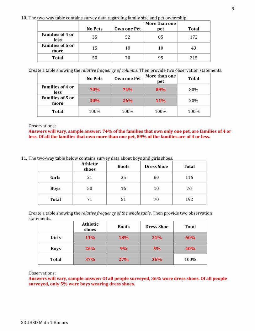
10. The two-way table contains survey data regarding family size and pet ownership.
No Pets
Own one Pet More than one
pet
Total Families of 4 or
less 35 52 85 172
Families of 5 or more
15 18 10 43
Total 50 70 95 215
Create a table showing the relative frequency of columns. Then provide two observation statements.
No Pets Own one Pet More than one
pet Total
Families of 4 or less
70% 74% 89% 80%
Families of 5 or more
30% 26% 11% 20%
Total 100% 100% 100% 100%
Observations: Answers will vary, sample answer: 74% of the families that own only one pet, are families of 4 or less. Of all the families that own more than one pet, 89% of the families are of 4 or less.
11. The two-way table below contains survey data about boys and girls shoes.
Athletic
shoes Boots Dress Shoe Total
Girls 21 35 60 116
Boys 50 16 10 76
Total 71 51 70 192
Create a table showing the relative frequency of the whole table. Then provide two observation statements.
Athletic
shoes Boots Dress Shoe Total
Girls 11% 18% 31% 60%
Boys 26% 9% 5% 40%
Total 37% 27% 36% 100%
Observations:
Answers will vary, sample answer: Of all people surveyed, 36% wore dress shoes. Of all people surveyed, only 5% were boys wearing dress shoes.

10
SDUHSD Math 1 Honors
Go 12. Sophie surveyed all 6th grade students at Reagan Elementary School to find out which TV Network was
their favorite. She thought that it would be important to know whether the respondent was a boy or a girl so she recorded her information this way.
Animal Planet Cartoon Network Disney Nickelodeon
GGBBBBBGBB BGBBBGGBBB
BBBBB
BBBBBBBBBG GGBBBGBGBG
GGBGG
GGGGGGBBBB BBGBGBGGGB BBGGBGGGGB
BBGGGGGB
BBBBGGGGGG GGGGGGBBGG GGGGGGGGGB BBBBBGGGGG
GGGGGGGG
When she looked at her chart above, Sophie realized that the data wasn’t telling her what she wanted to know. Her teacher suggested that her data would be easier to analyze if she could organize it into a two-way frequency table. Help Sophie out by putting the frequencies into the correct cells.
Favorite TV Networks Girls Boys Totals
Animal Planet 6 19 25
Cartoon Network 10 15 25
Disney 22 16 38
Nickelodeon 36 12 48
Totals 74 62 136
Now that Sophie has her data organized, use the two-way frequency table to answer her 3
questions. a. Are there more girls or boys in the 6th grade? Girls
b. Which network was the boys’ favorite? Animal Planet
c. Was there a network that was favored by more than 50% of one gender? No

11
SDUHSD Math 1 Honors
Topic: One variable statistical measures and comparisons The mean and standard deviation work as a team to help describe the center and spread for data that is symmetric about the mean. A box-and-whisker plot is a different way of describing the center and spread. For each set of data determine the mean, median, mode, standard deviation, and range. Then for #13-14, create box-and-whisker plots and for #16-17, create histograms. 13. * + 14. * +
Mean: 25, Median: 25, Mode: 25, Range: 10, Mean: 25, Median: 25, Mode: 24 & 25, Range: 25
15. How do the data sets in problems 13 and 14 compare to one another?
Problem 14 has a larger spread than problem 13. Both problems have the same medians. Problem 13 appears symmetric and problem 14 appears to be skewed.
16. * + 17. * + Mean: 4, Median: 4, Mode: 4, Range: 5, Mean: 11, Median: 11, Mode: 11, Range: 5,
18. How do the data sets in problems 16 and 17 compare to one another? Both sets have the same standard deviation and range. Both show normal distribution. However,
the center of each is different. Seven has been added to each item in the set for question 1 to obtain the set in question 2.

12
SDUHSD Math 1 Honors
Name: Modeling Data 8.4H
Set, Go!
Set Topic: Estimating the correlation coefficient Match the scatterplot with its correlation coefficient.
Correlation Coefficients: 0.05 0.97 0.68
__ _1.
_ _2.
__0.05_3.
__0.68__4.
__0.97_5.
Go Topic: Visually comparing slopes of lines Follow the prompt to sketch the graph of a line on the same grid with the given characteristics.
7. A greater slope
(sample answer)
8. A smaller slope
(sample answer)

13
SDUHSD Math 1 Honors
9. A larger y-intercept and a slope whose absolute value is smaller
(sample answer)
10. Slope is the negative reciprocal
(sample answer)
Topic: Describing data distributions 10. The line plot below shows the number of states students in Elisa’s social studies class have visited.
a. Choose the appropriate measures to describe the center and spread of the distribution. Justify your response based on the shape of the distribution.
The distribution is not symmetric and there is an outlier, 19. The median and interquartile
range are appropriate measures to use. b. Write a few sentences describing the center and spread of the distribution using the appropriate
measures. The median is 12 states. The lower quartile is 11. The upper quartile is 13. The interquartile
range is , or 2 states. The data are centered around 12 states. The spread of the data around the center is about 2
states.

14
SDUHSD Math 1 Honors
11. Below are survival times (in days) of 13 guinea pigs that were injected with a bacterial infection in a medical study:
79 83 84 91 91 93 95 97 97 98 101 105 111 a. Find the 5-number summary for this data set. Min: 79 Quartile 1: 87.5 Quartile 2: 95 Quartile 3: 99.5 Max: 111 b. Are there any outliers in the data set? Use the 1.5 IQR rule to check. Upper limit = Lower limit = No outliers c. Which would be more appropriate description of center and spread for this data set: The mean and
standard deviation or the 5-number summary? Why? The mean and standard deviation since the data is symmetric without outliers. 12. We have a class of 30 students and the data below shows the height (in cm) distribution of those people.
The data has already been sorted from lowest to highest. 132 151 151 152 156 156 157 160 161 162 163 163 165 167 167 169 171 172 175 175 177 177 178 183 186 189 189 189 197 206 a. Find the 5-number summary for this data set. Min: 132 Quartile 1: 160 Quartile 2: 168 Quartile 3: 178 Max: 206 b. Find the mode for this data set. 189 c. Are there any outliers in the data set above? Use the 1.5 IQR rule to check. Upper limit = Lower limit = 206 and 132 are outliers

15
SDUHSD Math 1 Honors
Name: Modeling Data 8.5H
Ready, Set!
Ready Topic: Finding distances and averages. The graph below has several points and shows the line use this graph to answer each question. 1. The vertical distance between point N and
the line is labeled on the graph. Find all of the vertical distances between the points and the line .
B: 3 D: 0 E: 3 G: 0 I: 1 L: 1 N: 3 X: 2
2. What is the sum of the distances between the points and the line ? 13 3. What is the average vertical distance that any of the points are away from the line ? 1.625 4. Is the line on the graph the line of best fit? Explain why or why not. If it is not the line of best fit, then
draw a line that better fits the data. It is not the line of best fit because there are very few points on or right near the line. 5. Estimate the correlation coefficient for this set of data points. If you have a way to calculate it exactly
then do so. 0.8587

16
SDUHSD Math 1 Honors
Set Topic: Scatterplots and line of best fit or regression lines.
Weeks Since School Started
Money in Savings 6. Create a scatterplot of the data.
1 200 3 175 4 162 7 120 10 87 13 57 20 5
7. Is the correlation of the graph positive or negative? Explain. Negative because as the number of weeks increases, the amount of money decreases. 8. What would you estimate the correlation coefficient to be? Why? If you have a technology that can
calculate it precisely then do so. The correlation coefficient would be close to -1 because there is a strong negative correlation.
The actual correlation coefficient is -0.9913. 9. Find the regression equation and graph it on the scatterplot above. . See the line in red on the graph above 10. What does the slope of the regression equation represent in terms of the variables? The slope represents the loss of money per week. 11. Most school years are 36 weeks. If the rate of spending is kept the same how much more money needs
to be saved during the summer in order for there to be money to last all 36 weeks? $376.56

17
SDUHSD Math 1 Honors
12. Which of the graphs below shows the best model for the data displayed and will create the best predictions? Circle your choice and say why it is the best model for the data.
The graph on the right is the best model because most of the points are either on or near the line. 13. Which of the graphs below shows the best model for the data displayed and will create the best
predictions? Circle your choice and say why it is the best model for the data.
The middle graph is the best model because most of the data points are on the model. 14. Which of the graphs below shows the best model for the data displayed and will create the best
predictions? Circle your choice and say why it is the best model for the data.
The first graph is the best model because most of the data points are on the model.
Go Topic: Data and statistics, when to use two-way tables and when to use scatterplots. 15. In what situations does it make the most sense to use a two-way table and look at residual frequencies to
make decisions or conclusions? It would make the most sense to use a two-way table and residual frequencies when looking at
categorical data and comparing the quantities or percents within those categories. 16. In what situations does it make the most sense to use a scatterplot and a linear or exponential model to
analyze and make decisions or draw conclusions?
It would make the most sense to use a scatterplot or a linear/exponential model when determining the type of relationship between two sets of data and when making predictions about the variables.

18
SDUHSD Math 1 Honors
17. Using the question your team agreed upon during today’s warm up, survey at least 10 peers. Record your data in the two-way table below:
Total
Total

19
SDUHSD Math 1 Honors
Name: Modeling Data 8.6H
Ready, Set!
Ready Topic: Describe the spread of the data. Given the box-and-whisker plots describe the spread of the data set. Provide specifics about the median, range, interquartile range, etc. 1.
Median: 5.5, IQR: 2.5, Range: 6, Min: 3, Max: 9, Q1: 4.5, Q3: 7
2.
Median: 10.5, IQR: 3.5, Range: 10, Min: 3, Max: 13, Q1: 8.5, Q3: 12
3 If the box-and-whisker plots above represent the results of two different classes on the same assessment,
which class did better? Why? The class in problem 2 did better because the median, max and “box” were higher than problem
1. 4. The two box-and-whisker plots below show the low temperatures for two cities in the United States.
a. Which city would be considered the coldest City D or City E? Why? City D is coldest because the minimum, quartiles, median, and maximum are lower than City E. b. Do these cities ever experience the same temperature? How do you know? The cities have overlapping “whiskers” between 28 and 30 degrees. c. Is there any way to know the exact temperature for any given day from the box and whisker plots? No d. What advantage, if any, could a scatterplot of temperature data have over a box-and-whisker plot?
A scatterplot would tell you the type of relationship in the data and would let you predict the temperatures during different parts of the year.
City E
City D

20
SDUHSD Math 1 Honors
Set Topic: Residuals, residual plots and correlation coefficients. The data sheets below are scatterplots that have the regression line and the residuals indicated. 5. a. Mark on the graph where ( ̅ ̅) would be located.
b. Use this given plot to create a residual plot. c. What would you predict the correlation coefficient to be? Why?
because there is a strong negative correlation. Data Sheet 1 Residual Plot 1

21
SDUHSD Math 1 Honors
6. a. Mark on the graph where ( ̅ ̅) would be located. b. Use this given plot to create a residual plot. c. What would you predict the correlation coefficient to be? Why?
0.9 because the data has a strong positive coerrelation. Data Sheet 2 Residual Plot 2

22
SDUHSD Math 1 Honors
The following graphs are residual plots. Analyze the residual plots to determine how well the line of best fit describes the data. 7. Plot 1
Analysis The line of best fit is not a good model since there is a pattern around the horizontal axis on the residual plot.
8. Plot 2
Analysis The line of best fit is a good model since the points are randomly dispersed around the horizontal axis.

23
SDUHSD Math 1 Honors
Name: Modeling Data 8.7H
Set, Go!
Set Topic: Creating and analyzing scatterplots. Determine whether a linear or an exponential model would be best for the given scatterplots. Then sketch a model on the graph that could be used to make predictions.
1.
Linear
2.
Linear
Go Topic: Linear and exponential functions For each of the representations below, label as a function or not a function. If the data is not a function, say why. If it is a function then label as linear, exponential or neither. 3.
x y 0 5 1 169 2 333 3 497
4. x y 1 15 2 25 3 15 2 30
5. x y 2 5 3 10 4 20 5 40
Function; Linear Not a function because for the input of 2, there is more than 1 output.
Function; Exponential
6. ( ) 7. ( ) Function; Linear Function; Exponential

24
SDUHSD Math 1 Honors
8. The amount of medicine in the blood stream of a cat changes as time passes. The initial dose of medicine is 80mm and the medicine breaks down 35% each hour.
Function; Linear 9.
Time 0 1 2 3 4
Money in Bank 250 337.50 455.63 615.09 830.38
Function; Exponential