
In a Few Minutes That I Had Spare
5
In a few minutes that I had spare, I doodled a couple of birds to offer up for use, and sent across the best of the two for consideration. It didn’t get taken up, so rather than let a sketch go to waste, I decided I’d illustrate it for a tutorial of how I like to use Illustrator. This is also the method that I used to create the cover images for the Adam Eason CDs. Step 1: Firstly, I took a photo of the sketch and loaded it into Photoshop (I’ve not installed my scanner yet since I reformatted my PC, hence taking a photo and not a scan). This first image is the sketch that I submitted. Step 2: I wasn’t quite happy with a few bits in the first draft the tail was too short, and the eyes made the bird look stoned! So, adding a couple of new layers in Photoshop, I used white and black brushes to paint over the parts I wanted to edit. At this stage, I also decided to group the sketch layers and set that to Multiply, so that I could throw down some colour underneath, to get a feel for the final look. Step 3:
-
Upload
joana-pinheiro -
Category
Documents
-
view
217 -
download
0
Transcript of In a Few Minutes That I Had Spare
8/7/2019 In a Few Minutes That I Had Spare
http://slidepdf.com/reader/full/in-a-few-minutes-that-i-had-spare 1/5
In a few minutes that I had spare, I doodled a couple of birds to offer up for use, and sent across
the best of the two for consideration. It didn’t get taken up, so rather than let a sketch go to
waste, I decided I’d illustrate it for a tutorial of how I like to use Illustrator.
This is also the method that I used to create the cover images for the Adam Eason CDs.
Step 1:
Firstly, I took a photo of the sketch and loaded it into Photoshop (I’ve not installed my scanner yet
since I reformatted my PC, hence taking a photo and not a scan). This first image is the sketch
that I submitted.
Step 2:
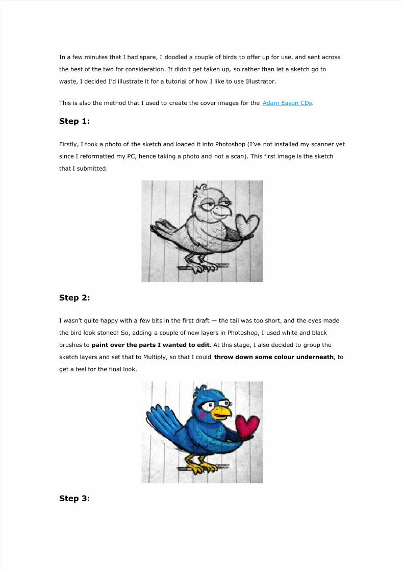
I wasn’t quite happy with a few bits in the first draft the tail was too short, and the eyes made
the bird look stoned! So, adding a couple of new layers in Photoshop, I used white and black
brushes to paint over the parts I wanted to edit. At this stage, I also decided to group the
sketch layers and set that to Multiply, so that I could throw down some colour underneath, to
get a feel for the final look.
Step 3:

8/7/2019 In a Few Minutes That I Had Spare
http://slidepdf.com/reader/full/in-a-few-minutes-that-i-had-spare 2/5
Happy with the last stage, I loaded up Illustrator and placed the sketch into the bottom layer. I
locked it and set it to 50% opacity, so that I could work over the top of it.
I then began to use the Pen tool to loosely draw the bird. I say ‘loosely’ here it’s best to be
as accurate as possible from the start, but at this stage there’s still lots of time for refinement.
Just getting it drawn is the first priority.
As you can see, I made quite a few changes to the sketch here. I didn’t like the feet clutching onto
a branch I thought it would make a stronger and more versatile image to have the bird
standing on the ground, reaching out to pass the heart, so I reworked his feet. The eyes were an
accidental discovery I created the circles for the basis of the eyes, and then decided that I
preferred the look of them being wide open, so it stayed like that. The mouth got tweaked a little
as well, to look less awkward.
Step 4:
Here’s the lengthy part. This is where I take my basic lines, tidy up the curves, so that
everything flows nicely, and then where I make the nice, varied line-widths.
So, using the white arrow Direct Selection Tool (press A) and the Convert Anchor Point Tool (Shift-
C), modify any lines that look like they’ve got any unintentional angles and points within
them, so that they curve smoothly.

8/7/2019 In a Few Minutes That I Had Spare
http://slidepdf.com/reader/full/in-a-few-minutes-that-i-had-spare 3/5
Next, to create the variable width line, lock all objects
and layers except the specific line you want to work on. Select it (Ctrl-A / Cmd-A), copy it
(Ctrl-C / Cmd-C), and paste behind (Ctrl-B / Cmd-B). You now have two copies of that line, one on
top of the other. Using the Direct Selection Tool, select one end of both lines (so you have two
anchors in your selection. Join them with Ctrl-J (or Cmd-J) and select ‘Corner’.
Now you’ve turned the two lines into an outlined shape. Invert the fill and stroke with Shift-X to
set black as the fill. Now if you move any other anchor points on the object, you’ll see the shape
of the line begin to emerge. This takes a fair bit of work, playing with the curves, to get the line to
look smooth throughout, but that’s the simplest and easiest technique that I’ve found for varied
widths. If you don’t want the line to come to a point, simply seperate the end anchors before
joining.
Step 5:
At this point, just before adding colour, I then take a look at all
of the lines and, using the Knife tool, slice off any segments that are overlapping i.e. if a

8/7/2019 In a Few Minutes That I Had Spare
http://slidepdf.com/reader/full/in-a-few-minutes-that-i-had-spare 4/5
line should be receding behind another, then that is the one that’ll get chopped up (TIP: Hold
Alt/Option when you start to use the Knife tool, and you’ll get a straight line).
Then just delete (or hide, if you like) the sections of line that you won’t need to show in
the final image.
Step 6:
Not much work to go now! I now create a new ‘Colour’ layer beneath the ‘Lines’ layer and
roughly block out the main sections of colour as set out in my Photoshop sketch (it doesn’t
need to be neat, as the edges of these block are hidden behind the black lines).
Step 7:
Time to add the finishing touches… Create a new ‘Shadows’ layer above ‘Colours’, and select
shades of your main colour blocks. Draw out the shapes of the shadows as sketched in Step 2.
You can also add a ‘Highlights’ layer, as I did for the heart. Depending on the number of
shadow/highlight depths you want, this can either be a very short step or an incredibly long one.
To add the final touches, I drew the stripes on the bird’s legs in a dark brown, and set the edge
of the tongue in a dark pink, to take some focus away from it.

8/7/2019 In a Few Minutes That I Had Spare
http://slidepdf.com/reader/full/in-a-few-minutes-that-i-had-spare 5/5
Final image: