Ian Bunting and Charles Sheppard 23February 2012.
22
Doctoral Enrolments and Graduation in South Africa Ian Bunting and Charles Sheppard 23February 2012
-
Upload
cornelius-hines -
Category
Documents
-
view
215 -
download
1
Transcript of Ian Bunting and Charles Sheppard 23February 2012.

Doctoral Enrolments and Graduation in South
AfricaIan Bunting and Charles Sheppard
23February 2012
Graph 1: Doctoral enrolments, doctoral graduates and research publications
Graph 2: Average annual changes: enrolments, graduates and publications
Graph 3: Doctoral enrolments by race group
Graph 4: Percentage of doctoral enrolments in race groupings
Graph 5: Graduation rates and cohort output equivalents
Graph 6: Actual doctoral graduates vs normative totals on National Plan
target ratio
Graph 7: Permanent academic staff
Graph 8: Percentage of academic staff with doctorates by institutional
category
Graph 9: Ratios of doctoral enrolments to academic staff with doctorates
Graph 10: Government research funding allocations by output category & financial
year
Graph 11: Estimates of Rand values of research outputs
Graph 12: Average annual increases in outputs
Graph 13: Total government research output funding per permanent academic
Graph 14: Doctoral and publication output funding per permanent academic
(2011/12)
Contents
2
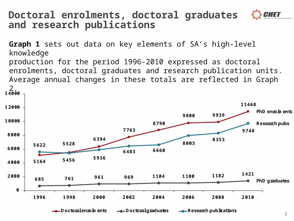
Graph 1 sets out data on key elements of SA’s high-level knowledgeproduction for the period 1996-2010 expressed as doctoral enrolments, doctoral graduates and research publication units. Average annual changes in these totals are reflected in Graph 2.
Doctoral enrolments, doctoral graduates and research publications
3
5164
55286394
77638790
9800 9939
11468
685 761 961 969 1104 1100 1182 1421
5622
5456 59366483 6660
80038353
9748
0
2000
4000
6000
8000
10000
12000
14000
1996 1998 2000 2002 2004 2006 2008 2010
Doctoral enrolments Doctoral graduates Research publications
PhD enrolments
Research pubs
PhD graduates

Graph 2 divides Graph 1 growth rates into the period between (a) 1996 and 2002, which covered the period of the 1997 HE White Paper and the 2001 National Plans, and (b) 2004-2010 which covered the introduction and implementation of the new 2003 government funding framework.
Average annual changes: enrolments, graduates and publications
4
7.0%
4.5%
5.9%6.0%
4.3%
5.4%
2.4%
6.6%
4.0%
0.0%
1.0%
2.0%
3.0%
4.0%
5.0%
6.0%
7.0%
8.0%
1996- 2002 2004- 2010 1996- 2010
Doctoral enrolments Doctoral graduates Research publications
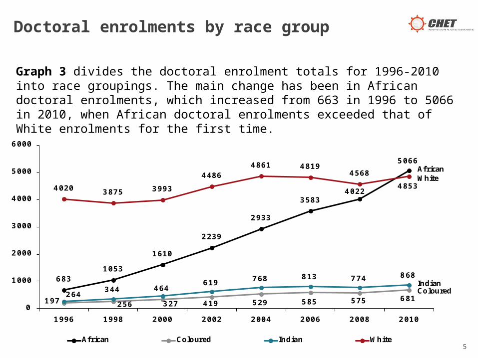
Graph 3 divides the doctoral enrolment totals for 1996-2010 into race groupings. The main change has been in African doctoral enrolments, which increased from 663 in 1996 to 5066 in 2010, when African doctoral enrolments exceeded that of White enrolments for the first time.
Doctoral enrolments by race group
5
6831053
1610
2239
2933
35834022
5066
197 256 327 419 529 585 575 681264344 464
619 768 813 774 868
4020 3875 3993
44864861 4819
4568
4853
0
1000
2000
3000
4000
5000
6000
1996 1998 2000 2002 2004 2006 2008 2010
African Coloured Indian White
AfricanWhite
Indian Coloured
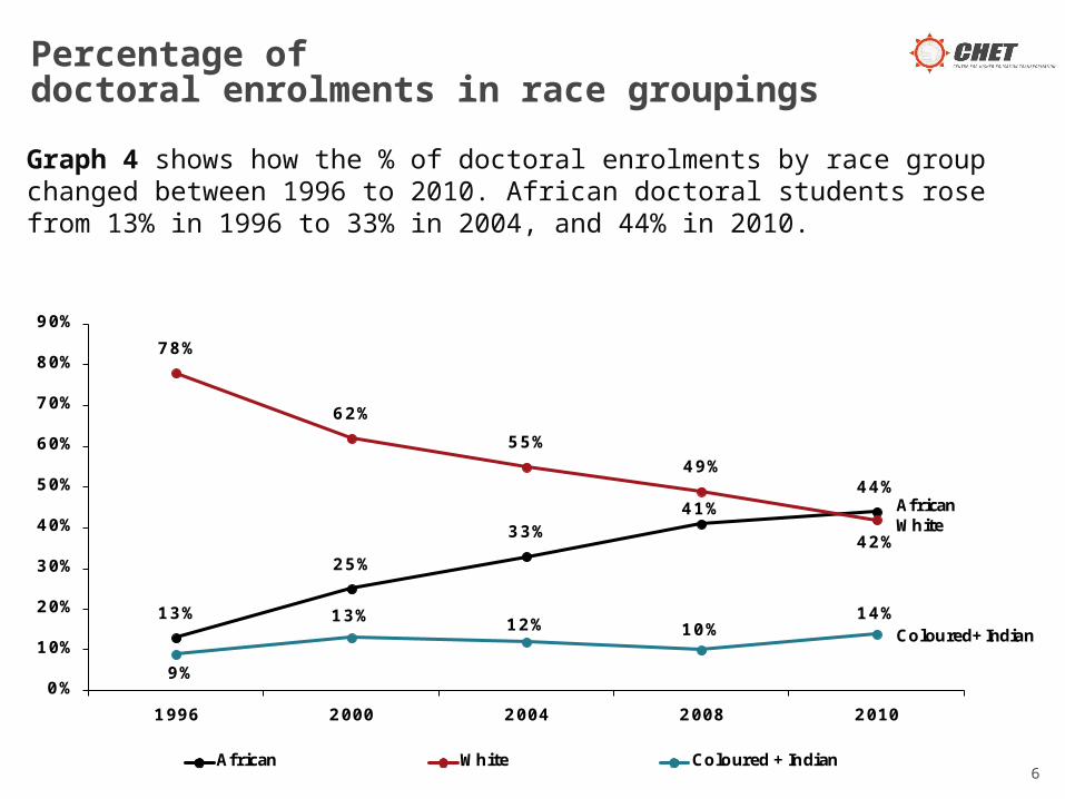
Graph 4 shows how the % of doctoral enrolments by race group changed between 1996 to 2010. African doctoral students rose from 13% in 1996 to 33% in 2004, and 44% in 2010.
Percentage of doctoral enrolments in race groupings
6
13%
25%
33%41%
44%
78%
62%
55%
49%
42%
9%
13% 12% 10%14%
0%
10%
20%
30%
40%
50%
60%
70%
80%
90%
1996 2000 2004 2008 2010
African White Coloured +Indian
AfricanWhite
Coloured+Indian
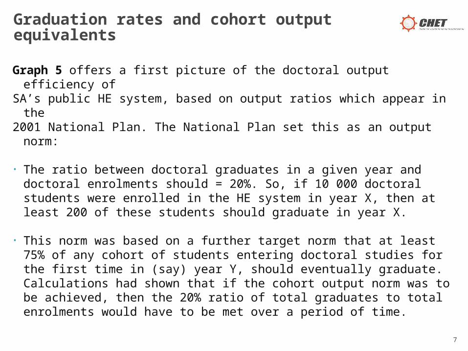
Graph 5 offers a first picture of the doctoral output efficiency ofSA’s public HE system, based on output ratios which appear in the 2001 National Plan. The National Plan set this as an output norm:
• The ratio between doctoral graduates in a given year and doctoral enrolments should = 20%. So, if 10 000 doctoral students were enrolled in the HE system in year X, then at least 200 of these students should graduate in year X.
• This norm was based on a further target norm that at least 75% of any cohort of students entering doctoral studies for the first time in (say) year Y, should eventually graduate. Calculations had shown that if the cohort output norm was to be achieved, then the 20% ratio of total graduates to total enrolments would have to be met over a period of time.
Graduation rates and cohort output equivalents
7

Graph 5 shows that, as far as doctoral outputs are concerned, the Public HE system has failed to meet the National Plan’s efficiency targets. Calculations show that over the period 1996–2002, less than 50% of students entering doctoral programmes in SA will eventually graduate.
Graduation rates and cohort output equivalents
8
14% 12% 12%
20%
52%
45% 45%
75%
0%
10%
20%
30%
40%
50%
60%
70%
80%
1998- 2002 2002- 2006 2006- 2008 National target
Ratio of graduates to enrolments Cohort graduation equivalent
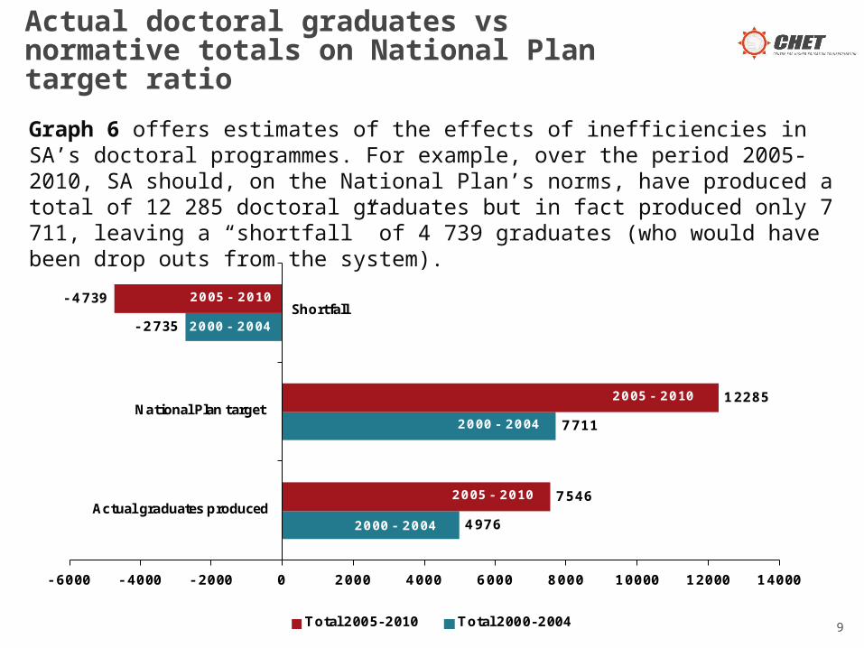
Graph 6 offers estimates of the effects of inefficiencies in SA’s doctoral programmes. For example, over the period 2005-2010, SA should, on the National Plan’s norms, have produced a total of 12 285 doctoral graduates but in fact produced only 7 711, leaving a “shortfall” of 4 739 graduates (who would have been drop outs from the system).
Actual doctoral graduates vs normative totals on National Plan target ratio
9
4976
7711
- 2735
7546
12285
- 4739
- 6000 - 4000 - 2000 0 2000 4000 6000 8000 10000 12000 14000
Actual graduates produced
National Plan target
Total 2005-2010 Total 2000-2004
2000 - 2004
2000 - 2004
2005 - 2010
Shortfall
2000 - 2004
2005 - 2010
2005 - 2010
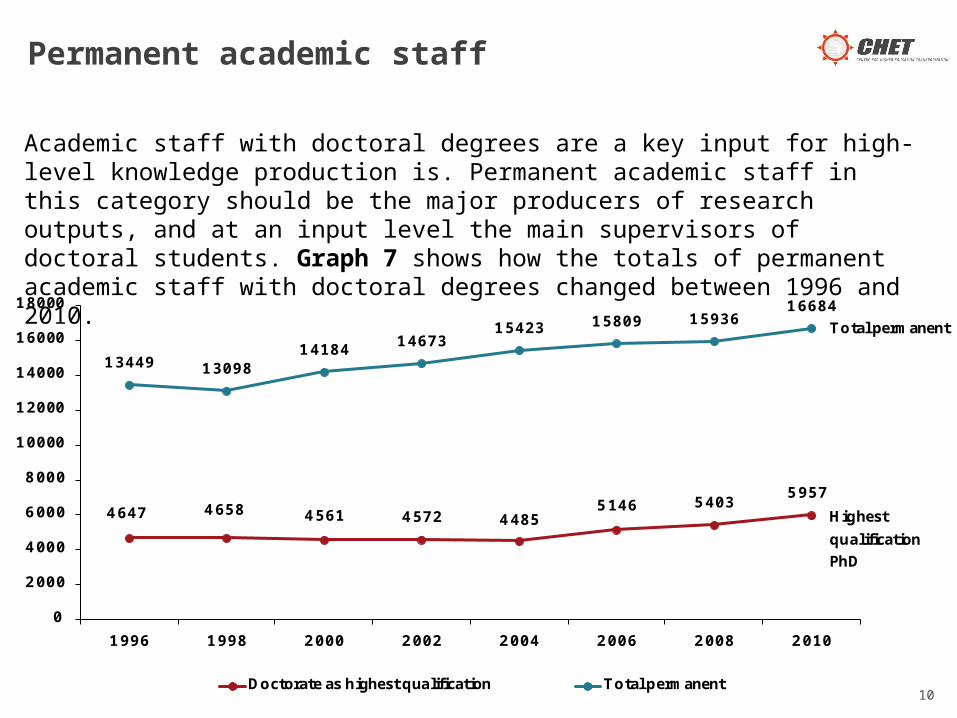
Academic staff with doctoral degrees are a key input for high-level knowledge production is. Permanent academic staff in this category should be the major producers of research outputs, and at an input level the main supervisors of doctoral students. Graph 7 shows how the totals of permanent academic staff with doctoral degrees changed between 1996 and 2010.
Permanent academic staff
10
4647 4658 4561 4572 44855146 5403
5957
13449 1309814184 14673
15423 15809 1593616684
0
2000
4000
6000
8000
10000
12000
14000
16000
18000
1996 1998 2000 2002 2004 2006 2008 2010
Doctorate as highest qualification Total permanent
Total permanent
Highest
qualification
PhD
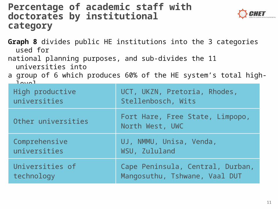
Graph 8 divides public HE institutions into the 3 categories used for national planning purposes, and sub-divides the 11 universities into a group of 6 which produces 60% of the HE system’s total high-level knowledge products and the remaining 5. The groups are:
Percentage of academic staff with doctorates by institutional category
High productive universities UCT, UKZN, Pretoria, Rhodes, Stellenbosch, Wits
Other universities Fort Hare, Free State, Limpopo, North West, UWC
Comprehensive universities UJ, NMMU, Unisa, Venda, WSU, Zululand
Universities of technology Cape Peninsula, Central, Durban, Mangosuthu, Tshwane, Vaal DUT
11
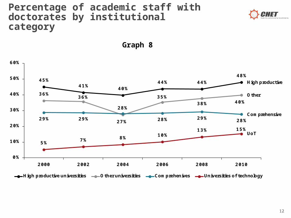
Percentage of academic staff with doctorates by institutional category
12
Graph 8
45%41%
40%44% 44%
48%
36%36%
27%
35%
38% 40%
29% 29%
28%
28% 29% 28%
5%7% 8%
10%13% 15%
0%
10%
20%
30%
40%
50%
60%
2000 2002 2004 2006 2008 2010
High productive universities Other universities Comprehenives Universities of technology
High productive
Other
Comprehensive
UoT

The low proportions permanent academic staff with doctoral degreesmust have an impact on the numbers of doctoral students which can be enrolled and supervised. Graph 9 shows what the ratios have been between doctoral enrolments and permanent academic staff with doctorates.
A ratio of two doctoral enrolments per permanent academic with a doctorate could be used as an indicator of institutional capacity. Graph 9 shows that the high productive group of universities and the comprehensives had ratios above 2 in 2010, which could be taken to imply that they have reached capacity as far as doctoral enrolments are concerned. Increases in their doctoral enrolments should depend on more academic staff obtain their own doctoral degrees.
The 2:1 norm suggests that the other group of 5 universities and the universities of technology may have spare supervisory capacity, but their ability to deal with this depends on their current financial and efficiency levels.
Ratios of doctoral enrolments to academic staff with doctorates
13
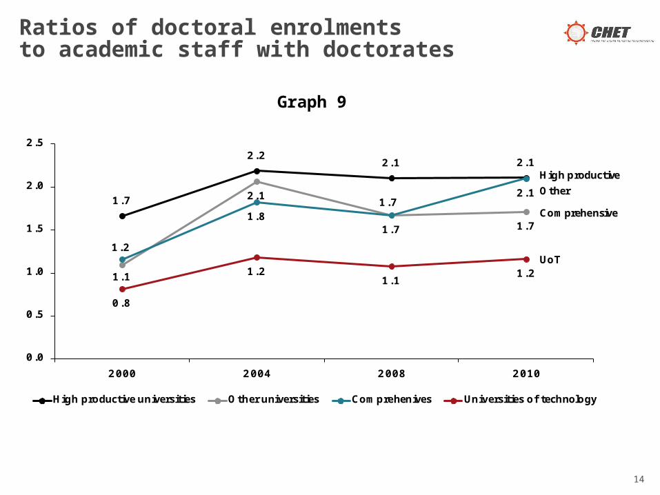
Ratios of doctoral enrolments to academic staff with doctorates
14
Graph 9
1.7
2.22.1 2.1
1.1
2.1
1.7 1.7
1.2
1.81.7
2.1
0.8
1.21.1
1.2
0.0
0.5
1.0
1.5
2.0
2.5
2000 2004 2008 2010
High productive universities Other universities Comprehenives Universities of technology
High productive
Other
Comprehensive
UoT
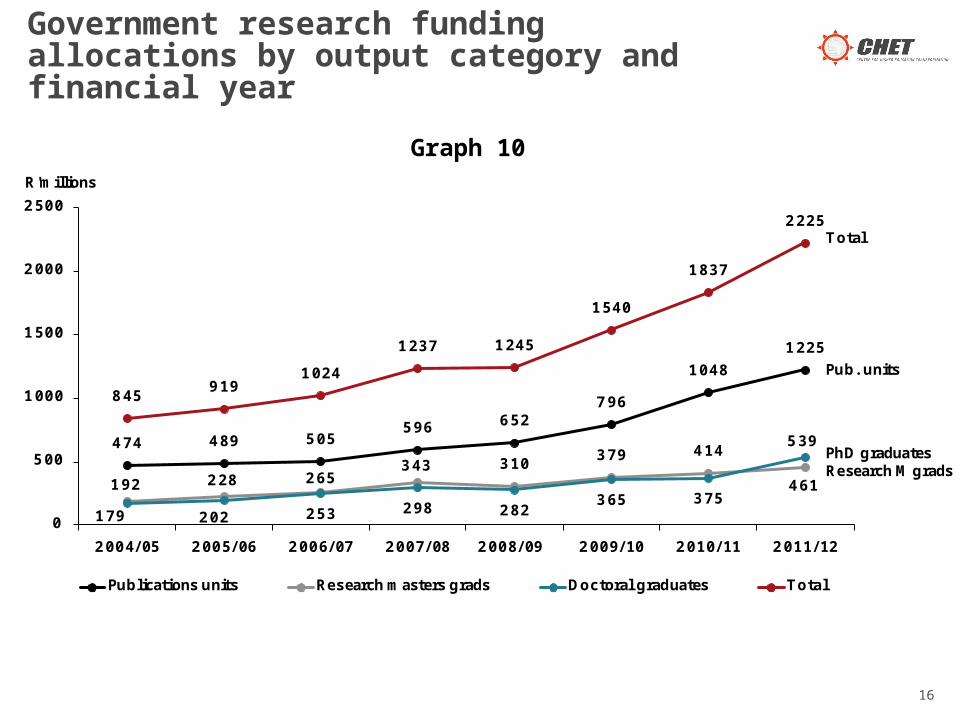
Government’s funding incentives for research outputs are complex because of the 2-year time lag between the completing of an output and the receipt of a funding allocation, and the weightings applied to research outputs.
Graph 10 shows what research funding totals were generated by each output category.
Graph 11 shows what the Rand values can be assigned to research output units.
Government research funding allocations by output category and financial year
15
Government research funding allocations by output category and financial year
16
Graph 10
474 489 505596 652
796
1048
1225
192 228 265343 310
379 414
461
179 202 253 298 282365 375
539
845919
1024
1237 1245
1540
1837
2225
0
500
1000
1500
2000
2500
2004/05 2005/06 2006/07 2007/08 2008/09 2009/10 2010/11 2011/12
Publications units Research masters grads Doctoral graduates Total
Total
Pub. units
PhD graduatesResearchM grads
R'millions

Estimates of Rand values of research outputs
17
Graph 11
87
82102
134
66
91110
110
191
251
286
393
0
50
100
150
200
250
300
350
400
450
2005/06 2007/08 2009/10 2011/12
Per publication unit Per research masters graduate Per doctoral graduate
Per PhD graduate
Per publication unitPer research Mgrads
R'000

It could be argued that the high Rand values for doctoral graduates should have functioned as strong incentives to institutions to expand these outputs. The data in Graph 12 suggest these financial incentives have not yet affected doctoral graduate growth, which was 3.5% pa between 2000 & 2004, and 3.6% pa between 2005 and 2010.
There are likely to be a number of reasons why doctoral graduate totals have not yet responded to the output funding incentives introduced for the first time in the 2004/5 financial year. One explanation is that only a few universities have been able to benefit from the introduction of government research output incentives. A second explanation is that doctoral processes in SA have been characterised by high levels of inefficiency, as has been seen in Graphs 5 and 6.
18
Average annual increases in outputs

Average annual increases in outputs
19
Graph 12
4.4%
6.7%
5.8%
3.5%
6.2%
1.5%
4.4%
3.6%
0.0%
1.0%
2.0%
3.0%
4.0%
5.0%
6.0%
7.0%
Publication units Masters graduates:
coursework + research
Research masters
graduates
Doctoral graduates
2000-2004 2005-2010

Graph 13 shows that government output funding can be related to staff capacity. In 2011/12 the high productive university group generated R290 000 in government research funds per permanent academic, which was considerably higher than the averages for the other groupings.
Total government research output funding per permanent academic
20
135
192215
290
5868
94
130
3946
60 66
8 13 19 25
0
50
100
150
200
250
300
350
2005/06 2007/08 2009/10 2011/12
High productive universities Other universities Comprehenives Universities of technology
High productive
Other
Comprehensive
UoT
R'000

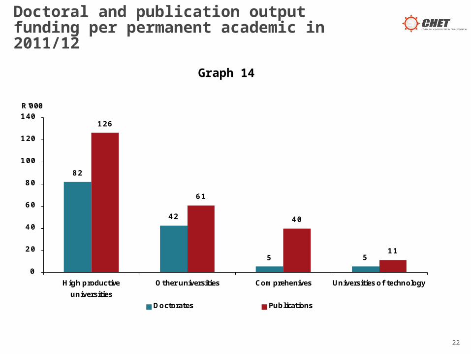
Graph 14 relates doctoral graduate funding to permanent academic staff, but also compares this doctoral funding to research publication funding per permanent academic. The graph shows that in 2011/12 the high productive universities group generated R82 000 in doctoral funding per permanent academic, and R126 000 in research publications. The amounts are lower, but similar wide differences can be seen in the other institutional categories.
These lower amounts generated by doctoral graduates could be related to institutional inefficiencies, but also to institutional incentives. Some institutions distribute publication output funds to authors, but few (if any) distribute doctoral graduate funds to supervisors. Academic staff members are therefore likely to gain more direct personal benefits from research publications than from doctoral graduates.
Doctoral and publication output funding per permanent academic in 2011/12
21
Doctoral and publication output funding per permanent academic in 2011/12
22
Graph 14
82
42
5 5
126
61
40
11
0
20
40
60
80
100
120
140
High productive
universities
Other universities Comprehenives Universities of technology
Doctorates Publications
R'000