
Human-Computer Interaction Final Project Reportrjh/courses/IntroductionToHCI/2013-14/Group... ·...
70
Human-Computer Interaction Final Project Report Team 2 - ‘Ours is the Fury’ Ben Fowler - 1395974 Chris Wright - 1375158 Abdelbaset Abdellatif - 1399985 Wen-Ting Li - 1363200 Nick Dugand - 0953626 1
Transcript of Human-Computer Interaction Final Project Reportrjh/courses/IntroductionToHCI/2013-14/Group... ·...

Human-Computer Interaction Final Project Report
Team 2 - ‘Ours is the Fury’
Ben Fowler - 1395974
Chris Wright - 1375158
Abdelbaset Abdellatif - 1399985
Wen-Ting Li - 1363200
Nick Dugand - 0953626
1

Contents
p. 3 - Executive summary/Introduction
p. 5 - Definition of problem addressed
p. 6 - Review of related work
p. 26 - Analysis of user requirements
p. 31 - First generation prototypes
p. 31 - Desktop based prototype 1
p. 36 - Desktop based prototype 2
p. 42 - Touch-screen based prototype
p. 48 - Interactive proof of concept prototype
p. 53 - Homepage proof of concept in HTML
p. 56 - Second generation prototype
p. 56 - Evaluation of tools used in constructing prototype
p. 59 - Prototype description
p. 64 - Evaluation
p. 67 - Results and conclusions
p. 68. - Summary and recommendations
p. 70 - References
2

Executive Summary
We have chosen to look at the process by which NHS patients receive medication
that has been prescribed to them by their GP. Traditionally prescriptions were handwritten
by GPs and physically taken to the pharmacy by the patient. The process has
incrementally become more and more computerised, initially through printing the
prescriptions using software packages in the GP surgery and ultimately via the introduction
of the Electronic Prescription Service, which eliminates the use of the paper prescriptions
from the process altogether.
The Electronic Prescription Service requires that the GP's computer system
interfaces with the pharmacies management system in a way that maintains security of
data, ensures patient safety and increases efficiency over the paper-based system. At the
same time, paper-based prescriptions have not been eliminated altogether and for the
foreseeable future the two systems will have to run side-by-side. Computerised pharmacy
management systems will have to be robust enough to deal with paper prescriptions and
electronic prescriptions without increasing the workload of pharmacists and
inconveniencing patients with longer waiting times.
Introduction
In England approximately 1.5 million paper prescriptions are issued every working
day. While some GP practices have on-site pharmacies, the majority of these prescriptions
are processed and dispensed by community pharmacies, which are private businesses,
independent of the National Health Service.
Although certain medications may be prescribed by specialists who are not qualified
as doctors (e.g. dentists, nurse prescribers, podiatrists and chiropractors), the majority of
prescriptions are written by GPs working from local surgeries. Traditionally, prescriptions
were handwritten by prescribers, although it is now more common for prescriptions to be
printed out from a computer. Prescriptions issued via the NHS must be written on a
specific form, the FP10 (see Figure 1), although there is a different version of this form for
controlled drugs used to treat drug addiction. Private prescriptions from medical
3

professionals working independently of the NHS do not have to be written on an FP10
form. Prescriptions are legally required to include the following information:
• The date the prescription is due to start.• The patient's surname, one forename, other initials, date of birth, address and title.• The age of the patient, where the patient is under the age of twelve years or over
the age of 60.• Name of prescriber, surgery address, telephone number, reference number and
primary care organisation.• Name of medication to be dispensed and the dosage and frequency written in
words and numbers.• The prescription must be signed and dated by the prescriber.
Patients are usually given the prescription at the local surgery to present to a
pharmacy of their choice, or in the case of repeat prescriptions, the pharmacist usually
picks up the prescription in batches from the surgery.
In England, patients pay a prescription charge of £7.85 per prescription, regardless
of the quantity, type or brand of medication, although certain groups are exempt from this
charge.
The pharmacist's role is to prepare the medication for the patient and endorse the
prescription. The pharmacist is required to be professionally registered with the General
Pharmaceutical Council and is legally responsible for any errors in dispensing the
medication. While the pharmacist may be assisted by dispensary assistants and
technicians, only the pharmacist may endorse a prescription and each pharmacy must
have a nominated responsible pharmacist present whenever the pharmacy is open. The
pharmacy is reimbursed the cost of the medication and a dispensing fee by the NHS. The
claims are made by sending the processed prescriptions to the local authority, usually on a
monthly basis. The introduction of electronic prescriptions at least gives the option of
speeding this process up.
Pharmacies are required to keep records of all prescriptions that have been
processed and details of the patients that medication has been dispensed. This
information is subject to data protection law and strict information governance protocols.
Patient information is not allowed to leave the pharmacy, in either paper or electronic form.
Pharmacists are only required to keep an inventory of controlled drugs kept on site – there
is no legal requirement to inventorise non-controlled medications. The controlled drug
registered may be kept in physical form or a computerised system.
The NHS introduced the Electronic Prescription Service to allow for prescriptions
4

and claims for reimbursement to be processed electronically. This service is still in its
infancy and it remains to be seen whether it is a more efficient system than paper-based
administration. For the moment, the majority of prescriptions are still paper-based.
Definition of Problem Addressed
FP10 NHS Prescription
1.) Patient safety
Pharmacists are required to be trained in biochemical mechanisms of action of drugs, be aware potentially unsafe combinations of drugs ('contraindications') and the safedosages of drugs. Prescribing the wrong medication, or wrong dose of the right medicationmay have potentially fatal results and even in the best case will lead to the patient not receiving the correct treatment for his/her ailment. A computerised system should, at the very least, not impede the checking and double-checking of medication dispensed against the medication prescribed by the GP. A system that actively helps with this process will safeguard patient safety and improve the customer experience. A poorly designed system can act as a distraction to the process of checking and double-checking the medication and allow mistakes to go unnoticed.
5
2.) Timeliness
It can take up to fifteen minutes for a patient to pick up their medication and at peak times, this wait may be even longer. For reasons of safety, it is important that pharmacists do not rush the preparation of the medication. At the same time, pharmacies are businesses and slow service reduces customer satisfaction, which in turn is likely to affect profits. A computerised system should, at the very least, not slow the pharmacists down unnecessarily, and in the best case, will speed up the transaction without compromising patient safety.
3.) Accuracy and security of information kept about patients
Pharmacists are required to store information about all the patients they dispense toand the medication dispensed. This data must accurate and easy for the pharmacist to input, amend and access. At the same time, it must be secure and is not allowed to leave the pharmacy.
4.) Management of stock
A prescription cannot be fulfilled if the pharmacy does not have the right medication in stock. If the pharmacy runs out of a popular medication, the patient will take his prescription elsewhere and the pharmacy has lost out on that patient's business. Conversely, medication that is out-of-date cannot be dispensed to patients. The pharmacist cannot claim back the cost of undispensed medication, so when out-of-date stock is thrown away, the business loses money. This is particularly detrimental in the caseof expensive medications.
It may be sensible for a pharmacist not to stock a certain type of medication, if the chances are it is more likely to be thrown away than dispensed. This risks alienating potential customers if there are unable to get the medication they have been prescribed. The pharmacy manager has to make a judgement call on when it is in the financial interests of the pharmacy to disappoint potential customers. A computerised system that helps the pharmacy keep the right levels of stock and prevent wasteful overstocking and under stocking will help keep the business profitable.
Review of Related Work
1.) - ProScript
See: http://securepharm.co.uk/support/pdf/proscriptmanual.pdf
6

Who is the product aimed at?
Community pharmacies in the UK.
What does the product do?
From http://www.rxsystems.co.uk/products: “[ProScript] is designed to efficiently manage the dispensary process and handles standard tasks such as labelling and endorsing, patient records, ordering and stock control”
How does the product deal with Human Computer Interaction?
ProScript is run from a standard office computer running a Windows operation system and must be installed on the local computer for it to be able to be run. Navigation of the interface is done via traditional mouse and keyboard input.
Input:
Text input. Particular use is made of keyboard shortcuts, by way of the keyboard function keys (e.g. buttons labelled 'F10 – Save'), although mouse-clicking these buttons has the same effect.
Often keys can often also be used in conjunction with the 'Alt' key for more shortcuts. Where this possible, the shortcut is underlined (e.g. 'Name' indicates that the 'Name' field can be selected by typing Alt + N).There is inconsistency in which buttons perform which functions. For example, sometimes the 'Enter' key is reserved for saving and sometimes the F10 key (see Figures 1.5 and 1.7).
Text fields can be navigated by clicking with the mouse or using the keyboard to tabthrough them. The currently selected field is highlighted in yellow. Unselected fields that are capable of being edited have a white background (see Figure 1.1). Some text fields may be filled in automatically. With patient records, ProScript takes information from the search query to fill in these fields.
Users can use certain characters within their search to refine the search results, e.g. the '/' character allows the user to search within the records for a certain strings of characters, which do not have to match an entire record (e.g. searching for '/water' will search for all drugs with 'water' in the description).
When specifying number values (e.g. for medicine dosages) the 'up' and 'down' cursor keys can be used to increase or decrease the dosage, or the keyboard's keypad
7

can be used to enter the value.
Figure 1.1:
Buttons:
Clicking on some buttons opens up new windows, for example starting a search for medicines. On some screens, buttons are only highlighted when they can be actioned. If the button is not needed, it will be greyed out.
ProScript uses various colours to distinguish the different buttons. There is some attempt to thematically assign colours depending on the action performed (e.g. a 'Cancel' button may be red). For the most part, however, the assignment of colours to various buttons appears to be arbitrary. It is noticeable that a red button does not always indicate a'dangerous' or negative action (see comparison in Figure 1.2).
8

Figure 1.2:
Most of the time, clickable buttons are postage-stamp sized and contain enough information for the user to know what they do. Occasionally smaller buttons are hidden away and their function is not immediately obvious (see 'MUR' button in Figure 3).
9

Figure 1.3:
When navigating the screens, users are given the option of confirming their action or going back to the previous screen. This can be done via the keyboard (F10 for confirm and ESC to go back) or clicking buttons. The Confirmation button is labelled with a simple tick and the Back button with an X. Save and print actions are also labelled with appropriate images. There is no consistency in the positioning of buttons with positive actions (e.g. 'Confirm') and negative actions (e.g. 'Cancel'). Sometimes positive buttons are positioned on the left and negative buttons on the right. Sometimes it is the other way around (see Figure 1.4).
10

Figure 1.4:
ProScript makes use of free text field in which notes can be written using the keyboard.
Layout:
As well as buttons and fields, ProScript makes use of menus, which are situated from left-to-right across the top of the screen, and tabs, which are situated across the top of the windows.
Users who are familiar with traditional Microsoft Windows packages will feel at
11

home navigating through ProScript, although there is a lot of information and options whichmay overwhelm a casual user of computers (see Figure 1.5). Many tables and lists will have a familiar look for people who are used to working with spreadsheets and databases (such as Microsoft Excel and Access). In terms of complexity, there is nothing in ProScript's input methods that could not be replicated in Microsoft Access.
Figure 1.5:
Output:
Information is conveyed to the user visually via the computer's monitor. No use is made of sounds (other than, it would be expected, default Windows notification sounds). Labels for medicines can also be printed,as well as patient records and management reports. The positioning and style of the 'Print' button is consistently inconsistent , as well the shortcut key assigned to printing (see Figure 1.6).
12

Figure 1.6:
Colour is used inconsistently. Some modules arbitrarily assign colours to different windows and buttons and, while there is some attempt to highlight certain functions with appropriate colour (e.g. red for warnings), this is not consistently applied.
Some modules are completely monochrome and resemble a spreadsheet (See Figure 1.7 for comparison of styles).The main colour of the font is black, although red and blue fonts are sometimes used to highlight certain items in lists.
13

Figure 1.7:
Analysis:
ProScript's main purpose is not to look beautiful or win awards
for design. It exists to help pharmacists manage patient records and details of medicines
described. It is understandable developers will 'play safe' with design and emphasise
functionality over aesthetics. However, there needs to be consistency in the form taken.
ProScript shows all the signs of a system whose separate components were built by
different people not working with a unified vision of how the system should function.
Inconsistencies in design principles can lead to errors by the user. For example, the
'Save' function is assigned to three different function keys (F1, F8 and F10), depending on
14
the window that is open. In one example, the F8 key was assigned to 'Delete'. It is not
unreasonable that someone would end up deleting when they wanted to print. For a
system that makes extensive use of keyboard shortcuts, this lack of consistency negates
the advantages of shortcuts (i.e. speed and simplicity).
Visually, some screens look like they have not been redesigned since the first
prototype. Colour is either used inconsistently or not at all. Buttons are placed all over the
screen, seemingly without thought as to why they have been placed where they have.The
overall impression of ProScript is that little thought has been put into the design, look and
feel of the system, and that is has been shipped, either with early prototype interfaces
unchanged from their original form, or with design features just added as an afterthought.
This does not just affect the aesthetic quality of the system, but it undermines its
functionality.
2.) - CareFusion - “Rowa”, “Pyxis”, various product range:
Company Website: http://www.carefusion.com/
Demonstration video: http://vimeo.com/32206377
Product brochures:
http://www.carefusion.com/pdf/Medication_Management/Rowa/rowa-hospital-brochure-2012.pdf
http://www.rowa.de/fileadmin/Brochures/CareFusion_Rowa_Katalog_2012_13_EN.pdf
http://www.carefusion.com/pdf/Medication_Management/Pyxis_MedStation_ES_Brochure.pdf
Who is the product aimed at?
Based in Kelburg, Germany, CareFusion primarily aims its wide range of systems atEuropean pharmaceutical companies, clinics and hospital dispensaries.
15

What does the product do?
Rowa, a technological subsidiary of CareFusion, focuses on delivering systems thatprovide automated pharmaceutical stock management, storage and dispensing. They offervarious products which fulfil this role in stores across the continent, resulting in lower expenses and much briefer times for usually manually conducted actions such as stock intake, recording, storage, barcode processing and temperature control. Each individual machine is capable of holding approximately between 40,000 and 60,000 packages, inputting up to 900 packs per hour, and outputting 2,000 packs per hour.
How does the product deal with Human Computer Interaction?
The Rowa systems are constructed with the easing of pressure on personnel in mind, and incorporate a simplistic but elegant touch-screen interface on their machines to input and output data on medicine conveyance and management. The machines are fully customizable for particular companies or locations, and the external transferral systems are bespoke for the shape, size, and preference of the store in question. When a customerrequests a dispensation, the system links to Visavia (the company's technical support and consultation hotline) and conducts a video call to a pharmacist or doctor, and upon acceptance, prescriptions or other, non-prescribed items can be purchased via credit card.
Figure 2.1 - The Pyxis system display and dispenser:
16

“ Pyxis MedStation ES System” interface overview video:http://www.carefusion.com/medical-products/medication-management/medication-technologies/pyxis-medstation-es-system/overview-video.aspx
Latest UI design iteration examples:
Figure 2.2:
Figure 2.3:
• Touch-screen interface with a large amount of system information.
17

• Clear, attractive interface with calm colours.• Automatic, semi-automatic, and manual features on all systems.• Physical customizability and modularity.
Other components:
Figure 2.4 - The Rowa system’s robotic stocking mechanism:
• Conveyor belt for storing, moving, and dispensing various medicines.
• Chutes for moving medication.
• Servo-controlled lifts for moving medication.
• Packaging mechanisms.
• Secondary conveyor system for buffering overflow.
• Labelling mechanisms.
• Un-interruptable Power Supply.
• Backup storage devices.
• Stock scan.
• User identification with various authorization levels.
18

• Refrigeration facilities.
• 24/7 integrated technical support and consultation network hotline.
• Patient analysis and infection surveillance and prevention capabilities in hospital integrated systems.
• TÜV certification.
Figure 2.5 - The Rowa system’s robotic stocking system:
Figure 2.6 - The Rowa system:
19

Contact details:
http://www.carefusion.com/contact/
3.) - Pharmaserv
See: http://www.youtube.com/watch?v=o2QOtiDsRoQ
Who is the product aimed at?
Pharmaserv is aimed at independent pharmacies, specifically pharmacies that are likely to want to maintain long-term relationships with their customers, who are likely to have ongoing clinical needs. Pharmaserv is aimed at pharmacies who have the resources to manage an IT server on-site, although there is an option to scale up to managing pharmacies across several sites.
The typical end user will be a qualified pharmacist who has to ensure that medicines are dispensed in accordance with prescriptions and all relevant laws and regulations. The pharmacist has a safety-critical role, in which mistakes may lead to significant harm and possibly death of the customer. The pharmacist has a public-facing role and must combine his / her medical role with the pressures of running a small-business and providing good customer service. The pharmacist must therefore balance a number of competing factors (e.g. safety, customer service, profit) throughout what is likelyto be a busy and at times, a stressful day.
What does the product do?
Pharmaserv manages:
• Prescription Processing• Claims adjudication• Inventory Management• Document Imaging• Front-End Merchandising (i.e. Point-of-Sale)• Automation Integration Options (i.e. Interactive Voice • Response telephone answering system)
20

How does the product deal with Human Computer Interaction?
Prescription processing is done via a computer and monitor using a Graphical User Interface that is controlled by mouse and keyboard. The pharmacist interacts with the software by entering information into fields via the keyboard and using the mouse to select items from drop down menu and check checkboxes.
Pharmaserv makes use of auto-fill to save time in updating fields. Pharmaserv needs to be installed on individual computers before it can be used (i.e. not via a browser) and those computers must be connected to a local server (not via the internet or remote server). This limitation would not appear to be too much of a restriction as the system is designed for independent pharmacies with only one place of business. Due to patient confidentiality / security issues the information would need to be stored in one place that iseasily securable (e.g. a back room of a shop or Icons are listed in menus along the left andtop of the screen.
The main working area is a form in which an individual patient record is displayed and can be edited. Icons are illustrated with rudimentary clip art, which is broadly thematically consistent with the function (e.g. dollar sign for pricing).New windows are opened when information is required to be selected from another database (e.g. selecting the drug for the patient) and when the claim is ready for processing.
Labels consist of abbreviations which are not intuitively understandable (QtyW, QtyD, Rfls Auth). This system could not be used for the first time without some basic training. As well as keyboard and mouse input, documents can be scanned using a scanner.
Output:
• DUR (Drug Utilisation Review) alerts are highlighted in the form of pop-up screens, as are potentially dangerous drug interactions.
• Visual verification screens bring up full-colour images of the drugs being dispensed to ensure that the drug selected from stock is the right one.
Style:
• The interface is mostly monochrome, although required fields are highlighted in colour. Alerts show up in colour (magenta) and Visual Verification Screens are pink with full-colour photographs.
• Pharmaserv's prescription processing screen emphasises functionality over beauty. The main screen is cluttered with menu, fields and icons. Apart from the photographs in the visual verification screens, there is very little colour. In terms of design, Pharmaserv would not look out of place on machine running Windows 3.1 in
21

the early 1990s and a similar interface could be mocked up in Microsoft Access. The emphasis is on input fields, drop-down menus and checkboxes. It is expected that the user will be comfortable with navigation of menus and windows.
• Someone with little or no experience of using a computer may be intimidated by the business-like functionality of the interface, although a high-level of education would be expected of its typical user (a qualified pharmacist).
• With a safety critical system, it might be preferable to have a sober and functional interface. It is also possible that important information could be lost among the 'clutter' of menus, field and drop down lists.
Other components:
• Front-End Merchandising (i.e. Point-of-Sale)• Uses: “An intuitive, highly graphical touch screen and bar-code
Automation Integration Options (i.e. Interactive Voice Response telephone answering system):
Customers can be put through to an interactive Voice Response answering system which can deal with routine enquiries and requests, such as repeat prescriptions. The system also makes outgoing telephone calls to customers, informing them when their prescriptions are available to be picked up.
With a safety critical system, it might be preferrable to have a sober and functional
interface that does not take risks and sticks to a traditional and familiar style. Pharmaserv's
interface is by no means beautifully designed, but it is visually consistent and it is not
unreasonable to expect a trained pharmacist to have the necessary IT skills to get to grips
with its, at times, complex interface. Thought has been put into how the system will be
used and how it can help the user with visual feedback warnings and verification screens.
Pharmaserv integrates many features into its system and is ambitious in its scope, incorporating a touchscreen point-of-sale of interface and the option for direct interaction with customers via the the telephone response system and automated telephone calls. This demonstrates and imagination on the part of the designers and a willingness to think of new ways to interact with customers and users beyond WIMP interfaces.
See: http://www.youtube.com/watch?v=o2QOtiDsRoQ
http://www.mckesson.com/.../pharmacy-management-software-and-
services/pharmaserv-suite-for-independent-pharmacies/
22
4.) - Meditech
Who is the product aimed at?
“MEDITECH's robust Pharmacy solution utilizes roles-based desktopsand user-defined worklists to enable pharmacists to efficiently and effectivelyperform their daily activities, while ensuring safe, quality care for their patients.” (Meditech Pharmacy Functionality Brief) The software is aimed at mainstream pharmacies, care homes, hospitals and GP surgeries. The users are the staff who work in these places, fromdoctors to technicians..
What does the product do?
• Utilises one routine for processing all patient and order types, such as inpatient or outpatient orders, nursing home patients, and IV and oral medications.
• Allows immediate access to lab results associated with medications being ordered or reviewed.
• Enables the streamlining of order entry by combining medications, dosages, and directions into standard order sets.
• Allows access to the patient's electronic medical record directly from the desktop.• Documents clinical interventions, adverse reactions, and progress notes all within
the single order processing area.• Compiles reports and statistics from the same work area.• Accesses customized desktops and worklists from any network device, as well as
remotely.• Computerised Physician Order Entry, medication reconciliation, e-prescribing, and
barcoded medication administration are all features that eliminate the need for handwritten prescriptions.
• The product looks very comprehensive and manages inventory, takes care of safetyrelated issues and can produce reports analysing stock levels and sales figures. The system also integrates with hardware to package and label products accordingly.
23

How does the product deal with Human Computer Interaction?
Prescription Processing:
“Pharmacy staff can also use rules-based logic when ordering, dosing, filling, and refilling medications to supply additional warnings, flags, and messages throughout the system. Bar code technology is available to check refill lists against medications dispensedas well”. (Meditech Pharmacy Functionality Brief)
Input: Users can manage patient records using a smartphone, tablet or a PC and the data
is shared amongst the relevant places in the network. For example, a patient record may be amended at a hospital. It is then amended at the pharmacy relevant to that hospital andpatient, and any practices in the same loop. The products are touch-screen for mobile and desktop software style for PC networks and systems.
Output: Meditech places a lot of emphasis on their electronic health record (EHR) system
which connects all relevant devices together in a network to share records. The interface isfull colour and looks well thought out and finished to provide for maximum usability.
Style: This company is well established and they have dozens of products for managing
much of the healthcare informatics systems in hospitals, GP practices, pharmacies and more. Their products are usable, innovative and accessible with an emphasis on function over form. The mobile solutions on offer adapt to different sized screens when needed.
24

Figure 4.1:
A page from Meditech site featuring two products, one touch screen app and the other desktop.
Figure 4.2 - The Electronic Health Register:
25

Analysis of User Requirements
A pharmacy management system is likely to be used by three classes of user – pharmacists, shop-managers (who are likely to also be qualified pharmacists, and dispensing assistants.
Persona 1: Jeffrey - Shop manager and responsible pharmacist
Jeffrey has been qualified as a pharmacist for 27 years. In this time, he has had eight permanent posts, as well as dozens of short-term locum placements. He has been Pharmacy Manager at Chadd & Johnson, an independently owned pharmacy in a small city, for seven years. He hopes this will be his last permanent post before retirement, but has no plans on retiring any time soon.
What Jeffrey enjoys most about his job is setting up systems, processes and Standard Operational Procedures. The two things he values more than anything are profit and efficiency. He believes the weakest point in any system is usually the human users, who he finds are prone to make errors. He believes that, if his procedures were always followed to the letter, there would never be any errors in his pharmacy. Jeffrey keeps a log of any incidents or 'near misses' that occur in the pharmacy. He expects that by doing that,colleagues will learn from their mistakes.
Jeffrey's least favourite part of the job is dealing with people. He employs two other part-time pharmacists in his pharmacy who are, in his words, “better at that sort of thing”.
A typical day for Jeffrey starts with him arriving at work at 8:00am, one hour before opening time. His first task is to go through e-mails in his inbox from head office. He does this at his computer in his manager's office, which is located above the shop. Jeffrey performs most of his managerial duties from this office. These include managing rotas, updating procedures, overseeing staff training schedules, sorting out monthly claims for the reimbursement of prescription expenses and raising invoices. Jeffrey is computer literate and uses the Microsoft Office package on a daily basis.
Jeffrey sees the value of computerised systems, but believes that there is no substitute for having good written procedures in place. There are certain things, he believes, that a computer will never be able to do, such as interpret a doctor's handwriting,or manage stocktaking.
When the shop opens, Jeffrey can usually be found in the pharmacy section,
26

processing prescriptions. There is usually one other pharmacist working with him, as well as a team of two dispensers. He lets the dispensers handle customers, and if a customer wants to speak to a pharmacist he usually prefers that his colleague deal with it.
As well as being the lead pharmacist, Jeffrey is also the store manager. This meansthat his main concern is the profitability of the shop and its viability as an ongoing business. The pharmacy brings customers into the shop, but the revenue from the pharmacy alone would not sustain his business. Jeffrey has to be commercially-minded. Tothis end, he has overseen recent refurbishments of the whole shop and opened up a new perfumery counter. The shop also sells beauty products, health products and medicinal equipment. Although the majority of the pharmacy's profits come from selling these products, Jeffrey spends 95% of his time dealing with pharmaceutical matters. He would like to devote more time to the shop and in expanding his business. He has overseen the construction of the shop's website, and wants to increase its’ visibility via social media.
Jeffrey is quite open about the importance of the bottom line: He is running a business and he will not provide a service to patients if this service is not profitable. Nothing makes Jeffrey angrier than throwing away medicines that have passed their expirydate, as this represents lost profits. However, if his colleagues followed the procedures he put in place, this situation would not arise.
Jeffrey often gets frustrated by what he sees as incompetence and bureaucracy in the NHS. He feels that new initiatives to bring about efficiency and improve customer satisfaction within the NHS have been achieved by shifting a lot of the work previously done by doctors and hospitals onto the pharmacists. In the past ten years, he has seen hisrevenue from the pharmacy decrease and the time it takes to process prescriptions increase threefold. Diversifying his business and finding new ways to monetise the patients that come into his shop is a commercial necessity.
Scenarios:
1.) A patient has come into the pharmacy with a prescription for Madeuprizol, an new drug that has only just been licensed in the UK. The patient is not local and not likely to ever come into the shop again. The patient's prescription is for only fourteen tablets of Madeuprizol. Because of its rarity, Jeffrey does not keep it in stock, but he can order it in by special delivery by this afternoon. It is not likely he will ever dispense Madeuprizol againin the foreseeable future. He needs to know if it is financially viable to do so.
2.) A patient presents Jeffrey with a prescription on a smart card.
27

3.) A particular patient with mental health problems is known to get angry and confrontational if he is dispensed the generic version of his medication, instead of the branded version. Jeffrey is loathe to ban this customer from his shop because, with his frequent and numerous prescriptions, he is a good source of revenue. Jeffrey needs a wayto remind his colleagues not to dispense the generic version of this medicine to this particular patient.
Persona 2: Nadia - locum pharmacist
Nadia originally studied Chemistry at University and, after a couple of years workingin a research laboratory, took a break in her career in order to have children. When her eldest child started secondary school, Nadia felt she was ready to resume her career. She decided to go back to University and chose to train to be a pharmacist. She has now been qualified for three years and works as a locum pharmacist for an agency. She has worked in several pharmacies since qualifying, but is settled into a regular routine of working three days a week in an independent pharmacy in a rural market town, and one day a week in the pharmacy section of a well-known supermarket.
Nadia enjoys working with people, and of the two pharmacies she works in, prefers the local and friendly feel of the independent pharmacy, compared to the more corporate setting of working in a supermarket. In the independent pharmacy, she feels that she is part of the community and has built up a good relationship with the locals. In the supermarket, she is a lot busier and has less time to get to know the patients and customers.
Nadia finds the most difficult part of her job is dealing with suppliers. Suppliers are reluctant to sell large quantities of medication in bulk, due to concerns that pharmacies arereselling the medication at a profit. Nadia thinks that this is a ridiculous state of affairs and very often it is the patient who suffers, when they cannot get the medication they are entitled to.
Nadia has a close working relationship with her dispenser, Tracey, and sees this working relationship as an important part of her job. Accuracy and attention to detail are essential in a pharmacy and it is standard practice for Tracey to double-check every prescription that Nadia endorses to ensure that the medicine dispensed matches what is written on the prescription.
Nadia's working day starts at 8:00am, one hour before the pharmacy opens. Many of the patients Nadia serves are drug addicts, who are required to pick up their prescriptions daily. As the collection arrangements of these prescriptions are scheduled a fortnight in advance, Nadia is able to predict what medication will be required in advance.
28

It is therefore sensible to get this ready before the shop opens, when it is quiet.
Nadia's second task of the day is to deal with any prescriptions that arrive in the post, and prioritise the ones that will be needed today. The pharmacy employs a delivery driver, who makes two deliveries a day - one in the morning, and one in the afternoon. Sheprepares the medications for the morning delivery by 10:30am.
The pharmacy serves two local GP clinics, both within walking distance of the pharmacy. Tracey and Nadia take it in turns to visit these pharmacies in their lunch hour and pick up any prescriptions that have been written in the last 24 hours.
The delivery driver makes his second round at 3:00pm, so Nadia needs to make sure that these prescriptions have been sorted.
The pharmacy closes at 5:30pm. Nadia needs to check the controlled medication is locked away and that the stock tallies with the controlled drug register. Before she finishes for the day, she takes a quick glance at the medicines in stock to see if they are running low on anything and re-orders if they are (The medication is supposed to be re-ordered automatically, but she finds it is always best to check herself, as the system is not 100% reliable).
Nadia does not consider herself to be very computer-savvy. She needs to use the Pharmacy Management System to add patient records to the database, endorse prescriptions and re-order stock. She can handle the basics, but sometimes has to ask Tracey or Wendy, the Pharmacy Manager, for help on re-ordering. She is also reluctant to use the Point-of-Sale system. She is thankful that Wendy, as Pharmacy Manager, has overall responsibility for running management reports from the computer, and she can focus on dispensing medication and endorsing prescriptions.
Scenarios:
1.) In her job at the supermarket, a patient presents a prescription for 100ml of methadone.He is usually only prescribed 10ml of methadone daily and an increase in dose by this amount is highly unorthodox, not to say dangerous. As Nadia only works at the supermarket one day a week, she is unaware that the patient is usually only prescribed 10ml daily. Although 100ml is a large dose, it is not unusual for some with a very high opiate tolerance to be prescribed this much. This dose would however likely be lethal to someone with a much lower tolerance.
29

2.) Nadia has received a prescription via the electronic prescription service for the first time. A pop-up on her computer tells her that the prescription is in her inbox.
3.) A patient presents a prescription for Hypothetadrine, which has come from the local hospital, and a prescription for Fictitiarin, which has come from his GP. Fictitiarin and Hypothetadrine are contraindicated medications.
Persona 3: Tracey - Dispensing assistant
Tracey works as a dispenser at a small, independent pharmacy in a market town. Tracey has 33 years of experience in retail, of which seventeen years have been spent working in pharmacies. Before starting her current job, Tracey worked in a large chain store pharmacy.
Tracey enjoys dealing with members of the public. As it is the only pharmacy in town, most people tend to come through the door at some point and Tracey likes being at the hub of the local community. Tracey enjoys being on her feet all day, and would not like to work behind a desk in an office.
Before she worked in pharmacies, Tracey had no particular interest in healthcare or medicines, but it is a subject that has become more and more interesting to her over the years. She enjoys being able to give advice to customers on things such as allergies, cold relief and painkillers, but realises that they are some areas where she cannot give advice and has to refer the customer to the pharmacist.
75% of her time is spent at the counter, dealing with customers, although she does help out the pharmacist in preparing medication for dispensing. Although the pharmacist is ultimately responsible for endorsing prescriptions and ensuring the correct medication is dispensed, Tracey has an important role in double-checking what the pharmacist has prepared.
While Tracey enjoys her job, she feels that her skills and experience are undervalued and she feels that she should be paid more. Her salary is currently at the level of a shop assistant. She feels that, with her knowledge of medicines and, in particular, her IT skills and familiarity with the Pharmacy Management Software, she is entitled to a pay rise.
30

Scenarios:
1.) A woman brings in a prescription for eczema treatment for her 81 year-old-father, who is present with her. Whilst the woman is a regular customer, there is no record of her fatheron the patient database. Because of mobility problems, she says she will be collecting her father's medication for the foreseeable future. The woman is worried that her father may occasionally come into the pharmacist in a confused state (he is in the early stages of senile dementia) and try to pick up his medication himself.
2.) Tracey is double-checking a prescription that her colleague, Nadia, has endorsed. She notices that the prescription is for Dihydrocodeine Modified Release tablets, whereas the pharmacist, Nadia, has used regular Dihydrocodeine tablets. Nadia has already entered details onto the computer and saved the record.
3.) A man brings in a prescription from his GP. He claims he is on benefits and, as such, is exempt from paying the prescription charge. He has brought proof that he is on benefits.
First Generation Prototypes
1.) Desktop based prototype
• Rationale:
This prototype allows only for manual data entry into the system. It does not interface with any specialist hardware or external software to update the database, relying on on human interaction via mouse and keyboard.
The main purpose of this prototype is to 'play it safe' and not depart from a format that most professionals with experience of using office-based software, and in particular applications in a healthcare setting, will feel familiar and comfortable with.
It is hoped that what this prototype lacks in innovation and creativity, it will make up for with safety and familiarity.
• Description:
Figure 1.1 shows the Patient Record screen. This screen is divided into panels. Commands for navigation of the application are situated in a column along the left of the screen. Details about the individual record and action buttons relating to this record are situated in the body.
31

Figure 1.1:
The patients details (name, address, date of birth et cetera) are in a panel across the top, along with an (optional) photograph of the patient. The layout is a familiar one (most social networking sites have information about the profiled person running across the top of the screen, with a photograph on the left). Action buttons for each field are situated as close to the field as possible. Safety critical information is highlighted in a subpanel on the right, which makes use of colour to draw the users attention to it. Field in the patient details panel a editable by clicking the 'Edit' button to the right of each field.
The patients prescribing history is displayed in a table sorted in chronological order. This shows the basic information about the most recent prescriptions dispensed to this patient, and scrollbars will allow access to information that has gone off the bottom of the screen. Adding a new prescription is done by clicking the 'Add Prescription' button at the bottom of the table. This will open a new 'Endorsing' screen. Entries in the prescribing history table cannot be deleted or amended by a standard user once they have been added (although some provision for a 'superuser' with full editing privileges would be made).
The 'event history' table is a customisable table allowing the pharmacist to add
32

details of any other services that the pharmacy offers (e.g. details of appointments) and works in a similar way to the prescribing history table.
The comments section is an editable free-text area where the user can draw other users' attention to information that is not covered by the default fields.
Figure 1.2 shows the Endorsing Screen. This screen is called as a separate windowwhen the user wants to add a prescription to the prescribing history. The top half of the screen is populated with information brought over from the patient details panel. This information is not editable.
The next section brings over information about the prescriber from the patient records page. Although this information is pre-filled, it is editable, in case the patient has a prescription that has not come from his regular prescriber.
Figure 1.2:
The bottom half of the page relates to the prescription being endorsed. The information is grouped together logically. The first row of fields relates to dates, the secondrow relates to the medication that has been prescribed. The third row relates to dosage and amount to be dispensed. Miscellaneous details and prescriber instruction make up thelast group of fields. Each row of fields has a checkbox underneath, which must be checkedto demonstrate that the pharmacist has checked the medication dispensed against the
33
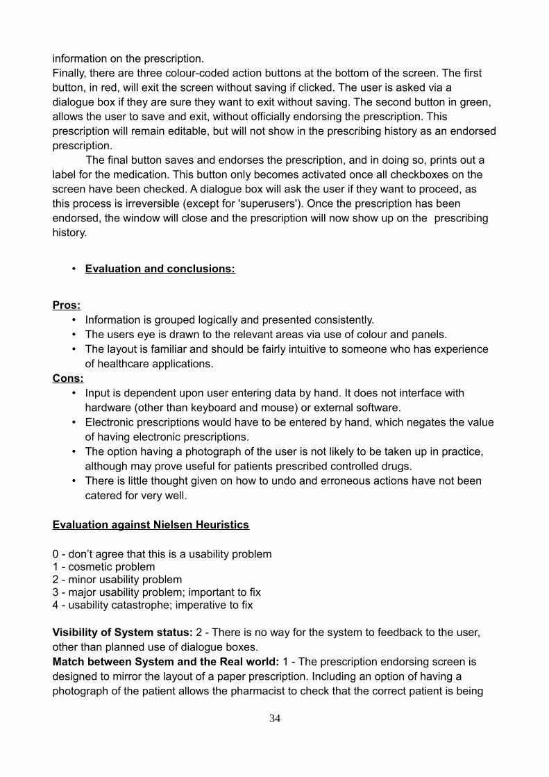
information on the prescription.Finally, there are three colour-coded action buttons at the bottom of the screen. The first button, in red, will exit the screen without saving if clicked. The user is asked via a dialogue box if they are sure they want to exit without saving. The second button in green, allows the user to save and exit, without officially endorsing the prescription. This prescription will remain editable, but will not show in the prescribing history as an endorsedprescription.
The final button saves and endorses the prescription, and in doing so, prints out a label for the medication. This button only becomes activated once all checkboxes on the screen have been checked. A dialogue box will ask the user if they want to proceed, as this process is irreversible (except for 'superusers'). Once the prescription has been endorsed, the window will close and the prescription will now show up on the prescribing history.
• Evaluation and conclusions:
Pros:• Information is grouped logically and presented consistently.• The users eye is drawn to the relevant areas via use of colour and panels.• The layout is familiar and should be fairly intuitive to someone who has experience
of healthcare applications.Cons:
• Input is dependent upon user entering data by hand. It does not interface with hardware (other than keyboard and mouse) or external software.
• Electronic prescriptions would have to be entered by hand, which negates the valueof having electronic prescriptions.
• The option having a photograph of the user is not likely to be taken up in practice, although may prove useful for patients prescribed controlled drugs.
• There is little thought given on how to undo and erroneous actions have not been catered for very well.
Evaluation against Nielsen Heuristics
0 - don’t agree that this is a usability problem1 - cosmetic problem2 - minor usability problem3 - major usability problem; important to fix4 - usability catastrophe; imperative to fix
Visibility of System status: 2 - There is no way for the system to feedback to the user, other than planned use of dialogue boxes.Match between System and the Real world: 1 - The prescription endorsing screen is designed to mirror the layout of a paper prescription. Including an option of having a photograph of the patient allows the pharmacist to check that the correct patient is being
34

dispensed to (particularly important with controlled drugs).User Control and Freedom: 2 - In a safety-critical system, it is arguably necessary to restrict a certain amount user control in the interests of maintaining standard procedures. Users are able to edit a free-text field and add customisable events. Patient fields are editable, but undoing a prescription once it has been endorsed is difficult.Consistency and standards: 1 - Information is grouped together consistently and logically.Recognition rather than recall: 1 - The design is intended to be familiar to users with experience with browsers and healthcare applications. For this reason it does not depart from the standard 'WIMP' model.Flexibility and efficiency to use: 1 - There is limited flexibility in allowing user to create events and comments, but standard operating procedures will understandably place necessary limitations on flexibility.Minimalistic design: 2 - A lot of information is presented on the endorsing screen and it isall relevant and necessary. Arguably some of the features on the main patient records page will be underused (event history) and is taking up unnecessary space.Help error recovery: 3 - As the design currently stands, no provision is made for this.Help & Documentation: 3 - As the design currently stands, no provision is made for this.Total score = 16
2.) Desktop-based prototype
• Rationale:
For easy access and use, this design follows a desktop-based system. Each function takes just 4 to 5 steps and helps new users to easily learn and operate this system. However there exists a privacy issue, therefore we can implement a rule for using the chip card, this could help make user’s information access more convenient and safer.
• Description:
1. Users could search for medicine information. Also access information about the stocks and other details about each medicine.
2. Show today’s tasks:1. How many tasks need finishing?2. How many patients will/have come today?
3. Button function:1. ID insertion, use ID card device to access information from user. Also display
prescription at the same time, and compare age/allergies/history to medicine side effects, could prevent prescription mistakes.Print prescription, print the medicine information, help patient to read how to
35

use these drugs, and any side effects related to this product.2. Create new patient/edit existing patient.3. Medicine page, displays limitation/stocks, these pills been dispensed by
different expiry date, once stocks below limitation or over expiry date, will show a flag. That could help user quickly check the stock and status of drugs.
36

37

38

Figure 2.6:
• Evaluation and conclusions:
Easy to use and access, suitable for different ages, the flags also prevent any mistakes ongiving wrong medicine. Chips card, also improves the information system, and then the user can easily know what the patient may need and some relevant data can help to perform an analysis.
Pros:
• The design is simple and intuitive to use, it can be learned with no training. • The overall structure resembles common web pages and will be familiar to anyone
who has used the internet. • This system adheres to the three clicks rule, this makes for good usability.• The card system makes it easy for the customer, pharmacy staff and doctor to relay
information to each other.• The card system acts as a form of ID for the customer, making the process faster.
Cons:
• There is a lot of wasted space. Screen real estate can be better managed.• The system background makes it difficult to see the text and is not appropriate in
such a system.• There is no system in this prototype for flagging up warnings for dosage or anything
39

else.
• There is no system in place for if the user loses their card.• Because of the legal implications involved in information sharing, problems may
arise if the customer decides to go to a different pharmacy without this systeminstalled. They would have to get a new “traditional” style prescription.
Evaluation against Nielsen Heuristics:
0 - don’t agree that this is a usability problem1 - cosmetic problem2 - minor usability problem3 - major usability problem; important to fix4 - usability catastrophe; imperative to fix
Visibility of System status - 3 - The system is well sectioned but the text is unreadabledue to the image in the background. The picture is not appropriate for this kind of system.
Match between System and the Real world - 1 -The menu titles are concise andobvious. Everything is in a logical place and unless the user is absolutely untrained, theinterface is very usable.
User Control and Freedom - 2 - No error prevention.
Consistency and standards - 2 - There is margin for error because user could choosewrong medication and there is no system to correct this.
Error Prevention - 2 - The system doesn’t handle user errors in a helpful way.
Recognition rather than recall - 1 - The interface style should be very familiar to peoplewho have seen a web page so is easy to follow and can be learned in minutes. There is noneed to remember anything unless the user wants to view different types of informatione.g. a patient and a supplier at the same time.
Flexibility and efficiency to use - 1 - System could be made faster but is fairly efficient.
Minimalistic design - 3 - This is the most minimalistic design possible and it can’t bemade any simpler without losing vital information processes. The aesthetics could beimproved to enhance user satisfaction, the background ruins the good design and makes itless usable, especially for people with sight deficiencies.
40

Help error recovery - 4 - If the user makes a mistake there is nothing to correct them ortell them how to fix it. This could have bad consequences so is important to employ somefeature to help.
Help & Documentation - 2 - No help or documentation is provided and is necessary asthe system requires some training.
Total score = 21 out of 40. The overall design is effective but let down by the images in the background.
3.) - Touch-screen based prototype
• Rationale:
• The intention behind this prototype was to produce an aesthetically inoffensive graphical user interface based on the fact that it would be integrated into a pharmaceutical environment. The interface has therefore been designed with calm colours, and elements from the Android OS to illustrate the touchscreen functionalityto some extent.
• The overall shape and positioning of the windows were also primarily inspired by the graphical user interfaces designed for the CareFusion “Rowa” robotic packagingand dispensing machine range, which were redesigned by UID to be more intuitive and modern than the original interfaces.
• It promotes the use of a biometric reader for identification and access for the sake of ease over potential monetary expense in implementing such a feature. The possibility of a more traditional key entry login was also included for those who might not want to use biometrics for whatever reason, or for those who physically could not (see figure 3.1 & 3.2).
• Being placed in medical environment, specifically a pharmacy, the option for requesting assistance was included with consideration toward the fact that some patients may have disabilities or difficulties with interacting with the system in general.
• Description:
This interface is built around the idea that a touch-screen interface is intuitive and easy to use for the average user. It has demonstrated an attempt at utilizing a minimalistic but sleek approach to design. Figures 3.1 and 3.2 illustrate the initial login screen for the users.
41

Figure 3.1:
42
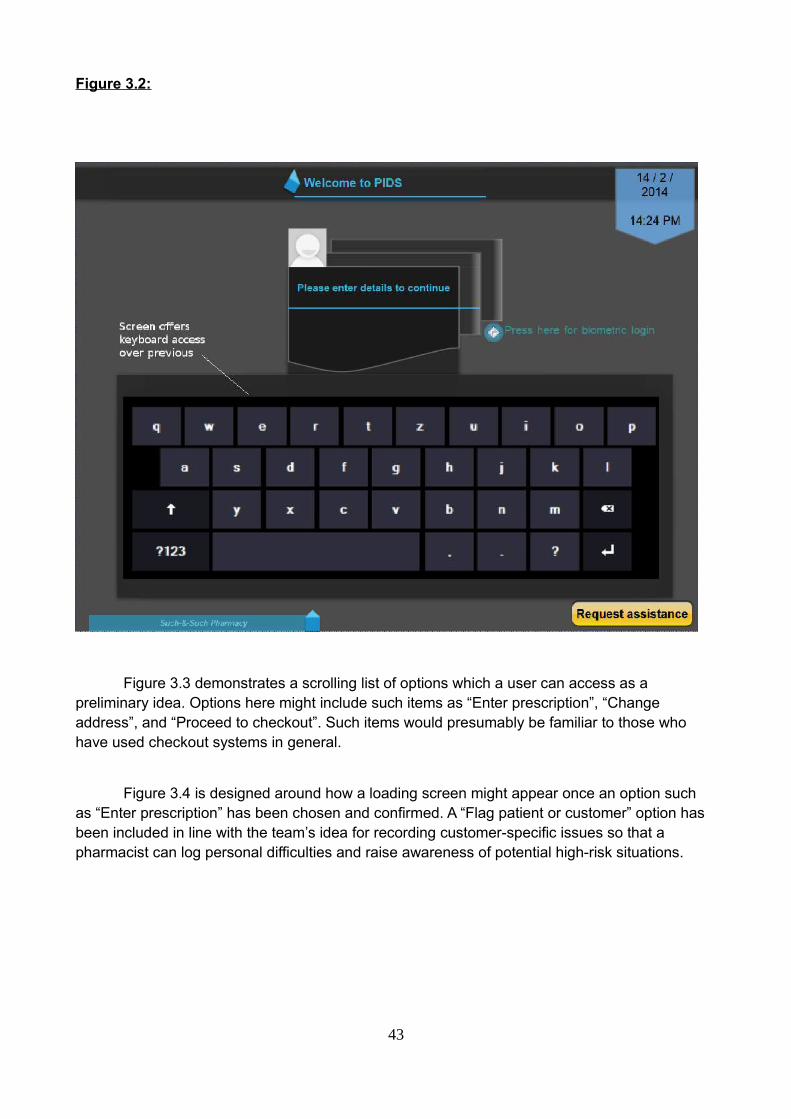
Figure 3.2:
Figure 3.3 demonstrates a scrolling list of options which a user can access as a preliminary idea. Options here might include such items as “Enter prescription”, “Change address”, and “Proceed to checkout”. Such items would presumably be familiar to those who have used checkout systems in general.
Figure 3.4 is designed around how a loading screen might appear once an option such as “Enter prescription” has been chosen and confirmed. A “Flag patient or customer” option has been included in line with the team’s idea for recording customer-specific issues so that a pharmacist can log personal difficulties and raise awareness of potential high-risk situations.
43
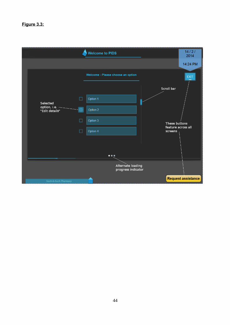
Figure 3.3:
44

Figure 3.4:
Figure 3.5 aims to illustrate how the interface might display information fields of the user, such asname, address, and previous medication, or how a pharmacist might view system data or personal information of a patient. It has purposefully remained generally abstract to represent how the space is utilised in the graphical user interface, and how across each field, the appearance would be homogenized for the purposes of familiarity and ease of access for frequent use.
45

Figure 3.5:
• Evaluation and conclusions:
Pros:
• The system includes obvious, clear details of what is requested of the user.• The interface has included rudimentary design features which would be expected by
a user, for example date and time.• Information is decently spaced, and a calm colour scheme was adopted.• The stylization of the GUI has remained generic so as to account for similarity
between possible displays to make repeated use easy and recognizable.
Cons:
• An option for logging out of the system has been overlooked.• It would be better if the screens for the customer and for the pharmacist were more
46

clearly divided.• There is a large amount of wasted space on certain screens.• Little consideration has been given regarding specifically what kind of information
might be displayed.• The system has taken appearance and style over functionality as a priority.
Evaluation against Nielsen Heuristics
0 - don’t agree that this is a usability problem1 - cosmetic problem2 - minor usability problem3 - major usability problem; important to fix4 - usability catastrophe; imperative to fix
Visibility of System status - 0 – Showing system status obviously was an objective withthe intention of not having the customer waiting at the lack of a prompt or message.
Match between System and the Real world - 0 -The menu screens are sufficiently clearand buttons or lists of information large enough to see.
User Control and Freedom - 2 – Simplicity allows for a low failure probability, although a‘forward’ or ‘back’ button has been omitted.
Consistency and standards - 0 – Consistent.
Error Prevention - 2 – Some functionality must be added.
Recognition rather than recall - 1 - The interface style is intuitive enough, style ishomogenous throughout.
Flexibility and efficiency to use - 2 – Some imperative options have been overlooked.
Minimalistic design - 1 – There is little to distract the user.
Help error recovery - 2 – This has not been made clear.
Help & Documentation - 1 - Whilst some buttons and options need to be added to theinterface, there is an option to request assistance.
Total score = 11 out of 40.
47

Interactive proof of concept prototype:
Before producing the final prototype, a development including the best features from the first round prototypes was produced using Visual Studio in C#.. It is based on the desktop style prototype with simplified menus and a more stylish but simple look and feel. The user can search at any time for products or patients.
They also have constant access to notifications via a sliding panel and everything iswithin 2 clicks. The only forced route is demonstrated by the link map detailed below. During his process, it is necessary that each step is performed and in the correct order.The card system remains as it is very practical and has benefits for all parties.
Login screen
From here the user can enter their username and password to login to the system. If they enter invalid data, an error message appears. The date and time is also displayed.
48

Error message
Home screen
From the home screen the user can see how many messages, emails and EPS messages they have and check them with one click. The search bar is accessible from every page and allows search for patients, products and suppliers. The search can be filtered by different parameters to refine results.
The icons on the left allow the user to print the screen, check the calendar, navigatethe web and send emails. They are also always accessible from any screen. The menu on the left allows the user to access patient records and inventory pages.
.
49

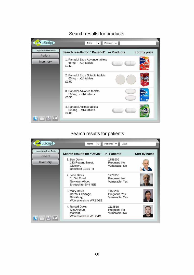
Patient search results
This screen displays patient data after searching using the search bar. Clicking on apatient record will navigate to their patient profile. Only minimal information is displayed here to allow ease of search.
50

Patient profile screen
This page contains all the information about a patient relevant to their records. It can be edited and updated at any time. If invalid data is typed into a field an error messageis displayed.
Error message
51
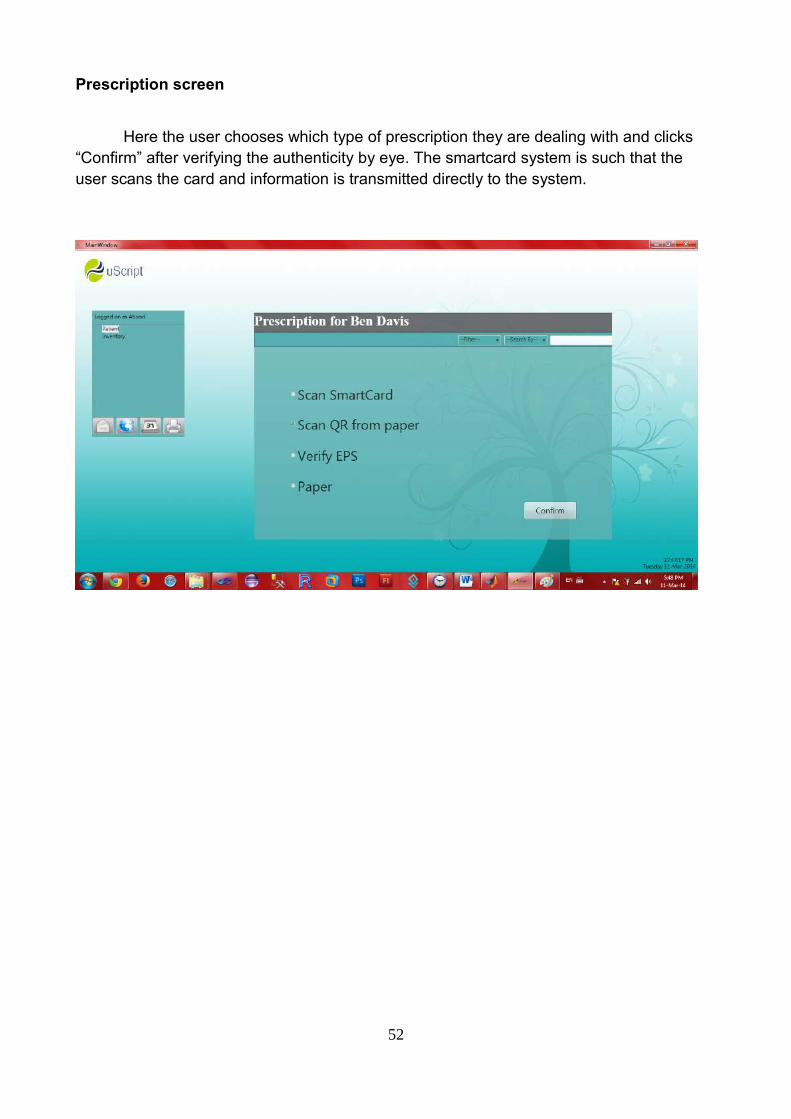
Prescription screen
Here the user chooses which type of prescription they are dealing with and clicks “Confirm” after verifying the authenticity by eye. The smartcard system is such that the user scans the card and information is transmitted directly to the system.
52
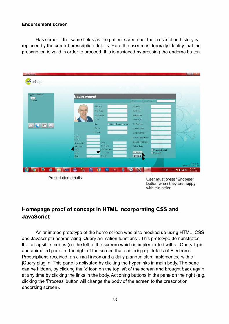
Endorsement screen
Has some of the same fields as the patient screen but the prescription history is replaced by the current prescription details. Here the user must formally identify that the prescription is valid in order to proceed, this is achieved by pressing the endorse button.
Homepage proof of concept in HTML incorporating CSS and JavaScript
An animated prototype of the home screen was also mocked up using HTML, CSS and Javascript (incorporating jQuery animation functions). This prototype demonstrates the collapsible menus (on the left of the screen) which is implemented with a jQuery login and animated pane on the right of the screen that can bring up details of Electronic Prescriptions received, an e-mail inbox and a daily planner, also implemented with a jQuery plug in. This pane is activated by clicking the hyperlinks in main body. The pane can be hidden, by clicking the 'x' icon on the top left of the screen and brought back again at any time by clicking the links in the body. Actioning buttons in the pane on the right (e.g. clicking the 'Process' button will change the body of the screen to the prescription endorsing screen).
53

54

Second Generation Prototype
• Evaluation of tools used in constructing prototypes:
Evolus Pencil
This application is a free to use graphic design tool specifically made for the
purposes of “throw away” prototyping in user interface construction. It was used in creating
prototype 3. Pencil possesses simple geometric shapes and colour choices and such,
which users can construct rudimentary graphics with. The application also has some
default popular system-oriented graphic components, such as those used in Android and
iOS interfaces to offer the user some widely recognisable appearance elements to place
into conceptual ideas for interface designs.
The application is straightforward to use, and is quite responsive when it comes to
piecing together simple user interface appearances so that designers can compare and
evaluate first and second generation prototypes in their work. It should be noted that
Pencil does not offer any means of constructing a functioning prototype. Generally
speaking, it was a simple program, and was particularly useful in constructing and
demonstrating some of the early design choices that the team had, without resorting to
more traditional methods or significantly more expensive software.
LibreOffice DrawPart of the Linux operating system open source office suite, Draw was used in some
of our second generation prototyping for the purposes of illustrating the direction of our
design choices, in addition to being accessible from the Linux-based machines in the
laboratories in which our team collaborated. The application has the means to construct
non-functioning images upon which the team could collectively criticize and amend
according to the functional requirements of the system we wished to build.
One drawback of using this application as reported, however, is that it begins to
slow down quite majorly when dealing with multiple images and text fields which
comprised the look and feel of the system we generally wanted to design. This meant that
the work done for the sections which involved prototyping multiple visual user interface
screen examples took longer than expected. It is also worth mentioning that using this
application to demonstrate the interface decisions the team made was somewhat
55

frustrating, and lacks any ability to provide a functioning prototype of any kind.
GraphicSprings
This is a web-based application for creating logos for businesses cards, company
websites, general business representation, or any other purposes for which a logo is
required - in the team’s case, to have a simple graphical representation for exemplifying
how a final system implementation might look. Much like other similar online services, the
suite was based around a desired company name, and some simple shapes, colouration
and certain relevant pictures based on the professional or vocational field in which a
designer might be working.
The application is quite easy to use, implementing a simple drag and drop method
of placing images and text, with the ability to colour and manipulate the elements
associated with the logo in general. There are a large number of example pictures based
on various possible vocations which one can use. Unfortunately, as with other applications
of the same vein, in order to download a high-resolution version of the desired logo, one
must create an account, and only upon completion is it requested of one to pay a fee
depending on the format of the image.
As a result, there are most likely better means of designing a logo for the purposes
of a rudimentary prototype.
LogoMaker
This is another web-based application for creating logos for various purposes, much
like GraphicSprings and other online design suites offering a similar service. Once again,
this required the making of an account after the desired logo was drawn up, upon which to
download a high-resolution image file, one must pay a fee. This makes it somewhat
inaccessible for those designers who merely want a conceptual design for the purposes of
a working prototype.
Otherwise, the application is straightforward to use, and provides a large number of
potential examples for logos associated with certain professions and particular areas of
work. It allows for image manipulation, as to be expected, text editing, and colouring to
produce a simple but sharp looking logo.
56
Proposed Procedure for the Evaluation of Prototypes:
(Plan description and rationale.)
Upon meeting several times, our team has discussed various means of presenting and
evaluating the prototypes which the team has produced over the course of working on this
project. We have considered a number of heuristic methods popularly utilized by designers
in general, and have observed the format and nature of questions that might be asked in
relation to design functionality including existing examples of generic Computer System
Usability Questionnaires (CSUQ). For the purposes of homogenized analyzation and
objective evaluation of the team’s work, keeping in line with what is popularly used within
the field, the team will implement such criteria as those stated in the Nielsen heuristics,
design principle “Golden Rules”, and Schneiderman’s design principles.
One proposed idea was to present a number of potential users of a prototype
system with a generic CSUQ in order to receive critical responses for the purposes of our
system’s evaluation. The team also feels it would be useful to provide an internal criticism
and evaluation of our own design. Furthermore, it seems sagacious to adapt existing
evaluation-based questionnaires more appropriately centered around the team’s non-
functional prototypes and present those to various individuals to receive third party input.
This would help in finalizing and system design proposals the team may have, and offer us
fresh insight into any flaws or technical mishaps which might have gone unobserved, or
are not immediately recognizable by those working on the prototypes themselves.
In general, collecting multiple perspectives both inside and outside of the team with
the objective of attaining unadulterated and specific critical feedback would prove
efficacious in the process of cultivating a suitably decent range of potential blueprint
adaptations. It is imperative to gain some alternative opinions with the intention of
generating an unbiased and unmediated look toward the project’s architectural and design
aspects, as well as its overall usability.
Unfortunately, towards the end of our project, we discovered that time and available
potential users to test the team’s prototype against through participation was not an
entirely realistic prospect. Instead, we relied almost exclusively upon heuristic evaluation
and cognitive walkthrough methods in order to critically analyse our prototypes. This was
not, however, entirely a caveat: mainly due to the fact that these approaches have been
57

tried and tested within design methodology and commonly used in software engineering,
and as a result we were still able to keep an objective view towards each team member’s
ideas and contributions. This ultimately allowed us to root out bad ideas and
implementations present in the team’s prototypes.
It could be considered that we also employed a certain measure of expert analysis,
given that we spoke to pharmacists and their assistants in the vocational field who either
already, or will in the future, be the primary users and therefore target audience of the kind
of system which we wished to create. Direct opinions posited from those who either like or
dislike certain ideas and who would work with such a system on a daily basis granted us
particular insight into the field. This aided us in avoiding some less obvious mistakes and
problems in our general design, and to consider ease of use capabilities and design
features which might favour our intended end user and their working environment. It also
specifically meant we could account for personal opinions, which is something of which the
team may not have necessarily been able to conceive of without this research, as the
majority of us have not worked in the relevant professional locale.
• Description of prototype:
“ uScript Pharmacy Inventory System”
Using the interactive proof of concept prototype as a template, the second prototype
was developed in LibreDraw as a collaboration of all the best features of the previous
designs. The final design retains the structure of a central information area with
surrounding menus which are always accessible from any screen.
The design has been kept simple and smart with focus on functional efficiency over
aesthetic quality. The buttons maintain a consistent look and feel throughout and all of the
text is the same font and one of 3 distinct sizes. Minimal colours are used throughout the
system and pictures are the appropriate size for their purpose.
The search bar at the top is always visible as well as the menu icons to the left, with
the option of having a sliding right panel to display tasks.
58

59
60

61

62

63
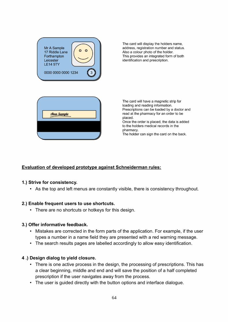
Evaluation of developed prototype against Schneiderman rules:
1.) Strive for consistency.
• As the top and left menus are constantly visible, there is consistency throughout.
2.) Enable frequent users to use shortcuts.
• There are no shortcuts or hotkeys for this design.
3.) Offer informative feedback.
• Mistakes are corrected in the form parts of the application. For example, if the user types a number in a name field they are presented with a red warning message.
• The search results pages are labelled accordingly to allow easy identification.
4 .) Design dialog to yield closure.
• There is one active process in the design, the processing of prescriptions. This has a clear beginning, middle and end and will save the position of a half completed prescription if the user navigates away from the process.
• The user is guided directly with the button options and interface dialogue.
64

5 .) Offer simple error handling.
• The user could make an error by typing the wrong type of information into a form field but will be notified immediately and refused access to continue until they correct the error.
6.) Permit easy reversal of actions.
• The user can choose to go back to any previous screen from any screen. The user may not however skip a screen during the prescription process as important steps could be missed.
7.) Support internal locus of control.
• The system is designed with the user centered as the instigator of actions. Howeverthere is a necessary guided part where the user is forced to follow procedure of verifying a prescription.
8.) Reduce short-term memory load.
• The user is not required to remember anything other than what the buttons do and the other part of their job which is not related to the application itself.
• Evaluation:
Please refer to Analysis of user requirements for extended persona and scenario explanations.
Persona 1 - Jeffrey, experienced pharmacist of 27 years
Scenario 1 (Recap) Retrieve pricing information and product details to make a call on whether or not to buy in a rare medication.Jeffrey needs pricing information on Madeuprizol and needs to know how many tablets are in each box, before he can make a judgement call on whether to make the order. He calls up the ordering system on the computer to see how much it will cost to purchase the tablets and what the minimum number of tablets he can purchase is.Scenario 2 (Recap)A patient presents Jeffrey with a prescription on a smart card.
Jeffrey placed the smart card in the reader, and was able to bring up the patients records straightaway. The records showed a photograph of the patient which Jeffrey could see was the same man who presented his card. The prescription endorsing screen was automatically filled in with details of the prescription from the card. Jeffrey, with the help of one of the dispensers, checked
65

the medication against the prescription on the card and endorsed the prescription, happy that the smartcard system limited his face-to-face time with the patient.
Scenario 3 (Recap)A message needs to be displayed to warn against a problematic customer.
Jeffrey logs a note on in the comments section of the patient's computer warning his colleagues only to dispense branded medication. He flags the customer up as potentially confrontational. This flag will be brought to his colleague's attention whenever his record isopened.
Persona 2 - Nadia - locum pharmacist
Scenario 1 (Recap) A message needs to appear to prevent overdosing patients.
After Nadia clicks the 'Endorse' button on the prescription screen, a warning flag comes upand informs her of the change of dose and asks her whether she really wants to proceed. Nadia checks the prescription again and confirms that she had entered the right dose, according to the prescription, but uses her judgement and calls the drug treatment clinic to check that this was the correct dose. The prescribing doctor realises he had accidentally pressed the '0' key twice on his prescribing software and had not realised he had increased the dose. Nadia destroys the erroneous prescription and waits for the doctor to send her a new one.
Scenario 2 (Recap) Nadia has received a prescription via the electronic prescription service for the first time. A pop-up on her computer tells her that the prescription is in her inbox.
She follows on-screen instructions on the pharmacy management system to process the prescription. The patients records are automatically completed with information from the electronic prescription. She likes this because she doesn't have to type in the details herself and she is free to check the medication in the store against the prescription which is on screen. The label is automatically set up up, and all she has to do to print it off is clicka button on the screen once she has checked everything is okay.
Scenario 3 (Recap) A patient presents a prescription for Hypothetadrine, which has come from the local hospital, and a prescription for Fictitiarin, which has come from his GP. Fictitiarin and Hypothetadrine are contraindicated medications.
66

When entering the prescription for Fictitiarin a warning on her computer came up with a listof contraindicated medications, including Hypothetadrine. Nadia was able to call the GP surgery and arrange an alternative prescription, which the patient picked up later that day.
Persona 3 - Tracey - dispensing assistant
Scenario 1 (Recap) A woman brings in a prescription for eczema treatment for her 81 year-old-father, who is present with her. While the woman is a regular customer, there is no record of her father on the patient database. Because of mobility problems, she says she will be collecting her father's medication for the foreseeable future. The woman is worried that her father may occasionally come into the pharmacist in a confused state (he is in the early stages of senile dementia) and try to pick up his medication himself.
Tracey adds the old man's record to the patient database, but cross-references it with the his daughter's record. The notes clearly state the medication is only to be dispensed to thedaughter and she is to be contacted if her father comes into the shop alone.
Scenario 2 (Recap) Tracey is double-checking a prescription that her colleague, Nadia, has endorsed. She notices that the prescription is for Dihydrocodeine Modified Release tablets, whereas the pharmacist, Nadia, has used regular Dihydrocodeine tablets. Nadia has already entered details onto the computer and saved the record.
Tracey is able to alert Nadia to the mistake, but she is unable to edit the error herself. The system only allows the responsible pharmacist to edit prescription records. Nadia logs into the system and edits the prescription history. She logs her error in the incident book.
Scenario 3 (Recap) A man brings in a prescription from his GP. He claims he is on benefits and, as such, is exempt from paying the prescription charge. He has brought proof that he is on benefits.
Tracey manually creates a new record and selects the appropriate field which indicates that he is not to be charged for his prescriptions.
• Results and conclusions:
• Because we used the scenarios and personas as a basis for developing the final
67

prototype, the end result was pretty satisfactory. The design fitted the scenarios welland despite there being improvements that could have been made, the product is one we had hoped for.
• For some screens there are too many text boxes, Whilst there are workarounds, they may not be preferable to seeing all the information on one screen.
• The inventory screen is crowded and difficult to read, this could have been improved by alternating colours and with better management of the space available.
• There is no sign-out button.
• The search screens only displays four results, this is good for displaying clear information but not good for looking through lots of results.
Summary and recommendations
During the course of this project we have identified a problem that needs a solution,
interviewed actual users and researched existing efforts and developed a prototype based
on input extrapolated from the findings. We evaluated the prototypes ourselves due to time
constraints, this could have been done better with more time.
We decided to interview real pharmacists in order to realise the real problems and
get genuine insight into how to develop a solution. Having this information proved
invaluable to informing the finished product and we were able to also produce some
advanced prototypes as proof of concept. Pharmacists are highly educated and qualified,
but not necessarily computer literate, hence need for simplicity and for interface not to be
intimidating. Despite help of computers, all pharmacists said it is very much a physical job,
dependent on human skills and subject to human error. Computers can't yet (replace)
human element, so role of system should be to facilitate and enable checking of
prescriptions, but not to intrude on that process.
As mentioned before, we were unable to perform user participation evaluation, mostly
because time and potential users for a functional prototype were unavailable - the former
being more of a constraint. In hindsight, this type of evaluation would have been useful,
given that our system was designed to be implemented in a public working environment.
Instead, we relied heavily on cognitive walkthrough methods and heuristic evaluation to
68
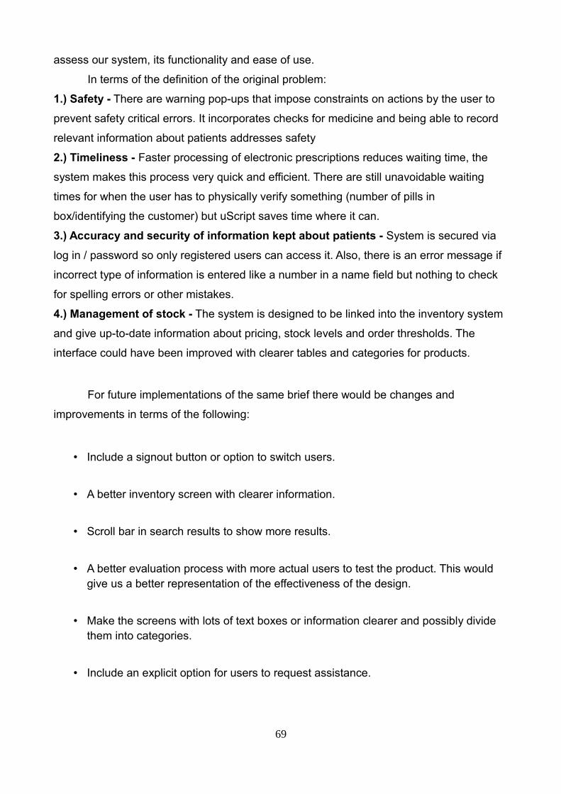
assess our system, its functionality and ease of use.
In terms of the definition of the original problem:
1.) Safety - There are warning pop-ups that impose constraints on actions by the user to
prevent safety critical errors. It incorporates checks for medicine and being able to record
relevant information about patients addresses safety
2.) Timeliness - Faster processing of electronic prescriptions reduces waiting time, the
system makes this process very quick and efficient. There are still unavoidable waiting
times for when the user has to physically verify something (number of pills in
box/identifying the customer) but uScript saves time where it can.
3.) Accuracy and security of information kept about patients - System is secured via
log in / password so only registered users can access it. Also, there is an error message if
incorrect type of information is entered like a number in a name field but nothing to check
for spelling errors or other mistakes.
4.) Management of stock - The system is designed to be linked into the inventory system
and give up-to-date information about pricing, stock levels and order thresholds. The
interface could have been improved with clearer tables and categories for products.
For future implementations of the same brief there would be changes and
improvements in terms of the following:
• Include a signout button or option to switch users.
• A better inventory screen with clearer information.
• Scroll bar in search results to show more results.
• A better evaluation process with more actual users to test the product. This would give us a better representation of the effectiveness of the design.
• Make the screens with lots of text boxes or information clearer and possibly divide them into categories.
• Include an explicit option for users to request assistance.
69

• A more appropriate colour scheme and use of images.
• A better inventory system for management of stock with more pricing information and threshold warnings on the main page/when appropriate.
References
• Dix, A., et al, (2004) ‘Human Computer Interaction’, 3rd edition, Pearson Education Limited
• Proscript User Guide (2005) http://securepharm.co.uk/support/pdf/proscriptmanual.pdf [online]
• Carefusion product brochures:
http://www.carefusion.com/pdf/ [online]
Medication_Management/Rowa/rowa-hospital-brochure-2012.pdf [online]
http://www.rowa.de/fileadmin/Brochures/ [online]
• Neilsen, J (January 1, 1995) 10 Usability Heuristics for User Interface Design, from http://www.nngroup.com/articles/ten-usability-heuristics/ [online]
• Schneiderman B., et al (2009) Designing the User Interface: Strategies for Effective Human-Computer Interaction - Prentice Hall
• “The Electronic Prescription Service: An introduction to Release 2 for healthcare professionals” - http://www.connectingforhealth.nhs.uk/systemsandservices/eps/library/comms/release2/release2.pdf
• “General Prescribing Guidance” - http://www.patient.co.uk/doctor/general-prescribing-guidance
• UID website: http://www.uid.com/ [online]
70