
HTML B OOT C AMP Chapter 9 Forms Kirkwood Continuing Education © Copyright 2015, Fred McClurg All...
33
HTML BOOT CAMP Chapter 9 Forms Kirkwood Continuing Education © Copyright 2015, Fred McClurg All Rights Reserved
-
Upload
edgar-derek-martin -
Category
Documents
-
view
214 -
download
0
Transcript of HTML B OOT C AMP Chapter 9 Forms Kirkwood Continuing Education © Copyright 2015, Fred McClurg All...

HTML BOOT CAMP
Chapter 9Forms
Kirkwood Continuing Education
© Copyright 2015, Fred McClurg All Rights Reserved

The <form> Tag
Description: Defines a form and provides a container for form elements.
Example:<form>
...
</form>2

<form> Tag “action” Attribute
Description: Defines the script that is executed upon form submission.
Example:<form action="script.php">
...
</form>
3

<form> Tag “method” Attribute
Description: Defines the method by which the data is passed to the script upon form submission.
Example:<form action="script.php"
method="get"> ... </form>
<form action="script.php"
method="post"> ... </form>
4

Which is better GET or POST?
Description: Both “get” and “post” serve different roles.
Use GET when: Small forms with few fields Save/retrieve bookmark of execution Pass parameters via a link Debugging code
Use POST when: Many or long text fields Capturing sensitive information (e.g.
credit card, social security, passwords)
5

<form> Tag “enctype” Attribute
Description: By default, form data is encoded. This attribute allows you to turn off the encoding.
Example:<form
action="mailto:[email protected]"
method="post"
enctype="text/plain"
onSubmit="window.alert('Form was sent via email ...')" >
Email: <input name="email" />
<input type="submit" />
</form>
6
Chapter 09 > Enctype Attribute
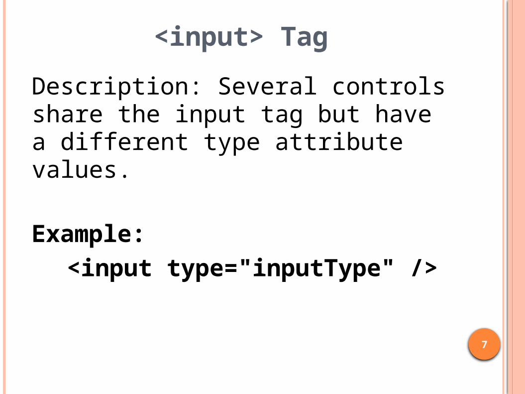
<input> Tag
Description: Several controls share the input tag but have a different type attribute values.
Example:<input type="inputType" />
7

<input> Tag “type” Attributes
Description: A number of tags support the following attributes.
8
Type Descriptionbutton Push button control (client-side)
checkbox Checkbox button (many of many selection)
hidden Hidden controlpassword Single line text field with masked displayradio Radio button (one of many selection)reset Push button for reset (client-side)submit Push button for submission (server-side)text Single line text field
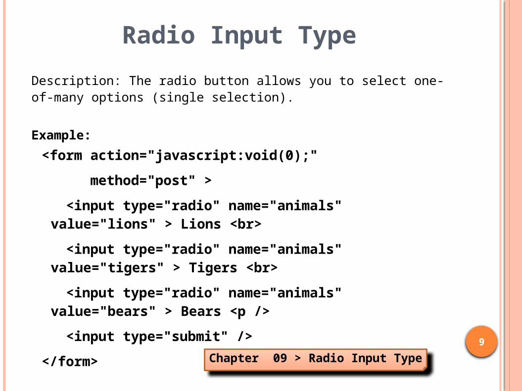
Radio Input Type
Description: The radio button allows you to select one-of-many options (single selection).
Example:
<form action="javascript:void(0);"
method="post" >
<input type="radio" name="animals" value="lions" > Lions <br>
<input type="radio" name="animals" value="tigers" > Tigers <br>
<input type="radio" name="animals" value="bears" > Bears <p />
<input type="submit" />
</form>
9
Chapter 09 > Radio Input Type

Check Box Input Type
Description: The check box allows you to select many-of-many options (multiple selection).
Example:
<form action="javascript:void(0);"
method="post" >
<input type="checkbox" name="animals" value="lions" > Lions <br>
<input type="checkbox" name="animals" value="tigers" > Tigers <br>
<input type="checkbox" name="animals" value="bears" > Bears <p />
<input type="submit" />
</form>
10
Chapter 09 > Check Box Input Type

<label> Tag with “for” & “id”
Description: Associates a label with a control.
Example:<input type="radio"
name="frequency"
value="1"
id="always">
<label for="always">
Always
</label>
11
Chapter 09 > Label Tag

Label ElementDescription: The labels can be associated with another element in order to assist screen readers and to enable the label to be clicked.
Example:<input type="radio" name="comedians"
value="ac" id="ac" />
<label for="ac">
Abbott & Costello
</label> <br>
<input type="radio" name="comedians"
value="lh" id="lh" />
<label for="lh">
Laurel & Hardy
</label> <br>
<input type="radio" name="comedians"
value="ml" id="ml" />
<label for="ml">
Dean Martin & Jerry Lewis
</label> <p />
12
Chapter 09 > Label Element

<input> type buttons
Description: The <input> tag features three different buttons.
Example:
<input type="button" value="Button" onclick="javascript:alert('Button pressed!');"/>
<input type="reset" value="Reset" />
<input type="submit" value="Submit" />
13
Chapter 09 > Input Type Buttons

<button> Tag with text
Description: The <button> has several advantages over the <input type=“button”> including HTML formatting of text and image support.
Example:<button type="submit">
<b>Danger, <em>Will
Robinson!</em> Danger!</b>
</button>14
Chapter 09 > Button Tag with Text

<button> Tag with <img>
Description: The <button> has several advantages over the <input type=“button”> including HTML formatting of text and image support.
Example:<button type="submit">
<img src="images/download.png"
alt="Download" />
</button>
15
Chapter 09 > Button Tag with Image

<input> Tag with Image Type
Description: The <input type="image"> allows you construct a clickable image that functions like a push button.
Example:
<input type="image"
id="imageButton"
title="You better not press this!"
alt="Push Button Warning"
src="images/cancel.32x32.png" />
<label for="imageButton">
Don't Press Me
</label>
16
Chapter 09 > Image Input Type

Text Input Type
Description: The default input type is “text”. It allows a single line of text.
Example:<form action="javascript:void(0);"
method="post" >
Full Name: <br>
<input type="text"
name="fullname" /> <p />
<input type="submit" />
</form>17
Chapter 09 > Text Input Type

<input> Tag Attributes
Description: There are a number of attributes that can be used with the input tag.
18
Type Descriptionvalue Defaulted text stringsize Controls width of text box to limit
the number of characters displayed
maxlength Limits the number of characters that can be entered
required Specifies field is required. Displays an error message and prevents form from submission if value is present.

More <input> Tag Attributes
Description: There are several new attributes that can be used with the input tag.
19
Type Descriptionreadonly Displays text and allows copy (Ctrl+v)
but does not allow user to modify text.disabled Displays text but does not allow copy
(Ctrl+v) or modification of text.placeholder
Light gray text that appears when the field is blank to provide context help for users. Text disappears when user begins typing.
pattern Regular expression that specifies a valid string. Text box turns red when losing focus to indicate string if is not valid

“readonly” & “disabled” Attribute
Description: Read only attribute prevents a text control from being modified. Disabled attribute prevents controls from being usable.
Example:Try to Enter: <br />
<input type="text"
value="Try to modify text"
readonly />
<input type="submit"
value="Try to Submit"
disabled />
20
Chapter 09 > Text Input Attributes

Password Input Type
Description: The password input type masks the password so it is not displayed while typing.
Example:Password:
<input type="password"
name="password"
placeholder="8 chars min"
pattern="^.{8,}$"
title="Minimum of 8 chars"
required >
21
Chapter 09 > Password Input Type

New <input> Tag “type” Attributes
Description: Several new input tag types have been introduced with HTML5.
22
Type Descriptioncolor Color pickeremail Email address fieldnumber Number fieldrange Slider for entering a number within
rangesearch Text field for a search stringtel Text field for a telephone numberurl Text field for a URL
Chapter 09 > New Input Types

New <input> Tag “type” Attributes
Description: Several new input tag types have been introduced with HTML5.
23
Type Descriptioncolor Color pickeremail Email address fieldnumber Number fieldrange Slider for entering a number within
rangesearch Text field for a search stringtel Text field for a telephone numberurl Text field for a URL
Chapter 09 > New Input Types

<textarea> Tag
Description: Defines a text box that permits multiple lines of input.
Example:<textarea
name="message"
rows="5"
cols="20"></textarea> 24
Chapter 09 > Multiple Line Text

<select> Tag (dropdown list)
Description: Defines a dropdown list of items. Only one item can be selected.
Example:<select name="media">
<option>Paperback</option>
<option>Hardcover</option>
<option>Kindle</option>
</select> 25
Chapter 09 > Dropdown List

<select> Tag “multiple” Attribute
Description: The size attribute greater than one defines a scrolling list of items. Multiple items can be selected.
Example:<select name="pet" size="3" multiple>
<option>Cat</option>
<option>Dog</option>
<option>Fish</option>
<option selected>
Other ...
</option>
</select>
26
Chapter 09 > Multiple Select List

<fieldset> & <legend> Tag
Description: Provides a visual grouping of elements.
Example:<fieldset>
<legend> Demographics </legend>
First:
<input type="text"
name="first"> <p />
...
</fieldset>
27
Chapter 09 > Fieldset & Legend

HTML5 Semantic Tags
Description: Several of the new semantic tags are available in HTML5.
28
Type Descriptionheader Container for a group of introductory
elementsnav Container for grouping navigation linkssection Defines sections in a document such
as chapters, headers, footers, etc.article Defines self-contained contentaside Defines content related to the
surrounding content
Chapter 09 > Semantic Tags

More HTML5 Semantic Tags
Description: Several additional semantic tags are available in HTML5.
29
Type Descriptionfigure Defines self-contained content like
illustrations, diagrams, photos, graphs, etc.
figurecaption Defines a caption for a figure element
footer Defines a footer for a documenttime Defines human-readable
date/timemain Specifies the main document
content
Chapter 09 > Semantic Tags

<details> & <summary> TagDescription: Provides a heading for the <details> element. In some browsers (e.g. Chrome) the heading can be clicked to view/hide the details.
Example:
<details>
<summary>
Carver, George Washington
</summary>
<p>An American botanist and inventor.
He performed research into and promotion
of alternative crops to cotton, such as
peanuts, soybeans, and sweet potatoes,
which also aided nutrition for farm
families.</p>
</details>
30
Chapter 09 > Details and Summary

<datalist> TagDescription: Provides a list of options for an input element which are displayed as autocompletion items.
Example:
<input list="lname"
name="lname"
placeholder='Type "mcglumphry"' />
<datalist id="lname">
<option value="Martin" />
<option value="McClurg" />
<option value="McGlashing" />
<option value="McGlumphry" />
<option value="McGrath" />
</datalist>
31
Chapter 09 > Datalist Tag

<meter> Tag
Description: The <meter> tag, also known as a gauge, displays a measurement within a range.
Example:
Your score:
<meter min="0" max="100"
low="40" high="80"
value="75">
75 Percent
</meter>
33
Chapter 09 > Meter Tag

<progress> Tag
Description: The <progress> tag displays progress of a task.
Example:Completed:
<progress value="75" max="100">
3/4 complete
</progress>
34
Chapter 09 > Meter Tag