How did i attract my target audience
13
WHO AND HOW DID I ADDRESS MY AUDIENCE? By David Gordon -Pictures-
Transcript of How did i attract my target audience

WHO AND HOW DID I ADDRESS MY AUDIENCE?
By David Gordon
-Pictures-

Planning for the audience
I had decided at the start to follow the rock/ punk. (magazines like Kerrang and NME.) This meant I was creating a magazine for that genre of music. In order to do this I needed the look what is most associated with rock and punk, and that is rebellious. (E.g.: Broken things, messy, dark colours and the model(s) acting up and rebelling. I used several style sheets to help me create that look.

The Audience in more detail
Already establishing my magazine is for the music fans of rock and punk I wanted to know age, gender, class and from this I could then personalize my magazine to fit. So I constructed a questionnaire.
The results pinned down and confirmed aspects of the rebellious look I mentioned in the previous slide. I also found out that I am heading towards a middle class audience (D’s to C’s.) The age of a genre like this is pretty braud however I will aim it at late teen’s as they seem to be the biggest group to be fans of the rock and punk genre.Additional important results:.A busy layout.Monthly issue with a price of about £1.90.Gossip on stars most popular story’s.and that the name of a magazine and look of the model is very important.
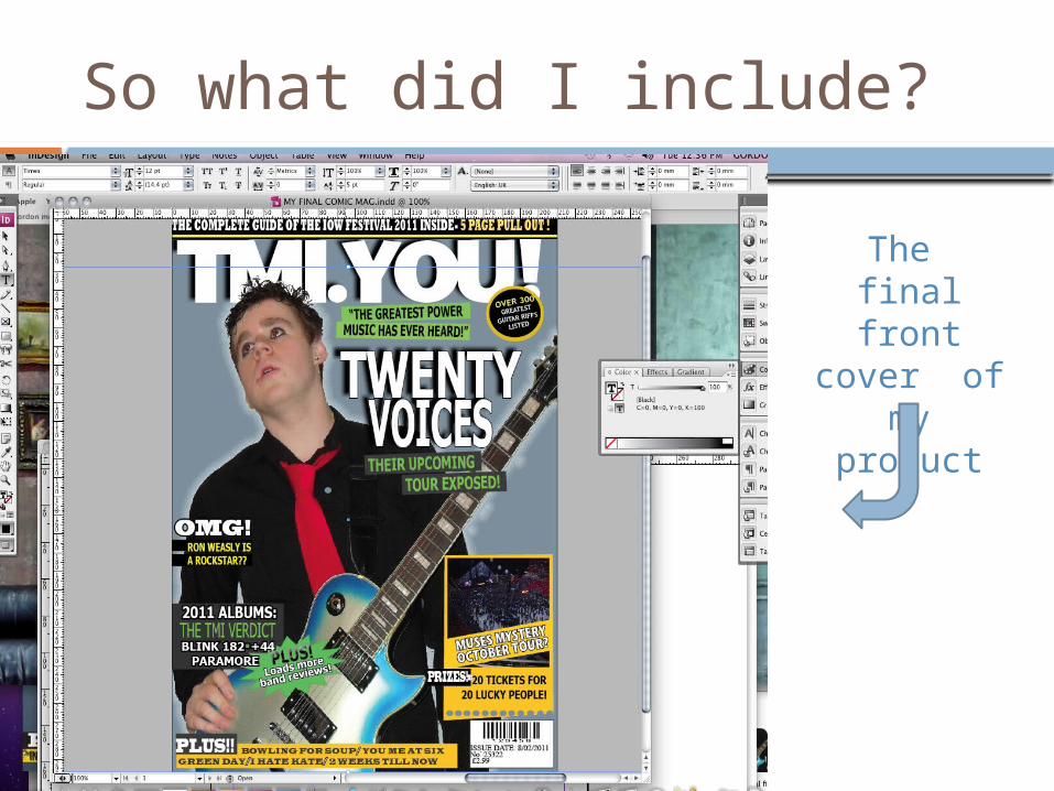
So what did I include?
The final front cover
of my product

I included-
A masthead which is catchy, simple and is presented in a abbreviated form. I based the idea of NME’s masthead. My products title is ‘The Music In You’ or TMI YOU! This is catchy and easy to remember and relates to the genre of magazine. I used a huge, chunky and modern font then used a shadow effect to really make it stand out from the rest of text.
A messy but not that busy front cover. Overlapping tag line and pictures, different fonts and sizes as well as a variety of mixed clashing colours. I achieved the overlapping by setting the overlapping status of each object or font. I also used the rotation tool a lot to give a messy but bold look. This is all a common theme in other rock mag’s and came as the most popular design in the questionnaire.
The price is also near to what the questionnaire had suggested. Instead of around £1.90 I chose £2.99. It is well in the middle class range and is still considerably cheaper then other rival magazines.

I included-
.The model is holding the guitar taking up the majority of the page he is positioned so he looks in the middle of performing. He has the punk look consisting of guy-liner, black and red coloured clothes and spiky hair. This being the biggest thing on the page means it must represent the punk rock genre clearly. Which I believe it did. I achieved this using Photoshop and also was then able to add effects like backlight glow in order to enhance the image to make it more eye catching.
I included tag lines which involves celebrity story’s (gossip), as well as other numerous music news. There is also a chance to win tickets to a concert as it is always a good way into tempting people to buy the mag. I shaped the prize for concert tickets on a ticket shaped background. This is easily done on ‘indesign’ and gives the magazine a more professional look and again relates to the topic of music.


Contents page includes-
Story's consisting of popular punk/ rock bands. Album listings, reviews and interviews. (Typical story’s which
are already in these genre mag’s. Stupidity and rebellious is the TMI reporter ‘Cow man’. It’s a
stupid yet funny and different character which could become an iconic image for TMI YOU. So I included this as it's typically of the liking’s to the main target audience’s age of the mag (teenagers.)
Again I Photoshoped the image at the top and included the effect of black and white and had also blurred it. This keeps with the dark colour theme but also make the magazine modern.
The layout is traditional and clear to see completely different to the Front cover. This shares and keeps a neutral point of age and social status. (trying to include a look here and there for my braud audience.)


Double Page Spread inside-
News of the rock band new tour. In more detail the text explains news of the band, the new tour and a little extra which is their past tours. Not much topics on a double page however that is all the audience wants to read and is plenty to keep the reader engaged. The Linguistic choice is very important for this genre of magazine. I needed to include youth orientated terms, short sentences and I included censored words to really grasp the rebellious aspect.
The social class of D’s and C’s means more pictures and less text . So place pictured covering 2/3rds of the page and just a third is text. This doesn't only fit the social class but it helps fit the wants of teenagers.

Double Page Spread inside-
The pictures. All black and white in order of the theme of darkness but also done in a modern artistic style. I changes the sharpness the tone to not only have a black and white photo but to also have a trendy, eye catching look. Photoshop is very good for things like enhancing pictures and making it have more of a WOW factor.
Again diagonal text with different fonts keep in tone with the rock, and wild look. However the colour of the fonts is important. The title is in big red capitals and means it will be read first. The smaller less enthusiastic colour (white) text is less of a priority for when engaging my target audience. In design has hundreds of fonts and colours bit also options when dealing with font. You can space, squeeze and stretch the fonts and customize/ personalize them to fit the design and style which is what I have done.

Did I achieve the target audience?
By creating the questionnaire and sticking by it as well in having style models the magazine was pretty easy to personalize in to the rock/ punk group of people.
.Darkness, overlapping, colours, rotation, font and models are all aspects of the layout which I took and personalized into the rock but modern genre.
Content included rebellious words and consisted of youth language but yet simple for the social class.
The magazine looks professional, has the rock and punk feel which is exactly what I needed to do
However...............
Improvements-
Ethos of my magazine is a bit vague. There isn't a consisting theme throughout in the sense of colour scheme. However in other aspects like the masthead, layout and content is perfectly fine. An example of my point is; Kerrang’s masthead is yellow and the contents listings are also yellow. Kerrang is known for the yellow colour and my magazine is missing that iconic aspect,


![[PDS] Attract your Target Audience](https://static.fdocuments.us/doc/165x107/546f3547af795953298b5932/pds-attract-your-target-audience.jpg)