Hot Typography SMPS Pacific Regional Conference
145
Hot Typography Igniting Fonts in Persuasive Proposals and Presentations DAVID LECOURS of LECOURSDESIGN
-
Upload
david-lecours -
Category
Design
-
view
1.586 -
download
0
Transcript of Hot Typography SMPS Pacific Regional Conference
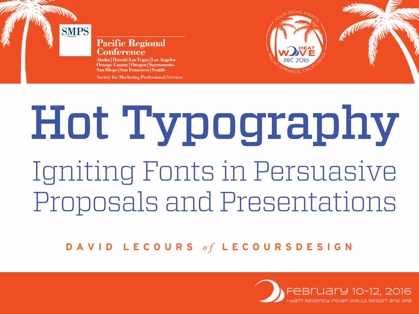
Hot Typography Igniting Fonts in PersuasiveProposals and Presentations
D A V I D L E C O U R S o f L E C O U R S D E S I G N

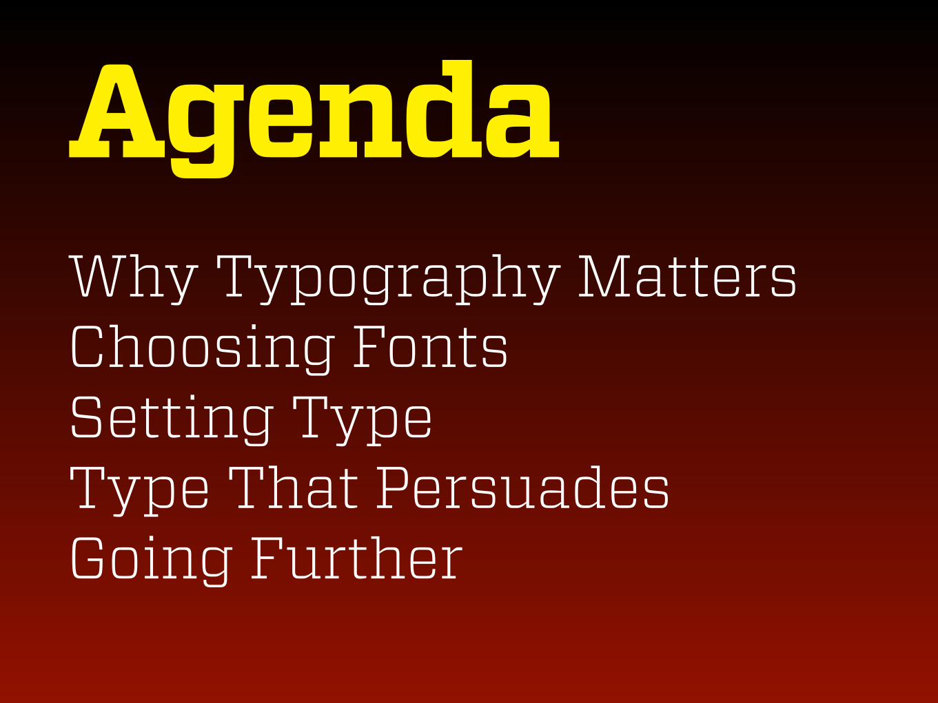
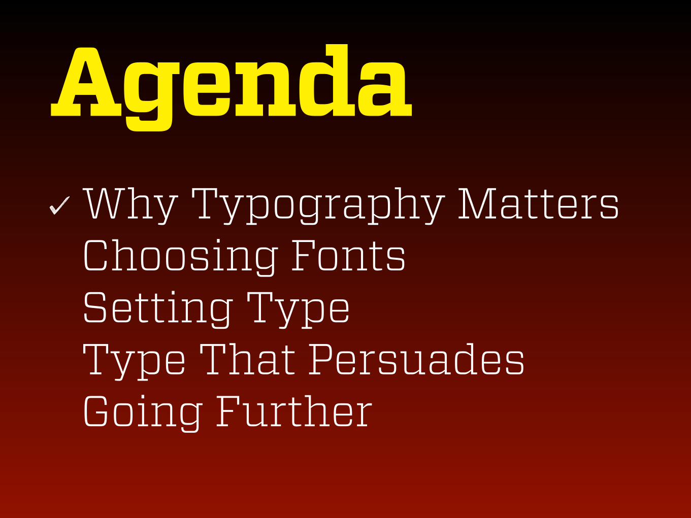
Agenda Why Typography Matters Choosing Fonts Setting Type Type That Persuades Going Further

Sharing = Caring
@davidlecours #smpsprc

Format Presentation / Stories Participation / Dialogue Notes / Slides
Resources lecoursdesign.com/type

Why Typography Matters
You’re a Graphic Designer Now

Clarity and Professionalism


It’s not the best idea that wins.
WHY

Typography is Voice


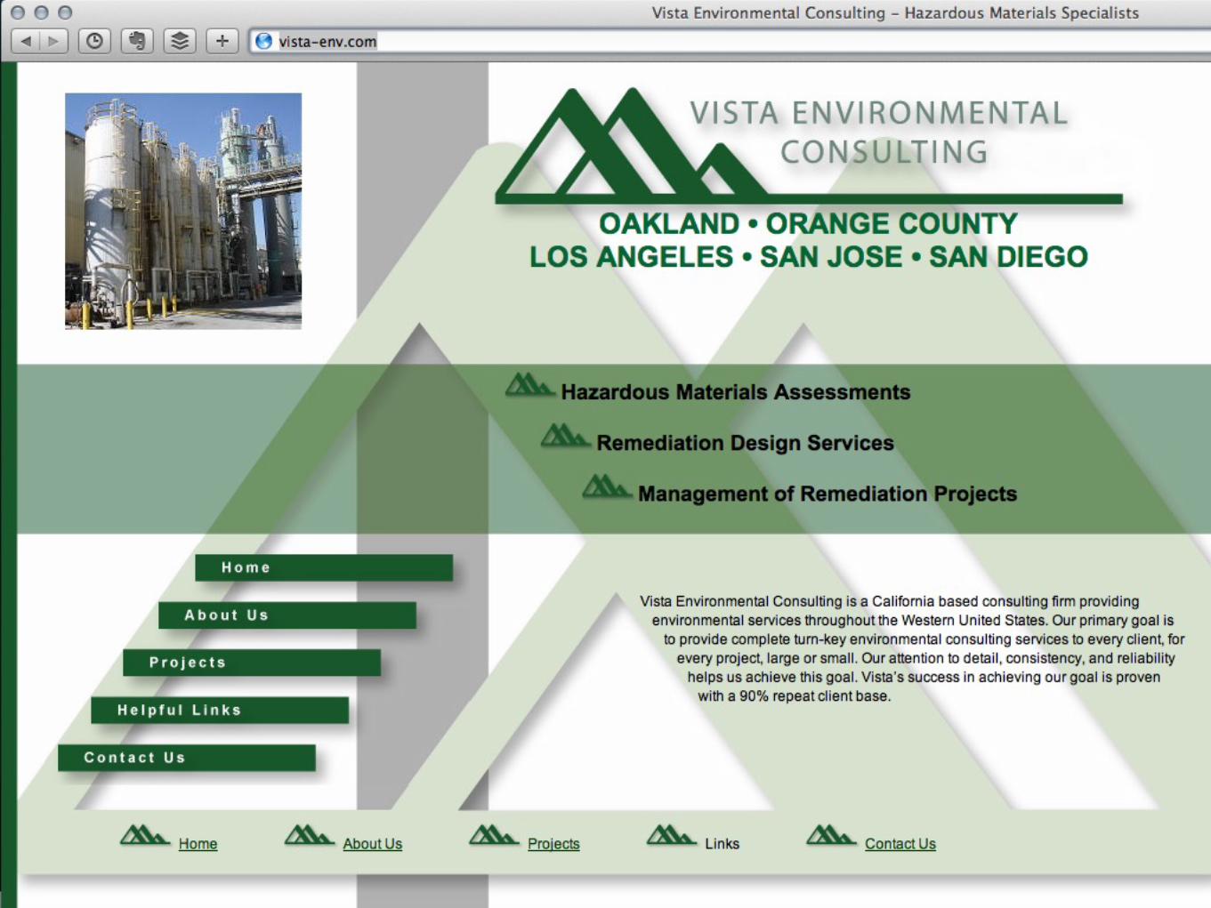
Commodity? Just Say No.
WHY

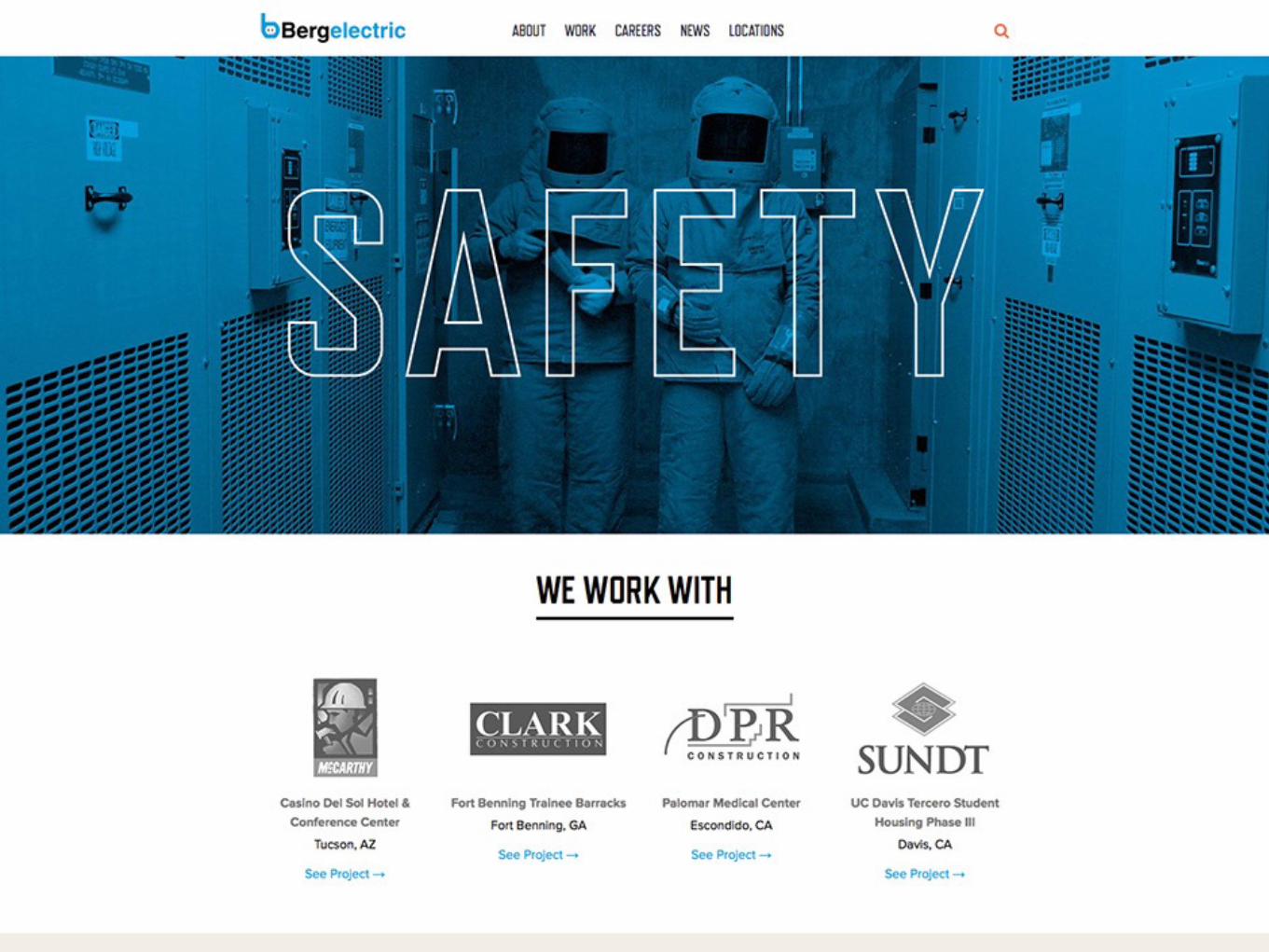
CustomizingSlide Decks & Proposals
WHY

3
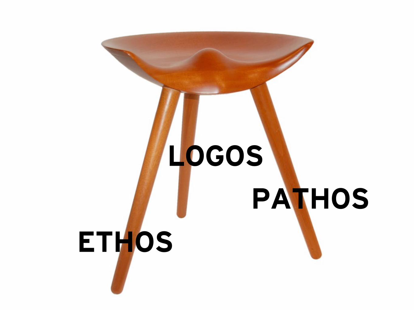
LOGOS
ETHOS
PATHOS
Agenda Why Typography Matters
Choosing Fonts Setting Type Type That Persuades Going Further

Choosing Fonts

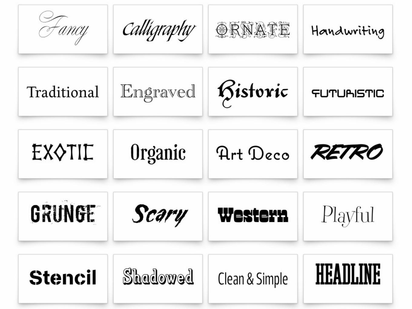
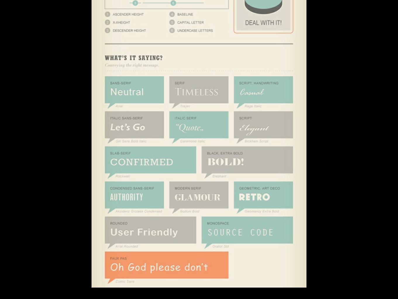
Type Classification


Serif classic


Sans Serif modern

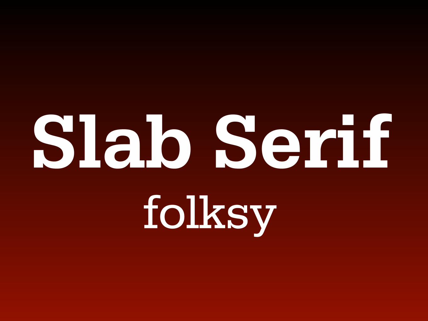
Slab Serif folksy


Script fancy


Script casual hand

PERIOD time & place

NASA Handel Gothic
1920’s Paris Braggadocio
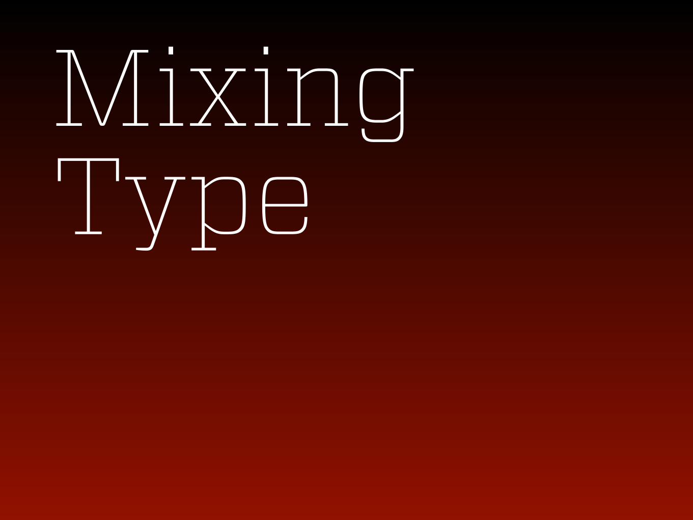
Mixing Type


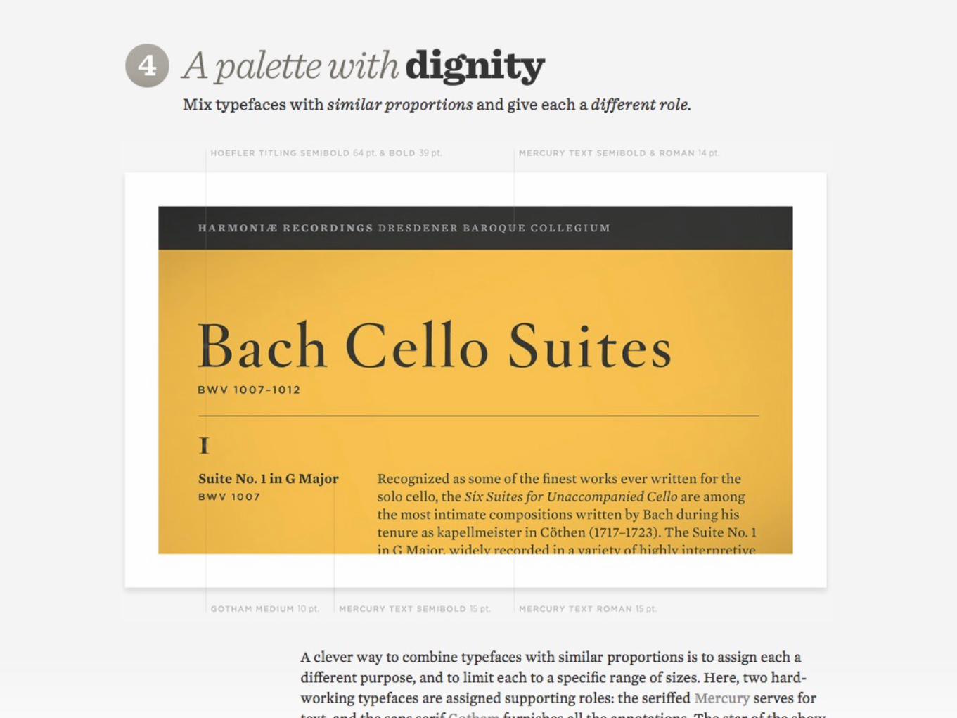


HEADLINE This is body copy that is meant to be readable. This is body copy that is meant to be readable. This is body copy that is meant to be readable.

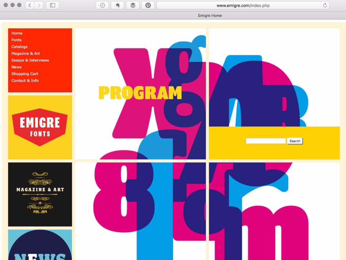
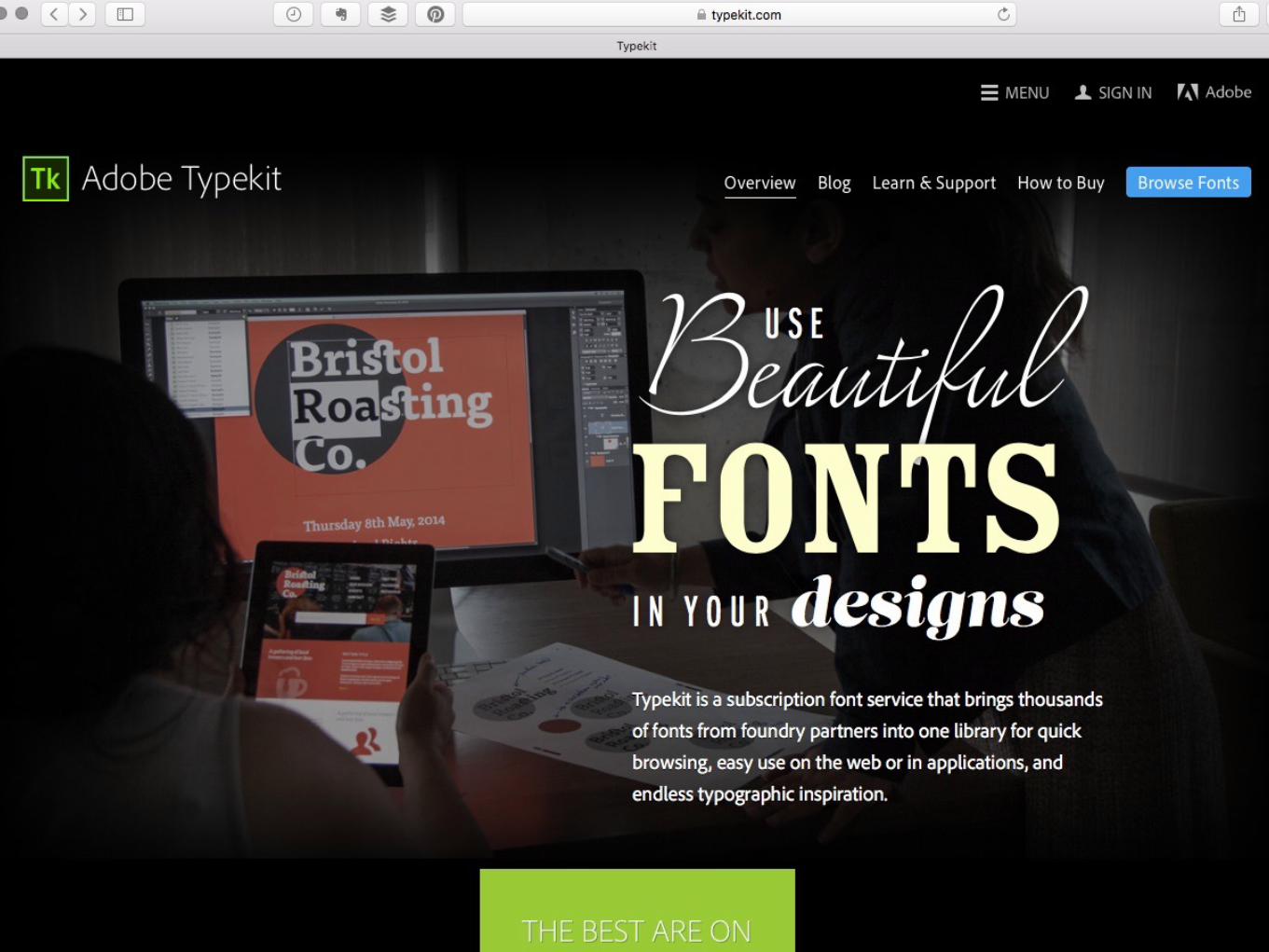
Where To Buy Fonts


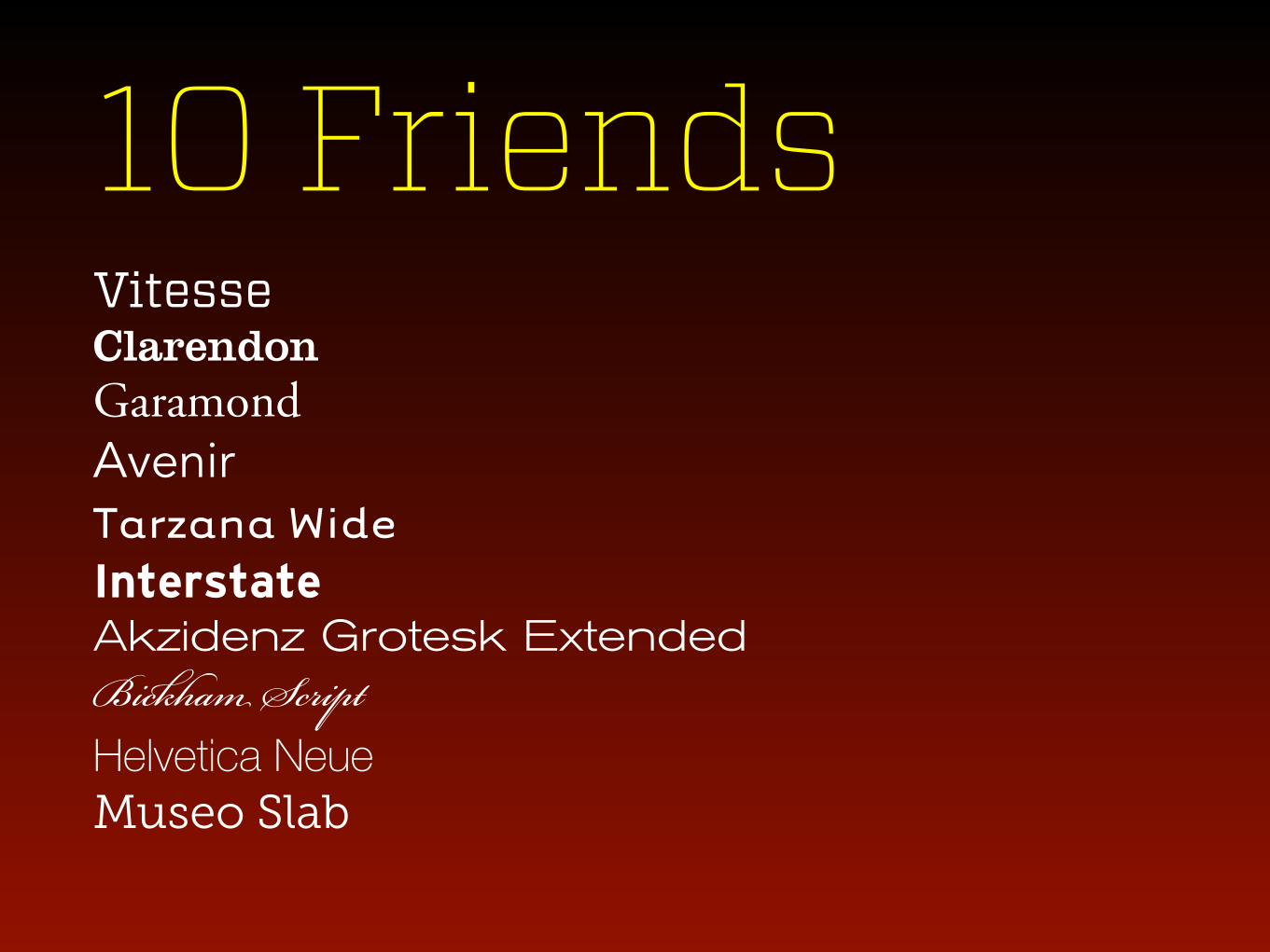
10 Friends Vitesse Clarendon
Garamond Avenir Tarzana Wide Interstate Akzidenz Grotesk Extended
Bickham Script Helvetica Neue
Museo Slab
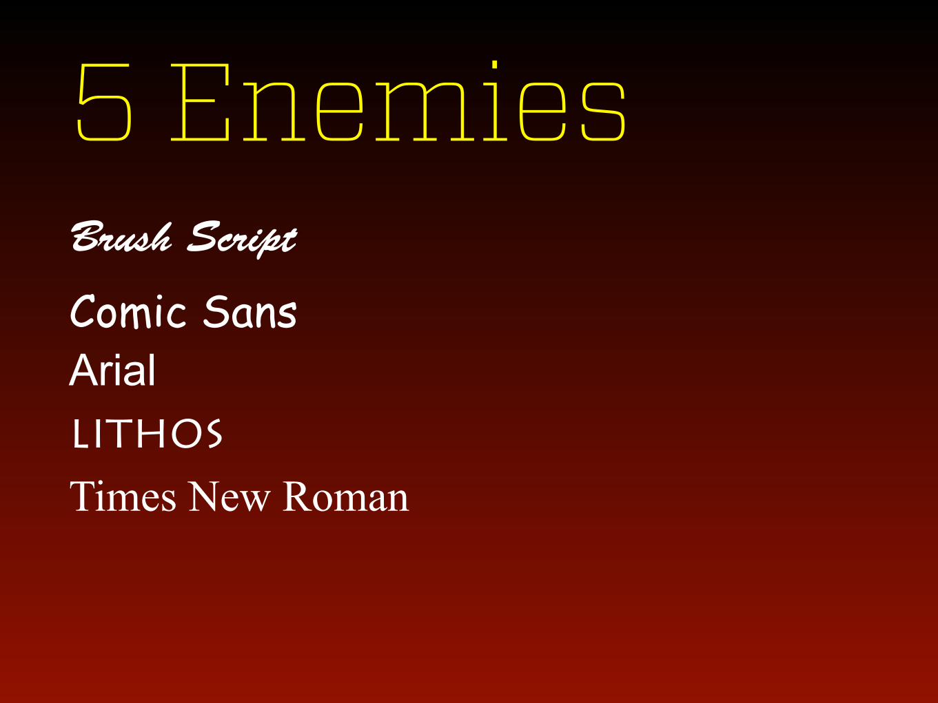
5 Enemies Brush Script
Comic Sans Arial Lithos
Times New Roman

Agenda Why Typography Matters Choosing Fonts
Setting Type Type That Persuades Going Further

Setting Type Top 10 Pro Tips

Use Typographic Rules


NASA Handel Gothic
1920’s Paris Braggadocio

Use Multiple Columns


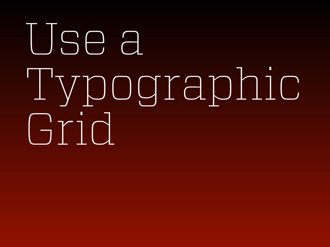
Use a Typographic Grid


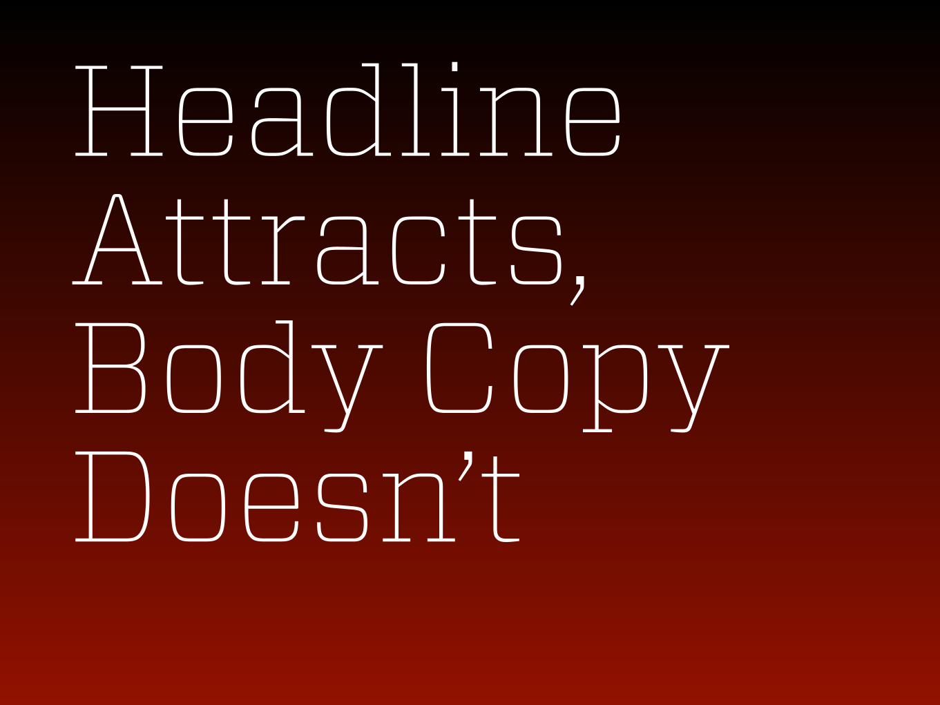
Headline Attracts, Body Copy Doesn’t


One Space After a Period. Ok?

Inches = 12" —vs.—
“Quotation”

Reverse Out Sparingly.

If body copy, then this reversed out text is causes eye fatigue. If body copy, then this reversed out text is causes eye fatigue. If body copy, then this reversed out text is causes eye fatigue. If body copy, then this reversed out text is causes eye fatigue.
If body copy, then this dark text on a light background is easiest on the eyes. If body copy, then this dark text on a light background is easiest on the eyes. If body copy, then this dark text on a light background is easiest on the eyes.

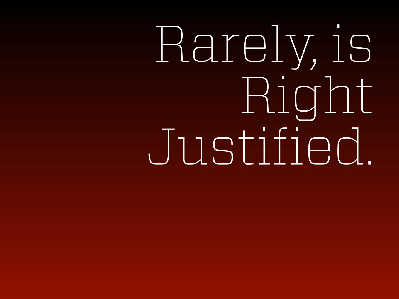
Rarely, is Right
Justified.

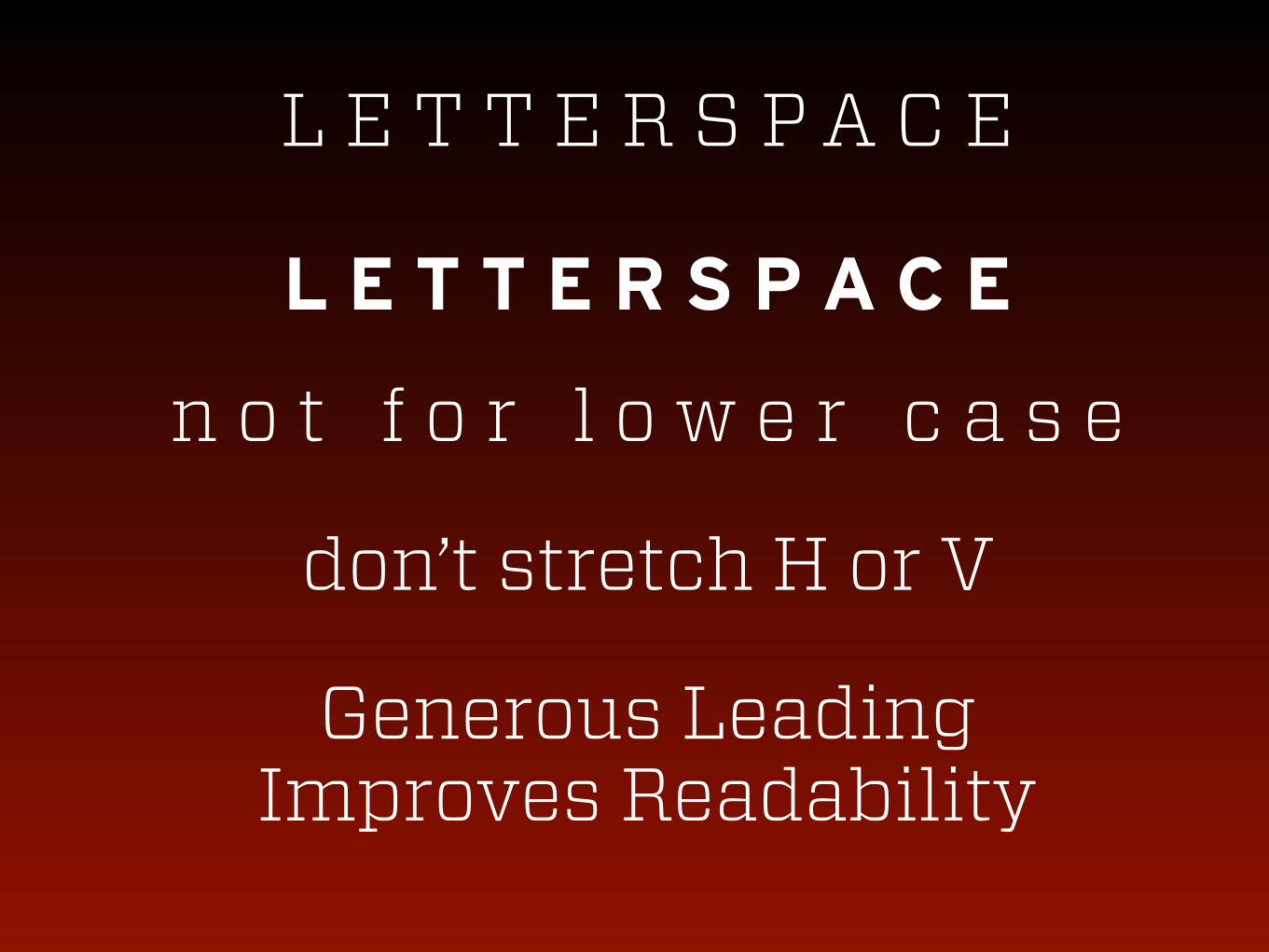
L E T T E R S P A C E
L E T T E R S P A C E
n o t f o r l o w e r c a s e
don’t stretch H or V
Generous Leading Improves Readability
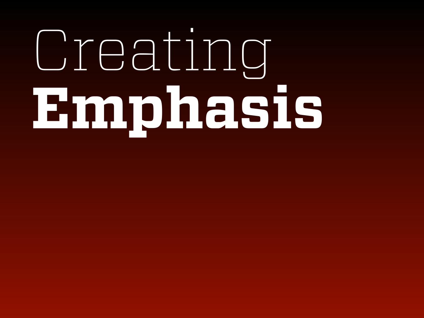
Creating Emphasis

You can change it.

You can change it.

You can change it.

You can change it.

You can change it.

You can change it.
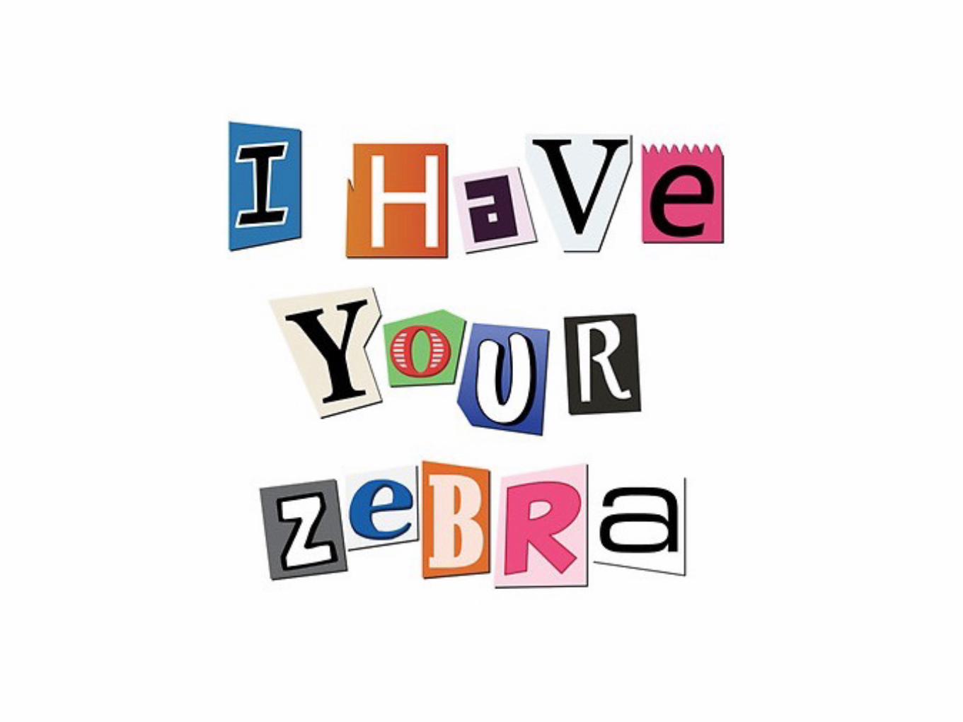
JUST SAY NO


Agenda Why Typography Matters Choosing Fonts Setting Type
Type That Persuades Going Further

Type That Persuades

Differentiation
WHY
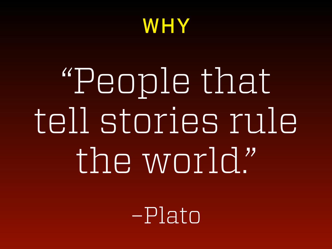
“People that tell stories rule
the world.”
–Plato
WHY


pms
spot
476
wg1
wg4
382
LOGOLOGO
hex
#f0ecde
#83bb41
#4e3f3a
#bbbaaf
#d8d6c8
c m y k r g b
5 4 12 0 240 236 222
54 4 100 0 131 187 65
57 63 65 48 78 63 58
27 21 29 0
15 11 20 0
187 186 175
216 214 200
Obey the Logo Laws
Never stretch the logo. Never change the colors or font. Avoid shrinking the logo smaller than 1" wide. Only enlarge
the logo if using an .ai or .pdf file (for print). Use .jpg, .png for web or devices, .png has transparent background.
cmyk = cyan, magenta, yellow, black
Used for print, also called 4 color process
rgb = red, green, blue used for on-screen
hex = hexadecimal color system
used to specify website color
pms = pantone matching system for
commercial printing with pantone inks
wg = warm gray
so_logo_clr_1.ai
so_logo_clr_1.pdf
so_logo_clr_1.jpg
so_logo_clr_1.png
so_logo_clr_2.ai
so_logo_clr_2.pdf
so_logo_clr_2.jpg
so_logo_clr_2.png
so_logo_bw.ai
so_logo_bw.pdf
so_icon.aiso_icon.pdf
so_icon.jpgso_icon.png
so_logo_clr_3.ai
so_logo_clr_3.pdf
so_logo_clr_3.jpg
so_logo_clr_3.png
COLORCOLOR
TYPOGRAPHYTYPOGRAPHY
BRAND NAMEBRAND NAME Our formal legal name is SpeakersOffice, Inc. Our trade/brand name is simply SpeakersOffice. This is how we prefer to be
known. Note that SpeakersOffice is one word with a capital S and O to assist readability. While it may be tempting to
shorten the name to SO, please resist. SO may be used for internal discussion between employees, but never for external
communication. Our website URL is speakersoffice.com.
BRAND
PROMISEBRAND
PROMISECorporations, associations, and bureaus trust our speakers to deliver transformational experiences
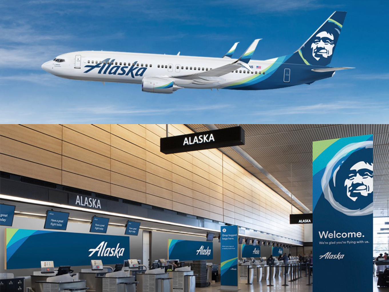
If words are the content, then typography is the voice used when communicating visually. The logotype is custom, based
on Trade Gothic Bold, set in ALL CAPS. Fonts are available for purchase at adobe.com/type
STATIONERYSTATIONERY
PaperRecommended
Neenah Classic Crest Smooth Avon Brilliant White
110# Cover for business cards
24 # Writing or 70# Text for letterhead, 2nd sheets, envelopesPrinterSir Speedy Printing rep: Alan
3517 Main Street, suite 303
Chula Vista, CA 91911
619.429.7200, [email protected]
Print CMYK or Digital
Avenir 45 Book, Oblique
Trade Gothic Bold, Oblique
Museo Slab 900, Italic
10 pt. Book for body text, w/ 13 pt. leading
18 pt. or larger for Headlines
18 pt. or larger for Headlines
S T Y L E G U I D E T O O U R B R A N D I D E N T I T Y
Note: .ai files are set up for PMS printing
.pdf files are set up for CMYK printing
pms
2935*
3115
cg3
454@ 30%
338
296
S T Y L E G U I D E T O O U R B R A N D I D E N T I T Y
L S A
LOGOLOGO
hex
#0055b8
#293145
#54b7bf
#83b5aa
#dcd9e0
c m y kr g b
100 46 0 00 85 184
85 75 48 4741 49 69
63 0 18 084 183 191
65 0 47 0
2 0 0 20
131 181 170
220 217 224
#f5f4ec
3 2 10 0245 244 236
Obey the Logo Laws
Never stretch the logo horizontally or vertically. Never change the colors or font. Avoid shrinking the logo smaller than .75" wide.
Only enlarge the logo if using an .ai or .pdf file. If a larger .png or .jpg file is needed, create it in Photoshop from the .ai file.
cmyk = cyan, magenta, yellow, black,
also called 4-color process, used for print
pms = pantone matching system for
commercial printing with pantone inks
for exact color matching. PMS 2935* is
LSA blue, used in logo. cg3 = cool gray 3.
rgb = red, green, blue used for on-screen
hex = hexadecimal color system
used to specify website color
Each formula has been chosen for
optimal color reproduction by system.
They are not direct software translations.
lsa_logo_blue_rectangle.ai
lsa_logo_blue_rectangle.pdf
lsa_logo_blue_rectangle.png
lsa_logo_wht.ai
lsa_logo_wht.pdf
lsa_logo_wht.png
(background pattern does not print)lsa_logo.ai
lsa_logo.pdf
lsa_logo.png
COLORCOLOR
TYPOGRAPHYTYPOGRAPHY
BRAND NAMEBRAND NAME Our brand name is LSA. When referring to the firm in speech or writing, use LSA. LSA is not an abbreviation for a longer,
more formal name. It is our name. LSA Associates, Inc. is our legal name and should only be used for contracts and legal
documents. Our website URL is lsa-assoc.com.
POSITIONING
STATEMENTPOSITIONING
STATEMENT
A positioning statement tells the world who we are, what we do, and what makes us unique in the market. Here is ours:
LSA is a 100% employee-owned environmental consulting firm. Clients rely on our four decades of experience and
creativity to anticipate and address their needs.
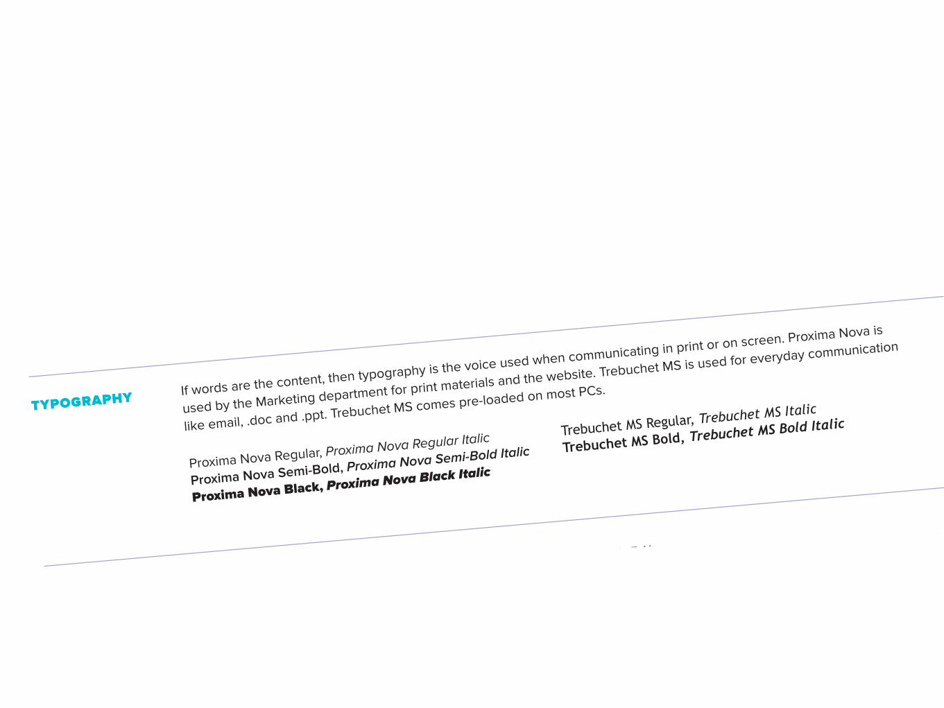
If words are the content, then typography is the voice used when communicating in print or on screen. Proxima Nova is
used by the Marketing department for print materials and the website. Trebuchet MS is used for everyday communication
like email, .doc and .ppt. Trebuchet MS comes pre-loaded on most PCs.
Note: .ai files are set up for PMS printing, .pdf files are set up for CMYK printing, .png files are for web or devices.
Proxima Nova Regular, Proxima Nova Regular Italic
Proxima Nova Semi-Bold, Proxima Nova Semi-Bold Italic
Proxima Nova Black, Proxima Nova Black Italic
Trebuchet MS Regular, Trebuchet MS Italic
Trebuchet MS Bold, Trebuchet MS Bold Italic
P R I N TS C R E E N

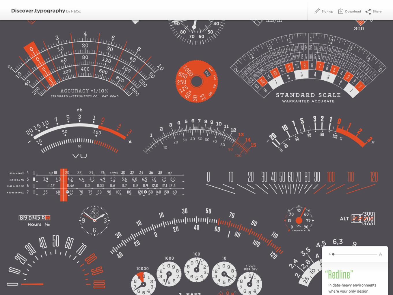
Trends in Typography


6
A R C H I T E C T SKIRKPATRICK


Web Typography


Slide Deck Typography
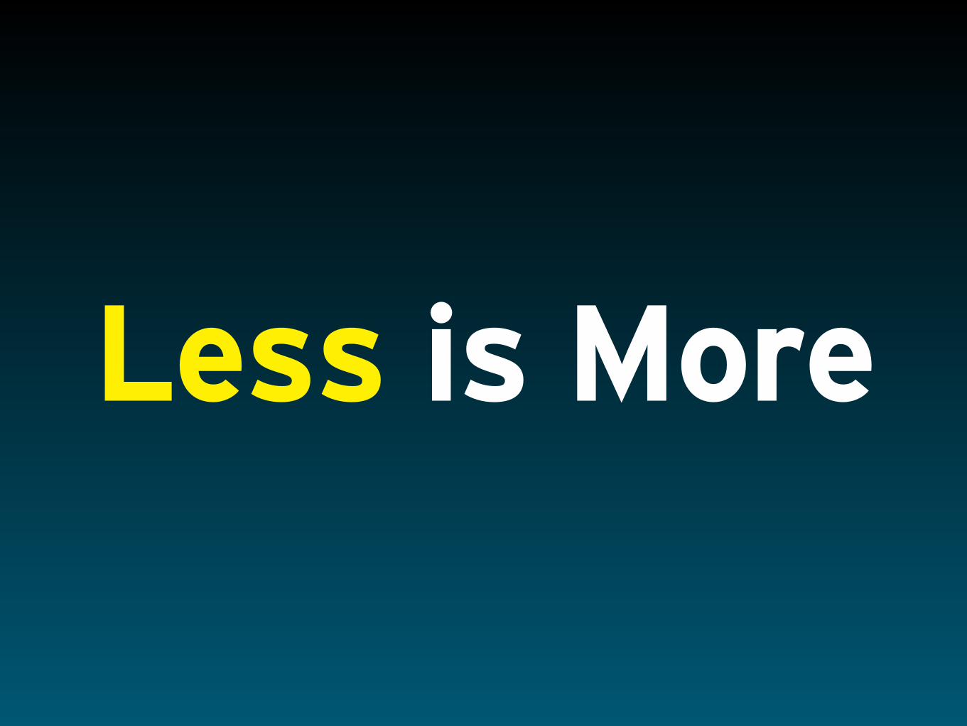
Less is More

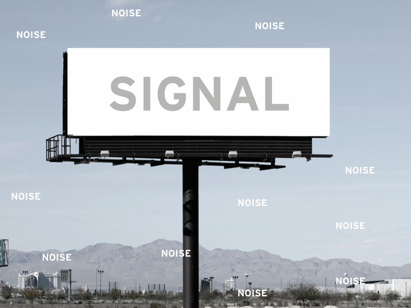
SIGNAL
NOISE
NOISE
NOISE
NOISENOISE
NOISE
NOISE
NOISE
NOISENOISE
NOISE

SIGNAL
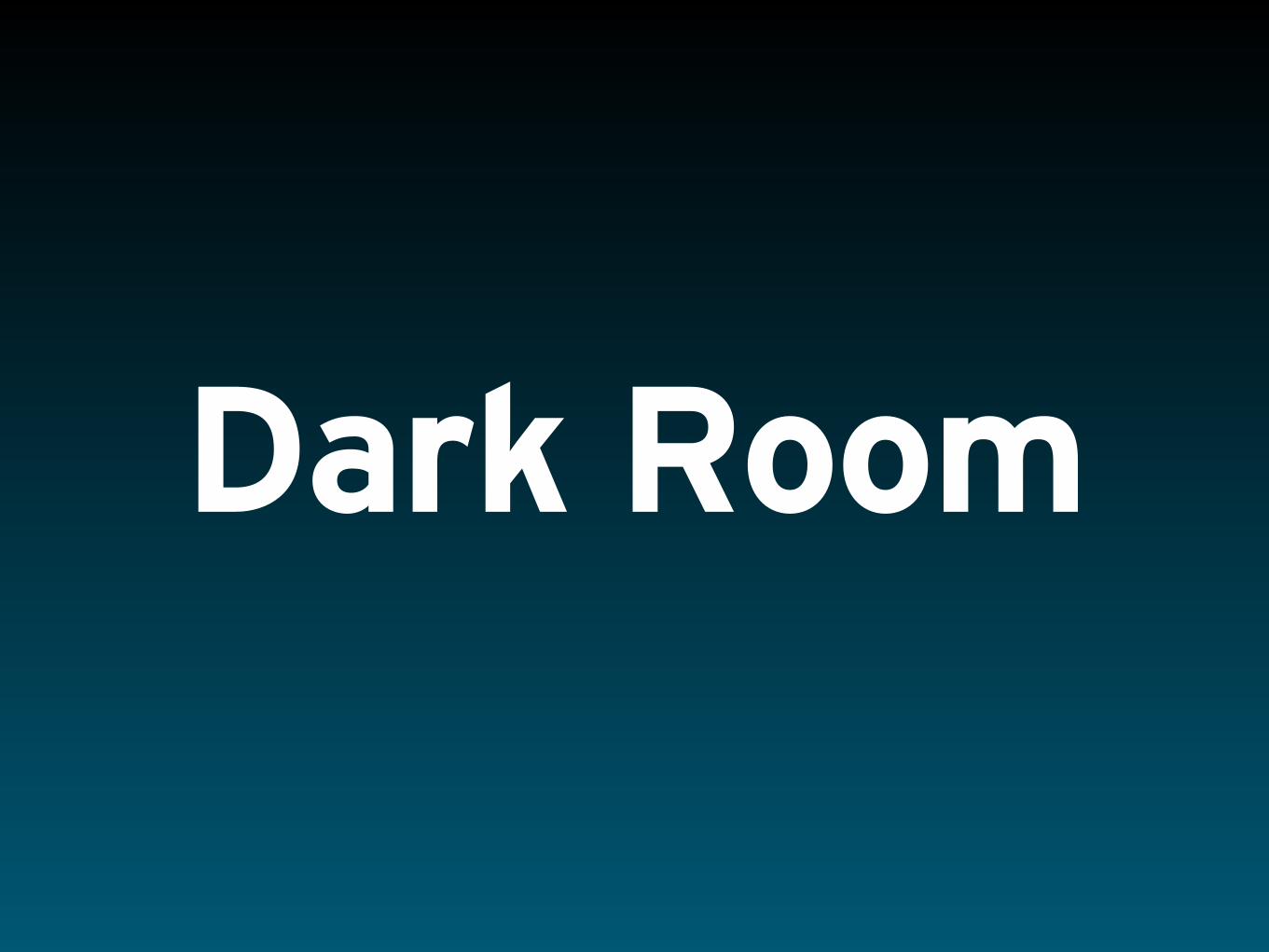
Dark Room

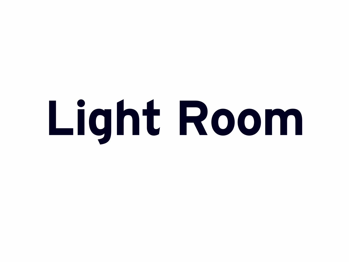
Light Room

Max. Contrast
Min. Contrast
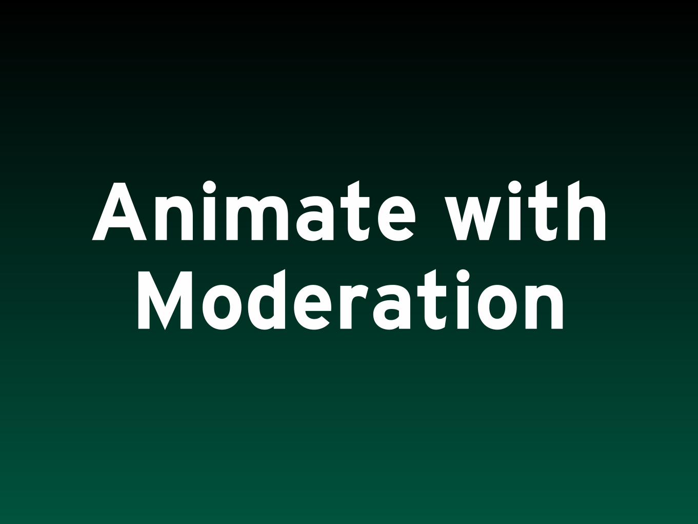
Animate with Moderation

Type Quality Control Cost
You Shoot ? Total Time
Royalty Free
Good wysiwyg $
Rights Managed
Better wysiwyg $$
Custom Best Partial $$$

Type Quality Control Cost
You Shoot ? Total Time
Royalty Free
Good wysiwyg $
Rights Managed
Better wysiwyg $$
Custom Best Partial $$$


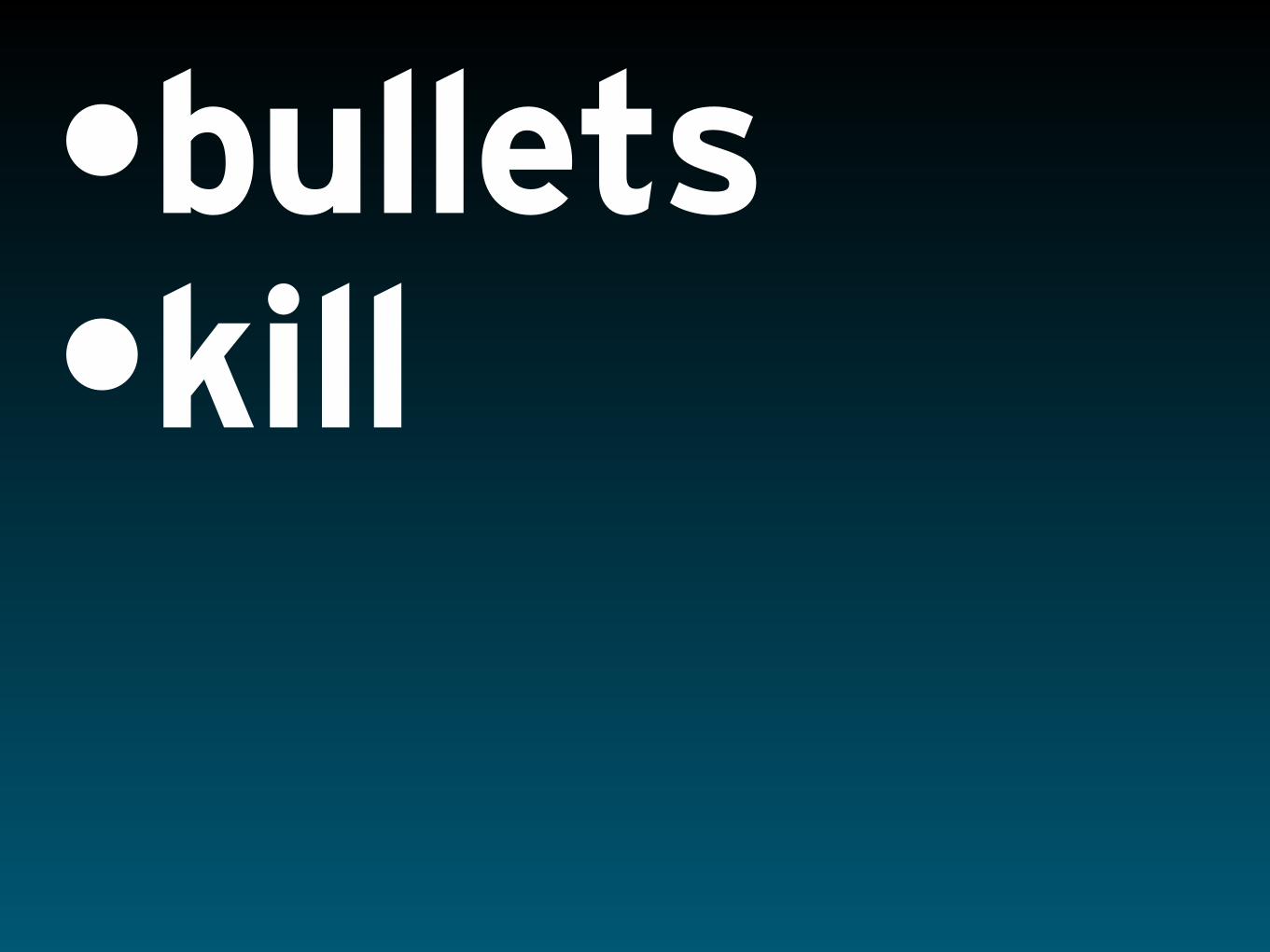
•bullets •kill

•bullets •kill •too many •audiences

Agenda Why Typography Matters Choosing Fonts Setting Type Type That Persuades
Going Further
Going Further

Web Resources


Hot Typography Igniting Fonts in PersuasiveProposals and Presentations
D A V I D L E C O U R S o f L E C O U R S D E S I G N