Holt McDougal Algebra 1 Scatter Plots and Trend Lines Holt Algebra 1 Warm Up Warm Up Lesson...
20
Holt McDougal Algebra 1 Scatter Plots and Trend Lines Scatter Plots and Trend Lines Holt Algebra 1 Warm Up Lesson Presentation Lesson Quiz Holt McDougal Algebra 1 15.1
-
Upload
john-gibson -
Category
Documents
-
view
260 -
download
3
Transcript of Holt McDougal Algebra 1 Scatter Plots and Trend Lines Holt Algebra 1 Warm Up Warm Up Lesson...
Holt McDougal Algebra 1
Scatter Plots and Trend LinesScatter Plots and Trend Lines
Holt Algebra 1
Warm Up
Lesson Presentation
Lesson Quiz
Holt McDougal Algebra 1
15.1
Holt McDougal Algebra 1
Scatter Plots and Trend Lines
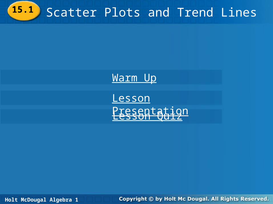
scatter plotcorrelationpositive correlation negative correlationno correlationtrend line
Vocabulary
15.1
Holt McDougal Algebra 1
Scatter Plots and Trend Lines
In this chapter you have examined relationships between sets of ordered pairs or data. Displaying data visually can help you see relationships. A scatter plot is a graph with points plotted to show a possible relationship between two sets of data. A scatter plot is an effective way to display some types of data.
15.1
Holt McDougal Algebra 1
Scatter Plots and Trend Lines
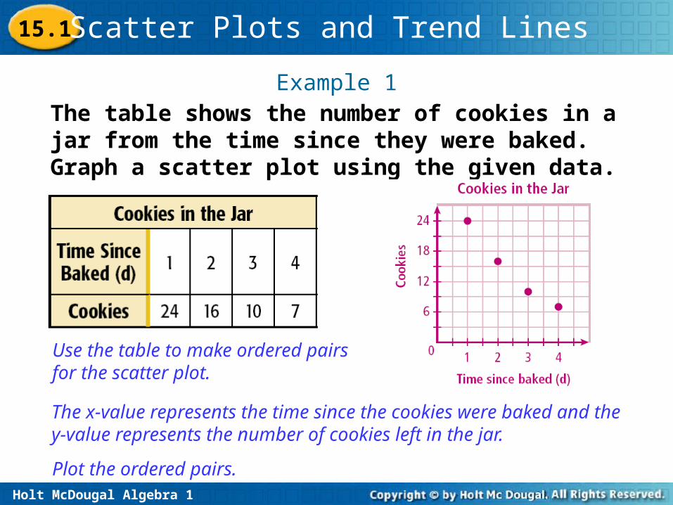
Example 1The table shows the number of cookies in a jar from the time since they were baked. Graph a scatter plot using the given data.
Use the table to make ordered pairs for the scatter plot.
The x-value represents the time since the cookies were baked and the y-value represents the number of cookies left in the jar.
Plot the ordered pairs.
15.1
Holt McDougal Algebra 1
Scatter Plots and Trend Lines
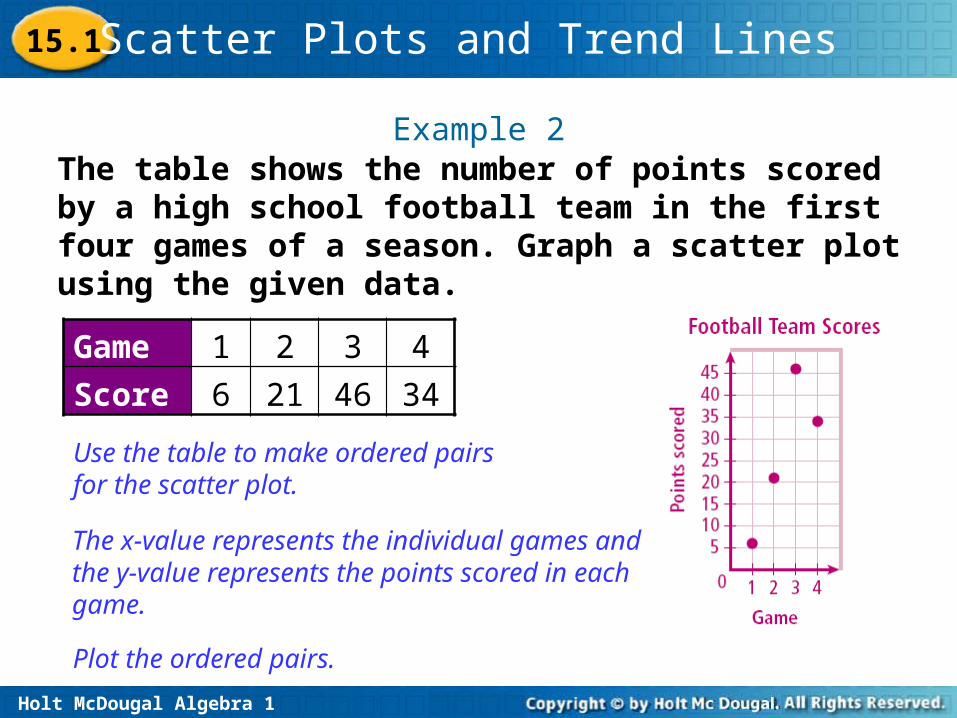
Example 2The table shows the number of points scored by a high school football team in the first four games of a season. Graph a scatter plot using the given data.
Use the table to make ordered pairs for the scatter plot.
The x-value represents the individual games and the y-value represents the points scored in each game.
Plot the ordered pairs.
Game 1 2 3 4
Score 6 21 46 34
15.1
Holt McDougal Algebra 1
Scatter Plots and Trend Lines
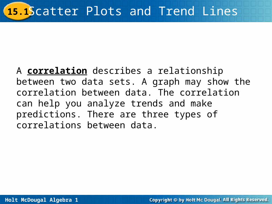
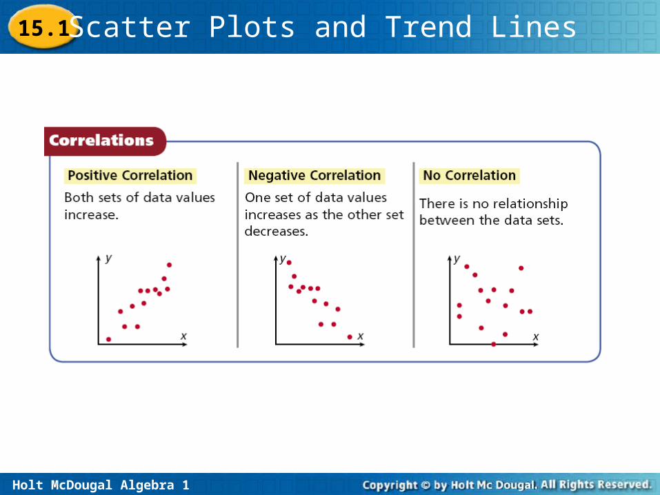
A correlation describes a relationship between two data sets. A graph may show the correlation between data. The correlation can help you analyze trends and make predictions. There are three types of correlations between data.
15.1
Holt McDougal Algebra 1
Scatter Plots and Trend Lines15.1
Holt McDougal Algebra 1
Scatter Plots and Trend Lines
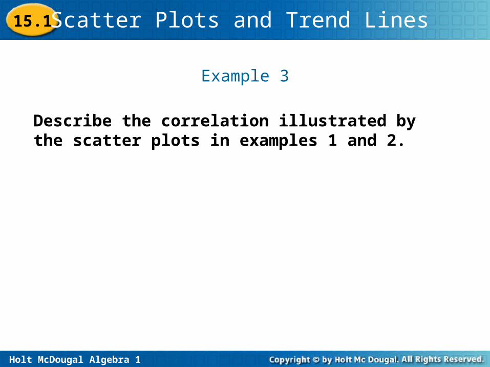
Example 3
Describe the correlation illustrated by the scatter plots in examples 1 and 2.
15.1
Holt McDougal Algebra 1
Scatter Plots and Trend Lines
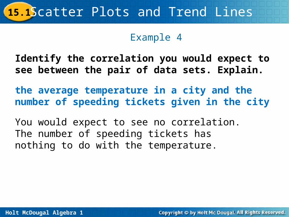
Example 4
the average temperature in a city and the number of speeding tickets given in the city
You would expect to see no correlation. The number of speeding tickets has nothing to do with the temperature.
Identify the correlation you would expect to see between the pair of data sets. Explain.
15.1

Holt McDougal Algebra 1
Scatter Plots and Trend Lines
the number of people in an audience and ticket sales
You would expect to see a positive correlation. As ticket sales increase, the number of people in the audience increases.
Example 5
Identify the correlation you would expect to see between the pair of data sets. Explain.
15.1
Holt McDougal Algebra 1
Scatter Plots and Trend Lines
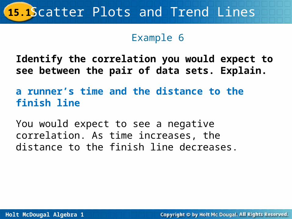
a runner’s time and the distance to the finish line
You would expect to see a negative correlation. As time increases, the distance to the finish line decreases.
Example 6
Identify the correlation you would expect to see between the pair of data sets. Explain.
15.1
Holt McDougal Algebra 1
Scatter Plots and Trend Lines
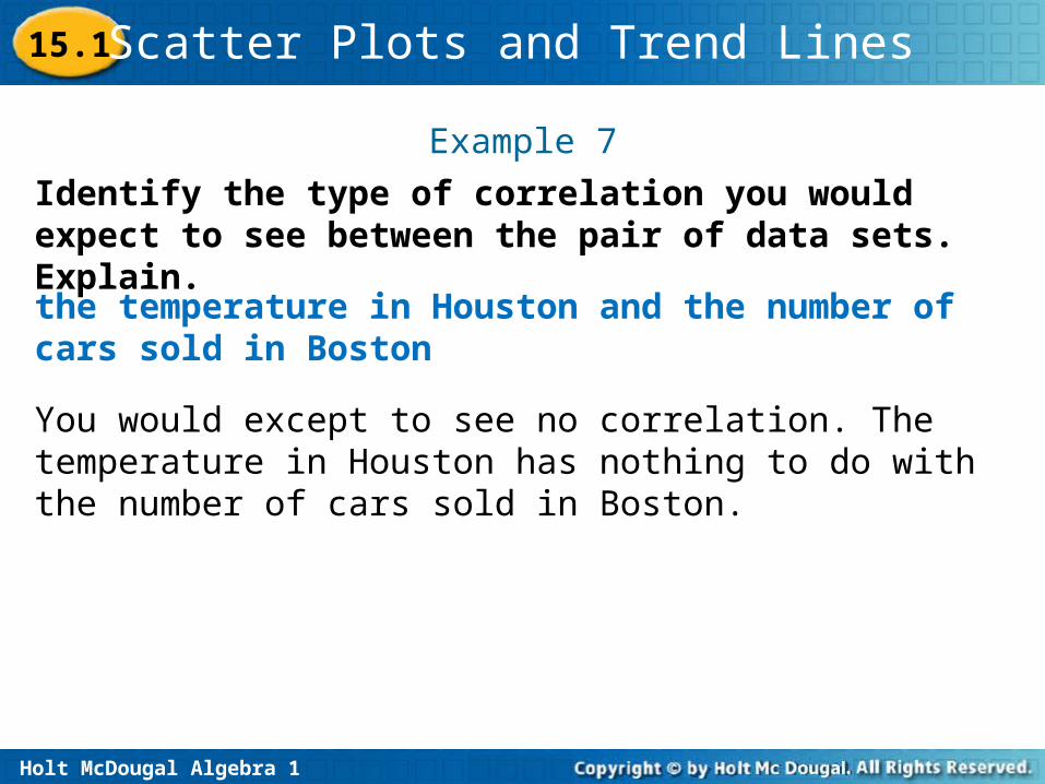
Example 7
Identify the type of correlation you would expect to see between the pair of data sets. Explain.
the temperature in Houston and the number of cars sold in Boston
You would except to see no correlation. The temperature in Houston has nothing to do with the number of cars sold in Boston.
15.1
Holt McDougal Algebra 1
Scatter Plots and Trend Lines
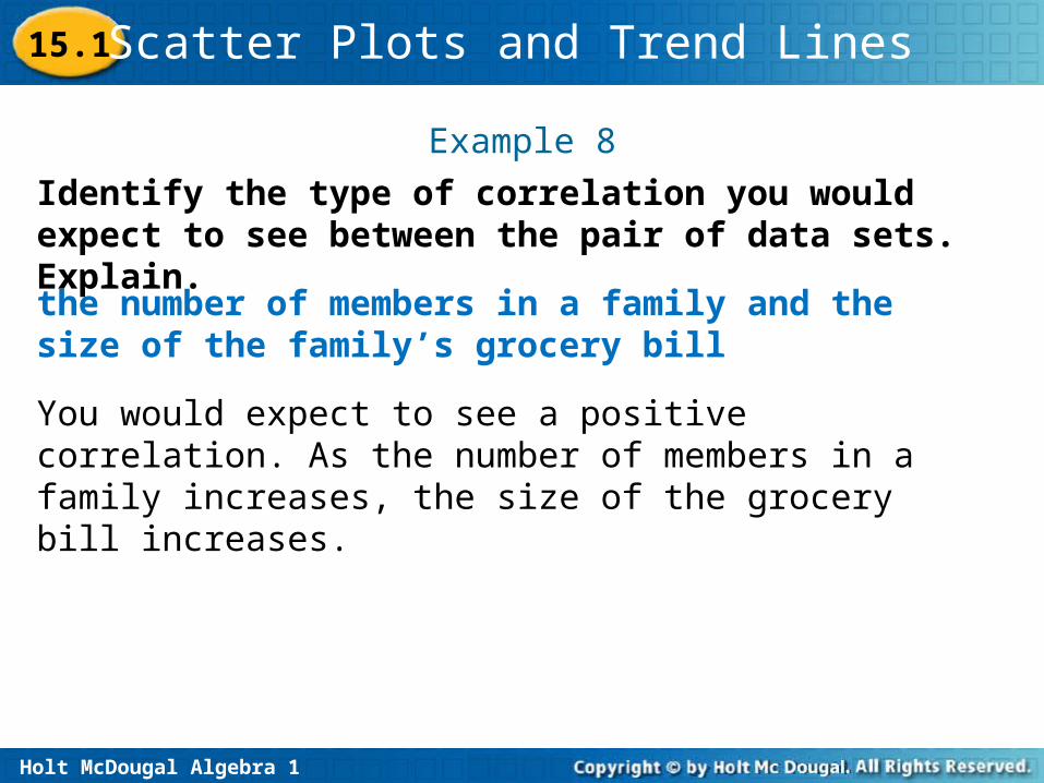
the number of members in a family and the size of the family’s grocery bill
You would expect to see a positive correlation. As the number of members in a family increases, the size of the grocery bill increases.
Example 8
Identify the type of correlation you would expect to see between the pair of data sets. Explain.
15.1
Holt McDougal Algebra 1
Scatter Plots and Trend Lines
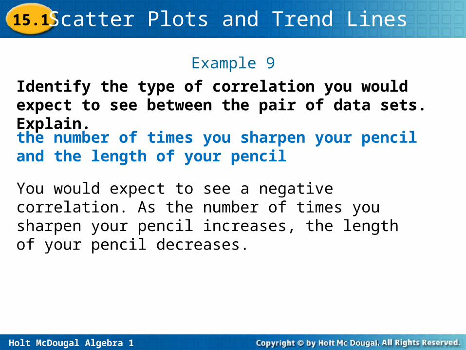
the number of times you sharpen your pencil and the length of your pencil
You would expect to see a negative correlation. As the number of times you sharpen your pencil increases, the length of your pencil decreases.
Example 9
Identify the type of correlation you would expect to see between the pair of data sets. Explain.
15.1
Holt McDougal Algebra 1
Scatter Plots and Trend Lines
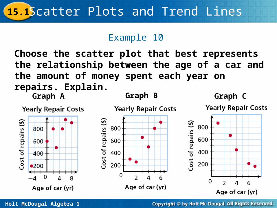
Example 10
Choose the scatter plot that best represents the relationship between the age of a car and the amount of money spent each year on repairs. Explain.
Graph A Graph B Graph C
15.1
Holt McDougal Algebra 1
Scatter Plots and Trend Lines
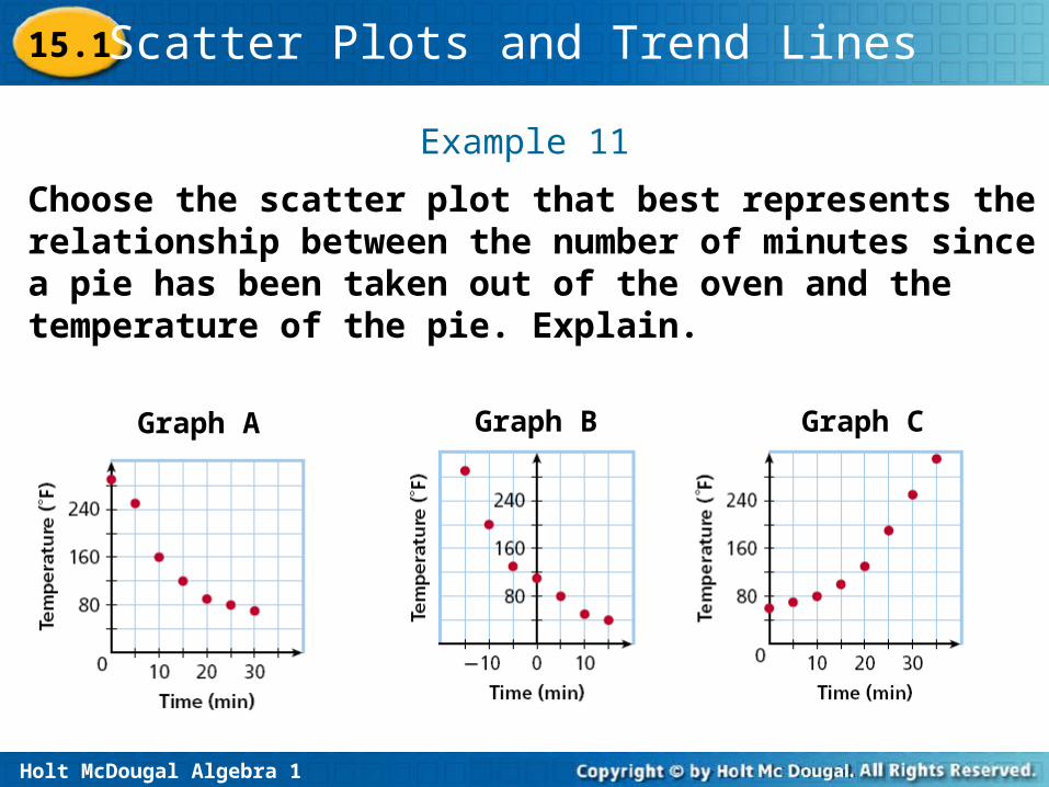
Example 11
Choose the scatter plot that best represents the relationship between the number of minutes since a pie has been taken out of the oven and the temperature of the pie. Explain.
Graph A Graph B Graph C
15.1
Holt McDougal Algebra 1
Scatter Plots and Trend Lines15.1
•
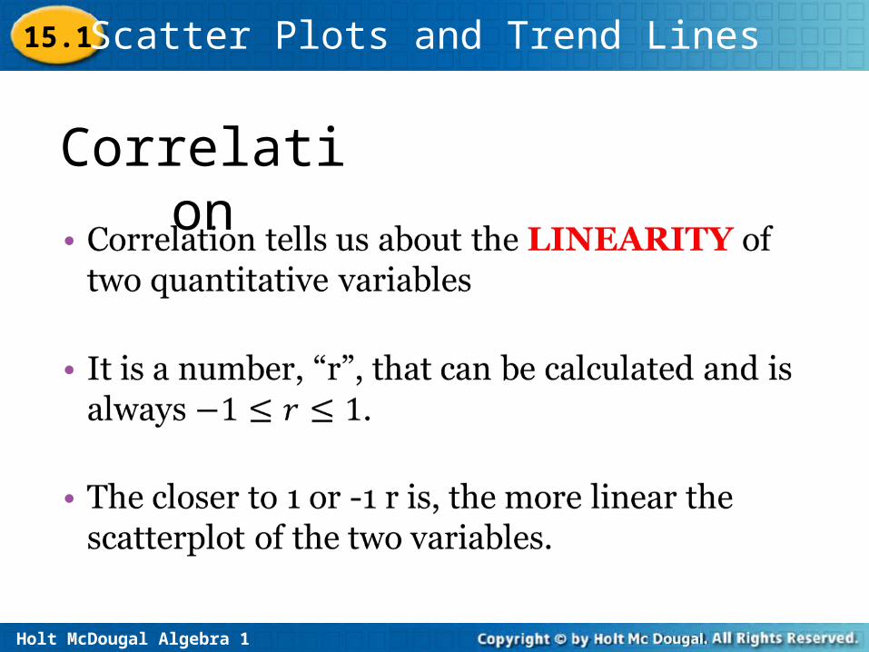
Correlation
Holt McDougal Algebra 1
Scatter Plots and Trend Lines15.1
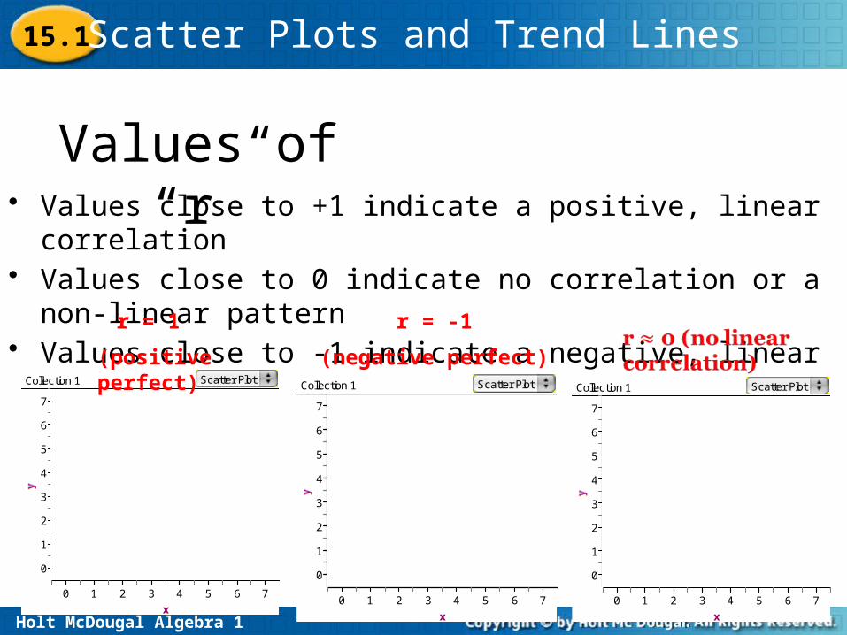
• Values close to +1 indicate a positive, linear correlation• Values close to 0 indicate no correlation or a non-linear pattern• Values close to -1 indicate a negative, linear correlation
0
1
2
3
4
5
6
7
x
0 1 2 3 4 5 6 7
Collection 1 Scatter Plot
r = 1
(positive perfect)
r = -1
(negative perfect)
0
1
2
3
4
5
6
7
x
0 1 2 3 4 5 6 7
Collection 1 Scatter Plot
0
1
2
3
4
5
6
7
x
0 1 2 3 4 5 6 7
Collection 1 Scatter Plot
Values of “r”
Holt McDougal Algebra 1
Scatter Plots and Trend Lines
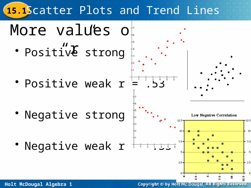
More values of “r”• Positive strong r = .90
• Positive weak r = .53
• Negative strong r = -.92
• Negative weak r = -.35
15.1
Holt McDougal Algebra 1
Scatter Plots and Trend Lines
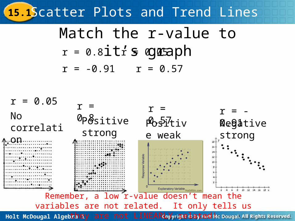
Match the r-value to it’s graph
Remember, a low r-value doesn’t mean the variables are not related. It only tells us they are not LINEARLY
related!
No correlation
Positive strong
Positive weak
Negative strong
r = 0.8 r = 0.05
r = -0.91 r = 0.57
r = 0.05 r = 0.8 r = 0.57 r = -0.91
15.1