Historical Thematic maps using Mapinfolazarus.elte.hu/hun/digkonyv/szakdolg/hector/hector.pdf ·...
35
Thesis 2 EÖTVÖS LORÁND UNIVERSITY UPV - EHU HISTORICAL THEMATIC MAPS USING MAPINFO ANALYSIS OF THE DIFFERENT GRAPHIC SOLUTIONS INCLUDED IN MAPINFO Author: Héctor Rodríguez Universidad del País Vasco ELTE, Department of Cartography and Geoinformatics December, 2006
-
Upload
nguyenminh -
Category
Documents
-
view
219 -
download
0
Transcript of Historical Thematic maps using Mapinfolazarus.elte.hu/hun/digkonyv/szakdolg/hector/hector.pdf ·...
Thesis 2
EÖTVÖS LORÁND UNIVERSITY UPV - EHU
HISTORICAL THEMATIC MAPS
USING MAPINFO
ANALYSIS OF THE DIFFERENT GRAPHIC SOLUTIONS INCLUDED IN MAPINFO
Author: Héctor Rodríguez Universidad del País Vasco
ELTE, Department of Cartography and Geoinformatics December, 2006
Thesis 3
EÖTVÖS LORÁND UNIVERSITY UPV - EHU
0.- INDEX
1.- Introduction page 3
2.- Brief description of the counties page 4
3.- Method page 7
3.1.- Data collection page 7
3.2.- Joining DXF files in AutoCad page 7
3.3.- Creating polygons in AutoCad page 8
3.3.1.- Checking page 9
3.3.1.a.- Polygon validation page 9
3.3.1.b.- Polygon-settlement correlation page10
3.4.- Data capture page11
3.4.1.- Making a graphic database page11
3.4.2.- Checking date page12
3.5.- Opening the files with MapInfo page13
3.5.1.- DXF files page13
3.5.2.- Thematic database page15
3.6.- Joining graphic data with thematic database page15
3.7.- Combining different polygons from the same settlement page17
3.8.- Geocoding page18
3.9.- Adding actual work to previously create database page19
3.10.- Georeference page19
3.11.- Creation of thematic maps page21
4.- Thematic maps page23
4.1.- Kind of maps page23
4.1.1.- Map edition page23
4.1.2.- Limitations of MapInfo page28
4.2.- Map printing page28
4.2.1.- Processing page28
4.2.2.- Limitations of MapInfo page29
4.3.- Map comparisons page30
5.- Used software page33
6.- Bibliography page34
7.- Annexe 1 page35

Thesis 4
EÖTVÖS LORÁND UNIVERSITY UPV - EHU
1.- INTRODUCTION
This project is a continuation of the final project made by two former Erasmus
students -Irene Antona and Ion Sola- in Budapest.
The project is based on Hungary historic cartography and its goal is to obtain
the thematic maps of five counties crossed by the Danube. The databases of three of
the counties were elaborated by the two former students mentioned earlier and the
databases of the other two counties have been created by me. The different maps show
aspects such as population, nationalities and religion. This project belongs to a wider
on-going international one which will illustrate all the counties crossed by the Danube
from Germany to Romania.
The counties I have worked on are called Komárom and Esztergom and they
have been added to Fejér, Tolna y Pest-Pilis-Solt-Kiskun, the three counties selected
by the former Erasmus students.
All the data have been obtained from an atlas about Hungary in 1914. This
atlas contains the data about population, nationalities and religion which were
introduced in a database to be worked with and to be the base for the different
thematic maps
The thematic maps will improve the understanding of the data. These way
users will be able to see the social situation of the counties in 1914, which will allow
different analysis, including the comparison of the situation in Hungary in different
years.
The final project has been divided in three parts: a brief description of the
counties, the work process to create the different maps and some comparisons of the
maps made using MapInfo.

Thesis 5
EÖTVÖS LORÁND UNIVERSITY UPV - EHU
2.- BRIEF DESCRIPTION OF THE
COUNTIES
The selected counties were situated in the heart of the historical land of
Hungary in 1914 and all of them were crossed by the Danube.
-ESZTERGOM
Area 985 km2
Number of Settlements 50
Population 72 936
Density of population 74,0 inhabitants / km
Nationalities 77,8 % m(Hungarian), 12,0 % n(German) 9,9 % sl (Slovak)
Religions 83,4 % (Roman Catholic), 13,2 % r (Calvinists), 2,5 % iz (Jews)
Esztergom was the smallest county selected to be included in this project with
985 km2. It had the smallest number of settlements with 50. Its borders were Bars in
the North, Hont and Nógrád in the East, Pest-Pilis-Solt-Kiskun in the South and
Komárom in the West.

Thesis 6
EÖTVÖS LORÁND UNIVERSITY UPV - EHU
-KOMÁROM
Area 2803 km2
Number of Settlements 93
Population 179 513
Density of population 64,0 inhabitants / km
Nationalities 88,3 % m, 6,1 % n 4,1 % sl
Religions 68,2 % rk, 25,7 % r, 2,9 % ev(Lutherans), 2,6 % iz
Komárom had a the lowest density of population with 64,0 inhabitants per
kilometre in 1914. It had a higher percentage of Hungarian nationality with 88,3%. Its
borders were Pozsony, Nitra and Bars in the North, Esztergom and Pest-Pilis-Solt-
Kiskun in the East, Féjer and Veszprém in the South and Gyır in the West.
-TOLNA
Area 3462 km2
Number of Settlements 123
Population 252 312
Density of population 72,9 inhabitants / km
Nationalities 69,4 % m, 29,3 % n
Religions 69 % rk, 14,8 % r, 12,6 % ev, 2,9 % iz
Tolna was a southern province located in the West side of Danube. Its borders
were Fejér in the North, Pest-Pilis-Solt-Kiskun in the East (with the river in the
middle), Veszprém and Somogy in the West and Baranya in the South. An important
characteristic of this county was the high density of German people, who were the
29,3 % of the total population.
-PEST-PILIS-SOLT-KISKUN
Area 10 288 km2
Number of Settlements 219
Population 829 192
Density of population 80,6 inhabitants / km
Nationalities 86,3 % m, 9,5 % n, 2,9 % sl
Religions 71,3 % rk, 17,2 % r, 7,7 % ev, 2,8 % iz
Pest-Pilis-Solt-Kiskun was the biggest province of the selected ones with an
area of 10 288 km2 and was also one of the biggest in the whole land of Hungary in
that period. Its borders were Nógrád, Heves and Hont in the North, Jász-Nagykun-
Szolnok and Csongrád in the East, Bács-Bodrog and Baranya in the South and Tolna,
Thesis 7
EÖTVÖS LORÁND UNIVERSITY UPV - EHU
Fejér, Komáron and Esztergom in the West. Pest-Pilis-Solt-Kiskun was also the county
with the highest number of settlements in the working area.
-FEJÉR
Area 4009 km2
Number of Settlements 104
Population 214 045
Density of population 53,4 inhabitants / km
Nationalities 85,7 % m, 11,1 % n, 2 % sl
Religions 68,2 % rk, 26,2 % r, 3,1 % ev, 2 % iz
Féjer was the province with the lowest population density (53,4 inhabitants per
kilometre). It was located on the left hand side of the Danube and it bordered in the
North with Komáron, with Pest-Pilis-Solt-Kiskun in the East, with Tolna in the South,
and with Veszprem in the West.

Thesis 8
EÖTVÖS LORÁND UNIVERSITY UPV - EHU
3. METHOD
In the followings sections I explain the different steps followed in the work
process. I illustrate how I obtained the data, how I worked with the data to create
shapes and to create a database, how I added the previous work and how I created the
maps.
3.1.- DATA COLLECTION
The first step of the project was to compile the different data to be used. My
main sources were: First the Historycal Atlas about Hungary in 1914 was, which was
borrowed from the library of the Department of Cartography and Geoinformatics. The
name of the atlas was “A Történelmi Magyarország Atlasza és Adattára 1914”.
Secondly, files with the territorial partition of Hungary in 1914 and the
information in the atlas were needed. Prof. Zentai Laszlo was asked for some DXF files
- which had been converted from the original CDR files - representing the maps used
in the atlas. However, there was a problem. When you convert CDR files into DFX files,
the line width become as small as possible and the polygons are divided in several
open lines, so those maps couldn’t be used and I had to use the files the former
students had worked with. In those files the polygons were closed and the lines were
segments of lines. So to make the final map I had to join different files of the different
layers and get them together.
3.2.- JOINING DXF FILES IN AUTOCAD
The following step was to open the DXF files in AutoCad to join the different
layers and to make the polygons. First the file containing the province’s contour was
opened and then all the other files to finish with the file with the settlement’s contour.
When I tried to open the DXF files, I found out that AutoCad wasn’t able to
load the files because the software found them incomplete. The solution was to copy
the files again and then loading them was possible.
Then I had four DXF files that I had to edit in AutoCad to create my
work area. Once I had made five layers to compose the map, the first step I did in
AutoCad was to open the counties file and erase all the lines except the lines belonging
to Esztergom and Komárom. These lines were saved in a new layer called “Provincia”.

Thesis 9
EÖTVÖS LORÁND UNIVERSITY UPV - EHU
This file also contained a frame, which was saved in another layer called “Marco”. This
frame was used to join this work with the previous one. It was saved in DWG format.
After that the town file was opened and all the lines except the lines belonging to the
selected counties were erased. This was saved in a new layer called “Municipio” and in
a new DWG file. Finally, I did the same with the settlements and the cities file.
3.3.- CREATING POLYGONS IN AUTOCAD
Once I had the different layers with the polylines of the counties I was going to
work with, I made the settlements and the cities polygons.
First, I opened the last DWG file named “Ciudades” which contained all the
layers. I made a new layer called “Poligonos” and made it current to make the new
polygons there. To make the polygons was very easy; I selected “Draw/Boundaries…”
command from the Draw upper menu, I had to click in the middle of the polygon that I
wanted to make.
Nevertheless, I had only one problem when trying to make one polygon. After
zooming it I found that the polylines didn’t close the polygon. Consequently, the
software couldn’t make the polygon. The solution was to extend the line using the
“Extend” command located in the Draw bar.
With the “Ciudades” file the process was different because they were polylines.
The process to be followed with polylines is to select them and click in the Properties
button of the upper menu, where the option “No” in the “Closed” box had to be
changed to the option “Yes”.

Thesis 10
EÖTVÖS LORÁND UNIVERSITY UPV - EHU
3.3.1. CHECKING
After all the polygons were created, two tasks had to be done: to check that all
the polygons were valid and to check that all of them existed and each polygon
represented only one settlement.
3.3.1.a.- Polygons validation
First, I checked that all the polygons had been made correctly. To do it, I filled
all the polygons with a colour. I did it selecting “Draw/Hatch…” in the upper menu.
There I chose the hatch and later I selected the polygon. If the polygon was valid, it
was filled with colour. I did it with all the polygons, one by one.

Thesis 11
EÖTVÖS LORÁND UNIVERSITY UPV - EHU
3.3.1.b.- Polygon-settlement correlation
After the last step, I had all the polygons filled with colour. The next step was
to check that all the polygons in the files were the same polygons that I had on the
original map. To do it, I photocopied the map from the atlas and every time I erased
the colour from one polygon, I checked it on the map, marking and numbering the
settlement. The conclusion of this work was that the number of settlements on the
map and in the files was the same (139). As all the polygons were valid and each one
represented only a settlement, I saved this map to a DXF file version 12 to be loaded
later into MapInfo.
3.4. DATA CAPTURE
The data were obtained from the Atlas “A Történelmi Magyarország Atlasza és
Adattára 1914”. This Atlas covers the administrative situation of Hungary in 1913.
The numerical statistics are based on the national census data of 1910. The thematic
information I have processed is the number of inhabitants and the ethnic and
religious data of each settlement.
3.4.1.- MAKING A GRAPHIC DATABASE
First, I made tables with the Excel software. The structure of the tables were
similar to the tables used by the former students had used. I made two tables, one
table for Esztergom and other one for Komárom. The distribution of the data was:
-Name of the settlement
-Settlement code
-County code
-Population
-Nationalities, Hungarian, Germans, Slovaks, Romanian, Gipsy…
-Religions, Roman Catholic, Greek Catholic, Greek Orthodox, Lutherans…
In the first column, there were the names of the settlements in Hungarian and
some of the characters of the Hungarian alphabet do not exist in my laptop. Besides,
the keyboard was configured for the Spanish language and some consonants and
vowels were either in different position or not included. The solution was to change the
keyboard configuration to Hungarian using the Windows Language tool and to put
some new characters in my keyboard with some sticks.

Thesis 12
EÖTVÖS LORÁND UNIVERSITY UPV - EHU
The second column had the code of each settlement. This code was necessary
to relate the map to the thematic data. I kept the same way of encoding used by
Erasmus students last year, which was formed by three letters and three digits. The
former referred to the county and the latter to the place each settlement occupies in
alphabetic order in each of the two counties.
The third column includes the county code. This code made easier the work
with a database.
The next column records the number of inhabitants.
The other columns have data about nationalities and religions. The same fields
that appeared in the gazetteer of the Atlas have been recorded. The ethnic groups
recorded were Hungarian, German, Slovakian, Romanian, Russniak, Croatian,
Serbian, Gipsy, Wend, Polish, Greek, Italian, Bunievatz, Socatz, Czech and Moraviar
and Bulgarian. Meanwhile, the religious groups recorded were Roman Catholic, Greek
Catholic, Calvinist, Lutheran, Greek Orthodox, Unitarian or Jewish.
It was easy to work with the data from the atlas with this distribution because
at the end of the atlas you can find all the Hungarian settlements with this
information in the same alphabetic order:
- Name of the settlement.
- Code of letters and numbers for locating the settlement in the map.
- Name of the county where is located.
- Name of the district.
- Actual name of the settlement and the country to which belongs.
- Number of inhabitants of the settlement.
- Number of people of each nationality.
- Number of people of each religious group.

Thesis 13
EÖTVÖS LORÁND UNIVERSITY UPV - EHU
Sometimes a settlement which was located in Hungary in 1914, it is located in
another country nowadays. In these cases the name can have changed and be written
in the language of the new country to which it belongs
This is an example:
Viszka 35B-C2 Hunyad vm. Marosillyei j. (Visca)
1260 18m 1237ro 1243go
The settlement was named Viszka and can be found on the map sheet no. 35B
of the Atlas (field C2). The settlement administratively belonged to Marosillyei District
of Hunyad County. Visca is the present name and now it belongs to Slovakia. The
settlement had 1260 inhabitants in 1910: 18 people claimed to be Hungarian and
1237 people to be Romanian, while the rest of the inhabitants belonged to other ethnic
groups. From the total number of inhabitants, 1243 people claimed to be Roman
Catholic according to the census of 1910.
Before starting to structure the data, I photocopied the pages of the atlas that
contained all the data previously explained. Those pages contain all the Hungarian
settlements in alphabetic order, and I had to find the settlements belonging to the two
selected counties. The solution was to read all the settlements and underline the
settlements of Esztergom in one colour and the settlements of Komárom in other
colour.
When I finished underlining all the settlements I began to introduce the data
into two tables, one for all the settlements of each county in alphabetic order. As it is
best to have one table which contains the settlements of both counties, another table
was made where both above mentioned tables were pasted and all the settlements
ordered in alphabetic order.
3.4.2.- CHECKING DATA
As I had to find the settlements belonging to my counties among all the
Hungarian settlements, the possibility of making a mistake was high. To avoid this
problem, I decided to check on the data.
First, when I found the name of a settlement I underlined it and I counted it on
another sheet of paper. This way, at the end of the search, I had counted all the
underlined settlements. The result of this check was that I had 141 settlements and
only 139 polygons, so it was a mistake in the database. Later while I was filling the
table with the settlement’s data I looked for the settlement in the map and I marked it.

Thesis 14
EÖTVÖS LORÁND UNIVERSITY UPV - EHU
With this check I could see if any settlement was missing or if one settlement was
counted twice. The result of this check was that one town contained three settlements,
so the three settlements were joined. I chose the big settlement, erased the others and
added the data of the erased settlements to the remainder settlement. Then I had 139
settlements with 139 polygons.
3.5.- OPENING THE FILES WITH MAPINFO
Once the database was completed and the polygons had been done in AutoCad
and saved as DXF files, these files had to be loaded in MapInfo and geocoded with the
database. The first step of this process was to open the DXF maps and the database in
MapInfo.
3.5.1.- DXF FILES
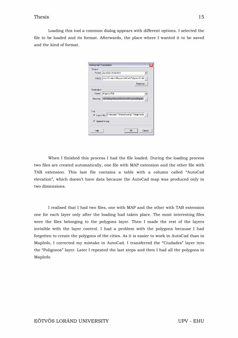
I opened the file created in AutoCad. This was possible with the tool “Universal
Translator” that MapInfo has in the “Tool” menu.
Thesis 15
EÖTVÖS LORÁND UNIVERSITY UPV - EHU
Loading this tool a common dialog appears with different options. I selected the
file to be loaded and its format. Afterwards, the place where I wanted it to be saved
and the kind of format.
When I finished this process I had the file loaded. During the loading process
two files are created automatically, one file with MAP extension and the other file with
TAB extension. This last file contains a table with a column called “AutoCad
elevation”, which doesn’t have data because the AutoCad map was produced only in
two dimensions.
I realised that I had two files, one with MAP and the other with TAB extension
one for each layer only after the loading had taken place. The most interesting files
were the files belonging to the polygons layer. Then I made the rest of the layers
invisible with the layer control. I had a problem with the polygons because I had
forgotten to create the polygons of the cities. As it is easier to work in AutoCad than in
MapInfo, I corrected my mistake in AutoCad. I transferred the “Ciudades” layer into
the “Poligonos” layer. Later I repeated the last steps and then I had all the polygons in
MapInfo.

Thesis 16
EÖTVÖS LORÁND UNIVERSITY UPV - EHU
3.5.2.- THEMATIC DATABASE
The next step was to load the Excel file selecting “File/Open…” in the upper
menu. When I clicked this option one common dialog appeared:
In this window I selected the kind of file to open, Microsoft Excel (*.xls) and the
last table made, which contained the data of both counties.
3.6.-JOINING GRAPHIC DATA WITH THEMATIC
DATABASE
The objective of this step was to have a polygon joined to one row of the table
so that, when you select the polygon on the map, one row of the table is also selected.
The row to be selected should be the row belonging to the same settlement.
When I selected one polygon of the map, one row was also selected but
it didn’t contain any information. I needed to transfer the information from the Excel
table to this table. One option was to write all the information again, settlement by
settlement. But I had a lot of settlements with numerous fields containing information,
so I rejected this option. Instead I decided to copy the data from one table to the other
table. I needed one common column and I only had one column in the table of the
map which wasn’t useful. Then I made another column, I clicked in
“Table/Maintenance/Table Structure…” in the upper menu, where you can add
columns or remove them. I added a new column with the same characteristics and the
same name that the common column I needed. This column was called “Village_code”.
This column is alphanumeric with a length of six characters. When I had made it, I

Thesis 17
EÖTVÖS LORÁND UNIVERSITY UPV - EHU
had a new column without information. The next step was to rename the polygons
with the name of the settlements. Although this step was tedious due to the quantity
of names to be included, there was no other way of doing it. I looked in the paper map
for the settlement corresponding to the polygon, copied the settlement code and wrote
it in the new column in the selected row.
After this when I selected one polygon from the map one row with the
settlement code was selected at the same time. The next step was transferring all the
data from the imported table to the map table. I made news column, following the
same steps that I have described before. I made as many columns as the Excel file had
and I wanted to copy. The columns had to have the same characteristics, the same
name and the same length.
Once all the columns with the same characteristics had been made, I copied
the different fields. I had to copy column by column because MapInfo can’t copy all the
columns at the same time. As I had two columns in common the fields were copied
correctly. All the data belonged to the corresponding village. I did it selecting
“Table/Update Column…” in the upper menu.
With that selection, MapInfo shows a window where I selected the table to be
updated and the column to be filled. Then I selected the table I wanted to copy the
information from and the way to copy that information. I wanted to copy the

Thesis 18
EÖTVÖS LORÁND UNIVERSITY UPV - EHU
information with the same value so I selected the “Value” option. In the “Join” option I
selected the common column. This column allows all the information to be copied
correctly, so the data belong, to the correct settlement.
3.7. COMBINING DIFFERENT POLYGONS FROM THE
SAME SETTLEMENT
I had three settlements which had two polygons. For example the settlement
Héteny contained two polygons. I had to join the two polygons, so that when any of
them was selected, the two polygons would be selected. First, I made the layer editable
and I looked for the settlements that were repeated. I selected these polygons and in
the upper menu I clicked on “Objects/Combine…” In the next window I could choose if
I wanted to add, to multiply etc…the data. As the data were from the same settlement
I chose the “Value” option. This option keeps a common value of the data in all fields.
Before I had had two rows for the same settlement, and later I had one row
selected every time two polygons were selected.

Thesis 19
EÖTVÖS LORÁND UNIVERSITY UPV - EHU
3.8.- GEOCODING
Geocoding is the most important step. This step would permit me to have one
column of the table in common with the thematic map by using some codes. The
“Village code” was used again.
I clicked in “Table/Geocoded…” in the upper menu and one window appeared.
In this window I chose different options such as the table to geocode (this table was
the table that had been made at the moment of importing the map), the reference
column and the table where the software will find the data to geocode (the imported
table) and the column with a relation. Geocoding can be either automatic or
interactive and I chose the automatic option.
When I clicked the Ok button, the software began the processing. After
finishing this process, it showed the number of geocoded polygons in a window and I
had 139 polygons geocoded. The process had been correct. However I had found out
there were errors, I would have had to repeat interactively the process.

Thesis 20
EÖTVÖS LORÁND UNIVERSITY UPV - EHU
3.9.- ADDING ACTUAL WORK TO PREVIOUSLY CREATE
DATABASE
Next I had to open the MAP file done by the previous year students. I selected
“Field/Open…” from the upper menu and I chose the file. When the file was to be
opened, the software identified the same codes because that work was also geocoded
and this way, the previous year’s work added to my work.
The two works were in the same window and joined, although the tables from
the different works were apart but this it didn’t matter.
Finally, I selected the same appearance options for both works. I selected the
same type of line, the same colour, the same size, the same symbol… I did it selecting
“Options/Region Style… or Options/Line Style…” in the upper menu.
Before doing this last step, I had to select all the polygons or all the symbols
that I wanted to change. Besides I had to make the layer editable. All of this was done
following the same steps that I have previously described.
3.10.- GEOREFERENCE
In this step I endowed my work with real coordinates. I only needed a
Hungarian map with coordinates. With the help of MapInfo I made a bidimensional
simple transformation. To do this transformation it is necessary to have a scale
change, a translation and a rotation.
I asked Prof. István Elek for help. He explained the process and gave me both
MapInfo version 8 and the Hungarian map with coordinates.
Thesis 21
EÖTVÖS LORÁND UNIVERSITY UPV - EHU
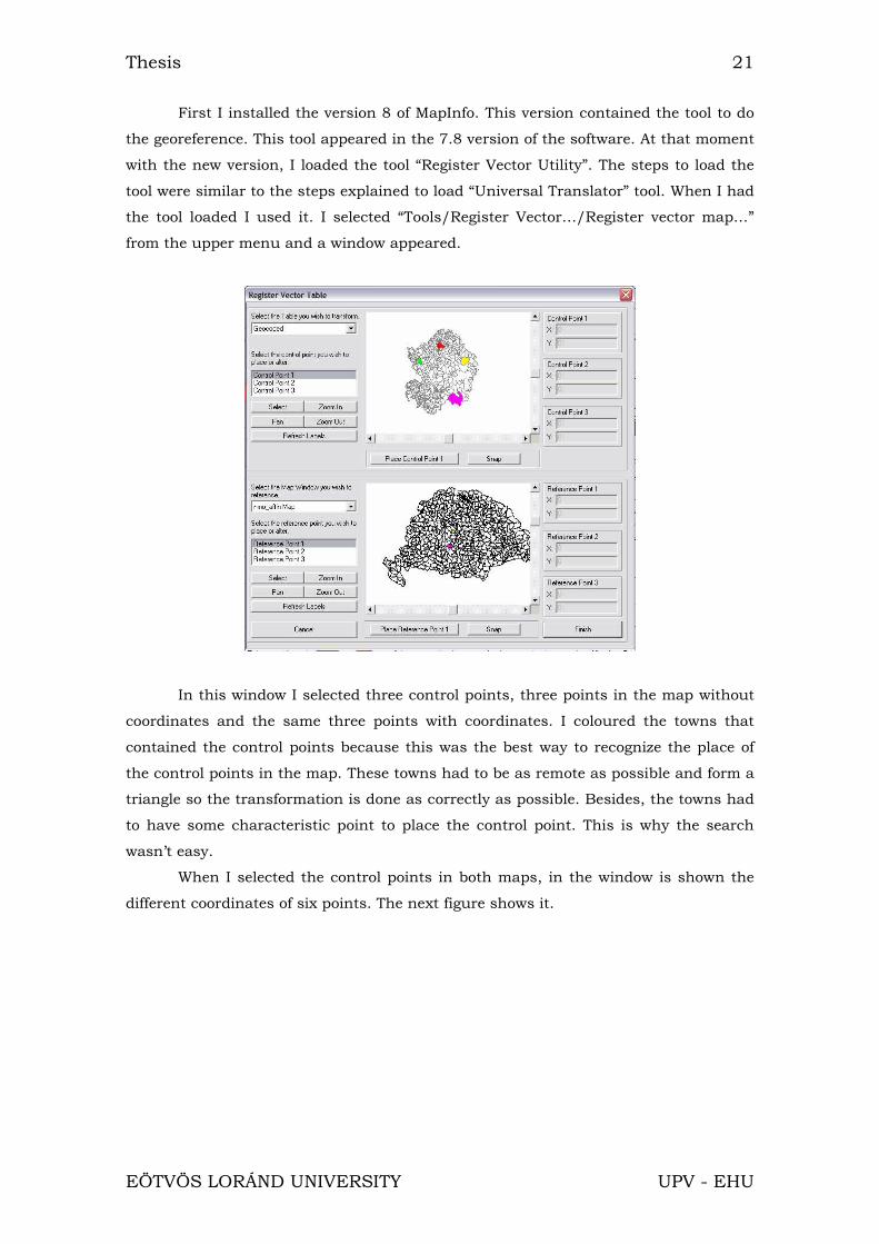
First I installed the version 8 of MapInfo. This version contained the tool to do
the georeference. This tool appeared in the 7.8 version of the software. At that moment
with the new version, I loaded the tool “Register Vector Utility”. The steps to load the
tool were similar to the steps explained to load “Universal Translator” tool. When I had
the tool loaded I used it. I selected “Tools/Register Vector…/Register vector map…”
from the upper menu and a window appeared.
In this window I selected three control points, three points in the map without
coordinates and the same three points with coordinates. I coloured the towns that
contained the control points because this was the best way to recognize the place of
the control points in the map. These towns had to be as remote as possible and form a
triangle so the transformation is done as correctly as possible. Besides, the towns had
to have some characteristic point to place the control point. This is why the search
wasn’t easy.
When I selected the control points in both maps, in the window is shown the
different coordinates of six points. The next figure shows it.

Thesis 22
EÖTVÖS LORÁND UNIVERSITY UPV - EHU
This step was repeated with the map of my work. When I georeferenced the two
works, both were joined perfectly because both had the same coordinates. I have to
mention that the process wasn’t precise and exact because the maps were different,
the contour of the towns wasn’t similar and the zoom didn’t permit to work in an ideal
scale. However for the context of the work the results were valid.
3.11. CREATION OF THEMATIC MAPS
When I had georeferenced the work, the last step was to make thematic maps.
MapInfo can make some kinds of predetermined thematic maps.
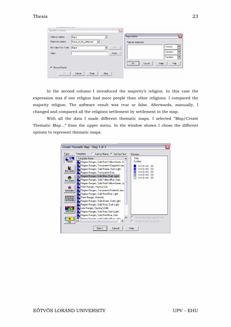
Before making thematic maps, I made new columns in the tables to prepare
data to make thematic maps. I created two columns. The process was similar to the
process explained previously. I selected “Table/Update Column…” to fill the columns.
There I selected the table that contained the column to fill and the table that
contained the data. As these two tables were the same, the software allowed me to
select one expression which could fill the table. In the first column I introduced the
density of population. In the expression I selected the column “Population” divided by
area. It was possible to introduce the area because the map had coordinates.
Thesis 23
EÖTVÖS LORÁND UNIVERSITY UPV - EHU
In the second column I introduced the majority’s religion. In this case the
expression was if one religion had more people than other religions. I compared the
majority religion. The software result was true or false. Afterwards, manually, I
changed and compared all the religions settlement by settlement in the map.
With all the data I made different thematic maps. I selected “Map/Create
Thematic Map…” from the upper menu. In the window shown I chose the different
options to represent thematic maps.
Thesis 24
EÖTVÖS LORÁND UNIVERSITY UPV - EHU
4.- THEMATIC MAPS
I have made different thematic maps using the data of the database. Therefore
the maps show data like inhabitants, religion, density of population, nationalities…
4.1.- KIND OF MAPS
There are numerous kinds of thematic maps, choroplets, surface maps,
cartodiagrams… I have made thematic maps with MapInfo. I have made the maps as
best as MapInfo allows.
4.1.1.- MAP EDITION
MapInfo has an option in which the software, with the database, is able to
make different thematic maps, as I have explained previously. MapInfo permits the
creation of element maps, surface maps and cartodiagrams in different ways.
I can’t make all kinds of thematic maps offered by MapInfo using the actual
data. The reason is that the map representation would be wrong. For example, surface
maps cannot be done because we don’t have the appropriated data to create them. All
the data that I had are not continuous and to make surface maps continuous data are
needed. In this project the data was stored separately for each settlement. So there
was no continuous change like temperature or atmospheric pressure data which
would be continuous data.
I made maps about inhabitants, religion and nationalities. I made alternative
maps for the different possibilities such as cartodiagrams, choroplets.....
I have made maps with inhabitants data that are discontinuous, so I had to
represent those data in element maps. I decided to choose different shades of colour.
The darkest tone shows the settlements with more people and the lightest tone the
settlements with less people. Also I represented it in a map with points. In this map,
the settlements with more inhabitants were represented with points distributed more
densely. On the contrary, the settlements with fewer inhabitants were represented
with less point. The change between both extremes was gradual so the map shows the
settlements with more people with more points. I did the same but I changed points to

Thesis 25
EÖTVÖS LORÁND UNIVERSITY UPV - EHU
a hatch using diagonal lines. The high range had more lines than the low ranges. The
change was gradual. In these two last examples, MapInfo coloured points and lines
with black colour as the default colour. I changed the black to another colour. Last I
made one map with gradual symbols. The symbol used was the draw of a person. In
the villages with more people the symbol is bigger than in the villages with less people.
In this case, MapInfo didn’t make different ranges, it used a gradual size. The
graduation was made by MapInfo. MapInfo allows different kinds of graduation,
logarithmic, constant or square root. I chose logarithmic. This method isn’t the most
exact but it is the best way to represent the information in this map. I have forgotten
to write that in my work I had the village of Budapest. Budapest has a huge number of
people in comparison with the other settlements. This is a problem because in the
calculation done with MapInfo the results are distorted. Besides I had the last year
work in another table, so I had two tables with two ranges. For these reasons I had to
change the ranges given by MapInfo for another ranges. The previous and the final
ranges were:
INHABITANTS
Table 1 Table 2 Final range
0 2000 100 900 100 1100
2000 3000 900 1400 1100 1800
3000 4000 1400 1700 1800 2700
4000 5000 1700 2400 2700 4200
5000 881000 2400 22400 4200 880400
The next maps that I made were the maps with density of population data.
These data weren’t continuous either. The density was inhabitants per square
kilometre and the density of each settlement was different so I made choroplet. In the
first map I chose a colour in different shades. The higher range had the darkest tone
and the lower range had the lightest colour. As with the previous data, because of the
huge number of inhabitants in Budapest I had to modify the ranges. I did it to show
Points Lines Colour Symbols

Thesis 26
EÖTVÖS LORÁND UNIVERSITY UPV - EHU
the very best map. The other kind of map that I made was using points. But this was
different than the inhabitants map. Each point drawn shows a number of people. This
way, I managed to show in the map the settlements with more density of population,
because these settlements had a higher number of points than the settlements with
fewer inhabitants. I changed the colour of the points from black to green. Also I
changed the value of the point. In some maps, one point represented fifty people and
in other maps with points represented twenty people.
DENSITY OF POPULATION
Table 1 Table 2 Final range
0 200 70 130 0 100
200 300 130 140 100 150
300 400 140 170 150 300
400 500 170 190 300 600
500 29900 190 7520 600 29900
Finally I made the maps about religions. In each settlement different people
that believe in different religions existed. These data weren’t continuous either. The
best options to show this variable were cartodiagrams because of the existence of
several religions with different number of devotes. MapInfo can make different
cartodiagrams. First I made half-pies cartodiagrams. In each half-pie the percentage of
people that believed in this religion was shown in a different colour. Every half-pie had
as many colours as religions existed in the settlement. The size of the half-pie would
change depending on the number of religions. In the second type, the cartodiagram
was a pie chart. This way, as previously, each religion had a different colour and it
own percentage of believers. The sizes of the pie charts will change in order of the
number of believers. The higher number of believers will have the higher size. In both
ways, the size of the charts is calculated by the software. The graduation can be
constant, logarithmic or square root. The best graduation is logarithmic due to the
existence of Budapest that distorts the results. The last map I made was with bar
charts. In this cartodiagram each bar shows a different religion and is coloured in
Points Colour

Thesis 27
EÖTVÖS LORÁND UNIVERSITY UPV - EHU
different colours. Depending on the number of believers, the bar will be high or small.
Also the size of the bar charts will change in order of the number of religious. The
graduation, at same at the last ways, will be in different kinds.
After this, I made the maps that showed the majority religion of each settlement. Again
the data were discontinuous, so I made choroplets. As the religions were different and
they didn’t have any relation, I chose different colours, one colour for each religion so
the user would be able to identify the different religions at first. I only had five
religions. I also made a map with a gradation of brown. The darkest showed the
religion most repeated in the different settlements and the lightest the least repeated .
However, I also made another map with the opposite legend.
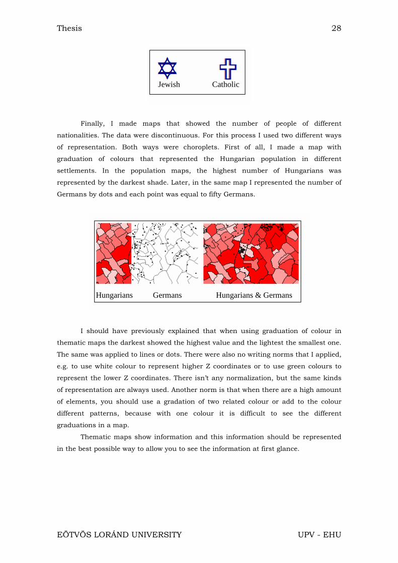
I made other map using proportional symbols. I chose one religion and the
number of believers was shown with a symbol of a different size. In this way the data
were discontinuous. The size of the symbol, as all along the project, was made by
MapInfo with a graduation of square root, logarithmic or constant. I chose the
logarithmic because Budapest has a high population. Later, in this map I added a
graduation of colour that showed the inhabitants of each settlement as I have
explained at the beginning of this section.
Half-pie Pie Bar
Different colours
Thesis 28
EÖTVÖS LORÁND UNIVERSITY UPV - EHU
Finally, I made maps that showed the number of people of different
nationalities. The data were discontinuous. For this process I used two different ways
of representation. Both ways were choroplets. First of all, I made a map with
graduation of colours that represented the Hungarian population in different
settlements. In the population maps, the highest number of Hungarians was
represented by the darkest shade. Later, in the same map I represented the number of
Germans by dots and each point was equal to fifty Germans.
I should have previously explained that when using graduation of colour in
thematic maps the darkest showed the highest value and the lightest the smallest one.
The same was applied to lines or dots. There were also no writing norms that I applied,
e.g. to use white colour to represent higher Z coordinates or to use green colours to
represent the lower Z coordinates. There isn’t any normalization, but the same kinds
of representation are always used. Another norm is that when there are a high amount
of elements, you should use a gradation of two related colour or add to the colour
different patterns, because with one colour it is difficult to see the different
graduations in a map.
Thematic maps show information and this information should be represented
in the best possible way to allow you to see the information at first glance.
Jewish Catholic
Hungarians Germans Hungarians & Germans

Thesis 29
EÖTVÖS LORÁND UNIVERSITY UPV - EHU
4.1.2.- LIMITATIONS OF MAPINFO
As I have explained, MapInfo offers different possibilities of representation of
maps. However, there are three important limitations in its use.
First, MapInfo doesn’t allow to change the size of charts or to move them. This
means that small areas produce charts that can hide another chart or the cross
border while big areas will produce big charts, which will consequently hide more
information. MapInfo doesn’t allow fixing the size of chart bars either, so if you have
an area with high values, such as Budapest, the bars will hide a larger map area. If
you change the size of the charts you won’t see some information.
Secondly, when you use symbols, you can’t move them because MapInfo places
them automatically. If they are very little, they appear in the cross border of the
settlement, and it can seem as if they belonged to another settlement. Besides, if you
enlarge the size of the symbols you can’t avoid hiding information.
Last, when you chose a graduation of colour, you have to choose the default
colour because MapInfo doesn’t allow any minimizing of colour. You should choose
different colours and this way difficult the work if you want to change, e.g. from brown
to yellow.
4.2.- MAP PRINTING
There are two steps to be explained. First the process of printing and the
colours used and then some limitations of the software in this area.
4.2.1.- PROCESSING
I made the map, and I saved the window in different formats and in different
dimensions with MapInfo layer. Some maps were saved in TIFF format, others in
bitmap (BMP) format. I could print these formats but I had to do these steps for each
map. Therefore I had the same number of maps as windows saved. If I wanted to add
the legend, I had to save the legend in a new window and afterwards add the legend
with one image-editing software like Paint.
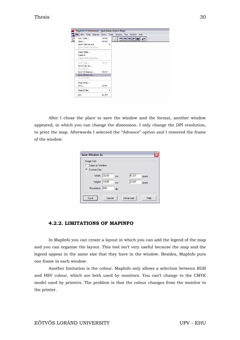
The process to save the map windows is to choose “File/Saved window as…” in
the upper menu.
Thesis 30
EÖTVÖS LORÁND UNIVERSITY UPV - EHU
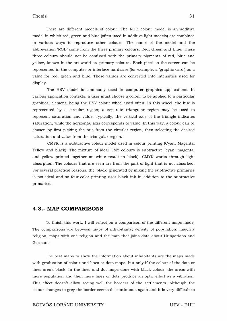
After I chose the place to save the window and the format, another window
appeared, in which you can change the dimension. I only change the DPI resolution,
to print the map. Afterwards I selected the “Advance” option and I removed the frame
of the window.
4.2.2. LIMITATIONS OF MAPINFO
In MapInfo you can create a layout in which you can add the legend of the map
and you can organize the layout. This tool isn’t very useful because the map and the
legend appear in the same size that they have in the window. Besides, MapInfo puts
one frame in each window.
Another limitation is the colour. MapInfo only allows a selection between RGB
and HSV colour, which are both used by monitors. You can’t change to the CMYK
model used by printers. The problem is that the colour changes from the monitor to
the printer.
Thesis 31
EÖTVÖS LORÁND UNIVERSITY UPV - EHU
There are different models of colour. The RGB colour model is an additive
model in which red, green and blue (often used in additive light models) are combined
in various ways to reproduce other colours. The name of the model and the
abbreviation ‘RGB’ come from the three primary colours: Red, Green and Blue. These
three colours should not be confused with the primary pigments of red, blue and
yellow, known in the art world as ‘primary colours’. Each pixel on the screen can be
represented in the computer or interface hardware (for example, a ‘graphic card’) as a
value for red, green and blue. These values are converted into intensities used for
display.
The HSV model is commonly used in computer graphics applications. In
various application contexts, a user must choose a colour to be applied to a particular
graphical element, being the HSV colour wheel used often. In this wheel, the hue is
represented by a circular region; a separate triangular region may be used to
represent saturation and value. Typically, the vertical axis of the triangle indicates
saturation, while the horizontal axis corresponds to value. In this way, a colour can be
chosen by first picking the hue from the circular region, then selecting the desired
saturation and value from the triangular region.
CMYK is a subtractive colour model used in colour printing (Cyan, Magenta,
Yellow and black). The mixture of ideal CMY colours is subtractive (cyan, magenta,
and yellow printed together on white result in black). CMYK works through light
absorption. The colours that are seen are from the part of light that is not absorbed.
For several practical reasons, the 'black' generated by mixing the subtractive primaries
is not ideal and so four-color printing uses black ink in addition to the subtractive
primaries.
4.3.- MAP COMPARISONS
To finish this work, I will reflect on a comparison of the different maps made.
The comparisons are between maps of inhabitants, density of population, majority
religion, maps with one religion and the map that joins data about Hungarians and
Germans.
The best maps to show the information about inhabitants are the maps made
with graduation of colour and lines or dots maps, but only if the colour of the dots or
lines aren’t black. In the lines and dot maps done with black colour, the areas with
more population and then more lines or dots produce an optic effect as a vibration.
This effect doesn’t allow seeing well the borders of the settlements. Although the
colour changes to grey the border seems discontinuous again and it is very difficult to
Thesis 32
EÖTVÖS LORÁND UNIVERSITY UPV - EHU
see it. Besides in lines and dots maps the borders seems discontinuous. The map with
the symbols of persons show very well the information, but the symbols can hide other
symbols and some borders. It shows correctly the settlements with a high population.
In this case the border colour used is grey.
The maps about density of population don’t have any problem. In the maps of
gradation of colour you can see perfectly the areas with a higher value of density. The
colour of the borders in this map is black because another colour made more difficult
the reading of information. In the dot maps with points, when a dot is equal to twenty
people, logically there are more dots than when a dot is equal to fifty, and they look
same as a green colour or black. Maybe black colour is the best way. In this map, and
opposite to what happened in the aforementioned map, the colour of the border
should be grey. If the colour had been black, the dots and borders would have been
mixed.
The maps about religions represented by charts are more problematical.
MapInfo doesn’t allow any change in sizes or location of the charts, so some charts
can hide information. The best maps were made using half-pies. This kind of map
contained the charts with the smallest, but readable size, with less hidden map
information. It isn’t a good quality map, but it is the best of the maps made. The maps
with pies hide a lot of information. The worst solution is the bar chart. In this kind of
maps, you can’t read the map information due to the little settlements.
In the maps representing the majority religions the first version was to
represent each religion with a different colour. At first the Roman Catholic, which is
the majority religion, had a light green colour. The next religions had different colours,
red for the Calvinist, blue for Lutherans and green and purple for the other religions.
The blue and red colours were darker than the green of the Roman Catholics. Then I
changed the light green colour to dark green colour. Then red and blue didn’t stand
out from the other colours. Later, I tried with a brown scale. First, I used the light
brown for the Roman Catholic and the dark brown for the Calvinist. This map was
erroneous, I changed the value of the colour and use dark brown for Catholics.
In the maps with the symbols of religions, as had happened with the
inhabitants map with symbols, it looks very well at first glance and you can see the
settlements with more believers. This map only has the problem of hidden
information; it depends on the size of the symbols. Besides, I chose symbols that show
the religion: a cross for the Catholics and a David’s Star for Jewish. When I added the
information about the inhabitants with a graduation of colour, the map allows to
identify if the religion was majority or not. As the colour of the population was
Thesis 33
EÖTVÖS LORÁND UNIVERSITY UPV - EHU
different from the colour of the symbols, there wasn’t any problem to distinguish both
in the map.
In the map that shows the two nationalities it is very easy to identify the
information. The processes to represent the information were graduation of colour and
dots. The basic colour of the graduation chosen was red and it shows the number of
Hungarians. The dots are black and show the number of Germans. One dot is equal to
fifty people. In the map you can see the places with the higher number of Germans.
Besides, the places with a low number of Hungarians have the higher number of
Germans. The border is black, which makes dots and border mixed, but if the colour
of the border is grey it would be very difficult to see the border. Then the best solution
is to draw the border with black.

Thesis 34
EÖTVÖS LORÁND UNIVERSITY UPV - EHU
5.- USED SOFTWARE
The software used in this work are:
AutoCad (*.dwg/*.dxf)
It is one of the CAD software more used in the world. I have used the version
2000 and the version 2004 of the software. Both versions are similar, although if you
work in the 2004 version and later you want to open the file with the 2000 version,
you should to save previously the file in the 2000 version.
Excel (*.xls)
With this software I made the database with the data that I obtained from the
Atlas. The software is included in Microsoft Office. I used the 2003 version although it
doesn’t matter because I didn’t make any calculation.
MapInfo (*.map/*.tab)
This is Geographical Information System software. It is a vectorial GIS. I used
7.0 and 8.0 version. The difference is that the last version has the tool to transform
coordinates. I used this tool to give coordinates to my map.
Word (*.txt)
Word is a text processor. It is one of the most sell and use software over the
world. This software is included in Microsoft Office. I used it to write the memory of
the work. I had the 2003 version.
PowerPoint (*.pps)
With this software made the slides to present my work. It is included in
Microsoft Office. I used the 2003 version. It has new presentation options like as
movements.

Thesis 35
EÖTVÖS LORÁND UNIVERSITY UPV - EHU
6.0.- BIBLIOGRAPHY
- ARANAZ DEL RIO, FERNANDO, Tu amigo el mapa, Ministerio de Fomento,
Dirección General del Instituto Geográfico Nacional, cuarta edición, Spain, 1998 April.
-MAPINFO, MapInfo Professional, user's guide version 6.5, MapInfo Corporation,
Troy, New York (EEUU), 2001 May.
- PELLICER PEREZ, JULIO, Cartografía, Ministerio de educación, Cuba, 1980.
-ZENTAI, LÁZSLÓ, A Történelmi Magyarország Atlasza és Adattára 1914, Talma
Kiadó, Budapest (Hungary), 2001.
Web sources:
- Free multimedia encyclopedia, 2006 of November of 21.
<www.wikipedia.com>

Thesis 36
EÖTVÖS LORÁND UNIVERSITY UPV - EHU
ANNEXE 1