Hieu Ung Text
18
Tutorials on creating metal type abound online, as do variations on simple liquid effects. Most are fairly short, offering a good foundation for the reader on ho w certain effects are achieved but fail to take that extra step (or few steps) to make the piece really shine. Once you have an idea of how different techniques fit together in a piece, it is fairly easy to com bine, say, the process to create metal and the process to create liquid to create something that exists in both sides of the FX map. 1 Create a new image with the following attributes: Width: 11 inches Height: 11 inches Resolution: 300 ppi, 8bit Background Color: White Color Mode: RGB (Important or it won'r work) 2 Since the desired effect is to appear liquefied, a font that appears to have been made with a crayon or round brush will work perfectly. Select the Type tool and open the Character
Transcript of Hieu Ung Text

8/3/2019 Hieu Ung Text
http://slidepdf.com/reader/full/hieu-ung-text 1/18
Tutorials on creating metal type abound online, as do variations on simple liquid effects. Most are fairly
short, offering a good foundation for the reader on how certain effects are achieved but fail to take that
extra step (or few steps) to make the piece really shine. Once you have an idea of how different
techniques fit together in a piece, it is fairly easy to combine, say, the process to create metal and theprocess to create liquid to create something that exists in both sides of the FX map.
1
Create a new image with the following attributes:
Width: 11 inches
Height: 11 inches
Resolution: 300 ppi, 8bit
Background Color: White
Color Mode: RGB (Important or it won'r work)
2
Since the desired effect is to appear liquefied, a font that
appears to have been made with a crayon or round brush will
work perfectly. Select the Type tool and open the Character

8/3/2019 Hieu Ung Text
http://slidepdf.com/reader/full/hieu-ung-text 2/18
palette from the Options bar. The font I’ve chosen is called ‘WallowHmkBold’… if you do not have this
installed on your system just use the font of your choice. The attributes for the characters are seen below:
3
Note that the color is gray in the #666666 range and NOT
stark black.
Type a word across the face of the image.
4
Rasterize the type layer, then paint a few additional gray dots around the type.

8/3/2019 Hieu Ung Text
http://slidepdf.com/reader/full/hieu-ung-text 3/18
5
Open the Channels palette and duplicate a channel…
the Blue channel will work fine. Go to Image>Adjustments>Invert.
6
Open the Filter menu and select Blur>Gaussian Blur. First, blur
the channel at a 25 pixel radius. Blur the channel again at a radius of 15 pixels.

8/3/2019 Hieu Ung Text
http://slidepdf.com/reader/full/hieu-ung-text 4/18
7
Turn on all the other layers (Click the eye to the left
of RGB)
Turn off the Blue copy channel, but don’t delete it… you’ll need it in a moment or two.
Click on the letters RGB to make sure that th RGB channel is active.
8
Go to
Filter>Render>Li
ghting Effects.
Set it up as
outlined in the
image below…
be sure to select
the Blue copy
8/3/2019 Hieu Ung Text
http://slidepdf.com/reader/full/hieu-ung-text 5/18
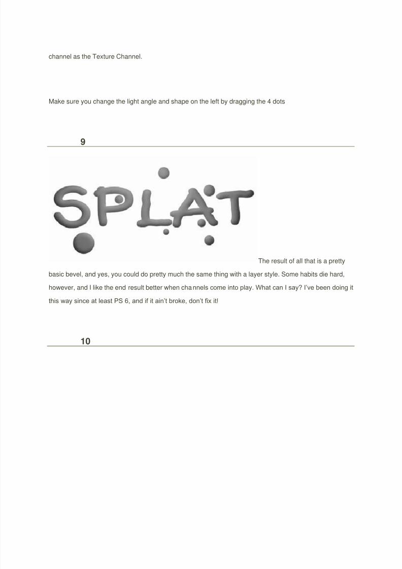
channel as the Texture Channel.
Make sure you change the light angle and shape on the left by dragging the 4 dots
9
The result of all that is a pretty
basic bevel, and yes, you could do pretty much the same thing with a layer style. Some habits die hard,
however, and I like the end result better when channels come into play. What can I say? I’ve been doing it
this way since at least PS 6, and if it ain’t broke, don’t fix it!
10

8/3/2019 Hieu Ung Text
http://slidepdf.com/reader/full/hieu-ung-text 6/18
Duplicate the text layer
and go to Filter>Sketch>Chrome. Set up the reflections as seen in the dialog box below:
11
Now you can play with Layer Styles a bit. Open the Layer Styles dialog box and select Bevel/Emboss.
Enter the following settings… note that the Shadow color is again gray in the #666666 range and not
black. Make sure the Gloss Contour is changed to cone.Once done click OK.

8/3/2019 Hieu Ung Text
http://slidepdf.com/reader/full/hieu-ung-text 7/18
12
Make a Curves adjustment layer and Levels adjustment layer with the settings seen here:
13
Against a black background the shine really comes out.

8/3/2019 Hieu Ung Text
http://slidepdf.com/reader/full/hieu-ung-text 8/18

8/3/2019 Hieu Ung Text
http://slidepdf.com/reader/full/hieu-ung-text 9/18
16
You can now throw the text into any image you so choose. In the following
example, I’ve blurred a tech-style background, placed the type in that document, then placed a duplicate
of the blurred layer above the text. The Blend mode of the top layer is changed to Soft Light to serve as
reflections off the type, or making the type appear transparent allowing you to see the backgroundthrough it. I’ll let you decide what is actually happening.
That’s it for now. Until next time, I’ll see you at ActionFx.com. Take care!

8/3/2019 Hieu Ung Text
http://slidepdf.com/reader/full/hieu-ung-text 10/18
Shining Neon Text Effect in Photoshop
Tags
photoshop
tutorial
Since we released Abduzeedo's new design, we've received quitea few emails asking for a tutorial showing how to reproduce the our logo
effect. Actually since the first time we used that effect, on the SparklingHot Girl in Photoshop tutorial, a lot of people have asked us how to dothat effect. So in this very short tutorial we will show you how to do thatin Photoshop.
Step 1
Create a new document, use the size you want, it doesn't matter. Then fill the background with a very
dark gray, #111111.

8/3/2019 Hieu Ung Text
http://slidepdf.com/reader/full/hieu-ung-text 11/18
Step 2
Now place your logo in the document. Duplicate the layer and hide it, we will need it later on.

8/3/2019 Hieu Ung Text
http://slidepdf.com/reader/full/hieu-ung-text 12/18
Step 3
Now with the visible layer, lets apply a Layer Style. Go to Layer>Layer Style>Gradient Overlay. Then
use Normal for the Blend Mode, and 60% Opacity. For the color use a gradient with red, yellow, green,
and blue.

8/3/2019 Hieu Ung Text
http://slidepdf.com/reader/full/hieu-ung-text 13/18
Step 4
Now let's add some blur, go to Filter>Blur>Gaussiam Blur. Use 4.0 pixels for the Radius.

8/3/2019 Hieu Ung Text
http://slidepdf.com/reader/full/hieu-ung-text 14/18
Step 5
Make the duplicated layer visible and go to Filter>Blur>Gaussian Blur. Use this time 1 pixel for the
Radius.

8/3/2019 Hieu Ung Text
http://slidepdf.com/reader/full/hieu-ung-text 15/18
Step 6
Go to Layer>Layer Style>Blending Options. Change the Fill Opacity to 0% on the AdvancedBlending. Then go to Outer Glow. Use Color Dodge for the Blend Mode, 50% Opacity, White for the
Color, and 18 pixels for the Size. After that, if your logo is not white, you can go to Color Overlay and
use white for the color.

8/3/2019 Hieu Ung Text
http://slidepdf.com/reader/full/hieu-ung-text 16/18

8/3/2019 Hieu Ung Text
http://slidepdf.com/reader/full/hieu-ung-text 17/18
Step 7
Now group this single layer and rename the group to "Over" then change the blend mode to Color
Dodge. After that you can group everything again and rename it to "Logo".
Conclusion
With this technique you will be able to create a nice neo effect to pretty much all kinds of backgrounds.
The only thing you will have to do is change some opacities depending on the color of the background.

8/3/2019 Hieu Ung Text
http://slidepdf.com/reader/full/hieu-ung-text 18/18