Hazard Assessment - University of Colorado Boulder · Temblor Range east of the city of San Luis...
5
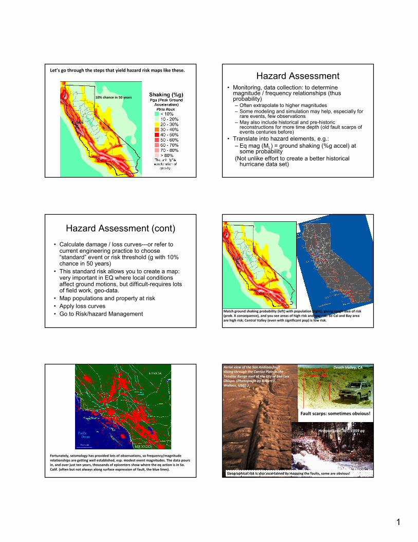
1 10% chance in 50 years Let’s go through the steps that yield hazard risk maps like these. Hazard Assessment • Monitoring, data collection: to determine magnitude / frequency relationships (thus probability) – Often extrapolate to higher magnitudes – Some modeling and simulation may help, especially for rare events, few observations – May also include historical and pre-historic reconstructions for more time depth (old fault scarps of events centuries before) • Translate into hazard elements, e.g.: – Eq mag (M L ) = ground shaking (%g accel) at some probability (Not unlike effort to create a better historical hurricane data set) Hazard Assessment (cont) • Calculate damage / loss curves---or refer to current engineering practice to choose “standard” event or risk threshold (g with 10% chance in 50 years) • This standard risk allows you to create a map: very important in EQ where local conditions affect ground motions, but difficult-requires lots of field work, geo-data. • Map populations and property at risk • Apply loss curves • Go to Risk/hazard Management Match ground shaking probability (left) with population (right), giving rough idea of risk (prob. X consequence), and you see areas of high risk and low risk: So Cal and Bay area are high risk; Central Valley (even with significant pop) is low risk. Fortunately, seismology has provided lots of observations, so frequency/magnitude relationships are getting well established, esp. modest event magnitudes. The data pours in, and over just ten years, thousands of epicenters show where the eq action is in So. Calif. (often but not always along surface expression of fault, the blue lines). Fault scarps: sometimes obvious! Aerial view of the San Andreas fault slicing through the Carrizo Plain in the Temblor Range east of the city of San Luis Obispo. (Photograph by Robert E. Wallace, USGS.) Hebgen Lake, MT, 1959 eq Death Valley, CA Geographical risk is also ascertained by mapping the faults, some are obvious!
Transcript of Hazard Assessment - University of Colorado Boulder · Temblor Range east of the city of San Luis...
1
10% chance in 50 years
Let’s go through the steps that yield hazard risk maps like these.
Hazard Assessment• Monitoring, data collection: to determine
magnitude / frequency relationships (thus probability)– Often extrapolate to higher magnitudes
– Some modeling and simulation may help, especially for rare events, few observations
– May also include historical and pre-historic reconstructions for more time depth (old fault scarps of events centuries before)
• Translate into hazard elements, e.g.:
– Eq mag (ML) = ground shaking (%g accel) at some probability
(Not unlike effort to create a better historical hurricane data set)
Hazard Assessment (cont)
• Calculate damage / loss curves---or refer to current engineering practice to choose “standard” event or risk threshold (g with 10% chance in 50 years)
• This standard risk allows you to create a map: very important in EQ where local conditions affect ground motions, but difficult-requires lots of field work, geo-data.
• Map populations and property at risk
• Apply loss curves
• Go to Risk/hazard ManagementMatch ground shaking probability (left) with population (right), giving rough idea of risk
(prob. X consequence), and you see areas of high risk and low risk: So Cal and Bay area
are high risk; Central Valley (even with significant pop) is low risk.
Fortunately, seismology has provided lots of observations, so frequency/magnitude
relationships are getting well established, esp. modest event magnitudes. The data pours
in, and over just ten years, thousands of epicenters show where the eq action is in So.
Calif. (often but not always along surface expression of fault, the blue lines).
Fault scarps: sometimes obvious!
Aerial view of the San Andreas fault
slicing through the Carrizo Plain in the
Temblor Range east of the city of San Luis
Obispo. (Photograph by Robert E.
Wallace, USGS.)
Hebgen Lake, MT, 1959 eq
Death Valley, CA
Geographical risk is also ascertained by mapping the faults, some are obvious!

2
Aerial surveys right after eq’s can reveal fault patterns not mapped before because
they had no sfc expression. Surface rupture, 1992 Landers EQ, San Bernardino
County, CA. –ranged from 2 inches to 20 ft
Not all faults are created
equal, or offer equal risk:
some that are “locked”
may not have ruptured in
modern times, but show
pre-historic evidence of
fewer, big ruptures.
SO
Different contributions to
a point’s risk of shaking by
an ensemble of different
faults
Ground motions for known magnitudes and relationship b/w ML and shaking can be
established, and then linked to frequency of seismic activity. Here are peak velocity
contours for the magnitude 6.7 1994 Northridge earthquake. Contours of velocity are in
cm/sec, measured by accelerometers. Red star is epicenter, note peak motions off-set to
north along foothills.
Another step in risk assessment is to map actual damage, here expressed by the
Modified Mercalli eq intensity scale, and link it to ground shaking, and thus be able to
project damage into the future.
Damage
ProjectionsYou can also link ground
motions to rough ideas, or
categories, of damage and the
Mercalli scale is typically used
as an anchor for such
comparisons (Box. 5.1 in
textbook).
Add it all up!
• Run lots of simulations
• Add new data all the time (M and accelerations to let you know how each signature of a fault plays out across a varied topography)
• Look for hidden, quiescent old faults
• Up-date risk assessment
• Up-date hazard reduction efforts
• Improve disaster preparedness
3
OK, next step is
mitigation:
Damage and Loss
Reduction
OK: so you know the risk,
now you can you design
and retro-fit the built
environment to reduce
loss (at least you start
trying, within limits of
costs and benefits).
EQ Resistant Design/Code• Global problem: URM: adobe, brick, stone
• Good: “weak” structures like pole/thatch
• Good: wood frame construction (80% houses in U.S.)
• Two main approaches in engineered structures:
– Bracing, and shock-absorbing bases, “strong, flexible, ductile materials (e.g., steel framing)– allow motions to move thru the building w/ less damage.
– “Base Isolation,” is most extreme and expensive mitigation (see next slide): prevent motions form transmitting form ground to the building.
– Base Isolation is very expensive, so: Maybe not every bldg, but schools, hospitals, nuclear power plants, dams, etc. Also: gas, water, electric lines
• Avoid glass; facades; parapets; balconies, etc. that fall away from structures (often into streets on people!)
• Interior design: anchor everything!
• Choose safer locations: e.g., bedrock often better than clay, alluvial sediments, or man-made fill (especially fill)
Base isolation in Martin Luther King Jr. civic center
in Berkeley—this was an expensive retro-fit! Does
not work for tall bldgs.
Other approaches add bracing to transmit motions
though bdlgs, see next slide
See more seismic design specs at:
http://www.wbdg.org/design/seismic_design.php
?r=resist_hazards
Bracing: structural members that transmit waves
thru the structure safely:
Can be tested on “shaking tables”: see:
http://peer.berkeley.edu/testing/index.html
http://www.ecs.csun.edu/~shustov/000-EPF.html
Replacement of the Bay bridge after
1989 Loma Prieta EQ, with seismic
design. Long Term Problem
• Still: majority of structures, even in EQ zones, not resistant (CA code improved in 1933; strengthened dramatically in 1970s and 1980s) still most bldgs are at risk.
• So, there’s a lot to accomplish in terms of emergency preparedness! Especially since there’s no skill in EQ predictions, though it is known that catastrophic EQ events will eventually occur in American and other cities. More on that later.
4
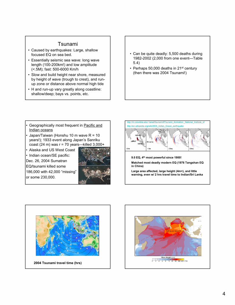
Tsunami• Caused by earthquakes: Large, shallow
focused EQ on sea bed.
• Essentially seismic sea wave: long wave
length (100-200km!) and low amplitude
(<.5M); fast: 500-6000 Km/h
• Slow and build height near shore, measured
by height of wave (trough to crest), and run-
up zone or distance above normal high tide
• H and run-up vary greatly along coastline:
shallow/deep; bays vs. points, etc.
• Can be quite deadly: 5,500 deaths during
1982-2002 (2,000 from one event—Table
5.4)
• Perhaps 50,000 deaths in 21st century
(then there was 2004 Tsunami!)
• Geographically most frequent in Pacific and
Indian oceans
• Japan/Taiwan (Honshu 10 m wave R = 10
years!); 1933 event along Japan’s Sanriku
coast (24 m) was r = 70 years---killed 3,000+
• Alaska and US West Coast
• Indian ocean/SE pacific:
Dec. 26, 2004 Sumatran
EQ/tsunami killed some
186,000 with 42,000 “missing”
or some 230,000.
http://iri.columbia.edu/~lareef/tsunami/#Tsunami_Animation:_National_Institute_of
http://en.wikipedia.org/wiki/2004_Indian_Ocean_earthquake
9.0 EQ, 4th most powerful since 1900!
Matched most deadly modern EQ (1976 Tangshan EQ
in China)
Large area affected, large height (4m+), and little
warning, even w/ 2 hrs travel time to Indian/Sri Lanka
2004 Tsunami travel time (hrs)
5
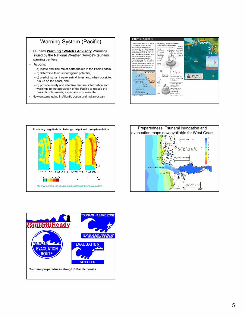
Warning System (Pacific)
• Tsunami Warning / Watch / Advisory Warnings
issued by the National Weather Service's tsunami
warning centers
• Actions:
– a) locate and size major earthquakes in the Pacific basin,
– b) determine their tsunamigenic potential,
– c) predict tsunami wave arrival times and, when possible,
run-up on the coast, and
– d) provide timely and effective tsunami information and
warnings to the population of the Pacific to reduce the
hazards of tsunamis, especially to human life
• New systems going in Atlantic ocean and Indian ocean
http://www.pmel.noaa.gov/tsunami/pugetsound/pre2/movie/ps.html
Predicting magnitude is challenge: height and run-up/inundation Preparedness: Tsunami inundation and
evacuation maps now available for West Coast
Tsunami preparedness along US Pacific coasts.