Feedback development
4
PRINT SCREENS AFTER FEEDBACK
-
Upload
joannajcjmedia -
Category
Social Media
-
view
45 -
download
0
Transcript of Feedback development

PRINT SCREENS AFTER FEEDBACK

DESATURATING IT
I got feedback on my magazine from a professional media expert from media hub, and he said my magazine was too bright for my 16+ independent audience. I therefore responded to his feedback by pressing Ctrl + U, which brought up this Hue/saturation widget. After which I decreased the Saturation in order to grey my photo and make it look less
poppy.

Changing font and adding stroke
I was also given feedback to change the font and positioning of my cover lines. I scrolled through the fonts until I found the font “Agency FB” which fits looks better on my front cover than my previous font. Then I went to the FX option on the layer, and added a white stroke, whilst the font is black so it creates
an interesting font that stands out.
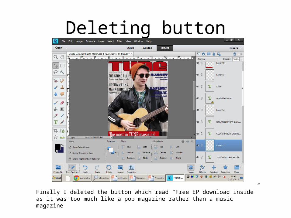
Deleting button
Finally I deleted the button which read “Free EP download inside” as it was too much like a pop magazine rather than a music magazine