Feature article analysis
3
Feature article analysis
-
Upload
franzzz202 -
Category
Social Media
-
view
36 -
download
0
Transcript of Feature article analysis
Feature article analysis
As seen in this first feature article, this is an article on the rock group ‘My Chemical Romance’ in the magazine ‘Kerrang’. As seen the composition and structure has a unique touch to it which does and doesn’t follow media conventions of other magazines. Unusually this feature article uses many images which are vibrant and full of life. Usually we would expect there to be one image on one side of the page and text on the other. This has been followed however the use of more than 2 images is not. This has made the text for the article smaller and look more detailed. The title of the article follows conventions as clearly seen, it is big bold and also uses different font text then from the main text. The photo annotations on the images also follow conventions of magazine feature articles. The main text has been sorted into columns which once more follow conventions. The images used effectively represent the music genre type, through ‘mise en scene’ such as costume and portrays the energy and life this music genre acquires. The page background colour is black, which may once more portray the music genre as well as expressing the characters of this group. There is conventionally page and page number which is ideal for collectors.
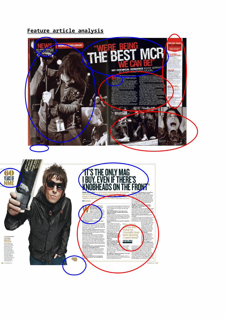
This next feature article is from the music magazine NME on ‘Liam Gallagher’. In this magazine the differences are clear to the previous ‘Kerrang’ feature article. The background colour and house scheme is clearly white and black. This connotes a simple, informative piece of text unlike Kerrang’s where the colours are more intimidating and portray the style of the music genre. Here conventions of music magazines are more followed then challenged with the structure and style. This is seen through the layout of the image. The image is placed on the left hand side and the text on the right. Here the text is more evenly distributed and may portray the openness character in the interview given. Another convention is followed through the increase of the quotation in the interview. “You did stir the Blur thing up... I thought they were pansies I hated them”. This emphasises the quotation by Liam in the interview. The Increased letter of the initial word in the opening text also follows conventions in music magazines which are also done in ‘Kerrangs’ magazine. Annotations of the image are also used as in the other magazine to show the similarities between the two. The positioning of the title is also placed very similarly which represents the importance of the artist (s) quotation and the meaning of the text. The text however in NME’s feature article is continuous and the same throughout, unlike Kerrangs feature article which uses 2 to 3 which may portray the unique, vibrant and mixed personalities of the group. Just like NME’s the feature article also has an opening introduction, which sets the story behind the text or the artists. In conclusion the structure and composition of the two feature article have been change to suit the style and reflect the music genre. The uses of dark vibrant colours portrays the energy and the rock and roll music genre as well as the use of images in ‘NME’s’ feature article whereas the ‘Kerrang’ have used a simple transcript layout to present and interview rather than portray the music genre its self.