Evaluation question 1
28
Question 1 • In what ways does your media product use, develop or challenge forms and conventions of real media products?
Transcript of Evaluation question 1
Question 1 • In what ways does your media product use, develop or challenge forms and
conventions of real media products?
FRONT COVER
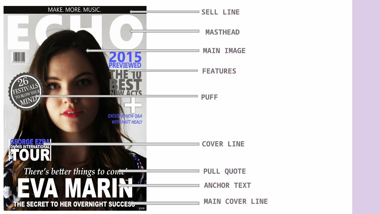
SELL LINE
MASTHEAD
MAIN IMAGE
PUFF
ANCHOR TEXT
PULL QUOTE
FEATURES
COVER LINE
MAIN COVER LINE
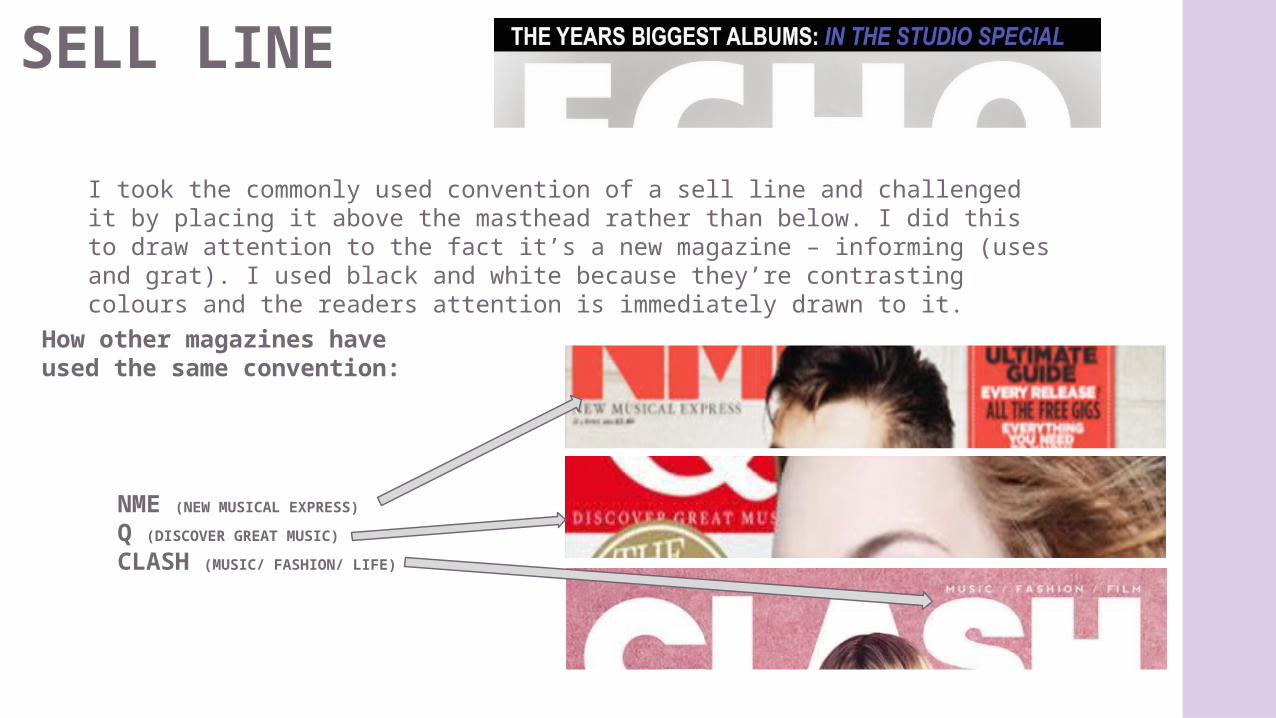
SELL LINE
I took the commonly used convention of a sell line and challenged it by placing it above the masthead rather than below. I did this to draw attention to the fact it’s a new magazine – informing (uses and grat). I used black and white because they’re contrasting colours and the readers attention is immediately drawn to it.
How other magazines have used the same convention:
NME (NEW MUSICAL EXPRESS)
Q (DISCOVER GREAT MUSIC)
CLASH (MUSIC/ FASHION/ LIFE)
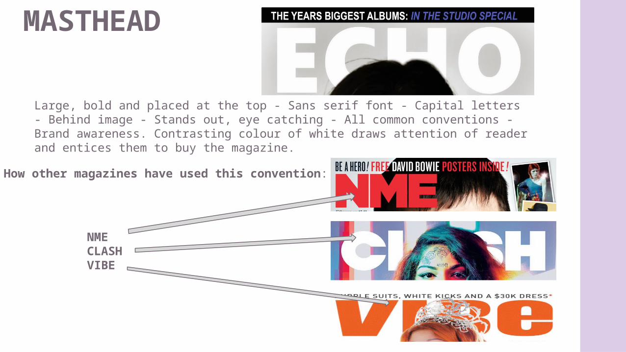
MASTHEAD
Large, bold and placed at the top - Sans serif font - Capital letters - Behind image - Stands out, eye catching - All common conventions - Brand awareness. Contrasting colour of white draws attention of reader and entices them to buy the magazine.
How other magazines have used this convention:
NMECLASH VIBE
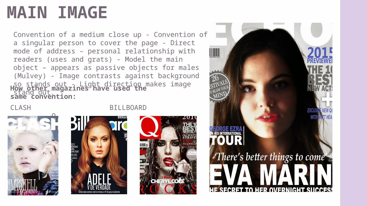
MAIN IMAGE Convention of a medium close up - Convention of a singular person to cover the page - Direct mode of address – personal relationship with readers (uses and grats) - Model the main object – appears as passive objects for males (Mulvey) - Image contrasts against background so stands out - Light direction makes image stand out.
How other magazines have used the same convention:
CLASH BILLBOARD Q
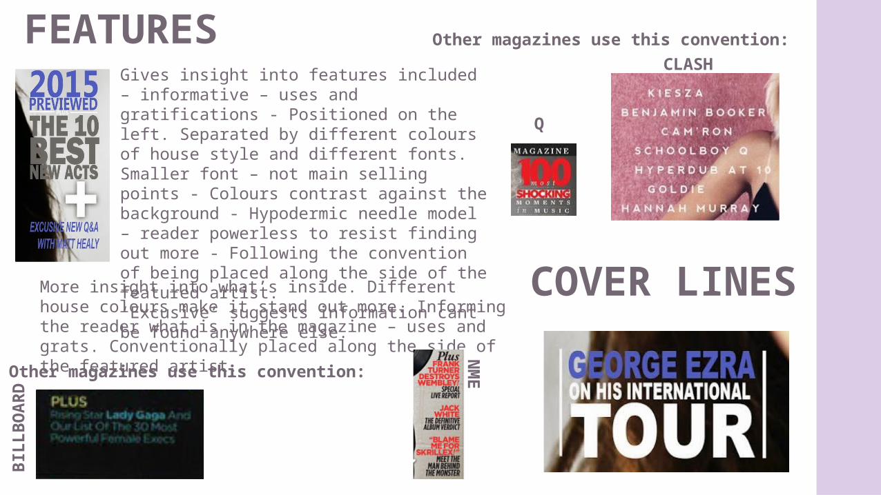
FEATURESGives insight into features included – informative – uses and gratifications - Positioned on the left. Separated by different colours of house style and different fonts. Smaller font – not main selling points - Colours contrast against the background - Hypodermic needle model – reader powerless to resist finding out more - Following the convention of being placed along the side of the featured artist.‘Excusive’ suggests information cant be found anywhere else.
Other magazines use this convention:
COVER LINESMore insight into what’s inside. Different house colours make it stand out more. Informing the reader what is in the magazine – uses and grats. Conventionally placed along the side of the featured artist.
Other magazines use this convention:
Q
CLASH
BIL
LB
OA
RD
NM
E
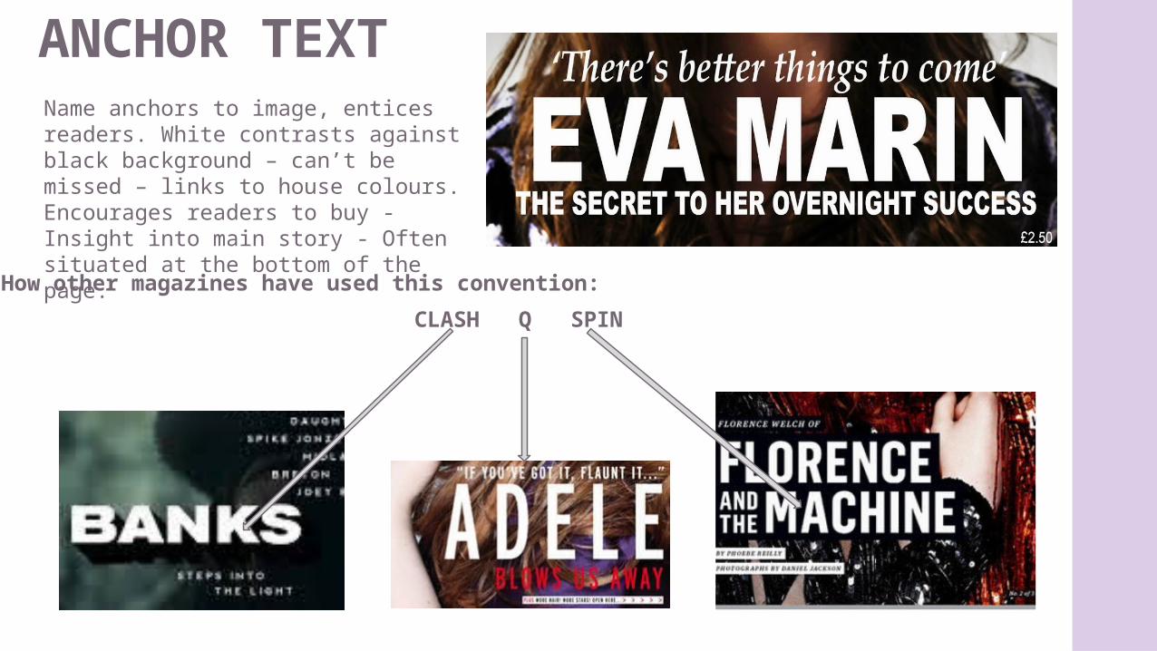
ANCHOR TEXTName anchors to image, entices readers. White contrasts against black background – can’t be missed – links to house colours. Encourages readers to buy - Insight into main story - Often situated at the bottom of the page.
How other magazines have used this convention:
CLASH Q SPIN
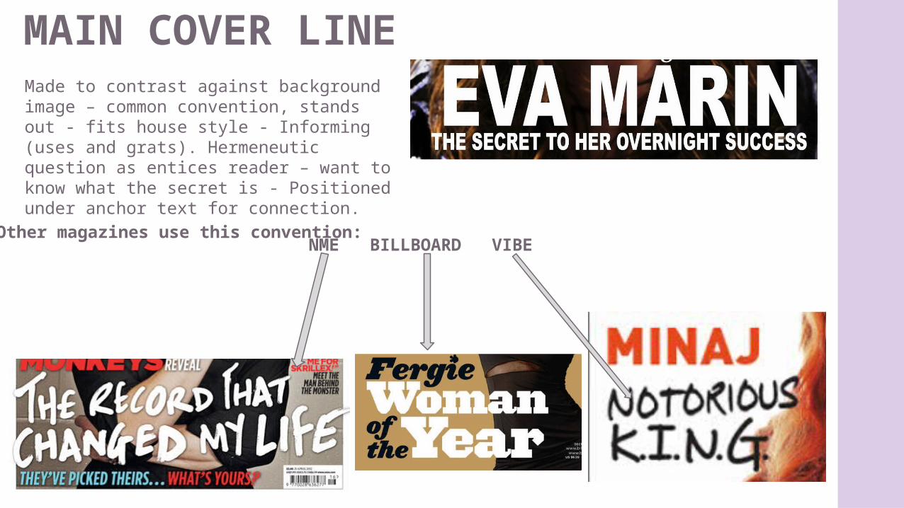
MAIN COVER LINEMade to contrast against background image – common convention, stands out - fits house style - Informing (uses and grats). Hermeneutic question as entices reader – want to know what the secret is - Positioned under anchor text for connection.
Other magazines use this convention:NME BILLBOARD VIBE
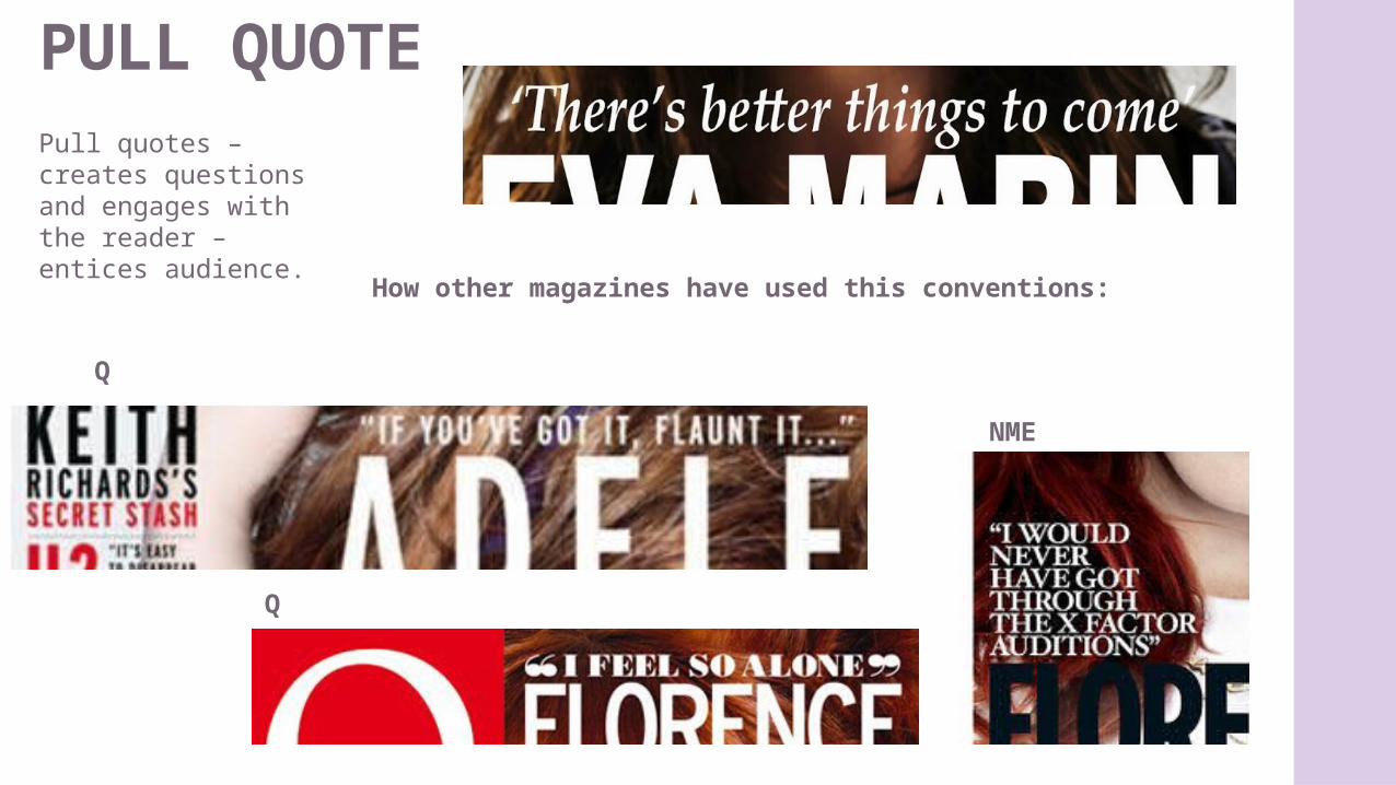
PULL QUOTEPull quotes – creates questions and engages with the reader – entices audience.
How other magazines have used this conventions:
Q
Q
NME
HOUSE STYLE
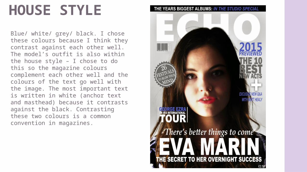
Blue/ white/ grey/ black. I chose these colours because I think they contrast against each other well. The model’s outfit is also within the house style – I chose to do this so the magazine colours complement each other well and the colours of the text go well with the image. The most important text is written in white (anchor text and masthead) because it contrasts against the black. Contrasting these two colours is a common convention in magazines.
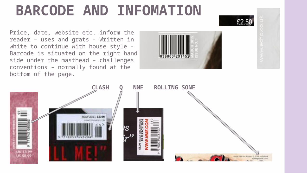
BARCODE AND INFOMATIONPrice, date, website etc. inform the reader – uses and grats - Written in white to continue with house style - Barcode is situated on the right hand side under the masthead – challenges conventions – normally found at the bottom of the page.
CLASH Q NME ROLLING SONE
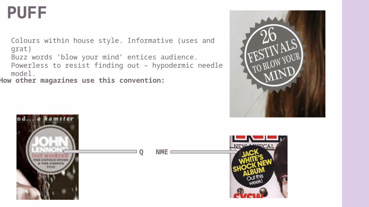
PUFFColours within house style. Informative (uses and grat)Buzz words ‘blow your mind’ entices audience. Powerless to resist finding out – hypodermic needle model.
How other magazines use this convention:
Q NME
CONTENTS
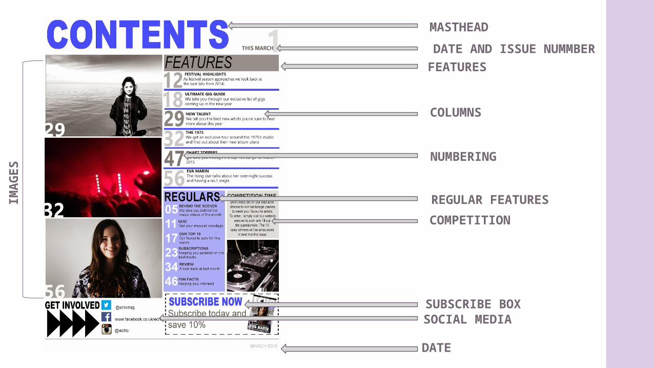
IMA
GES
SOCIAL MEDIA
DATE
DATE AND ISSUE NUMMBER
FEATURES
MASTHEAD
COLUMNS
NUMBERING
REGULAR FEATURES
SUBSCRIBE BOX
COMPETITION
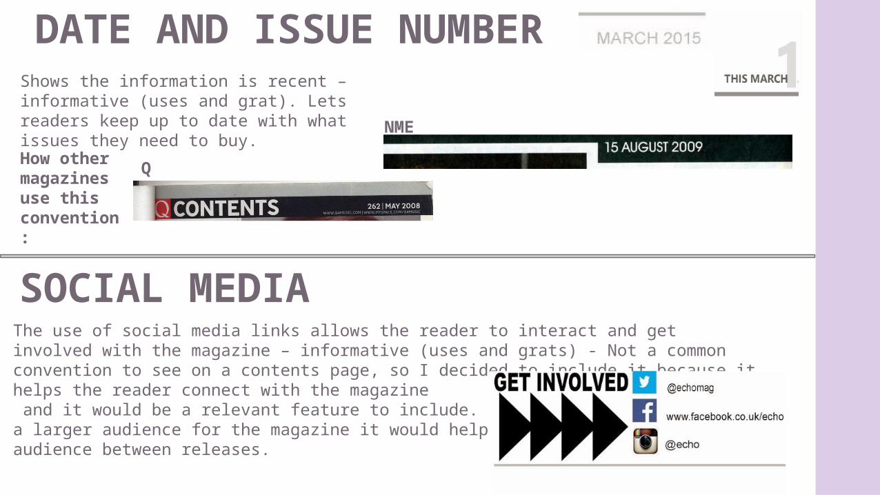
DATE AND ISSUE NUMBERShows the information is recent – informative (uses and grat). Lets readers keep up to date with what issues they need to buy.
How other magazines use this convention:
SOCIAL MEDIAThe use of social media links allows the reader to interact and get involved with the magazine – informative (uses and grats) - Not a common convention to see on a contents page, so I decided to include it because it helps the reader connect with the magazine and it would be a relevant feature to include. In order to gain a larger audience for the magazine it would help reach the audience between releases.
Q
NME
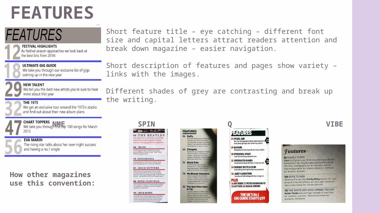
FEATURESShort feature title – eye catching – different font size and capital letters attract readers attention and break down magazine – easier navigation.
Short description of features and pages show variety – links with the images.
Different shades of grey are contrasting and break up the writing.
How other magazines use this convention:
NME SPIN Q VIBE
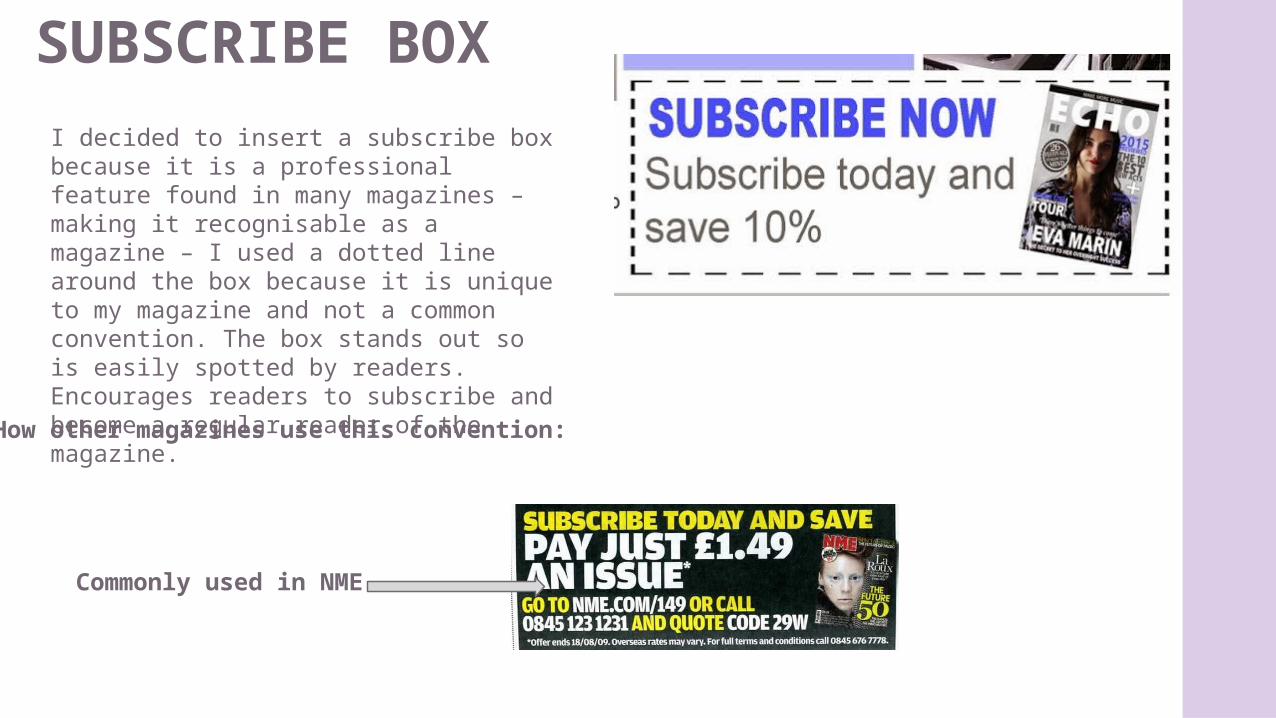
SUBSCRIBE BOX
How other magazines use this convention:
I decided to insert a subscribe box because it is a professional feature found in many magazines – making it recognisable as a magazine – I used a dotted line around the box because it is unique to my magazine and not a common convention. The box stands out so is easily spotted by readers. Encourages readers to subscribe and become a regular reader of the magazine.
Commonly used in NME
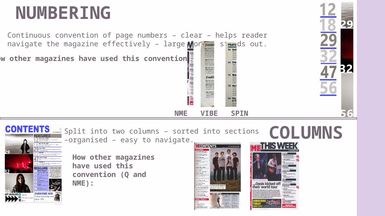
NUMBERING
COLUMNS
Continuous convention of page numbers – clear – helps reader navigate the magazine effectively – large font – stands out.
How other magazines have used this convention:
Split into two columns – sorted into sections –organised – easy to navigate.
How other magazines have used this convention (Q and NME):
NME VIBE SPIN
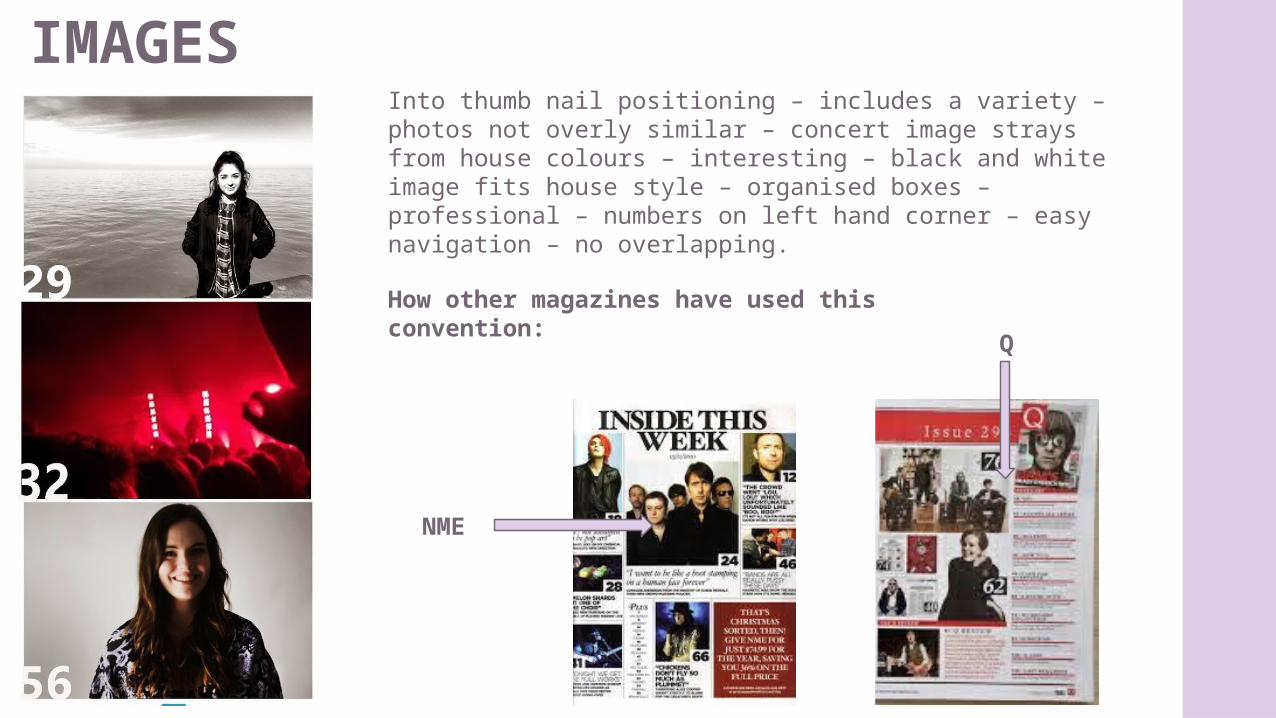
IMAGESInto thumb nail positioning – includes a variety – photos not overly similar – concert image strays from house colours – interesting – black and white image fits house style – organised boxes – professional – numbers on left hand corner – easy navigation – no overlapping.
How other magazines have used this convention:
Q
NME
DOUBLE PAGE SPREAD
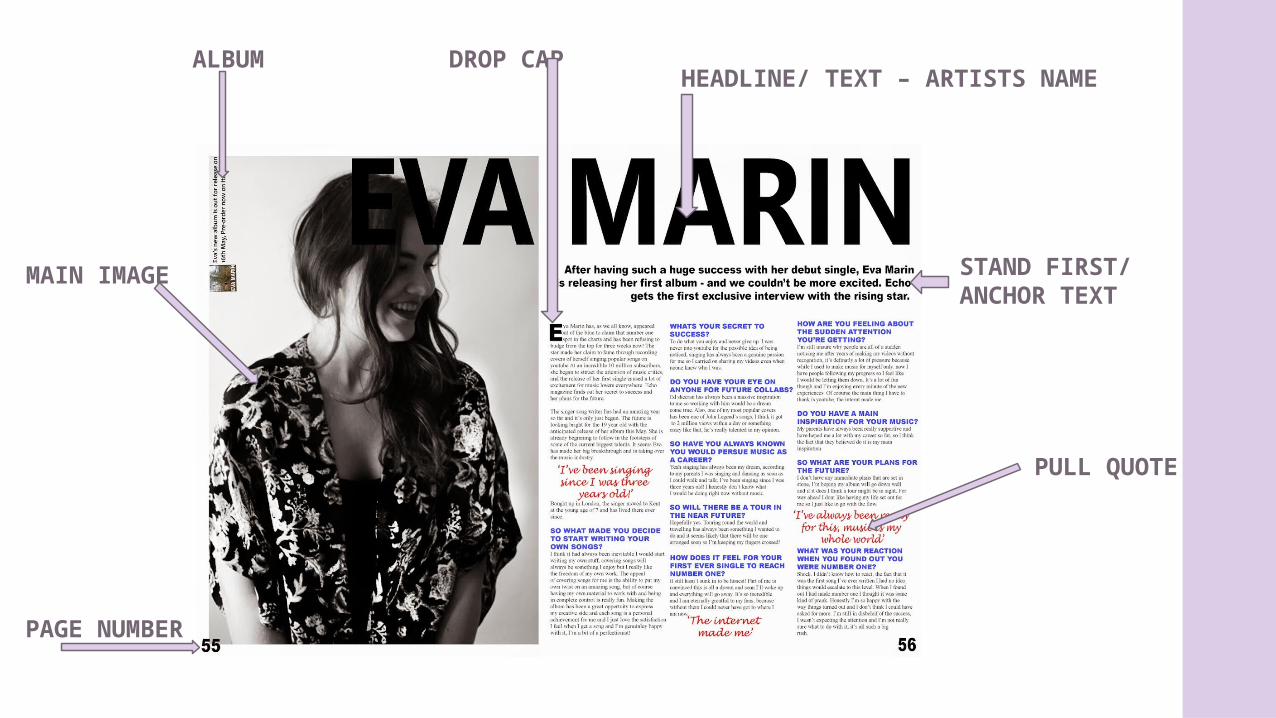
PULL QUOTE
MAIN IMAGE
HEADLINE/ TEXT – ARTISTS NAME
PAGE NUMBER
DROP CAP
STAND FIRST/ANCHOR TEXT
ALBUM
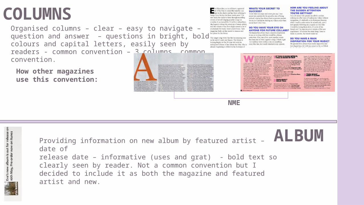
COLUMNSOrganised columns – clear – easy to navigate – question and answer – questions in bright, bold colours and capital letters, easily seen by readers - common convention – 3 columns, common convention.
How other magazines use this convention:
NME
ALBUM Providing information on new album by featured artist – date ofrelease date – informative (uses and grat) - bold text so clearly seen by reader. Not a common convention but I decided to include it as both the magazine and featured artist and new.
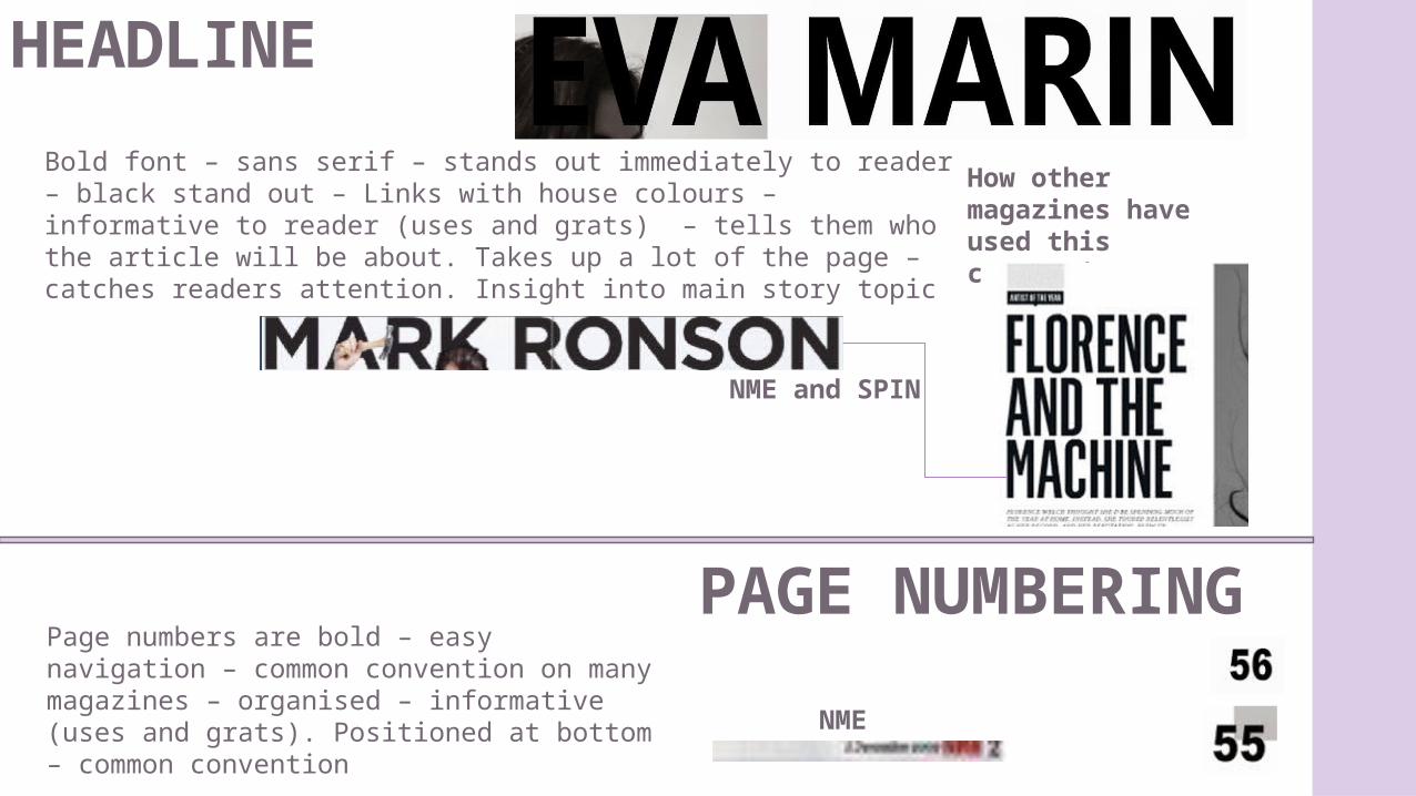
HEADLINE
Bold font – sans serif – stands out immediately to reader – black stand out – Links with house colours – informative to reader (uses and grats) – tells them who the article will be about. Takes up a lot of the page – catches readers attention. Insight into main story topic
How other magazines have used this convention:
NME and SPIN
PAGE NUMBERINGPage numbers are bold – easy navigation – common convention on many magazines – organised – informative (uses and grats). Positioned at bottom – common convention NME
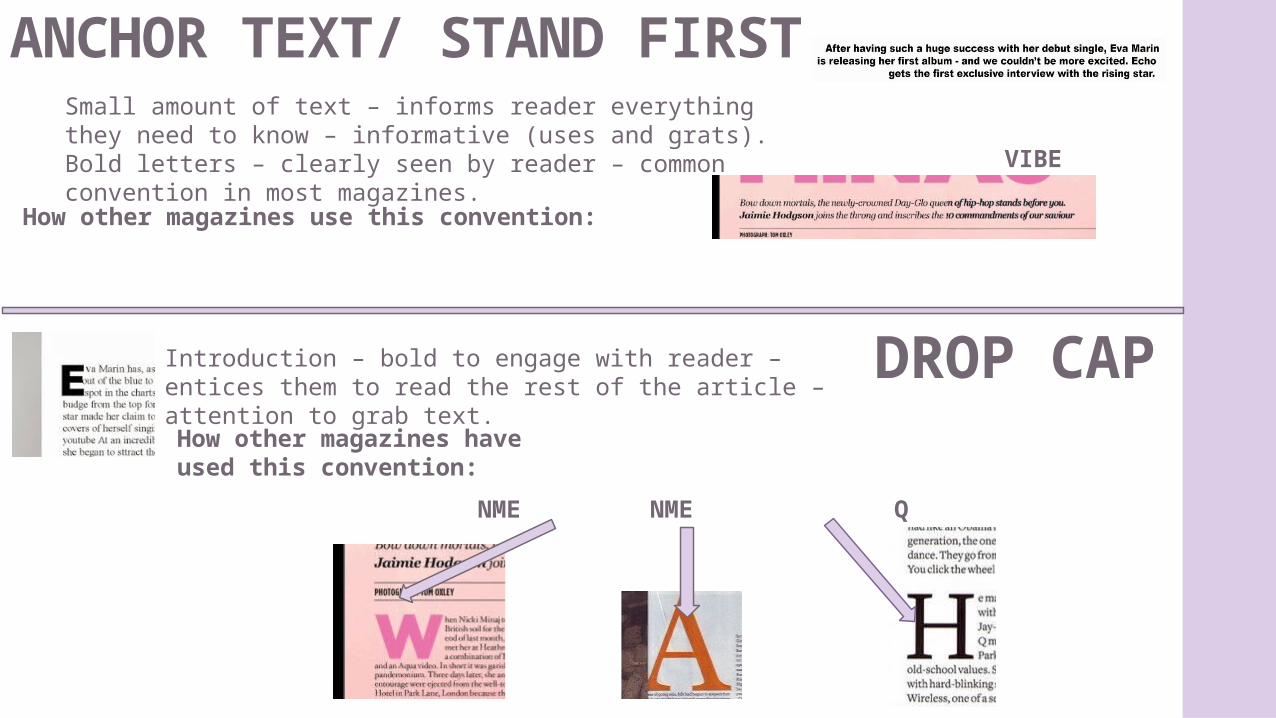
ANCHOR TEXT/ STAND FIRSTSmall amount of text – informs reader everything they need to know – informative (uses and grats). Bold letters – clearly seen by reader – common convention in most magazines.
How other magazines use this convention:
DROP CAPIntroduction – bold to engage with reader – entices them to read the rest of the article –attention to grab text.
How other magazines have used this convention:
VIBE
NME NME Q
PULL QUOTE
TEXT
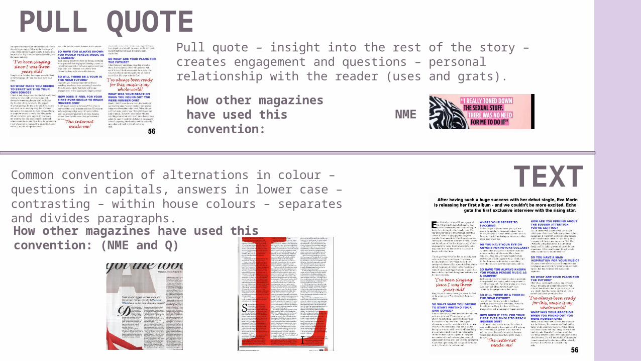
Pull quote – insight into the rest of the story – creates engagement and questions – personal relationship with the reader (uses and grats).
Common convention of alternations in colour – questions in capitals, answers in lower case – contrasting – within house colours – separates and divides paragraphs.
How other magazines have used this convention: NME
How other magazines have used this convention: (NME and Q)
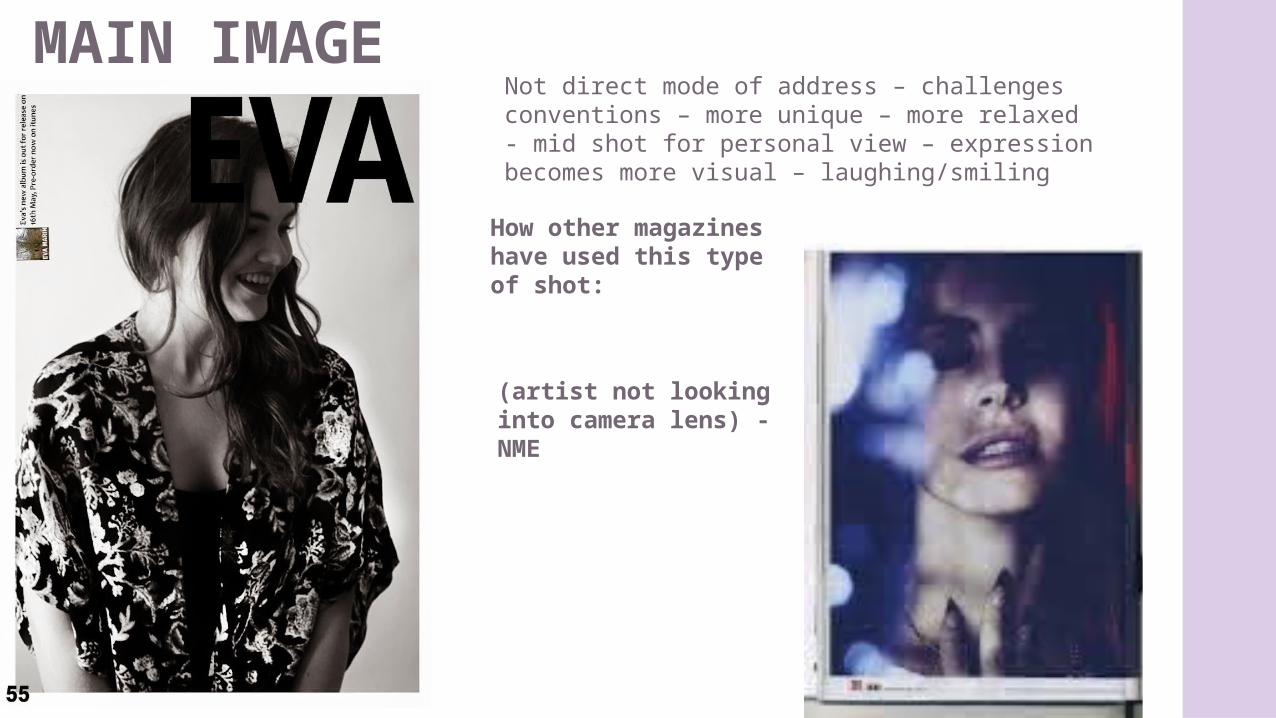
MAIN IMAGENot direct mode of address – challenges conventions – more unique – more relaxed - mid shot for personal view – expression becomes more visual – laughing/smiling
How other magazines have used this type of shot:
(artist not looking into camera lens) - NME
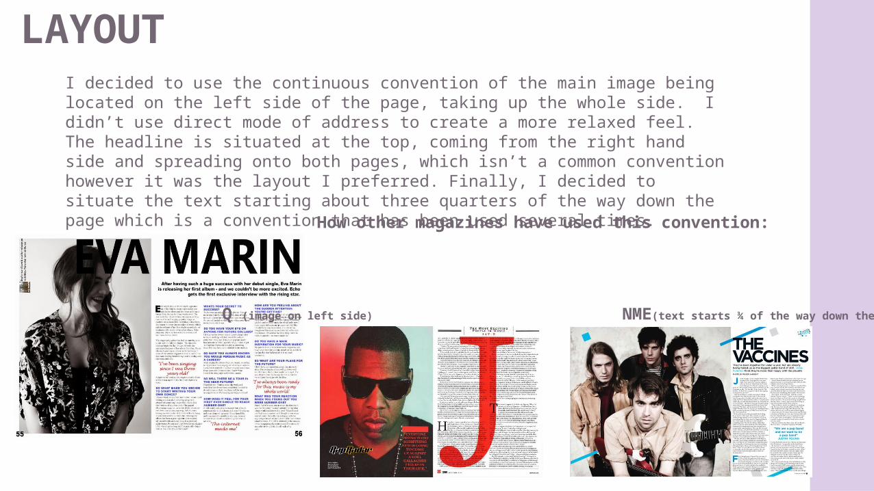
LAYOUTI decided to use the continuous convention of the main image being located on the left side of the page, taking up the whole side. I didn’t use direct mode of address to create a more relaxed feel. The headline is situated at the top, coming from the right hand side and spreading onto both pages, which isn’t a common convention however it was the layout I preferred. Finally, I decided to situate the text starting about three quarters of the way down the page which is a convention that has been used several times.
How other magazines have used this convention:
Q (image on left side) NME(text starts ¾ of the way down the page