Extreme Weather Sharing and Evaluating Lessons Using Google Docs and Spreadsheets

Portland State University Portland State University
PDXScholar PDXScholar
Dissertations and Theses Dissertations and Theses
Spring 5-18-2015
Evaluating the Effects of a Congestion and Weather Evaluating the Effects of a Congestion and Weather
Responsive Advisory Variable Speed Limit System in Responsive Advisory Variable Speed Limit System in
Portland, Oregon Portland, Oregon
Matthew Blake Downey Portland State University
Follow this and additional works at: https://pdxscholar.library.pdx.edu/open_access_etds
Part of the Civil Engineering Commons, and the Transportation Engineering Commons
Let us know how access to this document benefits you.
Recommended Citation Recommended Citation Downey, Matthew Blake, "Evaluating the Effects of a Congestion and Weather Responsive Advisory Variable Speed Limit System in Portland, Oregon" (2015). Dissertations and Theses. Paper 2397. https://doi.org/10.15760/etd.2394
This Thesis is brought to you for free and open access. It has been accepted for inclusion in Dissertations and Theses by an authorized administrator of PDXScholar. Please contact us if we can make this document more accessible: [email protected].
Evaluating the Effects of a Congestion and Weather Responsive Advisory Variable
Speed Limit System in Portland, Oregon
by
Matthew Blake Downey
A thesis submitted in partial fulfillment of the
requirements for the degree of
Master of Science
in
Civil and Environmental Engineering
Thesis Committee:
Christopher Monsere, Chair
Robert L. Bertini
Miguel Figliozzi
Portland State University
2015

© 2015 Matthew Blake Downey
i
Abstract
Safety and congestion are ever present and increasingly severe transportation
problems in urban areas throughout the nation and world. These phenomena can have
wide-ranging consequences relating to safety, the economy, and the environment.
Adverse weather conditions represent another significant challenge to safety and mobility
on highways. Oregon is not immune from either of these global issues. Oregon Route
(OR) 217, to the southwest of the downtown Portland, is one of the worst freeways for
congestion in the state and is also subject to the Pacific Northwest’s frequently inclement
and unpredictable climate. High crash rates, severe recurrent bottlenecks and highly
unreliable travel times continuously plague the corridor, making it a major headache for
the thousands of commuters using it every day.
In an effort to more effectively combat both congestion and adverse weather,
transportation officials all over the world have been turning to increasingly technological
strategies like Active Traffic Management (ATM). This can come in many forms, but
among the most common are variable speed limit (VSL) systems which use real-time
data to compute and display appropriate reduced speeds during congestion and/or adverse
weather. After numerous studies and deliberations, Oregon Department of Transportation
(ODOT) selected Oregon Route (OR) 217 as one of the first locations in the state to be
implemented with an advisory VSL system, and that system began operation in the
summer of 2014. This thesis seeks to evaluate the effectiveness of this VSL system
through the first eight months of its operation through an in-depth and wide-ranging
“before and after” analysis.

ii
Analysis of traffic flow and safety data for OR 217 from before the VSL system
was implemented made clear some of the most prevalent issues which convinced ODOT
to pursue VSL. Using those issues as a basis, a framework of seven specific evaluation
questions relating to both performance and safety, as well as both congestion and adverse
weather, was established to guide the “before and after” comparisons. Hypotheses, and
measures of effectiveness for each question were developed, and data were obtained from
a diverse array of sources including freeway detectors, ODOT’s incident database, and
the National Oceanic and Atmospheric Administration (NOAA).
The results of the various “before and after” comparisons performed as a part of
this thesis indicate that conditions have changed on OR 217 in a number of ways since
the VSL system was activated. Many, but not all, of the findings were consistent with the
initial hypotheses and with the findings from other VSL studies in the literature. Certain
locations along the corridor have seen significant declines in speed variability, supporting
the common notion that VSL systems have a harmonizing effect on traffic flow. Crash
rates have not decreased, but crashes have become less frequent in the immediate vicinity
of VSL signs. Flow distribution between adjacent lanes has been more even since VSL
implementation during midday hours and the evening peak, and travel time reliability has
seen widespread improvement in three of the corridor’s four primary travel lanes during
those same times. The drops in flow that generally occur upstream of bottlenecks once
they form have had diminished magnitudes, while the drops in flow downstream of the
same bottlenecks have grown. Finally, the increase in travel times that is usually brought

iii
about by adverse weather has been smaller since VSL implementation, while the decline
in travel time reliability has largely disappeared.

iv
To my amazing parents, Edwin and Louise Downey. From paleontologist to NHL
goaltender to transportation engineer, you have always been incredibly supportive of my
constantly changing career of choice. Now that I have finally found my calling in life, I
owe it all to you. Thank you, and I love you.

v
Acknowledgements
Thank you to my excellent advisor Dr. Robert Bertini, who got me involved with
this project on my first day in Portland and has been incredibly supportive and helpful as
I gradually moved from putting together some very basic sample data plots to developing
this thesis. Thank you to Dr. Chris Monsere for chairing this committee, helping out with
various issues that have come up throughout my time in Portland, and for introducing me
to the world of R. Two years ago, I would have never envisioned myself doing anything
remotely related to computer programming, but this thesis would have never happened
without his extremely useful analysis class. Thank you to Dr. Miguel Figliozzi for
participating on this committee, providing useful feedback, and broadening my
transportation knowledge in his classes. Thank you to the Oregon Department of
Transportation, Portland State University and the Dwight David Eisenhower Graduate
Fellowship program for their generous financial support that made this thesis possible.
Thank you to my awesome siblings, Megan and Kevin Downey, who each found time to
visit me and make sure I managed to see more of Portland than just classrooms and
computer labs. Finally, thank you to Edwin and Louise Downey, the most wonderful
parents in the whole world, without whom I could never have done any of this.

vi
Table of Contents
Abstract ................................................................................................................................ i
Acknowledgements ............................................................................................................. v
List of Tables ..................................................................................................................... ix
List of Figures .................................................................................................................... xi
1.0 Introduction ................................................................................................................... 1
1.1 Variable Speed Limits............................................................................................... 2
1.2 OR 217 VSL System Background ............................................................................ 6
1.3 Motivation & Objectives........................................................................................... 8
1.4 Organization .............................................................................................................. 9
2.0 Literature Review........................................................................................................ 10
2.1 History..................................................................................................................... 10
2.2 System Types & Purposes ...................................................................................... 13
2.2.1 Weather-Responsive ........................................................................................ 13
2.2.2 Congestion-Responsive.................................................................................... 14
2.2.3 Work Zone Systems ......................................................................................... 15
2.3 Evaluation Methods & Performance Measures ...................................................... 15
2.3.1 Before and After Evaluation Methods ............................................................. 17
2.4 Evaluation Results .................................................................................................. 19
2.4.1 Effects on Congestion & Operations ............................................................... 19
2.4.2 Effects on Safety and Adverse Weather Performance ..................................... 21
2.4.3 Simulation Results ........................................................................................... 22
2.5 Summary ................................................................................................................. 23
3.0 Motivations for VSL on OR 217 ................................................................................ 25
3.1 Corridor Almanac ................................................................................................... 25
3.2 Crash Trends ........................................................................................................... 27
3.3 Effects of Adverse Weather .................................................................................... 29
3.4 Speeds, Flows, & Travel Times .............................................................................. 31
3.5 Bottleneck Patterns ................................................................................................. 37
3.6 Summary ................................................................................................................. 39
vii
4.0 Methodology ............................................................................................................... 41
4.1 Corridor Instrumentation ........................................................................................ 41
4.2 Data Description ..................................................................................................... 48
4.2.1 Traffic Flow Data ............................................................................................. 48
4.2.2 Crash & Incident Data ..................................................................................... 49
4.2.3 Weather Data ................................................................................................... 51
4.3 Evaluation Framework ............................................................................................ 51
4.4 Analysis Techniques ............................................................................................... 54
4.4.1 Speed Variation ................................................................................................ 54
4.4.2 Crash & Incident Frequency and Distribution ................................................. 57
4.4.3 Adjacent Lane Flow & Speed Distribution ...................................................... 60
4.4.4 Travel Time Reliability .................................................................................... 62
4.4.5 Bottleneck Flow Characteristics ...................................................................... 66
4.4.6 Impact of Adverse Weather on Performance ................................................... 70
4.5 Summary ................................................................................................................. 72
5.0 Results & Discussion .................................................................................................. 73
5.1 Wavetronix Analysis ............................................................................................... 73
5.1.1 Traffic Speeds and Volumes ............................................................................ 73
5.1.2 Travel Time Comparison ................................................................................. 77
5.2 Speed Variation ....................................................................................................... 83
5.2.1 Allen Boulevard and Denney Road Speed Variation ...................................... 83
5.2.2 Scholls Ferry and Greenburg Speed Variation ................................................ 88
5.2.3 Discussion ........................................................................................................ 91
5.3 Crash & Incident Frequency and Distribution ........................................................ 94
5.3.1 Incident Trees................................................................................................... 95
5.3.2 Crash Frequency .............................................................................................. 99
5.3.3 Crash Distribution .......................................................................................... 100
5.3.4 Discussion ...................................................................................................... 105
5.4 Adjacent Lane Flow & Speed Distribution ........................................................... 106
5.4.1 Greenburg Road Lane Flow & Speed Distribution........................................ 107
5.4.2 Lane Flow & Speed Distribution at Other Stations ....................................... 111

viii
5.4.3 Discussion ...................................................................................................... 116
5.5 Travel Time Reliability ......................................................................................... 119
5.5.1 OR 217 NB Travel Times .............................................................................. 119
5.5.2 OR 217 SB Travel Times ............................................................................... 126
5.5.3 OR 217 Volume Comparison......................................................................... 132
5.5.4 Discussion ...................................................................................................... 138
5.6 Bottleneck Flow Characteristics ........................................................................... 143
5.6.1 Northbound Bottlenecks ................................................................................ 144
5.6.2 Southbound Bottlenecks ................................................................................ 152
5.6.3 Discussion ...................................................................................................... 156
5.7 Impact of Adverse Weather on Travel Time ........................................................ 159
5.7.1 Effect of Precipitation on Travel Times......................................................... 159
5.7.2 Effect of Precipitation on Travel Time Variability ........................................ 164
5.7.3 Discussion ...................................................................................................... 167
5.8 Summary ............................................................................................................... 171
6.0 Conclusions ............................................................................................................... 178
6.1 Contributions......................................................................................................... 181
6.2 Limitations ............................................................................................................ 182
6.3 Future Research .................................................................................................... 184
References ....................................................................................................................... 189

ix
List of Tables
TABLE 1: VSL SYSTEMS IN THE UNITED STATES ............................................................... 12
TABLE 2: EVALUATION MATRIX ........................................................................................ 52
TABLE 3: SPEED VARIATION ANALYSIS SAMPLE SIZES ..................................................... 56
TABLE 4: “BEFORE” LOOP DETECTOR SAMPLE SIZES ........................................................ 63
TABLE 5: “AFTER” LOOP & RADAR DETECTOR SAMPLE SIZES .......................................... 64
TABLE 6: “WET” AND “DRY” SAMPLE SIZES ..................................................................... 71
TABLE 7: AVERAGE SPEED AND FLOW COMPARISONS BETWEEN ADJACENT LOOP & RADAR
DETECTORS ................................................................................................................ 74
TABLE 8: PERCENT DIFFERENCE BETWEEN CORRIDOR TRAVEL TIMES WITH AND WIHOUT
RADAR DETECTOR READINGS .................................................................................... 80
TABLE 9: PERCENT DIFFERENCE BETWEEN CORRIDOR TRAVEL TIMES WITH AND WIHOUT
RADAR DETECTOR READINGS .................................................................................... 81
TABLE 10: SPEED VARIABILITY BEFORE AND AFTER VSL ................................................ 86
TABLE 11: SPEED VARIABILITY BEFORE AND AFTER VSL ................................................ 87
TABLE 12: SPEED VARIABILITY BEFORE AND AFTER VSL ................................................ 89
TABLE 13: SPEED VARIABILITY BEFORE AND AFTER VSL ................................................ 90
TABLE 14: OR 217 INCIDENT TREE.................................................................................... 97
TABLE 15: OR 217 INCIDENT TREE.................................................................................... 98
TABLE 16: OR 217 CRASH RATES BEFORE AND AFTER VSL ........................................... 100
TABLE 17: RELATIVE CRASH FREQUENCIES NEAR OR 217 VSL SIGNS BEFORE AND AFTER
ACTIVATION ............................................................................................................ 101
TABLE 18: LANE SPEED & FLOW DISTRIBUTION BEFORE AND AFTER VSL ..................... 109
TABLE 19: LANE SPEED & FLOW DISTRIBUTION BEFORE AND AFTER VSL ..................... 112
TABLE 20: LANE SPEED & FLOW DISTRIBUTION BEFORE AND AFTER VSL ..................... 115
TABLE 21: TRAVEL TIME VARIABILITY BEFORE AND AFTER VSL .................................. 121
TABLE 22: TRAVEL TIME VARIABILITY BEFORE AND AFTER VSL .................................. 122
TABLE 23: TRAVEL TIME RELIABILITY BEFORE AND AFTER VSL ................................... 126
TABLE 24: TRAVEL TIME VARIABILITY BEFORE AND AFTER VSL .................................. 127
TABLE 25: TRAVEL TIME VARIABILITY BEFORE AND AFTER VSL .................................. 128
TABLE 26: TOTAL DAILY VOLUMES BEFORE AND AFTER VSL ....................................... 135
TABLE 27: TOTAL DAILY VOLUMES BEFORE AND AFTER VSL ....................................... 135
TABLE 28: TOTAL DAILY VOLUMES BEFORE AND AFTER VSL ....................................... 136
TABLE 29: TOTAL DAILY VOLUMES BEFORE AND AFTER VSL ....................................... 136
TABLE 30: BOTTLENECK CHARACTERISTICS BEFORE AND AFTER VSL ........................... 147
TABLE 31: BOTTLENECK CHARACTERISTICS BEFORE AND AFTER VSL ........................... 148
TABLE 32: BOTTLENECK CHARACTERISTICS BEFORE AND AFTER VSL ........................... 153
TABLE 33: BOTTLENECK CHARACTERISTICS BEFORE AND AFTER VAS .......................... 154
TABLE 34: TRAVEL TIMES IN “WET” & “DRY” CONDITIONS BEFORE AND AFTER VSL .. 161
TABLE 35: STANDARD DEVIATIONS OF TRAVEL TIME IN "WET" & "DRY" CONDITIONS
BEFORE AND AFTER VSL ........................................................................................ 165

x
TABLE 36: EVALUATION RESULTS MATRIX ..................................................................... 172

xi
List of Figures
FIGURE 1: SAMPLE VSL CONFIGURATION ........................................................................... 3
FIGURE 2: PORTLAND AREA FREEWAY MAP ........................................................................ 6
FIGURE 3: OR 217 AT ALLEN BLVD ................................................................................... 26
FIGURE 4: OR 217 MAP ..................................................................................................... 26
FIGURE 5: OR 217 AT SCHOLLS FERRY RD ........................................................................ 26
FIGURE 6: OR 217 CRASHES BY COLLISION TYPE.............................................................. 27
FIGURE 7: OR 217 INJURIES BY CRASH TYPE & SEVERITY ................................................ 28
FIGURE 8: OR 217 REAR-END COLLISION SEVERITY ......................................................... 28
FIGURE 9: OR 217 CRASHES BY WEATHER CONDITION ..................................................... 29
FIGURE 10: OR 217 CRASHES BY ROAD CONDITION.......................................................... 30
FIGURE 11: AVERAGE "WET" AND "DRY" TRAVEL TIMES ................................................. 31
FIGURE 12: OR 217 NB TYPICAL SPEED & FLOW DISTRIBUTION ...................................... 32
FIGURE 13: OR 217 SB TYPICAL SPEED & FLOW DISTRIBUTION ....................................... 32
FIGURE 14: LANE SPEED DIFFERENTIAL ............................................................................ 34
FIGURE 15: LANE FLOW DISTRIBUTION ............................................................................. 34
FIGURE 16: PM PEAK TRAVEL TIME VARIABILITY ............................................................ 36
FIGURE 17: PM PEAK TRAVEL TIME VARIABILITY ............................................................ 36
FIGURE 18: OR 217 NB SPEED CONTOUR PLOT ................................................................ 38
FIGURE 19: OR 217 NB OBLIQUE FLOW PLOT .................................................................. 39
FIGURE 20: OR 217 SB VSL & DETECTOR LAYOUT ......................................................... 44
FIGURE 21: OR 217 NB VSL & DETECTOR LAYOUT ......................................................... 45
FIGURE 22: OR 217 VSL SIGNS ON BRIDGES ..................................................................... 46
FIGURE 23: OR 217 VSL SIGNS ON SIGN GANTRY ............................................................ 46
FIGURE 24: OR 217 ATM INSTALLATIONS ........................................................................ 47
FIGURE 25: TIMELINE OF ANALYZED DATA ....................................................................... 53
FIGURE 26: OR 217 NB SPEED CONTOUR PLOT ................................................................ 69
FIGURE 27: OR 217 NB OBLIQUE FLOW PLOT ................................................................... 69
FIGURE 28: COMPARISON OF CORRIDOR TRAVEL TIMES WITH AND WITHOUT RADAR
DETECTOR READINGS ................................................................................................ 82
FIGURE 29: COMPARISON OF CORRIDOR TRAVEL TIMES WITH AND WITHOUT RADAR
DETECTOR READINGS ................................................................................................ 82
FIGURE 30: AVERAGE HOURLY SPEED RANGE AND STANDARD DEVIATION BEFORE AND
AFTER VSL................................................................................................................ 85
FIGURE 31: AVERAGE HOURLY SPEED RANGE AND STANDARD DEVIATION BEFORE AND
AFTER VSL................................................................................................................ 91
FIGURE 32: RELATIVE CRASH FREQUENCIES BY OR 217 MILEPOST BEFORE AND AFTER
VSL ......................................................................................................................... 102
FIGURE 33: OR 217 CRASHES BY TIME OF DAY ............................................................... 103
FIGURE 34: OR 217 CRASHES BY TIME OF DAY ............................................................... 103
FIGURE 35: OR 217 CRASHES BY MONTH ........................................................................ 103

xii
FIGURE 36: OR 217 CRASHES BY MONTH ........................................................................ 103
FIGURE 37: FLOW RATIOS BEFORE AND AFTER VSL ....................................................... 110
FIGURE 38: AVERAGE LANE FLOW DIFFERENCES BEFORE AND AFTER VSL ................... 110
FIGURE 39: AVERAGE LANE FLOW DIFFERENCES BEFORE AND AFTER VSL ................... 113
FIGURE 40: AM PEAK TRAVEL TIME RANGES BEFORE AND AFTER VSL ........................ 123
FIGURE 41: PM PEAK TRAVEL TIME RANGES BEFORE AND AFTER VSL ......................... 123
FIGURE 42: AM PEAK TRAVEL TIME RANGES BEFORE AND AFTER VSL ........................ 124
FIGURE 43: PM PEAK TRAVEL TIME RANGES BEFORE AND AFTER VSL ......................... 124
FIGURE 44: AM PEAK TRAVEL TIME RANGES BEFORE AND AFTER VSL ........................ 130
FIGURE 45: PM PEAK TRAVEL TIME RANGES BEFORE AND AFTER VSL ......................... 130
FIGURE 46: AM PEAK TRAVEL TIME RANGES BEFORE AND AFTER VSL ........................ 131
FIGURE 47: PM PEAK TRAVEL TIME RANGES BEFORE AND AFTER VSL ......................... 131
FIGURE 48: TOTAL DAILY VOLUMES BEFORE AND AFTER VSL ...................................... 134
FIGURE 49: OR 217 NB SPEED CONTOUR PLOT .............................................................. 144
FIGURE 50: OR 217 NB OBLIQUE FLOW PLOT ................................................................. 149
FIGURE 51: OR 217 NB OBLIQUE FLOW PLOT ................................................................. 149
FIGURE 52: OR 217 NB OBLIQUE FLOW PLOT ................................................................. 151
FIGURE 53: OR 217 NB OBLIQUE FLOW PLOT ................................................................. 151
FIGURE 54: OR 217 SB SPEED CONTOUR PLOT ............................................................... 152
FIGURE 55: AVERAGE HOURLY “WET” & “DRY” TRAVEL TIMES BEFORE AND AFTER VSL
................................................................................................................................. 162
FIGURE 56: AVERAGE HOURLY “WET” & “DRY” TRAVEL TIMES BEFORE AND AFTER VSL
................................................................................................................................. 162
FIGURE 57: AVERAGE HOURLY "WET" & "DRY" TRAVEL TIMES BEFORE AND AFTER VSL
................................................................................................................................. 163
FIGURE 58: AVERAGE HOURLY "WET" & "DRY" TRAVEL TIMES BEFORE AND AFTER VSL
................................................................................................................................. 163
FIGURE 59: PEAK HOUR TRAVEL TIME VARIABILITY IN "WET" CONDITIONS BEFORE AND
AFTER VSL.............................................................................................................. 166
FIGURE 60: VSL SIGN DISPLAY CONTOUR ...................................................................... 186

1
1.0 Introduction
Safety and congestion are ever present and increasingly severe transportation
problems in urban areas throughout the nation and the world. These phenomena can have
wide-ranging consequences relating to safety, the economy, and the environment. In 2012
alone, traffic crashes resulted in a total of 33,561 fatalities and over 2.3 million injuries
(NHTSA). The Texas A&M Transportation Institute (TTI) estimated that, in 2011 alone,
congestion cost Americans $121 billion in excess travel time and fuel consumption,
equating to a rate of $818 per commuter (Schrank et al., 2012). This problem is not
getting any better, as a joint 2014 study by INRIX and the Centre for Economics and
Business Research reports that annual congestion costs will expand to $290.3 billion, or
$2,301 per commuter, by 2030. An attempt at quantifying the public health impact of
congestion found that mortality related to fine particulate emissions from congestion in
83 major urban areas was equal to $31 billion in 2000 (Levy, Buonocore, & von
Stackelberg, 2010). The environmental damage associated with congestion is further
evidenced by TTI’s estimates that over 56 billion pounds of carbon dioxide (CO2)
emissions was produced in 2011 just by commuters stuck in congestion (Schrank et al.,
2012).
Poor weather conditions represent another significant challenge to mobility and
safety on highways and other roads. In terms of safety, poor weather conditions,
including rain, snow, and fog, can reduce both visibility and road friction, making crashes
more likely and more difficult to avoid, particularly when drivers are traveling too fast.
The Federal Highway Administration (FHWA) reported that between 2002 and 2012, an
2
average of 23% of all vehicle crashes were weather-related, leading to an annual average
of 6,250 fatalities and 480,000 injuries (FHWA, 2014). Various studies have pegged the
increase in the crash rate during precipitation at approximately 50% (SWOV, 2012). In
terms of mobility, heavy rain can reduce average speeds by up to 16% and road capacity
by up to 30%, and poor visibility can shrink capacity by 12% (Hranac, Sterzin,
Krechmer, Rakha, & Farzaneh, 2006).
The challenges presented by congestion and poor weather highlight the need for
new and better strategies for managing highways, and one of the most promising
strategies to gain attention recently is Active Traffic Management (ATM). As defined in
the Transportation Research Board’s (TRB) Glossary of Regional Transportation
Systems Management and Operations terms, ATM is “the ability to dynamically manage
recurrent and non-recurrent congestion on the mainline based on prevailing traffic
congestion” through the use of new technologies (Neudorff, Mason, & Bauer, 2012).
ATM systems come in many forms, including ramp metering, queue warning, and, of
most interest to this study, variable speed limits. They have been implemented in both
congestion and weather-responsive applications and, as will be detailed later, have
produced promising results.
1.1 Variable Speed Limits
Variable speed limit (VSL) systems are a form of ATM that generally utilize
traffic detectors, weather sensors, and/or road surface condition data to assess driving
conditions and determine whether a reduced speed is appropriate to improve safety and/or
operations. They can be used for a number of different purposes, with the most common

3
Figure 1: Sample VSL Configuration
Source: The Oregonian
including speed management in congested conditions, speed management in adverse
weather, and speed management around work zones. An example of a VSL configuration
is shown in Figure 1, which depicts the new system on Oregon Route (OR) 217 which
serves as the focus of this study. As can be seen, each travel lane has its own display, and
the VSL speed signs are differentiated from general speed limit signs by their placement,
electronic display and coloring. The two primary objectives of most VSL systems are
improving safety and capacity. They can achieve enhanced safety by reducing the
likelihood of rear-end crashes and enhanced capacity by harmonizing the flow of traffic.
VSL systems generally consist of components such as detector stations, weather stations,
VSL signs, a control center and a communications system.

4
A VSL system can be controlled manually by patrol officers and traffic
management personnel or automatically by sophisticated algorithms. In both cases, the
jurisdiction in charge typically pre-determines certain threshold values for measures such
as rainfall intensity or lane occupancy, and when these values are surpassed, the system is
activated and a reduced speed is displayed until conditions improve. VSL systems can
help with queue warning by gradually stepping down speeds over space upstream of
congestion, ensuring drivers are not caught off guard when they suddenly come upon
more congested conditions.
A key distinguishing feature of any VSL system is whether the displayed speeds
are regulatory or advisory. Variable speeds that are regulatory in nature are subject to
local enforcement, while variable advisory speed (VAS) systems are generally not. For
consistency purposes, VSL will be used for both regulatory and advisory systems in this
report, with appropriate qualifiers attached to distinguish between the two. The Federal
Highway Administration (FHWA) recommends that VSL systems be regulatory rather
than advisory because they generally result in higher levels of compliance. However, the
OR 217 system being analyzed in this study is advisory. The Oregon Statewide Variable
Speed System Concept of Operations, created before installation of the 217 system,
explained some of the benefits of an advisory system, including greater flexibility in
setting speeds, greater public acceptance, and the fact that advisory speeds are still
enforceable through the state’s basic speed rule (DKS Associates, 2013).
While VSL systems take a number of different forms and must be designed
individually to meet the requirements of their unique environments and purposes, several

5
general guidelines regarding the display and placement of VSL signs have been
established which should typically be followed when setting up any VSL system. The
FHWA summarized such guidelines in a 2012 report (Katz et al., 2012), and they
included:
Using speed limits in five mph increments
Displaying speed limit changes for at least one minute
Not allowing speed differentials of more than 15 mph between
consecutive signs without advance warning
Using variable message signs to explain reason for speed reductions
Additionally, the state of Oregon has a number of rules relating to the establishment of
variable speed zones. The most notable of these rules is OAR 734-020-0018, which
mandates a comprehensive engineering study including crash patterns, traffic
characteristics, and type and frequency of adverse road conditions prior to the
establishment of VSL (ODOT, 2012). Further, the engineering study must include
specific recommendations regarding system boundaries, system algorithms, sign
placement and means and procedures for changing posted speeds.

6
1.2 OR 217 VSL System Background
This study seeks to evaluate the effectiveness of an advisory VSL system
activated along OR 217 during the summer of 2014. OR 217, located in the middle of
Figure 2, is a 7.5 mile highway through suburban Portland that has established a
reputation as a heavily congested corridor. In 2010, the Oregon Department of
Transportation carried out the OR-217 Interchange Management Study in an attempt to
identify strategies to enhance the safety and operations of this corridor, and an advisory
VSL system was ultimately chosen as the most promising and cost-effective solution.
Figure 2: Portland Area Freeway Map
Source: AARoads
7
The justification for choosing VSL revolved around the speed harmonizing effects
of VSL, which could potentially address all of OR 217’s noted issues. Bottlenecks and
stop-and-go traffic typically arise from un-expecting drivers coming upon heavy traffic
and suddenly and rapidly decelerating, sending a shockwave upstream. By gradually
reducing the speed of all drivers in a harmonious fashion during peak demand, such
situations should be eliminated. Doing so would also eliminate the problem of unreliable
travel times, as everyone would be traveling at a fairly uniform and predictable rate.
Harmonizing traffic can also be linked with heightened safety, particularly on OR 217
where so many crashes are rear-ends, as the likelihood of rear-end crashes resulting from
stop-and-go traffic would be greatly reduced. In giving their final endorsement of a VSL
system, ODOT estimated it would bring about a 20% reduction in rear-end crashes and a
5% reduction in delay, totaling to a benefit of $6.6 million in improved mobility and
safety (DKS Associates, 2010).
Although not considered in this study, a System-Wide Adaptive Ramp Metering
(SWARM) system was also recently added to OR 217 in an attempt to improve
operations. Implementation of this system began in May 2005 and a similar “before and
after” evaluation of the SWARM system was carried out in 2008. That study found that
with SWARM implemented along OR 217, average delay increased and reliability
decreased, contrary to the system’s intent (Monsere, Eshel, & Bertini, 2009). The fact
that OR 217 is relatively short and bounded by freeway interchanges on both ends, the
corridor’s relatively short ramp spacing and high mainline flows were highlighted as
possible reasons for why the results did not align with expectations and changes to

8
SWARM parameters were recommended. Many of the demand and geometric issues that
limited the SWARM system’s effectiveness will likely also hamper the VSL system. In
addition, any changes made to the system since 2008, as well as occasional system bugs
that necessitate switching back and forth between fixed-rate and optimized metering,
make it difficult to definitively separate any operational benefits associated with the VSL
system from those attributable to the SWARM system.
1.3 Motivation & Objectives
OR 217’s advisory VSL system was activated for the first time on July 22, 2014
and has been in continuous operation since. This study seeks to determine how effective
the system has been in improving the safety and mobility of OR 217 so far. Specifically,
seven different performance measures relating to both the safety and mobility of OR 217
are presented and analyzed using a “before” and “after” framework.
In addition, this study will serve as a valuable addition to the large, but by no
means conclusive, body of literature regarding field evaluations of variable speed
systems. They are still a relatively new addition to the worlds of transportation
engineering and traffic management in the United States, and the results of many past
studies contradict one another, leaving the question of their effectiveness still
unanswered.

9
1.4 Organization
The remainder of this document is structured as follows. Section 2 summarizes
and reviews prior literature relating to the various types of VSL systems that have been
implemented throughout the world, how VSL systems have been evaluated in the past,
and what the results of past evaluations have been. Next, an overview of the corridor and
the primary motivations for the installation of a VSL system on OR 217 are summarized
and discussed. After that, the data and analysis methods used in this study are detailed,
followed by in-depth discussion of the various analyses performed and their results.
Finally, conclusions and potential areas for future study are touched upon.
10
2.0 Literature Review
Active traffic management (ATM) has become an increasingly common tool in
recent years for addressing the issues associated with congestion and adverse weather on
freeways, and a wide body of research revolving around the analysis of various ATM
installations throughout the world exists. VSL and VAS systems, along with ramp
metering, are some of the most common forms of ATM, so a substantial amount of prior
research into their effects in particular has been performed as well. This section will
discuss previous literature related to the history of VSL/VAS systems and their adoption,
the wide variety of forms VSL systems have taken throughout the world, established
methods of system evaluation, and the results of past evaluation studies of VSL/VAS
corridors.
2.1 History
While interest in VSL/VAS has only grown significantly in the past decade or so,
their history actually stretches back much further to the 1960’s. In fact, even earlier, in
the 1950’s, New Jersey state police occasionally put up temporary wooden signs with
reduced speed limits during adverse weather (Goodwin, 2003). Domestically, the first
two locations to experiment with VSL were New Jersey and Michigan (Robinson, 2000).
On the John C. Lodge Freeway near Detroit and the New Jersey Turnpike, systems were
set up that relied on traffic officials to manually change posted speed limits based on their
own observations of traffic conditions. Improved safety and operation during congestion
was the primary intent of both of these early systems. The Michigan system was
dismantled after only a few years because officials there did not feel it produced any

11
significant results, but the New Jersey Turnpike system is still in operation, though it has
undergone substantial upgrades to become automated and weather-responsive as well
(Robinson, 2000). Internationally, Germany installed its first VSL system with automated
enforcement in the 1970’s to stabilize traffic flow during congestion, and the Netherlands
built its first automated systems in the early 1980’s (Han, Luk, Pyta, & Cairney, 2009).
Since the first experimental systems, the number of VSL/VAS systems has grown
tremendously, especially since about 1990. As of 2012, 20 states had either implemented
VSL systems or were planning future installations (Katz et al., 2012). Table 1, adapted
from a 2012 report by the FHWA’s Safety Program (Katz et al., 2012), summarizes the
VSL systems that had been built or planned in the United States as of 2012. As can be
seen, the majority of existing systems are regulatory and require manual activation, and a
number of systems have been taken down. Abroad, additional installations have been
built in Australia, France, Finland, Sweden and the United Kingdom, with the early
systems in Germany and the Netherlands being updated and expanded (Al-Kaisy, Ewan,
& Veneziano, 2012). The sizes, purposes and characteristics of these systems vary
widely, as have their results. They can be distinguished as being either manually or
automatically activated, congestion or weather-responsive, urban or rural, and regulatory
or advisory. While addressing every existing installation would be unnecessarily
exhaustive, further detailing a few of these systems will help to highlight the high degree
of variation among them and how no one method of operation is universally ideal.

12
Table 1: VSL Systems in the United States
Source: FHWA Safety Program
State Location Activation
Type
Enforcement
Type Sensor Type Status
AL I-10 Manual Regulatory Visibility, CCTV Active
CO I-70 Manual Regulatory Loops, Radar, Temperature,
Precipitation, Wind speed Active
DE Bridges Manual Regulatory Speed, Volume, Occupancy,
Weather Active
FL I-4 Hybrid Regulatory Loops, Radar, CCTV Active
ME I-95 Manual Advisory Cameras, Radar Active
ME I-295 Manual Advisory Cameras, Radar Active
MN I-35W Automated Advisory Loops Active
MO I-270 Hybrid Advisory Speed, Occupancy Active
NJ Turnpike Manual Regulatory Speed Active
PA Turnpike Manual Regulatory Speed, Weather, CCTV Active
VA Bridges &
Tunnels Manual Regulatory CCTV Active
TN I-75 Manual Regulatory Speed, Weather (Fog) Active
WA I-90 Manual Regulatory Speed, Weather Active
WA US 2 Manual Regulatory Speed, Weather Active
WA I-5, I-90,
SR 520 Automated Regulatory Speed, Weather Active
WY I-80 Manual Regulatory Speed, Weather Active
ID I-84 Manual Advisory Vehicle, Weather Test Site
MN I-94 Automated Advisory Loops Under
construction
VA I-77 Hybrid Regulatory TBD Planned
FL Turnpike/
I-595 Automated Advisory Moisture Removed
LA I-10/I-310 Manual Advisory Speed, Visibility Removed
MD I-695 Automated Regulatory Speed, Queue Removed
MI I-96 Automated Regulatory Speed Removed
MN I-494 Automated Advisory Speed Removed
NV I-80 Manual Regulatory Visibility Removed
NM I-40 Automated Regulatory Speed, Weather Removed
SC I-526 Manual No speed
change Fog Removed
UT I-80 Manual Regulatory Day/Night automatic Removed
UT I-215 Manual Regulatory Speed, Weather Removed
VA I-95 Hybrid Regulatory Speed, Queue length Removed
13
2.2 System Types & Purposes
2.2.1 Weather-Responsive
The first VSL systems were designed primarily with inclement weather in mind,
so the majority of systems worldwide are still weather-oriented. In 1994, Finland built its
first experimental VSL system on a 15 mile rural segment of E18 in the southeastern
portion of the country (Al-Kaisy et al., 2012; Robinson, 2000). This system is purely
weather-responsive and regulatory. A series of 67 VSL signs are connected to 2
automated weather stations capable of measuring precipitation, temperature, and road
surface conditions, and posted speeds range from 49 miles per hour (mph) to 74
depending on conditions. This system has been well received by both officials and users
in Finland, with 95% of drivers supporting it.
Wyoming installed its first variable speed limit corridor along a remote section of
Interstate 80 in 2009, with four other sections added since then. Similar to the Finnish
system, the Wyoming system is purely weather-responsive and primarily aimed at
mitigating poor driving conditions during harsh Wyoming winters. Each VSL corridor is
instrumented with LED VSL signs, road weather information systems (RWIS) capable of
monitoring temperature, humidity, and wind speed, and Wavetronix speed sensors
capable of monitoring volume, individual vehicle speed, occupancy, and vehicle
classification. Unlike the Finnish system, which is automatically activated by weather
data, the Wyoming system is currently manually operated by highway patrol troopers and
a Traffic Management Center who monitor weather and speed data and adjust speed
limits accordingly. A University of Wyoming research project concluded this manual
14
protocol was inefficient, so an automated protocol based on real-time speed and weather
data was built, and simulations showed it would be more effective and efficient
(Buddemeyer, Young, Sabawat, & Layton, 2010; Young, Sabawat, Saha, & Sui, 2012).
2.2.2 Congestion-Responsive
A very different form of VSL system was activated in Minnesota in 2010. This
system, built along the highly urbanized I-35W corridor southwest of downtown
Minneapolis, is advisory rather than regulatory, and primarily congestion-responsive
rather than weather-responsive. It is one of the few active VSL deployments in the United
States aimed solely at improving highway operations during congestion, though interest
in such congestion-responsive systems is growing (Edara, Sun, & Hou, 2013). A total of
174 VSL signs are linked with the highway’s system of single loop detectors (Katz et al.,
2012). Detector readings of speed and density are collected every 30 seconds, and, using
a series of pre-determined threshold levels, an algorithm is applied to them to determine
whether a reduced speed is appropriate and if so, what it should be. The algorithm was
specifically designed to mitigate the formation of shock waves along the highway (Kwon,
Park, Lau, & Kary, 2011).
In 2008, the Missouri Department of Transportation installed a VSL system along
parts of Interstate 270 and Interstate 255 near St. Louis. Like the Minneapolis system, the
St. Louis system is primarily aimed at dealing with recurring congestion in an urban area,
but its speeds are regulatory rather than advisory. The corridor is split into zones
composed of a few loop detector stations, and 30-second average speed, flow and
occupancy readings for each zone are fed into a VSL algorithm. If average occupancy is

15
found to be greater than 7%, flow greater than 10 vehicles in 30 seconds, and average
speed less than 55 mph, an enforceable reduced speed limit equal to the average speed
rounded up to the nearest multiple of 5 will be recommended by the system. A degree of
manual control is built in as well, as TMC operators verify conditions through camera
feeds before posting reduced speed limits (Kianfar, Edara, & Sun, 2013).
2.2.3 Work Zone Systems
In addition to these permanent corridor-wide applications, both congestion and
weather-responsive, VSL systems have also been used increasingly in recent years
around temporary work zones to improve both operation and safety. Initially, simulation-
based studies by Lin et al. and others were used to demonstrate the potential benefits of
VSL control around work zones (Lin, Kang, & Chang, 2004), and the results of those
studies have since led to real applications. In 2006, a two-state VAS system was
developed and implemented for a work zone on I-494 near Minneapolis in order to bring
upstream speeds down to the level of downstream traffic (Kwon, Brannan, Shouman,
Isackson, & Arseneau, 2007). Washington, Missouri, Ohio, Virginia and New Hampshire
have also used both regulatory and advisory VSL systems around work zones (Edara et
al., 2013).
2.3 Evaluation Methods & Performance Measures
Given the unique characteristics of each VSL/VAS system, it is difficult to single
out a specific set of evaluation methods and performance measures that can be applied to
each of them. However, a number of reports and guides exist that attempt to summarize
the most important performance measures to be monitored for ATM systems in general.

16
In an FHWA report documenting lessons learned from ATM installations throughout the
country, travel time, travel speeds, travel time reliability and variability, spatial and
temporal extent of congestion, throughput, and user perceptions were highlighted as key
measures of effectiveness for ATM evaluations (Kuhn, Gopalakrishna, & Schreffler,
2013). Similarly, the Active Traffic Management Guidebook prepared by the FHWA
listed a series of ATM performance measures used in Europe, including lane speed
differentials, duration of speeds below a certain threshold, lane utilization, and vehicle
speed distribution (Stribiak & Jacobson, 2012).
While not specifically mentioned in these summary documents, compliance is
another common and important performance measure analyzed for VSL evaluations.
Numerous studies have shown how vital driver compliance is to the success of a VSL
system, particularly in terms of safety benefits. Using a Paramics simulation model,
Hellinga and Mandelzys found that a very high compliance scenario resulted in a 39%
improvement in safety relative to no VSL, while a low compliance scenario resulted in
only a 10% improvement (Hellinga & Mandelzys, 2011). With loop detector data,
compliance rates are fairly straightforward to calculate. The University of Wyoming
summarized speed compliance for Wyoming’s VSL system by computing the percentage
of vehicles traveling above and below the posted speed limit. Speed variance was also
captured by computing the percentage of vehicles traveling three and five mph above and
below the posted speed limit (Young et al., 2012).
In addition to these operations-related measures, safety performance measures are
another important component of many VSL evaluations. The University of Wyoming

17
performed a thorough evaluation of Wyoming’s rural, weather-responsive variable speed
limit system, for which reducing crashes was the primary motivator. Eleven years of
crash data (seven before VSL and four after) was analyzed to mitigate the influence of
annual fluctuations, and seasonal crash frequencies for each year were computed. At least
three years of “after” crash data is generally necessary in such safety analyses before any
changing trends can become established and identifiable. These crash totals were
multiplied by 1,000,000 and divided by total vehicle miles traveled (VMT) in order to
express crash rates as crashes per million vehicle miles traveled, which were compared
between before and after system activation. Additionally, a safety benefit analysis using
crash cost values from the Highway Safety Manual was performed to monetize the safety
benefits of the system (Young et al., 2012).
2.3.1 Before and After Evaluation Methods
Before and after studies of VSL systems similar to the one described in this thesis
have used several of the performance measures and evaluation methods mentioned in
these summary reports, but have also included several unique measures specifically
designed to highlight the impact the systems have on traffic operations. These previous
studies in particular provided a lot of inspiration for appropriate evaluation methods to
apply to the 217 system.
DeGaspari et al. focused on reliability measures such as the planning time index
and travel time buffer index in a “before and after” evaluation of the VSL system on I-5
near Seattle. Using 5-minute loop detector readings, planning time index and buffer index
values from before and after system activation were calculated, plotted and tabulated,

18
with paired t-tests used to check the significance of any changes (DeGaspari, Jin, Walton,
& Wall, 2013).
Weikl et al. focused on bottleneck characteristics including pre-queue flow,
congestion form, and queue discharge flow in an evaluation of a VSL system on
Autobahn 99 near Munich, Germany. Bottleneck locations before and after system
activation were identified using special contour and oblique plots, and the characteristics
of these bottlenecks were computed and compared between before and after data sets.
Mean lane flow distribution values as a percentage of total flow were also analyzed and
plotted (Weikl, Bogenberger, & Bertini, 2013).
In analyzing the effects of I-35W VAS system in Minnesota, Hourdos et al.
developed several unique plotting methods and measures. Volume-occupancy diagrams
were split into 5% occupancy slices to compute and plot median and quartile volume
values for each occupancy range in order to highlight localized impacts of the system.
Congestion rates defined as the number of 30-second detector speed readings below a
certain level divided by the total number of speed readings were calculated and plotted to
create a picture of the system’s impact on aggregate traffic behavior along the entire
corridor. Several filters to remove data from special events such as holidays, crashes, and
bad weather were applied while calculating these congestion rates (Hourdos, Abou, &
Zitzow, 2013).
Kianfar et al. focused on the impacts on maximum flow and critical occupancy of
a VSL system on I-270 near St. Louis. Flow-occupancy plots for individual locations in
the corridor were produced using before and after data sets and then compared using the
19
Kolmogorov-Smirnov test for statistical significance and a parametric curve fitting
procedure for determining the magnitude of any significant differences. Critical
occupancies for each flow-occupancy plot were determined by fitting regression lines
using different values and selecting the one with the lowest root mean square error. Pre-
breakdown and post-breakdown flows were then determined from best-fit lines through
these critical occupancies and compared between before and after. The number of
congested observations, defined as occupancies greater than critical occupancies, for each
study site along the corridor was also computed in order to compare the daily congestion
duration before and after VSL activation (Kianfar et al., 2013).
2.4 Evaluation Results
2.4.1 Effects on Congestion & Operations
Numerous previous before and after evaluations of VSL systems both
domestically and abroad have shown promising results regarding the operational benefits
of VSL during congestion. DeGaspari et al. discovered statistically significant drops in
both the travel time buffer index and planning index for all days of the week and all 2-
hour daily intervals except 6-8 AM after the installation of a VSL system on I-5 near
Seattle (DeGaspari et al., 2013). Mean and 95th percentile travel times along the corridor
decreased between 4 and 31% for all studied periods except 6-8 AM. Weikl et al. found
that the flow drop caused by congestion on Autobahn 99 near Munich was more
homogeneous with VSL than without VSL and that median and center lane flow was
harmonized with VSL (Weikl et al., 2013). Kwon et al. found that maximum measured
speed differences around a work zone on I-494 in Minneapolis decreased between 25 and

20
35% after VSL activation and that total throughput downstream of the work zone
increased 2 to 7% (Kwon et al., 2007). The nearby VSL system on I-35W resulted in
slower shockwave velocities, meaning smoother transitions between congested and
uncongested states, and volumes for high occupancies between 30 and 50% decreased
slightly, meaning drivers are able to drive faster with larger gaps during congestion
(Hourdos et al., 2013). Active traffic management systems in general have led to
operations benefits including a 3 to 7% increase in throughput during congestion, traffic
harmonization, and greater travel time reliability throughout Europe (Mirshahi et al.,
2007).
While these studies indicated significant operational and mobility improvements
after VSL activation, other studies have produced more inconsistent results, indicating
VSL is not a universally successful solution to dealing with congestion. Kianfar et al.
studied the effects of a VSL system on flow and occupancy through eight heavily
congested locations along I-270 in Missouri. Critical occupancies decreased at four of the
eight locations and increased at the others, and changes in re-breakdown flow and post-
breakdown flow around bottlenecks were similarly inconsistent. Additionally, the
average daily duration of congestion decreased at only five of the eight locations and
increased at the other three (Kianfar et al., 2013). With the Autobahn 99 VSL system, the
harmonizing benefits came at the cost of diminished total capacity (Weikl et al., 2013).
The work zone VSL system on I-270 in Missouri led to a 6 to 13% reduction in total
throughput and a 1.5 to 10% increase in travel time through the work zone. Additionally,
the standard deviation of speeds was 4.4 mph higher than without VSL, a trend the

21
researchers noted may be due to the advisory nature of this system (Edara et al., 2013).
One of the earlier evaluations of a VSL system from the Netherlands found no positive
effects on capacity or flow, leading the authors to conclude VSL is not suitable for fixing
congestion problems (van den Hoogen & Smulders, 1994). The operational benefits of
VSL are still not clear and more evaluations and studies, such as this one, are needed to
develop a better understanding.
2.4.2 Effects on Safety and Adverse Weather Performance
Given the historical roots of VSL systems in primarily safety and weather-related
applications, many more evaluations of their safety benefits have been performed. Rama
and Schirokoff found that a weather-responsive VSL system in Finland reduced crashes
by 13% during the winter and 2% during the summer and reduced the overall injury crash
risk by 10% (Rama & Schirokoff, 2004). Model estimation using field data showed that
Wyoming’s VSL system was expected to reduce crash frequency by 0.67 crashes per
week per 100 miles of corridor length, or about 50 crashes per year. In monetary terms,
this was equated to an annual safety benefit of $4,703,654 (Young et al., 2012). In a
summary of VSL applications throughout the world, Robinson noted that VSL on several
rural Autobahn stretches in Germany has reduced crash rates by 20 to 30% and a system
on the M-25 highway near London contributed to a 10 to 15% reduction in crashes
(Robinson, 2000).
Related to the reduction in crashes associated with VSL systems, they have also
been effective at reducing speeds and speed variability during poor weather in several
locations. A system on A16 in the Netherlands aimed at creating safer driving conditions

22
during fog led to an 8 to 10 kilometers (kph) per hour drop in mean speeds during foggy
conditions (Robinson, 2000). Another VSL system primarily aimed at addressing foggy
conditions in Utah led to a reduction in the average standard deviation of vehicle speeds
by 22% (Perrin, Martin, & Coleman, 2002). The previously mentioned Wyoming system
also helped to reduce speed variation during winter storms because it provided drivers
guidance as to an appropriate reduced speed (Young et al., 2012).
Despite the numerous studies linking VSL systems to lower accident rates, in an
evaluation of a VSL system near Antwerp, Belgium, Corthout et al. claimed that the
homogenizing effects of VSL actually have little to do with observed reductions in
crashes. Rather, they argued that crashes dropped mostly because of accompanying
warning signs that heighten driver awareness, since secondary crashes tend to be reduced
more than crashes as a whole (Corthout, Tampere, & Deknudt, 2010). Their conclusions
suggest that even the safety benefits of VSL, which have been studied in much more
depth than the operational benefits, are still a matter of contention and lacking
overarching consensus.
2.4.3 Simulation Results
While before and after field evaluations of VSL applications provide the most
direct look at their effectiveness, they can be costly and time-consuming. In addition,
many studies of the effects of speed limit changes do not or cannot control for
confounding factors such as other policy or technology changes or changes in traffic
volumes not linked to the VSL system, making it difficult to separate the effects of the
VSL system from the effects of other things (Milliken et al., 1998). Because of these

23
challenges and limitations of field tests, numerous researchers have turned to simulation
models to study VSL.
Abdel-Aty et al. used the Paramics microsimulation tool to evaluate the effects of
a potential VSL system on Interstate 4 in Orlando. They found that crash likelihood fell at
the location of interest but increased upstream, prompting a recommendation that variable
message signs (VMS) be used in tandem with VSL to warn drivers of upcoming speed
limit reductions. The simulated VSL system brought about a consistent reduction in
corridor travel times as well, indicating it could have both safety and efficiency benefits
if built (Abdel-Aty, Dilmore, & Dhindsa, 2006). Another Paramics simulation study by
Lee et al. found that a VSL system could reduce average crash potential by 25%, but that
this reduction in risk would come at the cost of increased travel times. Additionally, they
found that short duration VSL activations of only a few minutes actually increased risk
due to the increased frequency of speed limit changes (Lee, Hellinga, & Saccomanno,
2006).
2.5 Summary
A large body of previous research into various aspects of VSL systems exists.
This section has shown that there is a substantial amount of diversity among VSL
applications, evaluation methods, and results. Regarding the actual effects of VSL
systems, there is no consensus among the many existing studies as to whether or not they
bring about significant benefits, particularly those related to traffic operations.
Several potential reasons exist for why so many VSL studies seem to contradict
one another, but a major one is the inherent differences in the characteristics of each

24
system. A system designed to address winter weather in Finland is going to be very
different in purpose and effect from a system aimed at mitigating congestion problems
near downtown Seattle, just as a system intended to combat bottleneck conditions in
Germany will have little in common with a system deployed in rural Wyoming. Even
similar congestion-responsive systems in St. Louis and Minneapolis are still going to
vary quite a bit from each other because the cities have unique highway alignments,
driver characteristics, and traffic flows. Because of this, it is crucial that officials and
engineers decide precisely what they hope to achieve with a VSL system before
designing and implementing it and make sure it is designed to specifically meet the
unique needs of their location. Past evaluations of other systems should not be relied on
as perfect examples of what to expect, and a site-specific evaluation has to be carried out
to identify actual impacts.
The system in place on OR 217 is unique from many of those reviewed here since
it is both congestion and weather-responsive with primarily a safety goal. Thus, the
methods and results of other evaluations are not directly applicable and a unique
evaluation approach incorporating elements from multiple other studies is necessary.
VSL systems have been found to bring about significant benefits in congestion and
weather-responsive applications in terms of both operation and safety improvements,
highlighting why ODOT saw VSL as an appropriate option to address the numerous
issues on OR 217. The evaluation of this system will add to the growing body of research
into VSL and only help to clarify how effective it really is.

25
3.0 Motivations for VSL on OR 217
The issues associated with OR 217 pre-VSL are numerous and wide-ranging,
relating to both safety and operations. In this section, a brief almanac of the corridor and
its general performance trends is presented and the major problems with the corridor that
prompted to ODOT to explore and ultimately implement VSL are discussed.
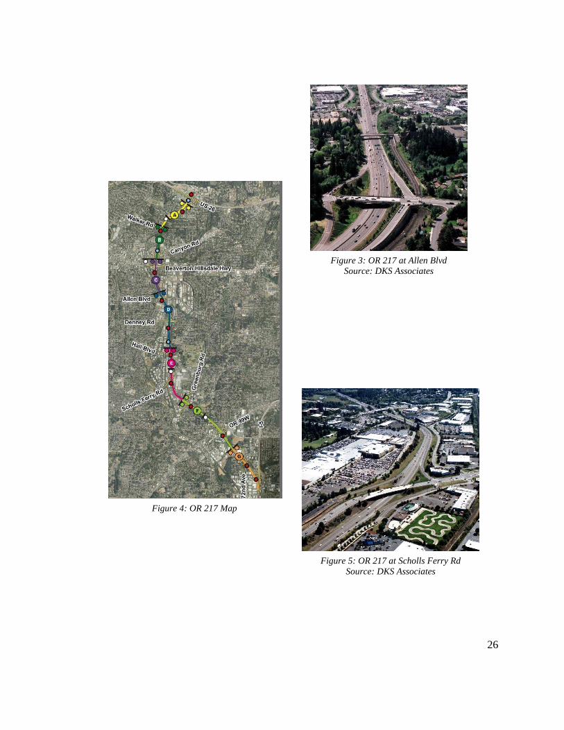
3.1 Corridor Almanac
OR 217 is a 7.52 mile highway primarily serving as a connector between
downtown Portland and southwestern suburbs including Beaverton and Tigard. The
highway, which is divided and has 2 lanes in each direction for most of its length, runs
from Interstate 5 on its southern end to US Highway 26 on its northern end. The
highway’s posted speed limit is 55 miles per hour. Along the corridor, there are eleven
sets of on- and off-ramps in each direction connecting with intersecting local streets. Its
location relative to downtown Portland makes OR 217 a popular route for commuters.
Figure 4 presents a map of the study area, with the labels indicating the locations of
interchanges, and Figure 3 and Figure 5 are aerial photographs of two of these
interchanges. In 2013, OR 217 had an average annual daily traffic (AADT) of
approximately 110,000 vehicles across both directions, equivalent to an average daily
vehicle-miles traveled (VMT) value of about 830,000 vehicle-miles. There were 322
crashes reported along the corridor in 2013, a rate of 1.06 crashes per million VMT (2013
Crash Book).
26
Figure 3: OR 217 at Allen Blvd
Source: DKS Associates
Figure 4: OR 217 Map
Figure 5: OR 217 at Scholls Ferry Rd
Source: DKS Associates

27
3.2 Crash Trends
In addition to the capacity and mobility challenges facing OR 217, it also exhibits
safety issues. In 2013, OR 217 had 322 reported crashes according to the 2013 State
Highway Crash Rate Tables. This equates to a crash rate of 1.06 crashes per million
vehicle miles, higher than the statewide average of 0.92 for urban non-interstate
freeways. All but one of the eight segments into which the corridor is split in the report
experienced increases from 2012 crash rates. OR 217 is particularly prone to rear-end
crashes, attributable to its proclivity for congestion. As shown in Figure 6, more than
two-thirds of the crashes reported on OR 217 from 2010 through 2012 were read-end
type crashes. Three years of crash data was analyzed to account for any annual
fluctuations in crash numbers unrepresentative of long-term trends. The relative
proportion of rear-end crashes on OR 217 is slightly higher than statewide average of
65.6% for all urban freeways in 2012.
2%
69%
11%
7%
11%
Other
Rear-End
Sideswipe
(Overtaking)
Turning
Fixed Object
n = 944
Figure 6: OR 217 Crashes by Collision Type
2010 - 2012

28
Approximately half of the crashes on OR 217 between 2010 and 2012 involved at
least one injury. As shown in Figure 7, the majority of these injuries were Class B and
came from rear-end collisions. In Oregon, Class B injury crashes are those resulting in
moderate, non-incapacitating injuries that are evident. Figure 8 demonstrates that the
common notion that rear-end crashes tend to be minor “fender benders” is a
misconception, as more than half of the rear-end crashes on OR 217 between 2010 and
2012 resulted in at least one injury. In addition to the safety-related consequences, each
one of these frequent rear-end collisions typically leads to the formation of a new
bottleneck, restricting flow through the entire corridor for an extended period of time.
280
290
300
310
320
330
340
350
360
PDO INJ
Cra
she
s
Severity
0
100
200
300
400
500
600
700
800
900
Fatality Injury A Injury B Injury C
Other
Sideswipe
FixedObject
Turning
Rear-end
Figure 8: OR 217 Rear-end Collision Severity
2010 - 2012 Figure 7: OR 217 Injuries by Crash Type & Severity
2010 - 2012
n = 652 n = 1,285

29
7%
60%
1%
27%
0% 1% 4%
Cloudy
Clear
Foggy
Rain
Sleet
Snow
Unknown
n = 944
Figure 9: OR 217 Crashes by Weather Condition
2010-2012
3.3 Effects of Adverse Weather
The OR 217 has a weather-responsive component in addition to the congestion-
responsive component because the corridor has a history of diminished safety and
efficiency during adverse weather. With adverse weather, particularly precipitation,
present, OR 217 has a tendency to experience more crashes and significantly higher and
even less reliable travel times.
Figure 9 and Figure 10 show the percentage of crashes on OR 217 from 2010
through 2012 that occurred in various types of weather and with various road surface
conditions. Forms of winter precipitation such as snow were factors in a very small
portion of crashes, which can be attributed to the relatively rare occurrence of frozen
precipitation in Portland. Rain, however, was falling during more than one quarter of the
reported crashes and roads were wet during more than one third. Precipitation was only
reported by the National Weather Service during about 10% of all the hours during these
three years, indicating that wet weather conditions are significantly overrepresented in the
crash data and that crashes become much more likely on OR 217 during precipitation
events.

30
60%
2%
0%
4%
34% Dry
Icy
Snowy
Unknown
Wet
Figure 10: OR 217 Crashes by Road Condition
2010-2012
In addition to negatively impacting safety, precipitation can also have a
significant effect on the operational performance of OR 217. Figure 11 demonstrates this
by showing average travel times along OR 217 NB recorded during each hour of the day
from October through December of 2012 under “wet” and “dry” conditions, split between
midweek days and weekend days. Gaps between the “wet” and “dry” travel times are
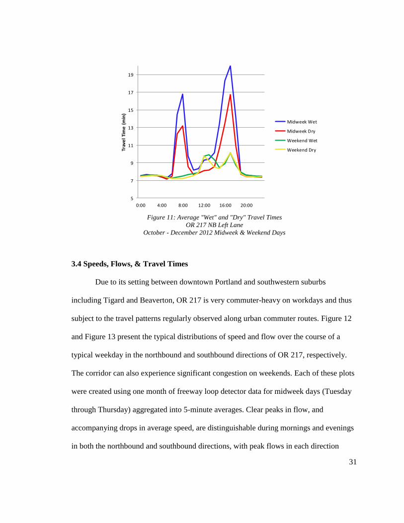
noticeable, particularly during peak hours on midweek days. During this period, travel
times during peak hours of midweek days were between 16.6% and 24.5% longer in wet
conditions. The amount of variability in observed travel times was also found to be
greater during adverse weather, as the standard deviation of travel times during midweek
peak hours was 32% greater in wet conditions. This suggests that OR 217 drivers vary
significantly in how they adjust speeds in response to adverse weather, possibly
contributing to the overrepresentation of wet conditions in the crash data.
n = 944
31
3.4 Speeds, Flows, & Travel Times
Due to its setting between downtown Portland and southwestern suburbs
including Tigard and Beaverton, OR 217 is very commuter-heavy on workdays and thus
subject to the travel patterns regularly observed along urban commuter routes. Figure 12
and Figure 13 present the typical distributions of speed and flow over the course of a
typical weekday in the northbound and southbound directions of OR 217, respectively.
The corridor can also experience significant congestion on weekends. Each of these plots
were created using one month of freeway loop detector data for midweek days (Tuesday
through Thursday) aggregated into 5-minute averages. Clear peaks in flow, and
accompanying drops in average speed, are distinguishable during mornings and evenings
in both the northbound and southbound directions, with peak flows in each direction
5
7
9
11
13
15
17
19
0:00 4:00 8:00 12:00 16:00 20:00
Trav
el
Tim
e (
min
)Midweek Wet
Midweek Dry
Weekend Wet
Weekend Dry
Figure 11: Average "Wet" and "Dry" Travel Times
OR 217 NB Left Lane
October - December 2012 Midweek & Weekend Days

32
regularly approaching 3,500 vehicles per hour (vph) across all lanes and average speeds
dropping by 15 mph or more for several hours during both the morning and evening
peaks. Between these peak times, flows subside and speeds recover, but not all the way to
free-flow levels.
0
500
1000
1500
2000
2500
3000
3500
4000
0
10
20
30
40
50
60
70
0:00 3:00 6:00 9:00 12:00 15:00 18:00 21:00
Sp
eed
(m
ph
)
Speed
Volume
Vo
lum
e (vp
h)
0
500
1000
1500
2000
2500
3000
3500
4000
0
10
20
30
40
50
60
70
0:00 3:00 6:00 9:00 12:00 15:00 18:00 21:00
Sp
eed
(m
ph
)
Speed
Volume
Vo
lum
e (vp
h)
Figure 12: OR 217 NB Typical Speed & Flow Distribution
October 2012 Midweek Days
Figure 13: OR 217 SB Typical Speed & Flow Distribution
October 2012 Midweek Days
33
A common goal for congestion-responsive VSL systems is to equalize speeds and
flows across adjacent lanes during peak demand times. Significant differences between
speeds in adjacent lanes encourage drivers to take advantage of faster lanes by making
lane changes that would otherwise be necessary. This excessive lane changing can
negatively affect freeway safety and throughput by leading to more conflicts and stop-
and-go traffic. Excessive flow discrepancies can also limit the overall capacity of a
freeway, since they generally lead to one lane being underutilized.
Figure 14 and Figure 15 show that discrepancies in speeds and flows between
adjacent lanes are an issue for OR 217. Using one month of midweek loop detector data
for one southbound station, Figure 14 shows average values for the difference between
average left and right lane speeds during the evening peak and Figure 15 shows average
volumes in lane in vph. As can be seen, speeds in the left lane are generally 2-5 mph
greater, while volumes are generally about 100 vph greater. As evening demand
approaches a maximum around 5:00 PM, the speed and flow differentials between lanes
noticeably decrease, suggesting a lot of unnecessary and performance-inhibiting lane
changing. The exact patterns exhibited at the Greenburg SB station are not consistent
throughout the corridor, as volumes are generally higher in the left lane during high
demand at other locations, but adjacent lane speed and flow discrepancies do exist all
along OR 217. By bringing all drivers, regardless of lane, to a uniform reduced speed, a
VSL system would ideally negate any incentive to change lanes except when necessary.

34
The persistence of severe congestion on OR 217 also contributes to highly
variable and unreliable corridor travel times. The free-flow travel time from one end to
the other is approximately seven minutes, but average travel times are often more than
double that during peak demand hours in the morning and evening. 95th percentile travel
times can be another two times larger than average travel times, meaning that some
commuters may traverse the corridor in 15 minutes while others take 30 minutes.
0
1
2
3
4
5
6
7
8
9
14:00:00 15:00:00 16:00:00 17:00:00 18:00:00 19:00:00
Lef
t L
an
e S
pee
d -
Rig
ht
La
ne
Sp
eed
(m
ph
)
Figure 14: Lane Speed Differential
OR 217 Greenburg SB
May 2013 Midweek Days
0
500
1000
1500
2000
2500
3000
14:00:00 15:00:00 16:00:00 17:00:00 18:00:00 19:00:00
Flo
w (
vp
h)
Right Lane
Left Lane
Figure 15: Lane Flow Distribution
OR 217 Greenburg SB
May 2013 Midweek Days

35
Figure 16 and Figure 17 demonstrate this by showing the gaps between 95th,
50th, and 5th percentile travel times during the typical evening peaks in both directions.
Created using one month of midweek 5-minute aggregated loop detector speed readings
for the leftmost lanes in each direction, large discrepancies between the three values are
clearly evident. In Figure 17, there is an average range of 5.24 minutes between the 95th
and 5th percentile travel times, while the average range is 4.51 minutes in Figure 16. For
a freeway with a free-flow travel time of just seven minutes, these are substantial
differences which indicate poor travel time reliability. Such a significant range in
experienced travel times makes it very difficult to predict ahead of time how long the
drive will take, which is particularly problematic for commuters hoping to reach work by
a certain time or shippers attempting to make their deliveries on time. Additional
evidence of the unreliability of OR 217 travel times can be garnered from calculation of
the travel time buffer index, which represents how much extra time drivers must allow
for trips to reach their destinations on time as a percentage of average travel time. For the
month of data shown, this buffer index exceeds 50% during the most congested times.

36
0
5
10
15
20
25
30
35
2:00 PM 3:00 PM 4:00 PM 5:00 PM 6:00 PM 7:00 PM 8:00 PM
Tra
vel
Tim
e (m
in)
95% TT Average TT
5% TT
Figure 16: PM Peak Travel Time Variability
OR 217 SB Left Lane
October 2012 Midweek Days
0
5
10
15
20
25
2:00 PM 3:00 PM 4:00 PM 5:00 PM 6:00 PM 7:00 PM 8:00 PM
Tra
vel
Tim
e (m
in)
Figure 17: PM Peak Travel Time Variability
OR 217 NB Right Lane
October 2012 Midweek Days
37
3.5 Bottleneck Patterns
The consistently heavy demand placed upon OR 217 leads to a significant
problem of recurrent bottlenecks. In both directions and during both the morning and
evening peaks, commuter traffic routinely leads to the formation of bottlenecks whose
effects can propagate quickly upstream to engulf over half the corridor under average
speeds of 30 mph or less for several hours. Bottlenecks on weekends, while not as severe
as those on weekdays, also present a problem for OR 217. These bottlenecks can
significantly diminish the capacity of OR 217, as flow through locations encompassed
within bottleneck congestion can drop by over 20% relative to free-flow conditions.
Figure 18 and Figure 19 demonstrate the typical weekday congestion patterns for
the northbound direction and the effects the noticeable bottlenecks have on flow using
one day’s worth of loop detector data. In Figure 18, the x-axis represents time, the y-axis
represents location, and the colors represent measured speeds in mph. In the figure, the
direction of traffic is from bottom to top. Figure 19 is an oblique flow plot (Bertini &
Myton, 2005) for one location within the later pronounced area of low average speeds
shown in Figure 18. The development of this type of plot is described in greater detail in
Section 4.4.5. As shown in Figure 18, a bottleneck typically develops on OR 217 NB
upstream of the interchange with Denney Road (milepost 2.68) around 4:00 PM, and
average speeds for the entire corridor upstream of that point fall well below free-flow
levels for several hours. These recurrent bottlenecks along OR 217 can significantly
reduce the capacity of the corridor, as demonstrated in Figure 19. In this oblique plot, the
y-axis represents cumulative vehicle counts through the 99W WB detector station

38
(milepost 5.85) minus a scaling factor to clearly show when major changes in flow occur.
The trend in average flow through this station during the evening peak clearly reveals the
effects the later bottleneck in Figure 18 had on the capacity of OR 217 NB. An average of
approximately 4,105 vph had been passing through the station until 4:30 PM, when
congestion caused by the downstream bottleneck reached this location. At that time,
average flow plummeted by 22.5% to 3,178 vph and did not begin to rebound for about
half an hour. Such significant reductions in flow severely inhibit the performance of OR
217 during times of heavy demand.
Figure 18: OR 217 NB Speed Contour Plot
February 13, 2013
.17
.18
.26
.53
.60
.42
.48
.81
0.80
Station Influence Length
0.83
0.59
.67
MP .10 - Barnes
MP .45 - Wilshire
MP .76 - Walker
MP 1.92 – B-H Hwy
MP 2.55 - Allen
MP 3.12 - Denney
MP 3.5 - Hall
MP 4.35 – Scholls Ferry
MP 5.11 - Greenburg
MP 5.95 – 99W West
MP 6.77 – 72nd
MP 7.0 – OR 217 WB to SB
U.S. 26 West
U.S. 26 East
I-5 SB
MP .25 - WAVETRONIX
MP 1.5 - WAVETRONIX
.52
.58
MP 3.4 - WAVETRONIX.19
= Loop Detector
= Radar Detector
= VAS Sign
MP .66 - Walker
MP 1.34 – TV Hwy
MP 2.16 – Allen
MP 2.68 - Denney
MP 3.85 – Scholls Ferry
MP 4.65 - Greenburg
MP 5.85 – 99W West
MP 5.9 – 99W East
MP 6.61 – 72nd
.54
.42
.41
.59
.62
.59
.62
1.00
U.S. 26 East
Barnes
MP .25 - WAVETRONIX
MP 3.4 - WAVETRONIX
MP 1.5 - WAVETRONIX
.46
.63
1.01
Station Influence Length
0.38
7
6
5
4
3
2
1
0
Milepost
Denney Rd
99W WB
Bottleneck

39
3.6 Summary
Analysis of the conditions on OR 217 prior to the VSL system’s implementation
clearly demonstrates that the corridor has some significant problems and has the potential
to benefit from an effective VSL system. OR 217 is prone to severe congestion and
recurrent bottlenecks on a regular basis during weekdays, with average speed declines of
50% not uncommon during peak demand hours. Recurrent bottlenecks in both directions
create queues several miles long that last for several hours. Additionally, the corridor’s
performance varies a great deal between different hours and days, contributing to highly
unreliable travel times. OR 217 is particularly prone to rear-end crashes, with an average
of more than one every day, and these collisions can have major consequences in terms of
both safety and throughput. Finally, during adverse weather, OR 217 is even more
susceptible to crashes and travel times are higher and more unreliable.
Historical trends suggest OR 217’s problems are not going to solve themselves.
Between 1985 and 2005, traffic volumes doubled, and they are expected to grow another
-200
-100
0
100
200
300
400
500
14:00:00 15:00:00 16:00:00 17:00:00 18:00:00 19:00:00
N(x
,t)-
q0t,
q0=
35
66
.8
veh
icle
s/h
ou
r
4105
vph
3787 vph
3178
vph
Figure 19: OR 217 NB Oblique Flow Plot
February 13, 2013

40
30% by 2025. The growth in demand is expected to increase the extent of daily
congestion from 3 hours to 8 hours by 2025. The crash rate has increased 89% just since
2009. These trends, combined with the previously discussed mobility and safety issues,
clearly indicate that something needed to be done to improve OR 217, and ODOT
ultimately settled on an advisory VSL system.

41
4.0 Methodology
The previous section demonstrated that prior the VSL system, OR 217 was
suffering from a number of issues. In order to assess the effectiveness of the VSL system
in addressing these issues, data from several different sources was obtained and analyzed
using an array of analysis techniques. Each of these analyses was carried out in the form
of a “before and after” comparison in order to get a clear picture of how OR 217 has
changed since the system’s implementation. In this chapter, available instrumentation
along OR 218 and the various types of data used are detailed as well as the analysis
methodologies applied to each of them.
4.1 Corridor Instrumentation
The primary means of traffic data collection along OR 217 is a series of dual-loop
detector stations placed upstream of each entrance ramp. These stations record and store
vehicle count, occupancy, and speed measurements every 20 seconds. At each detector
station, there is one dual-loop detector placed in each traffic lane. Loops are also located
on each accompanying ramp, but these loops only record vehicle counts. OR 217 is also
instrumented with a series of radar traffic sensors, manufactured by Wavetronix, which
collect the same data as the loop detectors. As with the loop detectors, the radar detectors
are grouped into stations, with one sensor for each traffic lane. The Wavetronix sensors
were strategically located along OR 217 to minimize any large gaps between loop
detector stations, thus improving the resolution of traffic measurements. Figure 20 and
Figure 21 show the lane configurations and layout of available instrumentation on OR
217 southbound and northbound, respectively.
42
The VAS system being evaluated in this study was constructed on OR 217 over
the past several years as one component of the OR 217 Active Traffic Management
project and consists of a series of large electronic message signs. There are ten locations
along OR 217 with these variable speed signs for both the northbound and southbound
directions. Figure 22 and Figure 23 show the two primary configurations of these signs,
either on bridges or metal structures. As shown, each travel lane has its own sign, and
adjacent signs do not necessarily display the same speed.
The congestion-responsive component of the system works by collecting data
from the corridor’s traffic detectors. Each VAS sign is assigned a segment reaching to the
next sign downstream, and any sensor data within that segment is relayed to that sign.
Each detector station is assigned a certain volume and occupancy threshold, one of which
must be met for its speed readings to influence the VAS sign. If one of these thresholds is
met, the 85th percentile speed at that station is computed and rounded to the nearest 5
mph. Finally, these 85th percentile station speeds for each station within a VAS sign’s
segments meeting either the volume or occupancy threshold are compiled, and the lowest
one is displayed on the sign until the controlling station’s 85th percentile speed has risen
to the next highest 5 mph increment. If the lowest 85th percentile station speed is below
25 mph, the sign display will read “SLOW” instead of an actual speed. Speeds displayed
at VAS signs upstream of the most congested segments are stepped down based on how
far upstream they are to encourage drivers to gradually decelerate before they reach the
heaviest congestion.
43
The weather-responsive component of OR 217’s VAS sign continuously collects
real-time data from new RWIS sensors installed along the corridor, represented as
diamonds in Figure 24. The VAS systems then uses a lookup table to determine an
appropriate reduced speed to display based on the sensor measurements of visibility and
grip factor, which indicates the level of grip of the roadway surface. If both congestion
and adverse weather are occurring, the component which computes the lowest
appropriate speed for each sign takes priority. The logic behind the two different
components of OR 217’S VAS system are described in greater detail in the Oregon
Statewide Variable Speed System Concept of Operations (DKS Associates, 2013).
In addition to these signs, new radar detectors, variable message signs and
roadway weather sensors were installed along OR 217 as part of the project. Figure 24,
courtesy of DKS Associates, details the locations of each component of the ATM project,
with VAS signs labeled in orange.

44
Station Influence Length
MP .10 - Barnes
MP .45 - Wilshire
MP .76 - Walker
MP 1.92 – B-H Hwy
MP 2.55 - Allen
MP 3.12 - Denney
MP 3.5 - Hall
MP 4.35 – Scholls Ferry
MP 5.11 - Greenburg
MP 5.95 – 99W West
MP 6.77 – 72nd
MP 7.0 – OR 217 WB to SB
U.S. 26 West
U.S. 26 East
I-5 SB
MP .25 - Wavetronix
MP 1.5 - Wavetronix
MP 3.4 - Wavetronix
7
6
5
4
3
2
1
0
Milepost
MP .25 – VAS Sign
MP .91 – VAS Sign
MP 1.58 – VAS Sign
MP 2.48 – VAS Sign
MP 3.83 – VAS Sign
MP 4.96 – VAS Sign
MP 6.33 – VAS Sign
= Loop Detector
= Radar Detector
= VAS Sign
Figure 20: OR 217 SB VSL & Detector Layout

45
MP .66 - Walker
MP 1.34 – TV Hwy
MP 2.16 – Allen
MP 2.68 - Denney
MP 3.85 – Scholls Ferry
MP 4.65 - Greenburg
MP 5.85 – 99W West
MP 5.9 – 99W East
MP 6.61 – 72nd
.54
.42
.41
.59
.62
.59
.62
1.00
U.S. 26 East
MP .25 - Wavetronix
MP 3.4 - Wavetronix
MP 1.5 - Wavetronix
.46
.63
1.01
Station Influence Length
0.38
7
6
5
4
3
2
1
0
Milepost
MP .91 – VAS Sign
MP 1.58 – VAS Sign
MP 2.51 – VAS Sign
MP 4.13 – VAS Sign
MP 4.96 – VAS Sign
MP 5.71 – VAS Sign
MP 6.69 – VAS Sign
= Loop Detector
= Radar Detector
= VAS Sign
Figure 21: OR 217 NB VSL & Detector Layout

46
Figure 22: OR 217 VSL Signs on Bridges
Source: The Oregonian
Figure 23: OR 217 VSL Signs on Sign Gantry

47
Figure 24: OR 217 ATM Installations
Source: DKS Associates

48
4.2 Data Description
4.2.1 Traffic Flow Data
The traffic flow data utilized in this evaluation comes from Portal
(portal.its.pdx.edu), a comprehensive transportation data archive that collects and stores
data relating to a number of different performance measures for Portland’s transportation
network. The Portal user interface offers a number of useful and interesting features in
addition to raw data, such as various charts and plots, but most Portal data used in this
evaluation was downloaded directly from the internal database using the statistical
program R.
Of particular interest to this evaluation was Portal’s historical traffic data. The
previously mentioned loop detectors and radar detectors installed on OR 217 are
connected to this archive, so that all 20-second volume, occupancy and speed readings
from the corridor’s detector stations are easily obtainable. The tables of detector readings
contain five columns for time, volume, speed, occupancy, and detector ID, and were
merged with a separate table containing more detailed information for each detector, such
as lane number, milepost and influence length. A detector’s influence length, as shown
in Figure 20, was calculated simply as the distance between its midpoints with the
upstream and downstream detectors and represents the length of freeway for which that
detectors readings are applicable. Travel times for individual detectors were computed by
dividing influence length by each 20-second speed readings. Only data from detectors
placed in the mainline lanes in each directions was considered for this study. Ramp
detector data was omitted because the ramp detectors do not record speeds and because
49
system errors made any ramp data unavailable for a large portion of both the “before”
and “after” time periods.
Since this was a “before and after” evaluation, it was necessary to select
appropriate time periods to act as sources for the “before” and “after” data sets. The OR
217 VSL system was activated on July 22, 2014, so the chosen “after” period for most
data types was July 22, 2014 through December 31, 2014. This five month period was
deemed sufficient since it includes driving conditions in three seasons. For the “before”
traffic data, a similar sample was desired to ensure the “before” and “after” data sets were
comparable. August through December of 2013 was not an appropriate “before” sample
because construction on OR 217 during that time resulted in significant disruptions to
data collection from the detectors. As a result, August through December of 2012 was
chosen as the “before” period for all traffic data analysis. Although the data availability
for 2012 was much greater than for 2013, the radar detectors on OR 217 did not become
fully operational until early 2013, meaning no data from the six radar detector stations
shown in Figure 20 is included in “before” traffic data set. The ramifications of this are
discussed in Section 5.1.
4.2.2 Crash & Incident Data
The crash and incident data used in this evaluation came from two sources.
ODOT’s statewide reported crash database stores information pertaining to any reported
crash involving a fatality, injury and/or damages in excess of $1,500. This database
contains extensive amounts of data for each crash, including time, location, type and
severity. ODOT’s annual state highway crash rate tables combine this reported crash data
50
with vehicle miles traveled (VMT) data to compute crash rates for each highway covered
by the agency. In addition, data from all reported incidents along OR 217 that initiate a
response from ODOT are available from the agency’s Transportation Operation Center
System (TOCS) database. These incidents include, but are not limited to, crashes,
breakdowns, stalls, maintenance, and construction. This database contains data regarding
the type, time, duration and location of each incident. It should be noted that the TOCS
database does not include all OR 217 incidents, as some are responded to by other
agencies, some are not reported, and some occur while the traffic management center is
not staffed.
Three years of crash data from the reported crash database, spanning from
January 2010 through December 2012, was used as the “before” crash data set. During
analysis of crash data, several years of data is preferable to one to account for annual
fluctuations, and three years is a commonly used period. Two years of TOCS incident
data, spanning from July 2012 through June 2014, was used as “before” incident data set.
This period was selected to encompass the “before” period from the traffic analysis and
two of each season. Incident data from the end of 2013, when there was ongoing
construction on 217, was included because it was assumed that this construction,
primarily re-paving and work on the VSL system, would have a minimal impact on
incident totals or types. For the “after” period, reported crash data is currently
unavailable. Reported crash data for 2014 will not be released until October or November
2015, so only incident data could be used in this evaluation. The period from July 22,
2014 through December 31, 2014 was selected to coincide with the “after” traffic data.
51
Since the TOCS database merely designates a crash as a crash without any data regarding
the type, road conditions or severity, none of those parameters could be studied for the
period after VSL implementation in this evaluation.
4.2.3 Weather Data
Since the OR 217 VSL system is both congestion and weather-responsive,
obtaining sufficient weather data was also important for this evaluation. The new RWIS
sensors along the corridor will be the primary source of weather data governing the actual
operation of the VSL system, but data from these sensors is not yet available. For this
evaluation, hourly weather data containing information about temperature, precipitation,
and visibility from the National Oceanic and Atmospheric Administration (NOAA) was
obtained through Portal. The utilized weather readings came from Hillsboro Airport,
which is located approximately 10 miles away from OR 217. The relatively low
resolution of this weather data limited the amount of correlation that could be drawn
between performance on OR 217 and weather conditions but still allowed for some
insight.
4.3 Evaluation Framework
With the available data summarized previously, a series of specific evaluation
questions and hypotheses were created to guide the analysis. In all, seven such questions
were developed, covering both operations and safety. These questions and hypotheses, as
well as appropriate measures of effectiveness for testing them and their corresponding
analysis periods, are summarized in Table 2. Figure 25 is a timeline of the analysis
periods selected for the various types of data.

52
Table 2: Evaluation Matrix
Evaluation Question Hypotheses Measures of Effectiveness Data Date Ranges
Is the variability in measured speeds
affected by the VSL system?
Speed variance, particularly
during peak demand hours, will be
reduced
Standard deviation of speeds Before: 8/1/12-12/31/12
Range of measured speeds After: 8/1/14-12/31/14
Will the frequency and distribution
of crashes be affected by the VSL
system?
Crash rates, particularly the rate of
rear-end crashes, will be reduced
Crashes per million VMT Before: 8/1/12-6/31/14
Crash distribution by time of day
The relative frequency of crashes
during peak demand hours will be
reduced
Crash distribution by milepost After: 7/22/14-12/31/14
Is speed variance between adjacent
lanes affected by the VSL system?
Lane speed differentials, particularly
during peak hours, will be reduced Lane speed ratio
Before: 8/1/12-12/31/12
After: 8/1/14-12/31/14
Is flow variance between adjacent
lanes affected by the VSL system?
Total flow, particularly during peak
hours, will be more evenly
distributed between adjacent lanes
Lane flow ratio
Before: 8/1/12-12/31/12
After: 8/1/14-12/31/14
Does the VSL system improve the
reliability of travel times?
Travel times will be more reliable,
particularly during peak demand
hours
Mean & 95th percentile travel time Before: 8/1/12-3/31/13
Travel time buffer index After: 8/1/14-3/12/15
Are the reductions in flow that
accompany bottleneck formation
affected by the VSL system?
The reductions in flow caused by
bottlenecks, both upstream and
downstream, will be less severe
Pre-queue flow Before: 7/25/12-11/14/12
Queue discharge flow After: 7/23/14-11/12/14
Does the VSL system affect the
changes in travel time and travel
time variability that accompany
adverse weather conditions?
The increase in travel time during
adverse weather conditions will be
larger
Mean travel time Before: 10/1/12-2/28/13
Travel times during adverse weather
conditions will become more
reliable than during fair weather
conditions
Standard deviation of travel times After: 10/1/14-2/28/15
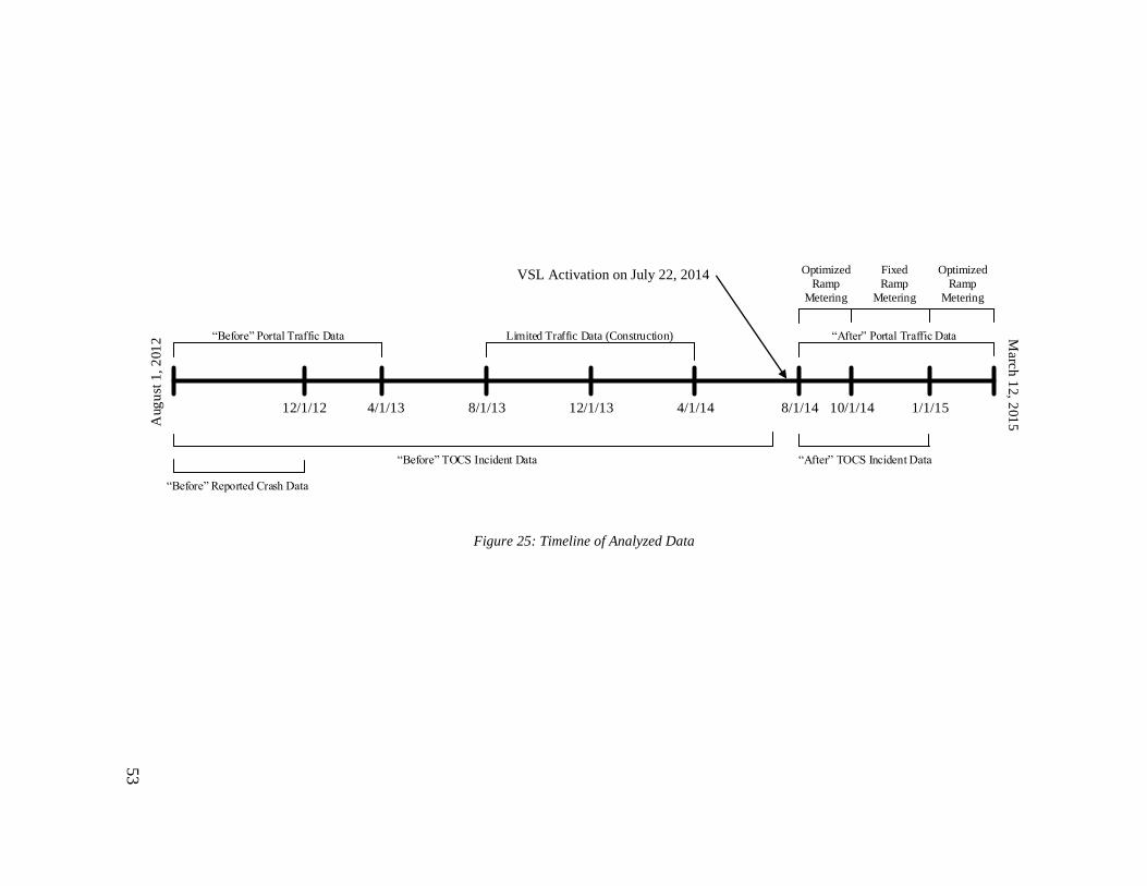
53
12/1/12
“Before” TOCS Incident Data
Limited Traffic Data (Construction)
“After” TOCS Incident Data
“Before” Reported Crash Data
“Before” Portal Traffic Data “After” Portal Traffic Data
Optimized
Ramp
Metering
Fixed
Ramp
Metering
Optimized
Ramp
Metering
Aug
ust
1,
201
2 Marc
h 1
2, 2
01
5
4/1/13 8/1/1412/1/13 4/1/148/1/13 10/1/14 1/1/15
VSL Activation on July 22, 2014
Figure 25: Timeline of Analyzed Data

54
4.4 Analysis Techniques
For each evaluation question, specific analysis techniques had to be developed in
order to answer them and compare the VSL system impacts with the hypotheses. This
section describes in detail the primary analysis techniques used during this evaluation.
4.4.1 Speed Variation
As mentioned earlier, one of the primary justifications given for the installation of
a VSL system on OR 217 was the supposed speed harmonization effect of such system. A
high degree of variability in observed speeds is detrimental to traffic operations and
safety, since having a fleet of vehicles traveling at several different speeds can increase
the likelihood of stop-and-go conditions and crashes. Thus, in evaluating the
effectiveness of the OR 217 VSL system, one of the key measures of interest was to see
how speed variability has changed between before and after the system’s implementation.
In order to analyze the system’s impacts on speed variability, 20-second traffic
detector data from the five month “before” and “after” traffic data sets was initially
downloaded from Portal. As the speed and flow patterns in the left and right lanes for
both directions differ, readings from adjacent lanes were not combined for this part of the
evaluation. In order to obtain more consistent data sets, only midweek days, Tuesday
through Thursday, were considered in this analysis. The commuter-heavy nature of OR
217 means weekday and weekend travel patterns for the corridor are significantly
different, so analyzing them together would be inappropriate. The corridor’s congestion
problems are much more pronounced on weekdays, they were the focus of much of the
analysis carried out in this evaluation. Mondays and Fridays were likewise omitted from
55
this and other analyses because they tend to have much more irregular travel patterns for
various reasons, including holidays, late arrivals to work and early departures, making it
difficult to compare different Mondays and Fridays.
In this analysis, data from four detector stations in each direction were studied.
The included detector stations were Greenburg, Scholls Ferry, Denney and Allen. These
stations were chosen because, as shown in Figure 4, they are all located near the center of
the corridor and thus less likely to be influenced externally by conditions on I-5 and US
26 not considered by the VSL system. Additionally, the data quality and availability of
these stations was found to be superior to that of other stations.
With all of the 20-second traffic data obtained for the “before” and “after”
analysis periods, average speed readings for each 20 second interval at each detector
during each of the months included in the data sets were computed. For example, all
speed readings from Detector 100050, in the right lane of the Allen Boulevard
northbound station, between 7:00:00 AM and 7:00:20 AM on Wednesdays in October
were averaged to obtain just one monthly average speed for that specific time interval.
Monthly averages were computed since travel patterns and weather conditions along OR
217 are not consistent from August through December and traffic can vary considerably
month to month. Averaging the raw data in this way produced 4,320 average
observations for each detector in each month. To then analyze the variability of these
average monthly speed readings, standard deviations of each 5-minute interval, each
encompassing 15 readings, were computed. Doing so provided 288 standard deviation

56
values and an adequate amount of resolution to observe how speed variation changed
over the course of a typical day.
For testing the statistical significance of any observed changes in speed variation
before and after VSL implementation, standard deviations for the different detectors and
months had to be combined in order to establish adequate sample sizes. The eight
samples produced from this data combination for both the “before” and “after” periods
are summarized in Table 3. The five month periods were split to account for seasonal
variations, since October through December tends to be Portland’s wettest time of year
while August and September are fairly dry. In 2014, for instance, 10.61 inches of
precipitation were recorded at Hillsboro Airport between October and December, while
only 0.92 inches was recorded during August and September.
Table 3: Speed Variation Analysis Sample Sizes
Number Direction Lane Time Period Observations
1 North Left August - September 2304
2 North Right August - September 2304
3 North Left October - December 3456
4 North Right October - December 3456
5 South Left August - September 2304
6 South Right August - September 2304
7 South Left October - December 3456
8 South Right October - December 3456

57
The observations in each of these larger samples were then separated into the following
groups to account for shifts in demand on the corridor throughout the course of a typical
day:
- Early: 12:00 AM TO 6:00 AM
- Morning Peak: 6:00 AM to 10:00 AM
- Midday: 10:00 AM to 3:00 PM
- Evening Peak: 3:00 PM to 7:00 PM
- Late: 7:00 PM to 12:00 AM
The breakpoints between these daily segments were chosen based on observation
of typical demand patterns on OR 217, and these same segments were used in several of
the other analyses performed for this evaluation. Finally, with the speed standard
deviations arranged in the described manner, Welch’s t-tests were performed in R to test
the significance of any observed changes to mean standard deviations after VSL
implementation. The results of this speed variation analysis, accompanied by several
plots and tables, are discussed in Section 5.2.
4.4.2 Crash & Incident Frequency and Distribution
Analysis of the effects of the VSL system on safety focused on both the crash and
incident data. As mentioned earlier, statewide reported crash data is currently unavailable
for the “after” VSL period, so detailed crash analysis could only performed for the
“before” period for this evaluation. This crash analysis largely involved taking the 3-year
crash history obtained for OR 217 and breaking the reported crashes into various
categories based on the data fields of most interest. In all, seven crash-related parameters
58
were determined to be of interest and analyzed in detail. These parameters were time,
milepost, crash type, collision type, crash severity, weather condition and road condition,
and were selected for being the most likely to be impacted in some way by the VSL
system. The results of the reported crash analysis for the “before” period are discussed in
Section 3.2.
Incident data was available for both the “before” and “after” VSL periods,
allowing for some preliminary analysis of the system’s safety impact. The incidents from
both periods were first split by type in order to create incident trees. Using the total
number of incidents during a certain period, incident trees show the percentage of these
incidents that fall into a number of sub-categories. For this analysis, six different incident
sub-categories were developed, including accidents, breakdowns, blocking hazards,
potential delays, responses with no delay, and miscellaneous. Specific incident types
included in the TOCS database were then split among these sub-categories. All of the
incidents included in the “before” and “after” data sets were distributed into the
appropriate incident tree branches, allowing for a direct comparison of the incident shares
for the various sub-categories between before and after VSL implementation.
Being the incident type of most interest to this evaluation, crashes were filtered
out of the two incident data sets to allow for more analysis. In order to compare crash
rates, a measure of vehicle miles traveled (VMT) first had to be calculated for OR 217.
This was done using 20-second detector volume data from the two five month traffic flow
data sets previously described. Volume data was converted to VMT by multiplying each
20-second volume observation by the station influence length shown in Figure 20.

59
Since volumes at different stations on OR 217 can vary greatly, data from just one
station in each direction, Greenburg, was used to estimate VMT. Greenburg was chosen
because, based on observation, it tends to have fewer issues with missing data than most
other stations. For various reasons, however, significant periods of missing data did occur
sporadically throughout both the “before” and after analysis periods. To deal with this
missing data, any days with noticeable gaps in volume data were filtered out of the data
sets. Portal’s user interface was used to quickly identify these large gaps. In all, 37 days
were removed from the August-December 2014 data and 11 days from the August-
December 2012 data. Reasons for this discrepancy in missing data between the two
periods is unclear, though ODOT did make major changes to how detector data is
managed in early 2014.
Once the missing data days were removed from the data sets, the remaining VMT
values were summed to produce monthly totals and average VMT values for each day of
the week for each month were calculated. Then, these average daily values were
multiplied by the number of missing days in each month to get an estimated total VMT.
For example, December 2014 had one missing Thursday of data, and the average
northbound VMT for every other Thursday in the month was 38,740 VMT. Thus, 38,740
was added to the initial sum of 1,258,384 to arrive at an estimated monthly total of
1,297,214 VMT. The crash totals for each month were then divided by these monthly
VMT totals to get monthly rates of crashes per million VMT.
The other parameters of interest in the TOCS database were milepost and
duration. Using just the crash incidents from the “before” and “after” incident data sets,
60
plots and tables breaking them down by milepost and duration were developed to look for
any impacts the VSL system may have had on those parameters. The results of the
“before” and “after” incident analysis are discussed in Section 5.3.
4.4.3 Adjacent Lane Flow & Speed Distribution
Another common goal of VSL systems is to more evenly distribute flow between
adjacent lanes, particularly during congested periods. When one lane is being subjected to
high volumes and heavy congestion while its adjacent lane experiences lower volume and
higher speeds, total capacity may be compromised since the adjacent lane is likely being
under-utilized. Thus, measures of flow and speed distribution between adjacent lanes was
another key parameter of interest to this evaluation.
The same five month sets of 20-second data from midweek days used in the speed
variability analysis were used in this analysis. The same four stations in each direction,
Greenburg, Allen, Scholls Ferry and Denney, were analyzed to again avoid external
influence from US 26 or I-5. Additionally, these stations all have just two lanes in each
direction. Road segments with three lanes, as is the case at the northern and southern ends
of OR 217, have very different dynamics, making using them for comparison purposes
difficult. Starting with the raw monthly 20-second data, simultaneous readings at adjacent
detectors were merged in R. Much like the speed variability analysis, monthly average
speed and volume readings for each 20-second interval of the day were then computed.
The volume readings were then converted to flow in vph by multiplying by 180. With
these monthly average sets of data, several additional parameters relating to lane
distribution, such as speed ratio, flow ratio, and flow percentages in each lane were

61
computed. Speed and flow ratio were defined as the average 20-second speed and flow in
the left lane of a station divided by the average speed and flow in the right lane, while the
flow percentages were simply the percentage of total 20-second flow passing through
each lane.
Combining the data in this way produced 4,320 observations, equal to the number
of 20-second intervals in one day, of each variable for each of the eight analyzed detector
stations and each of the ten months. To then determine whether or not any change in
these lane distribution variables after VSL implementation was evident, average speed
ratio and flow ratio values for each of the five daily segments used in the speed variation
analysis were computed and compared between the “before” and “after” data sets. Using
the daily segments allowed for observation of the different effects the VSL system may
have had on lane distribution during different times of day. Welch’s t-tests were again
used to check the statistical significance of any observed changes. For the t-tests of flow
distribution, left flow percentage was used as the variable of interest rather than flow
ratio since there were some instances of an average flow ratio of infinity, which would
have ruined the outcome of the t-tests. The results of the lane distribution analysis may be
found in Section 5.4.
62
4.4.4 Travel Time Reliability
Improving the reliability of corridor travel times is one of the primary intents of
the OR 217 VSL system. High average travel times can be frustrating themselves, but a
high degree of variability in travel times is even worse, particularly for commuters or
shippers who need to be at a certain destination at a certain time. To provide insight into
how the VSL system is affecting the variability of OR 217 travel times, a thorough
analysis of various measures of travel time reliability was carried out.
For this analysis, eight months of “before” and “after” 20-second traffic data on
midweek days, encompassing August 2012 through March 2013 and August 2014
through March 2015, was used as the starting point. Three additional months of data were
studied in this analysis to account for the changing status of the OR 217 ramp-metering
system during the “after” period. During August and September of 2014, the system was
functioning properly at an optimized rate, but a bug forced the system to be operated at a
fixed rate after that until January 2015. Based on the theory that differences in the ramp
metering rate would affect travel times more than other analyzed parameters like lane
distribution and speed variation, additional “after” travel time data from 2015 was studied
to see how the impact of the VSL system may have changed when the ramp metering
system switched from an optimized rate to a fixed rate, then back again to an optimized
rate.
Since speeds, and thus travel times, can be significantly different in adjacent
lanes, the left and right lanes were analyzed separately. Some preliminary cleaning of the
raw traffic data was necessary in this analysis to improve the quality of the results. To

63
start, any detector readings with a speed of zero mph or a volume of zero and null speed
were removed, since such observations would have a corresponding travel time of
infinity. Next, detector readings with a volume reading of over 30 vehicles in 20 seconds
were removed, since anything greater than 30 was deemed infeasible and the result of a
detector error. Finally, an additional variable called the volume-speed ratio was computed
for each reading, and any reading with a ratio of greater than four was removed. For
instance, if one detector recorded five vehicles in 20 seconds but an average speed of one
mph, it was removed since such a scenario is not possible.
Cleaning the data in this manner produced the sample sizes shown in Table 4 and
Table 5. The sample sizes were grouped into three periods based on the three different
statuses of the ramp metering system during the “after” period. The 2014 data has
generally larger cleaned sample sizes due to the inclusion of radar detector readings. As
can be seen in the far right column, there was a higher instance of erroneous readings in
the “before” data set for each lane, suggesting that ODOT’s move to a new data feed
process in early 2014 may have improved data quality.
Table 4: “Before” Loop Detector Sample Sizes
Lane Data Set Aug –
Sep 2012
Oct – Dec
2012
Jan – March
2013
Percent
Removed
NB Left Raw 945,702 1,408,122 1,293,885
34.47% Cleaned 588,275 871,316 930,924
NB
Right
Raw 945,702 1,408,122 1,293,885 25.86%
Cleaned 702,800 979,021 1,022,742
SB Left Raw 1,155,858 1,721,038 1,581,415
30.25% Cleaned 774,919 1,211,675 1,123,149
SB Right Raw 1,155,858 1,721,038 1,581,415
28.56% Cleaned 775,562 1,207,825 1,199,888

64
Table 5: “After” Loop & Radar Detector Sample Sizes
Lane Data Set Aug –
Sep 2014
Oct – Dec
2014
Jan – March
2015
Percent
Removed
NB Left Raw 1,019,764 1,838,422 1,629,905
25.23% Cleaned 785,266 1,369,436 1,200,601
NB
Right
Raw 1,112,504 1,892,615 1,629,904 18.06%
Cleaned 931,124 1,544,675 1,322,094
SB Left Raw 1,298,052 2,207,994 1,900,577
25.30% Cleaned 987,625 1,630,833 1,420,166
SB Right Raw 1,205,341 2,153,890 1,900,598
15.66% Cleaned 1,066,395 1,786,655 1,582,858
With the data cleaned, the next step in this analysis was to translate the speed
readings into travel times. Individual detector travel times were computed by simply
dividing detector influence length by speed. To reduce the computational cost of dealing
with these large data sets, the detector readings were agglomerated into average values
for each minute rather than every 20 seconds. Average corridor travel time for each lane
was obtained by summing the individual detector travel times for each detector in a lane.
To account for any missing detector readings, estimated corridor travel time was
calculated by multiplying the summed up travel time by a ratio of total lane length (7.28
miles for OR 217 NB and 6.98 miles for OR 217 SB) to the influence lane lengths of the
detectors present in the data. For example, the average travel time in the left lane of OR
217 NB on December 2, 2014 at 5:00 PM was computed to be 15.52 minutes and the
summed up influence length was 6.81 miles because data from one detector, radar
detector 100314, was missing. Thus, the total estimated travel time was calculated to be
16.59 minutes.

65
The average estimated corridor travel times for each minute of each midweek day
were next combined to allow for observation of the variability of travel times. Using the
“ddply” function in R, the 95th percentile travel time, mean travel time, and 5th
percentile travel time for each minute and lane in each of the three periods were
computed. The 95th percentile and 5th percentile travel times were selected as the upper
and lower bounds in this analysis because using them adequately captured the wide range
in experienced corridor travel times. One additional measure of travel time reliability, the
buffer index, was computed from these travel time values to provide further insight. The
buffer index, defined as the difference between 95th percentile and mean travel time as a
percent of the mean travel time, is a widely used measure representing the additional time
drivers must add to their average travel time to ensure on-time arrival. These corridor-
wide measures of travel time variability were again broken up into the five daily
segments discussed previously to study how the impacts of the VSL system varied
throughout the day. Welch’s t-tests of the significance of any observed changes to the
buffer index and to mean travel times were performed.
Since corridor wide travel times could be impacted by changes in demand in
addition to the VSL system, a comparison of OR 217 volumes between the “before” and
“after” data sets was also performed as part of the travel time reliability analysis. Two
stations in each direction, Greenburg and Allen, were singled out for this comparison.
These stations have fewer problems with missing or erroneous data than most of the other
stations, and are each located roughly around the third points of the corridor. The left and
right lanes were again kept separate. For the flow comparison, 20-second data from each

66
Wednesday in the sixteen months of interest was used since Wednesdays tend to have the
most consistent travel patterns. The 20-second volume readings were combined to get
average values. Summation of the average 20-second volumes produced average daily
volumes for each detector during each period. The results of the travel time reliability
analysis and accompanying flow comparison may be found in Section 5.5.
4.4.5 Bottleneck Flow Characteristics
The severe bottlenecks that form on OR 217 on a regular basis are significant
contributors to the corridor’s performance. The harmonizing and smoothing effects of a
VSL system ideally would limit the severity of bottleneck conditions and reduce their
effect on throughput. To determine whether this is the case on OR 217, an analysis of
bottleneck characteristics before and after VSL implementation was performed.
In order to analyze bottleneck characteristics, it was first necessary to identify the
bottlenecks themselves and their extents. The process used to identify and analyze
bottlenecks came from a well-established procedure for bottleneck diagnosis (Bertini &
Myton, 2005). To begin, one day’s worth of 20-second speed and volume data, separated
by direction, was obtained from Portal. Using a number of different functions in R,
including “melt”, “cast”, “interp”, and “filled.contour”, this data was manipulated in
order to create speed contour plots as shown in Figure 26, with time on the x-axis and
milepost on the y-axis. This particular contour plots comes from OR 217 NB data for the
evening peak on August 14, 2014. The orange and red colors represent congestion, since
they are associated with low average speeds, and where they begin is the bottleneck.
Observation of these contour plots allowed for the designation of one detector station
67
located immediately downstream of the bottleneck (the lower horizontal dotted line) and
one located within the congestion caused by the bottleneck (the upper horizontal dotted
line.
Once these stations were identified, their data was taken out of the larger data set
for further analysis. Oblique curves of cumulative flow for each station, as shown in
Figure 27, were constructed to aid with further bottleneck diagnosis and analysis. Figure
27 represents the oblique plot for the upstream station in Figure 26, located in the middle
of the congested area. To create these curves, cumulative flows for each 20-second
interval were adjusted by a scaling factor equal to q0t’, where q0 is equal to the hourly
flow for the entire period analyzed and t’ is the elapsed time from the start of the curve.
Doing so produced curves like in Figure 27, in which positive slopes between two points
indicate higher than average flows and negative slopes indicate lower than average flows.
5-minute aggregate speeds are plotted in red to help show the relationship between
changes in flow and changes in speed.
Using the speed contour plots and oblique flow plots, it was possible to identify
the beginning and end of bottlenecks and the queue conditions associated with them.
With the speed contour plots, 45 mph was chosen as the approximate dividing point
between queued and un-queued conditions, since that is 10 mph below the static speed
limit. The first two vertical dotted lines in Figure 27, at 4:15 PM and 5:30 PM
respectively, designate the endpoints of the bottleneck, while the first and third dotted
lines represent the endpoints of queued congestions at the upstream detector station. With
these cutoff points determined, the oblique flow plot was used to locate an appropriate

68
time frame with which to estimate pre-queue flow. This was done by identifying the last
period with relatively constant slope before the start of the bottleneck, which was from
4:06 PM to 4:15 PM in this instance. Finally, pre-queue flow was calculated as the
average flow over this time period and queue discharge flow was calculated as the
average flow between the endpoints of queued conditions. The percent change between
these two values provided an indication of how significantly flow through an upstream
and downstream station was caused by the bottleneck.
In all, ten bottlenecks were analyzed in this manner from both the “before” and
“after” data sets, with five each in the northbound and southbound directions. When
choosing which days and bottlenecks to analyze, any days with significant precipitation
or crashes were eliminated since such factors would have their own impacts on flow and
bottleneck severity. Additionally, only bottlenecks during the evenings of midweek days
was considered, since they tend to be the most significant. Speed contour plots for the
remaining midweek days in the two data sets were constructed, and ten in each direction
with relatively similar patterns were chosen to ensure all were comparable. For all of the
northbound bottlenecks, the Allen station at milepost 2.16 was used as the downstream
station and the Greenburg station at milepost 4.65 was used as the upstream station. For
all of the southbound bottlenecks, the Denney station at milepost 3.12 was used as the
downstream station and the Beaverton-Hillsboro Highway station at milepost 1.92 was
used at the upstream station. The results of the bottleneck flow characteristic analysis
may be found in Section 5.6.

69
Figure 26: OR 217 NB Speed Contour Plot
August 14, 2014
Figure 27: OR 217 NB Oblique Flow Plot
Greenburg Rd Station
August 14, 2014
.17
.18
.26
.53
.60
.42
.48
.81
0.80
Station Influence Length
0.83
0.59
.67
MP .10 - Barnes
MP .45 - Wilshire
MP .76 - Walker
MP 1.92 – B-H Hwy
MP 2.55 - Allen
MP 3.12 - Denney
MP 3.5 - Hall
MP 4.35 – Scholls Ferry
MP 5.11 - Greenburg
MP 5.95 – 99W West
MP 6.77 – 72nd
MP 7.0 – OR 217 WB to SB
U.S. 26 West
U.S. 26 East
I-5 SB
MP .25 - WAVETRONIX
MP 1.5 - WAVETRONIX
.52
.58
MP 3.4 - WAVETRONIX.19
= Loop Detector
= Radar Detector
= VAS Sign
MP .66 - Walker
MP 1.34 – TV Hwy
MP 2.16 – Allen
MP 2.68 - Denney
MP 3.85 – Scholls Ferry
MP 4.65 - Greenburg
MP 5.85 – 99W West
MP 5.9 – 99W East
MP 6.61 – 72nd
.54
.42
.41
.59
.62
.59
.62
1.00
U.S. 26 East
Barnes
MP .25 - WAVETRONIX
MP 3.4 - WAVETRONIX
MP 1.5 - WAVETRONIX
.46
.63
1.01
Station Influence Length
0.38
7
6
5
4
3
2
1
0
Milepost
Allen Blvd NB
Greenburg Rd NB
0
10
20
30
40
50
60
70
-150
-100
-50
0
50
100
150
200
250
2:00 PM 2:46 PM 3:28 PM 4:13 PM 4:58 PM 5:44 PM 6:27 PM
N(x
,t)-
q0
t
3412 vph
3741 vph
Sp
eed (m
ph)
70
4.4.6 Impact of Adverse Weather on Performance
Since the OR 217 VSL system includes a weather-responsive component in
addition to the congestion-responsive component, another goal of this study was to
analyze the system’s effects on the performance of OR 217 in adverse weather. This
analysis took the form of a comparison of speed and travel time variability between fair
and adverse weather conditions.
Five months of “after” traffic data from October 2014 through February 2015 and
five months of “before” traffic data from October 2012 through February 2013 were used
in this analysis. These months were chosen because, historically, autumn and winter are
the wettest periods in Portland and thus provide the best sample of adverse weather
conditions. Midweek days were again used as the period of interest in this analysis.
Traffic data in individual lanes was again kept separate. Hourly weather data from the
NOAA was used as the weather data. The relatively low resolution of this data limited the
amount of direct correlation that could be drawn between weather and performance, but
this was the only reliable source of weather data that could be found.
Estimated total travel times were computed from the 20-second detector data in
the same manner as for the travel time reliability analysis. The time stamps of these
detector readings had to be rounded to the nearest hour to make them compatible with the
weather data. With this done, the traffic and weather data were merged together and then
separated into “wet” and “dry” subsets, so any detector reading from an hour during
which any precipitation was measured was placed into a “wet” subset.

71
The decision was made to split the data in this simple manner because no
significant relationship between the amount of precipitation and performance was
uncovered. Additionally, subsets of each “wet” and “dry” data set corresponding to peak
hours (7:00 AM to 10:00 AM and 4:00 PM to 7:00 PM) were created so performance
during times of adverse weather and heavy demand could be analyzed separately. Table 6
shows how many hours during each time period were categorized as “wet” and “dry”.
Welch’s t-tests were performed to determine the statistical significance of any differences
in average speeds and total travel times between fair and adverse weather conditions for
each lane and time period. Finally, for plotting purposes, an average hourly “wet” speed
and travel time and average “dry” speed and travel time for each lane and time period
were computed. The results of the adverse weather performance analysis may be found in
Section 5.7.
Table 6: “Wet” and “Dry” Sample Sizes
Period
Daily
Segment Weather Condition Hours
Oct 2014 – Feb 2015 All Hours Wet 187
Oct 2014 – Feb 2015 All Hours Dry 1277
Oct 2014 – Feb 2015 Peak Hours Wet 52
Oct 2014 – Feb 2015 Peak Hours Dry 374
Oct 2012 – Feb 2013 All Hours Wet 180
Oct 2012 – Feb 2013 All Hours Dry 1324
Oct 2012 – Feb 2013 Peak Hours Wet 56
Oct 2012 – Feb 2013 Peak Hours Dry 378

72
4.5 Summary
In this section, the data and methods used in this study were discussed. A large
and diverse pool of data was available for analysis, and identifying which data and how
much of it to use was challenging. Construction of the evaluation matrix in Section 4.3
provided helpful guidance as to what data was of most interest by pinpointing the
performance measures most likely to be impacted by the VSL system. With these
performance measures in mind, an array of analysis methods were developed to
manipulate and interpret the data in ways that would shed light on the VSL system’s
impacts on them. Some of these analysis methods have been used in past evaluations of
VSL systems, while others were uniquely developed for this study. In the next section,
the results of these analyses will be summarized and discussed.

73
5.0 Results & Discussion
In this chapter, the results of the various analyses presented in the previous
section are presented. Following each set of results is a discussion of their implications
and relation to the findings of past studies. The first section deals with the results of a
comparison between the loop detector data and radar detector data and the later sections
address comparisons of OR 217’s performance before and after VSL implementation.
5.1 Wavetronix Analysis
As mentioned earlier, the radar detectors on OR 217 did not become fully
operational until early 2013, meaning data from these detectors is absent from the
“before” traffic data set covering the time period from August 2012 through December
2012. In order to assess what impact, if any, inclusion of the radar data in the “after”
traffic data set had on the overall quality of that data and whether or not including it was
appropriate for the “before and after” analyses, a separate analysis of the “after” radar
data was carried out initially. This section summarizes and discusses the findings of that
analysis.
5.1.1 Traffic Speeds and Volumes
The first question considered when analyzing the radar data was whether or not it
was compatible and generally in agreement with the loop detector data. To assess this,
focus was centered on the two radar detector stations closest to loop detector stations. As
shown in Figure 20 and Figure 21, these were the northbound Wavetronix station at
milepost 1.5, located 0.16 miles upstream of the Tualatin Valley (TV) Highway detector

74
station at milepost 1.34, and the southbound Wavetronix station at milepost 3.4, located
0.1 miles upstream of the Hall Boulevard loop detector station at milepost 3.5.
Average speeds and total volumes between 7:00 AM and 7:00 PM for selected
days at these two stations as well as the loop detector stations immediately downstream
of each were measured and compared to see how well aligned the radar and loop detector
data was. Ten days between the VSL system’s activation date, July 22, 2014, and the end
of 2014, including both weekdays and weekends, were randomly selected for these
comparisons. For each day, the average of every 20-second speed reading and the sum of
every 20-second volume reading between 7:00 AM and 7:00 PM were recorded. Table 7
shows the average values of each of these measurements at each station across all ten
days, as well the percent difference in each value from the upstream loop detector station
to the downstream radar detector station.
Table 7: Average Speed and Flow Comparisons Between Adjacent Loop & Radar Detectors
Station Total Volume Difference Mean Speed Difference
TV Hwy NB 30,984 -0.34%
57.05 1.53%
WAVETRONIX NB 31,091 56.19
Hall SB 33,486 1.22%
54.34 7.70%
WAVETRONIX SB 33,083 50.45
As shown in Figure 20 and Figure 21, there are no exit ramps between either of
the studied pair of detectors. This means that the total volumes passing through the radar
detector stations should be equal to or slightly less than the total volumes passing through
the loop detector stations, especially since the distance between each pair of stations is
less than 0.2 miles. Table 7 shows that, while the average total volumes for each pair of
stations were close, they did differ slightly. Over the ten analyzed days, the northbound

75
radar detector station recorded an average of 107, or 0.34%, more vehicles than the
upstream loop detector station, which should be impossible. Lane changing may be
causing some vehicles to be missed, and some long vehicles or trucks may be counted
multiple times. The volume discrepancy between the two stations varied from 2,064, or
6.36%, more vehicles at the radar station, on November 4, 2014 to 1,145, or 4.05% more
vehicles at the loop station on October 18, 2014. The southbound radar station recorded
an average of 403, or 1.22%, fewer vehicles than the upstream loop station which, while
technically possible, is highly unlikely to be factual. The southbound volume discrepancy
ranged from 143, or 0.49%, more vehicles at the radar station on August 24, 2014 to 926,
or 2.77%, more vehicles at the loop station on November 20, 2014.
For the northbound detectors, there does not appear to be any identifiable trend in
the total volume discrepancies, as higher volumes at the loop station were recorded on six
of the ten days and at the radar station on the other four days. For the southbound
detectors, higher volumes were recorded at the loop station on nine of the ten days,
though the discrepancy never exceeded 3%. Assessing with which form of detector the
brunt of these detection errors lies is not possible based on this data alone, but since the
discrepancies are not overly significant, data from the radar and loop detectors appears to
be compatible. Although the apparent disappearance of several thousand vehicles on
some of the analyzed data would be very problematic for more precise analysis of day-to-
day and corridor-wide volume trends, the relatively small magnitude of the volume
discrepancies was decided not to be a significant enough reason to exclude the radar data
from the “after” traffic data set when comparing to the “before” data.

76
In terms of speeds, the mean readings at each of the northbound stations were
generally very close to one another over the ten analyzed days, with the loop station
having an overall mean speed just 0.86 mph, or 1.53% greater, than that of the radar
station. The largest average speed difference recorded was 1.99 mph, or 3.4%, on August
24, 2014 and average speeds were higher at the loop station on nine of the ten days. Since
the northbound stations are separated by 0.16 miles, it is entirely possible that speeds at
each could differ by a few mph. The speed discrepancy between the two southbound
stations was larger. The loop station recorded an overall mean speed 3.9 mph, or 7.7%
greater than that of the radar station. The largest average speed difference recorded was
9.6 mph, or 17.83%, on August 24, 2014 and average speeds were higher at the loop
station on each of the ten analyzed days.
Despite being larger than in the northbound direction, the southbound speed
differences are still well within the realm of possibility. Moving from 63.43 mph to 53.83
mph over 0.1 miles, as was the case for the average speeds on August 24, 2014, requires
a deceleration rate of just 2.36 feet per second squared. The higher speeds at the
downstream loop station are also believable since they may be the result of acceleration
by merging vehicles from the Hall Boulevard on-ramp. Overall, the speed readings from
the radar and loop detector stations in each direction were fairly consistent with one
another, so combining data from both into one larger set was deemed acceptable.

77
5.1.2 Travel Time Comparison
In the previous section, it was shown that speed and volume data from the radar
detectors is compatible with equivalent data from the loop detectors. Figure 28 and
Figure 29 in this section show how corridor-wide performance measures like travel time
do not change much when radar data is added to loop data. Based on these findings, it
was decided to retain readings from the radar detectors in the “after” traffic data although
such data was unavailable for the “before” period. To determine what, if any, impact
inclusion of data from the three additional detector stations would have on corridor-wide
measurements such as travel time, a preliminary comparison of “after” travel times
between data sets with and without radar data was carried out using the method described
in Section 4.4.4. Inclusion of the radar detector readings impacts corridor-wide travel
time because it reduces the influence lengths of the adjacent loop detectors, so speed
readings from those loop detectors have less influence on travel time as a whole.
95th percentile travel times, mean travel times, and average buffer indices for
each OR 217 travel lane were computed in one minute intervals for each of the five
designated “after” months using both a data set including radar detector readings and a
data set without radar detector readings. The minute-resolution data was then aggregated
into the five previously described data segments (early, AM peak, midday, PM peak, and
late) to obtain five average values of each performance measure for each month, for a
total of 75 comparable values. The percentage differences in these values between the
radar-inclusive and radar-omitting data sets were computed, and Welch’s t-tests were
performed to find the statistical significance of the differences.

78
Table 8 and Table 9 show these differences as the percent difference from the
radar-omitting data set value for the two northbound and southbound lanes, respectively.
At the bottom of each table, the mean values for each month have been aggregated to
obtain an average percent difference over the entire time period. Instances in which the
performance measure was greater in the radar-inclusive data set are italicized, and
differences that were found to be statistically significant at a confidence level of 95% are
designated in bold.
As can be seen, corridor-wide travel time values computed using the two sets of
data were generally not significantly different from one another. Of the 300 percentage
differences shown and tested with Welch’s t-tests, only 35 were found to be statistically
significant. 25 of these significant differences occurred during the early (12:00 AM to
6:00 AM) or late (7:00 pm to 12:00 AM) daily segments when volumes are lower and a
few outlying speed observations at one or two detectors can skew overall travel times.
The magnitude of the differences was generally less than 5%, particularly for the AM
peak, midday, and PM peak segments when demand is highest. Mean travel time values
in particular were very close between the two data sets, as the overall average differences
for any one lane and daily segment did not exceed 3%, and were below 1% in 12 of the
20 comparisons.
Figure 28 and Figure 29 demonstrate how close the travel time metrics were from
the radar-inclusive and radar-omitting data sets. In each of them, 5-minute aggregate
values for 95th percentile, mean, and 5th percentile travel times over one month have

79
been plotted, with the red dotted lines representing values from the radar-omitting data
and the green solid lines representing values from the radar-inclusive data. As shown in
Table 9, travel times in the southbound right lane during August 2014 had the
greatest amount of difference between the two data sets, yet in Figure 28, the two travel
time trends and ranges are still very similar to one another. The gaps between the various
percentile lines are generally less than one minute in magnitude, and the largest gap is
approximately four minutes. In Figure 29 representing the northbound right lane in
August 2014, when there were no statistically significant differences, there is almost no
difference between the radar-omitting and radar-inclusive travel time lines.
While the differences were generally not significant, there was a clear trend in
three of the four lanes for mean travel times and buffer indices to be lower when radar
detector data was considered. For the northbound right lane and both southbound lanes,
only 40 of the 275 compared values were greater in the radar-inclusive data sets. A
possible reason for the lower travel time metrics when radar data is included is the shorter
influence lengths for several of the loop detector stations. When radar detectors are
included, eleven stations have shorter influence lengths since the whole corridor length is
divided among more stations, meaning speed readings at these stations have less
individual influence on overall travel times. In other words, including data from the three
radar detector stations enhances the resolution of the traffic data and lower speeds at any
one detector will have less of an effect on corridor-wide performance metrics. This trend
is less apparent for the northbound left lane, where 43 of the 75 values were greater in the
radar-inclusive data set.
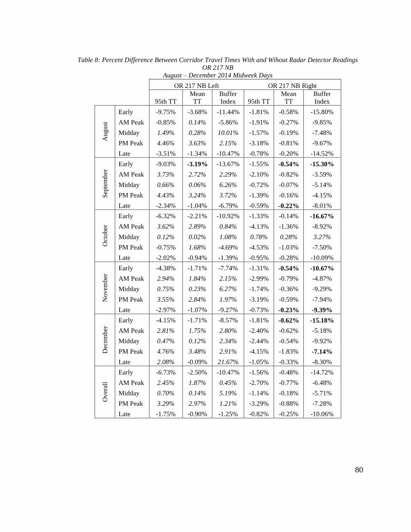
80
Table 8: Percent Difference Between Corridor Travel Times With and Wihout Radar Detector Readings
OR 217 NB
August – December 2014 Midweek Days
OR 217 NB Left OR 217 NB Right
95th TT
Mean
TT
Buffer
Index 95th TT
Mean
TT
Buffer
Index A
ug
ust
Early -9.75% -3.68% -11.44% -1.81% -0.58% -15.80%
AM Peak -0.85% 0.14% -5.86% -1.91% -0.27% -9.85%
Midday 1.49% 0.28% 10.01% -1.57% -0.19% -7.48%
PM Peak 4.46% 3.63% 2.15% -3.18% -0.81% -9.67%
Late -3.51% -1.34% -10.47% -0.78% -0.20% -14.52%
Sep
tem
ber
Early -9.03% -3.19% -13.67% -1.55% -0.54% -15.30%
AM Peak 3.73% 2.72% 2.29% -2.10% -0.82% -3.59%
Midday 0.66% 0.06% 6.26% -0.72% -0.07% -5.14%
PM Peak 4.43% 3.24% 3.72% -1.39% -0.16% -4.15%
Late -2.34% -1.04% -6.79% -0.59% -0.22% -8.01%
Oct
ob
er
Early -6.32% -2.21% -10.92% -1.33% -0.14% -16.67%
AM Peak 3.62% 2.89% 0.84% -4.13% -1.36% -8.92%
Midday 0.12% 0.02% 1.08% 0.78% 0.28% 3.27%
PM Peak -0.75% 1.68% -4.69% -4.53% -1.03% -7.50%
Late -2.02% -0.94% -1.39% -0.95% -0.28% -10.09%
No
vem
ber
Early -4.38% -1.71% -7.74% -1.31% -0.54% -10.67%
AM Peak 2.94% 1.84% 2.15% -2.99% -0.79% -4.87%
Midday 0.75% 0.23% 6.27% -1.74% -0.36% -9.29%
PM Peak 3.55% 2.84% 1.97% -3.19% -0.59% -7.94%
Late -2.97% -1.07% -9.27% -0.73% -0.23% -9.39%
Dec
emb
er
Early -4.15% -1.71% -8.57% -1.81% -0.62% -15.18%
AM Peak 2.81% 1.75% 2.80% -2.40% -0.62% -5.18%
Midday 0.47% 0.12% 2.34% -2.44% -0.54% -9.92%
PM Peak 4.76% 3.48% 2.91% -4.15% -1.83% -7.14%
Late 2.08% -0.09% 21.67% -1.05% -0.33% -8.30%
Ov
eral
l
Early -6.73% -2.50% -10.47% -1.56% -0.48% -14.72%
AM Peak 2.45% 1.87% 0.45% -2.70% -0.77% -6.48%
Midday 0.70% 0.14% 5.19% -1.14% -0.18% -5.71%
PM Peak 3.29% 2.97% 1.21% -3.29% -0.88% -7.28%
Late -1.75% -0.90% -1.25% -0.82% -0.25% -10.06%
81
Table 9: Percent Difference Between Corridor Travel Times With and Wihout Radar Detector Readings
OR 217 SB
August – December 2014 Midweek Days
OR 217 SB Left OR 217 SB Right
95th TT
Mean
TT BI 95th TT
Mean
TT BI A
ug
ust
Early -3.93% 0.14% -18.34% -0.07% 0.55% -11.05%
AM Peak -1.40% 0.37% -6.41% -4.76% -1.13% -11.67%
Midday -1.41% 0.53% -8.35% -6.82% -2.23% -15.33%
PM Peak -4.57% -1.30% -13.75% -9.36% -4.79% -16.62%
Late -1.15% 0.40% -15.27% 0.56% 0.81% -6.26%
Sep
tem
ber
Early -2.19% 0.81% -19.10% -0.15% 0.57% -11.70%
AM Peak -0.87% 0.35% -2.46% -5.84% -2.89% -5.63%
Midday 0.27% 0.80% -4.32% -1.76% 0.07% -9.88%
PM Peak -3.96% -1.38% -10.25% -10.49% -5.67% -16.55%
Late -1.25% 0.35% -11.81% 0.12% 0.70% -8.99%
Oct
ob
er
Early -3.30% 0.54% -20.12% -0.08% 0.54% -10.66%
AM Peak -2.21% 0.40% -7.78% -6.10% -2.28% -9.84%
Midday 0.08% 0.72% -3.07% -3.51% -0.72% -9.38%
PM Peak -2.95% -1.72% -3.17% -7.84% -5.30% -7.08%
Late -1.41% 0.23% -6.39% 1.36% 0.87% 2.44%
No
vem
ber
Early -3.10% 0.71% -21.38% -0.05% 0.57% -8.54%
AM Peak -1.57% 0.34% -3.71% -3.85% -1.18% -5.03%
Midday 0.79% 1.01% -0.22% -3.20% -0.45% -7.00%
PM Peak -1.96% -0.50% -4.09% -7.38% -4.12% -8.61%
Late -1.67% 0.24% -12.32% -0.07% 0.63% -8.44%
Dec
emb
er
Early -13.23% -6.99% -33.98% 1.20% -0.55% 39.09%
AM Peak -10.23% -5.95% -14.43% -11.90% -4.84% -18.85%
Midday -9.39% 0.75% -29.32% -7.28% 4.53% -26.09%
PM Peak -2.56% -6.14% 6.25% 4.08% -1.83% 10.65%
Late -20.02% -8.90% -61.50% -5.11% -2.78% -25.66%
Ov
eral
l
Early -5.15% -0.96% -22.59% 0.33% 0.19% 5.45%
AM Peak -3.26% -0.90% -6.96% -4.52% -1.55% -11.07%
Midday -1.93% 0.76% -9.06% -5.16% -0.22% -13.23%
PM Peak -3.20% -2.21% -5.00% -4.50% -2.69% -7.78%
Late -5.10% -1.54% -21.46% -3.93% -2.14% -11.32%

82
0
5
10
15
20
25
30
35
3:00
PM
3:30
PM
4:00
PM
4:30
PM
5:00
PM
5:30
PM
6:00
PM
6:30
PM
7:00
PM
Tra
vel
Tim
e (m
in)
0
5
10
15
20
25
3:00
PM
3:30
PM
4:00
PM
4:30
PM
5:00
PM
5:30
PM
6:00
PM
6:30
PM
7:00
PM
Tra
vel
Tim
e(m
in)
Travel Time with Radar Data
Travel Time without Radar Data
Figure 28: Comparison of Corridor Travel Times with and without Radar Detector Readings
OR 217 SB Right Lane
August 2014 Midweek Days
Figure 29: Comparison of Corridor Travel Times with and without Radar Detector Readings
OR 217 NB Right Lane
August 2014 Midweek Days

83
Overall, there is not a great difference between corridor-wide travel time metrics
computed with and without the radar detector data. What differences were found were for
the most part statistically insignificant, particularly during daylight hours. Thus, it was
reasoned that including the radar data when comparing the “before” and “after” traffic
data sets would not significantly affect the results. The results of this analysis suggest
that, had the radar data been available in 2012 as well, “before” values for average travel
times and buffer indices likely would have been between 0 and 5% lower than they were
computed to be. This is something to keep in mind while perusing the results presented in
Section 5.5.
5.2 Speed Variation
Speed harmonization has been one of the most commonly noted effects of VSL
systems in past evaluations (Kwon et al., 2007; Mirshahi et al., 2007) and was one of the
primary justifications for installing the system on OR 217. In order to assess what impact,
if any, the VSL system has had on the variability of measured speeds, the traffic data
from four detector stations was analyzed using the method described in Section 4.4.1, and
the results of that analysis are presented in this section by detector station.
5.2.1 Allen Boulevard and Denney Road Speed Variation
The Allen Boulevard detector stations along both the northbound and southbound
directions of OR 217, located at mileposts 2.16 and 2.55, respectively, experienced a
considerable reduction in speed variation during the evening peak hours. Table 10
presents the results of the speed variation analysis for these stations, broken down by
lane, month and daily segment. The “early” and “late” segments have been omitted from
84
this analysis because speed variability is much higher and more unpredictable when flows
are low and the VSL system is not likely to be operating very often during those times.
The “SD” values for each lane and segment are average 5-minute standard
deviations of speed for the specified month, and overall averages for both data sets are
shown at the bottom of the table. Instances in which “after” hourly standard deviations
were lower than “before” values are designated in italics, and instances in which they
were higher are highlighted. It can be seen that during the “AM Peak” and “PM Peak”
segments, there was a widespread reduction in variation across all four lanes and all five
months. For instance, overall speed variation during the PM peak fell by about 25% in
each northbound lane. On the other hand, overall speed variation tended to be greater
during midday hours. Welch’s t-tests were used to determine the significance of the
overall changes in speed variation, and the changes that were statistically significance at a
confidence level of 95% are indicated in bold. As shown, the decreases in speed variation
during the PM peak were statistically significant in all four lanes.
Figure 30 highlights the improvement in speed variation at the Allen Boulevard
northbound right lane detector in September 2014. The red and green bars represent
average hourly speed ranges over the course of the entire month for the “before” and
“after” periods, while the two lines trace average hourly standard deviations. For eleven
of the fourteen hours charted, the “before” speed range is clearly higher than the “after”
range, indicating more variability in speeds before the VSL system. During the AM and
PM peak hours, in particular, the “before” speed ranges are between 12% and 50%
greater than their accompanying “after” speed ranges.

85
The Denney Road detector stations, immediately south of the Allen Boulevard
stations at milepost 3.12 in the southbound direction and milepost 2.68 in the northbound
direction, experienced similar improvement in speed variation during peak demand hours.
As shown in Table 11, overall speed variability declined in all four lanes for both the AM
peak and PM peak. All of these declines were statistically significant except for the
reduction in the southbound right lane during the AM peak. Midday speed variability was
generally higher in the left lanes and slightly lower in the right lanes. Another trend
apparent from Table 11, as well as Table 10, is that the reduction in speed variability was
most dramatic in the two months immediately after the VSL system’s activation, August
and September, and then declined in magnitude over the following three months.
0
0.5
1
1.5
2
2.5
3
3.5
4
4.5
0
2
4
6
8
10
12
14
16
6:00
AM
7:00
AM
8:00
AM
9:00
AM
10:00
AM
11:00
AM
12:00
PM
1:00
PM
2:00
PM
3:00
PM
4:00
PM
5:00
PM
6:00
PM
7:00
PM
After DiffBefore DiffAfter SDBefore SD
Aver
age
Sp
eed
Ran
ge
(mp
h) S
tand
ardD
eviatio
n (m
ph
)
Figure 30: Average Hourly Speed Range and Standard Deviation Before and After VSL
OR 217 Allen NB Right Lane
September Midweek Days, 2012 (Before) & 2014 (After)
86
Table 10: Speed Variability Before and After VSL
OR 217 Allen NB & Allen SB
August – December Midweek Days, 2012 (Before) & 2014 (After)
Allen NB Allen SB
Before SD (mph) After SD (mph) Change (%) Before SD (mph) After SD (mph) Change (%)
Left Right Left Right Left Right Left Right Left Right Left Right
Au
gu
st AM Peak 3.78 3.30 2.11 2.04 -44.29 -38.11 5.11 3.24 3.94 2.81 -22.93 -13.54
Midday 1.95 1.76 2.03 1.77 4.16 0.43 2.29 2.29 2.38 2.37 3.61 3.32
PM Peak 3.38 3.17 1.89 1.83 -44.09 -42.29 3.94 3.63 2.38 2.34 -39.64 -35.60
Sep
tem
ber
AM Peak 3.66 3.43 2.50 2.30 -31.64 -32.87 3.83 3.40 3.20 2.82 -16.49 -17.24
Midday 2.07 1.84 2.03 1.62 -1.87 -11.80 1.85 1.76 2.19 2.04 18.67 16.29
PM Peak 3.09 2.95 1.88 1.83 -39.23 -38.07 3.86 3.43 3.31 3.27 -14.27 -4.76
Oct
ob
er
AM Peak 2.83 2.57 1.88 1.63 -33.59 -36.28 2.75 2.39 2.19 1.94 -20.55 -18.72
Midday 1.74 1.54 1.91 1.57 9.50 1.96 1.75 1.73 1.87 1.84 6.92 6.05
PM Peak 2.48 2.39 1.68 1.66 -32.22 -30.47 2.98 2.74 2.04 1.90 -31.48 -30.78
No
vem
ber
AM Peak 2.76 2.22 3.76 2.22 36.19 -0.13 3.29 2.48 3.79 2.81 15.20 13.22
Midday 1.82 1.62 2.27 1.74 25.25 7.57 1.94 1.93 2.58 2.27 33.22 17.33
PM Peak 2.30 2.14 2.23 1.67 -2.98 -22.21 3.13 3.00 2.74 2.46 -12.56 -18.18
Dec
emb
er
AM Peak 2.28 2.11 3.42 2.80 49.90 32.25 3.96 2.72 3.70 2.98 -6.56 9.37
Midday 1.89 1.74 2.23 1.72 17.80 -1.52 2.21 2.04 2.65 2.53 20.03 23.89
PM Peak 2.21 2.07 2.58 2.25 16.75 8.67 2.63 2.28 3.00 2.81 13.72 23.12
Ov
eral
l AM Peak 3.06 2.73 2.73 2.20 -10.76 -19.34 3.79 2.85 3.36 2.67 -11.23 -6.26
Midday 1.89 1.70 2.09 1.68 10.59 -0.97 2.01 1.95 2.33 2.21 16.29 13.22
PM Peak 2.69 2.54 2.05 1.85 -23.77 -27.43 3.31 3.02 2.69 2.55 -18.62 -15.36

87
Table 11: Speed Variability Before and After VSL
OR 217 Denney NB & Denney SB
August – December Midweek Days, 2012 (Before) & 2014 (After)
Denney NB Denney SB
Before SD (mph) After SD (mph) Change (%) Before SD (mph) After SD (mph) Change (%)
Left Right Left Right Left Right Left Right Left Right Left Right
Au
gu
st AM Peak 3.57 3.10 1.98 1.88 -44.40 -39.36 3.25 2.98 2.31 2.07 -28.94 -30.55
Midday 1.90 1.97 1.92 1.69 0.96 -14.16 1.96 2.01 1.95 1.80 -0.32 -10.33
PM Peak 3.25 3.13 1.68 1.57 -48.42 -49.76 3.07 2.83 1.74 1.60 -43.29 -43.55
Sep
tem
ber
AM Peak 3.27 3.04 2.20 2.13 -32.58 -30.06 3.40 2.87 3.04 2.44 -10.59 -14.83
Midday 1.65 1.61 2.04 1.59 23.52 -1.32 1.82 1.97 2.05 1.97 12.28 -0.33
PM Peak 2.88 2.74 1.89 1.70 -34.44 -38.00 2.62 2.39 2.08 2.07 -20.59 -13.14
Oct
ob
er
AM Peak 1.93 1.82 1.90 1.76 -1.47 -3.39 2.74 2.25 2.33 1.92 -14.94 -14.69
Midday 1.39 1.37 1.88 1.42 35.74 4.31 1.52 1.62 1.66 1.54 9.31 -4.59
PM Peak 1.34 1.41 1.45 1.39 8.03 -1.15 2.01 1.86 1.39 1.22 -30.81 -34.32
No
vem
ber
AM Peak 2.72 2.04 3.35 2.24 23.10 10.16 3.03 2.36 3.51 2.45 15.56 3.75
Midday 1.60 1.35 2.27 1.63 41.43 20.24 1.93 1.90 2.05 1.90 6.24 -0.02
PM Peak 1.68 1.47 1.81 1.44 7.71 -2.01 2.42 2.06 2.07 1.82 -14.37 -11.63
Dec
emb
er
AM Peak 3.93 3.08 3.30 2.59 -16.00 -15.91 3.79 2.83 3.63 2.74 -4.34 -3.25
Midday 2.00 1.64 2.10 1.55 4.95 -5.35 1.92 1.63 2.09 1.83 8.98 12.25
PM Peak 2.08 1.94 2.14 1.83 3.16 -5.48 2.18 1.86 2.49 2.09 14.01 12.18
Ov
eral
l AM Peak 3.08 2.62 2.55 2.12 -17.37 -18.96 3.24 2.66 2.96 2.33 -8.64 -12.56
Midday 1.71 1.59 2.04 1.58 19.50 -0.70 1.83 1.83 1.96 1.81 7.12 -0.98
PM Peak 2.25 2.14 1.80 1.59 -20.15 -25.72 2.46 2.20 1.95 1.76 -20.55 -19.97

88
5.2.2 Scholls Ferry and Greenburg Speed Variation
The Scholls Ferry and Greenburg detector stations, further south at mileposts 4.35
and 5.11 in the southbound direction and mileposts 3.85 and 4.65 in the northbound
direction, did not experience the same decrease in speed variation as the two stations
further north. As shown in Table 12 and Table 13, both stations actually had statistically
significant increases in speed variation in all four lanes and during all three daily
segments after VSL implementation. The only insignificant increase was in the
southbound left lane during the AM peak, though speed variation was still 6% higher
during that time. Unlike the two previous detector stations, there does not appear to be
distinct difference between speed variation differences in the first two months after VSL
implementation and the following three. Figure 31, in contrast to Figure 30, shows the
average hourly speed ranges and standard deviations using the same month of data for the
northbound right lane detector at the Scholls Ferry station. The “after” speed ranges are
noticeably higher than the “before” speed ranges for all hours, as are the standard
deviations.

89
Table 12: Speed Variability Before and After VSL
OR 217 Scholls Ferry NB & Scholls Ferry SB
August – December Midweek Days, 2012 (Before) & 2014 (After)
Scholls Ferry NB Scholls Ferry SB
Before SD (mph) After SD (mph) Change (%) Before SD (mph) After SD (mph) Change (%)
Left Right Left Right Left Right Left Right Left Right Left Right
Au
gu
st AM Peak 2.03 1.79 2.93 2.19 44.04 22.77 2.35 1.93 2.65 2.36 12.96 21.94
Midday 1.86 1.44 2.89 1.82 55.57 26.36 1.66 1.39 2.00 1.78 20.84 27.51
PM Peak 2.33 2.45 2.74 2.62 17.89 6.78 1.26 1.25 2.12 2.05 68.60 63.86
Sep
tem
ber
AM Peak 2.01 1.81 3.01 2.53 49.40 39.55 2.30 1.81 2.96 2.77 28.70 53.49
Midday 1.63 1.14 3.04 1.79 86.43 56.86 1.35 0.98 2.24 1.75 66.20 78.64
PM Peak 2.15 1.96 3.20 3.11 48.84 58.40 1.07 1.16 2.34 2.34 118.33 101.92
Oct
ob
er
AM Peak 1.85 1.64 2.40 1.97 30.18 20.27 2.10 1.85 2.05 1.80 -2.24 -2.43
Midday 1.41 1.03 2.71 1.60 91.74 55.66 1.48 0.99 1.87 1.52 26.25 53.89
PM Peak 1.86 1.69 2.00 1.85 7.29 9.43 1.18 1.22 1.68 1.68 42.85 38.21
No
vem
ber
AM Peak 2.80 2.25 4.19 2.84 49.86 26.32 2.72 2.08 3.77 2.89 38.42 39.02
Midday 2.04 1.31 3.32 1.85 62.94 41.13 1.74 1.24 2.28 1.76 31.10 41.36
PM Peak 2.36 2.37 3.05 2.48 29.22 4.51 1.86 1.58 2.81 2.26 51.18 43.37
Dec
emb
er
AM Peak 3.29 2.73 4.01 3.16 21.57 15.68 3.50 2.45 4.04 3.18 15.53 29.62
Midday 2.19 1.50 2.88 1.90 31.29 26.38 1.78 1.31 2.05 1.67 15.12 27.21
PM Peak 2.09 1.95 3.09 2.90 47.45 48.73 2.27 1.82 3.34 2.69 46.91 48.32
Ov
eral
l AM Peak 2.40 2.04 3.31 2.54 37.98 24.23 2.59 2.02 3.10 2.60 19.32 28.50
Midday 1.83 1.28 2.97 1.79 62.48 39.49 1.60 1.18 2.09 1.70 30.45 43.22
PM Peak 2.16 2.09 2.82 2.59 30.44 24.25 1.53 1.40 2.46 2.21 60.94 57.05

90
Table 13: Speed Variability Before and After VSL
OR 217 Greenburg NB & Greenburg SB
August – December Midweek Days, 2012 (Before) & 2014 (After)
Greenburg NB Greenburg SB
Before SD (mph) After SD (mph) Change (%) Before SD (mph) After SD (mph) Change (%)
Left Right Left Right Left Right Left Right Left Right Left Right
Au
gu
st AM Peak 2.49 2.11 2.80 2.23 12.45 5.60 2.22 1.80 2.14 1.97 -3.56 9.64
Midday 1.72 1.51 2.36 1.94 37.03 28.34 1.91 1.60 2.16 2.04 13.39 27.27
PM Peak 2.56 2.25 2.58 2.17 0.87 -3.60 1.87 1.97 2.18 2.29 16.48 16.19
Sep
tem
ber
AM Peak 2.03 1.50 3.85 3.28 89.25 119.11 1.99 1.36 2.08 1.88 4.67 37.94
Midday 1.35 1.26 3.27 2.79 142.55 121.46 1.63 1.25 2.20 1.99 35.16 58.92
PM Peak 1.75 1.64 3.96 3.32 126.62 102.27 1.43 1.60 2.33 2.24 62.90 40.38
Oct
ob
er
AM Peak 2.19 1.66 2.33 1.81 5.94 9.63 1.96 1.75 1.77 1.43 -10.05 -18.17
Midday 1.32 1.30 1.99 1.60 50.75 23.21 1.56 1.23 1.94 1.83 24.61 49.41
PM Peak 1.76 1.50 1.83 1.51 4.44 0.58 1.30 1.43 1.74 1.78 33.75 24.57
No
vem
ber
AM Peak 2.86 2.16 3.95 2.72 38.37 25.76 2.72 1.77 3.56 2.32 30.74 30.71
Midday 1.82 1.38 2.67 1.75 47.09 26.52 1.78 1.40 2.36 1.96 32.84 40.01
PM Peak 2.84 2.18 2.43 1.83 -14.58 -15.89 1.95 1.72 2.52 2.01 28.79 16.39
Dec
emb
er
AM Peak 3.31 2.44 3.76 2.91 13.59 19.05 3.17 2.15 3.24 2.49 2.22 15.65
Midday 1.99 1.47 2.57 1.91 28.66 30.04 1.78 1.31 2.31 2.09 29.90 60.06
PM Peak 2.26 1.84 3.31 2.63 46.56 42.61 2.10 1.57 3.33 2.72 58.18 73.49
Ov
eral
l AM Peak 2.58 1.97 3.34 2.59 29.49 31.24 2.41 1.77 2.56 2.02 6.01 14.17
Midday 1.64 1.38 2.57 2.00 56.78 44.35 1.73 1.36 2.19 1.98 26.90 46.04
PM Peak 2.23 1.88 2.82 2.29 26.41 21.72 1.73 1.66 2.42 2.21 39.66 33.17

91
5.2.3 Discussion
The conclusion most apparent from the speed variation analysis results is that they
lack consistency. The two stations located further north on the corridor, at Allen
Boulevard and Denney Road, had significantly less peak hour speed variability after VSL
implementation, while the two stations further south, at Scholls Ferry and Greenburg
Road, had significantly more. Two likely reasons exist for why the speed variation
improvements discovered at the northern stations were not replicated at the southern
stations. One reason is simply the alignment of OR 217, and the other has to do with how
much speed variability was present at each station prior to VSL implementation.
As shown in Figure 4, the OR 217 intersections with Allen and Denney are both
located along the long straight portion of the corridor, while the intersections with Scholls
Ferry and Greenburg occur near a major horizontal curve in the freeway. Although, as
0
0.5
1
1.5
2
2.5
3
3.5
4
0
2
4
6
8
10
12
14
6:00
AM
7:00
AM
8:00
AM
9:00
AM
10:00
AM
11:00
AM
12:00
PM
1:00
PM
2:00
PM
3:00
PM
4:00
PM
5:00
PM
6:00
PM
7:00
PM
After DiffBefore DiffAfter SDBefore SD
Aver
age
Sp
eed
Ran
ge
Stan
dard
Dev
iation
Figure 31: Average Hourly Speed Range and Standard Deviation Before and After VSL
OR 217 Scholls Ferry NB Right Lane
September Midweek Days, 2012 (Before) & 2014 (After)

92
shown in Figure 20 and Figure 21, VSL signs are located in close proximity to all four of
these stations, it is possible that drivers are paying less attention to those nearest to this
horizontal curve since traversing a curve requires more attention than driving straight. If
this is indeed the case, it would help explain why the VSL system is not improving
performance as much near the curve, though it does not explain why speed variation has
actually increased at Scholls Ferry and Greenburg. Additionally, the curve cuts through
the busy Washington Square shopping center, while the Allen and Denney intersections
are in more residential and vegetated areas of the corridor, so there is more to distract
driver attentions away from the VSL signs at that location.
Another possible reason why the improvement at Allen and Denney does not
extend further south is that speed variation at these two stations was significantly higher
than at Scholls Ferry and Greenburg prior to VSL implementation. By comparing the
overall “Before VSL” standard deviations from Table 10 and Table 11 with those in
Table 12 and Table 13, it can be seen that, during the AM peak and PM peak, speed
variations in each lane at the Allen and Denney stations were greater than their
equivalents at the Scholls Ferry and Greenburg stations. For instance, the overall standard
deviations for the northbound left lane detectors at Denney and Allen were 3.08 mph and
3.06 mph, respectively, while the overall standard deviations for the same detectors at
Scholls Ferry and Greenburg were 2.4 mph and 2.58 mph respectively, roughly 15 to
20% smaller. Simply put, the Allen and Denney stations had more room for
improvement. Again, this not help to explain why speed variation is significantly higher
at Greenburg and Scholls Ferry than it was prior to the VSL system.

93
For the two stations that did show a reduction in speed variability after VSL
implementation, another trend apparent from the data is that this reduction gradually
dissipated after the system had been operating for a few months. In Table 10 and Table
11, it can be seen that the percentage reductions in speed standard deviations were
greatest in August 2014 relative to August 2012, while standard deviations were
generally higher in December 2014 relative to December 2012. Widespread improvement
was still apparent in September 2014 and October 2014, and the results were mixed for
November 2014. This trend suggests that, during the first few months of operation,
drivers were taking notice of the VSL system and adjusting their speeds accordingly.
Over time, however, this initial response to the system appears to have waned and drivers
have returned to their pre-VSL behavior. Another likely factor in the difference between
the results from August through September and those from October through December is
a change in the corridor’s automated ramp metering system that occurred between the
two periods. The system, which is supposed to operate based on a real-time optimization
algorithm, malfunctioned in September 2014 and was forced to work on a fixed-rate basis
for the remainder of 2014. This, in effect, increased the rate of vehicles allowed on to OR
217 from entrance ramps, particularly during peak hours, likely negating many of the
operational benefits from the VSL system. The results for Allen and Denney clearly
suggest that the performance of OR 217 benefits the most when the VSL system and
SWARM system are functioning properly in conjunction with one another.
The inconsistent nature of the speed variation analysis reflects the contradictory
results that have come from other VSL evaluations. Kwon et al. discovered that a work-

94
zone VSL system along I-494 in Minneapolis reduced maximum speed differences by 25-
35% compared to pre-VSL levels (Kwon et al., 2007), which aligns well with what was
found in this study at the Denney and Allen detector stations and is shown in Figure 30.
Edara et al., on the other hand, found that a work-zone VSL system along I-270 in
Missouri increased speed standard deviations by 4.4 mph (Edara et al., 2013), which is
more in agreement with the results for the Scholls Ferry and Greenburg detector stations
in this study. One of the possible reasons given in the I-270 evaluation for the increase in
variability was the advisory nature of that VSL system. Given that they cannot be
penalized for ignoring the lower advisory speeds, some drivers may feel comfortable with
ignoring them altogether while others try to adhere to them. Such variation in how people
react to advisory speeds could certainly increase overall speed variability, and since the
OR 217 system is also advisory, this reasoning may be applicable there as well.
5.3 Crash & Incident Frequency and Distribution
Improving freeway operations and efficiency are major goals of the OR 217 VSL
system, but enhancing safety is perhaps the most important. Section 3.2 showed that the
corridor exhibited notable safety challenges. The hope with the VSL system is that, by
making traffic move in a more uniform and homogeneous manner, primary and
secondary crashes will become less frequent and the freeway will begin to exhibit
improved safety performance. Traffic safety trends can take several years or more to take
hold and become distinguishable, so five months of “after” data is not enough to
definitively assess the system’s impacts on safety. However, the incident data currently
available can provide useful preliminary insight into safety trends that may or may not

95
take hold over time. In this section, the results from comparing the “before” and “after”
incident data, as described in Section 4.4.2, are presented and discussed.
5.3.1 Incident Trees
Incident trees are a useful visual tool for showing the distribution of reported
incidents among different types and categories. Table 14 and Table 15 present incident
trees for the “before” and “after” incident data sets. Table 14 represents incidents
reported in the TOCS database from August 2012 through December 2012 and August
2013 through December 2013, and Table 15 represents incidents reported from July 22,
2014 through December 2014. Only incidents from August through December were
included in the “before” tree to make the two trees more comparable, since the
frequencies of different incident types vary by time of year. As shown in the next section,
incidents, particularly crashes, are not evenly distributed throughout the year. The values
in these tables represent the frequency of incidents reported during each period
corresponding to each subtype used by ODOT, both as total numbers and a percentage of
the overall total. As shown, the incident subtypes have been grouped into larger
categories based on their characteristics and potential to cause delay. One thing to keep in
mind is that, as indicated, these numbers only represent reported incidents and not all
incidents, since some incidents are never reported.
Table 14 has a much higher incident total than Table 15, but this is merely
because it covers ten months of data while Table 15 only covers about five months. There
was an average of 60.8 incidents per month during the “before” period. The 298 reported
incidents during the five month “after” period translates to 59.6 per month, very close to
96
the “before” incident rate. The portion of incidents classified as crashes was 29.61%
during the “before” period and 30.54% during the “after” period, again very close. The
only substantial difference in the categorical breakdown of incidents between the two
periods was for breakdowns such as abandoned and disabled vehicles. 28.29% of
incidents during the before period were breakdowns, while the percentage rose to 39.26%
during the “after” period, mostly due to an increase in the number of disabled vehicles.
Reasons for this are unclear, but it is unlikely to be related to the VSL system. Overall,
the system does not appear to have affected the overall frequency of incidents or the
relative frequency of crashes much so far.

97
Table 14: OR 217 Incident Tree
August-December 2012 & August-December 2013
Crashes
Crash 180 29.61%
SUBTOTAL 180 29.61%
Reported
Breakdowns
Total = 608 Abandoned Vehicle (Hazard) 3 0.49%
Abandoned Vehicle (Non-Hazard) 30 4.93%
Disabled Vehicle (Hazard) 33 5.43%
Disabled Vehicle (Non-Hazard) 99 16.28%
Vehicle Fire 7 1.15%
SUBTOTAL 172 28.29%
Hazards/Blocking
Animal Struck (Hazard) 2 0.33%
Damaged ODOT Property 4 0.66%
All Incidents Fencing 0 0.00%
Hazardous Debris 76 12.5%
Hazard Tow 2 0.33%
Road Construction 10 1.64%
Road Maintenance 114 18.75%
Obstruction on Roadway 4 0.66%
Pedestrians In Roadway 1 0.16%
Wrong-way Driver 1 0.16%
SUBTOTAL 214 35.20%
Unreported
Potential Delay
Incidents Animal Struck (Non-Hazard) 2 0.33%
Unknown Hazmat Spill 3 0.49%
High Water 12 1.97%
Non-Hazardous Debris 4 0.66%
Pothole 2 0.33%
SUBTOTAL 23 3.78%
Response/No Delay
Agency Assist 1 0.16%
Crash Investigation 0 0.00%
Medical Emergency 1 0.16%
SUBTOTAL 2 0.33%
Misc./No Delay
Herbicide Application 5 0.82%
Other 12 1.97%
SUBTOTAL 17 2.80%
TOTAL 608 100.00%

98
Table 15: OR 217 Incident Tree
August - December 2014
Crashes
Crash 91 30.54%
SUBTOTAL 91 30.54%
Reported
Breakdowns
Total = 298 Abandoned Vehicle (Hazard) 1 0.34%
Abandoned Vehicle (Non-Hazard) 27 9.06%
Disabled Vehicle (Hazard) 30 10.07%
Disabled Vehicle (Non-Hazard) 57 19.13%
Vehicle Fire 2 0.67%
SUBTOTAL 117 39.26%
Hazards/Blocking
Animal Struck (Hazard) 0 0.00%
Damaged ODOT Property 1 0.34%
All Incidents Fencing 0 0.00%
Hazardous Debris 37 12.42%
Hazard Tow 1 0.34%
Road Construction 0 0.00%
Road Maintenance 23 7.72%
Obstruction on Roadway 5 1.68%
Pedestrians In Roadway 1 0.34%
Wrong-way Driver 0 0.00%
Unreported SUBTOTAL 68 22.82%
Incidents
Potential Delay
Unknown Animal Struck (Non-Hazard) 3 1.01%
Hazmat Spill 0 0.00%
High Water 3 1.01%
Non-Hazardous Debris 1 0.34%
Pothole 0 0.00%
SUBTOTAL 7 2.35%
Response/No Delay
Agency Assist 0 0.00%
Crash Investigation 0 0.00%
Medical Emergency 2 0.67%
SUBTOTAL 2 0.67%
Misc./No Delay
Herbicide Application 6 2.01%
Other 7 2.35%
SUBTOTAL 13 4.36%
TOTAL 298 100.00%

99
5.3.2 Crash Frequency
Although the previous section showed that the sheer number of crashes and
relative frequency of crashes among all incidents has not changed much since VSL
implementation, it did not take into account any accompanying changes to demand. The
TOCS database only includes crashes responded to by ODOT. The statewide reported
crash database includes other crashes, but since that data is not available for the “after”
period, only crashes in the TOCS database for both periods were considered in this
analysis to ensure compatible data sets. Since a greater number of vehicles on the
roadway is generally associated with a greater likelihood of crashes, crash rates are often
presented as a function of VMT. To show more clearly how the OR 217 crash rate has
changed since VSL implementation, crash rates per million VMT before and after were
computed using the method described in Section 4.4.2.
Table 16 presents the total number of crashes, estimated VMT through the
Greenburg detector stations, and crash rates per million VMT for August 2012 through
December 2012 (before VSL) and August 2014 through December 2014 (after VSL).
There were ten more crashes during the “after” period, and total estimated VMT was just
0.76% greater. Because of this, the overall crash rate per million VMT increased 12.47%
from 6.41 to 7.21. The crash rate increased dramatically during August and September
2014 compared to the same months in 2012, while it declined significantly in December
2014 compared to December 2012. The data in this table suggests that the VSL system
has not brought significant safety improvements to OR 217. However, as mentioned

100
previously, this is only five months’ worth of data, and it will take more time than that for
any significant safety trends to take hold.
Table 16: OR 217 Crash Rates Before and After VSL
August – December 2012 (Before) & 2014 (After)
Before VSL (Aug-Dec 2012) After VSL (Aug-Dec 2014)
Crashes
Estimated VMT
(millions)
Crash
Rate Crashes
Estimated VMT
(millions)
Crash
Rate
Change
(%)
August 7 2.566 2.73 10 2.469 4.05 48.46
September 7 2.356 2.97 16 2.373 6.74 126.94
October 21 2.338 8.98 22 2.359 9.33 3.85
November 21 2.236 9.39 26 2.226 11.68 24.39
December 19 2.207 8.61 11 2.367 4.65 -46.01
Overall 75 11.704 6.41 85 11.793 7.21 12.47
5.3.3 Crash Distribution
In the previous section, it was shown that the crash rate along OR 217 was
actually higher in the final five months of 2014, after VSL implementation, than it was in
the final five months of 2012. While the TOCS incident data does not provide a lot of
detail about each crash, two additional data fields relating to the distribution of the
crashes are of interest to this study. Crash mileposts and dates can provide insight into the
distribution of incidents across time and along the length of the corridor, and each is
subjected to further analysis in this section.
Figure 32 shows the relative frequency of crashes along OR 217 at each tenth of a
mile as a percentage of all of the crashes reported. The red bars represent the relative
frequencies for the “before” period of July 2012 through June 2014 and the green bars
represent the relative frequencies for the “after” period of July 22, 2014 through
December 2014. A schematic of northbound OR 217 is provided to the left to show the

101
locations of ramps and the VSL signs, indicated in red. For both periods, the most
common crash location by far is the northern end of OR 217 where it intersects with US
26. After that, crashes tend to be clustered near VSL signs, helping to explain how the
sign locations were chosen. For the most part, relative frequencies at crash “hot spots”
near VSL signs decreased after VSL implementation. Table 17 shows relative crash
frequencies before and after for the six mileposts nearest to northbound VSL signs, and
four of them experienced a decrease in the relative frequency of crashes ranging from 9%
to 35%. This suggests that the VSL signs may be making drivers more aware of traffic
conditions, thereby causing them to drive safer when near them.
Table 17: Relative Crash Frequencies near OR 217 VSL Signs Before and After Activation
July 2012 – June 2014 (Before) & July 22,2014 – December 2014 (After)
Milepost Before Crash Frequency After Crash Frequency Change
0.9 8.50% 7.69% -9.53%
1.5 8.08% 8.79% 8.79%
4.3 4.04% 5.49% 35.89%
4.9 9.43% 7.69% -18.45%
5.9 8.42% 5.49% -34.80%
6.7 3.70% 3.30% -10.81%
In addition to the distribution of crashes along the length of OR 217, the temporal
distribution of crashes, with regards to both time of day and time of year, are of interest
and can be analyzed using the TOCS database. Figure 33 and Figure 34 show the
distribution of reported crashes by time of day for the “before” and “after” periods,
respectively, and Figure 35 and Figure 36 show the distribution by month. The crash
totals in Figure 33 and Figure 35 are obviously much higher since they cover a longer
time period, but relative differences between different times of day and months can still
be compared.
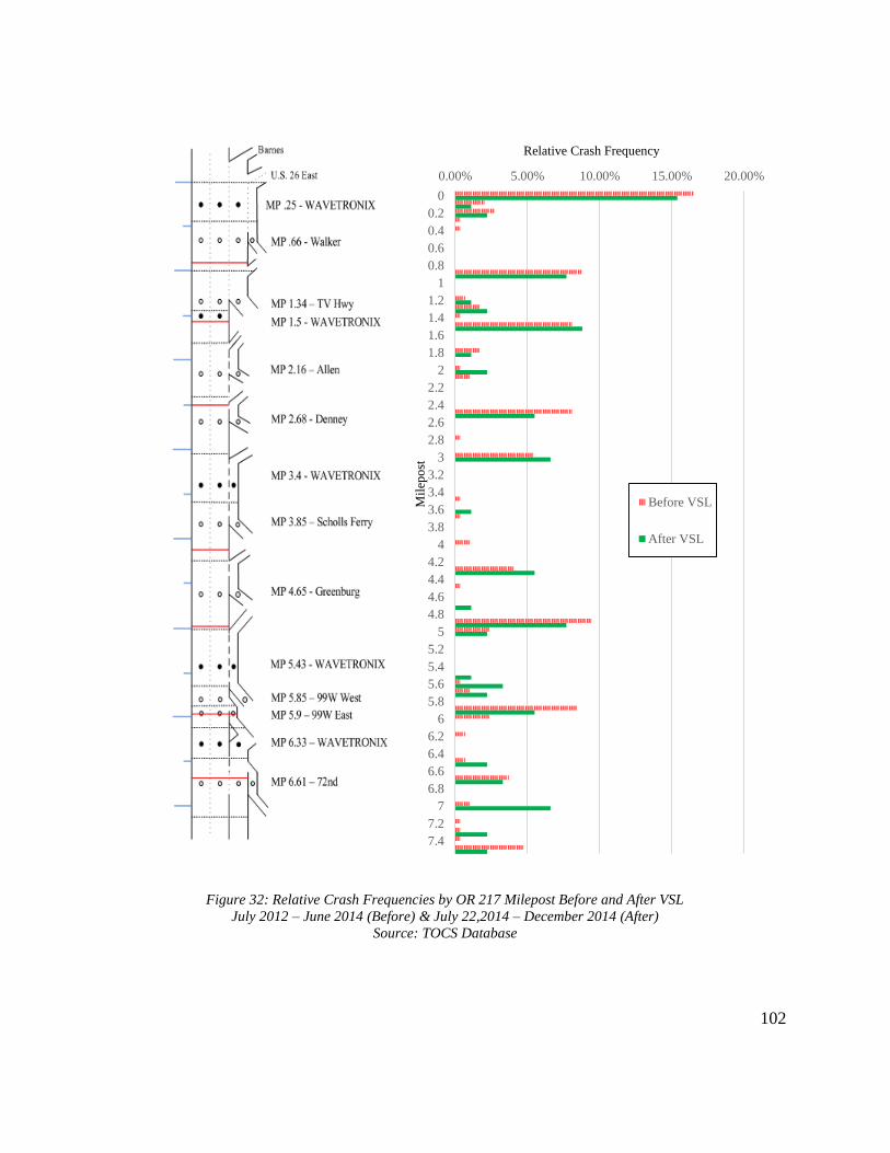
102
0.00% 5.00% 10.00% 15.00% 20.00%
0
0.2
0.4
0.6
0.8
1
1.2
1.4
1.6
1.8
2
2.2
2.4
2.6
2.8
3
3.2
3.4
3.6
3.8
4
4.2
4.4
4.6
4.8
5
5.2
5.4
5.6
5.8
6
6.2
6.4
6.6
6.8
7
7.2
7.4
Before VSL
After VSL
Relative Crash Frequency
Mil
epo
st
Figure 32: Relative Crash Frequencies by OR 217 Milepost Before and After VSL
July 2012 – June 2014 (Before) & July 22,2014 – December 2014 (After)
Source: TOCS Database

103
0.00% 10.00% 20.00% 30.00% 40.00%
August
September
October
November
December
Percentage of Crashes
Figure 33: OR 217 Crashes by Time of Day
July 2012 - June 2014
Source: TOCS Database
Figure 34: OR 217 Crashes by Time of Day
July 22, 2014 - December 2014
Source: TOCS Database
Figure 36: OR 217 Crashes by Month
July 22, 2014 - December 2014
Source: TOCS Database
Figure 35: OR 217 Crashes by Month
August – December 2012 & 2013
Source: TOCS Database
0.00% 5.00% 10.00% 15.00%
12:00 AM
2:00 AM
4:00 AM
6:00 AM
8:00 AM
10:00 AM
12:00 PM
2:00 PM
4:00 PM
6:00 PM
8:00 PM
10:00 PM
Percentage of Crashes
0.00% 5.00% 10.00% 15.00%
12:00 AM
2:00 AM
4:00 AM
6:00 AM
8:00 AM
10:00 AM
12:00 PM
2:00 PM
4:00 PM
6:00 PM
8:00 PM
10:00 PM
Percentage of Crashes
0.00% 10.00% 20.00% 30.00% 40.00%
August
September
October
November
December
Percentage of Crashes
n = 84 n = 371
n = 167 n = 84
104
In Figure 33 and Figure 34, clear peaks in reported crashes are evident during
both the morning and evening commutes. It makes sense that crashes would be more
common during times of heavy demand, since adding more vehicles to the corridor
increases the likelihood of a collision between them. Since the congestion-responsive
component of the VSL system is most likely to be operating during demand peaks, crash
rates during these times are the most likely to be effected if the system impacts safety.
During the “before” period, about 25% of the reported crashes occurred between 6:00
AM and 10:00 AM, and another 33% occurred between 3:00 PM and 7:00 PM. During
the “after” period, the relative proportion of crashes during the AM peak dropped to 19%
while remaining at 33% during the PM peak. While not enough to definitely assign cause
and effect, these statistics suggest that the VSL system may be helping to reduce crash
risk during the morning commute. The evening peak, during which OR 217 tends to have
more widespread and long-lasting congestion, has not yet experienced the same
improvement in safety.
In Figure 35 and Figure 36, October and November stick out as the months with
the most reported crashes, and December also tends to have more crashes than most other
months. These three months are generally the wettest of the year in the Portland area, so
the uptick in crashes during them is likely associated with an increased frequency of
adverse weather conditions. Since the VSL system also has a weather-responsive
component, this is another safety trend with strong potential to be addressed by the
system. During the “before” period, the 87 crashes reported during October and
November represented a 102% increase from the 43 crashes reported during August and

105
September. During the “after” period, the 48 crashes reported during October and
November was only an 85% increase from the 26 crashes during August and September.
Part of this may be due to the relatively mild and dry conditions in the region during the
final three months of 2014 compared to historical averages, but may also be an indication
that the VSL system is improving driver awareness during adverse weather. A full year’s
worth of “after” TOCS data plus later statewide reported crash data will allow for a more
robust analysis of the monthly distribution of crashes since VSL implementation.
5.3.4 Discussion
More time is needed to truly assess the impacts of the OR 217 VSL system on
corridor safety, but some preliminary changes are apparent from just five months of
“after” data. The frequency of crashes relative to other types of reported incidents has not
changed much since VSL implementation, but the distribution of those crashes through
space and time has shifted. Many of the VSL signs were strategically located near “hot
spots” along OR 217 where crashes are most common, and the frequency of crashes near
these signs relative to other locations along the corridor has largely declined since the
system began to operate. The relative frequency of crashes during the morning commute
and during the wettest months of the year also appear to have declined.
The decrease in the relative frequency of crashes during October and November
aligns well with the findings several past studies showing a reduction in the risk of
crashes during adverse weather with VSL systems in place. Rama and Schirokoff found
that a VSL system in Finland had reduced the wintertime crash rate by 13% (Rama &
Schirokoff, 2004). Most evaluations of congestion-responsive systems have focused
106
solely on freeway operations and performance, so there is little previous work relating to
congestive-responsive systems and safety with which to compare this study’s findings.
This section has shown that there have been some promising developments
relating to the safety of OR 217 since VSL implementation. However, five months of
“after” incident data is not enough to determine whether these changes will be sustained
over time or are merely short-term fluctuations. Sometime in the fall of 2015, ODOT will
release more detailed and substantive 2014 crash data from its reported crash database,
similar in structure to that presented in Section 3.2. With this data, a more thorough
analysis of crash types and severities since VSL implementation will be possible. Then,
in a few years, once the system has been in operation for a significant period of time,
analyzing its long-term safety impacts will begin to be possible.
5.4 Adjacent Lane Flow & Speed Distribution
As discussed in Section 3.4, one of the efficiency issues associated with OR 217
is the uneven distribution of speeds and flows across adjacent lanes. As is to be expected,
speeds are consistently higher in the left lanes, while flow is generally, but not always,
greater in the right lanes. The frequent significant discrepancies in lane speed and flow
act as an incentive for drivers to make unnecessary lane changes, which does not help
freeway performance and safety. Also, having many more vehicles in one lane reduces
the overall capacity of the freeway, since that means the other lane is being underutilized.
As shown in Table 2, it was hypothesized that the VSL system would help to limit such
discrepancies by bringing the entire traffic stream down to a uniform lower speed during
congestion. To test this hypothesis, the method described in Section 4.4.3 was carried out

107
using data from three two-lane detector stations in each direction, and this section
presents the results from doing so.
5.4.1 Greenburg Road Lane Flow & Speed Distribution
Table 18 presents the speed ratio and flow ratio values, computed as left lane
values divided by right lane values, before and after VSL implementation for the
Greenburg Road northbound and southbound detector stations as well as the percent
difference between the “before” and “after” values. The ratios are divided by month and
daily segment, with overall values at the bottom. Values in bold highlight changes that
were statistically significant at a confidence level of 95% and italicized values indicate
changes that brought the ratios closer to a value of one. A speed ratio or flow ratio
moving closer to one was taken as a positive change since it means the adjacent lanes
were used more equally after VSL implementation.
Of the 30 percentages computed for each direction, 14 were significant for OR
217 NB and 22 were significant for OR 217 SB, suggesting that, overall, there has been a
significant change in lane utilization since VSL implementation. In the northbound
direction, overall speed ratios and flow ratios both moved closer to one for all three daily
segments. For the southbound direction, overall speed ratios actually increased, but flow
ratios still declined for the AM peak and midday segments. These numbers indicate that,
particularly in terms of flow, the left lane and right lane for both directions of OR 217 at
this station are being utilized more equally since VSL implementation. The changes in
flow ratio were greater in magnitude for the AM peak and PM peak segments than for the
108
midday segments, indicating lane utilization has been most impacted during the most
congested times.
Although many of the changes in flow ratio and speed ratio at the Greenburg
detectors were statistically significant, the small magnitude of them means they did not
have much of an impact on overall flow. Moving from a flow ratio of 1.08 to 1.06 during
the AM peak, as shown for Greenburg NB, when total flows are generally about 3,000
vph, is roughly equivalent to moving just 15 vehicles from the left lane to the right lane in
one hour. Figure 37 and Figure 38 show the relatively minor overall impact of the
September flow ratio improvements at the Greenburg NB station. In Figure 37, it can be
seen that although the change in flow ratio for all three daily segments in September was
statistically significant, the trends in 5-minute average flow ratio for the “before” and
“after” periods are remarkably similar. Figure 38 shows that, for September PM peak
hours, when the flow ratio was 2.08% closer to one following VSL implementation, the
trend in average difference between left and right lane speeds after VSL, in green, is not
noticeably closer to zero than the “before” trend in red. However, the average flow
difference between the “after” left and right lanes for this time period, 57 vph, is 22%
smaller than the average “before” gap of 73 vph, so some improvement is still present.

109
Table 18: Lane Speed & Flow Distribution Before and After VSL
OR 217 Greenburg NB & Greenburg SB
August – December Midweek Days, 2012 (Before) & 2014 (After)
Greenburg NB Greenburg SB
Speed Ratio (L/R) Flow Ratio (L/R) Speed Ratio (L/R) Flow Ratio (L/R)
Before After Change Before After Change Before After Change Before After Change
Au
gu
st AM Peak 1.07 1.05 -2.30% 1.10 1.07 -2.76% 1.09 1.13 3.34% 0.92 0.96 4.93%
Midday 1.08 1.08 -0.35% 0.83 0.83 0.24% 1.10 1.15 4.22% 0.78 0.80 2.80%
PM Peak 1.07 1.05 -2.00% 0.98 1.00 1.96% 1.12 1.14 1.69% 0.97 0.94 -2.66%
Sep
tem
ber
AM Peak 1.05 1.01 -3.19% 1.09 1.06 -2.05% 1.08 1.12 3.64% 0.94 0.98 4.95%
Midday 1.09 1.08 -0.81% 0.79 0.81 2.47% 1.10 1.14 3.94% 0.75 0.75 0.17%
PM Peak 1.06 1.06 0.00% 0.97 0.99 2.08% 1.11 1.13 2.36% 0.96 0.96 0.07%
Oct
ob
er
AM Peak 1.04 0.98 -6.52% 1.08 1.09 0.51% 1.11 1.07 -3.27% 0.97 0.98 1.40%
Midday 1.11 1.09 -1.84% 0.81 0.82 1.01% 1.10 1.15 4.43% 0.74 0.76 2.97%
PM Peak 1.07 1.07 0.01% 0.99 0.99 0.16% 1.11 1.14 2.47% 0.97 0.97 -0.02%
No
vem
ber
AM Peak 1.03 0.99 -3.95% 1.07 1.03 -4.48% 1.08 1.09 0.62% 0.95 0.92 -3.13%
Midday 1.08 1.06 -2.06% 0.80 0.79 -1.54% 1.10 1.14 3.83% 0.75 0.76 1.27%
PM Peak 1.05 1.07 1.45% 0.98 0.98 -0.35% 1.10 1.14 3.07% 0.96 0.93 -3.04%
Dec
emb
er
AM Peak 1.01 1.02 0.44% 1.04 1.03 -0.92% 1.07 1.08 1.18% 0.93 0.93 -0.05%
Midday 1.08 1.06 -1.80% 0.83 0.82 -1.35% 1.10 1.15 3.97% 0.78 0.78 0.10%
PM Peak 1.07 1.06 -1.33% 0.97 0.97 0.02% 1.10 1.12 1.89% 0.97 0.93 -4.30%
Ov
eral
l AM Peak 1.04 1.01 -3.10% 1.08 1.06 -1.95% 1.09 1.10 1.10% 0.94 0.95 1.57%
Midday 1.09 1.07 -1.37% 0.81 0.81 0.16% 1.10 1.15 4.08% 0.76 0.77 1.45%
PM Peak 1.07 1.06 -0.37% 0.98 0.99 0.77% 1.11 1.14 2.29% 0.96 0.94 -2.01%

110
0.6
0.7
0.8
0.9
1
1.1
1.2
1.3
1.4
1.5
6:00 AM 8:00 AM 10:00 AM 12:00 PM 2:00 PM 4:00 PM 6:00 PM
After Flow Ratio
Before Flow Ratio
Flo
w R
atio
(L
eft
Lan
e F
low
/Rig
ht
Lan
e F
low
)
Figure 37: Flow Ratios Before and After VSL
OR 217 Greenburg NB
September Midweek Days, 2012 (Before) & 2014 (After)
-300
-200
-100
0
100
200
300
400
500
600
3:00 PM 4:00 PM 5:00 PM 6:00 PM 7:00 PM
After Flow Diff
Before Flow Diff
Rig
ht
Lan
e F
low
-L
eft
Lan
e F
low
(vp
h)
Figure 38: Average Lane Flow Differences Before and After VSL
OR 217 Greenburg NB
September Midweek Days, 2012 (Before) & 2014 (After)

111
5.4.2 Lane Flow & Speed Distribution at Other Stations
To see if the changes in lane utilization discovered at the Greenburg Road stations
were an isolated occurrence or a corridor-wide phenomenon, two other stations were
subjected to the same analysis described in the previous section. These other analyzed
station, at Allen Boulevard and Scholls Ferry Road, are both located between mileposts
2.16 and 4.35 and experience demand patterns similar to those at Greenburg Road. Lane
flow distribution patterns, however, are not the same at all three stations. Thus, all three
were analyzed to see if the VSL system had different impacts on lane utilization at
locations with different existing lane utilization dynamics.
Table 19 presents the speed ratio and flow ratio values before and after VSL
implementation for the Allen northbound and southbound stations. Prior to the VSL
system, speeds were generally higher in the left lane and flows were generally higher in
the right lane during all three daily segments for Allen NB. After VSL implementation,
the speed ratio generally moved between 1% and 2% further from one, while the flow
ratio moved closer to one for 12 of the 15 analyzed segments. Lane utilization for Allen
SB prior to VSL implementation was similar to that for Allen NB except that left lane
flows were greater than right lane flows during the AM and PM Peak segments. With the
VSL system operating, speed ratios mostly moved closer to one, in contrast to the
changes at Allen NB. The flow ratio trend for Allen SB was inconsistent, as flow
generally became more uneven during the AM peak and more even during the other two
segments.

112
Table 19: Lane Speed & Flow Distribution Before and After VSL
OR 217 Allen NB & Allen SB
August – December Midweek Days, 2012 (Before) & 2014 (After)
Allen NB Allen SB
Speed Ratio (L/R) Flow Ratio (L/R) Speed Ratio (L/R) Flow Ratio (L/R)
Before After Change Before After Change Before After Change Before After Change
Au
gu
st AM Peak 1.08 1.10 2.24% 0.97 0.99 1.61% 1.11 1.11 0.01% 1.01 1.06 4.43%
Midday 1.10 1.12 2.01% 0.76 0.77 0.57% 1.16 1.15 -0.83% 0.96 1.03 6.75%
PM Peak 1.09 1.11 2.27% 0.91 0.94 2.48% 1.16 1.15 -1.24% 1.18 1.17 -1.00%
Sep
tem
ber
AM Peak 1.08 1.11 2.09% 0.99 1.00 0.66% 1.12 1.13 1.36% 1.05 1.12 7.35%
Midday 1.10 1.11 1.29% 0.74 0.74 -0.32% 1.14 1.14 0.05% 0.90 0.91 1.78%
PM Peak 1.09 1.11 1.67% 0.90 0.93 3.01% 1.15 1.13 -1.50% 1.17 1.17 0.08%
Oct
ob
er
AM Peak 1.09 1.05 -3.85% 0.99 1.02 2.53% 1.13 1.07 -5.66% 1.08 1.11 3.09%
Midday 1.09 1.10 1.01% 0.72 0.75 3.94% 1.15 1.15 0.25% 0.89 0.95 6.36%
PM Peak 1.09 1.11 2.01% 0.91 0.94 2.81% 1.16 1.15 -0.57% 1.18 1.18 0.45%
No
vem
ber
AM Peak 1.07 1.09 2.02% 0.98 0.93 -5.01% 1.11 1.05 -5.32% 1.07 1.04 -2.28%
Midday 1.09 1.10 1.62% 0.72 0.74 2.16% 1.15 1.15 -0.14% 0.89 0.93 4.16%
PM Peak 1.08 1.10 1.86% 0.91 0.92 1.23% 1.15 1.14 -0.80% 1.15 1.09 -5.41%
Dec
emb
er
AM Peak 1.10 1.07 -1.87% 0.97 0.94 -2.37% 1.09 1.07 -1.65% 1.01 1.04 2.13%
Midday 1.09 1.11 1.70% 0.74 0.76 2.16% 1.18 1.16 -1.51% 1.00 1.05 5.21%
PM Peak 1.11 1.12 1.05% 0.91 0.92 0.89% 1.17 1.15 -1.96% 1.14 1.10 -3.37%
Ov
eral
l AM Peak 1.08 1.08 0.12% 0.98 0.97 -0.56% 1.11 1.09 -2.25% 1.04 1.07 2.89%
Midday 1.09 1.11 1.53% 0.74 0.75 1.69% 1.16 1.15 -0.44% .93 .97 4.83%
PM Peak 1.09 1.11 1.77% 0.91 0.93 2.08% 1.16 1.14 -1.22% 1.16 1.14 -1.88%
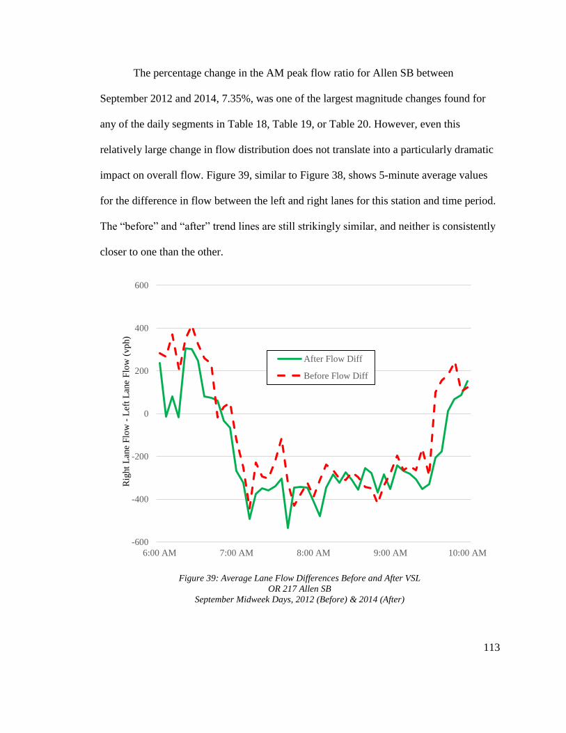
113
The percentage change in the AM peak flow ratio for Allen SB between
September 2012 and 2014, 7.35%, was one of the largest magnitude changes found for
any of the daily segments in Table 18, Table 19, or Table 20. However, even this
relatively large change in flow distribution does not translate into a particularly dramatic
impact on overall flow. Figure 39, similar to Figure 38, shows 5-minute average values
for the difference in flow between the left and right lanes for this station and time period.
The “before” and “after” trend lines are still strikingly similar, and neither is consistently
closer to one than the other.
-600
-400
-200
0
200
400
600
6:00 AM 7:00 AM 8:00 AM 9:00 AM 10:00 AM
After Flow Diff
Before Flow Diff
Rig
ht
Lan
eF
low
-L
eft
Lan
e F
low
(vp
h)
Figure 39: Average Lane Flow Differences Before and After VSL
OR 217 Allen SB
September Midweek Days, 2012 (Before) & 2014 (After)
114
Table 20 presents the speed ratio and flow ratio values before and after VSL
implementation for the Scholls Ferry northbound and southbound stations. Lane flow
distribution at Scholls Ferry NB before VSL was much different than at the other two
analyzed northbound stations, as left lane flows during peak hours were typically
between 15 and 20% greater than right lane flows. Speeds were still generally higher in
the left lane. After VSL, speed ratios increased even more, as was the case for the other
two stations. Flow ratios, both during the peak hours when the left lane was more heavily
utilized and during midday when the right lane was more heavily utilized, generally
moved a few percent closer to one. Prior to VSL, Scholls Ferry SB had the same flow
utilization pattern as Scholls Ferry NB, though the difference in flow between the left and
right lanes during peak hours was not as large. Speed ratios again increased further away
from one. Similar to the results for Allen SB, the flow ratio changes were inconsistent, as
they moved closer to one during the midday and PM peak but further from one during the
AM peak

115
Table 20: Lane Speed & Flow Distribution Before and After VSL
OR 217 Scholls Ferry NB & Scholls Ferry SB
August – December Midweek Days, 2012 (Before) & 2014 (After)
Scholls Ferry NB Scholls Ferry SB
Speed Ratio (L/R) Flow Ratio (L/R) Speed Ratio (L/R) Flow Ratio (L/R)
Before After Change Before After Change Before After Change Before After Change
Au
gu
st AM Peak 1.07 1.07 0.64% 1.25 1.24 -0.96% 1.10 1.13 2.85% 1.00 1.06 5.95%
Midday 1.08 1.08 0.15% 0.98 0.98 0.00% 1.11 1.12 0.94% 0.86 0.88 3.28%
PM Peak 1.08 1.14 5.90% 1.16 1.17 1.36% 1.11 1.11 0.46% 1.04 1.03 -1.23%
Sep
tem
ber
AM Peak 1.06 1.09 3.18% 1.23 1.22 -0.58% 1.12 1.16 4.18% 1.03 1.11 7.46%
Midday 1.08 1.09 0.75% 0.94 0.95 1.34% 1.10 1.12 1.30% 0.82 0.85 2.80%
PM Peak 1.07 1.10 3.03% 1.16 1.16 -0.19% 1.10 1.11 0.98% 1.04 1.05 0.33%
Oct
ob
er
AM Peak 1.05 1.08 2.97% 1.23 1.22 -0.35% 1.15 1.12 -2.83% 1.08 1.13 3.73%
Midday 1.08 1.09 1.61% 0.94 0.96 1.86% 1.11 1.13 1.78% 0.81 0.86 5.95%
PM Peak 1.06 1.10 4.26% 1.17 1.17 0.28% 1.11 1.13 1.34% 1.05 1.04 -0.95%
No
vem
ber
AM Peak 1.04 1.04 0.78% 1.22 1.18 -3.26% 1.10 1.12 1.46% 1.06 1.09 3.06%
Midday 1.08 1.09 0.76% 0.96 0.95 -0.45% 1.11 1.13 1.96% 0.83 0.86 3.63%
PM Peak 1.09 1.12 2.66% 1.18 1.15 -2.27% 1.12 1.14 1.57% 1.04 1.00 -4.20%
Dec
emb
er
AM Peak 1.01 1.03 2.09% 1.19 1.17 -1.80% 1.07 1.08 0.59% 1.01 1.04 2.49%
Midday 1.08 1.09 1.58% 0.98 0.99 0.24% 1.11 1.12 0.94% 0.87 0.89 2.03%
PM Peak 1.11 1.15 3.33% 1.18 1.16 -1.20% 1.13 1.13 -0.24% 1.05 0.99 -5.69%
Ov
eral
l AM Peak 1.04 1.06 1.93% 1.22 1.21 -1.40% 1.11 1.12 1.25% 1.04 1.08 4.52%
Midday 1.08 1.09 0.97% 0.96 0.97 0.59% 1.11 1.12 1.38% 0.84 0.87 3.53%
PM Peak 1.08 1.12 3.84% 1.17 1.16 -0.41% 1.11 1.12 0.82% 1.05 1.02 -2.38%

116
5.4.3 Discussion
One observation clearly evident from the results of the “before” and “after” lane
utilization analysis is that speed discrepancies between adjacent lanes did not diminish
after VSL implementation, as was hypothesized in Table 2. Speed harmonization is one
of the most commonly noted effects of a VSL system, but that has not occurred on OR
217. Of the six detector stations analyzed in this section, the speed ratios at four of them
moved further away from one for all three daily segments. The magnitude of these
changes was generally only 1 or 2%, but they still indicate that the difference between
average left and right lane speeds has grown slightly since VSL implementation. This
finding may be linked to the results in Section 5.2.2, which showed that speed variability
has increased at some locations along OR 217 since the VSL system began operating. An
uptick in speed variability means an increase in the range of travel speeds, and widening
the range of speeds could in turn inflate the speed ratio if the variability increase was
larger in the left lane.
The advisory nature of the OR 217 VSL system may again be a culprit for the
increase in speed discrepancies between adjacent lanes. The common reputation of left
lanes as passing lanes or “fast lanes” may mean left lane drivers on OR 217 feel less
inclined to obey reduced speeds posted by the VSL system than their right lane
counterparts. They are most likely in the left lane to try and get through the corridor
quicker, and since the VSL postings are advisory, they have little incentive to follow
them simply for the sake of overall capacity. Drivers in the generally more congested

117
right lanes, however, probably do not have as much flexibility in selecting a travel speed
and are forced to obey the VSL postings almost by default.
Although speed discrepancies have not improved since VSL implementation,
there appears to have been a widespread reduction in flow discrepancies, particularly
during midday and evening peak hours. The flow ratio moved closer to one at five of the
six analyzed stations during the PM peak segment and at all six during the midday
segment. Half of the stations also saw flow ratios during the AM peak move closer to
one. This improvement was not restricted to stations with any certain pattern of flow
distribution pre-VSL. Allen NB, where flows were lower in the right lane during all three
daily segments, Scholls Ferry NB, where flows were substantially higher in the left lane
during peak hours, and Greenburg NB, where the existing flow distribution was between
that of the other two northbound stations, all experienced improvements in flow ratios.
Since lane speed discrepancies have increased since VSL implementation, it is a
bit surprising that lane flow has simultaneously become more evenly distributed. A
possible reason for this phenomenon is that the VSL system is making drivers more
aware overall of congestion. Since speeds are only displayed on the VSL signs when
necessary, seeing them activated may be acting as a clue for drivers that traffic is
particularly bad, causing them to seek out the most under-utilized travel lane. Unlike the
speed variability decreased shown in Section 5.2.1 at Allen and Denney, the
improvement in flow distribution was most significant in the two months immediately
following VSL activation and subsequently followed by a gradual drop-off in magnitude.
There is not any distinguishable temporal trend in flow ratio changes at any of the six

118
detector stations, suggesting this may be a more sustainable improvement than the initial
decrease in speed variation.
The operational benefits to be gained from the noted improvement in lane flow
distribution are likely to be minimal. The majority of the percent changes in flow ratio
were less than 3%, roughly equivalent to moving between 20 and 25 vehicles from one
lane to the other over the course of one hour, assuming an overall flow of between 3,000
vph and 3,200 vph. Figure 39 showed that even when the flow ratio changed by more
than 7%, the overall effect on the difference in flow between adjacent lanes was not
particularly noticeable. Still, evening out flow between lanes is a positive development
even if it does not increase total corridor capacity. A more evenly distributed traffic
stream should limit the incentive for unnecessary lane-changing, thereby reducing
conflicts and enhancing safety.
The more even distribution of flow among adjacent lanes after VSL activation for
OR 217 is consistent with some of the results reported from an evaluation of a VSL
system on Autobahn 99 near Munich, Germany (Weikl et al., 2013). With that system, it
was found that lane flow distribution upstream of identified bottlenecks was more even
while the VSL system was on. This harmonizing effect became more pronounced as total
flow increased, consistent with the observation from OR 217 that flow ratio changes were
generally larger during the AM peak and PM peak than during midday hours. Although
overall flow was found to have decreased with the German VSL system on, the
evaluation made sure to highlight “obvious” benefits related to safety and harmonization.
119
The flow ratio improvements described in this section for OR 217 should be taken as
similarly promising for the corridor, even though they are relatively small in magnitude.
5.5 Travel Time Reliability
Travel times along OR 217, as highlighted in Section 3.4, can be highly variable,
adding to the frustration of commuters. When peak hour travel times can fall anywhere
from seven or eight minutes to more than 25 minutes, as was the case in Figure 16,
accurately predicting how long the drive will take is almost impossible, so commuters
have to budget a lot of extra time for travel in order to ensure on-time arrivals. By
homogenizing the traffic stream and reducing the frequency of stop-and-go conditions
and incidents which contribute to travel time variability, the VSL system should enhance
the reliability of travel time for OR 217, as hypothesized in Table 2, and solve one of the
corridor’s biggest sources of dissatisfaction among drivers. In order to test whether or not
this has been the case over the first eight months of the system’s existence, the
methodology described in Section 4.4.4 was used and the results are presented here.
5.5.1 OR 217 NB Travel Times
Table 21 and Table 22 present the results of the travel time variability analysis for
the northbound left and right lanes, respectively. Shown in each are average 95th
percentile travel times, mean travel times, and buffer indices by time of day and time of
year, with overall values at the bottom. The three rightmost columns represent percent
changes in each parameter between the “before” and “after” periods, and italicized values
indicate a decrease after VSL implementation. Welch’s t-tests were performed to assess
the statistical significance of changes to mean travel times and buffer indices, and the

120
bolded values are those found to be statistically significant at a confidence level of 95%.
The results have been separated into the three different monthly groups to align with the
changes in OR 217’s ramp metering system from an optimized rate (August – September
2014) to a fixed rate (October – December 2014) and back again to an optimized rate
(January – March 2015).
Of the eighteen changes in buffer index analyzed between the two lanes, all but
one were found to be statistically significant. For the northbound left lane, five of the
significant changes represented increases in the buffer index after VSL and four
represented decreases. For the right lane, only one of the significant changes represented
an increase while the other seven were all decreases. Overall, the left lane’s travel time
buffer index increased during the AM peak and PM peak but decreased during midday
hours, while the right lane’s buffer index decreased more than 14% for all three
segments, with the midday buffer index experiencing the largest decrease. Month to
month, both lanes experienced the greatest improvements in travel time reliability during
the January to March 2015 period, while travel time variability from August through
September 2014 compared least favorably to the “before” period. For instance, the left
lane’s AM peak buffer index grew from 27.75% in August and September 2014 to
43.88% during the same period after VSL and fell from 53.14% in January through
March 2013 to 36.99% during January through March 2015.
Although the primary intent of the VSL system is to reduce travel time variability
rather than travel times themselves, changes in mean travel times after VSL
implementation were also analyzed. For the most part, the trends in mean travel times

121
match those for the travel time buffer indices. The northbound right lane again saw much
more improvement in this area than the left lane, with average travel times overall falling
between 3 and 14% for all three daily segments. Mean travel times in the left lane
increased an average of 8 to 10% during the peak hours and fell about 3% during midday
hours. Most of the changes were again statistically significant, and the most improvement
was shown during the period from January through March.
Table 21: Travel Time Variability Before and After VSL
OR 217 NB Left Lane
August - March Midweek Days, 2012-2013 (Before) & 2014-2015 (After)
Before VSL After VSL Change (%)
95th
TT
Mean
TT BI
95th
TT
Mean
TT BI 95th TT
Mean
TT BI
Au
gu
st -
Sep
tem
ber
AM Peak 12.90 9.58 27.75 16.69 10.83 43.88 29.45 13.00 58.13
Midday 8.52 7.52 11.90 8.57 7.55 12.59 0.64 0.50 5.82
PM Peak 16.42 11.69 38.29 20.95 13.79 47.91 27.58 17.91 25.13
Oct
ob
er -
Dec
emb
er
AM Peak 16.32 11.05 40.00 20.37 12.19 56.31 24.84 10.35 40.78
Midday 9.79 7.80 23.24 9.00 7.65 16.54 -8.11 -1.94 -28.84
PM Peak 21.80 13.63 57.31 23.87 14.23 63.16 9.46 4.39 10.21
Jan
uar
y –
Mar
ch AM Peak 16.48 10.41 53.14 15.44 10.66 36.99 -6.28 2.47 -30.38
Midday 10.29 7.83 30.76 7.65 7.29 4.91 -25.67 -7.00 -84.03
PM Peak 17.06 10.99 51.82 18.08 11.88 47.68 5.93 8.11 -7.99
Ov
eral
l AM Peak 15.23 10.35 40.30 17.50 11.23 45.73 16.00 8.61 22.84
Midday 9.53 7.72 21.97 8.41 7.50 11.35 -11.04 -2.81 -35.69
PM Peak 18.43 12.11 49.14 20.97 13.30 52.92 14.33 10.14 9.12

122
Table 22: Travel Time Variability Before and After VSL
OR 217 NB Right Lane
August - March Midweek Days, 2012-2013 (Before) & 2014-2015 (After)
Before VSL After VSL Change (%)
95th
TT
Mean
TT BI
95th
TT
Mean
TT BI 95th TT
Mean
TT BI
Au
gu
st -
Sep
tem
ber
AM Peak 13.72 10.09 29.46 13.94 10.23 30.67 1.65 1.41 4.10
Midday 10.24 8.41 19.33 9.34 8.16 13.36 -8.79 -2.91 -30.88
PM Peak 18.40 12.82 41.53 16.01 11.94 33.06 -12.97 -6.87 -20.39
Oct
ob
er -
Dec
emb
er
AM Peak 18.21 12.06 43.33 16.78 11.26 43.09 -7.88 -6.59 -0.55
Midday 12.01 8.85 32.28 10.14 8.30 20.47 -15.63 -6.12 -36.60
PM Peak 27.06 16.13 64.46 18.85 12.48 48.42 -30.33 -22.62 -24.89
Jan
uar
y -
Mar
ch AM Peak 17.54 10.89 54.34 13.33 10.16 28.05 -23.98 -6.76 -48.39
Midday 10.83 8.37 29.12 8.17 7.78 5.00 -24.54 -7.01 -82.84
PM Peak 19.98 12.22 59.43 14.46 10.77 32.58 -27.64 -11.85 -45.18
Ov
eral
l AM Peak 16.49 11.01 42.38 14.68 10.55 33.94 -10.07 -3.98 -14.94
Midday 11.03 8.54 26.91 9.21 8.08 12.94 -16.32 -5.34 -50.11
PM Peak 21.81 13.72 55.14 16.44 11.73 38.02 -23.65 -13.78 -30.16
Figure 40 through Figure 43 highlight the differences in travel time variability
changes between the northbound left and right lanes. In each of these figures, the thinner
red lines represent 95th percentile, mean, and 5th percentile travel times before VSL and
the thicker green lines represent the same values after VSL. They were created using 5-
minute averages of the data from October through December of 2012 and 2014. Plotting
these lines together provides a visual representation of the magnitude of travel time
ranges, as a large gap between the various percentile lines indicates a high degree of
variability.

123
0
5
10
15
20
25
30
35
40
45
6:00 AM 7:00 AM 8:00 AM 9:00 AM 10:00 AM
After 95th TT
After Mean TT
After 5th TT
Before 95th TT
Before Mean TT
Before 5th TT
Tim
e (m
in)
Figure 40: AM Peak Travel Time Ranges Before and After VSL
OR 217 NB Left Lane
October - December Midweek Days, 2012 (Before) & 2014 (After)
0
5
10
15
20
25
30
35
40
45
3:00 PM 4:00 PM 5:00 PM 6:00 PM 7:00 PM
After 95th TT
After Mean TT
After 5th TT
Before 95th TT
Before Mean TT
Before 5th TT
Tim
e(m
in)
Figure 41: PM Peak Travel Time Ranges Before and After VSL
OR 217 NB Left Lane
October - December Midweek Days, 2012 (Before) & 2014 (After)
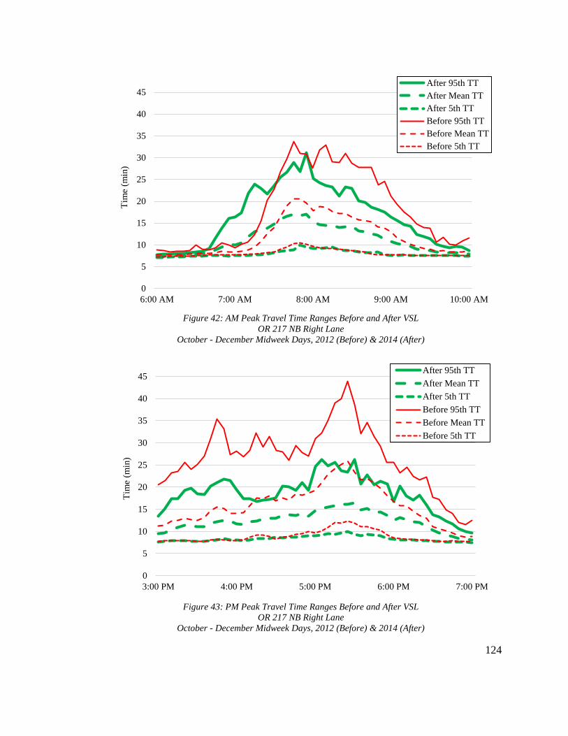
124
In
0
5
10
15
20
25
30
35
40
45
6:00 AM 7:00 AM 8:00 AM 9:00 AM 10:00 AM
After 95th TT
After Mean TT
After 5th TT
Before 95th TT
Before Mean TT
Before 5th TT
Tim
e (m
in)
0
5
10
15
20
25
30
35
40
45
3:00 PM 4:00 PM 5:00 PM 6:00 PM 7:00 PM
After 95th TT
After Mean TT
After 5th TT
Before 95th TT
Before Mean TT
Before 5th TT
Tim
e(m
in)
Figure 42: AM Peak Travel Time Ranges Before and After VSL
OR 217 NB Right Lane
October - December Midweek Days, 2012 (Before) & 2014 (After)
Figure 43: PM Peak Travel Time Ranges Before and After VSL
OR 217 NB Right Lane
October - December Midweek Days, 2012 (Before) & 2014 (After)

125
Figure 40 and Figure 41, for the northbound left lane, the “before” and “after”
mean and 5th percentile lines are relatively close to one another, but the “after” 95th
percentile line is clearly higher than the “before” 95th percentile line, particularly
between 7:00 AM and 8:00 AM and between 4:30 PM and 6:00 PM. This indicates that
the range in travel times experienced in this lane from October through December 2014
was greater than from October through December 2012, as supported by the results in
Table 21. In Figure 41, the average gap between the “before” 95th percentile and mean
lines is 5.27 minutes, while the average gap is 8.18 minutes between the “after” lines,
showing how the travel time range for the northbound left lane grew after VSL
implementation.
Figure 42 and Figure 43, for the northbound right lane, contrast significantly to
the left lane figures, as the “after” 95th percentile line is almost universally below the
“before” 95th percentile line, except around 7:00 AM. In fact, the “after” mean line is
also generally below the “before” mean line, particularly in Figure 43. This suggests that,
while travel times were becoming more variable in the northbound left lane after VSL
implementation, travel times in the right lane were becoming significantly less variable.
In Figure 43, for instance, the average gap between the “before” 95th percentile and mean
lines is 10.93 minutes, while the average gap is only 6.37 minutes between the “after”
lines.
Overall, the degree of improvement seen in travel time reliability in the
northbound right lane was greater than the degree of worsening seen in the left lane.
Table 23 demonstrates this by showing average travel time metrics across both

126
northbound lanes for the entire “before” and “after” analysis periods from August
through March. In the three rightmost columns, showing the percent change in each
metric after VSL implementation, it can be seen that seven of the nine overall travel time
values were lower with the system operating. During the AM peak, the average travel
time buffer index across both lanes fell 3.78% despite that value growing by over 22% in
the left lane. Additionally, the only values that showed an increase when combining data
from both lanes, the 95th percentile and mean travel times during the AM peak, each
grew by less than 2%. This indicates that overall travel time reliability in the northbound
lanes has improved since VSL implementation despite the reductions in reliability shown
for the left lane alone in Table 21.
Table 23: Travel Time Reliability Before and After VSL
OR 217 NB
August - March Midweek Days, 2012-2013 (Before) & 2014-2015 (After)
Before VSL After VSL Change (%)
95th
TT
Mean
TT BI
95th
TT
Mean
TT BI
95th
TT
Mean
TT BI
AM Peak 15.86 10.68 41.34 16.09 10.89 39.83 1.45 1.93 -3.78
Midday 10.28 8.13 24.44 8.81 7.79 12.14 -16.68 -4.35 -101.23
PM Peak 20.12 12.91 52.14 18.70 12.51 45.47 -7.59 -3.19 -14.67
5.5.2 OR 217 SB Travel Times
Table 24 and Table 25 present the results of the travel time variability analysis for
the southbound left and right lanes, respectively. Of the eighteen changes in buffer index
analyzed between the two lanes, sixteen were found to be statistically significant. Six of
the eight significant changes in each lane represented decreases in the buffer index after
VSL. Overall, the travel time variability trends in each southbound lane were very similar
to one another, unlike the northbound lanes. The average AM peak buffer index increased

127
about 30% overall in both lanes, the midday buffer index decreased between 15 and 20%,
and the PM peak buffer index fell about 2%. The fact that midday hours saw the biggest
improvement in travel time variability for the southbound lanes is consistent with the
results from the northbound lanes.
The temporal trend of southbound travel time reliability improvements is less
apparent than for the northbound lanes, where the period from January through March
saw by far the greatest reduction in travel time variability during all three daily segments.
In the southbound lanes, AM peak travel time variability was only reduced in the period
from October through December, midday travel time variability was most improved in
the period from January through March, and PM peak variability was most improved in
the period from August through September 2014.
Table 24: Travel Time Variability Before and After VSL
OR 217 SB Left Lane
August - March Midweek Days, 2012-2013 (Before) & 2014-2015 (After)
Before VSL After VSL Change (%)
95th
TT
Mean
TT BI
95th
TT
Mean
TT BI 95th TT
Mean
TT BI
Au
gu
st -
Sep
tem
ber
AM Peak 10.28 8.37 18.33 15.79 10.75 35.70 53.59 28.40 94.70
Midday 9.19 7.66 18.29 9.18 7.79 15.65 -0.05 1.76 -14.43
PM Peak 13.84 10.61 29.49 14.45 11.36 27.15 4.42 7.11 -7.94
Oct
ob
er -
Dec
emb
er
AM Peak 17.20 10.71 51.23 16.23 11.04 37.57 -5.63 3.13 -26.67
Midday 11.30 8.15 35.39 10.96 8.29 30.04 -3.03 1.66 -15.12
PM Peak 20.72 13.33 52.60 21.89 13.33 59.85 5.68 -0.05 13.79
Jan
uar
y -
Mar
ch AM Peak 13.20 8.98 39.52 16.00 10.38 45.09 21.16 15.61 14.08
Midday 8.37 7.40 12.67 8.17 7.44 9.96 -2.36 0.48 -21.42
PM Peak 17.99 11.94 49.74 16.40 11.51 42.93 -8.88 -3.64 -13.68
Ov
eral
l AM Peak 13.56 9.35 36.36 16.01 10.72 39.45 23.04 15.71 27.37
Midday 9.62 7.74 22.12 9.44 7.84 18.55 -1.81 1.30 -16.99
PM Peak 17.52 11.96 43.94 17.58 12.06 43.31 0.40 1.14 -2.61

128
Table 25: Travel Time Variability Before and After VSL
OR 217 SB Right Lane
August - March Midweek Days, 2012-2013 (Before) & 2014-2015 (After)
Before VSL After VSL Change (%)
95th
TT
Mean
TT BI
95th
TT
Mean
TT BI
95th
TT
Mean
TT BI
Au
gu
st -
Sep
tem
ber
AM Peak 11.68 9.23 20.34 20.09 12.67 44.29 72.06 37.25 117.76
Midday 11.22 8.66 26.06 11.28 9.06 21.18 0.52 4.65 -18.73
PM Peak 17.83 12.77 38.60 18.15 13.55 33.58 1.77 6.12 -13.00
Oct
ob
er -
Dec
emb
er
AM Peak 21.44 12.40 59.49 19.77 12.80 42.65 -7.80 3.22 -28.30
Midday 14.50 9.42 47.86 14.00 9.80 39.47 -3.44 4.09 -17.54
PM Peak 26.48 16.17 60.45 28.17 16.27 67.88 6.38 0.64 12.28
Jan
uar
y -
Mar
ch AM Peak 17.77 11.40 49.08 19.40 11.80 50.10 9.18 3.50 2.09
Midday 11.21 9.34 19.64 9.53 8.35 13.99 -14.92 -10.66 -28.77
PM Peak 24.17 15.36 56.67 20.73 13.54 53.49 -14.22 -11.81 -5.61
Ov
eral
l AM Peak 16.96 11.01 42.97 19.75 12.42 45.68 24.48 14.66 30.51
Midday 12.31 9.14 31.19 11.60 9.07 24.88 -5.95 -0.64 -21.68
PM Peak 22.83 14.76 51.91 22.35 14.45 51.65 -2.03 -1.68 -2.11
The changes in average southbound travel times after VSL implementation did
not match as well with the changes in buffer indices as they did for the northbound
direction. While there was still some agreement, many of the daily segments that saw a
decrease in the average buffer index actually experienced a simultaneous increase in the
average travel time. For instance, the average AM peak buffer index in the southbound
left lane fell more than 25% during the period from October through December, yet the
lane’s average travel time rose more than 3% at the same time, the trends in mean travel
times match those for the travel time buffer indices. Overall, average southbound travel
times rose about 15% during the AM peak after VSL implementation and remained fairly
constant during midday hours and the PM peak in both lanes. Mean travel times in the
left lane increased an average of 8 to 10% during the peak hours and fell about 3% during
129
midday hours. Only half of the changes in southbound average travel times were
statistically significant, and there was again no consistent temporal trend.
Figure 44 through Figure 47 highlight how similar the travel time variability
changes were in both of the southbound lanes were, as well as how the changes between
before and after VSL implementation were quite different during each of the peak
periods. They were created using overall 5-minute averages of the data from August
through March. Plotting these lines together provides a visual representation of the
magnitude of travel time ranges, as a large gap between the various percentile lines
indicates a high degree of variability.
In Figure 44, for the southbound left lane and AM peak segment, the “after” 95th
percentile and mean lines are clearly higher than the “before” lines between 6:30 AM and
9:00 AM. This indicates that, since VSL implementation, the lane is taking longer to
traverse in the morning and travel times are more variable, supporting the results in Table
24. The average gap between the “after” 95th percentile and mean lines is 5.28 minutes,
while the average gap is only 4.21 minutes between the “before” line, highlighting the
expansion of the travel time range since VSL implementation. In Figure 45, for the PM
peak segment, all of the “before” and “after” lines are much closer to one another, with
the “before” 95th percentile line being a bit higher after 5:00 PM and the “after” line
higher before that. The figure visually demonstrates how, in comparison to the AM peak
period, southbound travel time variability during the PM peak has not changed much
since VSL implementation.

130
0
5
10
15
20
25
30
35
40
45
6:00 AM 7:00 AM 8:00 AM 9:00 AM 10:00 AM
After 95th TT
After Mean TT
After 5th TT
Before 95th TT
Before Mean TT
Before 5th TT
Tim
e (m
in)
Figure 44: AM Peak Travel Time Ranges Before and After VSL
OR 217 SB Left Lane
August - March Midweek Days, 2012-2013 (Before) & 2014-2015 (After)
0
5
10
15
20
25
30
35
40
45
3:00 PM 4:00 PM 5:00 PM 6:00 PM 7:00 PM
After 95th TT
After Mean TT
After 5th TT
Before 95th TT
Before Mean TT
Before 5th TT
Tim
e(m
in)
Figure 45: PM Peak Travel Time Ranges Before and After VSL
OR 217 SB Left Lane
August - March Midweek Days, 2012-2013 (Before) & 2014-2015 (After)

131
0
5
10
15
20
25
30
35
40
45
6:00 AM 7:00 AM 8:00 AM 9:00 AM 10:00 AM
After 95th TT
After Mean TT
After 5th TT
Before 95th TT
Before Mean TT
Before 5th TT
Tim
e (m
in)
Figure 46: AM Peak Travel Time Ranges Before and After VSL
OR 217 SB Right Lane
August - March Midweek Days, 2012-2013 (Before) & 2014-2015 (After)
0
5
10
15
20
25
30
35
40
45
3:00 PM 4:00 PM 5:00 PM 6:00 PM 7:00 PM
After 95th TT
After Mean TT
After 5th TT
Before 95th TT
Before Mean TT
Before 5th TT
Tim
e(m
in)
Figure 47: PM Peak Travel Time Ranges Before and After VSL
OR 217 SB Right Lane
August - March Midweek Days, 2012-2013 (Before) & 2014-2015 (After)

132
Figure 46 and Figure 47, for the southbound right lane, are essentially zoomed-in
versions of the left lane figures. The trends demonstrated in Figure 46 and Figure 47 are
strikingly similar to those in Figure 44 and Figure 45, with the only significant difference
being that the magnitudes of the right lane travel time values are larger. Again, the “after”
travel time range during the AM peak is noticeably larger than the “before” range, while
the ranges are fairly close to one another during the PM peak. In Figure 46, the average
gap between the “after” 95th percentile and mean lines is 7.33 minutes, while the gap
between the “before” lines is only 5.95 minutes. In Figure 47, the average gaps are 8.06
minutes and 7.90 minutes for the “before” and “after” periods, respectively. Taken
together, the trends in Figure 44, Figure 45, Figure 46, and Figure 47 show that the
changes in travel time variability since VSL implementation have been very consistent
across both southbound lanes, unlike the differing trends observed in the two northbound
lanes.
5.5.3 OR 217 Volume Comparison
In addition to impacts of the VSL system, travel time and travel time variability
measurements can also be affected by changes in travel demand over time. Higher
demand means more vehicles on the roadway, which will likely contribute to longer
travel times and greater variability as congestion worsens. A comparison of average
travel volumes during the “before” and “after” periods was performed using the
methodology described at the end of Section 4.4.4 in order to assess whether changes in
demand, rather than the VSL system, may be responsible for some of the travel time
changes noted in the previous two sections. Doing so allowed for a more accurate
133
assessment of how OR 217 travel times have changed in response to the VSL system in
particular.
Due to the frequent on- and off-ramps located along both directions of OR 217,
corridor volumes can vary substantially depending on the measurement location. For this
study’s flow comparison, two stations in each direction, at Greenburg Road and Allen
Boulevard were selected for analysis. As shown in Figure 20, these stations are each
located roughly around the third points of the corridor, meaning analyzing each of them
should capture a fair amount of the spatial variability in volumes.
Table 26 through Table 29 show the results of the “before” and “after” volume
comparisons at each of the four analyzed stations by lane and in total. The values shown
represent total average daily volumes recorded on Wednesdays during each of the time
periods. Overall, volumes did not change very much between the period from August
2012 through March 2013 and the period from August 2014 through March 2015. The
largest change was in the left lane at Allen NB, where average daily flow grew by 622
vehicles, or 2.64%. All of the other overall changes were less than 2% in magnitude.
Average volumes during the "after” period were higher than during the “before” period at
all stations except Allen SB, where overall volumes were down about 0.5%, indicating
there has been a general increase in demand along OR 217 since the “before” period.
Figure 48 shows visually how average total daily volumes have changed at each analyzed
station between the “before” and “after” periods.
Focusing on the two northbound stations in Table 26 and Table 27, the increase in
flow was most significant during the period from January through March 2014 and

134
smallest for the period from October through December 2014. As expected, volumes in
the right lane were consistently higher than volumes in the left lanes during all studied
periods. However, the increases in volumes between the “before” and “after” period were
larger in the left lanes at each station, particularly at Allen NB. Overall, right lane
volumes at Allen NB grew only 0.92%, but left lane volumes grew 2.64%. In Figure 48,
all of the “after” columns for the northbound lanes are higher than their respective
“before” columns except for Allen NB during the period from October through
December. The magnitude of the difference between the columns ranges from 91
vehicles per day to 1,899.
42,000
44,000
46,000
48,000
50,000
52,000
54,000
56,000
58,000
Au
g -
Sep
Oct
- D
ec
Jan
- M
arch
Ov
eral
l
Au
g -
Sep
Oct
- D
ec
Jan
- M
arch
Ov
eral
l
Au
g -
Sep
Oct
- D
ec
Jan
- M
arch
Ov
eral
l
Au
g -
Sep
Oct
- D
ec
Jan
- M
arch
Ov
eral
l
Greenburg NB Greenburg SB Allen NB Allen SB
Aver
age
Wed
nes
day
Vo
lum
e (v
ehic
les)
Before After
Figure 48: Total Daily Volumes Before and After VSL
OR 217 Allen & Greenburg
August - March Wednesdays, 2012-2013 (Before) & 2014-2015 (After)

135
Table 26: Total Daily Volumes Before and After VSL
OR 217 NB Greenburg
August - March Wednesdays, 2012-2013 (Before) & 2014-2015 (After)
Left Lane Volume (vehicles) Right Lane Volume (vehicles) Total Volume (vehicles)
Before After Difference Before After Difference Before After Difference
Aug -
Sep 23,548 24,091 2.30% 27,288 27,406 0.43% 50,836 51,497 1.30%
Oct -
Dec 22,156 22,088 -0.32% 25,720 25,879 0.61% 47,876 47,967 0.19%
Jan -
March 22,279 22,735 2.04% 26,195 26,901 2.72% 48,474 49,636 2.40%
Overall 22,661 22,971 1.34% 26,401 26,729 1.26% 49,062 49,700 1.30%
Table 27: Total Daily Volumes Before and After VSL
OR 217 NB Allen
August - March Wednesdays, 2012-2013 (Before) & 2014-2015 (After)
Left Lane Volume (vehicles) Right Lane Volume (vehicles) Total Volume (vehicles)
Before After Difference Before After Difference Before After Difference
Aug -
Sep 24,677 25,296 2.51% 30,292 30,688 1.31% 54,968 55,983 1.85%
Oct -
Dec 23,719 23,886 0.72% 29,698 29,279 -1.41% 53,417 53,165 -0.47%
Jan -
March 23,219 24,298 4.68% 28,934 29,754 2.85% 52,153 54,052 3.64%
Overall 23,872 24,494 2.64% 29,641 29,907 0.92% 53,513 54,400 1.67%
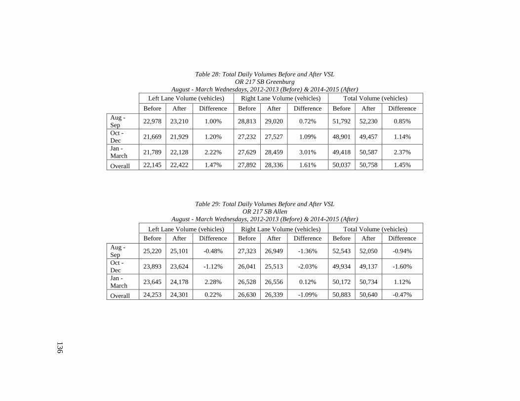
136
Table 28: Total Daily Volumes Before and After VSL
OR 217 SB Greenburg
August - March Wednesdays, 2012-2013 (Before) & 2014-2015 (After)
Left Lane Volume (vehicles) Right Lane Volume (vehicles) Total Volume (vehicles)
Before After Difference Before After Difference Before After Difference
Aug -
Sep 22,978 23,210 1.00% 28,813 29,020 0.72% 51,792 52,230 0.85%
Oct -
Dec 21,669 21,929 1.20% 27,232 27,527 1.09% 48,901 49,457 1.14%
Jan -
March 21,789 22,128 2.22% 27,629 28,459 3.01% 49,418 50,587 2.37%
Overall 22,145 22,422 1.47% 27,892 28,336 1.61% 50,037 50,758 1.45%
Table 29: Total Daily Volumes Before and After VSL
OR 217 SB Allen
August - March Wednesdays, 2012-2013 (Before) & 2014-2015 (After)
Left Lane Volume (vehicles) Right Lane Volume (vehicles) Total Volume (vehicles)
Before After Difference Before After Difference Before After Difference
Aug -
Sep 25,220 25,101 -0.48% 27,323 26,949 -1.36% 52,543 52,050 -0.94%
Oct -
Dec 23,893 23,624 -1.12% 26,041 25,513 -2.03% 49,934 49,137 -1.60%
Jan -
March 23,645 24,178 2.28% 26,528 26,556 0.12% 50,172 50,734 1.12%
Overall 24,253 24,301 0.22% 26,630 26,339 -1.09% 50,883 50,640 -0.47%
137
At the two southbound stations, represented in Table 28 and Table 29, the growth
in volume was again most significant during the period from January through March
2015. At Greenburg SB, the increases in flow gradually grew in magnitude from a low of
0.85% during the period from August through September to a high of 2.37% during
January through March. Volumes at Allen SB actually decreased during the two earlier
periods before growing 1.12% during the period from January through March. As was the
case at the northbound stations, flow in the left lane of Allen SB grew more than flow in
the right lane, while right lane volumes increased more at Greenburg SB. Figure 48
reinforces these noted trends graphically, as it can be seen that all of the “after” columns
for Greenburg SB are higher than their respective “before” columns while three of the
four “before” columns for Allen SB are higher.

138
5.5.4 Discussion
Travel times and travel time variability along OR 217 have generally, though not
universally, diminished since implementation of the VSL system in agreement with the
hypothesis in Table 2. All lanes except the northbound left lane experienced a drop in
average travel time buffer indices during midday and PM peak hours. The AM peak
buffer index rose for both southbound lanes. In the northbound left lane, the only daily
segment that experienced an overall decrease in the travel time buffer index was midday.
The results in the northbound lanes contrasted significantly with one another, while the
results for the two southbound lanes were very similar to one another. Each of the
northbound lanes saw a gradual increase in the variability drop over time, with the most
improvement shown in the period from January through March 2015. For the southbound
lanes, no such clear temporal trend was apparent from the results.
The results for the northbound right lane, summarized in Table 22, are most in
line with the predictions in Table 2. There was widespread reduction in both average
travel times and travel time buffer indices across the entire study period and during all
three daily segments. The northbound left lane’s travel time analysis results, on the other
hand, mostly contradict with the predictions except for the period from January through
March and midday hours, as overall travel times and variability were higher in the “after”
data. This could be an indication that more northbound drivers are choosing to utilize the
left lane than before, thereby easing congestion in the right lane while worsening it in the
left lane. Indeed, Table 26 and Table 27 show that northbound left lane flows have grown
more than northbound right lane flows since the “before” period.

139
The discrepancy in travel time variability results between the two northbound
lanes may be caused by the VSL system’s homogenizing effects. Section 5.4 showed that
lane flow has been more evenly distributed since VSL implementation, and that is
reflected by the results in this section. Prior to the VSL system, travel times in the
northbound right lane were consistently several minutes longer than those in the left lane,
and variability was higher as well. By evening out flow between the two lanes, the VSL
system seems to have minimized, or even reversed this gap, as northbound travel times in
the right and left lane were closer to one another during the “after” period and variability
was higher in the left lane. Many of the drivers who previously stuck solely to the right
lane may be being enticed into the left lane as their overall awareness of traffic conditions
has been boosted by the system. Before the VSL system, the right lane was the worst for
congestion and frustration due to its higher volumes and location adjacent to frequent on-
and off-ramps. The net effect of improving travel time variability in the worst lane while
making it worse in the less-congested lane could still be a positive for the corridor
overall. Table 23 supports this conclusion by showing that average travel times across
both northbound lanes have mostly improved since VSL implementation despite the
worsened conditions noted in the left lane.
Despite their differences, the results for the two northbound lanes were similar in
that they showed gradual improvement over the course of the study period and the
occurrence of the largest gains in reliability during midday hours. For both lanes, the
period from January through March 2015 exhibited the largest decrease in average travel
time buffer indices during all three daily segments, while the period from August through

140
September 2015, immediately after VSL implementation, showed the least improvement.
This could be an indication that it took several months for drivers to adjust their behavior
in response to the VSL system in a significant manner. Right after implementation, many
drivers were likely skeptical of the system and hesitant to pay attention to it. Over time,
however, the results suggest that more and more drivers bought in to the system and
realized that heeding it would be beneficial to them. This gradual increase in the system’s
effectiveness at reducing travel time reliability also indicates that the switch from an
optimized ramp metering rate to a fixed rate from October 2014 through December 2014
did not significantly impact travel time, as the buffer indices during that period compared
more favorably to the “before” data than the buffer indices from August and September
of 2014.
The travel time reliability analysis results for the two southbound lanes were quite
different than those for the two northbound lanes. The southbound right lane did not
experience widespread improvement at the expense of the left lane. Rather, the travel
time and travel time variability trends in the two southbound left lanes were near mirror
images of one another. Prior to the VSL system, travel times were again consistently
several minutes longer in the right lane and variability was also higher, and those trends
held steady after VSL implementation. Additionally, there was no apparent temporal
trend in the reliability improvements between the three different periods as was the case
in the northbound lanes. The two directions on OR 217 do have different commute
patterns and characteristics, but it is nonetheless puzzling that the travel time reliability
analysis results in each direction differ so significantly.

141
Perhaps the most interesting observation from the southbound results is that travel
time variability increased significantly during the AM peak while falling during the PM
peak. This is in contrast to the northbound results, where the trends for the AM peak and
PM peak in each lane were the same. Reasons for this discrepancy are unclear, but it may
be related to the differing dynamics of the two peak periods. As shown in Figure 44 and
Figure 46, there is a clear peak in southbound morning travel times right before 8:00 AM,
while evening travel times, shown in Figure 45 and Figure 47 are more evenly distributed
over the entire period. This is likely because arrival times are probably a lot less flexible
and variable than departure times for a lot of commuters. Thus, as volumes have
gradually grown since the “before” period, as demonstrated in the previous section, more
vehicles are trying to get to their destinations at the same time in the morning and the
effectiveness of the VSL system is limited during the morning. In the evening, on the
other hand, commuters are more spread out in when they choose to leave work, giving
the VSL system more of a chance to make an impact. Why this finding was not apparent
for the northbound lanes is unclear.
The fact that the reductions in travel time variability were by far most substantial
during midday hours in all four lanes is interesting because it indicates that the VSL
system is most effective during moderately congested, rather than severely congested,
times. In Table 2, it was predicted that the effects of the VSL system would be most
apparent during peak hours, but that does not seem to be the case in this analysis. In all
four lanes, the average midday buffer index was between 15 and 50% lower in the “after”
data, much more significant than the buffer index changes during the peak periods. This
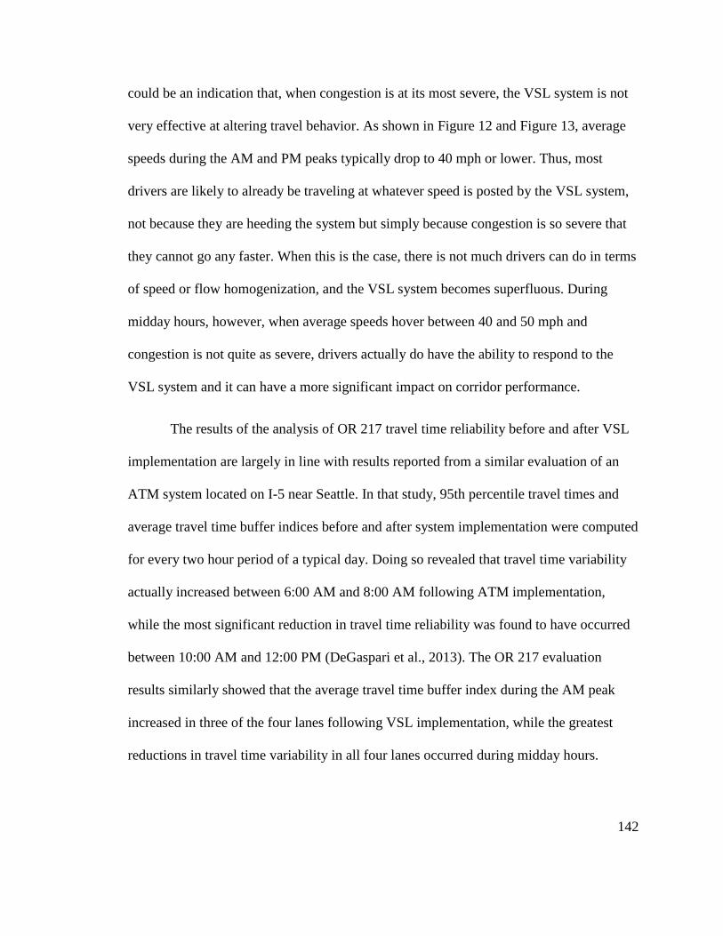
142
could be an indication that, when congestion is at its most severe, the VSL system is not
very effective at altering travel behavior. As shown in Figure 12 and Figure 13, average
speeds during the AM and PM peaks typically drop to 40 mph or lower. Thus, most
drivers are likely to already be traveling at whatever speed is posted by the VSL system,
not because they are heeding the system but simply because congestion is so severe that
they cannot go any faster. When this is the case, there is not much drivers can do in terms
of speed or flow homogenization, and the VSL system becomes superfluous. During
midday hours, however, when average speeds hover between 40 and 50 mph and
congestion is not quite as severe, drivers actually do have the ability to respond to the
VSL system and it can have a more significant impact on corridor performance.
The results of the analysis of OR 217 travel time reliability before and after VSL
implementation are largely in line with results reported from a similar evaluation of an
ATM system located on I-5 near Seattle. In that study, 95th percentile travel times and
average travel time buffer indices before and after system implementation were computed
for every two hour period of a typical day. Doing so revealed that travel time variability
actually increased between 6:00 AM and 8:00 AM following ATM implementation,
while the most significant reduction in travel time reliability was found to have occurred
between 10:00 AM and 12:00 PM (DeGaspari et al., 2013). The OR 217 evaluation
results similarly showed that the average travel time buffer index during the AM peak
increased in three of the four lanes following VSL implementation, while the greatest
reductions in travel time variability in all four lanes occurred during midday hours.

143
Except for Allen SB, daily average volumes were generally about 800 vehicles
higher across both lanes during the “after” period. Though not shown in these charts,
between 45 and 55% of a given lane’s total volume usually passes through between 6:00
AM and 10:00 AM or 3:00 PM and 7:00 PM, the daytime hours when the VSL system is
most likely to be operating. Using a total growth in volume of 800 vehicles and a 50%
volume share for the peak hours, this means that approximately 50 more vehicles are
passing through both directions of OR 217 during each peak hour, less than one
additional vehicle per minute in each lane. Such a small average increase in flow is likely
to have a minimal impact on corridor-wide travel times. Still, this growth in demand is
something that must be considered when trying to separate out the VSL system’s impacts
on travel times from other influences on travel time.
5.6 Bottleneck Flow Characteristics
Section 3.5 showed that recurrent bottlenecks are a significant inhibitor to the
performance of OR 217. They routinely form in both directions during the morning and
evening peaks and can cause total flow through nearby stations to drop by 20% or more
for several hours at a time. In Table 2, it was hypothesized that the presence of the VSL
system would reduce the drop in flow that occurs at locations downstream of bottlenecks
and at locations within bottleneck queues. The methodology described in Section 4.4.5
was used to test this theory, and the results of doing so are presented in this section by
direction. Bottleneck effects during the evening peak are typically more widespread and
severe than during the morning peak, so they are the focus of this analysis.
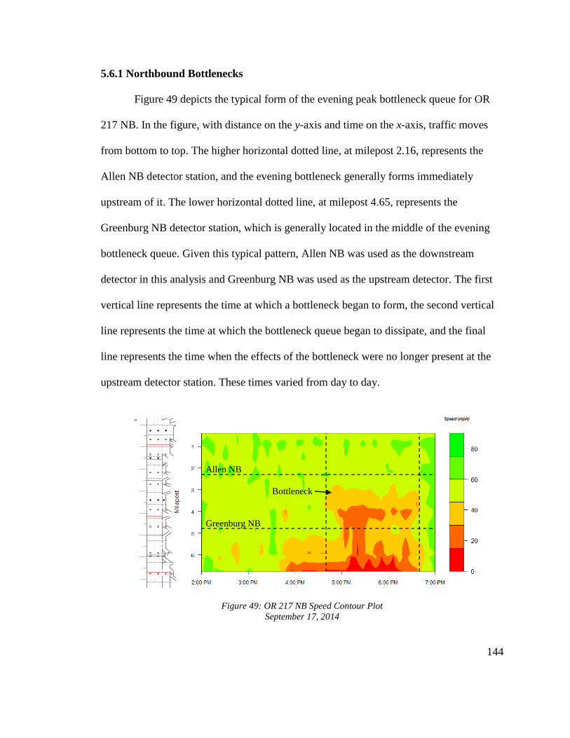
144
5.6.1 Northbound Bottlenecks
Figure 49 depicts the typical form of the evening peak bottleneck queue for OR
217 NB. In the figure, with distance on the y-axis and time on the x-axis, traffic moves
from bottom to top. The higher horizontal dotted line, at milepost 2.16, represents the
Allen NB detector station, and the evening bottleneck generally forms immediately
upstream of it. The lower horizontal dotted line, at milepost 4.65, represents the
Greenburg NB detector station, which is generally located in the middle of the evening
bottleneck queue. Given this typical pattern, Allen NB was used as the downstream
detector in this analysis and Greenburg NB was used as the upstream detector. The first
vertical line represents the time at which a bottleneck began to form, the second vertical
line represents the time at which the bottleneck queue began to dissipate, and the final
line represents the time when the effects of the bottleneck were no longer present at the
upstream detector station. These times varied from day to day.
Figure 49: OR 217 NB Speed Contour Plot
September 17, 2014
.17
.18
.26
.53
.60
.42
.48
.81
0.80
Station Influence Length
0.83
0.59
.67
MP .10 - Barnes
MP .45 - Wilshire
MP .76 - Walker
MP 1.92 – B-H Hwy
MP 2.55 - Allen
MP 3.12 - Denney
MP 3.5 - Hall
MP 4.35 – Scholls Ferry
MP 5.11 - Greenburg
MP 5.95 – 99W West
MP 6.77 – 72nd
MP 7.0 – OR 217 WB to SB
U.S. 26 West
U.S. 26 East
I-5 SB
MP .25 - WAVETRONIX
MP 1.5 - WAVETRONIX
.52
.58
MP 3.4 - WAVETRONIX.19
= Loop Detector
= Radar Detector
= VAS Sign
MP .66 - Walker
MP 1.34 – TV Hwy
MP 2.16 – Allen
MP 2.68 - Denney
MP 3.85 – Scholls Ferry
MP 4.65 - Greenburg
MP 5.85 – 99W West
MP 5.9 – 99W East
MP 6.61 – 72nd
.54
.42
.41
.59
.62
.59
.62
1.00
U.S. 26 East
Barnes
MP .25 - WAVETRONIX
MP 3.4 - WAVETRONIX
MP 1.5 - WAVETRONIX
.46
.63
1.01
Station Influence Length
0.38
7
6
5
4
3
2
1
0
Milepost
Greenburg NB
Allen NB
Bottleneck

145
Table 30 and Table 31 summarize the characteristics of each of the ten analyzed
evening bottlenecks at the downstream and upstream detector stations, respectively. Pre-
queue flow represents the average flow through the detector stations immediately prior to
bottleneck formation, and queue discharge flow shows the average flow during the
designated queue duration. The final three columns in each table present the percentage
drop in flow between pre-queue and queue discharge conditions, both overall and by
lane. Averages for the five “before” bottlenecks and five “after” bottlenecks are shown in
the bottom two rows.
At the Allen NB station, located immediately downstream of bottleneck
formation, the average drop in flow between pre-queue and queue discharge conditions
was about twice as large during the “after” bottlenecks than during the “before”
bottlenecks, going from 4.32% to 8.48%. The average flow drop in the right lane actually
decreased slightly, but the average flow drop in the left lane increased substantially.
Because of this, the flow drops in each lane were much closer to one another during the
“after” bottlenecks. In terms of lane utilization, flow was more evenly split between the
left and right lanes during both pre-queue and queue discharge conditions.
Figure 50 and Figure 51 show the difference in flow drop during two specific
bottleneck queues at Allen NB, as well as the trends in average speeds during each one.
In these oblique plots, cumulative 20-second flows are adjusted by a scaling factor related
to average hourly flow over the entire period. Positive slopes indicate higher than average
flows, while negative slopes indicate lower than average flows. In Figure 50, an oblique
flow plot from July 25, 2012, total average flow, shown with the blue lines, only dropped

146
2.43% after bottleneck formation. In Figure 51, representing October 8, 2014, total flow
dropped almost 10% after bottleneck formation. The difference in slope between the blue
lines labeled with different flow values is much more pronounced in Figure 51 than in
Figure 50, indicating that total throughput coming out of a bottleneck queue has not
improved with the VSL system. While each plot is just one day of data, the trends they
show are representative of the average flow drops found at all analyzed “before” and
“after” bottlenecks.
At the Greenburg NB station, typically located right in the middle of evening
bottleneck queues, the average drop in total flow was about 3% less during the “after”
bottlenecks. The average drop in the right lane was less than half of the “before” average
drop, while the average drop in the left lane was only slightly less than the “before”
average drop. The average flow discrepancy between the right and left lane was slightly
higher in the “after” case during both pre-queue and queue discharge conditions, with the
left lane holding a higher percentage of total flow. The average left lane flow drop was
much larger than the average right lane flow drop after VSL, while the average flow
drops in each lane were relatively close before VSL. Compared to the average flow drop
downstream of the bottleneck queue at Allen NB, the average flow drop at Greenburg NB
was about twice as large before the VSL system, but slightly less after the VSL system.
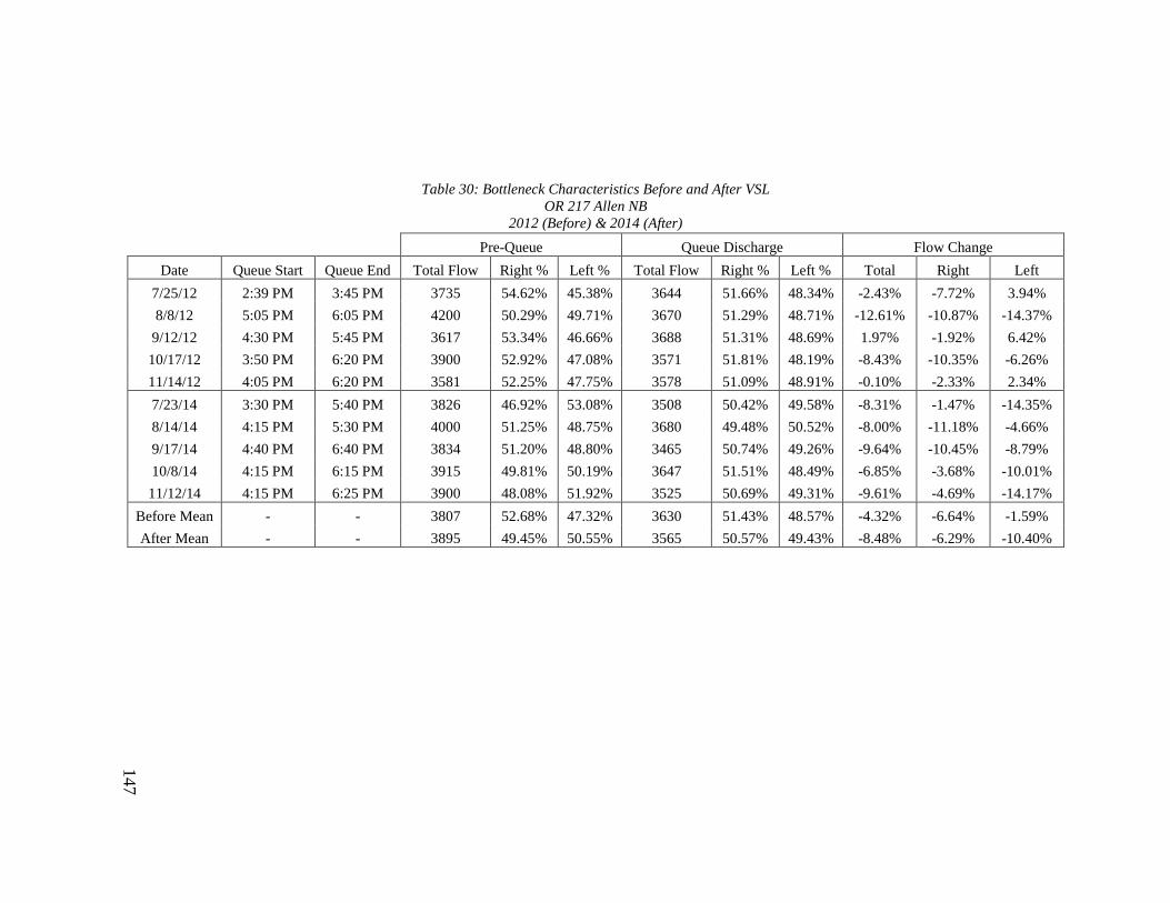
147
Table 30: Bottleneck Characteristics Before and After VSL
OR 217 Allen NB
2012 (Before) & 2014 (After)
Pre-Queue Queue Discharge Flow Change
Date Queue Start Queue End Total Flow Right % Left % Total Flow Right % Left % Total Right Left
7/25/12 2:39 PM 3:45 PM 3735 54.62% 45.38% 3644 51.66% 48.34% -2.43% -7.72% 3.94%
8/8/12 5:05 PM 6:05 PM 4200 50.29% 49.71% 3670 51.29% 48.71% -12.61% -10.87% -14.37%
9/12/12 4:30 PM 5:45 PM 3617 53.34% 46.66% 3688 51.31% 48.69% 1.97% -1.92% 6.42%
10/17/12 3:50 PM 6:20 PM 3900 52.92% 47.08% 3571 51.81% 48.19% -8.43% -10.35% -6.26%
11/14/12 4:05 PM 6:20 PM 3581 52.25% 47.75% 3578 51.09% 48.91% -0.10% -2.33% 2.34%
7/23/14 3:30 PM 5:40 PM 3826 46.92% 53.08% 3508 50.42% 49.58% -8.31% -1.47% -14.35%
8/14/14 4:15 PM 5:30 PM 4000 51.25% 48.75% 3680 49.48% 50.52% -8.00% -11.18% -4.66%
9/17/14 4:40 PM 6:40 PM 3834 51.20% 48.80% 3465 50.74% 49.26% -9.64% -10.45% -8.79%
10/8/14 4:15 PM 6:15 PM 3915 49.81% 50.19% 3647 51.51% 48.49% -6.85% -3.68% -10.01%
11/12/14 4:15 PM 6:25 PM 3900 48.08% 51.92% 3525 50.69% 49.31% -9.61% -4.69% -14.17%
Before Mean - - 3807 52.68% 47.32% 3630 51.43% 48.57% -4.32% -6.64% -1.59%
After Mean - - 3895 49.45% 50.55% 3565 50.57% 49.43% -8.48% -6.29% -10.40%

148
Table 31: Bottleneck Characteristics Before and After VSL
OR 217 Greenburg NB
2012 (Before) & 2014 (After)
Pre-Queue Queue Discharge Flow Change
Date Queue Start Queue End Total Flow Right % Left % Total Flow Right % Left % Total Right Left
7/25/12 4:05 PM 5:45 PM 3708 48.68% 51.32% 3587 49.00% 51.00% -3.28% -2.65% -3.87%
8/8/12 5:05 PM 6:00 PM 3968 49.05% 50.95% 3643 49.71% 50.29% -8.19% -6.95% -9.40%
9/12/12 4:30 PM 5:45 PM 4140 49.57% 50.43% 3560 49.47% 50.53% -14.01% -14.18% -13.84%
10/17/12 4:40 PM 6:20 PM 3738 51.69% 48.31% 3299 49.94% 50.23% -11.73% -14.72% -8.24%
11/14/12 4:15 PM 5:55 PM 3830 50.13% 49.87% 3364 49.48% 50.52% -12.18% -13.31% -11.04%
7/23/14 3:40 PM 6:15 PM 3525 48.94% 51.06% 3221 48.80% 51.20% -8.62% -8.88% -8.38%
8/14/14 4:15 PM 6:10 PM 3741 45.40% 54.60% 3412 47.97% 52.03% -8.79% -3.63% -13.09%
9/17/14 5:00 PM 6:30 PM 3594 46.85% 53.15% 3194 49.47% 50.53% -11.13% -6.15% -15.51%
10/8/14 4:40 PM 6:00 PM 3761 49.24% 50.76% 3590 49.84% 50.16% -4.54% -3.37% -5.67%
11/12/14 5:05 PM 6:00 PM 3526 49.04% 50.96% 3455 48.62% 51.38% -2.01% -2.85% -1.21%
Before Mean - - 3877 49.82% 50.18% 3490 49.52% 50.51% -9.88% -10.36% -9.28%
After Mean - - 3629 47.89% 52.11% 3375 48.94% 51.06% -7.02% -4.97% -8.77%

149
Figure 50: OR 217 NB Oblique Flow Plot
Allen Blvd Station
July 25, 2012
Figure 51: OR 217 NB Oblique Flow Plot
Allen Blvd Station
October 8, 2014
1 3 5 7 9 11 13 15 17 19 21 23 25 27 29 31 33 35 37 39 41 43 45 47 49 51 53
48
50
52
54
56
58
60
62
64
66
-150
-100
-50
0
50
100
150
200
250
300
350
2:00 PM 2:40 PM 3:20 PM 4:02 PM 4:53 PM 5:43 PM 6:33 PM
Oblique
Flow
Speed
N(x
,t)-
q0
t
3644 vph3735 vph
Sp
eed (m
ph)
1 3 5 7 9 11131517192123252729313335373941434547495153
0
10
20
30
40
50
60
70
-150
-100
-50
0
50
100
150
200
250
300
350
400
2:00 PM 2:44 PM 3:34 PM 4:18 PM 5:06 PM 5:50 PM 6:32 PM
Oblique
Flow
Speed
N(x
,t)-
q0
t 3647 vph3915 vph S
peed
(mp
h)

150
Figure 52 and Figure 53 show the difference in flow drop during two of the
analyzed bottleneck queues at Greenburg NB. In Figure 52, an oblique flow plot from
September 12, 2012, total average flow dropped 14% after bottleneck formation. In
Figure 53, representing October 8, 2014, total flow dropped almost 10% after bottleneck
formation, and this drop was relatively consistent across both lanes. In contrast to Figure
50 and Figure 51 at Allen NB, the difference in slope between the blue lines is more
pronounced for the “before” VSL day than the “after” day at Greenburg NB, indicating
that, within the bottleneck queue, the breakdown in flow was less severe with the VSL
system in place. The relationship between speed and flow is also more apparent than in
the figures for Allen NB, as average speeds clearly fell at Greenburg NB once the
bottleneck queue reached it and later rebounded as the queue began to clear.
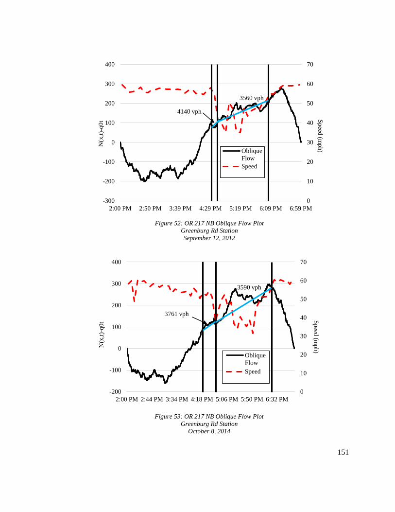
151
Figure 52: OR 217 NB Oblique Flow Plot
Greenburg Rd Station
September 12, 2012
Figure 53: OR 217 NB Oblique Flow Plot
Greenburg Rd Station
October 8, 2014
0
10
20
30
40
50
60
70
-300
-200
-100
0
100
200
300
400
2:00 PM 2:50 PM 3:39 PM 4:29 PM 5:19 PM 6:09 PM 6:59 PM
Oblique
Flow
Speed
N(x
,t)-
q0
t3560 vph
4140 vph
Sp
eed(m
ph)
1 3 5 7 9 11131517192123252729313335373941434547495153
0
10
20
30
40
50
60
70
-200
-100
0
100
200
300
400
2:00 PM 2:44 PM 3:34 PM 4:18 PM 5:06 PM 5:50 PM 6:32 PM
Oblique
Flow
Speed
N(x
,t)-
q0
t
3590 vph
3761 vph
Sp
eed (m
ph)
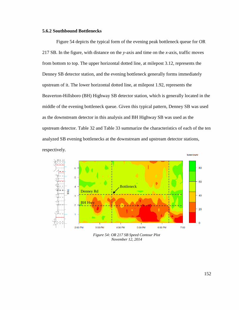
152
5.6.2 Southbound Bottlenecks
Figure 54 depicts the typical form of the evening peak bottleneck queue for OR
217 SB. In the figure, with distance on the y-axis and time on the x-axis, traffic moves
from bottom to top. The upper horizontal dotted line, at milepost 3.12, represents the
Denney SB detector station, and the evening bottleneck generally forms immediately
upstream of it. The lower horizontal dotted line, at milepost 1.92, represents the
Beaverton-Hillsboro (BH) Highway SB detector station, which is generally located in the
middle of the evening bottleneck queue. Given this typical pattern, Denney SB was used
as the downstream detector in this analysis and BH Highway SB was used as the
upstream detector. Table 32 and Table 33 summarize the characteristics of each of the ten
analyzed SB evening bottlenecks at the downstream and upstream detector stations,
respectively.
Figure 54: OR 217 SB Speed Contour Plot
November 12, 2014
.17
.18
.26
.53
.60
.42
.48
.81
0.80
Station Influence Length
0.83
0.59
.67
MP .10 - Barnes
MP .45 - Wilshire
MP .76 - Walker
MP 1.92 – B-H Hwy
MP 2.55 - Allen
MP 3.12 - Denney
MP 3.5 - Hall
MP 4.35 – Scholls Ferry
MP 5.11 - Greenburg
MP 5.95 – 99W West
MP 6.77 – 72nd
MP 7.0 – OR 217 WB to SB
U.S. 26 West
U.S. 26 East
I-5 SB
MP .25 - WAVETRONIX
MP 1.5 - WAVETRONIX
.52
.58
MP 3.4 - WAVETRONIX.19
= Loop Detector
= Radar Detector
= VAS Sign
MP .66 - Walker
MP 1.34 – TV Hwy
MP 2.16 – Allen
MP 2.68 - Denney
MP 3.85 – Scholls Ferry
MP 4.65 - Greenburg
MP 5.85 – 99W West
MP 5.9 – 99W East
MP 6.61 – 72nd
.54
.42
.41
.59
.62
.59
.62
1.00
U.S. 26 East
Barnes
MP .25 - WAVETRONIX
MP 3.4 - WAVETRONIX
MP 1.5 - WAVETRONIX
.46
.63
1.01
Station Influence Length
0.38
7
6
5
4
3
2
1
0
Milepost
BH Hwy
Denney Rd
Bottleneck
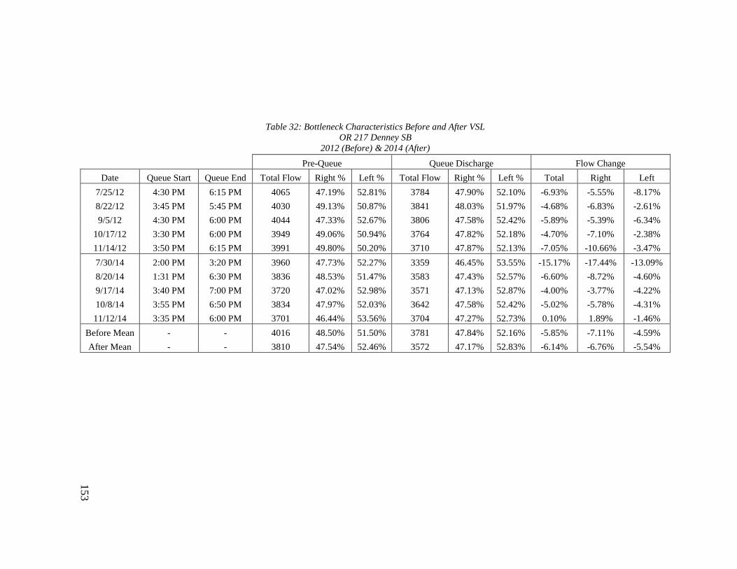
153
Table 32: Bottleneck Characteristics Before and After VSL
OR 217 Denney SB
2012 (Before) & 2014 (After)
Pre-Queue Queue Discharge Flow Change
Date Queue Start Queue End Total Flow Right % Left % Total Flow Right % Left % Total Right Left
7/25/12 4:30 PM 6:15 PM 4065 47.19% 52.81% 3784 47.90% 52.10% -6.93% -5.55% -8.17%
8/22/12 3:45 PM 5:45 PM 4030 49.13% 50.87% 3841 48.03% 51.97% -4.68% -6.83% -2.61%
9/5/12 4:30 PM 6:00 PM 4044 47.33% 52.67% 3806 47.58% 52.42% -5.89% -5.39% -6.34%
10/17/12 3:30 PM 6:00 PM 3949 49.06% 50.94% 3764 47.82% 52.18% -4.70% -7.10% -2.38%
11/14/12 3:50 PM 6:15 PM 3991 49.80% 50.20% 3710 47.87% 52.13% -7.05% -10.66% -3.47%
7/30/14 2:00 PM 3:20 PM 3960 47.73% 52.27% 3359 46.45% 53.55% -15.17% -17.44% -13.09%
8/20/14 1:31 PM 6:30 PM 3836 48.53% 51.47% 3583 47.43% 52.57% -6.60% -8.72% -4.60%
9/17/14 3:40 PM 7:00 PM 3720 47.02% 52.98% 3571 47.13% 52.87% -4.00% -3.77% -4.22%
10/8/14 3:55 PM 6:50 PM 3834 47.97% 52.03% 3642 47.58% 52.42% -5.02% -5.78% -4.31%
11/12/14 3:35 PM 6:00 PM 3701 46.44% 53.56% 3704 47.27% 52.73% 0.10% 1.89% -1.46%
Before Mean - - 4016 48.50% 51.50% 3781 47.84% 52.16% -5.85% -7.11% -4.59%
After Mean - - 3810 47.54% 52.46% 3572 47.17% 52.83% -6.14% -6.76% -5.54%
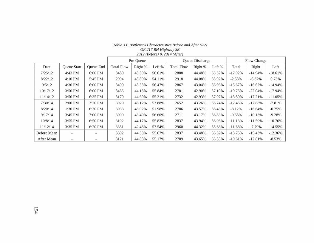
154
Table 33: Bottleneck Characteristics Before and After VAS
OR 217 BH Highway SB
2012 (Before) & 2014 (After)
Pre-Queue Queue Discharge Flow Change
Date Queue Start Queue End Total Flow Right % Left % Total Flow Right % Left % Total Right Left
7/25/12 4:43 PM 6:00 PM 3480 43.39% 56.61% 2888 44.48% 55.52% -17.02% -14.94% -18.61%
8/22/12 4:10 PM 5:45 PM 2994 45.89% 54.11% 2918 44.08% 55.92% -2.53% -6.37% 0.73%
9/5/12 4:30 PM 6:00 PM 3400 43.53% 56.47% 2867 43.04% 56.96% -15.67% -16.62% -14.94%
10/17/12 3:50 PM 6:00 PM 3465 44.16% 55.84% 2781 42.90% 57.10% -19.75% -22.04% -17.94%
11/14/12 3:50 PM 6:35 PM 3170 44.69% 55.31% 2732 42.93% 57.07% -13.80% -17.21% -11.05%
7/30/14 2:00 PM 3:20 PM 3029 46.12% 53.88% 2652 43.26% 56.74% -12.45% -17.88% -7.81%
8/20/14 1:30 PM 6:30 PM 3033 48.02% 51.98% 2786 43.57% 56.43% -8.12% -16.64% -0.25%
9/17/14 3:45 PM 7:00 PM 3000 43.40% 56.60% 2711 43.17% 56.83% -9.65% -10.13% -9.28%
10/8/14 3:55 PM 6:50 PM 3192 44.17% 55.83% 2837 43.94% 56.06% -11.13% -11.59% -10.76%
11/12/14 3:35 PM 6:20 PM 3351 42.46% 57.54% 2960 44.32% 55.68% -11.68% -7.79% -14.55%
Before Mean - - 3302 44.33% 55.67% 2837 43.48% 56.52% -13.75% -15.43% -12.36%
After Mean - - 3121 44.83% 55.17% 2789 43.65% 56.35% -10.61% -12.81% -8.53%

155
At the Denney SB station, typically located just downstream of southbound
evening bottlenecks, the average flow drop between pre-queue and queue discharge
conditions was slightly higher during the “after” period. This is consistent with the results
from Allen NB, which is also generally downstream of the bottleneck and has
experienced an increase in the pre-queue to queue discharge flow drop since VSL
implementation. Lane flow during bottleneck queues at Denney SB was slightly more
uneven during the “after” period. However, the average flow drops in each lane were
more uniform than during the “before” period, when, on average, flow in the right lane
dropped over 50% more than flow in the left lane.
The average flow drop at BH Highway SB, which is generally within the evening
bottleneck queue, was lower during the “after” bottlenecks, going from 13.75% to
10.61%. Again, this is consistent with the results of the northbound bottleneck analysis,
since the average flow drop at Greenburg NB has also fallen since VSL implementation.
Lane flow distribution at BH Highway SB in queued conditions was essentially the same
during the “before” and “after” bottlenecks, with the percentages of total flow in each
lane changing by less than 0.5%. The average flow drops in each lane were farther apart
during the “after” bottlenecks, with the average flow drop in the right lane being about
50% greater than that in the left lane. During the “before” bottlenecks, the average flow
drop in the right lane was only 25% greater than that in the left lane. Both before and
after the VSL system, the average flow drops at BH Highway SB were larger than at
Denney SB, but the difference was smaller for the “after” bottlenecks.

156
5.6.3 Discussion
Since activation of the VSL system on OR 217, there have been differing impacts
on the flow drops that accompany the formation of bottlenecks depending on where flows
are being measured. Stations immediately downstream of bottlenecks have experienced
an increase in the flow drop between pre-queue and queue discharge conditions, while
stations upstream of the bottlenecks and caught within their queues, have experienced a
decrease in the magnitude of the flow drop. The flow drops at the downstream stations
were more consistent across both lanes during the “after” bottlenecks, while there was a
greater difference between the flow drops in each lane at the upstream stations.
The results from the two analyzed stations typically located upstream of evening
bottlenecks, Greenburg NB and BH Highway SB, are in agreement with what was
predicted in Table 2. Overall, the drops in flow that occur at each station upon the arrival
of an evening bottleneck queue have decreased about 3% since VSL implementation,
suggesting that breakdowns in flow associated with congestion are less severe. A possible
cause for this finding is heightened awareness among drivers of downstream congestion
due to the VSL system. When the system is active, it, in conjunction with VMS
messages, acts as a warning to drivers that they should expect congestion ahead, giving
them more time to gradually decelerate and reducing the number of drivers being forced
to stop abruptly when they reach the tail of a queue. VSL signs upstream of the typical
northbound evening bottleneck location around milepost 3 are located at mileposts 4.13,
4.96, 5.71, and 6.69, meaning the system can begin alerting drivers of downstream
congestion and instructing them to begin slowing nearly four miles away from the

157
bottleneck. VSL signs upstream of the typical southbound evening bottleneck location
around milepost 3, at mileposts 2.48, 1.58, 0.91 and 0.25, can warn drivers to begin
decelerating nearly three miles in advance of the bottleneck. The heightened awareness
among drivers should limit the occurrence of capacity-reducing stop-and-go conditions
and allow traffic to progress through the queue at a smooth, albeit slower, rate.
The two stations typically located downstream of evening bottlenecks, in contrast
to the upstream stations and the predictions in Table 2, experienced an increase in the
flow drops that accompany bottleneck formation after VSL implementation. The average
pre-queue to queue discharge flow drop at Allen NB was almost twice as large during the
“after” bottlenecks and the drop at Denney SB was only about 5% larger. Part of this
heightened drop in flow downstream of bottlenecks after VSL may be attributable to
lingering influences of the VSL system after drivers have escaped from queued
conditions. Prior to the system’s activation, many drivers would likely accelerate quickly
to take as much advantage as possible of the sudden change to free-flow conditions. With
the system in place, however, drivers may still have the lower posted speeds in mind
when they escape congestion.
Increased homogeneity in the left and right lane flow drops downstream of
congestion could also be a result of the VSL system. Since VSL implementation, the flow
drop at Allen NB and Denney SB has been relatively consistent across both lanes,
whereas the average flow drops in the right lane were significantly larger than those in
the left lane before VSL. This may be an indication that, if the VSL is helping to even out
lane flow distribution as suggested by the results in Section 5.4, drivers are realizing the
158
benefits of even distribution and attempting to maintain it even after escaping the
congestion targeted by the system. Thus, rather than a lot of drivers in the right lane
unnecessarily moving to the “fast” left lane upon passing through a bottleneck to make up
time, as was likely the case before the system, many are simply choosing to stay in
whichever lane they happen to be in since they understand excess lane-changing will not
benefit them.
The results for the two downstream detector stations are consistent with the
findings of an evaluation of a VSL system near Munich, Germany. In that evaluation,
which used a similar methodology for diagnosing and analyzing bottlenecks, the mean
drop in flow between pre-queue and queue discharge conditions was found to be 4% with
the VSL system on, higher than the average 3% drop with the system off (Weikl et al.,
2013). Additionally, that study found an increase in lane homogeneity downstream of
bottlenecks, similar to the increased consistency of the flow drops in adjacent lanes
reported for this study of OR 217. One area where the two evaluation results differ is lane
flow distribution within bottleneck queues. In the Munich study, homogeneity between
lanes within the congested area was found to be greater with the VSL system on, while
this study found that lane flow distribution actually became more uneven with the VSL
system in place. However, the corridor of interest in the Munich study was three lanes
across and includes different driving rules for trucks, so the results of the two studies are
not completely comparable.

159
5.7 Impact of Adverse Weather on Travel Time
Section 3.3 showed that the performance of OR 217 can be compromised even
more than usual when adverse weather, particularly precipitation, is present. A weather-
responsive component was included in the corridor’s VSL system to mitigate the negative
impacts that weather can have on both operations and safety. Detailed data about weather
conditions during crashes after VSL implementation is not yet available, so the
relationship between weather and safety post-VSL cannot be analyzed in depth. Traffic
flow data that is available, though, can be used to shed light on any operational benefits
of the weather-responsive component. In this section, the methods described in Section
4.4.6 are used to compare corridor-wide travel times during adverse weather before and
after VSL implementation.
5.7.1 Effect of Precipitation on Travel Times
The presence of precipitation can have a significant impact on corridor-wide
travel times. Figure 55 through Figure 58 demonstrate this by showing average hourly
midweek travel times along OR 217 NB (Figure 55 and Figure 56) and OR 217 SB
(Figure 57 and Figure 58) in “wet” and “dry” conditions both before (October 2012 –
February 2013) and after (October 2014 – February 2015) VSL implementation. In each
of the figures, the dotted lines, representing travel times when precipitation is present, are
clearly higher than the solid lines, representing travel times during dry conditions. For
instance, before VSL, the average “dry” travel time at 5:00 PM for the OR 217 SB left
lane was 15.13 minutes and the average “wet” travel time was 22.25 minutes, a 47%
increase. Additionally, the gaps between “wet” and “dry” travel times are largest during

160
the morning and evening peak hours. Welch’s t-tests confirmed that the differences
between “wet” and “dry” travel times were statistically significant at a confidence level
of 95% for all lanes both before and after VSL implementation.
Comparing the “before” and “after” data, the increases in travel time during
precipitation before VSL, represented by the thinner lines, are much larger for every lane
except the northbound left lane. Table 34 validates this observation by summarizing the
average differences between “wet” and “dry” travel times before and after VSL
implementation, both for an entire day and peak hours. The italicized values indicate the
number of hourly travel time values obtained for each time period, and the bold “after”
values indicate declines in travel times after VSL implementation. All of the differences
shown in the table were found to be statistically significant at a confidence level of 95%.
As shown, every difference between “wet” and “dry” travel times was greater during the
“before” period except for those in the northbound left lane. For instance, average “wet”
travel times in the southbound right lane were 2.06 minutes greater than “dry” travel
times before VSL and only 1.06 minutes greater after VSL. The table also clearly shows
that differences between “wet” and “dry” travel times are amplified during peak hours,
being between two and four times greater than overall differences.

161
Table 34: Travel Times in “Wet” & “Dry” Conditions Before and After VSL
October – February Midweek Days, 2012-2013 (Before) & 2014-2015 (After)
All Hours Peak Hours
Dry Mean
TT (min)
Wet Mean
TT (min)
Difference
(min)
Dry Mean
TT (min)
Wet Mean
TT (min)
Difference
(min)
Before NB Left 9.18 (1324) 10.02 (180) 0.83 11.47 (378) 14.08 (56) 2.62
After NB Left 8.99 (1277) 10.29 (187) 1.3 11.93 (374) 15.45 (52) 3.52
Before NB Right 9.98 (1324) 11.16 (180) 1.17 12.83 (378) 16.29 (56) 3.46
After NB Right 8.82 (1277) 9.75 (187) 0.94 10.91 (374) 13.29 (52) 2.39
Before SB Left 8.79 (1324) 10.37 (180) 1.58 11.13 (378) 14.70 (56) 3.57
After SB Left 8.58 (1277) 9.62 (187) 1.04 11.23 (374) 13.66 (52) 2.43
Before SB Right 10.52 (1324) 12.58 (180) 2.06 13.58 (378) 18.68 (56) 5.1
After SB Right 9.62 (1277) 11.18 (187) 1.56 13.10 (374) 16.72 (52) 3.62
The table also supports the travel time improvements presented in Section 5.5, as
mean travel times were lower after VSL for twelve of the sixteen lane and precipitation
combinations analyzed. The magnitudes of the drops in “wet” travel times were mostly
greater than the drops in “dry” travel times for the same combination of lane and hours.
For instance, the mean peak hour travel time in the northbound right lane during “dry”
conditions fell 1.92 minutes, or 15%, after VSL implementation, while the mean peak
hour travel time during “wet” conditions fell 3 minutes, or 18.4%. This suggests that the
weather-responsive component of the system may be more effective at enhancing the
corridor’s operational performance than the congestion-responsive component, possibly
because drivers are more apt to respond to the system during adverse weather.
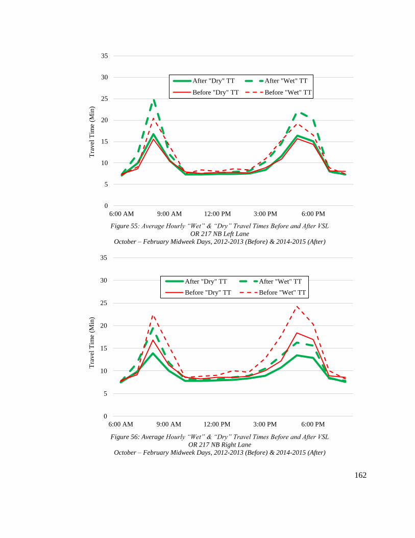
162
Figure 55: Average Hourly “Wet” & “Dry” Travel Times Before and After VSL
OR 217 NB Left Lane
October – February Midweek Days, 2012-2013 (Before) & 2014-2015 (After)
Figure 56: Average Hourly “Wet” & “Dry” Travel Times Before and After VSL
OR 217 NB Right Lane
October – February Midweek Days, 2012-2013 (Before) & 2014-2015 (After)
0
5
10
15
20
25
30
35
6:00 AM 9:00 AM 12:00 PM 3:00 PM 6:00 PM
After "Dry" TT After "Wet" TT
Before "Dry" TT Before "Wet" TTT
ravel
Tim
e (M
in)
0
5
10
15
20
25
30
35
6:00 AM 9:00 AM 12:00 PM 3:00 PM 6:00 PM
After "Dry" TT After "Wet" TT
Before "Dry" TT Before "Wet" TT
Tra
vel
Tim
e (M
in)

163
0
5
10
15
20
25
30
35
6:00 AM 9:00 AM 12:00 PM 3:00 PM 6:00 PM
After "Dry" TT After "Wet" TT
Before "Dry" TT Before "Wet" TTT
ravel
Tim
e (M
in)
0
5
10
15
20
25
30
35
6:00 AM 9:00 AM 12:00 PM 3:00 PM 6:00 PM
After "Dry" TT After "Wet" TT
Before "Dry" TT Before "Wet" TT
Tra
vel
Tim
e (M
in)
Figure 57: Average Hourly "Wet" & "Dry" Travel Times Before and After VSL
OR 217 SB Left Lane
October - February Midweek Days, 2012-2013 (Before) & 2014-2015 (After)
Figure 58: Average Hourly "Wet" & "Dry" Travel Times Before and After VSL
OR 217 SB Right Lane
October - February Midweek Days, 2012-2013 (Before) & 2014-2015 (After)

164
5.7.2 Effect of Precipitation on Travel Time Variability
Section 3.3 also highlighted how, prior to the VSL system, the already significant
variability in OR 217 travel times was even higher during adverse weather. Since VSL
implementation, the discrepancy in travel time variability between “wet” and “dry” times
has diminished substantially. Table 35 shows average standard deviations of travel time
in “wet” and “dry” conditions both before and after the VSL system during all hours and
just peak hours. Again, the italicized values indicate the number of hourly travel time
values obtained for each time period and the bold “after” values indicate declines in
travel times after VSL implementation, and all of the differences were statistically
significant. As can be seen, before VSL, peak hour travel time standard deviations were
between 19 and 78% greater during wet conditions in all four lanes, signifying that
drivers were varying considerably in how they adjusted their driving to compensate for
adverse weather. After the VSL system became active, this trend almost entirely
disappeared or even reversed, as peak hour “wet” travel time standard deviations were
between 11% smaller and 17% greater than “dry” standard deviations during the “after”
period. Overall, the “wet” standard deviations were generally smaller than their
respective “dry” standard deviations after VSL implementation, indicating drivers were
behaving more homogeneously during adverse weather.

165
Table 35: Standard Deviations of Travel Time in "Wet" & "Dry" Conditions Before and After VSL
October – February Midweek Days, 2012-2013 (Before) & 2014-2015 (After)
All Hours Peak Hours
Dry TT SD
(min)
Wet TT SD
(min)
Difference
(%)
Dry TT SD
(min)
Wet TT SD
(min)
Difference
(%)
Before NB Left 2.90 (1324) 2.39 (180) -17.56% 3.55 (378) 4.23 (56) 19.17%
After NB Left 1.72 (1277) 1.81 (187) 5.20% 3.93 (374) 4.57 (52) 16.36%
Before NB Right 2.83 (1324) 2.61 (180) -7.92% 4.16 (378) 5.14 (56) 23.58%
After NB Right 1.29 (1277) 1.21 (187) -6.17% 3.01 (374) 3.03 (52) 0.61%
Before SB Left 1.61 (1324) 2.65 (180) 64.52% 3.11 (378) 5.53 (56) 77.86%
After SB Left 1.91 (1277) 1.69 (187) -11.67% 3.85 (374) 3.44 (52) -10.63%
Before SB Right 3.10 (1324) 4.51 (180) 45.28% 4.53 (378) 7.86 (56) 73.45%
After SB Right 2.38 (1277) 2.25 (187) -5.43% 5.01 (374) 4.72 (52) -5.87%
The results in Table 35 provide further evidence of the reductions in travel time
variability seen in Section 5.5. Travel time standard deviations were lower after VSL for
eleven of the sixteen lane and precipitation combinations analyzed. However, only the
northbound right lane showed a drop in travel time variability during “dry” peak hours,
while only the northbound left lane did not show a drop during “wet” peak hours. Since
the congestion-responsive component of the VSL system is most likely to be active
during peak hours, this finding could be further indication that the weather-responsive
component has been more effective at improving operational performance or that drivers
are more likely to heed the system during adverse weather.
Figure 59 further demonstrates the improvements in “wet” variability since VSL
implementation by presenting boxplots of peak hour travel times in each lane. The red
boxes represent “before” travel times and the green boxes represent “after” travel times.
For each box, the middle line represents median travel time, the lower edge represents the
25th percentile travel time, and the upper edge represents the 75th percentile travel times.

166
The “whiskers” extending out from each box symbolize the interquartile range for each
set of data, and longer “whiskers” indicate a higher degree of variability. For the two
right lanes, there is clearly more variability in the “before” travel times, as both the upper
edge of the “before” boxes and the upper whiskers are noticeably higher than those for
the “after” period. The only lane for which there was more variability in “wet” travel
times after VSL implementation was the northbound left lane, as previously demonstrated
in Table 35.
Figure 59: Peak Hour Travel Time Variability in "Wet" Conditions Before and After VSL
OR 217
October – February Midweek Days, 2012-2013 (Before) & 2014-2015 (After)

167
5.7.3 Discussion
Through the first seven months of the VSL system’s operation, the significant
declines in the efficiency and throughput of OR 217 during precipitation events present
before the system appear to have largely been negated. Prior to VSL implementation,
average peak hour travel times along the corridor were generally between three and four
minutes greater during “wet” conditions. After the VSL system began to operate, these
gaps dropped to about 2.5 minutes. Increases in travel time are to be expected during
adverse weather as drivers slow down for safety reasons, so the drop in “wet” travel times
post-VSL is surprising. Part of this may be due to the significantly higher precipitation
total recorded during the “before” period. According to the Portal weather data, 24.3
inches of precipitation was recorded at Hillsboro Airport during the “before” analysis
period, while only 16.72 inches was recorded during the “after” period. Differences in
precipitation intensity between the two periods may also be partially responsible, but the
hourly nature of the available weather data made it impossible to accurately assess
intensity.
The reduction in “wet” travel times may also be a secondary effect of the drop in
“wet” travel time variability since VSL implementation. By harmonizing the flow of
traffic and negating the uptick in speed variability that accompanied adverse weather in
the past, the system could actually be reducing how much drivers need to slow down to
maintain safe operations, helping to explain why “wet” travel times have fallen. The
observation from Table 34 that the drops in “wet” mean travel times were generally
larger than the drops in “dry” mean travel times could be an indication that either the

168
VSL signs are more visible in cloudy and rainy conditions or that drivers are more likely
to pay attention to them in such conditions.
In contrast to the reduction in the speed difference between “wet” and “dry”
conditions, the drop in travel time variability during “wet” conditions is clearly a positive
development since VSL implementation and supports the hypothesis in Table 2. Prior to
the system, travel times were much more variable during “wet” conditions, but since it
began operation, “wet” travel time variability has generally been lower than “dry”
variability. Such a change is positive for the safety of OR 217 because shrinking the
variability in travel speeds reduces the likelihood of a collision between drivers adjusting
differently to compensate for adverse weather. The change in “wet” speed variability is
most likely the result of increased awareness of adverse weather due to the VSL system.
Operating VSL signs, in conjunction with variable message signs, provide a clear
indication of when weather is compromising safety, so they make a larger share of the
traffic stream aware that they should be slowing down. Additionally, the system tells
drivers what an appropriate reduced speed is, rather than leaving it up to them to choose a
pace they are comfortable with. The drop in “wet” speed variability could also be an
indication that the VSL system is dampening acceleration and deceleration rates during
adverse weather, which would be another safety benefit. By posting appropriate reduced
speeds, the system may be helping drivers to gradually and uniformly adapt to changing
weather rather than randomly and rapidly brake or speed up based on their individual
levels of comfort with the driving conditions.
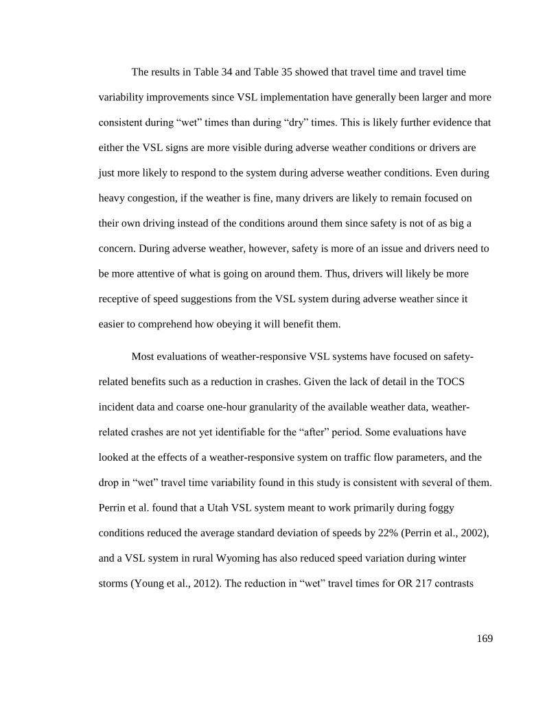
169
The results in Table 34 and Table 35 showed that travel time and travel time
variability improvements since VSL implementation have generally been larger and more
consistent during “wet” times than during “dry” times. This is likely further evidence that
either the VSL signs are more visible during adverse weather conditions or drivers are
just more likely to respond to the system during adverse weather conditions. Even during
heavy congestion, if the weather is fine, many drivers are likely to remain focused on
their own driving instead of the conditions around them since safety is not of as big a
concern. During adverse weather, however, safety is more of an issue and drivers need to
be more attentive of what is going on around them. Thus, drivers will likely be more
receptive of speed suggestions from the VSL system during adverse weather since it
easier to comprehend how obeying it will benefit them.
Most evaluations of weather-responsive VSL systems have focused on safety-
related benefits such as a reduction in crashes. Given the lack of detail in the TOCS
incident data and coarse one-hour granularity of the available weather data, weather-
related crashes are not yet identifiable for the “after” period. Some evaluations have
looked at the effects of a weather-responsive system on traffic flow parameters, and the
drop in “wet” travel time variability found in this study is consistent with several of them.
Perrin et al. found that a Utah VSL system meant to work primarily during foggy
conditions reduced the average standard deviation of speeds by 22% (Perrin et al., 2002),
and a VSL system in rural Wyoming has also reduced speed variation during winter
storms (Young et al., 2012). The reduction in “wet” travel times for OR 217 contrasts

170
with the results of a VSL system in the Netherlands which caused average speeds to drop
between 8 and 10 kph during foggy conditions (Robinson, 2000).
Higher resolution weather data is needed to perform a more detailed analysis of
the effects of the weather-responsive component of the VSL system. Hourly precipitation
data makes it impossible to decipher exactly when precipitation was falling and how
intense it was, limiting the accuracy and significance of any findings spawning from it.
The RWIS sensors installed on OR 217 as a part of the corridor’s large ATM expansion
project will be an extremely valuable source of weather data for future research into the
system’s impact. Additionally, the release of more detailed reported crash data from
ODOT, which does indicate weather conditions during each crash, will allow for an in-
depth comparison of the link between weather and crashes before and after the VSL
system. Despite the limitations of the available weather data, though, this study has still
shown that it is changing how drivers respond to adverse weather.
171
5.8 Summary
In this chapter, the results of the “before” and “after” evaluation of the OR 217
VSL system were reported and discussed in depth. In the eight months since the VSL
system was first activated, it is clear that there have been some significant changes to the
performance characteristics of the corridor. Table 36 reintroduces the evaluation
questions and their hypotheses presented in Table 2 and compares them to the general
findings from this chapter. The fourth column of Table 36 provides a visual
representation of how well the final results aligned with the initial predictions, with more
filled-in circles representing a greater degree of agreement. Many of the findings were
supportive of the hypotheses laid out in Table 2, while others seem to directly contradict
what was expected. The hypotheses and results correlated best for the evaluation
questions relating to travel time reliability and lane flow distribution. Additionally, the
results were largely in agreement with the results from past evaluation studies of other
VSL systems, though some differences were noted as well. All of the results from this
chapter are summarized in greater detail in the remainder of this section.

172
Table 36: Evaluation Results Matrix
Evaluation Question Hypotheses Results
Correlation
with
Hypotheses
Is the variability in measured speeds affected
by the VSL system?
Speed variance, particularly during
peak demand hours, will be reduced
Speed variance generally decreased at
two northern stations and increased at
two southern stations; Improvements
were largest during peak hours
●●●○○
Will the frequency and distribution of
crashes be affected by the VSL system?
Crash rates, particularly the rate of rear-
end crashes, will be reduced
The crash rate per million VMT
increased, but crashes were less frequent
near VSL signs
●●○○○
The relative frequency of crashes during
peak demand hours will be reduced
The relative frequency of crashes during
the AM peak fell but remained
unchanged during the PM peak
●●●○○
Is speed variance between adjacent lanes
affected by the VSL system?
Lane speed differentials, particularly
during peak hours, will be reduced
Lane speed differentials generally
increased, with little difference between
peak and midday hours
●○○○○
Is flow variance between adjacent lanes
affected by the VSL system?
Total flow, particularly during peak
hours, will be more evenly distributed
between adjacent lanes
Lane flow differentials generally
decreased, particularly during midday
and PM peak hours
●●●●○
Does the VSL system improve the reliability
of travel times?
Travel times will be more reliable,
particularly during peak demand hours
Travel time reliability generally
improved, except in the northbound left
lane; Improvements were largest during
midday hours
●●●●○
Are the reductions in flow that accompany
bottleneck formation affected by the VSL
system?
The reductions in flow caused by
bottlenecks, both upstream and
downstream, will be less severe
Reductions in flow were less severe
upstream of bottlenecks and more severe
downstream of bottlenecks
●●●○○
Does the VSL system affect the changes in
travel time and travel time variability that
accompany adverse weather conditions?
The increase in travel time during
adverse weather conditions will be larger
The increase in travel time during
adverse weather was generally smaller ●○○○○
Travel times during adverse weather
conditions will become more reliable
than during fair weather conditions
Travel time variability during adverse
weather was generally smaller than
during fair weather
●●●●●
173
Since radar detector data was only available for the “after” period, it was of
interest to see how inclusion of this data might affect corridor-wide measurements such
as travel time. Section 5.1 showed that, overall, corridor-wide travel times obtained from
radar-inclusive and radar-omitting data sets are not significantly different. Most of the
measured differences in average travel times and buffer indices between the two data sets
were insignificant, with travel times obtained from the radar-inclusive data set tending to
be 0 to 5% lower than those obtained from the radar-omitting data set. With these
findings, it was reasoned that including “after” radar data when comparing to “before”
data would be acceptable.
The results of the speed variation analysis in Section 5.2 were largely
inconsistent. The two analyzed stations located on the northern portion of OR 217
showed significant reductions in peak hour speed variability following VSL
implementation, while the two stations located further south showed significant increases
in variability. Possible reasons mentioned for this discrepancy were the differing
alignment and development characteristics near each pair of stations and the relative
amount of speed variation present at each pair of stations during the “before” period.
Additionally, it was shown that, for the stations that did see a reduction in speed
variability, the declines were most pronounced during the months when the ramp
metering system was operating at an optimized rate, suggesting that these operational
benefits are maximized when the two systems are both functioning properly.
Not enough “after” data was available at the time of this study to definitively
assess the impacts of the VSL system on safety, but preliminary results presented in
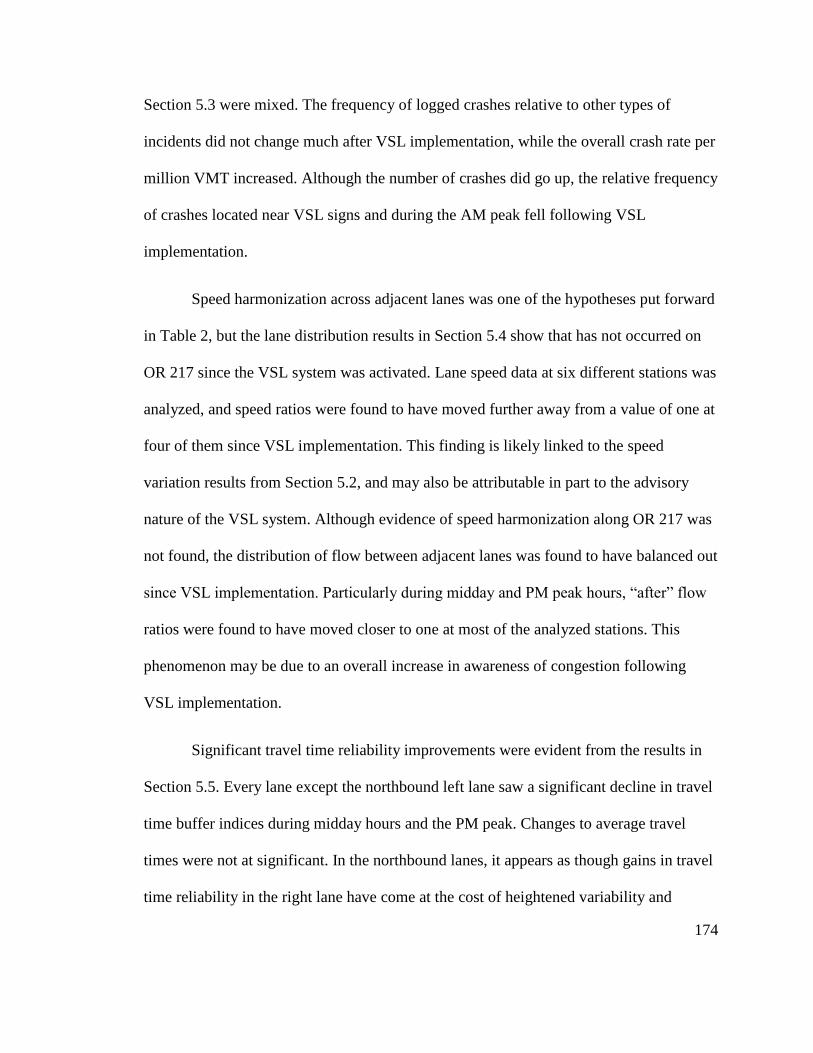
174
Section 5.3 were mixed. The frequency of logged crashes relative to other types of
incidents did not change much after VSL implementation, while the overall crash rate per
million VMT increased. Although the number of crashes did go up, the relative frequency
of crashes located near VSL signs and during the AM peak fell following VSL
implementation.
Speed harmonization across adjacent lanes was one of the hypotheses put forward
in Table 2, but the lane distribution results in Section 5.4 show that has not occurred on
OR 217 since the VSL system was activated. Lane speed data at six different stations was
analyzed, and speed ratios were found to have moved further away from a value of one at
four of them since VSL implementation. This finding is likely linked to the speed
variation results from Section 5.2, and may also be attributable in part to the advisory
nature of the VSL system. Although evidence of speed harmonization along OR 217 was
not found, the distribution of flow between adjacent lanes was found to have balanced out
since VSL implementation. Particularly during midday and PM peak hours, “after” flow
ratios were found to have moved closer to one at most of the analyzed stations. This
phenomenon may be due to an overall increase in awareness of congestion following
VSL implementation.
Significant travel time reliability improvements were evident from the results in
Section 5.5. Every lane except the northbound left lane saw a significant decline in travel
time buffer indices during midday hours and the PM peak. Changes to average travel
times were not at significant. In the northbound lanes, it appears as though gains in travel
time reliability in the right lane have come at the cost of heightened variability and

175
congestion in the left lane, possibly as a result of flow homogenizing effects of the VSL
system. Additionally, the improvements in travel time reliability for each northbound
lane gradually grew in magnitude over the course of the eight month “after” period,
indicating that it took drivers a fair amount of time to actually adjust their behavior in
response to the VSL system. Contrastingly, the results for each of the southbound lanes
were strikingly similar to one another, with no one lane showing significantly more
improvement in reliability. There was also no obvious temporal trend in the results for
the southbound lanes. One thing that was consistent among all the travel time reliability
results was that the gains in reliability were greatest during midday hours, suggesting the
VSL system is most impactful during moderate, rather than severe, congestion.
Section 5.6, which focused on the characteristics of recurrent bottlenecks before
and after the VSL system, showed that stations located within bottleneck queues have
seen decreases in the magnitude of the flow drop that accompanies a transition from pre-
queue to queue discharge conditions, while the flow drop increased at stations
immediately downstream of the typical bottleneck locations. The decline in the flow drop
upstream of bottlenecks may be due to an increased awareness among drivers of
downstream congestion thanks to the VSL system, giving them more time to decelerate
gradually.
Adverse weather can have a significant impact on corridor travel times and travel
time variability, and, as shown in Section 5.7, the VSL system seems to have had an
effect on the magnitude of this impact. Since VSL implementation, the difference in
travel times during “wet” and “dry” conditions has declined, suggesting that the

176
breakdowns in performance associated with adverse weather have decreased in severity.
Since the primary intent of the system’s weather-responsive component is to slow drivers
down during poor weather, this finding contrasts with what was expected. However, this
may be an indication that by reducing speed variability during adverse weather, the
system is reducing the degree to which drivers need to slow down to maintain safe
operations. Travel time variability during “wet” conditions was found to be lower than
“dry” variability during the “after” period, rather than greater as during the “before”
period, possibly because the VSL system is choosing an appropriate reduced speed rather
than leaving that decision up to each driver.
Through the first eight months of the VSL system’s operation, changes have
certainly come to the performance of OR 217. Common freeway performance measures
including travel time buffer indices, speed variability, and lane flow distribution were all
statistically significantly different between the “before VSL” and “after VSL” periods.
The dynamics of OR 217’s bottleneck characteristics have also shown some modification
since VSL implementation. Most of the changes aligned with the initial predictions in
Table 2, though some were contrary to what was expected. Some changes in safety trends
for the corridor were also noticeable during the early stages of the VSL system’s
existence. Crashes have become less frequent close to the VSL signs and during the
evening peak, and the increase in travel time variability which accompanied the onset of
adverse weather in the past has dissipated. More time will tell just how effective the VSL
system ends up being at solving OR 217’s array of performance and safety problems.

177
Judging solely from the preliminary findings presented in this study, it seems as though
the system has been a worthwhile investment for the region.

178
6.0 Conclusions
This thesis has analyzed the impacts of a new VSL system on the performance of
OR 217 over the first eight months of the system’s operation. Chapter 1 provided a
background of the concept of variable speed limits and of the OR 217 system in
particular. Chapter 2 summarized the large body of a previous research into VSL systems
throughout the world, highlighting the different types of systems, how they have been
evaluated, and what the results of those evaluations have been. Chapter 3 demonstrated
why state transportation officials chose to instrument OR 217 with a VSL system by
identifying the numerous performance and safety-related issues that have plagued the
corridor in the past. Chapter 4 outlined the methodology followed in order to evaluate the
impact of the OR 217 VSL system, including identification of available data sources, a
series of guiding evaluation questions, and specific analysis techniques for each question.
Finally, Chapter 5 presented and discussed the results of the evaluation.
While the overall effectiveness of the OR 217 VSL system at addressing the
corridor’s noted problems will take more than eight months of “after” data to truly assess,
some changes to OR 217’s performance characteristics are already becoming apparent.
Some locations along the corridor have seen a significant decline in the degree of
variability among measured speeds, a likely result of the traffic homogenizing effects of a
VSL system. This is perhaps one of the most promising findings of the evaluation, as
reduced speed variability could help to solve many of the corridor’s other problems by
limiting the occurrence of stop-and-go traffic, reducing the likelihood of rear-end crashes,

179
mitigating the severity of recurrent bottlenecks, and enhancing the reliability of corridor-
wide travel times.
Other performance measures that have shown widespread improvement along OR
217 since implementation of the VSL system are flow distribution between adjacent lanes
and travel time reliability. Significant discrepancies between flows in the right and left
lanes of a two-lane road can limit efficiency and throughput, since they indicate one lane
is being under-utilized while the other is being over-utilized. In the months following the
VSL system’s activation, there has been a more even split in flow across both lanes in
each direction at several locations along the corridor than there was prior to the system’s
existence, particularly during midday hours and the evening peak. Such a finding
supports the notion that the VSL system is boosting the awareness of drivers, thereby
allowing them to make more efficient use of the corridor. Travel time buffer indices have
largely fallen for three of OR 217’s four primary lanes, again particularly during midday
hours and the evening peak, signaling an increase in travel time reliability. This is likely a
secondary result of the improvements the VSL system has brought to OR 217’s speed
variability and flow distribution. By evening out the movement of traffic through the
corridor, the system is limiting stop-and-go conditions that make travel time predictions
so difficult.
Recurrent bottlenecks have not disappeared from OR 217 since the VSL system
began to operate, but their dynamics have changed. Significant drops in flow following
the transition from a free-flow state to queued conditions are still observable, but the
magnitude of flow drops within bottleneck queues has fallen since VSL implementation.

180
The system appears to be enhancing the ability of drivers to cope with congestion by
giving them more advance warning of downstream congestion and allowing them to
gradually adjust their driving behavior rather than being forced to decelerate rapidly once
they reach the tail of a queue. At the same time, the flow drops downstream of queues
that accompany the formation of bottlenecks have mostly increased in magnitude since
VSL implementation, possibly due to lingering effects from the system. With the system
in place, drivers may still have the lower posted speeds in mind when they escape
congestion.
Preliminary evaluation results of the VSL system’s impact on OR 217’s safety
performance were largely inconclusive, though some signs of improvement were
identified. The frequency of crashes relative to other types of incidents has not changed
significantly since the system began operation, and the crash rate has actually ticked up
slightly. The distribution of crashes on OR 217, both temporally and spatially, has also
changed since VSL implementation, and these changes seem to be an indication of the
safety benefits the system could bring to the corridor in the longer term. Crashes in the
immediate vicinity of VSL signs, many of which were placed at crash “hot spots”, have
become less frequent, and the increase in relative crash frequency associated with the
evening peak and “wet” months were both lower in the period following VSL
implementation.
The increase in travel times that accompanies the onset of adverse weather has,
contrary to what was expected, diminished in magnitude since the VSL system was
activated. This means drivers are not slowing down as much in adverse weather as they
181
were previously. Although reasons for this finding are unclear, it may be due to overall
increase in safety attributable to the VSL system. By harmonizing the flow of traffic, the
system could be reducing the degree to which drivers must slow during adverse weather
to maintain an acceptable level of safety. The growth in travel time variability that
accompanied adverse weather prior to the system has largely dissipated or even reversed
since it began to operate, indicating that, even though they are not slowing down as much
during adverse weather, drivers are slowing down more uniformly. This is additional
evidence of the harmonizing effects of the VSL system, and represents a solid safety
benefit.
6.1 Contributions
This thesis makes several contributions to the continuously expanding body of
research into the effectiveness of VSL systems. The majority of existing VSL systems are
either entirely weather-responsive or congestion-responsive, whereas the OR 217 system
is both. The presented results show that one system encompassing both congestion-
responsive and weather-responsive components can be effective at addressing issues
related to each. With a combination of both meteorological and traffic flow data being
continuously fed into the VSL system, it is able to always compute the reduced speed that
is most appropriate for both the weather and traffic conditions, whereas solely weather-
responsive or congestion-responsive systems can only react to one. The benefits of
having a combined VSL system are most clearly reflected in the reduction in travel time
variability during adverse weather, as this suggests the system is enhancing both the
operational and safety performance of OR 217 during adverse weather.

182
Another contribution of this thesis is that it shows that advisory VSL systems can
have an effect on corridor performance. Previous evaluations of advisory VSL systems
have highlighted their advisory nature as a possible reason for limited effectiveness
(Edara et al., 2013). While some performance measures such as speed distribution in
adjacent lanes and speed variability at certain locations have not improved since VSL
implementation, there has been widespread and significant improvement to measures
such as flow distribution, queue-discharge flow upstream of bottlenecks, and travel time
variability. All of these changes demonstrate that many, though perhaps not all, drivers
on OR 217 are heeding the VSL system despite its postings not being enforceable.
6.2 Limitations
Though this thesis makes some valuable contributions, it is not without its
limitations. The primary limitation is simply the relative dearth of “after VSL” data
available. As of April 1, 2015, the system has only been active for slightly over eight
months. This amount of data allowed for a preliminary assessment of the system’s
impacts, but more time must elapse before its effectiveness can be definitely assessed.
Changes to traffic dynamics do not happen overnight, even with the introduction of
something as major as a VSL system, and it can take a long time for sustained trends to
develop and become identifiable. The lack of “after” data is most limiting for the
evaluation of the system’s impact on safety. Due to annual fluctuations in crash numbers,
several years of crash data is typically used in road safety analyses, but such a sample of
“after” crash data was not available for this study. Additionally, standard delays in the
availability of reported crash data in Oregon meant only detail-lacking and partial

183
incident data was available for the “after” period. Related to the lack of “after” data is the
limited amount of detail in the weather data that was used. The only reliable source of
weather data found for the area, from NOAA, had a relatively low one-hour resolution,
limiting the amount and significance of analysis that could be performed with it. Ideally,
precipitation data with a resolution of no more than 15 minutes could be used to more
directly and accurately link changes in operational performance with changes in the
weather. In the future, weather data from the VSL system itself may also be available.
Another significant limitation of this study is that conditions and instrumentation
along OR 217 have changed in ways aside from those connected to the VSL system since
2012. Limited data availability during 2013 and early 2014 necessitated the selection of
an earlier “before” period for comparison purposes, but doing so also increased the
likelihood that additional external factors aside from the VSL system have had an effect
on corridor performance. While total volumes have not changed dramatically since 2012,
they are generally higher, and the growth in demand is likely to have had its own effects
on measures like lane distribution and travel time reliability. Additionally, any changes to
the corridor’s ramp-metering system since 2012 and occasional switches from optimized
to fixed rates would also impact the performance of OR 217. With all of these other
factors to consider, it is difficult to separate out changes attributable to the VSL system
from those caused by other things.
Finally, this study was restricted to analysis of the conditions on OR 217 with the
system in place. While the VSL system is on OR 217, it could possibly have an impact on
the traffic conditions on surrounding roadways, such as I-5 and US 26, as well. Most of

184
the traffic on OR 217 eventually ends up on one of these other two freeways, so any
significant changes to the flow of traffic on OR 217 could very well spill over to their
traffic streams. The local roads connected to OR 217 by its numerous on and off-ramps
may also be effected by the VSL system, but they were not taken into account in this
study.
In addition to limitations of this study, there are a few potential limitations to the
OR 217 VSL system itself which could restrict its long-term effectiveness. OR 217, with
its closely spaced and diverse array of ramps and numerous horizontal curves, has a
unique geometry that acts as a contributing factor to its heavy congestion. There are very
few stretches along the corridor that are perfectly straight and absent of additional
merging lanes. Because of this, drivers likely need to pay more attention to the actual
roadway on OR 217 than they would on many other freeways, and thus may be less
inclined to notice and heed overhead advisory speed limit signs. Also, when choosing
where to place the VSL signs, ODOT chose to focus on locations with existing structures
that could hold the signs in order to keep the project cost down. Because of this, the signs
may not necessarily be placed in optimal locations for improving corridor performance.
6.3 Future Research
Future research into the effectiveness of the OR 217 VSL system should focus
more on its impacts on corridor safety. Due to the previously mentioned limitations of
this study, not many definite conclusions related to safety could be drawn. In the fall of
2015, the first set of reported crash data covering a period during which the system was
active will be made available. That data will have much more detail about each individual

185
crash than the TOCS incident data used in this study, meaning more substantive analysis
of collision types, weather conditions and severity can be performed. However, that data
set will still contain only five months of “after” data. Several years with the system in
place need to elapse before a comprehensive and reliable assessment of its impacts on
safety can be performed.
Compliance with the VSL system’s posted speeds is another area that could be the
focus of future research. Data is available from the system that indicates, each time the
system is activated, which signs have been prompted and what they are displaying. Such
data could be paired with actual speed data from Portal to see whether or not average
speeds align with the system’s posted speeds. Researchers at California Polytechnic State
University are already working on developing a method to study compliance, as
demonstrated in Figure 60. This figure, with time on the x-axis and location along the y-
axis, shows what speed, if any, was being displayed by each northbound VSL sign over
the course of one day. Such a figure could conceivably be combined with a similar one
showing actual measured speeds at each detector station to assess how much agreement
there was between posted and actual speeds and provide an indication of compliance
levels. It would also be useful to study compliance over time, in order to determine
whether drivers generally become less compliant with the VSL system the longer it has
been active or more compliant.
186
Regression analysis of the influence of various external factors on performance
measures such as travel time and the effectiveness of the VSL system would be another
interesting pursuit. As mentioned previously, the “before” and “after” analysis periods in
this study were not completely identical aside from the introduction of the VSL system.
External factors such as economic conditions and commuting trends have likely seen
considerable change since 2012, but were not controlled for in this study. Any changes to
such variables could impact the usage and performance of OR 217 by changing the size
and characteristics of the corridor’s large commuter pool. In fact, Section 5.5.3 showed
that volumes have largely grown since 2012, so it would be of use in the future to
investigate whether the changes to performance measures like travel time reliability are
more attributable to the VSL system or external demand variables. Additionally,
Figure 60: VSL Sign Display Contour
OR 217 NB
January 5, 2015
Source: Gary Griggins, Cal Polytechnic State University

187
regression analysis could be used to investigate any seasonal trends in the system’s
impact or to compare the congestion-responsive and weather-responsive components.
A more in-depth analysis of the system’s weather-responsive component would
also be worthy of the attention of future researchers. As mentioned, this study was limited
by the lack of detail in available weather data and by having a small sample of adverse
weather conditions to work with. Data from the new weather sensors installed along OR
217 would be a much more accurate and insightful source than NOAA measurements if it
made available to researchers and would allow for a more direct linking between weather
conditions and performance. Additionally, seasonal trends in the effectiveness of the VSL
system could be investigated to see if drivers are more responsive overall to the system
during seasons when adverse weather is more likely to occur.
ODOT is planning on developing a survey in order to gauge public perception of
the VSL system on OR 217, and analyzing that survey’s findings would be another
interesting pursuit for future research. The long-term effectiveness of the system will
largely be assessed by safety statistics and traffic flow data, but it is also important to
determine whether or not drivers actually using the highway notice any improvement. If
the numbers show that performance has improved with the system, but actual drivers
cannot see any difference, the system would not truly be as effective as suggested by the
data. A survey could also help with analysis of compliance by giving an indication of
how often respondents notice and react to the VSL system’s posted speeds.
One of the limitations of this study was that it focused solely on the performance
of OR 217, although the corridor’s VSL system could have residual impacts on

188
surrounding roadways. Thus, future research could also look into a comparison of traffic
conditions on roadways such as I-5 and US 26 before and after the OR 217 VSL system
was activated. Both of these freeways have sets of loop and radar detectors similar to OR
217 that would allow for many of the analyses conducted in this study to be replicated.
Another potential area for future research would be an in-depth comparison of the
OR 217 VSL system with a similar system that is regulatory rather than advisory. If
another commuter-heavy urban corridor instrumented with a regulatory VSL system
could be identified and subjected to an evaluation similar to this one for OR 217, it would
be interesting to see if the magnitudes of its effects on performance and safety varied
significantly from those of the advisory OR 217 system. Such a comparison would shed
additional light on whether or not the extra effort required to establish a regulatory
system is worth it to bring about more significant improvements.

189
References
Abdel-Aty, M., Dilmore, J., & Dhindsa, A. (2006). Evaluation of variable speed limits for
real-time freeway safety improvement. Accident Analysis and Prevention, 38, 335–
345. http://doi.org/10.1016/j.aap.2005.10.010
Al-Kaisy, A., Ewan, L., & Veneziano, D. (2012). Evaluation of a Variable Speed Limit
System for Wet and Extreme Weather Conditions: Phase 1 Report. Bozeman, MT.
Bertini, R. L., & Myton, A. M. (2005). Using PeMS Data to Empirically Diagnose
Freeway Bottleneck Locations in Orange County, California. In TRB 84th Annual
Meeting Compendium of Papers. Washington, D.C.: Transportation Research Board.
Buddemeyer, J., Young, R., Sabawat, V., & Layton, E. (2010). Variable Speed Limits
System for Elk Mountain Corridor. Laramie, WY.
Corthout, R., Tampere, C. M. J., & Deknudt, P. (2010). Assessment of Variable Speed
Limits from the Drivers’ Perspective. In 13th International IEEE Annual
Conference on Intelligent Transportation Systems. Madeira Island, Portugal: IEEE.
DeGaspari, M., Jin, P. J., Walton, C. M., & Wall, W. J. (2013). The Effect of Active
Traffic Management on Travel Time Reliability: A Case Study of I-5 in Seattle. In
TRB 92nd Annual Meeting Compendium of Papers. Washington, D.C.:
Transportation Research Board.
DKS Associates. (2010). OR 217 Interchange Management Study. Salem, OR.
DKS Associates. (2013). Oregon Statewide Variable Speed System Concept of
Operations. Salem, OR.
Edara, P., Sun, C., & Hou, Y. (2013). Evaluation of Variable Advisory Speed Limits in
Work Zones. Columbia, MO.
FHWA. (2014). How Do Weather Events Impact Roads? Retrieved January 23, 2015,
from http://www.ops.fhwa.dot.gov/weather/q1_roadimpact.htm
Goodwin, L. C. (2003). Best Practices for Road Weather Management. Washington,
D.C.
Han, C., Luk, J., Pyta, V., & Cairney, P. (2009). Best Practice for Variable Speed Limits:
Literature Review. Sydney, Australia.
Hellinga, B., & Mandelzys, M. (2011). Impact of Driver Compliance on the Safety and
Operational Impacts of Freeway Variable Speed Limit Systems. Journal of
190
Transportation Engineering, 137, 260–268. http://doi.org/10.1061/(ASCE)TE.1943-
5436.0000214
Hourdos, J., Abou, S. C., & Zitzow, S. (2013). Effectiveness of Urban Partnership
Agreement Traffic Operations Measures in the I-35W Corridor. Minneapolis, MN.
Hranac, R., Sterzin, E., Krechmer, D., Rakha, H., & Farzaneh, M. (2006). Empirical
Studies on Traffic Flow in Inclement Weather. Washington, D.C.
Katz, B., O-Donnell, C., Donoughe, K., Atkinson, J., Finley, M., Balke, K., … Warren,
D. (2012). Guidelines for the Use of Variable Speed Limit Systems in Wet Weather.
McLean, VA.
Kianfar, J., Edara, P., & Sun, C. (2013). Operational Analysis of a Freeway Variable
Speed Limit System - Case Study of Deployment in Missouri. In TRB 92nd Annual
Meeting Compendium of Papers. Washington, D.C.: Transportation Research Board.
Kuhn, B., Gopalakrishna, D., & Schreffler, E. (2013). The Active Transportation and
Demand Management Program (ATDM): Lessons Learned. College Station, TX.
Kwon, E., Brannan, D., Shouman, K., Isackson, C., & Arseneau, B. (2007). Field
Evaluation of a Variable Advisory Speed Limit System for Reducing Traffic
Conflicts at Work Zones. In TRB 86th Annual Meeting Compendium of Papers.
Washington, D.C.: Transportation Research Board.
Kwon, E., Park, C., Lau, D., & Kary, B. (2011). Minnesota Variable Speed Limit System:
Adaptive Mitigation of Shock Waves for Safety and Efficiency of Traffic Flows. In
TRB 90th Annual Meeting Compendium of Papers. Washington, D.C.:
Transportation Research Board.
Lee, C., Hellinga, B., & Saccomanno, F. (2006). Evaluation of variable speed limits to
improve traffic safety. Transportation Research Part C: Emerging Technologies, 14,
213–228. http://doi.org/10.1016/j.trc.2006.06.002
Levy, J. I., Buonocore, J. J., & von Stackelberg, K. (2010). Evaluation of the public
health impacts of traffic congestion: a health risk assessment. Environmental
Health : A Global Access Science Source, 9, 65. http://doi.org/10.1186/1476-069X-
9-65
Lin, P.-W., Kang, K.-P., & Chang, G.-L. (2004). Exploring the Effectiveness of Variable
Speed Limit Controls on Highway Work-Zone Operations. Journal of Intelligent
Transportation Systems, 8, 155–168. http://doi.org/10.1080/15472450490492851

191
Milliken, J. G., Council, F. M., Gainer, T. W., Garber, N. J., Gebbie, K. M., & Hall, W. J.
(1998). Special Report 254: Managing Speed. Washington, D.C.
Mirshahi, M., Obenberger, J., Fuhs, C., Howard, C., Krammes, R., Kuhn, B., … Yung, J.
(2007). Active Traffic Management: The Next Step in Congestion Management.
Washington, D.C.
Monsere, C. M., Eshel, O., & Bertini, R. L. (2009). Empirical Evaluation of Freeway
Corridor Performance Before and After System-Wide Adaptive Ramp Metering
System Implementation. In TRB 88th Annual Meeting Compendium of Papers.
Washington, D.C.: Transportation Research Board.
Neudorff, L. G., Mason, J., & Bauer, J. (2012). Glossary of Regional Transportation
Systems Management and Operations Terms. Washington, D.C.
Perrin, J., Martin, P. T., & Coleman, B. (2002). Testing the Adverse Visibility
Information System Evaluation (ADVISE) - Safer Driving in Fog. In TRB 81st
Annual Meeting Compendium of Papers. Washington, D.C.: Transportation
Research Board.
Rama, P., & Schirokoff, A. (2004). Effects of Weather-Controlled Variable Speed Limits
on Injury Accidents. In Paper presented at the 4th European Congress on ITS.
Budapest, Hungary: ERTICO - ITS Europe.
Robinson, M. (2000). Examples of Variable Speed Limit Applications. Washington, D.C.
Schrank, D., Eisele, B., & Lomax, T. (2012). TTI’s 2012 Urban Mobility Report. College
Station, TX.
Stribiak, J., & Jacobson, L. (2012). Active Traffic Management Guidebook. Washington,
D.C.
SWOV Fact sheet: The influence of weather on road safety. (2012). Leidschendam, the
Netherlands.
Transportation, O. D. of. Establishment of Variable Speed Zones, Pub. L. No. 734-020-
0018 (2012). United States of America: Oregon Secretary of State.
Van den Hoogen, E., & Smulders, S. (1994). Control by Variable Speed Signs: Results of
the Dutch Experiment. In Road Traffic Monitoring and Control, 26-28 April 1994,
Conference Publication No. 391. London, England: IEE.
Weikl, S., Bogenberger, K., & Bertini L, R. (2013). Traffic Management Effects of
Variable Speed Limit System on a German Autobahn: Empirical Assessment Before

192
and After System Implementation. Transportation Research Record: Journal of the
Transportation Research Board, pp 48–60. Retrieved from
http://dx.doi.org/10.3141/2380-06
Young, R., Sabawat, V., Saha, P., & Sui, Y. (2012). Rural Variable Speed Limits: Phase
II. Laramie, WY.