Eval question 1. revised 2 pptx
24
Evaluation: Question 1 In what ways does your media product use, develop or challenge forms and conventions of real media products?
-
Upload
harry-gupta -
Category
Design
-
view
37 -
download
0
Transcript of Eval question 1. revised 2 pptx

Evaluation: Question 1In what ways does your media product use, develop or challenge forms and conventions of real media products?

FRONT COVER

SELL LINE
MASTHEAD
MAIN IMAGE
ANCHOR TEXT
MAIN COVER LINE
DATE

SELL LINEI decided that one of the ways in which my magazine would look realistic, would be if I were to carry out the convention of having a sell line. When researching my chosen magazines, I noticed that they both position their sell lines at the top of the magazine, above the masthead which is a nonconformity to the usual magazine conventions.

MASTHEADI chose to have a big, bold, white masthead that really fits in with the colour scheme of my magazine. I decided against having the masthead behind the artist as I wanted the magazine’s title to be more prominent than the features within the magazine. Although the white font is very similar and runs the risk of slipping into the background, I feel that it is quite an assertive and bold choice of colouring for my calming magazine.

DATEI felt that this was vital in the making of my product. Not only does it create a sense of realism but it also allows the fans and readers to keep up-to-date with the issues of the magazine which will hopefully entice readers into further purchases and subscriptions.

MAIN IMAGEIn my main image I used a medium close up shot to achieve the aim of creating a personal relationship (uses and grat) with the audience. in addition to this, I have used a mirror effect on the image and created a strange, almost ethereal feeling for the audience. There is a definite, direct address to the audience and the model is attractive yet idealistic which challenges The Male Gaze (Mulvey). I have created an impression of my artist, not as a sex object, but as an attractive woman appealing to men and an aspirational image for women. I feel that the light used captures an intensity in her eyes and creates an immediate focal point.

TAG LINEI decided not to include a tag line as I wanted to avoid cluttering my front cover. Researching some other inspirational magazines, they didn’t crowd their front covers and kept them as simplistic as possible. However they do have a few tag lines on some, which I thought about including, but decided against.

ANCHOR TEXTThe artist’s name entices the fans and anchors the image. It introduces the main image and artist for the magazine and sets the scene and links with the house style. Bold text and font encourages the fans to buy the magazine with their favorite celebrity on the front cover.

MAIN COVER LINEThis is a commonly used convention that I thought really dressed my magazine well. I used a quote from inside the magazine, instead of one or more singular words. I felt that, due to the fact that I didn’t have any tag lines, I should have a more unique main cover line. I positioned this beneath the anchor line in order to entice the audience with a snippet of the artist’s double page spread. This would encourage the audience to buy the magazine.

CONTENTS PAGE

FEATURES
NUMBERING
COLUMNS
IMAGES

COLUMNSI have included the simple common convention of columns into my contents page and double page spread. My contents page is comprised of three different columns aligned with three different photographs. They are framed and structured like a professional article.

FEATURESFor my features, the layout is very simple and I haven’t added any eye catching colours or tables; I have created a very calm and subtle contents page that doesn’t look overly busy. I have listed the important artists and put them in a bolded, larger font to the other text, making a clear contrast. I aimed to achieve a final layout that wasn’t too text heavy, but the appropriate amount for a contents page. I wanted to create a look that wasn’t based entirely on imagery but was more about the information inside.

NUMBERINGBy adding numbers in bold, it designates a clear page number for the reader, creating a simple and clear structure for my target audience. This was essential for my target audience who wouldn’t want to waste time searching the magazine for the feature that interested them most. All of the numbers are the same size for accuracy and to create a realistic neat format.

IMAGESI have altered the contrast on all of my images and kept them resembling my inspirational design from Clash Magazine (see slide 14). I have altered the size and slant of them to create the unique feeling that my magazine has. I have added three images as I didn’t want my contents page to seem too text heavy, but equally distribute it as it is first and formally a ‘contents’ page.

DOUBLE PAGE SPREAD
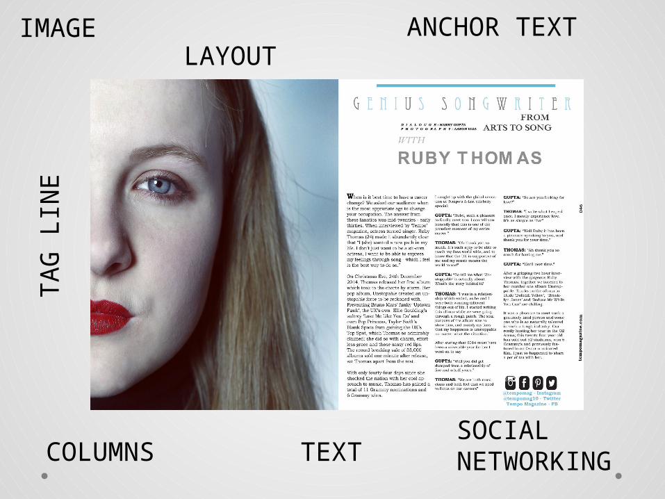
IMAGE
COLUMNSSOCIAL NETWORKING
ANCHOR TEXT
TEXT
TA
G
LIN
ELAYOUT

TEXTI have included common conventions, such as columns and bold text, to signify the names in the interview and to make them stand out.I separated paragraphs to create a professional, ordered, layout and used a calm colour palette.
TAG LINEI included the tag line of “from arts to song” which creates quite a hermenuetic question: Why has she moved from arts to song? Will she still do arts? Etc.
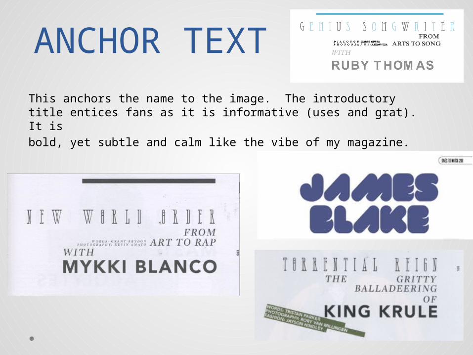
ANCHOR TEXT
This anchors the name to the image. The introductory title entices fans as it is informative (uses and grat). It is bold, yet subtle and calm like the vibe of my magazine.

IMAGEThis uses a direct mode of address. This connects with the audience creating a personal relationship (uses and grat).Ann extreme close up of half of the face was used to connect with front cover image. This creates a connection with the audience and is a contrast from the regular double page spreads and make my magazine much more unique. I have changed the contrast in the image so that she has a very ghostly feel. This is in comparison to the front cover, where I have darkened the image. This gives fans two completely different looks for the artist.

SOCIAL NETWORKING
This isn’t a convention that I found in my research but I felt that it should be mentioned. My target audience is 16-20 and frequent users of these sites; I felt that they should be able to access them easily with icons showing the different kind of social media. Although usually found on the contents page, I thought that it would be quite unique and different to be found on the double page spread, also encouraging readers to read the article about the artist.

LAYOUTI have conformed to the convention of the artist being on the left and the text on the right because I recognize that the natural reading process is left to right. Having a simplistic, yet effective double page spread, therefore creates a calmer, easier experience for the readers. However, I did add a quirky image for them to keep them engaged. The fact that the image is sliced in half and on a slant creates quite an austere feeling for the audience. My text has been positioned carefully and I have designated a clean, central fold in the middle of the page.

WEBSITE AND PAGE NUMBERING
I have included a website (alongside the social media section) which I think will really involve an audience. It is placed at the side of the page and I feel that this adds to my magazine’s quirky and cool approach. I have lined it up with the last paragraph of the article so that the appearance remains neat. With regards to the page number, I have placed it running up the side of the page which creates an unusual effect. I have seen this done in my research work.

![[MS-PPTX]: PowerPoint (.pptx) Extensions to the Office ...interoperability.blob.core.windows.net/files/MS-PPTX/[MS-PPTX... · 1 / 76 [MS-PPTX] — v20140428 PowerPoint (.pptx) Extensions](https://static.fdocuments.us/doc/165x107/5ae7f6357f8b9a6d4f8ed3b3/ms-pptx-powerpoint-pptx-extensions-to-the-office-ms-pptx1-76-ms-pptx.jpg)