
Email Marketing Benchmark Report - Sign-Up.to · Welcome to the 2018 Email Marketing Benchmark...
62
2018 Email Marketing Benchmark Report
Transcript of Email Marketing Benchmark Report - Sign-Up.to · Welcome to the 2018 Email Marketing Benchmark...

2018Email Marketing Benchmark Report

Welcome
Welcome to the 2018 Email Marketing Benchmark Report
When you’re running a business it can be difficult to find meaningful data to measure your marketing against. Reports on big businesses and US firms just aren’t that useful for most organisations. That’s why we created our Email Marketing Benchmarks.
This 2018 report is our 10th annual report. We hope that it continues to be a valuable resource to help you review and improve your email marketing performance.
Please share this content
Please feel free to share this document with your colleagues and to post excerpts and links - all we ask is that you reference Sign-Up.to and include a link to the original source when you do. The link to share is below.
www.signupto.com/email-marketing-benchmarks/
Thank you.
Page 2/62

Section title
1. Introduction Page 4
2. Highlights Page 6
3. Open rate Page 10
4. Click-through rate Page 14
5. Unsubscribe rate Page 18
6. Click-to-open rate Page 22
7. Unsubscribe-to-open rate Page 26
8. Click-through and click-to-open Page 29
9. Unsubscribe and unsubscribe-to-open Page 30
10. Delivery rate Page 31
11. Overall performance Page 35
Section title
12. Device type Page 37
13. Marketing automation Page 47
14. Send behaviour Page 51
15. Engagement Page 57
Appendices
1. Raw data (key metrics) Page 59
2. Further resources Page 60
3. About Sign-Up.to Page 61
Contact Page 62
ContentsPage 3/62
www.signupto.com

Section 1 - Introduction
Introduction - background
www.signupto.com
Page 4/62
Background and scope
For our 2018 report we analysed over 1 billion emails (over 20 billion individual data points) sent through the Sign-Up.to email marketing platform between 1st January and 31st December 2017. These are sent from a range of predominantly UK based SME and enterprise sized organisations and public sector departments.
Permission
This research is based on Permission Marketing credentials. All campaigns included in the results are sent to fully opted-in lists (never to 3rd party or purchased lists).
Date terminology
For the purposes of this report, data is referred to by the year in which it has been collected - hence data for the 2018 report is referred to as 2017.
• Events / Music / Theatre/Club• Music /Artist / DJ / Band / Management• Restaurant / Hospitality• Estate Agent• Health /Beauty /Spa / Wellbeing• Travel• Publishing• Banking / Finance• Education / Training• Charity / Non-Profit• Public Relations• Legal / Accounting• Online Services• Retail B2B• Retail B2C
• Other Service B2C• Other Service B2B• Recruitment / HR• Sales / Marketing / Design• Government (Local / National)• Wholesale• Engineering / Manufacturing• IT• Community• Sport / Leisure• Medical• TV / Film / Radio• Fashion• Construction / Tradesman
Industry / sector classifications
This 2018 report documents campaigns according to 29 different industry/sector classifications. These sectors have been self-selected by the sender organisations. Some aspects of the report also include data from an additional ‘null’ classification (i.e. where no specific industry/sector has been set by the sender). This distinction is indicated where appropriate.

Section 1 - Introduction
Introduction - definitions
www.signupto.com
Page 5/62
Definitions - standard metrics
Unless otherwise specified all of the analysis reported here is based on unique user actions - e.g. in the calculation of open rate we only count the same recipient opening a campaign once.
• Open rate: the proportion of delivered emails that were opened (measured by an image load or link click); i.e. number opened / delivered.
• Clicks or click-through rate: the proportion of delivered emails that had a link clicked; i.e. unique clicks / delivered (sometimes referred to as CTR)
• Unsubscribe rate: the proportion of delivered emails that result in an unsubscription; i.e. unsubscribes / delivered.
• Bounced: messages returned by the receiving mail server as undeliverable.
• Delivered: messages accepted for delivery by the receiving mail server (total sent - bounced).
Definitions - derived metrics
We also document ‘derived’ rates as these are often a better way to compare some aspects of campaign performance. Again, unless specified only unique user actions are counted.
• Click-to-open (CTO) rate: the proportion of opened emails that had a link clicked; i.e. unique clicks / opens.
• Unsubscribes-to-opens (UTO) rate: the proportion of opened emails that result in an unsubscription; i.e. unsubscribes / opens.
We use these ‘x-to-opens’ figures as ways to compare the performance of the actual campaign content because they indicate what happens after the first objective of someone opening the campaign has been achieved.
Both standard and derived rates are typically expressed as a percentage. Unless specified (e.g. as a % change) any changes are typically specfied as a difference between 2 percentage values.

Section 2 - Highlights
Highlights - 2017
www.signupto.com
Page 6/62
2017 Summary
25.44% Open rate4.76% Click-through rate0.47% Unsubscribe rate12.50% Click-to-open rate2.52% Unsubscribe-to-open-rate
Methodology The open, click-through, unsubscribe, click-to-open (CTO) and unsubscribe-to-open (UTO) rates represent the overall average values of all sectors.
The overall values presented here are calculated as the average of the results of each sector. As with all of the results presented in this report, in order to eliminate statistical outliers any companies with zero or small send volumes are removed in the average calculations for each sector.
2017 summary - open, click-through, unsubscribe, CTO and UTO
Standard Metrics
The graph below shows a summary of the 5 headline performance metrics of the Benchmark Report - open, click-through, unsubscribe, click-to-open (CTO) and unsubscribe-to-open (UTO) rates.

Section 2 - Highlights
Highlights - 2 year trend
www.signupto.com
Page 7/62
Changes in the last 12 months
Open rate: increase from 24.79% to 25.44% Click-through rate: increase from 4.19% to 4.76% Unsubscribe rate: decrease from 0.49% to 0.47% CTO rate: increase from 11.88% to 12.50% UTO rate: decrease from 2.59% to 2.52%
Improved open and click performance
Increases in open, click-through and click-to-open rates all indicate improved performance on the 2016 data. Open rate increased by 2.62%, click-through rate by 13.6% and click-to-open rate by 5.22%.
Improved unsubscribe performance
Decreases in unsubscribe and unsubscribe-to-open rates also indicate improved performance on the 2016 data. Unsubscribe rate decreased by 4.08% and unsubscribe-to-open rate decreased by 2.70%.
Changes in the last 12 months
The graph below shows open, click-through, unsubscribe, click-to-open and unsubscribe-to-open rates for 2016 (grey) and 2017 (coloured).
Standard performance metrics - 2016-2017

Section 2 - Highlights
Highlights - 6 year trend
www.signupto.com
Page 8/62
Changes over the last 6 reports
The graph opposite shows the historical trend of each performance metric over the last 6 years, 2012-2017. Data for 2012-2016 is shown left to right in grey. Data for 2017 is shown coloured.
Improved open and click performance
At 25.44% and 4.76% respectively the open and click-through rates for 2017 both continue the upward trend and show a 6 year high. Whilst not a high, at 12.50% click-to-open rate continues a 4 year increasing trend.
Improved unsubscribe performance
At 0.47% and 2.52% respectively, unsubscribe and unsubscribe-to-open rates continue 4 and 3 year downward trends, with unsubscribe rate equalling the previous 6 year low.
Key metrics - 6 year trend

Section 2 - Highlights
Highlights - 6 year trend
www.signupto.com
Page 9/62
Open rate Click-through rate Unsubscribe rate
Click-to-open rate Unsubscribe-to-open rateChanges over the last 6 reports
The graphs here show further detail of the historical trend of each individual standard performance metric over the last 6 years, 2012-2017. Data for 2012-2016 is shown left to right in grey. 2017 is shown coloured.

Section 3 - Open rate
Open rate - by sector
www.signupto.com
Page 10/62
Summary 2017
25.44% Average 37.83% Maximum 16.92% Minimum
14 sectors above average 15 sectors below average
Top performing sectors - Government (Local / National) - Legal / Accounting - Charity / Non-profit Bottom performing sectors - Retail - B2B - Recruitment / HR - Engineering / Manufacturing
Open rate by sector
Above average Below average

Section 3 - Open rate
Open rate - 3 year trend
www.signupto.com
Page 11/62
Open rate Last 3 years: 2015-2017
The graph opposite shows open rates for each sector for the last 3 years 2015-2017.
2015 - Light grey 2016 - Dark grey 2017 - Blue
The results are ordered according to the highest to lowest open rate sectors of 2017.
Open rate by sector - 2015-2017
Section 3 - Open rate
Open rate - 2016-2017
www.signupto.com
Page 12/62
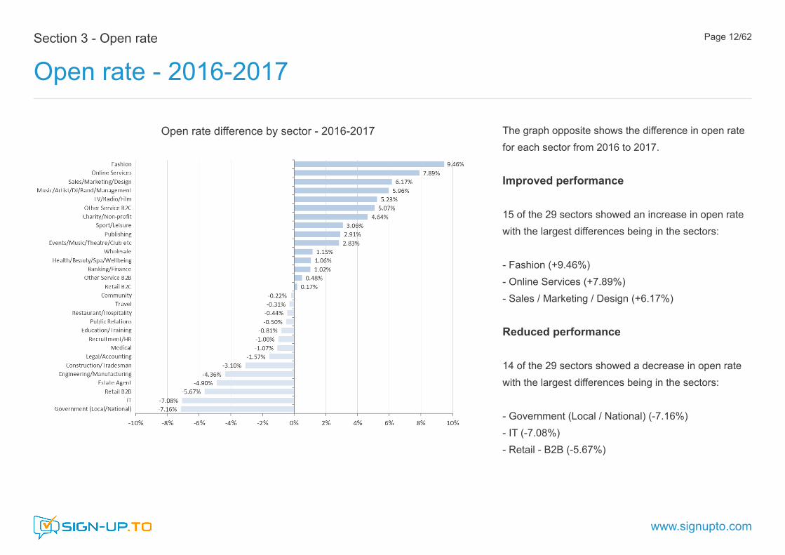
The graph opposite shows the difference in open rate for each sector from 2016 to 2017.
Improved performance 15 of the 29 sectors showed an increase in open rate with the largest differences being in the sectors:
- Fashion (+9.46%) - Online Services (+7.89%) - Sales / Marketing / Design (+6.17%)
Reduced performance 14 of the 29 sectors showed a decrease in open rate with the largest differences being in the sectors:
- Government (Local / National) (-7.16%) - IT (-7.08%) - Retail - B2B (-5.67%)
Open rate difference by sector - 2016-2017

Section 3 - Open rate
Open rate - considerations
www.signupto.com
Page 13/62
What impacts open rate?
Although we wouldn’t generally consider open rate as an exclusive measure of campaign engagement it’s a very common performance metric and often the first ‘go-to’ performance indicator.
• Sender recognition• Subject line• Timing
Sender recognition
Getting your subscribers to recognise and trust you as an email sender is a first step in getting your campaigns opened. As a genuine email marketer, SPF (Sender Policy Framework) and Sender ID should also be of interest. These are two slightly different ways that servers receiving email can verify that the person sending the message is allowed to send emails from that domain name. Consistently using a from-address and sender name will also allow you to build up recognition and an ongoing level of trust.
Subject line
Subject line is the second critical element in getting your email campaigns noticed and opened. Even if they recognise the sender, the subject line is your subscriber’s first impression of what is likely to follow. A general rule of thumb is to keep it short and interesting. If you can capture your reader’s attention and imagination in this short piece of text then an open is much more likely. Test it too. One of the simplest yet highest return improvements you can make to your email campaign is the testing of different subject lines.
Timing
Successful timing of an email delivery is an important part of being relevant. A large proportion of emails are opened soon after delivery so this is an important window of opportunity. Catching your reader at a time when the message is both convenient and timely can have a big impact on whether or not it is opened. Understanding the relationship between your objective, your audience and the nature of your content will provide valuable insight into when might be an optimum time to send your campaign.

Section 4 - Click-through rate
Click-through rate - by sector
www.signupto.com
Page 14/62
Summary 2017
4.76% Average 17.45% Maximum 1.26% Minimum
7 sectors above average 22 sectors below average
Top performing sectors - Community - TV / Radio / Film - Music - Artist / DJ / Band / Bottom performing sectors - Construction / Tradesman - Restaurant / Hospitality - Public Relations
Click-through rate by sector
Above average Below average

Section 4 - Click-through rate
Click-through rate - 3 year trend
www.signupto.com
Page 15/62
Click-through rate Last 3 years: 2015-2017
The graph opposite shows click-through rates for each sector for the last 3 years 2015-2017.
2015 - Light grey 2016 - Dark grey 2017 - Green
The results are ordered according to the highest to lowest click-through rate sectors of 2017.
Click-through rate by sector - 2015-2017
Section 4 - Click-through rate
Click-through rate - 2016-2017
www.signupto.com
Page 16/62
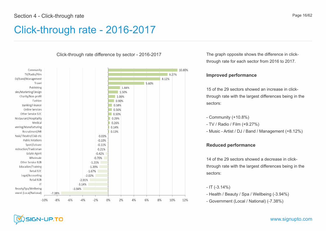
The graph opposite shows the difference in click-through rate for each sector from 2016 to 2017.
Improved performance 15 of the 29 sectors showed an increase in click-through rate with the largest differences being in the sectors:
- Community (+10.8%) - TV / Radio / Film (+9.27%) - Music - Artist / DJ / Band / Management (+8.12%)
Reduced performance 14 of the 29 sectors showed a decrease in click-through rate with the largest differences being in the sectors:
- IT (-3.14%) - Health / Beauty / Spa / Wellbeing (-3.94%) - Government (Local / National) (-7.38%)
Click-through rate difference by sector - 2016-2017

Section 4 - Click-through rate
Click-through rate - considerations
www.signupto.com
Page 17/62
What impacts click-through rate?
Analysing click-through performance is a very common if fairly elementary way of measuring campaign engagement. Not all campaigns have additional linked content, but many do and a reader who goes on to investigate further content is a positive sign of interest.
• Content• Relevance• Call to action
Content
It’s important to understand that people commonly skim read content. This applies to all content, but it’s especially evident with websites and emails. Many of your audience will be reading your email on a mobile or a tablet so make it quick and easy for your readers to find and digest the key points of your message. If you can do this well the core of your message will still be conveyed even if it is not read in detail.
Relevance
We engage with content which is relevant to us as individuals. Even adding a simple personalised greeting can add a sense of relevance. Precision marketing allows you to profile your audience according to various characteristics and then target content which is more relevantto them. Techniques like Dynamic Content can do this automatically but even a relatively simple segmentation of audience and content will improve relevance and have a dramatic effect on performance.
Call to action
A call to action that is easy to find, easy to understand and easy to clickwill increase the likelihood that this action will be taken. Text links can be fiddly, especially on a mobile device. Images can be good but it’s not always clear that the image is also a call to action and images are not always displayed. Dedicated HTML call to action buttons work best as they are always displayed even when images are not. Make them easy to find and include a concise, clear and irresistible instruction to act.

Section 5 - Unsubscribe rate
Unsubscribe rate - by sector
www.signupto.com
Page 18/62
Summary 2017
0.47% Average 1.65% Maximum 0.12% Minimum
10 sectors above average 19 sectors below average
Top performing sectors - Public Relations - Publishing - Government (Local / National) Bottom performing sectors - Recruitment / HR - Legal / Accounting - Fashion
Unsubscribe rate by sector
Above averageBelow average

Section 5 - Unsubscribe rate
Unsubscribe rate - 3 year trend
www.signupto.com
Page 19/62
Unsubscribe rate Last 3 years: 2015-2017
The graph opposite shows unsubscribe rates for each sector for the last 3 years 2015-2017.
2015 - Light grey 2016 - Dark grey 2017 - Orange
The results are ordered according to the lowest to highest unsubscribe rate sectors of 2017.
Unsubscribe rate by sector - 2015-2017

Section 5 - Unsubscribe rate
Unsubscribe rate - 2016-2017
www.signupto.com
Page 20/62
The graph opposite shows the difference in unsubscribe rate for each sector from 2016 to 2017.
Improved performance 16 of the 29 sectors showed a decrease in unsubscribe rate with the largest differences being in the sectors:
- Medical (-0.46%) - Sales / Marketing / Design (-0.46%) - Other Service - B2B (-0.71%)
Reduced performance
12 of the 29 sectors showed an increase in unsubscribe rate with the largest differences being in the sectors:
- Fashion (+1.28%) - Legal / Accounting (+0.24%) - Other Service - B2C (+0.16%)
Unsubscribe rate difference by sector - 2016-2017

Section 5 - Unsubscribe rate
Unsubscribe rate - considerations
www.signupto.com
Page 21/62
Understanding unsubscribes
Including an option to unsubscribe is a legal requirement of any email marketing activity.
Unsubscribes aren’t something that you usually want to see when you’re managing your email marketing but they can actually be good for you, so don’t be afraid of making it easy for people to opt-out.
The unsubscribe metric generally measures those who specifically request to opt-out using the embedded unsubscribe option - it doesn’t typically include non automated unsubscribes, i.e. those who reply or otherwise contact you to manually unsubscribe.
Make it easy
Always provide a robust and polite unsubscribe process and try to capture some information on the reason for leaving. Also consider offering a selective unsubscribe so that readers can set individual preferences on what they do and don’t receive.
Some considerations
High unsubscribe rates are an active indication of dissatisfaction. High one-off unsubscribes might just indicate a campaign that’s missed its target, but where high or growing unsubscribes are a trend it’s likely to indicate more serious problems with your data, content or both.
- Is a rise in unsubscribes just a one-off or a growing trend? This will help you identify and address the cause.
- Check your data. Do you have permission and have you used this data in the way anticipated by your readers?
- Are you being relevant? Your reader cares enough to open your message, so unsubscribe is a clear indication that you are not addressing their needs or wishes.
- Ultimately, if unsubscribe is the desired action make it quick and easy to do and make sure your ‘do not contact’ list is updated and effective.

Section 6 - Click-to-open rate
Click-to-open rate - by sector
www.signupto.com
Page 22/62
Summary 2017
12.50% Average 45.48% Maximum 4.22% Minimum
9 sectors above average 20 sectors below average
Top performing sectors - Community - Government (Local / National) - Music - Artist / DJ / Band Bottom performing sectors - Restaurant / Hospitality - Legal / Accounting - Public Relations
Click-to-open rate by sector
Above average Below average

Section 6 - Click-to-open rate
Click-to-open rate - 3 year trend
www.signupto.com
Page 23/62
Click-to-open rate Last 3 years: 2015-2017
The graph opposite shows click-to-open rates for each sector for the last 3 years 2015-2017.
2015 - Light grey 2016 - Dark grey 2017 - Purple
The results are ordered according to the highest to lowest click-to-open rate sectors of 2017.
Click-to-open rate by sector - 2015-2017

Section 6 - Click-to-open rate
Click-to-open rate - 2016-2017
www.signupto.com
Page 24/62
The graph opposite shows the difference in click-to-open rate for each sector from 2016 to 2017.
Improved performance 11 of the 29 sectors showed an increase in click-to-open rate with the largest differences being in the sectors:
- Community (+29.63%) - Fashion (+8.55%) - Music - Artist / DJ / Band / Management (+6.61%)
Reduced performance 17 of the 29 sectors showed a decrease in click-to-open rate with the largest differences being in the sectors:
- Legal / Accounting (-5.35%) - Government (Local / National) (-5.77%) - Health / Beauty / Spa / Wellbeing (-7.74%)
Click-to-open rate difference by sector - 2016-2017

Section 6 - Click-to-open rate
Click-to-open rate - considerations
www.signupto.com
Page 25/62
Understanding click-to-opens
Click-to-open rate gives a deeper insight into campaign performance because it looks at post-open interactions in relation to opens rather than the total delivered. This puts the focus of the metric on the performance of the actual email content (the design, relevance and strength of your call to action), and removes factors which influenced the recipient to open the email (factors like subject line and sender recognition).
It’s important to remember that different types of email campaigns will have different objectives. Not all campaigns contain click-through links and driving a click-through may not always be the primary objective. Many campaigns also contain multiple links - that’s why we record unique instead of total clicks per open when calculating click-to-open rates. Where campaigns contain multiple call to action links, a ‘heat-map’ can be an effective way of reviewing the relative engagement with each link. Understanding how subscribers are navigating and interacting with a campaign can be valuable in planning the placement of future content.
Goal-based metrics
Good as it is, the click-to-open rate is still a fairly basic performance metric. For further insight there are a number of more advanced goal-based options which delve more deeply into campaign effectiveness, e.g. the download of additional content or for eCommerce applications the completion of an online purchase. Goal-based metrics can be tracked as a one-off completion or monitored to provide behavioural insight over an extended period of time.
Engagement
Many email platforms simply take open and click performance as an adequate measure of engagement. In practice it’s often necessary to take a much wider view considering a number of different factors such as the type and frequency of interaction and also subscriber behaviour over a prolonged period of time. Data shows that a holistic approach like this gives a more realistic measure of real-life engagement.
Further information on measuring engagement can be found in Section 15 of this report.

Section 7 - Unsubscribe-to-open rate
Unsubscribe-to-open rate - by sector
www.signupto.com
Page 26/62
Summary 2017
2.52% Average 7.44% Maximum 0.58% Minimum
12 sectors above average 17 sectors below average
Top performing sectors - Government (Local / National) - Public Relations - Charity / Non-profit Bottom performing sectors - Legal / Accounting - Recruitment / HR - Fashion
Unsubscribe-to-open rate by sector
Above averageBelow average

Section 7 - Unsubscribe-to-open rate
Unsubscribe-to-open rate - 3 year trend
www.signupto.com
Page 27/62
Unsubscribe-to-open rate Last 3 years: 2015-2017
The graph opposite shows unsubscribe-to-open rates for each sector for the last 3 years 2015-2017.
2015 - Light grey 2016 - Dark grey 2017 - Red
The results are ordered according to the lowest to highest unsubscribe-to-open rate sectors of 2017.
Unsubscribe-to-open rate by sector - 2015-2017

Section 7 - Unsubscribe-to-open rate
Unsubscribe-to-open rate - 2016-2017
www.signupto.com
Page 28/62
The graph opposite shows the difference in unsubscribe-to-open rate for each sector from 2016 to 2017.
Improved performance 14 of the 29 sectors showed a decrease in unsubscribe-to-open rate with the largest differences being in the sectors:
- Medical (-1.39%) - Sales / Marketing / Design (-2.64%) - TV / Radio /Film (-2.64%)
Reduced performance
15 of the 29 sectors showed an increase in unsubscribe-to-open rate with the largest differences being in the sectors:
- Fashion (+5.03%) - Legal / Accounting (+1.61%) - Recruitment / HR (+1.07%)
Unsubscribe-to-open rate difference by sector - 2016-2017

Section 8 - Click-through and click-to-open
Click-through and click-to-open rate
www.signupto.com
Page 29/62
Summary
The graph opposite shows click-through (green) and click-to-open (purple) rates by sector, ordered by highest to lowest sector by click-through rate.
The highest click-through and click-to-open rates were seen in the Community sector (17.45% and 45.48% respectively).
The lowest click-through and click-to-open rates were in the Public Relations sector (1.26% and 4.22% respectively).
Click-through and click-to-open rate by sector

Section 9 - Unsubscribe and unsubscribe-to-open
Unsubscribe and unsubscribe-to-open rate
www.signupto.com
Page 30/62
Summary
The graph opposite shows unsubscribe (orange) and unsubscribe-to-open (red) rates by sector, ordered by lowest to highest sector by unsubscribe rate.
The lowest unsubscribe rate was in the Public Relations sector (0.12%). The lowest unsubscribe-to-open rate was in Government (Local / National) (0.58%).
The highest unsubscribe and unsubscribe-to-open rates were both in the Fashion sector (1.65% and 7.44% respectively).
Unsubscribe and unsubscribe-to-open rate by sector

Section 10 - Delivery rate
Delivery rate - by sector
www.signupto.com
Page 31/62
Summary 2017
95.64% Average 99.19% Maximum 90.97% Minimum
16 sectors above average 13 sectors below average
Top performing sectors - Community - Medical - Government (Local / National) Bottom performing sectors - Retail - B2B - Recruitment / HR - Wholesale
Delivery rate by sector
Above average Below average

Section 10 - Delivery rate
Delivery rate - 3 year trend
www.signupto.com
Page 32/62
Delivery rate Last 3 years: 2015-2017
The graph opposite shows delivery rates for each sector for the last 3 years 2015 -2017.
2015 - Light grey 2016 - Dark grey 2017 - Gold
The results are ordered according to the highest to lowest delivery rate sectors of 2017.
Delivery rate by sector - 2015-2017

Section 10 - Delivery rate
Delivery rate - 2016-2017
www.signupto.com
Page 33/62
The graph opposite shows the difference in delivery rate for each sector from 2016 to 2017.
Improved performance 12 of the 29 sectors showed an increase in delivery rate with the largest differences being in the sectors:
- Medical (+3.80%) - Sales / Marketing / Design (+3.62%) - TV / Radio / Film (+2.77%)
Reduced performance 17 of the 29 sectors showed a decrease in delivery rate with the largest differences being in the sectors:
- Travel (-3.03%) - Fashion (-3.29%) - Wholesale (-5.48%)
Delivery rate difference by sector - 2016-2017

Section 10 - Delivery rate
Delivery rate - considerations
www.signupto.com
Page 34/62
What impacts delivery?
Understanding the factors that affect email delivery is the first step towards improving your future campaigns. 3 of the most important considerations are:
• Data quality• Reputation• Content
Data quality
Data quality is a key factor in minimising delivery failure. Email data decays at around 3-4% per month so with a regular campaign schedule you should expect delivery success of 97% or higher. Having a robust process to collect, build and maintain a high quality of data is an important foundation of any email strategy. Integrating other related data applications, like a CRM system, will also ensure that your data is as up to date and robust as possible.
Reputation
Sender reputation is arguably now the most important factor in whether or not your emails are delivered. ISPs are becoming increasingly sophisticated in the way they actively monitor and approve email traffic for delivery. A history of positive interaction such as opening, clicking links and forwarding will act in your favour. By contrast a history of poor interaction and negative actions like marking as spam will make it much more likely that your current campaign will be removed.
Content
The quality of content is still important in getting your campaigns delivered. There’s a general rule of thumb that if your content looks and feels like spam then ISPs are also likely to identify it as such and decline delivery. Check that your link destinations are working and valid. Also check your HTML code quality and items like ALT-text for images, and if you build your campaign solely with images or pack it full of spammy words then rejection is more likely.

Section 11 - Overall performance
Overall performance - highest performers
www.signupto.com
Page 35/62
Overall performance in key metrics
The charts opposite show above average (green) and below average (red) performance of each of the key metrics:
• Open rate• Click-through rate• Unsubscribe rate• Click-to-open rate• Unsubscribe-to-open rate• Delivery rate
Above average is shown in green. Note that below average unsubscribe and unsubscribe-to-open rates are desirable so below average for these metrics are also shown in green.
Sectors are ordered top to bottom according to their overall average rank from each category.
Overall performance by sector - highest performers

Section 11 - Overall performance
Overall performance - lowest performers
www.signupto.com
Page 36/62
Overall performance by sector - lowest performers Above average performance for all metrics and top 3 by overall ranking - Government (Local / National) - Community - Music - Artist / DJ / Band / Management - TV / Radio / Film - Online Services
1. Government (Local / National) - above in all 6 categories 2. Community - above in all 6 categories 3. Charity / Non-profit - above in 5 of 6 categories
Below average performance for all metrics and bottom 3 by overall ranking - Recruitment / HR - IT - Construction / Tradesman
27. Retail - B2B - below in 5 of 6 categories 28. Construction / Tradesman - below in all 6 categories 29. Recruitment / HR - below in all 6 categories
Section 12 - Device type
Device type - opens
www.signupto.com
Page 37/62
Device opens
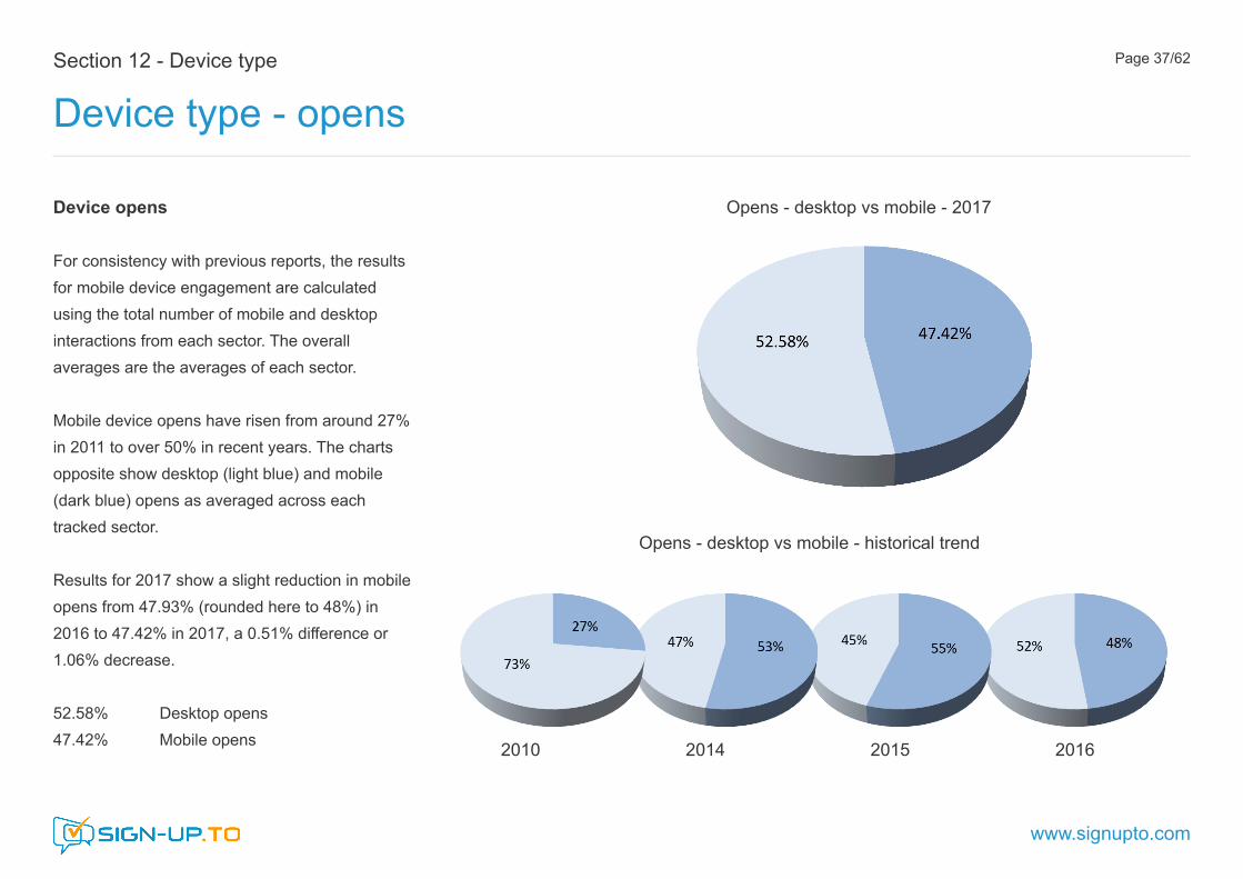
For consistency with previous reports, the results for mobile device engagement are calculated using the total number of mobile and desktop interactions from each sector. The overall averages are the averages of each sector.
Mobile device opens have risen from around 27% in 2011 to over 50% in recent years. The charts opposite show desktop (light blue) and mobile (dark blue) opens as averaged across each tracked sector.
Results for 2017 show a slight reduction in mobile opens from 47.93% (rounded here to 48%) in 2016 to 47.42% in 2017, a 0.51% difference or 1.06% decrease.
52.58% Desktop opens 47.42% Mobile opens
Opens - desktop vs mobile - 2017
Opens - desktop vs mobile - historical trend
2010 2014 2015 2016

Section 12 - Device type
Device type - opens
www.signupto.com
Page 38/62
Device opens - interpretation
The charts below show 6 different interpretations of the opens data for mobile and desktop devices. Charts 1 and 2 show that inclusion of the ‘null’ sector (where no industry sector has been set) has little effect on the results. Charts 3 and 4 show the same effect but where all campaigns are averaged as a whole (irrespective of their sector classification). Charts 5 and 6 show the effect of including only those sectors in the top 10 and above average overall open rates.
2. By sector averages (null classification included)
1. By sector averages (null classification excluded) 5. By sector averages (top 10 open rate sectors)
6. By sector averages (above average open rate sectors)
3. All emails (null classification excluded)
4. All emails (null classification included)

Section 12 - Device type
Device type - opens by sector
www.signupto.com
Page 39/62
Device opens by sector
The graph opposite shows desktop (light blue) and mobile (dark blue) opens by sector.
13 of the 29 sectors showed mobile open rate above the average with the highest being in
- TV / Radio / Film - Events - Music / Theatre / Club - Retail - B2C
16 of the 29 sectors showed mobile opens below the average with the lowest being in
- Education and Training - Online Services - IT
Open rate mobile vs desktop by sector 2017

Section 12 - Device type
Device type - mobile opens 2 year trend
www.signupto.com
Page 40/62
Opens on mobile Last 2 years: 2016-2017
The graph opposite shows opens on a mobile device for each sector for the last 2 years 2016 -2017.
2016 - Grey 2017 - Blue
The results are ordered according to the highest to lowest mobile open sectors of 2017.
Open rate on a mobile device by sector - 2016-2017

Section 12 - Device type
Device type - mobile opens 2016-2017
www.signupto.com
Page 41/62
The graph opposite shows the difference in opens on mobile for each sector from 2016 to 2017.
Increased mobile opens
12 of the 29 sectors showed an increase in mobile opens with the largest differences being in the sectors:
- Retail - B2B (+14.14%) - Sales / Marketing / Design (+13.27%) - Engineering / Manufacturing (+7.56%)
Reduced mobile opens 17 of the 29 sectors showed a decrease in mobile opens with the largest differences being in the sectors:
- Community (-6.57%) - Construction / Tradesman (-8.42%) - Online Services (-19.37%)
Open rates on mobile by sector - difference 2016-2017

Section 12 - Device type
Device type - click-through
www.signupto.com
Page 42/62
Device click-throughs
The chart opposite compares opens with click-throughs on desktop (light green) and mobile (dark green) as averaged across all tracked sectors. As with device opens the total number of interactions is considered in calculating the proportions of those on mobile and desktop.
As in previous reports click-through on mobile devices show significantly lower averages across all sectors than the equivalent mobile opens.
47.42% Opens (mobile) 37.32% Click-through (mobile)
Opens - desktop vs mobile - 2017
Click-through - desktop vs mobile - 2017

Device click-throughs
Applying similar interpretation to that of mobile opens, the 3 charts below show the effect of including the ‘null’ sector classification and of averaging click-through performance of all emails irrespective of their sector classification. Compared to mobile opens the results are less significant.
Section 12 - Device type
Device type - click-through
www.signupto.com
Page 43/62
1. By sector averages (null classification excluded) 3. By all emails (null classification included)2. By sector averages (null classification included)
Click-through - desktop vs mobile - 2017

Section 12 - Device type
Device type - click-through by sector
www.signupto.com
Page 44/62
Device click-through by sector
The graph opposite shows desktop (light green) and mobile (dark green) click-throughs by sector.
14 of the 29 sectors showed mobile click-throughs above the average with the highest being in
- TV / Radio / Film - Fashion - Events - Music / Theatre / Club
15 of the 29 sectors showed mobile click-throughs below the average with the lowest being in
- IT - Legal / Accounting - Banking / Finance
Click-through mobiile vs desktop by sector 2017

Section 12 - Device type
Device type - mobile click-through 2 year trend
www.signupto.com
Page 45/62
Click-through on mobile Last 2 years: 2016-2017
The graph opposite shows click-throughs on a mobile device for each sector for the last 2 years 2016-2017.
2016 - Grey 2017 - Green
The results are ordered according to the highest to lowest mobile click-through sectors of 2017.
Click-through on a mobile device by sector - 2016-2017

Section 12 - Device type
Device type - mobile click-through 2016-2017
www.signupto.com
Page 46/62
The graph opposite shows the difference in click-through on mobile for each sector from 2016 to 2017.
Increased mobile click-through
19 of the 29 sectors showed an increase in mobile click-through with the largest differences being in the sectors:
- Fashion (+16.79%) - Sales / Marketing / Design (+16.79%) - Health / Beauty / Spa / Wellbeing (+12.08%)
Reduced mobile click-through 10 of the 29 sectors showed a decrease in mobile click-through with the largest differences being in the sectors:
- Construction / Tradesman (-7.75%) - Online Services (-8.86%) - Banking / Finance (-16.68%)
Click-through rates on mobile by sector - difference 2016-2017

Section 13 - Marketing automation
Marketing automation - overview
www.signupto.com
Page 47/62
Summary
Automated campaigns typically exhibit significantly higher levels of engagement than non-automated. The graph opposite shows open, click-through and click-to-open rates for automated and non-automated campaigns.
Overall25.44% Open rate4.76% Click-through rate 12.50% Click-to-open rate
Automated emails41.36% Open rate22.66% Click-through rate 44.17% Click-to-open rate Non-automated emails14.73% Open rate 1.23% Click-through rate 7.86% Click-to-open rate
Open, click-through and CTO for automated and non-automated campaigns - 2017
Note - Although more frequent, due to their 1-1 nature automated campaigns represent a relatively small send volume compared to bulk send non-automated campaigns.

Section 13 - Marketing automation
Marketing automation - open rate by sector
www.signupto.com
Page 48/62
Automated campaigns Open rate - by sector
The graph opposite shows open rate for automated (dark blue) and non-automated (light blue) campaigns for each sector. The results are arranged from highest to lowest by automated opens.
Highest automated opens
- Legal / Accounting - Engineering / Manufacturing - Medical
Of these, only Legal / Accounting also exhibits higher than average overall open rates (second ranking). Engineering / Manufacturing was ranked as the lowest overall open rate.
Open rate for automated and non-automated campaigns by sector - 2017

Section 13 - Marketing automation
Marketing automation - click-through rate by sector
www.signupto.com
Page 49/62
Automated campaigns Click-through rate - by sector
The graph opposite shows click-through rate for automated (dark green) and non-automated (light green) campaigns for each sector. The results are arranged from highest to lowest by automated click-throughs.
Highest automated click-throughs
- Legal / Accounting - Medical - Engineering / Manufacturing
These also correspond to the highest sectors for automated opens.
Click-through rate for automated and non-automated campaigns by sector - 2017

Section 13 - Marketing automation
Marketing automation - click-to-open rate by sector
www.signupto.com
Page 50/62
Automated campaigns CTO rate - by sector
The graph opposite shows click-to-open rate for automated (dark purple) and non-automated (light purple) campaigns for each sector. The results are arranged from highest to lowest by automated click-to-opens.
Highest automated CTO
- Medical - Community - Music / Artist / DJ / Band
Medical and Community show extremely high (>99%) CTO for automated emails.
Click-to-open rate for automated and non-automated campaigns by sector - 2017

Section 14 - Send behaviour
Send - by week of the year
www.signupto.com
Page 51/62
Summary
The graph below shows the proportion of the total emails sent per week by all sectors. As a relatively large sample taken over a range of B2C and B2B sectors the average proportion of sends per week shows only a minor weekly variation - the average per week is 1.89% of the total. Peak values are seen in weeks 44 (2.37%), 24 (2.57%) and 47 (2.59%). Weeks with send volume above the weekly annual average are shown in darker grey.
% of send volume for each week of the year - Average of all sectors - 2017
Q1 Q2 Q3 Q4

Section 14 - Send behaviour
Send - by week of the year
www.signupto.com
Page 52/62
Sends by week of the year - variation by sector
Although overall send volumes per week for all sectors combined show a relatively limited variation, a greater degree of variation is typically seen within specific sectors, both in B2C and B2B areas.
The graphs opposite show the same proportion of the weekly to total volume sends for each week of the year for three specific sectors. In each case the send proportion is compared to the overall distribution for all sectors (grey).
- Travel (blue) - Retail B2C (purple) - Charity / Non-profit (green)
Travel
Retail B2C
Charity / Non-profit

Section 14 - Send behaviour
Send - by day of the week
www.signupto.com
Page 53/62
Summary
The graph opposite shows the proportion of all sends by day of the week for all sectors combined. As in previous years the peak is seen on Thursday (21.44%). The 2017 peak shows a slight reduction (from 22.29%) from the previous year.
The graph below shows the same data for both send and open volumes by day of the week.
% of send volume for each day of the week - average of all sectors - 2017
% of send volume and open volume
Section 14 - Send behaviour
Send - by day of the week
www.signupto.com
Page 54/62
Sends by day of the week - sector variation
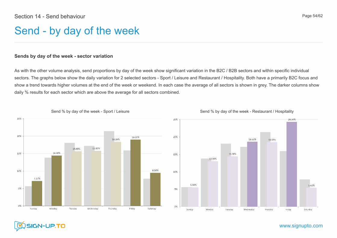
As with the other volume analysis, send proportions by day of the week show significant variation in the B2C / B2B sectors and within specific individual sectors. The graphs below show the daily variation for 2 selected sectors - Sport / Leisure and Restaurant / Hospitality. Both have a primarily B2C focus and show a trend towards higher volumes at the end of the week or weekend. In each case the average of all sectors is shown in grey. The darker columns show daily % results for each sector which are above the average for all sectors combined.
Send % by day of the week - Sport / Leisure Send % by day of the week - Restaurant / Hospitality

Section 14 - Send behaviour
Send analysis - by hour of the day
www.signupto.com
Page 55/62
Summary
The graph opposite shows the proportion of all sends by hour of the day for all sectors combined. Results from 2017 show the previous year’s mid-morning peak (shown below) now being exceeded by that of between 15:00-16:00 hrs. 10:00-11:00 hrs 10.18% 15:00-16:00 hrs 13.04%
% of send volume by hour of the day - Average of all sectors - 2017
Hourly % send volumes - 2016

Section 14 - Send behaviour
Send - by hour of the day
www.signupto.com
Page 56/62
% of send volume for each hour of the day - B2B sectors % of send volume for each hour of the day - B2C sectors
Sends by hour of the day - sector variation
As with the other volume analysis, send proportions by hour of the day also show significant variation - especially morning to afternoon. Although classification into B2B and B2C is a little subjective the graphs below show the hourly variation for those sectors primarily considered active in the B2B (blue) and B2C (red) sectors. In each case the hourly send proportions are compared to the overall values for all sectors.

Section 15 - Engagement
Engagement - overview
www.signupto.com
Page 57/62
Measuring engagement
Many email platforms simply take standard open or click-through data as a measure of engagement.
This report includes a wider view using the multi-parameter engagement algorithm included in the Sign-Up.to platform. This takes into consideration a number of different engagement factors including both the type and frequency of interaction and subscriber behaviour over a prolonged period of time. Data fitting shows that this gives a more realistic measure of real-life engagement with email marketing campaigns.
Subscriber classification
Subscriber interaction data is dynamically assembled and used to classify each subscriber from 1-star (not engaged) to 5-star (highly engaged). A ‘null’ classification is also included at any time for subscribers for whom there is not yet sufficient engagement data. This provides a comprehensive but easy to understand measure of campaign engagement.
Engagement snapshot - all sectors overall - 2017
Classification 2016 2017 Null 9.15% 7.92% 1-star 79.01% 81.80% 2-star 3.94% 3.68% 3-star 4.07% 3.75% 4-star 1.98% 1.56% 5-star. 1.86% 1.30 %
The chart above shows an overall snapshot showing subscriber engagement across all tracked sectors in each of the 6 engagement classifications for 2017.

Section 15 - Engagement
Engagement - by sector
www.signupto.com
Page 58/62
Engagement snapshot - by sector - end of 2017Engagement ranking - by sector
The graph opposite shows a snapshot of average subscriber engagement for each of the tracked sectors. For clarity the null engagement classifications have been removed.
More on engagement profiling
Traditional email performance metrics give useful campaign-based feedback but for a more in-depth understanding of engagement it’s necessary to look at a wider range of factors for individual subscribers and to consolidate this data over a prolonged period of time.
The engagement algorithm used for this report is fully automatic. It runs in the background collecting interaction data from each executed campaign, continually updating the subscriber ratings.
Engagement profiling can be used to target marginal subscribers with re-engagement campaigns or VIP subscribers with rewards and referral campaigns. More information on the Sign-Up.to engagement algorithm can be
found in the ‘Guide to Engagement’ referenced in Appendix 2.

Appendix 1
www.signupto.com
Page 59/62
Industry sector Open (%) Click (%) Unsub (%) CTO (%) UTO (%) Delivery (%) Events - Music / Theatre / Club etc 22.93% 4.03% 0.29% 9.30% 2.11% 96.73%Music - Artist / DJ / Band / Management 29.65% 12.18% 0.29% 21.17% 1.36% 96.88%Restaurant / Hospitality 18.73% 1.37% 0.53% 6.05% 3.01% 98.04%Estate Agent 20.45% 1.88% 0.53% 9.92% 2.23% 96.93%Health / Beauty / Spa / Wellbeing 24.56% 2.80% 0.44% 9.56% 2.67% 94.99%Travel 19.57% 7.95% 0.38% 7.95% 2.48% 93.97%Publishing 19.55% 3.80% 0.15% 12.11% 1.10% 96.26%Banking / Finance 25.57% 2.43% 0.63% 7.26% 2.75% 96.57%Education and Training 22.39% 2.46% 0.44% 9.80% 2.47% 94.26%Charity / Non-profit 34.66% 4.62% 0.23% 12.80% 0.80% 98.64%Public Relations 29.65% 1.26% 0.12% 4.22% 0.60% 96.40%Legal / Accounting 34.86% 2.34% 1.11% 5.95% 3.97% 95.22%Online Services 31.64% 6.99% 0.30% 17.33% 1.93% 96.72%Retail - B2B 18.57% 1.84% 0.40% 8.79% 3.49% 91.56%Retail - B2C 25.23% 4.08% 0.57% 10.28% 2.89% 97.88%Other Service - B2C 24.34% 2.19% 0.58% 7.68% 2.64% 97.95%Other Service - B2B 23.12% 2.83% 0.37% 9.12% 2.45% 94.12%Recruitment / HR 18.54% 1.91% 0.65% 8.46% 4.24% 91.42%Sales / Marketing / Design 30.36% 7.48% 0.41% 13.60% 2.25% 95.27%Government (Local / National) 37.83% 10.70% 0.16% 24.78% 0.58% 98.73%Wholesale 20.87% 1.62% 0.45% 8.12% 2.48% 90.97%Engineering / Manufacturing 16.92% 1.89% 0.41% 9.62% 2.87% 93.15%IT 19.61% 2.85% 0.50% 9.31% 3.95% 91.96%Community 28.75% 17.45% 0.24% 45.48% 1.40% 99.19%Sport / Leisure 28.91% 4.39% 0.41% 10.97% 2.30% 95.91%Medical 22.02% 3.55% 0.32% 15.55% 1.65% 98.76%TV / Radio / Film 34.32% 15.61% 0.44% 20.83% 1.94% 97.73%Fashion 34.50% 4.06% 1.65% 20.14% 7.44% 92.87%Construction / Tradesman 19.59% 1.39% 0.53% 6.47% 3.08% 94.38%
Raw data

Appendix 2
Additional resources
www.signupto.com
Page 60/62
Previous email marketing benchmark reports
This 2018 report is our 10th annual Benchmark Report. Previous generations and archive compilations are available on our website.
https://www.signupto.com/email-marketing-benchmarks/
Free email marketing guides
We publish a number of other guides on various aspects of email marketing. All can be downloaded free from our website.
https://www.signupto.com/resources/guides/
Email marketing blog
An extensive indexed library of email marketing related articles can be found at our regular blog site:
https://www.signupto.com/news/
Email marketing Discovery Mornings
Join a guided tour through 10 best-practice topics in email marketing. Discovery Mornings are designed for all levels of expertise and suitable for users of any email marketing platform. Held regularly in central London and free to attend.
https://www.signupto.com/resources/events/discovery-mornings/

Page XX/YY
About Sign-Up.to
Professional email marketing software and services
Sign-Up.to is an email and SMS marketing provider for professional businesses. Based on an established and popular self-service platform we specialise in helping businesses design, implement and execute high performing email marketing strategies.
Alongside our easy to use self-service platform, we offer a range of managed services, including, bespoke platform set-up and integration, advanced feature customisation and professional campaign outsourcing.
Further informationhttps://www.signupto.com/
Try Sign-Up.to. Free platfform trialhttps://www.signupto.com/trial/
Appendix 3

Contact Sign-Up.to
By telephone +44 (0) 20 3355 2630By email [email protected] www.signupto.com
Sign-Up.to St. Andrews House Woking Surrey GU21 6EB United Kingdom
www.signupto.com
© 2018 Sign-Up Technologies Ltd. (Sign-Up.to is a GoDaddy company)
Current revision: Feb-2018 (R3)
Section 1