Elements of lettering
72
36.00 ELEMENTS OF LETTERING FREDERIC 'W' GOO0¥
Transcript of Elements of lettering
36.00
ELEMENTS OFLETTERINGFREDERIC 'W'GOO0¥
College of Arohitectiiire Utjrary
Comefl UKTereity
^3
a^atntll TMttttBtt^ ffithrarg
Jlljata. »Mi ISort
BOUGHT WITH THE INCOME OF THE
SAGE ENDOWMENT FUND
THE GIFT OF
HENRY W. SAGE1891

Cornell University Library
NK 3600.G72E3
Elements of lettering
3 1924 020 596 064
Cornell University
Library'Bo 8i
The original of this book is in
the Cornell University Library.
There are no known copyright restrictions in
the United States on the use of the text.
http://www.archive.org/details/cu31924020596064


ELEMENTS OF LETTERING
^


AVRELIOAVG ' LIB
APHRODISIOPROC ' AVG
A ' RATIONIBVS
S < P ' Q' L
DEDIC'Q'VARINIO'Q'F
MAEC'LAEVIANO'AED
INSCRIPTION FROM BASE OF STATUE IN A ROMAN PALACE
\r\'"')^>\ \i-
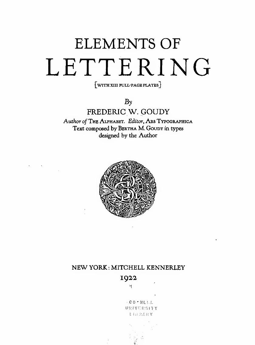
ELEMENTS OF
LETTERING[with XIII FULL'PAGE PLATEs]
By
FREDERIC W. GOUDYAuthor ofThe Alphabet. Editor, Ars Typographica
Text composed by Bertha M, Goudy in types
designed by the Author
NEW YORK : MITCHELL KENNERLEY
1922
QO'ULLL
r-r .-7
774-
COPYRIGHT 1922, BY FREDERIC W. GOUDY
THE VILLAGE PRESS, FOREST HILLS GARDENS, NEW YORKPRINTED IN AMERICA
To Professor C. Lauron Hooper
his earliest associate in printing, this little volume is inscribed
with the sincere regard of his friend,
the author

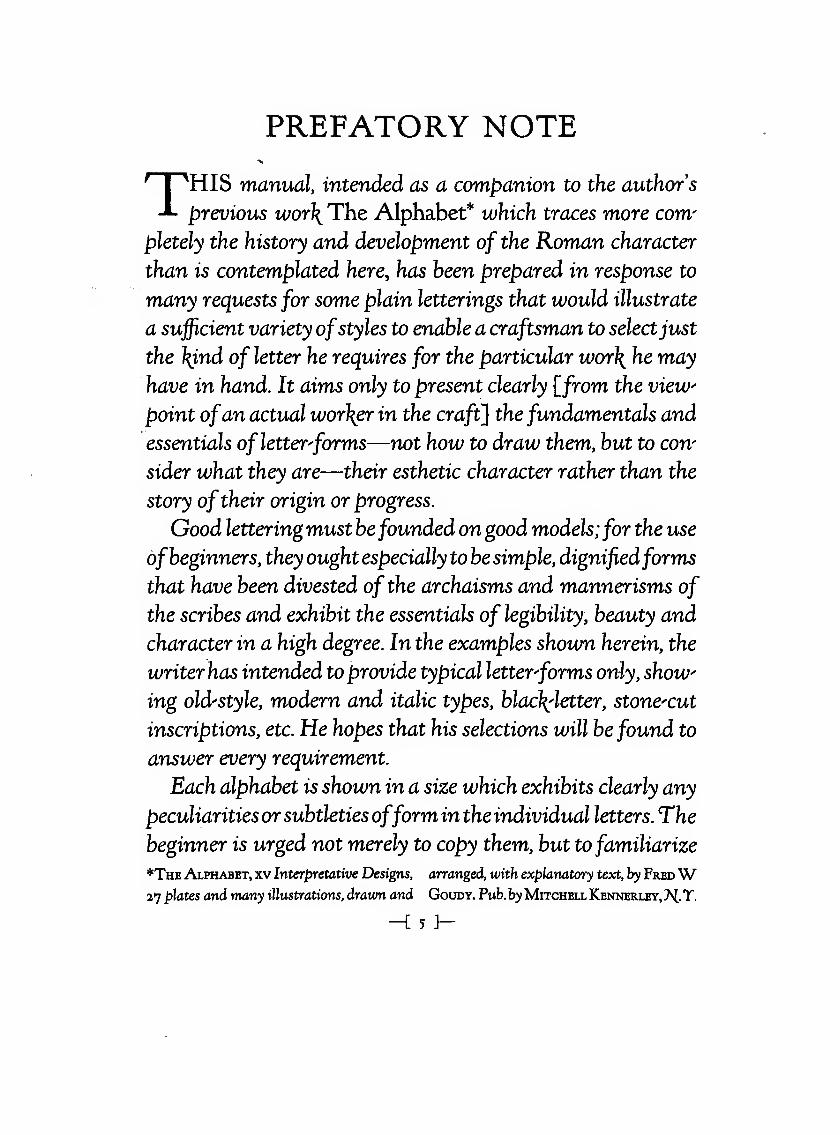
PREFATORY NOTE
THIS manual, intended as a companion to the authors
previous wor\ The Alphabet* which traces more com^
pletely the history and development of the Roman character
than is contemplated here, has been prepared in response to
many requests for some plain letterings that would illustrate
a sujficient variety ofstyles to enable a craftsman to selectjust
the }{ind of letter he requires for the particular wor\ he may
have in hand. It aims only to present clearly {^from the view
point ofan actual wor\er in the craft] the fundamentals and
essentials of letter^forms—not how to draw them, but to con'
sider what they are—their esthetic character rather than the
story oftheir origin or progress.
Good lettering must befounded on good models;for the use
ofbeginners, they ought especially to be simple, dignifiedforms
that have been divested of the archaisms and mannerisms of
the scribes and exhibit the essentials of legibility, beauty and
character in a high degree. In the examples shown herein, the
writer has intended to provide typical letter^forms only, show^
ing old-style, modern and italic types, blac\letter, stone^cut
inscriptions, etc. He hopes that his selections will be found to
answer every requirement.
Each alphabet is shown in a size which exhibits clearly any
peculiarities or subtleties ofform in the individual letters. The
beginner is urged not merely to copy them, but to familiarize
*The Alphabet, xv Interjpretative Designs, arranged, with explanatory text, by FredW27 plates and many illustrations, drawn and Goudy. Pub. by Mitchell Keiwerley, 7S[. T.
-i 5 J-
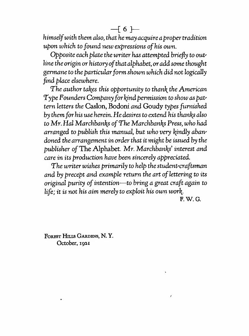
-C6]-himselfwith them also, that he may acquire aproper tradition
upon which to found new expressions of his own.
Opposite each plate the writer has attempted briefly to ouP
line the origin or history ofthat alphabet, oradd some thought
germane to the particularform shown which did not logically
find place elsewhere.
The author ta\es this opportunity to than\the American
Type Founders Companyforl^ndpermission to showaspat^
tern letters the Caslon, Bodoni and Goudy types furnished
by themfor his use herein. He desires to extend his than\s also
to Mr. Hal Marchban\s ofThe Marchban\s Press, who had
arranged to publish this manual, but who very l^ndly aban^
doned the arrangement in order that it might be issued by the
publisher ofThe Alphabet. Mr. Marchban\s interest and
care in its production have been sincerely appreciated.
The writer wishes primarily to help the studenPcraftsman
and by precept and example return the art of lettering to its
original purity of intention—to bring a great craft again to
life; it is not his aim merely to exploit his own wor\.
F. W. G.
Forest Hills Gardens, N. Y.
October, 1921
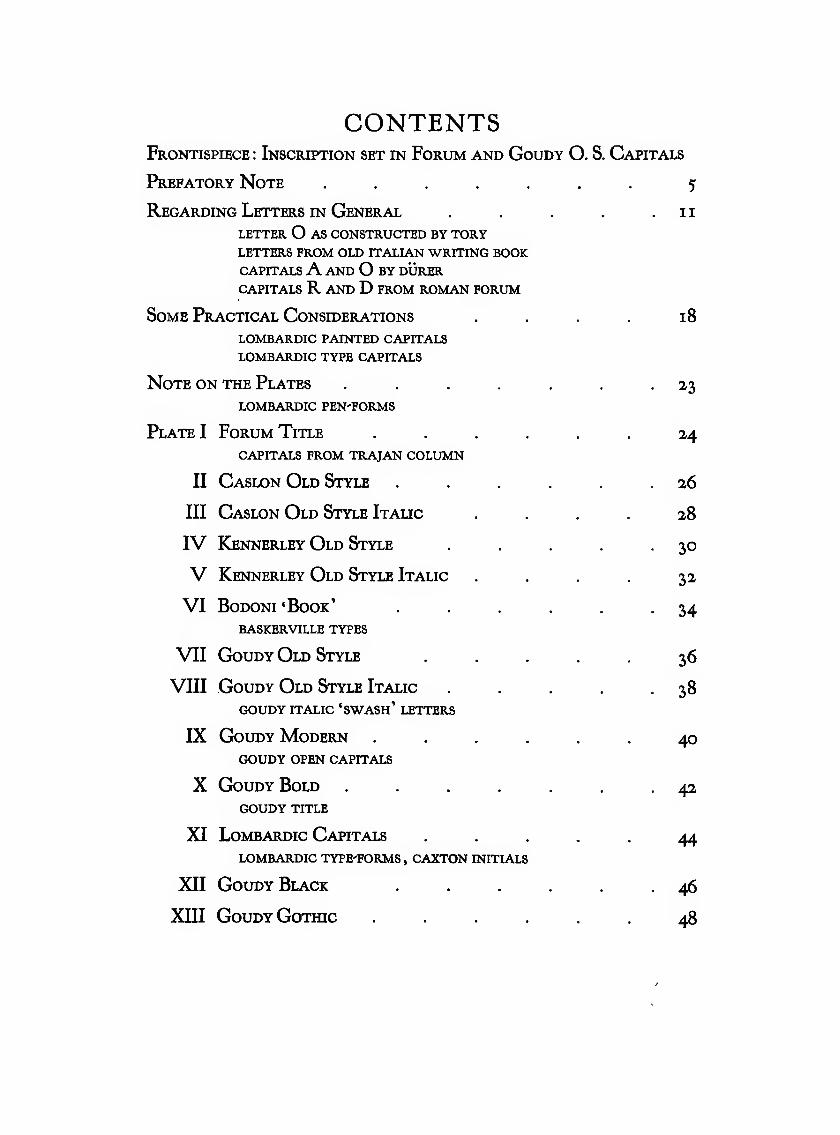
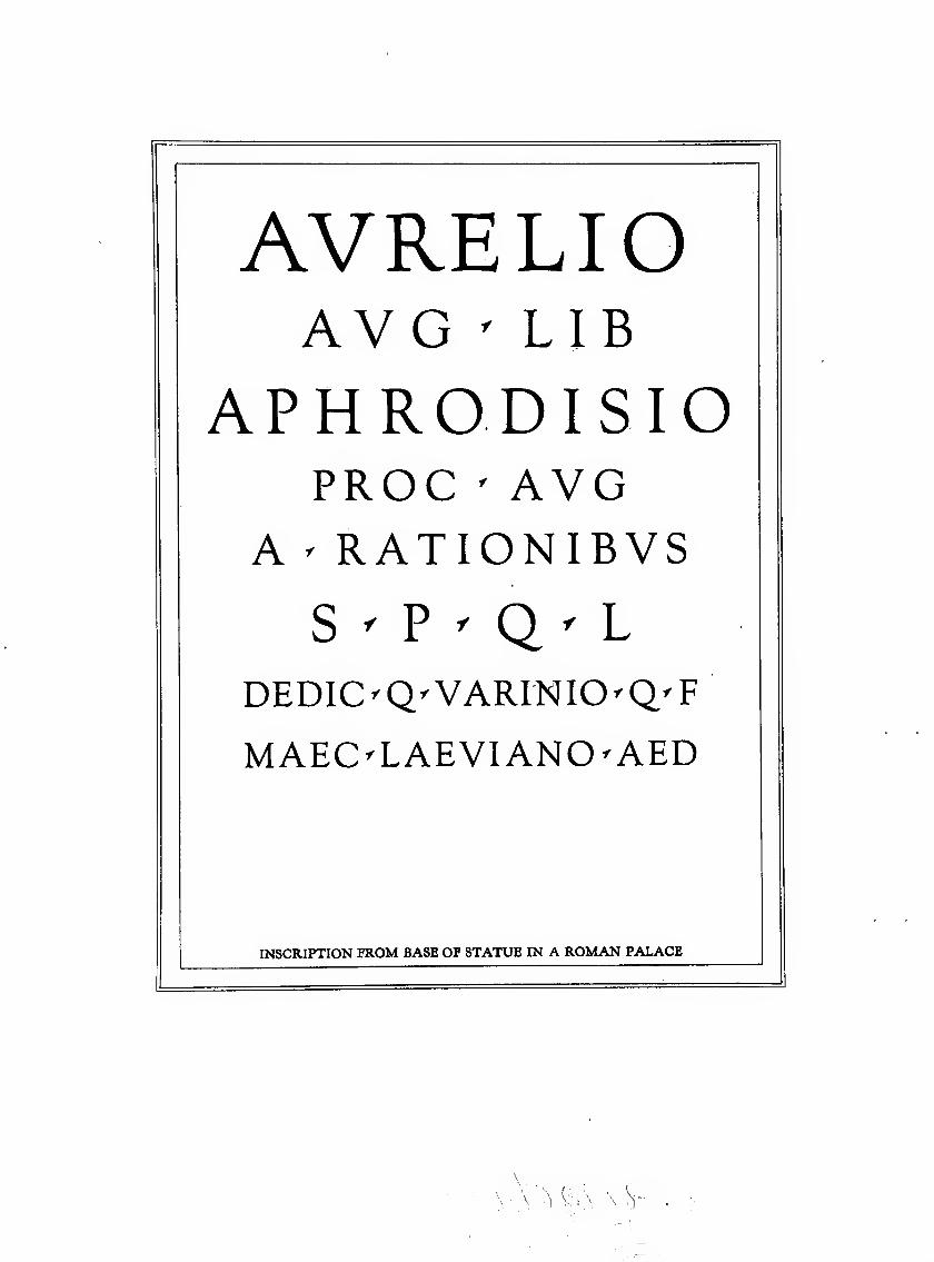
CONTENTSFrontispiece : Inscription set in Forum and Goudy O. S. Capitals
Prefatory Note ....... 5
Regarding Letters IN General . . . .11LETTER O AS CONSTRUCTED BY TORYletters from old ITALIAN WRITING BOOKCAPITALSA AND O BY DURERcapitals r and d from roman forum
Some Practical Considerations . . . 18
LOMBARDIC PAINTED CAPITALS
LOMBARDIC TYPE CAPITALS
Note ON THE Plates ....... 23
LOMBARDIC PEN'FORMS
Plate I Forum Title ...... 24capitals from TRAJAN COLUMN
II Caslon Old Style . . . .26III Caslon Old Style Italic .... 28
IV Kennerley Old Style . -30V Kennerley Old Style Italic . 32
VI BoDONi 'Book' . . .34baskerville types
VII Goudy Old Style ..... 36
VIII GouDY Old Style Italic . 38GOUDY ITALIC 'SWASh' LETTERS
IX GouDY Modern ...... 40GOUDY OPEN CAPITALS
X GoudyBold ....... 42GOUDY TITLE
XI Lombardic Capitals ..... 44LOMBARDIC TYPE'FORMS, CAXTON INITIALS
XII Goudy Black . . .46XIII Goudy Gothic ...... 48

Elements of Lettering
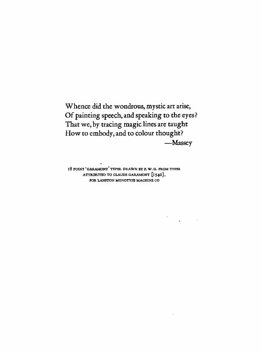
Whence did the wondrous, mystic art arise.
Of painting speech, and speaking to the eyes?
That we, by tracing magic lines are taught
How to embody, and to colour thought?
—Massey
18 POINT 'garamont' types, drawn by f. w. g. from types
ATTRIBUTED TO CLAUDE GARAMONT [1540]
,
FOR LANSTON MONOTYPE MACHINE CO
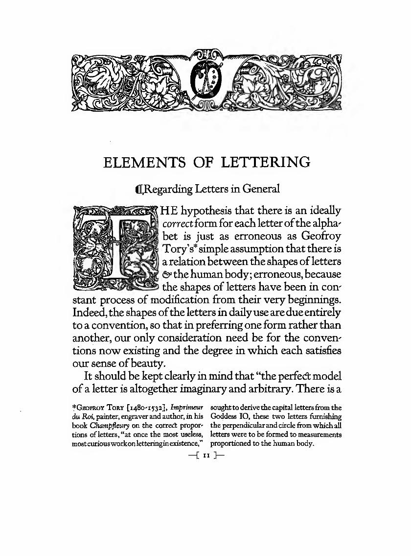
ELEMENTS OF LETTERING
Cl[,Regarding Letters in General
HE hypothesis that there is an ideally
correctform for each letterofthe alpha'
bet is just as erroneous as Geofroy
Tory's*simple assumption that there is
a relationbetween the shapes ofletters
<S>' thehuman body; erroneous, because
the shapes of letters have been in con'
stant process of modification from their very beginnings.
Indeed, the shapes ofthe letters in dailyuse aredue entirely
to a convention, so that in preferring one form rather than
another, our only consideration need be for the convene
tions now existing and the degree in which each satisfies
our sense ofbeauty.
It should be kept clearly in mind that "the perfed: model
of a letter is altogether imaginary and arbitrary. There is a
*GeofroyTory [i48o'I532], Imj;yrimeur sought to derive the capital lettersfrom the
du Roi, painter, engraver and author, in his Goddess lO, these two letters furnishing
book Champfieury on the corred: propor' the perpendicular and circle fromwhich all
tions of letters, "at once the most useless, letters were to be formed to measurements
mostcuriousworkonletteringinexistence," proportioned to the human body.
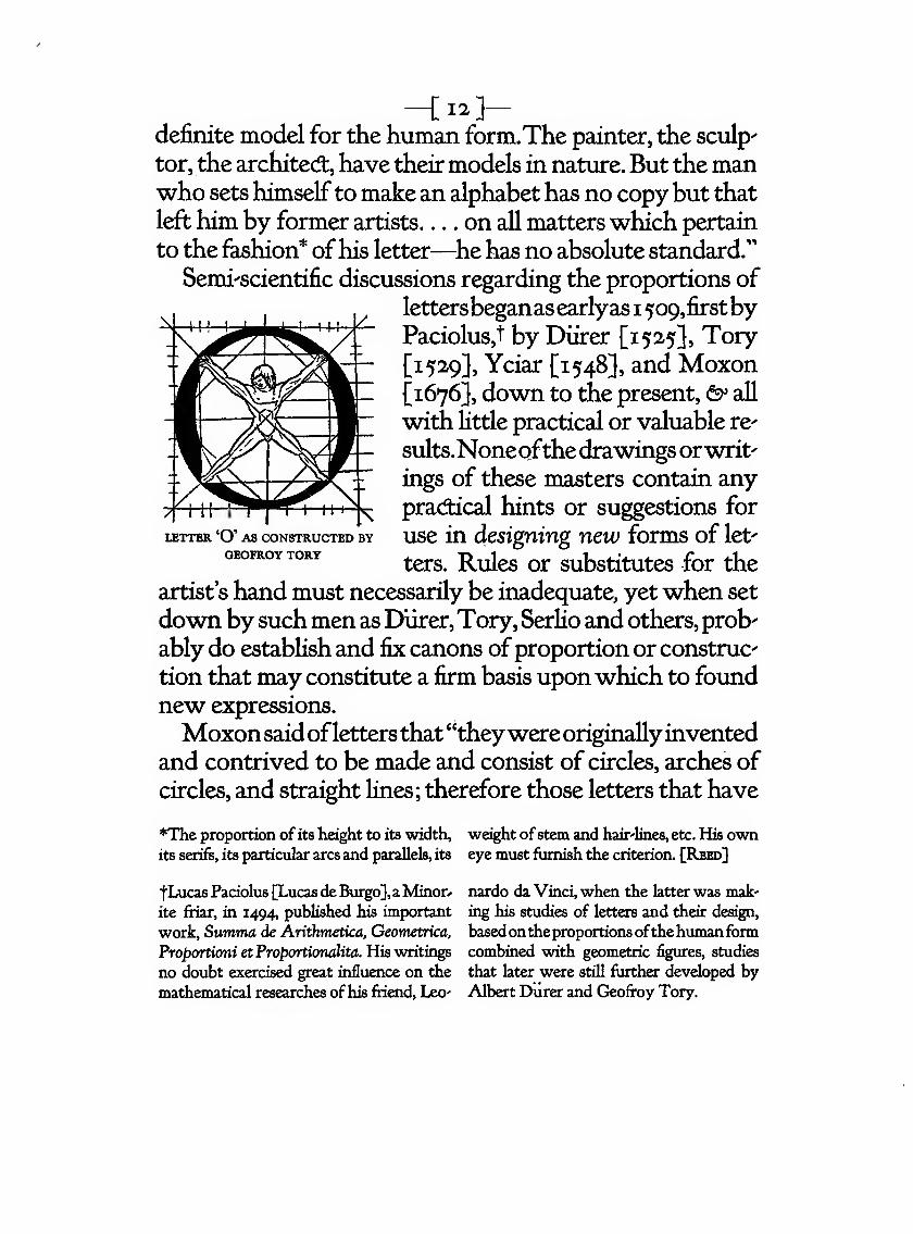
-[12]-definite model for the human form.The painter, the sculps
tor, the archited:, have their models in nature. But the manwho sets himselfto make an alphabet has no copy but that
left him by former artists on all matters which pertain
to the fashion* ofhis letter—^he has no absolute standard."
Semi'scientific discussions regarding the proportions of
lettersbeganas earlyas 1 509,firstbyPaciolus,t by Diirer [1525}, Tory
^1529}, Yciar [1548], and Moxon^1676], down to the present, &> all
with little practical or valuable re-
sults.Noneofthedrawings orwrit'
ings of these masters contain any
practical hints or suggestions for
use in designing new forms of let'
ters. Rules or substitutes for the
artist's hand must necessarily be inadequate, yetwhen set
down by suchmen as Durer,Tory, Serlio and others, prob'
ably do establish and iix canons ofproportion or construe
tion that may constitute a firm basis uponwhich to found
new expressions.
Moxonsaidoflettersthat"theywere originallyinvented
and contrived to be made and consist of circles, arches of
circles, and straight lines; therefore those letters that have
*The proportion of its height to its width, weight ofstem and hair'lines, etc. His ownits serifs, its particular arcs and parallels, its eye must furnish the criterion. [Reed]
LETTER 'O' AS CONSTRUCTED BY
GEOFROY TORY
fLucas Paciolus [Lucas de Bxirgo},a Minor*
ite friar, in 1494, published his important
work, Summa de Arithmetica. Geometrica,
Proportioni et Proportionalita. His writings
no doubt exercised great influence on the
mathematical researches ofhis friend, Leo'
nardo da Vinci, when the latter was mak'
ing his studies of letters and their design,
basedontheproportions ofthehumanformcombined with geometric figures, studies
that later were still further developed byAlbert Durer and Geofroy Tory.
-[ 13 ]-thesefigures entire,orelseproperlymixt,so astheprogressof
thepenmaybestadmit,maydeservethenameoftrue shape.'''
But these self-same curves, arcs of circles, straight lines,
make up also letter^formswe do not always consider 'true
shape'; nor is it possible to entertain the opinion that all let^
ters, although actually composed of these very elements,
will necessarily submit to analysis or be reducible to set
rules offormation thatwill make easierthe creation ofnew^
forms. Such an analysis can, at best, only fix and permit the
reproduction of the same form at another time; and even
thenthequalityoflifeandfreedominthe originalwill large^
ly be lost in the reproduction.The mere blending together
of geometrical elements common to all letter^forms, goodor bad, is not sufiicient; 'true shape' is something more sub^
tie than geometry.
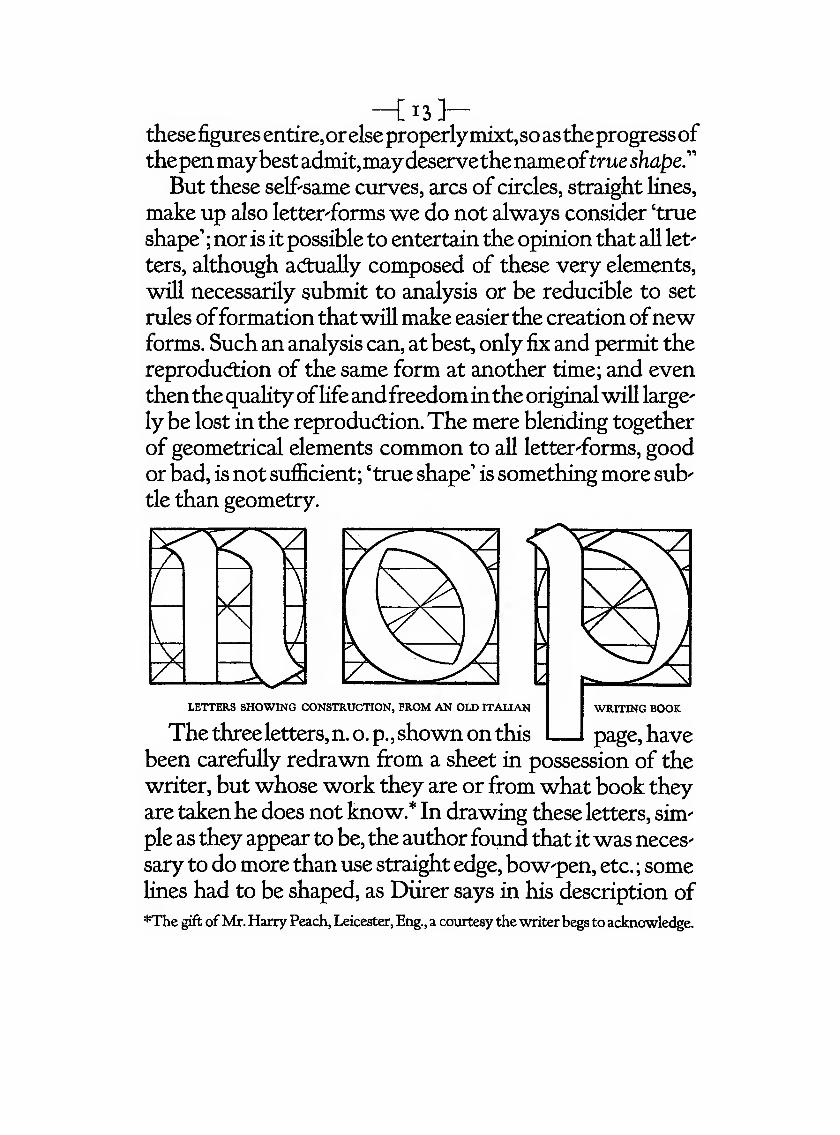
LETTERS SHOWING CONSTRUCTION, FROM AN OLD ITALIAN
The three letters, n. o. p. ,shown on this I I page, havebeen carefully redrawn from a sheet in possession of the
writer, but whose work they are or from what book they
are takenhe does not know.* In drawing these letters, sim^
pie as they appear to be, the author found that itwas neces-
sary to do more than use straight edge, bow-pen, etc. ; somelines had to be shaped, as Diirer says in his description of
*The gift ofMr. Harry Peach, Leicester, Eng., a courtesy the writer begs to acknowledge.
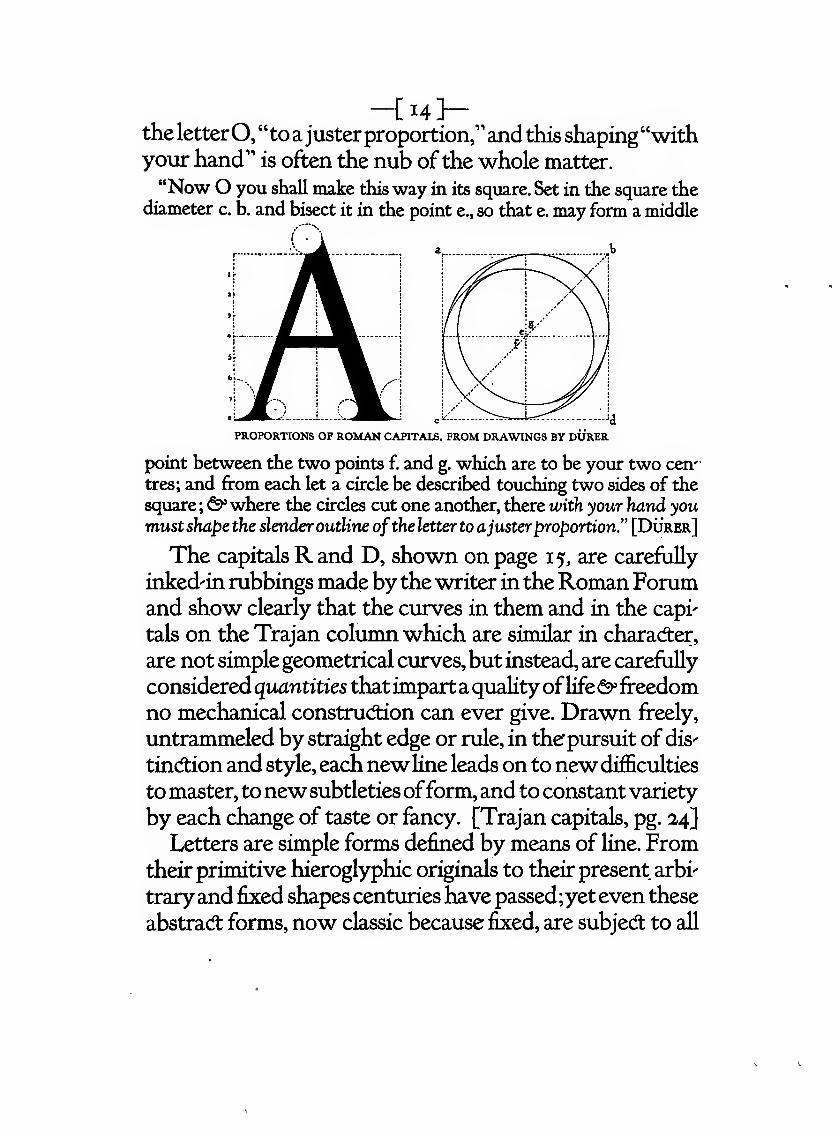
-{14]-the letterO, "to ajusterproportion,"and this shaping"withyour hand" is often the nub ofthe whole matter.
"Now O you shall make this way in its square. Set in the square thediameter c. b. and bisect it in the point e., so that e. may form a middle
I .
PROPORTIONS OF ROMAN CAPITALS. FROM DRAWINGS BY DURER
point between the two points f. and g. which are to be your two cen'
tres; and from each let a circle be described touching two sides of the
square;^where the circles cut one another, there with your hand youmustshape the slender outline ofthe letter to ajusterproportion." [Durer]
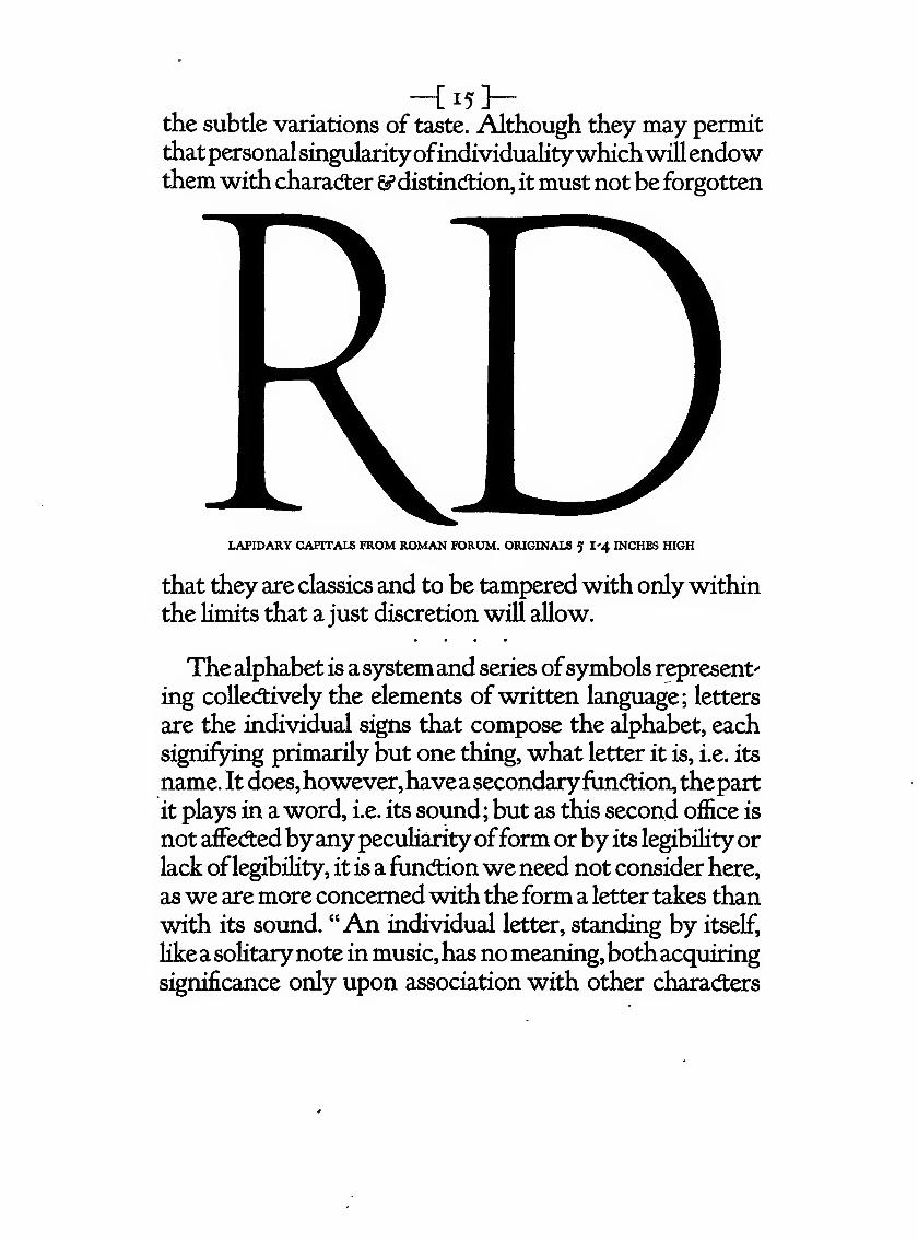
The capitalsR and D, shown on page 15, are carefully
inked'in rubbings made bythe writer in theRoman Forumand show clearly that the curves in them and in the capi'
tals on the Trajan column which are similar in charadier,
are not simple geometrical curves,but instead, are carefully
considered quantities thatimparta qualityoflife&"freedom
no mechanical construction can ever give. Drawn freely,
untrammeled by straight edge or rule, in the'pursuit of dis-
tinction and style, eachnewline leads on to new difficulties
to master, tonewsubtletiesofform, and to constantvariety
by each change of taste or fancy. [Trajan capitals, pg. 24]
Letters are simple forms defined by means of line. Fromtheir primitive hieroglyphic originals to their present arbi-
traryand fixed shapes centuries have passed;yeteven these
abstract forms, now classic because fixed, are subject to all
-Ci5]-the subtle variations of taste. Although they may permit
thatpersonalsingularityofindividualitywhichwillendowthem with character 5?distind;ion, it must not be forgotten
LAPIDARY CAPITALS FROM ROMAN FORUM. ORIGIKALS 5 I'4 INCHES HIGH
that they are classics and to be tampered with only within
the limits that a just discretion will allow.
The alphabet is asystemand series ofsymbols represent'
ing collectively the elements ofwritten language; letters
are the individual signs that compose the alphabet, each
signifying primarily but one thing, what letter it is, i.e. its
name. It does,however,haveasecondaryfunction, thepart
it plays in a word, i.e. its sound; but as this second office is
not aifecftedbyany peculiarityofform orby its legibilityor
lack oflegibility, it is a functionwe need not consider here,
aswe are more concerned with the form a letter takes than
with its sound. "An individual letter, standing by itself,
likeasolitarynote in music,has nomeaning,bothacquiringsignificance only upon association with other characters
-[i6]-whereby a relationship is established." It may, therefore,
theoretically, be discussed independently, but practically,
only as a part of the alphabet to which it belongs.
Collecftions of alphabets removed from their original
habitats [early stone^cut inscriptions, manuscript books,
etc.] do not always present adaptable forms uponwhich to
found an individual style. Such letters while entirely suit^
ableforuse forsome specific place orpurpose might mislead
the beginner, until he has learned something of the history
and development of letters, into mistaking mannerisms of
the scribe for the essentials of structure. For this reason,
the pattern alphabets presented here, for the most part, are
type forms, since they are the natural and inevitable ma^
terialized letters of the scribes, that is, handwriting divest'
ed of the scribe's vagaries and whimsicalities, conceived as
forms cut in metal, simplified and formali2;ed to meet newrequirements and new conditions of use.They are simple
shapes to be modified and givennew expressions ofbeauty
just as they themselves were adapted and simplified from
the forms of far-off times. And as nearly all lettering is in-
tended to be used as type or in conned:ion with types,
hand-lettering comes, therefore, to a considerable degree
within the limitations imposed by type.
Lettering based on or suggested by accepted type-forms
does not deny the artist ample opportunityto shape his let-
ters more freely or space them more precisely than fixed
and implacable metal types allow, as he may, by slight ad-
justment or modification of the shapes of his model letters,
persuade his forms to accommodate themselves to each
otherinamanneralmost impossiblewithreadymadetypes.
The use of these type models as a foundation tends also
-[I?]-to free the craftsman s rendition ofthem from any excres-
cences, meaningless lines oradditionsnotnecessaryto their
fundamental or essential elements; neither will their use as
patterns, in anyway preclude the thought ofbeauty to be
attained by the perfed:ly legitimate variations that goodtaste and common sense may did:ate.
Well selecfted and carefully drawn type-forms, copied
without radical changes ofshapes, will be found to appeal
to the artistic sense and add to the decorative value ofthe
page where used, to a degree not airways attained by prim
types, since the artist's handling ofline will give variety, a
quality of life and a freedom seldom found in types ready
to one's hand.
Yet slavish copying ofthe examples given is not recom^
mended [except as far as is necessary to familiarizie one's
selfwith their strud:ure]; they are patterns to be studied,
that the principles of construction and form underlying
each specimen maybe discovered.Each letterdrawn oughtto convey one clear idea, and one idea only—^what letter
it is—that the eye need not stop to disentangle the essen^
tid form from any eccentricities ofhandling nor be drawnto the conceit ofa craftsman intent on a display ofhis ownskill at the expense ofthework he is expected to embellish.
It is the personal quality he injed:s into his work, not freak-
ish variations or unnecessary additions to his pattern let-
ters, that will determine its charaAer.
There maybe timeswhenthe decorativequalityofaline
oflettering is of greater value than easy legibility, but this
fad: should not be made an excuse to deform letters for the
sake of expediency nor to produce any of unusual or un-
familiar shape without exceptional artistic warrant.
:QcrnPAINTED LOMBARDIC CAPITALS. ['S' WAS PAINTED IN RED AND BLUe]
CtSome Practical Considerations
IN THE construAion ofa letter the artist should first de-
termine justwhat is the intrinsic shape ofhis model—that
is. in ^at~degf6e-8tf=6Ae4mes, curves and angles, or the
directions the lines take thatcompose it, fixed orabsolutely
necessary to that particular letter. His next thought mustbe for form, which includes proportion and beauty, and
the particular form suitable to the place and purpose for
which it is intended. His decision here will largely deter-
mine the measure of his ability and taste.A letter should
possessanesthetic qualitythat is organic, an essential ofthe
form itselfand not the result of mere additions to its fun-
damental form nor to meaningless variations of it.
These points also, must be kept clearly in mind: First,
what the purpose of the lettering is, whether for a title-
page, a book-cover, a line or more for an advertisement, a
Doster ^vhere probably it must harmonizie with a picfture
neither overriding nor in turn being robbed of its ownvalue}. Second, the right letter to use for a given purpose,
not only suitable to that purpose but practicable for exe-
cution in the material employed. A letter drawn with a
broad pen and suitable enough on smooth paper might be
entirely out of place if cut in brass and stamped in gold
or color on the cloth covering of a book. Third, the selec-
tion of letters that will combine well with each other and-[i8]_
with the matter with which they are to be used. Someletters, like the Lombardic [plate XI, pg. 45] used generally
as initialsor as capitalswithGothiclower-case,and entirely
pleasing when so used, are yet ordinarily quite incompat-
ible for the formation ofwords. Even in Roman alphabets
thepowerofcombinationmaybe lost bycareless handling
;
certain letters coming next to others of the same familyHOB~~'-'~
LOMBARDIC TYPE CAPITALS.[aI^^—
'
may require slight modifications to bring them into har-
monywith those of less sympathetic form in orderthat the
eye may be carried easily to its neighbor. Fourth, the rela-
tive sizie ofthe letters. This point may require experiment
to determine the limits ofvariety permissible without sac-
rificing beauty or effed:iveness ofarrangement.
Pleasing legibility isthe greatdesideratum.Beauty, too, is
desirable,but beautydoes not in anywayrequire a sacrifice
ofeasy readability. Beauty is the inherent characteristic of
simplicity, dignity, harmony, proportion, strength—quali-
ties alw^ays found in an easily legible type; yet legibility is
seldom secured byapredeterminedeffort to produce it.Theattempt consciously to give a specific character or beauty
to a letter is too frequently, also, to exhibit the intellectual
process by which it is sought; its character seems to have
been thought in and does not appear to be the outcome ofa
subtle and indefinable taste that makes it delightful and
seemingly the obvious and inevitable thing.
Beautyofaletterdepends on the harmonious adaptation
of each of its parts to every other in a well proportioned
-C20]-manner, so that their exhibition as awhole shall satisfy our
esthetic sense, aresult gained onlyby blending togetherthefine strokes, stems and swells in their proper relations.
• a • •
The archited: is bound by the laws of strud:ure; the ar"
tistand craftsman arebound too, bylaws moremental thanphysical, yet none the less real or binding. While certain
fundamental forms seem to demand certain necessary se^
quences,theexcellenceofthefinalprodud;depends entirely
on the fertilityofthe artist's mind. As in other forms of de-
°^ ffffri thf l^rnr^ff"^^JiJ* "n Wlm in M 1 7rct^r>«L3 no^ tho torhi^i^
cal limitations of the craft in which he works, to its ownadvantage. He should not endeavor by mere trickery to
obtainresultsinonematerialormethodthatbyrightbelong
to other materials and other methods. Nor should he at-
tempt to master that which in the nature ofthings is not to
be overcome; he should, however, endeavor to express all
that belongs to his particular work, yet not attempt also
that which can be expressed properly only by other and
quite different means—drawing in line to imitate the tech-
nique ofawoodcut; designing a type that is to give the ef"
fed: ofa letter engraved on copper; or drawing letters that
are to be reproduced by process to simulate a manuscript
book'hand, etc.Theverylimitationsimposed uponacrafts-man freefromwhims,who understands fully the necessity
for diredness, will add beauty to all good work produced
by him within those limitations.
THE PLATES

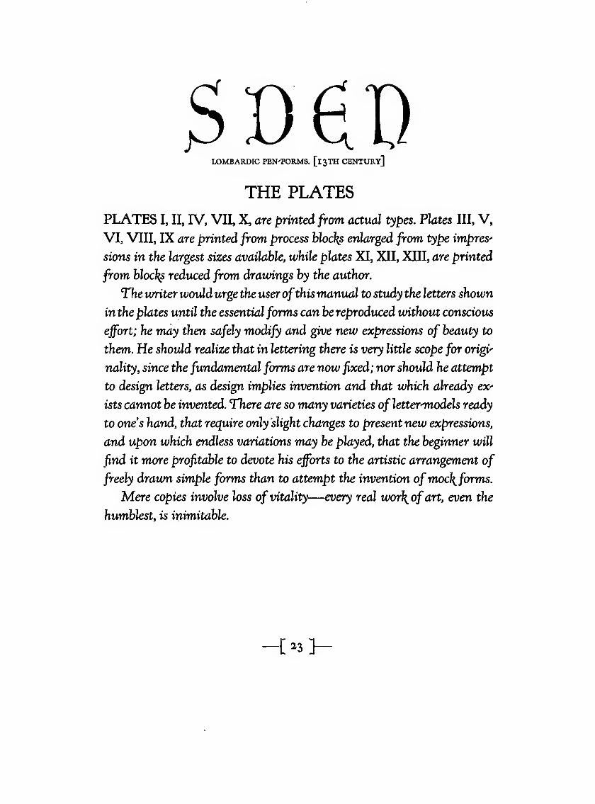
3DeDLOMBARDIC PEN'FORMS. [13TH CENTURY]
THE PLATES
PLATES I, II, IV, VII, X, are printed from actual types. Plates III, V,
VI, VIII, IX are printed from process hloc}{s enlarged from tyj[)e impres"
sions in the largest sizes available, while plates XI, XII, XIII, are printed
from blocks reduced from drawings by the author.
The writer would urge the user ofthismanual to study the letters shown
in the plates until the essential forms can be reproduced without conscious
effort; he may then safely modify and give new expressions of beauty to
them,. He should realize that in lettering there is very little scope for origi"
nality, since the fundamental forms are now fixed; nor should he attempt
to design letters, as design implies invention and that which already ex"
ists cannot be invented. There are so many varieties ofletter-'models ready
to ones hand, that require only slight changes to present new expressions,
and upon which endless variations may be played, that the beginner will
find it more profitable to devote his efforts to the artistic arrangement of
freely drawn simple forms than to attempt the invention ofmoc\forms.
Mere copies involve loss of vitality—every real wor\ofart, even the
humblest, is inimitable.
i^i}
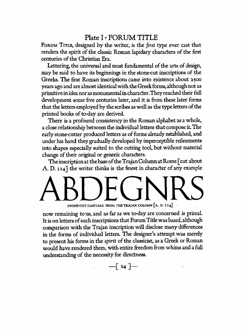
Plate I ^ FORUM TITLEForum Title, des^ned by the writer, is the first type ever cast that
renders the spirit of the classic Roman lapidary characters of the first
centuries ofthe Christian Era.
Lettering, the universal and most fundamental ofthe arts of design,
may be said to have its beginnings in the stone^cut inscriptions of the
Greeks. The first Roman inscriptions came into existence about 2500
years ago and are almost identicalwith tlie Greek forms, although not as
primitivein idea nor asmonumentalin characfter.Theyreached their full
development some five centuries later, and it is from these later forms
that the letters employed by the scribes as well as the type letters ofthe
printed books of tO'day are derived.
There is a profound consistency in the Romian alphabet as a whole,
a close relationship between the individual letters that compose it.The
early stonecutter produced letters as of forms already established, and
under his hand they gradually developed by imperceptible refinements
into shapes especially suited to the cutting tool, but without material
change of their original or generic charadters.
Theinscription at thebaseoftheTrajanColumn atRome [cut about
A. D. 114] the writer thinks is the finest in character ofany example
ABDEGNRSSTONE'CUT CAPITALS FROM THE TRAJAN COLUMN [a. D. 1 14]
now remaining to us, and as far as we to'day are concerned is primal.
It is on letters ofsuch inscriptions that Forum Titlewas based, although
comparison with the Trajan inscription will disclose many differences
in the forros of individual letters. The designer's attempt was merely
to present his forms in the spirit ofthe classicist, as a Greek or Roman
would have rendered them, with entire freedom from whims and a full
understanding of the necessity for direcftness.
_{ .4 ]-
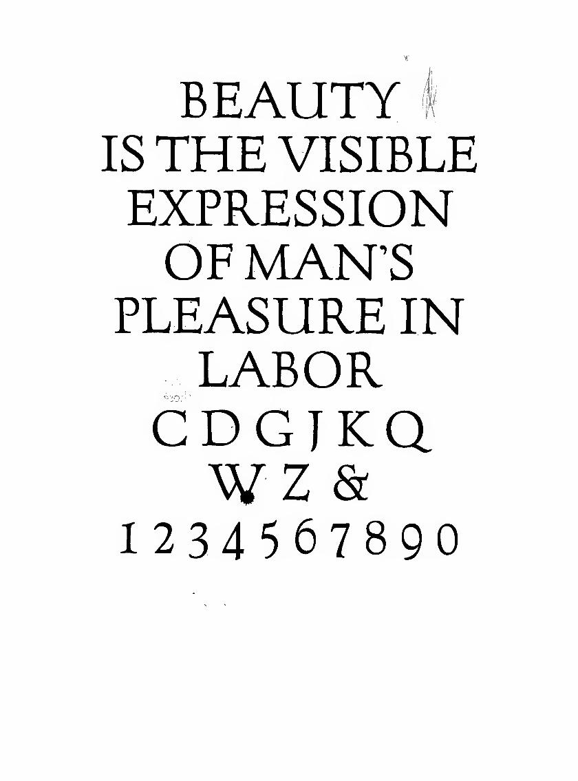
BEAUTYIS THE VISIBLEEXPRESSIONOF MAN'S
PLEASURE INLABOR
to:
CDGJKawz &
1234567890
Plate II - CASLON OLD STYLEWhen first cut, this letterpresented theperfection ofunassuming crafts-
manshipwithoutany artistic pretensions. Itwas cut in 1720 byWilliamCaslon, an engraver of the ornamentation ofgun barrels, and occasion-
allyofbookbinders' stamps and letters. It is straightforward and legible,
possessing a qualityofquaintness and even beauty,and a character that
makes its use well-nigh universal.
It is thewriter's personalopinionthatCaslonhad nothoughtoforigi-
nating or designii^ a new letter, but that he used simply a good Dutch
type £Dutch types predominated in England at that time] with which
he was familiar, as a model, and which he carried out with greater skill
due to his long experience as an engraver. The 72 pt. size shown oppo-
sitewas not cut byCaslon himself, buthas been added by theAmerican
Type Founders Co., following rather closely the design of the earlier
cutting of the smaller si^jes.
Caslon threw into his work the genius of taste; his skill enabled him
to reproduce the Dutch characters with a precision and uniformity that
his models lacked,while preservinginthemgreaterfreedomand graceof
form. Caslon O. S. is the first type of any distinction to be used in Eng-
land and is to-day more generally known by name to those using types
than any odier letter. In England it is known as "Caslon Old Face."
{26>
PACK MYBOXWITHFIVEDZENLQUORJGS(& The quickbrwnfxjumpsover the lazy
dgi23456789o
Plate III - CASLON OLD STYLE ITALICPlate III shows Gaslon Italic [enlarged from 36 point to a si2ie corres'
ponding to the Roman]. It is more formal than its model, Dutch italics
showing a tendency to extravagant flourishes. The inclination is muchgreater than that of Aldus' Italic and in the case ofA.V.W. not well
LWAPhandled; the inclination of the letters is that of the stems instead of be-
ing equally distributed on the line ofinclination, as shown bythe drawings ofW. and A.,the line H.W.IA. showing them as they are cut, the
line L. W. A. P., as the writer thinks they should be.
The italic character,nowan accessoryofthe Rpman letter, is wholly
independent ofthe Roman as to its origin, [see pg. 32]At first intended
and used for the entire text of classical works, it later came to be used
more generally to distinguish such portions of a book as the introduc
tion, preface, index, notes, etc., the text being in Roman. Still later it
found place in the text for quotations, and finally, to emphasise certain
words or phrases.
John Day, the first English type founder, carried italicHo a high sjtate
of perfection, but in the 17th century, italic types, like the Roman, suf'
fered debasement, and Dutch models were generally preferred.
Caslon cut a series of italic uniform with and in due relation to the
corresponding sizes of his Roman letter.
i^l
PJCKMTBXWirU FIVEDOZEN LI^UOR JUGS
1234567890
'The quick brown
foxjumps over the
lazy dog
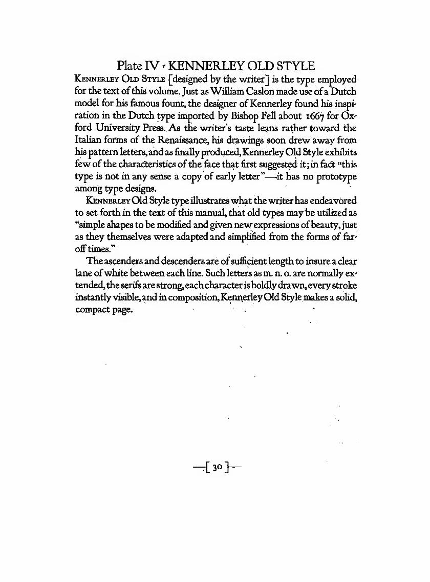
Plate IV ^ KENNERLEY OLD STYLEKennerley Old Style [designed by the writer] is the type employed
for the text ofthis volume. Just as William Caslon made use ofa Dutchmodel for his famous fount, the designer of Kennerley found his inspi'
ration in the Dutch type imported by Bishop Fell about 1667 ^^ Ox'
ford University Press. As me writers taste leans rather toward the
Italian fonns of the Renaissance, his drawings soon drew away from
his pattern letters,and as finallyproduced,KennerleyOld Style exhibits
few ofthe characteristics ofthe face that first su^ested it; in fad; "this
type is not in any sense a copy of early letter"—-it has no prototype
among type designs.
KennerleyOld Style type illustrateswhat thewriterhas endeavored
to set forth in the text of this manual, that old types may be utilized as
"simple shapes to be modified and given new expressions ofbeauty, just
as they themselves were adapted and simplii&ed from the forms of far'
offtimes.''
Theascenders and descenders are ofsufficient length to insure a clear
lane ofwhite between each line. Such letters as m. n. o. are normally ex'
tended, the serifs arestrong, eachcharacter isboldlydrawn, everystroke
instantly visible,and in composition, KennerleyOld Style makes a solid,
compact page.
-[30]-
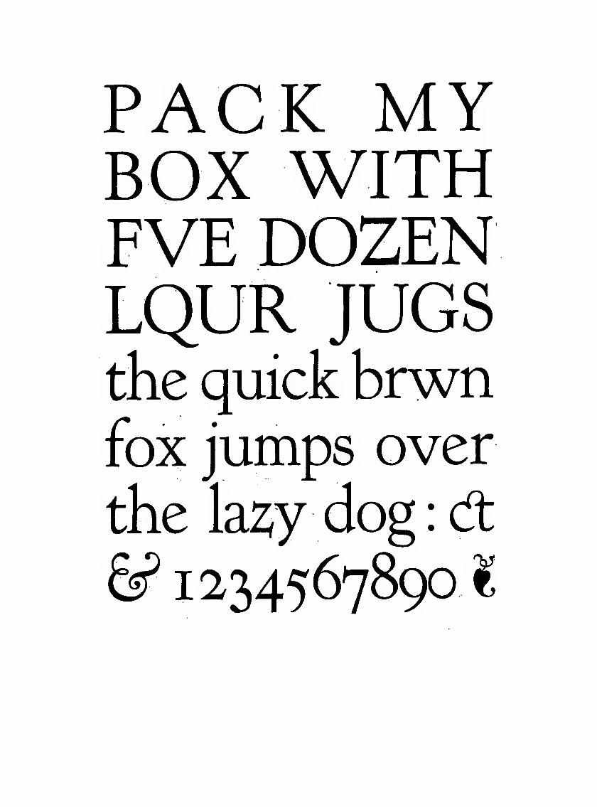
PACK MYBOX WITHFVE DOZENLQUR JUGSthe quick brwnfox jumps over
the la^y dog : d:
1234567890
1
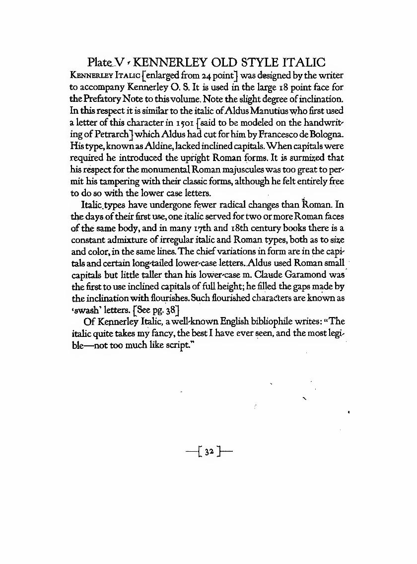
Plat^V - KENNERLEY OLD STYLE ITALICKennerley Italic [enlarged from 2,4 point] was designed by the writer
to accompany Kennerley O. S. It is used in the large 18 point face for
the PrefatoryNote to thisvolume. Note the slight degree ofinclination.
In this respect it is similar to the italic ofAldusManutiuswho first used
a letter of this character in 1501 |^said to be modeled on the handwrit-
ing of Petrarch]whichAldus had cut forhim by Francesco de Bologna.
His type,known asAldine, lacked inclined capitals.When capitals were
required he introduced the upright Roman forms. It is surmizied that
his respect for the monimientalRoman majusculeswas too great to per-
mit his tampering with their classic forms, although he felt entirely free
to do so with the lower case letters.
Italic.types have undergone fewer radical changes than Roman. In
the days oftheir first use, one italic served fortwo ormoreRoman faces
of the same body, and in many 17th and i8th century books there is a
constant admixture ofirregular italic and Roman types, both as to si2;e
and color, in the same lines.The chiefvariations in form are in the capi'
tals and certain long-tailed lower-case letters.Aldus used Roman small
capitals but little taller than his lower-case m. Claude Garamond was
the first to use inclined capitals of full height; he filled the gaps made by
the inclinationwith flourishes. Such flourished characfters are known as
'swash' letters. [See pg. 38.]
Of Kennerley Italic, awell-known English bibliophile writes: "The
italic quite takes my fancy, the best I have ever seen, and the most legi-
ble—^not too much like script."
u^y
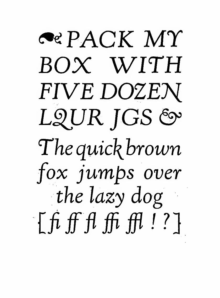
•^PACK MTBOX WITHFIVE DOZE?iL^R JGS &'
The quic\brown
fox jumps over
the lazy dog
ififfflffifflin
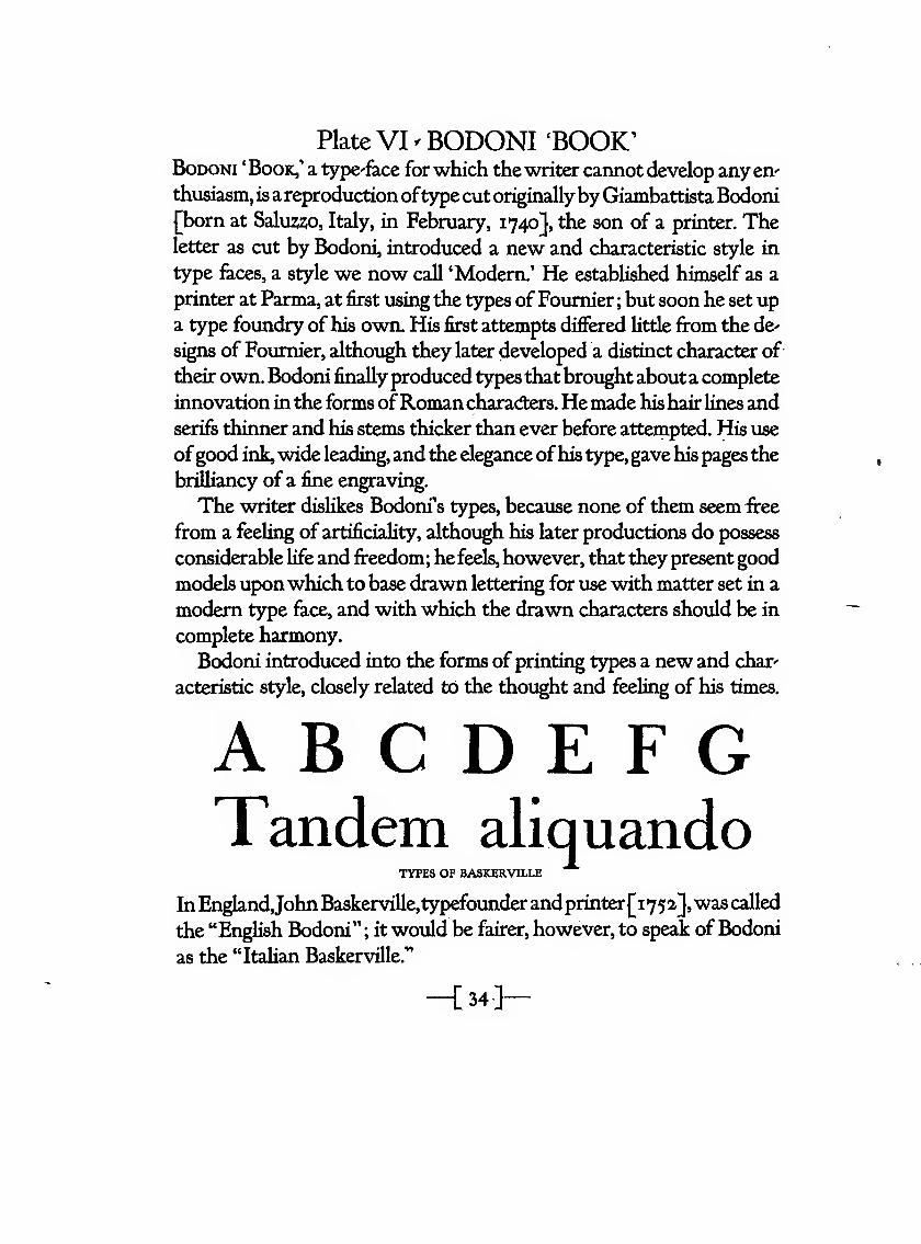
Plate VI ^ BODONI 'BOOK'BoDONi 'Book,' a type-face forwhich the writer cannot develop any en-
thusiasm, is areproduction oftype cut originallyby Giambattista Bodoni'born at Salu2;2;o, Italy, in February, 1740], the son of a printer. Theetter as cut by Bodoni, introduced a new and characteristic style in
type feces, a style we now call 'Modern.' He established himself as a
printer at Parma, at first using the types of Fournier ; but soon he set up
a type foundry of his own. His first attempts differed little firom the de-
signs of Fournier, although they later developed a distinct character of
their own. Bodoni finallyproduced typesthat brought abouta complete
innovation in the forms ofRomancharadters.Hemade his hair lines and
serifs thinner and his stems thicker than ever before attempted. His use
ofgood ink,wide leading,and the elegance ofhis type,gave his pages the
brdliancy of a fine engraving.
The writer dislikes Bodoni's types, because none of them seem free
from a feeling of artificiality, although his later productions do possess
considerable life and freedom; he feels, however, that they present good
models uponwhich to base drawn lettering for use with matter set in a
modern type face, and with which the drawn characters should be in
complete harmony.
Bodoni introduced into the forms of printing types a new and char-
acteristic style, closely related to the thought and feeling of his times.
A B C D E F GTandem aliquando
TYPES OF BASKERVILLE
InEngland,John Baskerville,typefounderand printer[i752],was called
the "English Bodoni" ; it would be fairer, however, to speak of Bodoni
as the "Italian Baskerville."
-[ 34-]-
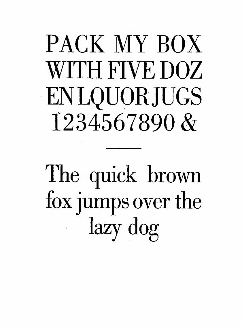
PACK MY BOXWITH FIVE DOZENLQUORJUGS1234567890 &
The quick brown
fox jumps over the
lazy do
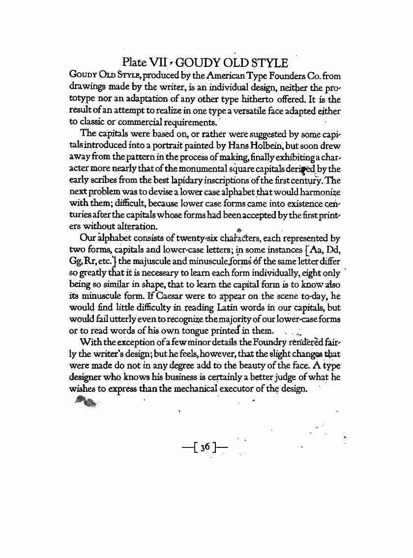
PlateVH/ GOUDYOLD STYLEGouDY Old Style,produced by theAmericanType Founders Co. fromdrawings made by the writer, is an individual design, neither the pro'
tot5^e nor an adaptation ofany other type hitherto offered. It is the
result ofan attempt to realize in one type a versatile face adapted either
to classic or commercial requirements.
The capitals w^ere based on, or rather were suggested by some capi'
talsintroduced into a portrait painted by Hans Holbein, but soon drewawayfrom the pattern in the process ofmaking, finally exhibiting a char^
acter more nearly that ofthe monumental square capitals deri^d^bytheearly scribes from the best lapidaryinscriptions ofthe first century.Thenext problem was to devise a lower case alphabet thatwould harmonisewith them; difficult, because lower case forms came into existence ceh'
turies afterthe capitalswhose formshad beenaccepted bythe first print'
ers without alteration.
Our alphabet consists oftwentysix chafadters, each represented bytwo forms, capitals and lower'case letters; m some instances [Aa, Dd,
Gg,Rr, etc.} the majuscule and minuscule/orms 6fthe same letter differ
so greatly that it is necessary to learn each form individually, eight only
bdng so similar in shape, that to learn the capital form is to know aiso
its minuscule form. If Caesar were to appear on the scene to'day, he
would find Httle difficulty in reading Latin words in our capitals, but
would failutterlyeven to recognise the majority ofourlower-caseforms
or to read words ofhis own tongue printedf in them. . . .,
Withtheexception ofafewminor details theFoiMidry rS;ridered fair'
ly the writer's design; but he feels,however, thst die slight changes t|iat
were made do not in any degree add to the beauty of the fo,ce. A type
designerwho knows his business is certainly a betterjudge ofwhat he
wishes to express than the mechanical executor of the design.
on
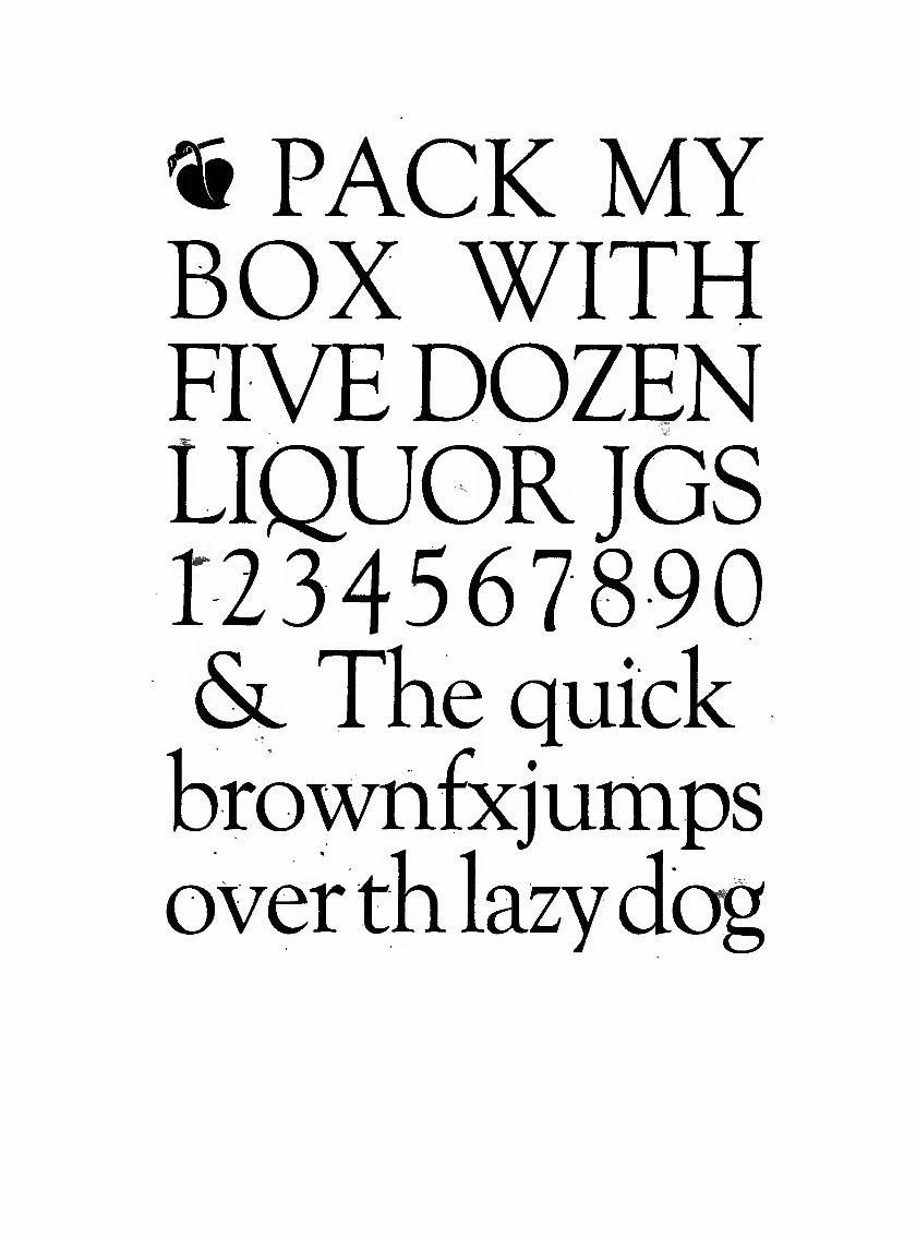
^ PACK MYBOX WITHFIVEDOZENLIQUOR JGS
<Sl The quick
xjumpsz
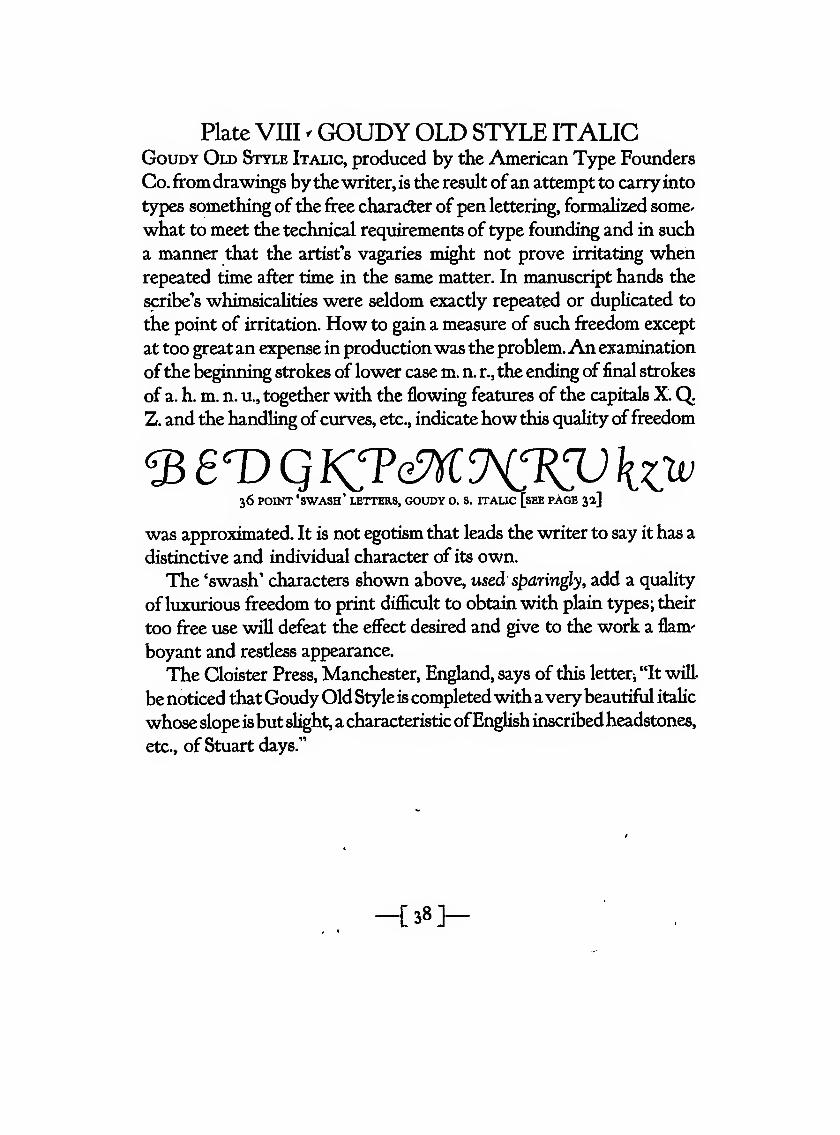
Plate VIII < GOUDY OLD STYLE ITALICGouDY Old Style Italic, produced by the American Type Founders
Co. fromdrawings by the writer, is the result ofan attempt to carryinto
types something of the free character of pen lettering, formalized some^
what to meet the technical requirements of type founding and in such
a manner that the artist's vagaries might not prove irritating whenrepeated time after time in the same matter. In manuscript hands the
scribe's whimsicalities were seldom exactly repeated or duplicated to
the point of irritation. How to gain a measure of such freedom except
at too greatan expense in productionwas the problem.An examination
ofthe beginning strokes of lower case m. n. r., the ending of final strokes
of a. h. m. n. u., together with the flowing features of the capitals X.QZ. and the handling ofcurves, etc., indicatehow this quality offreedom
36 POINT 'swash' letters, GOUDY O. S. ITALIC [sEE PAGE 3a]
was approximated. It is not egotism tliat leads the writer to say it has a
distinctive and individual character of its own.
The 'swash' characters shown above, vised sparingly, add a quality
ofluxurious freedom to print difficult to obtain with plain types; their
too free use will defeat the effect desired and give to the work a flam'
boyant and restless appearance.
The Cloister Press, Manchester, England, says of this letterj "It will
be noticed thatGoudyOld Style is completedwithavery beautifril italic
whose slope isbut slight, a characteristicofEnglish inscribedheadstones,
etc., of Stuart days."
-C38]-
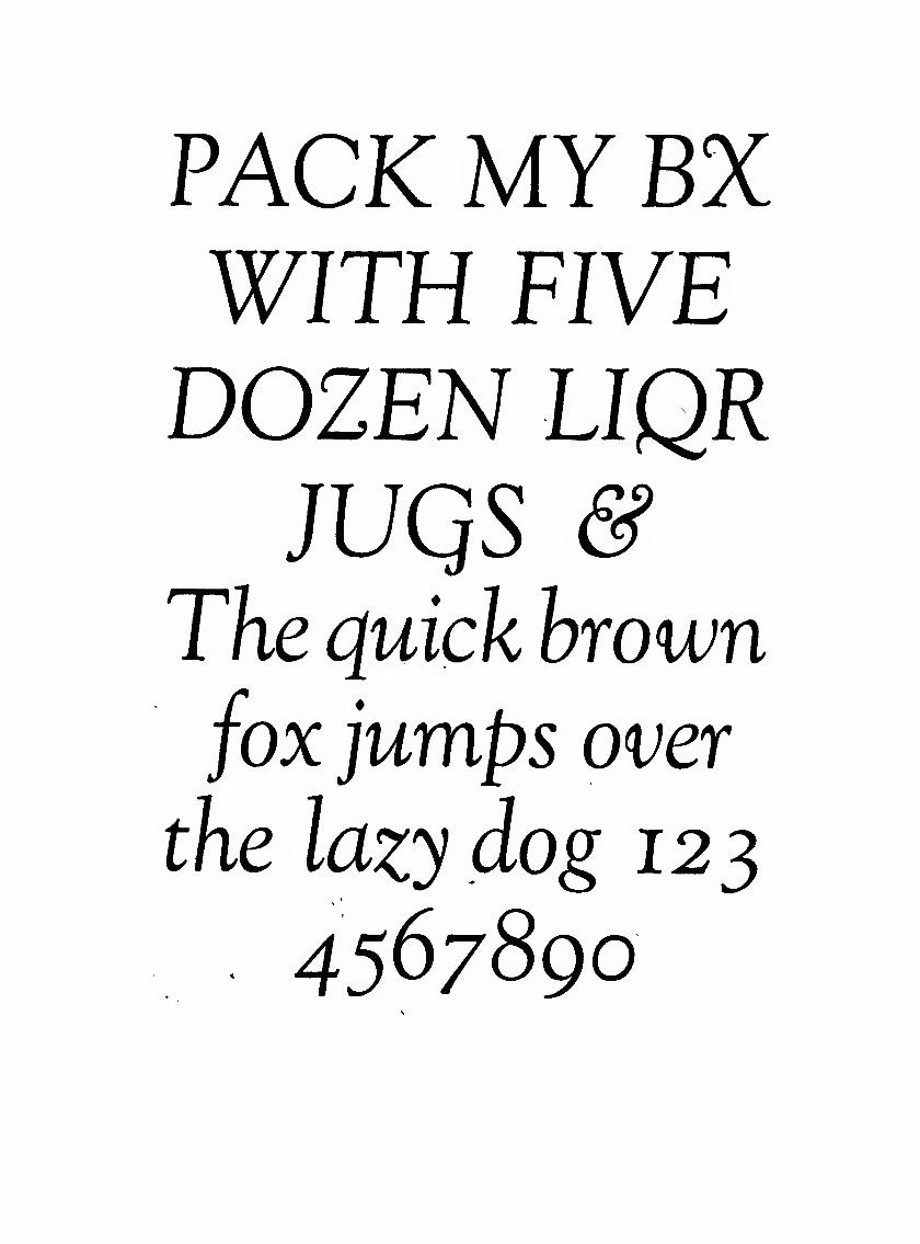
PACK MY BXWITH FIVEDOZEN LIQR
jvqs &The quick hrown
fox jumps over
the lazy dog 123
4567890
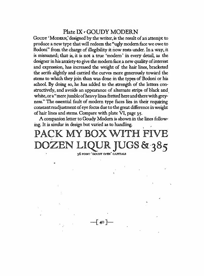
Plate IXvGOUDYMODERNGouDY 'Modern,' designed by the writer, is the result ofan attempt to
produce a new type that will redeem the "ugly modem face we owe to
Bodoni" from the charge of illegibility it now rests under. In a way, it
is misnamed; that is, it is not a true 'modern' in every detail, as the
designer in his anxietyto give the modern fece a new quality ofinterest
and expression, has increased the weight of the hair lines, bracketed
the serifs slightly and carried the curves more generously toward the
steros to which they join than was done in the types of Bodoni or his
school. By doing so, he has added to the. strength of the letters con'
structively, and avoids an appearance of alternate strips of black and
white,ora"merejumbleofheavy lines fretted hereandtherewith grey
ness." The essential fault of modern type faces lies in their requirii^
constantreadjustment ofeye focus due to the great difference inweight
of hair Hnes and stemis. Compare with plate VI, page 35.
A companion letter to Goudy Modem is shown in the lines follow-
ing. It is similar in design but varied as to handling.
PACK MYBOXWITH FIVEDOZEN LIQUR JUGS &385
36 POINT 'GOUDY open' CAPITALS
-[40>
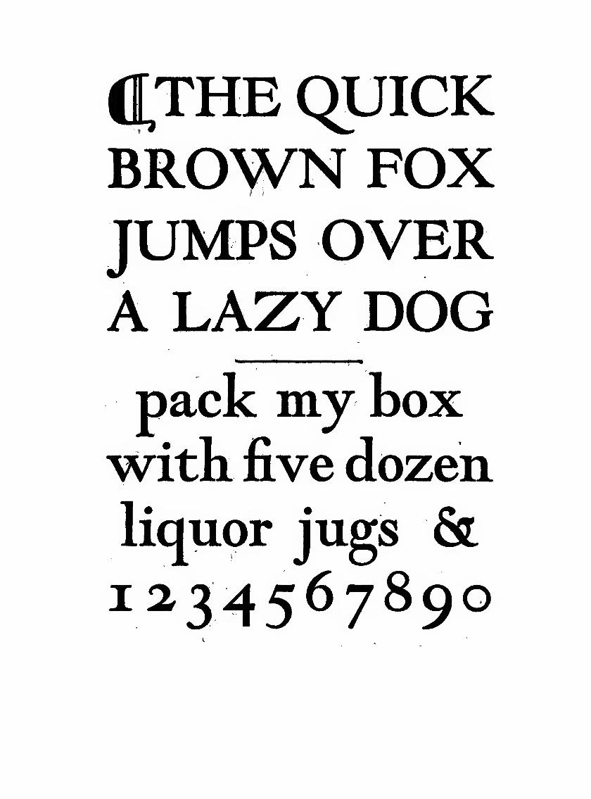
([THE QUICKBROWN FOXJUMPS OVERA LAZY DOGpack my boxwith five dozenliquor jugs &1^34567890
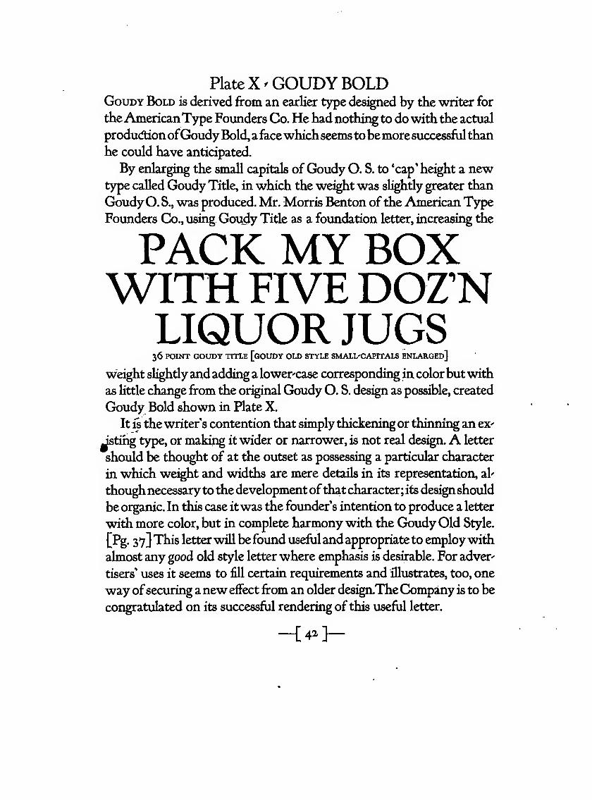
Plate X ^ GOUDY BOLDGouDY Bold is derived from an earlier type designed by the writer for
theAmericanType Founders Co, He had nothing to do with the actual
productionofGoudy Bold, afacewhichseems tobemore successfulthan
he could have anticipated.
By enlarging the small capitals ofGoudy O. S. to 'cap' height a newtype called Goudy Title, in which the weight was sightly greater than
GoudyO. S., was produced. Mr. Morris Benton ofthe American Type
Founders Co., using Goudy Title as a foundation letter, increasing the
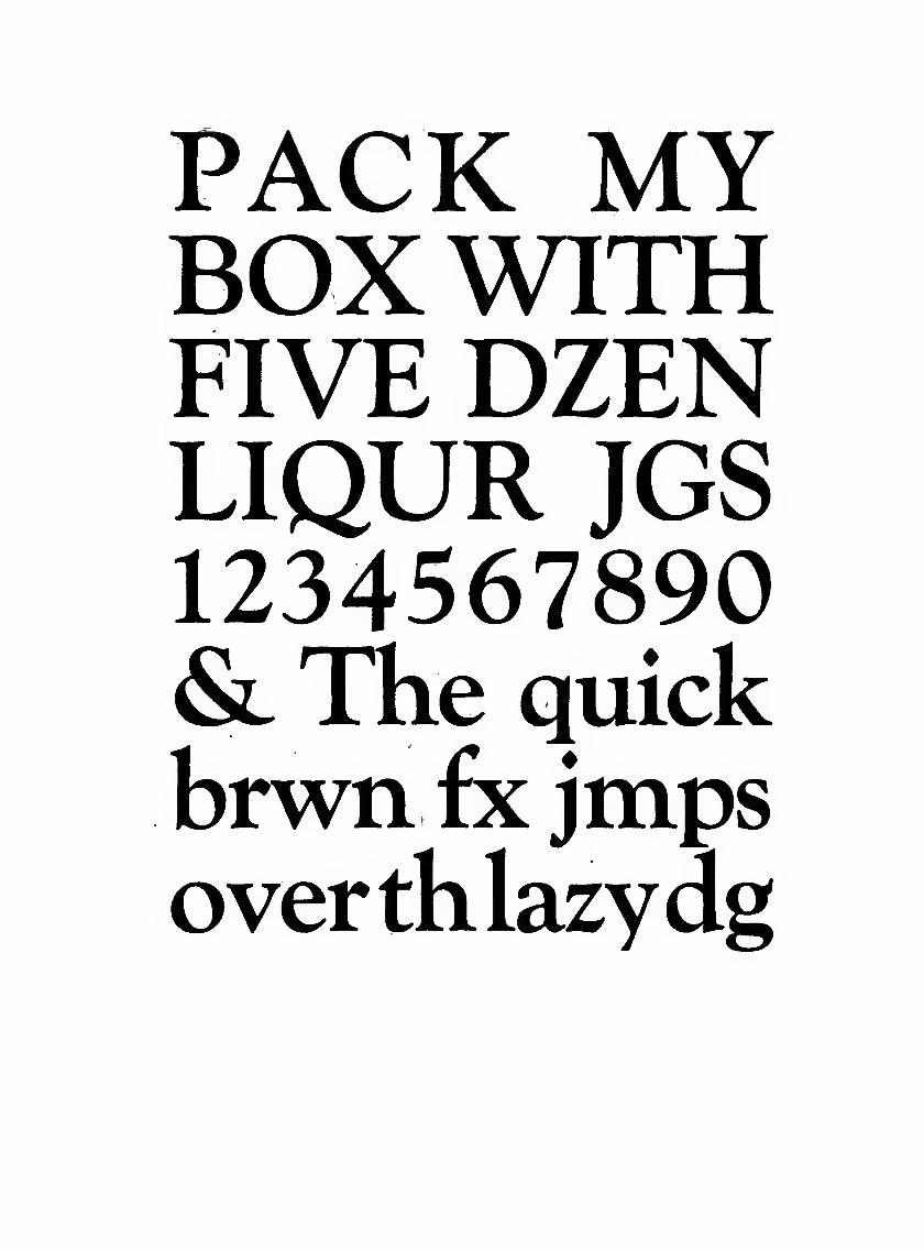
PACK MY BOXWITH FIVE DOZ'NLIQUOR JUGS36 POINT GOUDY TITLE [gOUDY OLD STYLE SMALL'CAPITALS ENLARGED]
we^ht slightlyand adding a lower-case corresponding in colorbutwith
as little change from the original Goudy O. S. design as possible, created
Goudy Bold shown in Plate X.
It is the writer's contention that simply thickenii^ or thinning an ex-
Jstihg type, or making it wider or narrower, is not real des^n.A letter
should be thought of at the outset as possessing a particular character
in which we^ht and widths are mere details in its representation, al'
thoughnecessaryto the development ofthat character; its designshould
be organic. In this case itwas the founder's intention to produce a letter
with more color, but in complete harmony with the Goudy Old Style.
{Pg. 37} This letter will befound usefuland appropriateto employwith
almost any good old style letter where emphasis is desirable. For adver-
tisers' uses it seems to fill certain requirements and illustrates, too, one
way ofsecuring anew effect from an older design.TheCompany is to be
congratulated on its successful rendering of this useful letter.
-{4-]-
PACK MYBOXWITHFIVE DZENLIQUR JGS1234567890& The quickbrwn fx jmpsoverthlazydig
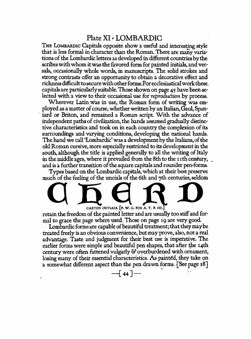
Plate XI ^ LOMBARDICThe Lombardic Capitals opposite show a useful and interesting, style
that is less formal in character than the Roman. There are many varia'
tions of the Lombardic letters as developed in different countries bythescribeswithwhom itwas the favored form for painted initials, and ver^
sals, occasionally whole words, in manuscripts. The solid strokes andstrong contrasts offer an opportunity to obtain a decorative effect andrichness difficultto securewithotherforms.For ecclesiasticalworkthese,
capitals are particularly suitable.Those shown on page 45 have been sclected with, a view to their occasional use for reproduction by process.
Wherever Latin was in use, the Roman form of writing was em'
ployed as a matter ofcourse, whetherwrittenby an Italian, Gaul, Span'
iard or Briton, and remained a Roman script. With the advance of
independent paths of civili2iation, the hands assumed gradually distinc
tive characteristics and took on in each country the complexion of its
surroundii^s and varying conditions, developing the national hands.
The hand we call 'Lombardic' was a development by the Italians, ofthe
old Roman cursive, more especially restricted to its development in the
south, although the title is applied generally to all the writing of Italy
in the middle ages, where it prevailed from the 8th to the i ith centxiry,^
and is a further transition ofthe square capitals and rounder pen'forms.
Types based on the Lombardic capitals, which at their best preserve
much ofthe feeling of the uncials ofthe 6th and 7th centuries, seldom
CAXTON INITIALS, [f. W^. G. FOR A. T. F. CO.]
retain the freedom ofthe painted letter and are usually too stiffand for'
mal to grace tiie page where used. Those on page 19, are very good.
Lombardicforms are capable ofbeautiful treatment; that theymaybetreated freely is an obvious convenience, butmay prove, also, not a real
advantage. Taste and judgment for their best use is imperative. Theearlier forms were simple and beautiful pen shapes, that after die 14th
century were often fattened vulgarly 6? overburdened with ornament,
losing many of their essential characteristics. As painted, they take on
a somewhat different aspect than the pen drawn forms. [See page 18]
-[44}-
Bct)r>
oDcmo
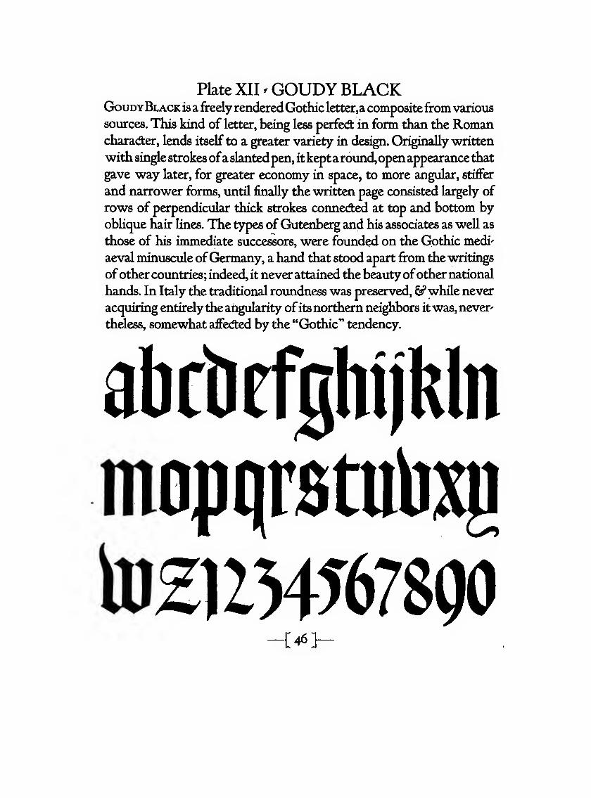
Plate XII ^ GOUDY BLACKGoudyBlack is a freely renderedGothic letter,acompositefrom various
sources. This kind of letter, being less perfed: in form than the Romancharacfter, lends itself to a greater variety in design. Originally written
with single strokesofaslantedpen, itkeptaround,openappearance that
gave way later, for greater economy in space, to more angular, stiffer
and narrower forms, until finally the written page consisted largely of
rows of perpendicular thick strokes connected at top and bottom by
oblique hair lines. The types of Gutenberg and his associates as well as
those of his immediate successors, were founded on the Gothic medi"
aeval minuscule ofGermany, a hand that stood apart from the writings
ofother countries; indeed, it never attained the beautyofother national
hands. In Italy the traditional roundness was preserved, €?*while never
acquiring entirelythe angularity ofitsnorthern neighbors itwas, never'
theless, somewhat aflfecfted by the "Gothic" tendency.
abcMjghiikln
moptirstu))^
to2UHT678Q0[46]-
SJBCD^f
Vk
^(5^
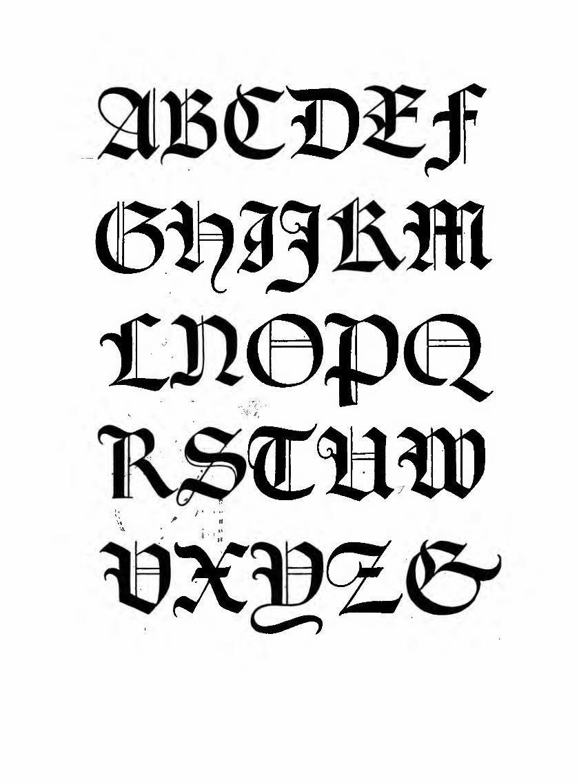
Plate XIII ^ GOUDY GOTHICGouDY Gothic, from the original drawings by the writer, is included
among the specimens given to showhowa lettermore pleasing than the
printer's 'lining Gothic' type can be produced with very slight modifi'
cations in form and detail.
The name 'Gothic' is misleading—^it properly belongs only to older
forms of black-letter. It probably is called 'Gothic' because usually as
bold and black as the Gothic black'letters of early manuscript hands.
English founders more corredly call it 'sans-serif.'
Gothic lettering became a distind: style in the 12th century; but the
term 'Gothic' when applied to a style which belongs not to one, but
to all the Germanic tribes, is purely a misnomer. In fadt the title did not
come into existence until centuries after any people called Goths had
passed from the earth. Moreover, 'Gothic' was at first a mere random
expression of contempt, a title of depreciation and scorn. Everything
notofthe classical Italianforms j^whichaloneseemedworthyofadmira-
tion] critics called 'Gothic,' meaning rude and barbarous thereby.
Printers 'Gotiiic' is a rude imitation ofclassicGreekand Roman lapi-
dary capitals. Its lack of grace and unpleasing monotony when used in
a succession of lines make it unsatisftidtory except for a single word or
a line where greater blackness is desired than is possible with the usual
Roman forms. Its use is occasional, and some real demand for a letter
of this character should be clearly evident, since it possesses very little
grace or beauty. It must be spaced carefrilly to avoid awkward gaps be-
tween irregular letters.
-[48]-
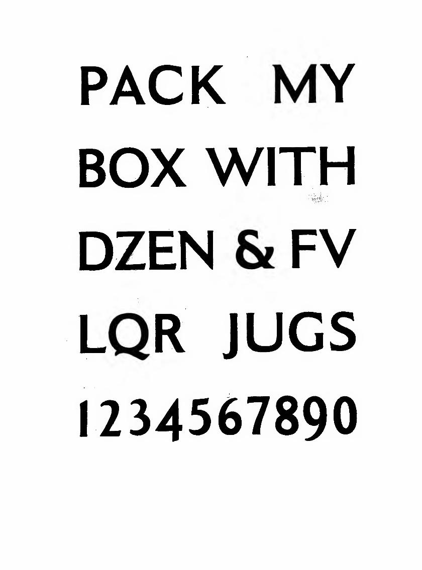
PACK MYBOX WITH
S'*'-'4:'
DZEN & FV
LQR JUGS
1234567890

THIS manual has been set by Bertha M. Goudy at the Village Press,
Forest Hills Gardens, New York, with types designed by the author,
and printed under his supervisionatTHEMarchbanks Press,NewYorkCity, in May, 1922. Published by Mitchell Kennerley, New York,