El Lissitzky's Multilayer Photographs: A Technical Analysis
11
1 Pollmeier When we look at El Lissitzky’s photographs, certain questions quickly arise: How did Lissitzky make these complex multilayer compositions, and is there material- based or phototechnical evidence that could tell us more about the authenticity or intended use of the individual prints? Are we looking at a first-generation print, i.e., the earliest and most immediate result of the artist’s cre- ative work? Or is it a reproduction, made for distribution or publication? As can be seen in several multilayer El Lissitzky’s Multilayer Photographs: A Technical Analysis klaus pollmeier photographs in the collection of The Museum of Modern Art (all but one from the Thomas Walther Collection), Lissitzky used elements of one montage for various other works, so even a reproduction may have become an original, if the desired image required a duplication within it. By using information from material analysis and knowledge of historical darkroom techniques, I will attempt to explain how Lissitzky made some of these multilayer photographs. All works by El Lissitzky © 2014 Artists Rights Society (ARS), New York/VG Bild-Kunst, Bonn Untitled 1924–30 MoMA 222.1986 (not in the Thomas Walther Collection) Object size 6 ¼ × 4 ⅝" (16.1 × 11.8 cm). This falls between the standard negative sizes of 9 × 12 cm (3 9/16 × 4 ¾") and 13 × 18 cm (5 × 7"), 1 both used by Lissitzky. The two plate-holder clamps visible at the bottom edge appear larger than life, suggesting that this is an enlargement from a 9 × 12 cm negative rather than a contact print from a 13 × 18 cm negative. Photographic paper Matte silver gelatin developing-out paper, single weight, with a thin baryta layer. Probably a gaslight paper, which could be handled under subdued artifi- cial light; gaslight paper was mainly used for contact printing, without the need of a darkroom or red safelights. The photographic emulsion contains a matting agent, probably starch grains. The image tone is dark brown in the shadows and more yellowish in the midtones and highlights. Chemical condition Since the bright/white image parts have turned yellow, the print probably was insufficiently fixed in an exhausted fixing bath rather than sul- fur toned. This left silver halide salts in the emulsion, which were invisible immediately after processing but over time turned into yellow-brown silver sulfide. Physical condition Under magnification, numerous tiny dark spots can be seen in the pits of the paper surface in the central sky area. These spots could be dirt residues from a previous cleaning or, more likely, chemical or microbio- logical residues. The overall physical condition is good, with some minor formation of colloidal silver (silver mirroring).
Transcript of El Lissitzky's Multilayer Photographs: A Technical Analysis

1Pollmeier
When we look at El Lissitzky’s photographs, certain questions quickly arise: How did Lissitzky make these complex multilayer compositions, and is there material- based or phototechnical evidence that could tell us more about the authenticity or intended use of the individual prints? Are we looking at a first-generation print, i.e., the earliest and most immediate result of the artist’s cre-ative work? Or is it a reproduction, made for distribution or publication? As can be seen in several multilayer
El Lissitzky’s Multilayer Photographs: A Technical Analysisk l a u s p o l l m e i e r
photographs in the collection of The Museum of Modern Art (all but one from the Thomas Walther Collection), Lissitzky used elements of one montage for various other works, so even a reproduction may have become an original, if the desired image required a duplication within it. By using information from material analysis and knowledge of historical darkroom techniques, I will attempt to explain how Lissitzky made some of these multilayer photographs.
All works by El Lissitzky © 2014 Artists Rights Society (ARS), New York/VG Bild-Kunst, Bonn
Untitled 1924–30 MoMA 222.1986 (not in the Thomas Walther Collection)
Object size6 ¼ × 4 ⅝" (16.1 × 11.8 cm). This falls between the standard negative sizes of 9 × 12 cm (3 9/16 × 4 ¾") and 13 × 18 cm (5 × 7"),1 both used by Lissitzky. The two plate-holder clamps visible at the bottom edge appear larger than life, suggesting that this is an enlargement from a 9 × 12 cm negative rather than a contact print from a 13 × 18 cm negative.
Photographic paperMatte silver gelatin developing-out paper, single weight, with a thin baryta layer. Probably a gaslight paper, which could be handled under subdued artifi-cial light; gaslight paper was mainly used for contact printing, without the need of a darkroom or red safelights. The photographic emulsion contains a matting agent, probably starch grains. The image tone is dark brown in the shadows and more yellowish in the midtones and highlights.
Chemical conditionSince the bright/white image parts have turned yellow, the print probably was insufficiently fixed in an exhausted fixing bath rather than sul-fur toned. This left silver halide salts in the emulsion, which were invisible immediately after processing but over time turned into yellow-brown silver sulfide.
Physical conditionUnder magnification, numerous tiny dark spots can be seen in the pits of the paper surface in the central sky area. These spots could be dirt residues from a previous cleaning or, more likely, chemical or microbio-logical residues. The overall physical condition is good, with some minor formation of colloidal silver (silver mirroring).

2Pollmeier
How the Image Was MadeIt may seem at first glance that this photomontage could be re-created simply by superimposing three negatives, one after the other, on developing-out paper. The process can be simulated with Adobe Photoshop software by com-bining three images (fig. 1). However, in this simulation, the newly made digital photographs are positives and have added their brightness to the result. In analogue photog-raphy, the translucent parts of each negative would have added darkness (density) to the paper during exposure. This means that wherever something bright can be seen, the paper was protected from light by at least one of the images. This could have been achieved only by exposing the paper to all three negatives at the same time.
One simple solution would have been to cut negatives B and C (film negatives) to size with scissors and lay them on a sheet of printing-out paper, almost touching each other in the middle, at their cut edges; then put negative A (a glass negative) on top of the film negatives and expose to direct light (possibly sunlight), creating a first-generation print of the image; reproduce this print on a 13-by-18-centi-meter (5-by-7-inch) glass plate, thereby slightly enlarging the image; and then contact print this negative on gaslight paper, and process. Theoretically, Lissitzky also could
have put the three combined negatives in an enlarger, made a developing-out print, and reproduced that for distribution purposes. However, we do not know whether an enlarger was available to him.
The typical plate holders of that time kept the plate in place with brass clamps. The clamps left small areas of unexposed paper, which can be seen near the bottom cor-ners of this print. They belong either to portrait negative A, or to the reproduction negative from which this print was made. It is more likely that they belong to the portrait nega-tive, since their size is larger than usual and the right mark seems retouched (in the negative) in order not to stand out from the boot.
The profile images touch each other in the lower part of the image but do not overlap, even though the angle between the two indicates that they should. As mentioned above, Lissitzky may have trimmed one or more of the film negatives with scissors. This would also explain why the images touch the edge of the negative and do not show the typical unexposed film margin. If Lissitzky indeed cut the film negatives to size, thus irreversibly destroying them, he must have had a very clear idea of how he wanted the final picture to look, and how he would achieve this.
A B C D
fig. 1 Photographs by the author (A, B, and C) are combined (D) to simulate the effect of exposing a photographic paper simultaneously with three negatives. For didactic purposes, images A–C are shown as positives. Courtesy Klaus Pollmeier
=+ +
3Pollmeier
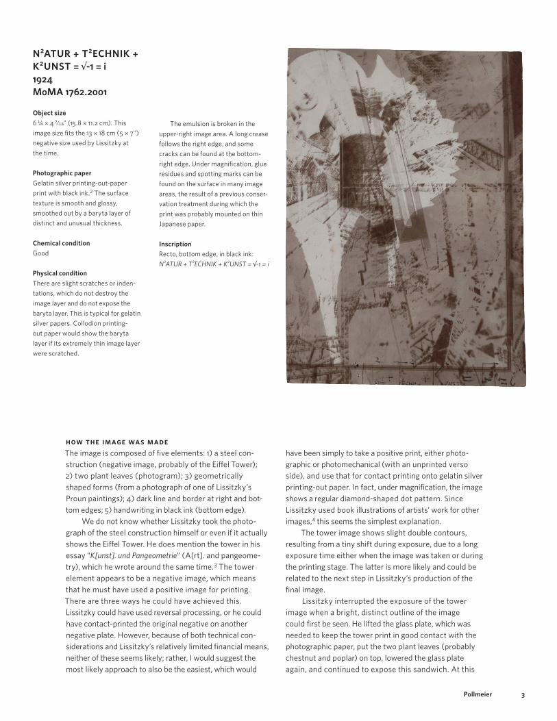
N2ATUR + T2ECHNIK + K2UNST = √-1 = i1924MoMA 1762.2001
Object size6 ¼ × 4 7/16" (15.8 × 11.2 cm). This image size fits the 13 × 18 cm (5 × 7") negative size used by Lissitzky at the time.
Photographic paperGelatin silver printing-out-paper print with black ink.2 The surface texture is smooth and glossy, smoothed out by a baryta layer of distinct and unusual thickness.
Chemical conditionGood
Physical conditionThere are slight scratches or inden-tations, which do not destroy the image layer and do not expose the baryta layer. This is typical for gelatin silver papers. Collodion printing- out paper would show the baryta layer if its extremely thin image layer were scratched.
The emulsion is broken in the upper-right image area. A long crease follows the right edge, and some cracks can be found at the bottom- right edge. Under magnification, glue residues and spotting marks can be found on the surface in many image areas, the result of a previous conser-vation treatment during which the print was probably mounted on thin Japanese paper.
InscriptionRecto, bottom edge, in black ink: N²ATUR + T²ECHNIK + K²UNST = √-1 = i
How the Image Was MadeThe image is composed of five elements: 1) a steel con-struction (negative image, probably of the Eiffel Tower); 2) two plant leaves (photogram); 3) geometrically shaped forms (from a photograph of one of Lissitzky’s Proun paintings); 4) dark line and border at right and bot-tom edges; 5) handwriting in black ink (bottom edge).
We do not know whether Lissitzky took the photo-graph of the steel construction himself or even if it actually shows the Eiffel Tower. He does mention the tower in his essay “K[unst]. und Pangeometrie” (A[rt]. and pangeome-try), which he wrote around the same time.3 The tower element appears to be a negative image, which means that he must have used a positive image for printing. There are three ways he could have achieved this. Lissitzky could have used reversal processing, or he could have contact-printed the original negative on another negative plate. However, because of both technical con-siderations and Lissitzky’s relatively limited financial means, neither of these seems likely; rather, I would suggest the most likely approach to also be the easiest, which would
have been simply to take a positive print, either photo-graphic or photomechanical (with an unprinted verso side), and use that for contact printing onto gelatin silver printing-out paper. In fact, under magnification, the image shows a regular diamond- shaped dot pattern. Since Lissitzky used book illustrations of artists’ work for other images,4 this seems the simplest explanation.
The tower image shows slight double contours, resulting from a tiny shift during exposure, due to a long exposure time either when the image was taken or during the printing stage. The latter is more likely and could be related to the next step in Lissitzky’s production of the final image.
Lissitzky interrupted the exposure of the tower image when a bright, distinct outline of the image could first be seen. He lifted the glass plate, which was needed to keep the tower print in good contact with the photographic paper, put the two plant leaves (probably chestnut and poplar) on top, lowered the glass plate again, and continued to expose this sandwich. At this

4Pollmeier
fig. 2 El Lissitzky (Lazar Markovich Lissitzky). Proun (Entwurf zu Proun S.K.). 1922–23. Watercolor, gouache, india ink, graphite, conté crayon, and varnish on buff paper, 8 7/16 × 11 ¾" (21.4 × 29.7 cm). Solomon R. Guggenheim Museum, New York. Gift, Estate of Katherine S. Dreier. Courtesy The Solomon R. Guggenheim Foundation/Art Resource, NY
point he may have unintentionally touched and moved the tower print, causing the slight shift of the contours.
The exposure time of the plant leaves was not suffi-cient to show their translucence, as in William Henry Fox Talbot’s photogenic drawings, for example. It was just enough to darken the surrounding uncovered image area and to show the leaves’ outline.
Finally, Lissitzky removed both the tower positive and the leaves and placed a 13-by-18-centimeter (5-by-7- inch) reproduction negative of one of his Proun paintings on the photographic paper. It is not clear which painting the artist used, but it must have been very similar to that in figure 2, though without the two rounded white elements, the arcing lines, or the brown rectangle. Its geometric forms show double contours exactly in the
longitudinal direction, different from the shift in the tower image. They appear darker than the rest of the image, supporting the assumption that they were added by an additional exposure of the negative. The double- and triple-contour border lines on the bottom and right edges could well belong to the edge of the reproduced Proun painting, the darker outward area being the mat or mounting board, which was somewhat brighter than the ground of the painting. The angle, the proportion of the Proun design, the contour lines, and the frame seem to nicely match the respective elements in a gouache study of a similar painting.
The described process makes this object a first- generation, original, or vintage work of art.

5Pollmeier
Kurt Schwitters1924MoMA 1763.2001
Object sizeImage: 4 ¼ × 3 7/8" (10.8 × 9.8 cm); sheet: 4 ½ × 4 1/16" (11.5 × 10.3 cm)
Photographic paperSingle-weight gelatin silver paper with a rather thin baryta layer. The surface texture is smooth, (semi-) matte.
Chemical conditionGood
Physical conditionSome glue residues on the verso with lines from lined paper indicate that this print was once mounted to a secondary support.
Image qualityIt is slightly out of focus, blurred at all edges of the image element.
How the Image Was MadeThe elements in this photograph come from various sources. The most obvious are the portraits of artist Kurt Schwitters, which come from two 13-by-18-centimeter (5-by-7-inch) glass-plate negatives owned today by the Sprengel Museum in Hannover (fig. 3).5 The negative on the left will be referred to as A, the one on the right with the broken lower-left corner as B. It is not clear when this cor-ner broke or who fixed it.
These negatives were used at their original scale in the montage, but they are larger than they appear in the Walther Collection print. Thus, the Walther Collection print is the result of a reproduction process. The original mon-tage does not seem to have survived. Figure 4 shows the image-size ratios.
Negative A is interesting because Lissitzky managed to frame Schwitters’s face with superimposed rectangular elements. Obviously Lissitzky positioned these elements carefully. Did he put them into the portrait via an extra exposure, or while he was photographing Schwitters? A sepa-rate exposure seems unlikely, as it would have been quite difficult to remember the exact position of the face when exposing the geometric object on the same plate that Lissitzky had just used for the portrait. Mis position ing would have destroyed the impressive expression of the face, a risk the photographer would likely not have taken.
Much simpler and less risky would have been to shoot the portrait through a sheet of glass, maybe from a windowpane or the door of a glass cabinet, which then
A B
fig. 3

6Pollmeier
would act as a semitransparent mirror and reflect the rect-angular object(s) into the image. By adjusting the angle of the glass, Lissitzky could have positioned the reflection in the center of the face. The typographic elements, dark-ened by the shadow of Schwitters’s head, derive from graphic art that was fixed to the wall as a background.
In negative B, Schwitters’s mouth is depicted in various positions, open and shut, indicating that Schwitters was talking during the long exposure. Lissitzky added three other image elements to the final composition: two are cutouts from books or journals, one of them from a pho-tographic manual; the third element is a small parrot, placed over Schwitters’s mouth.
At first it seems difficult to understand how Lissitzky constructed his final montage, yet the process ultimately reveals itself as very logical and even simple. Lissitzky most likely used printing-out paper in order to see immediately the effects of his multiple exposures. The two images in figure 5 show their original tone when exposed to gelatin silver printing-out paper. Lissitzky probably started with negative A and a mask cut to shape, in order to keep the area of the dark jacket white, and he protected the right half of the negative from the light. Otherwise, the dark image area would have interfered with the image of the next negative.
He then added negative B in a similar manner, also using a mask to keep certain areas white (fig. 6). Whether he exposed and thus added the masked negative of the parrot at this point or after he added the typographic elements would not have made a difference (fig. 7).6
The typographic elements in the lower part of the print were created using cutouts from original pages taken from books or journals. The one on the right, if reversed, shows a formula for a fixing bath cut from a photographic manual. During exposure, the rest of the paper was protected by opaque masks (fig. 8).
At this point, the composition was finished. For distribution purposes, the last step required was to repro-duce the print. To hide the uneven edges, Lissitzky first put a frame around the picture, made of two thin cardboard brackets. Their shadows can still be seen in the original print. During the reproduction step, the image lost a consid-erable amount of contrast. Lissitzky printed the copy negative on developing-out paper, which also changed the image tone to a rather dull brown, probably due to old fixer, which partly acted like a sulfur toner. Finally, he trimmed the edges (fig. 9).
Although the photograph was originally produced as a contact print and was thus very sharp, the reproduction step caused a slight lack of definition. Since the final image size fits into the 13-by-18-centimeter negative size, Lissitzky very likely contact-printed the copy negative, but since the copy negative included the cardboard edges, which the artist removed on the final image, the scale of reproduction is necessarily smaller than 1:1.
> >
+
+ =
=
+
+
+ + =
=
fig. 4
fig. 5
fig. 6
fig. 7
fig. 8
fig. 9
Figs. 3–9 courtesy Klaus Pollmeier

7Pollmeier
Self-Portrait (The Constructor) 1924MoMA 1764.2001
Object sizeImage: 5 ½ × 3 ½" (13.9 × 8.9 cm)
Photographic paperDouble-weight silver gelatin develop-ing-out-paper print with a thick baryta layer, untoned. The surface texture is smooth and semireflective. The paper was manufactured by Satrap as photographic postcard paper and has a corresponding imprint on the verso.
Chemical conditionThe image tone is brownish, partly due to degradation of the silver image material (the formation of silver sul-fide), especially in the outer areas of the image. The image is more neutral in the nondegraded center.
How the Image Was MadeThere are a number of versions of Lissitzky’s Self-Portrait (The Constructor), made in different sizes and through different processes. This photograph is a print (possibly a contact print) from a copy negative and seems to show a photomontage now in the collection of the State Tretyakov Gallery, Moscow (fig. 10), on an easel.7 The photomontage combines photogram, photomontage, drawing, and collage. We can only hypothesize as to the sequence in which the artist exposed the image ele-ments. Perhaps he began with the most dominant parts, the portrait and the hand with compass, which were combined in a photomontage and reproduction step before they were exposed together to the photographic printing-out paper.
The original portrait negative has survived as a 13-by-18-centimeter (5-by-7-inch) silver gelatin dry plate (fig. 11), which shows Lissitzky in front of graph paper. The negative has very well-defined shadows, rarely achieved in the known copy negatives, prints, and
Physical conditionGood. There is low-quality spotting and retouching in the bottom-right corner.
Image quality The image is sharp, with well- defined edges.
photomechanical reproductions, of this image. Since shadow detail is often lost in reproduction and no evidence for reproduction can be found in this negative, it is very likely to be the original camera negative.
The image of the hand with compass, also in front of graph paper, has survived as a gelatin silver bromide print (fig. 12). However, the print features a line describing an oval that does not appear in the Tretyakov Gallery photo-montage. For that, Lissitzky reproduced another version of this motif. The resulting negative (now lost) and the portrait negative were then exposed to photographic paper (very likely printing-out paper) and reproduced again.
One of the several negatives that resulted from this procedure has survived, partially covered with black paper and brushed-on retouching (fig. 13). In the upper part of the bright rectangle in the area of the fingertips, this mask-ing fits exactly with the same area in the Tretyakov Gallery photomontage. The masking was probably modified after the print was made, since the crease of the turtleneck

8Pollmeier
fig. 10 El Lissitzky (Lazar Markovich Lissitzky). Self-Portrait (The Constructor). 1924. Gelatin silver print. The State Tretyakov Gallery, Moscow fig. 11 El Lissitzky (Lazar Markovich Lissitzky). Self-Portrait. 1924. Bromide silver gelatin dry-plate negative. Sprengel Museum, Hannover. Niedersächsische Sparkassenstiftung fig. 12 El Lissitzky (Lazar Markovich Lissitzky). Untitled (Hand with a Compass). 1924. Gelatin silver print, 5 ¾ × 8 ⅙ (14.6 × 20.5 cm). Collection Ann and Jürgen Wilde, Zülpich. After photographing hand and compass over graph paper, Lissitzky protected the outer image areas from light (dodging) as he printed the negative. Before developing this print, he further exposed the upper-left corner of the paper, thus darkening it. The dynamic line was applied with black ink after the print was processed and dried.
fig. 13 El Lissitzky (Lazar Markovich Lissitzky). The second-state bromide silver gelatin glass negative used for Self-Portrait (The Constructor). 1924. 5 × 7" (13 × 18 cm). Sprengel Museum, Hannover. Niedersächsische Sparkassenstiftung fig. 14 Detail of El Lissitzky’s letterhead from the maquette for the book Prounen. c. 1924. Zincography. Russian State Archives fig. 15 Lissitzky’s Self-Portrait (The Constructor) (fig. 10), with red rectangles marking the pasted-on white paper rectangles, which are clearly visible in the photo- montage. This, the excellent image quality, and the fact that the work was made on printing-out paper make it probable that this is a first-generation print. fig. 16 El Lissitsky (Lazar Markovich Lissitzky). Bromide silver gelatin glass nega-tive of the final state of Self-Portrait (The Constructor). 1924. Sprengel Museum, Hannover. Niedersächsische Sparkassenstiftung
fig. 10
fig. 12
fig. 14
fig. 16
fig. 11
fig. 13
fig. 15
sweater is visible in the print but covered today in the neg-ative. The legs of the compass extending the bright rectangle, and their shadows, were very carefully masked in order to allow the exposure into them of other image elements (the letterhead and graph paper) and to create the impression of a seamless whole.
The left half of the photomontage is determined by a combination of graphic elements, among others the let-terhead from Lissitzky’s stationery.8 Another, published version of this stationery features the addition of a sticker bearing the word “PROUNEN” and a black line (fig. 14), which is missing in the final print.9 Lissitzky probably exposed the photographic paper through the stationery, thus reversing its tonal values. The letters “el” near the arrow likely did not print brightly enough during this expo-sure. They are heightened with opaque white paint in the photomontage. This retouching is not present in the Walther Collection work, but was observed in all the positive versions of the image on view in the exhibition El Lissitzky: Jenseits der Abstraktion. Fotografie, Design, Kooperation (El Lissitzky: Beyond abstraction. Photog-raphy, design, collaboration), organized by Margarita Tupitsyn and mounted at the Sprengel Museum, Hannover, in 1999.
Other graphic elements, like the bright vertical rectangles in the upper- and lower-left portion of the photomontage (marked in fig. 15) are attached collage elements, recognizable from discolored glue residues and shadows. The lower rectangle could have been applied at a later stage. In an early copy negative (fig. 16), this region is brighter than the adjacent fields. The letters “XYZ” were either stamped or carefully painted, then reproduced and finally exposed onto the paper.
The dark horizontal stripe above the head was cre-ated by exposing the photographic paper directly and protecting the rest; the dark outer edges remained unpro-tected during the previously described exposure steps. The arcing line, applied with black ink, and the signature were very likely added last. Both would be recognizable as drawing in a primary “prototype” version — very likely in the Tretyakov Gallery photomontage, which was not accessible for this research.

9Pollmeier
Record (Rekord)c. 1926MoMA 1766.2001
Image size10 ½ × 8 13/16" (26.7 × 22.4 cm)
Photographic paperSingle-weight (perhaps) gelatin silver developing-out paper, matte, sulfur toned
Chemical conditionGood, no chemical image degradation
Physical conditionSeveral cracks (lower-left corner; lower-edge diagonal, repaired; upper-left corner)
InscriptionVerso, center, in pencil, various infor-mation for photomechanical printing: Auto[typie], 60er R[aster]/204 m/m hoch/77% (Autotypic raster screen of 60 lines per centimeter, 204 millimeters high, 77%)
fig. 17 Knud Lönberg-Holm. New York: Broadway at Night (New York: Broadway bei Nacht). Page 150 in Erich Mendelsohn. Amerika: Bilderbuch eines Architekten (America: An architect’s picture book). Berlin: Rudolf Mosse Buchverlag, 1926. The Museum of Modern Art Library, New York. © The Knud Lönberg-Holm Archive from the Marc Dessauce Collection
How the Image Was MadeFor this montage, Lissitzky used two pictures taken by other photographers.10 One is a night view of Broadway in New York, originally photographed by Knud Lönberg-Holm (fig. 17).11 The second image, the runner, was cut out from an unknown publication.
Evidence that the runner was cut from another source can be detected in the figure’s hair and front leg and at the upper edge of the running track. Lissitzky did not simply place the cutout runner on the dark photograph of the city and reproduce the collage. Maybe the runner was not the appropriate size, and in any case, Lissitzky wanted the two to blend into each other. So he reproduced both, assembled the negatives in the enlarger, and exposed both at the same time onto photographic developing- out paper. He had to make sure, though, that both images were placed on a dark background during the reproduction step, so that the respective parts of each negative would remain clear and allow the dark elements of the other negative to shine through. Combining the images by subsequent

10Pollmeier
printing on printing-out paper, as he did in other mon-tages, would not have worked here because that would have added darkness, even in areas that were supposed to stay white. The dark background for the Broadway image can still be seen in the lower-right corner. In the reconstruction of Lissitzky’s process that follows (figs. 18-20), the runner was extracted from the original Lissitzky photograph and the Broadway scene repro-duced from the book using Adobe Photoshop.
When we compare reconstruction and original, it becomes clear that Lissitzky altered various elements of the Broadway image, probably before reproducing it. He darkened the second “Strand Roof” neon light, which otherwise would have interfered with the runner’s head, as well as the lights behind the runner’s legs, likely with a graphite pencil applied directly to the book page prior to reproduction. Lissitzky also blurred the large Coca-Cola panel and the neon lights between the runner’s legs. The texture in these areas seems to derive from chalk or graphite. White chalk would have worked best on the original book page before reproduction. Retouching with graphite pencil on the respective negative would have been another option, one requiring more skill and time,
however. Whether or not the upper-right corner was brightened intentionally or not remains uncertain.
The original Broadway image is sharper. Whether the lack of definition in the montage is due to Lissitzky’s technical restrictions or happened during the printing is unclear. If Lissitzky did not combine the two negatives face to face (which would mean that originally the runner would have faced the opposite direction), the thickness of the glass plate between the two image lay-ers would have caused a focusing problem, blurring the Broadway image.
It is interesting to note that for the version owned by The Metropolitan Museum of Art in New York, Lissitzky appears to have assembled the two negatives differently.12 In that print, the background image is in a slightly lower position and has shifted a little to the left.
The inscription on the back of the Walther Collection print, which indicates that it was given to a printing company, could explain the creases at the bottom. In the publication, the image was supposed to have a height of 8 inches (20.4 cm). Since the lower edge of the original was diagonal, the lithographer may simply have folded it to make it rectangular.13
>
>
>
Left, top: fig. 18 The cut-out runner reproduced on a black background to provide a copy negative. Left, bottom: fig. 19 The Broadway image reproduced on a black background to provide a copy negative. Above: fig. 20 Both negatives, combined and exposed to photographic developing- out paper, probably brown- (sulfur-) toned. Courtesy Klaus Pollmeier
11Pollmeier
When we analyze Lissitzky’s photographic images in detail, it becomes clear that the artist was far from work-ing like a professional photographer. His techniques were simple, cheap, and almost old-fashioned, requiring nothing in the way of expensive equipment. His 5-by-7- inch camera was certainly the most valuable tool in his kit, and even as his contemporaries began to explore the possibilities of the new Leica and Rolleiflex cameras, Lissitzky appears to have needed little more than some trays, bottles of chemicals, printing-out paper, and a contact-printing frame (or just a heavy piece of glass). For most of his montage work, a darkroom was not even necessary, since he contact-printed the negatives, and
the printing-out paper could be handled safely in subdued light. Only when he began making enlarge-ments, after 1926, would a real darkroom and an enlarger have been necessary.
Yet despite the relative paucity of his means, what remains remarkable to the close observer of Lissitzky’s photographic images is that the artist does not at all appear to have felt constrained. He seems to have visual-ized many aspects of the final image before the exposure of the negative in the camera, compensating for the shortcomings of his limited technology with a sharp and almost boundless imagination.14
Notes
1. A precise metric/imperial conversion is not provided for these measurements, here and throughout the essay, because “13 × 18 cm” and
“5 × 7"” describe the same stan-dard negative size (allowing for some tolerance in manufacture), labeled and sold in metric units in Europe and in imperial units in Great Britain and the United States.
2. The X-ray fluorescence anal-ysis conducted by MoMA’s conservation lab found silicon, strontium, and gold. Strontium chloride was a component of gelatin silver printing-out-paper emulsions, as was silicon chlo-ride. Gold would be used in gold toning, a standard procedure to improve image tone and stability.
3. El Lissitzky, “K. und Pangeometrie,” in Carl Einstein and Paul Westheim, eds., Europa Almanach. Malerei, Literatur, Musik, Architektur, Plastik, Buehne, Film, Mode (Potsdam: G. Kiepen-heuer, 1925), pp. 103–13.
4. See, for example, Record (Rekord) (MoMA 1766.2001), also discussed here.
5. The two portraits of Schwitters appear in Margarita Tupitsyn, El Lissitzky: Experiments in Photography (New York: Houk Freedman, 1991). The author reproduced them from the book and converted them to negatives using Adobe Photoshop soft-ware for this simulation.
6. For this reconstruction, the parrot image was extracted from the original montage using Photoshop. The original negative did not survive.
7. The author has published a detailed explanation of the pro-cess of making this picture in Margarita Tupitsyn, El Lissitzky. Jenseits der Abstraktion. Fotografie, Design, Kooperation (Munich: Schirmer/Mosel, 1999).
8. This stationery is in the collection of the Russian State Archives for Literature and Art, Moscow.
9. See Tupitsyn, El Lissitzky. Jenseits der Abstraktion, p. 76.
10. Tupitsyn asserts that this image is composed of three separate collaged elements: the track and hurdle, the hurdler himself, and a “double- printed night photograph.” I disagree and instead believe Lissitzky used only two ele-ments. Tupitsyn, El Lissitzky: Experiments in Photography, p. 30.
11. Lissitzky’s source was Erich Mendelsohn’s book Amerika — Bilderbuch eines Architekten, but it was not until subsequent editions that Mendelsohn (having faced criticism) included a list of photographer credits, identifying Knud Lönberg-Holm as the photographer of this particular image. Mendelsohn, Amerika — Bilderbuch eines Architekten, 3rd ed. (Berlin: Rudolph Mosse Buchverlag, 1928), pl. 44.
12. Runner in the City. c. 1926. Gelatin silver print, 5 3/16 × 5 1/16" (13.1 × 12.8 cm). The Metropolitan Museum of Art, New York. Ford Motor Company Collection. Gift of Ford Motor Company and John C. Waddell, 1987.1100.47.
13. This print is reproduced in Sophie Lissitzky-Küppers, El Lissitzky, Maler, Architekt, Typograf, Fotograf (Dresden: VEB Verlag der Kunst, 1967), p. 167.
14. See Klaus Pollmeier, “‘Der Konstrukteur’ von El Lissitzky. Ammerkungen zur Technik,” in Tupitsyn, El Lissitzky. Jenseits der Abstraktion, pp. 238–39.
Citation:Klaus Pollmeier. “El Lissitzky’s Multilayer Photographs: A Technical Analysis.” In Mitra Abbaspour, Lee Ann Daffner, and Maria Morris Hambourg, eds. Object:Photo. Modern Photographs: The Thomas Walther Collection 1909–1949. An Online Project of The Museum of Modern Art. New York: The Museum of Modern Art, 2014. http://www.moma.org/interactives/objectphoto/assets/essays/Pollmeier.pdf.