
Download (518kB) - City Research Online - City University
73
City, University of London Institutional Repository Citation: Badawood, D. (2012). Evaluation of storytelling in information visualization (MPhil to PhD Transfer Report). London, UK: City University London. This is the unspecified version of the paper. This version of the publication may differ from the final published version. Permanent repository link: https://openaccess.city.ac.uk/id/eprint/1741/ Link to published version: Copyright: City Research Online aims to make research outputs of City, University of London available to a wider audience. Copyright and Moral Rights remain with the author(s) and/or copyright holders. URLs from City Research Online may be freely distributed and linked to. Reuse: Copies of full items can be used for personal research or study, educational, or not-for-profit purposes without prior permission or charge. Provided that the authors, title and full bibliographic details are credited, a hyperlink and/or URL is given for the original metadata page and the content is not changed in any way. City Research Online: http://openaccess.city.ac.uk/ [email protected] City Research Online
Transcript of Download (518kB) - City Research Online - City University

City, University of London Institutional Repository
Citation: Badawood, D. (2012). Evaluation of storytelling in information visualization (MPhil to PhD Transfer Report). London, UK: City University London.
This is the unspecified version of the paper.
This version of the publication may differ from the final published version.
Permanent repository link: https://openaccess.city.ac.uk/id/eprint/1741/
Link to published version:
Copyright: City Research Online aims to make research outputs of City, University of London available to a wider audience. Copyright and Moral Rights remain with the author(s) and/or copyright holders. URLs from City Research Online may be freely distributed and linked to.
Reuse: Copies of full items can be used for personal research or study, educational, or not-for-profit purposes without prior permission or charge. Provided that the authors, title and full bibliographic details are credited, a hyperlink and/or URL is given for the original metadata page and the content is not changed in any way.
City Research Online: http://openaccess.city.ac.uk/ [email protected]
City Research Online

giCentre- School of Informatics
City University London
Evaluation of Storytelling in Information Visualization
By Donia Badawood
080002190
September 2012
A mini-thesis submitted to upgrade from MPhil to PhD
Supervisors: Prof. Jo Wood
Prof. Jason Dykes

Donia Badawood MPhil/PhD Transfer Report
080002190
2
Abstract Story telling has been used throughout the ages as a means of communication between people and to convey and
transmit knowledge from one person to another, and from one generation to the next. In various domains,
formulating of messages, ideas, or findings into a story has proven its efficiency in making them understandable,
comprehensible, memorable, interesting, and engaging. Information Visualization as an academic field has also
utilised the power of storytelling to make visualizations more understandable and interesting for a variety of
audiences, including experts. However, although storytelling has been a hot topic in information visualization for
some time, little or no empirical evaluations exist to compare different approaches of storytelling through
information visualization. There is also a need for work that addresses in depth some particular criteria and
techniques of storytelling such as transitions types in visual stories in general and data-driven stories in particular.
A within subject experiment with 13 participants has been conducted to explore empirically how two different
models of story delivery with information visualization influence narratives/stories constructed by audiences.
Specifically, the first model involves direct narrative by a speaker using a visualization design to tell a story,
while the second model involves constructing a story by interactively exploring visualization software. An open-
ended questionnaire in controlled laboratory settings has been used in which the primary goal was to collect a
number of stories derived from the two models. All the stories written by the participants were transcribed,
analysed, and coded, using data-driven and preset themes. Themes included initial perception of the main story
pattern/topic, insight types derived, narrative structures, and unexpected type of insights gained. This experiment
was followed by a semi-structured interview where each participant answered two Likert-scale questions on each
delivery model, and commented on the overall experiment. It is found that although most participants found
telling a story easier with the first model (narrative) they did not perform better in other aspects. The second
model (software) was advantegeous in the variety of insight types gained and participants accepted the message
and information more neutrally. In contrast, participants were more critical about the data in software model than
in the narrative model. The role of time in structuring story events was more apparent in the software model.
These findings have some significant practical implications on storytelling through information visualization. A
statement of the work done and a work plan for the remaining period of the PhD is also included explaining the
proposed enhancement to the experiment conducted and further research work planned to address the issue of
transitions in storytelling visualization.

Donia Badawood MPhil/PhD Transfer Report
080002190
3
Table of Contents Abstract ......................................................................................................................................................... 2
1. Introduction ........................................................................................................................................... 5
1.1 Research Context ................................................................................................................................ 5
1.2 Research Focus ................................................................................................................................... 6
1.3 Overall Research Aim and Individual Objectives ............................................................................... 7
1.4 Value and contribution of the research ............................................................................................... 8
1.5 Report Outline Structure ..................................................................................................................... 9
2. Literature Review ................................................................................................................................ 10
2.1 Storytelling in Information Visualization ......................................................................................... 11
2.2 Narrative Structure ............................................................................................................................ 14
2.3 Story Delivery ................................................................................................................................... 16
2.4 Transitions in Data-Driven Stories ................................................................................................... 18
2.5 Emerging issues and need for empirical research ............................................................................. 22
3. Research Methods ............................................................................................................................... 23
3.1 Research Strategy .............................................................................................................................. 24
3.2 Experiment #1: Story Delivery Models ............................................................................................ 25
3.2.1 Experimental Factors and overall Experiment Design ............................................................... 25
3.2.2 Questionnaire ............................................................................................................................. 28
3.2.3 Participants and Procedure ......................................................................................................... 29
3.2.4 Framework for Data Analysis .................................................................................................... 31
3.2.5 Ethical Considerations ............................................................................................................... 36
3.2.6 Limitations and Enhancement to the Work Done ...................................................................... 37
4.Preliminary Findings and Discussions ..................................................................................................... 38
4.1 Questionnaire .................................................................................................................................... 38
4.1.1 Initial Perception of Geographical and Temporal Patterns (Q1).................................................... 38
4.1.2 Insight Types Gained (Q2) ............................................................................................................. 39
4.1.3 Narrative Structure- Sequencing Story Events (Q2) ...................................................................... 40
4.1.4 Unexpected Insights Gained (Q3 and Q4) ..................................................................................... 41
4.1.5 Expected Purpose in Delivering Stories in Each Delivery Model (Q5) ......................................... 42
4.2 Participants subjective Feedback ...................................................................................................... 42
5.Implications of the Preliminary Findings of the First Experiment........................................................... 45
Work Done and Future Work Toward the Completion of the PhD ............................................................ 47
Donia Badawood MPhil/PhD Transfer Report
080002190
4
Work Done ……………………….…………………………………………………………………... 44
Future Work ............................................................................................................................................ 48
Research Activities and Timeline for the remaining period toward the completion of the PhD ............ 52
Conferences Attended and Planned Publications .................................................................................... 53
Bibliography ............................................................................................................................................... 53
Appendices .................................................................................................................................................. 60
Appendix A Questionnaire used in the first set of experiments (for GroupA) ....................................... 60
Appendix B The Explanatory Statement and Consent Form Used in the First Set of Experiments ....... 68

Donia Badawood MPhil/PhD Transfer Report
080002190
5
1. Introduction
This transfer report presents my PhD research project, its area, progress, and planned future
developments. It includes a short literature review around the subject of storytelling in general and in the
context of information visualization, the initial experimental work done so far, and proposed area for
investigation. As it is still a work in progress, some parts are subject to change, along with
improvements, or refinement in order to achieve the best out of the whole PhD project.
This chapter provides some insights into the overall research context, its scope, and the research aim and
objectives.
1.1 Research Context
For thousands of years, storytelling has been one of the most widespread and commonly used forms of
communication. Many scholars have demonstrated the power of storytelling as a means of information
transfer (Gershon and Page, 2001; Tergan et al., 2006). Over time, storytelling has evolved from its
origins as an oral tradition from generation to generation, into new fields and new forms of
communication such as novels, films, and computer games. Each of these storytelling forms has its own
strategies, models, theories, and techniques. Recently, there has been a great interest in storytelling
through information visualization, notably two workshops on telling stories with data at VisWeek
conferences in 2010 and 2011. There have also been a number of papers on the topic (Hullman and
Diakopolous, 2011; Segel and Heer, 2010). Although there are obvious differences in the details and ways
stories are told through information visualization, when compared with films or written text and there are
also differences in the nature and types of stories being told in each medium, there are certain concepts
and characteristics of storytelling common to all fields.
Storytelling is a broad topic that can be addressed from many different angles, such as building a
system that supports specific features/elements of storytelling, the role of the language and the body
Donia Badawood MPhil/PhD Transfer Report
080002190
6
language of the storyteller, the flow of story events and overall narrative structure, or the data type used in
the story, etc. While there are different definitions of what constitutes a story, the definition considered in
this research refers to any data-driven stories presented or told through the use of information
visualization. This is very similar to the focus of data-driven journalism (The Data Journalism Handbook,
2012) where stories are told using some form of data; this particular form of storytelling has become more
important and popular with the release and revolution of open data. Websites such as data.gov in the US
and data.gov.uk in the UK provide a rich sources for data stories that are of interest to many agents
ranging from local governments through to business stakeholders/organisations, to the general public. The
latter is the focus of this research work. Thus, the story audiences targeted in this work are the educated
general public.
In the first phase of this study, a controlled experiment was conducted, using two different models of
story delivery with information visualization, to examine empirically how inexpert general users
understand, construct, and tell stories. The first model involves watching a video where there is a
presenter/speaker telling a story, using information visualization software, while the second model
concerns letting the users explore an interactive visualization and construct stories by themselves. The
second proposed phase of the project will be an exploration of the transition types that are used to tell
stories through information visualization. New hypotheses and questions are expected to emerge from
these two phases and will be addressed in the remaining period of the PhD.
1.2 Research Focus
To narrow down the focus of the research into something that is suitable and meaningful in a PhD, two
specific areas or aspects of storytelling through information visualization have been chosen and an
empirical experiment has been conducted to explore the effect of the two story delivery methods. The first
area is the delivery model, where this research explores what advantages and disadvantages direct
narrative has compared with the interactive exploration of the story in the information visualization, and

Donia Badawood MPhil/PhD Transfer Report
080002190
7
how these impact on the narratives constructed using each model. The second area is concerned with the
transition types usually used to tell stories with information visualization, the patterns of using these
types, and how they impact on the flow of narratives, comprehension, and understanding. Within this
second area, the chosen case study data to explore transition types is the set of VAST challenge videos
from 2008 to 2012 (Visual Analytics Community, 2012). VAST challenge is a series of tasks released
annually as part of the world premier conference in information visualization, VisWeek, where a large
dataset is provided and a number of tasks specified. There are typically two or three mini-challenges (or
tasks) and a grand challenge. Every year a different dataset is released with different tasks types and a
compulsory video submission is required to address these tasks. These videos provide a valuable and
suitable dataset because the videos of any specific year are based on the same dataset and address the
same tasks, and they each have the same length and format; thereby providing suitable data for valid
comparison of the storytelling transition types.
1.3 Overall Research Aim and Individual Objectives
The overall aim of this research is to use existing theory and techniques from storytelling more generally
and investigate their relevance to storytelling in the design of information visualization, and empirically
examine the impact of different forms of storytelling visualization on story comprehension and
understanding. Specifically:
1. To identify the characteristics of storytelling in general and as an emerging field within
information visualization.
2. To investigate the effect of the story delivery model on narratives/stories constructed by
audiences.
3. To explore and model the transition types used to tell stories through information visualization.
4. To investigate the effect of different transitions within data-driven stories on the resultant or
perceived narratives/stories.
Donia Badawood MPhil/PhD Transfer Report
080002190
8
5. To provide guidelines and recommendations for the design of narrative visualizations based on
the implications of the empirical research findings.
1.4 Value and contribution of the research
The value and contribution of the work completed to date combined with the intended work planned can
be summarised in two main points. First, although useful studies have been conducted on storytelling in
information visualization, the majority of these studies are designed as case studies or theoretical
frameworks (Hullman and Diakopolous, 2011; Segel and Heer, 2010). The main contribution of this work
is that it takes the previous work in this area a step further by providing empirically-based results on the
effect of the manner in which stories are delivered; in other words, whether they are delivered through the
use of information visualization by a speaker, or whether they are constructed by users as a result of
interactive exploration of information visualization. In addition, Lam et al. (2012) stated that evaluation
studies on how visualization may support communication and knowledge transfer are less represented in
the literature than other types of evaluation research such as usability studies.
Second, one of the reasons for conducting a user study was to test whether theories or results from
different fields may or may not be applied to information visualization (Kosara et al., 2003). However, it
can be argued that this last point is not limited to user studies, but can also be applied to other research
types and strategies such as case studies and document-based research, which is the case in the intended
future work on transitions types in data-driven stories. For this purpose, and as the storytelling in
information visualization is still an emerging sub-field that has not been fully characterised and
investigated, a number of techniques and theories on storytelling in filmmaking, journalism and comics
have been discussed and connections between these techniques and information visualization have been
made in the background section below in addition to the data analysis and implications sections of the
first set of experiments conducted to date. Some of these models will also be used in the future work to

Donia Badawood MPhil/PhD Transfer Report
080002190
9
code the transition types used in VAST challenges videos, in particular, McCloud (1994, 2006) taxonomy
of panel-to-panel transitions in comics stories.
1.5 Report Outline Structure
Chapter 1 Introduction
This chapter provides information on the context of the research in hand, together with the scope, aims
and objectives of the research.
Chapter 2 Literature Review
This chapter provides a short literature review on some aspects of storytelling in general and, in
particular, in the context of information visualization such as narrative structure, story delivery,
transitions in storytelling, their benefits, taxonomies and the techniques used to facilitate these transitions.
It also identifies the gaps and extensions needed to address this topic and the emergence of the research in
hand from the previous work.
Chapter 3 Research Methods
This chapter provides some general information on the research strategies that have been chosen for the
research in hand. It also provides details of data collection methods and the procedure followed when
conducting the first empirical experiment/evaluation. It also briefly reviews information visualization
evaluation literature in order to identify the most appropriate empirical methods from various alternatives
to the objectives of the study in hand. The ethical considerations and limitations of the study are also
summarised.
Chapter 4 Preliminary Findings and Discussions
This chapter reports and discusses the findings of the research to date.

Donia Badawood MPhil/PhD Transfer Report
080002190
10
Chapter 5 Implications of the Preliminary Findings of the First Experiment
This chapter provides some recommendations based on the implications of the preliminary findings of the
first experiment.
Chapter 6 Work done and Future Work
This chapter briefly summarises the work completed and the activities and timeline of the future work
toward the end of the PhD.
2. Literature Review
In this section, previous studies on storytelling in the field of information visualization are summarised
and reviewed. Other literature on storytelling theories and techniques in filmmaking, journalism, and
comics is also discussed with relevance, where appropriate, to information visualization. It is divided into
5 sub-sections each of which covers different aspects of storytelling, relating it to storytelling in
information visualization. Sub-section 2.1 briefly touched on the previous work done explicitly on
narrative visualization. Sub-section 2.2 discusses the role of narrative structure and provides some
insights into a number of different methods used to tell a story in many domains and in information
visualization. Sub-section 2.3 discusses the role of story delivery and how it impacts on the way
audiences perceive and comprehend the story. Sub-section 2.4 provides an insight into the meaning of
transitions in storytelling and briefly summarises a possible taxonomy of panel-to-panel transitions in
comic stories and how it relates to storytelling through information visualization. Finally, sub-section 2.5,
summarises the main points in the literature review, the required work in the area, and introduces the
planned work in the research.

Donia Badawood MPhil/PhD Transfer Report
080002190
11
2.1 Storytelling in Information Visualization
Information visualization is considered to have two main purposes: exploration and analysis on the one
hand, and presentation and communication of information to some target audiences on the other
(Fulkerson et al., 2009; Keim, 2002). Storytelling or narrative visualization is usually listed under
communicative or presentational visualization due to the fact that one of the main characteristics of any
story is the message or the point that needs to be made. However, it can be argued that storytelling
visualization, particularly with interactivity functions in dynamic visualization designs where users
construct their own stories, has a combination of both exploratory and presentational visualizations,
simply because it is not possible to construct and tell a story without first exploring the data using the
available interactive features, or examining the static visualization.
Gershon and Page (2001) stated that using storytelling is an effective method of developing visualizations
and to do so, it is necessary to adopt a number of storytelling techniques such as building the picture,
animating the events, creating continuity, filling gaps, resolving conflict and ambiguity, etc. Given that
there are various types of information that can be visualized, and that the information visualization
methods and techniques used do not lend themselves to one-size-fits-all (Heer et al, 2005), storytelling
through information visualization becomes a challenging task. A similar point has been made by
Wojtkowski and Wojtkowski (2002), that what makes data visualization different from other types of
visual storytelling is the complexity of the content that needs to be communicated.
In addition to choosing the best-fit solution or visualization technique to the data in hand, there are
multiple formatting decisions in visual storytelling based on audience, topic, and objectives, vital to
ensuring that the message or the point of the data-driven story has been effectively delivered and
perceived by the target audiences. This requires deciding on the right data, amount of detail, the distance
between the target audience and story context, and the balance between the interactive nature of
information visualization and delivering an intended story or message. An interesting example that can be

Donia Badawood MPhil/PhD Transfer Report
080002190
12
used as a framework to classify the relationship between the audience and the story context has been
provided by Quesenbery and Brooks (2010). Although they are focusing on storytelling in the context of
engineering design, the model is still applicable to any domain that has different types of audiences and
needs a medium such as information visualization. The example is designing an electronic medical
records system, which is to create a story that helps explain the daily routine of hospital nurses as they
check in patients and keep records of their medical conditions. Within this example, the framework
comprises a three column table: Audience, Relationship, and Need. There are multiple types of
relationships, for instance, nurses are an audience who are part of the story context, a patient is an
audience who is related to the story context but has a different perspective than the central characters,
while a database designer/developer who has been assigned to work on a healthcare system for the first
time is an audience who knows the context from a technical perspective, etc. (Quesenbery and Brooks,
2010). It can be argued that such a classification and understanding of the intended audience is highly
relevant to any visualization design. It is also essential in deciding on the amount of context and detail
necessary to deliver a coherent story. Actually, a number of studies have been conducted in order to
understand the manner in which different users approach information visualization. The importance of
knowing the target audience is also highlighted in a number of sources (Grammel et al, 2010; Heer, 2010;
Yau, 2011).
To help understand the design space of narrative visualization, Segel and Heer (2010) analysed
approximately fifty information visualization case studies that have elements of narrative visualization,
mostly from sources of journalism, and looked for recurring design techniques and strategies. They
considered how users were led through visualizations and identified two approaches, author-driven and
reader-driven. The author-driven approach to information visualization is based on a purposeful linear
ordering of scenes in which the author’s message and strategic audience guidance prescribes cognitive
acquisition of key agenda items and learning objectives (Segel and Heer, 2010). Conversely, a reader-
driven approach circumvents the rigid formatting of author-direction, allowing for free interactivity with

Donia Badawood MPhil/PhD Transfer Report
080002190
13
the presentation (Segel and Heer, 2010). This implies changes in the story path that each user or audience
may follow and may also change the overall outcome of the story. There are inherent benefits to each
approach based on the audience, the primary objectives of the presentation and the disseminated
information, challenging the author/creator to consider the value of each technique before subscribing to
one approach or the other. Furthermore, Segel and Heer (2010) identified seven genres used in
storytelling visualization: magazine style, annotated chart, partitioned poster, flow chart, comic strip, slide
show, and film/video/animation. They also provided three main narrative structures based on the author-
driven and reader-driven approach. These structures will be discussed in sub-section 2.2 below.
A subsequent study by Hullman and Diakopoulos (2011) looked at the area of narrative visualization
from different angles, focusing on some rhetoric elements when using information visualization to tell
news stories. It also analysed a number of information visualizations that had storytelling elements, using
concepts from other domains such as, literary studies, and tried to provide a theoretical framework of the
rhetorical or persuasive techniques such as, information access, mapping, etc. used at four stages of
visualization design, (data, visual representation, annotations, and interactivity), and how these
techniques might influence interpretation.
However, although some useful studies have been conducted on narrative visualization, the majority of
these studies have been designed as case studies or theoretical frameworks (Segel and Heer, 2010;
Hullman and Diakipoulos, 2011). The lack of any empirical evaluation studies in this area was the main
motivation of the work reported in this research. There are also other topics and aspects of narrative
visualization that need to be explored and characterised; this research aims to address some of these
topics and conducts some empirical evaluations, comparing different approaches of storytelling through
information visualization.

Donia Badawood MPhil/PhD Transfer Report
080002190
14
2.2 Narrative Structure
Although elements of stories have variations across different domains, for example, film stories should
have a character as a main component while in data visualization, or journalism the story normally
consists of different kinds of data, common characteristics have been identified. All stories should have a
structure that controls the progression and transition between events and builds a unitary coherent story
(Block, 2001; Gershon and Page, 2001; Quesenbery and Brooks, 2010). Without this progression and
structure, there is no story but just a series of facts.
According to Tobin (2007), whatever the format that is used, the structure of every story follows the same
sequence; a beginning, middle, and end. However, Gershon and Page (2001) stated that in information
visualization this format is hard to apply and that “all stories should have beginning, middle, and end but
not necessarily in the same order”. As stated above, stories should contain change, or progression through
a specific path(s). An obvious factor controlling this progression is change over time and this limitation to
the scope of storytelling in information visualization is discussed below.
The reference literature offers different opinions regarding the role of time in storytelling and
visualization of data (Kuchar et al., 2006). For example, time is used in facilitating understanding and
comprehension of story events, and in the structuring or authoring of stories. Different aspects of time are
used to convey such things as absolute and relative time, and story and discourse time (Alexander, 2011;
Block, 2001; Kuchar et al., 2006). Some studies have proven that a chronological order of events in
stories enhances comprehension, understanding, and makes it more memorable (Kuchar et al., 2006).
Moreover, one of the main arguments for the role of time in structuring and holding a story together is
that storytelling is based on events, and events are simply successive actions performed during a period of
time. Hence, without time, no storytelling is possible. This argument suggests that only time-series data
can be effectively used in storytelling, but this is clearly not the case in narrative visualization. Therefore,
a discussion of some alternative solutions for initiating a progression in story events, using information
visualization in order to provide a coherent unitary narrative without using time or chronology to order or

Donia Badawood MPhil/PhD Transfer Report
080002190
15
structure these events is essential. Heath and Heath (2007) also discussed the possibility of structuring a
story as a myth and then chasing a clue, or an answer to a question. This may happen in films stories,
such as the crime genre, as well as in information visualization. For example, a design study exploring the
effect of the position and ethnicity of a candidate’s name on the likelihood of being elected in the case of
local elections in the UK (Wood et al., 2011) studied only one dataset in a specific year; with no change
over time in the data. But it can be argued that the visualization told a story, as here there was a clue or an
answer the designers were searching for as they investigated the problem in a series of steps, finally
achieving a solution to the problem by the end of the story.
Furthermore, whatever the story time or story structure, stories can be told in many different ways in
terms of the order of the events or narratives. In news stories for example, journalists often use an
“inverted pyramid” structure in their reports (Grunwald, 2005) where story events are told in descending
order, from the most important to least important. However, it can be argued that this structure aims
mainly to attract the reader’s attention without having to read the whole story. In this case, important
considerations should be taken into account, such as the effect of the storyteller’s subjectivity in judging
the importance of events and the significance of not misleading the audience by using unrepresentative
less important cases at the top of the pyramid. Another example of the discussion of time in storytelling is
the common separation between actual time and story discourse time in films (Alexander, 2011; Block,
2001; Pramaggiore and Wallis, 2011). The actual story time is the chronology of story events in the real
world, while the discourse time is the period during which the story events unfold when the story is told
in films. This concept can be applied to storytelling presentations using information visualization such as
those by Hans Rosling (Rosling, 2009) and VAST Challenges videos that provided and reported answers
for specific tasks using information visualization (Visual Analytics Benchmark Repository, n.d).
Narrative structures in storytelling visualization have been looked at from a different perspective by
Segel and Heer (2010). It presented three structures of narrative visualisation in an effort to reconcile the
complex problem of data presentation strategies versus audience member impact/learning objectives.

Donia Badawood MPhil/PhD Transfer Report
080002190
16
These structures are used via an author or reader-driven approach. The unique stylisation of the story
provides for variable experiences during the data navigation process, suggesting that in any presentation,
there is one best-fit structure that could conceivably enhance the reader/viewer experience over the others.
Firstly, the martini glass structure of a narrative visualisation involves a tight narrative path early in the
presentation which evolves into an open informational vessel of free, place-marked exploration and
informational review (Segel and Heer, 2010). Alternatively, an interactive slideshow structure involves
user-driven content in which key, visually coded information is actively transitioned via forward and back
buttons towards the primary objectives of the presentation, highlighting key points via amorphous charts,
graphs, and visual effects (Segel and Heer, 2010). Finally, the drill down story structure involves the
presentation of a general theme that is supplemented by individual (or grouped) details and backstories
contained within the categorical distinction of the overarching theme and the study objectives (Segel and
Heer, 2010).
The relevance of this discussion of narrative structure to storytelling in information visualization is
how different strategies of storytelling with information visualization impact on the structure of the stories
perceived by audiences and the insights they gained, as the main goal of visualization is to generate
insight (Spence, 2007). There are other aspects of storytelling that can be studied along with narrative
structure, one of which is the micro elements of the story structure or the transitions between smaller
segments of the story. This is briefly discussed in sub-section 2.4 below.
2.3 Story Delivery
Information visualization can be defined as building a mental model of something (Spence, 2007).
Therefore, some may argue that data stories are created and structured in peoples’ minds, and not in the
visualization design itself, as the latter only supports them to construct this mental model. A similar point
has been raised by Kosara (2010) where he suggested that “stories don’t tell themselves”, and that

Donia Badawood MPhil/PhD Transfer Report
080002190
17
visualization only sets a background or context, but stories are told by people, including the users of the
data.
Chen explains that different users may create different mental models, even when using the same
system (Chen, 2006). Hullman et al. (2011) also explain that small changes in representing information
visualization may provide different results or insights. In the same way, it can be argued that different
storytelling strategies with information visualization may result in differences in the way people perceive,
understand and construct narratives from them. There are various factors that can be examined, and one of
them is the story delivery model that will be addressed in the experiment reported in section 3.2 below.
Before detailing the procedure and findings of the conducted experiment/user study, it is beneficial to
review some story delivery techniques from other fields to enrich the scope of the study in hand and
explain the relevance of these techniques and how each is expected to influence stories on the part of the
recipients. A technique called “direct narration” or “voice-over narration” is sometimes used to tell stories
in films and documentaries (Pramaggiore and Wallis, 2011). Voice-over narration means that there is a
narrator, which may be a character in the film, who narrates and directs the viewers through the scenes in
the film. The role the narrator has in the story they describe may be made explicit at the outset or
“revealed” as part of the story telling process itself. The extent to which this technique is used varies from
extensively narrated events to restricted narration, where the events in the story just unfold, without being
directly narrated. An interesting critique of the voice-over narration technique is that it replicates what the
visual narrative already shows (Henderson, 1983). Hence, it is suggested that this technique should be
used to convey something different, and in some cases to highlight or emphasise some information
(Henderson, 1983).
A similar delivery model to the voice-over narration technique in information visualization is
employed when a speaker uses information visualization to tell a story. An example of this model of
delivery is Rosling’s talks on various issues in global health and economics using an animated bubble
chart (Rosling, 2009). However, it is difficult to avoid narrating what is shown in the visualization in
Donia Badawood MPhil/PhD Transfer Report
080002190
18
such talks, but the point is that it should provide something different. Another consideration with this
story delivery technique is the effect of the personal and subjective interpretation provided by the narrator
on the viewers’ engagement in the story, and on their acceptance of its message (Pramaggiore and Wallis,
2011).
The lack of empirical evidence as to what effect an authored narration has on the interpretation of
data-rich visualization was the motivation for the work carried out as part of this study. In the first set of
experiments reported in sub-section 3.2 below, the effect of the story delivery and narration model on the
narratives constructed by audiences will be explored.
2.4 Transitions in Data-Driven Stories
A transition simply means “the process or a period of changing from one state or condition to another”
(Oxford English dictionary, 2012). This basic definition of transition can be applied to the use of this
word in several contexts including storytelling and information visualization. As discussed in section 2.2
above all stories contain some kind of change in which the narrative structure adopted control these
changes. Actually, there are micro level elements of the changes in each story. These can be called
transitions. Transitions control the more detailed changes and progression in any story for example, scene
transitions in films (Bordwell, 2008; Ganti, 2004), and panel-to-panel transitions in comics (McCloud,
1994, 2006). Some may argue that the meaning and use of transitions in information visualization is
obvious, for instance, in a time-varying story that is based on change over time the transition occur from
T1 (point of time) to T2 (another point of time). In stories that describe a process, the transition occurs
between the steps of this process showing the cumulative outcome of these steps. However, as the
communicative visualization and storytelling usually tend to make a specific point, and have a purpose
whether it is to persuade or inform, the effective use of transitions to achieve the purpose, keep the flow
Donia Badawood MPhil/PhD Transfer Report
080002190
19
and continuity of the story, hold the audience attention, etc. extends beyond this obvious interpretation of
the meaning and role of transitions.
Storytelling through information visualization, whether the story is delivered by a direct narrative or a
speaker/presenter or explored interactively by users, consists of a chain of actions that trigger a transition
from one event or scene to another. As a result, the story unfolds smoothly and gives a sense of
continuity. This is similar to continuity editing in films where there are a number of techniques to ensure
the smooth transitions between shots and scenes (Bordwell, 2008). It can be argued that the idea of
continuity and smooth flow of the data-driven stories in information visualization has started from as
early as Tufte’s (2001) discussion of narratives of time and place. This gives a basis for possible elements
to use to create this continuity, which are time and space. However, with the variety of data that can be
visualized and used to tell coherent stories, it can be argued that time and place are not the only factors
that can be used to tell a story through information visualization. This depends heavily on the main point
of a story as with different messages or points; the designer may choose a different path and transitions to
make his/her point. It also depends on the underlying purpose, focus, and the complexity of data and
contents of the story. While there are some helpful studies and rules of the graphical representations
suitable for different data types and patterns usually represented and communicated through the use of
information visualization, such as, temporal patterns, network data, geographical patterns, etc., the
choices of transitions the author/designer has to communicate a message or make a point and tell a story
through information visualization are much more complex. It sometimes requires using several
visualization techniques, a combination of conflicting views or facts, etc. The extent to which different
types of transitions have been used to tell stories with data through information visualization is less
represented in the literature. Hence, further studies to cover this aspect of narrative visualization are
required. Looking at some characteristics and taxonomies of transitions across other more matured
domains of visual storytelling, such as films and comics, could be highly beneficial to address the issue of
transitions in storytelling visualization.

Donia Badawood MPhil/PhD Transfer Report
080002190
20
The characteristics and taxonomies of transitions in storytelling vary across domains. In comics, McCloud
(1994, 2006) proposed taxonomy of transitions types from one panel to another. His taxonomy consists of
six types of transitions: (1) Moment-to-moment: “a single action portrayed in a series of moments”. (2)
Action-to-action: “a single subject (person, object, etc.) in a series of actions” (3) Subject-to-subject: “a
series of changing subjects within a single scene” (4) Scene-to-scene: “transitions across significant
distance of time and/or space” (5) Aspect-to-aspect: “transitions from one aspect of a place, idea, or mood
to another” (6) Non-sequitur: “a series of seemingly nonsensical, unrelated images and/or words”.
This taxonomy of transitions has been considered an important theory in storytelling in comics for a
number of reasons. It provides a detailed explanation and analysis of the process of constructing and
telling a story in a visual medium through the use of a combination of pictures and words. It can be
argued that communicating data stories through information visualization consists of that same
elements/combination, the pictures (the visual representation) and words (such as, annotations and labels).
However, information visualization has one more important component that impact on or influence the
story development, it is highly an interactive medium. Despite this fact, it can be argued that McCloud’s
(1994) taxonomy of transitions types is still valid to be applied to storytelling through information
visualization as this interactivity still occurs in a sequential manner, with one action at a time to get to the
next event or panel. This is agrees with McCloud’s (1994, 2006) definition of comics stories as a
sequential art.
Actually, before adopting McCloud’s (1994, 2006) taxonomy and applying it to information visualization
case studies, this model should be refined and each type of transition should be defined in the context of
information visualization. As the research in hand is still in progress, this task is not fully completed but
an initial important step has been taken towards this refinement. A Glossary of equivalent terms could be
developed as follows:

Donia Badawood MPhil/PhD Transfer Report
080002190
21
Table1: Terms used in McCloud (1993, 2000) taxonomy of transitions and possible equivalent terms in
information visualization
McCloud Taxonomy of Transitions Equivalent Terms in Information Visualization
Panels Views
Subjects Data variables or dimensions
Action Change (on one variable)
Scene
Key facts or direct comparison without detailing how
a single object in the comparison exactly changes.
Conflict or comparison of space and time. For
example, in 1990s and in 2012, or now and ten years
ago.
Moment
Point of time or timestep. Such as in some small
multiples.
Aspect
Viewpoints, different angle of views. Similar to
camera movements in films. Connecting two different
ideas/datasets and establishing comparisons. Time
mostly stand still, but can also change in some
occasions.
Moreover, there are good and valuable user studies on transitions in information visualization. Heer and
Robertson (2007) provided a taxonomy of animated transitions in statistical data graphics and conducted a
user study on different aspects of using animated transitions between different statistical charts using

Donia Badawood MPhil/PhD Transfer Report
080002190
22
object tracking tasks. This study has been followed by Dragicevic et al (2011) who also conducted a user
study on animated transitions, particularly on temporal-distortion or pacing of animation. Although these
are useful and valuable user studies, they are limited to animated transitions and used object tracking
tasks to look for time and error metrics. Further work is still needed to address the issue of transitions in
narrative visualization.
There are a number of factors that may aid understanding, controlling, and going through the transitions
in any data-driven story delivered or told through information visualization, particularly when stories are
interactively explored and constructed. One factor is the use of annotations (Hullman and Diakopoulos,
2011). It can be argued that annotations are essential not just as legends or axis-labels, but also in leading
the users through the story path to its main message or point in both static and dynamic or interactive
visualizations. This contributes to the process of narrative construction and forming a mental model by
users and audiences. Kosara (2003) discussed the issue of context and focus and how the transitions
occurred between them. An example of this could be an interactive step such as distortion or zooming in a
specific area on a map which entails a transition. However, the discussion of these techniques is beyond
the scope of this research at this stage.
2.5 Emerging issues and need for empirical research
The literature review reveals that storytelling in information visualization has been a hot topic in recent
years and although some useful studies have been conducted on the topic of storytelling visualization, the
majority of these studies were designed as case studies and theoretical frameworks on specific aspects of
the storytelling. As a result, there is a need for some empirical evaluation studies which compares
different approaches of storytelling with information visualization. The lack of these studies was the
motivation for conducting an empirical experiment comparing two different models of story delivery, the

Donia Badawood MPhil/PhD Transfer Report
080002190
23
first is a direct narrative by a speaker using an information visualization design, and the second is by
interactively exploring a dataset using an information visualization software. The experiment conducted,
its factors and procedure are detailed in the next chapter.
Furthermore, the literature review reveals that much of the work on transitions in information
visualization has focussed more on technical or graphical techniques used than on the placement of these
transitions within a story, their impact on the meaning and comprehension, and their role in narrative
construction. This research is concerned with the use of transitions, changes, or shifts within data-driven
stories. It also focuses on comprehension and understanding rather than usability and metrics such as
error and time. The proposed work to be done in this area is to qualitatively code a dataset of storytelling
visualizations that use different transitions to tell a story based on the McCloud (1994, 2006) taxonomy of
transition types with some refinement and adjustment of the model. Then, subsequently to explore the use
of the patterns of these transitions within this dataset. A dataset of VAST challenges videos (Visual
Analytics Benchmark Repository, n.d) has been chosen for this work/task for a number of reasons. The
timeline for completing this and the justification of the dataset chosen is detailed in the future work plan
chapter below.
3. Research Methods
The literature review chapter above has touched on some aspects of storytelling and the previous work
completed on this sub-field in information visualization. The literature review has shown that little or no
empirical evaluation exists to compare different approaches of storytelling visualization. This chapter is
mainly related to objective 2 mentioned previously in the introductory chapter. It also provides brief
explanation and justification of the research strategy that will be used in the future intended work, and to
accomplish objective 3 of this research. It is divided into two main subsections. Sub-section 3.1 discusses
concisely the research strategies to be adopted in both the work achieved so far and the proposed work.

Donia Badawood MPhil/PhD Transfer Report
080002190
24
Sub-section 3.2 details the experimental design and procedure of the first set of experiments conducted.
More specifically, the experimental factors, the experimental design decisions, and questionnaire tasks for
each delivery model, the participants and their selection criteria and academic backgrounds, and the
detailed experiment procedure. An outline/description of how some ethical issues have been addressed in
the first experiment is also included.
3.1 Research Strategy
The primary aim of this research is to gain insight into the area of storytelling visualization, understand
and characterise some of its aspects, and to conduct some empirical practical work to fill in the gaps and
expand the previous work in this area. It starts with a general question as to how different models of
information visualization delivery differ and impact on comprehension and narrative construction and
development (objective 2). It will expand into the area of transitions used in story telling through
information visualization as the next step in this research which relates to objective 3.
Saunders et al. (2002: 92) concluded that it is important to choose the appropriate research strategy for the
research question. Hence, for objectives 2 and 3 of this research, different research strategies have been
chosen. For objective 2, the work completed so far, an empirical experimental evaluation research
strategy has been adopted. The justification of methods, the details of conducting this part of the research,
and the sample chosen are discussed in the sub-section 3.1 below where appropriate. For objective 3, the
future work planned, a case study research strategy will be adopted.
The second area chosen for this PhD research is the transition types in storytelling through information
visualization. As stated in objective 3 in the introductory chapter above, this research is aimed at
exploring and modelling the transition types used in telling stories with information visualization.
Therefore, a dataset of a number of data-driven stories is needed to address this objective, and to explore
and analyse the transitions in the stories. This dataset should be suitable for comparison and modelling of

Donia Badawood MPhil/PhD Transfer Report
080002190
25
transition types. To accomplish this, a case study research strategy has been chosen to study VAST
challenges videos (Visual Analytics Benchmark Repository, n.d.) Therefore, for each video, the types of
transitions used, the time and order of these transitions, and the graphical representation used will be
investigated. The next step after investigating and coding the videos is looking at the whole dataset
generated, analyse it, and aggregate or group it by different factors, for example, by author(s), years,
winners, etc.
Documenting and analysing these transitions through the use of the VAST challenges videos will provide
the framework for studying how very similar stories are told and allow exploration of what is going on at
specific points in time during the story discourse time (the period in which the story is being told), which
transition types are common to start with and which transition types to close with. This will also enable
identifying the graphical representations or techniques of these transitions. This work will provide the
context for the remaining stages of the research in hand, the transition types used, pattern of usage, and
how these impact on story development/construction, understanding, and comprehension. Accordingly,
based on the findings at this stage, appropriate experimental design should to further explore the topic.
For the work done and the proposed work, the mixed methods approach in dealing with and analysing the
data will be used. Both quantitative and qualitative results provide opportunity for an in-depth analysis of
the user response. Thomas (2003) and Creswell (2009) argue that in a complex, modernised sociological
environment, a mixed-method of research provides academics with a best-fit model for capture of
multiple, inter-related streams of data.
3.2 Experiment #1: Story Delivery Models
3.2.1 Experimental Factors and overall Experiment Design
The aim of this study is to explore and compare the effects of two different story delivery models that use
information visualization on how people construct narratives, comprehend and tell stories about the data.
The information visualization software used to explore this is Gapminder (Gapminder, 2012). This is an

Donia Badawood MPhil/PhD Transfer Report
080002190
26
animated bubble chart where the x and y axes allow user selected variables to be compared, and the
bubbles represent countries. These bubbles are coloured by continent, and an animation and/or timeline
slider can be used to show how the bubbles move over time. Within this context two delivery models of
storytelling have been examined:
1. Direct narratives by a speaker who is using information visualization to deliver a story to the
audience.
For this model, a video of Hans Rosling talking in TED (Rosling, 2009) has been chosen. Rosling’s
model of storytelling with information visualization is one of the most famous in the field. He used
Gapminder’s animated bubble chart to give talks on several topics. The chosen video concerns the HIV
epidemic where the x-axis is income per person in USD, and y-axis is the percentage of adults infected by
HIV.
2. Let the users/audiences explore the data at their own pace using interactive visualization software
similar to that represented by the speaker in the first model.
For this model, Gapminder World software (Gapminder, 2012) has been used and the participants were
allowed explore a dataset on child mortality (y-axis) and fertility rate (x-axis) for the same timing of
Rosling’s video.
A number of experimental design decisions have been made to control factors that may affect the
experiment results:
First, a within-subject experimental design has been used so that there is less variance due to
participant disposition. This means that any results or differences will be due to difference among

Donia Badawood MPhil/PhD Transfer Report
080002190
27
conditions rather than behavioural differences between participants. In addition, a within subject
experiment was also beneficial in getting a sufficiently large sample for the purpose of the study.
A position paper by Robertson recommended getting a sample of between 12 and 20 in controlled
experiments and fewer than this for qualitative or insight-based experiments (Robertson, 2008). As the
study in hand combines elements of both types, a sample of 13 participants should be adequate. This takes
into account the amount of qualitative data that needs to be analysed and the difficulty of recruiting
volunteer subjects.
Hans Rosling’s video on HIV has been chosen for the first delivery model for a number of reasons.
First, the number of views this video has received on multiple websites such as YouTube and TED is
fewer than other videos by Rosling. This makes it less likely that potential participants will have seen the
video. The second reason for choosing this video is to control the overall time for each experiment
session. This video is only about 10 minutes and focused on a specific topic.
However, for Gapminder, a different dataset has been chosen to avoid participants’ answers being
influenced by the first model they had experienced. The dataset chosen for the Gapminder interactive
model were also from a very similar domain to minimise the effect of participants’ backgrounds.
A counterbalancing technique has been used to assign participants to two groups. Each group
experienced the two delivery models in a different order to account for any learning effect.
Fig. 1 From left to right: Hans Rosling presenting facts on the HIV epidemic (Story Delivery Model #1) and
the Gapminder World interactive information visualization platform (Story Delivery Model #2)

Donia Badawood MPhil/PhD Transfer Report
080002190
28
3.2.2 Questionnaire
The experiment consisted of two phases followed by four Likert-scale subjective feedback questions. In
the first two phases, participants were required to answer five questions after watching the video and five
similar questions after exploring data on Gapminder. For each question, an estimation of the time required
to answer the question was given. This helped to control the overall experiment time and assisted
participants in estimating the amount of emphasis and focus needed for each question.
As the aim of this experiment is not to measure the usability of delivery models, measures such as time
and accuracy would not be appropriate; instead, the experiments aims to understand and explore how each
model affected users in constructing narratives and telling stories in addition to individual insight. Hence,
open-ended questions are important. Moreover, open-ended questions where participants tell stories in
writing help them to formulate their mental models about the story and to produce unitary narratives
(North et al., 2011). This is in contrast to think-aloud techniques used in insight-based evaluation which
generates a series of insights gained in the order they were discovered (North, 2006; North et al., 2011).
An open-ended question was asked to trigger the re-telling of a story to find out how participants
sequence story events gained from each delivery. This is a task that is widely used in education to assess
comprehension (Fulkerson et al., 2009). Part 1 of the questionnaire on Rosling’s video consisted of the
following five questions:
1. What was the video mostly about? (Approx. 1-2 min)
2. Re-tell the story you gained from the video in as much detail as you can. Try to write a story that
makes sense to someone who is not familiar with the story/topic. (Approx. 6-8 min)
3. What did you learn that you did not already know? In other words, describe new
information/knowledge you gained from the video. (Approx. 2-3 min)

Donia Badawood MPhil/PhD Transfer Report
080002190
29
4. Did you learn something that contradicts what you already know about the topic? What is it?
(Approx. 2-3 min)
5. What do you think the speaker’s purpose was in producing this video? (Approx. 2-3 min)
Part 2 of the questionnaire had exactly the same layout and approximate time needed for each question as
Part 1. The only difference being the precise wording of the questions. This was changed slightly to refer
to the second delivery model with Gapminder rather than Hans Rosling’s video. At the end of the
experiment, participants were asked to answer two five-point Likert-scale questions on each model. The
two questions on Hans Rosling’s video were as follows:
1. How easy or difficult did you find telling a story after watching the video?
2. How curious were you about the data/story in the video?
The answers ranged from “easy” to “difficult” for the first question and from “not at all” to “very curious”
for the second. Two similar questions were asked about the data/story they explored in Gapminder.
A copy of the full questionnaire as used in the experiment/study is attached in Appendix A.
3.2.3 Participants and Procedure
13 students (9 Females and 4 Males) were recruited from a local university. The age of the participants
ranged between 23 and 48. Three main selection criteria were identified: participants should not have
taken a Data Visualization course/module, they do not have advanced knowledge in information
visualization, and they are not professional data analysts. In other words, this study aimed for educated
but non-expert users of information visualization. This is also a difference between this study and an
insight-based evaluation approach which requires expert users (North et al., 2011). In the sample used,
participants came from varied academic backgrounds where eight of them had elected, but not yet started

Donia Badawood MPhil/PhD Transfer Report
080002190
30
to study a Data Visualization module, five of them came from an HCI course where data visualization
was not covered at all in their studies.
As it is difficult to recruit subjects from the general public, students who are likely to be motivated
about the scope of the study but also do not have advanced knowledge about the topic have been chosen.
Students who chose a Data Visualization module from a number of options are expected to have an
interest in visual data representation and communication while students with a HCI background are
expected to be interested in the interactivity aspects of the visualization systems.
The entire experiment was carried out in a single session for each participant. Total time for a single
participant was about an hour.
Initially, each participant was briefed on the purpose of the experiment and the experimental procedure
and asked to sign the consent form which was sent to them by email in advance.
Next, participants were randomly assigned to one of the two groups. Each group was shown the two
models of story delivery with information visualization in a different order.
Participants were allowed to take notes while watching the video or exploring Gapminder if they
wished and they were given a note sheet for this purpose. These notes could be used as a reminder of
important events in the story and to serve as an outline to tell the whole story. However, usage of this
option by participants was very limited.
Group A watched the ten-minute video of Hans Rosling presenting data on the global HIV epidemic
using an animated bubble chart (Rosling, 2009). Then, they answered Part 1 of the questionnaire. In the
next stage, they were briefed about Gapminder and were given a simplified version of the Gapminder user
guide to provide instructions about the available interactivity functions when exploring the data
(Gapminder, 2012). They were asked not to change the indicators (X and Y axes) in order to control the
number of indicators participants had to work with in both delivery models. Then, they answered Part 2 of
the questionnaire. Finally, they were asked to answer the four Likert-scale subjective feedback questions,
and to comment on the overall experience and to clarify their choices.

Donia Badawood MPhil/PhD Transfer Report
080002190
31
3.2.4 Framework for Data Analysis
In this sub-section, the process of analysing and coding the data is described while in the next chapter the
findings after following the analysis procedure detailed in this section are reported.
After transcribing all participants’ answers, the analysis and coding process for each question were as
follows:
3.2.4.1 Q1. Main Theme of the Video/Software
A completely data-driven coding approach was followed as there were no previous expectations about the
answers of this question. It was originally set to introduce the story and to gradually direct the participants
to the more important and longer question that follows. The emerging theme here was how participants
initially perceived the topic and the main factors for comparison in the story. Responses were coded
according to the main themes mentioned in answer to this question. Answers to this question were coded
into a total of four categories:
• Geographical: if the participant only reported spatial change. An example of this perception of
the story is “HIV epidemic in different countries”.
• Temporal: if the participant only reported change over time as the main topic of the story. An
example of this perception is “how child mortality changed over time”.
• Geographical and Temporal: if the participant reported both patterns in his/her answer to this
question.
• The fourth category/code was Neither. This code was assigned to answers that could not be
described as Geographical, Temporal, or both. For, example, “number of children in respect to
child mortality”.

Donia Badawood MPhil/PhD Transfer Report
080002190
32
The total number of answers that fill into each of these four categories for each story delivery model is
described in sub-section 4.1 and shown in Fig. 2.
3.2.4.2 Q2. Retelling the Story
Q2 was considered to be the question which would make the most significant contribution to the research,
and as a result, was the question that participants were encouraged to spend the longest amount of time in
answering. In the analysis of answers to this question, the first thing was to start identifying some possible
themes for coding participants’ stories such as, sequencing story events, and the role of unexpected
information and outliers.
Other themes and detailed codes under some themes have emerged from the data. Participants’ stories
have gone through a number of coding cycles. First, the stories have been prepared for analysis by
grouping stories generated from each delivery model separately. Each story has been formatted into a
four-column table. The first column contained the stories separating each sentence for analysis. The
second column contained space for preliminary description and code notes which represented the first
coding cycle. These notes helped to provide a transitional link between the raw data and codes in the
following coding cycles. The third column contained codes under the first emerging theme, Insight
Types; this column represented the second coding cycle where we employed an approach similar to the
insight-based evaluation approach. The fourth and last column was assigned to the Narrative Structure
theme which was identified as part of the third coding cycle. The classification was reiterated several
times using a code book of definitions and themes to ensure consistency amongst all participants and
delivery models.
I- Insight Types Theme
The main goal of visualization is to generate insight (Spence, 2007). While the definition and
characteristics of insight are discussed in a number of studies (North, 2006; Saraiya et al., 2005; Yi et al.,

Donia Badawood MPhil/PhD Transfer Report
080002190
33
2008) there are still some ambiguities, as well as contradictions between the definition of insight and the
way it is evaluated in information visualization. While North defined the insight as complex, deep and
qualitative (North, 2006), studies on insight-based evaluation suggested counting the accumulation of
smaller insight occurrences (Saraiya et al., 2005; Yi et al., 2008). However, although this study agrees
and identifies types of insight in the experiment, it did not count occurrences of insight, the arguments for
this approach in the data analysis are discussed below.
In insight-based evaluation, each occurrence of insight is registered. This in turn gives a total number of
insights gained. Then, for each occurrence the insight type is identified and can be categorised into simple
or complex insights (North, 2005, 2006; North et al., 2011). However, although this method looks like the
most appropriate evaluation method for the data and objectives of this study, despite the fact that we
aimed for general users, it is still challenging to categorise the insights into simple and complex varieties
since the authors do not accept the claim that a number of simple insights accumulate to form a more
complex one.
In contrast, North has classified insights like finding a minimum or maximum value as simple insights
while a combination of minimum and maximum values, called a Tradeoff insight, was classified as a
complex insight (North, 2005). This also makes it difficult to count insight occurrences, particularly in
written format stories as minimum and maximum values might be counted as two simple insights or one
complex insight. As a result, in the analysis of data based on the insight types theme, only insight types
gained by each participant have been identified but their number or significance has not been quantified.
In the end, the number of participants who gained each insight type has been calculated.
The insight types that emerged and which were used in coding the data based on the Insight Type
theme were:
• General Pattern: the general trend or pattern of most countries. For example, the general rise or
decline in an aspect, or a general relationship between two factors.

Donia Badawood MPhil/PhD Transfer Report
080002190
34
• Detailed Pattern: description of details on specific points of time or instances in general patterns.
For example, the general pattern is a decline in child mortality while the detailed pattern is the
average mortality rate in different periods of time to show how this happened.
• Outlier: maximum, minimum, or anything outside of the general pattern; in other words, an
exception.
• Tradeoff: a combination of minimum and maximum or making comparisons between most and
least in terms of one or more specific factors.
• Grouping: to group different things in one category based on one or more specific criteria. In
other words, define a subset or category of data. For example, Western and Eastern countries
have different figures, or oil-rich and Western countries have lower child mortality.
• Anomalies: the ability to identify data errors if there are any. For example, missing countries at
specific periods of time.
II- Narrative Structure Theme
The second theme used to analyse Q2 answers was narrative structure. The structure is simply how the
story is progressed, the order of sentences or information blocks in the story. It is important to distinguish
here between the narrative visualization structures as identified and discussed by Segel and Heer (2010)
and written narrative structure. The narrative structure here refers to the written narrative structure. In
other words, narratives and stories constructed and written by participants using the two delivery models;
not how information is structured in the visualization design.
A range of educational literature on assessing learning progress and comprehension through re-telling
has been consulted as well as literature on written news stories (Fulkerson, 2009; Grunwald, 2005;
Spiegel, 1981) in order to identify common narrative structures and develop appropriate codes for them.
In addition, some further narrative structures became obvious when reading through the participants’
stories.
Donia Badawood MPhil/PhD Transfer Report
080002190
35
In the analysis of participants’ stories, up to two structures have been recorded for each story. All
stories were assigned a main narrative structure that is the most appropriate one to explain the flow of
narrative in the story. Some additionally had a sub-structure which is the structure used within the main
story theme. For example, the main structure might be a chronological one but within this chronology it
may demonstrate a cause and effect over a specific period of time. Some of the stories written by the
participants had a clear sub-structure while others had only a main structure. Each of these main and sub-
structures were assigned one of the following five types:
• Problem-Solution: emphasising the problem and suggesting solutions whether from external
information used by the narrator in the first delivery model or from personal knowledge about the
topic either in the first or second model.
• General to Specific: starting from the general trend to more specific instances, details, outliers,
maximum, minimum, and more specific insights and relationships.
• Specific to General: starting from outliers, maximum, minimum, etc. to more general trends or
the bigger picture.
• Chronological: starting from past to present; in other words, describe relationships, patterns,
outliers, and any other insights in a chronological order.
• Cause and Effect: describe a figure, pattern, or insight and provide the cause(s) for this insight.
When data was coded based on the narrative structure theme, the following points were taken into
account:
• In both the general to specific and specific to general structures, participants may have written a
statement to conclude the overall message for delivering this kind of information. This does not
change the main narrative structure in the story.

Donia Badawood MPhil/PhD Transfer Report
080002190
36
• In the chronological structure, participants may start with a general statement describing the aim
of the visualization or the general pattern in the story as an introduction. However, the remaining
details are told chronologically.
3.2.4.3 Q3 and Q4. Participant Learning
A content analysis for these two questions in terms of what insight types were reported by participants as
new or contradictory information has been performed and recurring codes identified. The insight types
categories in sub-section 3.2.4.2 above for this purpose. Some participants’ answers to these two
questions contained additional different types of information to the insight types. However, this additional
information did not show any pattern in the results, as it depends heavily on the individual background
about the topic. The second thing taken into account when analysing answers to these two questions was
whether they represented part of the participants’ stories in Q2.
3.2.4.4 Q5. Narrative Purpose
Although no specific themes have been used in this question the difference between participants’ answers
to this question in the two delivery models were apparent and discussed in Section 5 of this paper.
3.2.4.5 Subjective Feedback Questions
The subjective feedback answers were treated as ordinal data and simple frequencies have been
calculated. We compared the two delivery models in terms of difficulty in telling stories and curiosity as
well as the relationship between curiosity about the data and difficulty of telling stories within each
delivery model.
3.2.5 Ethical Considerations
Ethical approval was obtained from the school Ethics Committee before conducting the first set of
experiments. As previously stated, all participants have been informed in writing (by e-mail) prior to the

Donia Badawood MPhil/PhD Transfer Report
080002190
37
experiment and verbally before starting the each experiment session about the study purpose, procedure,
duration, and that participation is a voluntary basis. A copy of the consent form used has been sent to
them in advance and written consent to participate has been obtained from the participants. They were
aware that they may withdraw from the study at any time. Raw data in the form of questionnaires is stored
securely for the period of the PhD research and then will be completely destroyed.
The preliminary results reported in chapter 4 below have been presented to the Data Visualization module
students including those who took part in the study in the last Data Vis lecture in Term2 in 2011/2012.
Participants will also be informed about any publications based on the study they took part in.
A copy of the Explanatory Statement and Consent Form for Participants is attached in Appendix B.
3.2.6 Limitations and Enhancement to the Work Done
One limitation is that the coding is not consistent yet. A plan to overcome this limitation is by providing a
sample of the participants’ answers to one or two of the giCentre members along with the CodeBook used
to qualitatively coding these answers and ask them to code them again if possible. The generated codes
will be compared with the one created by the researcher. Appropriate techniques to assess any differences
that might arise in coding will be used. One possible quantitative technique that is commonly used in such
situations is Fleiss-Kappa scoring which gives a measure of how similar several codings are. Using such
technique to assess and ensure consistency of coding will enhance the reliability of the study.
Further enhancement to the experiment reported above is planned. This is to conduct a complementary
similar user study controlling for the possible effect of dataset on narrative construction. Specifically, to
conduct a within-subjects experiment with two Hans Rosling videos (one for each data set) and then
counterbalance data sets between participants (half see video A, half see video B).

Donia Badawood MPhil/PhD Transfer Report
080002190
38
So far, the sample size is small and further experiments should be conducted to provide more
generalizable results that may provide firmer evidence for some observations. This will also allow for
further quantitative analysis and variance depiction.
4. Preliminary Findings and Discussions
In this section the preliminary results of data analysis are reported. In the next section some of the
implications for storytelling visualization are discussed.
4.1 Questionnaire
4.1.1 Initial Perception of Geographical and Temporal Patterns (Q1)
The results point to an interesting difference between the two story delivery models in terms of how the
participants perceived the main pattern or factor of comparison in each story (see Figure 2). This is
despite the fact that in both models, the same visualization design has been used and the characteristics of
the datasets were exactly the same.
It is found that after watching Rosling’s video, 11 participants (85%) emphasised only the
Geographical pattern, only one participant (8%) emphasised both Geographical and Temporal patterns,
and one participant (8%) did not emphasise either. This seems to result from the way in which Rosling
told the story. At the beginning of his talk, he played an animation to show how the HIV infection rate
has changed over time in the world. However, he spent most of the talk stressing trends and causes in
different countries.
In contrast, after exploring the data on Gapminder, only one participant (8%) emphasised the
Geographical pattern, four participants (31%) emphasised only the Temporal pattern, five participants
(39%) emphasised both Geographical and Temporal patterns, and three participants (23%) did not
identify clearly the main comparison factor or pattern in the story in their answers to Q1 in the
questionnaire.

Donia Badawood MPhil/PhD Transfer Report
080002190
39
This shows the important role of time in stories and that when users have the ability to freely explore
time-series data they perceive the chronology and temporal pattern in the first place. This tendency was
countered when their attention was strongly directed throughout the sequence of narratives as in Rosling’s
video.
4.1.2 Insight Types Gained (Q2)
In terms of the insight types gained by participants from each delivery model, the results clearly indicate
that a difference in the story delivery model affected users’ ability to gain specific insight types (see
Figure 3). Generally, the participants’ stories that were written after exploring the data on Gapminder
contained a slightly greater variety of insight types per story than the stories written after watching
Rosling’s video. Duplicate insight types were eliminated so that each insight type is distinct within a
story. In other words, with the Gapminder model, more participants gained a greater range of insight
types than from Rosling’s video. However, there were two interesting exceptions in the results. The first
is that the general pattern insight type was gained by more participants from Rosling’s video than from
Gapminder. The second exception was that the anomalies insight was only gained from Gapminder.
Fig 2 Initial perception of Geographical and Temporal patterns in the story in
the two delivery models
0
2
4
6
8
10
12
Geographical Temporal Geographical
and Temporal
Neither
No
. o
f P
art
icip
an
ts
Initial Pattern Perceived
Rosling Video Gapminder
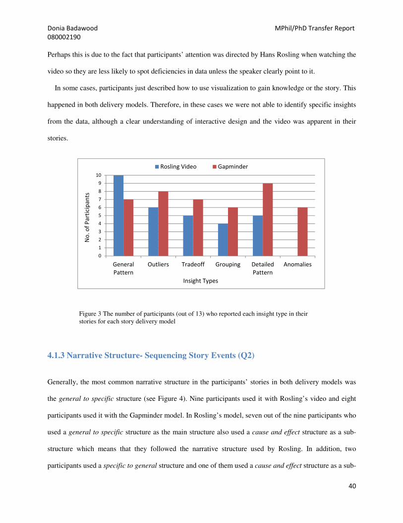
Donia Badawood MPhil/PhD Transfer Report
080002190
40
Perhaps this is due to the fact that participants’ attention was directed by Hans Rosling when watching the
video so they are less likely to spot deficiencies in data unless the speaker clearly point to it.
In some cases, participants just described how to use visualization to gain knowledge or the story. This
happened in both delivery models. Therefore, in these cases we were not able to identify specific insights
from the data, although a clear understanding of interactive design and the video was apparent in their
stories.
4.1.3 Narrative Structure- Sequencing Story Events (Q2)
Generally, the most common narrative structure in the participants’ stories in both delivery models was
the general to specific structure (see Figure 4). Nine participants used it with Rosling’s video and eight
participants used it with the Gapminder model. In Rosling’s model, seven out of the nine participants who
used a general to specific structure as the main structure also used a cause and effect structure as a sub-
structure which means that they followed the narrative structure used by Rosling. In addition, two
participants used a specific to general structure and one of them used a cause and effect structure as a sub-
0
1
2
3
4
5
6
7
8
9
10
General
Pattern
Outliers Tradeoff Grouping Detailed
Pattern
Anomalies
No
. o
f P
art
icip
an
ts
Insight Types
Rosling Video Gapminder
Figure 3 The number of participants (out of 13) who reported each insight type in their
stories for each story delivery model

Donia Badawood MPhil/PhD Transfer Report
080002190
41
structure. This might also result from the emphasis Rosling has given to specific countries in the video.
Only one participant used a problem-solution structure with Hans Rosling’s model. From this
participant’s comments at the end of the experiment, it seems that this is due to background knowledge in
the topic so the participant was able to provide details on the problem and discuss solutions rather than
following the speaker’s narrative structure.
An interesting finding was that the Chronological structure has not been used at all with Rosling’s
model while two participants used it with the Gapminder model. Although change over time is an
important part of the story in Rosling’s video, the speaker emphasised the context and reasons for patterns
within specific countries. In contrast, when participants explore time-series data independently, the role of
time becomes apparent for structuring and initiating progression in story events.
4.1.4 Unexpected Insights Gained (Q3 and Q4)
In Rosling’s model, twelve participants answered Q3 on the new information they had learned, seven of
them reported at least one outlier as part of the answer. Ten participants answered Q4 that asked them if
0
2
4
6
8
10
No
. o
f P
art
icip
an
ts
Narrative Structure
Rosling’s Video Gapminder
Figure 4 The number of participants (out of 13) who used each narrative structure as a
main structure of their stories for each story delivery model

Donia Badawood MPhil/PhD Transfer Report
080002190
42
they learned something that contradicts what they already know. Five of them also reported at least one
outlier as part of their answers.
In the Gapminder model, ten participants answered Q3, four of them reported at least one outlier in
their answers. Six participants answered Q4 but none of them reported outliers in their answers. However,
some participants interpreted the two questions in the same way and referred to Q3 in their answers to Q4.
For Q2 stories in both models, participants tended to use their answers about unexpected information
gained or part of them, whether this was new or something contradictory, outliers or other insights.
Specifically, they usually reported more examples and details in their answers to Q3 and Q4 while using
one of these details to express an idea or findings in their stories in Q2.
4.1.5 Expected Purpose in Delivering Stories in Each Delivery Model (Q5)
For both models, most answers ranged from raising awareness about the topic, urgency in solving the
problem or providing the data in a more compelling way that is easier to understand than a tabular format.
In other words, the purposes identified were mostly relevant to the data and the visual representations.
However, an interesting result occurred in the answers provided by two participants on the speaker’s
purpose in producing the video in Rosling’s model.
They thought that there was a personal purpose behind the story. For example, one of them said that the
purpose was “political posturing, perhaps to seek funding”. The apparent objectivity offered by the
Gapminder software did not prompt such questioning.
4.2 Participants subjective Feedback
Although most participants found telling a story after watching Rosling’s video easier, they did not
perform exceptionally better in other aspects such as the variety of insight types they gained as shown in
section 5.2. We could not say that the more the participants were curious about the data/story the easier
they found telling a story in both models, although this has happened in some cases.

Donia Badawood MPhil/PhD Transfer Report
080002190
43
However, some participants who were more curious about the video than Gapminder commented
“there is nothing wrong with the tool (Gapminder), it is about the data” while participants who were
more curious about Gapminder provided comments such as “if I had more time I would spend it exploring
more data and playing with the tool rather than watching the same video again”. One participant who
followed a chronological structure for their story for Q2 commented that with a specific question or goal
in mind it would be easier to tell a story using Gapminder. An interesting point here is whether the
participant would have used a different structure if they had a specific point or message to support. As
this was not the case, time was the most obvious parameter she could use to structure her story.
The results we found from the subjective feedback questions are summarised in Figures 5 to 8.
0
2
4
6
8
1 2 3 4 5
No
. o
f P
art
icip
an
ts
Difficulty of telling a story
1 = very easy and 5= very difficult
Rosling's Video Gapminder
Figure 5 Participants’ subjective feedback on the level of difficulty of
telling a story for each story delivery model
0
2
4
6
8
1 2 3 4 5
No
. o
f P
art
icip
an
ts
Curiosity about the story
1=not at all and 5= very curious
Rosling's Video Gapminder
Figure 6 Participants’ subjective feedback on the level of curiosity about the
data/story for each story delivery model
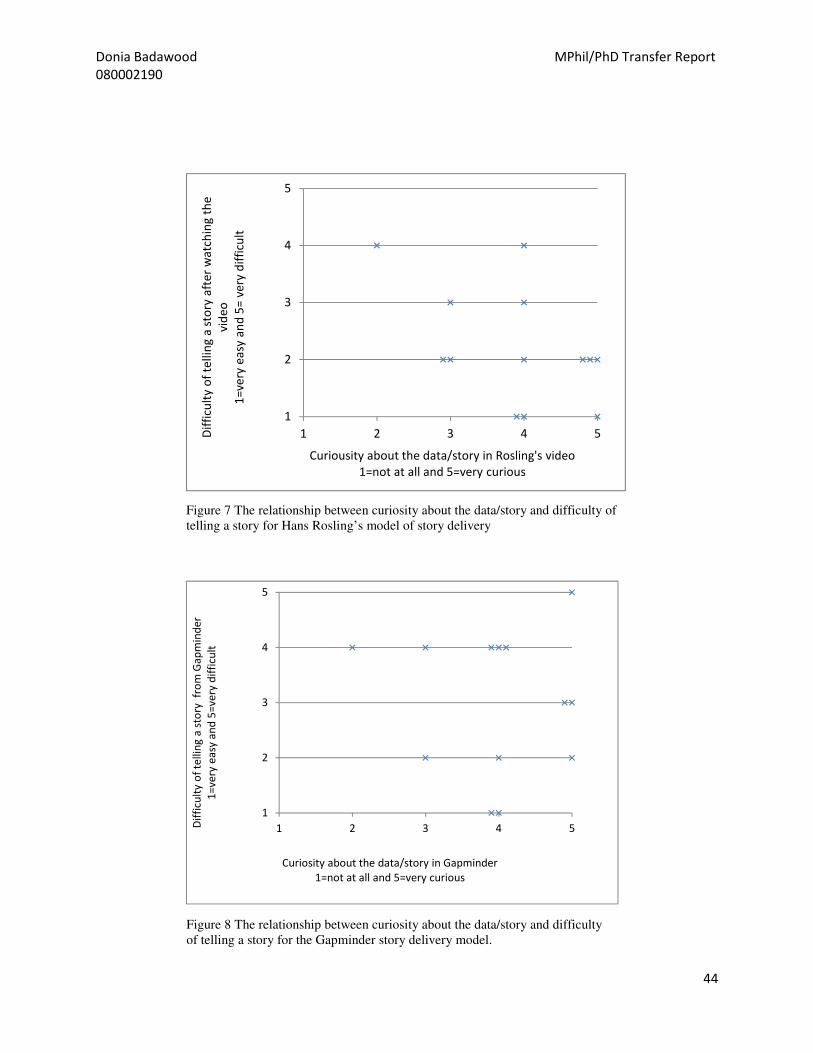
Donia Badawood MPhil/PhD Transfer Report
080002190
44
1
2
3
4
5
1 2 3 4 5Dif
ficu
lty
of
tell
ing
a s
tory
aft
er
wa
tch
ing
th
e
vid
eo
1=
very
ea
sy a
nd
5=
ve
ry d
iffi
cult
Curiousity about the data/story in Rosling's video
1=not at all and 5=very curious
Figure 7 The relationship between curiosity about the data/story and difficulty of
telling a story for Hans Rosling’s model of story delivery
1
2
3
4
5
1 2 3 4 5Dif
ficu
lty
of
tell
ing
a s
tory
fr
om
Ga
pm
ind
er
1=
ve
ry e
asy
an
d 5
=v
ery
dif
ficu
lt
Curiosity about the data/story in Gapminder
1=not at all and 5=very curious
Figure 8 The relationship between curiosity about the data/story and difficulty
of telling a story for the Gapminder story delivery model.

Donia Badawood MPhil/PhD Transfer Report
080002190
45
5.Implications of the Preliminary Findings of the First Experiment
The first experiment in this PhD project reported above has several implications for storytelling through
information visualization, based on the two story delivery models investigated. Most of the differences
between these two models seem to relate to the extent to which they direct and control audience attention.
The following recommendations are based on the implications of this study, and particularly on the
findings described in the previous section:
I- Pay more attention to data errors if there is no presenter or narrator to control and direct
audience attention
Participants were less critical about the data in the narrated Rosling delivery and did not spot any data
errors. In contrast, with regards to the Gapminder software, they were more critical about data and more
able to spot data errors. This might have resulted from the way in which participant attention was strongly
directed throughout the story in Rosling’s delivery, limiting ability to spot data errors. It suggests that
more attention should be paid to data errors in information visualization stories that are delivered and
constructed through users’ interactive exploration. If there are any errors that are apparent to a designer
before a tool or design is released, avoiding these errors or, alternatively, providing some notes or
explanations, can help to minimise their negative impact on audience engagement and avoid distracting
the users from the overall flow of the narrative they are exploring.
II- Consider providing other views and interpretations, in order to minimise the effect of a
single point of view on audience acceptance of the message.
Participants’ answers about the expected purpose of producing or providing the data/story in Rosling’s
video and in the Gapminder software highlight an important point. The “direct narration” or “voice-over
narration” techniques used in films entail interpreting or explaining story events from the narrator’s point

Donia Badawood MPhil/PhD Transfer Report
080002190
46
of view (Pramaggiore and Wallis, 2011). In information visualization, the narrator’s background
knowledge and understanding of the topic play an important role in his or her interpretation of story
events. In some cases, this might affect audience acceptance of the message or purpose of the story. The
results of our study show that two participants thought that there was a political or personal purpose
behind Rosling’s presentation, while none stated this in relation to the Gapminder software. A reasonable
approach for tackling this issue when delivering a data story is to consider ways in which alternative
perspectives can be demonstrated in the delivery of a message. This may be in conflict with the deliberate
subjectivity that can enhance the narrative. A trade-off is needed between the narrative coherence of a
single point of view and the confidence in the data implied by multiple or more objective perspectives.
III- Use outliers and contradictory information to capture and direct audience attention
without misleading the audience.
It can be argued that in storytelling in any medium, the primary goal is to capture audience attention, after
which, one can direct this attention to story events. Outliers were described by participants in this study as
unexpected findings or knowledge gained from both story delivery models. The fact that outliers catch
audience attention might be important, particularly in the absence of a narrator who directs audience
attention and emphasises the desired events in the story. This may also apply to known contradictory
information in a story during the design phase, but in our analysis of the contradictory information
reported by participants, we could not generalise on insight or knowledge types other than outliers, as
these depend heavily on individual background with regard to a topic. The danger in this approach is that
outliers, by definition, are not representative of the data as a whole, so care is needed to lead users from
the attention-grabbing outliers to the core messages implied by the data.

Donia Badawood MPhil/PhD Transfer Report
080002190
47
Work to Date and Future Work toward the Completion of the PhD Thesis
This section provides a summary of the work done so far. In addition, this section describes the approach
I will follow to address the remaining research objectives.
Before summarising the work done and future work plan, it is important to list the objectives of the PhD
research project to best describe how they are going to be addressed:
The overall aim of this research is to use existing theory and techniques from storytelling more generally
and investigate their relevance to storytelling in the design of information visualization, and empirically
examine the impact of different forms of storytelling visualization on story comprehension and
understanding. Specifically:
1. To identify the characteristics of storytelling in general and as an emerging field within
information visualization.
2. To investigate the effect of story delivery model on narratives/stories constructed by audiences.
3. To explore and model the transition types used to tell stories through information visualization.
4. To investigate the effect of different transitions within data-driven stories on resulted or perceived
narratives/stories.
5. To provide guidelines and recommendations for design of narrative visualizations based on the
implications of the empirical research findings.
Work Done
This sub-section summarises the work completed so far. For each task carried out, the research objective
it contributes to is provided.
Literature review (objective# 1)
The relevant literature to storytelling in the area of information visualization has been carried out.
Additionally, some related similar theories and principles from other domains such as, comics,
Donia Badawood MPhil/PhD Transfer Report
080002190
48
filmmaking, and journalism, have been considered and reviewed, linked and positioned within the scope
of the PhD research. The gaps in the knowledge and remaining areas to be investigated have been
identified as well as different approaches and methodologies in tackling the topic of storytelling in
information visualization. Further reading will be undertaken to remain updated about developments of
this area and to help shaping, or enrich and improve the future work. The literature review chapter in this
report touched on some areas covered in the literature review, this chapter will be expanded, detailed, and
perhaps re-structured in the final PhD thesis.
The first set of experiments (Story Delivery model)- (objective# 2)
The first set of experiments has been designed and carried out, data has been analysed and preliminary
results have been reported. Additionally, a review of the research methods used in this type of
experimental evaluation research in the information visualization domain has been carried out and the
relevance of these methods to the research question in hand has been discussed and identified in order to
choose an appropriate approach to the research question addressed in the first set of experiments. An
enhancement to this experiment is also planned and described in the future work plan below. A poster
based on the work done was submitted and accepted in VisWeek2012 conference.
Future Work
To best explain my work plan I have divided the tasks into 10 categories:
1. Literature review
While part of the literature review done was included in this upgrade report, additional materials,
sections, and details have been covered and need to be included in the final PhD thesis. Further
reading will also be undertaken to keep updated about the development of the research in the
area. Hence, this task will be ongoing as shown in the Gantt chart below.

Donia Badawood MPhil/PhD Transfer Report
080002190
49
2. Data Coding (VAST Challenges Videos)
This is including working on the McCloud (1993) taxonomy of panel-to-pane transitions in
comics stories to develop and explain a model that can be clearly applicable to storytelling
through information visualization. Part of this work has been done by developing a
preliminary/initial glossary of terms that relate the meaning of the transitions types in comics to
the possible meaning of these transitions in information visualization. Then, by qualitatively
coding the VAST Challenges videos based on this model to explore the transition types used.
Furthermore, to ensure consistency of codes a copy of the codebook used for coding the data of
the first set of experiments and for coding the VAST challenges videos along with sample data
will be given to some PhD students to code the data if possible. VAST challenges videos from
2008 to 2012 will be considered. Each year there are between 50 to 70 videos which means that
the dataset will be big enough to explore patterns and create visualizations.
3. Data Analysis (qualitatively coded data or data from experiments)
This task includes any qualitative analysis or coding of data obtained by experiments i.e. open-
ended questionnaire data of the first set of experiments and any other data generated by further
experiments. Again, to ensure consistency of codes a copy of the codebook used for coding the
data of the first set of experiments along with sample data will be given to some giCentre
members to code the data if possible. Furthermore, this task also includes any quantitative
analysis of the coded data, whether data from experiments or data generated from qualitatively
coding VAST challenges videos based on the transitions types used.

Donia Badawood MPhil/PhD Transfer Report
080002190
50
4. Create visualization of results
This task entails doing some grouping and aggregation of the codes generated in task 2 above.
This is to look for similarities and differences within and across datasets, tasks, years, authors,
etc. then, to create appropriate visualizations to represent the patterns and findings.
5. Formulate new questions and/or hypothesis based on the findings
After analysing and visualizing the findings, new hypothesis and/or questions for further work are
expected to emerge. Depending on these questions, appropriate research questions should be
addressed and appropriate experimental design should be completed.
6. Experimental Design
Based on the hypothesis/questions formulated from the findings, an appropriate experiment
framework will be designed.
7. Conducting Experiments
This task includes running experiments in the lab, for both the first and second set of experiments.
This task will take place in Autumn and Spring Terms as a good number of responses are
expected. It is not expected to take place during Summer, Christmas or New Year vacations.
More participants are going to be recruited for the first experiment (on Story Delivery Models) to
enhance the generalizability of the results and enable further quantitative analysis of the data. A
further complementary user study to the first experiment is also planned; this will differ from the
presented experiment in this report in that the first delivery model will be a video or presentation
of the visualizations used by Rosling without him present. The findings of the two sets of
experiments will then be compared. This task will be tackled simultaneously with coding and
analysing data.

Donia Badawood MPhil/PhD Transfer Report
080002190
51
8. Writing papers/posters for publications
This task depends on the achieved progress and the work produced. As the targeted and most
relevant venue to the research is the VisWeek conference which usually takes place in October,
the likely papers and posters submission deadline has been used to allocate time for this task
(March and June).
9. Attending or presenting work in academic conferences
As said above the most relevant venue to the research work is the VisWeek conference. So,
attending this venue would be a valuable experience. Additional venues might also be attended as
appropriate.
10. Write-up
Although this is an ongoing task, 12- 18 weeks have been allocated for the write-up at the end of
the research work.

Donia Badawood MPhil/PhD Transfer Report
080002190
52
Research Activities and Timeline for the remaining period toward the completion of the PhD
2012 2013 2014
Sep
Oct
No
v
Dec
Jan
Feb
Mar
Ap
r
May
Jun
Jul
Au
g
Sep
Oct
No
v
Dec
Jan
Feb
Mar
Ap
r
Literature Review
Data coding (VAST
challenge videos)
Data analysis (from
experiments or quantitative
analysis of coded data)
Create visualization of
results
Formulate new questions
based on the findings
Experimental design
Conducting Experiments
Writing papers/posters for
publication
Attending or presenting
work in academic
conferences
Write up
Primary Task
Secondary Task

Donia Badawood MPhil/PhD Transfer Report
080002190
53
Conferences Attended and Planned Publications
There are two publications based on the MSc dissertation which have a relevance to this PhD work. These two
papers are:
Wood, J. & Badawood, D. & Dykes, J. and Slingsby, A. (2011). BallotMaps: Detecting name bias in
alphabetically ordered ballot papers. IEEE Transactions on Visualization and Computer Graphics, 17(12),
pp. 2384-2391
Badawood, D. and Wood, J. (2011) Effects of candidate position on ballot papers: Exploratory visualization of
voter choice in the London local council elections 2010, Proceedings of the GIS Research UK 19th Annual
Conference
A poster based on the work done so far has been accepted for presentation at VisWeek2012 conference:
Badawood, D. and Wood, J. (2012). The Effect of Innformation Visualization Delivery on Narrative Construction
and Development. Poster presented at IEEE VisWeek2012, Seattle WA, US, October 2012.
It is also planned to write and submit a paper or poster for publication to an international conference based on the
2nd
year work and implementation of the second set of experiments in the PhD research project.

Donia Badawood MPhil/PhD Transfer Report
080002190
54
Bibliography
Alexander, B.( 2011) The New Digital Storytelling: Creating Narratives with New Media, ABC-CLIO:
Santa Barbara, CA, US.
Amar, R. & Stasko, J., (2004) BEST PAPER: A Knowledge Task-Based Framework for Design and
Evaluation of Information Visualizations. In IEEE Symposium on Information Visualization, 2004.
INFOVIS 2004. IEEE Symposium on Information Visualization, 2004. INFOVIS 2004. IEEE, pp. 143–
150.
Anon, 2010a. All too much: Monstrous amounts of data. The Economist [Online]Available at:
http://www.economist.com/node/15557421 [Accessed November 2, 2011].
Anon, 2010b. Data, data everywhere. The Economist [Online] Available at:
http://www.economist.com/node/15557443 [Accessed November 2, 2011].
Anon, 2010c. New rules for big data: Regulators are having to rethink their brief. The Economist [Online]
Available at: http://www.economist.com/node/15557487 [Accessed November 2, 2011].
Anon, 2010d. Show me: New ways of visualizing data. The Economist. [Online] Available at:
http://www.economist.com/node/15557455 [Accessed November 2, 2011].
Anon, 2010e. The open society: Governments are letting in the light. The Economist. [Online] Available
at: http://www.economist.com/node/15557477 [Accessed November 2, 2011].
Bertini, E., Plaisant, Catherine & Santucci, G., 2007. BELIV’06: beyond time and errors; novel
evaluation methods for information visualization. interactions, 14(3), pp.59–60.
Block, B.A., 2001. The visual story: seeing the structure of film, TV, and new media, Focal Press: Oxford,
UK.
Bordwell, D. (2008) The hook: scene transitions in classical cinema’,[Online] Available at:,
<http://www.davidbordwell.net/essays/hook.php> Accessed 29th July 2012.
Burmester, M., Mast, M., Tille, R., and Weber, W., (2010) How Users Perceive and Use Interactive
Information Graphics: An Exploratory Study. In Information Visualisation (IV), 2010 14th International
Conference. Information Visualisation (IV), 2010 14th International Conference. IEEE, pp. 361–368.
Card, S.K., Mackinlay, J.D. & Shneiderman, B.(1999). Readings in information visualization: using
vision to think, Morgan Kaufmann: San Francisco, CA, USA.
Carpendale, S.,( 2008). Evaluating Information Visualizations. In A. Kerren et al., eds. Information
Visualization. Berlin, Heidelberg: Springer-Verlag, pp. 19–45 [Online] Available at:
http://dx.doi.org/10.1007/978-3-540-70956-5_2 [Accessed March 10, 2012].
Chen, Chaomei, (2006). Information visualization: beyond the horizon, Springer: London, UK.

Donia Badawood MPhil/PhD Transfer Report
080002190
55
Creswell, J.W. (2009) Research Design: Qualitative, Quantitative, and Mixed Methods Approaches.
Sage Publications: California.
Cruz & Machado, P., 2011. Generative Storytelling for Information Visualization. Computer Graphics
and Applications IEEE, 31(2), pp.80–85.
The Data Journalism Handbook. (2012) [Online] Available at: http://datajournalismhandbook.org
(Accessed 29th July 2012).
Dautenhahn, K., (1998). Story-Telling in Virtual Environments. In ECAI’98 Workshop on Intelligent
Virtual Environments, Brighton, UK.
Dragicevic, P., Bezerianos, A., Javed, W., Elmqvist, N., Fekete, J.,( 2011). Temporal distortion for
animated transitions. In Proceedings of the 2011 annual conference on Human factors in computing
systems. CHI ’11. New York, NY, USA: ACM, pp. 2009–2018. [Online] Available at:
http://doi.acm.org/10.1145/1978942.1979233 [Accessed July 29, 2012].
Eccles, R. et al.,( 2007) Stories in GeoTime. In IEEE Symposium on Visual Analytics Science and
Technology, 2007. VAST 2007. IEEE Symposium on Visual Analytics Science and Technology, 2007.
VAST 2007. IEEE, pp. 19–26.
Ellis, G. & Dix, A., (2006) An explorative analysis of user evaluation studies in information visualisation.
In Proceedings of the 2006 AVI workshop on BEyond time and errors: novel evaluation methods for
information visualization. BELIV ’06. New York, NY, USA: ACM, pp. 1–7. [Online] Available at:
http://doi.acm.org/10.1145/1168149.1168152 [Accessed November 2, 2011].
Fekete, J., Vanwijk, J., Stasko, and Paris-sud, U., (2008) Information Visualization. In A. Kerren et al.,
eds. Berlin, Heidelberg: Springer-Verlag, pp. 1–18.[Online] Available at: http://dx.doi.org/10.1007/978-
3-540-70956-5_1 [Accessed July 29, 2012].
Forsell, C., (2010). A Guide to Scientific Evaluation in Information Visualization. In Information
Visualisation (IV), 2010 14th International Conference. Information Visualisation (IV), 2010 14th
International Conference. IEEE, pp. 162–169.
Fry, B.,( 2008). Visualizing data, O’Reilly Media, Inc.: Sebastopol, Canada.
Fulkerson, D., Nicholas, P., Haynie, K., and Mislevy, R.,( 2009). Narrative Structures in the Development
of Scenario-Based Science Assessments (Large-Scale Assessment Technical Report 3), Menlo Park, CA:
SRI International. [Online] Available at: http://ecd.sri.com/publications.html# [Accessed March 16,
2012].
Ganti, K (2004) ‘In conversation with Walter Murch’, FilmSound.org, [Online] Available at:
http://filmsound.org/murch/interview-with-walter-murch.htm (Accessed 26th July 2012).
Gapminder. (2012) [Online] Available at: http://www.gapminder.org (Accessed 29th July 2012).
Gee, J.P.,( 2007). What video games have to teach us about learning and literacy, Palgrave Macmillan:
New York, USA.

Donia Badawood MPhil/PhD Transfer Report
080002190
56
Gershon, N., (2005). Storytelling, visualization, and collaboration - beyond words & images. In
Proceedings of the 2005 International Symposium on Collaborative Technologies and Systems, 2005.
Proceedings of the 2005 International Symposium on Collaborative Technologies and Systems, 2005.
IEEE, p. 7–7.
Gershon, Nahum and Page, W., (2001). What storytelling can do for information visualization. Commun.
ACM, 44(8), pp.31–37.
Gonzalez, C.S. and Socas, V., (2011). Using the Eye Tracking Technique to Evaluate Non-Linear
Narratives. In 2011 Eighth International Conference on Information Technology: New Generations
(ITNG). 2011 Eighth International Conference on Information Technology: New Generations (ITNG).
IEEE, pp. 1097–1098.
Grammel, L., Tory, M., and Storey, M., (2010). How Information Visualization Novices Construct
Visualizations. IEEE Transactions on Visualization and Computer Graphics, 16(6), pp.943 –952.
Grunwald, E., (2005). Narrative Norms in Written News. Nordicom Review, 26(1), pp.63–79.
Heath, C. & Heath, D.,( 2007). Made to stick: why some ideas survive and others die, Random House:
London, UK.
Heer, J., (2010). Visualization Evaluation of the Masses, by the Masses, and for the Masses. In
BELIV Workshop. ACM Press, 2010.
Heer, J., Mackinlay, J., Stolte, C., and Agrawala, M., (2008). Graphical Histories for Visualization:
Supporting Analysis, Communication, and Evaluation. IEEE Transactions on Visualization and
Computer Graphics, 14(6), pp.1189–1196.
Heer, Jeffrey and Robertson, George, (2007). Animated Transitions in Statistical Data Graphics. IEEE
Transactions on Visualization and Computer Graphics, 13(6), pp.1240–1247.
Henderson, B., (1983). Tense, Mood, and Voice in Film: Notes After Genette. Film Quarterly, 36(4),
pp.4–17.
Hullman, J., Adar, E. and Shah, P., (2011). Benefitting InfoVis with Visual Difficulties. IEEE
Transactions on Visualization and Computer Graphics, 17(12), pp.2213–2222.
Hullman, J. and Diakopoulos, N.,( 2011). Visualization Rhetoric: Framing Effects in Narrative
Visualization. IEEE Transactions on Visualization and Computer Graphics, 17(12), pp.2231–2240.
Hurlburt, G.F. and Voas, J., (2011). Storytelling: From Cave Art to Digital Media. IT Professional, 13(5),
pp.4–7.
Isenberg, P., Zuk, T., Collins, C., and Carpendale, S., (2008). Grounded evaluation of information
visualizations. In Proceedings of the 2008 conference on BEyond time and errors: novel evaLuation
methods for Information Visualization. BELIV ’08. New York, NY, USA: ACM, pp. 6:1–6:8. [Online]
Available at: http://doi.acm.org/10.1145/1377966.1377974 (Accessed November 2, 2011).

Donia Badawood MPhil/PhD Transfer Report
080002190
57
Keim, D.,( 2002). Information Visualization and Visual Data Mining. IEEE Transactions on Visualization
and Computer Graphics, 7(1), pp.100–107.
Kosara, R.,( 2010). Stories Don’t Tell Themselves. eagereyes blog. [Online] Available at:
http://eagereyes.org/blog/2010/stories-dont-tell-themselves (Accessed March 19, 2012).
Kosara, R., Healey, C. G., Internate, V, Laidlaw, D. H., and Ware, C., (2003). Thoughts on User Studies:
Why, How, and When. Computer Graphics and Applications, 23(4), pp.20–25.
Kosara, R., Miksch, S. and Hauser, H.,( 2002). Focus+context taken literally. IEEE Computer Graphics
and Applications, 22(1), pp.22 –29.
Kuchar, O.A., Hoeft, T. J., Havre, S., and Perrine, K. A., (2006). Isn’t it about time? [data visualization].
IEEE Computer Graphics and Applications, 26(3), pp.80–83.
Lam, H., Bertini, E., Isenberg, P., Plaisant, C., and Carpendale, S.,( 2012). Empirical Studies in
Information Visualization: Seven Scenarios. IEEE Transactions on Visualization and Computer
Graphics, 18(9), pp.1520 –1536.
Lima, M., (2009). Information Visualization Manifesto. Visual Complexity blog. [Online] Available at:
http://www.visualcomplexity.com/vc/blog/?p=644 (Accessed November 2, 2011).
McCloud, S., (2006). Making Comics: Storytelling Secrets of Comics, Manga and Graphic Novels,
HarperCollins: New York, USA.
McCloud, S., (1994). Understanding Comics: The Invisible Art, HerperCollins: New York, USA.
Munteanu, I., Timm, M. and Weiland, T.,( 2010). It’s About Time. IEEE Microwave Magazine, 11(2),
pp.60–69.
Munzner, T., (2008). Information Visualization. In A. Kerren et al., eds. Berlin, Heidelberg: Springer-
Verlag, pp. 134–153. [Online] Available at: http://dx.doi.org/10.1007/978-3-540-70956-5_6 (Accessed
November 2, 2011).
Nielsen, L. & Madsen, S., (2006) Storytelling as Method for Sharing Knowledge across IT Projects. In
Proceedings of the 39th Annual Hawaii International Conference on System Sciences, 2006. HICSS ’06.
Proceedings of the 39th Annual Hawaii International Conference on System Sciences, 2006. HICSS ’06.
IEEE, p. 191a– 191a.
North, C.,( 2006). Toward measuring visualization insight. IEEE Computer Graphics and Applications,
26(3), pp.6–9.
North, C., Saraiya, P. and Duca, K.,(2011). A comparison of benchmark task and insight evaluation
methods for information visualization. Information Visualization, 10(3), pp.162 –181.
North, Chris, (2005). Information Visualization. In Handbook of Human Factors and Ergonomics.JOhn
Wiley & Sons: New York, USA.

Donia Badawood MPhil/PhD Transfer Report
080002190
58
Oxford Dictionary (2012) [Online] Available at: http://oxforddictionaries.com/definition/transition
(Accessed 29th July 2012).
Park, A., (2007). Intended Use Evaluation Approach for Information Visualization. [Online] Available at:
http://scholar.lib.vt.edu/theses/available/etd-12122006-152038/ (Accessed November 2, 2011).
Plaisant, C., Fekete, J.-D. & Grinstein, G.,( 2008). Promoting Insight-Based Evaluation of Visualizations:
From Contest to Benchmark Repository. IEEE Transactions on Visualization and Computer Graphics,
14, pp.120–134.
Plaisant, C. (2004) The challenge of information visualization evaluation. In Proceedings of the working
conference on Advanced visual interfaces. AVI ’04. New York, NY, USA: ACM, pp. 109–116. [Online]
Available at: http://doi.acm.org/10.1145/989863.989880 (Accessed November 2, 2011).
Pramaggiore, M. and Wallis, T., (2011) Film: A Critical Introduction 3rd ed., Laurence King: London,
UK.
Quesenbery, W. and Brooks, K., (2010) Storytelling for user experience: crafting stories for better
design, O’Reilly Media, Inc.
Robertson, G. (2008) "Beyond Time and Errors - Position Statement," In
Proc. BELIV (Florence, Italy), 5 April 2008. ACM Press.
Robertson, G., Fernandez, R., Fisher, D., Lee, B., and Stasko, J.,( 2008). Effectiveness of Animation in
Trend Visualization. IEEE Transactions on Visualization and Computer Graphics, 14(6), pp.1325–1332.
Rosling, H., (2009) TED [Online] Available at: http://www.gapminder.org/videos/ted-talk-
2009-hans-rosling-hiv-facts (Accessed 29th July 2012).
Saraiya, P., North, C. and Duca, K.,( 2005). An insight-based methodology for evaluating bioinformatics
visualizations. IEEE Transactions on Visualization and Computer Graphics, 11(4), pp.443–456.
Saunders, M., Lewis, P., and Thornhill, A. (2000). Research Methods for Business Students, Pearson
Education Limited: London, UK.
Segel, E. and Heer, J.,( 2010). Narrative Visualization: Telling Stories with Data. IEEE Transactions on
Visualization and Computer Graphics, 16(6), pp.1139–1148.
Smoliar, S.W. and Baker, J.D., (1999). Storytelling, jamming, and all that jazz: knowledge creation in the
world of new media. In Proceedings of the 32nd Annual Hawaii International Conference on System
Sciences, 1999. HICSS-32. Proceedings of the 32nd Annual Hawaii International Conference on System
Sciences, 1999. HICSS-32. IEEE.
Spence, R., (2007). Information visualization: design for interaction, Pearson Education: Essex, UK.
Spiegel, D.L.(1981) Six Alternatives to the Directed Reading Activity. Reading Teacher, 34(8), p.914–
20.

Donia Badawood MPhil/PhD Transfer Report
080002190
59
Stenliden, L. and Jern, M., (2010) EDUCATING OFFICIAL STATISTICS USING GEOVISUAL
ANALYTICS STORYTELLING METHODS. INTED2010 Proceedings, pp.2736–2747.
Tergan, S.-O., Keller, T. and Burkhard, R.A., (2006) Integrating knowledge and information: digital
concept maps as a bridging technology. Information Visualization, 5(3), pp.167–174.
Thomas, R.M. (2003) Blending Quantitative and Qualitative Research Methods in Theses and
Dissertation. Sage Publications: California, USA.
Tobin, P.,(2007). Teaching IT through storytelling. South African Computer Journal, 38, pp.51–61.
Tory, M. and Möller, T., (2004) Human Factors in Visualization Research. IEEE Transactions on
Visualization and Computer Graphics, 10(1), pp.72–84.
Tufte, E.R., (2001) The visual display of quantitative information, Graphics Press: Cheshire, USA.
Tversky, B., Y, J.B.M. & Betrancourt, M., (2002) Animation: Can it facilitate. INTERNATIONAL
JOURNAL OF HUMAN-COMPUTER STUDIES, 57, p.247–262.
Visual Analytics Benchmark Repository (n.d) [Online] Available at:
http://hcil.cs.umd.edu/localphp/hcil/vast/archive/ (Accessed 29th July 2012).
Visual Analytics Community (2012) [Online] Available
at:http://www.vacommunity.org/VAST+Challenge+2012&highlight=vast%20challenge (Accessed 29th
July 2012).
Ware, C., (2004) Information visualization: perception for design, Morgan Kaufmann: Massachusetts,
USA.
Wojtkowski, W. and Wojtkowski, W.G., (2001) Storytelling : its role in information visualization.
Information Visualization, pp. 1-5
Wood, J., Badawood, D., Dykes, J., Slingsby, A., (2011) BallotMaps: Detecting name bias in
alphabetically ordered ballot papers. IEEE Transactions on Visualization and Computer Graphics,
17(12), pp.2384–2391.
Yau, N., (2011) Visualize This: The Flowing Data Guide to Design, Visualization, and Statistics, Wiley:
Indianapolis, USA.
Yi, J.S., Kang, Y., Stasko, J. T., and Jacko, J. A.,(2008) Understanding and characterizing insights: how
do people gain insights using information visualization? In Proceedings of the 2008 conference on
BEyond time and errors: novel evaLuation methods for Information Visualization. BELIV ’08. New
York, NY, USA: ACM, pp. 4:1–4:6. [Online] Available at: http://doi.acm.org/10.1145/1377966.1377971
(Accessed November 2, 2011).

Donia Badawood MPhil/PhD Transfer Report
080002190
60
Appendices
Appendix A Questionnaire used in the first set of experiments (for GroupA)
Part I
(HIV Epidemic Video)

Donia Badawood MPhil/PhD Transfer Report
080002190
61
Age: ___________
Gender: M F
1. What was the video mostly about? (Approx. 1-2 min)
…………………………………………………………………………………………………………………………………………………
…………………………………………………………………………………………………………………………………………………
2. Re-tell the story you gained from the video in as much detail as you can. Try to write a
story that makes sense to someone who is not familiar with the story/topic.
(Approx. 6-8 min)

Donia Badawood MPhil/PhD Transfer Report
080002190
62
………………………………………………………………………………………………………………………………………………….
………………………………………………………………………………………………………………………………………………….
………………………………………………………………………………………………………………………………………………….
………………………………………………………………………………………………………………………………………………….
………………………………………………………………………………………………………………………………………………….
………………………………………………………………………………………………………………………………………………….
………………………………………………………………………………………………………………………………………………….
……………………………………………………………………………………………………………………………….………………..
Turn the page for more space>>
…………………………………………………………………………………………………………………………………………………..
……………………………………………………………………………………………………………………………………………….….
…………………………………………………………………………………………………………………………………………………..
…………………………………………………………………………………………………………………………………………………..
………………………………………………………………………………………………………………………………………………….
……………………………………………………………………………………………………………………………………….………...
………………………………………………………………………………………………………………………………………………….
………………………………………………………………………………………………………………………………………………….
…………………………………………………………………………………………………………………………………………………
…………………………………………………………………………………………………………………………………………………

Donia Badawood MPhil/PhD Transfer Report
080002190
63
…………………………………………………………………………………………………………………………………………………
…………………………………………………………………………………………………………………………………………………
If you need more space please use the back of this page
3. What did you learn that you did not already know? In other words, describe the new
information/knowledge you gained from the video? (Approx. 2-3 min)
..........................................................................................................................................................
………………………………………………………………………………………………….………………………………………………..
……………………………………………………………………………………………………………………………………………………
4. Did you learn something that contradicts what you already know about the topic?
What is it? (Approx. 2-3 min)
..........................................................................................................................................................
…………………………………………………………………………………………………………………………………………………..
………………………………………………………………………………………………………………………………………………….

Donia Badawood MPhil/PhD Transfer Report
080002190
64
5. What do you think the speaker’s purpose was in producing this video? (Approx. 2-3
min)
..........................................................................................................................................................
……………………………………………………………………………………………………………………………………………………
……………………………………………………………………………………………………………………………………………………
Part II
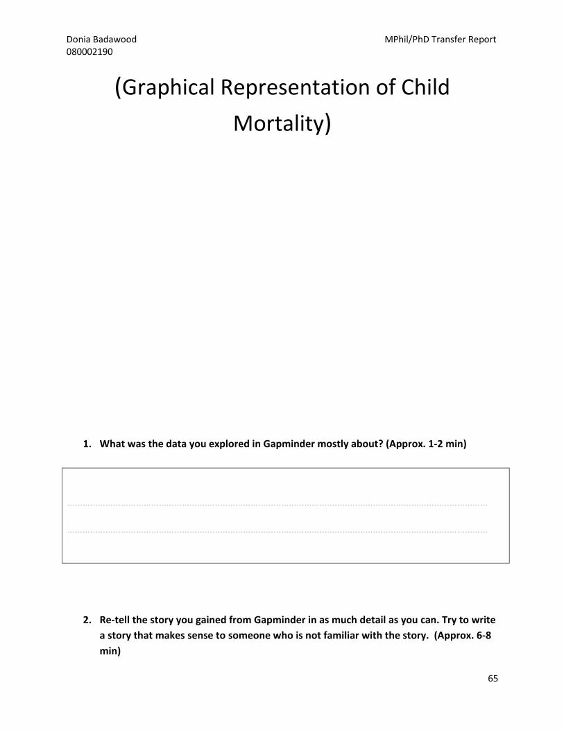
Donia Badawood MPhil/PhD Transfer Report
080002190
65
(Graphical Representation of Child
Mortality)
1. What was the data you explored in Gapminder mostly about? (Approx. 1-2 min)
…………………………………………………………………………………………………………………………………………………
…………………………………………………………………………………………………………………………………………………
2. Re-tell the story you gained from Gapminder in as much detail as you can. Try to write
a story that makes sense to someone who is not familiar with the story. (Approx. 6-8
min)

Donia Badawood MPhil/PhD Transfer Report
080002190
66
………………………………………………………………………………………………………………………………………………….
………………………………………………………………………………………………………………………………………………….
………………………………………………………………………………………………………………………………………………….
………………………………………………………………………………………………………………………………………………….
………………………………………………………………………………………………………………………………………………….
………………………………………………………………………………………………………………………………………………….
………………………………………………………………………………………………………………………………………………….
……………………………………………………………………………………………………………………………….………………..
Turn the page for more space>>
…………………………………………………………………………………………………………………………………………………..
……………………………………………………………………………………………………………………………………………….….
…………………………………………………………………………………………………………………………………………………..
…………………………………………………………………………………………………………………………………………………..
………………………………………………………………………………………………………………………………………………….
……………………………………………………………………………………………………………………………………….………...
………………………………………………………………………………………………………………………………………………….
………………………………………………………………………………………………………………………………………………….
…………………………………………………………………………………………………………………………………………………
…………………………………………………………………………………………………………………………………………………
Donia Badawood MPhil/PhD Transfer Report
080002190
67
…………………………………………………………………………………………………………………………………………………
…………………………………………………………………………………………………………………………………………………
If you need more space please use the back of this page
3. What did you learn that you did not already know? In other words, describe the new
information/knowledge you gained from Gapminder? (Approx. 2-3 min)
..........................................................................................................................................................
………………………………………………………………………………………………….………………………………………………..
……………………………………………………………………………………………………………………………………………………
4. Did you learn something that contradicts what you already know about the topic?
What is it? (Approx. 2-3 min)
..........................................................................................................................................................
…………………………………………………………………………………………………………………………………………………..
………………………………………………………………………………………………………………………………………………….

Donia Badawood MPhil/PhD Transfer Report
080002190
68
5. What do you think the purpose was in providing this data in Gapminder? (Approx. 2-3
min)
..........................................................................................................................................................
……………………………………………………………………………………………………………………………………………………
……………………………………………………………………………………………………………………………………………………
Appendix B The Explanatory Statement and Consent Form Used in the First Set
of Experiments
Explanatory Statement and Consent Form for Participants
Project Title: A Research Experiment on User Interpretation of Graphical Data Representation
Explanatory Statement
Purpose of the Study:
The aim of this study is to examine how the general users (non-expert users) interpret different
forms of data visualization (graphical data representation), construct meaning and make sense
of them.

Donia Badawood MPhil/PhD Transfer Report
080002190
69
Suitable Participants:
A suitable participant for this experiment should satisfy the following criteria:
_ Participant has not previously taken any Data Visualization module (IN2393).
_ Participant does not have advanced knowledge in data visualization
_ Participant is not a professional data analyst
Benefits of the experiment in general and for participants:
This study helps understanding how people interpret and comprehend data represented
graphically/visually. The outcomes of this experiment contributes to the body of the knowledge
by providing information on how different forms of data visualization affect the way in which
people interpret and make sense of it and therefore, provide useful design guidelines of data
visualization.
As the participants who have been asked to take part in this study are students in the School of
Informatics who have the Data Visualization module as an option for elective modules in the
next semester, this experiment is a good opportunity for them to get a flavour of what is involved
in data visualization.
Experiment Procedure:
Overall, the experiment will take approximately 1 hour distributed as follows:
11 min: watching a video.
15-18 min: answering a questionnaire (Part I).
11-15 min: exploring an interactive graphical data representation.
15-18 min: answering a questionnaire (Part II)
2-3 min: chatting/interview
However, the order of this procedure will be followed for one group of the participants and
reversed for the second group to account for learning and ordering effect in the results of the
study. At the end, there might be a 2-3 minutes interview to get a general feedback on the
experiment.
What will happen to the results of the study:
This experiment represents part of the PhD project of the researcher (see below for contact
details). The results will be reported in the PhD thesis and/or any published material based on it
(e.g. a journal article or conference paper). Participants will be informed about the results of the

Donia Badawood MPhil/PhD Transfer Report
080002190
70
study once it is completed by e-mail.
For any inquiries about the research contact:
Donia Badawood (the researcher)
PhD Student
giCentre
School of Informatics- City University London
E-mail: [email protected]
Dr. Jo Wood (the supervisor)
Reader in GI Science
giCentre
School of Informatics- City University London
E-mail: [email protected]
If you need to complain
If you would like to complain about any aspect of the study, City University London has
established a complaints procedure via the Secretary to Senate Research Ethics Committee. To
complain about the study, you need to phone 020 7040 3040. You can then ask to speak to the
Secretary to Senate Research Ethics Committee and inform them that the name of the project
is: A Research Experiment on User Interpretation of Graphical Data Representation
You could also write to the Secretary at:
Anna Ramberg
Secretary to Senate Research Ethics Committee
Research Office, E214
City University London
Northampton Square
London
EC1V 0HB
Email: [email protected]

Donia Badawood MPhil/PhD Transfer Report
080002190
71
Consent Form
I agree to take part in the above City University research project. I have had the project
explained to me, and I have read the Explanatory Statement, which I may keep for my records. I
understand that agreeing to take part means that I am willing to:
_ Use a computer to watch a video
_ Use a computer to explore some graphical data representation
_ Complete questionnaires on both the video and the interactive graphical data
representation

Donia Badawood MPhil/PhD Transfer Report
080002190
72
_ Be interviewed by the researcher if needed and allow the interview to be audiotaped
Data Protection
This information will be held and processed for the following purpose:
To explore/examine how users/audience interpret and construct meaning from different forms of
graphical data representation.
I understand that any information I provide is confidential, and that no information that could
lead to the identification of any individual will be disclosed in any reports on the project, or to
any other party. No identifiable personal data will be collected nor published.
Withdrawal from study
I understand that my participation is voluntary, and that I can withdraw at any stage of the
project without being penalised or disadvantaged in any way.
Name: ......................................................................................................(please print)
Signature: .......................................................................……Date: .............................