Designing and Formatting Documents - Oxford...
33
Designing and Formatting Documents CHAPTER OBJECTIVES The objectives of this chapter are to Identify five basic principles of planning a document’s visual design. Explain the elements of effective pages and screens (active and passive blank space, line length, ragged right margins). Explain standards for type sizes and fonts, highlighting, capitalization, and color. Explain how to design and word headings that help readers locate information. Explain how to create, design, and maintain Web sites. Explain how to test the visual design of print and online documents. TEACHING STRATEGIES One of the exciting things about teaching technical writing is that we get to address document design issues. Strongly consider getting your students to use headings, lists, tables, and graphics in writing projects for your course. For many of your students, exposure to these topics will be fresh and exciting—it will give them some great tools for creating professional-looking documents. To save grading time and introduce students to the concept of a corporate-style approach, consider establishing a standard “house” style for headings, as well as other document design elements such as lists, notices (warnings), tables, graphics, and the like. Such standardization does not stifle students’ creativity; few have ever used headings or other document design elements anyway. They may be more comfortable starting with a standard and becoming aware of design variables before 133
-
Upload
duonghuong -
Category
Documents
-
view
216 -
download
3
Transcript of Designing and Formatting Documents - Oxford...
Designing and Formatting Documents
CHAPTER OBJECTIVES
The objectives of this chapter are to
Identify five basic principles of planning a document’s visual design. Explain the elements of effective pages and screens (active and passive blank space,
line length, ragged right margins). Explain standards for type sizes and fonts, highlighting, capitalization, and color. Explain how to design and word headings that help readers locate information. Explain how to create, design, and maintain Web sites. Explain how to test the visual design of print and online documents.
TEACHING STRATEGIES
One of the exciting things about teaching technical writing is that we get to address document design issues. Strongly consider getting your students to use headings, lists, tables, and graphics in writing projects for your course. For many of your students, exposure to these topics will be fresh and exciting—it will give them some great tools for creating professional-looking documents.
To save grading time and introduce students to the concept of a corporate-style approach, consider establishing a standard “house” style for headings, as well as other document design elements such as lists, notices (warnings), tables, graphics, and the like. Such standardization does not stifle students’ creativity; few have ever used headings or other document design elements anyway. They may be more comfortable starting with a standard and becoming aware of design variables before they begin designing on their own. Also, a standardized document design mirrors what often happens in corporate and organizational writing: professionals are expected to use a design that is standard to their organization or profession. Having students use a standard design can help make them aware of the design variables—capitalization, bold, italics, underlining, type size, typeface, horizontal spacing, vertical spacing, and the relationship of design to body text.
As instructor, you can hand out spec sheets (similar to the “Example Design Specifications” contained in the worksheets section of this chapter) detailing your requirements for headings, lists, and other document design elements. Having a standard document design for your class can also help keep students from becoming obsessed with surface features of their writing projects—getting carried away with fonts and type sizes and special effects. Some of your students may not know how to use the “styles” functions featured on most word processing programs that define, for example, a set of headings to use throughout a document. Consider having a “field trip” to the computer lab where your novice computer
133

users can catch up and where everyone can see how to use styles as a way of increasing productivity and consistency within documents.
WORKSHOP ACTIVITIES
Here are some ideas for exploring document design.
Traditional Classroom
1. Redesign the GrillWizard instructions in textbook Exercise 1 or the memo in Exercise 4. You might want to do one of these with the whole class and save the other for out-of-class or group work. Get students to find ways to introduce headings, lists, highlighting, as well as other design principles discussed in Chapter 8.
2. Provide your students with a document that is a design disaster, and ask them to analyze the problems and redesign the document. You can give students a disaster document or use the memo exercise included in the worksheets for this chapter of the instructor’s manual on the day that you assign the chapter as homework. Ask the students to do a brief analysis of the problems in the document and then redesign it. You will need to use a brief one-page document for this exercise.
If you do this exercise, it can be fun to ask for volunteers to submit their new documents to you with their names left off and then use the new documents as the center of a class discussion about document design. If you need hard copy, ask them to simply bring the documents to class; if you can use an electronic file, ask them to e-mail you the documents well before class time so that you have time to download them to disk or desktop. You’ll need to have a means to display the student samples (overhead projector, ELMO device, or computer screen for an electronic copy) and to set out clear guidelines about appropriate ways to critique the samples in the class. As a class, have students begin by pointing out things in the samples that can be improved. Then move on to things that are done well; this leaves the students who have created the documents with positive feedback as their last critique.
This is usually a positive and enjoyable exercise because most students will create revisions that are clearly better than the originals, so it is easy to give positive reinforcement and to see the variety of ways that one can approach document design; none of the samples you collect will be identical!
3. Review highlighting and other special typography. In technical writing, highlighting can become a problem. Computer manuals, for example, often use a complex, overly elaborate system of highlighting—specifically, bold, italics, underscores, alternate fonts, caps, and even color. Consider having your students find text with heavy use of highlighting, and analyze it to determine the highlighting rules that are being applied; evaluate the effectiveness of the highlighting scheme; and, if possible, recommend some simpler schemes.
134
4. Have students visit the Web site of a professional association in their field as suggested in textbook Exercise 7. Have students do a brief analysis of the site using the questions in Exercise 7 and the guidelines for designing Web sites discussed in Chapter 8 as guides for their analysis. Ask them to be prepared to take the class to the Web site if the classroom has a computer with Internet access or to download specific pages from the site and bring them as examples of aspects of the site that they found especially strong or especially problematic. As a class, discuss several of the Web sites that the students visited.
Computer Classroom
1. Demonstrate word processing techniques. Using a word processing program, ensure that your students know how to perform the design and formatting techniques discussed in Chapter 8. Margins, tabs, headers or footers, and page numbers are often difficult—find a way to introduce them to these techniques in their preferred software. Try showing them how to use “styles.” For example, show them how to design a set of headings with special font, type size, and other characteristics. Also, spend some time ensuring that they have adequate control over the various types of vertical lists.
2. Create a draft brochure from the pieces provided in class. Do a quick Web search for a common topic— résumé dos and don’ts work great for this. Find a site that has several different categories of information pertinent to the topic: résumé design, résumé style, scannable résumés, and online résumés, for example. Copy and paste these into a file; then e-mail it or otherwise transfer it to your students (FTP, post to a discussion thread as an attachment). In class, have them access the content you’ve provided and then spend the class time turning it into a brochure. This will give them great experience with columns, typeface choices, highlighting, headings, and generally organizing information. If you have time, let them present their final drafts to each other so that they can see the variations in approach. Remember that the information you’re using is probably copyrighted (on the Web), so students should keep their brochure “publication” only for class purposes.
3. Create a design specification sheet for your team or for the class. In small groups,
students should create a set of design criteria to be used in either all future assignments or in a specific future assignment (such as a report, proposal, or set of instructions). Make sure their design specs cover headings, spacing (margins, line length, tabs, columns, justification), highlighting, and text (font choice, size). If creating a design spec sheet for the whole class, then each group should present its proposed scheme and all students should vote (or you as the instructor can be the CEO!). Make sure to save the finalized spec sheets to use on future assignments, and work this requirement into your grading.
4. Demonstrate Web editing techniques. Using your preferred Web editor, do the same thing that is discussed in the first computer classroom activity above. You may also wish to discuss the basics of creating cascading style sheets (css). If your college/university makes Web space available to students, you may wish to take students through the process of setting up their accounts and posting pages on the site.
135
5. Create a simple Web site/page. Have students work individually or in pairs with a Web editor to create a simple Web site or page. You may wish to have them create a Web site for your class, a personal Web site, or a topical site of some sort (technical writing or otherwise). Have them design the page following the guidelines discussed in Chapter 8 and post the site on your college/university server. If you are using a class delivery vehicle such as WebCT or Blackboard, have them upload the HTML pages there.
6. Create a Web design specification sheet for your team or for the class. In small groups, students should create a set of design criteria to be used in a specific future Web page assignment. You may use this activity to discuss cascading style sheets and have the students create the cascading style sheet that the class will use. Make sure the students’ design specs cover headings, highlighting, text (font choice, size), color, background, and the other elements discussed in Chapter 8. If creating a style sheet for the whole class, then each group should present its proposed scheme and all students should vote (or you as the instructor can be the CEO!). Make sure to save the finalized css to use on future assignments, and work this requirement into your grading.
WRITING PROJECTS
Here are some ideas for writing projects related to Chapter 8.
Traditional Assignments 1. Write a revision of textbook Exercise 1, 4, 5, or 6 and an explanatory memo. Have
your students redesign the document in one of these exercises and then write a memo explaining what they did and why. (See workshop Activity 1 above.)
2. Write a memo on the document design of a technical manual. Consider having your students do workshop Activity 3 as a writing exercise. Although item 3 focuses on highlighting, you can open this exercise up to other document-design features such as headings, line spacing, line length, fonts, and margins. Obviously, not every group of students will be right for this much focus on document design, but some will be very keen on it—especially your technical communication majors.
3. Conduct a usability test. Assign the class to teams of three or four, and then assign pairs of teams to use each other as subjects for usability tests as described in Exercise 3 in the textbook. Have each team design a usability test, conduct it using its partner team members as subjects, and report the results as required by the exercise.
136
Distance Learning Assignments
1. Analyze Web page design, including the consistency of design used within a Web site. Have students each choose one Web site representing a major organization or company in his/her field. One or two representative pages of the site should then be analyzed for their design elements. After studying the design in detail, students should then look through the rest of the Web site and critique the consistency of that design throughout the site. After this evaluation, students should prepare a report to you that analyzes the general design (pointing out strengths and flaws), discusses design consistency throughout the site, and makes conclusions about the quality of the site design and the way it represents the company. An important note: make sure students pick sites that have enough design to analyze. Some are sparse and will leave them with nothing to talk about.
2. Study several online résumés in your field, and write a short report discussing the pros and cons of publishing your résumé online. With minimal effort, a student should be able to find at least two, if not three or four, actual online résumés representing professionals or other students in his/her field. Encourage students to find contrasting examples to make the exercise more interesting. After studying the résumés, they should then write a comparative analysis according to the design criteria in the chapter. To conclude the report, students should discuss, in detail, their own résumé design plans (for either online or paper version). You might even have students create a résumé design specification sheet as part of this assignment.
3. Create a multiple page Web site. Have students create a Web site that consists of at least two pages that are linked together. You may assign the content or have the students choose their own. You could also turn this into a lengthy class or team project and require the class (or each team) to design and create an e-zine. This would require the class (or team) to choose a topic, purpose, and audience for the e-zine; to decide upon the design specifications (perhaps to create a css); to assign particular “articles” to class members; and to post the e-zine online or in WebCT or Blackboard. This project can be a lot of fun because students can exercise their creativity while learning a challenging, and most would consider worthwhile, skill!
137
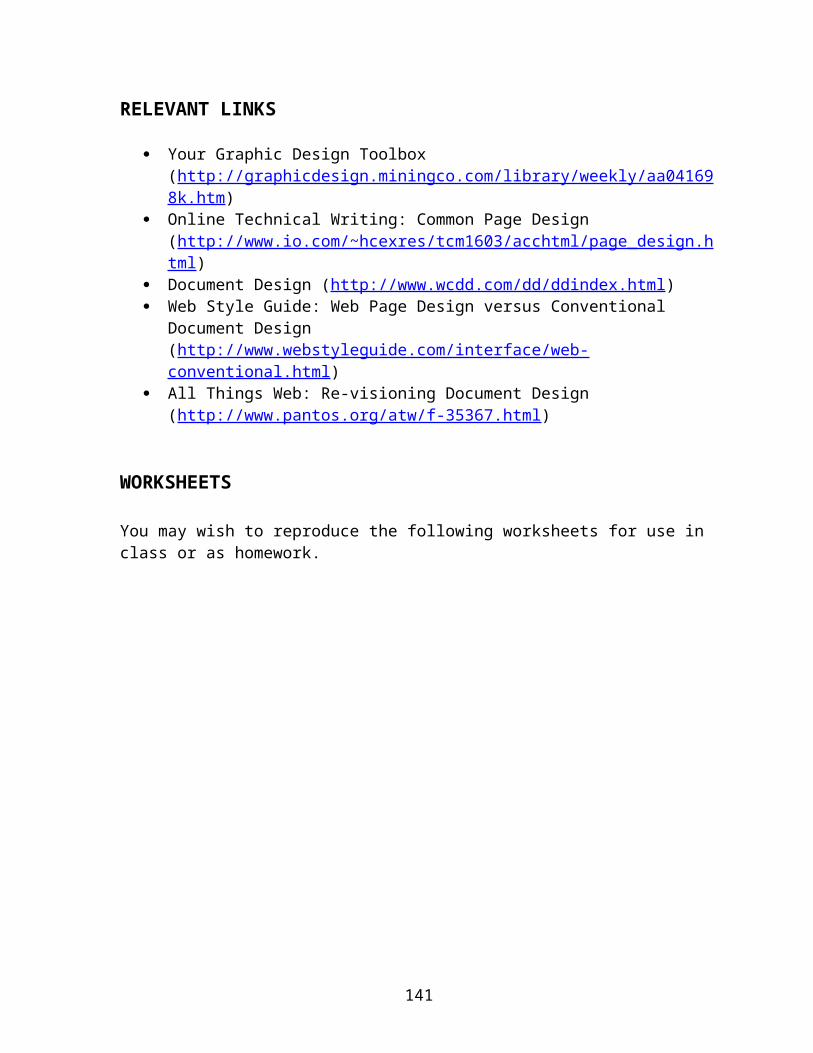
RELEVANT LINKS
Your Graphic Design Toolbox (http://graphicdesign.miningco.com/library/weekly/aa041698k.htm)
Online Technical Writing: Common Page Design (http://www.io.com/~hcexres/tcm1603/acchtml/page_design.html)
Document Design (http://www.wcdd.com/dd/ddindex.html) Web Style Guide: Web Page Design versus Conventional Document Design
(http://www.webstyleguide.com/interface/web-conventional.html) All Things Web: Re-visioning Document Design (http://www.pantos.org/atw/f-
35367.html)
WORKSHEETS
You may wish to reproduce the following worksheets for use in class or as homework.
138
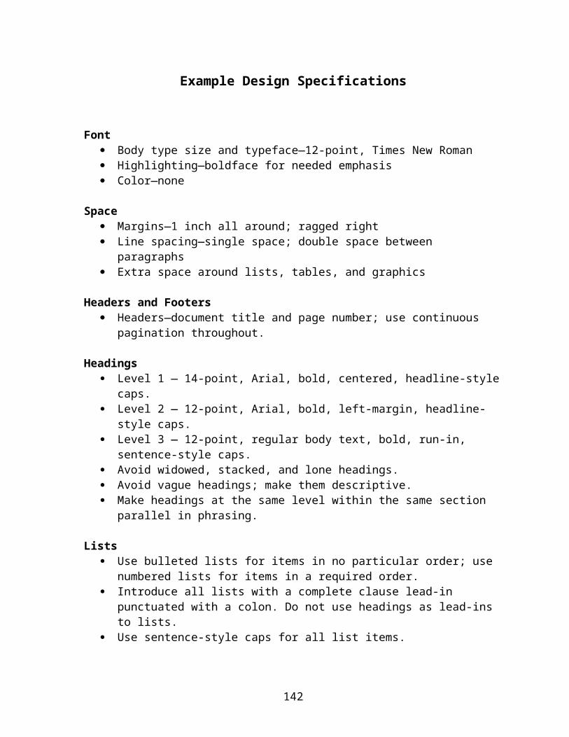
Example Design Specifications
Font Body type size and typeface—12-point, Times New Roman Highlighting—boldface for needed emphasis Color—none
Space Margins—1 inch all around; ragged right Line spacing—single space; double space between paragraphs Extra space around lists, tables, and graphics
Headers and Footers Headers—document title and page number; use continuous pagination throughout.
Headings Level 1 — 14-point, Arial, bold, centered, headline-style caps. Level 2 — 12-point, Arial, bold, left-margin, headline-style caps. Level 3 — 12-point, regular body text, bold, run-in, sentence-style caps. Avoid widowed, stacked, and lone headings. Avoid vague headings; make them descriptive. Make headings at the same level within the same section parallel in phrasing.
Lists Use bulleted lists for items in no particular order; use numbered lists for items in a
required order. Introduce all lists with a complete clause lead-in punctuated with a colon. Do not use
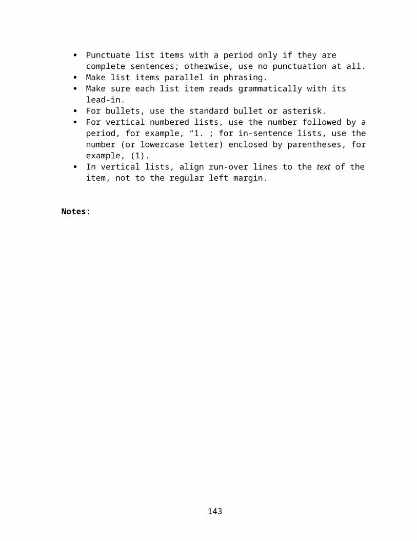
headings as lead-ins to lists. Use sentence-style caps for all list items. Punctuate list items with a period only if they are complete sentences; otherwise, use
no punctuation at all. Make list items parallel in phrasing. Make sure each list item reads grammatically with its lead-in. For bullets, use the standard bullet or asterisk. For vertical numbered lists, use the number followed by a period, for example, “1.”;
for in-sentence lists, use the number (or lowercase letter) enclosed by parentheses, for example, (1).
In vertical lists, align run-over lines to the text of the item, not to the regular left margin.
Notes:
139
Example Web Site Style Sheet (can be applied to a css)
Background Colors Background for all pages in the home frame: #FFFFFF (White)
Background color for the menu and header frame: #800000 (Maroon)
Text Colors Maroon (#660000) for CSS style headings 1 and 2.
Black (#000000) for heading 3 and all body text in home frame.
White (#FFFFFF) for text in menu or header frame.
Font: Family—Arial, Helvetica, sans serif
Footer Place “For more information:” (CSS Style—Heading1) after last horizontal rule with
any applicable information.
Place “See left menu bar:” (CSS Style—Heading2) beneath above heading with any applicable information.
Place in footer the Date option in Dreamweaver (Insert, Date, Update Automatically on Save) to record when page was last edited. Updater’s name may be included (CSS Style—Update)i.e., Last updated: February 13, 2003
Line spacing and justification Single spaced
Single-line spaces below headings (automatic)
Two-line spaces between sections and paragraphs
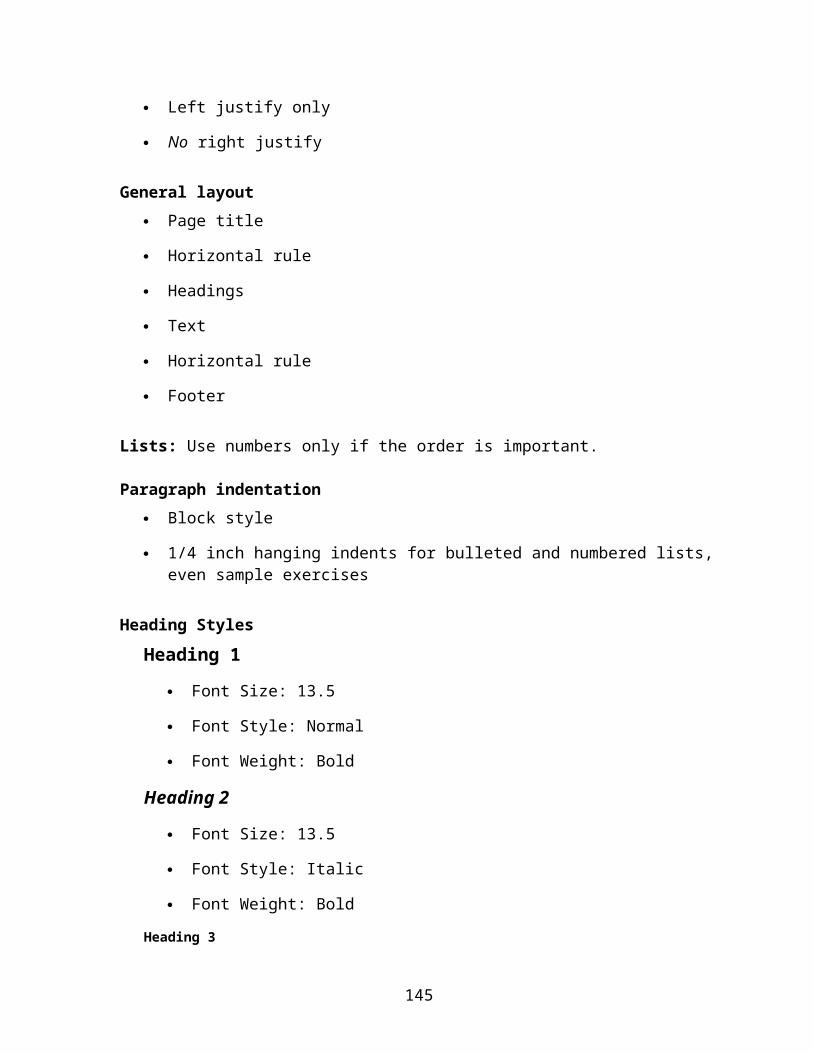
Left justify only
No right justify
General layout Page title
Horizontal rule
Headings
140
Text
Horizontal rule
Footer
Lists: Use numbers only if the order is important.
Paragraph indentation Block style
1/4 inch hanging indents for bulleted and numbered lists, even sample exercises
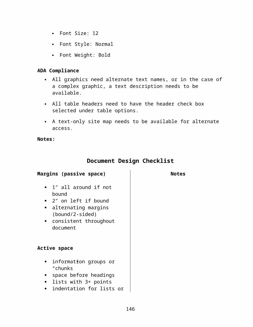
Heading Styles
Heading 1
Font Size: 13.5
Font Style: Normal
Font Weight: Bold
Heading 2
Font Size: 13.5
Font Style: Italic
Font Weight: Bold
Heading 3
Font Size: 12
Font Style: Normal
Font Weight: Bold
ADA Compliance All graphics need alternate text names, or in the case of a complex graphic, a text
description needs to be available.
All table headers need to have the header check box selected under table options.
A text-only site map needs to be available for alternate access.
Notes:
141
Document Design Checklist
Margins (passive space)
1″ all around if not bound 2″ on left if bound alternating margins (bound/2-sided) consistent throughout document
Notes
Active space
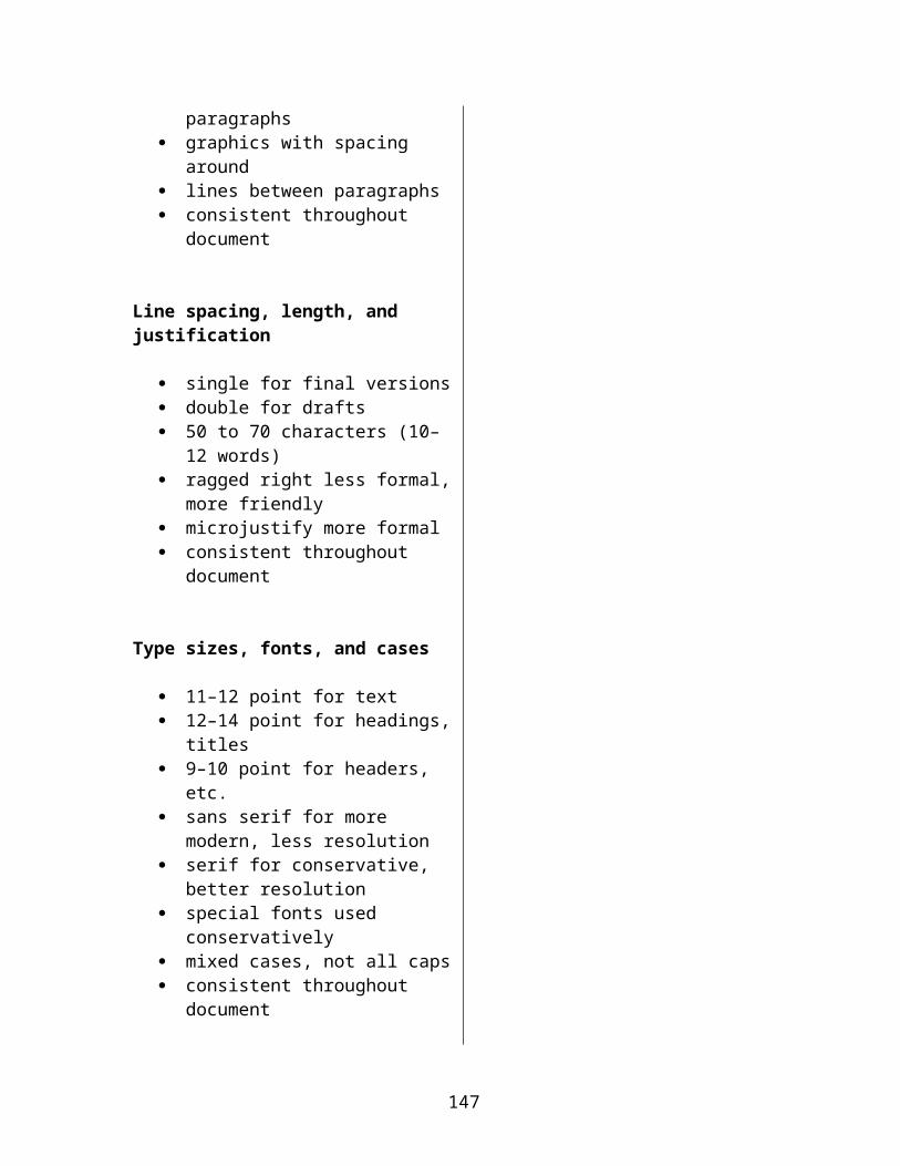
information groups or “chunks” space before headings lists with 3+ points indentation for lists or paragraphs graphics with spacing around lines between paragraphs consistent throughout document
Line spacing, length, and justification
single for final versions double for drafts 50 to 70 characters (10–12 words) ragged right less formal, more
friendly microjustify more formal consistent throughout document
Type sizes, fonts, and cases
11–12 point for text 12–14 point for headings, titles 9–10 point for headers, etc. sans serif for more modern, less
resolution serif for conservative, better
resolution special fonts used conservatively mixed cases, not all caps consistent throughout document
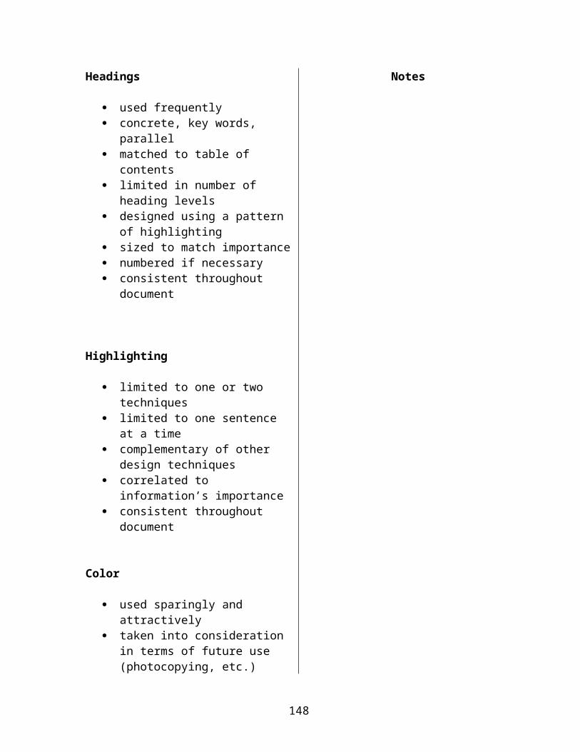
Headings Notes
142
used frequently concrete, key words, parallel matched to table of contents limited in number of heading levels designed using a pattern of
highlighting sized to match importance numbered if necessary consistent throughout document
Highlighting
limited to one or two techniques limited to one sentence at a time complementary of other design
techniques correlated to information’s
importance consistent throughout document
Color
used sparingly and attractively taken into consideration in terms of
future use (photocopying, etc.) consistent throughout document
Headers, footers, and page numbers
used to identify document; placed within document
consistent throughout document
143

Redesigning a Memo for Easy Reading
Instructions: Please Read Carefully!
1. Think about the class discussion and reading on document design. You might review your notes or look at examples in the book.
2. Writing on this page, make notations on how you could improve the following memo for clearer, more selective reading.
3. Using a word processor, redesign the memo using the elements we discussed in class (including good memo format) to make the information more easily accessible.
4. You may change minor wording to make it clearer or to help it fit with your design, but do not alter the purpose or significant details.
5. Put your name on the back of the final printout.
6. Turn in this original (with your notations) and your revision.
144
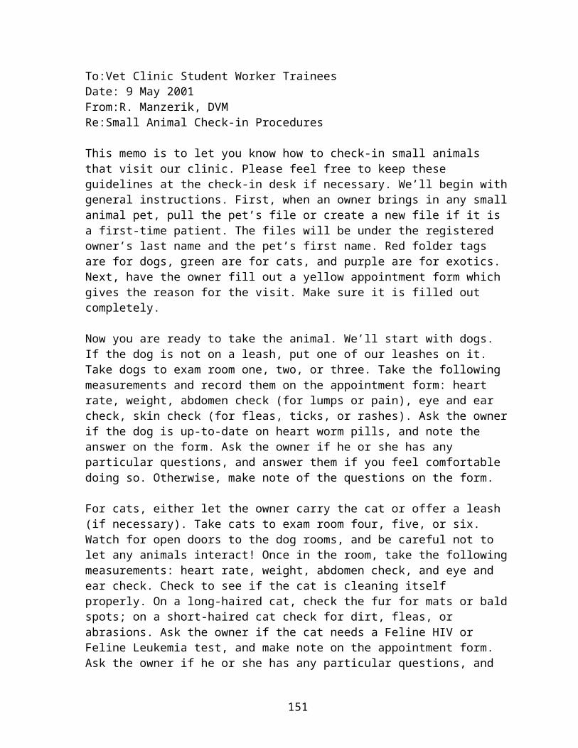
To:Vet Clinic Student Worker Trainees Date: 9 May 2001From:R. Manzerik, DVMRe:Small Animal Check-in Procedures
This memo is to let you know how to check-in small animals that visit our clinic. Please feel free to keep these guidelines at the check-in desk if necessary. We’ll begin with general instructions. First, when an owner brings in any small animal pet, pull the pet’s file or create a new file if it is a first-time patient. The files will be under the registered owner’s last name and the pet’s first name. Red folder tags are for dogs, green are for cats, and purple are for exotics. Next, have the owner fill out a yellow appointment form which gives the reason for the visit. Make sure it is filled out completely.
Now you are ready to take the animal. We’ll start with dogs. If the dog is not on a leash, put one of our leashes on it. Take dogs to exam room one, two, or three. Take the following measurements and record them on the appointment form: heart rate, weight, abdomen check (for lumps or pain), eye and ear check, skin check (for fleas, ticks, or rashes). Ask the owner if the dog is up-to-date on heart worm pills, and note the answer on the form. Ask the owner if he or she has any particular questions, and answer them if you feel comfortable doing so. Otherwise, make note of the questions on the form.
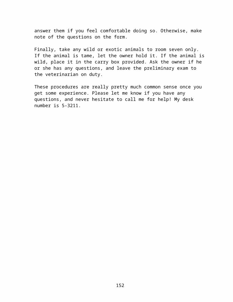
For cats, either let the owner carry the cat or offer a leash (if necessary). Take cats to exam room four, five, or six. Watch for open doors to the dog rooms, and be careful not to let any animals interact! Once in the room, take the following measurements: heart rate, weight, abdomen check, and eye and ear check. Check to see if the cat is cleaning itself properly. On a long-haired cat, check the fur for mats or bald spots; on a short-haired cat check for dirt, fleas, or abrasions. Ask the owner if the cat needs a Feline HIV or Feline Leukemia test, and make note on the appointment form. Ask the owner if he or she has any particular questions, and answer them if you feel comfortable doing so. Otherwise, make note of the questions on the form.
Finally, take any wild or exotic animals to room seven only. If the animal is tame, let the owner hold it. If the animal is wild, place it in the carry box provided. Ask the owner if he or she has any questions, and leave the preliminary exam to the veterinarian on duty.
These procedures are really pretty much common sense once you get some experience. Please let me know if you have any questions, and never hesitate to call me for help! My desk number is 5-3211.
145
OVERHEADS
The figures on the following pages may be reproduced as overhead transparencies or simply shown on a computer. The following set of discussion questions associated with each of the figures may be used to elicit student reflections on the concepts.
Discussion Questions for Figure 8-1
In what situations might document design be most crucial? What situations might require that a document use few design elements? What rhetorical effects can design decisions create?
Discussion Questions for Figure 8-2
Look at the documents you use: textbooks, newspapers, Web pages. What pet peeves do you have about design?
How does design online differ from that used in hard copy? What are your design limitations when using e-mail?
Discussion Questions for Figure 8-3
In what ways can all of the capabilities of our word processing, Web editing, and desktop publishing programs be a double-edged sword?
What benefits can using these techniques have in your writing while in college?
Discussion Questions for Figure 8-4
Have you ever had experiences in which you were unable to locate information you needed in a document? What were the results of that? How did it affect you as you tried to complete what you were working on?
Have you ever had an instructor deduct points from essays, exams, etc., because they couldn’t find information you had included in the text? Would using these suggestions for helping readers locate information have helped?
146
Discussion Questions for Figure 8-5
Have you ever created a Web site? Did you consider these issues as you created it? Why or why not?
Have you ever visited Web sites that violated one or more of these principles and found that it created problems for you as you tried to use the site?
Discussion Questions for Figure 8-6
Which of these design traits have you found useful on Web sites? Which, when absent, have created problems (or irritants) for you?
What Web sites have you visited that were design disasters? How might incorporating these principles have improved the sites?
147
Basics of Document Design
Know what decisions are yours to make
Choose a design that fits your situation
Plan your design from the beginning
Reveal your design to your readers
Keep your design consistent
Figure 8-1: Basics of Document Design

Designing Effective Pages and Screens
1. Use blank space to frame and group information:
Passive space: margins
Active space: headings, lists (numbered or bulleted), space between paragraphs
2. Set the spacing for easy reading
3. Use a medium line length
4. Use a ragged right margin
Figure 8-2: Designing Effective Pages and Screens
Guidelines for Readable Type
1. Choose a legible type size
2. Choose a typeface (font) that is appropriate
3. Use special typefaces sparingly
4. Use highlighting effectively:
Don’t use too many different techniques
Don’t use any one technique too often
Be consistent in the way you use each technique
5. Use a mixture of cases, not all capitals
6. Use color carefully
Figure 8-3: Guidelines for Readable Type
Helping Readers Locate Information
1. Write descriptive headings: Use concrete language Use questions, verb phrases, and sentences
instead of nouns alone Use standard keywords if readers expect them Make the headings at a given level parallel Make sure the headings match the table of
contents
2. Design distinctive headings: Limit the number of heading levels Create a pattern for the headings and stick to
it Match the size to the importance Put more space before a heading than after it Keep each heading with the section it covers Use headings frequently Consider using numbers with your headings
3. Use page numbers and headers and footers
Figure 8-4: Helping Readers Locate Information
Creating a Web Site
Explore and experiment
Strive for a consistent design throughout the site
Make the site inviting but simple
Focus your efforts on the home page
Give users opportunities to interact with the pages
Be sensitive to the cultural differences of an international audience
Make the site accessible to users with disabilities
Figure 8-5: Creating a Web Site
Designing the Pages of a Web Site
1. Include a complete menu of links at the top and bottom of each page
2. Avoid excessive links in the running text
3. Include identifying information on each page
4. Choose a light, solid color for the background
5. Adjust the length of the pages to the information
6. Keep illustrations small
7. Restrict animation to video or audio-video clips that the user specifically clicks to view
Figure 8-6: Designing the Pages of a Web Site
Designing the Pages of a Web Site
8. Use only two levels of headings
9. Minimize your use of italics
10. Use bold type selectively and consistently
11. Edit and proofread carefully
12. Check the design of the site using a variety of computers and monitors
Figure 8-6: Designing the Pages of a Web Site