DESIGN AND BRAND GUIDELINES - Binero Group€¦ · These guidelines reflect Binero Group´s...
18
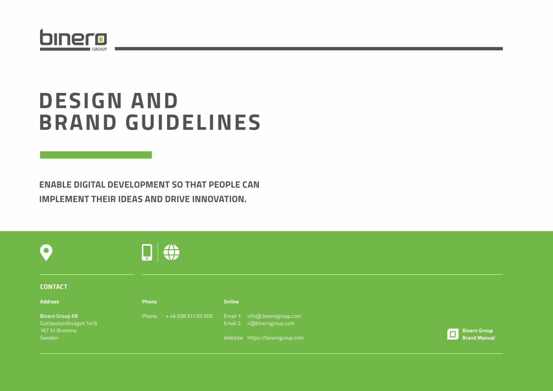
DESIGN AND BRAND GUIDELINES CONTACT Address Binero Group AB Gustavslundsvägen 141A 167 51 Bromma Sweden Phone Phone: + 46 (0)8 511 05 500 Online Email 1: [email protected] Email 2: [email protected] Website: https://binerogroup.com Binero Group Brand Manual ENABLE DIGITAL DEVELOPMENT SO THAT PEOPLE CAN IMPLEMENT THEIR IDEAS AND DRIVE INNOVATION.
Transcript of DESIGN AND BRAND GUIDELINES - Binero Group€¦ · These guidelines reflect Binero Group´s...
DESIGN ANDBRAND GUIDELINES
CONTACT
Address
Binero Group ABGustavslundsvägen 141A 167 51 BrommaSweden
Phone
Phone: + 46 (0)8 511 05 500
Online
Email 1: [email protected] 2: [email protected] Website: https://binerogroup.com
Binero GroupBrand Manual
ENABLE DIGITAL DEVELOPMENT SO THAT PEOPLE CAN IMPLEMENT THEIR IDEAS AND DRIVE INNOVATION.
Binero Group Brand Guidelines
2 // 34
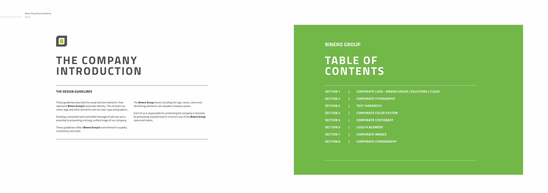
THE COMPANYINTRODUCTION
These guidelines describe the visual and text elements that represent Binero Group´s corporate identity. This includes our name, logo and other elements such as color, type and graphics.
Sending a consistent and controlled message of who we are is essential to presenting a strong, unified image of our company.
These guidelines reflect Binero Group´s commitment to quality, consistency and style.
The Binero Group brand, including the logo, name, colors and identifying elements, are valuable company assets.
Each of us is responsible for protecting the company’s interests by preventing unauthorized or incorrect use of the Binero Group name and marks.
THE DESIGN GUIDELINES SECTION 1 | CORPORATE LOGO - BINERO GROUP | SOLUTIONS | CLOUD
SECTION 2 | CORPORATE TYPOGRAPHY
SECTION 3 | TEXT HIERARCHY
SECTION 4 | CORPORATE COLOR SYSTEM
SECTION 5 | CORPORATE STATIONERY
SECTION 6 | LOGO PLACEMENT
SECTION 7 | CORPORATE IMAGES
SECTION 8 | CORPORATE ICONOGRAPHY
TABLE OF CONTENTS
BINERO GROUP

1
3 4
2
Our Logo is the key building block of our identity, the primary visual element that identifies us. The signature is a combination
of the the symbol itself and our company name – they have a fixed relationship that should never be changed in any way.
CORPORATE LOGO01
LOGO DARK VERSION LOGO LIGHT VERSION3) The Logo Dark Version will be used when the backround color is light colored.
4) The Logo Light Version will be used when the backround color ist dark colored.
Recommended formats are:.eps | .ai | .png | .jpg | .tiff | .svg
Attention:Use of any stylized, animated, hand drawn or other versions of a inofficial logo is not permitted. This undermines the logo system and brand consistency. Please consult with Binero Group Trademark Licensing if you have any questions or need further help.
2) The Logo SymbolConsists of a powerful "leaf"-element evoking the culture and history of the Binero brand.
The Logo Subtitle GROUP is chosen for its corporate, highly legible meaning, which has been further enhanced by the use of upper case letters in gray tone of the chosen corporate color. The font that is used here is "Lato" - SemiBold.
1) The general Logo The main logo is the dark logo used on white or colored backround. For darker backrounds you will find an alternative below.
THE CORPORATE FONTSAND TYPOGRAPHY
THE FULL LOGOTYPE
The Binero Group Masterbrand or Corporate Logo comprises two elements, the logo symbol and logo type. The Logo Symbol is a powerful image evoking the culture of design services - the connection between the strength of communication and the different points that influence.
It has a particular relationship with the Binero Group name.The Logo Type has been carefully chosen for its timeless and yet refined, highly legible style, which has been further enhanced by the use of lower case letters. The typeface is vector made and has also been modified to compliment and balance perfectly with the logo symbol.
The corporate logo is presented through the use of colour as well as shape and form. The three corporate colours are Green, Grey and White. It is a fresh and appealing blend of colours chosen for their strong combination - modern - classic - timeless.The Colours have been selected according to international standards as shown below and are easily implemented.
LOGO SYMBOLFull-White Version
LOGO SYMBOLFull-Gray Version
Inverted
x
x
1/2 x1/2 x 1/2 x
1/2 x1/2 x
1/2 x 1/2 x
1/2 x1/2 x
40 mm 30 mm 20 mm
15 m
m
10 m
m
5 m
m
LOGO EFull-White Version
LOGO FFull-Gray Version
Binero Group Brand Guidelines
6 // 34
It is important to keep corporate marks clear of any other graphic elements. To regulate this, an exclusion zone has been established around the corporate mark. This exclusion zone indicates the closest any other graphic element or message can
be positioned in relation to the mark of the the symbol itself and our company name – they have a fixed relationship that should never be changed in any way.
BINERO GROUP - LOGO CONSTRUCTION, CLEARSPACE AND COMPUTATION
CLEARSPACE
Full Logo
Definition-Whenever you use the logo, it should be surrounded with clear space to ensure its visibility and impact. No graphic elements of any kind should invade this zone.
Computation-To work out the clearspace take the height of the logo and divide it in half. (Clearspace = Height / 2).
CLEARSPACE
Logo Symbol
0.5 x
0.5 x
1.5 x
APPLICATION ON A BACKGROUND
LOGO AWhite Version
LOGO BWhite Version
LOGO CGray Version
LOGO DGray Version
MINIMUM LOGO SIZES
Full LogoMinimum Size: 20mm x 3.33 mm
Logo SymbolMinimum Size: 5 mm x 5 mm
PRIMARY LOGOS AND LOGO SYMBOLS
Usage:Use them as the dominant logotype for all internal and external visual presentations of the company.
SECONDARY LOGO
Usage:Use them when simplicity requires it
SECONDARY LOGO SYMBOL
40 mm 30 mm 20 mm
15 m
m
10 m
m
5 m
m
MINIMUM LOGO SIZES
Full LogoMinimum Size: 20mm x 3.33 mm
Logo SymbolMinimum Size: 5 mm x 5 mm
x
x
1/2 x1/2 x 1/2 x
1/2 x1/2 x
LOGO EFull-White Version
LOGO FFull-Gray Version
Binero Group Brand Guidelines
8 // 34
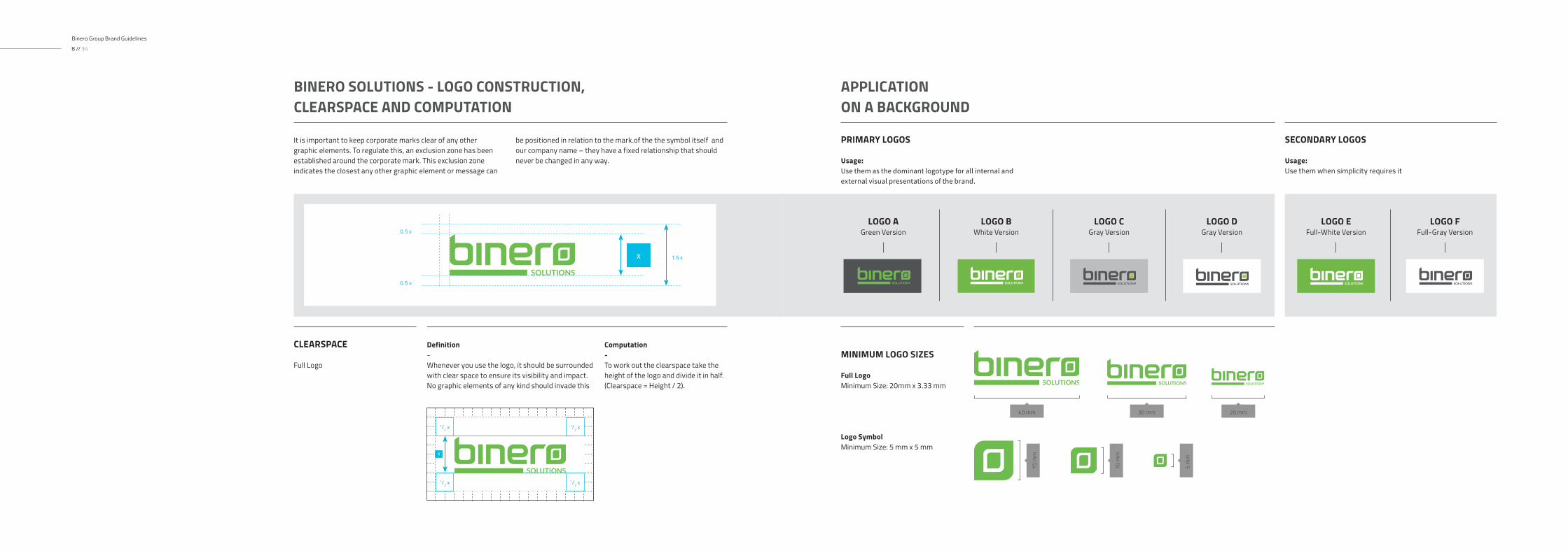
It is important to keep corporate marks clear of any other graphic elements. To regulate this, an exclusion zone has been established around the corporate mark. This exclusion zone indicates the closest any other graphic element or message can
be positioned in relation to the mark.of the the symbol itself and our company name – they have a fixed relationship that should never be changed in any way.
BINERO SOLUTIONS - LOGO CONSTRUCTION, CLEARSPACE AND COMPUTATION
CLEARSPACE
Full Logo
Definition-Whenever you use the logo, it should be surrounded with clear space to ensure its visibility and impact. No graphic elements of any kind should invade this
Computation-To work out the clearspace take the height of the logo and divide it in half. (Clearspace = Height / 2).
0.5 x
0.5 x
1.5 x
APPLICATION ON A BACKGROUND
LOGO AGreen Version
LOGO BWhite Version
LOGO CGray Version
LOGO DGray Version
PRIMARY LOGOS
Usage:Use them as the dominant logotype for all internal and external visual presentations of the brand.
SECONDARY LOGOS
Usage:Use them when simplicity requires it
40 mm 30 mm 20 mm
15 m
m
10 m
m
5 m
m
MINIMUM LOGO SIZES
Full LogoMinimum Size: 20mm x 3.33 mm
Logo SymbolMinimum Size: 5 mm x 5 mm
x
x
1/2 x 1/2 x
1/2 x1/2 x
LOGO CFull-White Version
LOGO DFull-Gray Version
Binero Group Brand Guidelines
10 // 34
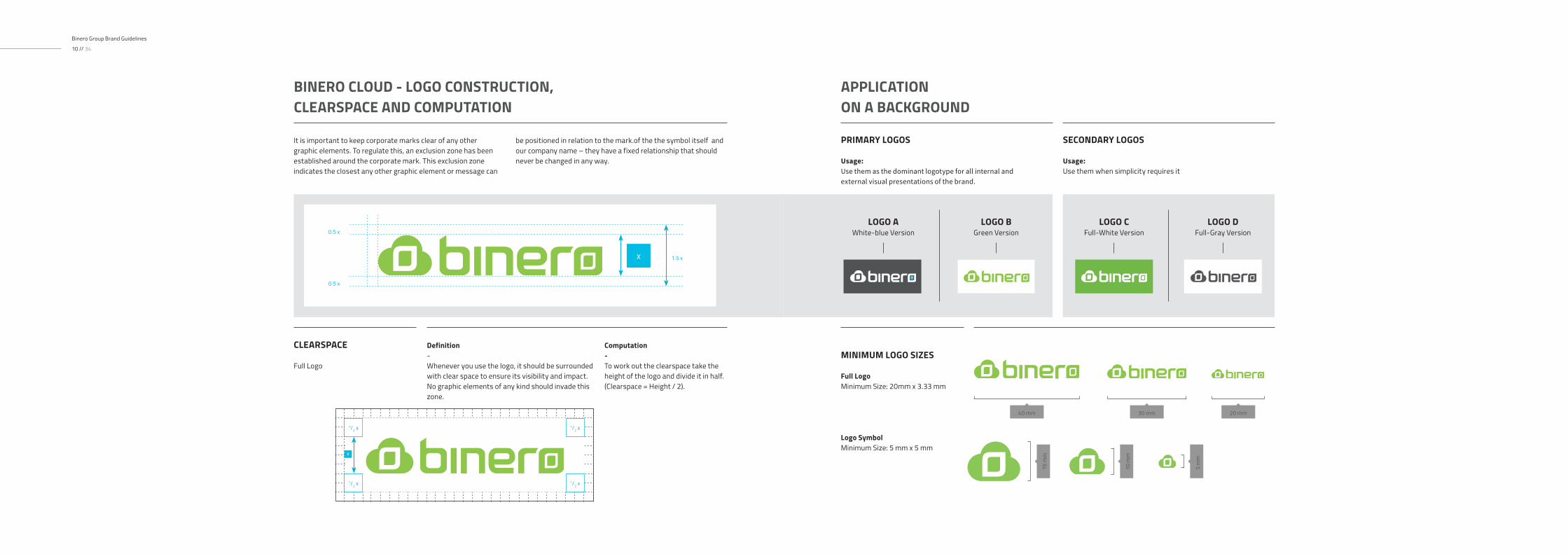
It is important to keep corporate marks clear of any other graphic elements. To regulate this, an exclusion zone has been established around the corporate mark. This exclusion zone indicates the closest any other graphic element or message can
be positioned in relation to the mark.of the the symbol itself and our company name – they have a fixed relationship that should never be changed in any way.
BINERO CLOUD - LOGO CONSTRUCTION, CLEARSPACE AND COMPUTATION
CLEARSPACE
Full Logo
Definition-Whenever you use the logo, it should be surrounded with clear space to ensure its visibility and impact. No graphic elements of any kind should invade this zone.
Computation-To work out the clearspace take the height of the logo and divide it in half. (Clearspace = Height / 2).
0.5 x
0.5 x
1.5 x
APPLICATION ON A BACKGROUND
LOGO AWhite-blue Version
LOGO BGreen Version
PRIMARY LOGOS
Usage:Use them as the dominant logotype for all internal and external visual presentations of the brand.
SECONDARY LOGOS
Usage:Use them when simplicity requires it

Binero Group Brand Guidelines
12 // 34
Typography is the art and technique of arranging type to make written language legible, readable, and appealing when displayed. The arrangement of type involves selecting typefaces, point sizes, line lengths, line-spacing (leading), and letter-spacing (tracking), and adjusting the space between pairs of letters. The
term typography is also applied to the style, arrangement, and appearance of the letters, numbers, and symbols created by the process. Typography also may be used as a decorative device, unrelated to communication of information.. Here are some of the most common techniques for Binero Group layouts.
THE CORPORATE TYPOGRAPHY02
Binero Group Brand Guidelines
14 // 34
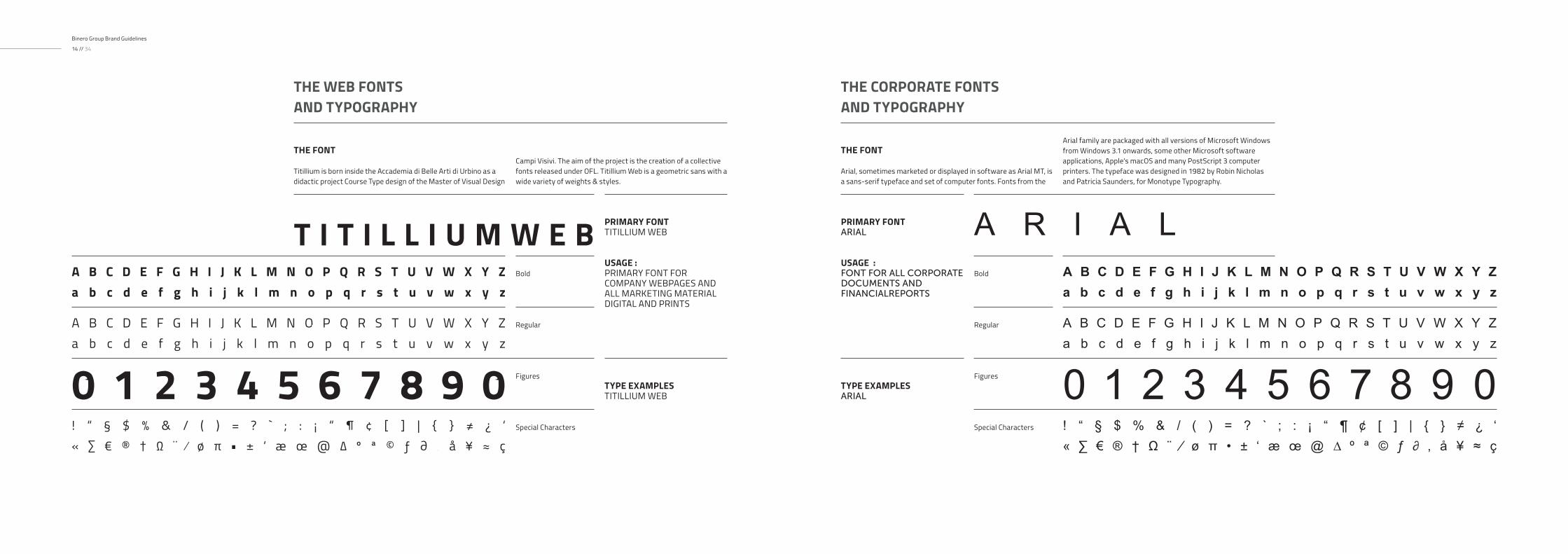
THE FONT
Titillium is born inside the Accademia di Belle Arti di Urbino as a didactic project Course Type design of the Master of Visual Design
Campi Visivi. The aim of the project is the creation of a collective fonts released under OFL. Titillium Web is a geometric sans with a wide variety of weights & styles.
THE WEB FONTSAND TYPOGRAPHY
PRIMARY FONTTITILLIUM WEB
USAGE : PRIMARY FONT FOR COMPANY WEBPAGES AND ALL MARKETING MATERIAL DIGITAL AND PRINTS
T I T I L L I U M W E BBold
Regular
A B C D E F G H I J K L M N O P Q R S T U V W X Y Za b c d e f g h i j k l m n o p q r s t u v w x y z
A B C D E F G H I J K L M N O P Q R S T U V W X Y Za b c d e f g h i j k l m n o p q r s t u v w x y z
TYPE EXAMPLESTITILLIUM WEB0 1 2 3 4 5 6 7 8 9 0
Special Characters
Figures
! “ § $ % & / ( ) = ? ` ; : ¡ “ ¶ ¢ [ ] | { } ≠ ¿ ‘« ∑ € ® † Ω ¨ ⁄ ø π • ± ‘ æ œ @ ∆ º ª © ƒ ∂ ‚ å ¥ ≈ ç
THE FONT
Arial, sometimes marketed or displayed in software as Arial MT, is a sans-serif typeface and set of computer fonts. Fonts from the
Arial family are packaged with all versions of Microsoft Windows from Windows 3.1 onwards, some other Microsoft software applications, Apple's macOS and many PostScript 3 computer printers. The typeface was designed in 1982 by Robin Nicholas and Patricia Saunders, for Monotype Typography.
THE CORPORATE FONTSAND TYPOGRAPHY
PRIMARY FONTARIAL
USAGE : FONT FOR ALL CORPORATE DOCUMENTS AND FINANCIALREPORTS
A R I A LBold
Regular
A B C D E F G H I J K L M N O P Q R S T U V W X Y Za b c d e f g h i j k l m n o p q r s t u v w x y z
A B C D E F G H I J K L M N O P Q R S T U V W X Y Za b c d e f g h i j k l m n o p q r s t u v w x y z
TYPE EXAMPLESARIAL 0 1 2 3 4 5 6 7 8 9 0
Special Characters
Figures
! “ § $ % & / ( ) = ? ` ; : ¡ “ ¶ ¢ [ ] | { } ≠ ¿ ‘« ∑ € ® † Ω ¨ ⁄ ø π • ± ‘ æ œ @ ∆ º ª © ƒ ∂ ‚ å ¥ ≈ ç

Typographic hierarchy is another form of visual hierarchy, a sub-hierarchy per se in an overall design project. Typographic hierarchy presents lettering so that the most important words are displayed with the most impact so users can scan text for key
information. Typographic hierarchy creates contrast between elements. There are a variety of ways you can create a sense of hierarchy. Here are some of the most common techniques for Binero Group layouts.
TYPOGRAPHY AND TEXT HIERARCHY03
CONTEXT TEXTAND INNER HEADLINES
HEADLINES AND TYPOBREAKS
Caption Text
Copy Text
Headlines Copy Text
Sublines Sections
Binero Group Typo-
Titillium Web Regular 8 pt Type / 11 pt Leading
Binero Group Typo- Titillium Web Regular 12 pt Type / 15 pt Leading
Binero Group Typo- Titillium Web - Semi Bold 16pt Type / 16pt Leading
Binero Group Typo- Titillium Web - Semi Bold 24pt Type / 24pt Leading
Binero Group Typo- Tutillium Web - Semi Bold 34pt Type / 34 pt Leading
The header- Titillium Web - Semi Bold 48pt Type / 48 pt Leading
Big Headlines and Title
Sequencer and Title for Marketing

Binero Group Brand Guidelines
18 // 34
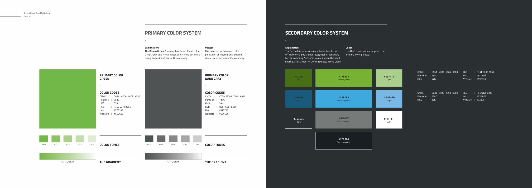
Color plays an important role in the Binero Group corporate identity program. The colors below are recommendations for various media. A palette of primary colors has been developed, which comprise the “One Voice” color scheme. Consistent use
of these colors will contribute to the cohesive and harmonious look of the Binero Group brand identity across all relevant media. Check with your designer or printer when using the corporate colors that they will be always be consistent.
CORPORATE COLOR SYSTEM
THE PRIMARY COLOR SYSTEM AND COLOR CODES
04
#FFFFFFLight
Binero Group Brand Guidelines
20 // 34
PRIMARY COLORGREEN
-
COLOR CODESCMYK : C034 M000 Y072 K030Pantone : 368CHKS : 65K RGB : R119 G179 B051 Hex : #77B333Websafe : #66CC33
PRIMARY COLORDARK GRAY
-
COLOR CODESCMYK : C059 M049 Y049 K041Pantone : 445CHKS : 93K RGB : R087 G087 B086 Hex : #575756Websafe : #666666
PRIMARY COLOR SYSTEM-
Usage:Use them as the dominant color palette for all internal and external visual presentations of the company.
Explanation: The Binero Group Company has three official colors: Green, Grey and White. These colors have become a recognizable identifier for the company.
COLOR TONES COLOR TONES100 % 100 %60 % 60 %
THE GRADIENT THE GRADIENTGreen Gradient Grey Gradient
80 % 80 %40 % 40 %20 % 20 %
SECONDARY COLOR SYSTEM-
Usage:Use them to accent and support the primary color palette.
Explanation: The Secondary colors are complementary to our official colors, but are not recognizable identifiers for our company. Secondary colors should be used sparingly (less than 10 % of the palette in one piece.
RGB : R51 G176 B249 Hex : #33B0F9Websafe : #3399FF
CMYK : C080 M029 Y000 K002Pantone : 298CHKS : 47K
#33B0F9Secondary Color
#77B333Primary Color
#19587CDark
#457113Dark
#343434Dark
#81817ESecondary Color
#252526Secondary Color
#B8E4FDLight
#457113Light
RGB : R151 G200 B061 Hex : #97c83dWebsafe : #99cc33
CMYK : C053 M000 Y085 K000Pantone : 368CHKS : 67K
Binero Group Brand Guidelines
22 // 34
Stationery is a primary means of communication and it is essential that every application be a consistent reflection of our corporate identity. There is only one approved design format for all corporate and business unit stationery, although there are slight variations in size and content for different regions of the world. This section illustrates approved layouts for standard
business stationery. It includes specifications for typography, color, printing method, paper stock and word processing Stationery brand management guidelines do not include invoices, bills of lading, credit letters, business forms, checks, e-mail tags or other business processes
CORPORATE STATIONERY
INTERNATIONAL PAPERSTATIONERY
05
Peter JacksonCreative Director
Main Street 4th2515 Los AngelesUnited States
P: +01.1234.5678.90F: +01.1234.5678.90E: [email protected] binero.se
binero.cloud
binero.solutions
binerogroup.com
Binero Group AB Gustav Jerner
Tel. +46 76 62 94 943
Email [email protected]
Binero Group Brand Guidelines
24 // 34
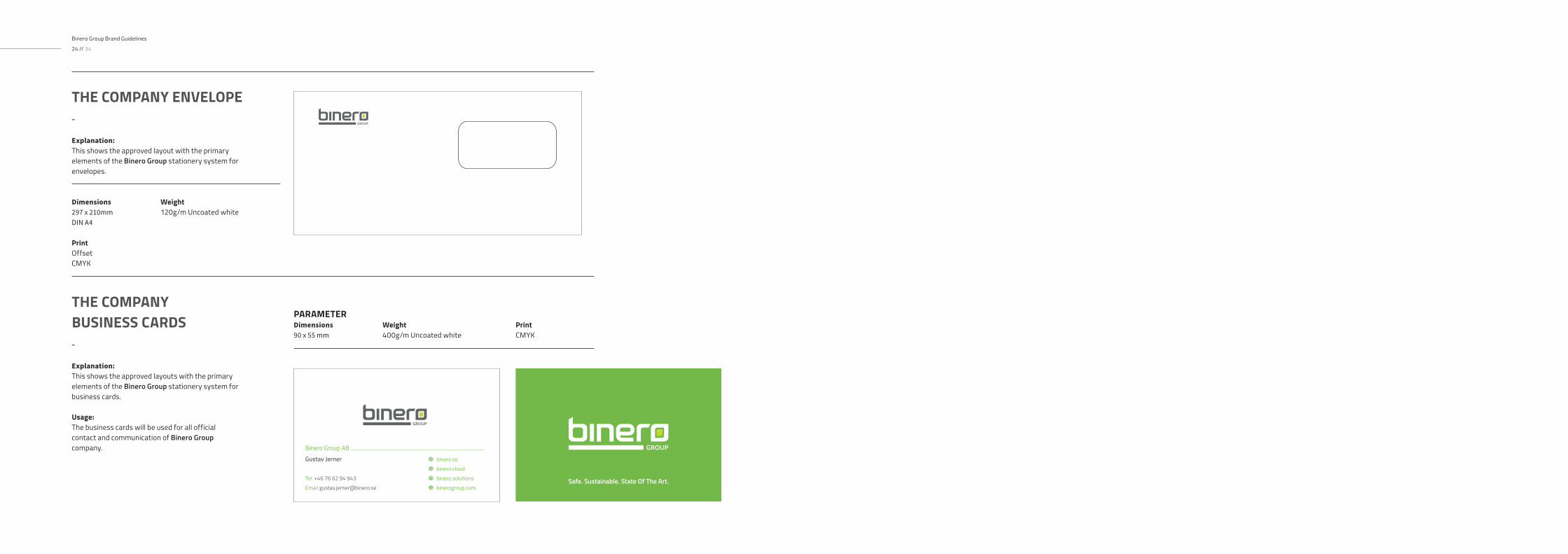
THE COMPANY ENVELOPE-
Explanation: This shows the approved layout with the primary elements of the Binero Group stationery system for envelopes.
Dimensions 297 x 210mmDIN A4
Weight 120g/m Uncoated white
Print OffsetCMYK
THE COMPANYBUSINESS CARDS-
Explanation: This shows the approved layouts with the primary elements of the Binero Group stationery system for business cards.
Usage:The business cards will be used for all official contact and communication of Binero Group company.
PARAMETERDimensions 90 x 55 mm
Weight 400g/m Uncoated white
Print CMYK

THE CORRECT LOGO PLACEMENT06
Example 297 x 210mmDIN A4
PARAMETER
CORRECTLOGO PLACEMENT-Explanation: To place the Binero Group logo in the correct way please use one of the approved styles that are shown here. To place the Binero Group logo in other ways is not allowed.
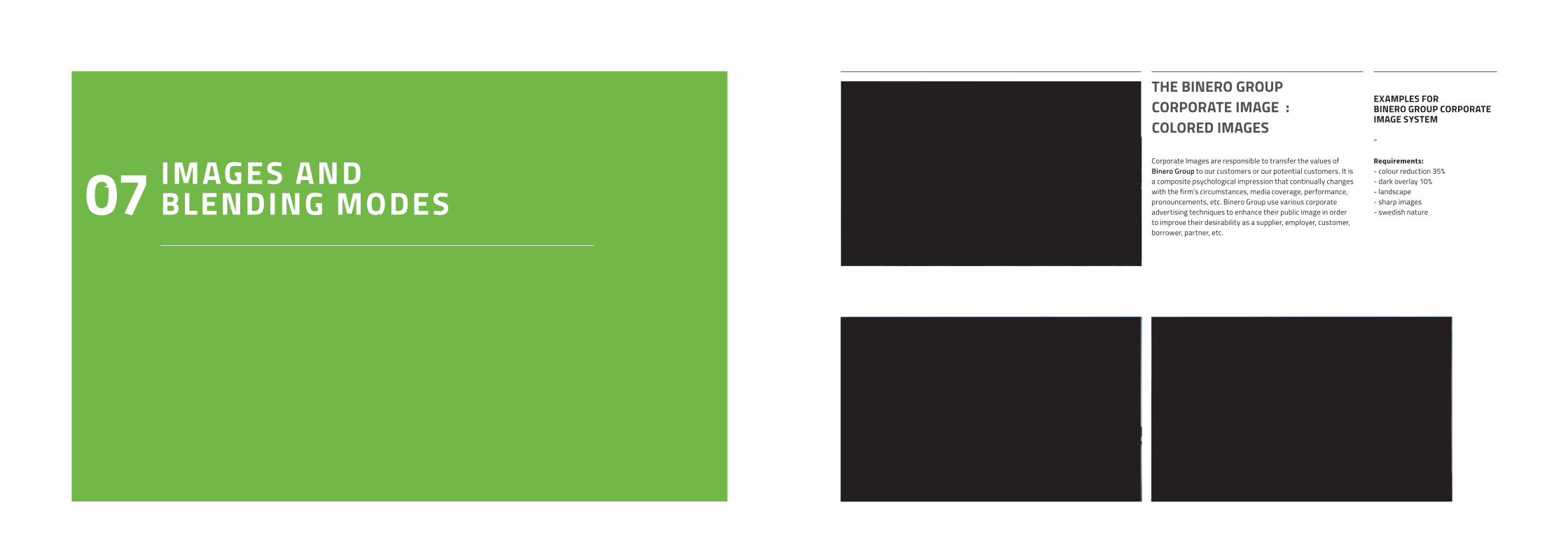
IMAGES AND BLENDING MODES07
Corporate Images are responsible to transfer the values of Binero Group to our customers or our potential customers. It is a composite psychological impression that continually changes with the firm’s circumstances, media coverage, performance, pronouncements, etc. Binero Group use various corporate advertising techniques to enhance their public image in order to improve their desirability as a supplier, employer, customer, borrower, partner, etc.
THE BINERO GROUPCORPORATE IMAGE : COLORED IMAGES
EXAMPLES FOR BINERO GROUP CORPORATE IMAGE SYSTEM
- Requirements: - colour reduction 35%- dark overlay 10% - landscape- sharp images- swedish nature
Binero Group Brand Guidelines
30 // 34
EXAMPLES FOR BINERO GROUP CORPORATE IMAGE SYSTEM
- Requirements: - font white colours- darkened images- sharp images- nature- modern and crisp
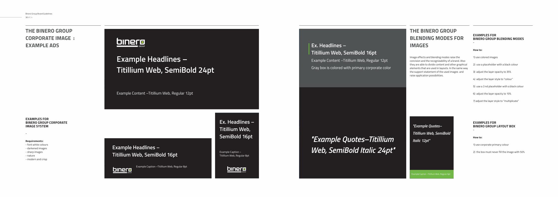
THE BINERO GROUP CORPORATE IMAGE : EXAMPLE ADS
Image effects and blending modes raise the concision and the recognizability of a brand. Also they are able to divide content and other graphical elements that are used in layouts. In the same way the support statement of the used images and raise application possibilities.
THE BINERO GROUPBLENDING MODES FOR IMAGES
EXAMPLES FOR BINERO GROUP BLENDING MODES- How to:
1) use colored images
2) use a placeholder with a black colour
3) adjust the layer opacity to 35%
4) adjust the layer style to “colour”
5) use a 2:nd placeholder with a black colour
6) adjust the layer opacity to 10%
7) adjust the layer style to “multiplicate”
Example Headlines –Titillium Web, SemiBold 24pt
Example Content –Titillium Web, Regular 12pt
Example Headlines –Titillium Web, SemiBold 16pt
Example Caption –Titillium Web, Regular 8pt
Ex. Headlines –Titillium Web, SemiBold 16pt
Example Caption –Titillium Web, Regular 8pt
Ex. Headlines –Titillium Web, SemiBold 16ptExample Content –Titillium Web, Regular 12pt
Gray box is colored with primary corporate color
"Example Quotes–Titillium Web, SemiBold Italic 24pt"
"Example Quotes–
Titillium Web, SemiBold
Italic 12pt"
Example Caption –Titillium Web, Regular 6pt
EXAMPLES FOR BINERO GROUP LAYOUT BOX- How to:
1) use corporate primary colour
2) the box must never fill the image with 50%

file
file
CHEVRON-RIGHT
chevron-circle-right
Download
Download
CHEVRON-RIGHT Chevron-down Chevron-left chevron-circle-right chevron-circle-down CHEVRON-CIRCLE-LEFT
CLOUD
Download
Exclamation-triangle
Chart-Line
file
Lock
Sync-alt
paper-plane
Leaf
Suitcase
cog
Toggle-on
Angle-Double-Right
Tachometer-Alt
laptop
BOLT
server
CORPORATE ICONOGRAPHY08
An icon is a pictogram displayed on a screen or print layout in order to help the user navigate through the content in a easier way. The icon itself is a small picture or symbol serving as a quick, “intuitive” representation of for example a software tool, function or a data file.
BINERO GROUP CORPORATE ICONOGRAPHY
EXAMPLES FOR BINERO GROUP CORPORATE ICONOGRAPHY SYSTEM
- How to: - use icon preferably with a backround/object- minimum stroke size: 12 pt - upscale only proportional
Example:
https://fontawesome.com/ICONONOGRAPHY DOWNLOAD LINK
Font Awesome IconsGo to the "Free" icons section
Direct Link :
Learn more CHEVRON-RIGHT

DESIGN ANDBRAND GUIDELINES
CONTACT
Address
Binero Group ABGustavslundsvägen 141A 167 51 BrommaSweden
Binero GroupBrand Manual
DOWNLOAD
Download
Binero GroupBrand Collection
Direct Link : https://binerogroup.com/press