Deluna artwork
49
DANIEL DELUNA PAINTING / DRAWING / DIGITAL MEDIA
-
Upload
daniel-deluna -
Category
Documents
-
view
219 -
download
1
description
Rochester, NY based artist Daniel DeLuna has exhibited his painting, drawing and digital work internationally. Starting as a painter, his work has been greatly extended and influenced by his engagement with digital media at the same time retaining the connection to the initial practice in those traditional mediums. Working with an abstract visual language, he creates richly evocative work influenced by art history, music, and design. He holds an MFA from Pratt Institute in Brooklyn, NY. and is currently Associate Professor in the School of Design at the Rochester, Institute of Technology.
Transcript of Deluna artwork
DANIEL DELUNAPAINTING / DRAWING / DIGITAL MEDIA
VARIATION AND COHERENCEESSAY / CHRIS ASHLEY

The art of Daniel DeLuna, who is based in Rochester, New York and is an Associate Professor of New Media Design at Rochester Institute of Technology, explores seeming
ambient order and happenstance, incorporates intentional and off-handed design, and presents situations formal and casual, refined and intuitive. An additional slew of appar-ently contradictory yet ultimately reconcilable comments about his work come to mind: one might say the tempera-ture of his art is dispassionate yet felt, and cool but per-sistent; an image’s atmosphere is both spacious and dense, the mood calm but attentive; structures shift but are stable; imagery and motifs are simultaneously historically rooted and forward thinking. There is a great deal of visual ac-tivity taking place, no matter the medium DeLuna uses: drawings, paintings, prints, and still and animated digital images. And the work is beautiful—sensitive and sensual yet rigorous and intelligent, robust and complex yet deli-cate and crafted. In DeLuna’s work there is a lot to look at, absorb, and think about.
DeLuna’s images consist of lines and solids, circles and rectangles, often in black and white and minimal color, occasionally in color but in a more monochromatic strain. Working within bands and loose grids, he places and builds up marks, scrawls, dashes, and dots which emerge, escape, or unwind from, or stumble and skitter across and in-be-tween, regular and irregular shapes and constructions. In the recent drawings the contrast between ruled horizontal lines and gestural marks can be read as both picture and writing; there is a sense of handwriting, notation, or short-hand found in the long and short, straight and curved lines crossing the horizontal areas; the impulse and movement in these lines indicate pause, thought, action, and reaction, while also making and filling space, inferring movement and mood. In the lines and spaces we find the contrast be-
tween things precise and gestural, planned and incidental, wild and cultivated, urban and rural, arid and bountiful.DeLuna has said, “I almost always work listening to music,
which is an enormous influence on my working method... I respond to music that is rich, dense and multi-layered.” His taste spans from indie rock to pop fringe, and includes glitch music, which incorporates the sound of skipping CDs. This last comment recalls how DeLuna’s images and animations can prompt synesthesia, which is a neurologi-
DD042011 / Graphite on Paper / 7 x 17 Inches / 2011
DD012311 / Graphite on Paper / 14 x 11 Inches / 2011

cally-based condition in which stimulation of one sensory or cognitive pathway leads to automatic, involuntary ex-periences in a second sensory or cognitive pathway. For example, a response to DeLuna’s images might include the hearing of sounds— beats, chords, measures—while at a different time certain sounds may bring DeLuna’s images to mind.
The word ambient, used above, not only refers to the visu-ally spatial sense of DeLuna’s work, but also recalls Am-bient Music, a musical genre with early roots in the 20th century (think of Erik Satie) now often associated with Brian Eno, which focuses largely on the timbral charac-
teristics of sounds to evoke an atmospheric or visual and unobtrusive quality. One can think of this kind of music as being suitable accompaniment to DeLuna’s images, espe-cially his animations. At the same time, his art’s tendency to develop and cohere in series through repetition, varia-tion, and iteration can be analogously thought of as tracks on an album, or layered tracks on a song.
The imagery and tone of DeLuna’s art brings to mind the early 20th century abstract films and drawings of Hans Richter, and the photos and films László Moholy-Nagy, and likewise one can think particularly of Cy Twombly blackboard paintings. Richter wrote, “Painting has its own peculiar problems and specific sensations, and so has the film. But there are also problems in which the dividing line is obliterated, or where the two infringe upon each other.” This is the territory in which DeLuna’s art dwells and operates, where different media inform and compete with each other. Two sculptors come to mind: Barry LeVa and Richard Serra; their art, based on systems, natural movement, and the inherent tendencies of simple materi-als, involves order and scatter, placement and acceptance, weight and measure, can be found in DeLuna’s compact and compressed compositions and designs. His drawings are like film stills or animation cells, plans for social spac-es, records of interaction, and evidence of engagement and presence.
DeLuna’s pursuits and methodology are a consistent and restless exploration and expansion of his interests and imagery. These include locating his practice in the digital realm, where the rate of production, replication, distribu-tion, interaction, and feedback enhances his position and approach. The digital and non-digital sides of his work inform each other, enabling a successfully achieved and in-tegrated body of visual work.
Chris Ashley September 2010Ashley is an artist, educator and critic based in Oakland, California
ASHLEY Riemenschneider, 20080426 / HTML, 340 x 300 pixels / 2008

DD021211 / Graphite on Paper / 14 x 11 Inches / 2011
A STATEMENT OF SORTSINTERVIEW / DANIEL DELUNA

The following interview was conducted in June of 2011 at the residence of Daniel DeLuna by Daniel DeLuna.
DD Having some familiarity with you and your work, I know that you are engaged in creating more conventional painting and drawing as well as digital work, both still and animated. You’ve also worked for years as a commercial artist. How do you keep the two separate?
DD My take on the eternal debate about commercial ver-sus fine art boils down to intent. The objective of commer-cial art tends to a fast and direct method of communica-tion whereas fine art is slower and the experience can and perhaps should evolve over time. The visual vocabulary employed in both is exactly the same and each can and does inform the other. I frequently try to drive this point home to my design students by showing them images from art history, everything from Japanese prints to Assyrian reliefs. There are tens of thousands of years of culture to tap into and use as inspiration.
DD Let’s start from the very beginning. Where are you from?
DD A small town in Northwestern Indiana called Griffith, which is basically a suburb of a suburb of Chicago. It was a pretty conventional blue collar, middle class, mid-west-ern suburban upbringing, Little League, cub scouts, the whole bit.
DD Were you exposed to art back then? DD Sporadically. There where infrequent trips to the Art Institute of Chicago when I was a kid, but honestly, my primary experience of art was when I used to watch those “paint a landscape in a half hour” shows on PBS. I also used to copy pictures of my guitar heroes out of maga-zines. My dad has a few hanging in his basement, David Gilmour of Pink Floyd and George Lynch from Dokken that I made in high school. There’s also a painting of Thur-ston Moore from when I was a college freshman. They are not bad likenesses actually.
It’s interesting, I was visiting the Art Institute recently wandering around the collection. I had a really odd expe-rience of familiarity with some of the paintings. I’ve seen many of the same works over the past 25 years of course but it wasn’t the images of the work I was remembering but singular brush strokes.
I was looking at Rembrandt’s Old Man With A Gold Chain and recognized a little blob of paint representing a highlight on the chain. I hadn’t seen that painting in five or ten years but that single stroke was firmly ingrained in my mind. This happened on several occasions that day with other work. I connected with this work in a way
that was highly dependent on standing in front of the physical object, an experience that cannot be replicated by an image on the internet.
How did I remember a passage of paint that was a fraction of an inch in area? It was strangely comforting but was also shocking to have such a vivid connection with an im-age that I had barely consciously remembered.
DD Rockin’ with Dokken to Sonic Youth? That’s quite a transfor-mation in musical tastes!DD Going away to college helps. I bought Daydream Na-tion on cassette tape my first year. Now, twenty years later I own it on 180 gram vinyl. This is certainly related to what I was talking about with the Rembrandt painting, the analogue vinyl version of the album is so much fuller and present than the cd or mp3 versions I have.
DD How did you go from Bob Ross to the abstraction you prac-tice now?
DD I don’t remember the transition exactly. It certainly occurred while in college but the seeds were planted by something that happened in high school. My family and I briefly moved to Florida when I was a junior and one day, my mother, knowing that I had an interest in art, took me to a local museum. Walking into the lobby we were con-fronted by this large black wall covered with geometric patterns in white chalk. At the time I wasn’t even aware that was part of the exhibition. It turned out to be a wall drawing by Sol Lewitt, an artist who’s work I really respect now.
DD I see some connection to the work you do as far as the process based aspects...
DD Oh yeah, absolutely. I’m definitely influenced by Lewitt. There is some connection to using a definable sys-tem but my work is not as rigidly structured of course. The
DD091812 / Digital animation / Dimensions variable / 2012
system I employ such as overlaid intervals of horizontal or vertical lines are simply the springboard for the overall image.
There were lots of other works in the museum by artists that I came to be interested in later—Clifford Still, Alfred Jensen, Frank Stella—but the one that really stood out was Donald Judd. I remember there being one of his anodized aluminum boxes with a Plexiglas top sitting on the floor. I thought it was a display case that had something in it so I walked over and placed my hands on it so I could bend over and get a better look at its contents. The guard im-mediately stopped me of course. I was embarrassed and confused but it made me want to figure out what that strange object was and why it needed a security guard to keep people from touching it. I remember there were hand prints on the top already so I wasn’t the first one to make this mistake.
It did take some time for abstraction to take hold of me completely though. My first drawing assignment in college was to create the best drawing I was capable of so I made a copy of an image of Eddie Van Halen jumping while play-ing his guitar taken from a magazines. It was a hit in the dorm, although not so much in class. (laughter)
DD So abstraction was in the back of your mind though?
DD Yeah I think so, of course I had some familiarity at that time with artists such as Picasso and Van Gogh, whom are
not abstract artists obviously, but my reading of them was simply in terms a stylistic deviation from realism. I went to a state school in Indiana for my undergraduate degree called Ball State. It was about an hour from Indianapo-lis which has a really fantastic free art museum, the IMA. During my second or third year in school I started to get serious and visited the museum as much as I could and read art and philosophy books voraciously. I read Tema Celeste, Artforum, Art In America and whatever art pe-
riodicals I could get my hands on to try to connect to the contemporary art scene.
Back then, the work of post-structuralists such as Gilles Deleuze and Felix Guattari were very much in the air and abstract painting seemed to be a good way to embody these ideas. I remember one of the notions put forth by Deleuze and Guattari was idea of the rhizome and how discreet node connections within a system were where meaning was con-structed. Perceptual being such as ourselves were merely nodes that went on “trips of intensity” defined by these connections. Although I think some of the work that came from this thinking perhaps took itself a bit too seriously, lost some sense of the poetic, it was exciting to me to learn that people were creating abstract work from an intellec-tual standpoint.
My senior year, one of my painting professors had David Reed come visit the school because she knew I was inter-ested in his work. He was a great model of what it meant to be a serious artist to me. At that time most of my experi-ence of art was still coming from second hand sources of printed matter. This was even before the days of the inter-net. Al Gore hadn’t taken the initiative in creating it yet.
DD So what happened after college?
DD I went to grad school at Pratt Institute in Brooklyn to study painting and get an MFA with the goal of eventually teaching. It didn’t quite turn out the way I expected, the chair of the department sat all the new grad students down before classes began and told us to put teaching out of our minds because there were not any jobs available. I was stunned but remain thankful to this day that he shattered those illusions on the first day. After a year I switched to computer graphics which led to the career in commercial art and now the teaching position I have at the Rochester Institute of Technology.
DD How long were you in New York?
DD I lived in Brooklyn for about ten years. Clinton Hill, Williamsburg, Dumbo, then Boerum Hill. Being in New York was a great experience and where I really learned to look at art. I totally immersed myself in the culture. Also, New York being the living breathing beast that it is also had a tremendous affect on me.
DD Who are some contemporary artists you consider to be in-fluences?
DD (thinks for a moment) Wow, that’s a tough one, good question though. Thanks for asking. Just off the top of my head, Frank Nitsche, Albert Oehlen, David Batchelor, Bill Jensen, James Brooks, David Row, Willem DeKoon-ing, Carroll Dunham, Bernard Frize, Carl Fudge, Ashile
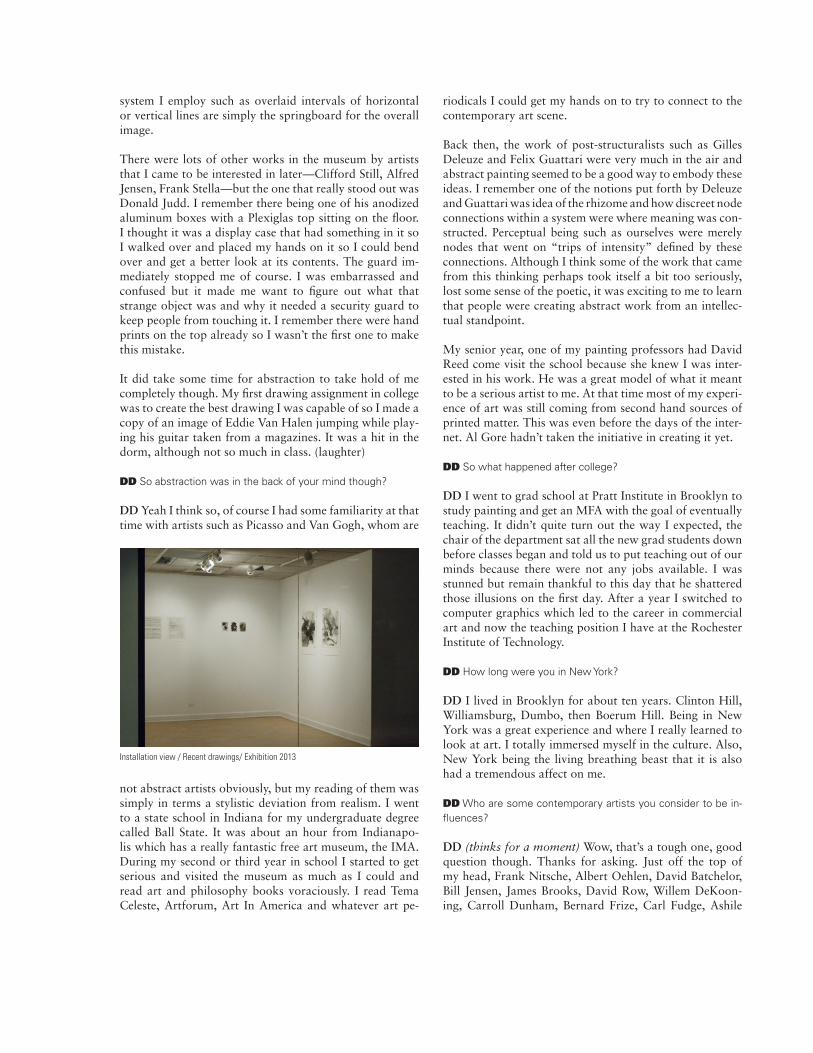
Installation view / Recent drawings/ Exhibition 2013
Gorky, Adolph Gottlieb, Katharina Grosse, Heimo Zober-nig, Hans Hoffman, Jacqueline Humphries, Franz Kline, Joan Mitchell, Jonathan Lasker, Robert Motherwell, Joan Miro, Ed Moses, Thomas Nozkowski, Stephen Parrino, Richard Serra, David Reed, Gerhard Richter, Sigmar Pol-ke, Gary Stephan, Amy Silman, Pierre Soulages, Thomas Schiebitz, Cy Twombly, Christopher Wool, John Zinnser, Chris Martin, Alan Uglow, James Siena, Stephen Westfall, Wade Guyton, Stephen Ellis, Adrian Schiess, Paul Henry Ramirez, Andrew Spence, Bruce Pearson, Joseph Marioni, Manfred Mohr, Eric Tucker, Jeff Elrod, Juan Ulse, Beatriz Milhazes, Mary Heilmann and Dennis Hollingsworth.
DD Come on, really, all those people?
DD To varying degrees, sure. I’m also interested every-thing from Medieval Illuminated Manuscripts, the Assyr-ian reliefs I mentioned before, ancient Chinese sculpture to Modernist Graphic design. As I said, I always tell my stu-dents that artists have been grappling with the same visual problems for thousands of years that they are and there is as much more to be learned from the Book Of Kells as there is from the latest and greatest motion graphics piece on youTube. It doesn’t always sink in but I try.
DD What besides art influences you?
DD I love music, it sometimes drives my wife crazy but I constantly have music playing and it really influences my working method. I often make analogies and connections in my mind while working by assigning attributes to ele-ments in the pieces as functioning in a similar fashion as in musical structures. The relationship of the melody over a bass line for example. It’s a bit simplistic to look at it in that light of course, but it does help clarify the process for myself sometimes. I’m not trying to do a visualization of music though. That is one of the reasons that I don’t use sound in the animated pieces. I want the visual to be the primary experience. I think that we are so used to seeing sound and moving image married to one another that iso-lating the image makes it even more powerful and engag-ing. I certainly wouldn’t want the animated pieces to be read as some sort of pedestrian rave graphics for example.
DD Where did the geometry versus gesture thing come from?
DD I’ve been doing geometrical based work for a long time, the gestural stuff would creep in but not to the extent that it has in last few years though. My first year at Pratt I was taking a seminar with the sculptor Gillian Jagger and
we had to bring in slides and present work made prior to enrolling in the class and she wanted us to explain how it related to our childhood. I though, “Oh god, I make geo-metric abstraction, how will I BS myself out of this?” The more I thought about it the more I realized that it did in-deed relate to the industrial urban environment of the steel mills, and oil refineries of Northwest Indiana that I en-countered in my youth. There was a harsh geometry that was humanized in a strange way through the dirt, grime, peeling paint, and rust. I remember that area striking me as some sort of post-apocalyptic Mad Max movie set. That vocabulary rooted itself in my mind but for years I didn’t make the connection.
DD Like Kline with the bridges? As abstract as his work was it was always there.
DD Yeah, Gillian was right to make us frame the work in that way. Kline wasn’t painting bridges nor am I painting steel mills I think in both of our cases it’s just a familiar visual language that one can tap into and use.
DD You create conventional paintings and drawings but also uti-lize digital tools extensively. Are you a technophile?
DD Quite the opposite actually, I could care less about the medium, the computer is simply a tool I use to create the work. I could set it aside tomorrow if the work didn’t necessitate using it. As far as being a technophile, not at all. Even though I teach computer graphics I have a great deal of ambivalence towards computers. I do use comput-ers for the animated pieces as well as generating elements through chance operations by employing very simplistic programming code as well as using drawing tools from off the shelf software such as Adobe Illustrator for the paint-ings, drawings and photo pieces.
DD How do you want your audience to respond to the work?
DD My goal is to have the viewer engage in a unique and meaningful visual experience, whatever that means for that particular viewer. I’m not trying to teach or persuade with the work and I’m not searching for beauty. I person-ally often find the work to be beautiful but I think I would prefer it to be challenging. It should be a little raw at first, and then perhaps it wins you over with its depth and charm eventually. I’ve been told that this also describes the experience that some people have with me! My wife, for example. (laughter)

DRAWINGSGRAPHITE / PAPER
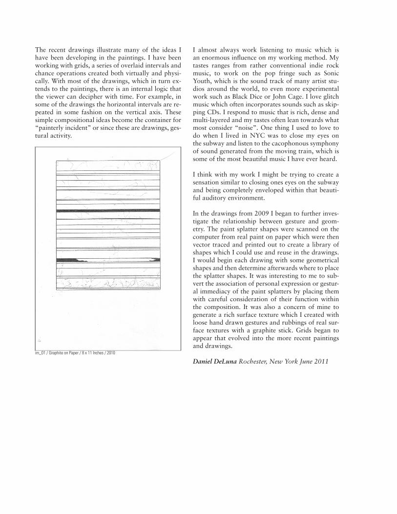
im_01 / Graphite on Paper / 8 x 11 Inches / 2010
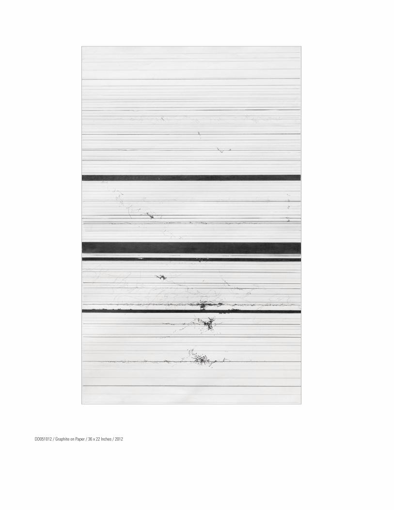
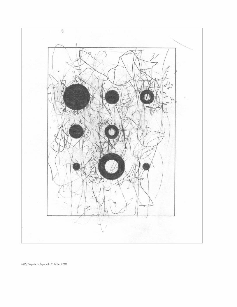
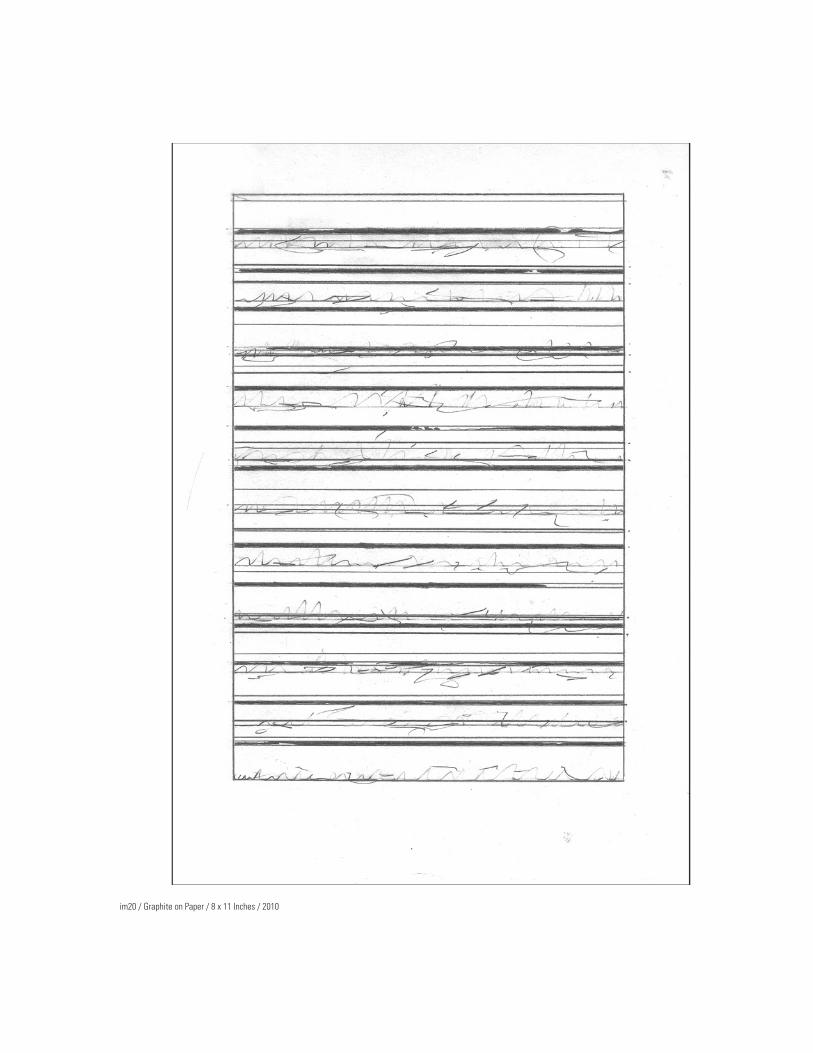
The recent drawings illustrate many of the ideas I have been developing in the paintings. I have been working with grids, a series of overlaid intervals and chance operations created both virtually and physi-cally. With most of the drawings, which in turn ex-tends to the paintings, there is an internal logic that the viewer can decipher with time. For example, in some of the drawings the horizontal intervals are re-peated in some fashion on the vertical axis. These simple compositional ideas become the container for “painterly incident” or since these are drawings, ges-tural activity.
I almost always work listening to music which is an enormous influence on my working method. My tastes ranges from rather conventional indie rock music, to work on the pop fringe such as Sonic Youth, which is the sound track of many artist stu-dios around the world, to even more experimental work such as Black Dice or John Cage. I love glitch music which often incorporates sounds such as skip-ping CDs. I respond to music that is rich, dense and multi-layered and my tastes often lean towards what most consider “noise”. One thing I used to love to do when I lived in NYC was to close my eyes on the subway and listen to the cacophonous symphony of sound generated from the moving train, which is some of the most beautiful music I have ever heard.
I think with my work I might be trying to create a sensation similar to closing ones eyes on the subway and being completely enveloped within that beauti-ful auditory environment.
In the drawings from 2009 I began to further inves-tigate the relationship between gesture and geom-etry. The paint splatter shapes were scanned on the computer from real paint on paper which were then vector traced and printed out to create a library of shapes which I could use and reuse in the drawings. I would begin each drawing with some geometrical shapes and then determine afterwards where to place the splatter shapes. It was interesting to me to sub-vert the association of personal expression or gestur-al immediacy of the paint splatters by placing them with careful consideration of their function within the composition. It was also a concern of mine to generate a rich surface texture which I created with loose hand drawn gestures and rubbings of real sur-face textures with a graphite stick. Grids began to appear that evolved into the more recent paintings and drawings.
Daniel DeLuna Rochester, New York June 2011

DD041413 / Graphite on Paper / 36 x 23 Inches / 2013

DD021713 / Graphite on Paper / 36 x 23.25 Inches / 2013

DD061712 / Graphite on Paper / 36 x 22.5 Inches / 2012
DD051012 / Graphite on Paper / 36 x 22 Inches / 2012

im10 / Graphite on Paper / 8 x 11 Inches / 2010
im07 / Graphite on Paper / 8 x 11 Inches / 2010
im20 / Graphite on Paper / 8 x 11 Inches / 2010

im22 / Graphite on Paper / 8 x 11 Inches / 2010
PAINTINGSACRYLIC / INK / PAPER
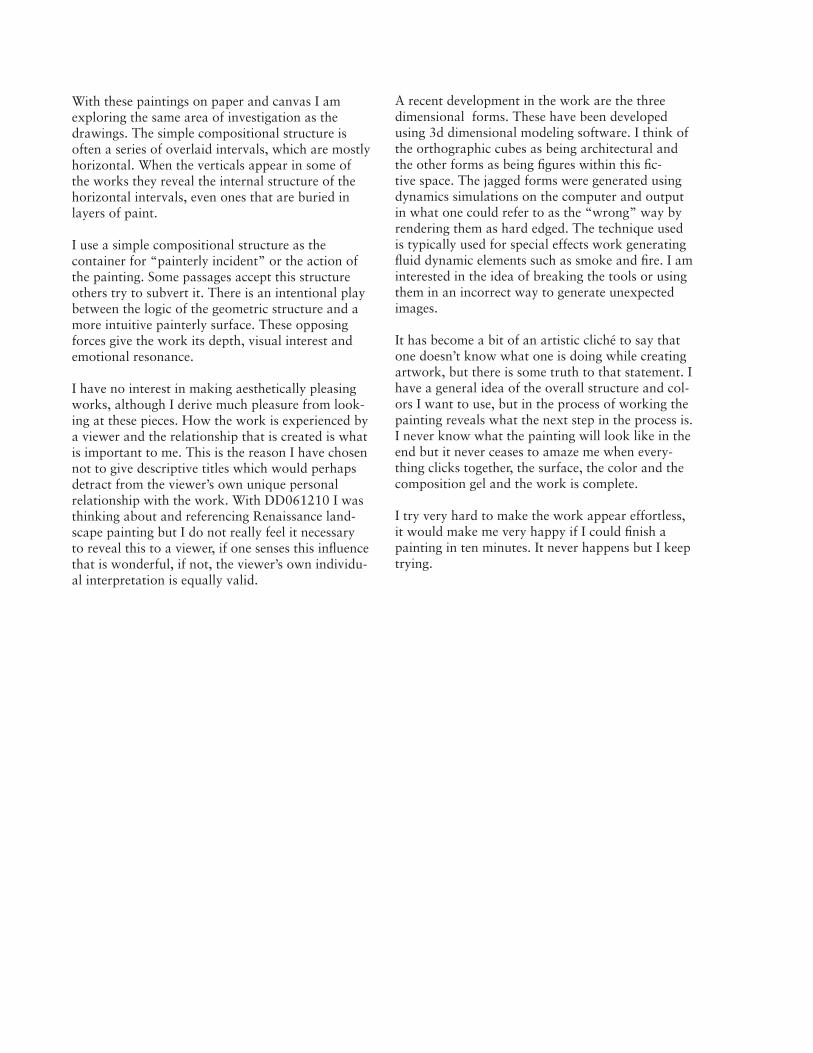
With these paintings on paper and canvas I am exploring the same area of investigation as the drawings. The simple compositional structure is often a series of overlaid intervals, which are mostly horizontal. When the verticals appear in some of the works they reveal the internal structure of the horizontal intervals, even ones that are buried in layers of paint.
I use a simple compositional structure as the container for “painterly incident” or the action of the painting. Some passages accept this structure others try to subvert it. There is an intentional play between the logic of the geometric structure and a more intuitive painterly surface. These opposing forces give the work its depth, visual interest and emotional resonance.
I have no interest in making aesthetically pleasing works, although I derive much pleasure from look-ing at these pieces. How the work is experienced by a viewer and the relationship that is created is what is important to me. This is the reason I have chosen not to give descriptive titles which would perhaps detract from the viewer’s own unique personal relationship with the work. With DD061210 I was thinking about and referencing Renaissance land-scape painting but I do not really feel it necessary to reveal this to a viewer, if one senses this influence that is wonderful, if not, the viewer’s own individu-al interpretation is equally valid.
A recent development in the work are the three dimensional forms. These have been developed using 3d dimensional modeling software. I think of the orthographic cubes as being architectural and the other forms as being figures within this fic-tive space. The jagged forms were generated using dynamics simulations on the computer and output in what one could refer to as the “wrong” way by rendering them as hard edged. The technique used is typically used for special effects work generating fluid dynamic elements such as smoke and fire. I am interested in the idea of breaking the tools or using them in an incorrect way to generate unexpected images.
It has become a bit of an artistic cliché to say that one doesn’t know what one is doing while creating artwork, but there is some truth to that statement. I have a general idea of the overall structure and col-ors I want to use, but in the process of working the painting reveals what the next step in the process is. I never know what the painting will look like in the end but it never ceases to amaze me when every-thing clicks together, the surface, the color and the composition gel and the work is complete.
I try very hard to make the work appear effortless, it would make me very happy if I could finish a painting in ten minutes. It never happens but I keep trying.

DD010813 / Ink on Paper / 18 x 7 1/2 Inches / 2013

DD011113 / Ink on Paper / 17 6/8 x 7 5/8 Inches / 2013

DD100712 / Ink on Paper / 30 x 22 Inches / 2012

DD010312 / Ink on Paper / 30 x 22 Inches / 2012
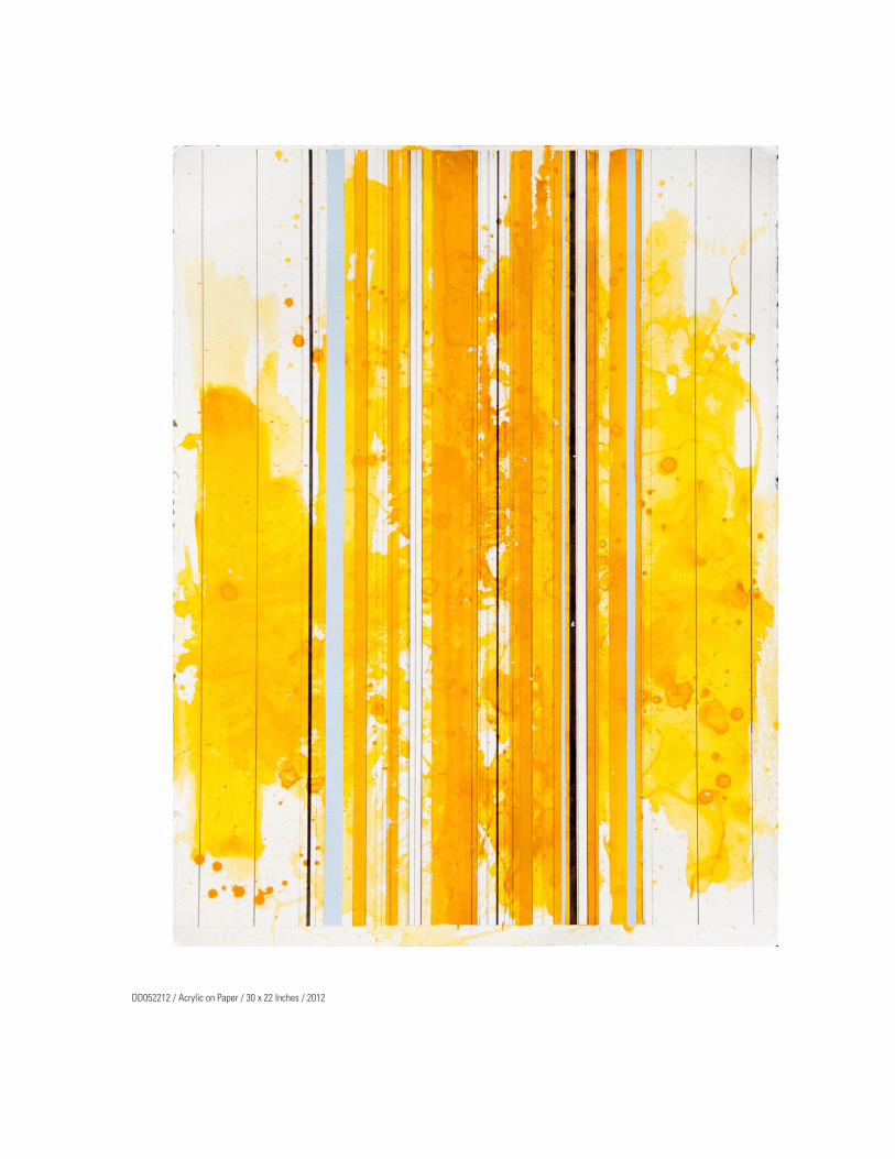
DD052212 / Acrylic on Paper / 30 x 22 Inches / 2012
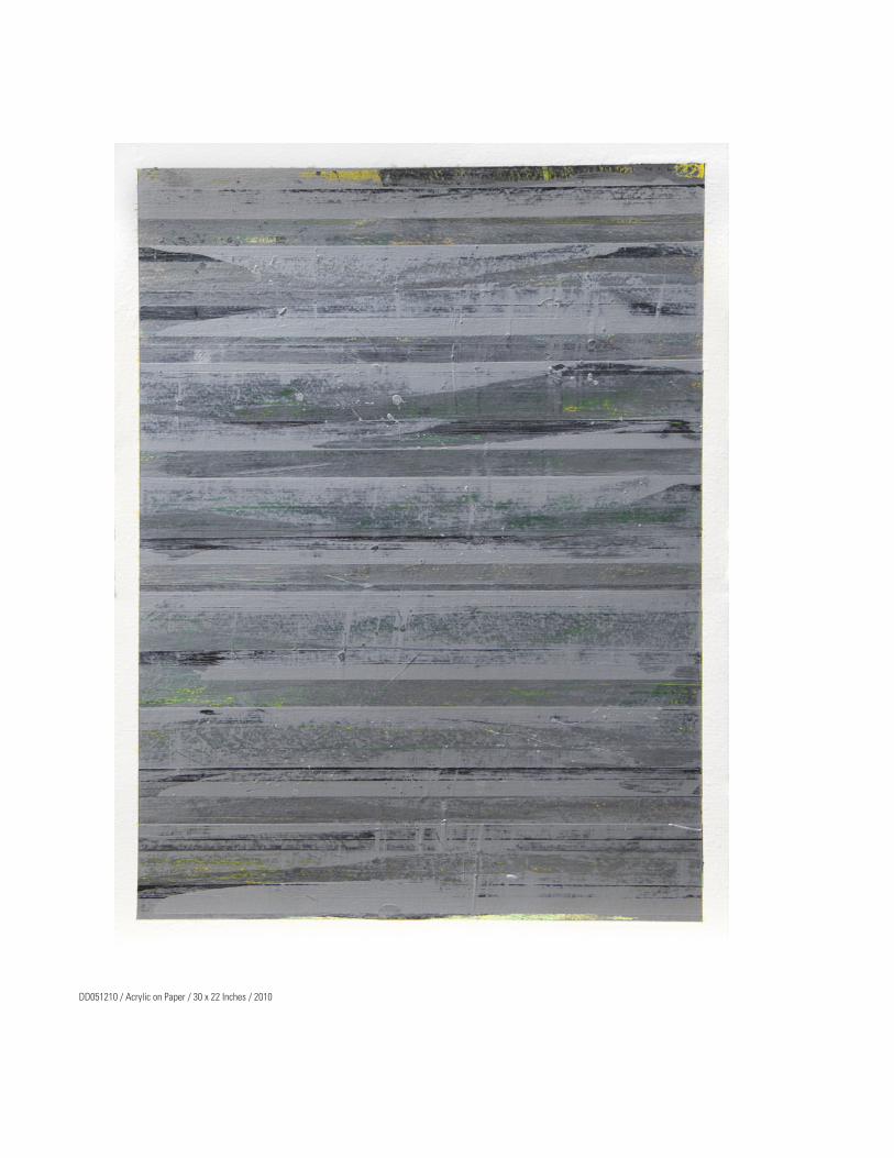
DD051210 / Acrylic on Paper / 30 x 22 Inches / 2010

DD052410 / Acrylic on Paper / 30 x 22 Inches / 2010

DD051810 / Acrylic on Paper / 30 x 22 Inches / 2010
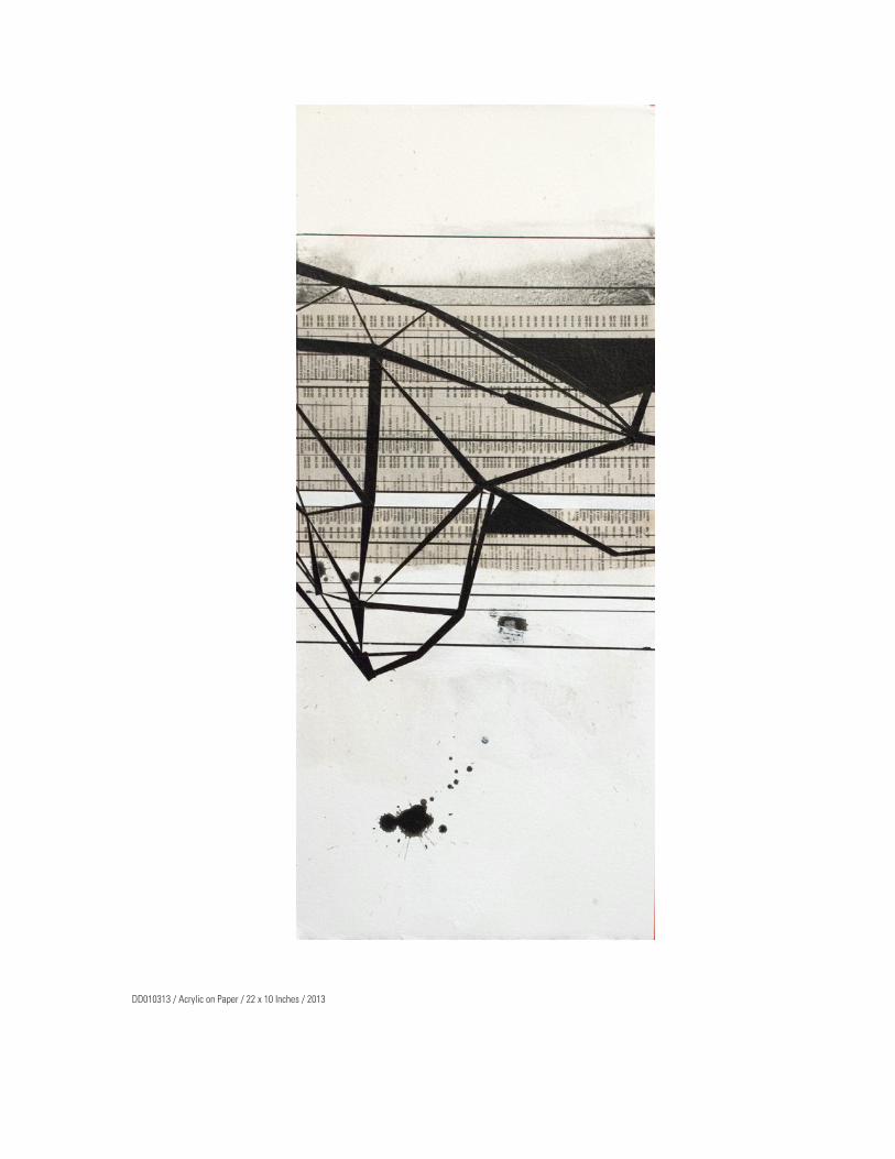
DD010313 / Acrylic on Paper / 22 x 10 Inches / 2013
PAINTINGSACRYLIC / CANVAS

DD020913 / Acrylic on Canvas / 18 x 24 Inches / 2013
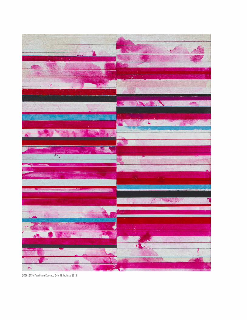
DD061613 / Acrylic on Canvas / 24 x 18 Inches / 2013

DD011213 / Acrylic on Canvas / 9 1/4 x 48 Inches / 2013

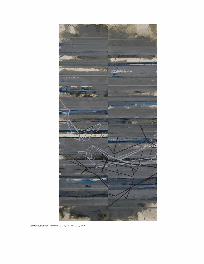
DD092713_SeaLungs / Acrylic on Canvas / 24 x 48 Inches / 2013
DIGITAL MEDIAANIMATION

24 Short Pieces
24 Short Pieces is a series of motion clips inspired by a suite of drawings of the same name executed by the artist Cy Twombly. Twombly’s drawings consisted of a few pencil scrawls and brush strokes and deceptively look as though they had been cre-ated in a matter of a few seconds which imbues them with a directness, immediacy and a nontradi-tional beauty and elegance. Each of the pieces that comprise my set were created digitally using off the shelf software and took as much as several days for each one to execute. Although my work is far re-moved stylistically from Twombly it was my goal to capture the immediacy and fluidity of his drawings.
I consider these pieces to be more in the realm of drawings than the obvious interpretation of video or animation. When creating these works I was thinking in terms of mark making, layering and era-sures, trying to build up a rich, tactile surface even though the work is purely digital. Although they can evoke some sort of subject matter for the view-er they were not intended to be narrative pieces. It was also important to not include audio thereby di-vorcing any associations from music videos, dance club graphics and the like. I want the experience to be more in line with visiting a museum and having an intimate visual relationship with the work.
My abstract painting practice informs how I ap-proach creating digital work such as this. Although 24 Short Pieces are computer generated, I view
myself more as a painter than an animator. I think that the area where different disciplines collide is a particularly fertile ground for creative endeavors and painting or drawing are the perfect mediums with which to work in this space. One only needs to look at the work of artists such as Blinky Palermo, Jessica Stockholder, Katharina Grosse, or an artist more engaged in the digital, such as the late Jeremy Blake, to clearly see that paint on canvas is not the only way to make a painting and pencil or charcoal on paper is not the only way to make a drawing.
There are numerous ways in which these works can be seen. I have a version on DVD that presents each of the drawings two times in random order. Between each drawing is a black frame that has a random duration between zero and six seconds. The entire edit runs for approximately four min-utes. The nature of a presentation like this theoreti-cally could continue for infinity much like Bran-cusi’s Endless Column. Another option is that the drawings could be projected on a wall or viewed simultaneously on several different screens.
To see the animated gif versions of these pieces navigate to:
http://24shortpieces.blogspot.com
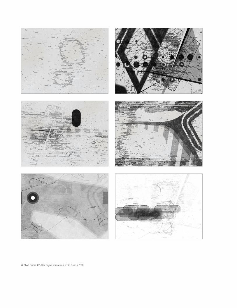
24 Short Pieces #01-06 / Digital animation / NTSC 3 sec. / 2008
Motion Paintings
This series of animations further investigates the concerns that I was dealing with in the project 24 Short Pieces. The idea behind this series is to take a very simple compositional idea, the principle of a central axis, for example, as the primary structural concept. I think of these simple compositional ideas as being the container for “painterly incident” or gestural activity, this is my attempt to humanize the geometry.
These pieces are in color, as opposed to 24 Short Pieces, and are seamless loops. As with 24SP there is no sound. Although I appreciate experimental animation that incorporates sound it never quite seems appropriate for my work. I like disturbing the expectation of sound because we are so used to seeing sound and image together that it becomes a given. I feel the visual impact becomes stronger in my work when sound is not present.
These works have been created at HD resolution. With 24 Short Pieces I wanted all of the work to
be seen together but I feel each of these pieces can stand alone yet exist within a larger series.
Another main difference of these pieces as com-pared to 24 Short Pieces or the motion sketches is that they are meant to be seen in their high resolution state on a HD monitor or television or projected large scale on a wall. The size does not matter yet the format does so I will not distribute these online as animated gifs as I have several other projects.
As with the three-dimension forms that have re-cently appeared in my drawing and paintings, their appearance in these pieces derived from elements generated in a computer animation program using a fluid dynamics engine that was designed and geared towards special effects work for film and television. I purposely use the tools incorrectly to create new and unexpected forms for use in my work.
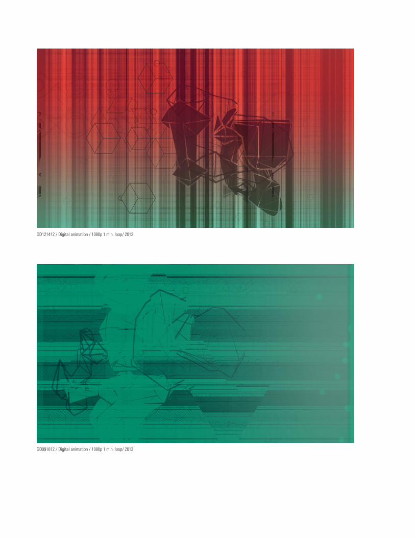
DD091812 / Digital animation / 1080p 1 min. loop/ 2012
DD121412 / Digital animation / 1080p 1 min. loop/ 2012
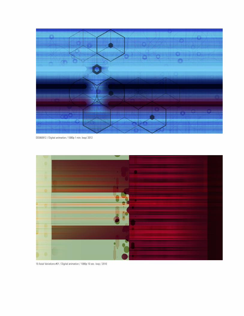
10 Axial Variations #01 / Digital animation / 1080p 10 sec. loop / 2010
DD060912 / Digital animation / 1080p 1 min. loop/ 2012


DIGITAL MEDIAPHOTO PRINTS

Digital Photo Prints
Some of these digitally created images were printed out at a relatively large scale, some as large as 40 x 32 inches, as Lambda photo prints. Various tech-niques were employed that I have also used in my drawings and paintings such as chance operations or using scanned paint splatters.
One technique that I have used in some of these pieces that is unique is that I would create a jpeg document in photoshop that was a simple solid color or gradient and once I saved it to the hard drive I would change the file extension from .jpg to .txt. This would enable me to open the document in a word processing application and I could alter the code of the image file to create unexpected noise ar-tifacts. I would simple do a “find and replace” func-tion in the word processor, changing all instances of the letter “a” to “b” for example. I would then change the extension back to .jpg and open the file as an image once again. The resulting digital noise was then used as a layer in the image. This is yet another case where I have integrated my interest in chance operations and glitch artifacts.

DD121412 / Ink Jet Print / 4 x 7 inches / 2012

DD022113 / Lamda Photo Print / 40.97 x 32.1 Inches / 2013

DD021613 / Lamda Photo Print / 25.1 x 44.8 Inches / 2013