Data visualization with R
41
Biswajeet Data Visualization Using ‘R ‘
-
Upload
biswajeet-dasmajumdar -
Category
Data & Analytics
-
view
44 -
download
5
Transcript of Data visualization with R
Biswajeet
Data VisualizationUsing
‘R ‘

Introduction
A picture is worth a thousand words –
especially when you are trying
to understand and gain insights from data.
Data visualization is the presentation and representation of data
that exploits our visual perception abilities in order to amplify cognition

Why is data visualization important?
The human brain processes information, using charts or graphs to
visualize large amounts of complex data is easier than poring over
spreadsheets or reports.

What’s Missing ?
The skills required for most effectively displaying information are not intuitive and rely largely on principles that must be learned
Stephen Few- ‘Show me the Numbers’
Doing data visualisation well is less a technology problem ,
more a people problem
Paraphrasing Aron Pilhofer, New York Times
Purpose of Data Visualization
To find relationships among hundreds, or even thousands, of
variables to determine their relative importance
To simplify data values, promote the understanding of them, and communicate important concepts and ideas
It enables decision makers to see analytics presented visually, so they can grasp difficult concepts or identify new patterns.
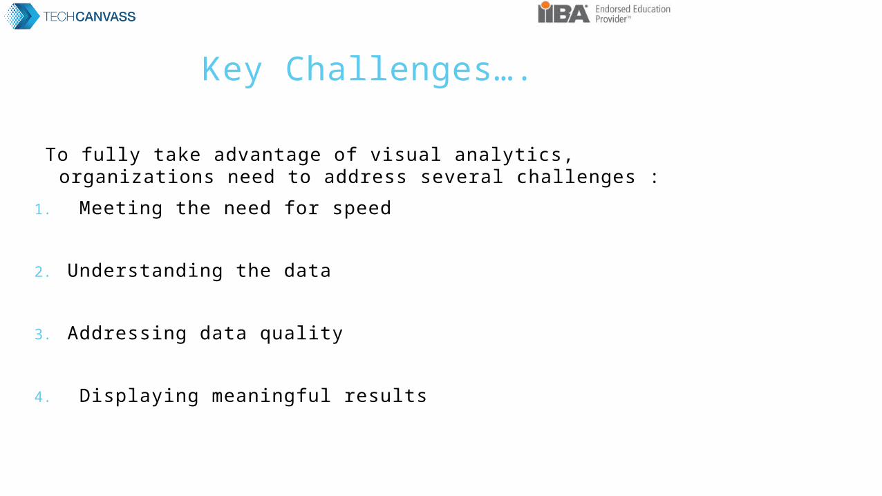
Key Challenges….
To fully take advantage of visual analytics, organizations need to address several challenges :
1. Meeting the need for speed
2. Understanding the data
3. Addressing data quality
4. Displaying meaningful results

Data Visualization - Variety

Basic Concepts to generate best Visual Analytics
Understand the data we are trying to visualize, including its size and cardinality
Determine what we are trying to visualize and what kind of information we want to communicate
Know your audience and understand how it processes visual information
Use a visual that conveys the information in the best and simplest form for your audience
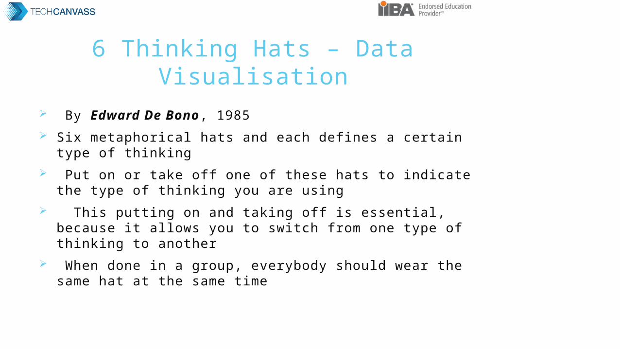
6 Thinking Hats – Data Visualisation
By Edward De Bono, 1985 Six metaphorical hats and each defines a certain type of thinking Put on or take off one of these hats to indicate the type of
thinking you are using This putting on and taking off is essential, because it allows
you to switch from one type of thinking to another When done in a group, everybody should wear the same hat at
the same time

Principle – 6 Thinking Hats
Parallel thinking which ensures that all the people in a meeting are focused on and thinking about the same subject at the same time.
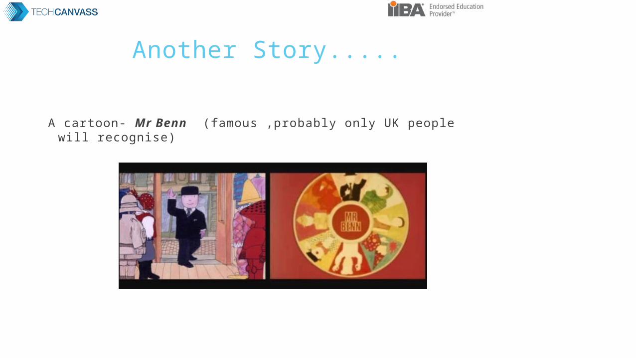
Another Story.....
A cartoon- Mr Benn (famous ,probably only UK people will recognise)
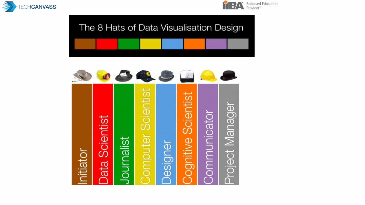
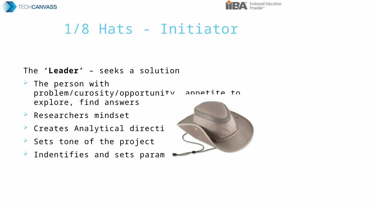
1/8 Hats - Initiator
The ‘Leader’ – seeks a solution The person with problem/curosity/opportunity ,appetite to
explore, find answers Researchers mindset Creates Analytical direction Sets tone of the project Indentifies and sets parameters
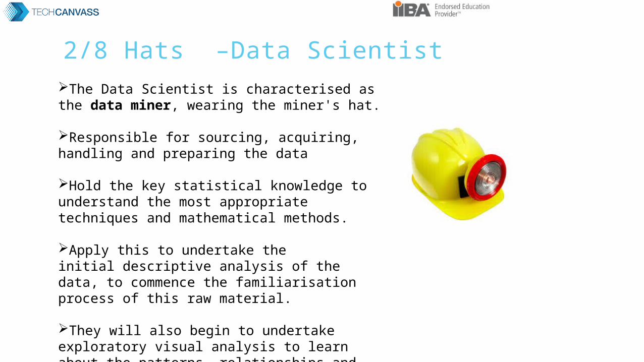
2/8 Hats –Data ScientistThe Data Scientist is characterised as the data miner, wearing the miner's hat.
Responsible for sourcing, acquiring, handling and preparing the data
Hold the key statistical knowledge to understand the most appropriate techniques and mathematical methods.
Apply this to undertake the initial descriptive analysis of the data, to commence the familiarisation process of this raw material.
They will also begin to undertake exploratory visual analysis to learn about the patterns, relationships and physical properties of the data.
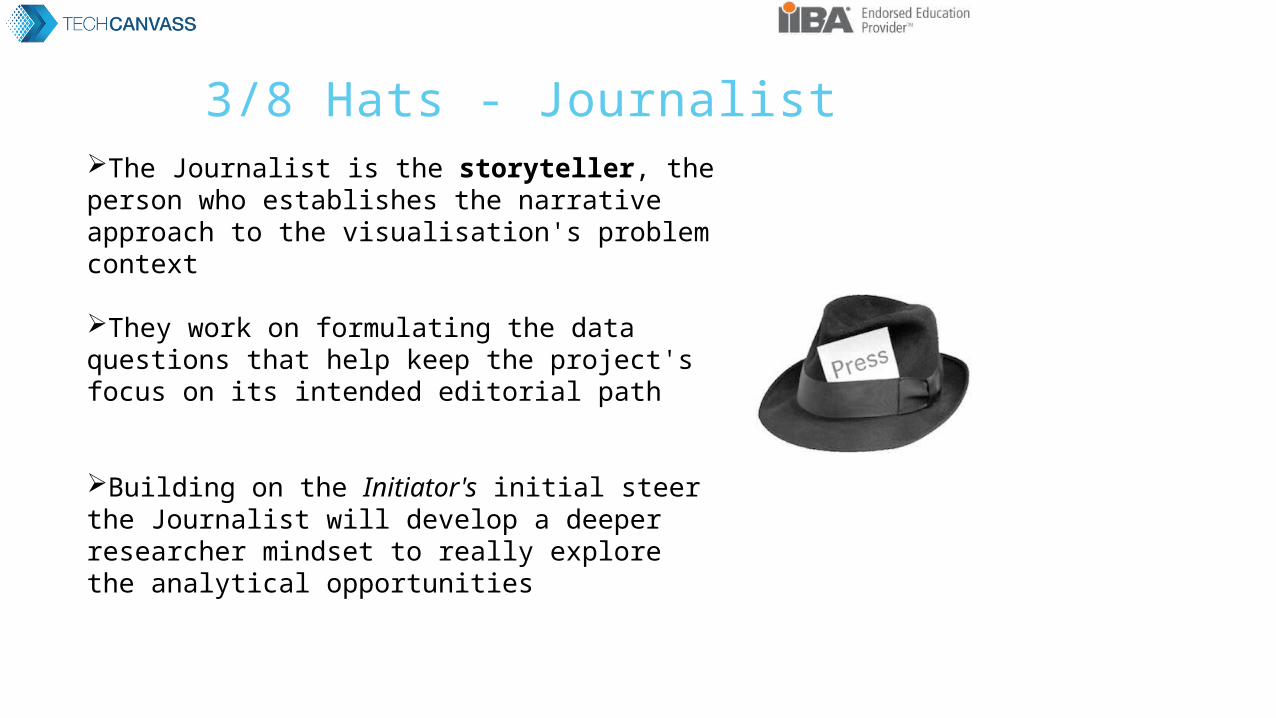
3/8 Hats - JournalistThe Journalist is the storyteller, the person who establishes the narrative approach to the visualisation's problem context
They work on formulating the data questions that help keep the project's focus on its intended editorial path
Building on the Initiator's initial steer the Journalist will develop a deeper researcher mindset to really explore the analytical opportunities
4/8 Hats –Computer Scientist
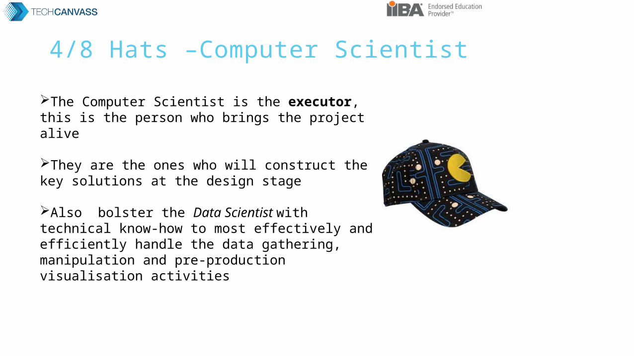
The Computer Scientist is the executor, this is the person who brings the project alive
They are the ones who will construct the key solutions at the design stage
Also bolster the Data Scientist with technical know-how to most effectively and efficiently handle the data gathering, manipulation and pre-production visualisation activities
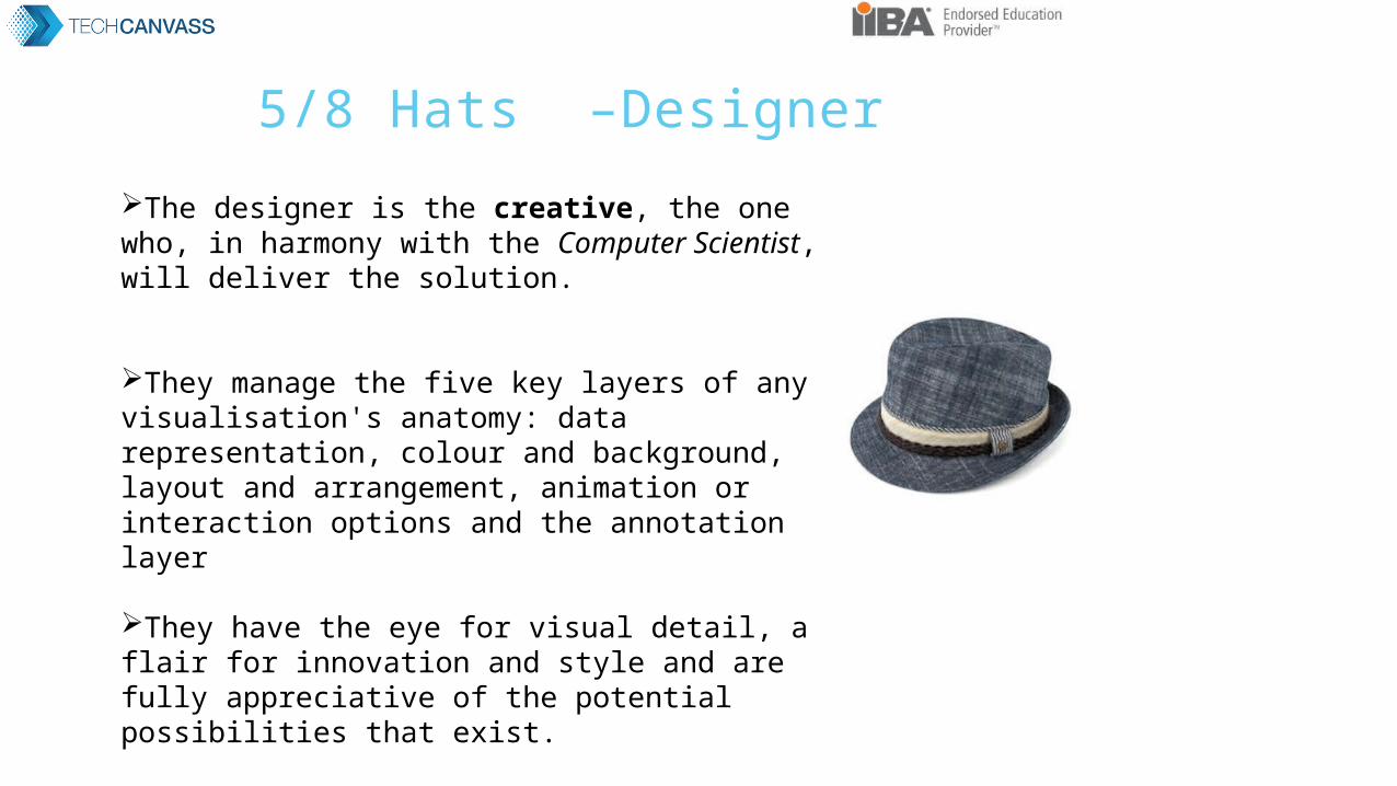
5/8 Hats –Designer
The designer is the creative, the one who, in harmony with the Computer Scientist, will deliver the solution.
They manage the five key layers of any visualisation's anatomy: data representation, colour and background, layout and arrangement, animation or interaction options and the annotation layer
They have the eye for visual detail, a flair for innovation and style and are fully appreciative of the potential possibilities that exist.
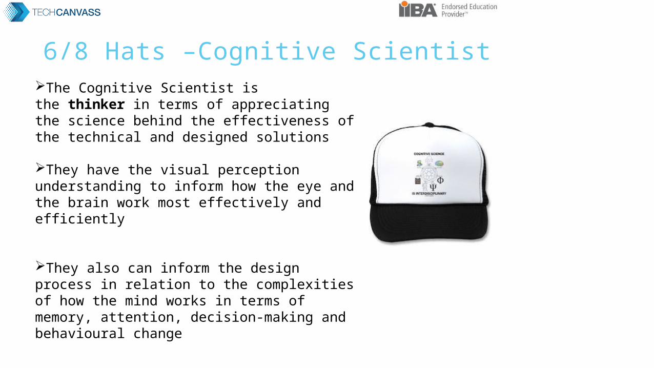
6/8 Hats –Cognitive ScientistThe Cognitive Scientist is the thinker in terms of appreciating the science behind the effectiveness of the technical and designed solutions
They have the visual perception understanding to inform how the eye and the brain work most effectively and efficiently
They also can inform the design process in relation to the complexities of how the mind works in terms of memory, attention, decision-making and behavioural change

7/8 Hats –NegotiatorThe Communicator is the negotiator
They act as the client-customer-designer gateway informing all parties of the respective needs, feedback loops and progress updates
They need to be able to articulate and explain matters to different types of people, technical and non-technical, and be capable of managing expectations and relationships
Ultimately launch, publicise and showcase the final work

8/8 Hats –Project Manager
Manager does much to pick up many of the unpopular duties to bring the whole project together
They manage the process and look after the project's progress, ensuring it is cohesive, on time and on message

Summary - Data Visualisation Design View of how the relevance of these mindsets and duties surfaces at
different points of a typical visualisation design process.

How to Install R Studio
RStudio is an integrated development environment (IDE) for R. It includes a console, syntax-highlighting editor that supports direct code execution, as well as tools for plotting, history, debugging and workspace management.
In order to run R and R-studio on your system, you need to follow the following three steps in the same order.
Install R Install R-Studio Install R-Packages (If needed)

Prerequisites for RStudio
These software packages can be downloaded from http://www.r-project.org/ and http://rstudio.org/ respectively and are available on the Windows, Linux and Mac OS X platforms.
It must be noted that the R-Scripts can run without the installation of the IDE, using R-Console, and students are free to use any other IDE for R if they wish to do so.
Any version of R (2.11.1 or higher)
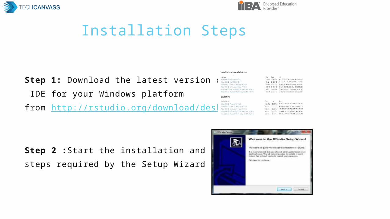
Installation Steps
Step 1: Download the latest version of RStudio
IDE for your Windows platform
from http://rstudio.org/download/desktop
Step 2 :Start the installation and follow the
steps required by the Setup Wizard
Installation RStudio for Linux
For complete R System installation in Linux, follow the instructions on the following link (Link )
For Ubuntu with Apt-get installed, execute
sudo apt-get install r-base in terminal.

Install Package in R Studio
In RStudio
Go to Tools Install Packages Enter the Package name
Or
In RStudio console type
> install. packages(“Package name")

Types of plots in R - Histogram
A histogram consists of parallel vertical bars that graphically shows the frequency distribution of a quantitative variable. The area of each bar is equal to the frequency of items found in each class.
ExampleConsider the R built-in data set faithful, the histogram of
the eruptions variable is a collection of parallel vertical bars showing the number of eruptions classified according to their durations.

ProblemFind the histogram of the eruption durations in faithful.
SolutionWe apply the hist function to produce the histogram of
the eruptions variable.
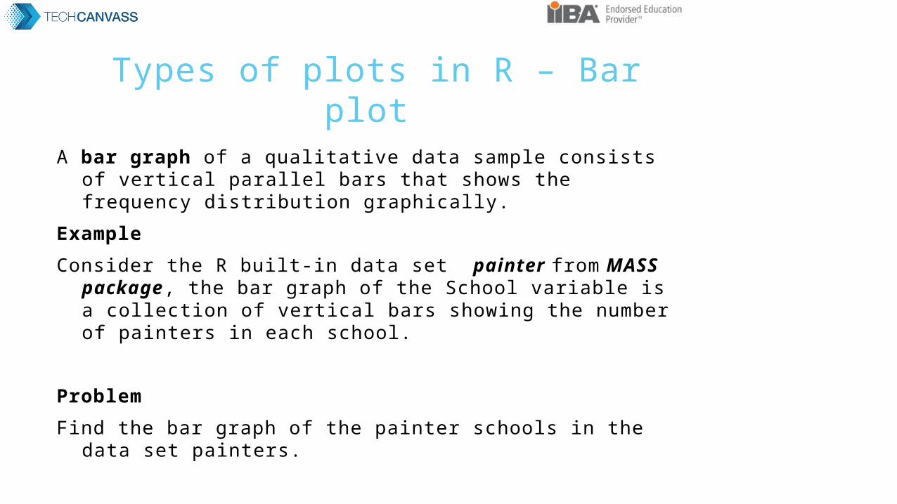
Types of plots in R – Bar plot
A bar graph of a qualitative data sample consists of vertical parallel bars that shows the frequency distribution graphically.
ExampleConsider the R built-in data set painter from MASS package, the
bar graph of the School variable is a collection of vertical bars showing the number of painters in each school.
ProblemFind the bar graph of the painter schools in the data set painters.
Solution
We first apply the table function to compute the frequency distribution of the School variable

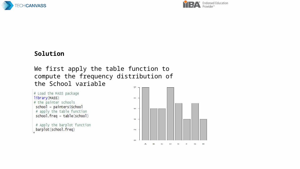
Types of plots in R – Pie Chart
A pie chart of a qualitative data sample consists of pizza wedges that shows the frequency distribution graphically.
ExampleConsider the R built-in data set painters, the pie chart of
the School variable is a collection of pizza wedges showing the proportion of painters in each school.
ProblemFind the pie chart of the painter schools in the data set painters.
Solution. We first apply the table function to produce the frequency
distribution of School.

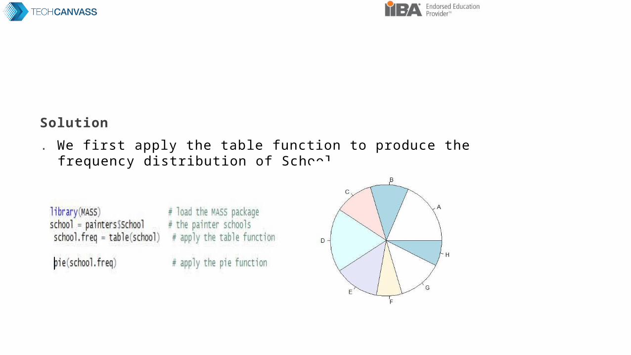
Types of plots in R – Scatter plot
A scatter plot pairs up values of two quantitative variables in a data set and display them as geometric points inside a Cartesian diagram.
ExampleConsider the R built in data set faithful, we pair up
the eruptions and waiting values in the same observation as(x,y) coordinates. Then we plot the points in the Cartesian plane.
ProblemFind the scatter plot of the eruption durations and waiting intervals
in faithful. Does it reveal any relationship between the variables?
Solution We apply the plot function to compute the scatter plot
of eruptions and waiting
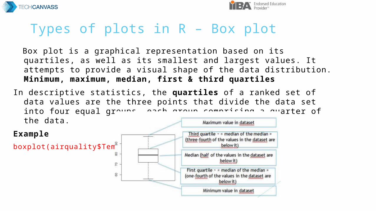
Types of plots in R – Box plot Box plot is a graphical representation based on its quartiles, as well as its
smallest and largest values. It attempts to provide a visual shape of the data distribution. Minimum, maximum, median, first & third quartiles
In descriptive statistics, the quartiles of a ranked set of data values are the three points that divide the data set into four equal groups, each group comprising a quarter of the data.
Exampleboxplot(airquality$Temp)

Types of plots in R – Box plot
Extension from one to many variables for comparison purposes
Outliers
Wider range
Skewed Dist(Not
Symmetric)
Plots for basic descriptive statistics
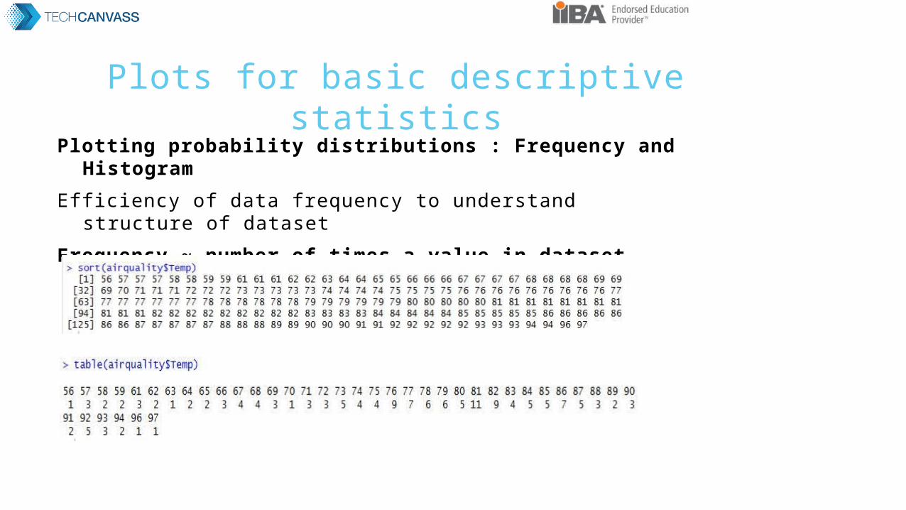
Plotting probability distributions : Frequency and HistogramEfficiency of data frequency to understand structure of dataset
Frequency ~ number of times a value in dataset

Histogram ~ frequency distribution of unique value in dataset
More visual than a table
Value Frequency
56 11/153 = 0.60%
57 31/153 = 1.9%
58 21/153 = 1.30%
59 21/153 = 1.30%
61 31/153 = 1.9%
hist (airquality$Temp)
Plots for basic descriptive statistics
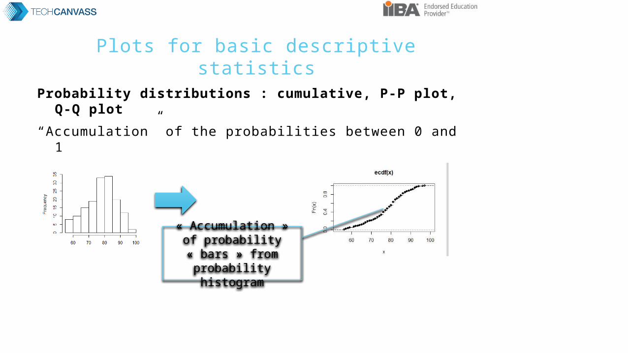
Probability distributions : cumulative, P-P plot, Q-Q plot“Accumulation” of the probabilities between 0 and 1
« Accumulation » of probability « bars »
from probability histogram

Plots for basic descriptive statistics
Q-Q plot to check conformance with theoretical distribution
qqplot(airquality$Temp, rnorm(n = length(airquality$Temp), mean = mean(airquality$Temp) , sd = sd(airquality$Temp)))
abline(0,1)

Plots for basic descriptive statistics
Scatterplot ~ plot one variable against another (one per axis)
plot(airquality$Temp,airquality$Month)
plot(airquality)
Plot all variable against every other variable


![Some Examples in R- [Data Visualization--R graphics]](https://static.fdocuments.us/doc/165x107/5871290c1a28abe4448b6bb3/some-examples-in-r-data-visualization-r-graphics.jpg)