Data-driven journalism, every day
68
Odense, Denmark - January 27-28, 2017 Data-driven journalism, every day Mirko Lorenz, Cofounder and CEO
-
Upload
mirko-lorenz -
Category
Data & Analytics
-
view
150 -
download
0
Transcript of Data-driven journalism, every day

Odense, Denmark - January 27-28, 2017
Data-driven journalism, every day
Mirko Lorenz, Cofounder and CEO

Background Daily #ddj Next level
Three key points:
Note: This is a slightly edited version of a talk given at NODA 2017 in Odense (Jan. 2017). Changes were made to make the presentation easier to understand when the spoken narrative is missing.

Datawrapper - background and development so far
Part 1
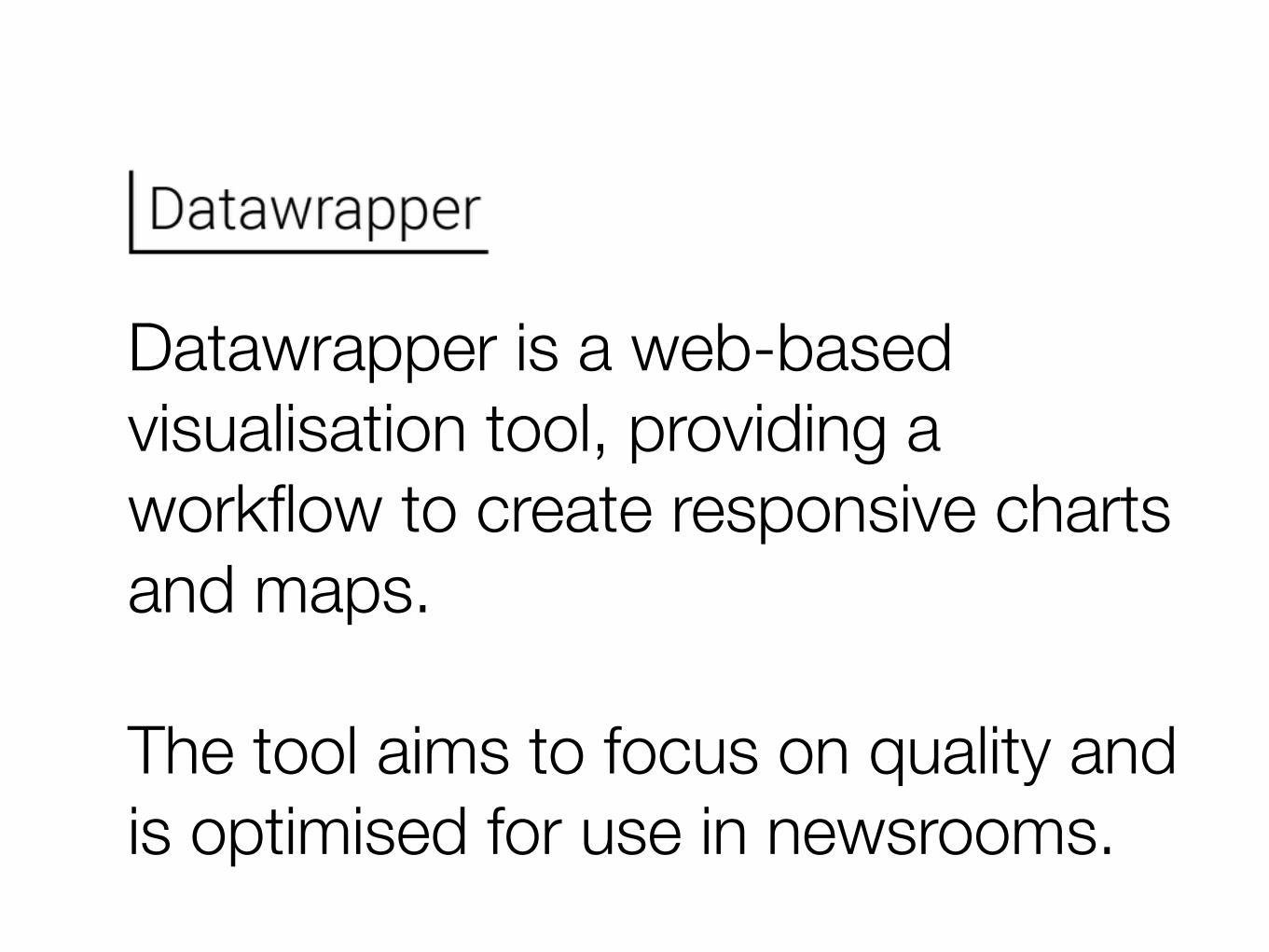
Datawrapper is a web-based visualisation tool, providing a workflow to create responsive charts and maps.
The tool aims to focus on quality and is optimised for use in newsrooms.
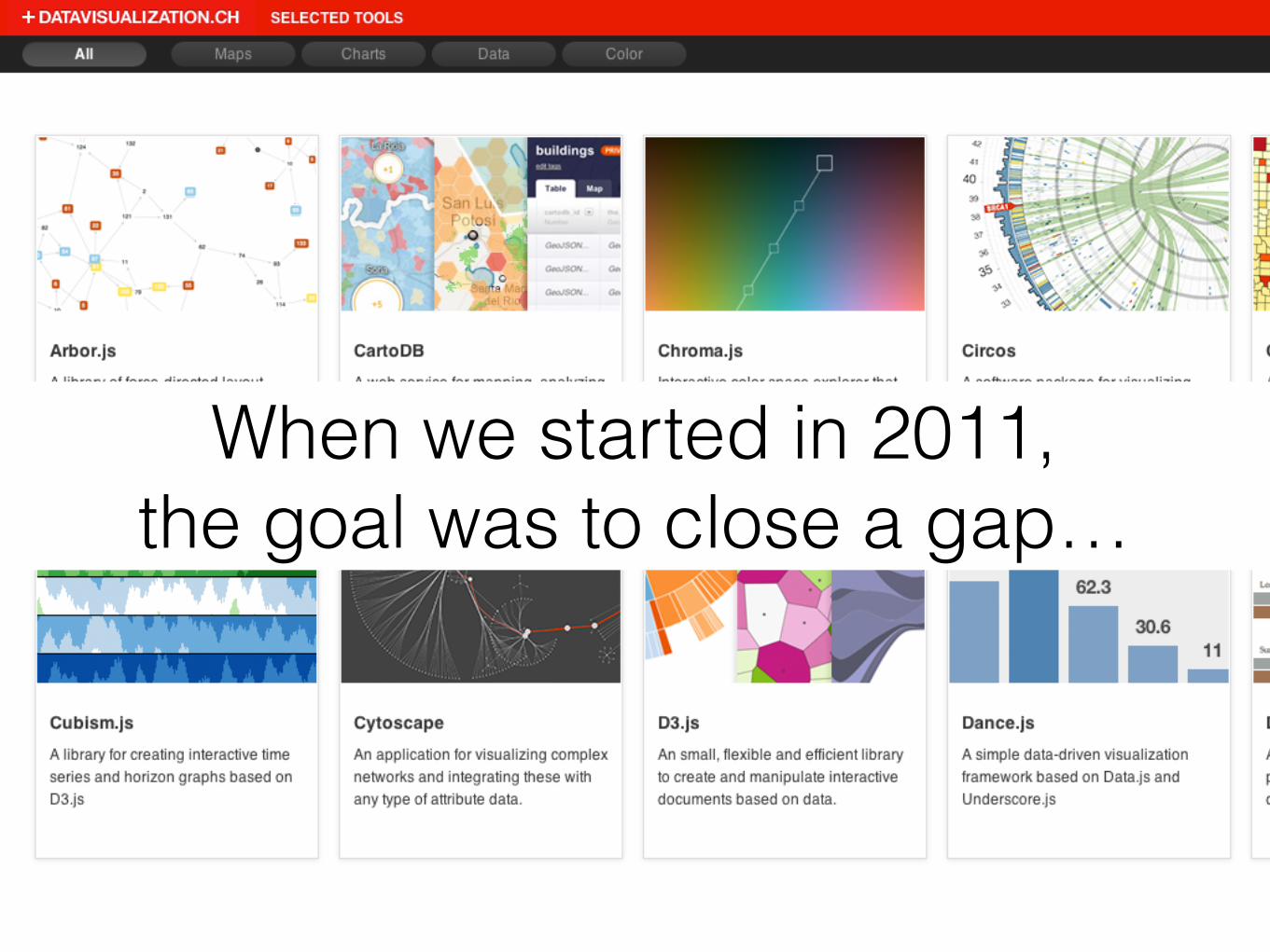
D3.JS and other visualization libraries are great, but hard to use for journalists...When we started in 2011,
the goal was to close a gap…
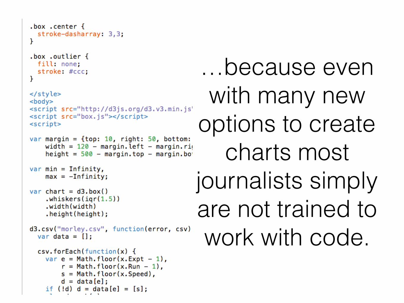
…because even with many new
options to create charts most
journalists simply are not trained to work with code.

In September 2016 Datawrapper
crossed the mark of 1 billion chart views.

No outside investors No debt Popular in newsrooms worldwide
Datawrapper today:
How Datawrapper works, in four main steps.
QuickWalkthrough

User Dashboard: All drafts and charts in one place. Direct access to blog & tutorials.
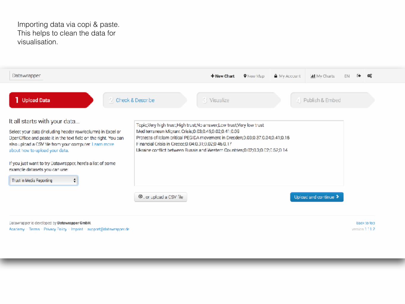
Importing data via copi & paste. This helps to clean the data for visualisation.

Step 2 is to check and transform the data.
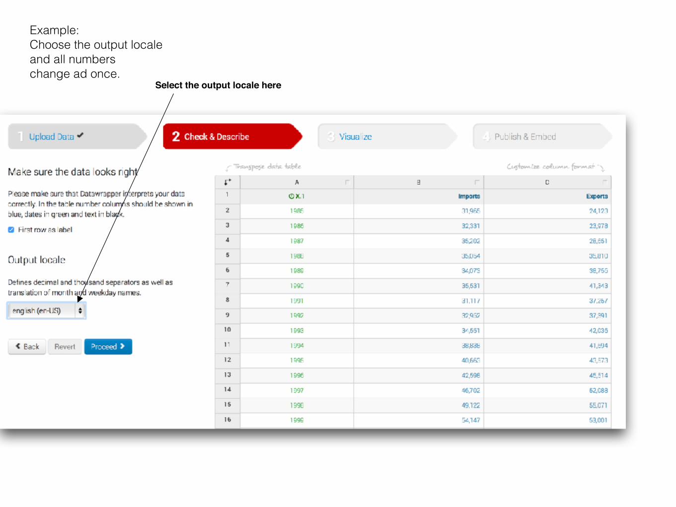
Select the output locale here
Example: Choose the output locale and all numbers change ad once.
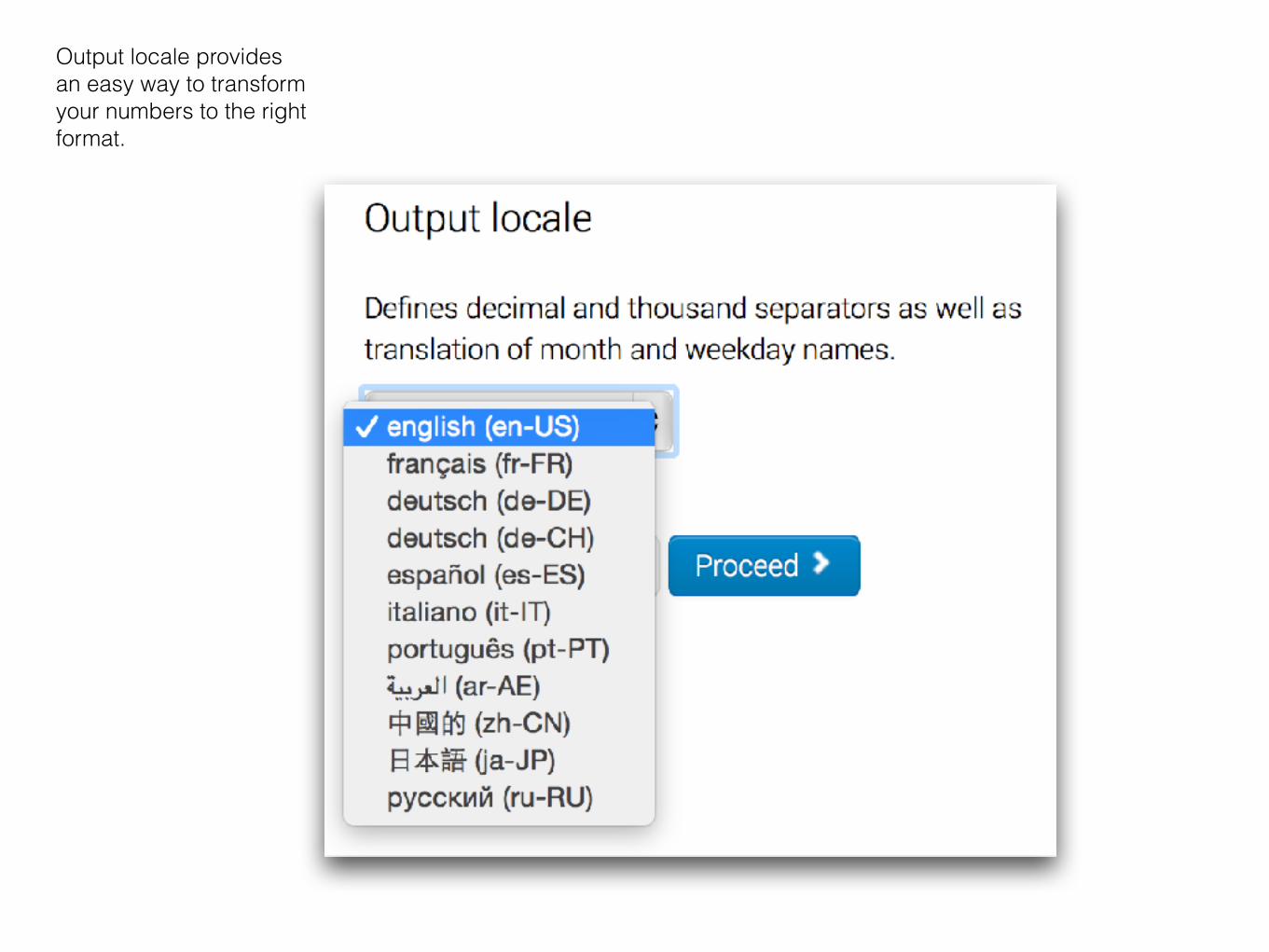
Output locale provides an easy way to transform your numbers to the right format.

Click on the column1Select the options here2
Advanced options: Transform numbers.
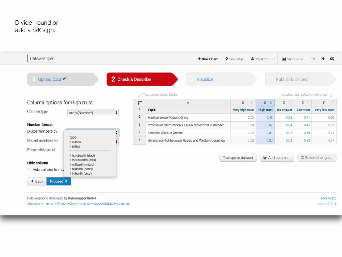
Divide, round or add a $/€ sign.

Select colors.
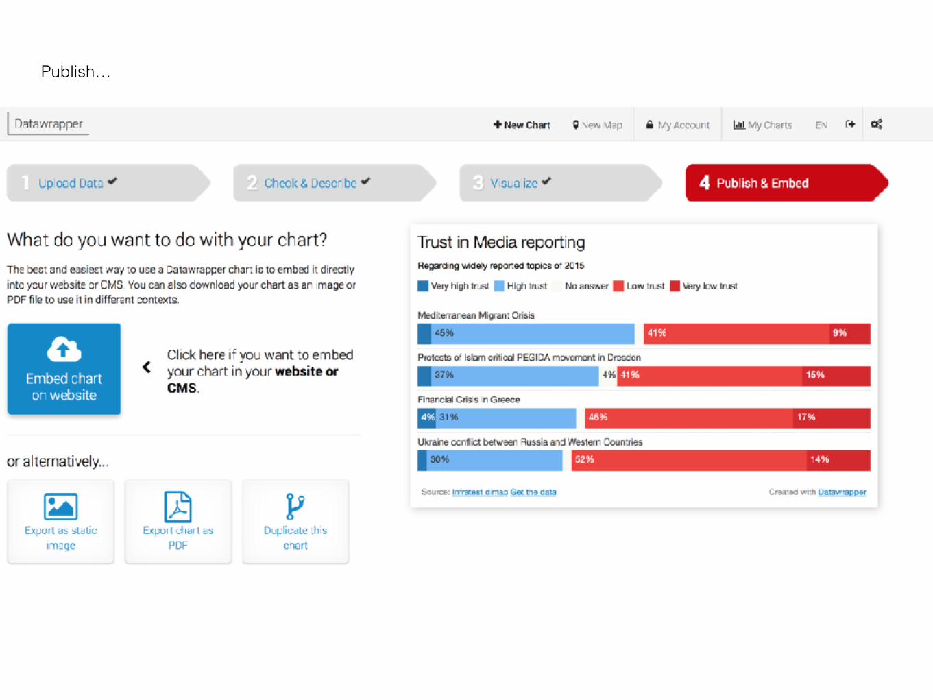
Publish…

Part 2Daily data-driven journalism: Have we even started?
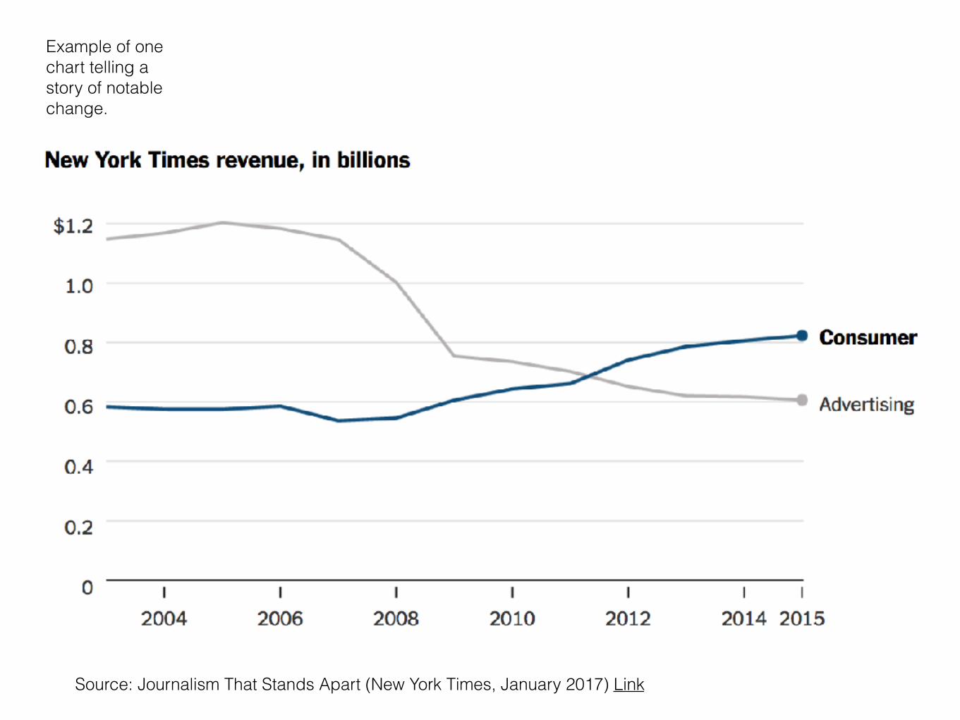
Example of one chart telling a story of notable change.
Source: Journalism That Stands Apart (New York Times, January 2017) Link
Data-driven journalism…

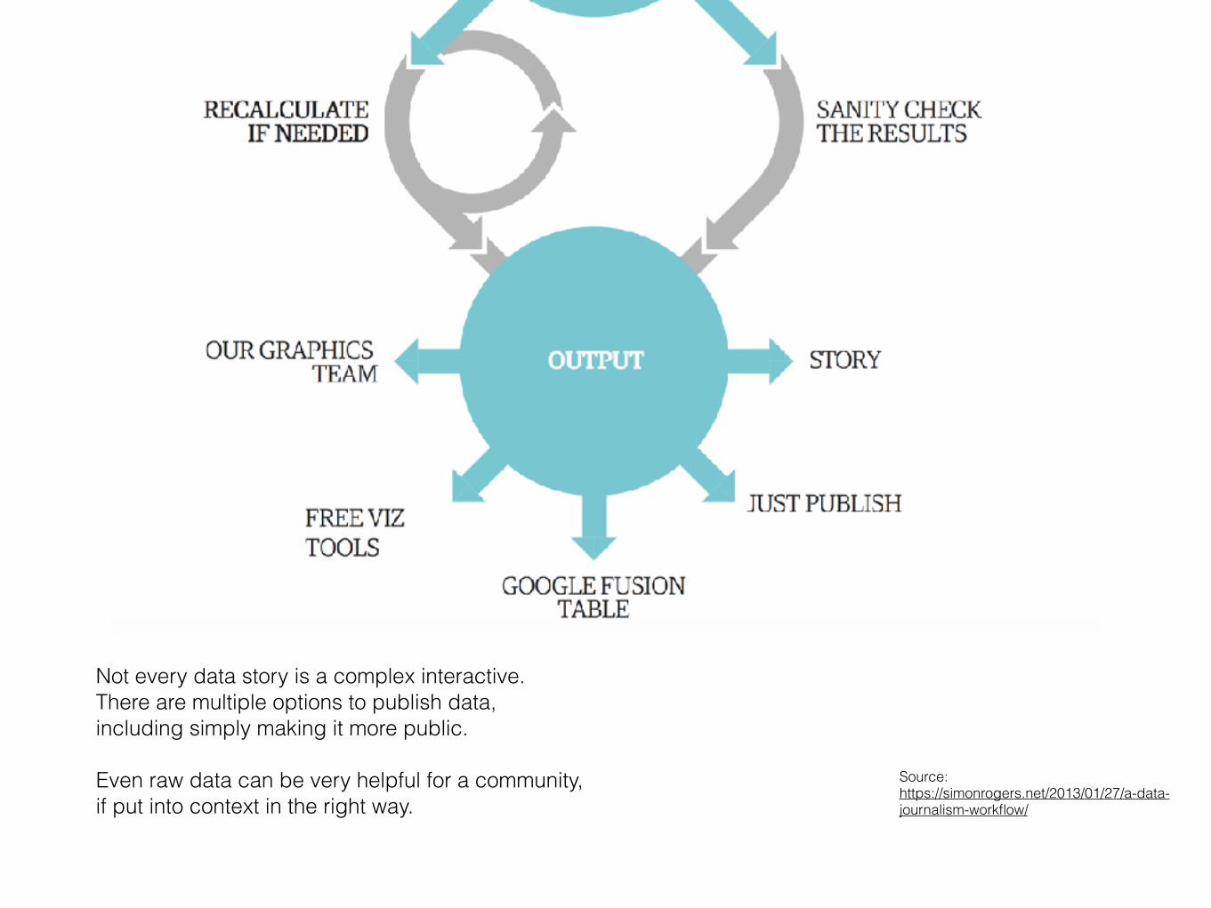
A workflow for daily data search, filtering and publishing in different ways.
This is how Simon Rogers created the widely noted Guardian Data Blog.
Source: https://simonrogers.net/2013/01/27/a-data-journalism-workflow/
Source: https://simonrogers.net/2013/01/27/a-data-journalism-workflow/
Not every data story is a complex interactive. There are multiple options to publish data, including simply making it more public.
Even raw data can be very helpful for a community, if put into context in the right way.

Source: http://atlas.qz.com
Another good example: Atlas by vox.com is demonstrates the value of constant, daily digging for data to enrich the story.
Why is hardly any regional/local medium working in this way?

Great current example how powerful data can be.
If one economist from Oxford University can start something like this, what keeps media companies from doing the same?
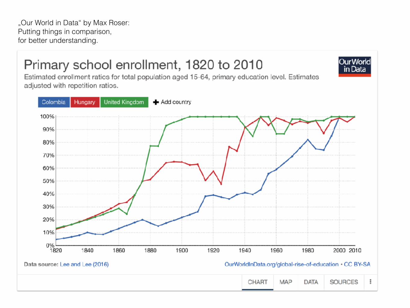
„Our World in Data“ by Max Roser: Putting things in comparison, for better understanding.

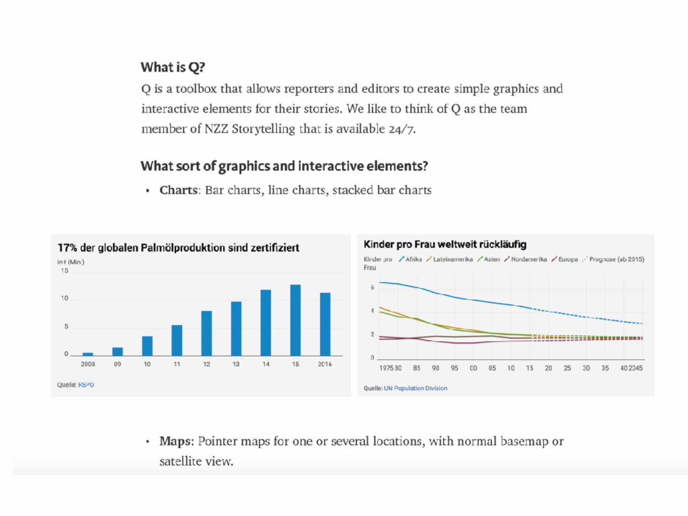
NZZ buildsit’s own toolbox.


The Wirecutter shows how we can and should create value for users.


Building trust is through being trustable. Announce your intention, then stick to it.
The Wirecutter makes money through affiliate links. A bit more background here.

Suggestions towards local, regional data-driven journalism
Why not combine Quartz Atlas, „Our world in Data“ and The Wirecutter - for the benefit of local newsrooms?

We need this, because often statistics remain difficult to understand.

https://www.theguardian.com/politics/2017/jan/19/crisis-of-statistics-big-data-democracy
By ignoring statistics and failing to turn hidden facts into comprehensible stories we do damage to a source of truth…

Track regional numbers. Track numbers better than officials. Transform the numbers. Reduce need to search. Show what is not known. Be there when decisions are made.
Do the math, because no one else does it for many people.
How to do better
Source of article: The Guardian
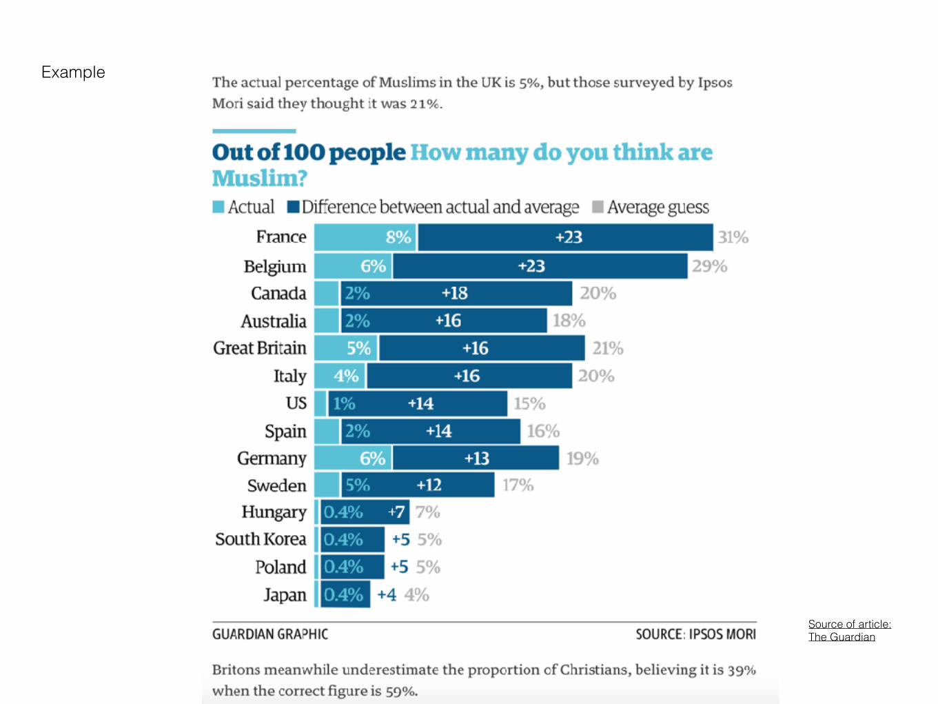
Example
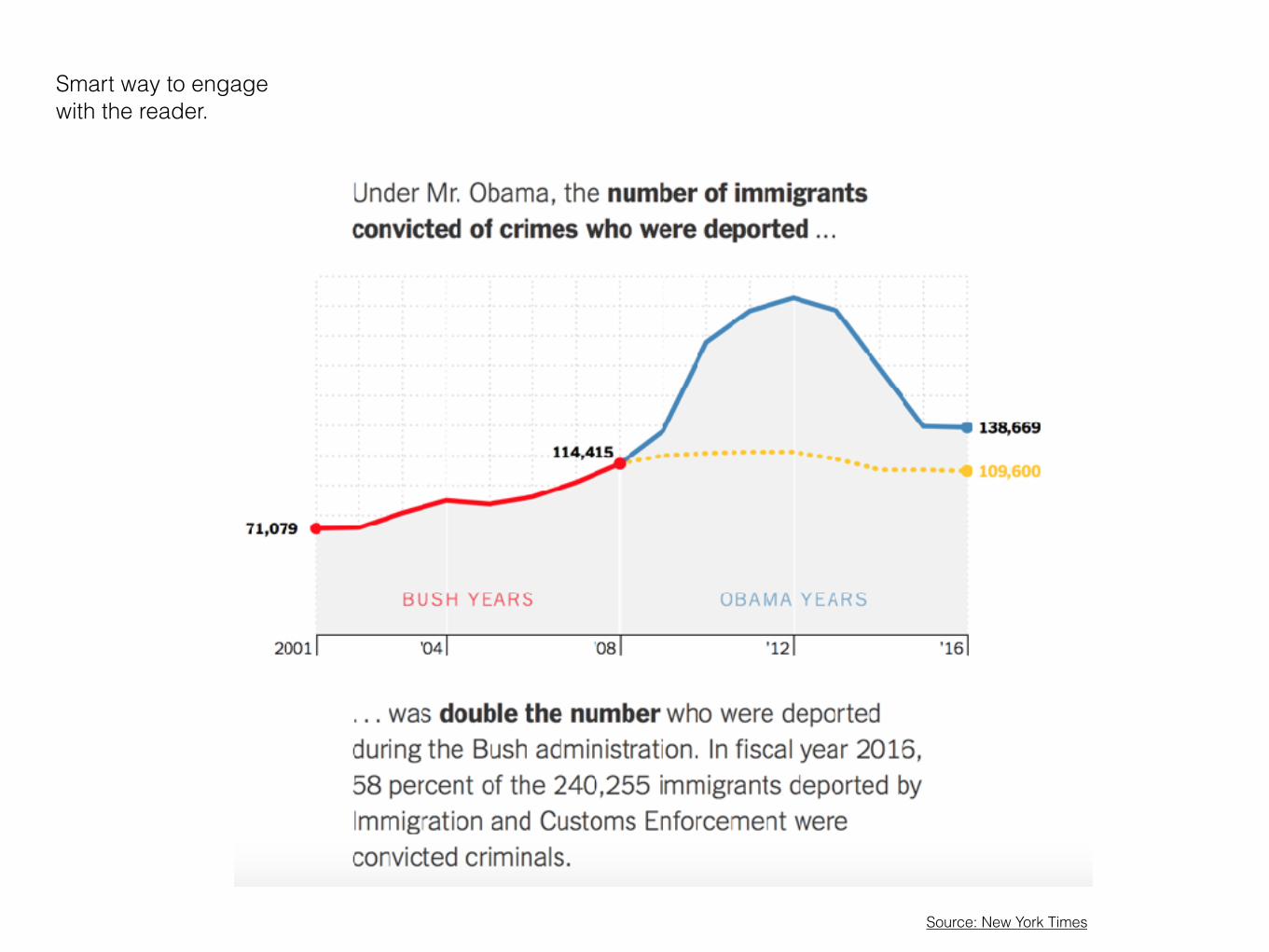
Smart way to engage with the reader.
Source: New York Times

Everyday I write the book Start doing daily data journalism. It is not a question of budget, it’s a quest for depth and quality.

One search technique every journalist can use: Combine Google search with „data“, then look at results under „Images“.

Another way: Be on the lookout when the statistical office (any) publishes new data. ChangeDetection is just one service which can be used for that.

Visualizing data No map, no interactive - but well done, basic charts instead. When working with charts simplicity is often the better choice.


Archie Tse: Why we are doing fewer interactives. Presentation from Malofiej 2016 (PDF)
The New York Times thinks twice before starting a big interactive data project - although they know how to it.
Why is simplicity often better?
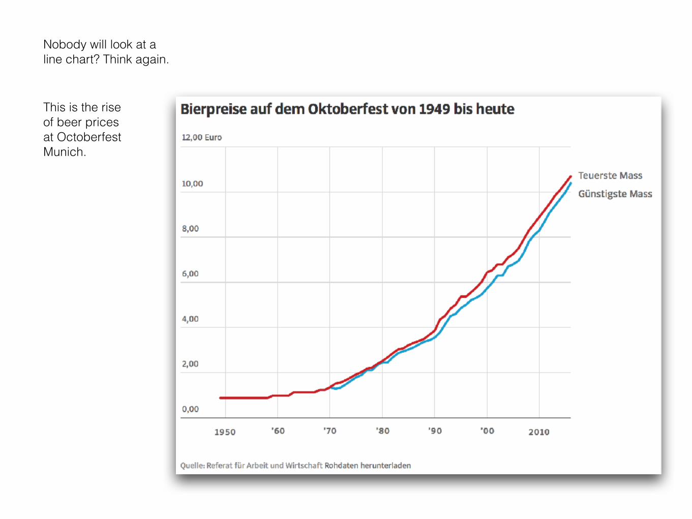
Nobody will look at a line chart? Think again.
This is the riseof beer pricesat Octoberfest Munich.

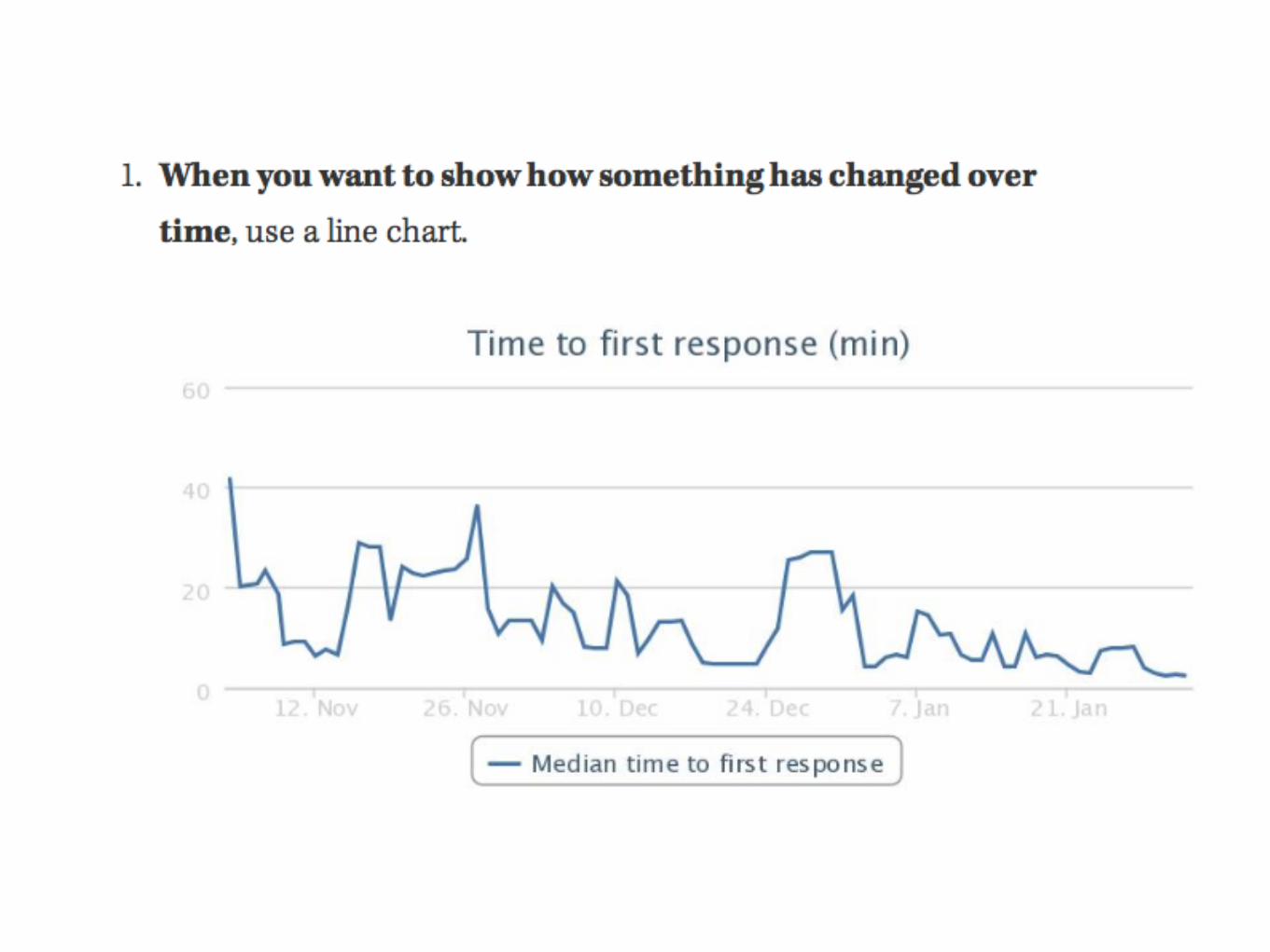
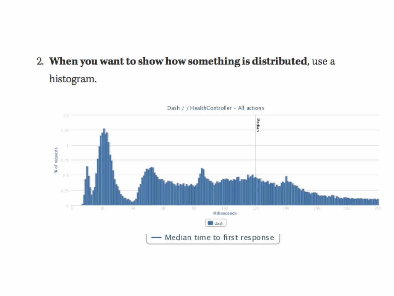
Provide good comparison A key principle, demonstrated in three simple charts
http://www.businessinsider.com/the-future-of-digital-2013-2013-11?op=1

http://www.businessinsider.com/the-future-of-digital-2013-2013-11?op=1


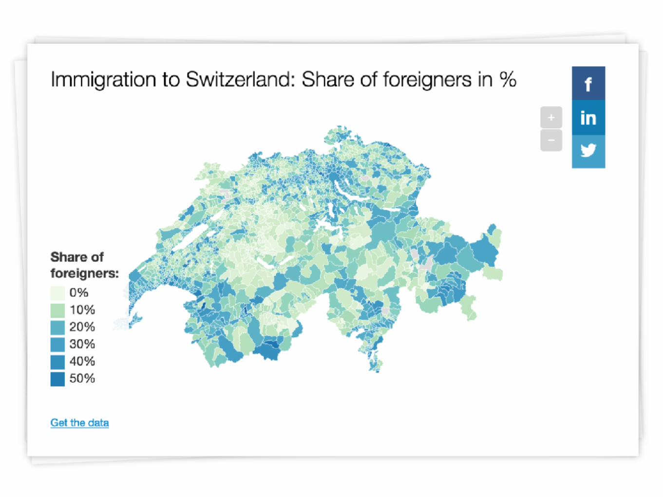
Power of Proximity Talk about data close to home.

http://interaktiv.morgenpost.de/m29/
Great story by Berliner Morgenpost: Following social, political changes along a bus route in Berlin.
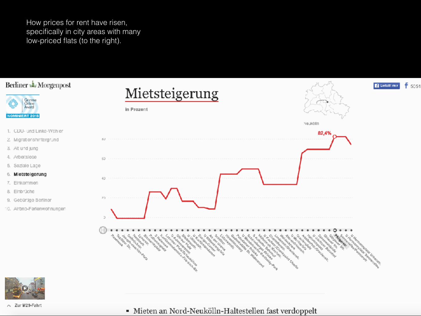
How prices for rent have risen, specifically in city areas with many low-priced flats (to the right).

Simple tools can help to get the story right.
Download PDF

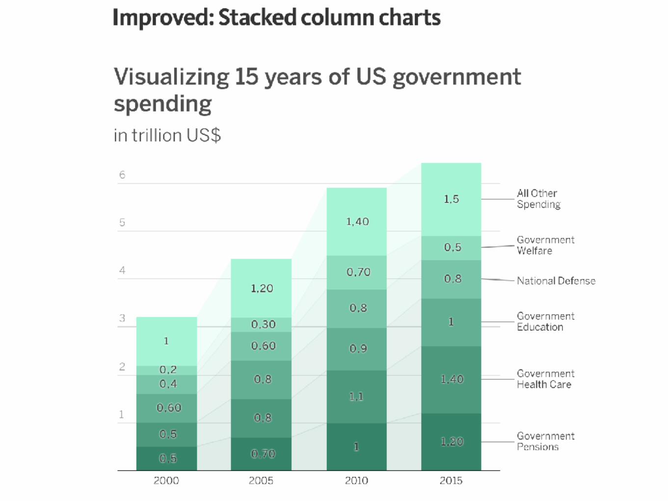
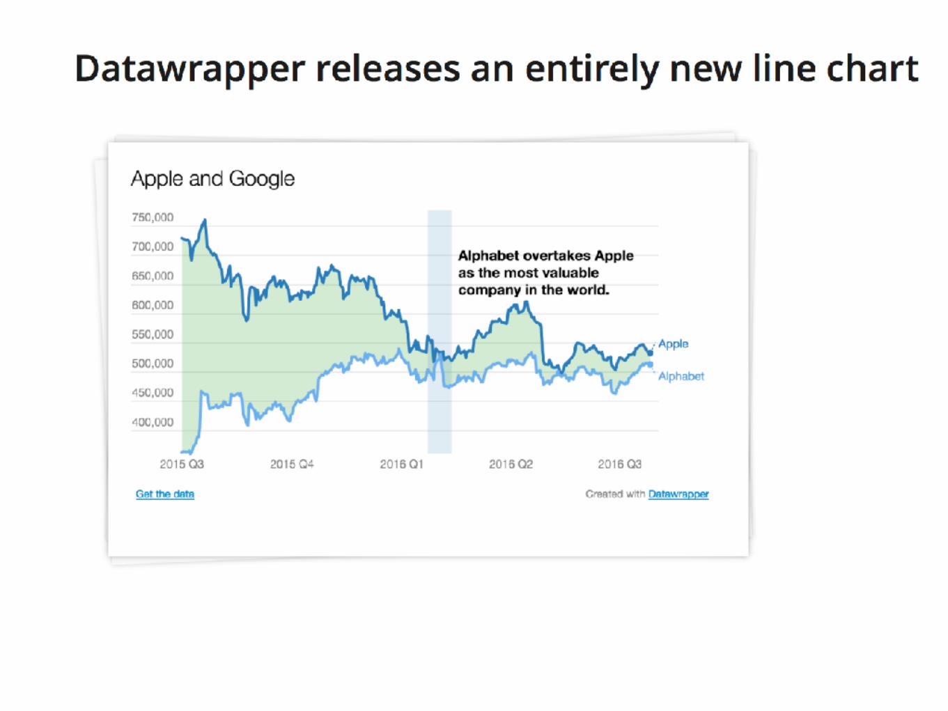
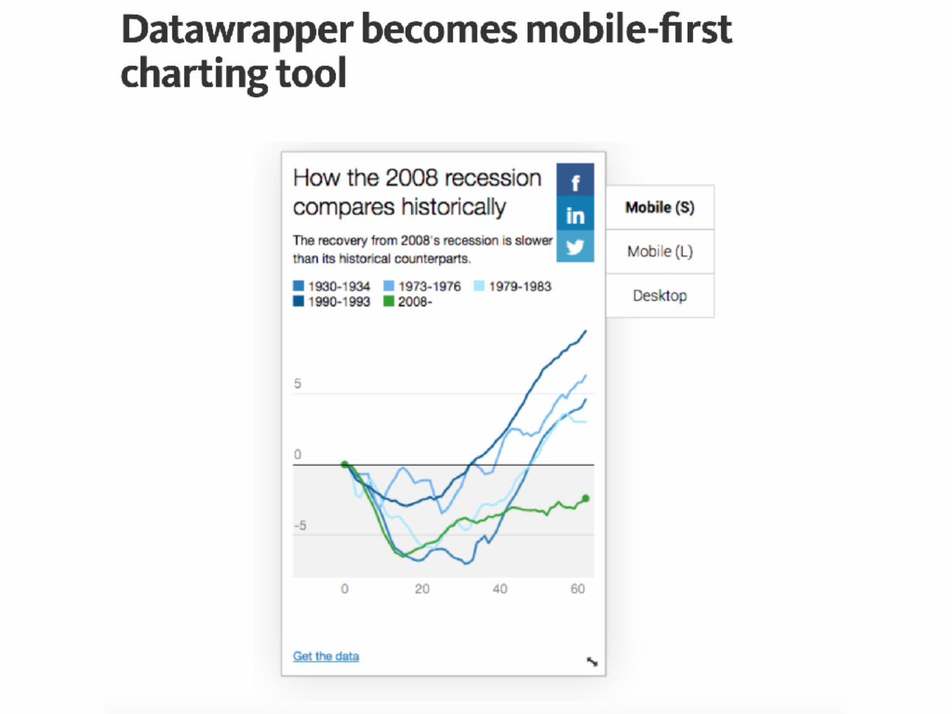
Datawrapper New features added in 2016


Summary
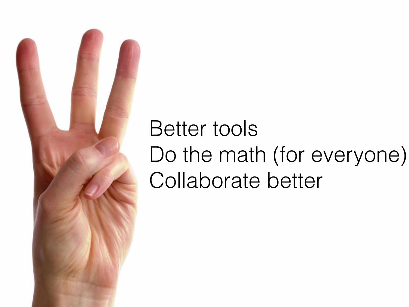
Better tools Do the math (for everyone) Collaborate better