Data Analysis Second Lab
17
Data Analysis – Lab II [email protected]
-
Upload
marco-braggion -
Category
Technology
-
view
304 -
download
2
Transcript of Data Analysis Second Lab
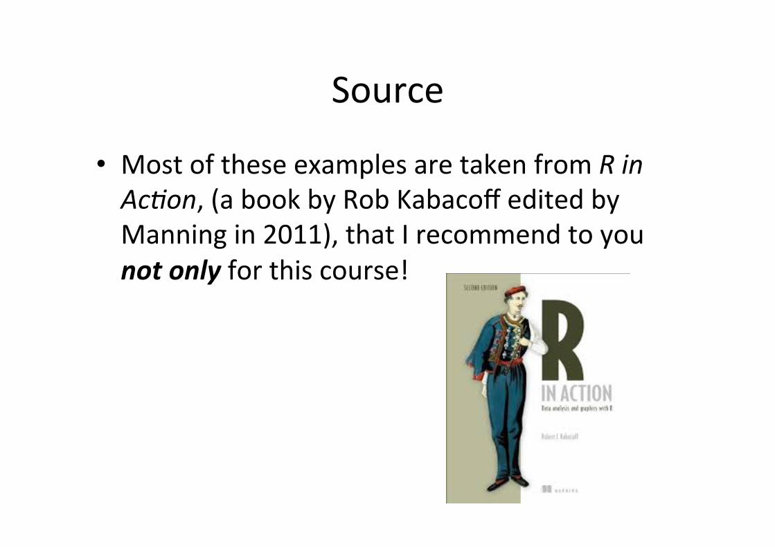
Source
• Most of these examples are taken from R in Ac'on, (a book by Rob Kabacoff edited by Manning in 2011), that I recommend to you not only for this course!

A simple scaKerplot
attach(mtcars) plot(wt, mpg) abline(lm(mpg~wt)) title("Regression of MPG on Weight") detach(mtcars)

2 3 4 5
1015
2025
30
wt
mpg
Regression of MPG on Weight
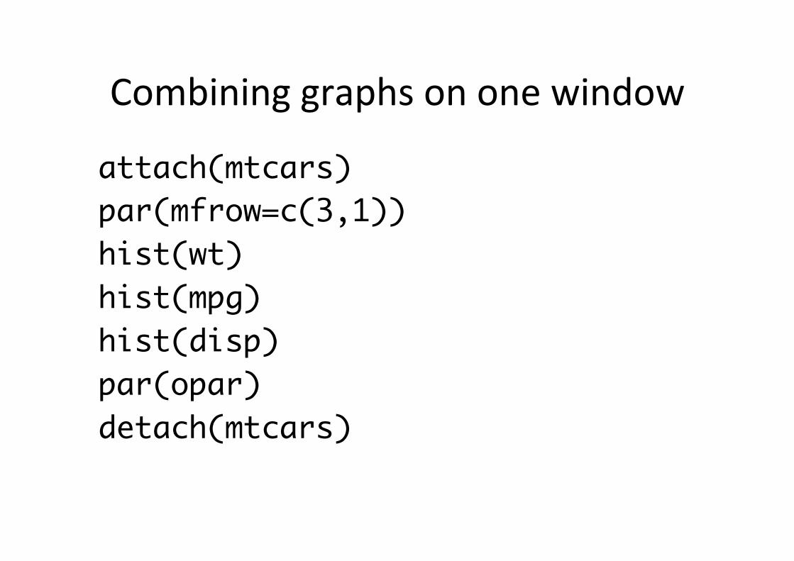
Combining graphs on one window
attach(mtcars) par(mfrow=c(3,1)) hist(wt) hist(mpg) hist(disp) par(opar) detach(mtcars)

Histogram of wt
wt
Frequency
2 3 4 5
04
8
Histogram of mpg
mpg
Frequency
10 15 20 25 30 35
06
12
Histogram of disp
disp
Frequency
100 200 300 400 500
03
6

Combining graphs (II) attach(mtcars) par(mfrow=c(2,2)) #2 rows 2 colsplot(wt,mpg, main="Scatterplot of wt vs. mpg") plot(wt,disp, main="Scatterplot of wt vs disp") hist(wt, main="Histogram of wt") boxplot(wt, main="Boxplot of wt")

2 3 4 5
1015
2025
30
Scatterplot of wt vs. mpg
wt
mpg
2 3 4 5
100
200
300
400
Scatterplot of wt vs disp
wt
disp
Histogram of wt
wt
Frequency
2 3 4 5
02
46
8
23
45
Boxplot of wt
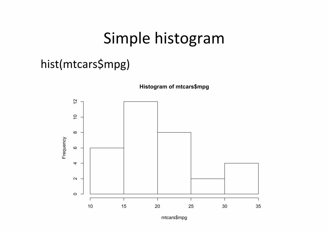
Simple histogram hist(mtcars$mpg)
Histogram of mtcars$mpg
mtcars$mpg
Frequency
10 15 20 25 30 35
02
46
810
12

Something more…
• hist(mtcars$mpg, breaks=12, col="red", xlab="Miles Per Gallon", main="Colored histogram with 12 bins")

Colored histogram with 12 bins
Miles Per Gallon
Frequency
10 15 20 25 30
01
23
45
67

Superimposing a normal curve (try it at home)

Histogram with normal curve
Miles Per Gallon
Frequency
10 15 20 25 30
01
23
45
67

Boxplot

4 6 8
1015
2025
30
Car Mileage Data
Number of Cylinders
Mile
s P
er G
allo
n

ScaKerplot Matrix
mpg
100 200 300 400 2 3 4 5
1015
2025
30
100
300
disp
drat
3.0
4.0
5.0
10 15 20 25 30
23
45
3.0 3.5 4.0 4.5 5.0
wt
Basic Scatter Plot Matrix

Further resources R code school (very nice intro for newbies): hKp://tryr.codeschool.com/ Quick-‐R (Rob Kabacoff site): hKp://www.statmethods.net/
R Zps (very detailed): hKp://pj.freefaculty.org/R/RZps.html
R seek (google-‐like search bar): hKp://www.rseek.org/