Cresterea vanzarilor in magazinele online
69
21 CRO Best Practices for eCommerce
-
Upload
ungureanu-lucian -
Category
Business
-
view
71 -
download
3
Transcript of Cresterea vanzarilor in magazinele online
21 CRO Best Practices
for
eCommerce
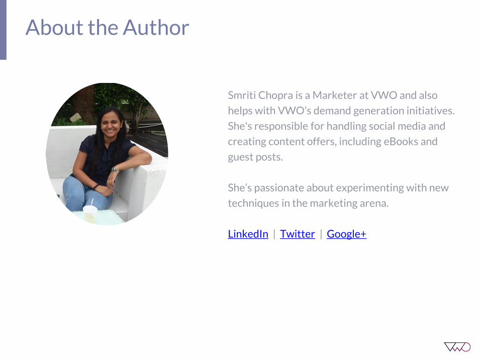
About the Author
Smriti Chopra is a Marketer at VWO and also
helps with VWO’s demand generation initiatives.
She's responsible for handling social media and
creating content offers, including eBooks and
guest posts.
She’s passionate about experimenting with new
techniques in the marketing arena.
LinkedIn | Twitter | Google+

Table of Contents
INTRODUCTION
CHAPTER 1
Reduce Form Fields
CHAPTER 2
Use A Contrasting CTA Button
CHAPTER 3
Get Rid of Automatic Image Slider
CHAPTER 4
Don’t Use Cheesy Stock Photos
CHAPTER 5
Test CTA Button Text
CHAPTER 6
Place CTA Above The Fold
CHAPTER 7
Add a Video
CHAPTER 8
Craft a Clear Headline
CHAPTER 9
Create Urgency
CHAPTER 10
Display Phone Number
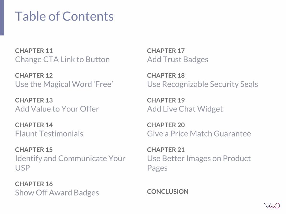
Table of Contents
CHAPTER 11
Change CTA Link to Button
CHAPTER 12
Use the Magical Word ‘Free’
CHAPTER 13
Add Value to Your Offer
CHAPTER 14
Flaunt Testimonials
CHAPTER 15
Identify and Communicate Your USP
CHAPTER 16
Show Off Award Badges
CHAPTER 17
Add Trust Badges
CHAPTER 18
Use Recognizable Security Seals
CHAPTER 19
Add Live Chat Widget
CHAPTER 20
Give a Price Match Guarantee
CHAPTER 21
Use Better Images on Product Pages
CONCLUSION

Introduction to Conversion Rate Optimization
Introduction
If you own an eCommerce website, youknow how challenging it is for you tosqueeze out revenue from your websitevisitors. Conversion Rate Optimization(CRO) helps you do precisely that!
CRO is essentially the science and art ofgetting a higher percentage of your visitorsto take the desired action on your website.For an eCommerce business, this desiredaction can be getting more visitors to clickon the ‘Buy-now’ button. In this case, everysingle click counts since it directly affectsthe bottom line of the company.
Getting more visitors to your websitebecomes futile once you realize that thosevisitors are not taking the desired action.Moreover, focusing on your existing visitorbase and getting them to convert more is afar more effective strategy than simplygetting more people to visit your website.In the most simplistic terms, CRO helps inbridging the gap between a visitor showinginterest in your product and an interestedvisitor finally becoming a customer. It helpsyour identify what visitors are looking forwhen they arrive at your website such thatyou can optimize key parameters on yourwebsite to suit the needs of your visitors.

21 CRO Best Practices

Reduce Form Fields
CHAPTER 1

1. Reduce Form Fields
From a marketer’s perspective, forms are agreat source of collecting data aboutprospective customers. The moreinformation we have about our targetaudience, the better we can reach out tothem. However, we often get carried awaywith this vast pool of information. It isimportant to understand that in theprocess of getting more information, wemight just be losing out on a set of audiencethat is simply too lazy to fill out too manydetails in our forms.
According to a research, forms with only 3fields receive 25% higher conversions.

1. Reduce Form Fields
Flying Scott, an airport car parkingcompany, conducted a test on their websitewhere they removed all unnecessary formfields from their details page of theirbooking process. As a result, they saw a35% increase in form submissions.

Use A Contrasting CTA Button
CHAPTER 2
2. Use A Contrasting CTA Button
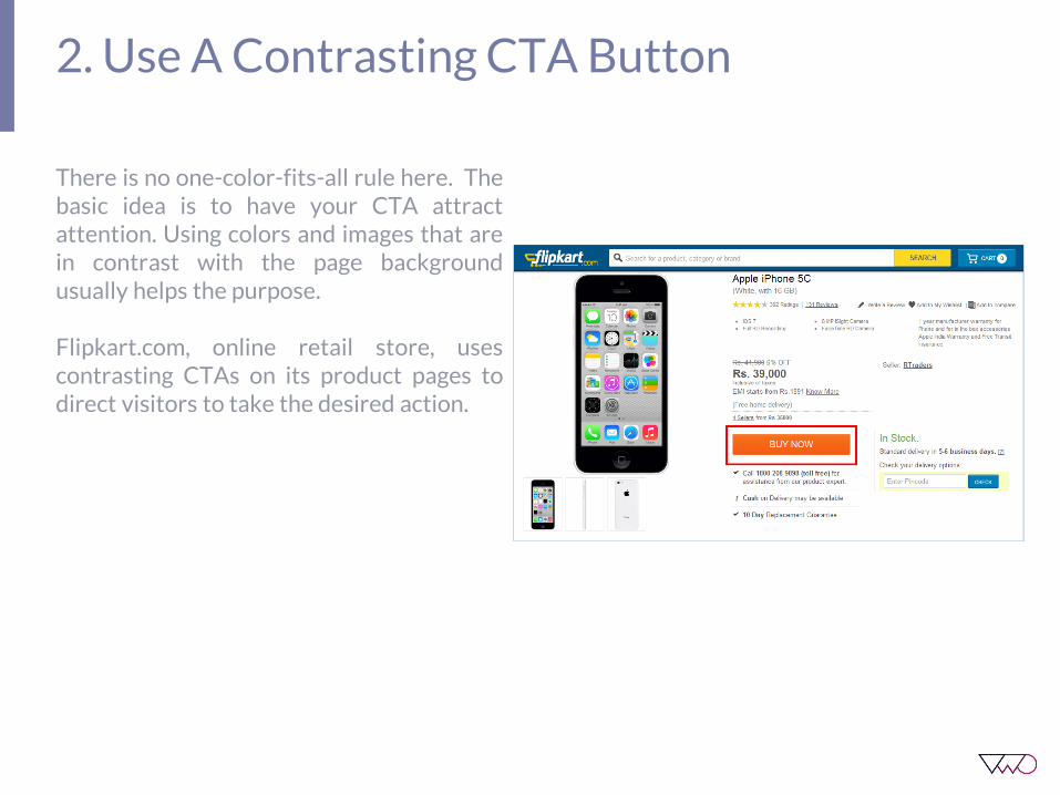
There is no one-color-fits-all rule here. Thebasic idea is to have your CTA attractattention. Using colors and images that arein contrast with the page backgroundusually helps the purpose.
Flipkart.com, online retail store, usescontrasting CTAs on its product pages todirect visitors to take the desired action.

Get Rid of Automatic Image Slider
CHAPTER 3

3. Get Rid of Automatic Image Slider
Even though those image carousels on yourhomepage look ‘cool’ design wise but theyactually might be costing you conversions.
A usability study by Neilson Norman groupconfirmed that auto-forwarding carouselsannoy users and reduce visibility. The studyhighlights a couple of reasons why thesebelieved-to-be “cool” design element areactually not good for your site’s usability orconversions:
1. Automatic rotation makes the user losecontrol of their interaction with the site.This is especially annoying for users withmotor skill issues.
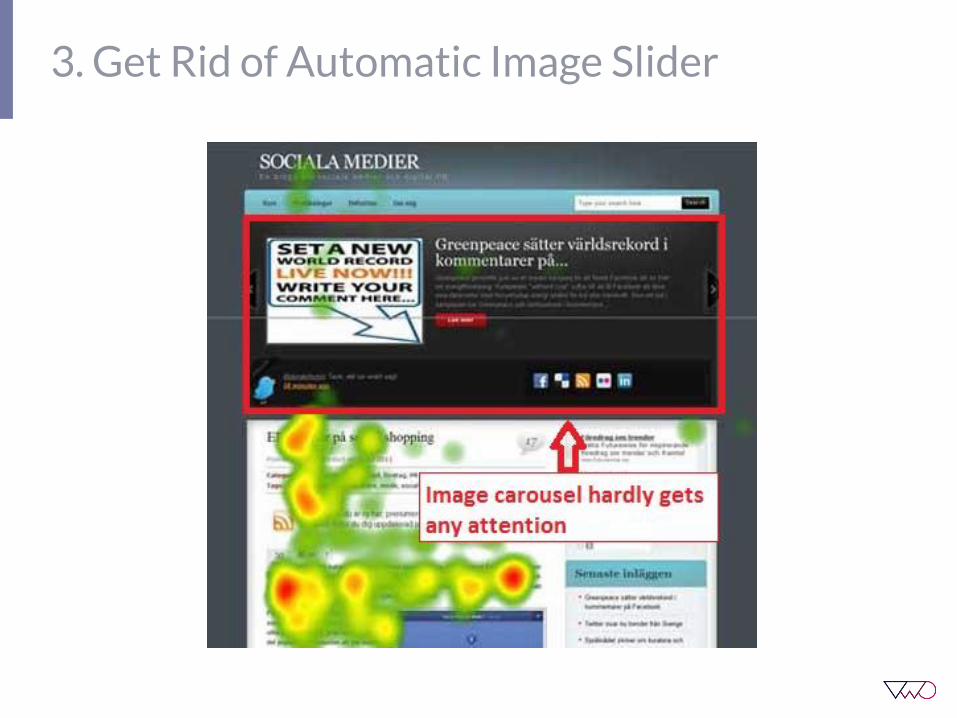
2. They create banner blindness and areoften easily ignored by users. The eyetracking example below from anothersource also validates this. You can see howthe image slider (the black area in thepicture) hardly gets any attention by sitevisitors.
3. Get Rid of Automatic Image Slider
3. Get Rid of Automatic Image Slider
3. Low-literacy users and internationalusers (whose native language differs fromthe language on your website) often readslowly. A user clearly expresses hisfrustration in the study when he says, “Ididn’t have time to read it. It keeps flashingtoo quickly.”
Image carousels are often thought to be aneasy way to display multiple offers on thehomepage. However, if you look at it from aconversion perspective, proposing multipleoffers in one place ends up confusing yourvisitor. Prioritize your offers and thendirect visitors to take the desired action.
Now that we know how image carouselscan be seriously dangerous for conversions,let’s have a look at a few alternatives to usein place of carousels:
1. Focus your homepage on yourprimary offerSince you have already prioritized youroffering, let your most relevant offer getthe maximum share of visitor attention.You can add a few offers that consistentlyperform well as secondary offers. BenSherman, an online clothing store andimplemented this very well on theirhomepage.

3. Get Rid of Automatic Image Slider

3. Get Rid of Automatic Image Slider
2. Convert Each Slide into a TargetedHomepageLet’s say, you have a global clothing storeonline. Now, countries often have differentclothing trends. So, you can segment yourvisitors on the basis of their geographicallocation with the help of your A/B testingsoftware. You can easily use pre-setsegments in VWO to set this up in just afew clicks. Once you have segmented yourvisitors, show them the homepage thatpromotes an offer about the most popularclothing trend in their country.
This means that instead of showing yourvisitors an ever-rotating image slider thatlists maybe even one offer per slide for the5 different countries from where you getmajority of your traffic, you are onlyshowing them their location-specific offer!Doesn’t that make a lot more sense?

Don’t Use Cheesy Stock Photos
CHAPTER 4

4. Don’t Use Cheesy Stock Photos
Conversion Scientist Brian Massey callsstock photos ‘business porn’.
Stock photos are high-quality, yes. But theylook staged. They are irritatingly perfect.Studies have shown that they are oftenignored by people. They make visitorsbrowse the site and not experience it. Onlyreal or relevant images engage visitors.
Using images for ornamental reasons (likethe below example of T Mobile) does moreharm than good to your landing page.
4. Don’t Use Cheesy Stock Photos
Images on your landing page play animportant role in building online trust foryour website. You don’t want to comeacross as fake and ignorant to your visitorswhen they first discover you online. Realimages let your website interact with yourvisitors.
The next big question is if not stock photosthen what? Try replacing stock photos onyour homepage with real human imagesand test it out for better conversions!
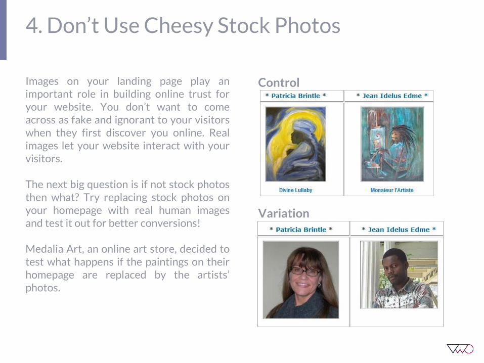
Medalia Art, an online art store, decided totest what happens if the paintings on theirhomepage are replaced by the artists’photos.
Control
Variation
4. Don’t Use Cheesy Stock Photos
Replacing the paintings with human photosled to a 95% increase in conversion ratefrom 8.8% with paintings to 17.2% withartist photos.
There are hundreds of research studiesonline that talk strongly about using humanimages on websites. Real images not onlyestablish an online trust for your brand butalso help build a strong emotional connectwith your visitors.
However, human photos are not panaceafor all websites. Best is to A/B test photosv/s no photos on your website. Manyresearch papers proved that in some cases,human photos may actually have a negativeimpact!

Test CTA Button Text
CHAPTER 5

5. Test CTA Button Text
This is one of the easiest tests to set up andcan drastically lift your conversions. Therelevance of your CTA copy influencesdecision making at the Zero Moment ofTruth (ZMOT). It essentially answers themost critical question “Why should I clickthis button?” Hence, the more value yourCTA conveys, the more conversions youget!
Let’s have a look at a live example of howCTA copy can impact conversions.Pcmbtoday.com, an online learning bookstore, experimented with a more culturallyrelevant CTA on their product page.

5. Test CTA Button Text
Here are a few things you should keep inmind while creating the copy for your CTAbutton:
1. Don’t use the word ‘Submit’! It’s beenoverused for its worth and doesn’t conveyany value to your visitors.
2. Use a valuable and actionable copy. Letyour CTA tell the visitors what they shouldexpect after clicking on it.
3. Add urgency to your CTA. The idea is tomake your visitors click on the CTA thereand then.
4. Begin with a verb. Adding an action verbto your CTA will induce visitors to take thedesired action.
5. Make sure your CTA copy is relevant tothe primary goal of your landing page.

Place CTA Above The Fold
CHAPTER 6

6. Place CTA Above The Fold
As we have seen already, your CTA is themost important element on your landingpage. This is where you want your visitorsto focus on. Whether it is your websitehomepage, a product page or the checkoutpage, your CTA should be visible in a singleglance.
Don’t ask your visitors to put in extra efforti.e. scroll down below the fold to reach yourcall to action. Place it above the fold, at aprominent position on your page.

Add a Video
CHAPTER 7
7. Add a Video
Adding a video to your website provides apassive engagement medium where yourvisitors can experience your messagethrough an interactive platform. Accordingto a study by eyeviewdigital.com, usingvideo on landing pages can increaseconversion by 80%.
Using a video on the landing page not onlyoffers a more detailed description of yourproduct, it also helps engages visitors for agreater period of time, allowing your brandmessage to sink in well.
Here’s a list of different ways in which youcan use videos for your ecommercewebsite:
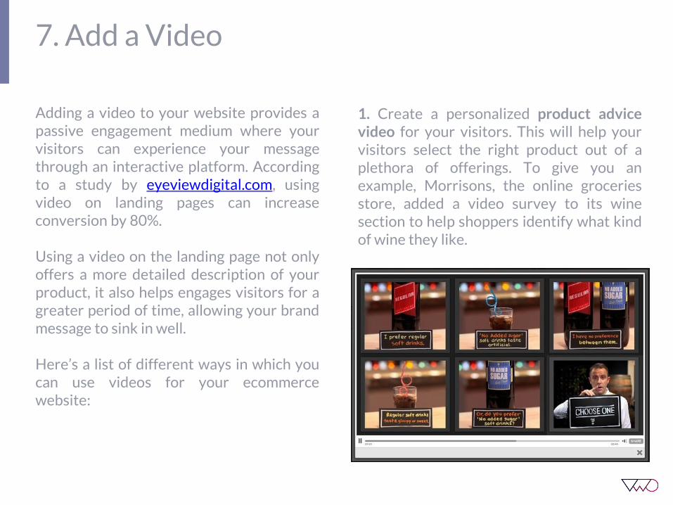
1. Create a personalized product advicevideo for your visitors. This will help yourvisitors select the right product out of aplethora of offerings. To give you anexample, Morrisons, the online groceriesstore, added a video survey to its winesection to help shoppers identify what kindof wine they like.
7. Add a Video
2. Use instructional videos for complexproducts. For products that require set upand installation, add a how to video to yourproduct page.
3. Educate your visitors about a newproduct category. This is an easy way togive your audience more information abouta product category without making them gothrough huge chunks on online content.
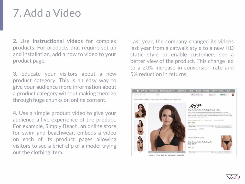
4. Use a simple product video to give youraudience a live experience of the product.For example, Simply Beach, an online storefor swim and beachwear, embeds a videoon each of its product pages allowingvisitors to see a brief clip of a model tryingout the clothing item.
Last year, the company changed its videoslast year from a catwalk style to a new HDstatic style to enable customers see abetter view of the product. This change ledto a 20% increase in conversion rate and5% reduction in returns.

Craft a Clear Headline
CHAPTER 8
8. Craft a Clear Headline
Headline is usually one of the mostnoticeable things on a landing page andgetting it right can boost your websiteconversions to a great extent. Make sureyour headline is clear and to the point.According to an eyetracking study byNielson Norman Group, users preferstraight headlines to subtle ones. Don’tbeat around the bush, get straight to thepoint with your headline.
Make sure your headline is crisp yetdetailed to instantly let the prospects knowwhat they can expect on your website.There’s no scope for ambiguity since youhave only 10-20 seconds to make an impactwith your headline.
Movexa, a joint-supplement manufacturerthat sells supplements online,experimented with making its headlineclearer by adding the word ‘supplement’.This change led to an 89.97% increase inconversions.

7. Craft a Clear Headline
Here’s a comparison of the control andvariation to summarize the test conductedby Movexa:

Create Urgency
CHAPTER 9
9. Create Urgency
A study was conducted in 1975 whereresearchers wanted to know how peoplewould value cookies in two identical glassjars. One jar had 10 cookies while the othercontained just two. Though the cookies andjars were identical, participants valued theones in the near-empty jar more highly.
And that’s the scarcity principle at play. Itessentially means that people tend to placehigher value on an object that is scarce anda lower value on one that is available inabundance. When combined with Urgency,which is essentially the other side of thesame coin, the two make for a potentweapon for increasing eCommerce sales.
Here’s how you can create urgency amongbuyers to make them act now!
1. Stock ScarcityDisplaying your stock meter on theeCommerce product page is always a goodconversion practice. Not only does itensure there are no last-minuteheartbreaks for the customer, it alsospeeds up the buying process. A user mightbe convinced to make a purchase, buthe/she might not be always willing to buyright away. They might want to comparethe prices on other websites, look fordiscount coupons or simply forget aboutthe product — thanks to the myriaddistractions of the web.

9. Create Urgency
Boticca.com, an online store for fashionaccessories, almost urges visitors tocomplete the purchase right away. The useof an active verb like ‘Act’ is used to driveimmediate action.
9. Create Urgency
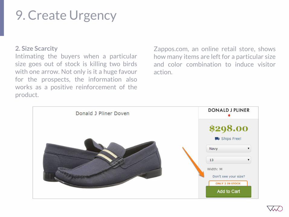
2. Size ScarcityIntimating the buyers when a particularsize goes out of stock is killing two birdswith one arrow. Not only is it a huge favourfor the prospects, the information alsoworks as a positive reinforcement of theproduct.
Zappos.com, an online retail store, showshow many items are left for a particular sizeand color combination to induce visitoraction.
9. Create Urgency
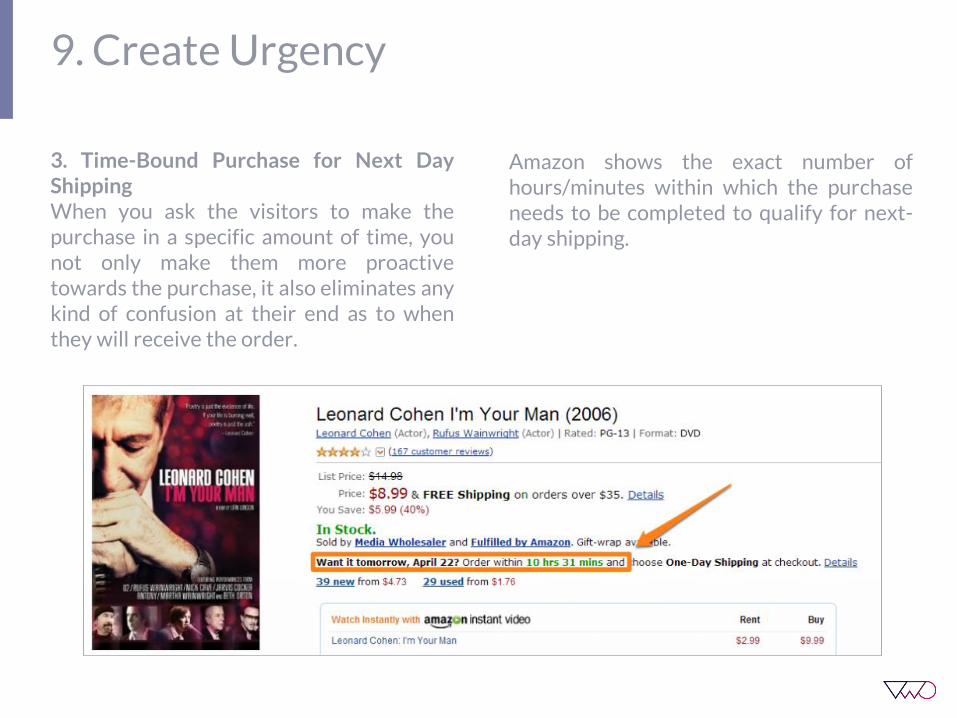
3. Time-Bound Purchase for Next DayShippingWhen you ask the visitors to make thepurchase in a specific amount of time, younot only make them more proactivetowards the purchase, it also eliminates anykind of confusion at their end as to whenthey will receive the order.
Amazon shows the exact number ofhours/minutes within which the purchaseneeds to be completed to qualify for next-day shipping.

9. Create Urgency
4. Limited-Period DiscountsThe fear of missing out is a legitimate one. Itis the anticipated regret of not being able toseize an opportunity. A limited-timediscount works exactly at that level. Itmakes the offer look so tempting andfleeting that one is compelled to seize theopportunity.
MakeMyTrip.com, an online ticket bookingplatform, shows an alert when the last fewdiscounted airline tickets are left in stock.See how they use color psychology here toinstil urgency. The use of the color ‘Red’ isnot a mere coincidence. The color isassociated with energy, increased heartrate and is often used in clearance sales.
9. Create Urgency
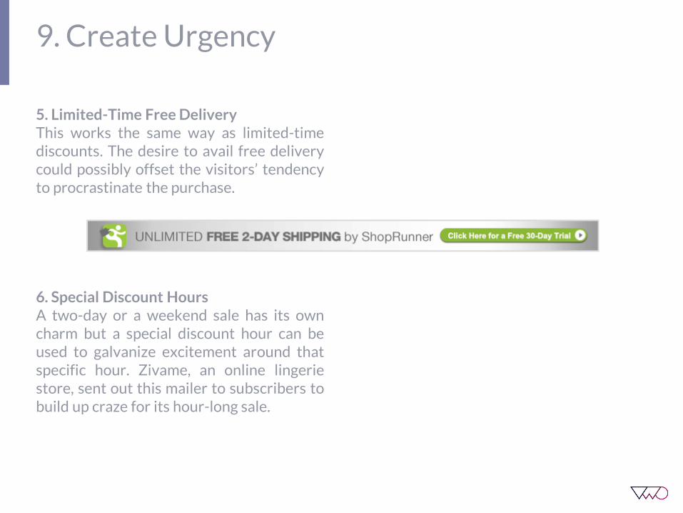
5. Limited-Time Free DeliveryThis works the same way as limited-timediscounts. The desire to avail free deliverycould possibly offset the visitors’ tendencyto procrastinate the purchase.
6. Special Discount HoursA two-day or a weekend sale has its owncharm but a special discount hour can beused to galvanize excitement around thatspecific hour. Zivame, an online lingeriestore, sent out this mailer to subscribers tobuild up craze for its hour-long sale.

9. Create Urgency

Display Phone Number
CHAPTER 10

10. Display Phone Number
It is usually a good practice to add yourcontact number in your homepage headerso that it isn’t missed by your site visitors.This adds credibility and also assurespeople that you are easily approachable ifthey have any problems or concerns duringtheir purchase process.
Also, people surfing through your websiteon their mobile phone will easily be able toreach out to you since the phone numberdisplayed will be clickable.
See how OzScopes, an online telescoperetailer, has its phone number noticeablydisplayed on the homepage:

Change CTA Link to Button
CHAPTER 11
11. Change CTA Link to Button
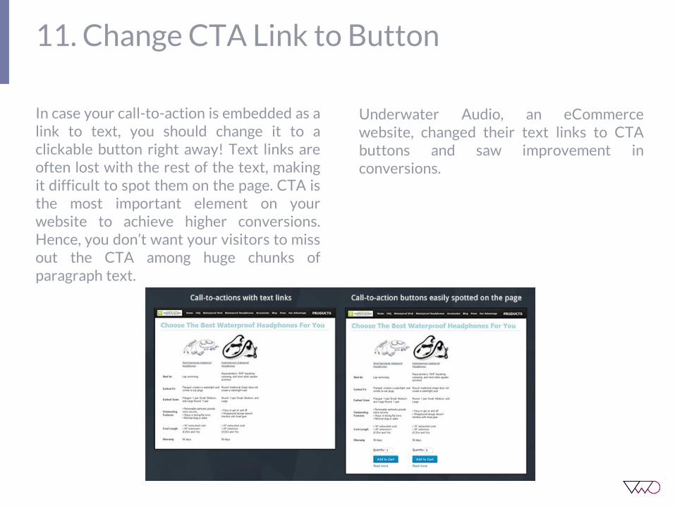
In case your call-to-action is embedded as alink to text, you should change it to aclickable button right away! Text links areoften lost with the rest of the text, makingit difficult to spot them on the page. CTA isthe most important element on yourwebsite to achieve higher conversions.Hence, you don’t want your visitors to missout the CTA among huge chunks ofparagraph text.
Underwater Audio, an eCommercewebsite, changed their text links to CTAbuttons and saw improvement inconversions.

Use the Magical Word ‘Free’
CHAPTER 12

12. Use the Magical Word ‘Free’
The word free is a powerful emotionaltrigger and a source of irrationalexcitement. The moment you see the wordfree, there’s an urgency to take actioncreated in your mind. Same is the case withyour visitors. People end up buying stuffthey don’t even need when it is offered forfree.
In this world of uncertainty, ‘free’ is a sure-shot conversion booster. Way back in1999, Amazon began offering free shippingon orders of $99 or more. Since then theyhave been experimenting with theirmarketing strategy to best take advantageof our desire for 'free.'
Gregory Ciotti of Copyblogger puts inanother perspective to the ‘power of free’.She points to loss aversion and our naturalinstinct to go after “low hanging fruit” asthe reasons why we are so susceptible tosnatching up free stuff.

Add Value to Your Offer
CHAPTER 13

13. Add Value to Your Offer
As long as the perceived value of your offeris not greater than what you are askingfrom your customers, you cannot makethem convert.
One great way to increase the perceivedvalue of your offer is to add benefits in yourcopy. Answer the “What’s in it for me?”question of your visitors, and they willhappily convert into leads or sales.
Urbanladder.com, an online furniture retailstore, add value to its offer by introducing alucky winner content for newsletter signup.

Flaunt Testimonials
CHAPTER 14

14. Flaunt Testimonials
Adding testimonials to your website is likespreading word-of-mouth in the real world.The more your happy customers talk aboutyou, the better will be your conversions.
Having big names or companies talkingabout you is a huge conversion booster. Itadds credibility and assuages buyers’ fears.
However, in order to add testimonials toyour website, don’t forget that they have tocome from real customers based on theirexperience with your website.
By testimonials, I don’t mean this:
I love your website. Your dresses are socool. ~ Amanda, USA
There are so many websites that displayfake testimonials like the one above.Anyone can write and put them up. Thebest testimonials are the ones that do theselling for you by saying what is uniqueabout your offer and emphasize thebenefits of your offer.
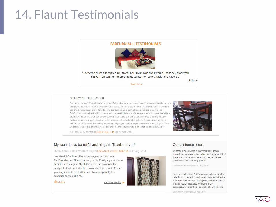
Fabfurnish.com, an online furniture store,beautifully uses customer testimonials onthe website. In addition to adding a quotefrom the customer on the homepage, theyhave a ‘Share your story’ section wherecustomers share their stories about theirexperiences with buying products from thewebsite.
14. Flaunt Testimonials
Identify and Communicate Your USP
CHAPTER 15

15. Identify and Communicate Your USP
Your Unique Selling Proposition is the realreason why you exist. To identify your USP,answer these questions for yourself:
1. What is it that distinguishes you fromyour competitors?
2. What gives you an edge over them?
Once you have identified your USP, makesure you communicate it clearly to yourtarget audience.
For example, Zappos.com, an eCommercestore, identified superior customer serviceas its USP and they have beencommunicating it well to their targetaudience through their tagline which says“Powered by Service”.
Also, they prominently display the ‘FreeShipping and Returns’ badge on theirhomepage to reinforce their USP ofsuperior customer service.

Show Off Award Badges
CHAPTER 16
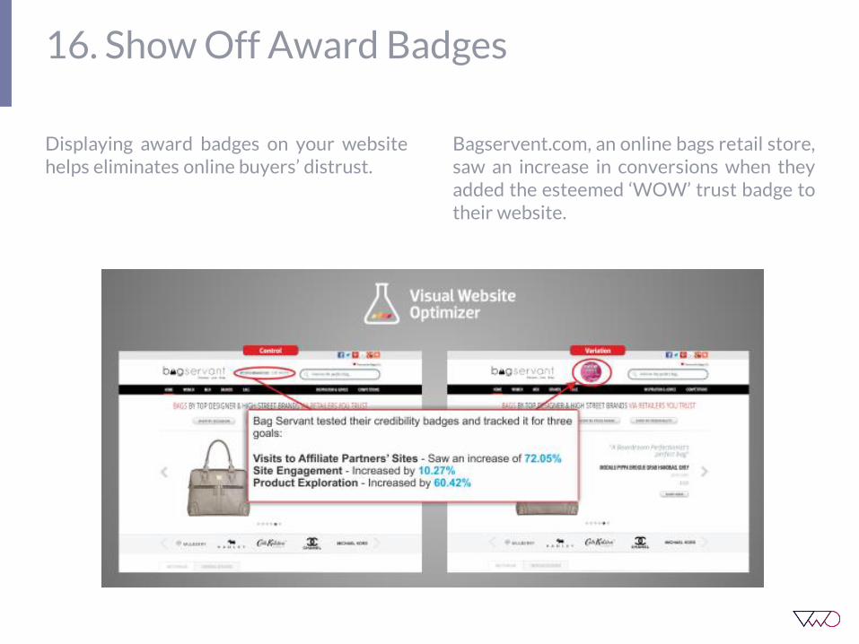
16. Show Off Award Badges
Displaying award badges on your websitehelps eliminates online buyers’ distrust.
Bagservent.com, an online bags retail store,saw an increase in conversions when theyadded the esteemed ‘WOW’ trust badge totheir website.
Add Trust Badges
CHAPTER 17

17. Add Trust Badges
There are various ways to add trustelements to your website. If you have gotgreat reviews from Glassdoor, Yelp orBetter Business Bureau don’t hesitate toflaunt them. You can also look at adding aTrust Pilot widget to your website andboost conversions.
Express Watches, an online watch retailer,saw a 58. 39% increase in sales when theyadded the Trust Pilot widget to theirwebsite.

Use Recognizable Security Seals
CHAPTER 18
18. Use Recognizable Security Seals
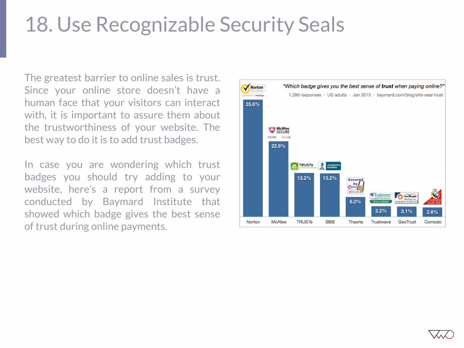
The greatest barrier to online sales is trust.Since your online store doesn’t have ahuman face that your visitors can interactwith, it is important to assure them aboutthe trustworthiness of your website. Thebest way to do it is to add trust badges.
In case you are wondering which trustbadges you should try adding to yourwebsite, here’s a report from a surveyconducted by Baymard Institute thatshowed which badge gives the best senseof trust during online payments.
Add Live Chat Widget
CHAPTER 19
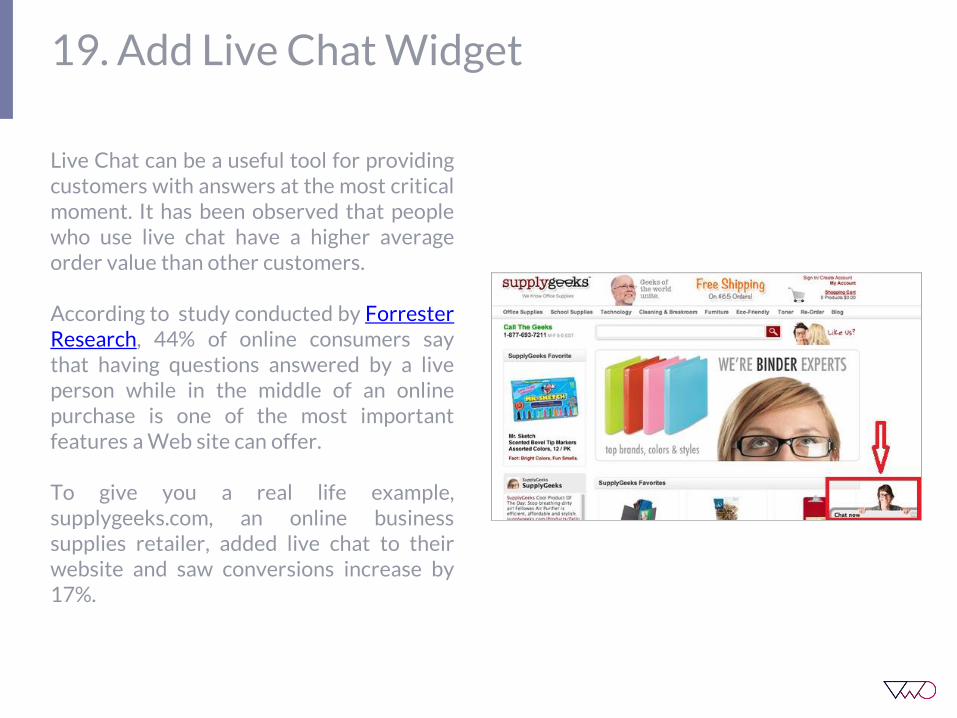
19. Add Live Chat Widget
Live Chat can be a useful tool for providingcustomers with answers at the most criticalmoment. It has been observed that peoplewho use live chat have a higher averageorder value than other customers.
According to study conducted by ForresterResearch, 44% of online consumers saythat having questions answered by a liveperson while in the middle of an onlinepurchase is one of the most importantfeatures a Web site can offer.
To give you a real life example,supplygeeks.com, an online businesssupplies retailer, added live chat to theirwebsite and saw conversions increase by17%.

Give a Price Match Guarantee
CHAPTER 20

20. Give a Price Match Guarantee
People want to be sure that they are notgetting ripped off. Assure them that youcan give them the best price in the market.If possible, show them a comparison of yourprices with your competitor’s prices.
BestBuy.com, an online retail store, offers aselective Price Match guarantee on theiritems.

Use Better Images on Product Pages
CHAPTER 2
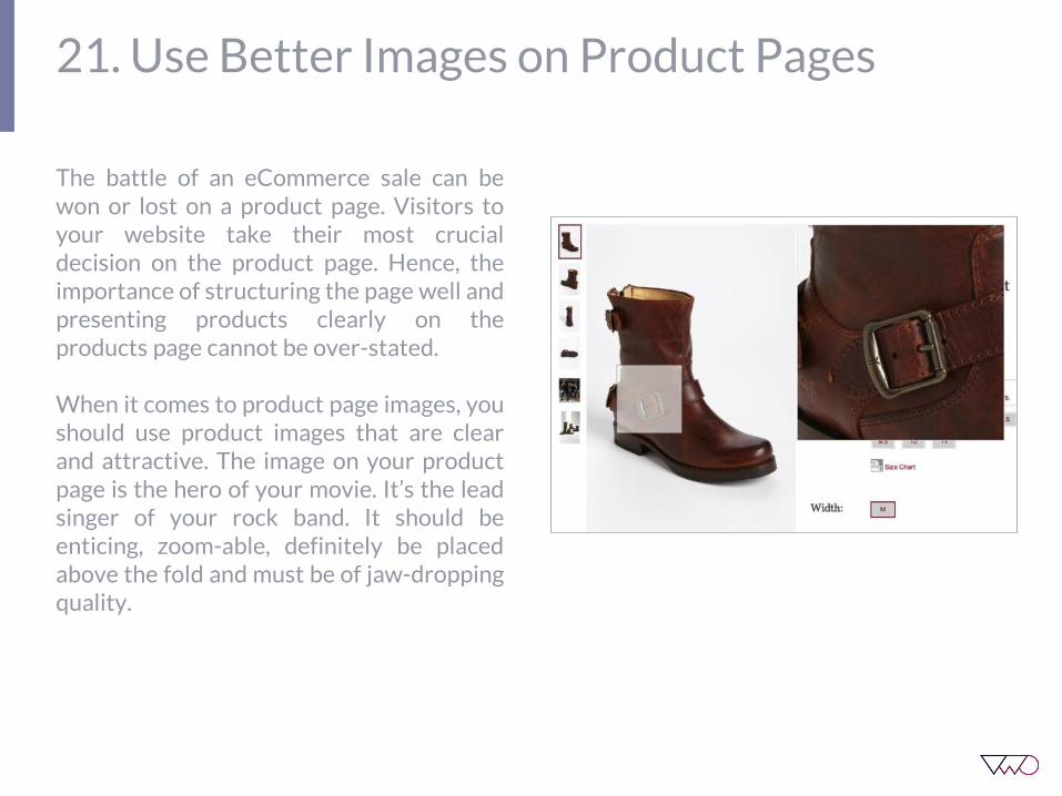
21. Use Better Images on Product Pages
The battle of an eCommerce sale can bewon or lost on a product page. Visitors toyour website take their most crucialdecision on the product page. Hence, theimportance of structuring the page well andpresenting products clearly on theproducts page cannot be over-stated.
When it comes to product page images, youshould use product images that are clearand attractive. The image on your productpage is the hero of your movie. It’s the leadsinger of your rock band. It should beenticing, zoom-able, definitely be placedabove the fold and must be of jaw-droppingquality.

Conclusion
In the end, all methods to increase websitesales and leads come down to betterrelevance, improving clarity, fewerdistractions, reducing anxiety, andincreasing urgency. When you take care ofthese, you should have good hypotheses tostart off your tests and look forward tobetter conversions on your website.
Some of the changes as described in thiseBook can be quickly implemented on yourwebsite and immediately reap in more saleswhile others may require more expertise.
However, I would recommend going withone change at a time so that you are able toanalyze what’s working and what’s not inyour specific business scenario.
You can start implementing those tipswhich you think are most relevant to yourbusiness needs. But before you do that, Iabsolutely insist that you A/B test them.
Built-in Heatmaps
Gain insights about your visitors. Find out what
they like/don’t like.
WYSIWYG Editor
Forget spending hours on coding. DIY without any
help from your developer.
Super Smooth Usability
Creating tests is a breeze
Quick Integrations
One-click integration available with GA,
KISSmetrics, Clicktale
Exploit our Idea Factory
Find A/B testing ideas to improve conversion rate
of your website
Intuitive
A/B Testing
for Busy
Marketers

About VWO
VWO is a leading website testing platform usedby more than 3,700 brands in 75 countries tooptimize their websites for generating leads.
Companies such as ShoeDazzle, Groupalia,JustFab and Unibet use VWO to understand andanalyse online user activity and behaviour.
VWO offers marketers an easy-to-implement anduse, but highly effective A/B testing, multivariate,behavioural targeting, usability and heat maptesting solution that requires no codingknowledge.
GET STARTED WITH VWO