Creating Charts in Office 2007
26
Copyright © 2008 Carlson School of Management, Office of Information Technology, University of Minnesota. Duplication of material without prior written consent is forbidden. February, 2008 Creating Charts in Office 2007 Table of Contents Microsoft Charts ...................................................................................................................... 1 Inserting a Chart in Excel ........................................................................................................ 1 Tip – Shortcut Key to Create a Default Chart in Excel ..................................................... 2 Activating Your Chart .......................................................................................................... 2 Resizing an Embedded Chart ................................................................................................. 2 Moving a Chart .................................................................................................................... 3 Working with Chart Tools ........................................................................................................ 3 Displaying Chart Titles and Labels .......................................................................................... 3 Changing the Chart Type ........................................................................................................ 4 Chart Types ........................................................................................................................ 5 Modifying the Data to Display in the Pie-in-Pie Chart ...................................................... 7 Changing the Chart Design ..................................................................................................... 8 Changing Chart Colors ........................................................................................................ 9 Chart Options .......................................................................................................................... 9 Adding or Removing Data from a Chart .................................................................................10 Adding Data .......................................................................................................................10 Clicking and Dragging ....................................................................................................10 Copy and Paste..............................................................................................................10 Removing Data from a Chart ..............................................................................................11 Modifying Chart Source Data .................................................................................................11 Chart Layouts ........................................................................................................................12 Customizing Chart Features...................................................................................................12 Adding a Chart Title........................................................................................................12 Adding / Removing Axis Titles ........................................................................................12 Adding / Removing / Moving a Legend ...........................................................................13 Adding / Removing Data Labels .....................................................................................13 Formatting Data Labels ..................................................................................................13 Adding / Removing Data Tables ....................................................................................15 Adding Error Bars...............................................................................................................15 Adding Trendlines to Two-Dimensional Charts...................................................................16 Deleting a Trendline .......................................................................................................16 Changing the Series Order ....................................................................................................17 Creating a Chart Template .....................................................................................................18 Applying a Chart Template .................................................................................................19
Transcript of Creating Charts in Office 2007
Copyright © 2008 Carlson School of Management, Office of Information Technology, University of Minnesota. Duplication of material without prior written consent is forbidden. February, 2008
Creating Charts in Office 2007
Table of Contents
Microsoft Charts ...................................................................................................................... 1
Inserting a Chart in Excel ........................................................................................................ 1 Tip – Shortcut Key to Create a Default Chart in Excel ..................................................... 2
Activating Your Chart .......................................................................................................... 2
Resizing an Embedded Chart ................................................................................................. 2
Moving a Chart .................................................................................................................... 3
Working with Chart Tools ........................................................................................................ 3
Displaying Chart Titles and Labels .......................................................................................... 3
Changing the Chart Type ........................................................................................................ 4
Chart Types ........................................................................................................................ 5 Modifying the Data to Display in the Pie-in-Pie Chart ...................................................... 7
Changing the Chart Design ..................................................................................................... 8
Changing Chart Colors ........................................................................................................ 9
Chart Options .......................................................................................................................... 9
Adding or Removing Data from a Chart .................................................................................10
Adding Data .......................................................................................................................10 Clicking and Dragging ....................................................................................................10 Copy and Paste ..............................................................................................................10
Removing Data from a Chart ..............................................................................................11
Modifying Chart Source Data .................................................................................................11
Chart Layouts ........................................................................................................................12
Customizing Chart Features ...................................................................................................12 Adding a Chart Title ........................................................................................................12 Adding / Removing Axis Titles ........................................................................................12 Adding / Removing / Moving a Legend ...........................................................................13 Adding / Removing Data Labels .....................................................................................13 Formatting Data Labels ..................................................................................................13 Adding / Removing Data Tables ....................................................................................15
Adding Error Bars ...............................................................................................................15
Adding Trendlines to Two-Dimensional Charts ...................................................................16 Deleting a Trendline .......................................................................................................16
Changing the Series Order ....................................................................................................17
Creating a Chart Template .....................................................................................................18
Applying a Chart Template .................................................................................................19
Creating Charts in Office 2007
2 Copyright © 2008, Carlson School of Management, University of Minnesota
Changing the Default Chart in Excel ......................................................................................19
Enhancing your Chart with Text, Arrows, and Drawings .........................................................20
Creating a Chart in Power Point .............................................................................................21 Modifying a Chart ...........................................................................................................22
Creating a Chart in Word .......................................................................................................23
Moving a Chart in Word ......................................................................................................24
Editing Chart Data in Word or PowerPoint .............................................................................24
Creating Charts in Office 2007
Copyright © 2008 Carlson School of Management, Office of Information Technology, University of Minnesota. Duplication of material without prior written consent is forbidden. February, 2008
Microsoft Charts
Microsoft Office 2007 allows you to create sophisticated charts in a wide variety of styles. For this course, we will work primarily in Excel. However, charting in Word and PowerPoint is now directly integrated with Excel so all formatting and layout options are the same, no matter which application you use. Instructions to insert a chart in Word and PowerPoint are included later in this class.
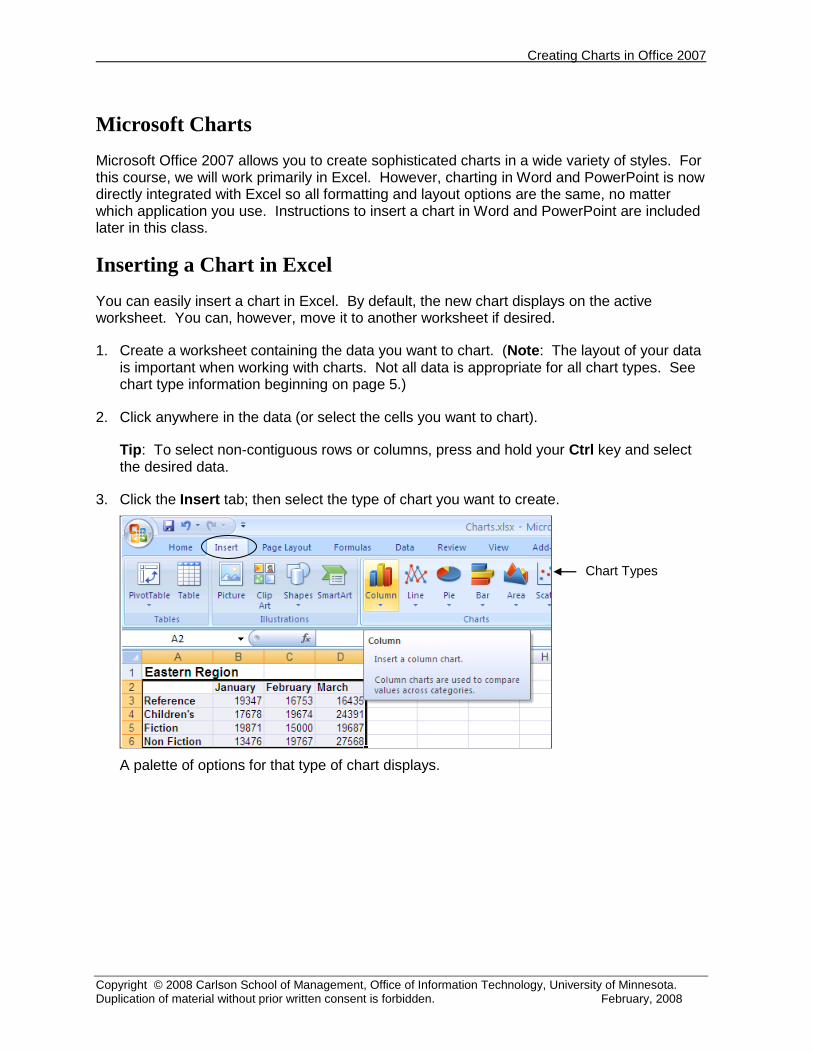
Inserting a Chart in Excel
You can easily insert a chart in Excel. By default, the new chart displays on the active worksheet. You can, however, move it to another worksheet if desired.
1. Create a worksheet containing the data you want to chart. (Note: The layout of your data is important when working with charts. Not all data is appropriate for all chart types. See chart type information beginning on page 5.)
2. Click anywhere in the data (or select the cells you want to chart).
Tip: To select non-contiguous rows or columns, press and hold your Ctrl key and select the desired data.
3. Click the Insert tab; then select the type of chart you want to create.
A palette of options for that type of chart displays.
Chart Types

Creating Charts in Office 2007
2 Copyright © 2008, Carlson School of Management, University of Minnesota
4. Click the desired option for that chart type. The chart displays on the active worksheet. A Chart Tools context-sensitive tab displays at the top of the Excel screen with tools for formatting your chart when the chart is “active.” (To activate a chart, simply click once on it.)
Tip – Shortcut Key to Create a Default Chart in Excel
You can quickly create a default chart using Excel’s default column chart. Simply select a cell within the data you want to chart; then press the F11 key. (To chart only some cells within a range, select the range of cells you want to chart.) The default chart type is created on a new worksheet. You can then format the chart as necessary. Note: The default chart in Excel is a two-dimensional column chart; however you can change the default chart type. See page 19 for more information.
Activating Your Chart
You must click once on your chart to activate it and make the Chart Tools tab available. When the chart is active, the Chart Tools tab displays with a wide variety of chart options.
Resizing an Embedded Chart
You can resize an embedded chart. Click once on the chart to activate it. Selection handles display around the chart. Click and drag one of the handles to make the chart the desired size.
To move chart to different worksheet
To move chart on the active sheet, click and drag the “border.”
To resize a chart on the active sheet, click and drag the “handles.”

Creating Charts in Office 2007
Copyright © 2008, Carlson School of Management, University of Minnesota 3
Moving a Chart
To move the chart on the active worksheet, click on the chart “border” and drag it to the desired location.
To move the chart to a different worksheet, click the Move Chart Location button. Select the desired location, and click OK.
Working with Chart Tools
After creating your chart, you may want to change the layout, chart type, or add features to it.
Displaying Chart Titles and Labels
Inserting a chart as described above does not automatically display titles or labels. Use one of the following options to add titles and/or labels to your chart.
Option 1
1. Single-click the chart to activate it and provide chart options.
2. Activate the Chart Tools context sensitive tab.
3. In the Chart Layouts gallery, select a chart type that includes titles.
When the new layout displays with text boxes, click in the text box to enter a title.
Click “title” box to enter desired title

Creating Charts in Office 2007
4 Copyright © 2008, Carlson School of Management, University of Minnesota
Option 2
You can also add titles by selecting the Chart Tools context-sensitive tab, then clicking Layout tab. This allows you to specifically add the options you want, including gridlines and data labels.
Changing the Chart Type
You can change the chart type if you feel that another chart type would more effectively illustrate your data. For instance, the same type of source data that is effectively displayed in a column or bar chart can also be displayed in a line chart.
1. Single-click the chart to activate it. Selection handles display around the chart and the Chart Tools tab displays.
2. From the Design tab of the Chart Tools tab, click the Change Chart Type button.
3. Select the desired option and click OK.
Creating Charts in Office 2007
Copyright © 2008, Carlson School of Management, University of Minnesota 5
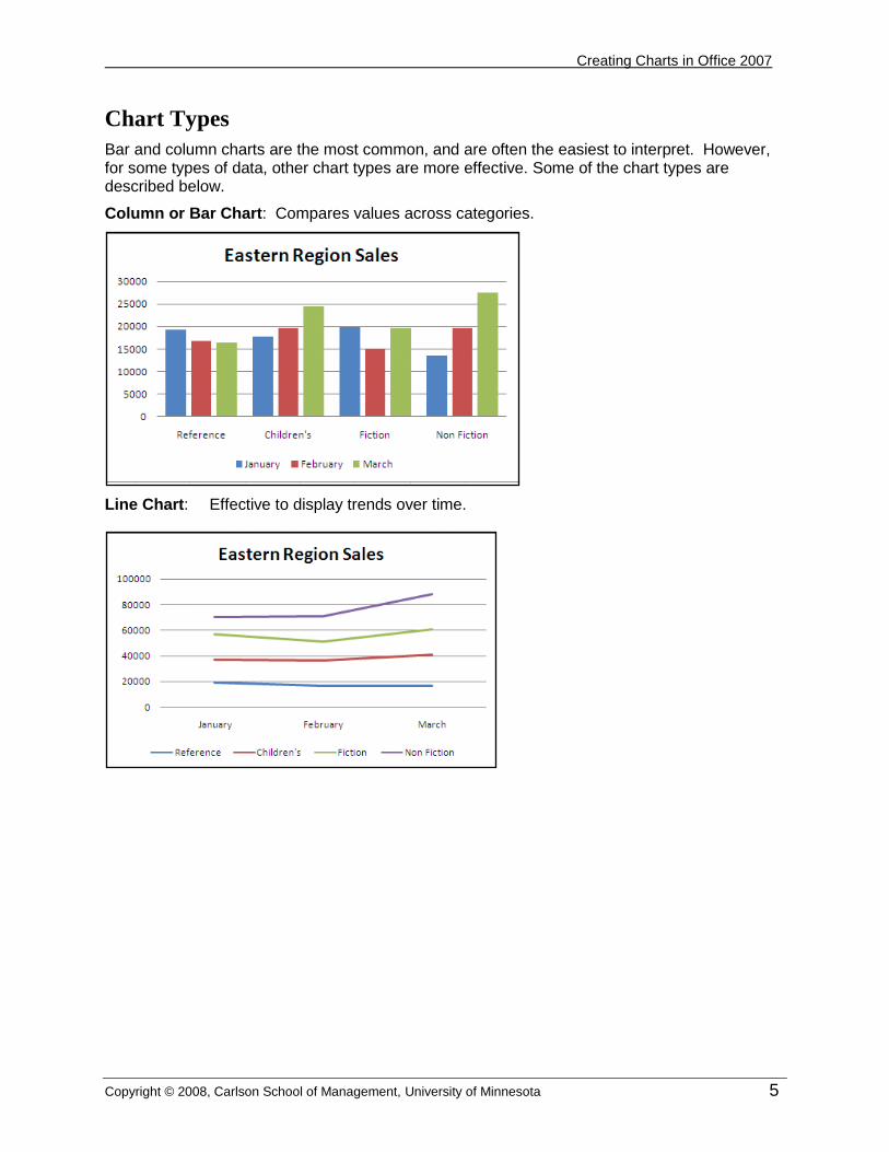
Chart Types
Bar and column charts are the most common, and are often the easiest to interpret. However, for some types of data, other chart types are more effective. Some of the chart types are described below.
Column or Bar Chart: Compares values across categories.
Line Chart: Effective to display trends over time.

Creating Charts in Office 2007
6 Copyright © 2008, Carlson School of Management, University of Minnesota
Stacked Column Chart – Displays total or percent by either series or category.
100% Stacked Column Chart
Total Stacked Column Chart
Scatter Plot – X / Y Scatter
A scatter plot displays the relationship between two groups of numerical data.

Creating Charts in Office 2007
Copyright © 2008, Carlson School of Management, University of Minnesota 7
Pie Chart: Displays the contribution of each value to a total.
Tip: To create a pie-in-pie chart, enter the data you want to display in the smaller chart in the last rows. To adjust how much data displays in the smaller chart, see the instructions which follow.
Modifying the Data to Display in the Pie-in-Pie Chart
By default, the last three rows of data display in the smaller pie chart and refer to a piece of the larger pie chart. In the example above, Travel, Cooking, and Gardening are all represented in the Series “March” Point 8 piece. To modify that setting:
1. Click on the chart to activate it; then click again on the piece you want to modify. Note: Only the piece you want to change should have “handles” around it.
2. Right-click the piece and select Format Data Point. The following dialog box displays.
3. In the Second plot contains the last values area, select the desired option; then click Close.
Data for smaller chart
Creating Charts in Office 2007
8 Copyright © 2008, Carlson School of Management, University of Minnesota
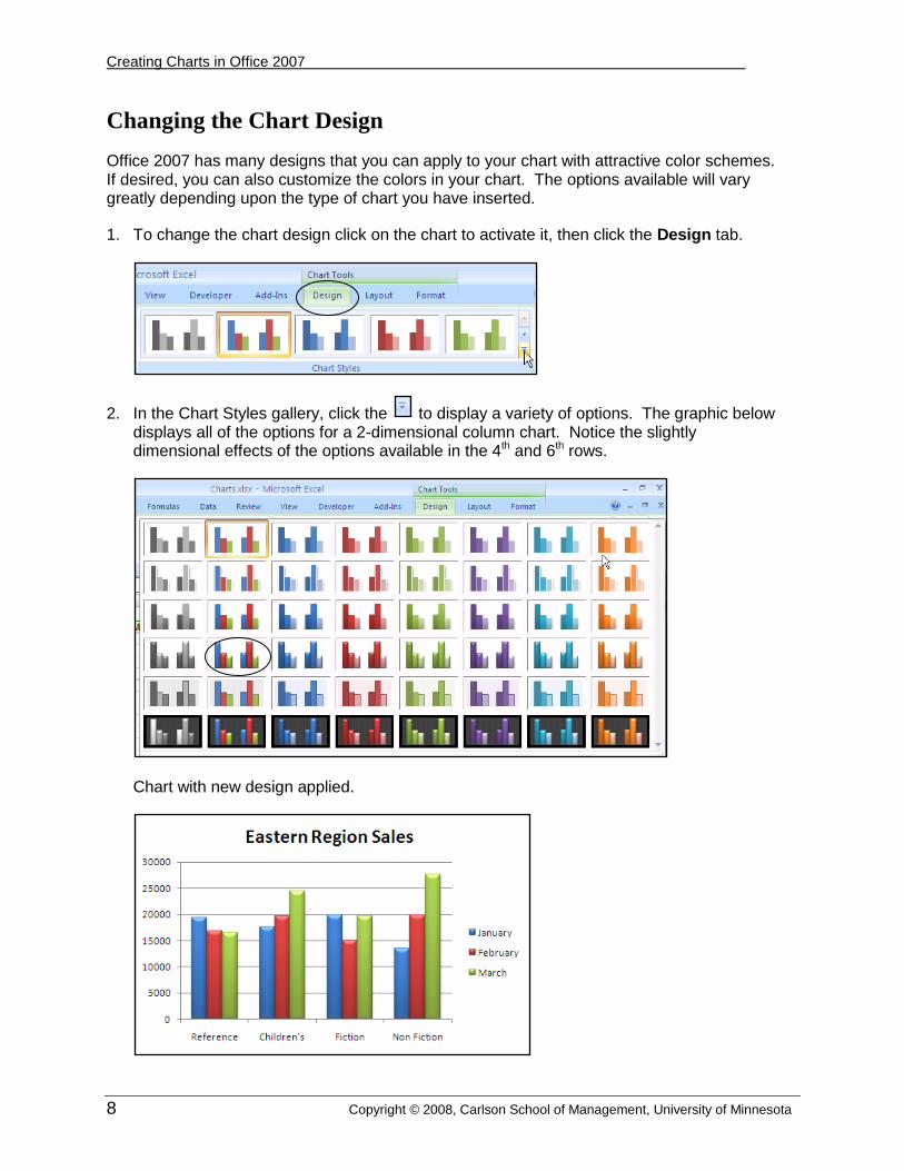
Changing the Chart Design
Office 2007 has many designs that you can apply to your chart with attractive color schemes. If desired, you can also customize the colors in your chart. The options available will vary greatly depending upon the type of chart you have inserted.
1. To change the chart design click on the chart to activate it, then click the Design tab.
2. In the Chart Styles gallery, click the to display a variety of options. The graphic below displays all of the options for a 2-dimensional column chart. Notice the slightly dimensional effects of the options available in the 4th and 6th rows.
Chart with new design applied.
Creating Charts in Office 2007
Copyright © 2008, Carlson School of Management, University of Minnesota 9
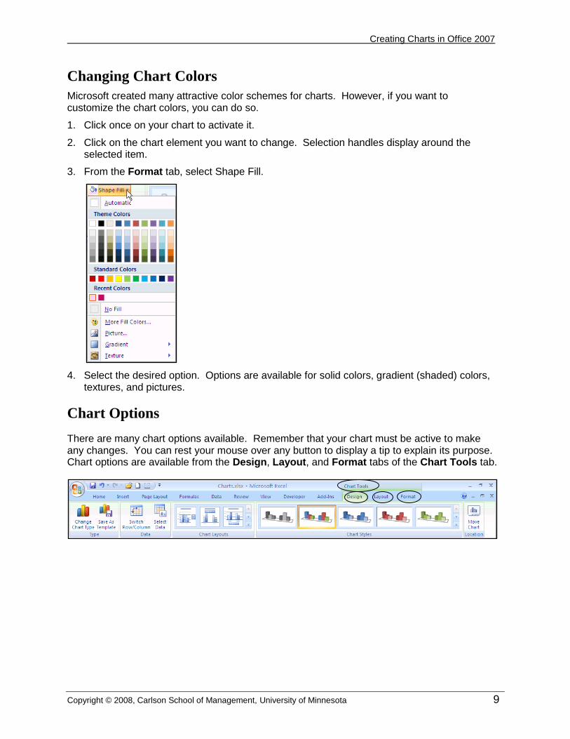
Changing Chart Colors
Microsoft created many attractive color schemes for charts. However, if you want to customize the chart colors, you can do so.
1. Click once on your chart to activate it.
2. Click on the chart element you want to change. Selection handles display around the selected item.
3. From the Format tab, select Shape Fill.
4. Select the desired option. Options are available for solid colors, gradient (shaded) colors, textures, and pictures.
Chart Options
There are many chart options available. Remember that your chart must be active to make any changes. You can rest your mouse over any button to display a tip to explain its purpose. Chart options are available from the Design, Layout, and Format tabs of the Chart Tools tab.

Creating Charts in Office 2007
10 Copyright © 2008, Carlson School of Management, University of Minnesota
Adding or Removing Data from a Chart
You can easily add or remove data from a chart in a variety of ways.
Adding Data
Excel provides several methods to add new data to a chart.
Clicking and Dragging
When you have an imbedded chart selected, Excel draws rectangles around the chart’s worksheet data. Use any of the following methods to add data by clicking and dragging.
You can click and drag a fill handle to include the new data (or remove data) in your chart.
Copy and Paste
You can use copy and paste to add data to a chart. Simply select the data, and click the Copy button; then paste the data directly on the Chart. This can be a useful way to add data on a chart that displays on a separate worksheet.
Click and drag handle to include additional data.
Creating Charts in Office 2007
Copyright © 2008, Carlson School of Management, University of Minnesota 11
Removing Data from a Chart
Use any of the following methods to remove data from a chart.
You can use your Delete key to remove data. To get the best results, click on the chart to select the series or data point you want to delete and press the Delete key. (If you delete from the data, you get a result that displays a legend item with no data.)
You can also click and drag to include or remove data from your chart as indicated in the Adding Data instructions above.
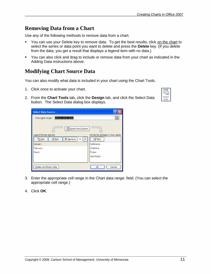
Modifying Chart Source Data
You can also modify what data is included in your chart using the Chart Tools.
1. Click once to activate your chart.
2. From the Chart Tools tab, click the Design tab, and click the Select Data button. The Select Data dialog box displays.
3. Enter the appropriate cell range in the Chart data range: field. (You can select the appropriate cell range.)
4. Click OK.

Creating Charts in Office 2007
12 Copyright © 2008, Carlson School of Management, University of Minnesota
Chart Layouts
Once you have applied a chart style, you can quickly modify the chart layout to display pre-formatted options such as a legend, axis titles, gridlines, data labels, etc.
1. Click the chart to activate it.
2. From the Chart Tools tab, Design Tab, select the desired option from the Chart Layouts gallery. The options that display will depend on the chart type.
3. Select the desired option.
Customizing Chart Features
If you want to customize features that display on your chart, you should use the Layout tab.
Adding a Chart Title
When you insert a chart, it does not automatically have a Chart Title.
1. Click on your chart to activate it.
2. From the Chart Tools tab, click the Layout tab, and in the Labels gallery, click the Chart Title button. Several options are available.
3. Select the desired option.
Adding / Removing Axis Titles
Depending upon your data, you may want to add or remove axis titles. For instance, if your chart displays months or currency, there is no need for an axis title. However, other types of data may require an axis title to provide clarity.
1. Click on your chart to activate it.
2. From the Chart Tools tab, click the Layout tab; in the Labels gallery, click the Axis Title button. Several options are available.
3. Select the desired option.
Layout options for column chart.

Creating Charts in Office 2007
Copyright © 2008, Carlson School of Management, University of Minnesota 13
Adding / Removing / Moving a Legend
A legend is often needed in a chart to identify the data in your chart. You can add or remove a legend, or specify the location to provide the most effective layout and presentation.
1. Click on your chart to activate it.
2. From the Chart Tools tab, click the Layout tab; in the Labels gallery, click the Legend button. Many options are available.
3. Select the desired option.
Adding / Removing Data Labels
You can add data labels to your chart to help identify the information displayed. These can be value labels or identify the categories or series displayed. Note: It is usually not necessary to have labels AND a legend. Keep your chart as simple and uncluttered as possible, while still clearly identifying the data displayed. Labels can be displayed directly on the data points or inside or outside the data points. You can also format the data labels.
1. Click on your chart to activate it.
2. From the Chart Tools tab, click the Layout tab; in the Labels gallery, click the Data Labels button. Many options are available.
3. Select the desired option.
Formatting Data Labels
When you specify a data label location, you might want to change some options. For instance, if you display the labels in the “inside end” of a column, you might want the labels to display vertically, as shown below.

Creating Charts in Office 2007
14 Copyright © 2008, Carlson School of Management, University of Minnesota
1. To customize data label options select More Data Label Options to display the Format Data Labels dialog box. Note: Formatting must be done on each category or series individually (e.g., all Reference columns in the chart above).
Note: To format at single item, (e.g., Reference for January), click on the chart column, bar, pie piece, etc.; then click the label to select it, and select More Data Label Options.
2. Many formatting options are available. Select the option you want to modify. If you want to change the labels to a vertical alignment, as mentioned above, select Alignment.
3. In the Text direction field, select the desired option.
4. Apply other formatting options, if desired.
5. Click Close.

Creating Charts in Office 2007
Copyright © 2008, Carlson School of Management, University of Minnesota 15
Adding / Removing Data Tables
You can show the data table (data that is represented in your chart) beneath the chart. This is typically only used when the chart displays on a worksheet separate from the source data (not an embedded chart).
1. Click on your chart to activate it.
2. From the Chart Tools tab, click the Layout tab, and in the Labels gallery, click the Data Table button. Several options are available.
3. Select the desired option.
Adding Error Bars
If you chart statistical or experimental data, you can use the Excel error bar feature to show the confidence level for your data. You can only use error bars on two-dimensional bar, column, area, or line charts.
1. Select the data series to which you want to add error bars.
2. From the Chart Tools tab, on the Layout tab, select Error Bars.
3. Select the desired error bar options.
4. For additional options, click More Error Bar Options and make the desired selections.
Example of chart with Error bars on March data

Creating Charts in Office 2007
16 Copyright © 2008, Carlson School of Management, University of Minnesota
Adding Trendlines to Two-Dimensional Charts
You can add trendlines to your two-dimensional charts. (This option is not available in three-dimensional charts.) A trendline is a graphic representation of trends in data series, such as a line sloping upward to represent increased sales over a period of months. Trendlines are used for the study of prediction.
1. Select the series to which you want to add a trendline.
2. From the Chart Tools tab, on the Layout tab, click Trendline.
3. Select the desired options.
4. If desired, select More Trendline Options to select additional options.
Deleting a Trendline
To delete a trendline, select it and press the Delete key. OR Click the Trendline button and select None,
Creating Charts in Office 2007
Copyright © 2008, Carlson School of Management, University of Minnesota 17
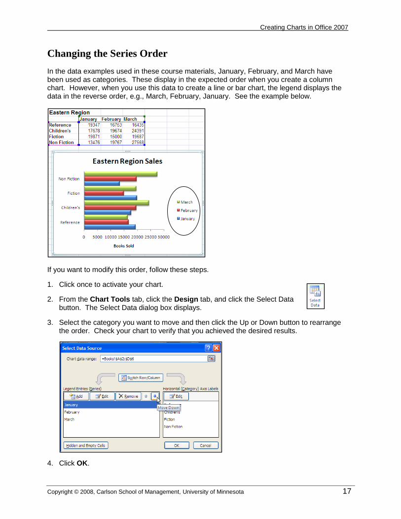
Changing the Series Order
In the data examples used in these course materials, January, February, and March have been used as categories. These display in the expected order when you create a column chart. However, when you use this data to create a line or bar chart, the legend displays the data in the reverse order, e.g., March, February, January. See the example below.
If you want to modify this order, follow these steps.
1. Click once to activate your chart.
2. From the Chart Tools tab, click the Design tab, and click the Select Data button. The Select Data dialog box displays.
3. Select the category you want to move and then click the Up or Down button to rearrange the order. Check your chart to verify that you achieved the desired results.
4. Click OK.
Creating Charts in Office 2007
18 Copyright © 2008, Carlson School of Management, University of Minnesota
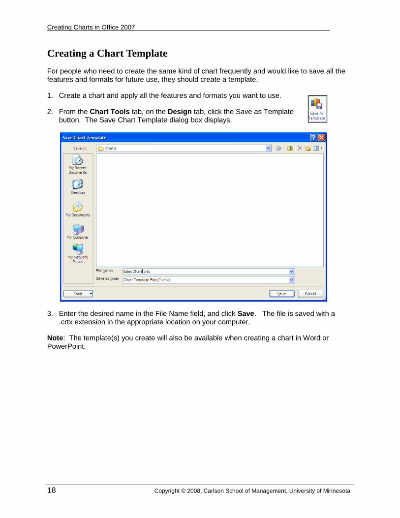
Creating a Chart Template
For people who need to create the same kind of chart frequently and would like to save all the features and formats for future use, they should create a template.
1. Create a chart and apply all the features and formats you want to use.
2. From the Chart Tools tab, on the Design tab, click the Save as Template button. The Save Chart Template dialog box displays.
3. Enter the desired name in the File Name field, and click Save. The file is saved with a .crtx extension in the appropriate location on your computer.
Note: The template(s) you create will also be available when creating a chart in Word or PowerPoint.
Creating Charts in Office 2007
Copyright © 2008, Carlson School of Management, University of Minnesota 19
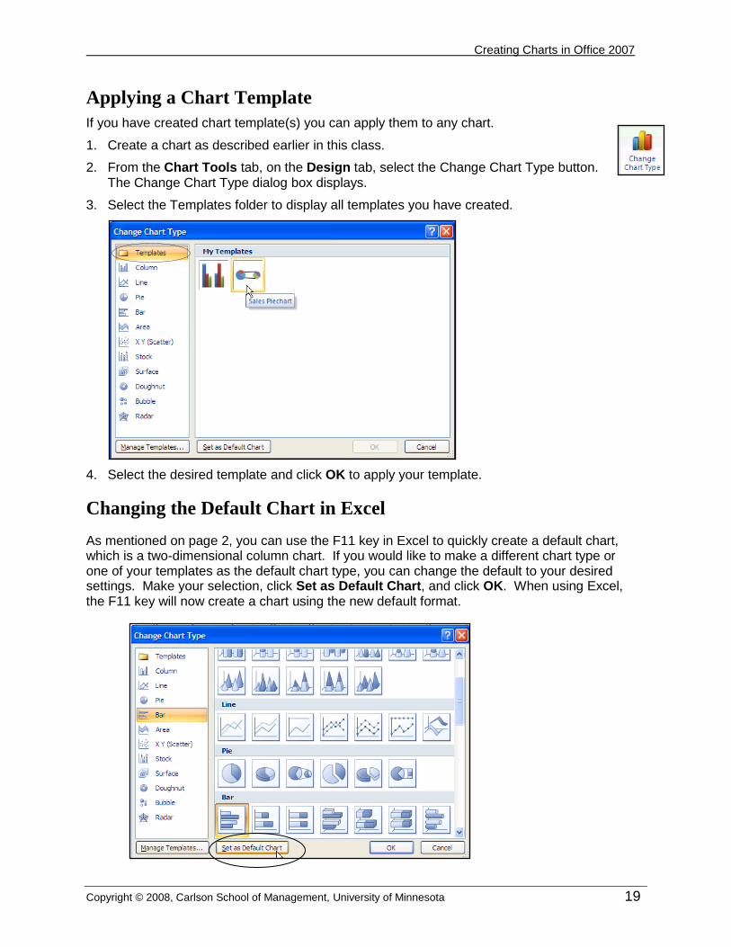
Applying a Chart Template
If you have created chart template(s) you can apply them to any chart.
1. Create a chart as described earlier in this class.
2. From the Chart Tools tab, on the Design tab, select the Change Chart Type button. The Change Chart Type dialog box displays.
3. Select the Templates folder to display all templates you have created.
4. Select the desired template and click OK to apply your template.
Changing the Default Chart in Excel
As mentioned on page 2, you can use the F11 key in Excel to quickly create a default chart, which is a two-dimensional column chart. If you would like to make a different chart type or one of your templates as the default chart type, you can change the default to your desired settings. Make your selection, click Set as Default Chart, and click OK. When using Excel, the F11 key will now create a chart using the new default format.
Creating Charts in Office 2007
20 Copyright © 2008, Carlson School of Management, University of Minnesota
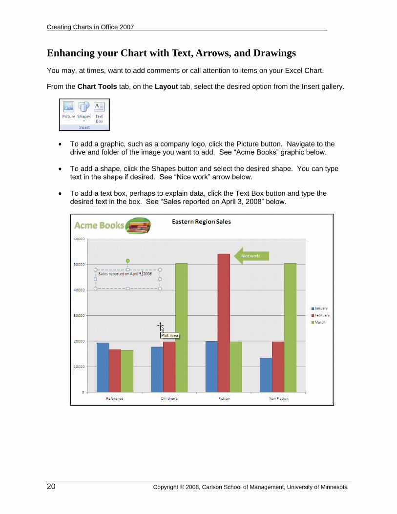
Enhancing your Chart with Text, Arrows, and Drawings
You may, at times, want to add comments or call attention to items on your Excel Chart.
From the Chart Tools tab, on the Layout tab, select the desired option from the Insert gallery.
To add a graphic, such as a company logo, click the Picture button. Navigate to the drive and folder of the image you want to add. See “Acme Books” graphic below.
To add a shape, click the Shapes button and select the desired shape. You can type text in the shape if desired. See “Nice work” arrow below.
To add a text box, perhaps to explain data, click the Text Box button and type the desired text in the box. See “Sales reported on April 3, 2008” below.

Creating Charts in Office 2007
Copyright © 2008, Carlson School of Management, University of Minnesota 21
Creating a Chart in Power Point
Charts in PowerPoint behave in the same manner as in Excel. To insert a chart in a PowerPoint slide, follow these steps.
1. From the Home tab of PowerPoint, select New Slide.
2. Click the Insert Chart button. The Insert Chart dialog box displays.
Select Insert Chart

Creating Charts in Office 2007
22 Copyright © 2008, Carlson School of Management, University of Minnesota
3. Select the desired chart layout and click OK.
Your computer opens Excel displaying a data sheet. The default data is reflected in the PowerPoint slide.
5. Edit the data in the Excel screen. Your chart will update appropriately. When finished with modifying the data, you can close Excel.
6. The PowerPoint portion of the screen provides tools for changing the chart type as well as other chart modifications.
Modifying a Chart
When you want to modify a chart, you must click the chart to activate it. The context-sensitive Chart Tools tab displays. Select the desired tabs to make changes to your chart.

Creating Charts in Office 2007
Copyright © 2008, Carlson School of Management, University of Minnesota 23
Creating a Chart in Word
1. To insert a chart in Word, position your cursor where you want the chart inserted.
2. Click the Insert tab; then select Chart.
3. Select the desired chart type and click OK. Your computer opens Excel displaying a data sheet. The default data is reflected in the Word document.
4. Edit the data in the Excel screen. Your chart in Word will update appropriately. When finished with modifying the data, you can close Excel.
5. The Word portion of the screen provides tools for changing the chart type as well as other chart modifications.
Creating Charts in Office 2007
24 Copyright © 2008, Carlson School of Management, University of Minnesota
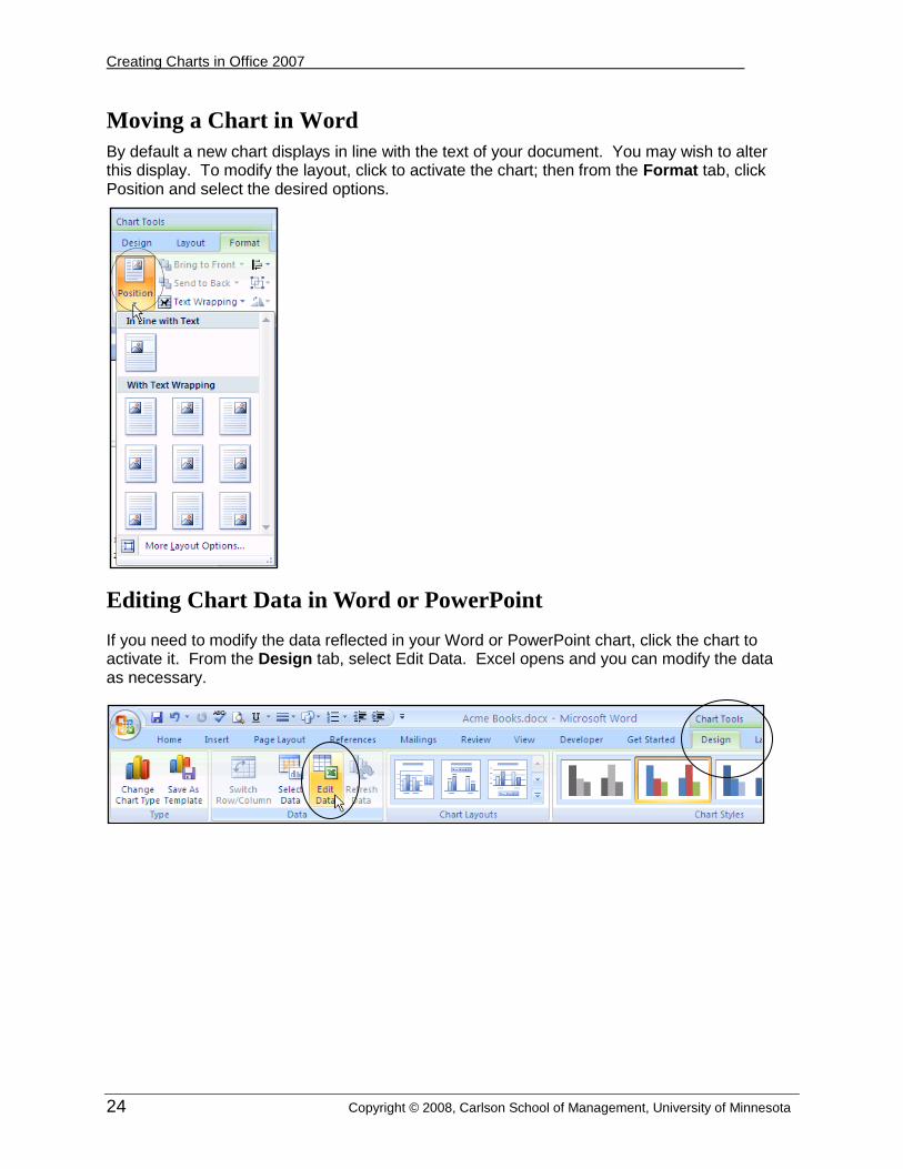
Moving a Chart in Word
By default a new chart displays in line with the text of your document. You may wish to alter this display. To modify the layout, click to activate the chart; then from the Format tab, click Position and select the desired options.
Editing Chart Data in Word or PowerPoint
If you need to modify the data reflected in your Word or PowerPoint chart, click the chart to activate it. From the Design tab, select Edit Data. Excel opens and you can modify the data as necessary.