Creating and saving more complex plots · PDF fileData Visualization in R Example with ggplot2...
21
DATA VISUALIZATION IN R Creating and saving more complex plots
Transcript of Creating and saving more complex plots · PDF fileData Visualization in R Example with ggplot2...

DATA VISUALIZATION IN R
Creating and saving more complex plots

Data Visualization in R
Side-effects and return values● All R graphics functions are called for their side-effects
● They generate a plot
● Unlike most functions, they return nothing useful
● Exception: barplot() function

Data Visualization in R
Side-effects and return values> library(MASS) > tbl <- table(UScereal$shelf) > mids <- barplot(tbl, horiz = TRUE, col = "transparent", names.arg = "") > mids [,1] [1,] 0.7 [2,] 1.9 [3,] 3.1 > text(10, mids, names(tbl), col = "red", font = 2, cex = 2) > title("Distribution of cereals by shelf")

Data Visualization in R
symbols() shows relations between 3 or more variables
> library(MASS) > symbols(UScereal$sugars, UScereal$calories, squares = UScereal$shelf, inches = 0.1, bg = rainbow(3)[UScereal$shelf]) > title("Cereal calories vs. sugars, coded by shelf")

Data Visualization in R
Saving plots as png files# Divert graphics output to png file > png("SavedGraphicsFile.png")
# Create the plot > symbols(UScereal$sugars, UScereal$calories, squares = UScereal$shelf, inches = 0.1, bg = rainbow(3)[UScereal$shelf])
# Add the title > title("Cereal calories vs. sugars, coded by shelf")

DATA VISUALIZATION IN R
Let’s practice!

DATA VISUALIZATION IN R
Using color effectively

Data Visualization in R
Limitations of color● Color-blindness: not everyone can see colors
● Black-and-white reproduction loses all color-coded details
● Can be overused and lose usefulness

Data Visualization in R
● “Ideally, about six …”
● “… hopefully no more than 12 …”
● “… and absolutely no more than 20”
Iliinsky & Steele’s recommended colors

Data Visualization in R
Iliinsky & Steele’s recommended colors

DATA VISUALIZATION IN R
Let’s practice!
DATA VISUALIZATION IN R
Other graphics systems in R

Data Visualization in R
Why base R?● Flexible
● Good for exploratory analysis
● Easy to learn
Data Visualization in R
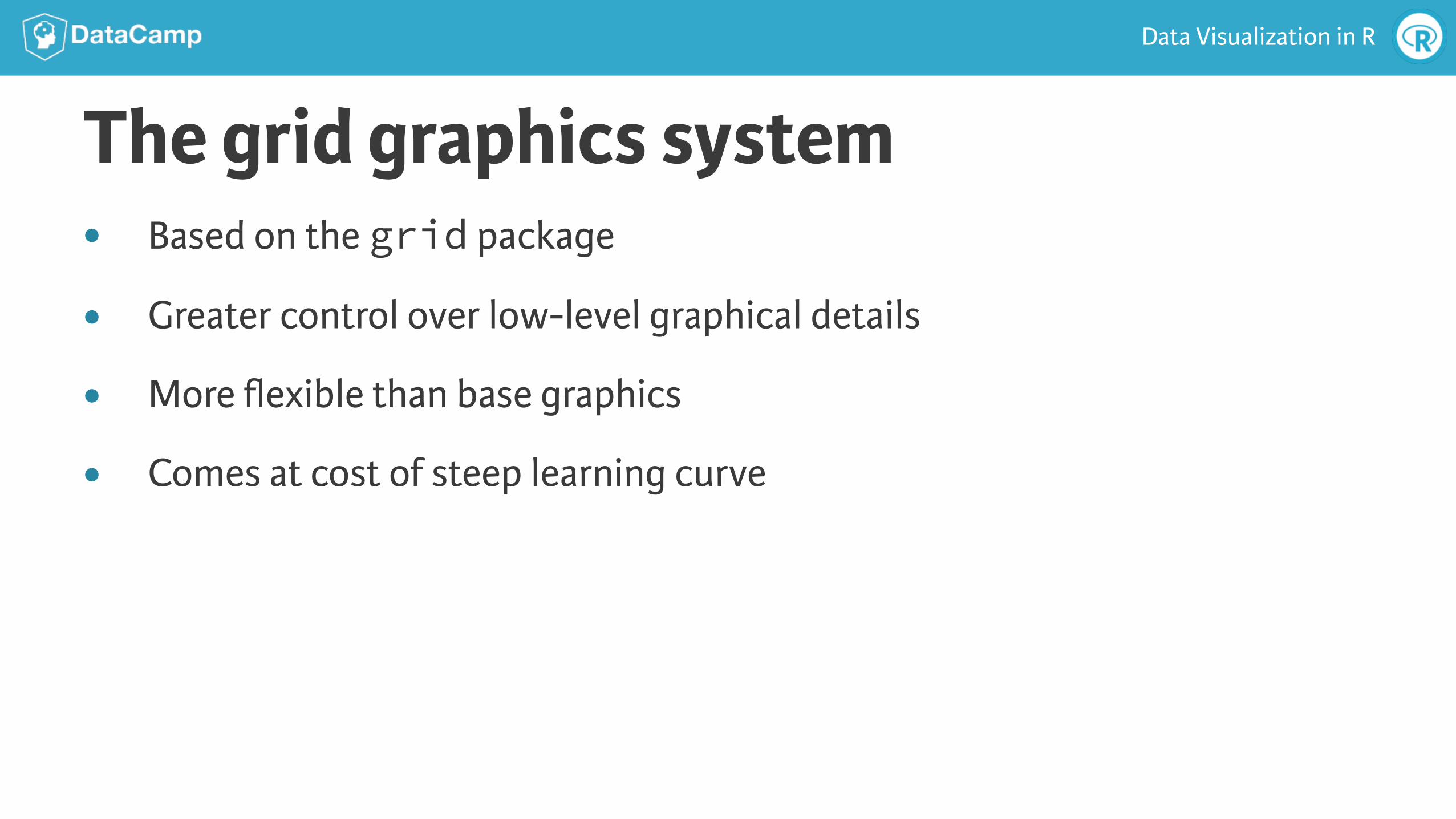
The grid graphics system● Based on the grid package
● Greater control over low-level graphical details
● More flexible than base graphics
● Comes at cost of steep learning curve

Data Visualization in R
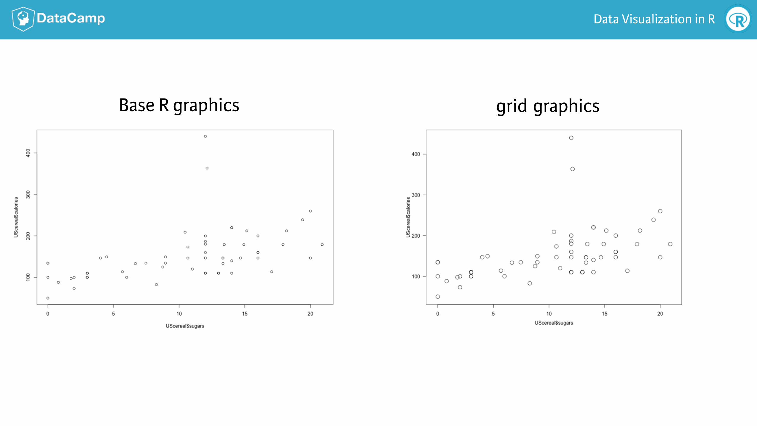
A simple sca"erplot in grid# Get the data and load the grid package > library(MASS) > x <- UScereal$sugars > y <- UScereal$calories > library(grid)
# This is the grid code required to generate the plot > pushViewport(plotViewport()) > pushViewport(dataViewport(x, y)) > grid.rect() > grid.xaxis() > grid.yaxis() > grid.points(x, y) > grid.text("UScereal$calories", x = unit(-3, "lines"), rot = 90) > grid.text("UScereal$sugars", y = unit(-3, "lines"), rot = 0) > popViewport(2)
Data Visualization in R
Base R graphics grid graphics

Data Visualization in R
The lattice graphics system● Built on grid graphics
● Very good for conditional graphs

Data Visualization in R
> library(MASS) > library(lattice) > xyplot(MPG.city ~ Horsepower | Cylinders, data = Cars93)
How does mileage vs. horsepower depend on cylinders?

Data Visualization in R
The ggplot2 graphics package● Very popular graphics package based on grid graphics
● The basis for other DataCamp courses
● Allows us to build complex plots in stages

Data Visualization in R
Example with ggplot2# Sets up plot, but does not display it > basePlot <- ggplot(UScereal, aes(x = sugars, y = calories))
# First, look at a simple scatterplot > basePlot + geom_point()
# Next, make point shapes depend on shelf variable > basePlot + geom_point(shape = as.character(UScereal$shelf))
# Make the points bigger, easier to see > basePlot + geom_point(shape = as.character(UScereal$shelf), size = 3)

DATA VISUALIZATION IN R
Let’s practice!