Package ‘ggpubr’ - The Comprehensive R Archive Network · Package ‘ggpubr’ August 7, 2019...
123
Package ‘ggpubr’ August 7, 2019 Type Package Title 'ggplot2' Based Publication Ready Plots Version 0.2.2 Date 2019-08-03 Description The 'ggplot2' package is excellent and flexible for elegant data visualization in R. However the default generated plots requires some formatting before we can send them for publication. Furthermore, to customize a 'ggplot', the syntax is opaque and this raises the level of difficulty for researchers with no advanced R programming skills. 'ggpubr' provides some easy-to-use functions for creating and customizing 'ggplot2'- based publication ready plots. License GPL-2 LazyData TRUE Encoding UTF-8 Depends R (>= 3.1.0), ggplot2, magrittr Imports ggrepel, grid, ggsci, stats, utils, tidyr, purrr, dplyr (>= 0.7.1), cowplot, ggsignif, scales, gridExtra, glue, polynom, rlang Suggests grDevices, knitr, RColorBrewer, gtable URL https://rpkgs.datanovia.com/ggpubr/ BugReports https://github.com/kassambara/ggpubr/issues RoxygenNote 6.1.1 Collate 'utilities_color.R' 'utilities_base.R' 'desc_statby.R' 'utilities.R' 'add_summary.R' 'annotate_figure.R' 'as_ggplot.R' 'axis_scale.R' 'background_image.R' 'bgcolor.R' 'border.R' 'compare_means.R' 'diff_express.R' 'facet.R' 'font.R' 'gene_citation.R' 'geom_bracket.R' 'geom_exec.R' 'get_legend.R' 'get_palette.R' 'ggadd.R' 'ggarrange.R' 'ggballoonplot.R' 'ggpar.R' 'ggbarplot.R' 'ggboxplot.R' 'ggdensity.R' 'ggpie.R' 'ggdonutchart.R' 'stat_conf_ellipse.R' 'stat_chull.R' 'ggdotchart.R' 'ggdotplot.R' 'ggecdf.R' 'ggerrorplot.R' 'ggexport.R' 'gghistogram.R' 'ggline.R' 'ggmaplot.R' 1
Transcript of Package ‘ggpubr’ - The Comprehensive R Archive Network · Package ‘ggpubr’ August 7, 2019...

Package ‘ggpubr’August 7, 2019
Type Package
Title 'ggplot2' Based Publication Ready Plots
Version 0.2.2
Date 2019-08-03
Description The 'ggplot2' package is excellent and flexible for elegant datavisualization in R. However the default generated plots requires some formattingbefore we can send them for publication. Furthermore, to customize a 'ggplot',the syntax is opaque and this raises the level of difficulty for researcherswith no advanced R programming skills. 'ggpubr' provides some easy-to-usefunctions for creating and customizing 'ggplot2'- based publication ready plots.
License GPL-2
LazyData TRUE
Encoding UTF-8
Depends R (>= 3.1.0), ggplot2, magrittr
Imports ggrepel, grid, ggsci, stats, utils, tidyr, purrr, dplyr (>=0.7.1), cowplot, ggsignif, scales, gridExtra, glue, polynom,rlang
Suggests grDevices, knitr, RColorBrewer, gtable
URL https://rpkgs.datanovia.com/ggpubr/
BugReports https://github.com/kassambara/ggpubr/issues
RoxygenNote 6.1.1
Collate 'utilities_color.R' 'utilities_base.R' 'desc_statby.R''utilities.R' 'add_summary.R' 'annotate_figure.R' 'as_ggplot.R''axis_scale.R' 'background_image.R' 'bgcolor.R' 'border.R''compare_means.R' 'diff_express.R' 'facet.R' 'font.R''gene_citation.R' 'geom_bracket.R' 'geom_exec.R' 'get_legend.R''get_palette.R' 'ggadd.R' 'ggarrange.R' 'ggballoonplot.R''ggpar.R' 'ggbarplot.R' 'ggboxplot.R' 'ggdensity.R' 'ggpie.R''ggdonutchart.R' 'stat_conf_ellipse.R' 'stat_chull.R''ggdotchart.R' 'ggdotplot.R' 'ggecdf.R' 'ggerrorplot.R''ggexport.R' 'gghistogram.R' 'ggline.R' 'ggmaplot.R'
1
2 R topics documented:
'ggpaired.R' 'ggparagraph.R' 'ggpubr_args.R' 'ggqqplot.R''utilities_label.R' 'stat_cor.R' 'stat_stars.R' 'ggscatter.R''ggscatterhist.R' 'ggstripchart.R' 'ggtext.R' 'ggtexttable.R''ggviolin.R' 'gradient_color.R' 'grids.R' 'reexports.R''rotate.R' 'rotate_axis_text.R' 'rremove.R' 'set_palette.R''show_line_types.R' 'show_point_shapes.R''stat_compare_means.R' 'stat_mean.R' 'stat_pvalue_manual.R''stat_regline_equation.R' 'text_grob.R' 'theme_pubr.R''theme_transparent.R'
NeedsCompilation no
Author Alboukadel Kassambara [aut, cre]
Maintainer Alboukadel Kassambara <[email protected]>
Repository CRAN
Date/Publication 2019-08-07 05:50:03 UTC
R topics documented:add_summary . . . . . . . . . . . . . . . . . . . . . . . . . . . . . . . . . . . . . . . . 3annotate_figure . . . . . . . . . . . . . . . . . . . . . . . . . . . . . . . . . . . . . . . 5as_ggplot . . . . . . . . . . . . . . . . . . . . . . . . . . . . . . . . . . . . . . . . . . 7axis_scale . . . . . . . . . . . . . . . . . . . . . . . . . . . . . . . . . . . . . . . . . . 7background_image . . . . . . . . . . . . . . . . . . . . . . . . . . . . . . . . . . . . . 8bgcolor . . . . . . . . . . . . . . . . . . . . . . . . . . . . . . . . . . . . . . . . . . . 9border . . . . . . . . . . . . . . . . . . . . . . . . . . . . . . . . . . . . . . . . . . . . 10compare_means . . . . . . . . . . . . . . . . . . . . . . . . . . . . . . . . . . . . . . . 10desc_statby . . . . . . . . . . . . . . . . . . . . . . . . . . . . . . . . . . . . . . . . . 13diff_express . . . . . . . . . . . . . . . . . . . . . . . . . . . . . . . . . . . . . . . . . 14facet . . . . . . . . . . . . . . . . . . . . . . . . . . . . . . . . . . . . . . . . . . . . . 15font . . . . . . . . . . . . . . . . . . . . . . . . . . . . . . . . . . . . . . . . . . . . . 16gene_citation . . . . . . . . . . . . . . . . . . . . . . . . . . . . . . . . . . . . . . . . 17geom_exec . . . . . . . . . . . . . . . . . . . . . . . . . . . . . . . . . . . . . . . . . 18get_legend . . . . . . . . . . . . . . . . . . . . . . . . . . . . . . . . . . . . . . . . . . 19get_palette . . . . . . . . . . . . . . . . . . . . . . . . . . . . . . . . . . . . . . . . . . 20ggadd . . . . . . . . . . . . . . . . . . . . . . . . . . . . . . . . . . . . . . . . . . . . 21ggarrange . . . . . . . . . . . . . . . . . . . . . . . . . . . . . . . . . . . . . . . . . . 23ggballoonplot . . . . . . . . . . . . . . . . . . . . . . . . . . . . . . . . . . . . . . . . 25ggbarplot . . . . . . . . . . . . . . . . . . . . . . . . . . . . . . . . . . . . . . . . . . 27ggboxplot . . . . . . . . . . . . . . . . . . . . . . . . . . . . . . . . . . . . . . . . . . 32ggdensity . . . . . . . . . . . . . . . . . . . . . . . . . . . . . . . . . . . . . . . . . . 36ggdonutchart . . . . . . . . . . . . . . . . . . . . . . . . . . . . . . . . . . . . . . . . 38ggdotchart . . . . . . . . . . . . . . . . . . . . . . . . . . . . . . . . . . . . . . . . . . 40ggdotplot . . . . . . . . . . . . . . . . . . . . . . . . . . . . . . . . . . . . . . . . . . 44ggecdf . . . . . . . . . . . . . . . . . . . . . . . . . . . . . . . . . . . . . . . . . . . . 47ggerrorplot . . . . . . . . . . . . . . . . . . . . . . . . . . . . . . . . . . . . . . . . . 49ggexport . . . . . . . . . . . . . . . . . . . . . . . . . . . . . . . . . . . . . . . . . . . 52gghistogram . . . . . . . . . . . . . . . . . . . . . . . . . . . . . . . . . . . . . . . . . 53

add_summary 3
ggline . . . . . . . . . . . . . . . . . . . . . . . . . . . . . . . . . . . . . . . . . . . . 56ggmaplot . . . . . . . . . . . . . . . . . . . . . . . . . . . . . . . . . . . . . . . . . . 61ggpaired . . . . . . . . . . . . . . . . . . . . . . . . . . . . . . . . . . . . . . . . . . . 63ggpar . . . . . . . . . . . . . . . . . . . . . . . . . . . . . . . . . . . . . . . . . . . . 65ggparagraph . . . . . . . . . . . . . . . . . . . . . . . . . . . . . . . . . . . . . . . . . 68ggpie . . . . . . . . . . . . . . . . . . . . . . . . . . . . . . . . . . . . . . . . . . . . 69ggpubr_args . . . . . . . . . . . . . . . . . . . . . . . . . . . . . . . . . . . . . . . . . 71ggqqplot . . . . . . . . . . . . . . . . . . . . . . . . . . . . . . . . . . . . . . . . . . . 73ggscatter . . . . . . . . . . . . . . . . . . . . . . . . . . . . . . . . . . . . . . . . . . . 75ggscatterhist . . . . . . . . . . . . . . . . . . . . . . . . . . . . . . . . . . . . . . . . . 79ggstripchart . . . . . . . . . . . . . . . . . . . . . . . . . . . . . . . . . . . . . . . . . 81ggtext . . . . . . . . . . . . . . . . . . . . . . . . . . . . . . . . . . . . . . . . . . . . 85ggtexttable . . . . . . . . . . . . . . . . . . . . . . . . . . . . . . . . . . . . . . . . . . 87ggviolin . . . . . . . . . . . . . . . . . . . . . . . . . . . . . . . . . . . . . . . . . . . 90gradient_color . . . . . . . . . . . . . . . . . . . . . . . . . . . . . . . . . . . . . . . . 94grids . . . . . . . . . . . . . . . . . . . . . . . . . . . . . . . . . . . . . . . . . . . . . 95rotate . . . . . . . . . . . . . . . . . . . . . . . . . . . . . . . . . . . . . . . . . . . . 96rotate_axis_text . . . . . . . . . . . . . . . . . . . . . . . . . . . . . . . . . . . . . . . 96rremove . . . . . . . . . . . . . . . . . . . . . . . . . . . . . . . . . . . . . . . . . . . 97set_palette . . . . . . . . . . . . . . . . . . . . . . . . . . . . . . . . . . . . . . . . . . 98show_line_types . . . . . . . . . . . . . . . . . . . . . . . . . . . . . . . . . . . . . . . 99show_point_shapes . . . . . . . . . . . . . . . . . . . . . . . . . . . . . . . . . . . . . 100stat_bracket . . . . . . . . . . . . . . . . . . . . . . . . . . . . . . . . . . . . . . . . . 100stat_chull . . . . . . . . . . . . . . . . . . . . . . . . . . . . . . . . . . . . . . . . . . 103stat_compare_means . . . . . . . . . . . . . . . . . . . . . . . . . . . . . . . . . . . . 104stat_conf_ellipse . . . . . . . . . . . . . . . . . . . . . . . . . . . . . . . . . . . . . . 107stat_cor . . . . . . . . . . . . . . . . . . . . . . . . . . . . . . . . . . . . . . . . . . . 109stat_mean . . . . . . . . . . . . . . . . . . . . . . . . . . . . . . . . . . . . . . . . . . 111stat_pvalue_manual . . . . . . . . . . . . . . . . . . . . . . . . . . . . . . . . . . . . . 112stat_regline_equation . . . . . . . . . . . . . . . . . . . . . . . . . . . . . . . . . . . . 114stat_stars . . . . . . . . . . . . . . . . . . . . . . . . . . . . . . . . . . . . . . . . . . 117text_grob . . . . . . . . . . . . . . . . . . . . . . . . . . . . . . . . . . . . . . . . . . 118theme_pubr . . . . . . . . . . . . . . . . . . . . . . . . . . . . . . . . . . . . . . . . . 119theme_transparent . . . . . . . . . . . . . . . . . . . . . . . . . . . . . . . . . . . . . . 121
Index 122
add_summary Add Summary Statistics onto a ggplot.
Description
add summary statistics onto a ggplot.

4 add_summary
Usage
add_summary(p, fun = "mean_se", error.plot = "pointrange",color = "black", fill = "white", group = 1, width = NULL,shape = 19, size = 1, linetype = 1, show.legend = NA,ci = 0.95, data = NULL, position = position_dodge(0.8))
mean_se_(x, error.limit = "both")
mean_sd(x, error.limit = "both")
mean_ci(x, ci = 0.95, error.limit = "both")
mean_range(x, error.limit = "both")
median_iqr(x, error.limit = "both")
median_mad(x, error.limit = "both")
median_range(x, error.limit = "both")
Arguments
p a ggplot on which you want to add summary statistics.
fun a function that is given the complete data and should return a data frame withvariables ymin, y, and ymax. Allowed values are one of: "mean", "mean_se","mean_sd", "mean_ci", "mean_range", "median", "median_iqr", "median_mad","median_range".
error.plot plot type used to visualize error. Allowed values are one of c("pointrange","linerange","crossbar","errorbar","upper_errorbar","lower_errorbar","upper_pointrange","lower_pointrange","upper_linerange","lower_linerange").Default value is "pointrange".
color point or outline color.
fill fill color. Used only whne error.plot = "crossbar".
group grouping variable. Allowed values are 1 (for one group) or a character vectorspecifying the name of the grouping variable. Used only for adding statisticalsummary per group.
width numeric value between 0 and 1 specifying bar or box width. Example width =0.8. Used only when error.plot is one of c("crossbar", "errorbar").
shape point shape. Allowed values can be displayed using the function show_point_shapes().
size numeric value in [0-1] specifying point and line size.
linetype line type.
show.legend logical. Should this layer be included in the legends? NA, the default, includesif any aesthetics are mapped. FALSE never includes, and TRUE always includes.It can also be a named logical vector to finely select the aesthetics to display.
ci the percent range of the confidence interval (default is 0.95).
data a data.frame to be displayed. If NULL, the default, the data is inherited fromthe plot data as specified in the call to ggplot.

annotate_figure 5
position position adjustment, either as a string, or the result of a call to a position adjust-ment function. Used to adjust position for multiple groups.
x a numeric vector.
error.limit allowed values are one of ("both", "lower", "upper", "none") specifying whetherto plot the lower and/or the upper limits of error interval.
Functions
• add_summary: add summary statistics onto a ggplot.
• mean_se_: returns the mean and the error limits defined by the standard error. We used thename mean_se_() to avoid masking mean_se().
• mean_sd: returns the mean and the error limits defined by the standard deviation.
• mean_ci: returns the mean and the error limits defined by the confidence interval.
• mean_range: returns the mean and the error limits defined by the range = max -min.
• median_iqr: returns the median and the error limits defined by the interquartile range.
• median_mad: returns the median and the error limits defined by the median absolute deviation.
• median_range: returns the median and the error limits defined by the range = max -min.
Examples
# Basic violin plotp <- ggviolin(ToothGrowth, x = "dose", y = "len", add = "none")p
# Add median_iqradd_summary(p, "mean_sd")
annotate_figure Annotate Arranged Figure
Description
Annotate figures including: i) ggplots, ii) arranged ggplots from ggarrange(), grid.arrange()and plot_grid().
Usage
annotate_figure(p, top = NULL, bottom = NULL, left = NULL,right = NULL, fig.lab = NULL, fig.lab.pos = c("top.left", "top","top.right", "bottom.left", "bottom", "bottom.right"), fig.lab.size,fig.lab.face)

6 annotate_figure
Arguments
p (arranged) ggplots.top, bottom, left, right
optional string, or grob.
fig.lab figure label (e.g.: "Figure 1").
fig.lab.pos position of the figure label, can be one of "top.left", "top", "top.right", "bot-tom.left", "bottom", "bottom.right". Default is "top.left".
fig.lab.size optional size of the figure label.
fig.lab.face optional font face of the figure label. Allowed values include: "plain", "bold","italic", "bold.italic".
Author(s)
Alboukadel Kassambara <[email protected]>
See Also
ggarrange()
Examples
data("ToothGrowth")df <- ToothGrowthdf$dose <- as.factor(df$dose)
# Create some plots# ::::::::::::::::::::::::::::::::::::::::::::::::::# Box plotbxp <- ggboxplot(df, x = "dose", y = "len",
color = "dose", palette = "jco")# Dot plotdp <- ggdotplot(df, x = "dose", y = "len",
color = "dose", palette = "jco")# Density plotdens <- ggdensity(df, x = "len", fill = "dose", palette = "jco")
# Arrange and annotate# ::::::::::::::::::::::::::::::::::::::::::::::::::figure <- ggarrange(bxp, dp, dens, ncol = 2, nrow = 2)annotate_figure(figure,
top = text_grob("Visualizing Tooth Growth", color = "red", face = "bold", size = 14),bottom = text_grob("Data source: \n ToothGrowth data set", color = "blue",
hjust = 1, x = 1, face = "italic", size = 10),left = text_grob("Figure arranged using ggpubr", color = "green", rot = 90),right = "I'm done, thanks :-)!",fig.lab = "Figure 1", fig.lab.face = "bold"
)

as_ggplot 7
as_ggplot Storing grid.arrange() arrangeGrob() and plots
Description
Transform the output of arrangeGrob() and grid.arrange() to a an object of class ggplot.
Usage
as_ggplot(x)
Arguments
x an object of class gtable or grob as returned by the functions arrangeGrob()and grid.arrange().
Value
an object of class ggplot.
Examples
# Creat some plotsbxp <- ggboxplot(iris, x = "Species", y = "Sepal.Length")vp <- ggviolin(iris, x = "Species", y = "Sepal.Length",
add = "mean_sd")
# Arrange the plots in one page# Returns a gtable (grob) objectlibrary(gridExtra)gt <- arrangeGrob(bxp, vp, ncol = 2)
# Transform to a ggplot and printas_ggplot(gt)
axis_scale Change Axis Scale: log2, log10 and more
Description
Change axis scale.
• xscale: change x axis scale.
• yscale: change y axis scale.

8 background_image
Usage
xscale(.scale, .format = FALSE)
yscale(.scale, .format = FALSE)
Arguments
.scale axis scale. Allowed values are one of c("none", "log2", "log10", "sqrt", "per-cent", "dollar", "scientific"); e.g.: .scale="log2".
.format ogical value. If TRUE, axis tick mark labels will be formatted when .scale ="log2" or "log10".
Examples
# Basic scatter plotsdata(cars)p <- ggscatter(cars, x = "speed", y = "dist")p
# Set log scalep + yscale("log2", .format = TRUE)
background_image Add Background Image to ggplot2
Description
Add background image to ggplot2.
Usage
background_image(raster.img)
Arguments
raster.img raster object to display, as returned by the function readPNG()[in png package]and readJPEG() [in jpeg package].
Author(s)
Alboukadel Kassambara <[email protected]>

bgcolor 9
Examples
## Not run:install.packages("png")
# Import the imageimg.file <- system.file(file.path("images", "background-image.png"),
package = "ggpubr")img <- png::readPNG(img.file)
# Plot with background imageggplot(iris, aes(Species, Sepal.Length))+background_image(img)+geom_boxplot(aes(fill = Species), color = "white")+fill_palette("jco")
## End(Not run)
bgcolor Change ggplot Panel Background Color
Description
Change ggplot panel background color.
Usage
bgcolor(color)
Arguments
color background color.
See Also
border().
Examples
# Load datadata("ToothGrowth")df <- ToothGrowth
# Basic plotp <- ggboxplot(df, x = "dose", y = "len")p
# Change panel background colorp +

10 compare_means
bgcolor("#BFD5E3")+border("#BFD5E3")
border Set ggplot Panel Border Line
Description
Change or set ggplot panel border.
Usage
border(color = "black", size = 0.8, linetype = NULL)
Arguments
color border line color.
size numeric value specifying border line size.
linetype line type. An integer (0:8), a name (blank, solid, dashed, dotted, dotdash, long-dash, twodash). Sess show_line_types.
Examples
# Load datadata("ToothGrowth")df <- ToothGrowth
# Basic plotp <- ggboxplot(df, x = "dose", y = "len")p
# Add borderp + border()
compare_means Comparison of Means
Description
Performs one or multiple mean comparisons.
Usage
compare_means(formula, data, method = "wilcox.test", paired = FALSE,group.by = NULL, ref.group = NULL, symnum.args = list(),p.adjust.method = "holm", ...)

compare_means 11
Arguments
formula a formula of the form x ~ group where x is a numeric variable giving the datavalues and group is a factor with one or multiple levels giving the correspondinggroups. For example, formula = TP53 ~ cancer_group.It’s also possible to perform the test for multiple response variables at the sametime. For example, formula = c(TP53,PTEN) ~ cancer_group.
data a data.frame containing the variables in the formula.
method the type of test. Default is wilcox.test. Allowed values include:
• t.test (parametric) and wilcox.test (non-parametric). Perform compar-ison between two groups of samples. If the grouping variable contains morethan two levels, then a pairwise comparison is performed.
• anova (parametric) and kruskal.test (non-parametric). Perform one-wayANOVA test comparing multiple groups.
paired a logical indicating whether you want a paired test. Used only in t.test and inwilcox.test.
group.by a character vector containing the name of grouping variables.
ref.group a character string specifying the reference group. If specified, for a given group-ing variable, each of the group levels will be compared to the reference group(i.e. control group).ref.group can be also ".all.". In this case, each of the grouping variablelevels is compared to all (i.e. basemean).
symnum.args a list of arguments to pass to the function symnum for symbolic number coding ofp-values. For example, symnum.args <-list(cutpoints = c(0,0.0001,0.001,0.01,0.05,1),symbols= c("****","***","**","*","ns")).In other words, we use the following convention for symbols indicating statisti-cal significance:
• ns: p > 0.05• *: p <= 0.05• **: p <= 0.01• ***: p <= 0.001• ****: p <= 0.0001
p.adjust.method
method for adjusting p values (see p.adjust). Has impact only in a situation,where multiple pairwise tests are performed; or when there are multiple group-ing variables. Allowed values include "holm", "hochberg", "hommel", "bonfer-roni", "BH", "BY", "fdr", "none". If you don’t want to adjust the p value (notrecommended), use p.adjust.method = "none".Note that, when the formula contains multiple variables, the p-value adjustmentis done independently for each variable.
... Other arguments to be passed to the test function.
Value
return a data frame with the following columns:

12 compare_means
• .y.: the y variable used in the test.
• group1,group2: the compared groups in the pairwise tests. Available only when method ="t.test" or method = "wilcox.test".
• p: the p-value.
• p.adj: the adjusted p-value. Default for p.adjust.method = "holm".
• p.format: the formatted p-value.
• p.signif: the significance level.
• method: the statistical test used to compare groups.
Examples
# Load data#:::::::::::::::::::::::::::::::::::::::data("ToothGrowth")df <- ToothGrowth
# One-sample test#:::::::::::::::::::::::::::::::::::::::::compare_means(len ~ 1, df, mu = 0)
# Two-samples unpaired test#:::::::::::::::::::::::::::::::::::::::::compare_means(len ~ supp, df)
# Two-samples paired test#:::::::::::::::::::::::::::::::::::::::::compare_means(len ~ supp, df, paired = TRUE)
# Compare supp levels after grouping the data by "dose"#::::::::::::::::::::::::::::::::::::::::compare_means(len ~ supp, df, group.by = "dose")
# pairwise comparisons#::::::::::::::::::::::::::::::::::::::::# As dose contains more thant two levels ==># pairwise test is automatically performed.compare_means(len ~ dose, df)
# Comparison against reference group#::::::::::::::::::::::::::::::::::::::::compare_means(len ~ dose, df, ref.group = "0.5")
# Comparison against all#::::::::::::::::::::::::::::::::::::::::compare_means(len ~ dose, df, ref.group = ".all.")
# Anova and kruskal.test#::::::::::::::::::::::::::::::::::::::::compare_means(len ~ dose, df, method = "anova")compare_means(len ~ dose, df, method = "kruskal.test")

desc_statby 13
desc_statby Descriptive statistics by groups
Description
Computes descriptive statistics by groups for a measure variable.
Usage
desc_statby(data, measure.var, grps, ci = 0.95)
Arguments
data a data frame.measure.var the name of a column containing the variable to be summarized.grps a character vector containing grouping variables; e.g.: grps = c("grp1", "grp2")ci the percent range of the confidence interval (default is 0.95).
Value
A data frame containing descriptive statistics, such as:
• length: the number of elements in each group• min: minimum• max: maximum• median: median• mean: mean• iqr: interquartile range• mad: median absolute deviation (see ?MAD)• sd: standard deviation of the mean• se: standard error of the mean• ci: confidence interval of the mean• range: the range = max - min• cv: coefficient of variation, sd/mean• var: variance, sd^2
Examples
# Load datadata("ToothGrowth")
# Descriptive statisticsres <- desc_statby(ToothGrowth, measure.var = "len",
grps = c("dose", "supp"))head(res[, 1:10])

14 diff_express
diff_express Differential gene expression analysis results
Description
Differential gene expression analysis results obtained from comparing the RNAseq data of twodifferent cell populations using DESeq2
Usage
data("diff_express")
Format
A data frame with 36028 rows and 5 columns.
name gene namesbaseMean mean expression signal across all sampleslog2FoldChange log2 fold changepadj Adjusted p-valuedetection_call a numeric vector specifying whether the genes is expressed (value = 1) or not
(value = 0).
Examples
data(diff_express)
# Default plotggmaplot(diff_express, main = expression("Group 1" %->% "Group 2"),
fdr = 0.05, fc = 2, size = 0.4,palette = c("#B31B21", "#1465AC", "darkgray"),genenames = as.vector(diff_express$name),legend = "top", top = 20,font.label = c("bold", 11),font.legend = "bold",font.main = "bold",ggtheme = ggplot2::theme_minimal())
# Add rectangle around labeslggmaplot(diff_express, main = expression("Group 1" %->% "Group 2"),
fdr = 0.05, fc = 2, size = 0.4,palette = c("#B31B21", "#1465AC", "darkgray"),genenames = as.vector(diff_express$name),legend = "top", top = 20,font.label = c("bold", 11), label.rectangle = TRUE,font.legend = "bold",font.main = "bold",ggtheme = ggplot2::theme_minimal())

facet 15
facet Facet a ggplot into Multiple Panels
Description
Create multi-panel plots of a data set grouped by one or two grouping variables. Wrapper aroundfacet_wrap
Usage
facet(p, facet.by, nrow = NULL, ncol = NULL, scales = "fixed",short.panel.labs = TRUE, panel.labs = NULL,panel.labs.background = list(color = NULL, fill = NULL),panel.labs.font = list(face = NULL, color = NULL, size = NULL, angle =NULL), panel.labs.font.x = panel.labs.font,panel.labs.font.y = panel.labs.font, strip.position = "top", ...)
Arguments
p a ggplot
facet.by character vector, of length 1 or 2, specifying grouping variables for faceting theplot into multiple panels. Should be in the data.
nrow, ncol Number of rows and columns in the panel. Used only when the data is facetedby one grouping variable.
scales should axis scales of panels be fixed ("fixed", the default), free ("free"), or freein one dimension ("free_x", "free_y").
short.panel.labs
logical value. Default is TRUE. If TRUE, create short labels for panels by omit-ting variable names; in other words panels will be labelled only by variablegrouping levels.
panel.labs a list of one or two character vectors to modify facet panel labels. For example,panel.labs = list(sex = c("Male", "Female")) specifies the labels for the "sex"variable. For two grouping variables, you can use for example panel.labs =list(sex = c("Male", "Female"), rx = c("Obs", "Lev", "Lev2") ).
panel.labs.background
a list to customize the background of panel labels. Should contain the combina-tion of the following elements:
• color,linetype,size: background line color, type and size• fill: background fill color.
For example, panel.labs.background = list(color = "blue", fill = "pink", linetype= "dashed", size = 0.5).
panel.labs.font
a list of aestheics indicating the size (e.g.: 14), the face/style (e.g.: "plain","bold", "italic", "bold.italic") and the color (e.g.: "red") and the orientation angle(e.g.: 45) of panel labels.

16 font
panel.labs.font.x, panel.labs.font.y
same as panel.labs.font but for only x and y direction, respectively.
strip.position (used only in facet_wrap()). By default, the labels are displayed on the top ofthe plot. Using strip.position it is possible to place the labels on either of thefour sides by setting strip.position = c("top","bottom","left","right")
... not used
Examples
p <- ggboxplot(ToothGrowth, x = "dose", y = "len",color = "supp")
print(p)
facet(p, facet.by = "supp")
# Customizefacet(p + theme_bw(), facet.by = "supp",
short.panel.labs = FALSE, # Allow long labels in panelspanel.labs.background = list(fill = "steelblue", color = "steelblue")
)
font Change the Appearance of Titles and Axis Labels
Description
Change the appearance of the main title, subtitle, caption, axis labels and text, as well as the legendtitle and texts. Wrapper around element_text().
Usage
font(object, size = NULL, color = NULL, face = NULL, family = NULL,...)
Arguments
object character string specifying the plot components. Allowed values include:
• "title" for the main title• "subtitle" for the plot subtitle• "caption" for the plot caption• "legend.title" for the legend title• "legend.text" for the legend text• "x","xlab",or "x.title" for x axis label• "y","ylab",or "y.title" for y axis label• "xy","xylab","xy.title" or "axis.title" for both x and y axis labels• "x.text" for x axis texts (x axis tick labels)

gene_citation 17
• "y.text" for y axis texts (y axis tick labels)• "xy.text" or "axis.text" for both x and y axis texts
size numeric value specifying the font size, (e.g.: size = 12).color character string specifying the font color, (e.g.: color = "red").face the font face or style. Allowed values include one of "plain","bold","italic","bold.italic",
(e.g.: face = "bold.italic").family the font family.... other arguments to pass to the function element_text().
Examples
# Load datadata("ToothGrowth")
# Basic plotp <- ggboxplot(ToothGrowth, x = "dose", y = "len", color = "dose",
title = "Box Plot created with ggpubr",subtitle = "Length by dose",caption = "Source: ggpubr",xlab ="Dose (mg)", ylab = "Teeth length")
p
# Change the appearance of titles and labelsp +font("title", size = 14, color = "red", face = "bold.italic")+font("subtitle", size = 10, color = "orange")+font("caption", size = 10, color = "orange")+font("xlab", size = 12, color = "blue")+font("ylab", size = 12, color = "#993333")+font("xy.text", size = 12, color = "gray", face = "bold")
# Change the appearance of legend title and textsp +font("legend.title", color = "blue", face = "bold")+font("legend.text", color = "red")
gene_citation Gene Citation Index
Description
Contains the mean citation index of 66 genes obtained by assessing PubMed abstracts and annota-tions using two key words i) Gene name + b cell differentiation and ii) Gene name + plasma celldifferentiation.
Usage
data("gene_citation")

18 geom_exec
Format
A data frame with 66 rows and 2 columns.
gene gene names
citation_index mean citation index
Examples
data(gene_citation)
# Some key genes of interest to be highlightedkey.gns <- c("MYC", "PRDM1", "CD69", "IRF4", "CASP3", "BCL2L1", "MYB", "BACH2", "BIM1", "PTEN",
"KRAS", "FOXP1", "IGF1R", "KLF4", "CDK6", "CCND2", "IGF1", "TNFAIP3", "SMAD3", "SMAD7","BMPR2", "RB1", "IGF2R", "ARNT")
# Density distributionggdensity(gene_citation, x = "citation_index", y = "..count..",
xlab = "Number of citation",ylab = "Number of genes",fill = "lightgray", color = "black",label = "gene", label.select = key.gns, repel = TRUE,font.label = list(color= "citation_index"),xticks.by = 20, # Break x ticks by 20gradient.cols = c("blue", "red"),legend = "bottom",legend.title = "" # Hide legend title)
geom_exec Execute ggplot2 functions
Description
A helper function used by ggpubr functions to execute any geom_* functions in ggplot2. Usefulonly when you want to call a geom_* function without carrying about the arguments to put in aes().Basic users of ggpubr don’t need this function.
Usage
geom_exec(geomfunc = NULL, data = NULL, position = NULL, ...)
Arguments
geomfunc a ggplot2 function (e.g.: geom_point)
data a data frame to be used for mapping
position Position adjustment, either as a string, or the result of a call to a position adjust-ment function.
... arguments accepted by the function

get_legend 19
Value
return a plot if geomfunc!=Null or a list(option, mapping) if geomfunc = NULL.
Examples
## Not run:ggplot() + geom_exec(geom_point, data = mtcars,
x = "mpg", y = "wt", size = "cyl", color = "cyl")
## End(Not run)
get_legend Extract Legends from a ggplot object
Description
Extract the legend labels from a ggplot object.
Usage
get_legend(p)
Arguments
p an object of class ggplot or a list of ggplots. If p is a list, only the first legend isreturned.
Value
an object of class gtable.
Examples
# Create a scatter plotp <- ggscatter(iris, x = "Sepal.Length", y = "Sepal.Width",
color = "Species", palette = "jco",ggtheme = theme_minimal())
p
# Extract the legend. Returns a gtableleg <- get_legend(p)
# Convert to a ggplot and printas_ggplot(leg)

20 get_palette
get_palette Generate Color Palettes
Description
Generate a palette of k colors from ggsci palettes, RColorbrewer palettes and custom color palettes.Useful to extend RColorBrewer and ggsci to support more colors.
Usage
get_palette(palette = "default", k)
Arguments
palette Color palette. Allowed values include:
• Grey color palettes: "grey" or "gray";
• RColorBrewer palettes, see brewer.pal and details section. Examples ofpalette names include: "RdBu", "Blues", "Dark2", "Set2", ...;
• Custom color palettes. For example, palette = c("#00AFBB", "#E7B800","#FC4E07");
• ggsci scientific journal palettes, e.g.: "npg", "aaas", "lancet", "jco", "uc-scgb", "uchicago", "simpsons" and "rickandmorty".
k the number of colors to generate.
Details
RColorBrewer palettes: To display all available color palettes, type this in R:RColorBrewer::display.brewer.all().Color palette names include:
• Sequential palettes, suited to ordered data that progress from low to high. Palette namesinclude: Blues BuGn BuPu GnBu Greens Greys Oranges OrRd PuBu PuBuGn PuRd PurplesRdPu Reds YlGn YlGnBu YlOrBr YlOrRd.
• Diverging palettes:Gradient colors. Names include: BrBG PiYG PRGn PuOr RdBu RdGyRdYlBu RdYlGn Spectral.
• Qualitative palettes: Best suited to representing nominal or categorical data. Names include:Accent, Dark2, Paired, Pastel1, Pastel2, Set1, Set2, Set3.
Value
Returns a vector of color palettes.

ggadd 21
Examples
data("iris")iris$Species2 <- factor(rep(c(1:10), each = 15))
# Generate a gradient of 10 colorsggscatter(iris, x = "Sepal.Length", y = "Petal.Length",color = "Species2",palette = get_palette(c("#00AFBB", "#E7B800", "#FC4E07"), 10))
# Scatter plot with default color paletteggscatter(iris, x = "Sepal.Length", y = "Petal.Length",color = "Species")
# RColorBrewer color palettesggscatter(iris, x = "Sepal.Length", y = "Petal.Length",color = "Species", palette = get_palette("Dark2", 3))
# ggsci color palettesggscatter(iris, x = "Sepal.Length", y = "Petal.Length",color = "Species", palette = get_palette("npg", 3))
# Custom color paletteggscatter(iris, x = "Sepal.Length", y = "Petal.Length",color = "Species",palette = c("#00AFBB", "#E7B800", "#FC4E07"))
# Or use thisggscatter(iris, x = "Sepal.Length", y = "Petal.Length",color = "Species",palette = get_palette(c("#00AFBB", "#FC4E07"), 3))
ggadd Add Summary Statistics or a Geom onto a ggplot
Description
Add summary statistics or a geometry onto a ggplot.
Usage
ggadd(p, add = NULL, color = "black", fill = "white", group = 1,width = 1, shape = 19, size = NULL, alpha = 1, jitter = 0.2,binwidth = NULL, dotsize = size, linetype = 1, show.legend = NA,error.plot = "pointrange", ci = 0.95, data = NULL,position = position_dodge(0.8), p_geom = "")

22 ggadd
Arguments
p a ggplot
add character vector specifying other plot elements to be added. Allowed valuesare one or the combination of: "none", "dotplot", "jitter", "boxplot", "point","mean", "mean_se", "mean_sd", "mean_ci", "mean_range", "median", "median_iqr","median_mad", "median_range".
color point or outline color.
fill fill color. Used only when error.plot = "crossbar".
group grouping variable. Allowed values are 1 (for one group) or a character vectorspecifying the name of the grouping variable. Used only for adding statisticalsummary per group.
width numeric value between 0 and 1 specifying bar or box width. Example width =0.8. Used only when error.plot is one of c("crossbar", "errorbar").
shape point shape. Allowed values can be displayed using the function show_point_shapes().
size numeric value in [0-1] specifying point and line size.
alpha numeric value specifying fill color transparency. Value should be in [0, 1], where0 is full transparency and 1 is no transparency.
jitter a numeric value specifying the amount of jittering. Used only when add contains"jitter".
binwidth numeric value specifying bin width. use value between 0 and 1 when you have astrong dense dotplot. For example binwidth = 0.2. Used only when add contains"dotplot".
dotsize as size but applied only to dotplot.
linetype line type.
show.legend logical. Should this layer be included in the legends? NA, the default, includesif any aesthetics are mapped. FALSE never includes, and TRUE always includes.It can also be a named logical vector to finely select the aesthetics to display.
error.plot plot type used to visualize error. Allowed values are one of c("pointrange","linerange","crossbar","errorbar","upper_errorbar","lower_errorbar","upper_pointrange","lower_pointrange","upper_linerange","lower_linerange").Default value is "pointrange".
ci the percent range of the confidence interval (default is 0.95).
data a data.frame to be displayed. If NULL, the default, the data is inherited fromthe plot data as specified in the call to ggplot.
position position adjustment, either as a string, or the result of a call to a position adjust-ment function. Used to adjust position for multiple groups.
p_geom the geometry of the main plot. Ex: p_geom = "geom_line". If NULL, thegeometry is extracted from p. Used only by ggline().
Examples
# Basic violin plotdata("ToothGrowth")p <- ggviolin(ToothGrowth, x = "dose", y = "len", add = "none")

ggarrange 23
# Add mean +/- SD and jitter pointsp %>% ggadd(c("mean_sd", "jitter"), color = "dose")
# Add box plotp %>% ggadd(c("boxplot", "jitter"), color = "dose")
ggarrange Arrange Multiple ggplots
Description
Arrange multiple ggplots on the same page. Wrapper around plot_grid(). Can arrange multipleggplots over multiple pages, compared to the standard plot_grid(). Can also create a commonunique legend for multiple plots.
Usage
ggarrange(..., plotlist = NULL, ncol = NULL, nrow = NULL,labels = NULL, label.x = 0, label.y = 1, hjust = -0.5,vjust = 1.5, font.label = list(size = 14, color = "black", face ="bold", family = NULL), align = c("none", "h", "v", "hv"),widths = 1, heights = 1, legend = NULL, common.legend = FALSE)
Arguments
... list of plots to be arranged into the grid. The plots can be either ggplot2 plotobjects or arbitrary gtables.
plotlist (optional) list of plots to display.
ncol (optional) number of columns in the plot grid.
nrow (optional) number of rows in the plot grid.
labels (optional) list of labels to be added to the plots. You can also set labels="AUTO"to auto-generate upper-case labels or labels="auto" to auto-generate lower-caselabels.
label.x (optional) Single value or vector of x positions for plot labels, relative to eachsubplot. Defaults to 0 for all labels. (Each label is placed all the way to the leftof each plot.)
label.y (optional) Single value or vector of y positions for plot labels, relative to eachsubplot. Defaults to 1 for all labels. (Each label is placed all the way to the topof each plot.)
hjust Adjusts the horizontal position of each label. More negative values move thelabel further to the right on the plot canvas. Can be a single value (applied to alllabels) or a vector of values (one for each label). Default is -0.5.
vjust Adjusts the vertical position of each label. More positive values move the labelfurther down on the plot canvas. Can be a single value (applied to all labels) ora vector of values (one for each label). Default is 1.5.
24 ggarrange
font.label a list of arguments for customizing labels. Allowed values are the combinationof the following elements: size (e.g.: 14), face (e.g.: "plain", "bold", "italic","bold.italic"), color (e.g.: "red") and family. For example font.label = list(size =14, face = "bold", color ="red").
align (optional) Specifies whether graphs in the grid should be horizontally ("h") orvertically ("v") aligned. Options are "none" (default), "hv" (align in both direc-tions), "h", and "v".
widths (optional) numerical vector of relative columns widths. For example, in a two-column grid, widths = c(2, 1) would make the first column twice as wide as thesecond column.
heights same as widths but for column heights.
legend character specifying legend position. Allowed values are one of c("top", "bot-tom", "left", "right", "none"). To remove the legend use legend = "none".
common.legend logical value. Default is FALSE. If TRUE, a common unique legend will becreated for arranged plots.
Value
return an object of class ggarrange, which is a ggplot or a list of ggplot.
Author(s)
Alboukadel Kassambara <[email protected]>
See Also
annotate_figure()
Examples
data("ToothGrowth")df <- ToothGrowthdf$dose <- as.factor(df$dose)
# Create some plots# ::::::::::::::::::::::::::::::::::::::::::::::::::# Box plotbxp <- ggboxplot(df, x = "dose", y = "len",
color = "dose", palette = "jco")# Dot plotdp <- ggdotplot(df, x = "dose", y = "len",
color = "dose", palette = "jco")# Density plotdens <- ggdensity(df, x = "len", fill = "dose", palette = "jco")
# Arrange# ::::::::::::::::::::::::::::::::::::::::::::::::::ggarrange(bxp, dp, dens, ncol = 2, nrow = 2)# Use a common legend for multiple plotsggarrange(bxp, dp, common.legend = TRUE)

ggballoonplot 25
ggballoonplot Ballon plot
Description
Plot a graphical matrix where each cell contains a dot whose size reflects the relative magnitudeof the corresponding component. Useful to visualize contingency table formed by two categoricalvariables.
Usage
ggballoonplot(data, x = NULL, y = NULL, size = "value",facet.by = NULL, size.range = c(1, 10), shape = 21,color = "black", fill = "gray", show.label = FALSE,font.label = list(size = 12, color = "black"), rotate.x.text = TRUE,ggtheme = theme_minimal(), ...)
Arguments
data a data frame. Can be:
• a standard contingency table formed by two categorical variables: a dataframe with row names and column names. The categories of the first vari-able are columns and the categories of the second variable are rows.
• a streched contingency table: a data frame containing at least three columnscorresponding, respectively, to (1) the categories of the first variable, (2) thecategories of the second varible, (3) the frequency value. In this case, youshould specify the argument x and y in the function ggballoonplot()
.
x, y the column names specifying, respectively, the first and the second variableforming the contingency table. Required only when the data is a stretched con-tingency table.
size point size. By default, the points size reflects the relative magnitude of the valueof the corresponding cell (size = "value"). Can be also numeric (size = 4).
facet.by character vector, of length 1 or 2, specifying grouping variables for faceting theplot into multiple panels. Should be in the data.
size.range a numeric vector of length 2 that specifies the minimum and maximum size ofthe plotting symbol. Default values are size.range = c(1,10).
shape points shape. The default value is 21. Alternaive values include 22, 23, 24, 25.
color point border line color.
fill point fill color. Default is "lightgray". Considered only for points 21 to 25.
show.label logical. If TRUE, show the data cell values as point labels.

26 ggballoonplot
font.label a vector of length 3 indicating respectively the size (e.g.: 14), the style (e.g.:"plain", "bold", "italic", "bold.italic") and the color (e.g.: "red") of point labels.For example font.label = c(14, "bold", "red"). To specify only the size and thestyle, use font.label = c(14, "plain").
rotate.x.text logica. If TRUE (default), rotate the x axis text.
ggtheme function, ggplot2 theme name. Default value is theme_pubr(). Allowed valuesinclude ggplot2 official themes: theme_gray(), theme_bw(), theme_minimal(),theme_classic(), theme_void(), ....
... other arguments passed to the function ggpar
Examples
# Define color palettemy_cols <- c("#0D0887FF", "#6A00A8FF", "#B12A90FF","#E16462FF", "#FCA636FF", "#F0F921FF")
# Standard contingency table#:::::::::::::::::::::::::::::::::::::::::::::::::::::::::# Read a contingency table: housetasks# Repartition of 13 housetasks in the coupledata <- read.delim(
system.file("demo-data/housetasks.txt", package = "ggpubr"),row.names = 1)
data
# Basic ballon plotggballoonplot(data)
# Change color and fillggballoonplot(data, color = "#0073C2FF", fill = "#0073C2FF")
# Change color according to the value of table cellsggballoonplot(data, fill = "value")+
scale_fill_gradientn(colors = my_cols)
# Change the plotting symbol shapeggballoonplot(data, fill = "value", shape = 23)+
gradient_fill(c("blue", "white", "red"))
# Set points size to 8, but change fill color by values# Sow labelsggballoonplot(data, fill = "value", color = "lightgray",
size = 10, show.label = TRUE)+gradient_fill(c("blue", "white", "red"))
# Streched contingency table#:::::::::::::::::::::::::::::::::::::::::::::::::::::::::
ggbarplot 27
# Create an Example Data Frame Containing Car x Color datacarnames <- c("bmw","renault","mercedes","seat")carcolors <- c("red","white","silver","green")datavals <- round(rnorm(16, mean=100, sd=60),1)car_data <- data.frame(Car = rep(carnames,4),
Color = rep(carcolors, c(4,4,4,4) ),Value=datavals )
car_data
ggballoonplot(car_data, x = "Car", y = "Color",size = "Value", fill = "Value") +
scale_fill_gradientn(colors = my_cols) +guides(size = FALSE)
# Grouped frequency table#:::::::::::::::::::::::::::::::::::::::::::::::::::::::::data("Titanic")dframe <- as.data.frame(Titanic)head(dframe)ggballoonplot(dframe, x = "Class", y = "Sex",size = "Freq", fill = "Freq",facet.by = c("Survived", "Age"),ggtheme = theme_bw()
)+scale_fill_gradientn(colors = my_cols)
# Hair and Eye Color of Statistics Studentsdata(HairEyeColor)ggballoonplot( as.data.frame(HairEyeColor),
x = "Hair", y = "Eye", size = "Freq",ggtheme = theme_gray()) %>%
facet("Sex")
ggbarplot Bar plot
Description
Create a bar plot.
Usage
ggbarplot(data, x, y, combine = FALSE, merge = FALSE,color = "black", fill = "white", palette = NULL, size = NULL,width = NULL, title = NULL, xlab = NULL, ylab = NULL,

28 ggbarplot
facet.by = NULL, panel.labs = NULL, short.panel.labs = TRUE,select = NULL, remove = NULL, order = NULL, add = "none",add.params = list(), error.plot = "errorbar", label = FALSE,lab.col = "black", lab.size = 4, lab.pos = c("out", "in"),lab.vjust = NULL, lab.hjust = NULL, lab.nb.digits = NULL,sort.val = c("none", "desc", "asc"), sort.by.groups = TRUE,top = Inf, position = position_stack(), ggtheme = theme_pubr(),...)
Arguments
data a data frame
x, y x and y variables for drawing.
combine logical value. Default is FALSE. Used only when y is a vector containing mul-tiple variables to plot. If TRUE, create a multi-panel plot by combining the plotof y variables.
merge logical or character value. Default is FALSE. Used only when y is a vectorcontaining multiple variables to plot. If TRUE, merge multiple y variables inthe same plotting area. Allowed values include also "asis" (TRUE) and "flip".If merge = "flip", then y variables are used as x tick labels and the x variable isused as grouping variable.
color, fill outline and fill colors.
palette the color palette to be used for coloring or filling by groups. Allowed valuesinclude "grey" for grey color palettes; brewer palettes e.g. "RdBu", "Blues",...; or custom color palette e.g. c("blue", "red"); and scientific journal palettesfrom ggsci R package, e.g.: "npg", "aaas", "lancet", "jco", "ucscgb", "uchicago","simpsons" and "rickandmorty".
size Numeric value (e.g.: size = 1). change the size of points and outlines.
width numeric value between 0 and 1 specifying box width.
title plot main title.
xlab character vector specifying x axis labels. Use xlab = FALSE to hide xlab.
ylab character vector specifying y axis labels. Use ylab = FALSE to hide ylab.
facet.by character vector, of length 1 or 2, specifying grouping variables for faceting theplot into multiple panels. Should be in the data.
panel.labs a list of one or two character vectors to modify facet panel labels. For example,panel.labs = list(sex = c("Male", "Female")) specifies the labels for the "sex"variable. For two grouping variables, you can use for example panel.labs =list(sex = c("Male", "Female"), rx = c("Obs", "Lev", "Lev2") ).
short.panel.labs
logical value. Default is TRUE. If TRUE, create short labels for panels by omit-ting variable names; in other words panels will be labelled only by variablegrouping levels.
select character vector specifying which items to display.
remove character vector specifying which items to remove from the plot.

ggbarplot 29
order character vector specifying the order of items.add character vector for adding another plot element (e.g.: dot plot or error bars).
Allowed values are one or the combination of: "none", "dotplot", "jitter", "box-plot", "point", "mean", "mean_se", "mean_sd", "mean_ci", "mean_range", "me-dian", "median_iqr", "median_mad", "median_range"; see ?desc_statby for moredetails.
add.params parameters (color, shape, size, fill, linetype) for the argument ’add’; e.g.: add.params= list(color = "red").
error.plot plot type used to visualize error. Allowed values are one of c("pointrange", "lin-erange", "crossbar", "errorbar", "upper_errorbar", "lower_errorbar", "upper_pointrange","lower_pointrange", "upper_linerange", "lower_linerange"). Default value is"pointrange" or "errorbar". Used only when add != "none" and add containsone "mean_*" or "med_*" where "*" = sd, se, ....
label specify whether to add labels on the bar plot. Allowed values are:• logical value: If TRUE, y values is added as labels on the bar plot• character vector: Used as text labels; must be the same length as y.
lab.col, lab.size
text color and size for labels.lab.pos character specifying the position for labels. Allowed values are "out" (for out-
side) or "in" (for inside). Ignored when lab.vjust != NULL.lab.vjust numeric, vertical justification of labels. Provide negative value (e.g.: -0.4) to put
labels outside the bars or positive value to put labels inside (e.g.: 2).lab.hjust numeric, horizontal justification of labels.lab.nb.digits integer indicating the number of decimal places (round) to be used.sort.val a string specifying whether the value should be sorted. Allowed values are
"none" (no sorting), "asc" (for ascending) or "desc" (for descending).sort.by.groups logical value. If TRUE the data are sorted by groups. Used only when sort.val
!= "none".top a numeric value specifying the number of top elements to be shown.position Position adjustment, either as a string, or the result of a call to a position adjust-
ment function.ggtheme function, ggplot2 theme name. Default value is theme_pubr(). Allowed values
include ggplot2 official themes: theme_gray(), theme_bw(), theme_minimal(),theme_classic(), theme_void(), ....
... other arguments to be passed to be passed to ggpar().
Details
The plot can be easily customized using the function ggpar(). Read ?ggpar for changing:
• main title and axis labels: main, xlab, ylab• axis limits: xlim, ylim (e.g.: ylim = c(0, 30))• axis scales: xscale, yscale (e.g.: yscale = "log2")• color palettes: palette = "Dark2" or palette = c("gray", "blue", "red")• legend title, labels and position: legend = "right"• plot orientation : orientation = c("vertical", "horizontal", "reverse")

30 ggbarplot
See Also
ggpar, ggline
Examples
# Datadf <- data.frame(dose=c("D0.5", "D1", "D2"),
len=c(4.2, 10, 29.5))print(df)
# Basic plot with label outsite# +++++++++++++++++++++++++++ggbarplot(df, x = "dose", y = "len",
label = TRUE, label.pos = "out")
# Change widthggbarplot(df, x = "dose", y = "len", width = 0.5)
# Change the plot orientation: horizontalggbarplot(df, "dose", "len", orientation = "horiz")
# Change the default order of itemsggbarplot(df, "dose", "len",
order = c("D2", "D1", "D0.5"))
# Change colors# +++++++++++++++++++++++++++
# Change fill and outline color# add labels inside barsggbarplot(df, "dose", "len",fill = "steelblue", color = "steelblue",label = TRUE, lab.pos = "in", lab.col = "white")
# Change colors by groups: dose# Use custom color paletteggbarplot(df, "dose", "len", color = "dose",palette = c("#00AFBB", "#E7B800", "#FC4E07"))
# Change fill and outline colors by groupsggbarplot(df, "dose", "len",fill = "dose", color = "dose",palette = c("#00AFBB", "#E7B800", "#FC4E07"))
# Plot with multiple groups# +++++++++++++++++++++
# Create some datadf2 <- data.frame(supp=rep(c("VC", "OJ"), each=3),
dose=rep(c("D0.5", "D1", "D2"),2),

ggbarplot 31
len=c(6.8, 15, 33, 4.2, 10, 29.5))print(df2)
# Plot "len" by "dose" and change color by a second group: "supp"# Add labels inside barsggbarplot(df2, "dose", "len",
fill = "supp", color = "supp", palette = "Paired",label = TRUE, lab.col = "white", lab.pos = "in")
# Change position: Interleaved (dodged) bar plotggbarplot(df2, "dose", "len",
fill = "supp", color = "supp", palette = "Paired",label = TRUE,position = position_dodge(0.9))
# Add points and errors# ++++++++++++++++++++++++++
# Data: ToothGrowth data set we'll be used.df3 <- ToothGrowthhead(df3, 10)
# It can be seen that for each group we have# different valuesggbarplot(df3, x = "dose", y = "len")
# Visualize the mean of each groupggbarplot(df3, x = "dose", y = "len",add = "mean")
# Add error bars: mean_se# (other values include: mean_sd, mean_ci, median_iqr, ....)# Add labelsggbarplot(df3, x = "dose", y = "len",add = "mean_se", label = TRUE, lab.vjust = -1.6)
# Use only "upper_errorbar"ggbarplot(df3, x = "dose", y = "len",add = "mean_se", error.plot = "upper_errorbar")
# Change error.plot to "pointrange"ggbarplot(df3, x = "dose", y = "len",add = "mean_se", error.plot = "pointrange")
# Add jitter points and errors (mean_se)ggbarplot(df3, x = "dose", y = "len",add = c("mean_se", "jitter"))
# Add dot and errors (mean_se)ggbarplot(df3, x = "dose", y = "len",add = c("mean_se", "dotplot"))
# Multiple groups with error bars and jitter point

32 ggboxplot
ggbarplot(df3, x = "dose", y = "len", color = "supp",add = "mean_se", palette = c("#00AFBB", "#E7B800"),position = position_dodge())
ggboxplot Box plot
Description
Create a box plot with points. Box plots display a group of numerical data through their quartiles.
Usage
ggboxplot(data, x, y, combine = FALSE, merge = FALSE,color = "black", fill = "white", palette = NULL, title = NULL,xlab = NULL, ylab = NULL, bxp.errorbar = FALSE,bxp.errorbar.width = 0.4, facet.by = NULL, panel.labs = NULL,short.panel.labs = TRUE, linetype = "solid", size = NULL,width = 0.7, notch = FALSE, select = NULL, remove = NULL,order = NULL, add = "none", add.params = list(),error.plot = "pointrange", label = NULL, font.label = list(size =11, color = "black"), label.select = NULL, repel = FALSE,label.rectangle = FALSE, ggtheme = theme_pubr(), ...)
Arguments
data a data frame
x character string containing the name of x variable.
y character vector containing one or more variables to plot
combine logical value. Default is FALSE. Used only when y is a vector containing mul-tiple variables to plot. If TRUE, create a multi-panel plot by combining the plotof y variables.
merge logical or character value. Default is FALSE. Used only when y is a vectorcontaining multiple variables to plot. If TRUE, merge multiple y variables inthe same plotting area. Allowed values include also "asis" (TRUE) and "flip".If merge = "flip", then y variables are used as x tick labels and the x variable isused as grouping variable.
color outline color.
fill fill color.
palette the color palette to be used for coloring or filling by groups. Allowed valuesinclude "grey" for grey color palettes; brewer palettes e.g. "RdBu", "Blues",...; or custom color palette e.g. c("blue", "red"); and scientific journal palettesfrom ggsci R package, e.g.: "npg", "aaas", "lancet", "jco", "ucscgb", "uchicago","simpsons" and "rickandmorty".
ggboxplot 33
title plot main title.
xlab character vector specifying x axis labels. Use xlab = FALSE to hide xlab.
ylab character vector specifying y axis labels. Use ylab = FALSE to hide ylab.
bxp.errorbar logical value. If TRUE, shows error bars of box plots.bxp.errorbar.width
numeric value specifying the width of box plot error bars. Default is 0.4.
facet.by character vector, of length 1 or 2, specifying grouping variables for faceting theplot into multiple panels. Should be in the data.
panel.labs a list of one or two character vectors to modify facet panel labels. For example,panel.labs = list(sex = c("Male", "Female")) specifies the labels for the "sex"variable. For two grouping variables, you can use for example panel.labs =list(sex = c("Male", "Female"), rx = c("Obs", "Lev", "Lev2") ).
short.panel.labs
logical value. Default is TRUE. If TRUE, create short labels for panels by omit-ting variable names; in other words panels will be labelled only by variablegrouping levels.
linetype line types.
size Numeric value (e.g.: size = 1). change the size of points and outlines.
width numeric value between 0 and 1 specifying box width.
notch If FALSE (default) make a standard box plot. If TRUE, make a notched box plot.Notches are used to compare groups; if the notches of two boxes do not overlap,this suggests that the medians are significantly different.
select character vector specifying which items to display.
remove character vector specifying which items to remove from the plot.
order character vector specifying the order of items.
add character vector for adding another plot element (e.g.: dot plot or error bars).Allowed values are one or the combination of: "none", "dotplot", "jitter", "box-plot", "point", "mean", "mean_se", "mean_sd", "mean_ci", "mean_range", "me-dian", "median_iqr", "median_mad", "median_range"; see ?desc_statby for moredetails.
add.params parameters (color, shape, size, fill, linetype) for the argument ’add’; e.g.: add.params= list(color = "red").
error.plot plot type used to visualize error. Allowed values are one of c("pointrange", "lin-erange", "crossbar", "errorbar", "upper_errorbar", "lower_errorbar", "upper_pointrange","lower_pointrange", "upper_linerange", "lower_linerange"). Default value is"pointrange" or "errorbar". Used only when add != "none" and add containsone "mean_*" or "med_*" where "*" = sd, se, ....
label the name of the column containing point labels. Can be also a character vectorwith length = nrow(data).
font.label a list which can contain the combination of the following elements: the size(e.g.: 14), the style (e.g.: "plain", "bold", "italic", "bold.italic") and the color(e.g.: "red") of labels. For example font.label = list(size = 14, face = "bold",color ="red"). To specify only the size and the style, use font.label = list(size =14, face = "plain").

34 ggboxplot
label.select can be of two formats:
• a character vector specifying some labels to show.• a list containing one or the combination of the following components:
– top.up and top.down: to display the labels of the top up/down points.For example, label.select = list(top.up = 10,top.down = 4).
– criteria: to filter, for example, by x and y variabes values, use this:label.select = list(criteria = "`y` > 2 & `y` < 5 & `x` %in% c('A','B')").
repel a logical value, whether to use ggrepel to avoid overplotting text labels or not.label.rectangle
logical value. If TRUE, add rectangle underneath the text, making it easier toread.
ggtheme function, ggplot2 theme name. Default value is theme_pubr(). Allowed valuesinclude ggplot2 official themes: theme_gray(), theme_bw(), theme_minimal(),theme_classic(), theme_void(), ....
... other arguments to be passed to geom_boxplot, ggpar and facet.
Details
The plot can be easily customized using the function ggpar(). Read ?ggpar for changing:
• main title and axis labels: main, xlab, ylab
• axis limits: xlim, ylim (e.g.: ylim = c(0, 30))
• axis scales: xscale, yscale (e.g.: yscale = "log2")
• color palettes: palette = "Dark2" or palette = c("gray", "blue", "red")
• legend title, labels and position: legend = "right"
• plot orientation : orientation = c("vertical", "horizontal", "reverse")
Suggestions for the argument "add"
Suggested values are one of c("dotplot", "jitter").
See Also
ggpar, ggviolin, ggdotplot and ggstripchart.
Examples
# Load datadata("ToothGrowth")df <- ToothGrowth
# Basic plot# +++++++++++++++++++++++++++# width: change box plots widthggboxplot(df, x = "dose", y = "len", width = 0.8)
# Change orientation: horizontal
ggboxplot 35
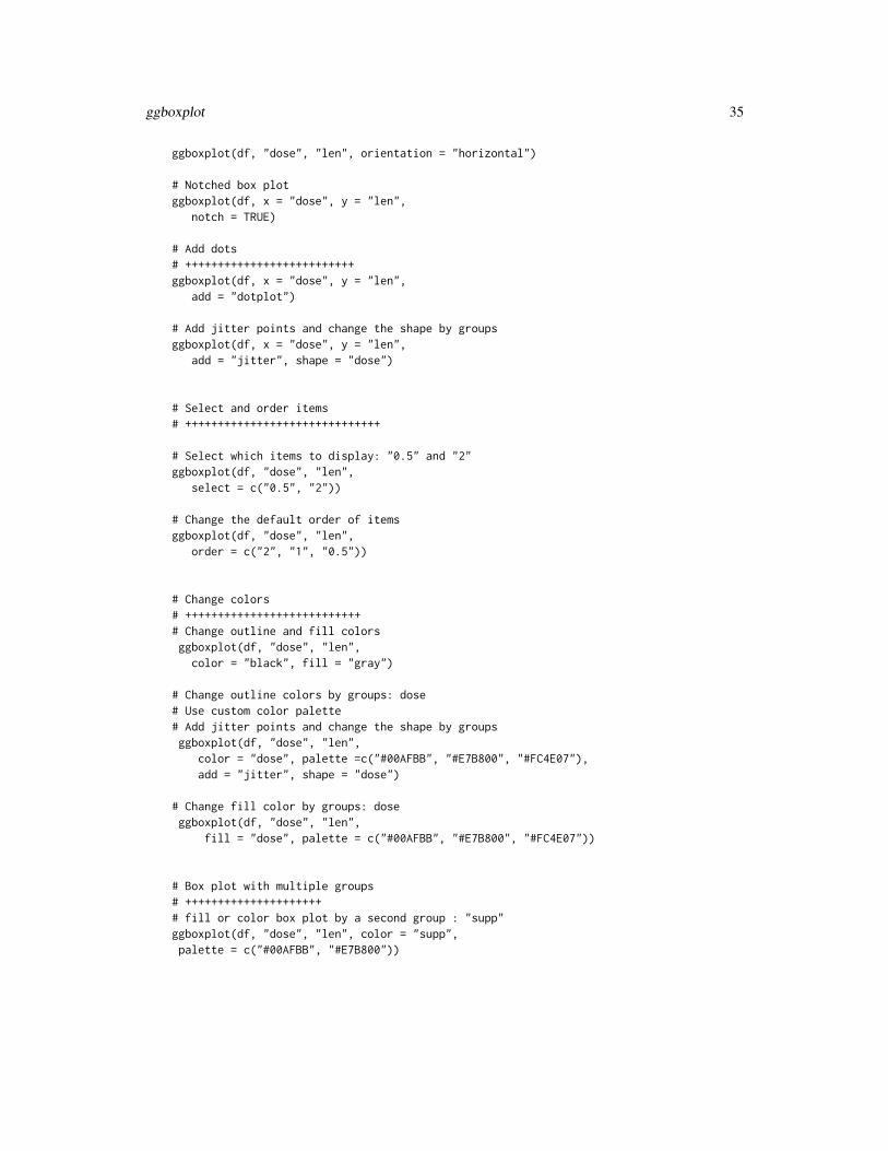
ggboxplot(df, "dose", "len", orientation = "horizontal")
# Notched box plotggboxplot(df, x = "dose", y = "len",
notch = TRUE)
# Add dots# ++++++++++++++++++++++++++ggboxplot(df, x = "dose", y = "len",
add = "dotplot")
# Add jitter points and change the shape by groupsggboxplot(df, x = "dose", y = "len",
add = "jitter", shape = "dose")
# Select and order items# ++++++++++++++++++++++++++++++
# Select which items to display: "0.5" and "2"ggboxplot(df, "dose", "len",
select = c("0.5", "2"))
# Change the default order of itemsggboxplot(df, "dose", "len",
order = c("2", "1", "0.5"))
# Change colors# +++++++++++++++++++++++++++# Change outline and fill colorsggboxplot(df, "dose", "len",color = "black", fill = "gray")
# Change outline colors by groups: dose# Use custom color palette# Add jitter points and change the shape by groupsggboxplot(df, "dose", "len",
color = "dose", palette =c("#00AFBB", "#E7B800", "#FC4E07"),add = "jitter", shape = "dose")
# Change fill color by groups: doseggboxplot(df, "dose", "len",
fill = "dose", palette = c("#00AFBB", "#E7B800", "#FC4E07"))
# Box plot with multiple groups# +++++++++++++++++++++# fill or color box plot by a second group : "supp"ggboxplot(df, "dose", "len", color = "supp",palette = c("#00AFBB", "#E7B800"))
36 ggdensity
ggdensity Density plot
Description
Create a density plot.
Usage
ggdensity(data, x, y = "..density..", combine = FALSE, merge = FALSE,color = "black", fill = NA, palette = NULL, size = NULL,linetype = "solid", alpha = 0.5, title = NULL, xlab = NULL,ylab = NULL, facet.by = NULL, panel.labs = NULL,short.panel.labs = TRUE, add = c("none", "mean", "median"),add.params = list(linetype = "dashed"), rug = FALSE, label = NULL,font.label = list(size = 11, color = "black"), label.select = NULL,repel = FALSE, label.rectangle = FALSE, ggtheme = theme_pubr(),...)
Arguments
data a data frame
x variable to be drawn.
y one of "..density.." or "..count..".
combine logical value. Default is FALSE. Used only when y is a vector containing mul-tiple variables to plot. If TRUE, create a multi-panel plot by combining the plotof y variables.
merge logical or character value. Default is FALSE. Used only when y is a vectorcontaining multiple variables to plot. If TRUE, merge multiple y variables inthe same plotting area. Allowed values include also "asis" (TRUE) and "flip".If merge = "flip", then y variables are used as x tick labels and the x variable isused as grouping variable.
color, fill density line color and fill color.
palette the color palette to be used for coloring or filling by groups. Allowed valuesinclude "grey" for grey color palettes; brewer palettes e.g. "RdBu", "Blues",...; or custom color palette e.g. c("blue", "red"); and scientific journal palettesfrom ggsci R package, e.g.: "npg", "aaas", "lancet", "jco", "ucscgb", "uchicago","simpsons" and "rickandmorty".
size Numeric value (e.g.: size = 1). change the size of points and outlines.
linetype line type. See show_line_types.
alpha numeric value specifying fill color transparency. Value should be in [0, 1], where0 is full transparency and 1 is no transparency.
title plot main title.
xlab character vector specifying x axis labels. Use xlab = FALSE to hide xlab.
ggdensity 37
ylab character vector specifying y axis labels. Use ylab = FALSE to hide ylab.
facet.by character vector, of length 1 or 2, specifying grouping variables for faceting theplot into multiple panels. Should be in the data.
panel.labs a list of one or two character vectors to modify facet panel labels. For example,panel.labs = list(sex = c("Male", "Female")) specifies the labels for the "sex"variable. For two grouping variables, you can use for example panel.labs =list(sex = c("Male", "Female"), rx = c("Obs", "Lev", "Lev2") ).
short.panel.labs
logical value. Default is TRUE. If TRUE, create short labels for panels by omit-ting variable names; in other words panels will be labelled only by variablegrouping levels.
add allowed values are one of "mean" or "median" (for adding mean or median line,respectively).
add.params parameters (color, size, linetype) for the argument ’add’; e.g.: add.params =list(color = "red").
rug logical value. If TRUE, add marginal rug.
label the name of the column containing point labels. Can be also a character vectorwith length = nrow(data).
font.label a list which can contain the combination of the following elements: the size(e.g.: 14), the style (e.g.: "plain", "bold", "italic", "bold.italic") and the color(e.g.: "red") of labels. For example font.label = list(size = 14, face = "bold",color ="red"). To specify only the size and the style, use font.label = list(size =14, face = "plain").
label.select can be of two formats:
• a character vector specifying some labels to show.• a list containing one or the combination of the following components:
– top.up and top.down: to display the labels of the top up/down points.For example, label.select = list(top.up = 10,top.down = 4).
– criteria: to filter, for example, by x and y variabes values, use this:label.select = list(criteria = "`y` > 2 & `y` < 5 & `x` %in% c('A','B')").
repel a logical value, whether to use ggrepel to avoid overplotting text labels or not.label.rectangle
logical value. If TRUE, add rectangle underneath the text, making it easier toread.
ggtheme function, ggplot2 theme name. Default value is theme_pubr(). Allowed valuesinclude ggplot2 official themes: theme_gray(), theme_bw(), theme_minimal(),theme_classic(), theme_void(), ....
... other arguments to be passed to geom_density and ggpar.
Details
The plot can be easily customized using the function ggpar(). Read ?ggpar for changing:
• main title and axis labels: main, xlab, ylab

38 ggdonutchart
• axis limits: xlim, ylim (e.g.: ylim = c(0, 30))
• axis scales: xscale, yscale (e.g.: yscale = "log2")
• color palettes: palette = "Dark2" or palette = c("gray", "blue", "red")
• legend title, labels and position: legend = "right"
• plot orientation : orientation = c("vertical", "horizontal", "reverse")
See Also
gghistogram and ggpar.
Examples
# Create some data formatset.seed(1234)wdata = data.frame(
sex = factor(rep(c("F", "M"), each=200)),weight = c(rnorm(200, 55), rnorm(200, 58)))
head(wdata, 4)
# Basic density plot# Add mean line and marginal rug
ggdensity(wdata, x = "weight", fill = "lightgray",add = "mean", rug = TRUE)
# Change outline colors by groups ("sex")# Use custom paletteggdensity(wdata, x = "weight",
add = "mean", rug = TRUE,color = "sex", palette = c("#00AFBB", "#E7B800"))
# Change outline and fill colors by groups ("sex")# Use custom paletteggdensity(wdata, x = "weight",
add = "mean", rug = TRUE,color = "sex", fill = "sex",palette = c("#00AFBB", "#E7B800"))
ggdonutchart Donut chart
Description
Create a donut chart.

ggdonutchart 39
Usage
ggdonutchart(data, x, label = x, lab.pos = c("out", "in"),lab.adjust = 0, lab.font = c(4, "bold", "black"), font.family = "",color = "black", fill = "white", palette = NULL, size = NULL,ggtheme = theme_pubr(), ...)
Arguments
data a data frame
x variable containing values for drawing.
label variable specifying the label of each slice.
lab.pos character specifying the position for labels. Allowed values are "out" (for out-side) or "in" (for inside).
lab.adjust numeric value, used to adjust label position when lab.pos = "in". Increase ordecrease this value to see the effect.
lab.font a vector of length 3 indicating respectively the size (e.g.: 14), the style (e.g.:"plain", "bold", "italic", "bold.italic") and the color (e.g.: "red") of label font.For example lab.font= c(4, "bold", "red").
font.family character vector specifying font family.
color, fill outline and fill colors.
palette the color palette to be used for coloring or filling by groups. Allowed valuesinclude "grey" for grey color palettes; brewer palettes e.g. "RdBu", "Blues",...; or custom color palette e.g. c("blue", "red"); and scientific journal palettesfrom ggsci R package, e.g.: "npg", "aaas", "lancet", "jco", "ucscgb", "uchicago","simpsons" and "rickandmorty".
size Numeric value (e.g.: size = 1). change the size of points and outlines.
ggtheme function, ggplot2 theme name. Default value is theme_pubr(). Allowed valuesinclude ggplot2 official themes: theme_gray(), theme_bw(), theme_minimal(),theme_classic(), theme_void(), ....
... other arguments to be passed to be passed to ggpar().
Details
The plot can be easily customized using the function ggpar(). Read ?ggpar for changing:
• main title and axis labels: main, xlab, ylab
• axis limits: xlim, ylim (e.g.: ylim = c(0, 30))
• axis scales: xscale, yscale (e.g.: yscale = "log2")
• color palettes: palette = "Dark2" or palette = c("gray", "blue", "red")
• legend title, labels and position: legend = "right"
• plot orientation : orientation = c("vertical", "horizontal", "reverse")
See Also
ggpar, ggpie

40 ggdotchart
Examples
# Data: Create some data# +++++++++++++++++++++++++++++++
df <- data.frame(group = c("Male", "Female", "Child"),value = c(25, 25, 50))
head(df)
# Basic pie charts# ++++++++++++++++++++++++++++++++
ggdonutchart(df, "value", label = "group")
# Change color# ++++++++++++++++++++++++++++++++
# Change fill color by group# set line color to white# Use custom color paletteggdonutchart(df, "value", label = "group",
fill = "group", color = "white",palette = c("#00AFBB", "#E7B800", "#FC4E07") )
# Change label# ++++++++++++++++++++++++++++++++
# Show group names and value as labelslabs <- paste0(df$group, " (", df$value, "%)")ggdonutchart(df, "value", label = labs,
fill = "group", color = "white",palette = c("#00AFBB", "#E7B800", "#FC4E07"))
# Change the position and font color of labelsggdonutchart(df, "value", label = labs,
lab.pos = "in", lab.font = "white",fill = "group", color = "white",palette = c("#00AFBB", "#E7B800", "#FC4E07"))
ggdotchart Cleveland’s Dot Plots

ggdotchart 41
Description
Draw a Cleveland dot plot.
Usage
ggdotchart(data, x, y, group = NULL, combine = FALSE,color = "black", palette = NULL, shape = 19, size = NULL,dot.size = size, sorting = c("ascending", "descending"),add = c("none", "segment"), add.params = list(), x.text.col = TRUE,rotate = FALSE, title = NULL, xlab = NULL, ylab = NULL,facet.by = NULL, panel.labs = NULL, short.panel.labs = TRUE,select = NULL, remove = NULL, order = NULL, label = NULL,font.label = list(size = 11, color = "black"), label.select = NULL,repel = FALSE, label.rectangle = FALSE, position = "identity",ggtheme = theme_pubr(), ...)
theme_cleveland(rotate = TRUE)
Arguments
data a data frame
x, y x and y variables for drawing.
group an optional column name indicating how the elements of x are grouped.
combine logical value. Default is FALSE. Used only when y is a vector containing mul-tiple variables to plot. If TRUE, create a multi-panel plot by combining the plotof y variables.
color, size points color and size.
palette the color palette to be used for coloring or filling by groups. Allowed valuesinclude "grey" for grey color palettes; brewer palettes e.g. "RdBu", "Blues",...; or custom color palette e.g. c("blue", "red"); and scientific journal palettesfrom ggsci R package, e.g.: "npg", "aaas", "lancet", "jco", "ucscgb", "uchicago","simpsons" and "rickandmorty".
shape point shape. See show_point_shapes.
dot.size numeric value specifying the dot size.
sorting a character vector for sorting into ascending or descending order. Allowed val-ues are one of "descending" and "ascending". Partial match are allowed (e.g.sorting = "desc" or "asc"). Default is "descending".
add character vector for adding another plot element (e.g.: dot plot or error bars).Allowed values are one or the combination of: "none", "dotplot", "jitter", "box-plot", "point", "mean", "mean_se", "mean_sd", "mean_ci", "mean_range", "me-dian", "median_iqr", "median_mad", "median_range"; see ?desc_statby for moredetails.
add.params parameters (color, shape, size, fill, linetype) for the argument ’add’; e.g.: add.params= list(color = "red").
x.text.col logical. If TRUE (default), x axis texts are colored by groups.
42 ggdotchart
rotate logical value. If TRUE, rotate the graph by setting the plot orientation to hori-zontal.
title plot main title.
xlab character vector specifying x axis labels. Use xlab = FALSE to hide xlab.
ylab character vector specifying y axis labels. Use ylab = FALSE to hide ylab.
facet.by character vector, of length 1 or 2, specifying grouping variables for faceting theplot into multiple panels. Should be in the data.
panel.labs a list of one or two character vectors to modify facet panel labels. For example,panel.labs = list(sex = c("Male", "Female")) specifies the labels for the "sex"variable. For two grouping variables, you can use for example panel.labs =list(sex = c("Male", "Female"), rx = c("Obs", "Lev", "Lev2") ).
short.panel.labs
logical value. Default is TRUE. If TRUE, create short labels for panels by omit-ting variable names; in other words panels will be labelled only by variablegrouping levels.
select character vector specifying which items to display.
remove character vector specifying which items to remove from the plot.
order character vector specifying the order of items.
label the name of the column containing point labels.
font.label a list which can contain the combination of the following elements: the size(e.g.: 14), the style (e.g.: "plain", "bold", "italic", "bold.italic") and the color(e.g.: "red") of labels. For example font.label = list(size = 14, face = "bold",color ="red"). To specify only the size and the style, use font.label = list(size =14, face = "plain").
label.select can be of two formats:
• a character vector specifying some labels to show.• a list containing one or the combination of the following components:
– top.up and top.down: to display the labels of the top up/down points.For example, label.select = list(top.up = 10,top.down = 4).
– criteria: to filter, for example, by x and y variabes values, use this:label.select = list(criteria = "`y` > 2 & `y` < 5 & `x` %in% c('A','B')").
repel a logical value, whether to use ggrepel to avoid overplotting text labels or not.label.rectangle
logical value. If TRUE, add rectangle underneath the text, making it easier toread.
position Position adjustment, either as a string, or the result of a call to a position adjust-ment function.
ggtheme function, ggplot2 theme name. Default value is theme_pubr(). Allowed valuesinclude ggplot2 official themes: theme_gray(), theme_bw(), theme_minimal(),theme_classic(), theme_void(), ....
... other arguments to be passed to geom_point and ggpar.

ggdotchart 43
Details
The plot can be easily customized using the function ggpar(). Read ?ggpar for changing:
• main title and axis labels: main, xlab, ylab
• axis limits: xlim, ylim (e.g.: ylim = c(0, 30))
• axis scales: xscale, yscale (e.g.: yscale = "log2")
• color palettes: palette = "Dark2" or palette = c("gray", "blue", "red")
• legend title, labels and position: legend = "right"
• plot orientation : orientation = c("vertical", "horizontal", "reverse")
See Also
ggpar
Examples
# Load datadata("mtcars")df <- mtcarsdf$cyl <- as.factor(df$cyl)df$name <- rownames(df)head(df[, c("wt", "mpg", "cyl")], 3)
# Basic plotggdotchart(df, x = "name", y ="mpg",
ggtheme = theme_bw())
# Change colors by group cylggdotchart(df, x = "name", y = "mpg",
group = "cyl", color = "cyl",palette = c('#999999','#E69F00','#56B4E9'),rotate = TRUE,sorting = "descending",ggtheme = theme_bw(),y.text.col = TRUE )
# Plot with multiple groups# +++++++++++++++++++++# Create some datadf2 <- data.frame(supp=rep(c("VC", "OJ"), each=3),
dose=rep(c("D0.5", "D1", "D2"),2),len=c(6.8, 15, 33, 4.2, 10, 29.5))
print(df2)
ggdotchart(df2, x = "dose", y = "len",color = "supp", size = 3,add = "segment",add.params = list(color = "lightgray", size = 1.5),position = position_dodge(0.3),

44 ggdotplot
palette = "jco",ggtheme = theme_pubclean()
)
ggdotplot Dot plot
Description
Create a dot plot.
Usage
ggdotplot(data, x, y, combine = FALSE, merge = FALSE,color = "black", fill = "lightgray", palette = NULL,title = NULL, xlab = NULL, ylab = NULL, facet.by = NULL,panel.labs = NULL, short.panel.labs = TRUE, size = NULL,binwidth = NULL, select = NULL, remove = NULL, order = NULL,add = "mean_se", add.params = list(), error.plot = "pointrange",label = NULL, font.label = list(size = 11, color = "black"),label.select = NULL, repel = FALSE, label.rectangle = FALSE,ggtheme = theme_pubr(), ...)
Arguments
data a data frame
x character string containing the name of x variable.
y character vector containing one or more variables to plot
combine logical value. Default is FALSE. Used only when y is a vector containing mul-tiple variables to plot. If TRUE, create a multi-panel plot by combining the plotof y variables.
merge logical or character value. Default is FALSE. Used only when y is a vectorcontaining multiple variables to plot. If TRUE, merge multiple y variables inthe same plotting area. Allowed values include also "asis" (TRUE) and "flip".If merge = "flip", then y variables are used as x tick labels and the x variable isused as grouping variable.
color outline color.
fill fill color.
palette the color palette to be used for coloring or filling by groups. Allowed valuesinclude "grey" for grey color palettes; brewer palettes e.g. "RdBu", "Blues",...; or custom color palette e.g. c("blue", "red"); and scientific journal palettesfrom ggsci R package, e.g.: "npg", "aaas", "lancet", "jco", "ucscgb", "uchicago","simpsons" and "rickandmorty".

ggdotplot 45
title plot main title.
xlab character vector specifying x axis labels. Use xlab = FALSE to hide xlab.
ylab character vector specifying y axis labels. Use ylab = FALSE to hide ylab.
facet.by character vector, of length 1 or 2, specifying grouping variables for faceting theplot into multiple panels. Should be in the data.
panel.labs a list of one or two character vectors to modify facet panel labels. For example,panel.labs = list(sex = c("Male", "Female")) specifies the labels for the "sex"variable. For two grouping variables, you can use for example panel.labs =list(sex = c("Male", "Female"), rx = c("Obs", "Lev", "Lev2") ).
short.panel.labs
logical value. Default is TRUE. If TRUE, create short labels for panels by omit-ting variable names; in other words panels will be labelled only by variablegrouping levels.
size Numeric value (e.g.: size = 1). change the size of points and outlines.
binwidth numeric value specifying bin width. use value between 0 and 1 when you havea strong dense dotplot. For example binwidth = 0.2.
select character vector specifying which items to display.
remove character vector specifying which items to remove from the plot.
order character vector specifying the order of items.
add character vector for adding another plot element (e.g.: dot plot or error bars).Allowed values are one or the combination of: "none", "dotplot", "jitter", "box-plot", "point", "mean", "mean_se", "mean_sd", "mean_ci", "mean_range", "me-dian", "median_iqr", "median_mad", "median_range"; see ?desc_statby for moredetails.
add.params parameters (color, shape, size, fill, linetype) for the argument ’add’; e.g.: add.params= list(color = "red").
error.plot plot type used to visualize error. Allowed values are one of c("pointrange", "lin-erange", "crossbar", "errorbar", "upper_errorbar", "lower_errorbar", "upper_pointrange","lower_pointrange", "upper_linerange", "lower_linerange"). Default value is"pointrange" or "errorbar". Used only when add != "none" and add containsone "mean_*" or "med_*" where "*" = sd, se, ....
label the name of the column containing point labels. Can be also a character vectorwith length = nrow(data).
font.label a list which can contain the combination of the following elements: the size(e.g.: 14), the style (e.g.: "plain", "bold", "italic", "bold.italic") and the color(e.g.: "red") of labels. For example font.label = list(size = 14, face = "bold",color ="red"). To specify only the size and the style, use font.label = list(size =14, face = "plain").
label.select can be of two formats:
• a character vector specifying some labels to show.• a list containing one or the combination of the following components:
– top.up and top.down: to display the labels of the top up/down points.For example, label.select = list(top.up = 10,top.down = 4).

46 ggdotplot
– criteria: to filter, for example, by x and y variabes values, use this:label.select = list(criteria = "`y` > 2 & `y` < 5 & `x` %in% c('A','B')").
repel a logical value, whether to use ggrepel to avoid overplotting text labels or not.label.rectangle
logical value. If TRUE, add rectangle underneath the text, making it easier toread.
ggtheme function, ggplot2 theme name. Default value is theme_pubr(). Allowed valuesinclude ggplot2 official themes: theme_gray(), theme_bw(), theme_minimal(),theme_classic(), theme_void(), ....
... other arguments to be passed to geom_dotplot, ggpar and facet.
Details
The plot can be easily customized using the function ggpar(). Read ?ggpar for changing:
• main title and axis labels: main, xlab, ylab
• axis limits: xlim, ylim (e.g.: ylim = c(0, 30))
• axis scales: xscale, yscale (e.g.: yscale = "log2")
• color palettes: palette = "Dark2" or palette = c("gray", "blue", "red")
• legend title, labels and position: legend = "right"
• plot orientation : orientation = c("vertical", "horizontal", "reverse")
See Also
ggpar, ggviolin, ggboxplot and ggstripchart.
Examples
# Load datadata("ToothGrowth")df <- ToothGrowth
# Basic plot with summary statistics : mean_sd# +++++++++++++++++++++++++++ggdotplot(df, x = "dose", y = "len",
add = "mean_sd")
# Change error.plot to "crossbar"ggdotplot(df, x = "dose", y = "len",add = "mean_sd", add.params = list(width = 0.5),error.plot = "crossbar")
# Add box plotggdotplot(df, x = "dose", y = "len",add = "boxplot")
# Add violin + mean_sdggdotplot(df, x = "dose", y = "len",
ggecdf 47
add = c("violin", "mean_sd"))
# Change colors# +++++++++++++++++++++++++++# Change fill and outline colors by groups: dose# Use custom color paletteggdotplot(df, "dose", "len",
add = "boxplot",color = "dose", fill = "dose",palette = c("#00AFBB", "#E7B800", "#FC4E07"))
# Plot with multiple groups# +++++++++++++++++++++# Change color by a second group : "supp"ggdotplot(df, "dose", "len", fill = "supp", color = "supp",
palette = c("#00AFBB", "#E7B800"))
ggecdf Empirical cumulative density function
Description
Empirical Cumulative Density Function (ECDF).
Usage
ggecdf(data, x, combine = FALSE, merge = FALSE, color = "black",palette = NULL, size = NULL, linetype = "solid", title = NULL,xlab = NULL, ylab = NULL, facet.by = NULL, panel.labs = NULL,short.panel.labs = TRUE, ggtheme = theme_pubr(), ...)
Arguments
data a data frame
x variable to be drawn.
combine logical value. Default is FALSE. Used only when y is a vector containing mul-tiple variables to plot. If TRUE, create a multi-panel plot by combining the plotof y variables.
merge logical or character value. Default is FALSE. Used only when y is a vectorcontaining multiple variables to plot. If TRUE, merge multiple y variables inthe same plotting area. Allowed values include also "asis" (TRUE) and "flip".If merge = "flip", then y variables are used as x tick labels and the x variable isused as grouping variable.
color line and point color.

48 ggecdf
palette the color palette to be used for coloring or filling by groups. Allowed valuesinclude "grey" for grey color palettes; brewer palettes e.g. "RdBu", "Blues",...; or custom color palette e.g. c("blue", "red"); and scientific journal palettesfrom ggsci R package, e.g.: "npg", "aaas", "lancet", "jco", "ucscgb", "uchicago","simpsons" and "rickandmorty".
size line and point size.
linetype line type. See show_line_types.
title plot main title.
xlab character vector specifying x axis labels. Use xlab = FALSE to hide xlab.
ylab character vector specifying y axis labels. Use ylab = FALSE to hide ylab.
facet.by character vector, of length 1 or 2, specifying grouping variables for faceting theplot into multiple panels. Should be in the data.
panel.labs a list of one or two character vectors to modify facet panel labels. For example,panel.labs = list(sex = c("Male", "Female")) specifies the labels for the "sex"variable. For two grouping variables, you can use for example panel.labs =list(sex = c("Male", "Female"), rx = c("Obs", "Lev", "Lev2") ).
short.panel.labs
logical value. Default is TRUE. If TRUE, create short labels for panels by omit-ting variable names; in other words panels will be labelled only by variablegrouping levels.
ggtheme function, ggplot2 theme name. Default value is theme_pubr(). Allowed valuesinclude ggplot2 official themes: theme_gray(), theme_bw(), theme_minimal(),theme_classic(), theme_void(), ....
... other arguments to be passed to stat_ecdf and ggpar.
Details
The plot can be easily customized using the function ggpar(). Read ?ggpar for changing:
• main title and axis labels: main, xlab, ylab
• axis limits: xlim, ylim (e.g.: ylim = c(0, 30))
• axis scales: xscale, yscale (e.g.: yscale = "log2")
• color palettes: palette = "Dark2" or palette = c("gray", "blue", "red")
• legend title, labels and position: legend = "right"
• plot orientation : orientation = c("vertical", "horizontal", "reverse")
See Also
ggpar

ggerrorplot 49
Examples
# Create some data formatset.seed(1234)wdata = data.frame(
sex = factor(rep(c("F", "M"), each=200)),weight = c(rnorm(200, 55), rnorm(200, 58)))
head(wdata, 4)
# Basic ECDF plotggecdf(wdata, x = "weight")
# Change colors and linetype by groups ("sex")# Use custom paletteggecdf(wdata, x = "weight",
color = "sex", linetype = "sex",palette = c("#00AFBB", "#E7B800"))
ggerrorplot Visualizing Error
Description
Visualizing error.
Usage
ggerrorplot(data, x, y, desc_stat = "mean_se", combine = FALSE,merge = FALSE, color = "black", fill = "white", palette = NULL,size = NULL, width = NULL, title = NULL, xlab = NULL,ylab = NULL, facet.by = NULL, panel.labs = NULL,short.panel.labs = TRUE, select = NULL, remove = NULL,order = NULL, add = "none", add.params = list(),error.plot = "pointrange", ci = 0.95, position = position_dodge(),ggtheme = theme_pubr(), ...)
Arguments
data a data frame
x, y x and y variables for drawing.
desc_stat descriptive statistics to be used for visualizing errors. Default value is "mean_se".Allowed values are one of , "mean", "mean_se", "mean_sd", "mean_ci", "mean_range","median", "median_iqr", "median_mad", "median_range"; see desc_statby formore details.
combine logical value. Default is FALSE. Used only when y is a vector containing mul-tiple variables to plot. If TRUE, create a multi-panel plot by combining the plotof y variables.

50 ggerrorplot
merge logical or character value. Default is FALSE. Used only when y is a vectorcontaining multiple variables to plot. If TRUE, merge multiple y variables inthe same plotting area. Allowed values include also "asis" (TRUE) and "flip".If merge = "flip", then y variables are used as x tick labels and the x variable isused as grouping variable.
color, fill outline and fill colors.
palette the color palette to be used for coloring or filling by groups. Allowed valuesinclude "grey" for grey color palettes; brewer palettes e.g. "RdBu", "Blues",...; or custom color palette e.g. c("blue", "red"); and scientific journal palettesfrom ggsci R package, e.g.: "npg", "aaas", "lancet", "jco", "ucscgb", "uchicago","simpsons" and "rickandmorty".
size Numeric value (e.g.: size = 1). change the size of points and outlines.
width numeric value between 0 and 1 specifying box width.
title plot main title.
xlab character vector specifying x axis labels. Use xlab = FALSE to hide xlab.
ylab character vector specifying y axis labels. Use ylab = FALSE to hide ylab.
facet.by character vector, of length 1 or 2, specifying grouping variables for faceting theplot into multiple panels. Should be in the data.
panel.labs a list of one or two character vectors to modify facet panel labels. For example,panel.labs = list(sex = c("Male", "Female")) specifies the labels for the "sex"variable. For two grouping variables, you can use for example panel.labs =list(sex = c("Male", "Female"), rx = c("Obs", "Lev", "Lev2") ).
short.panel.labs
logical value. Default is TRUE. If TRUE, create short labels for panels by omit-ting variable names; in other words panels will be labelled only by variablegrouping levels.
select character vector specifying which items to display.
remove character vector specifying which items to remove from the plot.
order character vector specifying the order of items.
add character vector for adding another plot element (e.g.: dot plot or error bars).Allowed values are one or the combination of: "none", "dotplot", "jitter", "box-plot", "point", "mean", "mean_se", "mean_sd", "mean_ci", "mean_range", "me-dian", "median_iqr", "median_mad", "median_range"; see ?desc_statby for moredetails.
add.params parameters (color, shape, size, fill, linetype) for the argument ’add’; e.g.: add.params= list(color = "red").
error.plot plot type used to visualize error. Allowed values are one of c("pointrange", "lin-erange", "crossbar", "errorbar", "upper_errorbar", "lower_errorbar", "upper_pointrange","lower_pointrange", "upper_linerange", "lower_linerange"). Default value is"pointrange" or "errorbar". Used only when add != "none" and add containsone "mean_*" or "med_*" where "*" = sd, se, ....
ci the percent range of the confidence interval (default is 0.95).
position Position adjustment, either as a string, or the result of a call to a position adjust-ment function.

ggerrorplot 51
ggtheme function, ggplot2 theme name. Default value is theme_pubr(). Allowed valuesinclude ggplot2 official themes: theme_gray(), theme_bw(), theme_minimal(),theme_classic(), theme_void(), ....
... other arguments to be passed to be passed to ggpar().
Details
The plot can be easily customized using the function ggpar(). Read ?ggpar for changing:
• main title and axis labels: main, xlab, ylab
• axis limits: xlim, ylim (e.g.: ylim = c(0, 30))
• axis scales: xscale, yscale (e.g.: yscale = "log2")
• color palettes: palette = "Dark2" or palette = c("gray", "blue", "red")
• legend title, labels and position: legend = "right"
• plot orientation : orientation = c("vertical", "horizontal", "reverse")
See Also
ggpar, ggline
Examples
# Data: ToothGrowth data set we'll be used.df<- ToothGrowthhead(df, 10)
# Plot mean_seggerrorplot(df, x = "dose", y = "len")
# Change desc_stat to mean_sd# (other values include: mean_sd, mean_ci, median_iqr, ....)# Add labelsggerrorplot(df, x = "dose", y = "len",desc_stat = "mean_sd")
# Change error.plot to "errorbar" and add mean point# Visualize the mean of each groupggerrorplot(df, x = "dose", y = "len",add = "mean", error.plot = "errorbar")
# Horizontal plotggerrorplot(df, x = "dose", y = "len",add = "mean", error.plot = "errorbar",orientation = "horizontal")
# Change error.plot to "crossbar"ggerrorplot(df, x = "dose", y = "len",

52 ggexport
error.plot = "crossbar", width = 0.5)
# Add jitter points and errors (mean_se)ggerrorplot(df, x = "dose", y = "len",add = "jitter")
# Add dot and errors (mean_se)ggerrorplot(df, x = "dose", y = "len",add = "dotplot")
# Multiple groups with error bars and jitter pointggerrorplot(df, x = "dose", y = "len",color = "supp", palette = "Paired",error.plot = "pointrange",position = position_dodge(0.5))
ggexport Export ggplots
Description
Export ggplots
Usage
ggexport(..., plotlist = NULL, filename = NULL, ncol = NULL,nrow = NULL, width = 480, height = 480, pointsize = 12,res = NA, verbose = TRUE)
Arguments
... list of plots to be arranged into the grid. The plots can be either ggplot2 plotobjects, arbitrary gtables or an object of class ggarrange.
plotlist (optional) list of plots to display.
filename File name to create on disk.
ncol (optional) number of columns in the plot grid.
nrow (optional) number of rows in the plot grid.
width, height plot width and height, respectively (example, width = 800, height = 800). Ap-plied only to raster plots: "png", "jpeg", "jpg", "bmp" and "tiff".
pointsize the default pointsize of plotted text (example, pointsize = 8). Used only forraster plots.
res the resolution in ppi (example, res = 250). Used only for raster plots.
verbose logical. If TRUE, show message.

gghistogram 53
Author(s)
Alboukadel Kassambara <[email protected]>
Examples
## Not run:require("magrittr")# Load datadata("ToothGrowth")df <- ToothGrowthdf$dose <- as.factor(df$dose)
# Box plotbxp <- ggboxplot(df, x = "dose", y = "len",
color = "dose", palette = "jco")# Dot plotdp <- ggdotplot(df, x = "dose", y = "len",
color = "dose", palette = "jco")# Density plotdens <- ggdensity(df, x = "len", fill = "dose", palette = "jco")
# Export to pdfggarrange(bxp, dp, dens, ncol = 2) %>%
ggexport(filename = "test.pdf")
# Export to pngggarrange(bxp, dp, dens, ncol = 2) %>%
ggexport(filename = "test.png")
## End(Not run)
gghistogram Histogram plot
Description
Create a histogram plot.
Usage
gghistogram(data, x, y = "..count..", combine = FALSE, merge = FALSE,color = "black", fill = NA, palette = NULL, size = NULL,linetype = "solid", alpha = 0.5, bins = NULL, binwidth = NULL,title = NULL, xlab = NULL, ylab = NULL, facet.by = NULL,panel.labs = NULL, short.panel.labs = TRUE, add = c("none", "mean","median"), add.params = list(linetype = "dashed"), rug = FALSE,add_density = FALSE, label = NULL, font.label = list(size = 11,color = "black"), label.select = NULL, repel = FALSE,

54 gghistogram
label.rectangle = FALSE, position = position_identity(),ggtheme = theme_pubr(), ...)
Arguments
data a data frame
x variable to be drawn.
y one of "..density.." or "..count..".
combine logical value. Default is FALSE. Used only when y is a vector containing mul-tiple variables to plot. If TRUE, create a multi-panel plot by combining the plotof y variables.
merge logical or character value. Default is FALSE. Used only when y is a vectorcontaining multiple variables to plot. If TRUE, merge multiple y variables inthe same plotting area. Allowed values include also "asis" (TRUE) and "flip".If merge = "flip", then y variables are used as x tick labels and the x variable isused as grouping variable.
color, fill histogram line color and fill color.
palette the color palette to be used for coloring or filling by groups. Allowed valuesinclude "grey" for grey color palettes; brewer palettes e.g. "RdBu", "Blues",...; or custom color palette e.g. c("blue", "red"); and scientific journal palettesfrom ggsci R package, e.g.: "npg", "aaas", "lancet", "jco", "ucscgb", "uchicago","simpsons" and "rickandmorty".
size Numeric value (e.g.: size = 1). change the size of points and outlines.
linetype line type. See show_line_types.
alpha numeric value specifying fill color transparency. Value should be in [0, 1], where0 is full transparency and 1 is no transparency.
bins Number of bins. Defaults to 30.
binwidth numeric value specifying bin width. use value between 0 and 1 when you havea strong dense dotplot. For example binwidth = 0.2.
title plot main title.
xlab character vector specifying x axis labels. Use xlab = FALSE to hide xlab.
ylab character vector specifying y axis labels. Use ylab = FALSE to hide ylab.
facet.by character vector, of length 1 or 2, specifying grouping variables for faceting theplot into multiple panels. Should be in the data.
panel.labs a list of one or two character vectors to modify facet panel labels. For example,panel.labs = list(sex = c("Male", "Female")) specifies the labels for the "sex"variable. For two grouping variables, you can use for example panel.labs =list(sex = c("Male", "Female"), rx = c("Obs", "Lev", "Lev2") ).
short.panel.labs
logical value. Default is TRUE. If TRUE, create short labels for panels by omit-ting variable names; in other words panels will be labelled only by variablegrouping levels.
add allowed values are one of "mean" or "median" (for adding mean or median line,respectively).

gghistogram 55
add.params parameters (color, size, linetype) for the argument ’add’; e.g.: add.params =list(color = "red").
rug logical value. If TRUE, add marginal rug.
add_density logical value. If TRUE, add density curves.
label the name of the column containing point labels. Can be also a character vectorwith length = nrow(data).
font.label a list which can contain the combination of the following elements: the size(e.g.: 14), the style (e.g.: "plain", "bold", "italic", "bold.italic") and the color(e.g.: "red") of labels. For example font.label = list(size = 14, face = "bold",color ="red"). To specify only the size and the style, use font.label = list(size =14, face = "plain").
label.select can be of two formats:
• a character vector specifying some labels to show.• a list containing one or the combination of the following components:
– top.up and top.down: to display the labels of the top up/down points.For example, label.select = list(top.up = 10,top.down = 4).
– criteria: to filter, for example, by x and y variabes values, use this:label.select = list(criteria = "`y` > 2 & `y` < 5 & `x` %in% c('A','B')").
repel a logical value, whether to use ggrepel to avoid overplotting text labels or not.label.rectangle
logical value. If TRUE, add rectangle underneath the text, making it easier toread.
position Position adjustment, either as a string, or the result of a call to a position adjust-ment function. Allowed values include "identity", "stack", "dodge".
ggtheme function, ggplot2 theme name. Default value is theme_pubr(). Allowed valuesinclude ggplot2 official themes: theme_gray(), theme_bw(), theme_minimal(),theme_classic(), theme_void(), ....
... other arguments to be passed to geom_histogram and ggpar.
Details
The plot can be easily customized using the function ggpar(). Read ?ggpar for changing:
• main title and axis labels: main, xlab, ylab
• axis limits: xlim, ylim (e.g.: ylim = c(0, 30))
• axis scales: xscale, yscale (e.g.: yscale = "log2")
• color palettes: palette = "Dark2" or palette = c("gray", "blue", "red")
• legend title, labels and position: legend = "right"
• plot orientation : orientation = c("vertical", "horizontal", "reverse")
See Also
ggdensity and ggpar

56 ggline
Examples
# Create some data formatset.seed(1234)wdata = data.frame(
sex = factor(rep(c("F", "M"), each=200)),weight = c(rnorm(200, 55), rnorm(200, 58)))
head(wdata, 4)
# Basic density plot# Add mean line and marginal ruggghistogram(wdata, x = "weight", fill = "lightgray",
add = "mean", rug = TRUE)
# Change outline colors by groups ("sex")# Use custom color palettegghistogram(wdata, x = "weight",
add = "mean", rug = TRUE,color = "sex", palette = c("#00AFBB", "#E7B800"))
# Change outline and fill colors by groups ("sex")# Use custom color palettegghistogram(wdata, x = "weight",
add = "mean", rug = TRUE,color = "sex", fill = "sex",palette = c("#00AFBB", "#E7B800"))
# Combine histogram and density plotsgghistogram(wdata, x = "weight",
add = "mean", rug = TRUE,fill = "sex", palette = c("#00AFBB", "#E7B800"),add_density = TRUE)
ggline Line plot
Description
Create a line plot.
Usage
ggline(data, x, y, group = 1, numeric.x.axis = FALSE,combine = FALSE, merge = FALSE, color = "black", palette = NULL,linetype = "solid", plot_type = c("b", "l", "p"), size = 0.5,

ggline 57
shape = 19, point.size = size, point.color = color, title = NULL,xlab = NULL, ylab = NULL, facet.by = NULL, panel.labs = NULL,short.panel.labs = TRUE, select = NULL, remove = NULL,order = NULL, add = "none", add.params = list(),error.plot = "errorbar", label = NULL, font.label = list(size = 11,color = "black"), label.select = NULL, repel = FALSE,label.rectangle = FALSE, show.line.label = FALSE,ggtheme = theme_pubr(), ...)
Arguments
data a data frame
x, y x and y variables for drawing.
group grouping variable to connect points by line. Allowed values are 1 (for one line,one group) or a character vector specifying the name of the grouping variable(case of multiple lines).
numeric.x.axis logical. If TRUE, x axis will be treated as numeric. Default is FALSE.
combine logical value. Default is FALSE. Used only when y is a vector containing mul-tiple variables to plot. If TRUE, create a multi-panel plot by combining the plotof y variables.
merge logical or character value. Default is FALSE. Used only when y is a vectorcontaining multiple variables to plot. If TRUE, merge multiple y variables inthe same plotting area. Allowed values include also "asis" (TRUE) and "flip".If merge = "flip", then y variables are used as x tick labels and the x variable isused as grouping variable.
color line colors.
palette the color palette to be used for coloring or filling by groups. Allowed valuesinclude "grey" for grey color palettes; brewer palettes e.g. "RdBu", "Blues",...; or custom color palette e.g. c("blue", "red"); and scientific journal palettesfrom ggsci R package, e.g.: "npg", "aaas", "lancet", "jco", "ucscgb", "uchicago","simpsons" and "rickandmorty".
linetype line type.
plot_type plot type. Allowed values are one of "b" for both line and point; "l" for lineonly; and "p" for point only. Default is "b".
size Numeric value (e.g.: size = 1). change the size of points and outlines.
shape point shapes.
point.size point size.
point.color point color.
title plot main title.
xlab character vector specifying x axis labels. Use xlab = FALSE to hide xlab.
ylab character vector specifying y axis labels. Use ylab = FALSE to hide ylab.
facet.by character vector, of length 1 or 2, specifying grouping variables for faceting theplot into multiple panels. Should be in the data.

58 ggline
panel.labs a list of one or two character vectors to modify facet panel labels. For example,panel.labs = list(sex = c("Male", "Female")) specifies the labels for the "sex"variable. For two grouping variables, you can use for example panel.labs =list(sex = c("Male", "Female"), rx = c("Obs", "Lev", "Lev2") ).
short.panel.labs
logical value. Default is TRUE. If TRUE, create short labels for panels by omit-ting variable names; in other words panels will be labelled only by variablegrouping levels.
select character vector specifying which items to display.
remove character vector specifying which items to remove from the plot.
order character vector specifying the order of items.
add character vector for adding another plot element (e.g.: dot plot or error bars).Allowed values are one or the combination of: "none", "dotplot", "jitter", "box-plot", "point", "mean", "mean_se", "mean_sd", "mean_ci", "mean_range", "me-dian", "median_iqr", "median_mad", "median_range"; see ?desc_statby for moredetails.
add.params parameters (color, shape, size, fill, linetype) for the argument ’add’; e.g.: add.params= list(color = "red").
error.plot plot type used to visualize error. Allowed values are one of c("pointrange", "lin-erange", "crossbar", "errorbar", "upper_errorbar", "lower_errorbar", "upper_pointrange","lower_pointrange", "upper_linerange", "lower_linerange"). Default value is"pointrange" or "errorbar". Used only when add != "none" and add containsone "mean_*" or "med_*" where "*" = sd, se, ....
label the name of the column containing point labels. Can be also a character vectorwith length = nrow(data).
font.label a list which can contain the combination of the following elements: the size(e.g.: 14), the style (e.g.: "plain", "bold", "italic", "bold.italic") and the color(e.g.: "red") of labels. For example font.label = list(size = 14, face = "bold",color ="red"). To specify only the size and the style, use font.label = list(size =14, face = "plain").
label.select can be of two formats:
• a character vector specifying some labels to show.• a list containing one or the combination of the following components:
– top.up and top.down: to display the labels of the top up/down points.For example, label.select = list(top.up = 10,top.down = 4).
– criteria: to filter, for example, by x and y variabes values, use this:label.select = list(criteria = "`y` > 2 & `y` < 5 & `x` %in% c('A','B')").
repel a logical value, whether to use ggrepel to avoid overplotting text labels or not.label.rectangle
logical value. If TRUE, add rectangle underneath the text, making it easier toread.
show.line.label
logical value. If TRUE, shows line labels.

ggline 59
ggtheme function, ggplot2 theme name. Default value is theme_pubr(). Allowed valuesinclude ggplot2 official themes: theme_gray(), theme_bw(), theme_minimal(),theme_classic(), theme_void(), ....
... other arguments to be passed to geom_dotplot.
Details
The plot can be easily customized using the function ggpar(). Read ?ggpar for changing:
• main title and axis labels: main, xlab, ylab
• axis limits: xlim, ylim (e.g.: ylim = c(0, 30))
• axis scales: xscale, yscale (e.g.: yscale = "log2")
• color palettes: palette = "Dark2" or palette = c("gray", "blue", "red")
• legend title, labels and position: legend = "right"
• plot orientation : orientation = c("vertical", "horizontal", "reverse")
See Also
ggpar, ggbarplot
Examples
# Datadf <- data.frame(dose=c("D0.5", "D1", "D2"),
len=c(4.2, 10, 29.5))print(df)
# Basic plot# +++++++++++++++++++++++++++ggline(df, x = "dose", y = "len")
# Plot with multiple groups# +++++++++++++++++++++
# Create some datadf2 <- data.frame(supp=rep(c("VC", "OJ"), each=3),
dose=rep(c("D0.5", "D1", "D2"),2),len=c(6.8, 15, 33, 4.2, 10, 29.5))
print(df2)
# Plot "len" by "dose" and# Change line types and point shapes by a second groups: "supp"ggline(df2, "dose", "len",
linetype = "supp", shape = "supp")
# Change colors# +++++++++++++++++++++

60 ggline
# Change color by group: "supp"# Use custom color paletteggline(df2, "dose", "len",
linetype = "supp", shape = "supp",color = "supp", palette = c("#00AFBB", "#E7B800"))
# Add points and errors# ++++++++++++++++++++++++++
# Data: ToothGrowth data set we'll be used.df3 <- ToothGrowthhead(df3, 10)
# It can be seen that for each group we have# different valuesggline(df3, x = "dose", y = "len")
# Visualize the mean of each groupggline(df3, x = "dose", y = "len",add = "mean")
# Add error bars: mean_se# (other values include: mean_sd, mean_ci, median_iqr, ....)# Add labelsggline(df3, x = "dose", y = "len", add = "mean_se")
# Change error.plot to "pointrange"ggline(df3, x = "dose", y = "len",add = "mean_se", error.plot = "pointrange")
# Add jitter points and errors (mean_se)ggline(df3, x = "dose", y = "len",add = c("mean_se", "jitter"))
# Add dot and errors (mean_se)ggline(df3, x = "dose", y = "len",add = c("mean_se", "dotplot"), color = "steelblue")
# Add violin and errors (mean_se)ggline(df3, x = "dose", y = "len",add = c("mean_se", "violin"), color = "steelblue")
# Multiple groups with error bars# ++++++++++++++++++++++
ggline(df3, x = "dose", y = "len", color = "supp",add = "mean_se", palette = c("#00AFBB", "#E7B800"))
# Add jitterggline(df3, x = "dose", y = "len", color = "supp",add = c("mean_se", "jitter"), palette = c("#00AFBB", "#E7B800"))
ggmaplot 61
# Add dot plotggline(df3, x = "dose", y = "len", color = "supp",add = c("mean_se", "dotplot"), palette = c("#00AFBB", "#E7B800"))
ggmaplot MA-plot from means and log fold changes
Description
Make MA-plot which is a scatter plot of log2 fold changes (on the y-axis) versus the mean expres-sion signal (on the x-axis).
Usage
ggmaplot(data, fdr = 0.05, fc = 1.5, genenames = NULL,detection_call = NULL, size = NULL, font.label = c(12, "plain","black"), label.rectangle = FALSE, palette = c("#B31B21", "#1465AC","darkgray"), top = 15, select.top.method = c("padj", "fc"),main = NULL, xlab = "Log2 mean expression",ylab = "Log2 fold change", ggtheme = theme_classic(), ...)
Arguments
data an object of class DESeqResults, get_diff, DE_Results, matrix or data framecontaining the columns baseMean, log2FoldChange, and padj. Rows are genes.
• baseMean: the mean expression of genes in the two groups.• log2FoldChange: the log2 fold changes of group 2 compared to group 1• padj: the adjusted p-value of the used statiscal test.
fdr Accepted false discovery rate for considering genes as differentially expressed.
fc the fold change threshold. Only genes with a fold change >= fc and padj <= fdrare considered as significantly differentially expressed.
genenames a character vector of length nrow(data) specifying gene names corresponding toeach row. Used for point labels.
detection_call a numeric vector with length = nrow(data), specifying if the genes is expressed(value = 1) or not (value = 0). For example detection_call = c(1, 1, 0, 1, 0, 1).Default is NULL. If detection_call column is available in data, it will be used.
size points size.
font.label a vector of length 3 indicating respectively the size (e.g.: 14), the style (e.g.:"plain", "bold", "italic", "bold.italic") and the color (e.g.: "red") of point labels.For example font.label = c(14, "bold", "red").
label.rectangle
logical value. If TRUE, add rectangle underneath the text, making it easier toread.

62 ggmaplot
palette the color palette to be used for coloring or filling by groups. Allowed valuesinclude "grey" for grey color palettes; brewer palettes e.g. "RdBu", "Blues",...; or custom color palette e.g. c("blue", "red"); and scientific journal palettesfrom ggsci R package, e.g.: "npg", "aaas", "lancet", "jco", "ucscgb", "uchicago","simpsons" and "rickandmorty".
top the number of top genes to be shown on the plot. Use top = 0 to hide to genelabels.
select.top.method
methods to be used for selecting top genes. Allowed values include "padj" and"fc" for selecting by adjusted p values or fold changes, respectively.
main plot main title.
xlab character vector specifying x axis labels. Use xlab = FALSE to hide xlab.
ylab character vector specifying y axis labels. Use ylab = FALSE to hide ylab.
ggtheme function, ggplot2 theme name. Default value is theme_pubr(). Allowed valuesinclude ggplot2 official themes: theme_gray(), theme_bw(), theme_minimal(),theme_classic(), theme_void(), ....
... other arguments to be passed to ggpar.
Value
returns a ggplot.
Examples
data(diff_express)
# Default plotggmaplot(diff_express, main = expression("Group 1" %->% "Group 2"),
fdr = 0.05, fc = 2, size = 0.4,palette = c("#B31B21", "#1465AC", "darkgray"),genenames = as.vector(diff_express$name),legend = "top", top = 20,font.label = c("bold", 11),font.legend = "bold",font.main = "bold",ggtheme = ggplot2::theme_minimal())
# Add rectangle around labelsggmaplot(diff_express, main = expression("Group 1" %->% "Group 2"),
fdr = 0.05, fc = 2, size = 0.4,palette = c("#B31B21", "#1465AC", "darkgray"),genenames = as.vector(diff_express$name),legend = "top", top = 20,font.label = c("bold", 11), label.rectangle = TRUE,font.legend = "bold",font.main = "bold",ggtheme = ggplot2::theme_minimal())

ggpaired 63
ggpaired Plot Paired Data
Description
Plot paired data.
Usage
ggpaired(data, cond1, cond2, x = NULL, y = NULL, id = NULL,color = "black", fill = "white", palette = NULL, width = 0.5,point.size = 1.2, line.size = 0.5, line.color = "black",title = NULL, xlab = "Condition", ylab = "Value",facet.by = NULL, panel.labs = NULL, short.panel.labs = TRUE,label = NULL, font.label = list(size = 11, color = "black"),label.select = NULL, repel = FALSE, label.rectangle = FALSE,ggtheme = theme_pubr(), ...)
Arguments
data a data frame
cond1 variable name corresponding to the first condition.
cond2 variable name corresponding to the second condition.
x, y x and y variables, where x is a grouping variable and y contains values for eachgroup. Considered only when cond1 and cond2 are missing.
id variable name corresponding to paired samples’ id. Used to connect pairedpoints with lines.
color points and box plot colors. To color by conditions, use color = "condition".
fill box plot fill color. To change fill color by conditions, use fill = "condition".
palette the color palette to be used for coloring or filling by groups. Allowed valuesinclude "grey" for grey color palettes; brewer palettes e.g. "RdBu", "Blues",...; or custom color palette e.g. c("blue", "red"); and scientific journal palettesfrom ggsci R package, e.g.: "npg", "aaas", "lancet", "jco", "ucscgb", "uchicago","simpsons" and "rickandmorty".
width box plot width.point.size, line.size
point and line size, respectively.
line.color line color.
title plot main title.
xlab character vector specifying x axis labels. Use xlab = FALSE to hide xlab.
ylab character vector specifying y axis labels. Use ylab = FALSE to hide ylab.
facet.by character vector, of length 1 or 2, specifying grouping variables for faceting theplot into multiple panels. Should be in the data.

64 ggpaired
panel.labs a list of one or two character vectors to modify facet panel labels. For example,panel.labs = list(sex = c("Male", "Female")) specifies the labels for the "sex"variable. For two grouping variables, you can use for example panel.labs =list(sex = c("Male", "Female"), rx = c("Obs", "Lev", "Lev2") ).
short.panel.labs
logical value. Default is TRUE. If TRUE, create short labels for panels by omit-ting variable names; in other words panels will be labelled only by variablegrouping levels.
label the name of the column containing point labels. Can be also a character vectorwith length = nrow(data).
font.label a list which can contain the combination of the following elements: the size(e.g.: 14), the style (e.g.: "plain", "bold", "italic", "bold.italic") and the color(e.g.: "red") of labels. For example font.label = list(size = 14, face = "bold",color ="red"). To specify only the size and the style, use font.label = list(size =14, face = "plain").
label.select can be of two formats:
• a character vector specifying some labels to show.• a list containing one or the combination of the following components:
– top.up and top.down: to display the labels of the top up/down points.For example, label.select = list(top.up = 10,top.down = 4).
– criteria: to filter, for example, by x and y variabes values, use this:label.select = list(criteria = "`y` > 2 & `y` < 5 & `x` %in% c('A','B')").
repel a logical value, whether to use ggrepel to avoid overplotting text labels or not.label.rectangle
logical value. If TRUE, add rectangle underneath the text, making it easier toread.
ggtheme function, ggplot2 theme name. Default value is theme_pubr(). Allowed valuesinclude ggplot2 official themes: theme_gray(), theme_bw(), theme_minimal(),theme_classic(), theme_void(), ....
... other arguments to be passed to be passed to ggpar().
Examples
# Example 1#::::::::::::::::::::::::::::::::::::::::::before <-c(200.1, 190.9, 192.7, 213, 241.4, 196.9, 172.2, 185.5, 205.2, 193.7)after <-c(392.9, 393.2, 345.1, 393, 434, 427.9, 422, 383.9, 392.3, 352.2)
d <- data.frame(before = before, after = after)ggpaired(d, cond1 = "before", cond2 = "after",
fill = "condition", palette = "jco")
# Example 2#::::::::::::::::::::::::::::::::::::::::::ggpaired(ToothGrowth, x = "supp", y = "len",color = "supp", line.color = "gray", line.size = 0.4,

ggpar 65
palette = "npg")
ggpar Graphical parameters
Description
Graphical parameters
Usage
ggpar(p, palette = NULL, gradient.cols = NULL, main = NULL,submain = NULL, caption = NULL, xlab = NULL, ylab = NULL,title = NULL, subtitle = NULL, font.main = NULL,font.submain = NULL, font.x = NULL, font.y = NULL,font.caption = NULL, font.title = NULL, font.subtitle = NULL,font.family = "", xlim = NULL, ylim = NULL, xscale = c("none","log2", "log10", "sqrt"), yscale = c("none", "log2", "log10", "sqrt"),format.scale = FALSE, legend = NULL, legend.title = NULL,font.legend = NULL, ticks = TRUE, tickslab = TRUE,font.tickslab = NULL, font.xtickslab = font.tickslab,font.ytickslab = font.tickslab, x.text.angle = NULL,y.text.angle = NULL, xtickslab.rt = x.text.angle,ytickslab.rt = y.text.angle, xticks.by = NULL, yticks.by = NULL,rotate = FALSE, orientation = c("vertical", "horizontal", "reverse"),ggtheme = NULL, ...)
Arguments
p an object of class ggplot or a list of ggplots
palette the color palette to be used for coloring or filling by groups. Allowed valuesinclude "grey" for grey color palettes; brewer palettes e.g. "RdBu", "Blues",...; or custom color palette e.g. c("blue", "red"); and scientific journal palettesfrom ggsci R package, e.g.: "npg", "aaas", "lancet", "jco", "ucscgb", "uchicago","simpsons" and "rickandmorty". Can be also a numeric vector of length(groups);in this case a basic color palette is created using the function palette.
gradient.cols vector of colors to use for n-colour gradient. Allowed values include brewer andggsci color palettes.
main, title plot main title.submain, subtitle
plot subtitle.
caption plot caption.
xlab character vector specifying x axis labels. Use xlab = FALSE to hide xlab.
ylab character vector specifying y axis labels. Use ylab = FALSE to hide ylab.

66 ggpar
font.main, font.submain, font.caption, font.x, font.y
a vector of length 3 indicating respectively the size (e.g.: 14), the style (e.g.:"plain", "bold", "italic", "bold.italic") and the color (e.g.: "red") of main title,subtitle, caption, xlab and ylab, respectively. For example font.x = c(14, "bold","red"). Use font.x = 14, to change only font size; or use font.x = "bold", tochange only font face.
font.title, font.subtitle
alias of font.submain and font.submain, respectively.
font.family character vector specifying font family.
xlim, ylim a numeric vector of length 2, specifying x and y axis limits (minimum and max-imum), respectively. e.g.: ylim = c(0, 50).
xscale, yscale x and y axis scale, respectively. Allowed values are one of c("none", "log2","log10", "sqrt"); e.g.: yscale="log2".
format.scale logical value. If TRUE, axis tick mark labels will be formatted when xscale oryscale = "log2" or "log10".
legend character specifying legend position. Allowed values are one of c("top", "bot-tom", "left", "right", "none"). To remove the legend use legend = "none". Leg-end position can be also specified using a numeric vector c(x, y); see detailssection.
legend.title legend title, e.g.: legend.title = "Species". Can be also a list, legend.title= list(color = "Species",linetype = "Species",shape = "Species").
font.legend legend text font style; e.g.: font.legend = c(10, "plain", "black").
ticks logical value. Default is TRUE. If FALSE, hide axis tick marks.
tickslab logical value. Default is TRUE. If FALSE, hide axis tick labels.font.tickslab, font.xtickslab, font.ytickslab
Font style (size, face, color) for tick labels, e.g.: c(14, "bold", "red").x.text.angle, y.text.angle
Numeric value specifying the rotation angle of x and y axis tick labels, respec-tively. Default value is NULL. For vertical x axis texts use x.text.angle = 90.
xtickslab.rt, ytickslab.rt
Same as x.text.angle and y.text.angle, respectively. Will be deprecated in thenear future.
xticks.by, yticks.by
numeric value controlling x and y axis breaks, respectively. For example, ifyticks.by = 5, a tick mark is shown on every 5. Default value is NULL.
rotate logical value. If TRUE, rotate the graph by setting the plot orientation to hori-zontal.
orientation change the orientation of the plot. Allowed values are one of c( "vertical", "hor-izontal", "reverse"). Partial match is allowed.
ggtheme function, ggplot2 theme name. Default value is theme_pubr(). Allowed valuesinclude ggplot2 official themes: theme_gray(), theme_bw(), theme_minimal(),theme_classic(), theme_void(), ....
... not used

ggpar 67
Examples
# Load datadata("ToothGrowth")df <- ToothGrowth
# Basic box plot# +++++++++++++++++++++++++++
p <- ggboxplot(df, x = "dose", y = "len")
# Change the plot orientation: horizontalggpar(p, orientation = "horiz")
# Change main title and axis labels# ++++++++++++++++++++++++++++
ggpar(p,main = "Plot of length \n by dose",xlab = "Dose (mg)", ylab = "Length")
# Title font styles: 'plain', 'italic', 'bold', 'bold.italic'ggpar(p,
main = "Length by dose",font.main = c(14,"bold.italic", "red"),font.x = c(14, "bold", "#2E9FDF"),font.y = c(14, "bold", "#E7B800"))
# Hide axis labelsggpar(p, xlab = FALSE, ylab = FALSE)
# Change colors# ++++++++++++++++++++++
# Change outline colors by groups: dosep2 <- ggboxplot(df, "dose", "len", color = "dose")p2
# Use custom color paletteggpar(p2, palette = c("#00AFBB", "#E7B800", "#FC4E07"))
# Use brewer paletteggpar(p2, palette = "Dark2" )
# Use grey paletteggpar(p2, palette = "grey")
# Use scientific journal palette from ggsci packageggpar(p2, palette = "npg") # nature
# Axis ticks, limits, scales

68 ggparagraph
# +++++++++++++++++++++++++
# Axis ticks labels and rotationggpar(p,font.tickslab = c(14,"bold", "#993333"),xtickslab.rt = 45, ytickslab.rt = 45)
# Hide axis ticks and tick labelsggpar(p, ticks = FALSE, tickslab = FALSE)
# Axis limitsggpar(p, ylim = c(0, 50))
# Axis scaleggpar(p, yscale = "log2")
# Format axis scaleggpar(p, yscale = "log2", format.scale = TRUE)
# Legends# ++++++++++++++++++# Change legend position and titleggpar(p2,legend = "right", legend.title = "Dose (mg)",font.legend = c(10, "bold", "red"))
ggparagraph Draw a Paragraph of Text
Description
Draw a paragraph o text. Splits a long text into multiple lines (by inserting line breaks) so that theoutput will fit within the current viewport.
Usage
ggparagraph(text, color = NULL, size = NULL, face = NULL,family = NULL, lineheight = NULL)
## S3 method for class 'splitText'drawDetails(x, recording)
Arguments
text the text to plot.
color font color, example: color = "black"
size font size, example: size = 12
face font face. Allowed values are one of "plain", "italic", "bold", "bold.italic".

ggpie 69
family font family
lineheight Line height, example: lineheight = 2.
x a grid grob
recording a logical value indicating whether a grob is being added to the display list orredrawn from the display list.
... other arguments passed to grob.
Author(s)
Alboukadel Kassambara <[email protected]>
Examples
# Density plotdensity.p <- ggdensity(iris, x = "Sepal.Length",
fill = "Species", palette = "jco")
# Text plottext <- paste("iris data set gives the measurements in cm",
"of the variables sepal length and width","and petal length and width, respectively,","for 50 flowers from each of 3 species of iris.","The species are Iris setosa, versicolor, and virginica.", sep = " ")
text.p <- ggparagraph(text, face = "italic", size = 12)
# Arrange the plots on the same pageggarrange(density.p, text.p,
ncol = 1, nrow = 2,heights = c(1, 0.3))
ggpie Pie chart
Description
Create a pie chart.
Usage
ggpie(data, x, label = x, lab.pos = c("out", "in"), lab.adjust = 0,lab.font = c(4, "bold", "black"), font.family = "",color = "black", fill = "white", palette = NULL, size = NULL,ggtheme = theme_pubr(), ...)
70 ggpie
Arguments
data a data frame
x variable containing values for drawing.
label variable specifying the label of each slice.
lab.pos character specifying the position for labels. Allowed values are "out" (for out-side) or "in" (for inside).
lab.adjust numeric value, used to adjust label position when lab.pos = "in". Increase ordecrease this value to see the effect.
lab.font a vector of length 3 indicating respectively the size (e.g.: 14), the style (e.g.:"plain", "bold", "italic", "bold.italic") and the color (e.g.: "red") of label font.For example lab.font= c(4, "bold", "red").
font.family character vector specifying font family.
color, fill outline and fill colors.
palette the color palette to be used for coloring or filling by groups. Allowed valuesinclude "grey" for grey color palettes; brewer palettes e.g. "RdBu", "Blues",...; or custom color palette e.g. c("blue", "red"); and scientific journal palettesfrom ggsci R package, e.g.: "npg", "aaas", "lancet", "jco", "ucscgb", "uchicago","simpsons" and "rickandmorty".
size Numeric value (e.g.: size = 1). change the size of points and outlines.
ggtheme function, ggplot2 theme name. Default value is theme_pubr(). Allowed valuesinclude ggplot2 official themes: theme_gray(), theme_bw(), theme_minimal(),theme_classic(), theme_void(), ....
... other arguments to be passed to be passed to ggpar().
Details
The plot can be easily customized using the function ggpar(). Read ?ggpar for changing:
• main title and axis labels: main, xlab, ylab
• axis limits: xlim, ylim (e.g.: ylim = c(0, 30))
• axis scales: xscale, yscale (e.g.: yscale = "log2")
• color palettes: palette = "Dark2" or palette = c("gray", "blue", "red")
• legend title, labels and position: legend = "right"
• plot orientation : orientation = c("vertical", "horizontal", "reverse")
See Also
ggpar, ggline
ggpubr_args 71
Examples
# Data: Create some data# +++++++++++++++++++++++++++++++
df <- data.frame(group = c("Male", "Female", "Child"),value = c(25, 25, 50))
head(df)
# Basic pie charts# ++++++++++++++++++++++++++++++++
ggpie(df, "value", label = "group")
# Change color# ++++++++++++++++++++++++++++++++
# Change fill color by group# set line color to white# Use custom color paletteggpie(df, "value", label = "group",
fill = "group", color = "white",palette = c("#00AFBB", "#E7B800", "#FC4E07") )
# Change label# ++++++++++++++++++++++++++++++++
# Show group names and value as labelslabs <- paste0(df$group, " (", df$value, "%)")ggpie(df, "value", label = labs,
fill = "group", color = "white",palette = c("#00AFBB", "#E7B800", "#FC4E07"))
# Change the position and font color of labelsggpie(df, "value", label = labs,
lab.pos = "in", lab.font = "white",fill = "group", color = "white",palette = c("#00AFBB", "#E7B800", "#FC4E07"))
ggpubr_args ggpubr General Arguments Description

72 ggpubr_args
Description
ggpubr General Arguments Description
Arguments
data a data framex character string containing the name of x variable.y character vector containing one or more variables to plotcombine logical value. Default is FALSE. Used only when y is a vector containing mul-
tiple variables to plot. If TRUE, create a multi-panel plot by combining the plotof y variables.
merge logical or character value. Default is FALSE. Used only when y is a vectorcontaining multiple variables to plot. If TRUE, merge multiple y variables inthe same plotting area. Allowed values include also "asis" (TRUE) and "flip".If merge = "flip", then y variables are used as x tick labels and the x variable isused as grouping variable.
color outline color.fill fill color.palette the color palette to be used for coloring or filling by groups. Allowed values
include "grey" for grey color palettes; brewer palettes e.g. "RdBu", "Blues",...; or custom color palette e.g. c("blue", "red"); and scientific journal palettesfrom ggsci R package, e.g.: "npg", "aaas", "lancet", "jco", "ucscgb", "uchicago","simpsons" and "rickandmorty".
linetype line types.size Numeric value (e.g.: size = 1). change the size of points and outlines.select character vector specifying which items to display.remove character vector specifying which items to remove from the plot.order character vector specifying the order of items.add character vector for adding another plot element (e.g.: dot plot or error bars).
Allowed values are one or the combination of: "none", "dotplot", "jitter", "box-plot", "point", "mean", "mean_se", "mean_sd", "mean_ci", "mean_range", "me-dian", "median_iqr", "median_mad", "median_range"; see ?desc_statby for moredetails.
add.params parameters (color, shape, size, fill, linetype) for the argument ’add’; e.g.: add.params= list(color = "red").
error.plot plot type used to visualize error. Allowed values are one of c("pointrange", "lin-erange", "crossbar", "errorbar", "upper_errorbar", "lower_errorbar", "upper_pointrange","lower_pointrange", "upper_linerange", "lower_linerange"). Default value is"pointrange" or "errorbar". Used only when add != "none" and add containsone "mean_*" or "med_*" where "*" = sd, se, ....
font.label a list which can contain the combination of the following elements: the size(e.g.: 14), the style (e.g.: "plain", "bold", "italic", "bold.italic") and the color(e.g.: "red") of labels. For example font.label = list(size = 14, face = "bold",color ="red"). To specify only the size and the style, use font.label = list(size =14, face = "plain").

ggqqplot 73
title plot main title.
xlab character vector specifying x axis labels. Use xlab = FALSE to hide xlab.
ylab character vector specifying y axis labels. Use ylab = FALSE to hide ylab.
ggtheme function, ggplot2 theme name. Default value is theme_pubr(). Allowed valuesinclude ggplot2 official themes: theme_gray(), theme_bw(), theme_minimal(),theme_classic(), theme_void(), ....
ggqqplot QQ Plots
Description
Quantile-Quantile plot.
Usage
ggqqplot(data, x, combine = FALSE, merge = FALSE, color = "black",palette = NULL, size = NULL, shape = NULL, add = c("qqline","none"), add.params = list(linetype = "solid"), conf.int = TRUE,conf.int.level = 0.95, title = NULL, xlab = NULL, ylab = NULL,facet.by = NULL, panel.labs = NULL, short.panel.labs = TRUE,ggtheme = theme_pubr(), ...)
Arguments
data a data frame
x variable to be drawn.
combine logical value. Default is FALSE. Used only when y is a vector containing mul-tiple variables to plot. If TRUE, create a multi-panel plot by combining the plotof y variables.
merge logical or character value. Default is FALSE. Used only when y is a vectorcontaining multiple variables to plot. If TRUE, merge multiple y variables inthe same plotting area. Allowed values include also "asis" (TRUE) and "flip".If merge = "flip", then y variables are used as x tick labels and the x variable isused as grouping variable.
color point color.
palette the color palette to be used for coloring or filling by groups. Allowed valuesinclude "grey" for grey color palettes; brewer palettes e.g. "RdBu", "Blues",...; or custom color palette e.g. c("blue", "red"); and scientific journal palettesfrom ggsci R package, e.g.: "npg", "aaas", "lancet", "jco", "ucscgb", "uchicago","simpsons" and "rickandmorty".
size point size.
shape point shape.

74 ggqqplot
add character vector. Allowed values are one of "none" and "qqline" (for addingqqline).
add.params parameters (color, size, linetype) for the argument ’add’; e.g.: add.params =list(color = "red").
conf.int logical value. If TRUE, confidence interval is added.
conf.int.level the confidence level. Default value is 0.95.
title plot main title.
xlab character vector specifying x axis labels. Use xlab = FALSE to hide xlab.
ylab character vector specifying y axis labels. Use ylab = FALSE to hide ylab.
facet.by character vector, of length 1 or 2, specifying grouping variables for faceting theplot into multiple panels. Should be in the data.
panel.labs a list of one or two character vectors to modify facet panel labels. For example,panel.labs = list(sex = c("Male", "Female")) specifies the labels for the "sex"variable. For two grouping variables, you can use for example panel.labs =list(sex = c("Male", "Female"), rx = c("Obs", "Lev", "Lev2") ).
short.panel.labs
logical value. Default is TRUE. If TRUE, create short labels for panels by omit-ting variable names; in other words panels will be labelled only by variablegrouping levels.
ggtheme function, ggplot2 theme name. Default value is theme_pubr(). Allowed valuesinclude ggplot2 official themes: theme_gray(), theme_bw(), theme_minimal(),theme_classic(), theme_void(), ....
... other arguments to be passed to ggpar.
Details
The plot can be easily customized using the function ggpar(). Read ?ggpar for changing:
• main title and axis labels: main, xlab, ylab
• axis limits: xlim, ylim (e.g.: ylim = c(0, 30))
• axis scales: xscale, yscale (e.g.: yscale = "log2")
• color palettes: palette = "Dark2" or palette = c("gray", "blue", "red")
• legend title, labels and position: legend = "right"
• plot orientation : orientation = c("vertical", "horizontal", "reverse")
See Also
ggpar
Examples
# Create some data formatset.seed(1234)wdata = data.frame(
sex = factor(rep(c("F", "M"), each=200)),

ggscatter 75
weight = c(rnorm(200, 55), rnorm(200, 58)))
head(wdata, 4)
# Basic QQ plotggqqplot(wdata, x = "weight")
# Change colors and shape by groups ("sex")# Use custom paletteggqqplot(wdata, x = "weight",
color = "sex", palette = c("#00AFBB", "#E7B800"))
ggscatter Scatter plot
Description
Create a scatter plot.
Usage
ggscatter(data, x, y, combine = FALSE, merge = FALSE,color = "black", fill = "lightgray", palette = NULL, shape = 19,size = 2, point = TRUE, rug = FALSE, title = NULL, xlab = NULL,ylab = NULL, facet.by = NULL, panel.labs = NULL,short.panel.labs = TRUE, add = c("none", "reg.line", "loess"),add.params = list(), conf.int = FALSE, conf.int.level = 0.95,fullrange = FALSE, ellipse = FALSE, ellipse.level = 0.95,ellipse.type = "norm", ellipse.alpha = 0.1,ellipse.border.remove = FALSE, mean.point = FALSE,mean.point.size = ifelse(is.numeric(size), 2 * size, size),star.plot = FALSE, star.plot.lty = 1, star.plot.lwd = NULL,label = NULL, font.label = c(12, "plain"), font.family = "",label.select = NULL, repel = FALSE, label.rectangle = FALSE,cor.coef = FALSE, cor.coeff.args = list(), cor.method = "pearson",cor.coef.coord = c(NULL, NULL), cor.coef.size = 4, ggp = NULL,show.legend.text = NA, ggtheme = theme_pubr(), ...)
Arguments
data a data frame
x, y x and y variables for drawing.
combine logical value. Default is FALSE. Used only when y is a vector containing mul-tiple variables to plot. If TRUE, create a multi-panel plot by combining the plotof y variables.
76 ggscatter
merge logical or character value. Default is FALSE. Used only when y is a vectorcontaining multiple variables to plot. If TRUE, merge multiple y variables inthe same plotting area. Allowed values include also "asis" (TRUE) and "flip".If merge = "flip", then y variables are used as x tick labels and the x variable isused as grouping variable.
color, fill point colors.
palette the color palette to be used for coloring or filling by groups. Allowed valuesinclude "grey" for grey color palettes; brewer palettes e.g. "RdBu", "Blues",...; or custom color palette e.g. c("blue", "red"); and scientific journal palettesfrom ggsci R package, e.g.: "npg", "aaas", "lancet", "jco", "ucscgb", "uchicago","simpsons" and "rickandmorty".
shape point shape. See show_point_shapes.
size Numeric value (e.g.: size = 1). change the size of points and outlines.
point logical value. If TRUE, show points.
rug logical value. If TRUE, add marginal rug.
title plot main title.
xlab character vector specifying x axis labels. Use xlab = FALSE to hide xlab.
ylab character vector specifying y axis labels. Use ylab = FALSE to hide ylab.
facet.by character vector, of length 1 or 2, specifying grouping variables for faceting theplot into multiple panels. Should be in the data.
panel.labs a list of one or two character vectors to modify facet panel labels. For example,panel.labs = list(sex = c("Male", "Female")) specifies the labels for the "sex"variable. For two grouping variables, you can use for example panel.labs =list(sex = c("Male", "Female"), rx = c("Obs", "Lev", "Lev2") ).
short.panel.labs
logical value. Default is TRUE. If TRUE, create short labels for panels by omit-ting variable names; in other words panels will be labelled only by variablegrouping levels.
add allowed values are one of "none", "reg.line" (for adding linear regression line)or "loess" (for adding local regression fitting).
add.params parameters (color, size, linetype) for the argument ’add’; e.g.: add.params =list(color = "red").
conf.int logical value. If TRUE, adds confidence interval.
conf.int.level Level controlling confidence region. Default is 95%. Used only when add !="none" and conf.int = TRUE.
fullrange should the fit span the full range of the plot, or just the data. Used only whenadd != "none".
ellipse logical value. If TRUE, draws ellipses around points.
ellipse.level the size of the concentration ellipse in normal probability.
ellipse.type Character specifying frame type. Possible values are "convex", "confidence"or types supported by stat_ellipse() including one of c("t","norm","euclid")for plotting concentration ellipses.
ggscatter 77
• "convex": plot convex hull of a set o points.• "confidence": plot confidence ellipses arround group mean points as coord.ellipse()[in
FactoMineR].• "t": assumes a multivariate t-distribution.• "norm": assumes a multivariate normal distribution.• "euclid": draws a circle with the radius equal to level, representing the
euclidean distance from the center. This ellipse probably won’t appear cir-cular unless coord_fixed() is applied.
ellipse.alpha Alpha for ellipse specifying the transparency level of fill color. Use alpha = 0for no fill color.
ellipse.border.remove
logical value. If TRUE, remove ellipse border lines.
mean.point logical value. If TRUE, group mean points are added to the plot.mean.point.size
numeric value specifying the size of mean points.
star.plot logical value. If TRUE, a star plot is generated.star.plot.lty, star.plot.lwd
line type and line width (size) for star plot, respectively.
label the name of the column containing point labels. Can be also a character vectorwith length = nrow(data).
font.label a vector of length 3 indicating respectively the size (e.g.: 14), the style (e.g.:"plain", "bold", "italic", "bold.italic") and the color (e.g.: "red") of point labels.For example font.label = c(14, "bold", "red"). To specify only the size and thestyle, use font.label = c(14, "plain").
font.family character vector specifying font family.
label.select character vector specifying some labels to show.
repel a logical value, whether to use ggrepel to avoid overplotting text labels or not.label.rectangle
logical value. If TRUE, add rectangle underneath the text, making it easier toread.
cor.coef logical value. If TRUE, correlation coefficient with the p-value will be added tothe plot.
cor.coeff.args a list of arguments to pass to the function stat_cor for customizing the dis-played correlation coefficients. For example: cor.coeff.args = list(method= "pearson",label.x.npc = "right",label.y.npc = "top").
cor.method method for computing correlation coefficient. Allowed values are one of "pear-son", "kendall", or "spearman".
cor.coef.coord numeric vector, of length 2, specifying the x and y coordinates of the correlationcoefficient. Default values are NULL.
cor.coef.size correlation coefficient text font size.
ggp a ggplot. If not NULL, points are added to an existing plot.show.legend.text
logical. Should text be included in the legends? NA, the default, includes if anyaesthetics are mapped. FALSE never includes, and TRUE always includes.

78 ggscatter
ggtheme function, ggplot2 theme name. Default value is theme_pubr(). Allowed valuesinclude ggplot2 official themes: theme_gray(), theme_bw(), theme_minimal(),theme_classic(), theme_void(), ....
... other arguments to be passed to geom_point and ggpar.
Details
The plot can be easily customized using the function ggpar(). Read ?ggpar for changing:
• main title and axis labels: main, xlab, ylab
• axis limits: xlim, ylim (e.g.: ylim = c(0, 30))
• axis scales: xscale, yscale (e.g.: yscale = "log2")
• color palettes: palette = "Dark2" or palette = c("gray", "blue", "red")
• legend title, labels and position: legend = "right"
• plot orientation : orientation = c("vertical", "horizontal", "reverse")
See Also
stat_cor, stat_stars, stat_conf_ellipse and ggpar.
Examples
# Load datadata("mtcars")df <- mtcarsdf$cyl <- as.factor(df$cyl)head(df[, c("wt", "mpg", "cyl")], 3)
# Basic plot# +++++++++++++++++++++++++++ggscatter(df, x = "wt", y = "mpg",
color = "black", shape = 21, size = 3, # Points color, shape and sizeadd = "reg.line", # Add regressin lineadd.params = list(color = "blue", fill = "lightgray"), # Customize reg. lineconf.int = TRUE, # Add confidence intervalcor.coef = TRUE, # Add correlation coefficient. see ?stat_corcor.coeff.args = list(method = "pearson", label.x = 3, label.sep = "\n"))
# loess method: local regression fittingggscatter(df, x = "wt", y = "mpg",
add = "loess", conf.int = TRUE)
# Control point size by continuous variable values ("qsec")ggscatter(df, x = "wt", y = "mpg",
color = "#00AFBB", size = "qsec")
# Change colors

ggscatterhist 79
# +++++++++++++++++++++++++++# Use custom color palette# Add marginal rugggscatter(df, x = "wt", y = "mpg", color = "cyl",
palette = c("#00AFBB", "#E7B800", "#FC4E07") )
# Add group ellipses and mean points# Add stars# +++++++++++++++++++ggscatter(df, x = "wt", y = "mpg",
color = "cyl", shape = "cyl",palette = c("#00AFBB", "#E7B800", "#FC4E07"),ellipse = TRUE, mean.point = TRUE,star.plot = TRUE)
# Textual annotation# +++++++++++++++++df$name <- rownames(df)ggscatter(df, x = "wt", y = "mpg",
color = "cyl", palette = c("#00AFBB", "#E7B800", "#FC4E07"),label = "name", repel = TRUE)
ggscatterhist Scatter Plot with Marginal Histograms
Description
Create a scatter plot with marginal histograms, density plots or box plots.
Usage
ggscatterhist(data, x, y, group = NULL, color = "black", fill = NA,palette = NULL, shape = 19, size = 2, linetype = "solid",bins = 30, margin.plot = c("density", "histogram", "boxplot"),margin.params = list(), margin.ggtheme = theme_void(),margin.space = FALSE, main.plot.size = 2, margin.plot.size = 1,title = NULL, xlab = NULL, ylab = NULL, legend = "top",ggtheme = theme_pubr(), ...)
Arguments
data a data frame
x x and y variables for drawing.

80 ggscatterhist
y x and y variables for drawing.
group a grouping variable. Change points color and shape by groups if the optionscolor and shape are missing. Should be also specified when you want to createa marginal box plot that is grouped.
color point colors.
fill point colors.
palette the color palette to be used for coloring or filling by groups. Allowed valuesinclude "grey" for grey color palettes; brewer palettes e.g. "RdBu", "Blues",...; or custom color palette e.g. c("blue", "red"); and scientific journal palettesfrom ggsci R package, e.g.: "npg", "aaas", "lancet", "jco", "ucscgb", "uchicago","simpsons" and "rickandmorty".
shape point shape. See show_point_shapes.
size Numeric value (e.g.: size = 1). change the size of points and outlines.
linetype line type ("solid", "dashed", ...)
bins Number of histogram bins. Defaults to 30. Pick a better value that fit to yourdata.
margin.plot the type of the marginal plot. Default is "hist".
margin.params parameters to be applied to the marginal plots.
margin.ggtheme the theme of the marginal plot. Default is theme_void().
margin.space logical value. If TRUE, adds space between the main plot and the marginal plot.
main.plot.size the width of the main plot. Default is 2.margin.plot.size
the width of the marginal plot. Default is 1.
title plot main title.
xlab character vector specifying x axis labels. Use xlab = FALSE to hide xlab.
ylab character vector specifying y axis labels. Use ylab = FALSE to hide ylab.
legend specify the legend position. Allowed values include: "top", "bottom", "left","right".
ggtheme the theme to be used for the scatter plot. Default is theme_pubr().
... other arguments passed to the function ggscatter().
Examples
# Basic scatter plot with marginal density plotggscatterhist(iris, x = "Sepal.Length", y = "Sepal.Width",
color = "#00AFBB",margin.params = list(fill = "lightgray"))
# Grouped dataggscatterhist(iris, x = "Sepal.Length", y = "Sepal.Width",color = "Species", size = 3, alpha = 0.6,palette = c("#00AFBB", "#E7B800", "#FC4E07"),

ggstripchart 81
margin.params = list(fill = "Species", color = "black", size = 0.2))
# Use boxplot as marginalggscatterhist(iris, x = "Sepal.Length", y = "Sepal.Width",color = "Species", size = 3, alpha = 0.6,palette = c("#00AFBB", "#E7B800", "#FC4E07"),margin.plot = "boxplot",ggtheme = theme_bw()
)
ggstripchart Stripcharts
Description
Create a stripchart, also known as one dimensional scatter plots. These plots are suitable comparedto box plots when sample sizes are small.
Usage
ggstripchart(data, x, y, combine = FALSE, merge = FALSE,color = "black", fill = "white", palette = NULL, title = NULL,xlab = NULL, ylab = NULL, facet.by = NULL, panel.labs = NULL,short.panel.labs = TRUE, shape = 19, size = NULL, select = NULL,remove = NULL, order = NULL, add = "mean_se",add.params = list(), error.plot = "pointrange", label = NULL,font.label = list(size = 11, color = "black"), label.select = NULL,repel = FALSE, label.rectangle = FALSE, jitter = 0.2,position = position_jitter(jitter), ggtheme = theme_pubr(), ...)
Arguments
data a data frame
x character string containing the name of x variable.
y character vector containing one or more variables to plot
combine logical value. Default is FALSE. Used only when y is a vector containing mul-tiple variables to plot. If TRUE, create a multi-panel plot by combining the plotof y variables.
merge logical or character value. Default is FALSE. Used only when y is a vectorcontaining multiple variables to plot. If TRUE, merge multiple y variables inthe same plotting area. Allowed values include also "asis" (TRUE) and "flip".If merge = "flip", then y variables are used as x tick labels and the x variable isused as grouping variable.
color outline color.

82 ggstripchart
fill fill color.
palette the color palette to be used for coloring or filling by groups. Allowed valuesinclude "grey" for grey color palettes; brewer palettes e.g. "RdBu", "Blues",...; or custom color palette e.g. c("blue", "red"); and scientific journal palettesfrom ggsci R package, e.g.: "npg", "aaas", "lancet", "jco", "ucscgb", "uchicago","simpsons" and "rickandmorty".
title plot main title.
xlab character vector specifying x axis labels. Use xlab = FALSE to hide xlab.
ylab character vector specifying y axis labels. Use ylab = FALSE to hide ylab.
facet.by character vector, of length 1 or 2, specifying grouping variables for faceting theplot into multiple panels. Should be in the data.
panel.labs a list of one or two character vectors to modify facet panel labels. For example,panel.labs = list(sex = c("Male", "Female")) specifies the labels for the "sex"variable. For two grouping variables, you can use for example panel.labs =list(sex = c("Male", "Female"), rx = c("Obs", "Lev", "Lev2") ).
short.panel.labs
logical value. Default is TRUE. If TRUE, create short labels for panels by omit-ting variable names; in other words panels will be labelled only by variablegrouping levels.
shape point shape
size Numeric value (e.g.: size = 1). change the size of points and outlines.
select character vector specifying which items to display.
remove character vector specifying which items to remove from the plot.
order character vector specifying the order of items.
add character vector for adding another plot element (e.g.: dot plot or error bars).Allowed values are one or the combination of: "none", "dotplot", "jitter", "box-plot", "point", "mean", "mean_se", "mean_sd", "mean_ci", "mean_range", "me-dian", "median_iqr", "median_mad", "median_range"; see ?desc_statby for moredetails.
add.params parameters (color, shape, size, fill, linetype) for the argument ’add’; e.g.: add.params= list(color = "red").
error.plot plot type used to visualize error. Allowed values are one of c("pointrange", "lin-erange", "crossbar", "errorbar", "upper_errorbar", "lower_errorbar", "upper_pointrange","lower_pointrange", "upper_linerange", "lower_linerange"). Default value is"pointrange" or "errorbar". Used only when add != "none" and add containsone "mean_*" or "med_*" where "*" = sd, se, ....
label the name of the column containing point labels. Can be also a character vectorwith length = nrow(data).
font.label a list which can contain the combination of the following elements: the size(e.g.: 14), the style (e.g.: "plain", "bold", "italic", "bold.italic") and the color(e.g.: "red") of labels. For example font.label = list(size = 14, face = "bold",color ="red"). To specify only the size and the style, use font.label = list(size =14, face = "plain").

ggstripchart 83
label.select can be of two formats:
• a character vector specifying some labels to show.• a list containing one or the combination of the following components:
– top.up and top.down: to display the labels of the top up/down points.For example, label.select = list(top.up = 10,top.down = 4).
– criteria: to filter, for example, by x and y variabes values, use this:label.select = list(criteria = "`y` > 2 & `y` < 5 & `x` %in% c('A','B')").
repel a logical value, whether to use ggrepel to avoid overplotting text labels or not.label.rectangle
logical value. If TRUE, add rectangle underneath the text, making it easier toread.
jitter the amount of jitter.
position position adjustment, either as a string, or the result of a call to a position adjust-ment function. Used to adjust position for multiple groups.
ggtheme function, ggplot2 theme name. Default value is theme_pubr(). Allowed valuesinclude ggplot2 official themes: theme_gray(), theme_bw(), theme_minimal(),theme_classic(), theme_void(), ....
... other arguments to be passed to geom_jitter, ggpar and facet.
Details
The plot can be easily customized using the function ggpar(). Read ?ggpar for changing:
• main title and axis labels: main, xlab, ylab
• axis limits: xlim, ylim (e.g.: ylim = c(0, 30))
• axis scales: xscale, yscale (e.g.: yscale = "log2")
• color palettes: palette = "Dark2" or palette = c("gray", "blue", "red")
• legend title, labels and position: legend = "right"
• plot orientation : orientation = c("vertical", "horizontal", "reverse")
See Also
ggpar, ggviolin, ggdotplot and ggboxplot.
Examples
# Load datadata("ToothGrowth")df <- ToothGrowth
# Basic plot with summary statistics: mean_se# +++++++++++++++++++++++++++# Change point shapes by groups: "dose"ggstripchart(df, x = "dose", y = "len",
shape = "dose", size = 3,add = "mean_se")

84 ggstripchart
# Use mean_sd# Change error.plot to "crossbar"ggstripchart(df, x = "dose", y = "len",
shape = "dose", size = 3,add = "mean_sd", add.params = list(width = 0.5),error.plot = "crossbar")
# Add summary statistics# ++++++++++++++++++++++++++
# Add box plotggstripchart(df, x = "dose", y = "len",shape = "dose", add = "boxplot")
# Add violin + mean_sdggstripchart(df, x = "dose", y = "len",shape = "dose", add = c("violin", "mean_sd"))
# Change colors# +++++++++++++++++++++++++++# Change colors by groups: dose# Use custom color paletteggstripchart(df, "dose", "len", shape = "dose",color = "dose", palette = c("#00AFBB", "#E7B800", "#FC4E07"),add = "mean_sd")
# Plot with multiple groups# +++++++++++++++++++++# Change shape and color by a second group : "supp"ggstripchart(df, "dose", "len", shape = "supp",
color = "supp", palette = c("#00AFBB", "#E7B800"))
# Adjust point positionggstripchart(df, "dose", "len", shape = "supp",
color = "supp", palette = c("#00AFBB", "#E7B800"),position = position_dodge(0.8) )
# You can also use position_jitterdodge()# but fill aesthetic is requiredggstripchart(df, "dose", "len", shape = "supp",
color = "supp", palette = c("#00AFBB", "#E7B800"),position = position_jitterdodge() )
# Add boxplotggstripchart(df, "dose", "len", shape = "supp",color = "supp", palette = c("#00AFBB", "#E7B800"),add = "boxplot", add.params = list(color = "black") )

ggtext 85
ggtext Text
Description
Add text to a plot.
Usage
ggtext(data, x = NULL, y = NULL, label = NULL, color = "black",palette = NULL, size = 11, face = "plain", family = "",show.legend = NA, label.select = NULL, repel = FALSE,label.rectangle = FALSE, grouping.vars = NULL,position = "identity", ggp = NULL, ggtheme = theme_pubr(), ...)
Arguments
data a data frame
x, y x and y variables for drawing.
label the name of the column containing point labels. Can be also a character vectorwith length = nrow(data).
color text font color.
palette the color palette to be used for coloring or filling by groups. Allowed valuesinclude "grey" for grey color palettes; brewer palettes e.g. "RdBu", "Blues",...; or custom color palette e.g. c("blue", "red"); and scientific journal palettesfrom ggsci R package, e.g.: "npg", "aaas", "lancet", "jco", "ucscgb", "uchicago","simpsons" and "rickandmorty".
size text font size.
face text font style. Allowed values are one of c("plain", "bold", "italic", "bold.italic").
family character vector specifying font family.
show.legend logical. Should text be included in the legends? NA, the default, includes if anyaesthetics are mapped. FALSE never includes, and TRUE always includes.
label.select can be of two formats:
• a character vector specifying some labels to show.• a list containing one or the combination of the following components:
– top.up and top.down: to display the labels of the top up/down points.For example, label.select = list(top.up = 10,top.down = 4).
– criteria: to filter, for example, by x and y variabes values, use this:label.select = list(criteria = "`y` > 2 & `y` < 5 & `x` %in% c('A','B')").
repel a logical value, whether to use ggrepel to avoid overplotting text labels or not.

86 ggtext
label.rectangle
logical value. If TRUE, add rectangle underneath the text, making it easier toread.
grouping.vars grouping variables to sort the data by, when the user wants to display the top nup/down labels.
position Position adjustment, either as a string, or the result of a call to a position adjust-ment function.
ggp a ggplot. If not NULL, points are added to an existing plot.
ggtheme function, ggplot2 theme name. Default value is theme_pubr(). Allowed valuesinclude ggplot2 official themes: theme_gray(), theme_bw(), theme_minimal(),theme_classic(), theme_void(), ....
... other arguments to be passed to ggpar.
Details
The plot can be easily customized using the function ggpar(). Read ?ggpar for changing:
• main title and axis labels: main, xlab, ylab
• axis limits: xlim, ylim (e.g.: ylim = c(0, 30))
• axis scales: xscale, yscale (e.g.: yscale = "log2")
• color palettes: palette = "Dark2" or palette = c("gray", "blue", "red")
• legend title, labels and position: legend = "right"
See Also
ggpar
Examples
# Load datadata("mtcars")df <- mtcarsdf$cyl <- as.factor(df$cyl)df$name <- rownames(df)head(df[, c("wt", "mpg", "cyl")], 3)
# Textual annotation# +++++++++++++++++ggtext(df, x = "wt", y = "mpg",
color = "cyl", palette = c("#00AFBB", "#E7B800", "#FC4E07"),label = "name", repel = TRUE)
# Add rectangle around labelggtext(df, x = "wt", y = "mpg",
color = "cyl", palette = c("#00AFBB", "#E7B800", "#FC4E07"),label = "name", repel = TRUE, label.rectangle = TRUE)

ggtexttable 87
ggtexttable Draw a Textual Table
Description
Draw a textual table.
• ggtexttable(): draw a textual table.
• ttheme(): customize table theme.
• rownames_style(),colnames_style(),tbody_style(): helper functions to customize thetable row names, column names and body.
• table_cell_font(): access to a table cell for changing the text font (size and face).
• table_cell_bg(): access to a table cell for changing the background (fill, color, linewidth).
Usage
ggtexttable(x, rows = rownames(x), cols = colnames(x), vp = NULL,theme = ttheme(), ...)
ttheme(base_style = "default", base_size = 11, base_colour = "black",padding = unit(c(4, 4), "mm"), colnames.style = colnames_style(size =base_size), rownames.style = rownames_style(size = base_size),tbody.style = tbody_style(size = base_size))
colnames_style(color = "black", face = "bold", size = 12,fill = "grey80", linewidth = 1, linecolor = "white",parse = FALSE, ...)
rownames_style(color = "black", face = "italic", size = 12,fill = NA, linewidth = 1, linecolor = "white", parse = FALSE,...)
tbody_style(color = "black", face = "plain", size = 12,fill = c("grey95", "grey90"), linewidth = 1, linecolor = "white",parse = FALSE, ...)
table_cell_font(tab, row, column, face = NULL, size = NULL)
table_cell_bg(tab, row, column, fill = NULL, color = NULL,linewidth = NULL)
Arguments
x a data.frame or matrix.
rows optional vector to specify row names

88 ggtexttable
cols optional vector to specify column names
vp optional viewport
theme a list, as returned by the function ttheme(), defining the parameters of the tabletheme. Allowed values include one of ttheme() and ttheme_clean().
... extra parameters for text justification, e.g.: hjust and x. Default is "centre" forthe body and header, and "right" for the row names. Left justification: hjust =0,x = 0.1. Right justification: hjust = 1,x = 0.9.
base_style character string the table style/theme. The available themes are illustrated in theggtexttable-theme.pdf file. Allowed values include one of c("default","blank","classic","minimal","light","lBlack","lBlue","lRed","lGreen","lViolet","lCyan","lOrange","lBlackWhite","lBlueWhite","lRedWhite","lGreenWhite","lVioletWhite","lCyanWhite","lOrangeWhite","mBlack","mBlue","mRed","mGreen","mViolet","mCyan","mOrange","mBlackWhite","mBlueWhite","mRedWhite","mGreenWhite","mVioletWhite","mCyanWhite","mOrangeWhite"). Note that, l = "light"; m = "medium".
base_size default font size
base_colour default font colour
padding length-2 unit vector specifying the horizontal and vertical padding of text withineach cell
colnames.style a list, as returned by the function colnames_style(), defining the style of thetable column names. Considered only when base_size = "default".
rownames.style a list, as returned by the function rownames_style(), defining the style of thetable row names. Considered only when base_size = "default".
tbody.style a list, as returned by the function tbody_style(), defining the style of the tablebody. Considered only when base_size = "default".
color, face, size
text font color, face and size, respectively. Allowed values for face includec("plain", "bold", "italic", "bold.italic").
fill background color.linewidth, linecolor
line width and color, respectively.
parse logical, default behaviour for parsing text as plotmath
tab an object of class ggtexttable.
row, column an integer specifying the row and the column numbers for the cell of interest.
Value
an object of class ggplot.
Examples
# datadf <- head(iris)
# Default table# Remove row names using rows = NULLggtexttable(df, rows = NULL)
# Blank themeggtexttable(df, rows = NULL, theme = ttheme("blank"))

ggtexttable 89
# classic themeggtexttable(df, rows = NULL, theme = ttheme("classic"))
# minimal themeggtexttable(df, rows = NULL, theme = ttheme("minimal"))
# Medium blue (mBlue) themeggtexttable(df, rows = NULL, theme = ttheme("mBlue"))
# Customize the table as you wantggtexttable(df, rows = NULL,
theme = ttheme(colnames.style = colnames_style(color = "white", fill = "#8cc257"),tbody.style = tbody_style(color = "black", fill = c("#e8f3de", "#d3e8bb"))
))
# Use RColorBrewer palette# Provide as many fill color as there are rows in the table body, here nrow = 6ggtexttable(df,
theme = ttheme(colnames.style = colnames_style(fill = "white"),tbody.style = tbody_style(fill = get_palette("RdBu", 6))
))
# Text justification#::::::::::::::::::::::::::::::::::::::::::::::# Default is "centre" for the body and header, and "right" for the row names.# Left justification: hjust=0, x=0.1# Right justification: hjust=1, x=0.9tbody.style = tbody_style(color = "black",
fill = c("#e8f3de", "#d3e8bb"), hjust=1, x=0.9)ggtexttable(head(iris), rows = NULL,
theme = ttheme(colnames.style = colnames_style(color = "white", fill = "#8cc257"),tbody.style = tbody.style
))
# Access and modify the font and# the background of table cells# :::::::::::::::::::::::::::::::::::::::::::::tab <- ggtexttable(head(iris), rows = NULL,
theme = ttheme("classic"))tab <- table_cell_font(tab, row = 3, column = 2,
face = "bold")tab <- table_cell_bg(tab, row = 4, column = 3, linewidth = 5,
fill="darkolivegreen1", color = "darkolivegreen4")tab

90 ggviolin
# Combine density plot and summary table#:::::::::::::::::::::::::::::::::::::# Density plot of "Sepal.Length"density.p <- ggdensity(iris, x = "Sepal.Length",
fill = "Species", palette = "jco")
# Draw the summary table of Sepal.Length# Descriptive statistics by groupsstable <- desc_statby(iris, measure.var = "Sepal.Length",
grps = "Species")stable <- stable[, c("Species", "length", "mean", "sd")]stable.p <- ggtexttable(stable, rows = NULL,
theme = ttheme("mOrange"))
# Arrange the plots on the same pageggarrange(density.p, stable.p,
ncol = 1, nrow = 2,heights = c(1, 0.5))
ggviolin Violin plot
Description
Create a violin plot with error bars. Violin plots are similar to box plots, except that they also showthe kernel probability density of the data at different values.
Usage
ggviolin(data, x, y, combine = FALSE, merge = FALSE, color = "black",fill = "white", palette = NULL, alpha = 1, title = NULL,xlab = NULL, ylab = NULL, facet.by = NULL, panel.labs = NULL,short.panel.labs = TRUE, linetype = "solid", trim = FALSE,size = NULL, width = 1, draw_quantiles = NULL, select = NULL,remove = NULL, order = NULL, add = "mean_se",add.params = list(), error.plot = "pointrange", label = NULL,font.label = list(size = 11, color = "black"), label.select = NULL,repel = FALSE, label.rectangle = FALSE,position = position_dodge(0.8), ggtheme = theme_pubr(), ...)
Arguments
data a data frame
x character string containing the name of x variable.
y character vector containing one or more variables to plot

ggviolin 91
combine logical value. Default is FALSE. Used only when y is a vector containing mul-tiple variables to plot. If TRUE, create a multi-panel plot by combining the plotof y variables.
merge logical or character value. Default is FALSE. Used only when y is a vectorcontaining multiple variables to plot. If TRUE, merge multiple y variables inthe same plotting area. Allowed values include also "asis" (TRUE) and "flip".If merge = "flip", then y variables are used as x tick labels and the x variable isused as grouping variable.
color outline color.fill fill color.palette the color palette to be used for coloring or filling by groups. Allowed values
include "grey" for grey color palettes; brewer palettes e.g. "RdBu", "Blues",...; or custom color palette e.g. c("blue", "red"); and scientific journal palettesfrom ggsci R package, e.g.: "npg", "aaas", "lancet", "jco", "ucscgb", "uchicago","simpsons" and "rickandmorty".
alpha color transparency. Values should be between 0 and 1.title plot main title.xlab character vector specifying x axis labels. Use xlab = FALSE to hide xlab.ylab character vector specifying y axis labels. Use ylab = FALSE to hide ylab.facet.by character vector, of length 1 or 2, specifying grouping variables for faceting the
plot into multiple panels. Should be in the data.panel.labs a list of one or two character vectors to modify facet panel labels. For example,
panel.labs = list(sex = c("Male", "Female")) specifies the labels for the "sex"variable. For two grouping variables, you can use for example panel.labs =list(sex = c("Male", "Female"), rx = c("Obs", "Lev", "Lev2") ).
short.panel.labs
logical value. Default is TRUE. If TRUE, create short labels for panels by omit-ting variable names; in other words panels will be labelled only by variablegrouping levels.
linetype line types.trim If TRUE (default), trim the tails of the violins to the range of the data. If FALSE,
don’t trim the tails.size Numeric value (e.g.: size = 1). change the size of points and outlines.width violin width.draw_quantiles If not(NULL) (default), draw horizontal lines at the given quantiles of the density
estimate.select character vector specifying which items to display.remove character vector specifying which items to remove from the plot.order character vector specifying the order of items.add character vector for adding another plot element (e.g.: dot plot or error bars).
Allowed values are one or the combination of: "none", "dotplot", "jitter", "box-plot", "point", "mean", "mean_se", "mean_sd", "mean_ci", "mean_range", "me-dian", "median_iqr", "median_mad", "median_range"; see ?desc_statby for moredetails.

92 ggviolin
add.params parameters (color, shape, size, fill, linetype) for the argument ’add’; e.g.: add.params= list(color = "red").
error.plot plot type used to visualize error. Allowed values are one of c("pointrange", "lin-erange", "crossbar", "errorbar", "upper_errorbar", "lower_errorbar", "upper_pointrange","lower_pointrange", "upper_linerange", "lower_linerange"). Default value is"pointrange" or "errorbar". Used only when add != "none" and add containsone "mean_*" or "med_*" where "*" = sd, se, ....
label the name of the column containing point labels. Can be also a character vectorwith length = nrow(data).
font.label a list which can contain the combination of the following elements: the size(e.g.: 14), the style (e.g.: "plain", "bold", "italic", "bold.italic") and the color(e.g.: "red") of labels. For example font.label = list(size = 14, face = "bold",color ="red"). To specify only the size and the style, use font.label = list(size =14, face = "plain").
label.select can be of two formats:
• a character vector specifying some labels to show.• a list containing one or the combination of the following components:
– top.up and top.down: to display the labels of the top up/down points.For example, label.select = list(top.up = 10,top.down = 4).
– criteria: to filter, for example, by x and y variabes values, use this:label.select = list(criteria = "`y` > 2 & `y` < 5 & `x` %in% c('A','B')").
repel a logical value, whether to use ggrepel to avoid overplotting text labels or not.label.rectangle
logical value. If TRUE, add rectangle underneath the text, making it easier toread.
position Position adjustment, either as a string, or the result of a call to a position adjust-ment function.
ggtheme function, ggplot2 theme name. Default value is theme_pubr(). Allowed valuesinclude ggplot2 official themes: theme_gray(), theme_bw(), theme_minimal(),theme_classic(), theme_void(), ....
... other arguments to be passed to geom_violin, ggpar and facet.
Details
The plot can be easily customized using the function ggpar(). Read ?ggpar for changing:
• main title and axis labels: main, xlab, ylab
• axis limits: xlim, ylim (e.g.: ylim = c(0, 30))
• axis scales: xscale, yscale (e.g.: yscale = "log2")
• color palettes: palette = "Dark2" or palette = c("gray", "blue", "red")
• legend title, labels and position: legend = "right"
• plot orientation : orientation = c("vertical", "horizontal", "reverse")

ggviolin 93
See Also
ggpar
Examples
# Load datadata("ToothGrowth")df <- ToothGrowth
# Basic plot# +++++++++++++++++++++++++++ggviolin(df, x = "dose", y = "len")# Change the plot orientation: horizontalggviolin(df, "dose", "len", orientation = "horiz")
# Add summary statistics# ++++++++++++++++++++++++++# Draw quantilesggviolin(df, "dose", "len", add = "none",
draw_quantiles = 0.5)
# Add box plotggviolin(df, x = "dose", y = "len",add = "boxplot")
ggviolin(df, x = "dose", y = "len",add = "dotplot")
# Add jitter points and# change point shape by groups ("dose")ggviolin(df, x = "dose", y = "len",add = "jitter", shape = "dose")
# Add mean_sd + jittered pointsggviolin(df, x = "dose", y = "len",add = c("jitter", "mean_sd"))
# Change error.plot to "crossbar"ggviolin(df, x = "dose", y = "len",add = "mean_sd", error.plot = "crossbar")
# Change colors# +++++++++++++++++++++++++++# Change outline and fill colorsggviolin(df, "dose", "len",
color = "black", fill = "gray")
# Change outline colors by groups: dose# Use custom color palette and add boxplotggviolin(df, "dose", "len", color = "dose",

94 gradient_color
palette = c("#00AFBB", "#E7B800", "#FC4E07"),add = "boxplot")
# Change fill color by groups: dose# add boxplot with white fill colorggviolin(df, "dose", "len", fill = "dose",
palette = c("#00AFBB", "#E7B800", "#FC4E07"),add = "boxplot", add.params = list(fill = "white"))
# Plot with multiple groups# +++++++++++++++++++++# fill or color box plot by a second group : "supp"ggviolin(df, "dose", "len", color = "supp",palette = c("#00AFBB", "#E7B800"), add = "boxplot")
gradient_color Set Gradient Color
Description
Change gradient color.
• gradient_color(): Change gradient color.
• gradient_fill(): Change gradient fill.
Usage
gradient_color(palette)
gradient_fill(palette)
Arguments
palette the color palette to be used for coloring or filling by groups. Allowed valuesinclude "grey" for grey color palettes; brewer palettes e.g. "RdBu", "Blues",...; or custom color palette e.g. c("blue", "red"); and scientific journal palettesfrom ggsci R package, e.g.: "npg", "aaas", "lancet", "jco", "ucscgb", "uchicago","simpsons" and "rickandmorty". Can be also a numeric vector; in this case abasic color palette is created using the function palette.
See Also
set_palette.

grids 95
Examples
df <- mtcarsp <- ggscatter(df, x = "wt", y = "mpg",
color = "mpg")
# Change gradient color# Use one custom colorp + gradient_color("red")
# Two colorsp + gradient_color(c("blue", "red"))
# Three colorsp + gradient_color(c("blue", "white", "red"))
# Use RColorBrewer palettep + gradient_color("RdYlBu")
# Use ggsci color palettep + gradient_color("npg")
grids Add Grids to a ggplot
Description
Add grids to ggplot.
Usage
grids(axis = c("xy", "x", "y"), color = "grey92", size = NULL,linetype = NULL)
Arguments
axis axis for which grid should be added. Allowed values include c("xy","x","y").
color grid line color.
size numeric value specifying grid line size.
linetype line type. An integer (0:8), a name (blank, solid, dashed, dotted, dotdash, long-dash, twodash). Sess show_line_types.
Examples
# Load datadata("ToothGrowth")
# Basic plotp <- ggboxplot(ToothGrowth, x = "dose", y = "len")

96 rotate_axis_text
p
# Add borderp + grids(linetype = "dashed")
rotate Rotate a ggplot Horizontally
Description
Rotate a ggplot to create horizontal plots. Wrapper around coord_flip.
Usage
rotate(...)
Arguments
... other arguments to pass to coord_flip.
Examples
# Load datadata("ToothGrowth")df <- ToothGrowth
# Basic plotp <- ggboxplot(df, x = "dose", y = "len",
color = "dose", palette = "jco")p# Create horizontal plotsp + rotate()
rotate_axis_text Rotate Axes Text
Description
Rotate the x-axis text (tick mark labels).
• rotate_x_text(): Rotate x axis text.
• rotate_y_text(): Rotate y axis text.
Usage
rotate_x_text(angle = 90, hjust = NULL, vjust = NULL, ...)
rotate_y_text(angle = 90, hjust = NULL, vjust = NULL, ...)

rremove 97
Arguments
angle numeric value specifying the rotation angle. Default is 90 for vertical x-axistext.
hjust horizontal justification (in [0, 1]).
vjust vertical justification (in [0, 1]).
... other arguments to pass to the function element_text().
Examples
# Load datadata("ToothGrowth")df <- ToothGrowth
# Basic plotp <- ggboxplot(df, x = "dose", y = "len")p# Vertical x axis textp + rotate_x_text()# Set rotation angle to 45p + rotate_x_text(45)p + rotate_y_text(45)
rremove Remove a ggplot Component
Description
Remove a specific component from a ggplot.
Usage
rremove(object)
Arguments
object character string specifying the plot components. Allowed values include:
• "grid" for both x and y grids• "x.grid" for x axis grids• "y.grid" for y axis grids• "axis" for both x and y axes• "x.axis" for x axis• "y.axis" for y axis• "xlab",or "x.title" for x axis label• "ylab",or "y.title" for y axis label

98 set_palette
• "xylab","xy.title" or "axis.title" for both x and y axis labels• "x.text" for x axis texts (x axis tick labels)• "y.text" for y axis texts (y axis tick labels)• "xy.text" or "axis.text" for both x and y axis texts• "ticks" for both x and y ticks• "x.ticks" for x ticks• "y.ticks" for y ticks• "legend.title" for the legend title• "legend" for the legend
Examples
# Load datadata("ToothGrowth")
# Basic plotp <- ggboxplot(ToothGrowth, x = "dose", y = "len",
ggtheme = theme_gray())p
# Remove all gridsp + rremove("grid")
# Remove only x gridsp + rremove("x.grid")
set_palette Set Color Palette
Description
• change_palette(),set_palette(): Change both color and fill palettes.
• color_palette(): change color palette only.
• fill_palette(): change fill palette only.
Usage
set_palette(p, palette)
change_palette(p, palette)
color_palette(palette = NULL, ...)
fill_palette(palette = NULL, ...)

show_line_types 99
Arguments
p a ggplot
palette Color palette. Allowed values include:
• Grey color palettes: "grey" or "gray";• RColorBrewer palettes, see brewer.pal and details section. Examples of
palette names include: "RdBu", "Blues", "Dark2", "Set2", ...;• Custom color palettes. For example, palette = c("#00AFBB", "#E7B800",
"#FC4E07");• ggsci scientific journal palettes, e.g.: "npg", "aaas", "lancet", "jco", "uc-
scgb", "uchicago", "simpsons" and "rickandmorty".
... other arguments passed to ggplot2 scale_color_xxx() and scale_fill_xxx() func-tions.
See Also
get_palette.
Examples
# Load datadata("ToothGrowth")df <- ToothGrowth
# Basic plotp <- ggboxplot(df, x = "dose", y = "len",
color = "dose")p
# Change the color paletteset_palette(p, "jco")
show_line_types Line types available in R
Description
Show line types available in R.
Usage
show_line_types()
Value
a ggplot.

100 stat_bracket
See Also
ggpar and ggline.
Examples
show_line_types()+theme_minimal()
show_point_shapes Point shapes available in R
Description
Show point shapes available in R.
Usage
show_point_shapes()
Value
a ggplot.
See Also
ggpar and ggline.
Examples
show_point_shapes()+theme_minimal()
stat_bracket Add Brackets with Labels to a GGPlot
Description
add brackets with label annotation to a ggplot. Helpers for adding p-value or significance levels toa plot.

stat_bracket 101
Usage
stat_bracket(mapping = NULL, data = NULL, position = "identity",na.rm = FALSE, show.legend = NA, inherit.aes = TRUE,label = NULL, y.position = NULL, xmin = NULL, xmax = NULL,step.increase = 0, step.group.by = NULL, tip.length = 0.03,size = 0.3, label.size = 3.88, family = "", vjust = 0, ...)
geom_bracket(mapping = NULL, data = NULL, stat = "bracket",position = "identity", na.rm = FALSE, show.legend = NA,inherit.aes = TRUE, label = NULL, y.position = NULL, xmin = NULL,xmax = NULL, step.increase = 0, step.group.by = NULL,tip.length = 0.03, size = 0.3, label.size = 3.88, family = "",vjust = 0, ...)
Arguments
mapping Set of aesthetic mappings created by aes() or aes_(). If specified and inherit.aes= TRUE (the default), it is combined with the default mapping at the top level ofthe plot. You must supply mapping if there is no plot mapping.
data The data to be displayed in this layer. There are three options:If NULL, the default, the data is inherited from the plot data as specified in thecall to ggplot().A data.frame, or other object, will override the plot data. All objects will befortified to produce a data frame. See fortify() for which variables will becreated.A function will be called with a single argument, the plot data. The returnvalue must be a data.frame, and will be used as the layer data.
position Position adjustment, either as a string, or the result of a call to a position adjust-ment function.
na.rm If FALSE (the default), removes missing values with a warning. If TRUE silentlyremoves missing values.
show.legend logical. Should this layer be included in the legends? NA, the default, includes ifany aesthetics are mapped. FALSE never includes, and TRUE always includes. Itcan also be a named logical vector to finely select the aesthetics to display.
inherit.aes If FALSE, overrides the default aesthetics, rather than combining with them.This is most useful for helper functions that define both data and aesthetics andshouldn’t inherit behaviour from the default plot specification, e.g. borders().
label character vector with alternative label, if not null test is ignored
y.position numeric vector with the y positions of the brackets
xmin numeric vector with the positions of the left sides of the brackets
xmax numeric vector with the positions of the right sides of the brackets
step.increase numeric vector with the increase in fraction of total height for every additionalcomparison to minimize overlap.
step.group.by a variable name for grouping brackets before adding step.increase. Useful togroup bracket by facet panel.

102 stat_bracket
tip.length numeric vector with the fraction of total height that the bar goes down to indicatethe precise column
size change the width of the lines of the bracket
label.size change the size of the label text
family change the font used for the text
vjust move the text up or down relative to the bracket
... other arguments passed on to layer. These are often aesthetics, used to set anaesthetic to a fixed value, like color = "red" or size = 3. They may also beparameters to the paired geom/stat.
stat The statistical transformation to use on the data for this layer, as a string.
Examples
df <- ToothGrowthdf$dose <- factor(df$dose)
# Add bracket with labelsggboxplot(df, x = "dose", y = "len") +
geom_bracket(xmin = "0.5", xmax = "1", y.position = 30,label = "t-test, p < 0.05"
)
# Customize bracket tip.length tip.lengthggboxplot(df, x = "dose", y = "len") +
geom_bracket(xmin = "0.5", xmax = "1", y.position = 30,label = "t-test, p < 0.05", tip.length = c(0.2, 0.02)
)
# Specify multiple brackets manuallyggboxplot(df, x = "dose", y = "len") +
geom_bracket(xmin = c("0.5", "1"), xmax = c("1", "2"),y.position = c(30, 35), label = c("***", "**"),tip.length = 0.01
)
# Compute statistical tests and add p-valuesstat.test <- compare_means(len ~ dose, ToothGrowth, method = "t.test")ggboxplot(df, x = "dose", y = "len") +
geom_bracket(aes(xmin = group1, xmax = group2, label = signif(p, 2)),data = stat.test, y.position = 35
)
# Increase step length between bracketsggboxplot(df, x = "dose", y = "len") +
geom_bracket(aes(xmin = group1, xmax = group2, label = signif(p, 2)),

stat_chull 103
data = stat.test, y.position = 35, step.increase = 0.1)
# Or specify the positions of each comparisonggboxplot(df, x = "dose", y = "len") +
geom_bracket(aes(xmin = group1, xmax = group2, label = signif(p, 2)),data = stat.test, y.position = c(32, 35, 38))
stat_chull Plot convex hull of a set of points
Description
Plot convex hull of a set of points.
Usage
stat_chull(mapping = NULL, data = NULL, geom = "path",position = "identity", na.rm = FALSE, show.legend = NA,inherit.aes = TRUE, ...)
Arguments
mapping Set of aesthetic mappings created by aes() or aes_(). If specified and inherit.aes= TRUE (the default), it is combined with the default mapping at the top level ofthe plot. You must supply mapping if there is no plot mapping.
data The data to be displayed in this layer. There are three options:If NULL, the default, the data is inherited from the plot data as specified in thecall to ggplot().A data.frame, or other object, will override the plot data. All objects will befortified to produce a data frame. See fortify() for which variables will becreated.A function will be called with a single argument, the plot data. The returnvalue must be a data.frame, and will be used as the layer data.
geom The geometric object to use display the data
position Position adjustment, either as a string, or the result of a call to a position adjust-ment function.
na.rm If FALSE, the default, missing values are removed with a warning. If TRUE,missing values are silently removed.
show.legend logical. Should this layer be included in the legends? NA, the default, includes ifany aesthetics are mapped. FALSE never includes, and TRUE always includes. Itcan also be a named logical vector to finely select the aesthetics to display.

104 stat_compare_means
inherit.aes If FALSE, overrides the default aesthetics, rather than combining with them.This is most useful for helper functions that define both data and aesthetics andshouldn’t inherit behaviour from the default plot specification, e.g. borders().
... Other arguments passed on to layer(). These are often aesthetics, used to setan aesthetic to a fixed value, like colour = "red" or size = 3. They may alsobe parameters to the paired geom/stat.
See Also
ggpar, ggscatter
Examples
# Load datadata("mtcars")df <- mtcarsdf$cyl <- as.factor(df$cyl)
# scatter plot with convex hullggscatter(df, x = "wt", y = "mpg", color = "cyl")+stat_chull(aes(color = cyl))
ggscatter(df, x = "wt", y = "mpg", color = "cyl")+stat_chull(aes(color = cyl, fill = cyl), alpha = 0.1, geom = "polygon")
stat_compare_means Add Mean Comparison P-values to a ggplot
Description
Add mean comparison p-values to a ggplot, such as box blots, dot plots and stripcharts.
Usage
stat_compare_means(mapping = NULL, data = NULL, method = NULL,paired = FALSE, method.args = list(), ref.group = NULL,comparisons = NULL, hide.ns = FALSE, label.sep = ", ",label = NULL, label.x.npc = "left", label.y.npc = "top",label.x = NULL, label.y = NULL, tip.length = 0.03,bracket.size = 0.3, step.increase = 0, symnum.args = list(),geom = "text", position = "identity", na.rm = FALSE,show.legend = NA, inherit.aes = TRUE, ...)
stat_compare_means 105
Arguments
mapping Set of aesthetic mappings created by aes() or aes_(). If specified and inherit.aes= TRUE (the default), it is combined with the default mapping at the top level ofthe plot. You must supply mapping if there is no plot mapping.
data The data to be displayed in this layer. There are three options:If NULL, the default, the data is inherited from the plot data as specified in thecall to ggplot().A data.frame, or other object, will override the plot data. All objects will befortified to produce a data frame. See fortify() for which variables will becreated.A function will be called with a single argument, the plot data. The returnvalue must be a data.frame, and will be used as the layer data.
method a character string indicating which method to be used for comparing means.
paired a logical indicating whether you want a paired test. Used only in t.test and inwilcox.test.
method.args a list of additional arguments used for the test method. For example one mightuse method.args = list(alternative = "greater") for wilcoxon test.
ref.group a character string specifying the reference group. If specified, for a given group-ing variable, each of the group levels will be compared to the reference group(i.e. control group).ref.group can be also ".all.". In this case, each of the grouping variablelevels is compared to all (i.e. basemean).
comparisons A list of length-2 vectors. The entries in the vector are either the names of 2values on the x-axis or the 2 integers that correspond to the index of the groupsof interest, to be compared.
hide.ns logical value. If TRUE, hide ns symbol when displaying significance levels.
label.sep a character string to separate the terms. Default is ", ", to separate the correlationcoefficient and the p.value.
label character string specifying label type. Allowed values include "p.signif" (showsthe significance levels), "p.format" (shows the formatted p value).
label.x.npc, label.y.npc
can be numeric or character vector of the same length as the number of groupsand/or panels. If too short they will be recycled.
• If numeric, value should be between 0 and 1. Coordinates to be used forpositioning the label, expressed in "normalized parent coordinates".
• If character, allowed values include: i) one of c(’right’, ’left’, ’center’,’centre’, ’middle’) for x-axis; ii) and one of c( ’bottom’, ’top’, ’center’,’centre’, ’middle’) for y-axis.
label.x, label.y
numeric Coordinates (in data units) to be used for absolute positioning of thelabel. If too short they will be recycled.
tip.length numeric vector with the fraction of total height that the bar goes down to indicatethe precise column. Default is 0.03. Can be of same length as the number of

106 stat_compare_means
comparisons to adjust specifically the tip lenth of each comparison. For exampletip.length = c(0.01, 0.03).If too short they will be recycled.
bracket.size Width of the lines of the bracket.
step.increase numeric vector with the increase in fraction of total height for every additionalcomparison to minimize overlap.
symnum.args a list of arguments to pass to the function symnum for symbolic number coding ofp-values. For example, symnum.args <-list(cutpoints = c(0,0.0001,0.001,0.01,0.05,1),symbols= c("****","***","**","*","ns")).In other words, we use the following convention for symbols indicating statisti-cal significance:
• ns: p > 0.05• *: p <= 0.05• **: p <= 0.01• ***: p <= 0.001• ****: p <= 0.0001
geom The geometric object to use display the data
position Position adjustment, either as a string, or the result of a call to a position adjust-ment function.
na.rm If FALSE (the default), removes missing values with a warning. If TRUEsilently removes missing values.
show.legend logical. Should this layer be included in the legends? NA, the default, includes ifany aesthetics are mapped. FALSE never includes, and TRUE always includes. Itcan also be a named logical vector to finely select the aesthetics to display.
inherit.aes If FALSE, overrides the default aesthetics, rather than combining with them.This is most useful for helper functions that define both data and aesthetics andshouldn’t inherit behaviour from the default plot specification, e.g. borders().
... other arguments to pass to geom_text or geom_label.
See Also
compare_means
Examples
# Load datadata("ToothGrowth")head(ToothGrowth)
# Two independent groups#:::::::::::::::::::::::::::::::::::::::::::::::::p <- ggboxplot(ToothGrowth, x = "supp", y = "len",
color = "supp", palette = "npg", add = "jitter")
# Add p-valuep + stat_compare_means()

stat_conf_ellipse 107
# Change methodp + stat_compare_means(method = "t.test")
# Paired samples#:::::::::::::::::::::::::::::::::::::::::::::::::ggpaired(ToothGrowth, x = "supp", y = "len",color = "supp", line.color = "gray", line.size = 0.4,palette = "npg")+
stat_compare_means(paired = TRUE)
# More than two groups#:::::::::::::::::::::::::::::::::::::::::::::::::# Pairwise comparisons: Specify the comparisons you wantmy_comparisons <- list( c("0.5", "1"), c("1", "2"), c("0.5", "2") )ggboxplot(ToothGrowth, x = "dose", y = "len",
color = "dose", palette = "npg")+# Add pairwise comparisons p-valuestat_compare_means(comparisons = my_comparisons, label.y = c(29, 35, 40))+stat_compare_means(label.y = 45) # Add global Anova p-value
# Multiple pairwise test against a reference groupggboxplot(ToothGrowth, x = "dose", y = "len",
color = "dose", palette = "npg")+stat_compare_means(method = "anova", label.y = 40)+ # Add global p-valuestat_compare_means(aes(label = ..p.signif..),
method = "t.test", ref.group = "0.5")
# Multiple grouping variables#:::::::::::::::::::::::::::::::::::::::::::::::::# Box plot facetted by "dose"p <- ggboxplot(ToothGrowth, x = "supp", y = "len",
color = "supp", palette = "npg",add = "jitter",facet.by = "dose", short.panel.labs = FALSE)
# Use only p.format as label. Remove method name.p + stat_compare_means(aes(label = paste0("p = ", ..p.format..))
)
stat_conf_ellipse Plot confidence ellipses.
Description
Plot confidence ellipses around barycenters. The method for computing confidence ellipses hasbeen modified from FactoMineR::coord.ellipse.

108 stat_conf_ellipse
Usage
stat_conf_ellipse(mapping = NULL, data = NULL, geom = "path",position = "identity", na.rm = FALSE, show.legend = NA,inherit.aes = TRUE, level = 0.95, npoint = 100, bary = TRUE, ...)
Arguments
mapping Set of aesthetic mappings created by aes() or aes_(). If specified and inherit.aes= TRUE (the default), it is combined with the default mapping at the top level ofthe plot. You must supply mapping if there is no plot mapping.
data The data to be displayed in this layer. There are three options:If NULL, the default, the data is inherited from the plot data as specified in thecall to ggplot().A data.frame, or other object, will override the plot data. All objects will befortified to produce a data frame. See fortify() for which variables will becreated.A function will be called with a single argument, the plot data. The returnvalue must be a data.frame, and will be used as the layer data.
geom The geometric object to use display the data
position Position adjustment, either as a string, or the result of a call to a position adjust-ment function.
na.rm If FALSE, the default, missing values are removed with a warning. If TRUE,missing values are silently removed.
show.legend logical. Should this layer be included in the legends? NA, the default, includes ifany aesthetics are mapped. FALSE never includes, and TRUE always includes. Itcan also be a named logical vector to finely select the aesthetics to display.
inherit.aes If FALSE, overrides the default aesthetics, rather than combining with them.This is most useful for helper functions that define both data and aesthetics andshouldn’t inherit behaviour from the default plot specification, e.g. borders().
level confidence level used to construct the ellipses. By default, 0.95.
npoint number of points used to draw the ellipses.
bary logical value. If TRUE, the coordinates of the ellipse around the barycentre ofindividuals are calculated.
... Other arguments passed on to layer(). These are often aesthetics, used to setan aesthetic to a fixed value, like colour = "red" or size = 3. They may alsobe parameters to the paired geom/stat.
See Also
stat_conf_ellipse
Examples
# Load datadata("mtcars")

stat_cor 109
df <- mtcarsdf$cyl <- as.factor(df$cyl)
# scatter plot with confidence ellipsesggscatter(df, x = "wt", y = "mpg", color = "cyl")+stat_conf_ellipse(aes(color = cyl))
ggscatter(df, x = "wt", y = "mpg", color = "cyl")+stat_conf_ellipse(aes(color = cyl, fill = cyl), alpha = 0.1, geom = "polygon")
stat_cor Add Correlation Coefficients with P-values to a Scatter Plot
Description
Add correlation coefficients with p-values to a scatter plot. Can be also used to add ‘R2‘.
Usage
stat_cor(mapping = NULL, data = NULL, method = "pearson",label.sep = ", ", label.x.npc = "left", label.y.npc = "top",label.x = NULL, label.y = NULL, output.type = "expression",geom = "text", position = "identity", na.rm = FALSE,show.legend = NA, inherit.aes = TRUE, ...)
Arguments
mapping Set of aesthetic mappings created by aes() or aes_(). If specified and inherit.aes= TRUE (the default), it is combined with the default mapping at the top level ofthe plot. You must supply mapping if there is no plot mapping.
data The data to be displayed in this layer. There are three options:If NULL, the default, the data is inherited from the plot data as specified in thecall to ggplot().A data.frame, or other object, will override the plot data. All objects will befortified to produce a data frame. See fortify() for which variables will becreated.A function will be called with a single argument, the plot data. The returnvalue must be a data.frame, and will be used as the layer data.
method a character string indicating which correlation coefficient (or covariance) is tobe computed. One of "pearson" (default), "kendall", or "spearman".
label.sep a character string to separate the terms. Default is ", ", to separate the correlationcoefficient and the p.value.
label.x.npc, label.y.npc
can be numeric or character vector of the same length as the number of groupsand/or panels. If too short they will be recycled.
110 stat_cor
• If numeric, value should be between 0 and 1. Coordinates to be used forpositioning the label, expressed in "normalized parent coordinates".
• If character, allowed values include: i) one of c(’right’, ’left’, ’center’,’centre’, ’middle’) for x-axis; ii) and one of c( ’bottom’, ’top’, ’center’,’centre’, ’middle’) for y-axis.
If too short they will be recycled.label.x, label.y
numeric Coordinates (in data units) to be used for absolute positioning of thelabel. If too short they will be recycled.
output.type character One of "expression", "latex" or "text".
geom The geometric object to use display the data
position Position adjustment, either as a string, or the result of a call to a position adjust-ment function.
na.rm If FALSE (the default), removes missing values with a warning. If TRUEsilently removes missing values.
show.legend logical. Should this layer be included in the legends? NA, the default, includes ifany aesthetics are mapped. FALSE never includes, and TRUE always includes. Itcan also be a named logical vector to finely select the aesthetics to display.
inherit.aes If FALSE, overrides the default aesthetics, rather than combining with them.This is most useful for helper functions that define both data and aesthetics andshouldn’t inherit behaviour from the default plot specification, e.g. borders().
... other arguments to pass to geom_text or geom_label.
See Also
ggscatter
Examples
# Load datadata("mtcars")df <- mtcarsdf$cyl <- as.factor(df$cyl)
# Scatter plot with correlation coefficient#:::::::::::::::::::::::::::::::::::::::::::::::::sp <- ggscatter(df, x = "wt", y = "mpg",
add = "reg.line", # Add regressin lineadd.params = list(color = "blue", fill = "lightgray"), # Customize reg. lineconf.int = TRUE # Add confidence interval)
# Add correlation coefficientsp + stat_cor(method = "pearson", label.x = 3, label.y = 30)
# Use R2 instead of Rggscatter(df, x = "wt", y = "mpg", add = "reg.line") +stat_cor(aes(label = paste(..rr.label.., ..p.label.., sep = "~`,`~")),
stat_mean 111
label.x = 3)
# Color by groups and facet#::::::::::::::::::::::::::::::::::::::::::::::::::::sp <- ggscatter(df, x = "wt", y = "mpg",
color = "cyl", palette = "jco",add = "reg.line", conf.int = TRUE)
sp + stat_cor(aes(color = cyl), label.x = 3)
stat_mean Draw group mean points
Description
Draw the mean point of each group.
Usage
stat_mean(mapping = NULL, data = NULL, geom = "point",position = "identity", na.rm = FALSE, show.legend = NA,inherit.aes = TRUE, ...)
Arguments
mapping Set of aesthetic mappings created by aes() or aes_(). If specified and inherit.aes= TRUE (the default), it is combined with the default mapping at the top level ofthe plot. You must supply mapping if there is no plot mapping.
data The data to be displayed in this layer. There are three options:If NULL, the default, the data is inherited from the plot data as specified in thecall to ggplot().A data.frame, or other object, will override the plot data. All objects will befortified to produce a data frame. See fortify() for which variables will becreated.A function will be called with a single argument, the plot data. The returnvalue must be a data.frame, and will be used as the layer data.
geom The geometric object to use display the data
position Position adjustment, either as a string, or the result of a call to a position adjust-ment function.
na.rm If FALSE (the default), removes missing values with a warning. If TRUEsilently removes missing values.
show.legend logical. Should this layer be included in the legends? NA, the default, includes ifany aesthetics are mapped. FALSE never includes, and TRUE always includes. Itcan also be a named logical vector to finely select the aesthetics to display.

112 stat_pvalue_manual
inherit.aes If FALSE, overrides the default aesthetics, rather than combining with them.This is most useful for helper functions that define both data and aesthetics andshouldn’t inherit behaviour from the default plot specification, e.g. borders().
... other arguments to pass to geom_point.
See Also
stat_conf_ellipse, stat_chull and ggscatter
Examples
# Load datadata("mtcars")df <- mtcarsdf$cyl <- as.factor(df$cyl)
# Scatter plot with ellipses and group mean pointsggscatter(df, x = "wt", y = "mpg",
color = "cyl", shape = "cyl", ellipse = TRUE)+stat_mean(aes(color = cyl, shape = cyl), size = 4)
stat_pvalue_manual Add Manually P-values to a ggplot
Description
Add manually p-values to a ggplot, such as box blots, dot plots and stripcharts.
Usage
stat_pvalue_manual(data, label = NULL, y.position = "y.position",xmin = "group1", xmax = "group2", x = NULL, size = 3.88,label.size = size, bracket.size = 0.3, color = "black",linetype = 1, tip.length = 0.03, remove.bracket = FALSE,step.increase = 0, step.group.by = NULL, hide.ns = FALSE,vjust = 0, position = "identity", ...)
Arguments
data a data frame containing statitistical test results. The expected default formatshould contain the following columns: group1 | group2 | p | y.position |etc. group1 and group2 are the groups that have been compared. p is theresulting p-value. y.position is the y coordinates of the p-values in the plot.
label the column containing the label (e.g.: label = "p" or label = "p.adj"), where pis the p-value. Can be also an expression that can be formatted by the glue()package. For example, when specifying label = "t-test, p = {p}", the expression{p} will be replaced by its value.
stat_pvalue_manual 113
y.position column containing the coordinates (in data units) to be used for absolute posi-tioning of the label. Default value is "y.position". Can be also a numeric vector.
xmin column containing the position of the left sides of the brackets. Default value is"group1".
xmax (optional) column containing the position of the right sides of the brackets. De-fault value is "group2". If NULL, the p-values are plotted as a simple text.
x x position of the p-value. Should be used only when you want plot the p-valueas text (without brackets).
size, label.size
size of label text.
bracket.size Width of the lines of the bracket.
color text and line color. Can be variable name in the data for coloring by groups.
linetype linetype. Can be variable name in the data for changing linetype by groups.
tip.length numeric vector with the fraction of total height that the bar goes down to indicatethe precise column. Default is 0.03.
remove.bracket logical, if TRUE, brackets are removed from the plot. Considered only in thesituation, where comparisons are performed against reference group or against"all".
step.increase numeric vector with the increase in fraction of total height for every additionalcomparison to minimize overlap.
step.group.by a variable name for grouping brackets before adding step.increase. Useful togroup bracket by facet panel.
hide.ns logical value. If TRUE, hide ns symbol when displaying significance levels.Filter is done by checking the column p.adj.signif, p.signif, p.adj and p.
vjust move the text up or down relative to the bracket. Can be also a column nameavailable in the data.
position position adjustment, either as a string, or the result of a call to a position adjust-ment function.
... other arguments passed to the function geom_bracket() or geom_text()
See Also
stat_compare_means
Examples
# T-teststat.test <- compare_means(len ~ dose, data = ToothGrowth,method = "t.test"
)stat.test
# Create a simple box plot

114 stat_regline_equation
p <- ggboxplot(ToothGrowth, x = "dose", y = "len")p
# Perform a t-test between groupsstat.test <- compare_means(len ~ dose, data = ToothGrowth,method = "t.test"
)stat.test
# Add manually p-values from stat.test data# First specify the y.position of each comparisonstat.test <- stat.test %>%mutate(y.position = c(29, 35, 39))
p + stat_pvalue_manual(stat.test, label = "p.adj")
# Customize the label with glue expression# (https://github.com/tidyverse/glue)p + stat_pvalue_manual(stat.test, label = "p = {p.adj}")
# Grouped bar plots#%%%%%%%%%%%%%%%%%%%%%%%%%%%%%%%%%%%%%%%%%%%ToothGrowth$dose <- as.factor(ToothGrowth$dose)# Comparisons against referencestat.test <- compare_means(
len ~ dose, data = ToothGrowth, group.by = "supp",method = "t.test", ref.group = "0.5"
)stat.test# Plotbp <- ggbarplot(ToothGrowth, x = "supp", y = "len",
fill = "dose", palette = "jco",add = "mean_sd", add.params = list(group = "dose"),position = position_dodge(0.8))
bp + stat_pvalue_manual(stat.test, x = "supp", y.position = 33,label = "p.signif",position = position_dodge(0.8)
)
stat_regline_equation Add Regression Line Equation and R-Square to a GGPLOT.
Description
Add regression line equation and R^2 to a ggplot. Regression model is fitted using the function lm.

stat_regline_equation 115
Usage
stat_regline_equation(mapping = NULL, data = NULL, formula = y ~ x,label.x.npc = "left", label.y.npc = "top", label.x = NULL,label.y = NULL, output.type = "expression", geom = "text",position = "identity", na.rm = FALSE, show.legend = NA,inherit.aes = TRUE, ...)
Arguments
mapping Set of aesthetic mappings created by aes() or aes_(). If specified and inherit.aes= TRUE (the default), it is combined with the default mapping at the top level ofthe plot. You must supply mapping if there is no plot mapping.
data The data to be displayed in this layer. There are three options:If NULL, the default, the data is inherited from the plot data as specified in thecall to ggplot().A data.frame, or other object, will override the plot data. All objects will befortified to produce a data frame. See fortify() for which variables will becreated.A function will be called with a single argument, the plot data. The returnvalue must be a data.frame, and will be used as the layer data.
formula a formula objectlabel.x.npc, label.y.npc
can be numeric or character vector of the same length as the number of groupsand/or panels. If too short they will be recycled.
• If numeric, value should be between 0 and 1. Coordinates to be used forpositioning the label, expressed in "normalized parent coordinates".
• If character, allowed values include: i) one of c(’right’, ’left’, ’center’,’centre’, ’middle’) for x-axis; ii) and one of c( ’bottom’, ’top’, ’center’,’centre’, ’middle’) for y-axis.
If too short they will be recycled.label.x, label.y
numeric Coordinates (in data units) to be used for absolute positioning of thelabel. If too short they will be recycled.
output.type character One of "expression", "latex" or "text".geom The geometric object to use display the dataposition Position adjustment, either as a string, or the result of a call to a position adjust-
ment function.na.rm If FALSE (the default), removes missing values with a warning. If TRUE
silently removes missing values.show.legend logical. Should this layer be included in the legends? NA, the default, includes if
any aesthetics are mapped. FALSE never includes, and TRUE always includes. Itcan also be a named logical vector to finely select the aesthetics to display.
inherit.aes If FALSE, overrides the default aesthetics, rather than combining with them.This is most useful for helper functions that define both data and aesthetics andshouldn’t inherit behaviour from the default plot specification, e.g. borders().
... other arguments to pass to geom_text or geom_label.

116 stat_regline_equation
Computed variables
x x position for left edge
y y position near upper edge
eq.label equation for the fitted polynomial as a character string to be parsed
rr.label R2 of the fitted model as a character string to be parsed
adj.rr.label Adjusted R2 of the fitted model as a character string to be parsed
AIC.label AIC for the fitted model.
BIC.label BIC for the fitted model.
hjust Set to zero to override the default of the "text" geom.
References
the source code of the function stat_regline_equation() is inspired from the code of the func-tion stat_poly_eq() (in ggpmisc package).
See Also
ggscatter
Examples
# Simple scatter plot with correlation coefficient and# regression line#::::::::::::::::::::::::::::::::::::::::::::::::::::ggscatter(mtcars, x = "wt", y = "mpg", add = "reg.line") +
stat_cor(label.x = 3, label.y = 34) +stat_regline_equation(label.x = 3, label.y = 32)
# Groupped scatter plot#::::::::::::::::::::::::::::::::::::::::::::::::::::ggscatter(
iris, x = "Sepal.Length", y = "Sepal.Width",color = "Species", palette = "jco",add = "reg.line") +facet_wrap(~Species) +stat_cor(label.y = 4.4) +stat_regline_equation(label.y = 4.2)
# Polynomial equation#::::::::::::::::::::::::::::::::::::::::::::::::::::
# Demo dataset.seed(4321)x <- 1:100y <- (x + x^2 + x^3) + rnorm(length(x), mean = 0, sd = mean(x^3) / 4)my.data <- data.frame(x, y, group = c("A", "B"),

stat_stars 117
y2 = y * c(0.5,2), block = c("a", "a", "b", "b"))
# Fit polynomial regression line and add labelsformula <- y ~ poly(x, 3, raw = TRUE)p <- ggplot(my.data, aes(x, y2, color = group)) +
geom_point() +stat_smooth(aes(fill = group, color = group), method = "lm", formula = formula) +stat_regline_equation(aes(label = paste(..eq.label.., ..adj.rr.label.., sep = "~~~~")),formula = formula
) +theme_bw()
ggpar(p, palette = "jco")
stat_stars Add Stars to a Scatter Plot
Description
Create a star plot by drawing segments from group centroid to each points.
Usage
stat_stars(mapping = NULL, data = NULL, geom = "segment",position = "identity", na.rm = FALSE, show.legend = NA,inherit.aes = TRUE, ...)
Arguments
mapping Set of aesthetic mappings created by aes() or aes_(). If specified and inherit.aes= TRUE (the default), it is combined with the default mapping at the top level ofthe plot. You must supply mapping if there is no plot mapping.
data The data to be displayed in this layer. There are three options:If NULL, the default, the data is inherited from the plot data as specified in thecall to ggplot().A data.frame, or other object, will override the plot data. All objects will befortified to produce a data frame. See fortify() for which variables will becreated.A function will be called with a single argument, the plot data. The returnvalue must be a data.frame, and will be used as the layer data.
geom The geometric object to use display the data
position Position adjustment, either as a string, or the result of a call to a position adjust-ment function.
na.rm If FALSE (the default), removes missing values with a warning. If TRUEsilently removes missing values.
118 text_grob
show.legend logical. Should this layer be included in the legends? NA, the default, includes ifany aesthetics are mapped. FALSE never includes, and TRUE always includes. Itcan also be a named logical vector to finely select the aesthetics to display.
inherit.aes If FALSE, overrides the default aesthetics, rather than combining with them.This is most useful for helper functions that define both data and aesthetics andshouldn’t inherit behaviour from the default plot specification, e.g. borders().
... other arguments to pass to geom_segment.
See Also
ggscatter
Examples
# Load datadata("mtcars")df <- mtcarsdf$cyl <- as.factor(df$cyl)
# Scatter plot with ellipses and group mean pointsggscatter(df, x = "wt", y = "mpg",
color = "cyl", shape = "cyl",mean.point = TRUE, ellipse = TRUE)+
stat_stars(aes(color = cyl))
text_grob Create a Text Graphical object
Description
Create easily a customized text grob (graphical object). Wrapper around textGrob.
Usage
text_grob(label, just = "centre", hjust = NULL, vjust = NULL,rot = 0, color = "black", face = "plain", size = NULL,lineheight = NULL, family = NULL, ...)
Arguments
label A character or expression vector. Other objects are coerced by as.graphicsAnnot.
just The justification of the text relative to its (x, y) location. If there are two values,the first value specifies horizontal justification and the second value specifiesvertical justification. Possible string values are: "left", "right", "centre","center", "bottom", and "top". For numeric values, 0 means left alignmentand 1 means right alignment.

theme_pubr 119
hjust A numeric vector specifying horizontal justification. If specified, overrides thejust setting.
vjust A numeric vector specifying vertical justification. If specified, overrides thejust setting.
rot The angle to rotate the text.
color text font color.
face font face. Allowed values include one of "plain","bold","italic","bold.italic".
size font size (e.g.: size = 12)
lineheight line height (e.g.: lineheight = 2).
family font family.
... other arguments passed to textGrob.
Value
a text grob.
Examples
text <- paste("iris data set gives the measurements in cm","of the variables sepal length and width","and petal length and width, respectively,","for 50 flowers from each of 3 species of iris.","The species are Iris setosa, versicolor, and virginica.", sep = "\n")
# Create a text grobtgrob <- text_grob(text, face = "italic", color = "steelblue")# Draw the textas_ggplot(tgrob)
theme_pubr Publication ready theme
Description
• theme_pubr(): Create a publication ready theme
• theme_pubclean(): a clean theme without axis lines, to direct more attention to the data.
• labs_pubr(): Format only plot labels to a publication ready style
• theme_classic2(): Create a classic theme with axis lines.
• clean_theme(): Remove axis lines, ticks, texts and titles.

120 theme_pubr
Usage
theme_pubr(base_size = 12, base_family = "", border = FALSE,margin = TRUE, legend = c("top", "bottom", "left", "right", "none"),x.text.angle = 0)
theme_pubclean(base_size = 12, base_family = "", flip = FALSE)
labs_pubr(base_size = 14, base_family = "")
theme_classic2(base_size = 12, base_family = "")
clean_theme()
Arguments
base_size base font size
base_family base font family
border logical value. Default is FALSE. If TRUE, add panel border.
margin logical value. Default is TRUE. If FALSE, reduce plot margin.
legend character specifying legend position. Allowed values are one of c("top", "bot-tom", "left", "right", "none"). Default is "top" side position. to remove the leg-end use legend = "none". Legend position can be also specified using a numericvector c(x, y). In this case it is possible to position the legend inside the plottingarea. x and y are the coordinates of the legend box. Their values should bebetween 0 and 1. c(0,0) corresponds to the "bottom left" and c(1,1) correspondsto the "top right" position. For instance use legend = c(0.8, 0.2).
x.text.angle Rotation angle of x axis tick labels. Default value is 0. Use 90 for vertical text.
flip logical. If TRUE, grid lines are added to y axis instead of x axis.
Examples
p <- ggplot(mtcars, aes(x = wt, y = mpg)) +geom_point(aes(color = gear))
# Default plotp
# Use theme_pubr()p + theme_pubr()
# Format labelsp + labs_pubr()

theme_transparent 121
theme_transparent Create a ggplot with Transparent Background
Description
Create a ggplot with transparent background.
Usage
theme_transparent(base_size = 12, base_family = "")
Arguments
base_size base font size
base_family base font family
See Also
theme_pubr
Examples
# Create a scatter plotsp <- ggscatter(iris, x = "Sepal.Length", y = "Sepal.Width",
color = "Species", palette = "jco",size = 3, alpha = 0.6)
sp
# Transparent themesp + theme_transparent()
Index
add_summary, 3aes(), 101, 103, 105, 108, 109, 111, 115, 117aes_(), 101, 103, 105, 108, 109, 111, 115, 117annotate_figure, 5, 24anova, 11arrangeGrob, 7as.graphicsAnnot, 118as_ggplot, 7axis_scale, 7
background_image, 8bgcolor, 9border, 9, 10borders(), 101, 104, 106, 108, 110, 112, 115,
118brewer.pal, 20, 99
change_palette (set_palette), 98clean_theme (theme_pubr), 119colnames_style (ggtexttable), 87color_palette (set_palette), 98compare_means, 10, 106coord.ellipse, 77coord_fixed, 77coord_flip, 96
desc_statby, 13, 49diff_express, 14drawDetails.splitText (ggparagraph), 68
element_text, 16, 17, 97expression, 118
facet, 15, 34, 46, 83, 92facet_wrap, 15fill_palette (set_palette), 98font, 16fortify(), 101, 103, 105, 108, 109, 111, 115,
117
gene_citation, 17
geom_boxplot, 34geom_bracket (stat_bracket), 100geom_density, 37geom_dotplot, 46geom_exec, 18geom_histogram, 55geom_jitter, 83geom_label, 106, 110, 115geom_point, 42, 78, 112geom_segment, 118geom_text, 106, 110, 115geom_violin, 92get_legend, 19get_palette, 20, 99ggadd, 21ggarrange, 5, 6, 23, 52ggballoonplot, 25ggbarplot, 27, 59ggboxplot, 32, 46, 83ggdensity, 36, 55ggdonutchart, 38ggdotchart, 40ggdotplot, 34, 44, 83ggecdf, 47ggerrorplot, 49ggexport, 52gghistogram, 38, 53ggline, 22, 30, 51, 56, 70, 100ggmaplot, 61ggpaired, 63ggpar, 26, 30, 34, 37–39, 42, 43, 46, 48, 51,
55, 59, 62, 64, 65, 70, 74, 78, 83, 86,92, 93, 100, 104
ggparagraph, 68ggpie, 39, 69ggplot, 4, 22ggplot(), 101, 103, 105, 108, 109, 111, 115,
117ggpubr_args, 71
122

INDEX 123
ggqqplot, 73ggscatter, 75, 80, 104, 110, 112, 116, 118ggscatterhist, 79ggstripchart, 34, 46, 81ggtext, 85ggtexttable, 87ggviolin, 34, 46, 83, 90glue, 112gradient_color, 94gradient_fill (gradient_color), 94grid.arrange, 5, 7grids, 95grob, 69
kruskal.test, 11
labs_pubr (theme_pubr), 119layer, 102layer(), 104, 108lm, 114
mean_ci (add_summary), 3mean_range (add_summary), 3mean_sd (add_summary), 3mean_se, 5mean_se_ (add_summary), 3median_iqr (add_summary), 3median_mad (add_summary), 3median_range (add_summary), 3
p.adjust, 11palette, 65, 94plot_grid, 5, 23
rotate, 96rotate_axis_text, 96rotate_x_text (rotate_axis_text), 96rotate_y_text (rotate_axis_text), 96rownames_style (ggtexttable), 87rremove, 97
set_palette, 94, 98show_line_types, 10, 36, 48, 54, 95, 99show_point_shapes, 4, 22, 41, 76, 80, 100stat_bracket, 100stat_chull, 103, 112stat_compare_means, 104, 113stat_conf_ellipse, 78, 107, 108, 112stat_cor, 77, 78, 109stat_ecdf, 48
stat_ellipse, 76stat_mean, 111stat_pvalue_manual, 112stat_regline_equation, 114stat_stars, 78, 117symnum, 11, 106
t.test, 11, 105table_cell_bg (ggtexttable), 87table_cell_font (ggtexttable), 87tbody_style (ggtexttable), 87text_grob, 118textGrob, 118, 119theme_classic2 (theme_pubr), 119theme_cleveland (ggdotchart), 40theme_pubclean (theme_pubr), 119theme_pubr, 80, 119, 121theme_transparent, 121theme_void, 80ttheme (ggtexttable), 87
wilcox.test, 11, 105
xscale (axis_scale), 7
yscale (axis_scale), 7


![Package ‘ptm’Package ‘ptm’ December 16, 2020 Type Package Title Analyses of Protein Post-Translational Modifications Version 0.2.2 Author Juan Carlos Aledo [au, cre] Maintainer](https://static.fdocuments.us/doc/165x107/60ac78ebfa69b114550b0f93/package-aptma-package-aptma-december-16-2020-type-package-title-analyses.jpg)