Make Money Promoting Affiliate Products. 1 Find or Create A Landing Page.
Upload
fabien-vauchellesCategory
view
334download
0
CREATE A LANDING PAGE

YOUR WEAPONS

WHICH CODE EDITOR ?
Sublime Text Web Storm
Both have (Zen Coding)Emmet (http://docs.emmet.io/)
WHICH BROWSER ?

CHROME, DEFINITELY.CHROME, DEFINITELY.

HTML & CSS

ARCHITECTURE OF A WEB PAGESkeleton withHTML
Design withCSS
Interact withJavascript
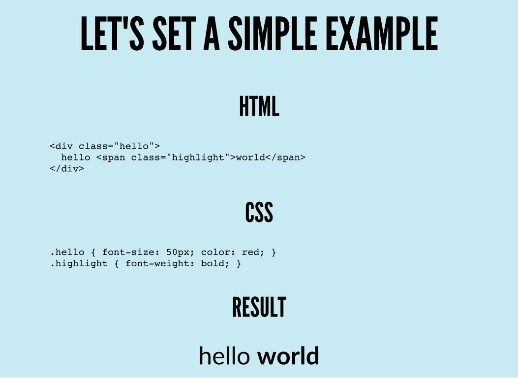
LET'S SET A SIMPLE EXAMPLEHTML
<div class="hello"> hello <span class="highlight">world</span></div>
CSS.hello { font-size: 50px; color: red; }.highlight { font-weight: bold; }
RESULT
hello world

AND A FULL PAGE !<html> <head> <title>The title of my page</title> <link rel="stylesheet" href="style.css"> </head> <body> <div class="header">This is my header</div> <script src="myscript.js"></script_> </body></html>

HTML5 / ALL THE TAGS

HTML5 / COMMON TAGS USED
We primarily use : div & spanand a, img, form, input, button.

CSS / BIND TO HTML WITH SELECTORS
to identify HTML tags and apply design.container {}.container .item:first-child {}:last-child:not(:last-child)

CSS / COMMON STYLES USED
position, float, display
margin, padding
font‐family, font‐size, font‐weight
text‐align
color, background

CSS / ADJUST STYLES WITH CHROME DEVTOOLS
LIVE CODING (slides/htmlcss/css/example.html)

SASS / ORGANIZE THE CSS
SASS :
is a CSS preprocessorsimplify reading of the codestructure code in multiple files

SASS / SIMPLIFY THE CSS
Don't write :.hero { background: black; }.hero h1 { color: red; }.hero .highlight { font-weight: bold; }
But write :.hero { background: black;
h1 { color: red;
.highlight { font-weight: bold; } }}

SASS / SPLIT THE CSS IN MULTIPLE FILES
Don't write all your CSS in 1 file ....hero { color: red; }/* ... > 1000 CSS messy lines */.footer { font-size: 12px; }
But split it in multiple files, sort by categories :@import '_header';@import '_layout';// ...@import '_footer';

EXISTINGS FRAMEWORKS ?
en français !...
Twitter Bootstrap (http://getbootstrap.com)
Foundation (http://foundation.zurb.com)KNACSS (http://www.knacss.com)

GRID / UNDERSTAND THE GRID SYSTEM
Bootstrap has a grid of 12 columns.

GRID / USE THE GRID SYSTEM
How to use the grid ?<div class="row"> <div class="col-md-4 col-sm-6">Column 1</div> <div class="col-md-4 col-sm-6">Column 2</div> <div class="col-md-4 col-sm-6">Column 3</div></div>
The grid will have :
3 columns for a medium screen (width >= 992px)
2 columns for a small screen (768px >= width > 992px)1 columns for a tiny screen (width < 768px)
DEMO (slides/bootstrap/grid/demo.html)
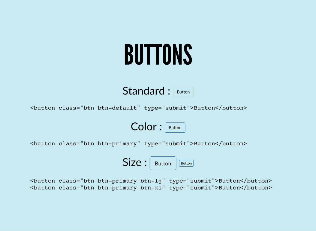
BUTTONSStandard : Button
<button class="btn btn-default" type="submit">Button</button>
Color : Button
<button class="btn btn-primary" type="submit">Button</button>
Size : Button Button<button class="btn btn-primary btn-lg" type="submit">Button</button><button class="btn btn-primary btn-xs" type="submit">Button</button>

FORMSEmail
Password
Sign in
<form class="form-horizontal"> <div class="form-group"> <div class="col-sm-12"> <input type="email" class="form-control" placeholder="Email"> </div> </div> <div class="form-group"> <div class="col-sm-12"> <input type="password" class="form-control" placeholder="Password"> </div> </div> <div class="form-group"> <div class="col-sm-12"> <button type="submit" class="btn btn-default">Sign in</button> </div> </div></form>

CLEAN <CODE>
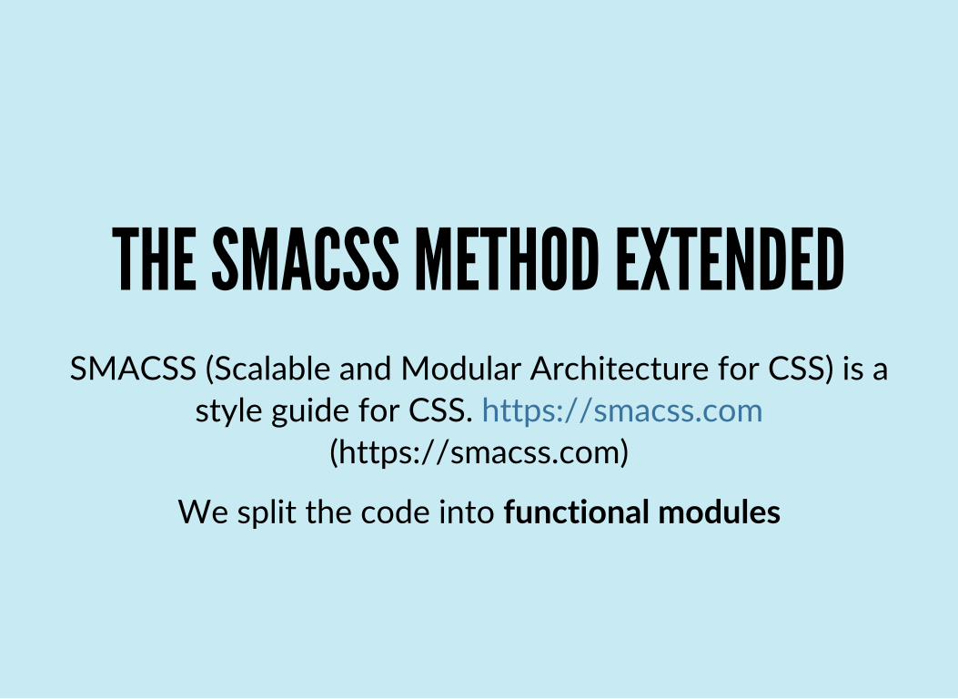
THE SMACSS METHOD EXTENDEDSMACSS (Scalable and Modular Architecture for CSS) is a
style guide for CSS. https://smacss.com(https://smacss.com)
We split the code into functional modules

ORGANIZE FILES / OVERVIEW
mylandingpage|- bower_components : external plugins|- node_modules : tools to build the project|- scss : my common styles|- src |- app : the page |- assets : media files |- images |- index.html : the homepage|- bower.json : list of the external plugins|- gulpfile.js : JS makefile|- package.json : list of tools to build the project

ORGANIZE FILES / 'SCSS' DIRECTORY
mylandingpage|- scss |- _base.scss : basics styles |- _form.scss : forms |- _layout.scss : all about structure |- _mixins.scss : functions |- _variables.scss : common configuration |- index.scss : import the previous |- vendor.scss : import the external styles

ORGANIZE FILES / 'SRC/APP' DIRECTORY
mylandingpage|- src |- app |- _header.scss : header of the page |- _features.scss : feature part |- _footer.scss : footer of the page |- _hero.scss : hero part |- _prices.scss : prices part |- navbar.js : navbar behavior JS |- index.js : misc behavior JS

ORGANIZE THE HTML CODESeparate into functional part
<div class="hero"> <div class="hero-header"></div> <div class="hero-header-title">Use the best, use Jobboard.</div> <div class="hero-header-subtitle">and stay on top</div> </div>
<div class="hero-calltoaction"> <button class="btn-register">Register</button> </div></div>
.hero { padding: 100px 0;
.hero-header { color: gray; } .hero-header-title { font-size: 40px; } .hero-header-subtitle { font-size: 20px; } .hero-calltoaction { margin-top: 50px; }}
.btn-register { color: white; background: orange; }

CSS styles can quickly become messy
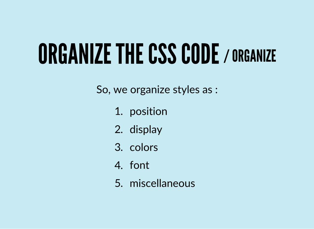
ORGANIZE THE CSS CODE / ORGANIZE
So, we organize styles as :
1. position
2. display3. colors
4. font
5. miscellaneous

ORGANIZE THE CSS CODE / EXAMPLE
.myitem { /* Position */ position: absolute; top: 0;
/* Display */ display: block; width: 100px; height: 50px; margin: 0 5px 20px 10px; padding: 5px 5px;
/* Colors */ color: whitesmoke; background: green;
/* Font */ font-family: 'Arial'; font-size: 12px;
/* Miscellaneous */ border-radius: 50%;}

RESPONSIVE !

WHAT IS RESPONSIVE WEB DESIGN(RWD) ?
Create a site which can be read across a wide range ofdevices, from desktop to mobile.
Find screens size here : http://screensiz.es(http://screensiz.es)

WHAT STRATEGY TO USE ?1. First, develop for desktop !2. Second, adapt mobile and tablet :)

USE @MEDIA QUERIES !Example :
<div class="hero">…</div>
.hero { width: 960px; }
@media screen and (max-width: 768px) { .hero { width: 600px; }}

ENDING
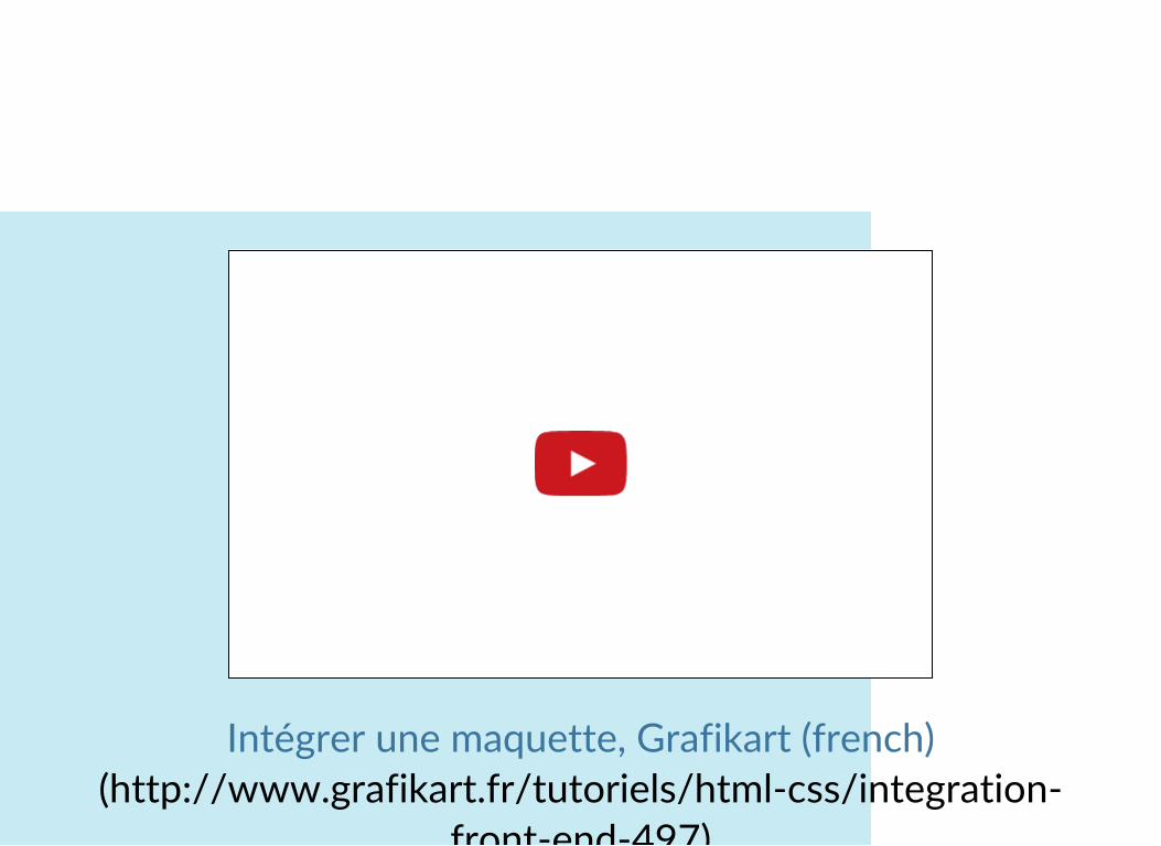
TO GO FURTHER
Intégrer une maquette, Grafikart (french)(http://www.grafikart.fr/tutoriels/html‐css/integration‐
front‐end‐497)
front‐end‐497)
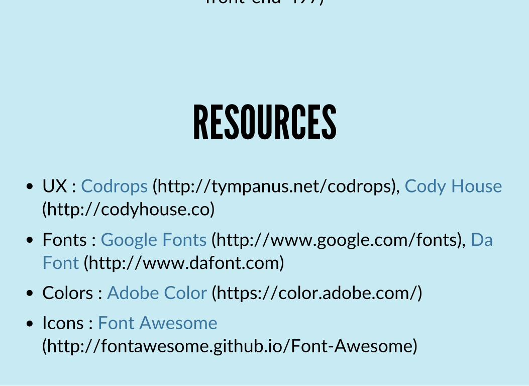
RESOURCESUX : ,
Fonts : ,
Colors : Icons :
Codrops (http://tympanus.net/codrops) Cody House(http://codyhouse.co)
Google Fonts (http://www.google.com/fonts) DaFont (http://www.dafont.com)
Adobe Color (https://color.adobe.com/)Font Awesome
(http://fontawesome.github.io/Font‐Awesome)

TUTORIAL

INSTALLATION / MAC (BREW)
In a shell, execute :$ brew install node$ sudo npm -g install gulp grunt grunt-cli yo sass node-sass bower

INSTALLATION / UBUNTU
In a shell, execute :$ curl -sL https://deb.nodesource.com/setup_0.12 | sudo bash -$ sudo apt-get install -y nodejs git$ sudo npm -g install gulp grunt grunt-cli yo sass node-sass bower

INSTALLATION / WINDOWS
Download & Install
Download & Install
Download & Install
Add python executable to the PATH
In a shell, execute :
Git Extensions(https://code.google.com/p/gitextensions)
NodeJS 0.10.33(http://nodejs.org/dist/v0.10.33)
Python 2.X.X(https://www.python.org/downloads)
npm -g install gulp grunt grunt-cli yo sass node-sass bower
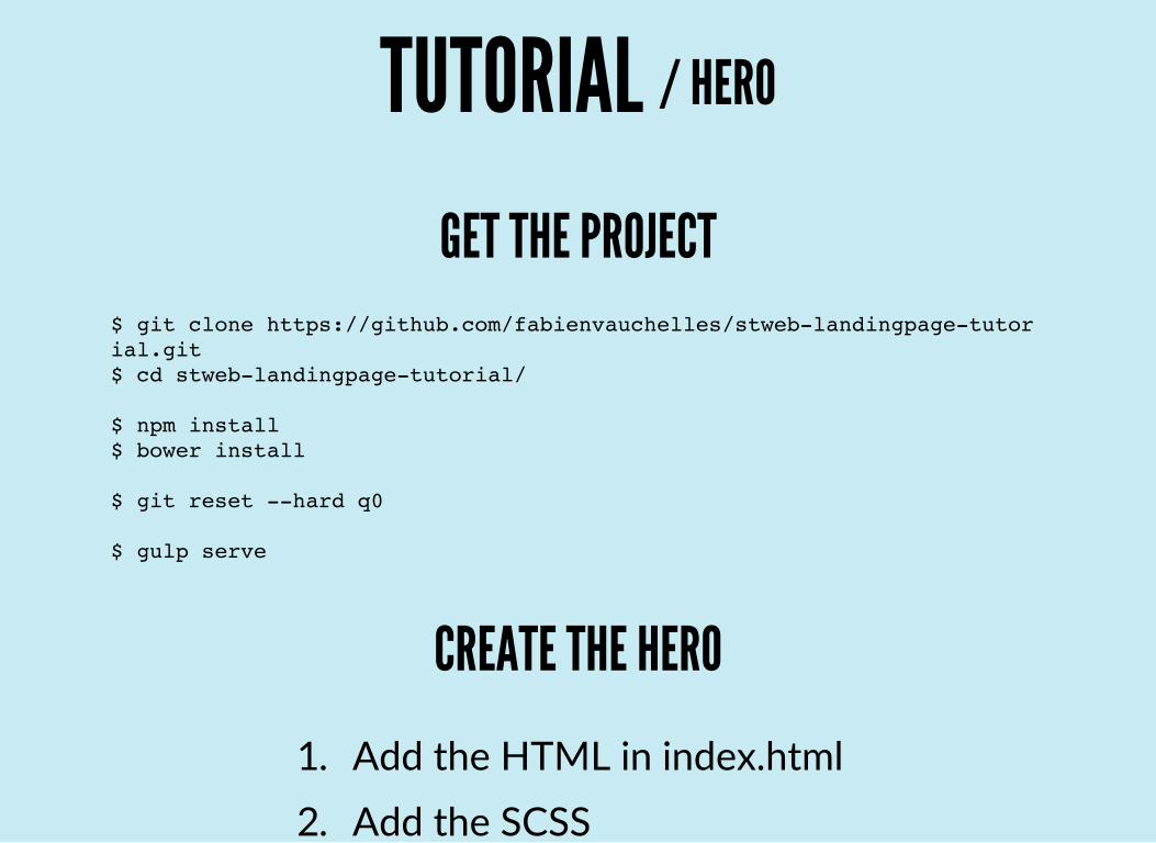
TUTORIAL / HERO
GET THE PROJECT$ git clone https://github.com/fabienvauchelles/stweb-landingpage-tutorial.git$ cd stweb-landingpage-tutorial/
$ npm install$ bower install
$ git reset --hard q0
$ gulp serve
CREATE THE HERO
1. Add the HTML in index.html2. Add the SCSS

2. Add the SCSS
TUTORIAL / FEATURES
GET THE NEXT STEP$ git reset --hard q1
$ gulp serve
CREATE THE FEATURES
1. Add the HTML in index.html2. Add the SCSS

TUTORIAL / BOOTSTRAP
GET THE NEXT STEP$ git reset --hard q2
$ gulp serve
USE BOOTSTRAPUse Bootstrap's columns for features

© Fabien Vauchelles (2015)
TUTORIAL / FINAL
GET AND READ THE SOLUCE$ git reset --hard q3
$ gulp serve