Contents page and dps analysis task
9
Music Magazine – Contents Page and DPS Textual Analysis Name: Hannah Hughes Candidate Number: 4067 Center Name: St. Andrew’s Catholic School Center Number: 64135 OCR Media Studies – AS Level Unit G321: Advanced Portfolio Picture of contents Page and DPS to be analysed HERE
-
Upload
hannahhughes -
Category
Education
-
view
151 -
download
0
Transcript of Contents page and dps analysis task

Music Magazine –
Contents Page and DPS Textual Analysis
Name: Hannah HughesCandidate Number: 4067Center Name: St. Andrew’s Catholic SchoolCenter Number: 64135
OCR Media Studies – AS Level
Unit G321: Advanced Portfolio
Picture of contents Page and DPS to be analysed
HERE

Content Title: This is a good place to expand on the house colours and styles and makes the magazine look professional.
Subline: (Summary of the story for the reader) This can help the reader decide whether they want to read the story or not. This is why it is very important that the subline be as appealing as possible. For this reason the subline is very important in a magazine, and can make the magazine look even more professional.
Sub Headings: This makes the magazine look professional as it includes the magazine logo and continues using the house colours and styles
Editor Photo: This shows that a real person did write this and that the editorial isn’t just a standard bit of text that they copy into ever magazine Kerrang! Make. It also makes the magazine look professional as they actually employ someone to be the editor of the magazine.
Editorial: The editorial is used to ‘Inform’ (Katz) the reader of what will be included in the magazine. It makes the magazine look professional.
Page number: This is here so that the reader can quickly and easily find the page they are looking for. It adds to the professional look the magazine has.
Main Image: The main image ofthe band ShineDown would immediately create some ‘star appeal’ (Richard Dyer) for the audience and attract a pass along audience very quickly and effectively.
Issue details: This connotes to the reader that the magazine is popular. This is because the issue number is so large that the magazine must be good to have been able to create that many issues.

‘repeat’ (Steve Neale - 1980) and WHY?
• The image taking up half the page. This suggests that this image is part an important or popular article and that the reader should go and read it.
• The Content Title and Sub-Heading in the middle of the page. This makes the page look professional and successfully includes in the logo on the page.
• The content page logo/ banner on the top left. This makes the magazine look professional and lets the reader know what page they are on.

Call out/ drop out quote: To draw people into reading the article (gives idea of what’s to come)
Alley Drop cap: Draw attention to article and show clearly where the article starts.
Headline: To attract people
to the article, also because it is red and white it makes it look more professional and stands out more
Sans Serif Text: Makes the article appear less formal By line: Small so
it doesn’t draw attention away from the article
Negative space/ white space: Makes the article appear smaller and easier to read, so more people will then read it.
Flush left: More appealing to the eye
Copy/ body: There isn’t much text on the page and it is very small font but this makes the image and headline stand out more
Kicker: Makes you read the first few words, and then you end up reading the whole article
Recto
Wob: White text on a black or other coloured background: binary opposition is to draw attention to the article.
Header: Used to keep with house styles
Page Number: So the reader can navigate through the magazine
Image: Gives audience visual information, image fills both pages to keep magazine informal Main image is a long shot and shows all 6 members looking directly at the camera. All the members are looking directly into the camera. This connotes that they are used to getting their pictures taken and are therefore a very popular
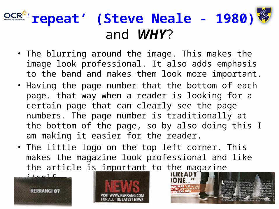
‘repeat’ (Steve Neale - 1980) and WHY?
• The blurring around the image. This makes the image look professional. It also adds emphasis to the band and makes them look more important.
• Having the page number that the bottom of each page. that way when a reader is looking for a certain page that can clearly see the page numbers. The page number is traditionally at the bottom of the page, so by also doing this I am making it easier for the reader.
• The little logo on the top left corner. This makes the magazine look professional and like the article is important to the magazine itself.

Sans Serif Text: Makes the article appear less formal
Drop cap: Draw attention to article and show clearly where the article starts.
Image: Gives audience visual information, image fills both pages to keep magazine informal . Main image is a medium shot and shows all 4 members looking directly at the camera. There are guitars in this image which shows us straight away that they are a band. Also none of the members are doing any poses which shows that they are more interest in the music and not the fame that comes with the music.
Call out/ drop out quote: To draw people into reading the article (gives idea of what’s to come)
By line: Small so it doesn’t draw attention away from the article
Headline: To attract people to the article, also because it is black and white it makes it look more professional and stands out more
Alley
Header: Used to keep with house styles
Page Number: So the reader can navigate through the magazine
Wob: Black text on a white or other coloured background: binary opposition 9Levi Strauss) to draw attention to the article.Flush left: More
appealing to the eye
Negative space/ white space: Makes the article appear smaller and easier to read, so more people will then read it.
Kicker: Makes you read the first few words, and then you end up reading the whole article

‘repeat’ (Steve Neale - 1980) and WHY?
• Have the main image fill over a page. This will add emphasis on the picture and attract the reader.
• The pop out quote from the interview. This is probable the most important quote from the interview and if the information that will attract the reader to the article.
• The little logo on the top right corner. This makes the magazine look professional and like the article is important to the magazine itself.

Page Number: So the reader can navigate through the magazine
By line: Small so it doesn’t draw attention away from the article
Image: Gives audience visual information, image fills both pages to keep magazine informal, her eyes are very wide and draws in reader in. she is looking directly into the camera. This connotes that she is used to getting her pictures taken and are therefore a very popularHeadline: To
attract people to the article, also because it is black and white it makes it look more professional and stands out more
Kicker: First few words are bigger then the rest of the article which makes you read the first few words, and then you end up reading the whole article
Flush left: More appealing to the eye
Copy/ body: There isn’t much text on the page and it is very small font but this makes the image and headline stand out more
Call out/ drop out quote: To draw people into reading the article (gives idea of what’s to come)
House Style: It is simple because it’s only black, white and red. The red is taken from her shirt in the centre of the image. Because it isn’t used much it is very efficient as the image is still very eye-catching
Drop cap: Draw attention to article and show clearly where the article starts.
Alley

‘repeat’ (Steve Neale - 1980) and WHY?
• I would repeat the colour theme. This makes the magazine look professional and is also appealing tot he eye, rather than having multiple colours.
• I would repeat the large quote. This draws the attention of the reader in, and will entice them to read the article.
• The large main image. This again draws the attention of the reader in, and makes it easier for readers to find the article, because its difficult to miss the big image.