Content Sparks Rebranding - The Logo
23
Rebranding Part 5: The Content Sparks Logo
-
Upload
sharyn-sheldon -
Category
Marketing
-
view
31 -
download
1
Transcript of Content Sparks Rebranding - The Logo

Rebranding
Part 5:
The Content
Sparks Logo

contentsparks.com
After selecting our new name, we needed to
start rebranding our visual image and all our
marketing materials.

contentsparks.com
The first, and arguably the most
important visual element to rebrand,
was our logo.

contentsparks.com
Melanie McDonald at Distinctive Design
Solutions was responsible for the design work.

contentsparks.com
We initially asked for two logo design concepts
to be developed, knowing that we would
select one of those and refine it to meet our
marketing vision.

contentsparks.com
So that she could better understand what we
had in mind, Melanie sent us a very detailed
logo questionnaire to complete.

contentsparks.com
It forced us to drill down on the marketing
messages we wanted our logo to represent,
including the personality of our brand and the
image we wanted to portray.

contentsparks.com
The look we wanted was professional
AND vibrant - two characteristics that aren't
always put together in the same sentence.

contentsparks.com
The logo had to be something that was modern
(but not too abstract), instantly recognizable,
and that would work in a variety of sizes and
on both light and dark backgrounds.

contentsparks.com
The sparks would need to be colorful
and dynamic to reflect the core theme
of sparking, or igniting inspiration.

contentsparks.com
We knew we wanted to use a strong orange
somewhere in the logo to represent the sparks
of a fire.

contentsparks.com
We were thinking about using a
blue/green/purple palate of colors but left
the choice to Melanie for the first round to
see what she recommended.
contentsparks.com
When we saw the initial design
concepts, one of them clearly stood
out more than the other.

contentsparks.com

contentsparks.com
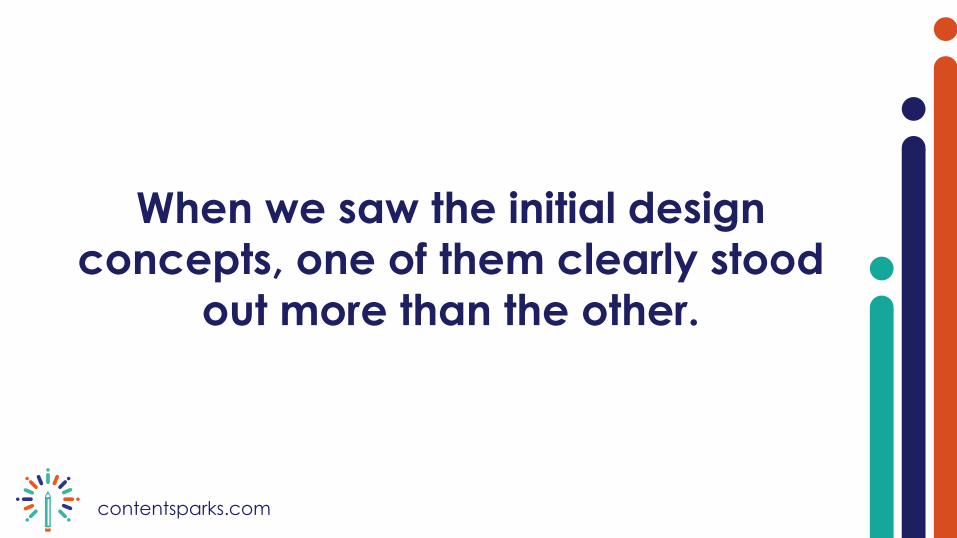
We all liked Concept 1 much better,
representing, as it did, an interesting
combination of a pencil and a sparkler.

contentsparks.com
Integrating a writing implement and sparks of
inspiration was definitely a good direction for
the logo.

contentsparks.com
We were also looking for something that we
could adapt to use for sub-branding,
including the new product groups we were
planning. Concept 1 lent itself better to that
aim.
contentsparks.com

contentsparks.com
With Melanie’s help and some feedback from a
few other people, we spent some time
refining the logo.

contentsparks.com
We wanted a slightly different look for the
pencil, and a different palate of colors for the
sparks. After a few rounds of tweaking, we
settled on the final version.

contentsparks.com
We think it represents what we stand for:
professional, customizable content, written
with flare, to help fire up your business.

contentsparks.com

contentsparks.com/fireup
Fire-Up Your Business with Content
Get started with your Free
Content Planning Template