Color - About | Department of...
7
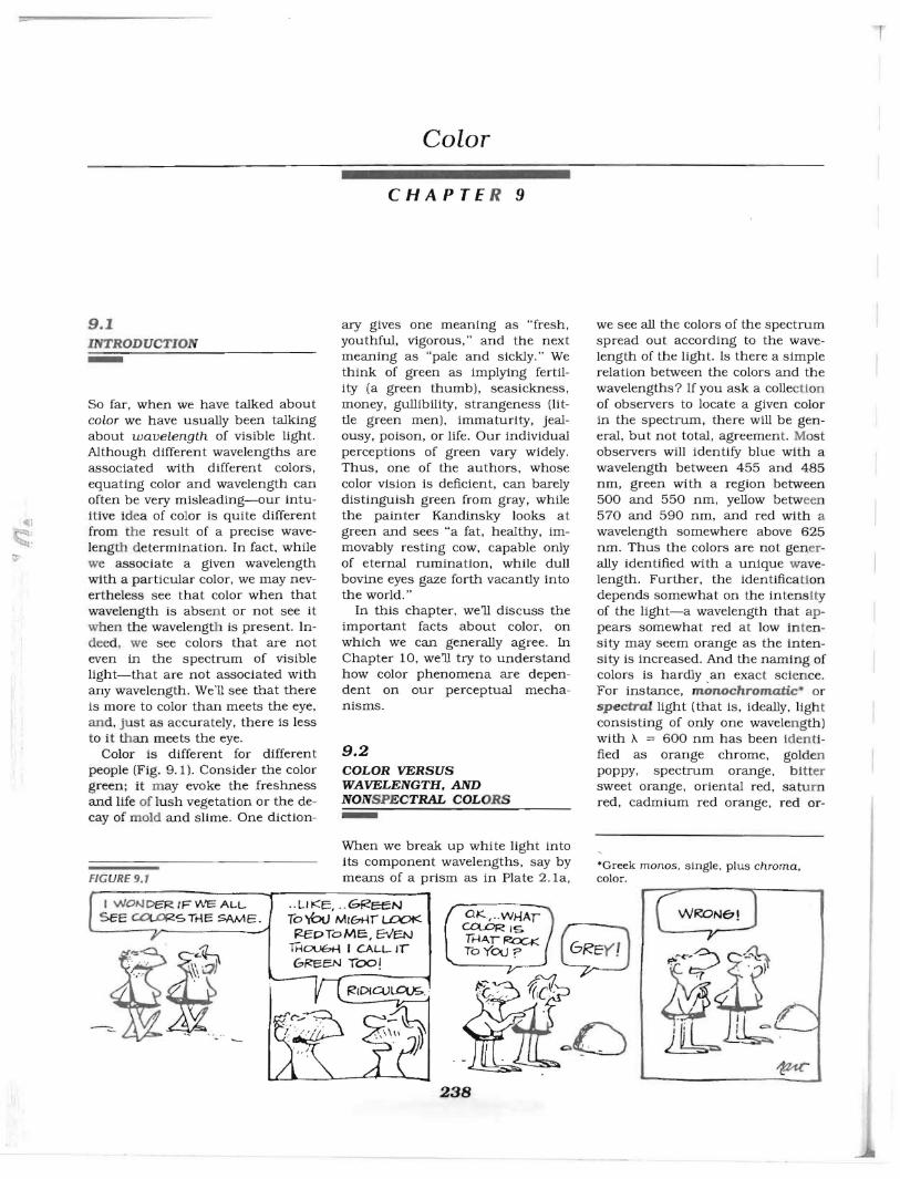
== r Color CHAPTE R 9 9.1 INTRODUCTION - So far, when we have talked about color we have usually been talking about wavelength of visible light. Although different wavelengths are associated with different colors, equating color and wavelength can often be very misleading-our intu- itive i de a of color is qUite different from the result of a precise wave- leng th d etermination. In fact, while we associate a given wavelength with a particular color, we may nev- ertheless see that color when that wavelength is absent or not see it when the wavelength is present. In- deed , we see colors that are not even in the spectrum of visible light-that are not associated with any wavelength. We'II see that there is more to color than meets the eye, an d, just as accurately, there is less to it than meets the eye. Color is different for different people (Fig. 9.1). Consider the color green; it m ay evoke the freshness and Ufe of lush vegetation or the de- cay of mold and slime. One diction- fiG URE 9.1 ary gives one meaning as "fresh, youthful, vigorous," and the next meaning as "pale and sickly." We think of green as implying fertil- ity (a green thumb), seasickness, money, gullibility, strangeness (lit- tle green men), immaturity, jeal- ousy, poison, or life. Our individual perceptions of green vary widely. Thus, one of the authors, whose color vision is deficient, can barely distinguish green from gray, while the painter Kandinsky looks at green and sees "a fat, healthy, im- movably resting cow, capable only of eternal rumination, while dull bovine eyes gaze forth vacantly into the world." In this chapter, well discuss the important facts about color, on which we can generally agree. In Chapter 10, well try to understand how color phenomena are depen- dent on our perceptual mecha- nisms. 9.2 COLOR VERSUS WAVELENGTH,AND NONSPECTRAL COL ORS - When we break up white light into its component wavelengths, say by means of a prism as in Plate 2.1a , we see all the colors of the spectrum spread out according to the wave- length of the light. Is there a Simple relation between the colors and the wavelengths? If you ask a collectLon of observers to locate a given color in the spectrum, there will be gen- eral, but not total , agreement. Mo st observers will identify blue with a wavelength between 455 and 485 nm, green with a region b etween 500 and 550 nm , yellow between 570 and 590 nm, and red with a wavelength somewhere above 625 run. Thus the colors are not gen.er- ally identified with a unique w ave- length . Further, the identifica ti on depends somewhat on the intenS ity of the light-a wavelength that ap - pears somewhat red at low in te n- sity may seem orange as the inten- sity is increased. And the naming of colors is hardly _ an exact sci ence . For instance, monochromatic · or sp e ctral light (that is, ideally, light consisting of only one wavelen g th) with A = 600 nm has been Ident i- fied as orange chrome, golden poppy, spectrum orange, bi tt er sweet orange, oriental red, saturn red, cadmium red orange, red or- 'Greek monos, Single, plus chroma , color. .. LIKE, .. GReeN To'IbtJ M,bHr LDOt< F!EDToMe:, EVa..! IHOl.JbH I CALL-IT 6F!eEN TOO! 238
Transcript of Color - About | Department of...
== r
Color
CHAPTE R 9
9.1 INTRODUCTION-So far, when we have talked about color we have usually been talking about wavelength of visible light. Although different wavelengths are associated with different colors, equating color and wavelength can often be very misleading-our intuitive idea of color is qUite different from the result of a precise wavelength determination. In fact, while we associate a given wavelength with a particular color, we may nevertheless see that color when that wavelength is absen t or not see it wh en the wavelength is present. Indeed , we see colors that are not even in the spectrum of visible light-that are not associated with any wavelength. We'II see that there is more to color than meets the eye, and, just as accurately, there is less to it than meets the eye.
Color is different for different people (Fig. 9.1). Consider the color green; it m ay evoke the freshness and Ufe of lush vegetation or the decay of mold and slime. One diction
fiGURE 9.1
ary gives one meaning as "fresh, youthful, vigorous," and the next meaning as "pale and sickly." We think of green as implying fertility (a green thumb), seasickness, money, gullibility, strangeness (little green men), immaturity, jealousy, poison, or life. Our individual perceptions of green vary widely. Thus, one of the authors, whose color vision is deficient, can barely distinguish green from gray, while the painter Kandinsky looks at green and sees "a fat, healthy, immovably resting cow, capable only of eternal rumination, while dull bovine eyes gaze forth vacantly into the world."
In this chapter, well discuss the important facts about color, on which we can generally agree. In Chapter 10, well try to understand how color phenomena are dependent on our perceptual mechanisms.
9.2 COLOR VERSUS WAVELENGTH,AND NONSPECTRAL COLORS -When we break up white light into its component wavelengths, say by means of a prism as in Plate 2.1a,
we see all the colors of the spectrum spread out according to the wavelength of the light. Is there a Simple relation between the colors and the wavelengths? If you ask a collectLon of observers to locate a given color in the spectrum, there will be general, but not total, agreement. Most observers will identify blue with a wavelength between 455 and 485 nm, green with a region b etween 500 and 550 nm, yellow between 570 and 590 nm, and red with a wavelength somewhere above 625 run. Thus the colors are not gen.erally identified with a unique wavelength. Further, the identifica tion depends somewhat on the intenSity of the light-a wavelength that appears somewhat red at low in tensity may seem orange as the intensity is increased. And the naming of colors is hardly _an exact science. For instance, monochromatic· or spectral light (that is, ideally, light consisting of only one wavelen gth) with A = 600 nm has been Identified as orange chrome, golden poppy, spectrum orange, bitter sweet orange, oriental red, saturn red, cadmium red orange, red or
'Greek monos, Single, plus chroma, color.
. . LIKE, . . GReeN To'IbtJ M,bHr LDOt< F!EDToMe:, EVa..!
IHOl.JbH I CALL-IT 6F!eEN TOO!
238

9.3 THE INTENSITY-DISTRIBUTION CURVE AND THE CLASSIFICATION OF COLORS
239
ange, and yet other names in a list that continues to grow as advertisers take over the English language.
If you compare the monochromatic colors in a good spectrum with the colors you normally see around you, you'll find that most colors you see don 't lie in the spectrum. For example , none of the colors in Plate 8.4 is identical to any of the colors seen in a spectrum cast by a p rism. A few examples of nonspectral colors are purple, pink, brown, silver, fluorescent red, and iridescent green. Where do these other colors come from? How do we get the sensation of all these colors that do not appear in the spectrum?
9.3 THE INTENSITY-DISTRIBUTION CURVE AND THE CLASSIFICATION OF COLORS
Most colors around us are not monochromatic, but instead contain a distribution oj wavelengths. Suppose we reflect white light from one of the green ish parts of Plate
I
8. 4 and break up the reflected light with a prism. If we then measure the intensity at each visible wavelength and plot the result, we will get an intensity-distribution curve somewh at like the solid curve in
I Figure 9.2. Although there is a predominance of green light, there is also a li ttle bit of every other visible wavelength present. Looking at the greenish part of the plate, then, your eye receives this entire distribution of different wavelengths.
When you simultaneously play two d ifferent notes on a piano, you usually hear the two separate notes. But when you shine two different wavelengths onto the same place on a screen, your eye doesn't separate the resulting light into two colors; rath er you see some sort of mixture. How can your sensations of these mixtures be characterized? For example, consider what happens if we shine a little extra red light along with the greenish light of Fig. 9.2:
400 500 600 700
Wavelength {nm}
FIGURE 9.2
Intensity-distribution curve. Solid line: the intensity of light, at each visible wavelength , obtained when white light is reflected from a greenish region of Plate 8.4. Dashed line: the same light with a little extra red light mixed in.
the color mixture is changed-indeed, there are an infinite number of other ways that we could modify the intensity-distribution curve, and most people can distinguish a million or so such different color mixtures. Recognizing this huge variety of colors, the author Nabokov felt that a phrase like "the sky is blue" conveyed little information. Thus in Speak, Memory he attempts to express the variety of the color blue with such terms as "blue-white," "misty-blue," "purplish-blue," "silvery blue," "cobalt blue, " "indigo blue," "azure," "china-blue," "dove-blue," "crystal blue," and "ice-bright." These are certainly more poetic than intensity-distribution curves, but may not convey the same image to every reader. What we want is a straightforward way of classifying all the distinguishable color sensations that is simpler than giving the intensity at each visible wavelength, but still contains all the necessary information.
Well see that rather than speCifying all the numbers in the intensity-distribution curve, for many purposes it is suffiCient to specify only three numbers. Your eye cannot extract all the information contained in the curve by looking at the light; many lights with very different curves appear the same to you. The three qualities of the colored light that determine how the light
appears are hue, saturation, and brightness .
Hue corresponds to the main color or color name; it is what d istinguishes one spectral color from another. For example, all yellows differ in hue from all blues, regardless of any other possible similarities. Hue is specified by the d ominant wavelength in an intensitydistribution curve. Thus, the greatest intensities in the light rep resented by Figure 9.2 lie between 500 and 530 nm, so the hue of that light is some sort of green_ (The t erm dominant wavelength is defined more precisely in Sec. 9. 4Cthe "dominant wavelength" may actually not be present, even though the color looks like light of that wavelength. )
Saturation corresponds to the purity of the color-a very saturated color generally has almost all its intensity fairly close to the dominant wavelength, while an unsaturated color would have contributiop.s from many other wavelengths. The monochromatic, spectral colors h ave the highest saturation. White ligh t, which generally consists of all wavelengths with no dominant on e, is completely unsaturated (Fig. 9 .3a J. (White is often thought of symb olically as the essence of pUIitybrides wear it. From our polnt of view, it is the least pure color you can get. ) Other colors may be thought of as a mixture of white light with a saturated color. Figure 9.3b shows the intensity-dis tribution curve of a saturated red ligh t . A mixture of tha t saturated red with white (Fig. 9.3cJ gives a desaturated red, or pink. The saturation is a measure of how much dominant wavelength there is compared to the amount of white mixed in . Most objects around you h ave u nsaturated colors because their d om inant hue comes from absorption, which takes place somewhat b elow their surface, but there is also som e surface reflection, which is inde- , pendent of wavelength and th us mixes in some white . (See th e TRY IT.) Artists use the terms chroma or (unfortunately) intensity ' to mean something similar to saturation. (Beca use the definitions come from

I '
CHAPTER 9, COLOR
-400 500 600 700
Wavelength (nm) (a)
400 500 600 700
Wavelength (nm) (b)
400 500 600 700
Wavelength (nm) (e)
FIGURE 9.3
Saturation. (a) White light is completely unsaturated. (b) A saturated red light. (c) A less saturated red light-pink.
different fields, the meanings are slightly different.)
The third attlibute of color depends on wheth er we're talking about colored lights or colored surfaces. Brightness refers to the sensation of overall Intensity of a light, ranging from dark, through dim, to bright, and dazzling Wig. 9.4a, see als o S ec. 7 .3A). Lightness, on the other hand, is related to the percentage of incident light reflected by a swjace and refers to the blackn ess , grayness, or whiteness of a color Wig. 9.4b).
We know how to change the brightness of a light (even a colored
.....
240
Bright
Dim
I
400 500 600 700
(a) Wavelength (nm)
]l 100- White
~ ~-----------------------; ~
~ Gray:.::: -"0
" ~
2: <: Black" \: ct a
400 500 600 700
(b) Wavelength (nm)
FIGURE 9.4
(a) Brightness of a light. The intensitydistribution curves for three different brightnesses. (b) lightness o'f a surface. The curves correspond to the percentage of incident light reflected at each wavelength .
one) ; we need only adjust the intensity of the source. To change the lightness of a surface you must make it less reflecting, say by lightly rubbing pep.cil allover It. The surface will then appear grayer-you have decreased Its lightness (Fig. 9.4b). Thus, the more reflecting the surface (in the visible). the lighter it is. We often think of lightness as being related to the total amount of light reflected at all visible wavelengths-but we must be careful. We can change the amount of reflected light in two ways. One is to make the surface less rtjlecting, say by the method just described. This indeed lowers the lightness. The other is to change the overall illumination-the incident light. But if you shine less light on a piece of white paper, it doesn't appear gray, it continues to look white. That is, the lightness of any surface is nearly independent of the overall illumination (lightness constancySec.7.3BJ.
To apply these ideas to color, take an orange surface and blacken it, lowering each point on the In tensity-distribution curve of its reflected light by a factor of two, perhaps, without changing th e rela tive heights. You have then decreased the surface's lightness without changing its hue. The surface w!l1 then look brown, providing you compare it to, say, the original OT
ange, so you can tell that it is the amount of reflected light, not the illumination, that has chan ged. Thus, surprisingly, the sensation of lightness corresponds more closely to the surface's ability to reflect light than to properties of the light actually entering your eye from that surface. (The artist's term value is somewhat like lightness, but may also involve saturation. J
Colors may be arranged according to their hue, saturation, and lightness in a color tree. There are several different schemes, but they are all similar to those shown in Plate 9.1 and Figure 9.5. The "trunk " of the tree consists of the completely unsaturated colors-it ranges from black at the bottom, through grays, to white at the top. That is, the height is a measure of lightness. Out from the trunk, you find different hues in different directionsthe hue varies around the tree.
White
Vl V> W Z lI (,9
Green .__----'-t-__ Yellow
Black
FIGURE 9.5
Schematic drawing of a color tree (compare with Plate 9.1) .
9.4 COLOR MIXING BY ADDITION
241
Finally, as you move away from the trunk in some direction, the color becomes more saturated. For example, moving out in the red direction, you go from gray through pink, and only reach a saturated red at the tip of that "branch." Such standard color trees, or at lases, are of great importance to artists, paint manufacturers, printers, and anyone who must reproduce colors reliably, because any surfaces with the same hue, saturation, and lightness will look the same color, no matter what the inten sity-distribution curves of their reflected light hap pen to be. Similarly, colored ligh ts with the same hue. saturation, and brightness will look the same color, no matter what their intensity-distribution curves happen to be. As we've said, your eye cannot detect the wavelength distribution-rather it is sens itive to these three attributes. Since a given sensation can be produced by a variety of different stimuli, the color tree tells us very little directly about the physical processes that occur In color perception. We can get such Information by exploring the various ways we can mix colors that appear identical to the eye.
TR Y IT
FOR SECTION 9.3
Surface reflections and saturation
To see the effects of surface reflections on the saturation of colors, examine a shiny red apple or a piece of colored plastic in a room with several lights. Notice that no matter how intense the red of the apple, or how saturated the color of the plas tic, the highlights (surface reflection s of the lights) still appear white-completely unsaturated. View the apple outside on an overcast day, when there are no highlights. Does this affect the sa turation? Crumple a piece of colored paper and compare the saturation of a p art of the paper that is partially shaded with an adjacent part that is not.
9.4 COLOR MIXING BY ADDITION-One way to learn something about our -perception of color is to start with lights for which we know both the intensity-distribution curves and the sensations that these lights produce, and then to ask what sensations are produced by combinations of these lights. In this section, we'll discuss combining two lights by shining them at the same spot on a white screen, a screen that diffusely reflects all visible wavelengths equally well. The light reflected to your eyes from that spot then contains both lights-it is an additive mixture; at every wavelength the intensities of the two lights add, so the combined intensity-distrubution curve is the sum of the two individual curves. (We1l refer to other techniques for mixing colors later.)
If we shine white light on the screen. that portion of the screen looks white to us. If. instead, we reflect the white light off a silver object and onto the screen. the screen again looks white, not silver. Had we used a copper object instead of the silver, the light on the screen would look orange; a fluorescent red object would reflect light to the screen that looks no different than ordinary red light. and so on, Thus, by concentrating on these lights , rather than on the objects themselves, we reduce the gamut of colors; but we're still left with the pure colors of the spectrum, washed-out colors. purples, and a host of other nonspectral colors, which remain for us to analyze .
A. The simple additive rules
Suppose the intenSity-distribution curves of a blue, a green, and a red light look like those shown in Figures 9.6a, b, and c. What will the combination of green plus red look like? Adding the two curves gives the result shown in Figure 9.6d-a
rather broad, flat-topped curve wlth no particular wavelength domin atIng. centered about "A = 575 to 600 nm, that is, in the yellow. We cannot yet tell by looking at this cu rve what the sensation produced by the corresponding light will be, bu t jf you actually do the experiment you find that the resultant light d oes look yellow. This is a fairly strange result ; in no way does yellow ap pear to be a mixture of green and red. Thus we see that your eye can interpret rather different intensity distributions as the same color-the mixture of Figure 9 .6d looks very much like the monochromatic yellow of Figure 9.6g. Indeed, you don't have to use the broad colors of Figures 9 .6b and c. If you mix roughly equal amounts of mon ochromatic green and monochromatic red (Fig. 9.6hl. the result also looks yellow, even though the spectral yellow ("A = 580 nm) js completely absent.
What about other color com b inations? Mixing blue and green lights gives a broad peak centered in t h e blue-green, a color called cyan· Wig. 9.6e). This is not too su rprising. but again the result looks nearly the same whether we use broad or narrow blues and greens.
Mixing equal amounts of blue and red gives a double-humped distribution Wig. 9.6f)-no one wavelength dominates. The sensation one gets is m a genta,t a k in d of purple. (Again. we must face the problem of color names. In this book, we1l reserve the name violet for the shortest wavelength vis ible light. the name purple for com bi nations of short and long wave length visible lights, and the name magenta for this particular p u rple. ) Now this is something new; purples aren't in the spectrum at all- a new hue! Shakespeare tells us: "To .. . add another hue/Unto the rainbow . . .lIs wasteful and ridiculous excess," and yet your eye does just that, producing a purple not present in any rainbow.
'Greek kuanos, dark bluet!) ..
tNeither Greek nor Latin, but the name of a town In northern Italy.

CHAPTER 9: COLOR
242
0 -;;;
~" .!;
400 500 600 700
or. "l
'-1/·n
~
about the details of the distribution curves, is what makes additive m Jxtures so appealing to physicists and is the reason that we can get away with talking about only three p roperties of a colored light.
B. Complementary colors
We can use the rules summarized in Figure 9.7 to discover some new additive combinations. We've seen that adding all three colors, blue, green, and red (with proper intensities), gives white:
B + G + R == W*
But green and red together give yellow:
G + R==Y
Hence, combining these two results:
B+ Y==W
blue and yellow lights added together give white. Two colors that, when added together, give white are called complementary colors. Thus blue and yellow are colors complementary to each other. Similarly, because we can think of cyan as being the same as blue and green mixed together:
C==B+G
we can write:
C+R==W
--cyan and red are complementary. Likewise:
M+G = W
-magenta and green are complementary. (Note: these are not th e complementary pairs your art teacher taught you.)
Again, it does not matter to your
'We follow the standard notation of th e C.I.E. (Commission lntemattonale d e l'Eclairage, the International Commission on illumination) and use == to mean "looks the same as," rather than = which would imply equality. Two colors that look the same need not be physically equal (see Fig. 9.8). These equations are valid only for the proper IntenSity balance of the colors being added.
00 "@"@ ~~ .!;.!;
400 500 600 700 400 500 600 700
(a)
.f' :3 ~ .!;
Wavelength (nm)
Y
(b)
0 V;
~" .!;
Wavelength (nm)
C
400 500 600 700 400 500 600 700
(d) Wavelength (nm) (e) Wavelength (nm)
400 500 600 700 400 500 600 700
(g) Wavelength (nm) (h) Wavelength (nm)
(e)
0 "@ ~ .!;
Wavelength (nm)
B
400 500 600 700
(f) Wavelength (nm)
400 500 600 700
(i) Wavelength (nm)
FIGURE 9.6
Additive color mixing. Intensitydistribution curves of (a) blue (B), (b) green (G), and (e) red (R) lights. Intensity-distribution curves of the additive mixtures (in equal amounts) of (d) G + R:= Yellow (Y), (e) B + G := Cyan (C), and (f) B + R:= Magenta (M). Intensity-distribution curves of (g) monochromatic yellow and (h) a yellow made of an additive mixture of monochromatic green plus monochromatic red. (i) Intensitydistribution curves of the additive mixture of B + G + R:= White (W).
Finally, if you add all three colors (blue, green, and red) together in th e p wper proportions, you get the fla t intenSity-distribution curve shown in Figure 9.6i. This appears white , as we would expect from Figure 9.3a.
Figure 9.7 summarizes the rules we have developed so far for additive mixing of colored lights. The marvelous thing about these rules is that they are valid no matter what the intensity distributions of the three colors are. If two colors
look the same, they will give identical results in an additive mixture with another color. This great s~mplicity, which allows us to forget
FIGURE 9.7
Simple additive mixing rules. The drawing shows three partially overlapping light beams, which combine additively . B = Blue, G = Green, R = Red, Y = Yellow, C = Cyan, M Magenta, and W = White:
G + R:=Y B + G:= C B + R:= M
B+G+R:=W

- -
9.4 COLOR MIXING BY ADDITION
400 480 500 580 600 700
(a) Wavelength (nm)
400 500 600 700
(b) Wavelength (nm)
FIGURE 9.8
The lights with these two intensity· distribution curves look alike to your eye, even though one has o nly two wavelengths present while the other has all vi~ible wavelengths. (a) Monochromatic blue plus monochromatic yellow. (b) Broad·band white (all visible wavelengths).
eye whether the intensity distributions are broad or mOE:)chromatic; if two colors are complementary, their additive mixture is white. So if we add monochromatic yellow (A = 580 n rn ) to monochromatic blue (A = 480 n m), the result will look just as white as ordinary white light. which has all the wavelengths in it. That is, to your eye, the lights represented by the two intensityd istribution curves of Figure 9.8 look llie same! 1\'10 such colors , wh ich look alike even though they h ave d ifferent intensity-distribution curves, are called metamers. *
We can plot the comb inations of monochromatic colors that are complementary (Fig. 9.9). Notice that there are no complementary monochromatic colors for the greens (roughly between 495 and 565 nm) . This is because, as we already know , the complement of green is th e nonspectral magenta-a double
"Greek meta, with, plus meros, part.
243
v B c G Y 0 R 700
680
660 R
640
620
600 o ~ ~ 580 Y ~
~~ -Ec 560 ~2 " <:: 540" " " " ~~
" 520 G 0
" c'E" 500
480 B
460
440
420 v
400~~~-L-L-L-L~~__~~~~~~~~~~-L-L-L-L~~~~
400 420 440 460 480 500 520 540 560 580 600 620 640 660 680 700
Wavelength of one light (nm)
fiGURE 9.9 TRY IT Wavelengths of complementary pairs of monochromatic colors. To find the FOR SECTION 9.48 complement of a given wavelength , say Complementary colors and 'A = 600 nm, draw a horizontal line from negative afterimages the 600-nm mark on the vertical axis. Find the point where this line intersects
Pick out one point on Plate 5.2 and starethe curve and drop a vertical line from at it for a while (3 0 seconds), then lookthat point to the horizontal axis to
determine the wavelength of the at a blank piece of white paper. Just as
complement, 'A = 489 nm . Thus, the with Figure 7.16, you will see a negative complement of orange (600 nm) is bluish afterimage. Here, however, because the cyan (489 nm). (V = Violet, B = Blue, plate you stared at is colored, the C = Cyan, G = Green, Y = Yellow, afterimage involves your color o = Orange, and R = Red.) The curves perception. When you stare at, say, the depend somewhat on the observer and red region, your mechanism for on the choice of white .
detecting red (whatever it may be) becomes desensitized. When you then look at white light, you see less red in it
humped IntenSity distribution, a with your desensitized red mechanism, combination of red and blue. This so the light will look like white with red gives us a way to describe the non removed. Since white light can be spectral 'purple hues by wavelength, considered as a mixture of cyan and red,
namely by the wavelength of their when you remove the red from white the light looks cyan. Where you stared at redcomplements. For example, we can in the plate, the afterimage is cyan.speak of a magenta 535c, meaning a Similarly, in every other region of the
color that gives white when added to afterimage, you see the complement of
535-nm green. the color in that region of the plate.The TRY IT uses negative afterim This phenomenon is used by artists
ages to show you that complemen who place a fairly saturated color next to tary colors ::Ire intimately involved its complement to give vibrating colors; with the inner workings ofyour eye. for example, when you stare at a

CHAPTER 9: COLOr.:
boundary between red and cyan, your eye tremors cause the afterimage of the cyan to overlap the red, and vice versa (see Sec. 7.6). Since the afterimage of cyan is already red, when it is seen on the red background it enhances the saturation of the red. Thus you see intense flashes of color at the boundary. (Kelly uses green rather than cyan. Examine the red-green border in the plate carefully. The effect here is different from the chromatic aberration effect at the redblue border, referred to in Sec. 5.28. The eye has very little dispersion between red and green.) Larry Poons has painted huge canvases of one color, scattered throughout with dots of another color. If you are fortunate enough to see such a work, stare at one dot for a half-minute and then let your eye roam over the painting. The afterimages of the dots roam with your eye and provide an exciting interplay with the painted dots.
Try producing the complementary afterimage in different circumstances. For example, place a small rectangular piece of colored paper on a white background, stare at a dot in the center of the colored
L paper for half a minute, then rotate the colored paper by 91]', and look at the dot again. The colored paper and its complementary afterimage form a cross.r Notice that where they cross, the colored paper looks very desaturated.
C. Chromaticity diagrams
We have seen that different additive combinations of blue, green, and red lights produce yellow, cyan, magenta, and white. This suggests that we might be able to produce any color as an additive mixture of three properly chos en lights. A way of testing this idea may be thought of as a game. You choose three dffferen t colored lights and we pick an arbitrary fourth colored light. You then mix your three lights, adjusting their relative amounts, to see if you can make a mixture that m atches our light in hue, saturation, and brightness. Suppose you p ick three pure, monochromatic colors, one each in the blue, green, and red parts of the spectrum. Can you then match any color that we pick?
Well, almost any. Although this is your best choice, and there are many colors you can match, there
244
are some that you can't. For instance, you can use your blue and green lights to make cyan, but if we choose a monochromatic. cyan, you're in trouble. The best cyan you can make from blue and green lights will not be as saturated. You can make good matches to many unsaturated colors, but you cannot make perfect matches when we choose saturated colors. Strictly speaking, you've lost the game. However, if we change the rules slightly, you can win.
Although you can't match the monochromatic cyan perfectly, you can convert it to something you can match; if you add a little of your red to our monochromatic cyan, the cyan will become desaturated. Since red is complementary to cyan, mixing a little red with a little of the cyan gives a little white, which, when combined with the rest of the cyan, gives a desaturated cyan. You can then match the resulting desaturated cyan with a mixture of your blue and green lights. That is, using only your three lights, you have produced a match:
mono- a blue + green == chromatic + little
cyan red
If we treated this as a mathematical equation with an equals sign, we could rewrite it as:
a mono-blue + green - little - chromatic
red cyan
That is, if we allow you negatLve amounts, you can match our mon ochromatic cyan. In fact, if we allow negative contributions, you can match any color we choose, no matter how saturated-you can always win the game. (Remember, a "negative contribution" is just a shorthand way of saying that you mix some of one of your colors with our color and then match the resultant color with your other two colors.)
If you choose as your three colors a monochromatic red with A = 650 nm, a monochromatic green with A = 530 nm, and a monochromatic blue with A = 460 nm, the relative amounts you will need to match any monochromatic color we choose are
FIGURE 9.1 0
The relative amounts of your three colors (460-nm blue, 530-nm green, and 650-nm red) needed to match any monochromatic (spectral) color that we choose. Notice that the req u ired amounts of red and green colors are zero at 460 nm. This is because you can match our 460 nm using only your 460-nm blue. The relative amount of the blue, then, is 100% at that point. Similarly, the blue and red amounts vanish at 530 nm, while the blue and green vanish at 650 nm. (For historical reasons, "equal amounts of blue, green, and red" means that the intensity ratios of blue/green/ red are about 1.3/1.0/1.8. The curves shown here and in succeeding figures are standardized; the actual data vary somewhat with observer, intensity of light, etc.)
Amount of 460 nm Blue
Relative amount ofyour 3 colors needed to match our monochromatic color
700% ~====!""!!!!!!!!!!'!II"""'::---?---;"",,------:.;IfI!!~
80%
60%
40% Amount of 530 nm Green
20%
-20% ~~~--~---~. 406 478 437 447 465 488 575 550 596 659 747
Wavelength of our color {nm}