CINEMA MARGINAL POSTERS - Fundació Història del Disseny Farias, Priscila L. et... · other...
17
BORDERLINE GRAPHICS: AN ANALYSIS OF CINEMA MARGINAL POSTERS REGINA C. WILKE SENAC-SP / BRAZIL [email protected] PRISCILA L. FARIAS USP & SENAC-SP / BRAZIL [email protected] ABSTRACT This paper presents a study on Brazilian Cinema Marginal film posters. It identifies the political and cultural context of the posters production, and considers their graphic, communicative and meaningful aspects. In 1968, the Institutional Act #5 (AI-5) comes into force in Brazil, and, for the next ten years, the country is haunted by the most violent period of military dictatorship. Cinema Marginal has its heyday between 1968 and 1973, a period marked by the military regime (1964-1985). Such films portray the spirit of that era in dissimilar ways that alternate between eroticism, horror, romance and suspense, often with political messages in subtext. Its main shared characteristics are the subversion of cinematic language and experimental attitude. Such films interact with avant-garde theatre, visual arts and Brazilian popular music, especially with the Tropicalia movement, setting up a privileged moment of creation, despite the sombre political framework. INTRODUCTION The study of Cinema Marginal posters aims to gathering information for a better understanding of Brazilian design history. The posters selected for this study are those designed for the films listed by Puppo (2008), in his catalogue for an exhibition of Cinema Marginal movies. Initially, we describe the political and cultural context influencing Cinema Marginal, and summarize the concepts that determine its language. We then introduce the Brazilian graphic arts environment of the era, and present the identified authors of the posters. Finally, based on an organization of the posters by affinity groups, we discuss the posters’ relation to the audiovisual language of the films, proposing a reflection on the visual, communicative and meaningful aspects of these graphic artefacts. CINEMA MARGINAL Cinema Marginal, also called underground or alternative experimental cinema (‘udigrudi’ cinema, according to cinema novo emblematic
-
Upload
trannguyet -
Category
Documents
-
view
213 -
download
0
Transcript of CINEMA MARGINAL POSTERS - Fundació Història del Disseny Farias, Priscila L. et... · other...

BORDERLINE GRAPHICS: AN ANALYSIS OF
CINEMA MARGINAL POSTERS
REGINA C. WILKE
SENAC-SP / BRAZIL
PRISCILA L. FARIAS
USP & SENAC-SP / BRAZIL
ABSTRACT
This paper presents a study on Brazilian Cinema
Marginal film posters. It identifies the political and
cultural context of the posters production, and
considers their graphic, communicative and
meaningful aspects.
In 1968, the Institutional Act #5 (AI-5) comes into
force in Brazil, and, for the next ten years, the
country is haunted by the most violent period of
military dictatorship. Cinema Marginal has its
heyday between 1968 and 1973, a period marked
by the military regime (1964-1985). Such films
portray the spirit of that era in dissimilar ways
that alternate between eroticism, horror,
romance and suspense, often with political
messages in subtext. Its main shared
characteristics are the subversion of cinematic
language and experimental attitude. Such films
interact with avant-garde theatre, visual arts and
Brazilian popular music, especially with the
Tropicalia movement, setting up a privileged
moment of creation, despite the sombre political
framework.
INTRODUCTION
The study of Cinema Marginal posters aims to
gathering information for a better understanding
of Brazilian design history. The posters selected
for this study are those designed for the films
listed by Puppo (2008), in his catalogue for an
exhibition of Cinema Marginal movies.
Initially, we describe the political and cultural
context influencing Cinema Marginal, and
summarize the concepts that determine its
language. We then introduce the Brazilian graphic
arts environment of the era, and present the
identified authors of the posters. Finally, based on
an organization of the posters by affinity groups,
we discuss the posters’ relation to the audiovisual
language of the films, proposing a reflection on
the visual, communicative and meaningful aspects
of these graphic artefacts.
CINEMA MARGINAL
Cinema Marginal, also called underground or
alternative experimental cinema (‘udigrudi’
cinema, according to cinema novo emblematic

2 DHS Conference 2011, Barcelona, Spain www.historiadeldisseny.org/congres/
filmmaker Glauber Rocha) is characterized by its
experimental language and idiosyncratic
techniques.
Cinema Marginal production era was marked by
Brazilian military regime (1964-1985), when
society came under the control of the armed
forces, who imposed a policy of repression that
curtailed most basic rights and liberties of the
citizens. In 1968, the Institutional Act #5 (AI-5)
came into force, and the subsequent ten years
were marked by the most violent events of that
period. In this social-political context, the censor
would persecute Brazilian politically active artists.
In the 1960’s, innovative cultural movements
emerged, like Cinema Novo (new cinema),
characterized by movies that focused on Brazilian
reality and lower production costs; and Tropicalia,
a musical and cultural movement that articulated
hedonism and opposition to military dictatorship.
In the end of the 1960's, there was also the
emergence of countercultural and hippie
movements. The ascend of ‘marginal’ culture in
Brazilian intellectual debate was underlined in
visual artist Helio Oiticica’s motto ‘Seja marginal,
seja heroi’ (‘Be a marginal, be a hero’), that
alluded to bandit Cara de Cavalo (horse face), a
myth built by the press.
At this point, Cinema Marginal, a very
heterogeneous set of films, produced
approximately between 1968 and 1973, stands
out, in dialogue with tropicalism, with mass
culture and its icons, with the culture of comics,
suburban theatre-circus, chanchada (Brazilian
trashy comedies) and traditional Hollywood
genres.
The young ‘marginal’ filmmakers broke away from
one of the tenets of Cinema Novo, that of
dramatically portraying Brazilian reality. In their
quest to respond to the historical moment, they
made room for aesthetic experimentations that
would take place, according to Ramos (1987: 31)
in ‘a fictional world that alternates between
enjoyment and horror, always having as a
reference the middle class itself, the producers of
the films themselves, their fears, their angst and
their pleasures.’
PRODUCTION CONTEXT
In the 1960’s, technical schools still dominated the
teaching of graphic arts in Brazil. On the other
hand, graphic design was in the verge of being
institutionalized in the country, with a discourse
based on the precepts of functionalism,
influenced by European schools, especially
Bauhaus and Ulm. This institutionalization was
guided by a technical, rational vision, more than
artistic or simply commercial motivations. Within
this framework, the Industrial Design courses at
the School of Industrial Design – ESDI, in Rio de
Janeiro, and within the Architecture and Urbanism
undergraduate program offered by the University
of São Paulo School of Architecture and Urbanism,
were established.
The conception of movie posters, in its turn, was,
mostly, in the hands of draftsmen or illustrators,
or of visual artists, who produced the image, and
of lettering artists who were responsible for
rendering texts. The process also involved
technicians specialized in photolithography.
The designers of Cinema Marginal posters fit
these different profiles. Tebaldo Simionato was a
painter and a commercial artist. Ferdy Carneiro
graduated from Rio de Janeiro School of Industrial
Design, and, other then working as a graphic
designer, was also a journalist and an art director
for advertising agencies. Fernando Pimenta, who
attended the National School of Fine Arts and the
Institute of Graphic Design, was an illustrator and
a graphic designer who produced not only posters,
but also newspaper ads for the films. Rogério
Duarte, a designer and one of the founders of
Tropicalism, articulated constructivist principles
with elements of Brazilian popular culture. Oscar
Ramos, highly respected in Brazilian visual arts
scene, would also act as an art director and film
set designer. Theresa Simões was a recognized
visual artist as well. Miécio Caffé, who was an
illustrator, painted panels for the façades of
almost all movie theatres in São Paulo the 1960’s
and 1970’s. Benicio, a self-taught artist, produced
illustrations for magazines and movie posters,
being responsible for around 50% of the
pornochanchada (a mix of pornography and
comedy genres) posters, and for at least 300
movie posters overall. Eduardo Catinari, also a
self-taught artist, worked with artistic painting
and graphic arts. Mixel Gantus was an illustrator
and a set designer. Hamilton and Môca were
illustrators. Other poster designers were part of
the staff involved in the film production: Guara
(Guaracy) Rodrigues was an actor, an assistant
director, and an editor for the movie for which he
designed the poster; Tonacci and Geraldo Veloso
are filmmakers who designed their own film
posters.
This diverse profile of training and professional
practice resulted in an eclectic set of posters.
While one line of work followed the precepts of
‘good form’, another endorsed the individual
language of the visual artists or illustrators, and
yet another would ensue the layout-men style of
visual communication born in advertising agencies
(Cardoso 2005). The design of movie posters, at a
given moment, is put in the hands of advertising
agencies, which directly sign the pieces, and soon
begin to provide specialists, like Benício, Gilberto
Marchi and Fernando Pimenta (Ramos & Miranda
1997: 96).
CINEMA MARGINAL POSTERS
Of the 61 films considered for this analysis, 43 are
feature films, five are medium-length films and 14
are short movies. It was possible to locate only 37
posters, all made for feature films. Other movies
of this category were never released
commercially, or it was not possible to locate their
posters in the public archives visited.
For the purpose of description and analysis, by
observing affinities in the use of image and text,
the posters were organized in the following
groups:
• Lettering integrated with illustration
• Text superimposed to illustration
4 DHS Conference 2011, Barcelona, Spain www.historiadeldisseny.org/congres/
• Photography associated with graphic
resources
• Photomontage
• Film frame mosaic
• Document simulation
LETTERING INTEGRATED WITH ILLUSTRATION
In seven of the 37 posters analysed lettering is
integrated to illustration. Handmade illustration
and the use of perspective are expressive
resources found in three posters of this group.
The strength of this technique in the construction
of meaning can be verified in the posters for À
Meia Noite Levarei Sua Alma (‘At Midnight I'll Take
Your Soul’, 1964), author unknown (fig. 1); O
Bandido da Luz Vermelha (‘The Red Light Bandit’,
1968), designed by Miécio Caffé (fig. 2); and Nenê
Bandalho (‘Despicable Baby’, 1970), by Hamilton
(fig. 3). Other posters with lettering embedded in
the image were also recorded: O Pornógrafo (‘The
Pornographer’, 1970), designed by Mixel Gantus
(fig. 4); Meterorango Kid, um Herói Interglático
(‘Meterorango Kid, an Intergalactic Hero’, 1969),
by Rogério Duarte (fig. 5); and Ritual dos Sádicos
(‘Sadistic’ Ritual’, 1969); by unknown designer.
This last film was banned by the military
government censorship, and later launched as O
Despertar da Besta (‘The Awakening of the
Beast’).
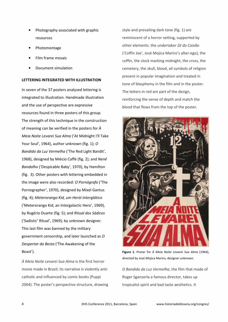
À Meia Noite Levarei Sua Alma is the first horror
movie made in Brazil; its narrative is violently anti-
catholic and influenced by comic books (Puppi
2004). The poster’s perspective structure, drawing
style and prevailing dark tone (fig. 1) are
reminiscent of a horror setting, supported by
other elements: the undertaker Zé do Caixão
(‘Coffin Joe’, José Mojica Marins’s alter-ego), the
coffin, the clock marking midnight, the cross, the
cemetery, the skull, blood, all symbols of religion
present in popular imagination and treated in
tone of blasphemy in the film and in the poster.
The letters in red are part of the design,
reinforcing the sense of depth and match the
blood that flows from the top of the poster.
Figure 1. Poster for À Meia Noite Levarei Sua Alma (1964),
directed by José Mojica Marins, designer unknown.
O Bandido da Luz Vermelha, the film that made of
Roger Sganzerla a famous director, takes up
tropicalist spirit and bad taste aesthetics. It

features an anti-hero, a misfit character, identified
in the bandit’s aphorism: ‘When we are not able
to do anything, we screw up. We screw up and get
screwed up’.
The poster illustration, by Miécio Caffé (fig. 2), in
perspective, emphasizes the figure of the bandit,
and his dubious taste shirt, eyes facing the reader,
weapon directed to a rape scene. The light beam
serves as a basis for the film title, with hand-
drawn uppercase letters simulating volume. In the
background we see the action spot, the city of São
Paulo. As for colour, red and yellow predominate,
the red light of the lantern becoming yellow by
poetic licence, while red, used in the title,
reinforces its content by redundancy. This
perspective representation, interrupted in the
foreground by the rape scene, is directly related
to the plot and to the film editing language.
Figure 2. Poster for O Bandido da Luz Vermelha (1968),
directed by Roger Sganzerla, designed by Miécio Caffé.

6 DHS Conference 2011, Barcelona, Spain www.historiadeldisseny.org/congres/
Figure 3. Poster for Nenê Bandalho (1970), directed by Emilio
Fontana, designed by Hamilton.
The film Nenê Bandalho presents the drama of a
bandit around the urban space, seen from bird’s
eye view, trying to escape from police by walking
on roofs, driven by a western track, in homage to
American cinema western and crime genres. In
the poster (fig. 3), the perspective organizes the
titles, which simulates buildings, and introduce
the character in action. Colour plays a key role in
connecting the significant elements of the image.
Other information, reversed white or red from a
solid black area, is set in neo-grotesque sans serif,
upper and lowercase, aligned left, creating
hierarchies by the use of different body sizes.
In the movie poster for O Pornógrafo (fig. 4),
lettering is integrated to the illustration by
displaying text inside comic strip balloons. The
graphic language of the poster makes reference to
the movie plot, where a bored journalist becomes
the author of successful pornographic comic
books.
Figure 4. Poster for O Pornógrafo (1970), directed by João
Callegaro, designed by Mixel Gantus.
In the poster for Meteorango Kid (fig. 5), we find a
psychedelic aesthetics, related to the
consumption of hallucinogenic drugs and
alterations of perception, which are part of the
universe of the main character, who constantly
seeks to escape reality through fantasy and
libertarian delusions. The use of ambiguous
lettering, where text may be read as image, the
choice of complementary colours, the feminine
figure representing woman’s sexual freedom, the
geodesic form as an allegory for intergalactic, all
those elements portray the spirit of the film. The
poster also exemplifies the language of a graphic
artist tuned with the visual trends of his time.

Figure 5. Poster for Meteorango Kid, Herói Intergalático
(1969), directed by André Luiz Oliveira, designed by Rogério
Duarte.
TEXT SUPERIMPOSED TO ILLUSTRATION
In eight posters text is superimposed to
illustration: those for O Profeta da Fome (‘The
Prophet of Hunger’, 1970), designed by Benicio
(fig. 6); O Segredo da Múmia (‘The Secret of the
Mummy’, 1977/81), by Oscar Ramos; Lilian M
(1974/75), by Gilberto Marchi (fig. 7); the two
posters for As Libertinas (‘The Libertines’, 1968
and 1969), by designers unknown; Cristais de
Sangue (‘Blood Crystals’, 1974/75), by Môca; A
Margem (‘The Edge’, 1967), designed by Tebaldo
Simionato (fig. 8); and A Herança (‘The
Inheritance’, 1971), poster signed by advertising
agency Blane Arte e Comunicação.
Figure 6. Poster for O Profeta da Fome (1969), directed by
Mauricio Capovilla, designed by Benicio.
O Profeta da Fome tells the story of a poor circus
performer from the countryside, a fakir who made
of hunger his profession. The poster (fig. 6)
announces Zé do Caixão as the main character, his
very popular character portrayed in psychedelic
style. In the movie, however, the main character is
played by Jose Mojica Marins, Zé do Caixão
creator and performer, in plainclothes. This
change of personas is most probably an
advertising strategy. All text is set in uppercase
grotesque type, condensed for the title and
director, and extended for Zé do Caixão,
emphasizing a name that was well known to the
general public. Colour is applied in harmony with
the image, establishing information links.

8 DHS Conference 2011, Barcelona, Spain www.historiadeldisseny.org/congres/
Figure 7. Poster for Lilian M: Confissões Amorosas (Relatório
Confidencial) (1975), directed by Carlos Reichenbach,
designed by Gilberto Marchi.
The colourful poster for Lilian M (fig. 7) was
designed for a black and white film. It has a strong
advertising appeal, set by the illustration, colour
and letterforms. The text is fragmented, allowing
for different readings. Words overlap the image,
the subtitle in foreground, like a stamp, cutting
the poster diagonally, marking the confidential
nature of the narrative. The title shows hand
drawn letters, integrated to the illustration. The
expression confissões amorosas (‘love
confessions’) positioned at the extreme bottom of
the poster, highlights the journey experienced by
the marginal character. The drawn image portrays
the main character surrounded by elements of
torture, like power switch and wires, against a
peeling wall. The dichotomy experienced by the
character is represented by the colour of her hair,
of half warm and half cool colour.
In the poster for A Margem (fig. 8), it is possible to
observe the influence of European modernist
design style in the choice and setting of lowercase
sans serif type.
Figure 8. Poster for A Margem (1967), directed by Ozualdo R.
Candeias, poster designed by Tebaldo Simionato.
PHOTOGRAPHY ASSOCIATED WITH GRAPHIC
RESOURSES
In most of the posters analysed (11, to be exact),
photography is used in combination with type or
hand lettering. Often, the photographic image is in
black and white, as in O Anjo Nasceu (‘The Angel is
Born’, 1969), designed by Thereza Simões (fig. 9);
Sem Essa, Aranha (‘Come on, Spider’, 1970, fig.

10); Caveira, my Friend (1970); and 25 (1975), all
three by unknown designers. In other posters,
photography is combined with other resources
including colour, like in O Jardim de Guerra (‘The
War Garden’, 1968), designed by Guará Rodrigues
(fig. 11), A Mulher de Todos (‘A Women for All’,
1969, fig. 12), Bandalheira Infernal (‘Hell of a
Mess’, 1975), O Homem de Corpo Fechado (‘The
Sheltered Man’, 1971) and A Sagrada Família
(‘The Holy Family’, 1970), the latter four by
unknown designers. Only two posters in the set
analysed, Copacabana, Mon Amour (1970) and O
Estranho Mundo do Zé do Caixão (‘The Strange
World of Coffin Joe,’ 1968) both by unknown
designers, rely on the use of colour photographs.
Figure 9. Poster for O Anjo Nasceu (1969), directed by Júlio
Bressane, designed by Theresa Simões.
In the poster for O Anjo Nasceu (fig. 9), a naked
boy with angel wings attached to his body
incorporates the idea of birth and the symbol of
innocence, of naiveté, establishing a poetic
correspondence between image and movie title.
Two other elements, the shadow and the gun,
complete the picture, and change the original
meaning, highlighting the ambiguity of this image
and of the film title. In the handwritten text that
runs parallel to the boy’s body, the title is
distinguished by being underlined. The director’s
name and film year are positioned at the end of
the diagonal created by the arm and the gun. The
poster shows graphic refinement in the
construction of the image by controlling the
spatial and visual directions generated by the
composition.
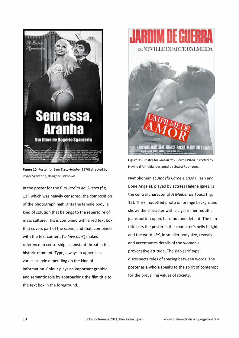
The poster for Sem Essa, Aranha (fig. 10), shows a
staged photo of character Zé Bonitinho (Cute Joe),
a cheesy dandy who always succeeds, and a
stripper, having as a backdrop the canvas of a
suburban circus. This synthetic image of the film
alludes to the rescue of chanchada (Brazilian
trashy comedies) promoted by Cinema Marginal.
The poster takes distance from the film due to the
absence of colour. The calligraphic typeface used
in the producer’s caption (‘A Belair Apresenta’)
contrasts with the grotesque sans serif type
chosen for the film title and other information,
centred in the foreground, which complements
the balanced composition of the image.
10 DHS Conference 2011, Barcelona, Spain www.historiadeldisseny.org/congres/
Figure 10. Poster for Sem Essa, Aranha (1970) directed by
Roger Sganzerla, designer unknown.
In the poster for the film Jardim da Guerra (fig.
11), which was heavily censored, the composition
of the photograph highlights the female body, a
kind of solution that belongs to the repertoire of
mass culture. This is combined with a red text box
that covers part of the scene, and that, combined
with the text content (‘a love film’) makes
reference to censorship, a constant threat in this
historic moment. Type, always in upper case,
varies in style depending on the kind of
information. Colour plays an important graphic
and semantic role by approaching the film title to
the text box in the foreground.
Figure 11. Poster for Jardim da Guerra (1968), directed by
Neville d'Almeida, designed by Guará Rodrigues.
Nymphomaniac Angela Carne e Osso (Flesh and
Bone Angela), played by actress Helena Ignez, is
the central character of A Mulher de Todos (fig.
12). The silhouetted photo on orange background
shows the character with a cigar in her mouth,
jeans button open, barefoot and defiant. The film
title cuts the poster in the character’s belly height,
and the word ‘de’, in smaller body size, reveals
and accentuates details of the woman's
provocative attitude. The slab serif type
disrespects rules of spacing between words. The
poster as a whole speaks to the spirit of contempt
for the prevailing values of society.

Figure 12. Poster for A Mulher de Todos (1969), directed by
Rogério Sganzerla, designer unknown.
PHOTOMONTAGE
Five of the posters analysed, designed for the
films Câncer (1968/72), by Fernando Pimenta (fig.
13); Bang Bang (1971), by Andrea Tonacci (fig.
14); Gamal, o Delírio do Sexo (‘Gamal, the
Delirium of Sex’, 1969, fig. 15), by unknown
designer; Viagem ao Fim do Mundo (‘Journey to
the End of the World’, 1968), by Ferdy Carneiro
(fig. 16); and Lerfa Mú!: Decifra-me ou te Devoro
(‘Lerfa Mú!: Decipher Me or I'll Devour You’,
1979), by Lygia Ferreira de Carvalho (fig. 17), use
photomontage.
Figure 13. Poster for Câncer (1968), directed by Ozualdo R.
Candeias, designed by Fernando Pimenta.
The feature film Câncer never entered the
commercial circuit, and the poster on figure 13
was created for a special exhibition. It shows a
picture of director Glauber Rocha, who
participates in the film narrative, sometimes
intervening, sometimes shouting. The image,
according to Pimenta (2009), is the result of
photographic mergers ‘the splash is a merger of
several nanking splashes, done over various
separated sheets of paper, then selected, cut,
assembled, photographed and retouched to
exhaustion’, resulting in an expressive synthesis of
the violent universe of the movie. The picture
emerges from the white background, and both,
figure and background, build information. The film
title and the name of the director portrayed are
set centralized in grotesque uppercase type, with
differences in size and weight marking hierarchy
—a very static composition that creates a
counterpoint to the active image.

12 DHS Conference 2011, Barcelona, Spain www.historiadeldisseny.org/congres/
Figure 14. Poster for Bang Bang (1971), directed by Andrea
Tonacci, designed by Andrea Tonacci.
Bang Bang is a thriller in a tone of satire, with
reference to comic books and burlesque movies,
and with emphasis on the visual construction of
the characters, treating the scenes as pure
cinematic events (Leite Neto 2004). The poster
(fig. 14), designed by the film director, features a
photomontage and, according to Barro (2008)
embodies the movie. In the montage we see the
main characters; the convertible car, repeated in
three different angles creating a sense of motion
reminiscent of American action films; and a movie
camera, that suggests the metalinguistic character
of the piece. The predominance of black and white
areas alternate in the composition, highlighting
fragments and adding rhythm to the piece. The
word ‘Bang’ is repeated three times in the
geometric centre of the poster, suggesting a
specialized sound sequence. The vertical red stripe
on the left displays again the name of the new
film, set with the same serif typeface, contrasting
with the sans serif used for other information, in a
rich graphic composition that includes reversals in
reading direction.
Figure 15. Poster for Gamal: o Delírio do Sexo (1969), directed
by João Batista de Andrade, designer unknown.
The poster for Gamal, o Delírio do Sexo (fig. 15),
shows a photomontage composed of movie
scenes. It refers to the plot of the movie, where,
after a disagreement with his nymphomaniac
wife, a man wanders the city, gathering
misfortune companions that, in the end, will also
fall in his wife’s arms. The title is hand-drawn and
combined with type setting that simulates an out-

of-control collage, with a mix of different styles,
alignments and body sizes, in a dreamlike
atmosphere (Silva 2008), a typographic metaphor
of delirium.
Figure 16. Poster for Viagem ao Fim do Mundo (1968),
directed by Fernando Cony, designed by Ferdy Carneiro.
The poster for the movie Viagem ao Fim do
Mundo (fig. 16) shows solutions taken from the
repertoire of modern graphic design, in what
refers to image-making techniques, type choice
and alignment. It displays a collage of newspaper
fragments and pictures, outlining different plans
to form a high contrast image homogenized by
use of colour. The image of a woman dominates
the space, supported by the diagonal axis. In the
title, different font styles, weight, body size and
case are used. The graphic language of the poster
speaks to the structure of the film, composed of
many overlapping levels of enunciation and of
various forms of language, incorporating issues
such as fascism, consumption, mysticism, poverty,
and, in a pioneering and iconic way, tropicalism
(Heffner 2004: 39).
The poster for Lerfa Mú!: Decifra-me ou te Devoro
(fig. 17) consists of a mix of drawing and
photomontage. The resulting image causes impact
by the use of a big area in red, and by the rhythm
in the photomontage, combined with the text
alignment used for the credits and the uppercase
and tilted lettering used for the title.
Figure 17. Poster for Lerfa Mú!: Decifra-me ou te Devoro
(1979), directed by Carlos Frederico, designed by Paulo
Carvalho and Lygia Ferreira de Carvalho.
14 DHS Conference 2011, Barcelona, Spain www.historiadeldisseny.org/congres/
FILM FRAME MOSAIC
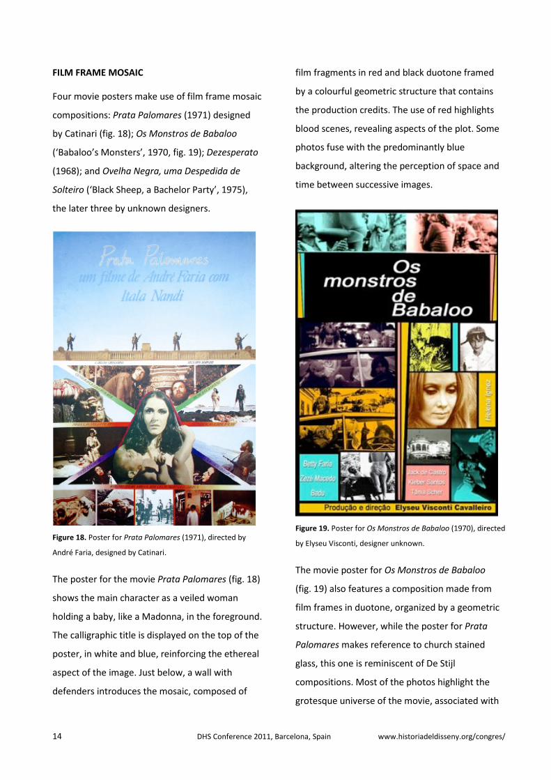
Four movie posters make use of film frame mosaic
compositions: Prata Palomares (1971) designed
by Catinari (fig. 18); Os Monstros de Babaloo
(‘Babaloo’s Monsters’, 1970, fig. 19); Dezesperato
(1968); and Ovelha Negra, uma Despedida de
Solteiro (‘Black Sheep, a Bachelor Party’, 1975),
the later three by unknown designers.
Figure 18. Poster for Prata Palomares (1971), directed by
André Faria, designed by Catinari.
The poster for the movie Prata Palomares (fig. 18)
shows the main character as a veiled woman
holding a baby, like a Madonna, in the foreground.
The calligraphic title is displayed on the top of the
poster, in white and blue, reinforcing the ethereal
aspect of the image. Just below, a wall with
defenders introduces the mosaic, composed of
film fragments in red and black duotone framed
by a colourful geometric structure that contains
the production credits. The use of red highlights
blood scenes, revealing aspects of the plot. Some
photos fuse with the predominantly blue
background, altering the perception of space and
time between successive images.
Figure 19. Poster for Os Monstros de Babaloo (1970), directed
by Elyseu Visconti, designer unknown.
The movie poster for Os Monstros de Babaloo
(fig. 19) also features a composition made from
film frames in duotone, organized by a geometric
structure. However, while the poster for Prata
Palomares makes reference to church stained
glass, this one is reminiscent of De Stijl
compositions. Most of the photos highlight the
grotesque universe of the movie, associated with

the aesthetics of the ugly and the extravagant.
The text in sans serif type, set in upper and
lowercase, occupies areas marked by colour. The
alignment of the title reinforces the centreline of
the poster and introduces a sense of rhythm that
bounces in the different sizes of the spaces where
the images are inserted.
DOCUMENT SIMULATION
The film posters designed for Matou a Família e
foi ao Cinema (‘Killed his Family and Went to the
Movies’, 1969), by Thereza Simões (fig. 20);
Crônica de um Industrial (‘An Industrialist
Chronicle’, 1976), by DPP-Embrafilme (fig. 21); and
Perdidos e Malditos (‘Lost and Damned,’ 1970), by
Geraldo Veloso (fig. 22); all simulate the looks of
official documents or legal evidence.
Figure 20. Poster for Matou a Família e foi ao Cinema (1969),
directed by Julio Bressane, designed by Theresa Simões.
The movie poster for Matou a Família e foi ao
Cinema simulates a plea of guilty produced in case
of flagrante delicto. The title of the film simulates
a stamp and production credits are set next to the
picture of the defendant. The poster thus makes
direct reference to the film title.
Figure 21. Poster for Crônica de um Industrial (1976), directed
by Luiz Rosemberg Filho, designed by Fernando Pimenta.
The movie poster for Crônica de um Industrial (fig.
21) simulates a document file, evidence records
held within a binder or a notebook. The
handmade letters reinforce the unique, individual
character of the notes. The pictures focus the love
life of a married businessman, seeking to
compensate his existential void with sex.
According to the designer, the composition was
done, ‘with what was available at the moment,
that is, haste and lack of money’ (Pimenta 2011).
16 DHS Conference 2011, Barcelona, Spain www.historiadeldisseny.org/congres/
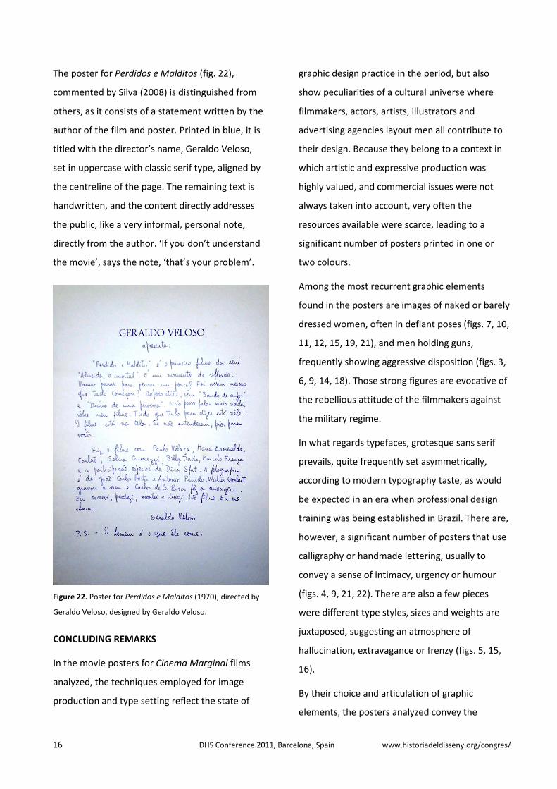
The poster for Perdidos e Malditos (fig. 22),
commented by Silva (2008) is distinguished from
others, as it consists of a statement written by the
author of the film and poster. Printed in blue, it is
titled with the director’s name, Geraldo Veloso,
set in uppercase with classic serif type, aligned by
the centreline of the page. The remaining text is
handwritten, and the content directly addresses
the public, like a very informal, personal note,
directly from the author. ‘If you don’t understand
the movie’, says the note, ‘that’s your problem’.
Figure 22. Poster for Perdidos e Malditos (1970), directed by
Geraldo Veloso, designed by Geraldo Veloso.
CONCLUDING REMARKS
In the movie posters for Cinema Marginal films
analyzed, the techniques employed for image
production and type setting reflect the state of
graphic design practice in the period, but also
show peculiarities of a cultural universe where
filmmakers, actors, artists, illustrators and
advertising agencies layout men all contribute to
their design. Because they belong to a context in
which artistic and expressive production was
highly valued, and commercial issues were not
always taken into account, very often the
resources available were scarce, leading to a
significant number of posters printed in one or
two colours.
Among the most recurrent graphic elements
found in the posters are images of naked or barely
dressed women, often in defiant poses (figs. 7, 10,
11, 12, 15, 19, 21), and men holding guns,
frequently showing aggressive disposition (figs. 3,
6, 9, 14, 18). Those strong figures are evocative of
the rebellious attitude of the filmmakers against
the military regime.
In what regards typefaces, grotesque sans serif
prevails, quite frequently set asymmetrically,
according to modern typography taste, as would
be expected in an era when professional design
training was being established in Brazil. There are,
however, a significant number of posters that use
calligraphy or handmade lettering, usually to
convey a sense of intimacy, urgency or humour
(figs. 4, 9, 21, 22). There are also a few pieces
were different type styles, sizes and weights are
juxtaposed, suggesting an atmosphere of
hallucination, extravagance or frenzy (figs. 5, 15,
16).
By their choice and articulation of graphic
elements, the posters analyzed convey the

peculiar, diverse, and often-controversial concepts
exposed in the films, making explicit Cinema
Marginal characteristics.
ACKNOWLEDGMENTS
To the filmmakers and producers who granted
permission for the use of the movie posters
images; to Brazilian scientific research agencies
CAPES, CNPq and FAPESP for research funding; to
Cinemateca Brasileira Archives for providing most
of the poster images used.
REFERENCES
Barro, Máximo (2008) ‘O Cartaz Brasileiro’, in O
Cinema em Cartaz (catalogue), São Paulo: FAAP.
Cardoso, Rafael (2005) ‘Le Cartaz Brésilien dans
l’Histoire de l’Affiche’, in Brasil em Cartaz
(catalogue). Chaumont. La Maison du livre et de
l'affiche.
Heffner, Hernani (2004) ‘Viagem ao Fim do
Mundo’, in PUPPO, Eugenio (org.) Cinema
Marginal Brasileiro e suas Fronteiras, São Paulo:
Eco Produções.
Leite Neto, Alcino. (2004) ‘Bang Bang’in PUPPO,
Eugenio (org.) Cinema Marginal Brasileiro e suas
Fronteiras, São Paulo: Eco Produções.
Pimenta, Fernando (2009) ‘Cartazes Nacionais’,
available at
http://www.pimentadesign.com/cartnac.php?bd=
cartazesnacionais, (last accessed 21/8/2011).
Puppo, Eugenio (org.) (2004) Cinema Marginal
Brasileiro e suas Fronteiras, São Paulo: Eco
Produções.
Ramos, Fernando (1987) Cinema Marginal
(1968/1973) - A Representação em seu Limite. São
Paulo: Brasiliense.
Ramos, Fernão & Miranda, Luiz Felipe (1997)
Enciclopédia do Cinema Brasileiro, São Paulo:
Senac São Paulo.
Silva, Simone Albertino (2008) O Design de
Cartazes no Cinema Marginal e na
Pornochanchada, Master degree thesis, Pontifícia
Universidade Católica do Rio de Janeiro.


![i% A jå km - Seoul Metropolitan Government...i% A jå km - 715 - - 716 - i% Ajåkm i% Ajåkm Z t ?v]w® Zé i% Av z2Zé i% Asõp Zé c u}uev z2Zé sÚn i% Au Zé Is~a±o a±Yý {](https://static.fdocuments.us/doc/165x107/6101ef33c5a30c31eb404c46/i-a-j-km-seoul-metropolitan-government-i-a-j-km-715-716-i-ajkm.jpg)
![s,Qt~ = w zÉ s>= v / VJ½ · AC §±¦ ¢¼«¥º¡70cm 20cm s,Qt~ = w zÉ s>= v / VJ½ “>@ª¸¦ tv >= N6» . A sC OH t3 t= U] u](https://static.fdocuments.us/doc/165x107/600ce78b86167449f339bed5/sqt-w-z-s-v-vj-ac-70cm-20cm-sqt-w-z-s.jpg)

![v v [Znews.seoul.go.kr/gov/files/2020/01/5e21c4955c42a6.99835679.pdfvv [Z vv [Z Z t ?v]w® pÉu `Õ Zé {i!Zé uen Zé uef Z j Zé u}|E vv Zé v jáZâZ v z2Zé n s²oy Zâi!t½p f](https://static.fdocuments.us/doc/165x107/5e544c74a57feb4de50c9b7b/v-v-znewsseoulgokrgovfiles2020015e21c4955c42a6-vv-z-vv-z-z-t-vw.jpg)