Back to Basics
140
Back to Basics Art Foundations for Teachers The Springville Museum of Art
-
Upload
springville-museum-of-art -
Category
Documents
-
view
152 -
download
1
description
Basic lessons for beginning visual arts teachers, or for regular classroom teachers who would like to incorporate more art in their classrooms. All lesson materials are for educational purposes only and are copyrighted by the Springville Museum of Art.
Transcript of Back to Basics

i
Back to BasicsArt Foundations for TeachersThe Springville Museum of Art

ii
The contents of this packet are for educational and personal use only. Copyright is retained by SWAP & the Springville Museum of Art
iii
Back to BasicsContents
Artists & Artworks . . . . . . . . . . . . . . . . . . . . . . . . . . . . . . . . . . . . . . . . . . . . . . . . . . . . . . . vDrawing: At the Heart of the Studio Experience . . . . . . . . . . . . . . . . . . . . . . . . . . . . . . . 13The Invisible Dot . . . . . . . . . . . . . . . . . . . . . . . . . . . . . . . . . . . . . . . . . . . . . . . . . . . . . . . 17Art is a Kind of Thinking . . . . . . . . . . . . . . . . . . . . . . . . . . . . . . . . . . . . . . . . . . . . . . . . . 23Blind Contour Drawing . . . . . . . . . . . . . . . . . . . . . . . . . . . . . . . . . . . . . . . . . . . . . . . . . . 29Hand Design . . . . . . . . . . . . . . . . . . . . . . . . . . . . . . . . . . . . . . . . . . . . . . . . . . . . . . . . . . . 33The Inventions Lessons . . . . . . . . . . . . . . . . . . . . . . . . . . . . . . . . . . . . . . . . . . . . . . . . . . 37Edible Color . . . . . . . . . . . . . . . . . . . . . . . . . . . . . . . . . . . . . . . . . . . . . . . . . . . . . . . . . . . 45Beyond the Rainbow: Creating Colors Outside the Box . . . . . . . . . . . . . . . . . . . . . . . . . 51Using Photography to Study & Learn Basic Visual Art Concepts . . . . . . . . . . . . . . . . . . 53Monoprinting Lessons . . . . . . . . . . . . . . . . . . . . . . . . . . . . . . . . . . . . . . . . . . . . . . . . . . . 61Aboriginal Dreamtime Glue Prints . . . . . . . . . . . . . . . . . . . . . . . . . . . . . . . . . . . . . . . . . 63The Shirt Off Your Back . . . . . . . . . . . . . . . . . . . . . . . . . . . . . . . . . . . . . . . . . . . . . . . . . 67Plexiglass Etching . . . . . . . . . . . . . . . . . . . . . . . . . . . . . . . . . . . . . . . . . . . . . . . . . . . . . . 71Basic Color Theory & Basic Shapes . . . . . . . . . . . . . . . . . . . . . . . . . . . . . . . . . . . . . . . . 75Recipe for a Watercolor Landscape . . . . . . . . . . . . . . . . . . . . . . . . . . . . . . . . . . . . . . . . . 77 Watercolor Vocabulary, Hints, Characteristics, & Techniques . . . . . . . . . . . . . . . 81Through the Gateway—Mysterious Landscapes (Space & Depth) . . . . . . . . . . . . . . . . . 85What Makes You Curious? (Value) . . . . . . . . . . . . . . . . . . . . . . . . . . . . . . . . . . . . . . . . . 91From Blah to Brilliant! (Adding meaning through theme-based learning) . . . . . . . . . . . 95Creating a Magic Elements of Design Book . . . . . . . . . . . . . . . . . . . . . . . . . . . . . . . . . 103Organized Flexibility to Foster Creativity (Student-made Sketchbook) . . . . . . . . . . . . 105Art History Spotlight . . . . . . . . . . . . . . . . . . . . . . . . . . . . . . . . . . . . . . . . . . . . . . . . . . . 109Daily Artist . . . . . . . . . . . . . . . . . . . . . . . . . . . . . . . . . . . . . . . . . . . . . . . . . . . . . . . . . . . 119Home (Interior Design & One-Point Perspective) . . . . . . . . . . . . . . . . . . . . . . . . . . . . . 121Altered Book or Personal Process Journal . . . . . . . . . . . . . . . . . . . . . . . . . . . . . . . . . . . 131Common Core Language Arts Anchor Standards: Reading (to link with Visual Arts) . 139

iv
v
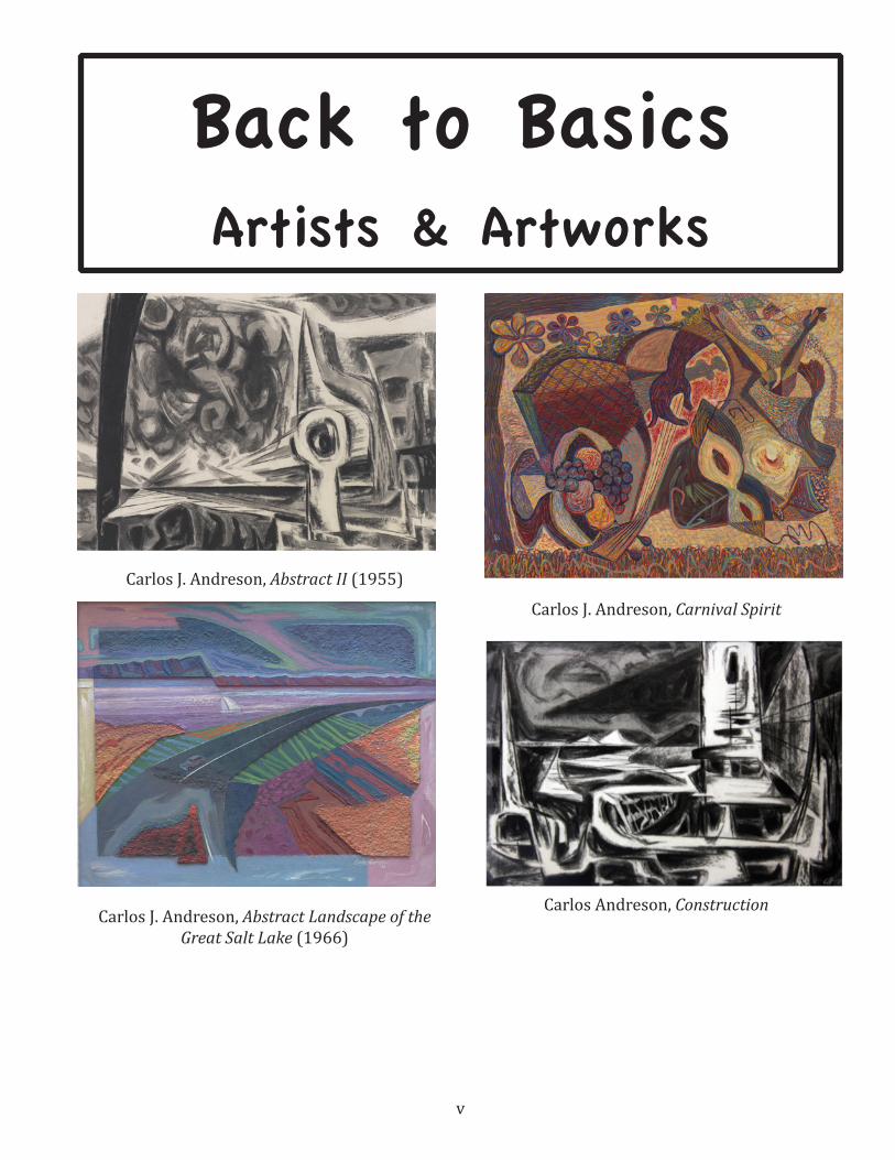
Back to BasicsArtists & Artworks
Carlos J. Andreson, Abstract II (1955)
Carlos J. Andreson, Abstract Landscape of the Great Salt Lake (1966)
Carlos J. Andreson, Carnival Spirit
Carlos Andreson, Construction
vi
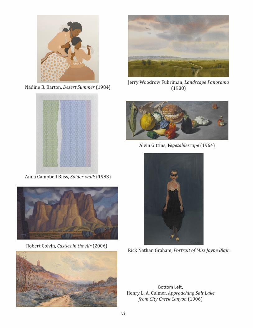
Nadine B. Barton, Desert Summer (1984)Jerry Woodrow Fuhriman, Landscape Panorama
(1988)
Alvin Gittins, Vegetablescape (1964)
Anna Campbell Bliss, Spider-walk (1983)
Robert Colvin, Castles in the Air (2006)
Bottom Left,Henry L. A. Culmer, Approaching Salt Lake
from City Creek Canyon (1906)
Rick Nathan Graham, Portrait of Miss Jayne Blair
vii
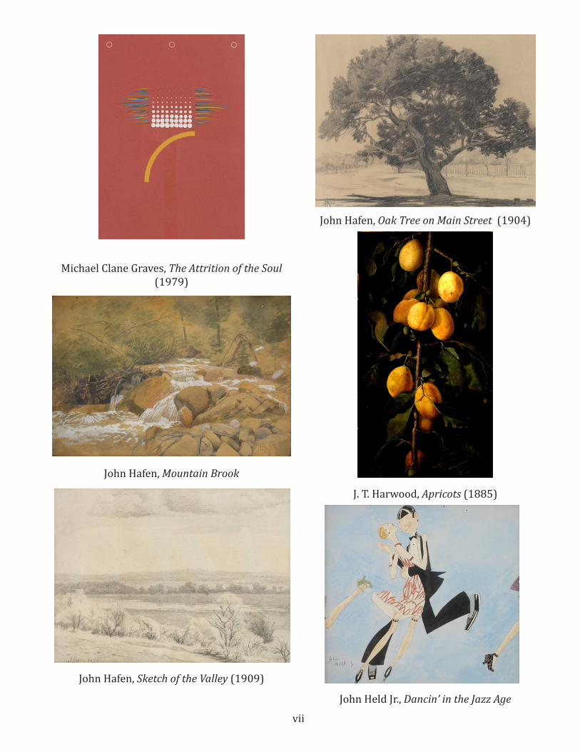
Michael Clane Graves, The Attrition of the Soul (1979)
John Hafen, Mountain Brook
John Hafen, Sketch of the Valley (1909)
John Hafen, Oak Tree on Main Street (1904)
J. T. Harwood, Apricots (1885)
John Held Jr., Dancin’ in the Jazz Age
viii
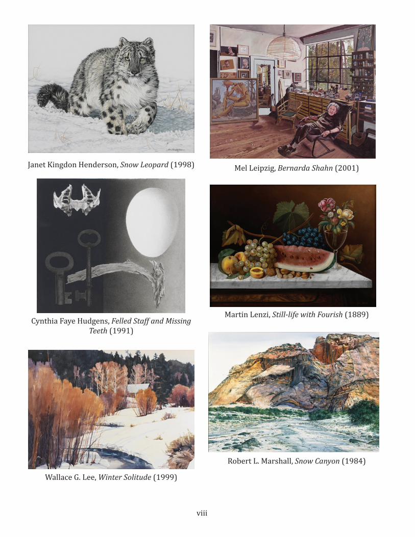
Janet Kingdon Henderson, Snow Leopard (1998)
Cynthia Faye Hudgens, Felled Staff and Missing Teeth (1991)
Wallace G. Lee, Winter Solitude (1999)
Mel Leipzig, Bernarda Shahn (2001)
Martin Lenzi, Still-life with Fourish (1889)
Robert L. Marshall, Snow Canyon (1984)
ix
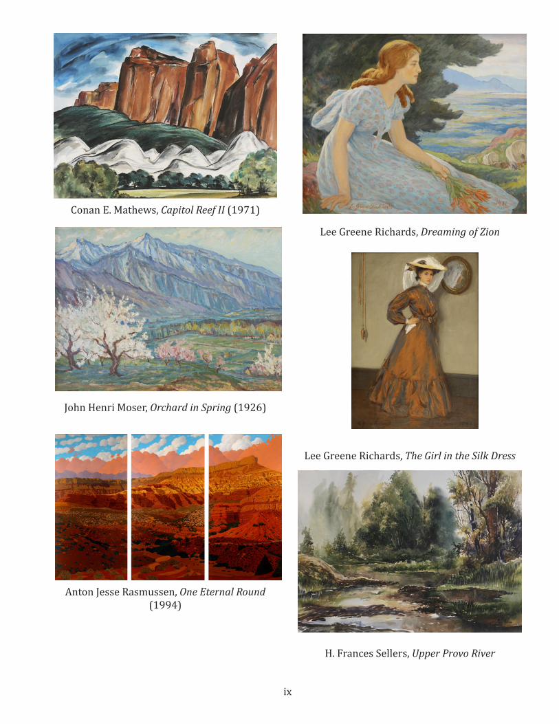
Conan E. Mathews, Capitol Reef II (1971)
John Henri Moser, Orchard in Spring (1926)
Anton Jesse Rasmussen, One Eternal Round (1994)
Lee Greene Richards, Dreaming of Zion
Lee Greene Richards, The Girl in the Silk Dress
H. Frances Sellers, Upper Provo River

x
Robert Lorenzo Shepherd, Cape Royal, North Rim Grand Canyon (1987)
Dennis V. Smith, Keeper of the Gate (1989)
Gibbs M. Smith, Manhattan (1988)
Pilar Pasqual Del Pobil Smith, Mujeres de Veracruz
Florence Ellen Ware, Suey Sin Fah (Two Chinese Lilies) (1935)
Bruce Hixon Smith, Ode to Ad (1978)

xi
Kimbal E. Warren, Angel’s Peak and Deep Lake Wind River, Wyoming (2004)
Alma Brockerman Wright, Bend in the Jordan (1913)
Mahonri Mackintosh Young, Covering Up AKA Boxing (1928)
Frank Zimbeaux, Main Street Salt Lake City (1929)
Additional Images:
Aboriginal Art with Two Goannas
Aboriginal Pinta Pinta Tjapanangka

xii
Aboriginal Barramundi Fish
List of Images for the Art History Spotlight(on CD in own folder, but not shown here)
Lee Bennion:Lee Bennion PhotographLee and Joe Bennion RaftingBennion’s Artworks:First LoveHorsesJoe at his wheelSelf at 51Self in StudioSketch of a BoySnow Queen
Cyrus E. Dallin:Young Cyrus E. DallinSide view photo of Cyrus E. DallinLee Greene Richards’ oil sketch of DallinLee Greene Richards’ Portrait of DallinDallin’s Artworks:Appeal to the Great SpiritJohn HancockMassasoitDallin with MassasoitThe Statue of Moroni Paul Revere two versions)Sacajewea Olympic Bowman League, National Archery As-sociation
Louise Richards Farnsworth:PhotographLee Greene Richards’ (her cousin) painting of herRichard’s Artworks:Capitol From North Salt LakeHay StacksMountain LandscapeSpringtimeStorm Clouds in the Tetons
Photograph of John and Thora HafenJohn Hafen in his painting studioJohn Hafen painting in a fieldJohn Hafen postcardHafen QuoteHafen’s artworks:Indian SummerHollyhocksSpringville, My Mountain HomeSketch of the ValleySpringville PastureCharles Smith’s portrait of HafenMahonri Young’s portrait of Hafen
These images are for educational and personal use only. Copyright is retained by SWAP & the
Springville Museum of Art
John Hafen
13
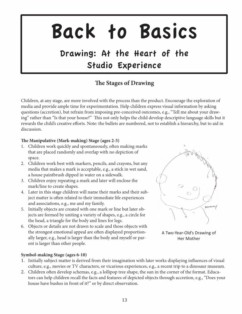
The Stages of Drawing
Children, at any stage, are more involved with the process than the product. Encourage the exploration of media and provide ample time for experimentation. Help children express visual information by asking questions (accretion), but refrain from imposing pre-conceived outcomes, e.g., “Tell me about your draw-ing” rather than “Is that your house?” This not only helps the child develop descriptive language skills but it rewards the child’s creative efforts. Note: the bullets are numbered, not to establish a hierarchy, but to aid in discussion.
The Manipulative (Mark-making) Stage (ages 2-5)1. Children work quickly and spontaneously, often making marks
that are placed randomly and overlap with no depiction of space.
2. Children work best with markers, pencils, and crayons, but any media that makes a mark is acceptable, e.g., a stick in wet sand, a house paintbrush dipped in water on a sidewalk.
3. Children enjoy repeating a mark and later will enclose the mark/line to create shapes.
4. Later in this stage children will name their marks and their sub-ject matter is often related to their immediate life experiences and associations, e.g., me and my family.
5. Initially objects are created with one mark or line but later ob-jects are formed by uniting a variety of shapes, e.g., a circle for the head, a triangle for the body and lines for legs.
6. Objects or details are not drawn to scale and those objects with the strongest emotional appeal are often displayed proportion-ally larger, e.g., head is larger than the body and myself or par-ent is larger than other people.
Symbol-making Stage (ages 6-10)1. Initially subject matter is derived from their imagination with later works displaying influences of visual
culture, e.g., movies or TV characters, or vicarious experiences, e.g., a recent trip to a dinosaur museum.2. Children often develop schemas, e.g., a lollipop tree shape, the sun in the corner of the format. Educa-
tors can help children recall the facts and features of depicted objects through accretion, e.g., “Does your house have bushes in front of it?” or by direct observation.
A Two-Year-Old’s Drawing of Her Mother
Back to BasicsDrawing: At the Heart of the
Studio Experience
14
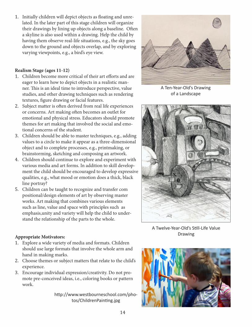
1. Initially children will depict objects as floating and unre-lated. In the later part of this stage children will organize their drawings by lining up objects along a baseline. Often a skyline is also used within a drawing. Help the child by having them observe real-life situations, e.g., the sky goes down to the ground and objects overlap, and by exploring varying viewpoints, e.g., a bird’s eye view.
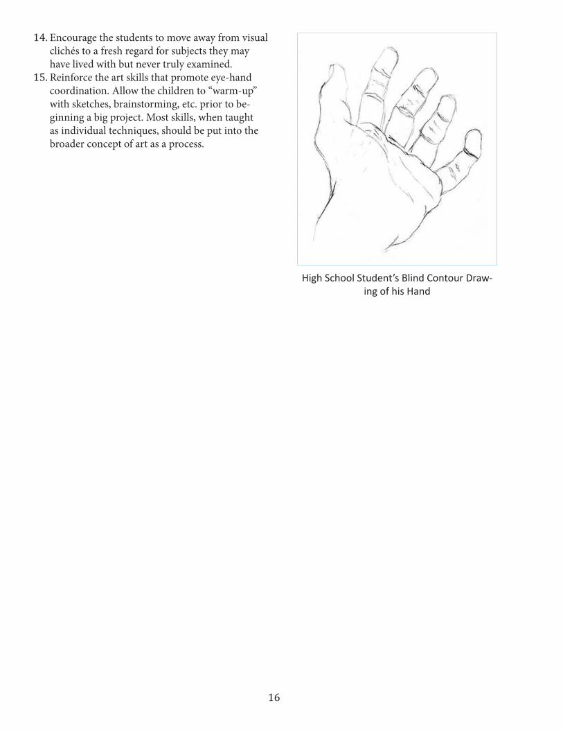
Realism Stage (ages 11-12)1. Children become more critical of their art efforts and are
eager to learn how to depict objects in a realistic man-ner. This is an ideal time to introduce perspective, value studies, and other drawing techniques such as rendering textures, figure drawing or facial features.
2. Subject matter is often derived from real life experiences or concerns. Art making often becomes an outlet for emotional and physical stress. Educators should promote themes for art making that involved the social and emo-tional concerns of the student.
3. Children should be able to master techniques, e.g., adding values to a circle to make it appear as a three-dimensional object and to complete processes, e.g., printmaking, or brainstorming, sketching and composing an artwork.
4. Children should continue to explore and experiment with various media and art forms. In addition to skill develop-ment the child should be encouraged to develop expressive qualities, e.g., what mood or emotion does a thick, black line portray?
5. Children can be taught to recognize and transfer com positional/design elements of art by observing master works. Art making that combines various elements such as line, value and space with principles such as emphasis,unity and variety will help the child to under-stand the relationship of the parts to the whole.
Appropriate Motivators:1. Explore a wide variety of media and formats. Children
should use large formats that involve the whole arm and hand in making marks.
2. Choose themes or subject matters that relate to the child’s experience.
3. Encourage individual expression/creativity. Do not pro-mote pre-conceived ideas, i.e., coloring books or pattern work.
A Twelve-Year-Old’s Still-Life Value Drawing
http://www.westbourneschool.com/pho-tos/ChildrenPainting.jpg
A Ten-Year-Old’s Drawing of a Landscape

15
4. While there are some specific skill-building tech-niques that should be learned such as creating a value scale or blending colors, promote the appli-cation of the skill within a larger context, e.g., use of low-keyed values to produce a specific mood or feeling within the artwork.
5. Younger children should be encouraged to describe their art making experience. Children should be made aware of the potential of art to create meaning or tell a story. Older children should be encouraged to take an abstract concept such as freedom or hap-piness and render the concept in a concrete, expres-sive art form.
6. Help the child to create a visual record of the expe-riences and images they have encountered. Promote sketchbooks and portfolios.
7. There is little merit in encouraging children of any age to make art with photographic accuracy; rather help the child make a distinction between work-ing for a realistic rendering and the development of skills to heighten their visual acuity. Often creativity is blocked when too much emphasis is placed on technique and skill.
8. Promote a variety of direct observations/accuracy activities with imagination, free-flowing activities. As an educator you should be able to distinguish the need and purpose for both.
9. Provide a stress-free environment for art making. Promote the pleasurable nature of self-expression and the mastery of certain skills.
10. Promote the nature of successful art making while allowing for the option of re-doing or correcting an artwork too. Failure is permanent if children are not allowed to try again.
11. Provide art-making experiences that exercise the imaginative powers and memories of children with the skills of concentration and expression. Encour-age the child to brainstorm, envision and produce.
12. Help the child to develop the vocabulary and skills necessary to succeed within their visual culture. Encourage critical thinking, problem-solving and evaluation/judgment skills learned from art making so they can thrive in the consumer, media-saturated world.
13. Promote direct observation when available. Chil-dren can observe contour (edges), details and structures easier when viewing an actual landscape, object or figure.
From the 2009 All-State High School Art ShowSpringville Museum of Art
Notan by an elementary student
16
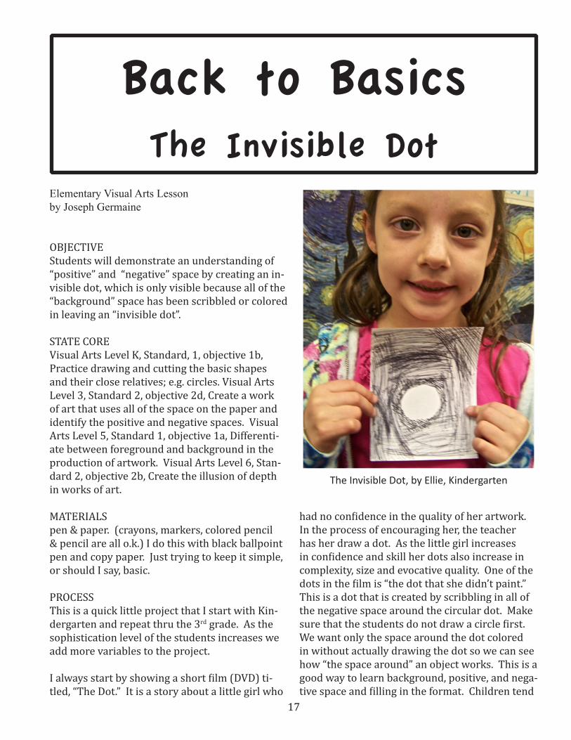
14. Encourage the students to move away from visual clichés to a fresh regard for subjects they may have lived with but never truly examined.
15. Reinforce the art skills that promote eye-hand coordination. Allow the children to “warm-up” with sketches, brainstorming, etc. prior to be-ginning a big project. Most skills, when taught as individual techniques, should be put into the broader concept of art as a process.
High School Student’s Blind Contour Draw-ing of his Hand
17
Back to BasicsThe Invisible Dot
Elementary Visual Arts Lessonby Joseph Germaine
OBJECTIVE Students will demonstrate an understanding of “positive” and “negative” space by creating an in-visible dot, which is only visible because all of the “background” space has been scribbled or colored in leaving an “invisible dot”.
STATE CORE Visual Arts Level K, Standard, 1, objective 1b, Practice drawing and cutting the basic shapes and their close relatives; e.g. circles. Visual Arts Level 3, Standard 2, objective 2d, Create a work of art that uses all of the space on the paper and identify the positive and negative spaces. Visual Arts Level 5, Standard 1, objective 1a, Differenti-ate between foreground and background in the production of artwork. Visual Arts Level 6, Stan-dard 2, objective 2b, Create the illusion of depth in works of art.
MATERIALSpen & paper. (crayons, markers, colored pencil & pencil are all o.k.) I do this with black ballpoint pen and copy paper. Just trying to keep it simple, or should I say, basic.
PROCESSThis is a quick little project that I start with Kin-dergarten and repeat thru the 3rd grade. As the sophistication level of the students increases we add more variables to the project.
I always start by showing a short film (DVD) ti-tled, “The Dot.” It is a story about a little girl who
had no confidence in the quality of her artwork. In the process of encouraging her, the teacher has her draw a dot. As the little girl increases in confidence and skill her dots also increase in complexity, size and evocative quality. One of the dots in the film is “the dot that she didn’t paint.” This is a dot that is created by scribbling in all of the negative space around the circular dot. Make sure that the students do not draw a circle first. We want only the space around the dot colored in without actually drawing the dot so we can see how “the space around” an object works. This is a good way to learn background, positive, and nega-tive space and filling in the format. Children tend
The Invisible Dot, by Ellie, Kindergarten
18
to have objects floating on the page. We want to scribble, color all the way to the edge of the paper dramatically emphasizing the empty shape left. Remember that positive and negative space and shapes are not necessarily the same thing and that they are relative to the context of work. To try to keep these somewhat complex ideas simple and workable, I define positive as the thing you drew and negative as the space around it. In this case we are “drawing” the negative space and the shape left over is the positive object of the draw-ing. So it may be better to call the positive space or shape, “the thing you are looking at” and the negative is the space around it. Nothing impor-tant is clear-cut and simple because important things always end up being something else, also.
ASSESSMENTThe criterion for success is: 1. Have you left an empty “dot”? 2. Did you fill in all of the space around the dot, clear to the edge of the paper? 3. What shape did your dot end up being?
This is a self-assessment as are most of the proj-ects in my classroom. When students have ful-filled the criteria and feel satisfied with the proj-ect it is complete.
SOURCES The Dot, by Peter Reynolds, 2003. One Red Dot: A Pop-Up Book for Children of all Ages, by David A. Carter, 2005. Beautiful Oops! by Barney Saltzberg, 2010. Zero, by Kathryn Otoshi, 2010. One, by Kathryn Otoshi, 2008. Dot, by Patricia Intriago, 2011. Ten Black Dots, by Donald Crews, 2010. Press Here, by Herve’ Tullet, 2011. “Ish”, by Peter Reynolds, 2004.
Kindergarteners, Abby & Wyatt working at the board to demonstrate to the rest of the class. I have found
that students are much more interested in their “fellow learners” than they are in the teacher.
The finished Invisible Dot on the board and signed by the respective Kindergarten artists.
Can You See It? by Andrew, 1st grade

19
The Double Dot, by Lorna, Kindergarten
My Dot by Nate, 1st grade
I also recommend, The Little Boy, Drum-ming to the Beat of Different Marchers, Sky Color, The North Star, and I’m Here, all by Peter Reyn-olds. My students love me to read these books to them. Ish and The Dot are also in DVD format. They are excellent.
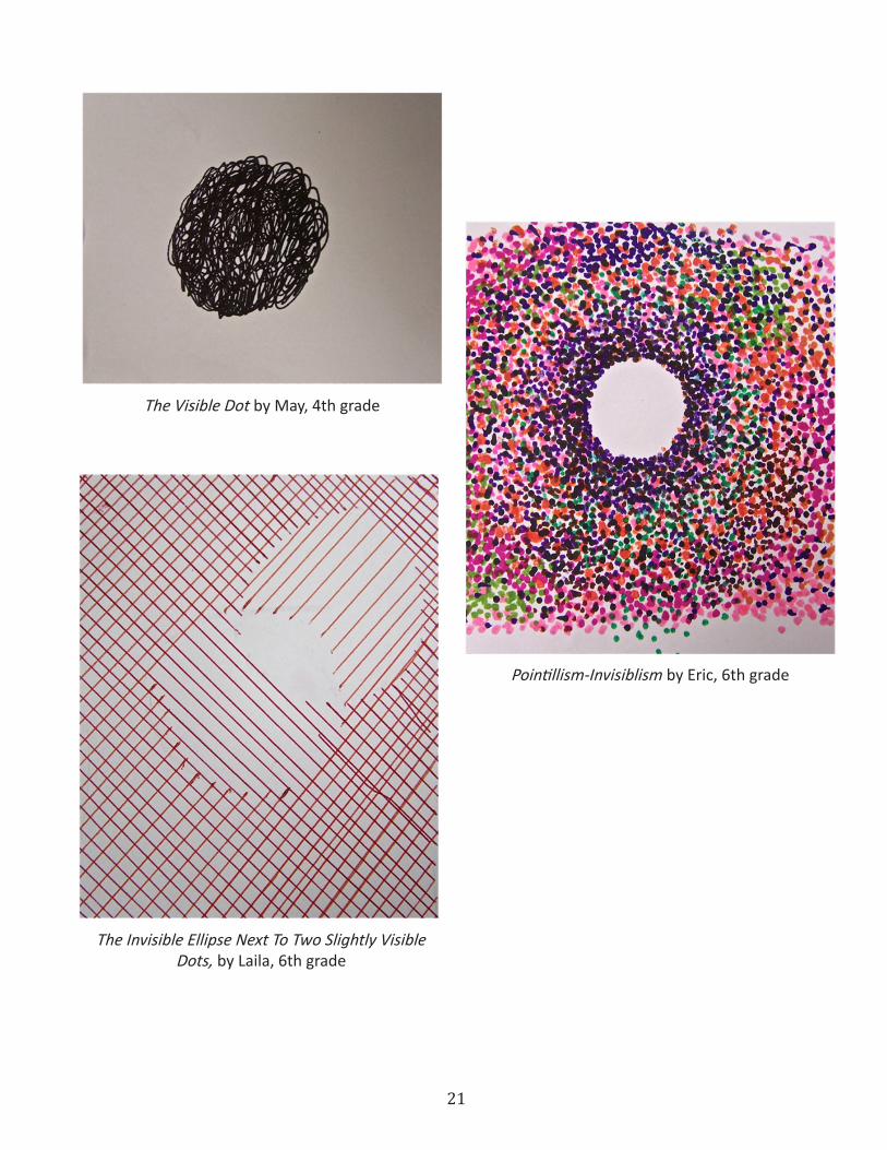
VARIATIONS & EXTENSIONSWhile this is a simple little project for primary grades it can be extended to more complex think-ing by having the students make other invisible shapes, employ other drawing techniques such as solid shading or small dots or straight lines or X’s or multiple dots. Color variation and value variation can also be used to expand the learning window.
For my older students, (4th–6th), who have done this project and seen the film, I review the old “In-visible Dot” project (which gives them all a nostal-gic rush), show them the DVD, have someone do an invisible dot on the board and then give them this BASIC assignment: “AVOID THE OBVIOUS.” They are then expected to work with the dot project and see where they can take it, re-invent it or discover a completely different solution. Often, the best lesson is the least instruction and the most invention.
Spiral Dot by Abbie, 5th grade
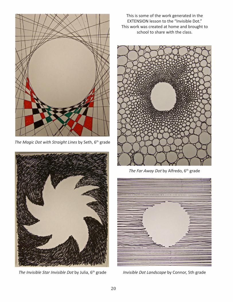
20
The Magic Dot with Straight Lines by Seth, 6th grade
The Far Away Dot by Alfredo, 6th grade
The Invisible Star Invisible Dot by Julia, 6th grade Invisible Dot Landscape by Connor, 5th grade
This is some of the work generated in the EXTENSION lesson to the “Invisible Dot.”
This work was created at home and brought to school to share with the class.
21
The Invisible Ellipse Next To Two Slightly Visible Dots, by Laila, 6th grade
Pointillism-Invisiblism by Eric, 6th grade
The Visible Dot by May, 4th grade

22
The Visible Dot Inside The Invisible Dot by Kayla, 5th grade
Multiple Dots by Evan, 6th grade

23
Back to BasicsArt is a Kind of Thinking
Elementary Levelby Joseph GermaineSome Quick but Significant Lessons
Hand, Chair, Self Portrait, Abstract Feelings
Objective: Students will demonstrate an un-derstanding of different ways to get the image in your mind before you start drawing by rendering (without specific drawing instruction) an image from a live subject, from memory, from imagina-tion and from emotional feelings.
State Core Links: These lessons are naturally about the elements line and shape as well as about the principle proportion, but they also can be tied to other specific elements and principles the class is studying.
Materials: pencil, paper, and insight
Activity: This unit is made up of four different short lessons on how to get the idea (mental im-age) to draw or paint or sculpt in art. This same approach could also be applied to dance, music or drama. To conserve space and time we will in-clude all four lessons in one, but you should break them up to fit into your own curriculum schedule. Sometimes, in our busy schedule, there is a short window in which a quick drawing exercise can be inserted. These are quick lessons both in their introduction by the teacher and in their execution by the students.
The four sources of images for artist that we will focus on are: 1) from life, 2) from memory, 3) from imagination and 4) from emotions or feelings. We will match the four sources of ideas with the four
motifs available in visual art: portrait, still life, landscape, and design. We define design as lines, shapes, values, colors, and textures that don’t make a picture of something else.
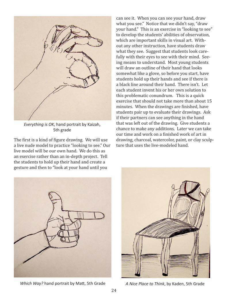
DRAWING FROM LIFE: (hand portrait) State Core: Standard 1(making) Objective 1 b. Observe objects in detail and portray them with greater accuracy.
James M. Rees, Positionused by permission of the artist
24
The first is a kind of figure drawing. We will use a live nude model to practice “looking to see.” Our live model will be our own hand. We do this as an exercise rather than an in-depth project. Tell the students to hold up their hand and create a gesture and then to “look at your hand until you
can see it. When you can see your hand, draw what you see.” Notice that we didn’t say, “draw your hand.” This is an exercise in “looking to see” to develop the students’ abilities of observation, which are important skills in visual art. With-out any other instruction, have students draw what they see. Suggest that students look care-fully with their eyes to see with their mind. See-ing means to understand. Most young students will draw an outline of their hand that looks somewhat like a glove, so before you start, have students hold up their hands and see if there is a black line around their hand. There isn’t. Let each student invent his or her own solution to this problematic conundrum. This is a quick exercise that should not take more than about 15 minutes. When the drawings are finished, have students pair up to evaluate their drawings. Ask if their partners can see anything in the hand that was left out of the drawing. Give students a chance to make any additions. Later we can take our time and work on a finished work of art in drawing, charcoal, watercolor, paint, or clay sculp-ture that uses the live-modeled hand.
A Nice Place to Think, by Kaden, 5th Grade
Everything is OK, hand portrait by Kaizah, 5th grade
Which Way? hand portrait by Matt, 5th Grade
25
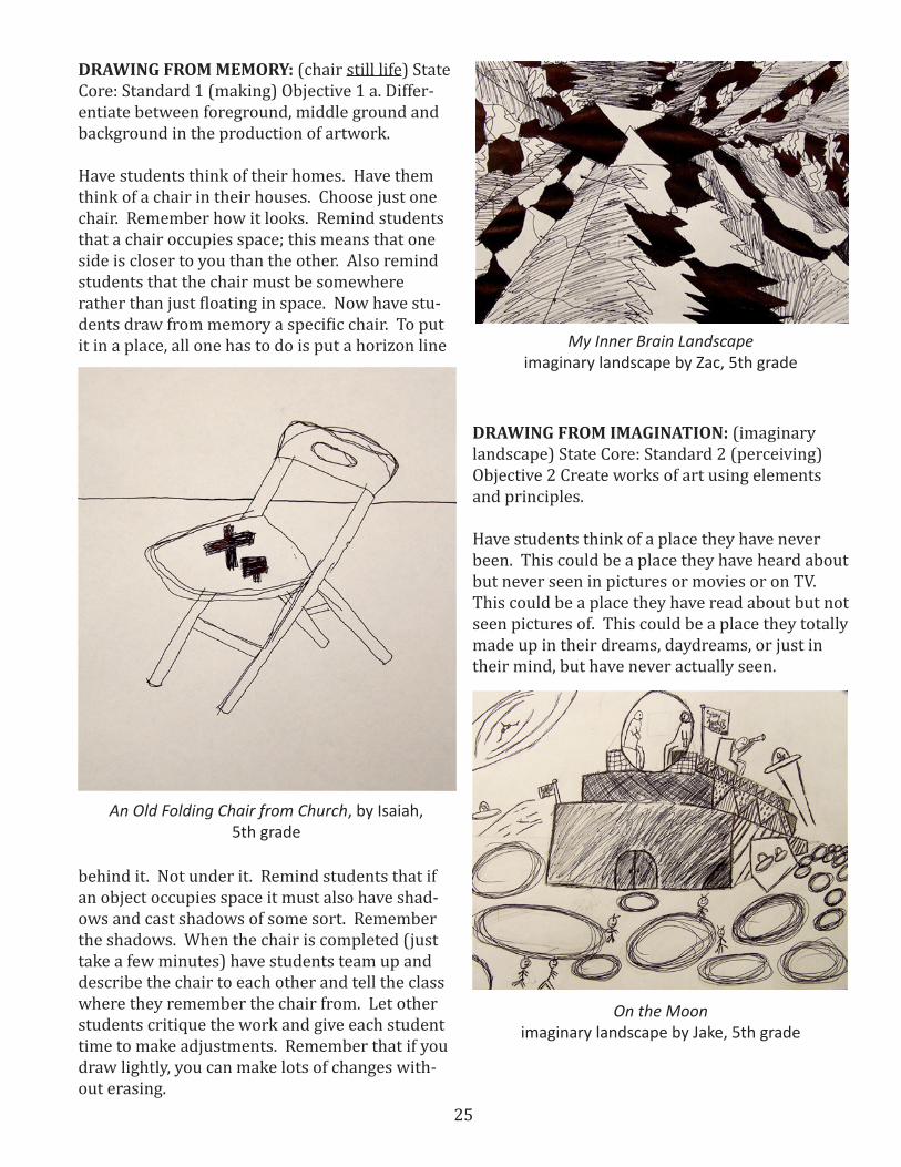
DRAWING FROM MEMORY: (chair still life) State Core: Standard 1 (making) Objective 1 a. Differ-entiate between foreground, middle ground and background in the production of artwork.
Have students think of their homes. Have them think of a chair in their houses. Choose just one chair. Remember how it looks. Remind students that a chair occupies space; this means that one side is closer to you than the other. Also remind students that the chair must be somewhere rather than just floating in space. Now have stu-dents draw from memory a specific chair. To put it in a place, all one has to do is put a horizon line
behind it. Not under it. Remind students that if an object occupies space it must also have shad-ows and cast shadows of some sort. Remember the shadows. When the chair is completed (just take a few minutes) have students team up and describe the chair to each other and tell the class where they remember the chair from. Let other students critique the work and give each student time to make adjustments. Remember that if you draw lightly, you can make lots of changes with-out erasing.
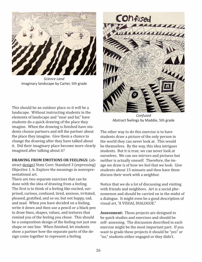
DRAWING FROM IMAGINATION: (imaginary landscape) State Core: Standard 2 (perceiving) Objective 2 Create works of art using elements and principles.
Have students think of a place they have never been. This could be a place they have heard about but never seen in pictures or movies or on TV. This could be a place they have read about but not seen pictures of. This could be a place they totally made up in their dreams, daydreams, or just in their mind, but have never actually seen.
An Old Folding Chair from Church, by Isaiah, 5th grade
My Inner Brain Landscapeimaginary landscape by Zac, 5th grade
On the Moonimaginary landscape by Jake, 5th grade
26
This should be an outdoor place so it will be a landscape. Without instructing students in the elements of landscape and “near and far,” have students do a quick drawing of the place they imagine. When the drawing is finished have stu-dents choose partners and tell the partner about the place they imagine. Give them a chance to change the drawing after they have talked about it. Did their imaginary place become more clearly imagined after talking about it?
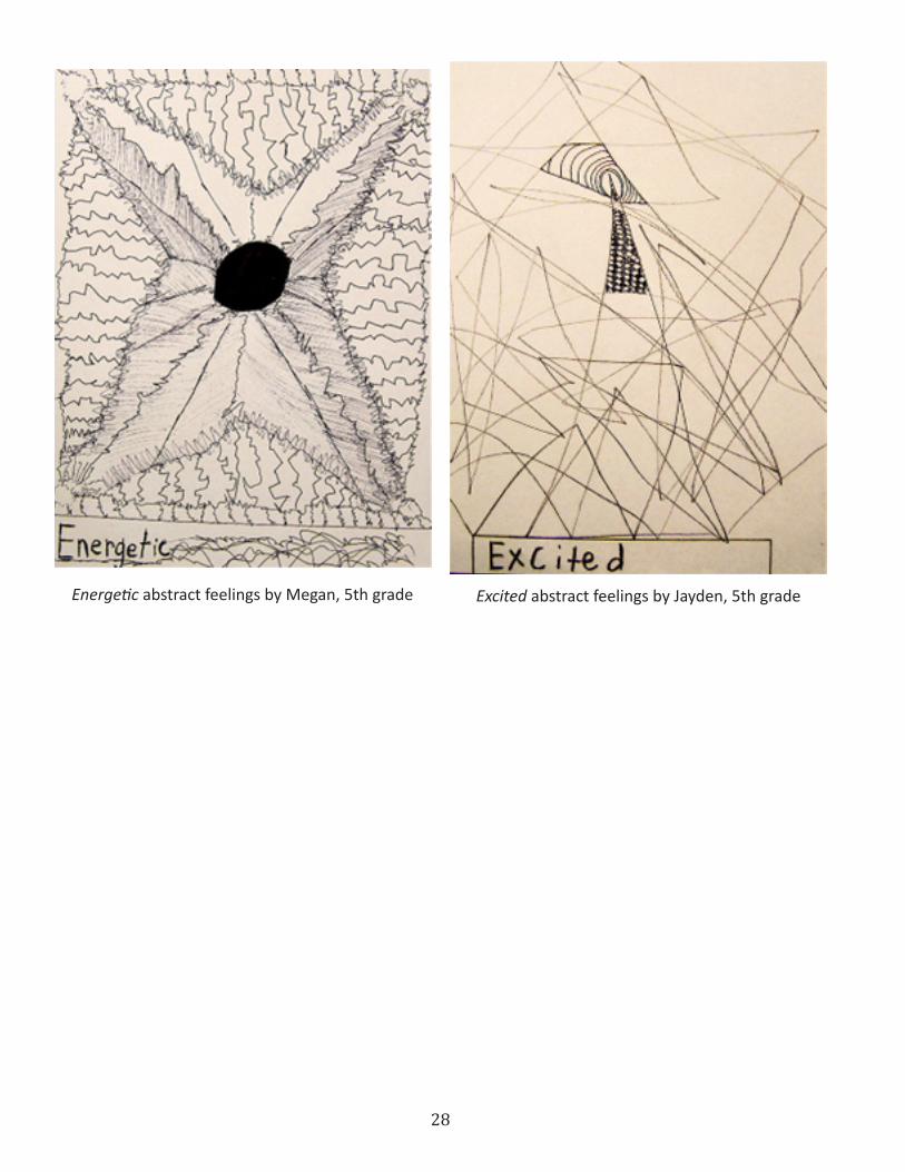
DRAWING FROM EMOTIONS OR FEELINGS: (ab-stract design) State Core: Standard 3 (expressing) Objective 1. b. Explore the meanings in nonrepre-sentational art.There are two separate exercises that can be done with the idea of drawing from a feeling. The first is to think of a feeling like excited, sur-prised, curious, confused, tired, anxious, irritated, pleased, gratified, and so on, but not happy, sad, and mad. When you have decided on a feeling, write it down and then use a pencil or a black pen to draw lines, shapes, values, and textures that remind you of the feeling you chose. This should be a composition design of the feeling not just one shape or one line. When finished, let students show a partner how the separate parts of the de-sign come together to represent a feeling.
Science Landimaginary landscape by Carter, 5th grade
The other way to do this exercise is to have students draw a picture of the only person in the world they can never look at. This would be themselves. By the way, this idea intrigues students. But it is true; we can never look at ourselves. We can see mirrors and pictures but neither is actually oneself. Therefore, the im-age we draw is of how we feel that we look. Give students about 15 minuets and then have them discuss their work with a neighbor.
Notice that we do a lot of discussing and visiting with friends and neighbors. Art is a social phe-nomenon and should be carried on in the midst of a dialogue. It might even be a good description of visual art, “A VISUAL DIALOGUE.”
Assessment: These projects are designed to be quick studies and exercises and should be self- assessing. The discussion described in each exercise might be the most important part. If you want to grade these projects it should be “yes” or “no,” students either engaged or they didn’t.
ConfusedAbstract feelings by Maddie, 5th grade

27
Variations: Obviously other subject matter could be assigned or chosen and other mediums could be used, but the important thing is to learn about more than one source to get ideas in your head. Other variations can be to turn these lessons into longer, more finished exhibition-quality work.
Extensions: These lessons are designed to be quick and not labor intensive, but of course some students will push it further. I let them save this kind of project to work on between projects when they are waiting for the next one. Notice that these are all done in value rendering because they are designed as drawing lessons. They can be drawn with pencil or pen. To extend these lessons, have students apply color. Have stu-dents work in colored pencil or watercolor or colored ballpoint pens. Don’t overlook colored ballpoint pen as an interesting medium. I am not recommending marker pens or crayon. These are difficult and awkward art mediums. That is the reason so few famous artists chose crayon or marker pens as their medium of choice. There is a wonderful felt tip pen made by Prismacolor, but it is still difficult in these projects.
Hypnotizingabstract feelings by Connor, 5th grade
Shocked abstract feelings by Kylee, 5th grade
28
Energetic abstract feelings by Megan, 5th grade Excited abstract feelings by Jayden, 5th grade
29
Elementary Levelby Joseph Germaine
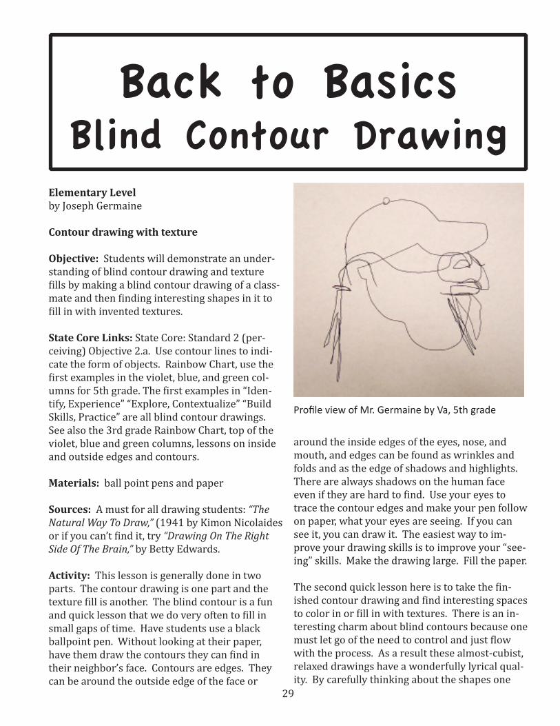
Contour drawing with texture
Objective: Students will demonstrate an under-standing of blind contour drawing and texture fills by making a blind contour drawing of a class-mate and then finding interesting shapes in it to fill in with invented textures.
State Core Links: State Core: Standard 2 (per-ceiving) Objective 2.a. Use contour lines to indi-cate the form of objects. Rainbow Chart, use the first examples in the violet, blue, and green col-umns for 5th grade. The first examples in “Iden-tify, Experience” “Explore, Contextualize” “Build Skills, Practice” are all blind contour drawings. See also the 3rd grade Rainbow Chart, top of the violet, blue and green columns, lessons on inside and outside edges and contours.
Materials: ball point pens and paper
Sources: A must for all drawing students: “The Natural Way To Draw,” (1941 by Kimon Nicolaides or if you can’t find it, try “Drawing On The Right Side Of The Brain,” by Betty Edwards.
Activity: This lesson is generally done in two parts. The contour drawing is one part and the texture fill is another. The blind contour is a fun and quick lesson that we do very often to fill in small gaps of time. Have students use a black ballpoint pen. Without looking at their paper, have them draw the contours they can find in their neighbor’s face. Contours are edges. They can be around the outside edge of the face or
around the inside edges of the eyes, nose, and mouth, and edges can be found as wrinkles and folds and as the edge of shadows and highlights. There are always shadows on the human face even if they are hard to find. Use your eyes to trace the contour edges and make your pen follow on paper, what your eyes are seeing. If you can see it, you can draw it. The easiest way to im-prove your drawing skills is to improve your “see-ing” skills. Make the drawing large. Fill the paper.
The second quick lesson here is to take the fin-ished contour drawing and find interesting spaces to color in or fill in with textures. There is an in-teresting charm about blind contours because one must let go of the need to control and just flow with the process. As a result these almost-cubist, relaxed drawings have a wonderfully lyrical qual-ity. By carefully thinking about the shapes one
Profile view of Mr. Germaine by Va, 5th grade
Back to BasicsBlind Contour Drawing

30
has inadvertently made and filling them in with invented textures or color or both, the students will create very appealing finished products. I have found it to be one of my students’ favorite projects. Make sure they give credit to their mod-el by having the name on the work. They should also sign their own name as the artist.
These are two very quick and easy projects that can be repeated many times without getting students rebelliously bored. These projects can also be worked on while other class members are working on major projects because they take very little instruction and even less repeated instruc-tion. Students will get good practice in learning to see what they are looking at and become in-timately familiar with the construction and fea-tures of the human face. Let students go with this one and be inventive. You might be surprised.
Assessment: The reward or punishment in this project is the project itself. The fun of doing it is the reward and the regret for not doing it is the punishment. By 5th grade, students should be
31
quite adept at self-evaluation and since this is an often-repeated project ,each student has a win-dow of improvement available.
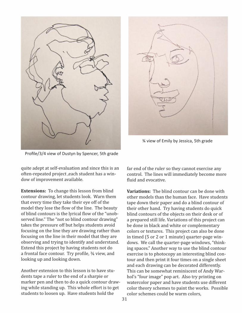
Extensions: To change this lesson from blind contour drawing, let students look. Warn them that every time they take their eye off of the model they lose the flow of the line. The beauty of blind contours is the lyrical flow of the “unob-served line.” The “not so blind contour drawing” takes the pressure off but helps students avoid focusing on the line they are drawing rather than focusing on the line in their model that they are observing and trying to identify and understand. Extend this project by having students not do a frontal face contour. Try profile, ¾ view, and looking up and looking down.
Another extension to this lesson is to have stu-dents tape a ruler to the end of a sharpie or marker pen and then to do a quick contour draw-ing while standing up. This whole effort is to get students to loosen up. Have students hold the
far end of the ruler so they cannot exercise any control. The lines will immediately become more fluid and evocative.
Variations: The blind contour can be done with other models than the human face. Have students tape down their paper and do a blind contour of their other hand. Try having students do quick blind contours of the objects on their desk or of a prepared still life. Variations of this project can be done in black and white or complementary colors or textures. This project can also be done in timed (5 or 2 or 1 minute) quarter-page win-dows. We call the quarter-page windows, “think-ing spaces.” Another way to use the blind contour exercise is to photocopy an interesting blind con-tour and then print it four times on a single sheet and each drawing can be decorated differently. This can be somewhat reminiscent of Andy War-hol’s “four image” pop art. Also try printing on watercolor paper and have students use different color theory schemes to paint the works. Possible color schemes could be warm colors,
¾ view of Emily by Jessica, 5th grade
Profile/3/4 view of Dustyn by Spencer, 5th grade
32
cool colors, neutral colors, primary or secondary or intermediate colors, complementary colors, monochromatic colors, or analogous colors. Look up wikipedia.com “color theory.”
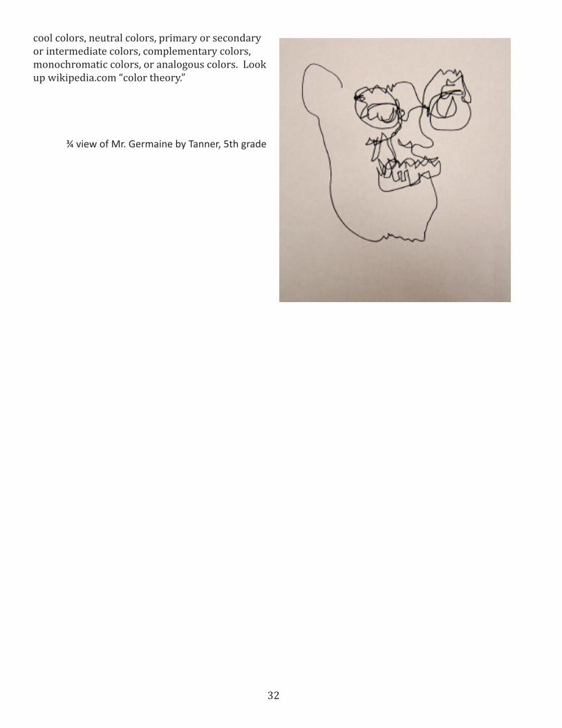
¾ view of Mr. Germaine by Tanner, 5th grade

33
Elementary Levelby Joseph Germaine
Objective: Students will demonstrate an under-standing of fore ground and back ground (interior and exterior) by tracing an image of their hand and decoration the interior of the hand.
State Core Links: 5th grade Rainbow Chart: Ele-ments of Art, page 4, Implied Texture, also Unity on page 2. 3rd grade Rainbow Chart: Elements of Art, page 1 Contour line, Line design, Organic line, Structural line and Repetition. Also in the Blue column page 1 (Explore and contextualize), cre-ate line designs showing overlapping, depth and proportion.
Materials: Ballpoint pens, paper and hands.
Sources: Use a number of cultural design books for ideas.
Activity: This is designed to be a filler lesson for students who finish other projects quickly. Have students trace around their hand and arm on a piece of paper using a black ballpoint pen. Make sure they are not just tracing an unattached hand floating in the middle of the paper. Help students find an interesting gesture for the hand and an interesting place for the arm and hand. Students should slow down and take a whole 5 seconds to trace their hand. If students are not reminded they will rapidly trace a loose contour of their hand that ends up looking like five hot dogs at-tached to a hamburger. They will do the hand symbol rather that a hand. Let the arm run off the paper. A border is optional.
After getting the hand and arm on the page, it is time to decorate the interior of the hand form. I use colored ballpoint pens, red, blue, and black. Show students that a red circle drawn on white paper is actually a white circle unless you color it in. A line around a shape does not color the shape, so students must take the time to color in the shapes and designs. We define design as: Lines, Shapes, Values, Colors, and Textures that don’t make a picture of something else.
This is supposed to be a quick lesson to fit in-be-tween longer, more aggressive lessons. Some stu-dents will spend a millisecond on this project and want to do something else. This is a good project for that because it is easy to find something else for the student to do. I tell them, “If you ask me if you are finished, that is the evidence that you are not, and I will always find something else for you to do. If your artwork is truly finished then you will know it.”
Extensions: Try using more than one hand trac-ing. Maybe have students use a neighbor’s hand and each of the students decorates one hand. Maybe they could use more than two hands. Use a highly decorated border, or put a geometric shape like a circle or square around and behind the hand. This is a good lesson for very young students to learn about overlapping.
Variations: Have students choose a cultural tradition in design. I recommend Oceania (try finding Fijian designs), African, Native American, Australian Aborigines, Celtic, and Arabic tradi-tional designs. There are many, many sources online and a lot of inexpensive paperback books. Try the ones with the CD-Rom to print out cop
Back to BasicsHand Design
34
ies for students to work from. You can also have students decorate their hand using specific stylis-tic design motifs such as Art Nouveau, Art Deco, Pointillism or artists such as Joan Miro, Paul Klee, Gustav Klimt, Henri Matisse, or Jackson Pollock.
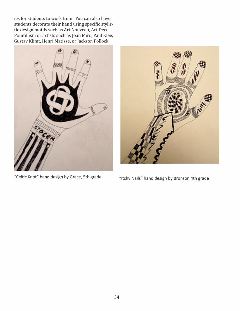
“Celtic Knot” hand design by Grace, 5th grade “Itchy Nails” hand design by Bronson 4th grade
35
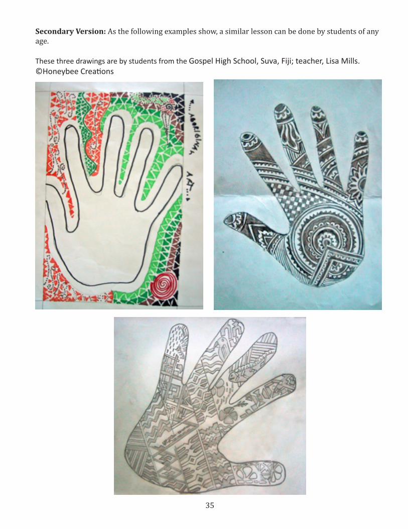
Secondary Version: As the following examples show, a similar lesson can be done by students of any age.
These three drawings are by students from the Gospel High School, Suva, Fiji; teacher, Lisa Mills. ©Honeybee Creations

36

37
Back to BasicsThe Inventions Lessons
Elementary Visual Arts Lessonsby Joseph Germaine
This is a series of lessons based on the idea that Education is and should be more about students and less about teachers, more about learning and less about teaching, and more about invention and less about instruction.
OBJECTIVE Students will demonstrate an understanding of basic elements of visual art by inventing their own lines, shapes, textures, and colors.
UTAH STATE COREVisual Arts Level K: Standard 2, objective 1 & 1a, analyze and reflect on the elements and prin-ciples in important works of are. Name the basic colors within works of art and/or in student work. Visual Arts Level 1: Standard 2, objective 2b, Reflect on works of art by their element and principles and Create an artwork using colors shapes and lines and values.Visual Arts Level 6: Standard 1 making, objective 2a, Predict the processes and techniques needed to make a work of art. Consider a variety of ideas before starting a work of art.
MATERIALSPaper, pencil, black ballpoint pen, colored pencils, watercolors, colored pencils and whatever your twist on this requires.
These lessons generally appear as single lessons but for the sake of brevity and ease we can group them together. I teach these lessons 9 times a day in 30 minute intervals – different students every
day – 45 classes a week. I am not the only teacher doing this. It seems untenable, but it isn’t. It is just different.
PROCESS Let’s start as basic as possible. Most young art-ists learning projects start with drawing lines. No matter what you want your students to make in art it generally requires them to draw lines on paper. In my classes we start most ceramic and sculpture projects with drawn plans to anticipate the outcome. So let’s give the youngsters a chance to develop their vocabulary of line and quality of line. We can call this “THE GREAT LINE HUNT.”Divide students into teams of two or three. Have students look around the room and find an in-teresting line and then describe the line to their
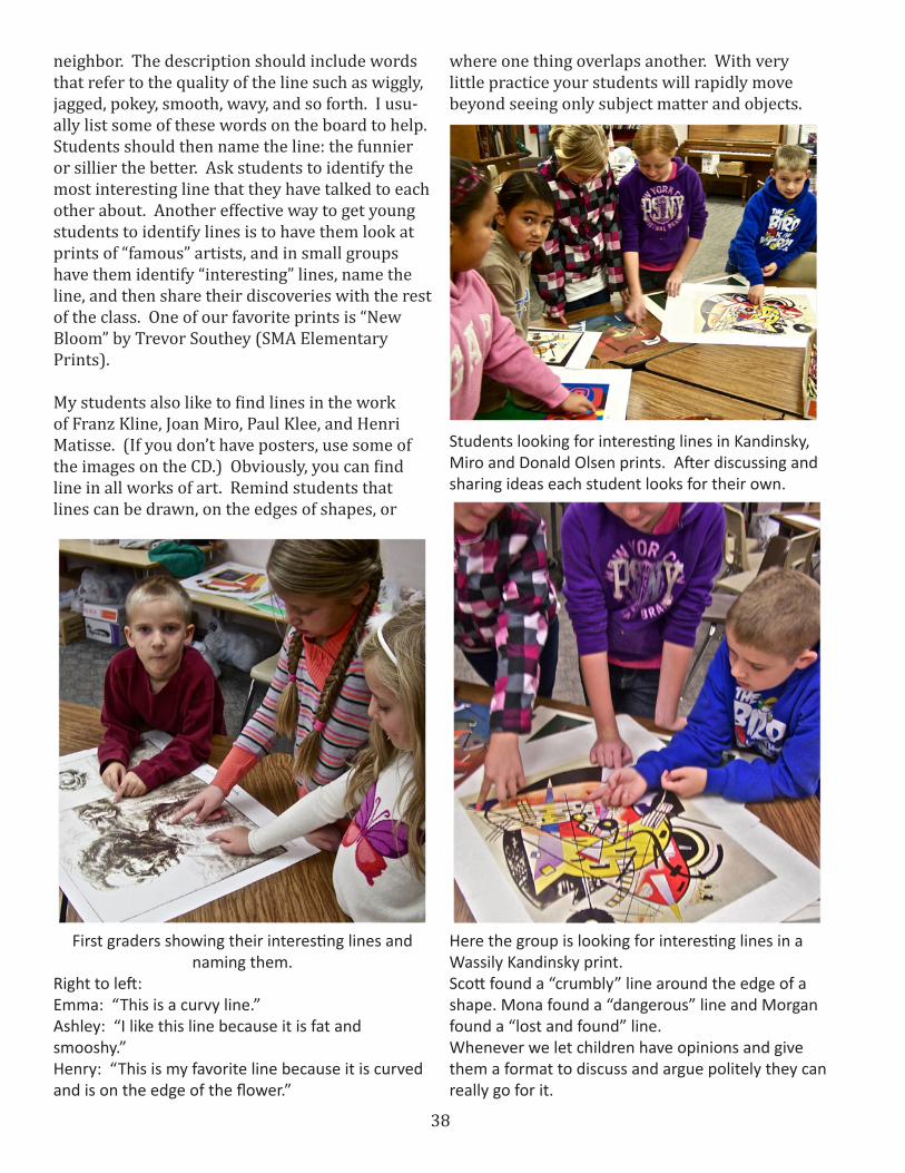
First graders finding interesting lines in Trevor Southey’s etching, New Bloom.
38
neighbor. The description should include words that refer to the quality of the line such as wiggly, jagged, pokey, smooth, wavy, and so forth. I usu-ally list some of these words on the board to help. Students should then name the line: the funnier or sillier the better. Ask students to identify the most interesting line that they have talked to each other about. Another effective way to get young students to identify lines is to have them look at prints of “famous” artists, and in small groups have them identify “interesting” lines, name the line, and then share their discoveries with the rest of the class. One of our favorite prints is “New Bloom” by Trevor Southey (SMA Elementary Prints).
My students also like to find lines in the work of Franz Kline, Joan Miro, Paul Klee, and Henri Matisse. (If you don’t have posters, use some of the images on the CD.) Obviously, you can find line in all works of art. Remind students that lines can be drawn, on the edges of shapes, or
where one thing overlaps another. With very little practice your students will rapidly move beyond seeing only subject matter and objects.
First graders showing their interesting lines and naming them.
Right to left:Emma: “This is a curvy line.”Ashley: “I like this line because it is fat and smooshy.”Henry: “This is my favorite line because it is curved and is on the edge of the flower.”
Students looking for interesting lines in Kandinsky, Miro and Donald Olsen prints. After discussing and sharing ideas each student looks for their own.
Here the group is looking for interesting lines in a Wassily Kandinsky print.Scott found a “crumbly” line around the edge of a shape. Mona found a “dangerous” line and Morgan found a “lost and found” line.Whenever we let children have opinions and give them a format to discuss and argue politely they can really go for it.

39
Omei and her sister find some interesting lines in Donald P. Olsen’s Chelsea VI. Omei says that she really likes the “swirly round and round” lines.
The “Tlingit Blanket” print is always a hit. All of the students eventually agreed that the “best lines in this picture are the ones made by the hangy-down fringe stuff at the bottom.” “Every line is just a little different but they all look the same.” We call this repetition and variation of a theme. At least the teacher does.
This is a close-up of Wyatt’s favorite lines. He named them, “The squiggly, fringy, crawly lines”. I think he captured the idea.
Wyatt likes the lines around this little black shape in Henri Matisse’s Beasts of the Sea.

40
After you have played this noisy and chaotic game for a little while, pass out half sheets of copy paper and have student write the word “LINE” across the top. Dropping down a thumb’s width or so, have students invent an interesting line and draw it from edge to edge of the paper. Students should then turn the paper over and write the “Name” of the line on the back, again using quali-tative vocabulary to identify the nature of the line. Now drop down another thumb’s width and repeat the process. Students should have enough room to get 6 to 10 lines on the paper. Make sure they name the lines. Make sure the lines go com-pletely to the edge of the paper.
Henry’s invented lines1 . “up and down”2 . “bumpy”3 . “swirly”4 . “bridge”5 . “spikey”
Reagan’s invented lines above, and line names, below. 1st grade
41
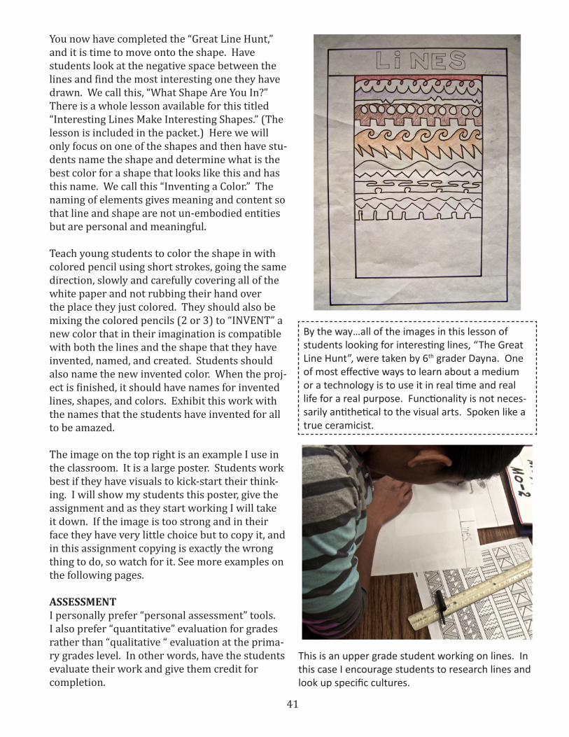
You now have completed the “Great Line Hunt,” and it is time to move onto the shape. Have students look at the negative space between the lines and find the most interesting one they have drawn. We call this, “What Shape Are You In?” There is a whole lesson available for this titled “Interesting Lines Make Interesting Shapes.” (The lesson is included in the packet.) Here we will only focus on one of the shapes and then have stu-dents name the shape and determine what is the best color for a shape that looks like this and has this name. We call this “Inventing a Color.” The naming of elements gives meaning and content so that line and shape are not un-embodied entities but are personal and meaningful.
Teach young students to color the shape in with colored pencil using short strokes, going the same direction, slowly and carefully covering all of the white paper and not rubbing their hand over the place they just colored. They should also be mixing the colored pencils (2 or 3) to “INVENT” a new color that in their imagination is compatible with both the lines and the shape that they have invented, named, and created. Students should also name the new invented color. When the proj-ect is finished, it should have names for invented lines, shapes, and colors. Exhibit this work with the names that the students have invented for all to be amazed.
The image on the top right is an example I use in the classroom. It is a large poster. Students work best if they have visuals to kick-start their think-ing. I will show my students this poster, give the assignment and as they start working I will take it down. If the image is too strong and in their face they have very little choice but to copy it, and in this assignment copying is exactly the wrong thing to do, so watch for it. See more examples on the following pages.
ASSESSMENTI personally prefer “personal assessment” tools. I also prefer “quantitative” evaluation for grades rather than “qualitative “ evaluation at the prima-ry grades level. In other words, have the students evaluate their work and give them credit for completion.
By the way…all of the images in this lesson of students looking for interesting lines, “The Great Line Hunt”, were taken by 6th grader Dayna. One of most effective ways to learn about a medium or a technology is to use it in real time and real life for a real purpose. Functionality is not neces-sarily antithetical to the visual arts. Spoken like a true ceramicist.
This is an upper grade student working on lines. In this case I encourage students to research lines and look up specific cultures.

42
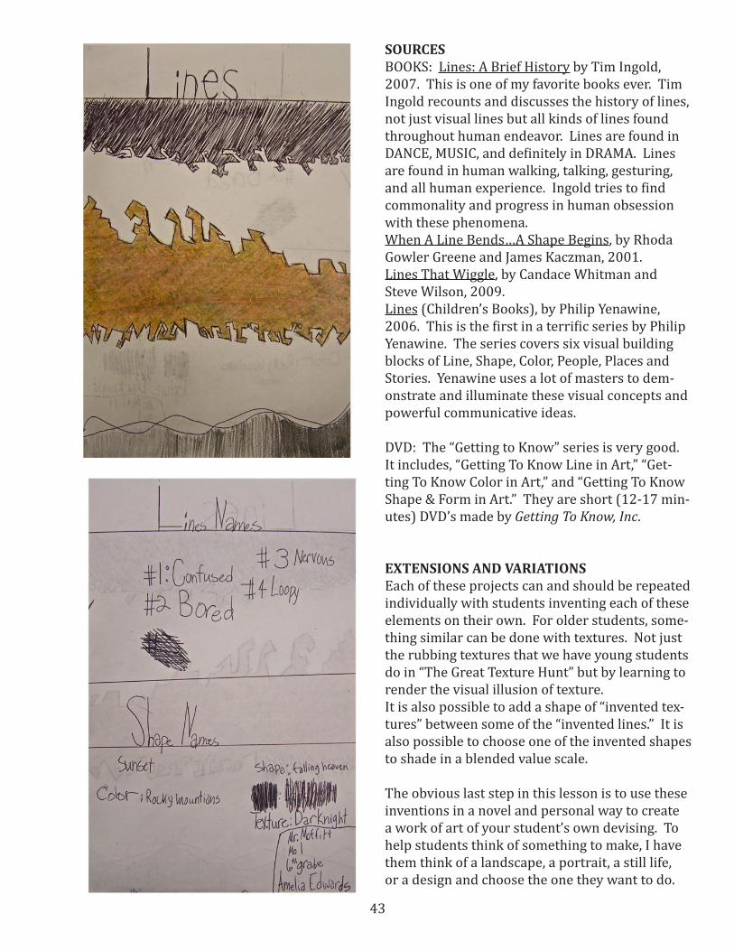
Examples on the right, next page, are invented lines with invented color, invented texture and a value scale shape by Amelia, 6th grade.
Amelia’s writing on the back of her paper. Lines: 1. Confused, 2. Bored, 3. Nervous, 4. Lazy. Color shape: “Falling Heaven”. Invented color name: “Rocky Mountains”. Texture name: “Dark Night”. Value shape name: “Sunset”. The Texture name is “Black Rain”.
This is “Lines and Textures” by Cayden, 4th grade. Her color is named “Caterpillar Guts Green”. She used green and gray and yellow. The color shape is named “Lightening Wall”. Her texture shape in named, “Black Lightening”. Cayden named her invented texture, “X’s from Texas” and her pencil value shape is “Humpy Shadows”. Sometimes the titles are at least as interesting as the artwork. This is a great example that “Art is a Kind of Thinking”.
This work is by Dayna, 6th grade. She named her lines 1. “Twister Sister”, 2. “Jagged Jungle”, 3. “Good”, 4. “Evil”, 5. “The Never Ending Circle of Life”. Her color shape in named “The Battle of Good and Evil”. Dayna named her invented color “Monkey Milk”. She used pink and burnt sienna and brown and a little touch of white. She used my Prismacolor pencils. She used a stipple technique to create her value scale in the intertwined line/shapes named “The Never Ending Circle of Life”.
43
SOURCESBOOKS: Lines: A Brief History by Tim Ingold, 2007. This is one of my favorite books ever. Tim Ingold recounts and discusses the history of lines, not just visual lines but all kinds of lines found throughout human endeavor. Lines are found in DANCE, MUSIC, and definitely in DRAMA. Lines are found in human walking, talking, gesturing, and all human experience. Ingold tries to find commonality and progress in human obsession with these phenomena. When A Line Bends…A Shape Begins, by Rhoda Gowler Greene and James Kaczman, 2001. Lines That Wiggle, by Candace Whitman and Steve Wilson, 2009. Lines (Children’s Books), by Philip Yenawine, 2006. This is the first in a terrific series by Philip Yenawine. The series covers six visual building blocks of Line, Shape, Color, People, Places and Stories. Yenawine uses a lot of masters to dem-onstrate and illuminate these visual concepts and powerful communicative ideas.
DVD: The “Getting to Know” series is very good. It includes, “Getting To Know Line in Art,” “Get-ting To Know Color in Art,” and “Getting To Know Shape & Form in Art.” They are short (12-17 min-utes) DVD’s made by Getting To Know, Inc.
EXTENSIONS AND VARIATIONS Each of these projects can and should be repeated individually with students inventing each of these elements on their own. For older students, some-thing similar can be done with textures. Not just the rubbing textures that we have young students do in “The Great Texture Hunt” but by learning to render the visual illusion of texture.It is also possible to add a shape of “invented tex-tures” between some of the “invented lines.” It is also possible to choose one of the invented shapes to shade in a blended value scale.
The obvious last step in this lesson is to use these inventions in a novel and personal way to create a work of art of your student’s own devising. To help students think of something to make, I have them think of a landscape, a portrait, a still life, or a design and choose the one they want to do.
44
Students are expected to use their new colors and lines and textures as part of this project. Annu-ally, this is one of the favorite projects because it is almost entirely about the student, the student’s imagination and the student’s invention and dis-covery.
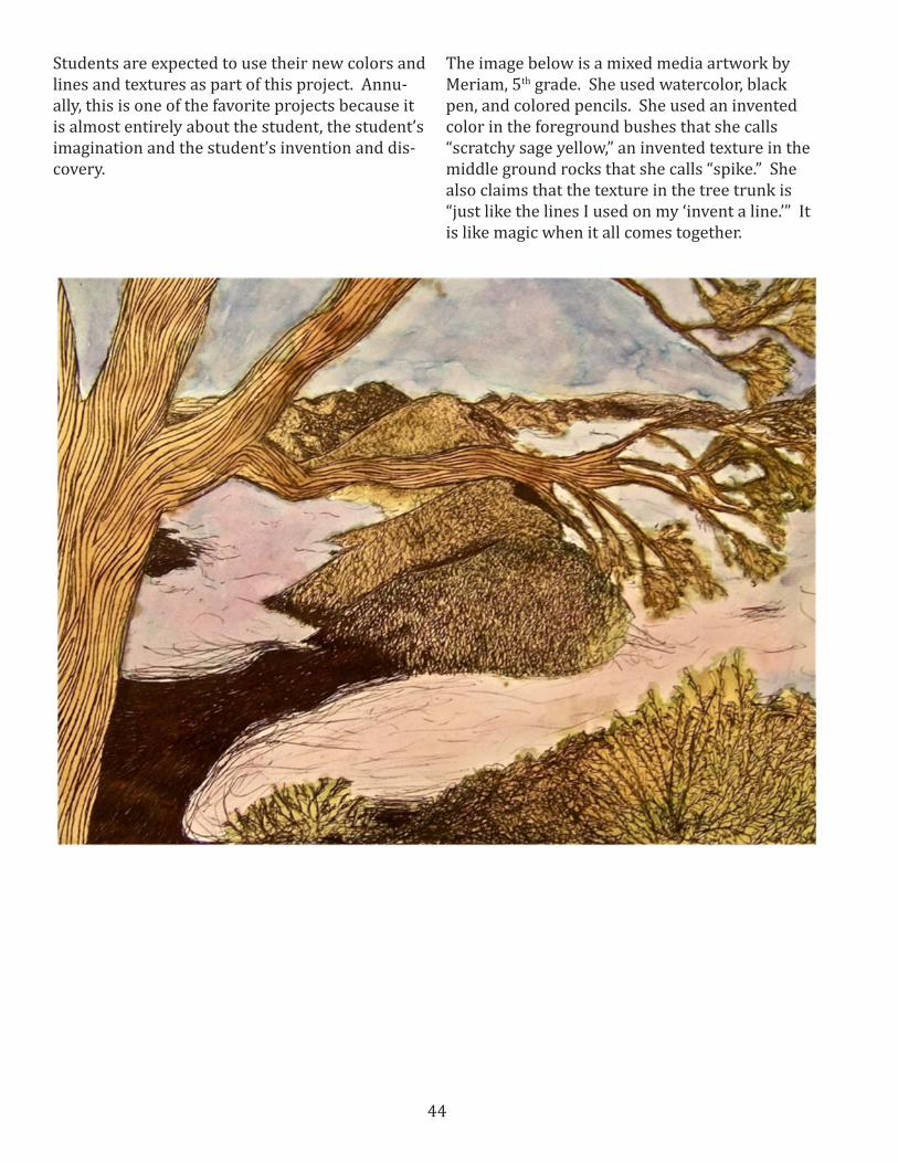
The image below is a mixed media artwork by Meriam, 5th grade. She used watercolor, black pen, and colored pencils. She used an invented color in the foreground bushes that she calls “scratchy sage yellow,” an invented texture in the middle ground rocks that she calls “spike.” She also claims that the texture in the tree trunk is “just like the lines I used on my ‘invent a line.’” It is like magic when it all comes together.
45
Back to BasicsEdible Color
Elementary Visual Arts Lesson, but could be adapted for Middle School/High SchoolBy Elicia Gray
OBJECTIVES Students will compare and contrast the artworks of Harwood, Bliss, Graves, Andreson, Lenzi, and Gittins.Students will read and contemplate “The Black Book of Color” by Menena Cottin. Students will learn to identify ways that they can experience color through senses other than sight.Students will compose a written description of a painting without including color names.Students will understand color mixing by melding different shades of cookie dough together.Students will generate a colorful work of edible art.Students will create a spinning top out of a ping-pong ball and an old CD.
STATE CORE OBJECTIVESStandard 1 (Making): Students will assemble and create works of art by experiencing a variety of art media and by learning the art elements and principles.Standard 2 (Perceiving): Students will find mean-ing by analyzing, criticizing, and evaluating works of art. Standard 3 (Expressing): Students will create meaning in artStandard 4 (Contextualizing): Students will find meaning in works of art through settings and other modes of learning.
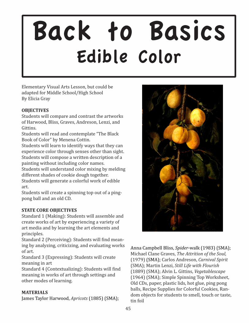
MATERIALSJames Taylor Harwood, Apricots (1885) (SMA);
Anna Campbell Bliss, Spider-walk (1983) (SMA); Michael Clane Graves, The Attrition of the Soul, (1979) (SMA); Carlos Andreson, Carnival Spirit (SMA); Martin Lenzi, Still Life with Flourish (1889) (SMA); Alvin L. Gittins, Vegetablescape (1964) (SMA); Simple Spinning Top Worksheet, Old CDs, paper, plastic lids, hot glue, ping pong balls, Recipe Supplies for Colorful Cookies, Ran-dom objects for students to smell, touch or taste, tin foil

46
ACTIVITY 1. Invite one student to the front of the class
and ask him/her to feel, touch, taste, or smell a number of strange items with his/her eyes closed. (Items may be rice, peeled grapes, sandpaper, pasta, potent spices, lemon juice, and so forth). Ask the student to describe what he or she is touching/feeling/tasting/smelling as accurately as possible. Invite the student to use descrip-tive words and imagine what colors she might be experiencing. Have several dif-ferent students participate in this activity, and invite them to discuss their findings. Was it difficult to determine the color of the object based on the clues from their other senses?
2. Explain that some art is meant to be expe-rienced through senses other than sight. Discuss how sculpture is sometimes differ-ent from painting or drawing.
3. As a class, read the children’s book entitled The Black Book of Color by Menena Cottin. This is a book about color written for blind children. The whole book is black, with raised textures and patterns that describe what color might feel like. Have children decide or guess which colors are repre-sented based on the textures and ideas that are described. Ask students whether it is possible to experience color without
using their eyes. In what ways would stu-dents describe color to kids who did not have the ability to see with their eyes?
4. Display the variety of images from Har-wood, Bliss, Graves, Andreson, Lenzi, and Gittins. Invite students to make connec-tions between the works. What do they have in common? What are the differenc-es? Divide students into small groups and assign an artwork to each group. Invite groups to write a description of their painting to be read to an imaginary blind person. Ask students to be as detailed and descriptive as possible, but with one little twist. Students may not use color names to describe any aspect of the paintings. They may explain what the color might feel/taste/smell/sound like, but they can-not include the name of the color. For ex-ample, if the background is green, students might say, “The background smells like freshly cut grass,” or if the table is red, the students might say “The table is the color of my scraped knee.” When students are finished, have them read their descriptions to the class, and have other class members guess which painting they are describing.
5. What were the results of this exercise? Which paintings were easier to describe? Explain that in all of these works, color is an important aspect. Ask students to consider how the works would be different if color was removed. Point out that some of these works are representational and some are abstract. Ask the class whether it was easier to describe the abstract works or the representational works.
6. Explain that many of the works repre-sented deal with food. Are there aspects of food that might help blind people better understand the items in the composition? Generally, food has a smell, taste, texture, and even a sound when you eat it. Explain that this additional information is helpful when determining the characteristics of an object. Remind students that even with the best information, our senses can be tricked into making mistakes.
7. Show students that even sight can be

47
tricky when it comes to color. Pull out the spinning top that has blue and yellow stripes on it. Spin the top to show that blue and yellow make green when the top is spinning. Explain the idea of visual mix-ing, and remind students that it is a trick our eyes play on us. In reality, the green on the spinning top does not exist—it only appears to be green because the two colors appear to be mixed together.
8. Invite students to make their own spinning tops with a CD, a ping-pong ball, and a plastic lid. (See further instructions on Spinning Top Handout). Students may include designs, patterns or drawings that play tricks on the eyes. If the teacher chooses, students may choose to include primary colors that when mixed create secondary colors.
9. Invite students to try their hands at color mixing by creating some colorful cookie dough. In this way, students can also experience color with their other senses—taste, smell, and touch. Make the cookie dough as outlined in the “Colorful Cookies Handout.” Divide the cookie dough into several parts and have students knead in the different primary colors. Once the
primary colors have been established, have students use little bits of primary colors together in order to create second-ary colors. Show students that when the two different colored pieces of dough are combined completely, they will become a different color.
10. Give students a little bit of each color and invite them to create an edible sculpture. Sculptures must be mostly flat in order for them to cook well, but may be in any shape/color that the student chooses. How could students use the dough in order to represent tricky concepts? Could they use the dough to create abstract ideas? Complex thoughts?
11. Once the sculptures are completed, have each student write his name on a small piece of tin foil and place the sculptures on it. Bake as instructed and then eat. Ask students to think about and respond to the following questions: Does the color of the dough affect the taste? How about the smell? Does the smell make the project more inviting?
12. Have students discuss their findings as they devour the evidence.

48
ASSESSMENT Teacher should carefully review the written descriptions of the paintings that students com-posed in groups, checking for completion and quality reasoning. Students will complete the Spinning Top Checklist. Before students consume their edible sculptures, teacher will check for completion and quality.
SOURCEShttp://amandascookin.com/2011/01/valentine-play-dough-cookie-pops.html
ADAPTATIONS This lesson caters to students with special needs in that it emphasizes and praises those with disabilities. If need be, students with difficulties may be paired with others, or given extra time to complete assignments.
VARIATIONHave students experiment with play dough if cookie dough is not an option. Also, students may choose to use salt dough or other simple, dispos-able materials.
EXTENSIONInvite a person with impaired vision to come and talk with the class. Have them discuss the ad-vantages and disadvantages, and how they have learned to experience life through their other senses.
Colorful Cookies3/4 cup butter, softened3 ounces cream cheese1 cup white sugar1 egg1 teaspoon vanilla extract2 3/4 cups all-purpose flour1 teaspoon baking powder1/4 teaspoon saltassorted colors of paste food coloring
In a bowl cream butter, cream cheese and sugar until fluffy. Add egg and vanilla; beat until smooth. In a medium bowl combine flour, bak-ing powder and salt. Add dry ingredients to the creamed mixture. Stir till soft dough forms. Di-vide dough according to the number of colors you plan to use. Tint each with a different food color paste. Knead until a solid color forms. Wrap in plastic wrap and chill for 2 hours. Preheat oven to 350 degrees F. Sculpt dough into desired shape. Bake cookies for 8 minutes or until lightly browned. Cool and store in an airtight container.
49
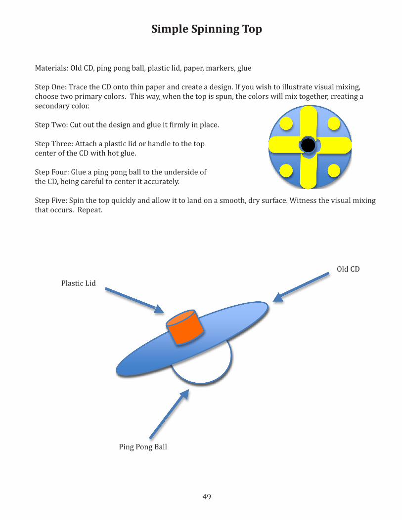
Simple Spinning Top
Materials: Old CD, ping pong ball, plastic lid, paper, markers, glue
Step One: Trace the CD onto thin paper and create a design. If you wish to illustrate visual mixing, choose two primary colors. This way, when the top is spun, the colors will mix together, creating a secondary color.
Step Two: Cut out the design and glue it firmly in place.
Step Three: Attach a plastic lid or handle to the top center of the CD with hot glue.
Step Four: Glue a ping pong ball to the underside ofthe CD, being careful to center it accurately.
Step Five: Spin the top quickly and allow it to land on a smooth, dry surface. Witness the visual mixing that occurs. Repeat.
Old CD
Plastic Lid
Ping Pong Ball

50
Spinning Top Assessment ToolPlease check all that apply
Name ___________________________________________________________________________________
I traced around a CD onto thin paper.I created a design on the paper.I added color to my designs and filled up all the space.I cut out my circle and glued it to my CD.I attached a plastic lid to the top center of the ping-pong ball with hot glue.I glued a ping-pong ball to the underside of the CD with hot glue.I was careful to glue the ping-pong ball in the center of the CD.I spun the top quickly on a smooth, dry surface.I noticed how “visual mixing” happened on my CDI traded my spinning top with two other people so they could see my “visual mixing.”I cleaned up all my scraps.I put away all my supplies.
51
Elementary Visual Arts LessonVicki Gehring
OBJECTIVESTeachers will learn how to create and mix colors and will be able to teach students more effectively. (The lesson assumes teachers will complete the activity before teaching the class, unless the teacher is already experienced in color theory.)Students will be able to create colors not found in crayon box sets, chalk pastels, and paint; will learn the basics of color theory; and will be able to create more interesting artwork.
UTAH STATE CORE OBJECTIVE Exploring a variety of art media, techniques, and processes
MATERIALSdrawing or art paper, crayons, chalk pastels, tempera paint with brushes and water to clean brushes and a plastic plate or something to use as a palette, poster or image of Capitol from North Salt Lake, by Louise Farnsworth and/or, Sunrise, North Rim of the Grand Canyon, by Mabel Pearl Frazer
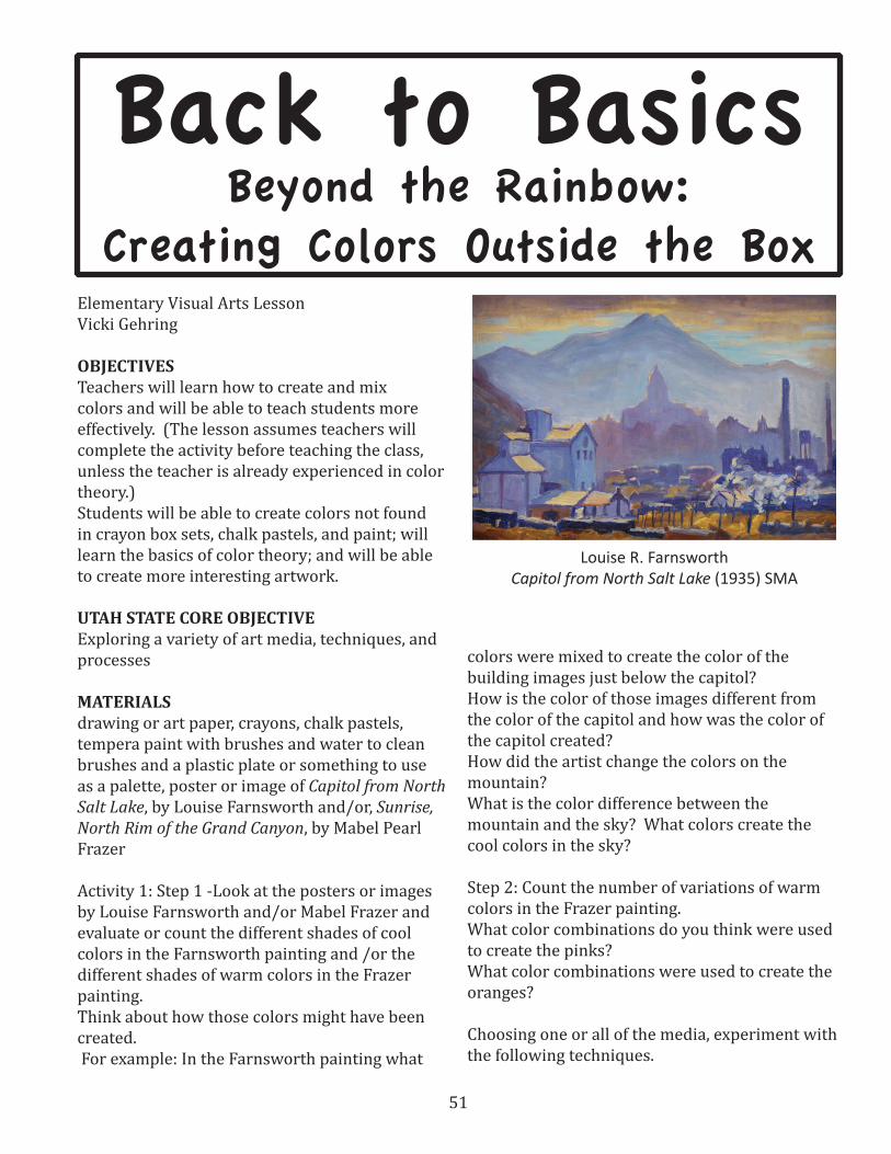
Activity 1: Step 1 -Look at the posters or images by Louise Farnsworth and/or Mabel Frazer and evaluate or count the different shades of cool colors in the Farnsworth painting and /or the different shades of warm colors in the Frazer painting.Think about how those colors might have been created. For example: In the Farnsworth painting what
colors were mixed to create the color of the building images just below the capitol? How is the color of those images different from the color of the capitol and how was the color of the capitol created?How did the artist change the colors on the mountain?What is the color difference between the mountain and the sky? What colors create the cool colors in the sky?
Step 2: Count the number of variations of warm colors in the Frazer painting.What color combinations do you think were used to create the pinks?What color combinations were used to create the oranges?
Choosing one or all of the media, experiment with the following techniques.
Back to BasicsBeyond the Rainbow:
Creating Colors Outside the Box
Louise R. FarnsworthCapitol from North Salt Lake (1935) SMA
52
Activity 2: Crayons While looking at one or the other image: select a variety of crayon colors that might be combined to reproduce the colors similar to the ones in the paintings. On the drawing paper, start making color patches by mixing several colors together until a color similar to one in the painting is created.Note: start by coloring lightly with the crayons. If the wax builds up too fast the colors don’t mix as well.Practice this with several of the colors in the paintings, experimenting with, not only which colors were used, but also the order in which colors were applied to get the best results.Note: It is important to experiment with not only which colors to combined, but in which order they were combined.
Activity 3: Chalk Pastel Using the same procedure, experiment with combining various chalk colors to recreate colors found in the paintings.Note: By smudging, chalk colors can be combined more easily than crayons, but it is less messy if the desired colors can be created by gently coloring one color on top of the other.
Activity 4: Paints White and black will be needed in addition to either the warm or cool colors being used.Put several dots (at least 3) of either a warm or cool color on the palette. Mix a little white with one ( this will produce a tint) and a very little black with one (this will produce a shade). Then try to reproduce the chosen color by combining other warm or cool colors to the chosen base color.If the color trying to be reproduced is light use combine with the tint. If it is dark try combining with the shade.Note: If the desired color is not created using one or two other colors, start over instead of trying to add too many colors. Paints mix easily, but can actually be harder when trying to reproduce a certain color, so just try coming close.
STUDENT ASSESSMENTCheck student experiments for completion.
TEACHER ASSESSMENT Using the new information and skills you have learned by completing these activities, draw a simple picture and, choose one of the media, to color it. Pay attention to how long it takes, so if you teach students to color this way and have them do a project you will know how long it may take them. Consider the difference between a drawing colored this way and how it might look if colored in a typical way using colors straight “from the box.” Did your drawing, colored using these techniques look more interesting? How do you think students will feel about using this method of combining colors to make their art work look more interesting?What has been learned about color that can be shared with students?How can teaching this information about color theory and media use engage students more fully in a learning process?
53
Back to BasicsUsing Photography to Study and Learn Basic Visual Art Concepts
Elementary Visual Arts Lessonby Joseph Germaine
OBJECTIVEStudents will demonstrate a basic understanding of 5 elements of visual art by finding and photo-graphing line, shape, value, color and texture. (Of course there are other elements, but this is BA-SIC)
UTAH STATE CORE LINKS Visual Arts Level 3: Standard 2, Perceiving, ob-jective 1: Analyze and reflect on works of art by their elements and principles. Visual Art Level 4: Standard 3, Expressing, objective 2: Discuss, evaluate and choose symbols, ideas, subject mat-ter, meanings, and purposes for artwork. Visual Arts Level 5: Standard 4, Contextualizing, objec-tive 1b: Describe what the artist’s intentions may have been at the time the art was created.
MATERIALS: Digital camera, computer with some photo-editing app, Printing capabilities and a lot of time and patience.
Drawing is the basis of most art processes. To get better at drawing one must get better at seeing. By seeing we don’t mean looking, we mean un-derstanding. See what I mean? There are many good projects to improve one’s ability to see. This digital photography project introduces a young student to another way of seeing (identifying specific visual elements) and introduces students to some of the basic possibilities of photography, especially the ability to see beyond the obvious subject matter and to begin to observe the visual
elements that one is organizing to communicate in a more personal and specific manner.
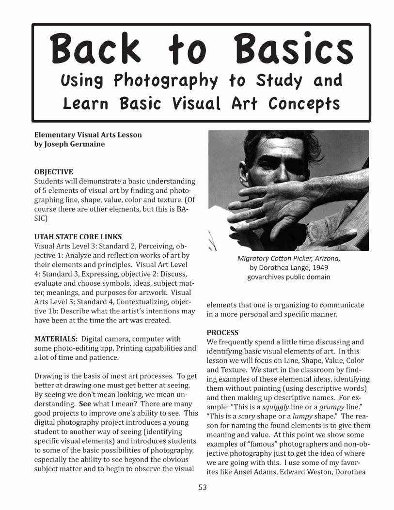
PROCESSWe frequently spend a little time discussing and identifying basic visual elements of art. In this lesson we will focus on Line, Shape, Value, Color and Texture. We start in the classroom by find-ing examples of these elemental ideas, identifying them without pointing (using descriptive words) and then making up descriptive names. For ex-ample: “This is a squiggly line or a grumpy line.” “This is a scary shape or a lumpy shape.” The rea-son for naming the found elements is to give them meaning and value. At this point we show some examples of “famous” photographers and non-ob-jective photography just to get the idea of where we are going with this. I use some of my favor-ites like Ansel Adams, Edward Weston, Dorothea
Migratory Cotton Picker, Arizona, by Dorothea Lange, 1949
govarchives public domain
54
Lange, and Margret-Bourke White. Try images by Harry Callahan who worked aggressively thru the 50’s 60’s & 70’s. I use these guys because they are old and dead, and I’m getting there myself. There are a lot of terrific contemporary photographers and many use digital equipment. Try images by Roe Ethridge for interesting cropping and use of geometric shapes or Elad Lassry for use of enig-matic patterns or Amanda Ross-Ho for unusual assemblages and compelling still-life design.
Now it is time to share a few techniques for successful photography such as how to hold the camera still while pushing the button (use a tripod), centering and composing the picture, observing the lighting conditions and taking more than one exposure from slightly different angles and different settings in the camera, noticing the background and avoiding visual distractions. This might sound technical but it is just the kind of thing you might tell your own children on a vaca-tion while they are taking snapshots.
>SNAPSHOTS: We use the term snapshot in a specific way to distinguish from photographs. A snapshot is a quick and effortless way to docu-ment a personal experience such as a birthday or a vacation but will only have relevance to those involved personally. A photo-graph is a visual statement or conversation about something one is wishing to discuss with the viewer, hence photo (light) and graph (writing) writing or drawing with light.
It is now time to go on the “image hunt” to find an interesting line, some compelling shapes, an enigmatic texture or two, a insightful use of value and some evocative color. There is not a lot to say about taking the photo except to avoid the obvi-ous and to look for that compelling image that is trying to emerge from the clutter of the rest of the world. Your job is to help it emerge and thus organize chaos.
Art, in particular photography, is about SEEING! This project is about learning to see what we are looking at.
When the photos have been taken, we should print them up. A good photo printer is a nice idea but not exactly necessary if you have a regular office printer. At my school all the teachers are networked into the printer down in the faculty workroom. This works just fine, but I like to use my photo printer hooked up to one of my class-room computers that we devote exclusively to photography. The quality of the paper is also an
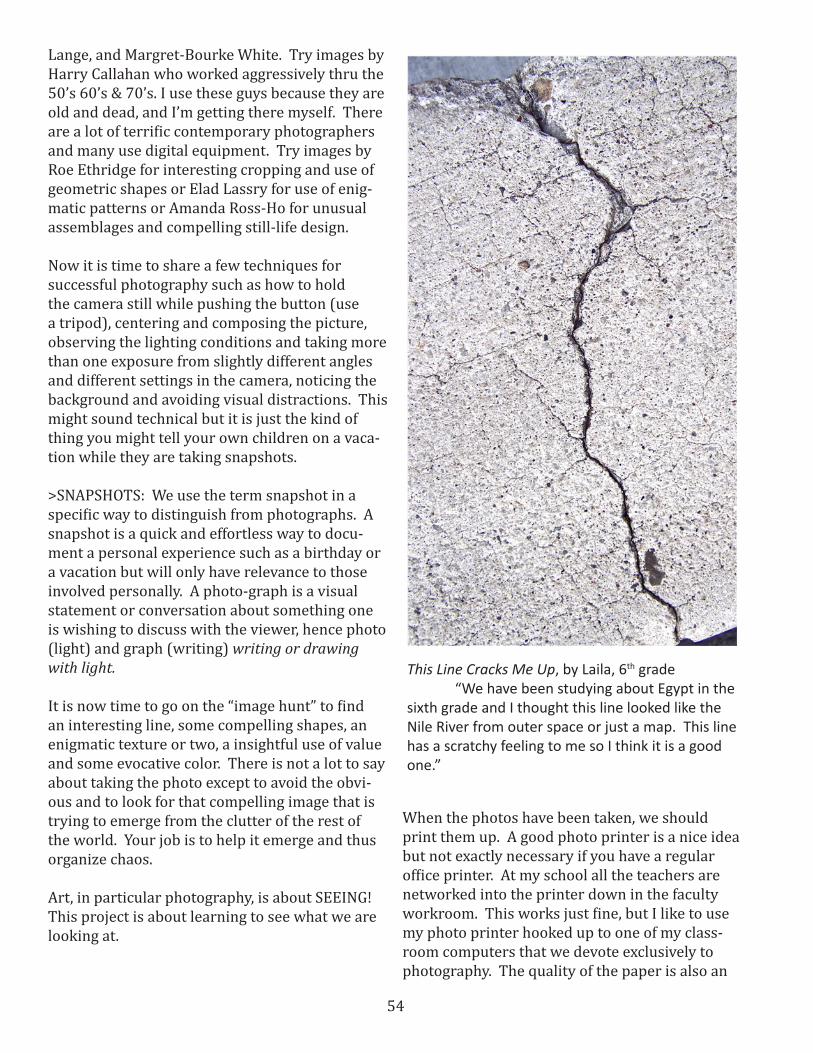
This Line Cracks Me Up, by Laila, 6th grade “We have been studying about Egypt in the sixth grade and I thought this line looked like the Nile River from outer space or just a map. This line has a scratchy feeling to me so I think it is a good one.”
55
important variable when it comes to printing. I like to use a satin finish medium weight card-stock. It is much less expensive than the com-mercial photo printing paper. Try to find some glossy (kaolin finish) paper just to see if it makes a difference. ASSESSMENTI like to have students do a “self-assessment” on their photographs. This is pretty easy and straightforward. I have students write down what they were trying to do (say) in the photo. In this assignment the students are attempting to discuss the nature of the specific line, shape or value they were identifying and focusing on. After identifying the element, students should address their success and why. Keep it short and post their evaluation with the work for the school to see and marvel.
SOURCES: There are many great books and web-sites about teaching photography to children:
Books: Focus: Five Women Photographers, by Sylvia Wolf. The Photographic Eye, by Michael F. O’Brien & Norman Sibley. The Digital Photogra-phy Book, by Scott Kelby, 2006. Complete Digital Photography, by Benn Long, 2011. Digital Photog-raphy for Beginners, by Darren Rowland, 2012. I Wanna Take Me a Picture: Teaching Photography and Writing to Children, by Wendy Ewald & Alex-andra Lightfoot, 2002
DVD: Digital Photography Unleashed: Capturing Wildly Great Pictures, with Jim Miotke, 58 minuets, 2004. Nikon School DVD—Under-standing Digital Photography, by Nikon with Bob Krist, 45 minuets.
Websites: www.teachingkidsphotography.com/ This is a good site for simple instructions for stu-dents and teachers, K-12.www.digital-photo-secrets.com/…/how-to-teach-photograph… This is an even simpler site by professional photographer David Peterson.www.ehow.com > Arts & Entertainment This is a stripped down approach to learning by doing.
VARIATIONS AND EXTENSIONSSome other ways to get your students to use pho-tography to learn “BASICS” is to have them find images to photograph that demonstrate the prin-ciples of design such as UNITY, BALANCE, VARIA-TION AND REPETITION OF A THEME and DOMI-NANCE AND EMPHASIS or perhaps principles of COMPOSITION such as CENTER OF ATTENTION, POINT OF INTEREST, HARMONY, OPPOSITION, and MOVEMENT. Another concept that can be taught with the camera is SYMMETRY (radial, bi-lateral, helical like screws and drill bits) and asymmetry. These images can be found about your classroom and around you school. First one has to know what these terms mean and then it is easy to find them.
Try doing a project of “NON-OBJECTIVE” photog-raphy without limiting it to visual elements of art. Any interesting composition that is not subject matter specific is fair game.
I use the camera for my Kindergarteners and First Graders to find letters (not printed) and num-bers in the textures and art works and structural aspects of our school. We publish alphabet and number books of images found and captured by the students.
I have a Nikon digital camera that can restrict the focal length to 9 inches. That means that only things 9 inches from the lens will be in fo-cus. Students are encouraged to find interesting images that can only be seen close up. We call these ‘Close Up Landscapes.” There is a lesson in a previous packet on this and other approaches to using photography to teach basic concepts in visual art.
One more idea is to have students look for and capture motion and gesture either by increasing the shutter speed to stop the action or by slowing it down to blurrrrrr the action.
HAPPY SHOOTING.
See more student examples on the following pages.

56
Far Away Lines by Danika, 4th grade “I am kind a messing with you when you look at this. Can you see what I did? I was looking for lines and suddenly they were everywhere. It kind a creeped me out. These line are good ones because they make you think something is far away or maybe it is just a sunrise.”
A Little Bit Bumpy, by Milton 1st grade “They are bumpy. That is textures. It is a good one.”
Can you tell which element each of these photographs depicts?
57
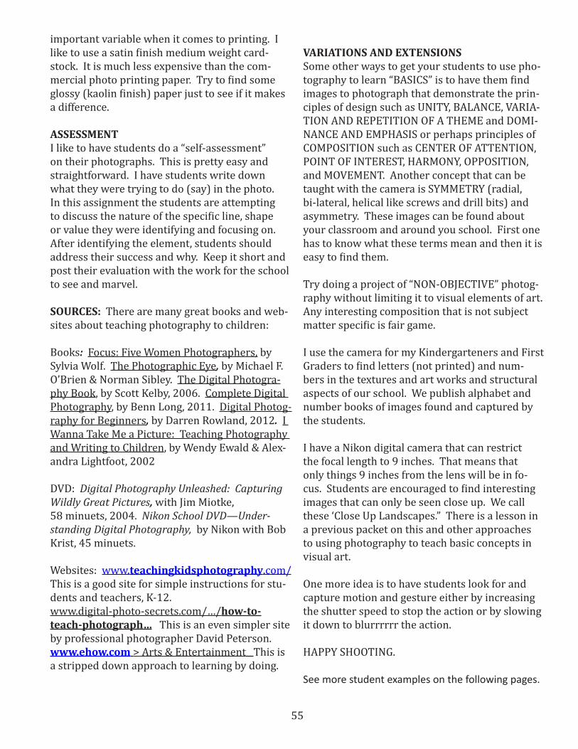
The Angel Moroni by Ronnie 4th grade “I know I wasn’t sup-posed to take pictures of an object just the element of value but here it is in the middle of my picture. Angel Moroni flying in the sky blowing his horn. Mr. Germaine says that we all end up seeing what we want to see any way. And there are all the cloud values. I had to see it in black and white before I could really see all of the lights and darks. It is good.”
Primary Colors by Jacob, 5th grade. “If you want to see color here it is. This is just red and yellow and blue. I like it because everybody asks what it is. I say. “Colors!” It’s like a joke.”
58
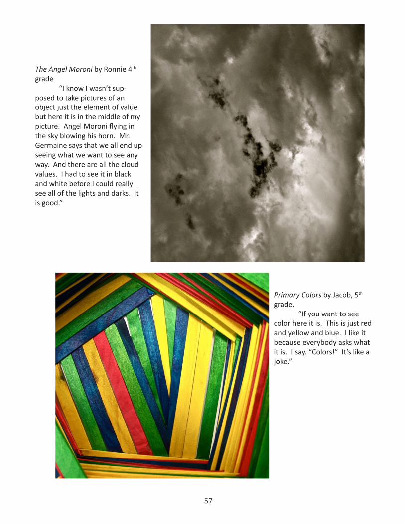
Some Lights, Some Darks, Some In Between, by Shane 3rd grade “I counted how many values in my picture. It is more than 21. I got mixed up and had to stop. This is a real good idea of values and it is a real interesting picture and nobody gets that it is just values and shapes and some textures and some other stuff.”
Some Good Colors, by Emma, 5th grade. “It is not so easy to find color that you can’t tell what it is. Every-thing with color is something else too. I had to crop the picture so you could just see color. I also used the satura-tion to make the color brighter. I like how it turned out when it got printed.”
CHECK THIS OUT IN THE COLOR COPY OF THE PACKET ON THE CD
Smooth & Lumpy, by Sophia 1st grade “This is not leaves. It is just lumpy and smooth. That is texture. I think I like it.”
59
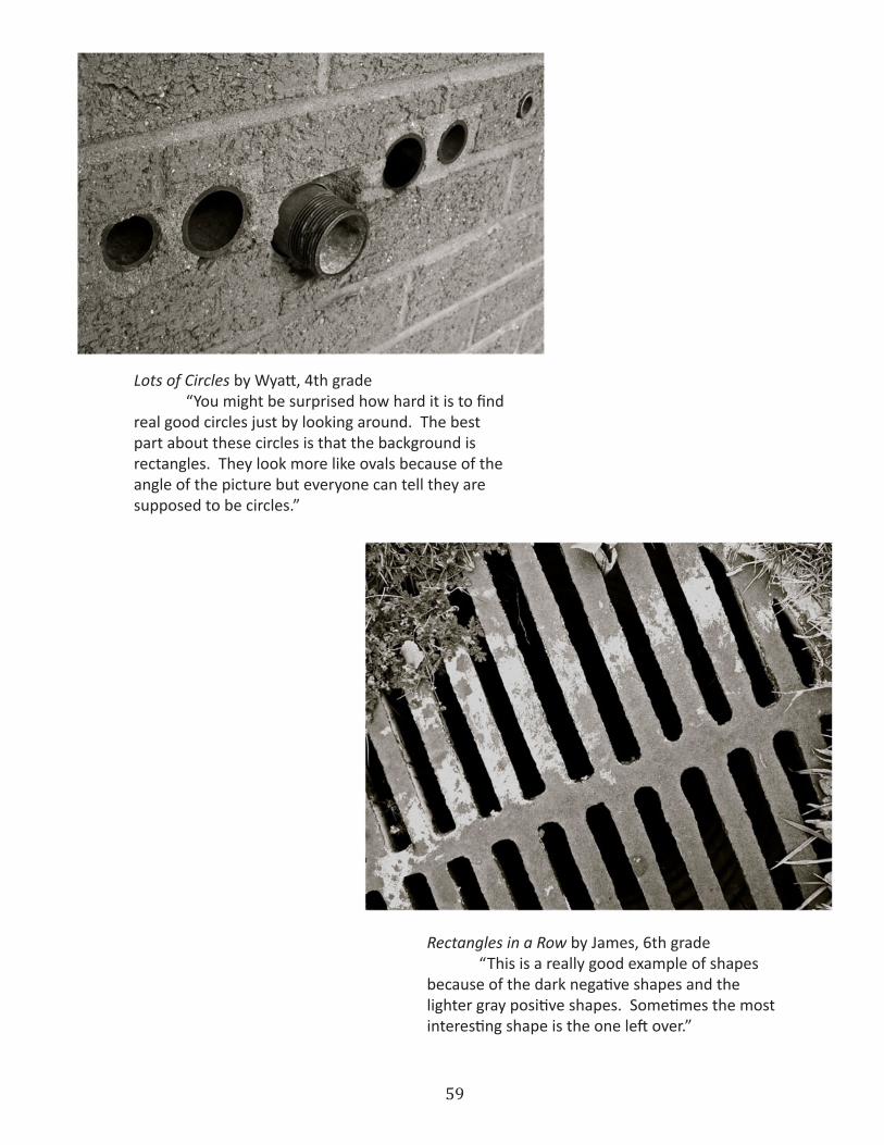
Lots of Circles by Wyatt, 4th grade “You might be surprised how hard it is to find real good circles just by looking around. The best part about these circles is that the background is rectangles. They look more like ovals because of the angle of the picture but everyone can tell they are supposed to be circles.”
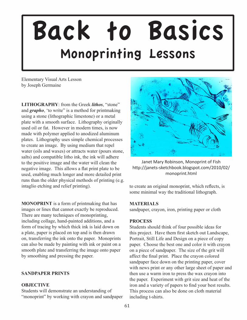
Rectangles in a Row by James, 6th grade “This is a really good example of shapes because of the dark negative shapes and the lighter gray positive shapes. Sometimes the most interesting shape is the one left over.”

60
61
Back to BasicsMonoprinting Lessons
Elementary Visual Arts Lessonby Joseph Germaine
LITHOGRAPHY: from the Greek lithos, “stone” and grapho, ‘to write” is a method for printmaking using a stone (lithographic limestone) or a metal plate with a smooth surface . Lithography originally used oil or fat . However in modern times, is now made with polymer applied to anodized aluminum plates . Lithography uses simple chemical processes to create an image . By using medium that repel water (oils and waxes) or attracts water (pours stone, salts) and compatible litho ink, the ink will adhere to the positive image and the water will clean the negative image. This allows a flat print plate to be used, enabling much longer and more detailed print runs than the older physical methods of printing (e .g . intaglio etching and relief printing) .
MONOPRINT is a form of printmaking that has images or lines that cannot exactly be reproduced . There are many techniques of monoprinting, including collage, hand-painted additions, and a form of tracing by which thick ink is laid down on a plate, paper is placed on top and is then drawn on, transferring the ink onto the paper . Monoprints can also be made by painting with ink or paint on a smooth plate and transferring the image onto paper by smoothing and pressing the paper .
SANDPAPER PRINTS
OBJECTIVE Students will demonstrate an understanding of “monoprint” by working with crayon and sandpaper
to create an original monoprint, which reflects, is some minimal way the traditional lithograph .
MATERIALS sandpaper, crayon, iron, printing paper or cloth
PROCESS Students should think of four possible ideas for this project. Have them first sketch out Landscape, Portrait, Still Life and Design on a piece of copy paper . Choose the best one and color it with crayon on a piece of sandpaper . The size of the grit will affect the final print. Place the crayon colored sandpaper face down on the printing paper, cover with news print or any other large sheet of paper and then use a warm iron to press the wax crayon into the paper . Experiment with grit size and heat of the iron and a variety of papers to find your best results. This process can also be done on cloth material including t-shirts .
Janet Mary Robinson, Monoprint of Fishhttp://janets-sketchbook.blogspot.com/2010/02/
monoprint.html
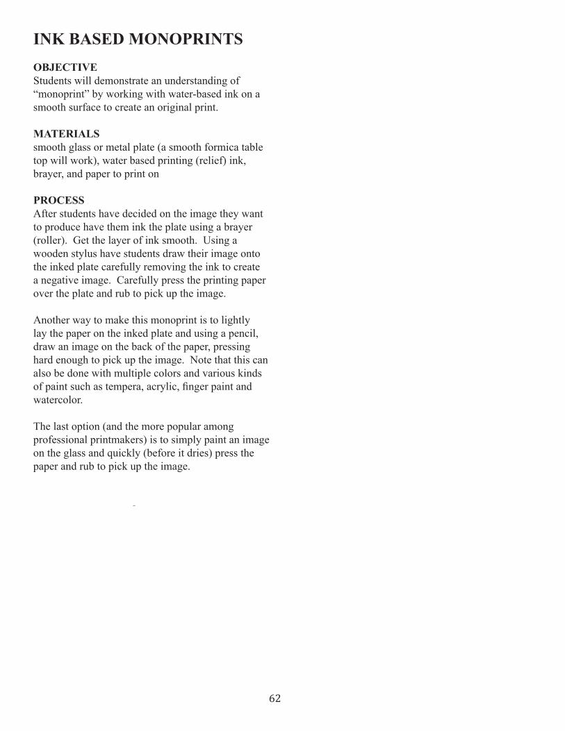
62
INK BASED MONOPRINTSOBJECTIVE Students will demonstrate an understanding of “monoprint” by working with water-based ink on a smooth surface to create an original print .
MATERIALS smooth glass or metal plate (a smooth formica table top will work), water based printing (relief) ink, brayer, and paper to print on
PROCESS After students have decided on the image they want to produce have them ink the plate using a brayer (roller) . Get the layer of ink smooth . Using a wooden stylus have students draw their image onto the inked plate carefully removing the ink to create a negative image . Carefully press the printing paper over the plate and rub to pick up the image .
Another way to make this monoprint is to lightly lay the paper on the inked plate and using a pencil, draw an image on the back of the paper, pressing hard enough to pick up the image . Note that this can also be done with multiple colors and various kinds of paint such as tempera, acrylic, finger paint and watercolor .
The last option (and the more popular among professional printmakers) is to simply paint an image on the glass and quickly (before it dries) press the paper and rub to pick up the image .

63
Back to BasicsAboriginal Dreamtime Glue Prints
Elementary Visual Art & Social Studies Lessonby Joseph Germaine
OBJECTIVE Students will demonstrate an understanding of the Australian Aboriginal artwork relating to “Dream Time” by creating a collagraphic glue print based on the “Dream Time Maps” of the Aboriginal culture. This same printmaking technique can be used for lessons related to other cultures or for designs that are purely student generated.
UTAH STATE CORE Making, Expressing, Contextualizing
MATERIALS Matt board, white glue in squeeze bottles, printing paper, crayons, (optional; relief printing ink). A few images of Aboriginal art are included on the CD.
PROCESS In Australian Aboriginal mythology, The Dreaming or Altjeringa (also called the Dreamtime) is a sacred “once upon a time” in which ancestral Totemic Sprit Beings formed The Creation. Aboriginals believe in two forms of time; two parallel streams of activity. One is the daily objective activity. The other is an infinite spiritual cycle called the “dreamtime,” more real than reality itself. Whatever happens in the dreamtime establishes the values, symbols, and laws of Aboriginal society. It was believed that some people of unusual spiritual powers had contact with the dreamtime and could bring it into daily life through the medium of visual art. Much of the rock painting, drawing and
painting on bark, body painting, and stone and wood carving are seen as “dreamtime” maps or instructions from what we might call, “the other side.” We are not expecting students to buy into the cosmology but by understanding Aboriginal thinking, a little bit, and seeing the traditional images and the contemporary art work based on these ideas, they will be able to generate their own ideas using these motifs. . After students have learned about Australian Aboriginal Art, have them draw a dream map using the dots and swirls common to this art form. The “dream” represented in the artwork does not have to be a real dream. An interesting story can serve as inspiration for the idea expressed in the artwork. Let students use their imagination. It will help to encourage students to discuss their dream maps with each other, answering questions and accepting suggestions.
Aboriginal Art with Two Goannashttp://tiptopwebsite.com/websites/index2.php?use
rname=teacherinprague&page=16
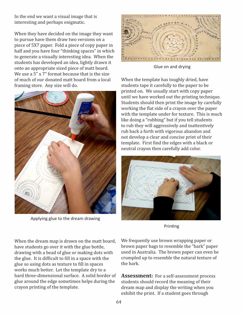
64
In the end we want a visual image that is interesting and perhaps enigmatic.
When they have decided on the image they want to pursue have them draw two versions on a piece of 5X7 paper. Fold a piece of copy paper in half and you have four “thinking spaces” in which to generate a visually interesting idea. When the students has developed an idea, lightly drawn it onto an appropriate sized piece of matt board. We use a 5” x 7” format because that is the size of much of our donated matt board from a local framing store. Any size will do.
When the template has toughly dried, have students tape it carefully to the paper to be printed on. We usually start with copy paper until we have worked out the printing technique. Students should then print the image by carefully working the flat side of a crayon over the paper with the template under for texture. This is much like doing a “rubbing” but if you tell students to rub they will aggressively and inattentively rub back a forth with vigorous abandon and not develop a clear and concise print of their template. First find the edges with a black or neutral crayon then carefully add color.
We frequently use brown wrapping paper or brown paper bags to resemble the “bark” paper used in Australia. The brown paper can even be crumpled up to resemble the natural texture of the bark.
Assessment: For a self-assessment process students should record the meaning of their dream map and display the writing when you exhibit the print. If a student goes through
Applying glue to the dream drawing
When the dream map is drawn on the matt board, have students go over it with the glue bottle, drawing with a bead of glue or making dots with the glue. It is difficult to fill in a space with the glue so using dots as texture to fill in spaces works much better. Let the template dry to a hard three-dimensional surface. A solid border of glue around the edge sometimes helps during the crayon printing of the template.
Glue on and drying
Printing

65
this extended process and writes a reasonable statement give them an A regardless of quality. Success breeds success.
The Hand by Michelle, 2nd grade
A finished “Dream Print”
End of the Rainbow by Braxton, 2nd grade

66
SOURCES Books: The Dreaming Universe: a mind-expanding journey into the realm where psyche and physics meet, by Fred Alan Wolf; Australian Dreaming: 40,000 Years of Aboriginal History, compiled by Jennifer Isaacs; White Man Got No Dreaming: Essays 1938-1973, by Bill Stanner; Klassic Koalas: Ancient Aboriginal Tales in New Retellings, by Lee Barwood and Joanne Ehrich (this one is good for children and has some excellent illustrations); The Beginner’s Guide to Aboriginal Art: The Symbols, The Meanings and Some Dreamtime Stories, by R. Lewis; Uluru: Australia’s Aboriginal Heart, by Caroline Arnold (for children).
AUDIO CD: Jinna Jinna: Australian Aboriginal Dreamtime Stories, by David Hudson.
DVD: Aboriginal Art: Past, Present, and Future, by Crystal Video Aboriginal Art: How to create it, by Peggy Flores, Crystal DVD
VARIATIONS The dreamtime image can be done by painting and drawing rather than by the printmaking process. Marker pens do a very good job on the complex dot pattern common to “dreamtime” art. Homemade paper can be made for this project to give a more rustic, bark-like look. Look up simple instructions at www.pioneerthinking.com for simple 10-step recipe for recycled school paper.
Another variation is to use printing ink to roll the image onto the paper rather than using crayons. This is a lot messier and much more difficult to execute, but give it a try. It will look good.
EXTENSION Another project relating to the dreamtime work is known as x-ray painting. This is a style of rock and bark paint that shows familiar Australian animals in a highly stylized decorative format that apparently shows the inside of the animal including the bones and has a look similar to an x-ray image. Students can achieve similar effect by using transparent watercolor
washed over black ballpoint pen drawing on good watercolor paper. Look up X-ray style rock art at www.metumseum.org/toah/hd/xray/hd_xray.htm an adequate shot history and description and excellent downloadable images. Try www.enchantedleraning.com/artists/xraystyle/ for simple instructions for an art lesson and some schematic examples of x-ray animals.
Older students can use either the glue technique or can cut into a printing surface such as styrofoam, lino blocks, or any of the other printing media sold by art supply companies.
An example of a more advanced student’s work

67
Back to BasicsThe Shirt Off Your Back
Elementary Visual Arts Lessonby Joseph Germaine
OBJECTIVE Students will demonstrate an understanding of stencil and printmaking by designing and cutting a cardstock stencil and then applying the design to a t-shirt.
MATERIALS Cardstock, Exacto knife, fabric ink or acrylic paint, stencil brush
PROCESS Show students some designs on t-shirts. Actually, they will have commercial designs on their own school shirts. Look at them and see if you can figure out how the shirts were printed. In American culture the printed t-shirt is huge and significant. It is also shallow and trivial, so be careful. It is usually a good idea to limit the parameters of a project in order to concentrate thinking. We have done this project in the past by focusing on Henri Matisse’s paper cuts or Joan Miro, or Paul Klee design motifs, landscapes, monograms, Andy Warhol (Pop Art) and traditional cultural designs such as Polynesian Tattoo designs, Celtic knots, Mexican and Native American pottery designs, African wood carving motifs and so on. By focusing on a specific genre of design, the students have a better chance to organize their thinking and come up with a usable personal idea. One of the hardest things for a young elementary student to do in art is “anything.” For many young students, “anything” means “nothing.”
http://www.socalevents.com/magazine/105-polynesian-tattoos-by-manea-dancers.html
Obviously, there are many ways to get designs and artwork onto t-shirts, but in this project we are focusing on the use of stencil as foundation for silkscreen serigraphic printmaking. The restrictions of stencil work and the sequential thinking necessary to pull off a successful stencil project need to be addressed. Remember that it is all right to use multiple stencils to achieve the desired look. Use some serigraphic images to explain how the artist must decide what order and color will work with this technique. Believe it or not, very young students will get it with just

68
a little bit of help. Here is the secret to success with this project: YOU MUST DO IT YOURSELF BEFORE YOU TRY TO TELL YOUR STUDENTS HOW TO DO IT! Art is not a theory—art is an application. As you do this project on your own you will discover all the technical and strategic processes you need to know to express yourself successfully and the “how to” instructions for your students.
Have students sketch several ideas for their shirt so they can choose the BEST one. When they have focused on the idea they want to make, give them some cardstock to draw on and then cut to make their first stencil. It is o.k. to start with a single stencil project but it is somewhat limiting. Most teachers are nervous about children with exacto knives. Here is a strategy to use the knife safely. First don’t have everyone in the class cutting with knives at the same time. I only have 5 out at a time. Next secure the cardstock to a masonite cutting board then secure the cutting board to the table with masking tape in a comfortable position to do the cutting without moving the board. Use sharp exacto knives. Dull knives cut the user because you have to use so much pressure to make it work. Have students keep one hand under the table while cutting. You should monitor the students carefully because they will naturally want to have their other hand out and above the work they are doing. After a few cautions the students will get used to only using one hand. I
have been using this technique for 25 years and the only student who ever got injured was a 24 year old student teacher who wanted to see if the blade was sharp by stroking it with his thumb. It was!
After the stencils are cut it is time to print. There is a variety of fabric inks and paints including embroidery pens, fabric paint, acrylic paint and tempera or craft paint. I use acrylic paint. Make sure you are using a stencil brush. You can make a good stencil brush by carefully cutting the bristles down on a number 12 watercolor brush or by buying a stencil brush. They come is several sizes. Have students mix colors to get their own rather than letting the paint company decide what color their artwork will be. Use a spray adhesive to secure the cardstock stencil to the fabric. Dab the stencil brush, do not stroke. Try to get smooth and even application of the paint. To get even edges make sure you are not pushing the bristles of the brush under the edge of the stencil. Let one stencil dry before you apply another stencil with another color. Point out that using opaque dark colors under translucent light colors doesn’t work.
RELATED PROJECTS Stencil printing on other clothing than T-Shirt such as pants, coats, sweaters, aprons, hats, jump suits, cover alls, belts, vests and socks. Don’t forget that there is negative stencil available for printing also. You can use other medium such as marker pens, ballpoint pen, paint and add-ons like sequins, patches, beads and other bobbles. Iron on Photo Transfers. Use of embroidery pens or try needle and thread “Embroidery.” A tessellation pattern done with a cardstock template is a natural for stencil making and T-shirt printing.
BIBLIOGRAPHY “Generation T: 108 Ways To Transform a T-Shirt”, by Megan Nicolay. “T-Shirt: One Small Item, One Giant Impact-The History of T-Shirts”, by Troth Wells. “The T-Shirt Book”, by Scott Fresener, Earl Smith and Nancy Hall. “T-Shirts”, by Susan Miller. “Vintage T-Shirts: 500 Authentic Tees From the 70’s and 80’s”, by Lisa
Bowl, 11th–13th centuries. Pueblo Alto, Chaco Canyon, New Mexico, USA
Public domain, http://en.wikipedia.org/wiki/File:Bowl_Chaco_Culture_NM_USA.jpg

69
Kidner. “Vintage Rock T-Shirts”, by Johan Kugelberg and Seth Wekser. “How To Print T-Shirts For Fun and Profit”, (screen printing-heat transfers and ink jet-to-garment process), by Pat & Scott Fresener. “The T-Shirt Printers Bible”, (T-shirt artwork simplified for Adobe Photoshop & Illustrator users), by Dane Clement (book and DVD). “2,2 86 Stencil Designs”, by H. Roessing. “Custom Stencil F/X”, by Craig Fraser. “Screen Printing”, by Millionaire Guidance (DVD).
The stencil, Sarah, 2nd grade
The Lion shirt
The process
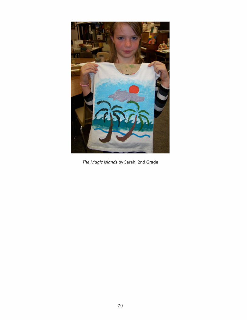
70
The Magic Islands by Sarah, 2nd Grade

71
Back to BasicsPlexiglass Etching
Elementary Visual Arts Lessonby Joseph Germaine
Etching shares some aspects of linocut, in that you cut into a medium to form your image. What is different, however, is that in etching, the part you carve is the inked part or the positive part of the final image, but in linocut or woodcut, the part you carve away is the white or negative part of the image. In drypoint etching we don’t use acid baths as in intaglio we just scratch the image into the metal plate or in this case, the plastic Plexiglas plate.
OBJECTIVE Students will demonstrate an understanding of the printmaking technique of ETCHING by creating an original “dry point” etching on Plexiglas.
MATERIALS small Plexiglas sheets, etching stylus (this could be a dissecting needle, a ceramic needle tool, a nail), water based etching ink, rubber gloves, aprons, paper towels or cleaning rags (tarlatan) and paper to print on.
PROCESS Students will first develop an idea for their print. Have students do some thumbnail sketches to crystallize their thinking on paper before they try it on the clear Plexiglas. To help students organize their thinking have them develop ideas in landscape, portrait, still life, design, monogram, Native American rock art, tapa cloth patterns and mandalas. If this project is to be done in a specific motif ,have students do several ideas so they can choose their “best.”
After sketching the desired idea, tape it to the underside of the Plexiglas and use the metal stylus to ‘scratch’ the image into the plastic. Remember to use pen and ink style cross hatching and textural devises to create a variety of textures and values. When the image is etched onto the plate it is time to ink. Using a water-based printers ink apply it the plate by rubbing it thoroughly with a tarlatan (or cheese cloth) into the etched scratches. When all of the scratched lines are well inked, wipe the surface of the
An intaglio etching by Jenni Jenkins Christensen, Morning Glory (1980)
SMA
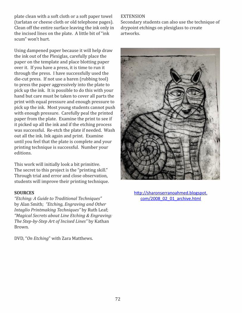
72
plate clean with a soft cloth or a soft paper towel (tarlatan or cheese cloth or old telephone pages). Clean off the entire surface leaving the ink only in the incised lines on the plate. A little bit of “ink scum” won’t hurt.
Using dampened paper because it will help draw the ink out of the Plexiglas, carefully place the paper on the template and place blotting paper over it. If you have a press, it is time to run it through the press. I have successfully used the die-cut press. If not use a baren (rubbing tool) to press the paper aggressively into the plate to pick up the ink. It is possible to do this with your hand but care must be taken to cover all parts the print with equal pressure and enough pressure to pick up the ink. Most young students cannot push with enough pressure. Carefully peal the printed paper from the plate. Examine the print to see if it picked up all the ink and if the etching process was successful. Re-etch the plate if needed. Wash out all the ink. Ink again and print. Examine until you feel that the plate is complete and your printing technique is successful. Number your editions.
This work will initially look a bit primitive. The secret to this project is the “printing skill.” Through trial and error and close observation, students will improve their printing technique.
SOURCES “Etching: A Guide to Traditional Techniques” by Alan Smith; “Etching, Engraving and Other Intaglio Printmaking Techniques” by Ruth Leaf; “Magical Secrets about Line Etching & Engraving: The Step-by-Step Art of Incised Lines” by Kathan Brown.
DVD, “On Etching” with Zara Matthews.
http://sharonserranoahmed.blogspot.com/2008_02_01_archive.html
EXTENSIONSecondary students can also use the technique of drypoint etchings on plexiglass to create artworks.

73
PLEXIGLAS ETCHING PRINTING PROCESS
second print-looser print re-inking (more loosely)first print-artists proof
peeling the printed papercovering the paper and plate with blotterthe inked template
ink on the templateinking the template
the finished template scratching onto platethe drawing

74
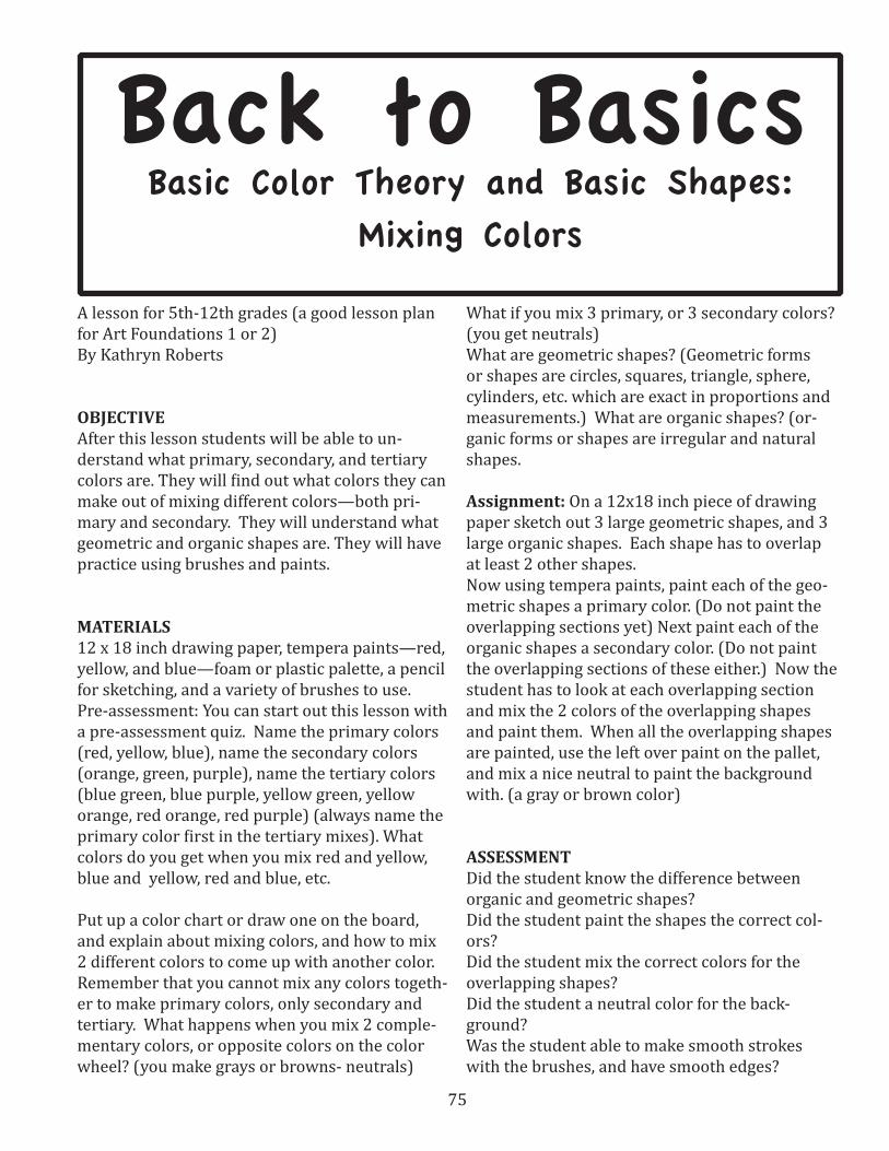
75
A lesson for 5th-12th grades (a good lesson plan for Art Foundations 1 or 2) By Kathryn Roberts
OBJECTIVEAfter this lesson students will be able to un-derstand what primary, secondary, and tertiary colors are. They will find out what colors they can make out of mixing different colors—both pri-mary and secondary. They will understand what geometric and organic shapes are. They will have practice using brushes and paints.
MATERIALS12 x 18 inch drawing paper, tempera paints—red, yellow, and blue—foam or plastic palette, a pencil for sketching, and a variety of brushes to use. Pre-assessment: You can start out this lesson with a pre-assessment quiz. Name the primary colors (red, yellow, blue), name the secondary colors (orange, green, purple), name the tertiary colors (blue green, blue purple, yellow green, yellow orange, red orange, red purple) (always name the primary color first in the tertiary mixes). What colors do you get when you mix red and yellow, blue and yellow, red and blue, etc.
Put up a color chart or draw one on the board, and explain about mixing colors, and how to mix 2 different colors to come up with another color. Remember that you cannot mix any colors togeth-er to make primary colors, only secondary and tertiary. What happens when you mix 2 comple-mentary colors, or opposite colors on the color wheel? (you make grays or browns- neutrals)
What if you mix 3 primary, or 3 secondary colors? (you get neutrals)What are geometric shapes? (Geometric forms or shapes are circles, squares, triangle, sphere, cylinders, etc. which are exact in proportions and measurements.) What are organic shapes? (or-ganic forms or shapes are irregular and natural shapes.
Assignment: On a 12x18 inch piece of drawing paper sketch out 3 large geometric shapes, and 3 large organic shapes. Each shape has to overlap at least 2 other shapes. Now using tempera paints, paint each of the geo-metric shapes a primary color. (Do not paint the overlapping sections yet) Next paint each of the organic shapes a secondary color. (Do not paint the overlapping sections of these either.) Now the student has to look at each overlapping section and mix the 2 colors of the overlapping shapes and paint them. When all the overlapping shapes are painted, use the left over paint on the pallet, and mix a nice neutral to paint the background with. (a gray or brown color)
ASSESSMENTDid the student know the difference between organic and geometric shapes? Did the student paint the shapes the correct col-ors? Did the student mix the correct colors for the overlapping shapes?Did the student a neutral color for the back-ground?Was the student able to make smooth strokes with the brushes, and have smooth edges?
Back to Basics Basic Color Theory and Basic Shapes:
Mixing Colors
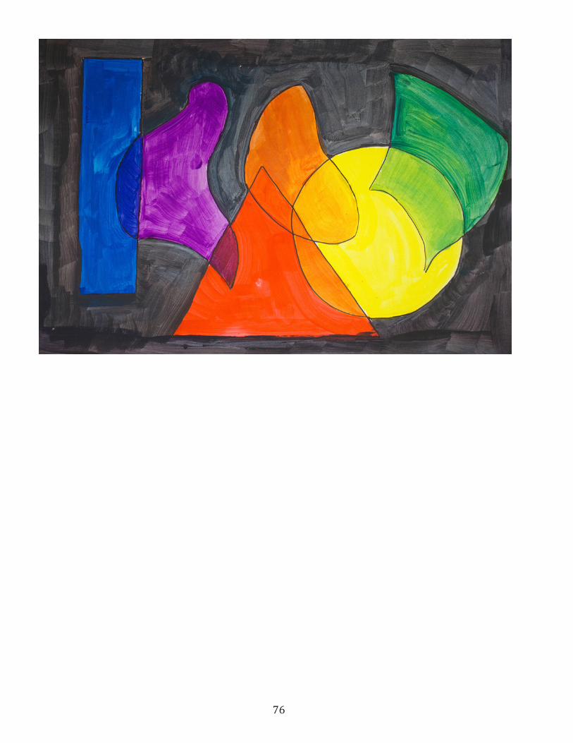
76

77
Back to BasicsRecipe for a Watercolor
Landscape
Elementary Visual Arts LessonBy Louise & Robert NickelsonTechniques and Instruction by Diane Asay
OBJECTIVESStudents will be able to identify landscape paintings and describe what makes a landscapeStudents will be able to identify and use indicators of space such as overlapping, placement in the picture plane, and detailStudents will be able to produce a variety of effects using watercolorStudents will demonstrate their skills in landscape and watercolor by producing a watercolor landscape
UTAH STATE CORE OBJECTIVES Standard 1 (Making): Students will assemble and create works of art by experiencing a variety of art media and by learning the art elements and principles .Standard 2 (Perceiving): Students will find meaning by analyzing, criticizing, and evaluating works of art . Standard 3 (Expressing): Students will create meaning in art
MATERIALS Images of watercolor landscapes from the CD:H . Frances Sellers, Upper Provo River Robert L . Marshall, Snow CanyonJohn Hafen, Mountain Brook Robert Lorenzo Shepherd, Cape Royal, North Rim Grand CanyonJerry Woodrow Fuhriman, Landscape Panorama
Conan E . Mathews, Capitol Reef II (see above)Henry L . A . Culmer, Approaching Salt Lake from City Creek CanyonAlma Brockerman Wright, Bend in the JordanWatercolorsPaintbrushesWater containersFoam plates for palettesPaper towels or ragsHeavyweight paper—1-2 strips and 1 sheet per studentCopy paperPencils
Note to teacher: It’s fine to be a beginning painter, just like your students; but it will be easier if
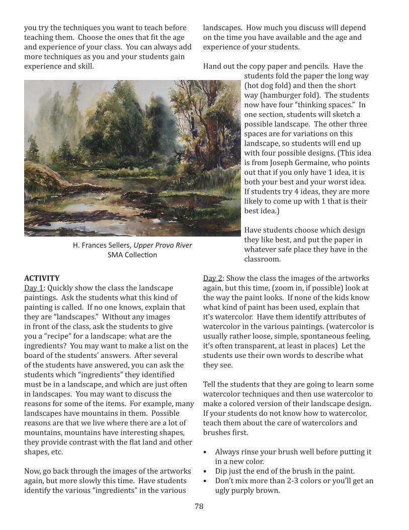
78
you try the techniques you want to teach before teaching them. Choose the ones that fit the age and experience of your class. You can always add more techniques as you and your students gain experience and skill.
ACTIVITY Day 1: Quickly show the class the landscape paintings. Ask the students what this kind of painting is called. If no one knows, explain that they are “landscapes.” Without any images in front of the class, ask the students to give you a “recipe” for a landscape: what are the ingredients? You may want to make a list on the board of the students’ answers. After several of the students have answered, you can ask the students which “ingredients” they identified must be in a landscape, and which are just often in landscapes. You may want to discuss the reasons for some of the items. For example, many landscapes have mountains in them. Possible reasons are that we live where there are a lot of mountains, mountains have interesting shapes, they provide contrast with the flat land and other shapes, etc.
Now, go back through the images of the artworks again, but more slowly this time. Have students identify the various “ingredients” in the various
landscapes. How much you discuss will depend on the time you have available and the age and experience of your students.
Hand out the copy paper and pencils. Have the students fold the paper the long way (hot dog fold) and then the short way (hamburger fold). The students now have four “thinking spaces.” In one section, students will sketch a possible landscape. The other three spaces are for variations on this landscape, so students will end up with four possible designs. (This idea is from Joseph Germaine, who points out that if you only have 1 idea, it is both your best and your worst idea. If students try 4 ideas, they are more likely to come up with 1 that is their best idea.)
Have students choose which design they like best, and put the paper in whatever safe place they have in the classroom.
Day 2: Show the class the images of the artworks again, but this time, (zoom in, if possible) look at the way the paint looks. If none of the kids know what kind of paint has been used, explain that it’s watercolor. Have them identify attributes of watercolor in the various paintings. (watercolor is usually rather loose, simple, spontaneous feeling, it’s often transparent, at least in places) Let the students use their own words to describe what they see.
Tell the students that they are going to learn some watercolor techniques and then use watercolor to make a colored version of their landscape design. If your students do not know how to watercolor, teach them about the care of watercolors and brushes first.
• Always rinse your brush well before putting it in a new color.
• Dip just the end of the brush in the paint.• Don’t mix more than 2-3 colors or you’ll get an
ugly purply brown.
H. Frances Sellers, Upper Provo RiverSMA Collection
79
• Keep 1 container of water as clean water and 1 for rinsing brushes.
• Don’t “scrub” with the brush.• Use the rag or paper towel to sop up any extra
water or to wipe brushes on.
You may want to have the students repeat the “rules” back to you or practice them. Demonstrate the first technique for the students. If you have an overhead projector, you can use that. Pass out a strip of paper and have the students mark the paper into 4-8 sections. Then have the students try the technique on one section of a strip of paper, for example, have them do a wash. Repeat the process for the other techniques you have chosen. Then talk briefly to the students about how they might use the techniques they’ve learned. For example, if they learned how to do a graded wash, they can make a wavy line with a bead of paint and then add water, and brush the paint and water down the page, so that they’ve established the form of mountains or hills. As part of teaching the techniques, you will want to show the students that with watercolor, you leave the paper showing to have white, and you go from light to dark since you can’t make a color lighter after it’s dried on the paper.
Day 3: Look at some of the landscapes again, letting the students identify places the artists used the specific techniques the class has learned. Then have the students get their landscape designs and their watercolor technique strips. Pass out the large sheets of paper and the watercolors and have the students do a very light sketch of their design on the paper, filling the whole page. Or, have students use a straight edge to create a border and fill the space within the border with their design. Then pass out the watercolors, brushes, and water containers and let the students create their watercolor landscape.
Students should title their watercolors, and if they can write, have them indicate their landscape recipe: what items they included in their landscape and why and what watercolor techniques they used and why. Display the watercolors with the student statements.
ASSESSMENTStudents should turn in their original sketches, their watercolor technique strips, the finished watercolors, and their statements. Give the students credit for completing the assignment.Older students can be evaluated for completion and for the quality of the work using a number or smiley face: 3 or smiley face = quality work, 2 or a straight face = okay work, 1 or a frowny face = quality needs work.
ADAPTATIONEven very young children can learn the basics of watercolor. They can start by learning to use brushes and watercolors appropriately. They can start with a non-objective design and just have fun with the paint. As they progress in their drawing skills, have them make simple drawings that relate to a holiday theme, to something you have read about or learned in science, and then have them paint the drawing.
VARIATION Give students an anticipatory set/motivation that relates to some other area of your curriculum. For example, if you have been studying a particular kind of animal, you could have the students imagine a scene that would contain the animal. Possible ideas could be a place, a time period, something sparked by a book you are reading as a class, land forms, etc.
EXTENSIONTeach your class additional watercolor techniques and have students use all the techniques they know to create an imaginary scene of their own design. Have students write a short story that could take place in their watercolor scene. Display the watercolors with the stories in the media center, in your reading center, or any place the students can read each other’s stories and enjoy the artwork that inspired the stories.
SOURCESSee the following pages for watercolor tips, hints, specific techniques, and vocabulary. They were created by Diane Asay.
80
Watercolor
Vocabulary:
1. Transparent: thin, clear paint which permits the under surface to show through
2. Opaque: thick or chalky paint which will not allow the under surface show through. Also called gouache.
3. Stain: pigments that penetrate the fibers of the support and cannot be removed without leaving a trace of color
4. Tinting: pigments that overpower other pigments when mixed together. Also called saturation.
5. Sedimentary: pigments which tend to settle on the support and are usually granular
6. Spreading: pigments which tend to “blos-som: or spread when placed on a wet surface
7. Glaze: a thin wash of transparent paint which is placed on top of another dried layer of paint
8. Wash: when pigment is brushed unto a sur-face
A. Flat: an area of color that does not vary in hue or value
B. Graded: an area of color which does not vary in hue but does in value
C. Variegated: an area of color which will vary in hue and may vary in value
9. Wet-on-wet: wet pigment that is placed on a wet support
10. Wet-on-dry: wet pigment that is placed on a dry support
11. Dry brush: paint that is mostly pigment and very little water and is usually placed on a dry support
12. Resist: any substance that will not permit the pigment to penetrate the surface. Can include wax, rubber cement, masking fluid, masking tape, or crayon
13. Support: the painting or drawing surface14. Pigment: ground color matter, usually mixed
with water soluble binders15. Temperature bias: colors that are either
cool or warm. Note: can have warm blues and cool reds and yellows.
Watercolor
Hints and guidelines:
Getting started: Gather all your supplies (see list following). Stretch paper onto a rigid surface and pre-wet pigments. Plan ahead as watercolors do not erase. For under drawings use a Col-erase (Sanford) colored pencil.
Painting: Paint from light to dark and beware colors dry lighter. Keep colors moist to activate the pigment. Use as large a brush as possible to avoid getting too detailed. Avoid over mixing colors as this tends to create a milky film. Also generally mixing more than 3 colors will create “muddy” colors. Use glazes to provide rich, dark colors and to lighten add water or lift off with a damp brush or tissue. To make hot-pressed paper work more like cold-pressed paper use clear wa-ter on areas to be painted later. Have two water supplies – one for dirty brushes and one clean. Mount paper on rigid support to allow moving the work around.
Clean-up: Rinse brushes, squeeze out excess moisture and store with the bristles up. Use mild hand soap if brushes are stained from pigments. Soap can be left in the brushes to help reshape brushes.
Mounting and framing: preserve watercolors under mats and glass. To display without glass use Golden Archival MSA spray varnish. Apply 7 coats, 4 hours apart. The first two coats use gloss finish than matte.
Problems:
Colors are overworked or muddy. Colors are weak and do not display wide value range.Work displays few contrasts and lacks variety of techniques and applications (i.e., loose/tight, detailed/blurred).No center of interest, too uniform

81
Watercolor
Characteristics:
You should learn the ways various pigments behave because you will have many more options when you know your pigments. Systematic test-ing of the pigments reveals their mixing abilities, transparency or opacity, staining qualities, tinting strengths, and glazing possibilities. These behav-iors or characteristics may change from brand to brand and so it is important to experiment.
Washes: Load a flat brush with pigment and with the paper slightly tilted drag the brush across the top portion of the paper. As the pigment flows to the bottom of the stroke overlap the “bead” of paint with the next stroke. Continue to load the brush with pigment and overlap strokes until the entire surface is covered. Wipe up excess paint at the bottom with a paper towel.
1. Flat – area of color that does not vary in hue or value. Use the same color and try to make the entire section of uniform color and value.
2. Graded – area of color that does not vary in hue but does in value. After the first stroke of the color gradually add more water until the final stroke is plain water.
3. Variegated – area of color that changes hue and may vary in value. Begin the wash with one color and then without rinsing the first color out the brush start adding the second color overlapping the previous stroke. The final stroke should be the second color only.
Color mixing: Choose two colors and experiment with the following methods of mixing colors:
4. Mixed on palette – thoroughly mix colors and place mixture on palette. Notice how often over mixing colors cause them to become chalky and muddy when dry.
5. Mixed on brush – dip side of brush into a color and the other side into another color and gen-tly brush this mixture onto the paper
6. Mixed on the paper – pre-wet a section and
then lightly drop the two colors into the sec-tion. Move the paper around to mix the color.
Transparent and Opaque:
7. Transparent – pick a color and dilute it with water enough to create a transparent layer of color. You should be able to see the whiteness of the paper through the color layer.
8. Opacity – pick a color and use a lot of pig-ment and very little water and paint a section. You should not be able to see the white of the paper.
9. On the back of your paper paint a strip of each color. When paint is dry paint other strips of color in the opposite direction. Compare where the colors intersect to determine which colors are more transparent.
Staining and Tinting:
10. Staining – paint a section and while the paint is still wet try to “lift” out the color by using a clean, damp brush or a piece of tissue.
11. Tinting – pre-wet a section and place a drop of a different color in each corner. Notice the tinting strength of various colors. Also notice how some color push another color aside while some mix together.
Glazes:
12. Paint a section and let it dry thoroughly. Work-ing quickly, apply a transparent layer of paint over the one half of the pre-painted section. Glaze several layers of color over each other. Make sure the layers are dry before applying another color.
WatercolorTechniques:
Although watercolors are generally “unforgiving” they are very versatile. Practice the following techniques to learn of watercolor’s varied abili-ties.
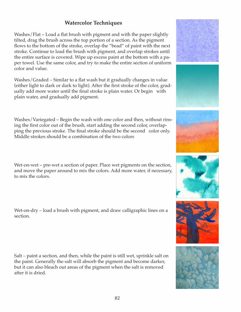
82
Watercolor Techniques
Washes/Flat – Load a flat brush with pigment and with the paper slightly tilted, drag the brush across the top portion of a section. As the pigment flows to the bottom of the stroke, overlap the “bead” of paint with the next stroke. Continue to load the brush with pigment, and overlap strokes until the entire surface is covered. Wipe up excess paint at the bottom with a pa-per towel. Use the same color, and try to make the entire section of uniform color and value.
Washes/Graded – Similar to a flat wash but it gradually changes in value (either light to dark or dark to light). After the first stroke of the color, grad-ually add more water until the final stroke is plain water. Or begin with plain water, and gradually add pigment.
Washes/Variegated – Begin the wash with one color and then, without rins-ing the first color out of the brush, start adding the second color, overlap-ping the previous stroke. The final stroke should be the second color only. Middle strokes should be a combination of the two colors
Wet-on-wet – pre-wet a section of paper. Place wet pigments on the section, and move the paper around to mix the colors. Add more water, if necessary, to mix the colors.
Wet-on-dry – load a brush with pigment, and draw calligraphic lines on a section.
Salt – paint a section, and then, while the paint is still wet, sprinkle salt on the paint. Generally the salt will absorb the pigment and become darker, but it can also bleach out areas of the pigment when the salt is removed after it is dried.
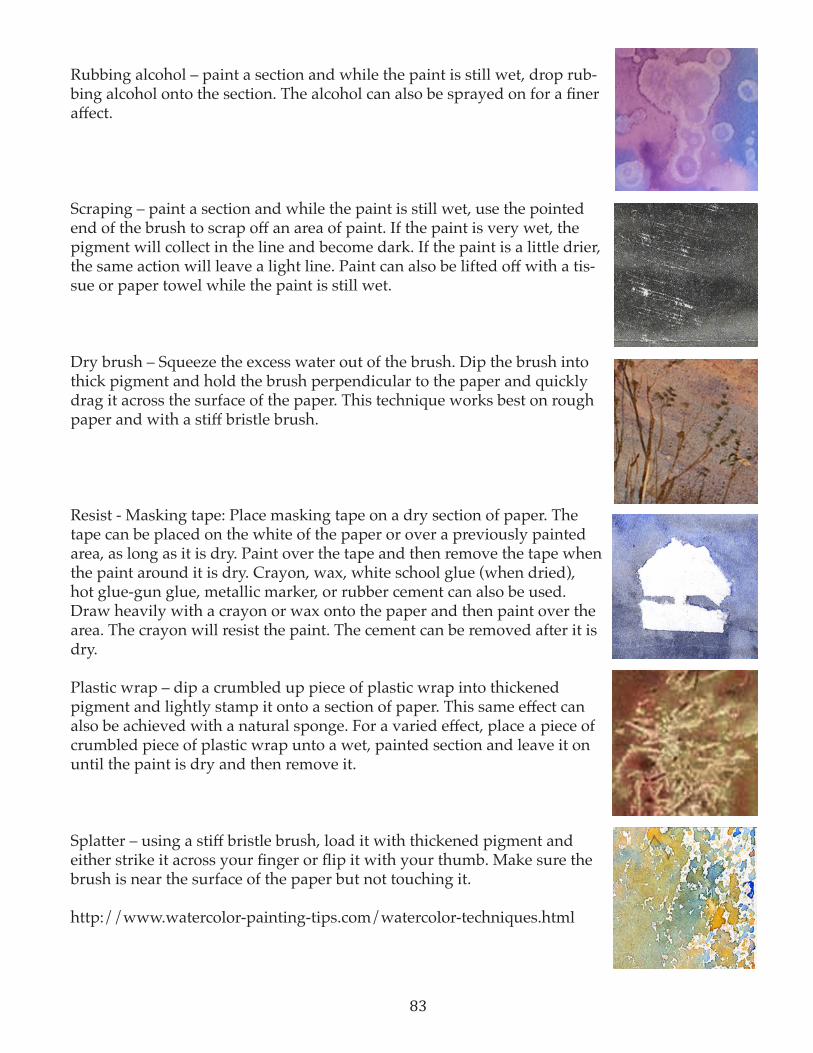
83
Rubbing alcohol – paint a section and while the paint is still wet, drop rub-bing alcohol onto the section. The alcohol can also be sprayed on for a finer affect.
Scraping – paint a section and while the paint is still wet, use the pointed end of the brush to scrap off an area of paint. If the paint is very wet, the pigment will collect in the line and become dark. If the paint is a little drier, the same action will leave a light line. Paint can also be lifted off with a tis-sue or paper towel while the paint is still wet.
Dry brush – Squeeze the excess water out of the brush. Dip the brush into thick pigment and hold the brush perpendicular to the paper and quickly drag it across the surface of the paper. This technique works best on rough paper and with a stiff bristle brush.
Resist - Masking tape: Place masking tape on a dry section of paper. The tape can be placed on the white of the paper or over a previously painted area, as long as it is dry. Paint over the tape and then remove the tape when the paint around it is dry. Crayon, wax, white school glue (when dried), hot glue-gun glue, metallic marker, or rubber cement can also be used. Draw heavily with a crayon or wax onto the paper and then paint over the area. The crayon will resist the paint. The cement can be removed after it is dry.
Plastic wrap – dip a crumbled up piece of plastic wrap into thickened pigment and lightly stamp it onto a section of paper. This same effect can also be achieved with a natural sponge. For a varied effect, place a piece of crumbled piece of plastic wrap unto a wet, painted section and leave it on until the paint is dry and then remove it.
Splatter – using a stiff bristle brush, load it with thickened pigment and either strike it across your finger or flip it with your thumb. Make sure the brush is near the surface of the paper but not touching it.
http://www.watercolor-painting-tips.com/watercolor-techniques.html

84

85
Back to BasicsThrough the Gateway—Mysterious Landscapes (Understanding how to create space and depth)
Upper Elementary—Secondary Visual ArtsLessonBy Elicia Gray
OBJECTIVES Students will examine the artworks of An-dreson, Warren, Colvin, Rasmussen, Moser, and Smith.Students will identify elements of space found in several different postcard images. Students will learn to identify and create overlapping forms, high and low placement, value and shading, variable size, and linear perspective.Students will design and produce a land-scape drawing based on the theme of “Through the Gateway.”Students will compose a written artist’s statement and title for their work.
UTAH STATE COREStandard 1 (Making): Students will assemble and create works of art by experiencing a variety of art media and by learning the art elements and principles.Standard 2 (Perceiving): Students will find meaning by analyzing, criticizing, and evalu-ating works of art. Standard 3 (Expressing): Students will create meaning in artStandard 4 (Contextualizing): Students will find meaning in works of art through settings and other modes of learning.
MATERIALSCarlos J. Andreson, Abstract Landscape of the Great Salt Lake (1966) (SMA); Kimbal Warren,
Angel’s Peak and Deep Lake Wind River, Wyoming (2004) (SMA); Robert Alan Colvin, Castles in the Air (2006) (SMA); Anton Jesse Rasmussen, One Eternal Round (1994) (SMA); John Henri Moser, Orchard in Spring (1926) (SMA); Dennis Von Smith, Keeper of the Gate (1989) (SMA) Space Worksheet, Space Answer Sheet, Mysteri-ous Landscape Assessmentpaper, pencils, postcard images of landscape paintings, oil pastels.
Dennis V. Smith, Keeper of the Gate (1989)SMA
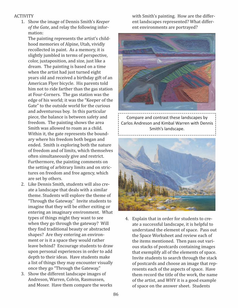
86
ACTIVITY 1. Show the image of Dennis Smith’s Keeper
of the Gate, and relay the following infor-mation: The painting represents the artist’s child-hood memories of Alpine, Utah, vividly recollected in paint. As a memory, it is slightly jumbled in terms of perspective, color, juxtaposition, and size, just like a dream. The painting is based on a time when the artist had just turned eight years old and received a birthday gift of an American Flyer bicycle. His parents told him not to ride farther than the gas station at Four-Corners. The gas station was the edge of his world; it was the “Keeper of the Gate” to the outside world for the curious and adventurous boy. In this particular piece, the balance is between safety and freedom. The painting shows the area Smith was allowed to roam as a child. Within it, the gate represents the bound-ary where his freedom both began and ended. Smith is exploring both the nature of freedom and of limits, which themselves often simultaneously give and restrict. Furthermore, the painting comments on the setting of arbitrary limits and on stric-tures on freedom and free agency, which are set by others.
2. Like Dennis Smith, students will also cre-ate a landscape that deals with a similar theme. Students will explore the theme of “Through the Gateway.” Invite students to imagine that they will be either exiting or entering an imaginary environment. What types of things might they want to see when they go through the gateway? Will they find traditional beauty or abstracted shapes? Are they entering an environ-ment or is it a space they would rather leave behind? Encourage students to draw upon personal experiences in order to add depth to their ideas. Have students make a list of things they may encounter visually once they go “Through the Gateway.”
3. Show the different landscape images of Andreson, Warren, Colvin, Rasmussen, and Moser. Have them compare the works
with Smith’s painting. How are the differ-ent landscapes represented? What differ-ent environments are portrayed?
Compare and contrast these landscapes by Carlos Andreson and Kimbal Warren with Dennis
Smith’s landscape.
4. Explain that in order for students to cre-ate a successful landscape, it is helpful to understand the element of space. Pass out the Space Worksheet and review each of the items mentioned. Then pass out vari-ous stacks of postcards containing images that exemplify all of the elements of space. Invite students to search through the stack of postcards and choose an image that rep-resents each of the aspects of space. Have them record the title of the work, the name of the artist, and WHY it is a good example of space on the answer sheet. Students

87
will also include a simple sketch of the technique they are identifying in the box provided.
5. Give a landscape demonstration using large paper, and show evidence of all aspects of space, including overlapping forms, high and low placement, value and shading, variable size, and linear perspec-tive. Then pass out large paper and have students start drawing their imaginary landscapes. Encourage them to incorpo-rate items from the list they composed during brainstorming.
6. When students have finished their line drawings, invite them to add color with oil pastels. Students can use traditional color, or they may use arbitrary color—assigning random colors to objects. Show students how to blend and overlap colors in order to create a painterly effect.
7. When their paintings are complete, have students create a written artist’s state-ment explaining what they found when they went “Through the Gateway.” Also have students create a title that exempli-fies the environment they produced.
ASSESSMENT The teacher should carefully review the Space Answer Sheet and the Artist’s Statement. Stu-dents will complete the Mysterious Landscape Assessment in order to ensure they have met the project criteria. (Copies of all of these are includ-ed at the end of this lesson)
SOURCEShttp://www.smofa.org/education/swap/poster_description.html?poster_id=28&name=Keeper_of_the_Gate
ADAPTATIONFor very young students, limit the techniques for creating a sense of space. For example, you may ask students to identify and use overlapping and position in the picture plane. You could also do the identification as a class, using poster-size im-ages or projected images.

88
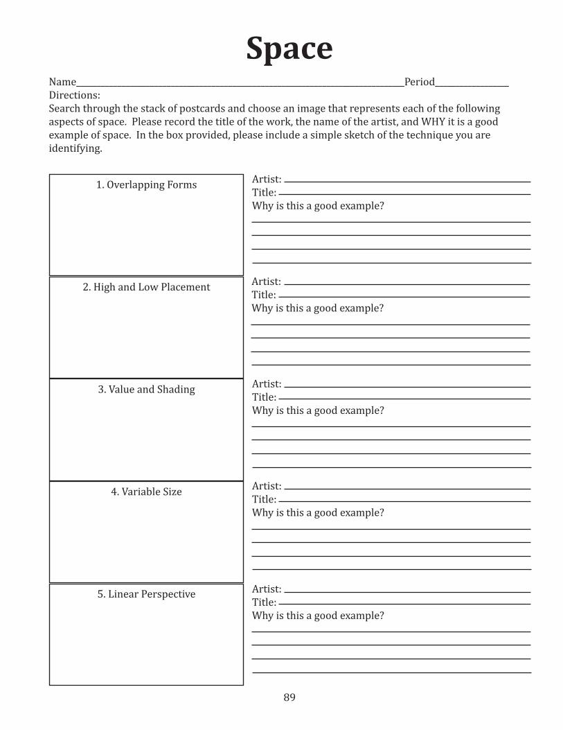
89
SpaceName________________________________________________________________________________Period__________________Directions:Search through the stack of postcards and choose an image that represents each of the following aspects of space. Please record the title of the work, the name of the artist, and WHY it is a good example of space. In the box provided, please include a simple sketch of the technique you are identifying.
5. Linear Perspective
4. Variable Size
3. Value and Shading
2. High and Low Placement
1. Overlapping Forms Artist:Title:Why is this a good example?
Artist:Title:Why is this a good example?
Artist:Title:Why is this a good example?
Artist:Title:Why is this a good example?
Artist:Title:Why is this a good example?
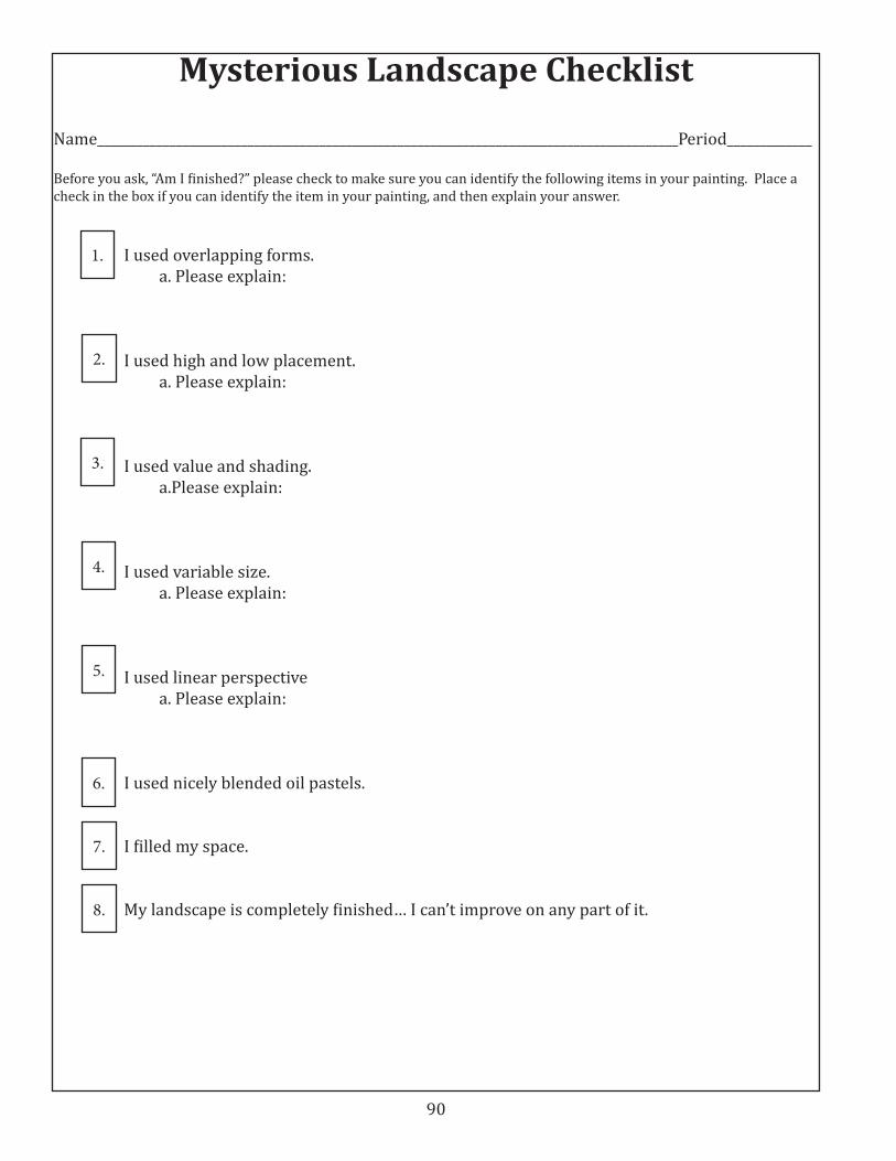
90
Mysterious Landscape Checklist
Name_________________________________________________________________________________________Period_____________
Before you ask, “Am I finished?” please check to make sure you can identify the following items in your painting. Place a check in the box if you can identify the item in your painting, and then explain your answer.
I used overlapping forms. a. Please explain:
I used high and low placement. a. Please explain:
I used value and shading. a.Please explain:
I used variable size. a. Please explain:
I used linear perspective a. Please explain:
I used nicely blended oil pastels.
I filled my space.
My landscape is completely finished… I can’t improve on any part of it.
1.
2.
3.
4.
5.
6.
7.
8.

91
Back to BasicsWhat Makes You Curious? (Value)
Upper Elementary—Secondary Visual Arts LessonBy Elicia Gray
OBJECTIVES Students will examine the artworks of Andreson, Hudgens, and Van Allsburg.Students will create a simple gesture draw-ing still life to be used for a final artwork.Students will design and produce a value drawing based on a group of curious items.Students will compare and contrast the works of Andreson, Hudgens, and Van Alls-burg.Students will compose a written artist’s statement and title for their work.Students will create a value scale as a study for their completed work.Students will arrange, organize, and photo-graph a group of curious items.
UTAH STATE COREStandard 1 (Making): Students will assemble and create works of art by experiencing a variety of art media and by learning the art ele-ments and principles.Standard 2 (Perceiving): Students will find mean-ing by analyzing, criticizing, and evaluating works of art. Standard 3 (Expressing): Students will create meaning in artStandard 4 (Contextualizing): Students will find meaning in works of art through settings and other modes of learning.
MATERIALSCarlos J. Andreson, Abstract II (1955) (SMA); Carlos J. Andreson, Construction (1955) (SMA);
Cynthia Faye Hudgens, Felled Staff and Missing Teeth (1991) (SMA) paper, pencils, curious items, desk lamps or other directional light sourcesChildren’s book: The Mysteries of Harris Burdick by Chris Van Allsburg.
ACTIVITY 1. Before teaching this lesson, invite students
to bring “curious items” from home. These can be items that are strange in shape or have peculiar content. They can be found objects, garbage, food, or any other bizarre
Cynthia Faye Hudgens, Felled Staff and Missing Teeth (1991) (SMA)

92
item. Have students put all of their objects on a table, and then group them into cat-egories. What do they have in common? What are the differences? Have a few students explain why they brought their items.
2. Gather students around for story time. Read The Mysteries of Harris Burdick by Chris Van Allsburg. The book consists of a group of drawings with non-existent sto-ries. Each illustration has only a title and a caption, and it is up to the viewer to infer the rest of the story. Ask students to look further at how these drawings were cre-ated. Point out that the artist did not use color, inviting the viewer to imagine that aspect as well. Compare Van Allsburg’s artworks with the items that students brought from home. What do they have in common? In what ways are they different?
3. Show students the works of Andreson and Hudgens. What do they have in common with Van Allsburg’s illustrations? They are all black and white. How is the content similar? They all deal with their subject matter in a curious way. Explain that An-dreson used abstraction to make his com-position curious, and Hudgens grouped curious items together.
4. Have students choose two or three objects from the table for a still-life composition. Invite them to arrange them in an inter-esting way and add strong lighting from one source (a desk lamp, a flashlight, etc.). Have them take a digital photo from sev-eral different angles, and then have them print the best composition of the photo in grayscale. The printed photo should be large in size.
5. Have students create a value scale by drawing five one-inch boxes right next to each other. The first box should be empty (white) and the last box should be as dark as the pencil allows. The boxes in between should gradually fade from light to dark. By simplifying the value scale down to 5 steps, students are able to easily see the difference in value between each box. Punch a hole in the middle of each square.
This way, students can compare the ac-tual value of their drawing with the actual value of their resource.
6. Demonstrate how to shade a sphere, cyl-inder, cube, and cone. Have students try drawing each of these, and point out to the students that they can use their value scales to test their range of values.
7. Invite students to create a gesture draw-ing of the still life they designed. Then they should gradually add value to their drawings, making sure to double-check the values with their value scales. Shade ac-cording to the photo, but remind students that their drawings do not need to be pho-torealistic. Accurate values and curious content are the primary objective.
8. When the drawings are complete, have students create a written artist’s state-ment explaining the items they chose, and why they found them to be curious.
9. Next students will choose a title and cap-tion for their work, much like the ones Chris Van Allsburg chose. Students may choose to add a title that relates directly to their work, or they may add one that is completely obscure, adding to the curious nature of the work.
SOURCESIf you need help, there are many on-line tutorials for shading. This is a good diagram w/o instruction: http://pwlawrence.com/wordpress/?p=258
And this site has a fairly simple tutorial with the steps outlined: http://ariches.edu.glogster.com/circlesintospheres/
This site has a tutorial for a variety of 3-D shapes: http://www.discover-how-to-draw.com/how-to-draw-3d-shapes-with-shading.html
ASSESSMENT The teacher should carefully review the written artist’s statement. The teacher will discuss and evaluate student thought processes and execu-

93
tion of those processes on a scale of 1-5. Five = Magnificent, Four = Great, Three = Good, Two = Standards were not met, One = Needs Improve-ment. Possible criteria may include: quality work, shows evidence of five different values, includes objects of a curious nature, looks similar to the photograph that students composed, and paper space is completely filled.
ADAPTATIONS For young children, instead of having them free-hand draw the still-life illustration, have them trace the composition they designed and then add value. Tracing is a way for students to still under-stand the contour lines of various objects without the frustration of traditional drawing.
VARIATION The idea of curiousness lends itself to a mixed media project very easily. Instead of drawing their items, have students bring curious items that could be incorporated right into an artwork. Strange pieces of twine, packaging peanuts, or trash could be integrated into a work of eerie strangeness.
EXTENSIONSThis assignment works well when integrated with the English classes. Have the English teacher read The Mysteries of Harris Burdick with her classes as well, and have the class create a list of titles and captions to be given to the art classes. Stu-dents in the art classes will then randomly choose a title and caption and create an artwork based on that theme. Display the artworks with their titles so the English class students can see how their ideas were interpreted.
Middle School Student Examples

94
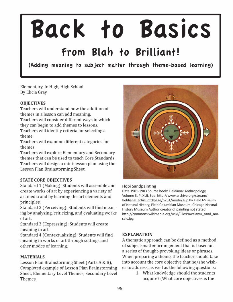
95
Elementary, Jr. High, High SchoolBy Elicia Gray
OBJECTIVES Teachers will understand how the addition of themes in a lesson can add meaning.Teachers will consider different ways in which they can begin to add themes to lessons.Teachers will identify criteria for selecting a theme.Teachers will examine different categories for themes.Teachers will explore Elementary and Secondary themes that can be used to teach Core Standards.Teachers will design a mini-lesson plan using the Lesson Plan Brainstorming Sheet.
STATE CORE OBJECTIVESStandard 1 (Making): Students will assemble and create works of art by experiencing a variety of art media and by learning the art elements and principles.Standard 2 (Perceiving): Students will find mean-ing by analyzing, criticizing, and evaluating works of art. Standard 3 (Expressing): Students will create meaning in artStandard 4 (Contextualizing): Students will find meaning in works of art through settings and other modes of learning.
MATERIALSLesson Plan Brainstorming Sheet (Parts A & B), Completed example of Lesson Plan Brainstorming Sheet, Elementary Level Themes, Secondary Level Themes
EXPLANATIONA thematic approach can be defined as a method of subject-matter arrangement that is based on a series of thought-provoking ideas or phrases. When preparing a theme, the teacher should take into account the core objective that he/she wish-es to address, as well as the following questions:
1. What knowledge should the students acquire? (What core objectives is the
Back to BasicsFrom Blah to Brilliant!
(Adding meaning to subject matter through theme-based learning)
Hopi SandpaintingDate 1901-1903 Source book: Fieldiana: Anthropology, Volume 3, Pl.XLII. See: http://www.archive.org/stream/fieldiana03chicuoft#page/n251/mode/2up By Field Museum of Natural History, Field Columbian Museum, Chicago Natural History Museum Author creator of painting not statedhttp://commons.wikimedia.org/wiki/File:Powalawu_sand_mo-saic.jpg
96
teacher trying to meet?)2. What other skills should the student
attain? (perceptual, manipulative, so-cial, analytical, adaptive…)
3. How might the teacher integrate feel-ings, interests, attitudes or emotions of various students?
CRITERIA FOR SELECTING A THEMEDr. Donna Kay Beattie, professor of Art Educa-tion, suggests the following criteria for selecting a theme:
1. The theme should relate to the student’s own environment. In this way, the stu-dent’s experiences become an important factor. A theme, therefore, might take into consideration the following: ethnic or na-tional origin; religion; gender; age; excep-tionalities; urban, suburban, rural; geo-graphic region; and socioeconomic level. A good theme allows for unique interpreta-tions by a diverse population of students.
2. The theme should possess sufficient pos-sibilities for gaining an insight and aware-ness. The more teaching experiences or lessons a theme can generate, the better it is.
3. A theme should be motivating, exciting, provocative, and cognitively complex. It should possess sufficient possibilities for critical thinking and divergent and creative thinking.
4. A theme should fit both a productive and reflective elaboration.
5. The total repertoire of themes should of-fer adequate guarantees for the sufficient exploration of the discipline(s) (i.e., con-tent, modes, media, concepts, techniques, processes, and the like.)
CATEGORIES OF THEMESDoctor Beattie also suggests that there are nine major categories or types of themes. Here is a summary of those nine ideas.1. Themes that focus on a single area, do-
main, field of study, or local environment. Examples are: Realism, Containers, Pollu-tion, Wee Beasts, Daydreams/Nightmares
2. Themes that focus on a single concrete and defined concept. Examples are: Feast, Happiness/Sadness, Captivity/Freedom, Heroes/Heroines
3. Themes that focus on words or phrases with ambiguous meanings. Examples are: Passages, Façade, Metamorphosis
4. Themes that are organized around prac-tical concerns that affect everyday life. Examples are: Saturdays, Meal Time, Girl-friends/Boyfriends
5. Themes that express a social reality or problem. Examples are: Revolution, Striv-ing for the top, Poverty
6. Themes that focus on personal identity or understanding one’s own emotions. Ex-amples are: Vanities, Mindscape, Alter-Ego, Failure
7. Themes that focus on fantasy or push the imagination. Examples are: Something Strange Lives in My…, Transforming the Real, Dragons I have known.
8. Themes based on poems, literature, quota-tions, or verses. These are most successful if they encompass metaphors, similes, and descriptive passages. Examples are: “I and the color are one”(Paul Klee), “The hands may almost be said to speak” (Quintilian)
9. Themes based on images, which include photographs, art reproductions, or de-tails of images. Examples are: Changing the composition; Adding another figure; Imagining what happens next; Creating a different mood.
LESSON PLANNING ACTIVITY 1. When designing a theme-based lesson
plan, there are several different approach-es. As a teacher, you may have students each choose different themes, or you may choose to give one theme to the entire class. Either way, once you have chosen a theme, be certain that meaningful content and skills can be taught in conjunction with the theme. Be aware that simply hav-ing a theme does not infuse meaning. The teacher must give students the opportuni-ty to brainstorm, ask questions, and make connections pertaining to the theme.
97
2. Begin by reviewing the Lesson Plan Brain-storming Sheet (Part A). On this work-sheet, the five areas of focus are: Theme, Technique/Skill, Medium, Core Standard, Project Inspiration. A Theme can be defined as a unifying or dominant idea. Technique/Skill—the manner of creating, or HOW an artwork is created, Medium—the materials used to create an artwork, Core Standard—National/State objec-tives established to meet specific teaching criteria, Project Inspiration—Ideas for art making activities. When designing a lesson, teachers may choose to start with any of these five areas, and then the other components will feed off of the main idea. In most cases, teachers will start with the core standard or objective that they wish to address, and then decide which tech-niques, mediums, themes, and projects will best help them meet those objectives.
3. When brainstorming, use the lists from the Lesson Plan Brainstorming Sheet (Part B). These lists are not comprehensive, but are meant to be used as a starting point from which teachers may build focused thoughts. Refer to the completed example of the Lesson Plan Brainstorming Sheet (Part A) for a brief sample lesson.
4. Compile a list of questions or thoughts you would like your students to explore, and integrate those questions into the step-by-step lesson explanation.
5. Identify or create a simple assessment tool that will measure the objective you desig-nated
SOURCESBeattie, Donna Kay, Art for Elementary Teachers, Supplemental Handouts.
Mandala personalizado (Technique: Watercolours) Date 2006 Source www.mandalas.com.mx By Monica Yañez Creative Commons 3.0 Licensehttp://commons.wikimedia.org/wiki/File:Mandala_personalizado.jpg

98
Elementary Themes
The MealtimePandora’s BoxInside and OutsideInside OutOn the Way To…Once Upon a Time…Out of Sight, Out of MindFrom Here to ThereTricksMore Than Meets the EyeThe Mind’s EyeMind MeanderingsArt as…The Sound of ArtVisual Puns (Rainbow Trout)Lost/FoundIn the Year 3000Boyfriends/GirlfriendsGames People PlayThe PartySaturdaysKeysThe Bitter EndDragons I Have KnownCopy CatsContainersFrom Beginning to EndLittle BeastsSecret PlacesWhat Evil I foundJourneysABC’s of MeI and MyselfTrapsEmerging/EmergenceProtectionHeroes/EnemiesCrookedLove/HateDisasterHappiness/SadnessTreasuresA Lonely AdventureNot at HomeCalm Before the StormOpposites
MirageMirror ImageMirrorMirror on the WallI am the Emperor of…Closet CreaturesNow you see it, Now you don’tArchetypesSecretsI have a feelingAn Unexpected GuestSomething Strange Lives in MyInsectsThe InsectaryFarfetchedPrimevalI SpyInscape/MindscapePicture PerfectThe Life WithinA Change in MeJust Who Are You?Growth and ChangeTrue to LifeLove Me TenderThings Thant Make You Go “Ummmm”What Bothers Me MostEver-ChangingCold SummersTransformationPassagesI Have the Body of…I Have Crawled into the skin ofPoverty/MiseryInfinityAbsurdVoyage Into the LimitlessWar/PeaceEeriePortable MemoriesSomewhere in TimeA Moment in TimeThe ExtraordinarilyIluminationLooking is Not Always Seeing
The Ideal PlaceWhat Makes Me Feel This WayReflectionsFrom Here to ThereIf I Were King/Queen for a DaySlice of LifeDo You see what I see?Where the Wild Things AreShadows and TracesLast Night’s DreamBody LinesWishesSeen But Not HeardDistortionImpact on the WorldCould Be WorldGhostsHow Simple Can You GetLost and AloneIslandEbony and IvoryYesterday’s Vision Looking In/OutShelterPathwaysWorlds that CollideYou Can Make a DifferenceThe House Where I LiveI Want, I Want, I WantSeeing DoubleChums
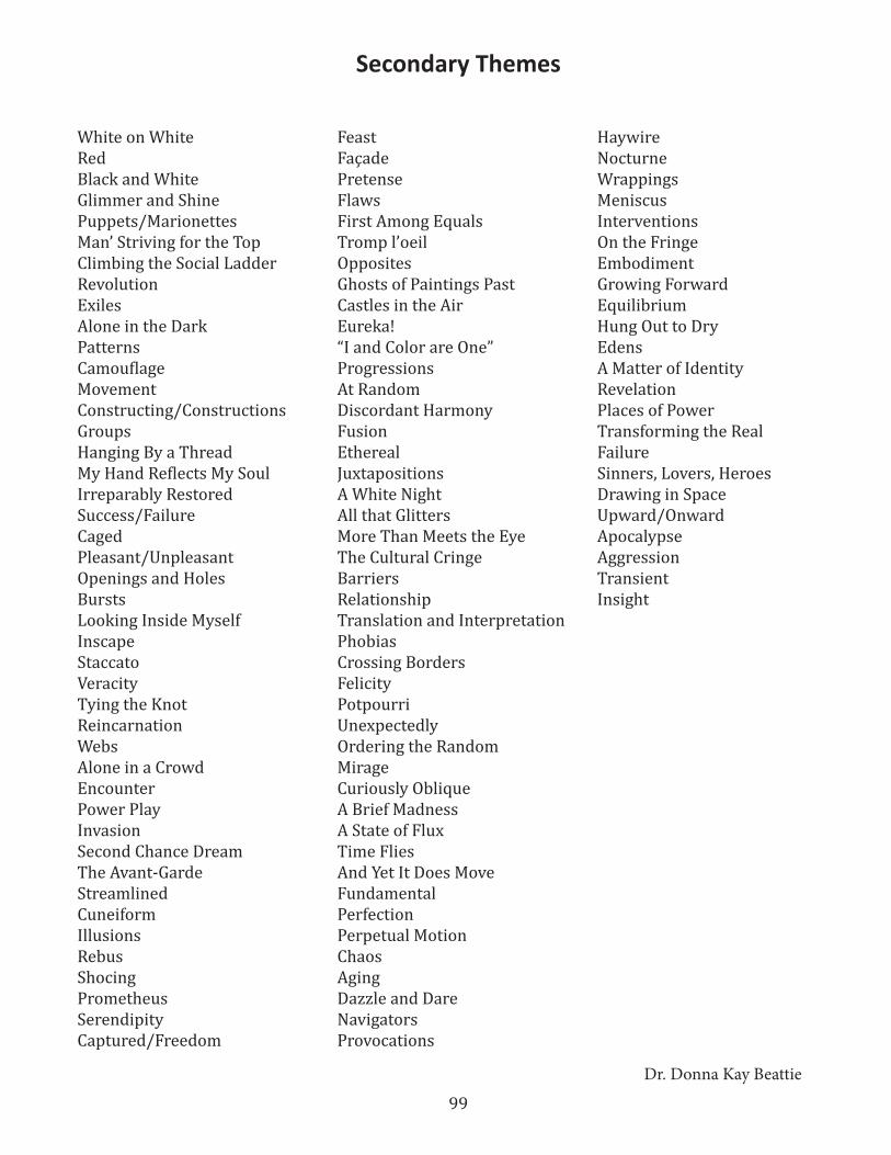
99
Secondary Themes
White on WhiteRedBlack and WhiteGlimmer and ShinePuppets/MarionettesMan’ Striving for the TopClimbing the Social LadderRevolutionExilesAlone in the DarkPatternsCamouflageMovementConstructing/ConstructionsGroupsHanging By a ThreadMy Hand Reflects My SoulIrreparably RestoredSuccess/FailureCagedPleasant/UnpleasantOpenings and HolesBurstsLooking Inside MyselfInscapeStaccatoVeracityTying the KnotReincarnationWebsAlone in a CrowdEncounterPower PlayInvasionSecond Chance DreamThe Avant-GardeStreamlinedCuneiformIllusionsRebusShocingPrometheusSerendipityCaptured/Freedom
FeastFaçadePretenseFlawsFirst Among EqualsTromp l’oeilOppositesGhosts of Paintings PastCastles in the AirEureka!“I and Color are One”ProgressionsAt RandomDiscordant HarmonyFusionEtherealJuxtapositionsA White NightAll that GlittersMore Than Meets the EyeThe Cultural CringeBarriersRelationshipTranslation and InterpretationPhobiasCrossing BordersFelicityPotpourriUnexpectedlyOrdering the RandomMirageCuriously ObliqueA Brief MadnessA State of FluxTime FliesAnd Yet It Does MoveFundamentalPerfectionPerpetual MotionChaosAgingDazzle and DareNavigatorsProvocations
HaywireNocturneWrappingsMeniscusInterventionsOn the FringeEmbodimentGrowing ForwardEquilibriumHung Out to DryEdensA Matter of IdentityRevelationPlaces of PowerTransforming the RealFailureSinners, Lovers, HeroesDrawing in SpaceUpward/OnwardApocalypseAggressionTransientInsight
Dr. Donna Kay Beattie
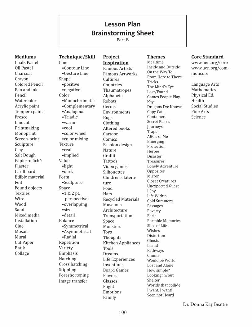
100
MediumsChalk PastelOil PastelCharcoal CrayonColored PencilPen and inkPencilWatercolorAcrylic paintTempera paintFrescoLinocutPrintmakingMonoprintScreen-printSculptureClaySalt DoughPapier-mâchéPlasterCardboardEdible materialFoilFound objectsTextilesWireWoodSandMixed mediaInstallationGlueMosaicMuralCut PaperBatikCollage
Technique/SkillLine •Contour Line •Gesture LineShape •positive •negativeColor •Monochromatic •Complementary •Analogous •Triadic •warm •cool •color wheel •color mixingTexture •real •impliedValue •light •darkForm •SculptureSpace •1 & 2 pt. perspective •overlapping •size •detailBalance •Symmetrical •Asymmetrical •RadialRepetitionVarietyEmphasisHatchingCross hatchingStipplingForeshorteningImage transfer
Project InspirationFamous ArtistsFamous ArtworksCulturesCountriesThaumatropesAlphabetsRobotsGermsEnvironmentsBugsClothingAltered booksCartoonComicsFashion designNatureGraffitiTattoosVideo gamesSilhouettesChildren’s Litera-tureFoodHatsRecycled MaterialsMuseumsArchitectureTransportationSpaceMonstersToysThoughtsKitchen AppliancesToolsDreamsLife ExperiencesInventionsBoard GamesFlavorsGlassesFlightEmotionsFamily
ThemesMealtimeInside and OutsideOn the Way To…From Here to ThereTricksThe Mind’s EyeLost/FoundGames People PlayKeysDragons I’ve KnownCopy CatsContainersSecret PlacesJourneysTrapsABC’s of MeEmergingProtectionHeroesDisasterTreasuresLonely AdventureOppositesMirrorCloset CreaturesUnexpected GuestI SpyLife WithinCold SummersPassagesPovertyEeriePortable MemoriesSlice of LifeWishesDistortionGhostsIslandPathwaysChumsWould be WorldLost and AloneHow simple?Looking in/outShelterWorlds that collideI want, I want!Seen not Heard
Core Standardwww.uen.org/corewww.uen.org/com-moncore
Language ArtsMathematicsPhysical Ed.HealthSocial StudiesFine ArtsScience
Lesson Plan Brainstorming Sheet
Part B
Dr. Donna Kay Beattie
101
Lesson PlanBrainstorming Sheet
Part A
Theme – a unifying or dominant idea Technique/Skill – manner of creating
Medium Core Standard
Project Inspiration
Step-by-Step Lesson Explanation

102
Lesson PlanBrainstorming Sheet
Theme
Inside/Outside
Technique/Skill
Color Mixing, Radial Balance
Medium
Colored Pencil, Brown paper
Core Standard3rd Grade Health Ed.
Standard 1. learn ways to improve mental health
Project Inspiration
Native American culture and the therapeutic qualities of the Mandala
Step-by-Step Lesson Explanation
1. Show students several examples of Mandalas. Discuss the healing qualities of mandalas. Explain that one way students can maintain or improve mental health is by simple meditation. Creating and viewing mandalas is said to produce a calming effect.2. Explain that most mandalas show radial balance, which is sort of like a target, or a snowflake. Designs “radiate” from the center.3. Explore the theme of “Inside/outside” as it pertains to a mandala. How can your personal mandala represent you on the inside and on the outside? Is it complex? Simple? Will it have vibrant color or subdued tones? Are the shapes soft and curved, or abrupt and jagged?4. Invite students to create their own mandala, keeping in mind that they will infuse their own personal aesthetic. As a brief exercise, have students cut a simple snowflake, and review the idea of radial balance.5. Have students begin by drawing their mandala in pencil. They may use simple shapes, or they can add complex pictures and designs.6. When Students have finished drawing, give a demonstration about color mixing, and review color schemes. Remind students that different schemes will create different moods. 7. After students have created their mandala, have them write a brief “artist’s statement” about how their mandala relates to the theme.8. Invite students to discuss how their mandalas contributed to their mental health. In what ways can viewing and creating a mandala contribute to positive mental health? Did the mandalas provide a positive, calming influence?9. Have students present their mandalas to the class.
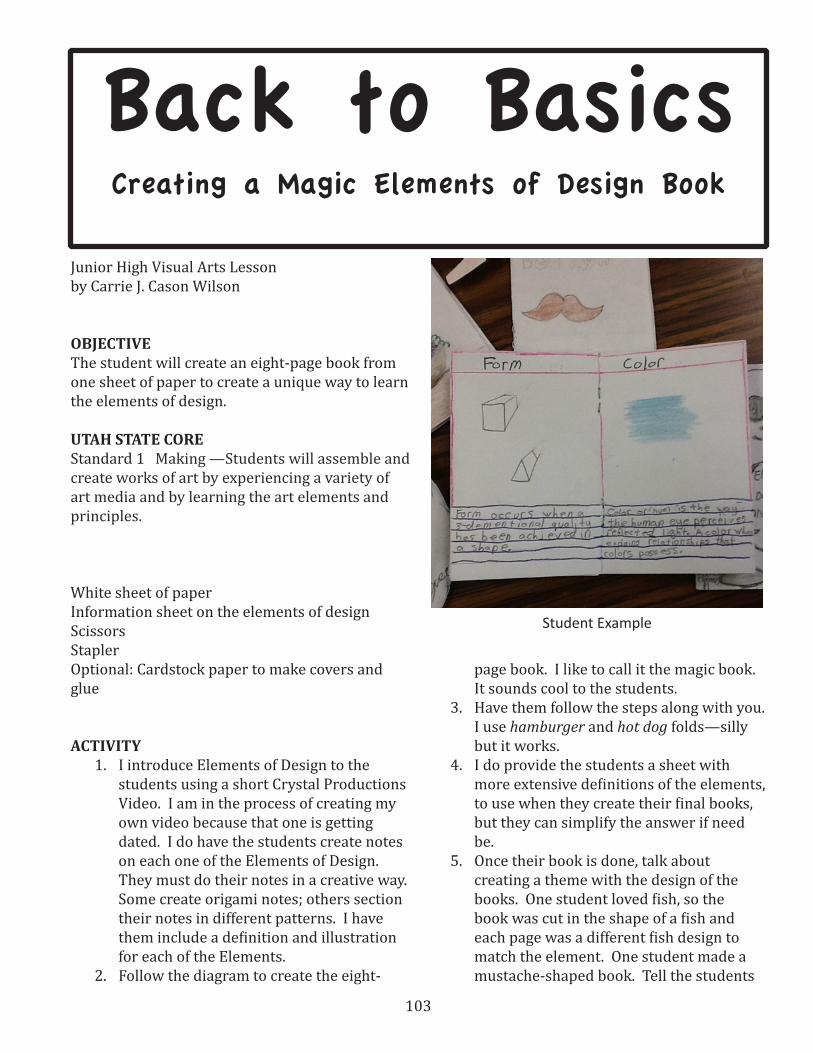
103
Back to BasicsCreating a Magic Elements of Design Book
Junior High Visual Arts Lessonby Carrie J. Cason Wilson
OBJECTIVE The student will create an eight-page book from one sheet of paper to create a unique way to learn the elements of design.
UTAH STATE CORE Standard 1 Making —Students will assemble and create works of art by experiencing a variety of art media and by learning the art elements and principles.
White sheet of paperInformation sheet on the elements of designScissorsStaplerOptional: Cardstock paper to make covers and glue
ACTIVITY 1. I introduce Elements of Design to the
students using a short Crystal Productions Video. I am in the process of creating my own video because that one is getting dated. I do have the students create notes on each one of the Elements of Design. They must do their notes in a creative way. Some create origami notes; others section their notes in different patterns. I have them include a definition and illustration for each of the Elements.
2. Follow the diagram to create the eight-
page book. I like to call it the magic book. It sounds cool to the students.
3. Have them follow the steps along with you. I use hamburger and hot dog folds—silly but it works.
4. I do provide the students a sheet with more extensive definitions of the elements, to use when they create their final books, but they can simplify the answer if need be.
5. Once their book is done, talk about creating a theme with the design of the books. One student loved fish, so the book was cut in the shape of a fish and each page was a different fish design to match the element. One student made a mustache-shaped book. Tell the students
Student Example
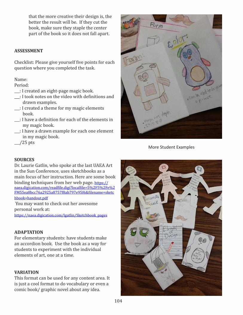
104
that the more creative their design is, the better the result will be. If they cut the book, make sure they staple the center part of the book so it does not fall apart.
ASSESSMENT
Checklist: Please give yourself five points for each question where you completed the task.
Name:Period:___: I created an eight-page magic book.___: I took notes on the video with definitions and drawn examples.___: I created a theme for my magic elements book.___: I have a definition for each of the elements in my magic book.___: I have a drawn example for each one element in my magic book.___/25 pts
SOURCES Dr. Laurie Gatlin, who spoke at the last UAEA Art in the Sun Conference, uses sketchbooks as a main focus of her instruction. Here are some book binding techniques from her web page. https://naea.digication.com/readfile.digi?localfile=5%2F5%2Fe%2FM55ea8bcc76a2925a8757f8ab797e95f6&filename=sketchbook+handout.pdf You may want to check out her awesome personal work at:https://naea.digication.com/lgatlin/Sketchbook_pages
ADAPTATIONFor elementary students: have students make an accordion book. Use the book as a way for students to experiment with the individual elements of art, one at a time.
VARIATIONThis format can be used for any content area. It is just a cool format to do vocabulary or even a comic book/ graphic novel about any idea.
More Student Examples
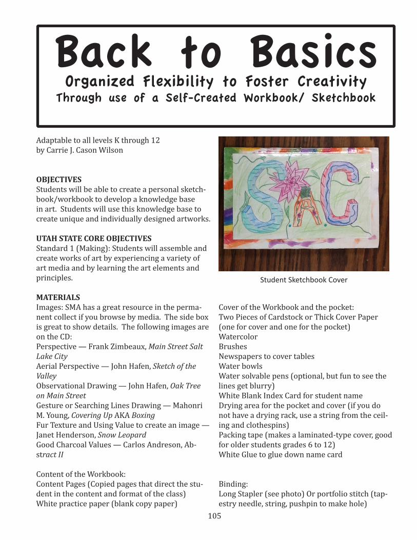
105
Back to BasicsOrganized Flexibility to Foster Creativity
Through use of a Self-Created Workbook/ Sketchbook
Adaptable to all levels K through 12by Carrie J. Cason Wilson
OBJECTIVESStudents will be able to create a personal sketch-book/workbook to develop a knowledge base in art. Students will use this knowledge base to create unique and individually designed artworks.
UTAH STATE CORE OBJECTIVESStandard 1 (Making): Students will assemble and create works of art by experiencing a variety of art media and by learning the art elements and principles.
MATERIALS Images: SMA has a great resource in the perma-nent collect if you browse by media. The side box is great to show details. The following images are on the CD:Perspective — Frank Zimbeaux, Main Street Salt Lake City Aerial Perspective — John Hafen, Sketch of the ValleyObservational Drawing — John Hafen, Oak Tree on Main StreetGesture or Searching Lines Drawing — Mahonri M. Young, Covering Up AKA BoxingFur Texture and Using Value to create an image — Janet Henderson, Snow LeopardGood Charcoal Values — Carlos Andreson, Ab-stract II
Content of the Workbook:Content Pages (Copied pages that direct the stu-dent in the content and format of the class)White practice paper (blank copy paper)
Cover of the Workbook and the pocket:Two Pieces of Cardstock or Thick Cover Paper (one for cover and one for the pocket)WatercolorBrushes Newspapers to cover tablesWater bowlsWater solvable pens (optional, but fun to see the lines get blurry) White Blank Index Card for student nameDrying area for the pocket and cover (if you do not have a drying rack, use a string from the ceil-ing and clothespins)Packing tape (makes a laminated-type cover, good for older students grades 6 to 12)White Glue to glue down name card
Binding:Long Stapler (see photo) Or portfolio stitch (tap-estry needle, string, pushpin to make hole)
Student Sketchbook Cover
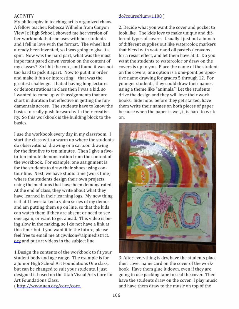
106
ACTIVITY My philosophy in teaching art is organized chaos. A fellow teacher, Rebecca Wilhelm from Canyon View Jr. High School, showed me her version of her workbook that she uses with her students and I fell in love with the format. The wheel had already been invented, so I was going to give it a spin. Now was the hard part, what was the most important pared down version on the content of my classes? So I hit the core, and found it was not too hard to pick it apart. Now to put it in order and make it fun or interesting—that was the greatest challenge. I hated having long lectures or demonstrations in class then I was a kid, so I wanted to come up with assignments that are short in duration but effective in getting the fun-damentals across. The students have to know the basics to really push forward with their creativ-ity. So this workbook is the building block to the basics.
I use the workbook every day in my classroom. I start the class with a warm up where the students do observational drawing or a cartoon drawing for the first five to ten minutes. Then I give a five-to-ten minute demonstration from the content of the workbook. For example, one assignment is for the students to draw their shoes using con-tour line. Next, we have studio time (work time) where the students design their own projects using the mediums that have been demonstrated. At the end of class, they write about what they have learned in their learning logs. My new thing is that I have started a video series of my demos and am putting them up on line, so that the kids can watch them if they are absent or need to see one again, or want to get ahead. This video is be-ing slow in the making, so I do not have a link at this time, but if you want it in the future, please feel free to email me at [email protected] and put art videos in the subject line.
1.Design the contents of the workbook to fit your student body and age range. The example is for a Junior High School Art Foundations One class, but can be changed to suit your students. I just designed it based on the Utah Visual Arts Core for Art Foundations Class. ( http://www.uen.org/core/core.
do?courseNum=1100 )
2. Decide what you want the cover and pocket to look like. The kids love to make unique and dif-ferent types of covers. Usually I just put a bunch of different supplies out like watercolor, markers that bleed with water and oil pastels/ crayons for a resist effect, and let them have at it. Do you want the students to watercolor or draw on the covers is up to you. Place the name of the student on the covers; one option is a one-point perspec-tive name drawing for grades 5 through 12. For younger students, they could draw their names using a theme like “animals.” Let the students drive the design and they will love their work-books. Side note: before they get started, have them write their names on both pieces of paper because when the paper is wet, it is hard to write on.
3. After everything is dry, have the students place their cover name card on the cover of the work-book. Have them glue it down, even if they are going to use packing tape to seal the cover. Then have the students draw on the cover. I play music and have them draw to the music on top of the
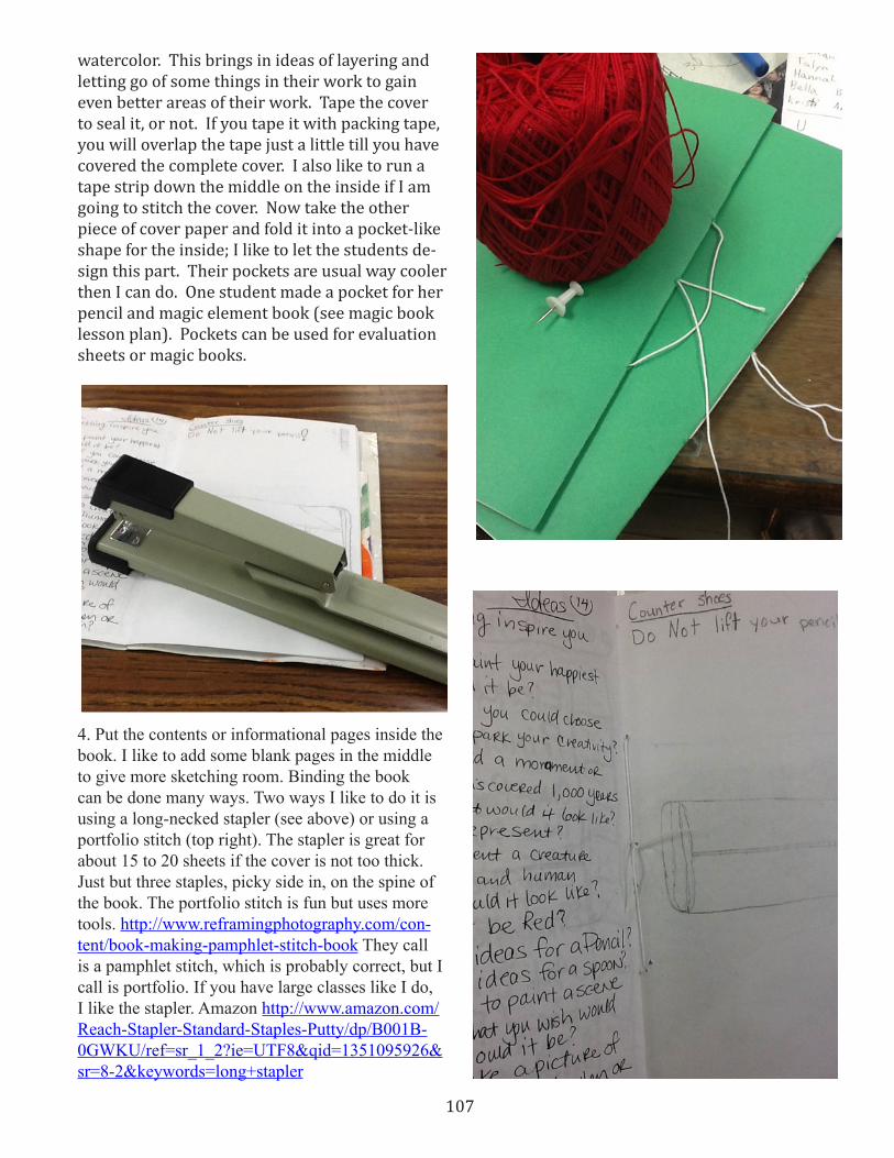
107
watercolor. This brings in ideas of layering and letting go of some things in their work to gain even better areas of their work. Tape the cover to seal it, or not. If you tape it with packing tape, you will overlap the tape just a little till you have covered the complete cover. I also like to run a tape strip down the middle on the inside if I am going to stitch the cover. Now take the other piece of cover paper and fold it into a pocket-like shape for the inside; I like to let the students de-sign this part. Their pockets are usual way cooler then I can do. One student made a pocket for her pencil and magic element book (see magic book lesson plan). Pockets can be used for evaluation sheets or magic books.
4 . Put the contents or informational pages inside the book . I like to add some blank pages in the middle to give more sketching room . Binding the book can be done many ways . Two ways I like to do it is using a long-necked stapler (see above) or using a portfolio stitch (top right) . The stapler is great for about 15 to 20 sheets if the cover is not too thick . Just but three staples, picky side in, on the spine of the book . The portfolio stitch is fun but uses more tools . http://www .reframingphotography .com/con-tent/book-making-pamphlet-stitch-book They call is a pamphlet stitch, which is probably correct, but I call is portfolio . If you have large classes like I do, I like the stapler . Amazon http://www .amazon .com/Reach-Stapler-Standard-Staples-Putty/dp/B001B-0GWKU/ref=sr_1_2?ie=UTF8&qid=1351095926&sr=8-2&keywords=long+stapler
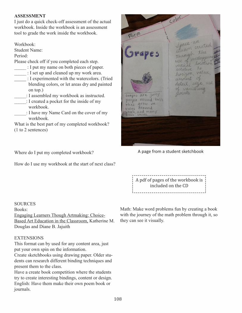
108
ASSESSMENT I just do a quick check-off assessment of the actual workbook . Inside the workbook is an assessment tool to grade the work inside the workbook .
Workbook:Student Name:Period:Please check off if you completed each step ._____ : I put my name on both pieces of paper ._____ : I set up and cleaned up my work area ._____ : I experimented with the watercolors . (Tried blending colors, or let areas dry and painted on top .)_____: I assembled my workbook as instructed ._____: I created a pocket for the inside of my workbook ._____: I have my Name Card on the cover of my workbook .What is the best part of my completed workbook? (1 to 2 sentences)
Where do I put my completed workbook?
How do I use my workbook at the start of next class?
SOURCES Books:Engaging Learners Though Artmaking: Choice-Based Art Education in the Classroom, Katherine M . Douglas and Diane B . Jajuith
EXTENSIONS This format can by used for any content area, just put your own spin on the information .Create sketchbooks using drawing paper . Older stu-dents can research different binding techniques and present them to the class . Have a create book competition where the students try to create interesting bindings, content or design .English: Have them make their own poem book or journals .
Math: Make word problems fun by creating a book with the journey of the math problem through it, so they can see it visually .
A page from a student sketchbook
A pdf of pages of the workbook is included on the CD
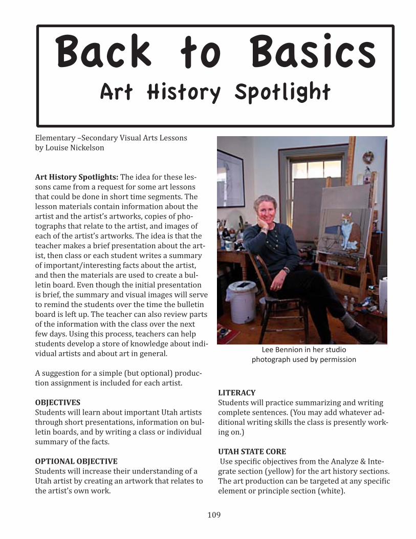
109
Elementary –Secondary Visual Arts Lessonsby Louise Nickelson
Art History Spotlights: The idea for these les-sons came from a request for some art lessons that could be done in short time segments. The lesson materials contain information about the artist and the artist’s artworks, copies of pho-tographs that relate to the artist, and images of each of the artist’s artworks. The idea is that the teacher makes a brief presentation about the art-ist, then class or each student writes a summary of important/interesting facts about the artist, and then the materials are used to create a bul-letin board. Even though the initial presentation is brief, the summary and visual images will serve to remind the students over the time the bulletin board is left up. The teacher can also review parts of the information with the class over the next few days. Using this process, teachers can help students develop a store of knowledge about indi-vidual artists and about art in general.
A suggestion for a simple (but optional) produc-tion assignment is included for each artist.
OBJECTIVES Students will learn about important Utah artists through short presentations, information on bul-letin boards, and by writing a class or individual summary of the facts.
OPTIONAL OBJECTIVE Students will increase their understanding of a Utah artist by creating an artwork that relates to the artist’s own work.
LITERACYStudents will practice summarizing and writing complete sentences. (You may add whatever ad-ditional writing skills the class is presently work-ing on.)
UTAH STATE CORE Use specific objectives from the Analyze & Inte-grate section (yellow) for the art history sections. The art production can be targeted at any specific element or principle section (white).
Lee Bennion in her studiophotograph used by permission
Back to BasicsArt History Spotlight
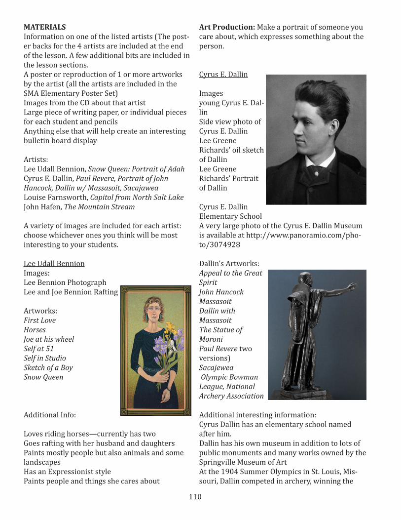
110
MATERIALSInformation on one of the listed artists (The post-er backs for the 4 artists are included at the end of the lesson. A few additional bits are included in the lesson sections.A poster or reproduction of 1 or more artworks by the artist (all the artists are included in the SMA Elementary Poster Set)Images from the CD about that artistLarge piece of writing paper, or individual pieces for each student and pencilsAnything else that will help create an interesting bulletin board display
Artists:Lee Udall Bennion, Snow Queen: Portrait of Adah Cyrus E. Dallin, Paul Revere, Portrait of John Hancock, Dallin w/ Massasoit, SacajaweaLouise Farnsworth, Capitol from North Salt Lake John Hafen, The Mountain Stream A variety of images are included for each artist: choose whichever ones you think will be most interesting to your students.
Lee Udall BennionImages:Lee Bennion PhotographLee and Joe Bennion Rafting
Artworks:First LoveHorsesJoe at his wheelSelf at 51Self in StudioSketch of a BoySnow Queen
Additional Info:
Loves riding horses—currently has twoGoes rafting with her husband and daughtersPaints mostly people but also animals and some landscapesHas an Expressionist stylePaints people and things she cares about
Art Production: Make a portrait of someone you care about, which expresses something about the person.
Cyrus E. Dallin
Imagesyoung Cyrus E. Dal-linSide view photo of Cyrus E. DallinLee Greene Richards’ oil sketch of DallinLee Greene Richards’ Portrait of Dallin
Cyrus E. Dallin Elementary SchoolA very large photo of the Cyrus E. Dallin Museum is available at http://www.panoramio.com/pho-to/3074928
Dallin’s Artworks:Appeal to the Great SpiritJohn HancockMassasoitDallin with MassasoitThe Statue of Moroni Paul Revere two versions)Sacajewea Olympic Bowman League, National Archery Association
Additional interesting information:Cyrus Dallin has an elementary school named after him. Dallin has his own museum in addition to lots of public monuments and many works owned by the Springville Museum of ArtAt the 1904 Summer Olympics in St. Louis, Mis-souri, Dallin competed in archery, winning the

111
bronze medal in the team competition. He fin-ished ninth in the Double American round and 12th in the Double York round.
Art Production: Make a clay sculpture of an ani-mal or a person’s head
Louise Richards Farnsworth
PhotographLee Greene Richards’ (her cousin) painting of her
Artworks:Capitol From North Salt LakeHay StacksMountain LandscapeSpringtimeStorm Clouds in the Tetons
Art Production: Make a landscape using complementary colors
John Hafen
Images:Photograph of John and Thora HafenJohn Hafen in his painting studioJohn Hafen painting in a fieldJohn Hafen postcardHafen Quote
Images of artworks:Indian SummerHollyhocksSpringville, My Mountain HomeSketch of the ValleySpringville PastureCharles Smith’s portrait of HafenMahonri Young’s portrait of Hafen
Art Production: Make a painting of a place you love using paint, colored pencils, or crayons.
Assessment: For younger students, assess the overall understanding and learning of the class about the individual artists by asking who, what, and when questions as well as questions about the students’ reactions to the information and to the artworks. You may wish to choose a few art terms to learn for each artist such as oil painting, pastel, sketch, etc. as well as terms such as Im-pressionist, Expressionist. When most or all of the class seems to understand at an appropriate level, move on to another artist.
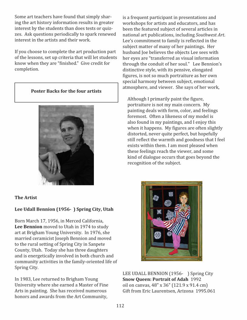
112
Some art teachers have found that simply shar-ing the art history information results in greater interest by the students than does tests or quiz-zes. Ask questions periodically to spark renewed interest in the artists and their work.
If you choose to complete the art production part of the lessons, set up criteria that will let students know when they are “finished.” Give credit for completion.
The Artist
Lee Udall Bennion (1956- ) Spring City, Utah
Born March 17, 1956, in Merced California, Lee Bennion moved to Utah in 1974 to study art at Brigham Young University. In 1976, she married ceramicist Joseph Bennion and moved to the rural setting of Spring City in Sanpete County, Utah. Today she has three daughters and is energetically involved in both church and community activities in the family-oriented life of Spring City.
In 1983, Lee returned to Brigham Young University where she earned a Master of Fine Arts in painting. She has received numerous honors and awards from the Art Community,
Poster Backs for the four artists
is a frequent participant in presentations and workshops for artists and educators, and has been the featured subject of several articles in national art publications, including Southwest Art. Lee’s commitment to family is reflected in the subject matter of many of her paintings. Her husband Joe believes the objects Lee sees with her eyes are “transferred as visual information through the conduit of her soul.” Lee Bennion’s distinctive style, with its pensive, elongated figures, is not so much portraiture as her own special harmony between subject, emotional atmosphere, and viewer. She says of her work,
Although I primarily paint the figure, portraiture is not my main concern. My painting deals with form, color, and feelings foremost. Often a likeness of my model is also found in my paintings, and I enjoy this when it happens. My figures are often slightly distorted, never quite perfect, but hopefully still reflect the warmth and goodness that I feel exists within them. I am most pleased when these feelings reach the viewer, and some kind of dialogue occurs that goes beyond the recognition of the subject.
LEE UDALL BENNION (1956- ) Spring CitySnow Queen: Portrait of Adah 1992oil on canvas, 48" x 36" (121.9 x 91.4 cm)Gift from Eric Laurentsen, Arizona 1995.061

113
The Art
Redheaded Adah Bennion, the youngest of three children of Joseph and Lee Bennion of Spring City, is often the subject of her mother’s paintings. This picture depicts the six year old in her pajamas standing in a window casement, with cutout paper snowflakes on the glass panes. In her left hand, Adah holds a troll doll, her hand covering its face. All the viewer sees is the doll’s legs and bright red-orange hair.
Typical of Lee Bennion’s work is the composition which concentrates upon the essential components–in this case, the window and figure. Another feature of Bennion’s work is the elongated figure, whose position she arranges to create an effective design. In this oil painting we see Adah gazing impishly at the viewer, while her pink-stockinged foot is wedged on the side of the window casing.
Although a bright, engaging portrait of her daughter, this painting, like Bennion’s other work, has layers of meaning and references. There is a visual play on words in the paper snowflakes on the inside of the window and the real snowflakes outside. The troll doll is a reference to time and a tie to Lee’s own childhood, when the dolls were first popular. Bennion also says that at the time of the painting, when Adah was young, Lee’s life primarily revolved around her family and home, and she was inside much of the time. Thus, subconsciously, she painted the interior scene to represent her life, and the window to represent the future changes and possibilities.
As with most of Lee’s work, Snow Queen’s subject looks out at the viewer with an unusually direct gaze, not only conveying Adah’s personality, but also allowing Lee, as the painter, to engage the viewer through that gaze.
Cyrus E. DallinPaul Revere, Portrait of John Hancock, Massasoit, and Sacajawea
The Artist – Cyrus E. Dallin (1861 -1944) Springville, Utah
A Romantic-Realist, Cyrus Dallin was born in Springville, Utah, in 1861. Two circumstances of his early life in the western wilderness profoundly influenced him; the proximity of the log cabin where he was born to the lofty Wasatch Mountains and his familiarity with the Indians in their native haunts. The first awakened and fostered in him a love for the magnificence of form; the second furnished him with an unfailing source of material for his creative work.
At the age of 18, Dallin traveled to Boston to begin his art studies. In 1888, he went to Paris, where he remained until 1890, studying at the Ecole des Beaux Arts and at the Académie Julian under Henri Chapu. In 1890, Dallin returned to America and moved to Massachusetts. He remained in the East for the rest of his life, returning to Utah only for short visits.
In 1883, Dallin began work on a model of a statue of Paul Revere which he submitted to a competition for a commission to produce a monumental statue of Paul Revere, for downtown Boston. Though Dallin won the competition, he
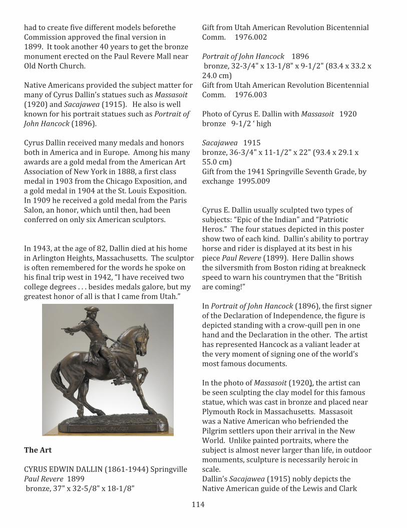
114
had to create five different models beforethe Commission approved the final version in 1899. It took another 40 years to get the bronze monument erected on the Paul Revere Mall near Old North Church.
Native Americans provided the subject matter for many of Cyrus Dallin’s statues such as Massasoit (1920) and Sacajawea (1915). He also is well known for his portrait statues such as Portrait of John Hancock (1896).
Cyrus Dallin received many medals and honors both in America and in Europe. Among his many awards are a gold medal from the American Art Association of New York in 1888, a first class medal in 1903 from the Chicago Exposition, and a gold medal in 1904 at the St. Louis Exposition. In 1909 he received a gold medal from the Paris Salon, an honor, which until then, had been conferred on only six American sculptors.
In 1943, at the age of 82, Dallin died at his home in Arlington Heights, Massachusetts. The sculptor is often remembered for the words he spoke on his final trip west in 1942, “I have received two college degrees . . . besides medals galore, but my greatest honor of all is that I came from Utah.”
The Art
CYRUS EDWIN DALLIN (1861-1944) Springville Paul Revere 1899 bronze, 37" x 32-5/8" x 18-1/8"
Gift from Utah American Revolution Bicentennial Comm. 1976.002
Portrait of John Hancock 1896 bronze, 32-3/4" x 13-1/8" x 9-1/2" (83.4 x 33.2 x 24.0 cm)Gift from Utah American Revolution Bicentennial Comm. 1976.003
Photo of Cyrus E. Dallin with Massasoit 1920bronze 9-1/2 ‘ high
Sacajawea 1915bronze, 36-3/4" x 11-1/2" x 22" (93.4 x 29.1 x 55.0 cm) Gift from the 1941 Springville Seventh Grade, by exchange 1995.009
Cyrus E. Dallin usually sculpted two types of subjects: “Epic of the Indian” and “Patriotic Heros.” The four statues depicted in this poster show two of each kind. Dallin’s ability to portray horse and rider is displayed at its best in his piece Paul Revere (1899). Here Dallin shows the silversmith from Boston riding at breakneck speed to warn his countrymen that the “British are coming!”
In Portrait of John Hancock (1896), the first signer of the Declaration of Independence, the figure is depicted standing with a crow-quill pen in one hand and the Declaration in the other. The artist has represented Hancock as a valiant leader at the very moment of signing one of the world’s most famous documents.
In the photo of Massasoit (1920), the artist can be seen sculpting the clay model for this famous statue, which was cast in bronze and placed near Plymouth Rock in Massachusetts. Massasoit was a Native American who befriended the Pilgrim settlers upon their arrival in the New World. Unlike painted portraits, where the subject is almost never larger than life, in outdoor monuments, sculpture is necessarily heroic in scale.Dallin’s Sacajawea (1915) nobly depicts the Native American guide of the Lewis and Clark
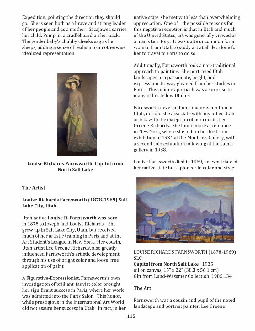
115
Expedition, pointing the direction they should go. She is seen both as a brave and strong leader of her people and as a mother. Sacajawea carries her child, Pomp, in a cradleboard on her back. The tender baby’s chubby cheeks sag as he sleeps, adding a sense of realism to an otherwise idealized representation.
Louise Richards Farnsworth, Capitol from North Salt Lake
The Artist
Louise Richards Farnsworth (1878-1969) Salt Lake City, Utah
Utah native Louise R. Farnsworth was born in 1878 to Joseph and Louise Richards. She grew up in Salt Lake City, Utah, but received much of her artistic training in Paris and at the Art Student’s League in New York. Her cousin, Utah artist Lee Greene Richards, also greatly influenced Farnsworth’s artistic development through his use of bright color and loose, free application of paint.
A Figurative-Expressionist, Farnsworth’s own investigation of brilliant, fauvist color brought her significant success in Paris, where her work was admitted into the Paris Salon. This honor, while prestigious in the International Art World, did not assure her success in Utah. In fact, in her
native state, she met with less than overwhelming appreciation. One of the possible reasons for this negative reception is that in Utah and much of the United States, art was generally viewed as a man’s territory. It was quite uncommon for a woman from Utah to study art at all, let alone for her to travel to Paris to do so.
Additionally, Farnsworth took a non-traditional approach to painting. She portrayed Utah landscapes in a passionate, bright, and expressionistic way gleaned from her studies in Paris. This unique approach was a surprise to many of her fellow Utahns.
Farnsworth never put on a major exhibition in Utah, nor did she associate with any other Utah artists with the exception of her cousin, Lee Greene Richards. She found more acceptance in New York, where she put on her first solo exhibition in 1934 at the Montross Gallery, with a second solo exhibition following at the same gallery in 1938.
Louise Farnsworth died in 1969, an expatriate of her native state but a pioneer in color and style .
LOUISE RICHARDS FARNSWORTH (1878-1969) SLC Capitol from North Salt Lake 1935 oil on canvas, 15" x 22" (38.3 x 56.1 cm)Gift from Lund-Wassmer Collection 1986.134
The Art
Farnsworth was a cousin and pupil of the noted landscape and portrait painter, Lee Greene
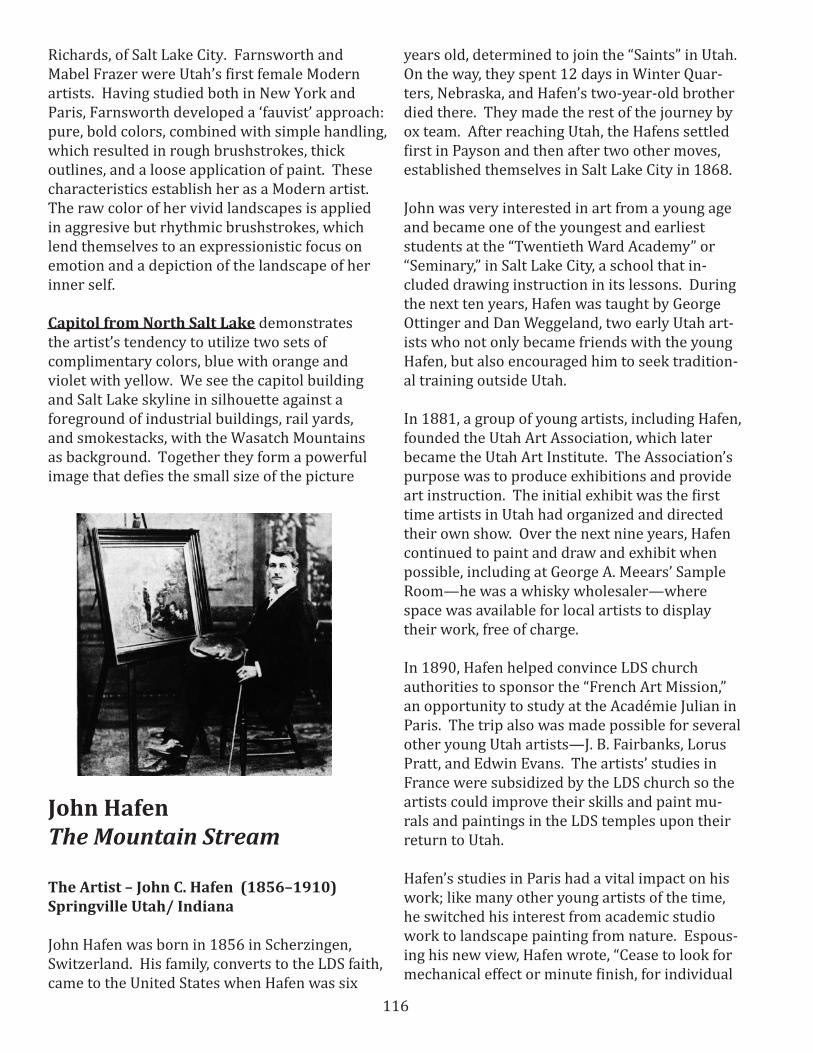
116
Richards, of Salt Lake City. Farnsworth and Mabel Frazer were Utah’s first female Modern artists. Having studied both in New York and Paris, Farnsworth developed a ‘fauvist’ approach: pure, bold colors, combined with simple handling, which resulted in rough brushstrokes, thick outlines, and a loose application of paint. These characteristics establish her as a Modern artist. The raw color of her vivid landscapes is applied in aggresive but rhythmic brushstrokes, which lend themselves to an expressionistic focus on emotion and a depiction of the landscape of her inner self.
Capitol from North Salt Lake demonstrates the artist’s tendency to utilize two sets of complimentary colors, blue with orange and violet with yellow. We see the capitol building and Salt Lake skyline in silhouette against a foreground of industrial buildings, rail yards, and smokestacks, with the Wasatch Mountains as background. Together they form a powerful image that defies the small size of the picture
John HafenThe Mountain Stream
The Artist – John C. Hafen (1856–1910) Springville Utah/ Indiana
John Hafen was born in 1856 in Scherzingen, Switzerland. His family, converts to the LDS faith, came to the United States when Hafen was six
years old, determined to join the “Saints” in Utah. On the way, they spent 12 days in Winter Quar-ters, Nebraska, and Hafen’s two-year-old brother died there. They made the rest of the journey by ox team. After reaching Utah, the Hafens settled first in Payson and then after two other moves, established themselves in Salt Lake City in 1868.
John was very interested in art from a young age and became one of the youngest and earliest students at the “Twentieth Ward Academy” or “Seminary,” in Salt Lake City, a school that in-cluded drawing instruction in its lessons. During the next ten years, Hafen was taught by George Ottinger and Dan Weggeland, two early Utah art-ists who not only became friends with the young Hafen, but also encouraged him to seek tradition-al training outside Utah.
In 1881, a group of young artists, including Hafen, founded the Utah Art Association, which later became the Utah Art Institute. The Association’s purpose was to produce exhibitions and provide art instruction. The initial exhibit was the first time artists in Utah had organized and directed their own show. Over the next nine years, Hafen continued to paint and draw and exhibit when possible, including at George A. Meears’ Sample Room—he was a whisky wholesaler—where space was available for local artists to display their work, free of charge.
In 1890, Hafen helped convince LDS church authorities to sponsor the “French Art Mission,” an opportunity to study at the Académie Julian in Paris. The trip also was made possible for several other young Utah artists—J. B. Fairbanks, Lorus Pratt, and Edwin Evans. The artists’ studies in France were subsidized by the LDS church so the artists could improve their skills and paint mu-rals and paintings in the LDS temples upon their return to Utah.
Hafen’s studies in Paris had a vital impact on his work; like many other young artists of the time, he switched his interest from academic studio work to landscape painting from nature. Espous-ing his new view, Hafen wrote, “Cease to look for mechanical effect or minute finish, for individual

117
leaves, blades of grass, or aped imitation of things, but look for smell, for soul, for feeling, for the beautiful in line and color.”
Back in Utah by 1892, Hafen began work on the murals for the Salt Lake Temple. Although Hafen did the most work, Pratt, Fairbanks, Evans, and Dan Weggeland all contributed their Paris-honed skills.
The next year, the Society of Utah Artists was re-established with Hafen serving as vice president. The society’s exhibits were well received, with many people willing to pay the entrance fees. Al-though Hafen’s paintings from the middle 1890s to about 1907 are now considered “masterpieces of Utah art,” he wasn’t able to support his fast-growing family on what he made from his work. Consequently, he held various jobs and at times received support from the Church in exchange for paintings and drawings, which now make up the impressive Hafen collection at the Museum of Church History and Art in Salt Lake City.
Hafen taught at the Brigham Young Academy and eventually settled in Springville with his wife and ten children. Originally, the family lived with the Myron Crandall Jr. family because the Hafens couldn’t afford to pay rent. Later, Hafen traded a painting for a hilly section of Crandall’s land. Alberto O. Treganza, a close friend of the Hafens, designed their home in the Swiss chalet style. The building was paid for by sales of paintings and the bartering of paintings to a local doctor who traded the paintings for work his destitute patients did on the Hafen home. To cover one bare cement wall, Hafen painted a mural of hol-lyhocks and attached it to the wall. After Hafen’s death, the canvas was removed, mounted, and framed and is now owned by the Springville Mu-seum of Art. The Hafen home in Springville still stands today. While in Springville, his interest in art education led Hafen to donate this painting, The Mountain Stream, to the Springville High School and to en-courage other artists (including his friend, Cyrus Dallin) to donate artwork. This art collection grew and eventually necessitated a building to
house and display the art: the collection became the Springville Museum of Art.
Although Hafen made frequent painting and sell-ing trips across the country, he lived in extreme poverty until he moved to Indiana late in his life. There he was accepted into a group of regional impressionist artists and at last began to achieve success as an artist, including the award of a prestigious commission to paint the governor’s portrait. He lived in an attractive cottage over-looking a beautiful valley, surrounded by friends. However, just as he began to realize his life-long dream of providing for his family through sales of his art, Hafen contracted pneumonia and died in 1910.
Ironically, John Hafen is now considered the most appealing of the early Utah stylists, and was called “Utah’s greatest artist” by Alice Merrill Horne, an early Utah art activist. He, of all the early Utah artists, best communicated the poetic essence of the local scenes of nature.
The Art
JOHN HAFEN (1856–1910) Springville Utah/ IndianaMountain Stream (1903) oil on canvas, 26” x 23”Gift from the artist
The painting, The Mountain Stream, is typical of the paintings Horne was referring to. It shows a wooded glade with a small stream tumbling

118
over stony ridges in miniature waterfalls. The composition is strong: The white trunks of the aspen trees in the middleground are set off by the staccato black markings where limbs have broken off or died. The light enters above the trees, highlighting the sharp green grasses and white flowers, and focusing on the frothy stream near the center of the painting. The brightness is balanced and contained by the darker maple tree, the shaded shrubs, and the shadowed section of stream in the foreground.
The technique is painterly, with leaves, flowers, and grasses merely indicated. Instead, Hafen has created the soul of a picture-perfect spot in the Utah mountains. As with the best literature, the painting leaves enough of the detail for the viewer to fill in that the scene becomes personal, it takes on the memories or imagination of the viewer.

119
Back to BasicsDaily Artist
Art History for SecondaryBy Sari Christensen
I decided my students needed to learn more about what is happening in contemporary art, so I insti-tuted a “Daily Artist” program . I spent 15 minutes at the beginning of class on an artist, using web resources, especially Art21 . I did not give quizzes because I found the students paid more attention and discussed the artists and their works more when they didn’t have the pressure of a test on the information . I was very pleased to discover how much the stu-dents enjoyed learning about the artists, complaining when we occasionally didn’t have time . I was also very happy with the conversations I heard among the students as they talked on their own about the art, the artists, and what ideas they now had for their own art . Although I featured contemporary artists, you could also find great information and images for art periods and artists throughout history .
For example, I spent 10 minutes researching Michel-angelo on line . At wikipaintings, I found a biogra-phy, a portrait, and 8 large images of his work . At Wikipedia they have a lot of information and even more images . On youtube, I found several good quality short videos . PBS has a DVD of the kind you might find in your district media center. Having books and posters around is also helpful in keeping students interest and in getting them to con-tinue to think and talk about the artists . I’ve found many great art books at garage sales .
Jacopino del Conte, Michelangelo Buonarroti, ca. 1535 Public Domainhttp://en.wikipedia.org/wiki/File:Michelangelo-Buonarroti1.jpgMichelangelo, Pieta, wikipedia.org

120
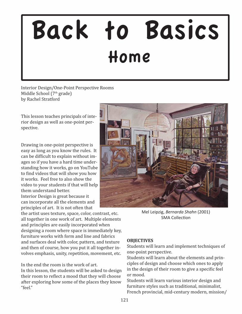
121
Back to Basics Home
Interior Design/One-Point Perspective Rooms Middle School (7th grade)by Rachel Stratford
This lesson teaches principals of inte-rior design as well as one-point per-spective.
Drawing in one-point perspective is easy as long as you know the rules. It can be difficult to explain without im-ages so if you have a hard time under-standing how it works, go on YouTube to find videos that will show you how it works. Feel free to also show the video to your students if that will help them understand better.Interior Design is great because it can incorporate all the elements and principles of art. It is not often that the artist uses texture, space, color, contrast, etc. all together in one work of art. Multiple elements and principles are easily incorporated when designing a room where space is immediately key, furniture works with form and line and fabrics and surfaces deal with color, pattern, and texture and then of course, how you put it all together in-volves emphasis, unity, repetition, movement, etc.
In the end the room is the work of art. In this lesson, the students will be asked to design their room to reflect a mood that they will choose after exploring how some of the places they know “feel.”
OBJECTIVESStudents will learn and implement techniques of one-point perspective.Students will learn about the elements and prin-ciples of design and choose which ones to apply in the design of their room to give a specific feel or mood.Students will learn various interior design and furniture styles such as traditional, minimalist, French provincial, mid-century modern, mission/
Mel Leipzig, Bernarda Shahn (2001)SMA Collection
122
craftsman, Asian, country, etc. and choose a de-sign style to employ in their design. Students will learn how use rulers to measure and find the center of the page.
UTAH STATE CORE Drawing Standard 1 (Making) Objective 2 Create drawings using art elements and principles. a. Create expressive drawings using art elements, including line, shape, form, value, contour, and perspective. b. Create expressive works of art using principles to organize the art elements, including mood, emphasis, and unity.Drawing Standard 4 (Contextualizing) Objective 3 Evaluate the impact of drawing on life outside of school. c. Examine careers related to drawing. d. Predict how drawing can add quality to life and lifelong learning.
MATERIALS 12 x 18” drawing paperruler for each studentT-square for each studentcolored pencils (Prismacolor pencils are always nice. I believe in giving students a chance to try out the good stuff. Just make sure to show them the benefits of better materials and how to use them)pencilsInterior Design reference materials: magazines such as Dwell or Traditional Home, catalogs such as Pottery Barn or Decorators Collection, and clips from HGTV shows on www.hgtv.com (they have shortened versions of the shows so students can see a room redesign in 5 min instead of 30.) Due to the popularity of home makeover shows, you will most likely find quite a few students who like to watch redesigns.
Vocabulary:vanishing point – the point at which all diagonal (orthogonal) lines converge (or intersect) in a one-point perspective drawing.horizon line – the line where the land and the sky meet. Inside, it is an imaginary horizontal line at eye level.
horizontal – parallel to the horizon (and the ground).vertical – perpendicular to the horizon line. In-side, the corners where the walls meet and the sides of a door frame are examples of vertical lines.perpendicular – intersecting at a 90 degree angleconverging – coming together from different di-rections and eventually meeting. orthogonal lines – diagonal lines that meet at the vanishing point in a perspective drawing.
elements of design – are like the building blocks that are used to make a piece of art or any design. Not every element need be used in an artwork/design, but it is a good idea to think about each one. The following definitions came from The 4-H Curriculum web page: http://new.4-hcurriculum.org/projects/kidspace/E-P.htmline – is a mark with greater length than width. Lines can be horizontal, vertical or diagonal, straight or curved, thick or thin.shape – is a closed line. Shapes can be geomet-ric, like squares and circles; or organic, like free formed shapes or natural shapes. Shapes are flat and can express length and width.forms – are three-dimensional shapes, expressing length, width, and depth. Balls, cylinders, boxes and triangles are forms.space – is the area between and around objects. The space around objects is often called negative space; negative space has shape. Space can also refer to the feeling of depth. Real space is three-dimensional; in visual art when we can create the feeling or illusion of depth we call it space.
color – is light reflected off objects. Color has three main characteristics: hue or its name (red, green, blue, etc.), value (how light or dark it is), and intensity (how bright or dull it is). .
texture – is the surface quality that can be seen and felt. Textures can be rough or smooth, soft or hard. Textures do not always feel the way they look; for example, a drawing of a porcupine may look prickly, but if you touch the drawing, the paper is still smooth.
123
principles of design – are organizational rules used to arrange the building blocks not all princi-ples need to be used in each design, but it’s a good idea to consider each. The following definitions came from The 4-H Curriculum web page: http://new.4-hcurriculum.org/projects/kidspace/E-P.htm
balance – is the distribution of the visual weight of objects, colors, texture, and space. If the design was a scale these elements should be balanced to make a design feel stable. In symmetrical balance, the elements used on one side of the design are similar to those on the other side; in asymmetri-cal balance, the sides are different but still look balanced. In radial balance, the elements are ar-ranged around a central point and may be similar.
emphasis – is the part of the design that catches the viewer’s attention. Usually the artist will make one area stand out by contrasting it with other areas. The area will be different in size, color, texture, shape, etc.
movement – is the path the viewer’s eye takes through the artwork, often to focal areas. Such movement can be directed along lines edges, shape and color within the artwork.pattern - is the repeating of an object or symbol all over the artwork.
repetition – works with pattern to make the art-work seem active. The repetition of elements of design creates unity within the artwork.proportion –is the feeling of unity created when all parts (sizes, amounts, or number) relate well with each other. When drawing the human figure, proportion can refer to the size of the head com-pared to the rest of the body.
rhythm – is created when one or more elements of design are used repeatedly to create a feeling of organized movement. Variety is essential to keep rhythm exciting and active, and moving the view-er around the artwork. Rhythm creates a mood like music or dancing.
variety – is the use of several elements of design
to hold the viewer’s attention and to guide the viewer’s eye through the artwork.
unity – is the feeling of harmony between all parts of the artwork creating a sense of complete-ness.
Writing activity1. Have students close their eyes and imagine
their favorite place. Why is it their favorite place? What does it look like there? What does it feel like there? Make sure students are writing full sentences with complete ideas for this part.
2. Have students write down a physical description of their favorite place and a description of the feel of that place. Have them explain why it is their favorite place.
3. Have students write what home feels like.Class discussionAsk students to share what they wrote about their favorite places. Then explore the idea of home with them. Why does home feel the way it does? Explain to them that they will be designing a room that will be in their future home. Have them think about what feeling they want in their home (thinking back on what feelings they liked about their favorite place). Do they want their home to feel warm and cozy? Chic and modern? Refresh-ing but comfortable? Have them write this down in their journals and then brainstorm what they would imagine in a room that fits that description. Let them know that when brainstorming they do not need to use complete sentences and that they can even sketch out any ideas they have.

124
Initial perspective activity1. In their sketchbooks or on a spare paper, have students practice drawing a horizon line and a
vanishing point in the center of the horizon line.
2. Have the students use rulers draw three or shapes (have them start with squares, rectangles, or triangles) on the paper at least one shape should be above the horizon line, one should be below, and one should be big enough to have part above and part below the horizon line. Also have them draw a horizontal line above or below the horizon line and a vertical line that cross-es the horizon line.

125
3. Once the shapes are drawn, have students use rulers to draw a light line from the vanishing point to the closest corners on the shapes and the ends of the two lines.
4. Have students draw horizontal and vertical lines to “cut off” the “tails” of the shapes and to make shapes out of what started out as the horizontal and vertical lines.

126
5. Tell the students to erase the “tails”. What you have left are the beginnings of dressers, beds, rugs, windows and posters.
6. Have students see what they can make out of what they have drawn.
Interior Design concepts and stylesTalk to the students about the elements and principles of design. Show them some examples of in-teriors and have them identify which elements and principles are used in each room and how they are used. This is a great group activity so it is a good idea to have enough images of interiors or even magazines to have two or three images per group. Then show them some clips from HGTV’s website, www.hgtv.com. These clips often identify different design styles. After watching some clips ask the groups if any of the images they had were in the same style as the rooms in the video clips. One thing to mention about interior design include that lighter wall and ceiling colors will help the room feel more open while darker colors on the walls will make the room feel smaller or a darker ceiling color will make it feel lower. I also like to make sure the students think through their color choices before getting started on their drawing. Remind the students that they need to choose a mood for the room and that the colors they use will be an integral part in creating that mood.
Studio project: One-point perspective room design1. In their journals or on scrap paper, have the students sketch a more complete idea of their
room. Have them test colors on the side and once they have picked what they want, add color to the sketch. Have them show their sketch to at least 2 neighbors and ask, “What feeling do you get from this room?” to make sure they are on the right track with their design. If they aren’t getting an answer similar to what they are looking for, have them ask for feedback.

127
2. Once they have checked with the teacher to make sure they have enough in the room (students should have at least 3 objects that are drawn to look three dimensional using perspective, i.e. furniture) and that they have a complete design, have the students start their final drawings on the 12 x 18” drawing paper.
3. Students should start by finding the center of the paper by very lightly drawing diagonal lines from opposite corners of the paper. Have the students mark the center of the “x” as the van-ishing point. Then have the students measure and mark the center of the 12” side. Then have them lightly connect that mark to the vanishing point and then continue the line through and all the way to the other side. This is the horizon line. Again, you want to draw lightly so that these lines can be erased later.
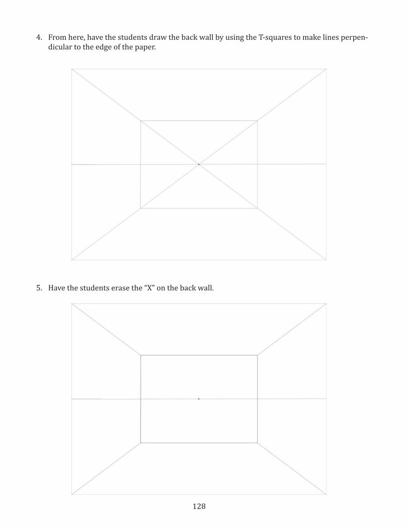
128
4. From here, have the students draw the back wall by using the T-squares to make lines perpen-dicular to the edge of the paper.
5. Have the students erase the “X” on the back wall.
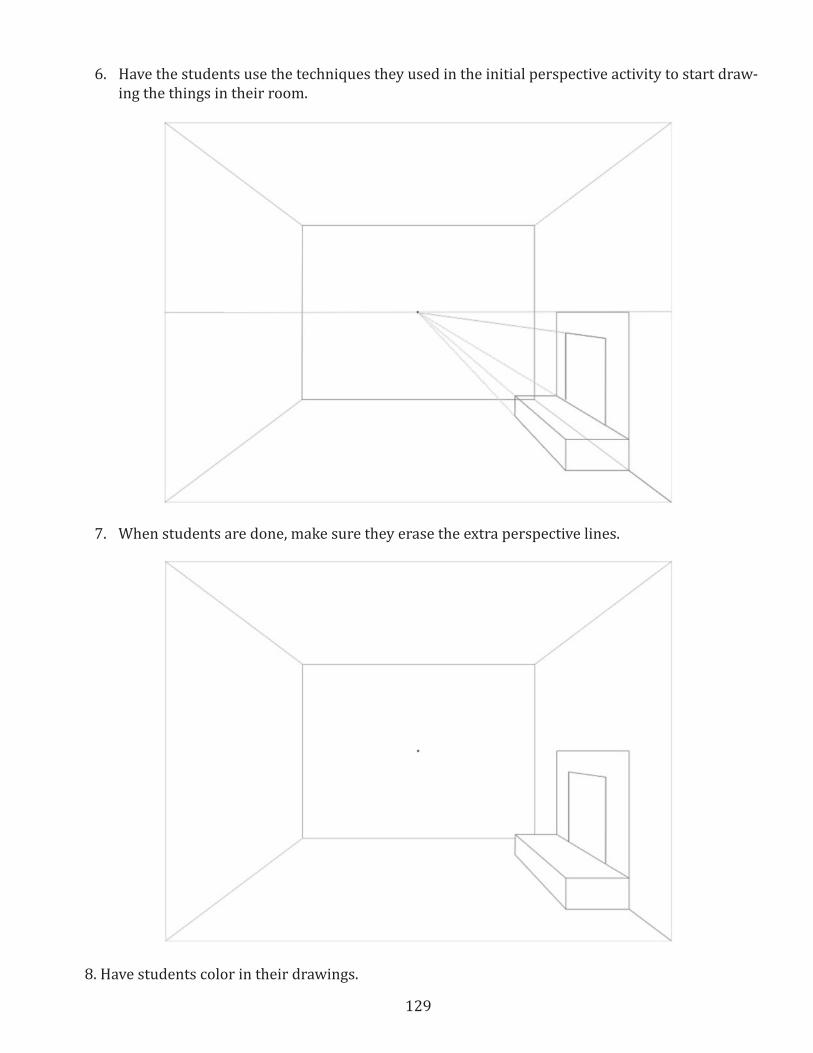
129
6. Have the students use the techniques they used in the initial perspective activity to start draw-ing the things in their room.
7. When students are done, make sure they erase the extra perspective lines.
8. Have students color in their drawings.
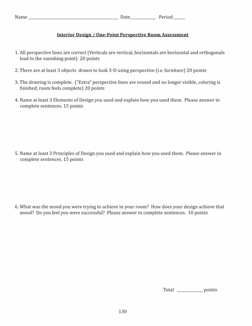
130
Name _________________________________________________ Date______________ Period ______
Interior Design / One-Point Perspective Room Assessment
1. All perspective lines are correct (Verticals are vertical, horizontals are horizontal and orthogonals lead to the vanishing point) 20 points
2. There are at least 3 objects drawn to look 3-D using perspective (i.e. furniture) 20 points
3. The drawing is complete. (“Extra” perspective lines are erased and no longer visible, coloring is finished, room feels complete) 20 points
4. Name at least 3 Elements of Design you used and explain how you used them. Please answer in complete sentences. 15 points
5. Name at least 3 Principles of Design you used and explain how you used them. Please answer in complete sentences. 15 points
6. What was the mood you were trying to achieve in your room? How does your design achieve that mood? Do you feel you were successful? Please answer in complete sentences. 10 points
Total ______________ points
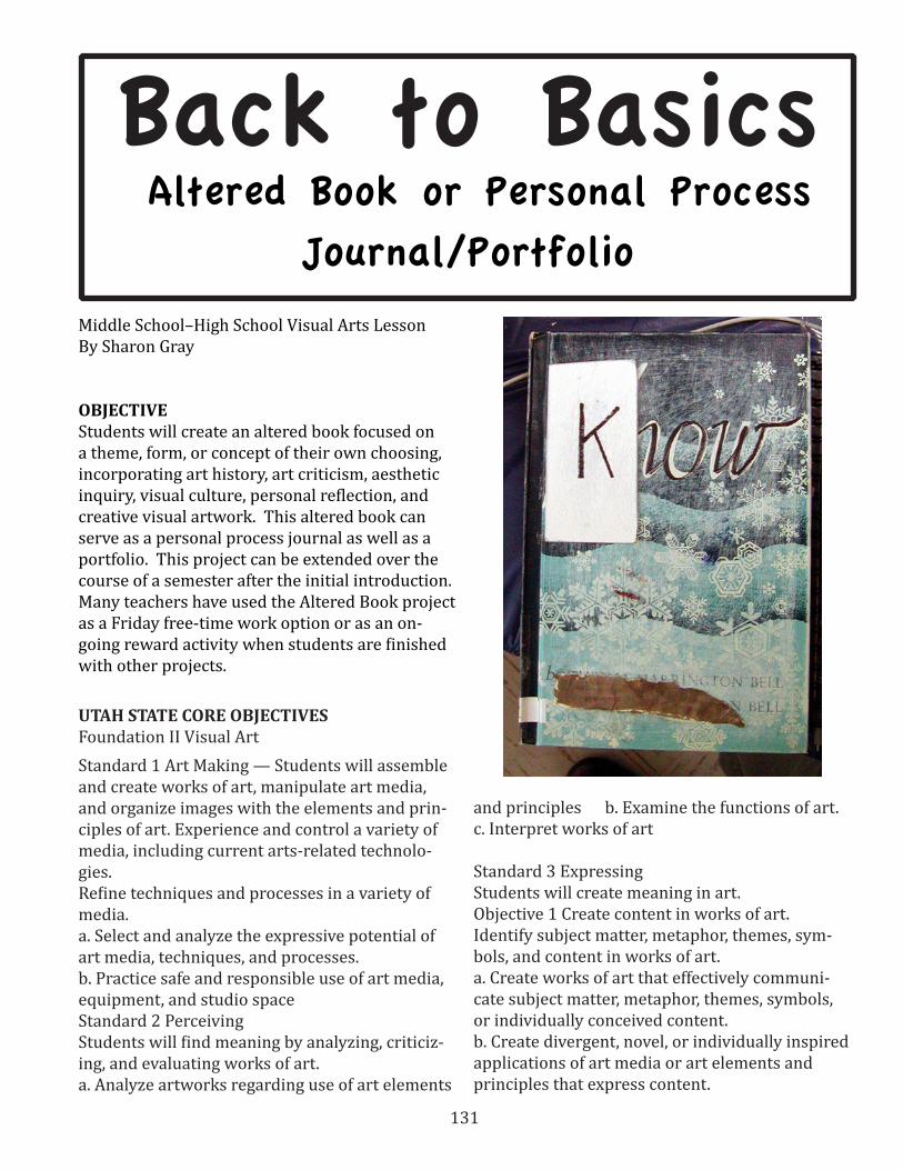
131
Back to Basics Altered Book or Personal Process
Journal/Portfolio
Middle School–High School Visual Arts LessonBy Sharon Gray
OBJECTIVEStudents will create an altered book focused on a theme, form, or concept of their own choosing, incorporating art history, art criticism, aesthetic inquiry, visual culture, personal reflection, and creative visual artwork. This altered book can serve as a personal process journal as well as a portfolio. This project can be extended over the course of a semester after the initial introduction. Many teachers have used the Altered Book project as a Friday free-time work option or as an on-going reward activity when students are finished with other projects.
UTAH STATE CORE OBJECTIVES Foundation II Visual Art Standard 1 Art Making — Students will assemble and create works of art, manipulate art media, and organize images with the elements and prin-ciples of art. Experience and control a variety of media, including current arts-related technolo-gies. Refine techniques and processes in a variety of media.a. Select and analyze the expressive potential of art media, techniques, and processes. b. Practice safe and responsible use of art media, equipment, and studio spaceStandard 2 Perceiving Students will find meaning by analyzing, criticiz-ing, and evaluating works of art.a. Analyze artworks regarding use of art elements
and principles b. Examine the functions of art. c. Interpret works of art
Standard 3 Expressing Students will create meaning in art. Objective 1 Create content in works of art.Identify subject matter, metaphor, themes, sym-bols, and content in works of art. a. Create works of art that effectively communi-cate subject matter, metaphor, themes, symbols, or individually conceived content. b. Create divergent, novel, or individually inspired applications of art media or art elements and principles that express content.
132
Objective 2 -Curate works of art ordered by me-dium and content. a. Organize a portfolio that expresses a purpose such as mastery of a medium, objectives of this Core, or significant content. b. Exhibit works of art selected by themes such as mastery of a medium, Core objectives, and significant content. Contextualizing Standard 4 Students will find meaning in works of art through settings and other modes of learning. Objective 1 : Align works of art according to his-tory, geography, and personal experience. a. Use visual characteristics to group artworks into historical, social, and cultural contexts; e.g., cubist view of the Egyptians, tenebrism of the Baroque. b. Analyze the impact of time, place, and culture on works of art.
MATERIALS A discarded hardcover book will serve as a personal process portfolio/journal. If preferred, a student could purchase an unlined hardcover sketchbook with at least 50 pages at least 8-1/2” X 11” (8-1/2” X 14” is even better).
Works of art to include in the project would de-pend on the student–selected theme and pref-erences. Suggested works from the Springville Museum of Art Spring Salon Catalogs or on-line collection include:
ACTIVITY Create an “Altered Book” by transforming a dis-carded book to serve as a personal process port-folio/journal. (Considerations: Leave space for a cover page to introduce your theme. Design a cover reflecting the theme.)
Select a theme. Exploring the theme: After working briefly with your theme, what are your thoughts now regarding its application to visual culture, art history or making art?
Assignment: There are only 9 art-making as-signments listed, however, you are required to
complete at least 20 pages of your journal. It is recommended that you complete the assignments in the order given. Place the numbered journal entries on the last few pages of your sketchbook. Your journal entries should follow the art making as soon as possible. Some journal entries should be made prior to art making. Additional writing can be included with your art-making assign-ments, to help make up the 20 pages.
1 _____ Choosing a topic, theme Journal Entry #1 -Before you begin your art making, write a brief statement on why you chose your object, life concern, or theme. A clear and meaningful theme addressed in a connected way (although the theme may change during the course of the project). What attracted you to it to begin with? Briefly brainstorm future art-making possibilities.
2_____ Art making #1 Create an Alliterative Alteration Collage : Select an artwork from art history and use it as a visual idea to construct a collage as a postcard or book page using maga-zine images or photos. Select an alliterative title to identify the significant issue or focus of the collage. Examples: “Amazing America,” “Nearby Neighborhoods” or “Mysterious Me,” and don’t forget “Practicing Pedagogy with a Pent-up Pony.”
3 _____ Art making #2 Drawing or painting exploring your theme: Do at least one investiga-tive, exploratory drawing or painting using ink, watercolor, and/or acrylic. Label and date.
4 _____ Journal entry #2 - Exploring the theme: After working briefly with your theme, what are your thoughts now regarding its application to visual culture, art history or making art?
5 _____ Art making #3, #4, and #5 - Media choic-es: Render the theme in 3 different media. At least one should be a 3-D reliquary. Also vary the size and orientation (vertical/horizontal) of your renderings. One media choice should be a media that you have never worked with before. Label and date each on the back.
6 _____ Journal entries #3, #4, and #5 - Respons-es to media choices: Write about each media

133
choice. What were your initial intentions, and how successful were you? What unexpected re-sults did you get?
7 _____ Art making #6 - Adopting a style: Choose an artist or style you either like or hate and create one work in that style. Base this decision on your research in art history. Label and date.
8 _____ Journal entry #6 - Responses to style adoption: Respond to mimicking a style. What were some of the problems you addressed? What aspects of the style were easily transferred to your work? What was not easy or was unsuccess-ful?
Share with the class- New Media Choice and Adopt a Style
9 ____ Art making #7 - Think outside the box: Create a work that is different from your previous works. This work should do one or more of the following: animate or personify the object, con-nect it to or transform it into another object, put it into an unlikely setting, alter its function or use. Label and date.
10 ____ Journal entry #7 - Writing outside the box: Push the artwork further. How can you still change or modify the work? How comfortable were you in creating an unusual work? What helps you to be more “creative”?
11____ Art making #8 and journal entry #8 - Make a statement: Create a work that makes a political, social or economic statement. Consider postmod-ern approaches to your subject matter. Before you begin your work brainstorm (either in a written format or with sketches or both). Determine your intent prior. Record your intent and brainstorm-ing in your journal before you begin and then respond to the process after your work in com-pleted. Label and date the artwork.
12____ Art making #9- Depth: This is your chance to explore your object /theme however you would like.
13 ____ Journal entry #9 - Seeing through some-one else’s eyes: Have two people go through your portfolio. One person should be an art major and the other a non-art major. Prepare 5 strategized questions to guide their observations. Record the questions and their responses in your journal. Write a brief response to their observations. How did you feel about what they said? Which person’s observations were more insightful?
14 ____ Journal entry #10 - Triangulated written assessment: At the conclusion of your portfolio conduct a written assessment with a peer, then yourself, and finally your instructor. A form is provided for you. Your response should empha-size the process, not just your best work. Note: the instructor will complete their assessment and return the form to you at your exit interview.
15____ Using the grading rubrics attached, grade your personal process portfolio. Turn in this as-signment sheet with checked off tasks along with your triangulated assessment sheet and your journal.
HIgh School Student’s Altered Book Cover

134
ASSESSMENT Using the rubric- grade your personal process portfolio. Turn in this assignment sheet with checked off tasks along with your triangulated assessment sheet and your journal.
STUDENT SELF-EVALUATION
Grade Sheet Personal Process Portfolio Name___________________________
10 Pts________ Effort: My effort was sincere and constant. I was able to work on this assignment in a thought-ful, applied manner. I worked on my portfolio gradually and purposefully
10 Pts._______ Quality: My process portfolio displays quality work. My artworks show concentrated effort and progression. They display craftsmanship, ability and passion for the art-making process. I put qual-ity time and effort into my work. My journal and portfolio display good craftsmanship, originality and thought.
30 Pts.________ Completeness: My Altered Book is complete. My altered book/portfolio shows that both parts (art making and journal keeping) are integral to the entire process and my entries reflect a thought-ful, immediate response to the art-making experience. My entries are complete, often probing further introspectively into the personal aspects of art making. My art works show a searching and stretching rather than minimal effort. I have completed the 20 pages required.
15 Pts.__________ Cohesion: My Altered Book/portfolio displays cohesion between the parts and the whole. It displays interaction between the art works and the journal entries. There is progression between the works and the various stages and processes are fluent. The portfolio itself also displays a connection to my works and the journal. It also shows an in-depth study of my object or theme.
10 Pts.______ Triangulated Assessment*
Total 75 _________
Please respond to the following statement:
Knowledge gained: I gained much knowledge while completing this process portfolio. I was able to see the relationship between this assignment and authentic art-making experiences. I was also able to make personal observations regarding my own art making process, both positively and negatively.
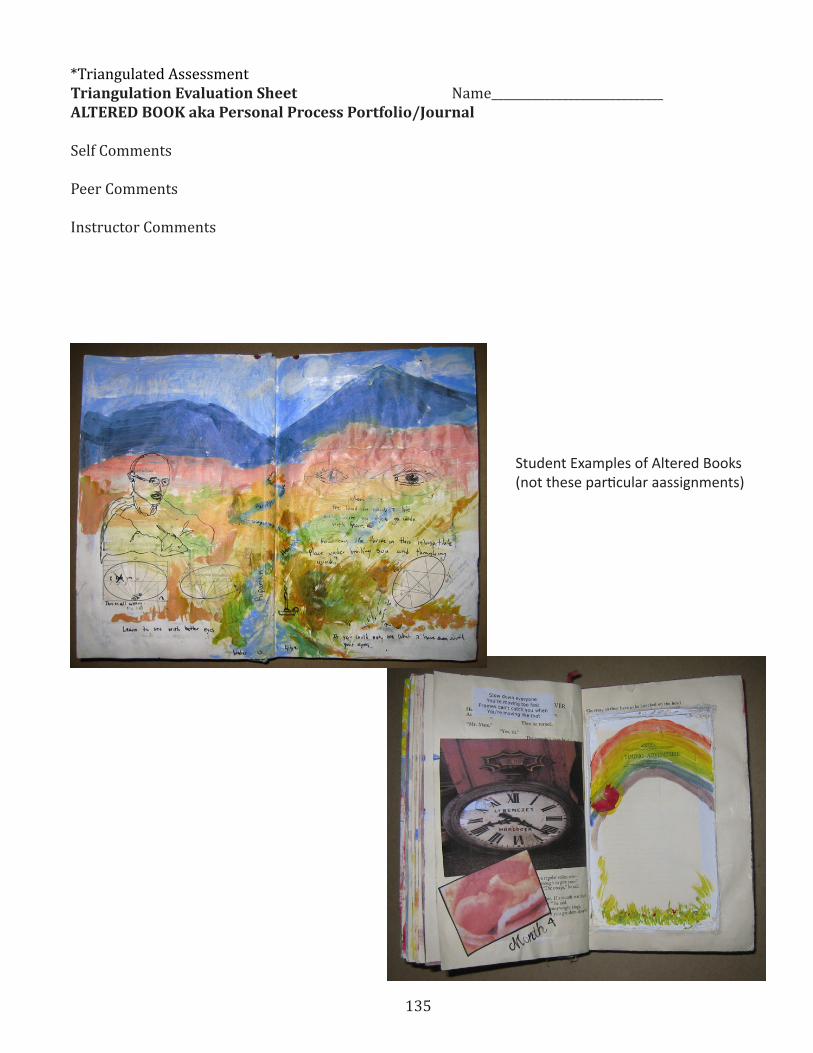
135
*Triangulated AssessmentTriangulation Evaluation Sheet Name_____________________________ALTERED BOOK aka Personal Process Portfolio/Journal
Self Comments
Peer Comments
Instructor Comments
Student Examples of Altered Books(not these particular aassignments)

136
137
EXTENSIONAltered Book Reliquaries Tools needed: Bone folder – or acrylic brush with slanted handle Glue [PVA/bookbinders glue or acrylic medium] Exacto knife with replacement blades Scissors Compass Metal ruler Paint acrylic, watercolor or poster Old Paint brush Archival ink pen [Micron 005 or extra fine tip] Gum eraser Matt, book binders or illustration board at least 81/2 x 11 inches A sheet of tracing paper the more transparent the better Suggested materials to collect: A used children’s board book Old black and white photograph to be used in art An old key A stick found outside 4-5 small toys fitting in the palm of your hand A cork A cartoon strip Various examples of paper and fabric goods, bric-a-brac Look up in advance website Karen’s Whimsy - http://karenswhimsy.com/

138

139
Back to BasicsCommon Core Language Arts Anchor Standards
Reading (Can be linked to Visual Arts)
Key Ideas and Details
* 1 . Read closely to determine what the text says explicitly and to make logical inferences from it; cite specific textual evidence when writing or speaking to support conclusions drawn from the text . * 2 . Determine central ideas or themes of a text and analyze their development; summarize the key supporting details and ideas . * 3 . Analyze how and why individuals, events, and ideas develop and interact over the course of a text .
Craft and Structure
* 4 . Interpret words and phrases as they are used in a text, including determining technical, conno-tative, and figurative meanings, and analyze how specific word choices shape meaning or tone. * 5 . Analyze the structure of texts, including how specific sentences, paragraphs, and larger portions of the text (e .g ., a section, chapter, scene, or stanza) relate to each other and the whole . * 6 . Assess how point of view or purpose shapes the content and style of a text .
Integration of Knowledge and Ideas
* 7 . Integrate and evaluate content presented in diverse media and formats, including visually and quantitatively, as well as in words .1 * 8 . Delineate and evaluate the argument and specific claims in a text, including the validity of the reasoning as well as the relevance and sufficiency of the evidence .
* 9 . Analyze how two or more texts address simi-lar themes or topics in order to build knowledge or to compare the approaches the authors take .
Range of Reading and Level of Text Complexity
* 10 . Read and comprehend complex literary and informational texts independently and proficiently.
Writing:
Text Types and Purposes1
* 1 . Write arguments to support claims in an analysis of substantive topics or texts, using valid reasoning and relevant and sufficient evidence. * 2 . Write informative/explanatory texts to ex-amine and convey complex ideas and information clearly and accurately through the effective selec-tion, organization, and analysis of content . * 3 . Write narratives to develop real or imagined experiences or events using effective technique, well-chosen details, and well-structured event se-quences .
Production and Distribution of Writing
* 4 . Produce clear and coherent writing in which the development, organization, and style are appro-priate to task, purpose, and audience . * 5 . Develop and strengthen writing as needed by planning, revising, editing, rewriting, or trying a new approach . * 6 . Use technology, including the Internet, to produce and publish writing and to interact and col-laborate with others .
140
Research to Build and Present Knowledge
* 7 . Conduct short as well as more sustained research projects based on focused questions, dem-onstrating understanding of the subject under inves-tigation . * 8 . Gather relevant information from multiple print and digital sources, assess the credibility and accuracy of each source, and integrate the informa-tion while avoiding plagiarism . * 9 . Draw evidence from literary or informational texts to support analysis, reflection, and research.
Range of Writing
* 10 . Write routinely over extended time frames (time for research, reflection, and revision) and shorter time frames (a single sitting or a day or two) for a range of tasks, purposes, and audiences .
Speaking and Listening:
Comprehension and Collaboration
* 1 . Prepare for and participate effectively in a range of conversations and collaborations with di-verse partners, building on others’ ideas and express-ing their own clearly and persuasively . * 2 . Integrate and evaluate information presented in diverse media and formats, including visually, quantitatively, and orally . * 3 . Evaluate a speaker’s point of view, reasoning, and use of evidence and rhetoric .
Presentation of Knowledge and Ideas
* 4. Present information, findings, and support-ing evidence such that listeners can follow the line of reasoning and the organization, development, and style are appropriate to task, purpose, and audience . * 5 . Make strategic use of digital media and visual displays of data to express information and enhance understanding of presentations . * 6 . Adapt speech to a variety of contexts and communicative tasks, demonstrating command of formal English when indicated or appropriate .
Language:
Conventions of Standard English
* 1 . Demonstrate command of the conventions of standard English grammar and usage when writing or speaking . * 2 . Demonstrate command of the conventions of standard English capitalization, punctuation, and spelling when writing .
Knowledge of Language
* 3 . Apply knowledge of language to understand how language functions in different contexts, to make effective choices for meaning or style, and to comprehend more fully when reading or listening .
Vocabulary Acquisition and Use
* 4 . Determine or clarify the meaning of unknown and multiple-meaning words and phrases by using context clues, analyzing meaningful word parts, and consulting general and specialized reference materi-als, as appropriate . * 5 . Demonstrate understanding of word relation-ships and nuances in word meanings . * 6 . Acquire and use accurately a range of general academic and domain-specific words and phrases sufficient for reading, writing, speaking, and listen-ing at the college and career readiness level; demon-strate independence in gathering vocabulary knowl-edge when encountering an unknown term important to comprehension or expression .