Analysis photo
2
The background of the double page spread is a pre-made grey to white gradient that I have made in Photoshop CS4. I then cut out the model from the original. The reason for this is that it made it easier to move the model around the page. Also because the model is wearing a bright color (yellow) it helps her to stand out even more against I chose the font Helvetica Neue Light for my article because it is simple and very easy to read. I chose the color black because it stands out easily against the gradient background but also because it goes with the house style of the double page spread. The font also goes with the house style of the front page as Helvetica font is also is used on the front cover. This font is called ‘Colors of Autumn’. I used this font in particular because it had a handwritten, urban look to us which is goes hand in hand with the theme of the theme of the double page spread. It also is quite bold and stands out heavily against the background especially because its in the color black. I chose to add this additional photograph of the model for the entertainment of the readers, since this photograph shows the model in a more informal setting, showing that she is relatable to viewers. I chose to put a shadow behind it to make it stand out against the background because the background of the photograph and background of the double page spread are quite similar.
-
Upload
yngmina -
Category
Art & Photos
-
view
19 -
download
0
Transcript of Analysis photo
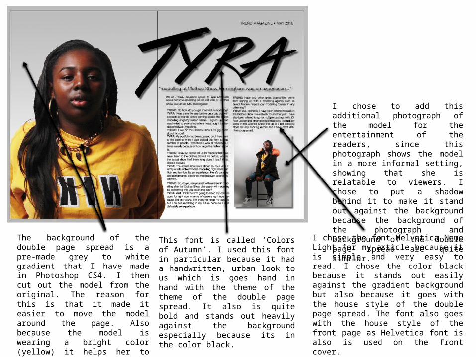
The background of the double page spread is a pre-made grey to white gradient that I have made in Photoshop CS4. I then cut out the model from the original. The reason for this is that it made it easier to move the model around the page. Also because the model is wearing a bright color (yellow) it helps her to stand out even more against the background.
I chose the font Helvetica Neue Light for my article because it is simple and very easy to read. I chose the color black because it stands out easily against the gradient background but also because it goes with the house style of the double page spread. The font also goes with the house style of the front page as Helvetica font is also is used on the front cover.
This font is called ‘Colors of Autumn’. I used this font in particular because it had a handwritten, urban look to us which is goes hand in hand with the theme of the theme of the double page spread. It also is quite bold and stands out heavily against the background especially because its in the color black.
I chose to add this additional photograph of the model for the entertainment of the readers, since this photograph shows the model in a more informal setting, showing that she is relatable to viewers. I chose to put a shadow behind it to make it stand out against the background because the background of the photograph and background of the double page spread are quite similar.
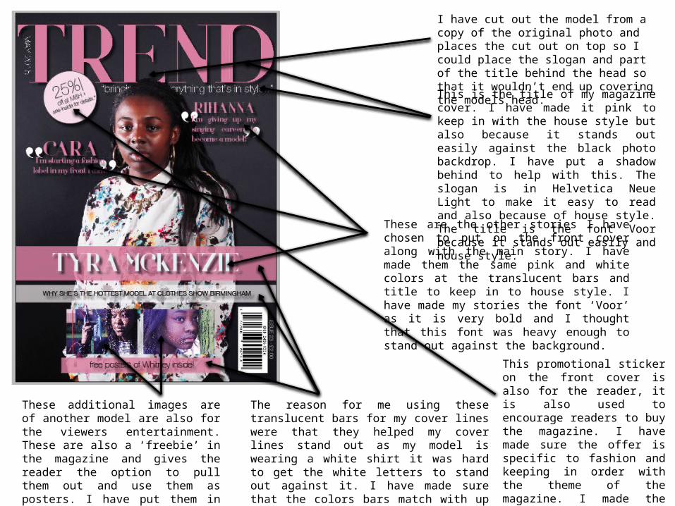
The reason for me using these translucent bars for my cover lines were that they helped my cover lines stand out as my model is wearing a white shirt it was hard to get the white letters to stand out against it. I have made sure that the colors bars match with up the models clothing as I used the color picker to get a color from her shirt.
These additional images are of another model are also for the viewers entertainment. These are also a ‘freebie’ in the magazine and gives the reader the option to pull them out and use them as posters. I have put them in this position to go with the orderly style of magazine cover.
This promotional sticker on the front cover is also for the reader, it is also used to encourage readers to buy the magazine. I have made sure the offer is specific to fashion and keeping in order with the theme of the magazine. I made the color of the sticker a slightly lighter pink to make it stand out against the color of the dark background.
These are the other stories I have chosen to put on the front cover along with the main story. I have made them the same pink and white colors at the translucent bars and title to keep in to house style. I have made my stories the font ‘Voor’ as it is very bold and I thought that this font was heavy enough to stand out against the background.
This is the title of my magazine cover. I have made it pink to keep in with the house style but also because it stands out easily against the black photo backdrop. I have put a shadow behind to help with this. The slogan is in Helvetica Neue Light to make it easy to read and also because of house style. The title is the font Voor because it stands out easily and house style.
I have cut out the model from a copy of the original photo and places the cut out on top so I could place the slogan and part of the title behind the head so that it wouldn’t end up covering the models head.